 |
||||
|
|
|
|||
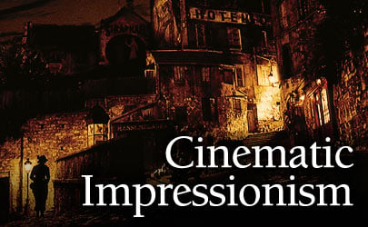
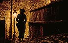
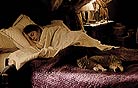
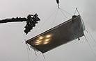
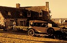
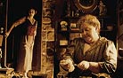
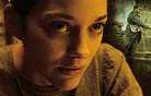
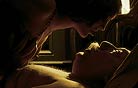
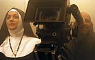
When the filmmakers moved to studio interiors — like Mathilde’s home, a string of bordellos, or the detective’s office — he continued his strategy of a soft light coming from above. “My gaffer and I developed a luminous ceiling that can be part of the set,” he reveals. “It’s made of very dense, brushed cotton — the same cotton that set decorators use on their sets — and I light through it. The light is spread evenly over the whole ceiling and it gives a base fill level that separates the elements of the set. There are even some scenes where it’s in the shot!” For a day interior, he might set this overhead “shower” at 11⁄2 to 2 stops below key. Delbonnel uses space lights or 5K soft lights to pierce through the ceiling. He adds that the units are patched through dimmers so he can warm the color temperature quickly and easily. If the ceiling is out of frame, he sometimes turns off lights to create a brighter center that helps separate the actors below from the background. On set and on location, Delbonnel typically keys his lighting with large sources, such as Dino lights for the Brittany day interiors. “It’s a classical choice that goes back to the work of cinematographers like Vittorio Storaro [ASC, AIC] and John Alcott [BSC]: the bigger and farther away the source is, the more you can work it — cut it or diffuse it. I keep things simple. In general, I start from a big source and play with the distance of the fixture and the diffusion in front of it to soften the light more or less. One great advantage of a big source is that it will wrap around a face. I will only use spots in the background. Again, I never have light behind the camera; it either comes from the side or from above. I add very little inside the set; I try to build the lighting as a function of the set and the frame.” Although he avoids lights on the set, Delbonnel occasionally uses a Kino Flo Flathead 80 with diffusion to supplement a large source. “The Flathead allows us to be near the actors because it doesn’t heat up.” When using reflectors, he avoids white. “I don’t like white reflections on the skin — you feel them.” He uses a gold reflector instead, or creates bounce light off a straw gel. Delbonnel stresses that his lighting is not realistic. “Realism doesn’t interest me! I strive for an unrealistic approach. It’s very important to me, and it’s why I don’t do certain films. For example, in this film we have scenes set in 1920, but there is no gaslight.” He adds that the strong colors of the film are “an affirmation that what you are seeing is not reality. We’re not reconstituting a period; we’re not doing sepia. We’re in a world that has existed, but isn’t a reference to other depictions.” At this point in the discussion, the cinematographer pauses to praise Gordon Willis, ASC. For Delbonnel, one of the landmarks of cinematography is Willis’ pioneering use of skirted bay lights (or “chicken coops”) to illuminate scenes from above in the Godfather movies. Prior to production on A Very Long Engagement, Jeunet screened the flashback sequences of Godfather II, set in Sicily and New York, for key collaborators as a reference for designing a warm color scheme. The color palette of Engagement is quite a bit more varied, however, and contributes much to the film’s modern look. Delbonnel broadly divides the film into the “cold” colors of the wartime trenches and the “warm” world of peacetime. The key color for the film is brown, “sometimes a reddish brown, as in Mathilde’s bedroom; sometimes a yellow brown, as in the hospital; and sometimes a greenish brown, as in the trenches. Brown is what ties the two parts of the movie together. We didn’t want a completely unified tone. The color is warm and rather monochromatic, but we always sought to bring out spots of other colors. For the trenches, the image is cold and always anchored on the blue of the French soldiers’ uniforms.” Delbonnel singles out Éclair Laboratories colorist Yvan Lucas for his contribution to the film’s sophisticated range of colors. In the 1990s, Lucas made great contributions to the application of silver-retention processes like NEC (Noir en Couleur), notably on every Jeunet film that has used them. “Yvan is one of the best timers in the world,” Delbonnel says, adding with a chuckle, “I wish I had his film credits! He has an exceptional eye. He’s not just someone who times my image. I want him to bring something to the image. We talk a lot. There were some rushes where I told him, ‘Do this, and if you want to, try something else.’ Sometimes he goes too far, and sometimes it’s better than what I imagined.” In a telephone interview, Lucas explains that Jeunet and Delbonnel asked him to follow the production “from initial tests, to hi-def timed dailies, to timing, to the first theater screenings, and through to the DVD.” Using a Discreet Lustre, Delbonnel and Lucas spent six weeks on the digital intermediate (DI) at Éclair, where they were visited frequently by Jeunet. “I come from photochemical processes like NEC, and I always strive to conserve the grain, the substance of film,” says Lucas. “I’m a little traditional that way.” He notes that the look of A Very Long Engagement was refined by a kind of “virtual” cinematography. “It’s as if Bruno had put more filters or gels on his lights, but in the DI. We stayed in the spirit of traditional timing, but with a lot more possibilities. To me, the feel of the film corresponds a little bit to NEC.” A key component of the color timing was desaturating the image and then enhancing certain colors. For the peacetime footage, says Lucas, “we added red to the blacks and desaturated, which yields a brownish hue. We then increased selected colors, and this added color was made more important because of the desaturation.” Delbonnel adds that “once you get past the basic opposition between warm and cold, the color is linked to the nature of the set. But [it’s linked] even more to the [location] of the sequence in the film and its proximity to the trenches or to Brittany.” When the filmmakers tried heightening several colors in the frame, recalls Lucas, “All of a sudden, the image became normal, so we decided pretty quickly to only strengthen one color. It became the rule for the film, but there were exceptions. For example, in the Orsay train station, we wanted to showcase the blue-greens of the glass façade and the brown of the costumes.” Lucas cautions that the amount of coloring required a delicate touch. “Obviously, the colors are not realistic, but if we had gone any further with them I don’t think we would have been able to include as many different hues in the film — it would have been too much. Bruno and I always strove for finesse.” |
|
|||
|
<< previous || next >> |
||||
|
|
|
|
|
|

|
|
|
|
|
|
 |
|
|
|
 |
|
|
|
||
|
|
 |
|
|
|
||
|
|
 |
|
|
|
||
|
|
 |
|
|
|
||
|
|
 |
|
|
|
||
|
|
 |
|
|
|
||
|
|
 |
|
|
|
||
|
|
 |
|
|
|
||
|
|
 |
|
|
|
||
|
|
 |
|
|
|
||
|
|
 |
|
|
|
||
|
|
 |
|
|
|
||
|
|
 |
|
|
|
||
|
|
 |
|
|
|
||
|
|
 |
|
|
|
||