Forget Me Not • page 2 • page 3 Film Dailies • page 2 • page 3 |

 |

Page
3
|
||
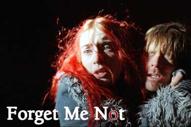
Before production commenced on Eternal Sunshine, Kuras conducted a photochemical color-timing test with the Reala stock, and she used that as a reference during the DI. She noted some key differences between color-timing for a DI and photochemical timing that she says will influence how she photographs films from now on. She emphasizes that "timing for a DI is vastly different than timing photochemically." For night exteriors and interiors, Kuras had exposed the daylight-balanced Reala uncorrected to allow for maximum stop under available-light conditions; her photochemical tests had indicated that the resultant yellow cast could be timed out. "It looked really beautiful, and I liked the way the blacks took shape. I've never been a huge proponent of blacks being really inky. I don't want them milky, but I like them to have roundness and, as I said before, sometimes even a bit of color. But what I didn't foresee was that when we began to take out those 12 points of yellow in the digital realm, we started to pick up video noise." Kuras then began to use digital sharpening and grain-reduction tools to reduce the noise. But, she notes, "when you do grain reduction, you're essentially making the image less sharp." Working with Eaves, Kuras began creating a series of filmout tests to determine which digital tweaks, with their attendant color shifts and noise consequences, would render the best image. "When I saw the first filmout, I said, 'We can do better. This looks muddy. Let's try again,'" says Kuras. "It's a problem that's inherent to the DI process, and you have to be careful. I didn't have that experience on Personal Velocity, but that originated on MiniDV, so it stayed in the digital realm. This was different. You might assume that working with a film original means you immediately have sharpness and clarity [in the digital realm], but you don't, even if the image is really well exposed. The nature of that image and what color lights you were using - whether you biased it toward the warm side or the cool side - significantly affects the way you perceive the film in a DI. Although I liked the Reala, I did notice that the whites had a tendency to be very grainy in the digital realm, even if the negative was well exposed." But Kuras stresses that if one keeps "a vigilant eye," the sharpness issue is easily managed. "We did our grain reduction in combination with image sharpening," she adds. "You'd think they're canceling each other out, but they're not. The sharpening tool really helped to smooth out the image in a way that I wouldn't have been able to do photochemically, and I was able to make the images a lot more seamless." The cinematographer also noted some less obvious differences in color rendition, primarily in the highlight areas, while timing the Eternal Sunshine scans. "In a night interior that I'd lit with tungsten units, I found that the hotspots in the highlights took on a bit of blue, which gave the skin tones a harsher feeling. But it's a very subtle feeling. I had to wonder whether it was because I was looking at so much tungsten that I felt that blue in the whites, or whether it was actually there." Kuras found that after subtracting a few points of blue from the highlight zones, the skin tones noticeably softened. "When Mike and I first started correcting, [I wanted to] stay as close to the scans as possible," says Kuras. "The scans contain as much information as you've got on the negative, and I thought we shouldn't mess around too much with that because it would be snappier and truer to the image. But because of the digital process, I found little subtleties that were affecting the image, like that rogue blue in the highlights. So in some instances, we altered the look of the film specifically for the DI filmout." The chief lesson to be learned from any DI, Kuras cautions, is that the process "is not a panacea for all ills. You can't rely on it to fix certain things you might assume you can fix in post." She learned this the hard way while timing a scene comprising footage shot in different locations that had been dressed to look identical. "One part was shot in a real location and featured a little boy in a period kitchen, and the other part was shot in an oversized set of that kitchen and featured Jim Carrey playing the little boy. When we shot the first part on location, I used smoke to haze out the blacks a bit and make it look a little more 'period.' Then we shot the oversized set in our so-called stage in New Jersey; it was our last day of shooting, and it would have taken days to smoke up the entire space. If I'd realized how much the smoke was going to influence the matching of the scene, I would have started smoking the warehouse up the weekend before. The lack of smoke posed a problem the DI couldn't fix. Even decreasing the black levels in the shadow areas didn't help, because it started making the image look too thin." Kuras says these lessons proved invaluable, and a DI is already in the works for her next feature, The Rose and the Snake, which she shot on Super 16mm. "The DI has been a very useful tool for me, regardless of whether the original material was film or video," she says. "Everybody asks me, 'What's the secret? How did you make Personal Velocity look like film?' But that's a question more easily posed than answered." Page
3
|
||


