HERO • page 2 • page 3 • sidebar GOLDEN YEARS • page 2 • page 3 DVD • page 2 • page 3 |

 |

Page
2
|
||
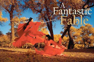
Chess House It was divined to be an auspicious day. Guess I shouldn't have bragged about the New York Film Critics Award [for In the Mood for Love]. Suddenly our lights fail for the first and only time, and the rain machine won't work. The action director keeps asking me to do the opposite of what Zhang wants. The rushes are too contrasty, and worst of all, they run out of my favorite beer. What to do but laugh at one more day on set? The Chess House is very monochrome. How monochrome should my light be? Can the film take without looking black-and-white? We seem to be losing our thrust. All I can suggest is that we try to find the color of the sound of fake (studio) rain falling on our real (art department) slate floors. I find it difficult to judge action for what it is. I'm not sure if we have a shot that conveys the intention of why a foot would, for example, kick a head. Why can't good editing make up for imperfect performance? I wonder. Then the martial-arts director asks to do it again. And again. Dimension Translating three dimensions into two seems easier through the movement that is basic to any film. To achieve it on paper in a collage or other work, the movement has to be suggested, contained within. I find it from time to time and often don't, but the most important thing is to keep trying as freehandedly as possible, rather than imposing it through some formal system or dated concept - to let my mistakes take you to the edge of something fresh, expressive, beautiful. Wide and Handheld The big bits of a work are the equivalent of a wide-angle shot. The paint and crayon and ink are my way of shooting "handheld." Research and Authenticity How things looked and how they were done is a major preoccupation for some, but not for Zhang. "What we think we know about what people did and said 3,000 years ago is obscured by time and limited research. Sloppy filmmakers and the soaps have made an even bigger mash of it all." "So we can set the record straight," I suggest. "No need. We know more or less how women and men walked, what greetings were made, and who came and went first in the street or in the court. So does the audience. They will only be confused by elaborate ritual and obscure signage." "You mean forget about detail? Forget it's a period film?" "As long as we're consistent and reasonably accurate, the film will take care of itself." Centered Zhang likes straight up-and-down, centered framing, not fussing around the edges of the screen. An image structured less like Chinese Art than classic architecture: the actor square and strong as a pillar holding up the form of the shot. Yet Hero is relatively "widescreen," and the spaces imaged are vast. I try to slip in this or that off to one side or the other and then get told, "Chris, get it level to the horizon and move the actors to the middle of the frame." To Zhang, all of the image is basically equivalent. I find it very "Party Centralist" as opposed to my more anarchistic ways. Ideas Zhang: "The typical Hong Kong martial-arts style actually evolved out of more modern martial-arts [Qing Dynasty] aesthetic. Everyone has done that and seen it." Jet: "So that's what we don't want. We must find something essential, quasi-spiritual." Me: "That means going back to an earlier sense of martial artistry?" [Martial-arts choreographer] Dong Wei: "Even I'm not sure what the hell that looked like." Zhang: "You don't know, we don't know, and the audience has even less of an idea!" Me: "So we can do what we want?" Zhang: "More or less. We can't go back 3,000 years. What they were doing 700 years ago would be good enough." Jet: "That's already earlier than the styles people are working from these days." Me: "Enough to make it a modern version of a historical style?" Zhang: "Right. It's already more informed than and different from other films." Me: "A modern, colored version of ancient ideas??" What We've Got It's the king's turn "at bat." We're to shoot his action to match what we shot earlier with Tony. It's not 10 a.m., but the day has become overcast. No light penetrates the vast palace interior. It doesn't match Tony's shot, I know, but what can we do? I try to light for the face and not the background, which means the background is getting too dark. I take out all the filters, knowing the image will go a deeper blue, and we shoot on, knowing it will be nightmare in post and remembering that one shoots with what one has, not always with what one wants. Slow and Painful Dong Wei, Zhang and I view the second-unit fight footage. Zhang: "Is the red too flat? Is the style too straight? What's the character feeling?" Me: "Maggie is mad. That seems to come across." Zhang: "How does Ziyi die?" Dong: "She just falls down." Zhang: "In what light?" Me: "The light dies in her." Zhang: "What does that look like?" Dong: "Slow and painful." Me: "That's a tall order. I'll try." Page
2
| ||


