President’s Desk: Men in White Suits
Shades of Picasso: When we talk about color in our craft, Vittorio Storaro, ASC, AIC perhaps best characterizes its use and implications.
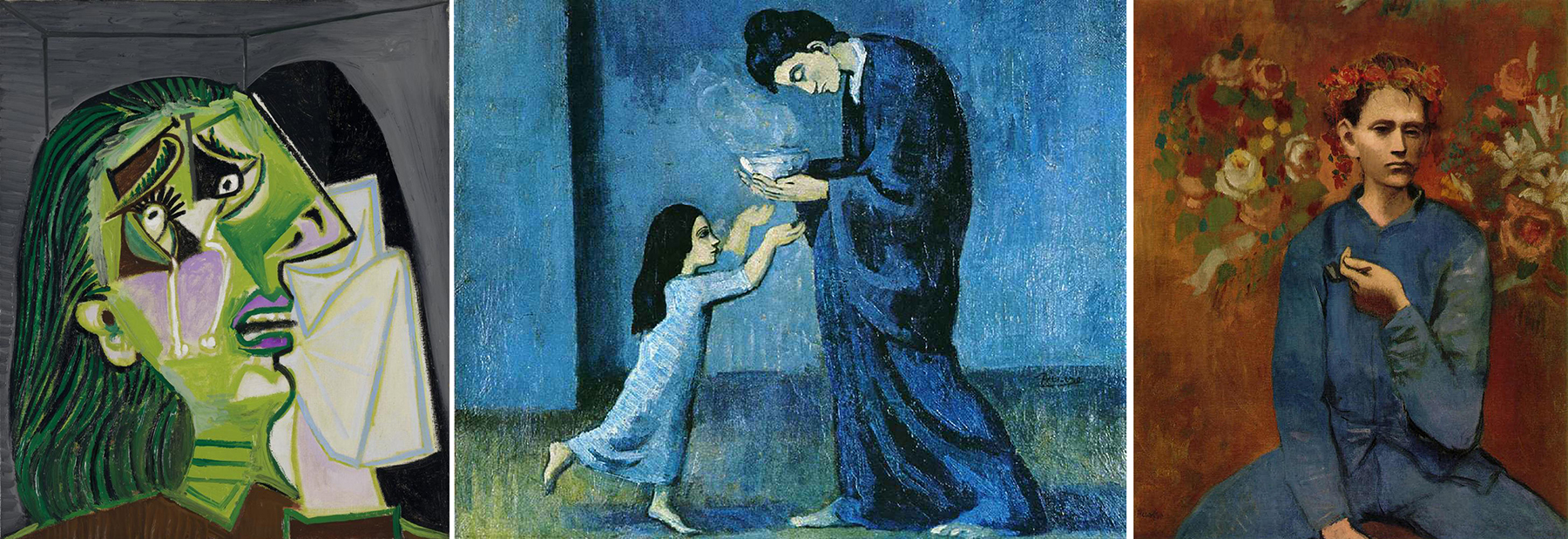
The other day I came across a quote by the Spanish artist Pablo Picasso: “When I don’t have any blue, I use red.”
I think it’s safe to assume that Picasso, who was often dressed in an impeccable white cotton suit, never actually ran out of blue paint. I take his quote in a metaphorical sense.
Picasso’s renowned Blue Period spanned the years 1901 to 1904, when, in a state of severe depression, he was painting almost exclusively with shades of blue and blue-green, only occasionally warming the essentially monochromatic images with other colors. These somber pieces, inspired by Spain and painted while Picasso was in Barcelona and Paris, are now some of the artist’s most popular works.
I find Picasso’s quote to be applicable to cinematography, in that as a director of photography, you prepare, you visualize your look, you go through painstaking research — only to find when you arrive on set that everything has changed and your well-prepared concept will not work. What was intended to be a backlit interior is now front-lit because of the actors’ or director’s choices. And the colors and textures you’d anticipated based on the art department’s plans are all different. This is where “blue changes to red” — and where cinematic depression can often take root.
In a way, though, Picasso is also saying that in the end, the color is not the most important element of the expression; the intensity of your creative vision is what is paramount. So, in his life as a painter, when the color blue no longer emotionally appealed to him, he switched to red, beginning what’s known as his Rose Period and creating yet another tone and body of work.
One can argue that Picasso’s Blue Period is more popular and significant than the Rose Period. But in his quote about “blue” and “red,” he explains, “Colors, like features, follow the changes of the emotions.”
When we talk about color in our craft, Vittorio Storaro, ASC, AIC perhaps best characterizes its use and implications. He uses color shades as a poet uses words. In every one of his films, the choice of color is rigidly connected to the ideology of history; the color does not simply duplicate what’s already in the scene, but creates additional emotional subtext.
Storaro has said, “The meaning of colors is universal, even in spite of cultural differences — if the audience does not understand the values, it still feels it.” This tells me that he, like Picasso, is first and foremost a storyteller showing us an interpretative world driven by moods and personal circumstances. They rely on their instincts and imagination as they concentrate on the creation of an image that speaks to our imaginations and emotions.
Storaro’s sophisticated philosophy is largely inspired by Johann Wolfgang von Goethe’s theory of colors, which focuses in part on the psychological effects that different colors have, and the way in which colors influence our perceptions of different situations.
And this brings me to my point, that cinematography should really be approached from an emotional and intuitive perspective. It’s striking how simple quotes, printed in black and white, can stir up such feelings.
“If you don’t know what color to take, take black,” said Picasso.
And, in regard to Storaro, Francis Ford Coppola said, “Vittorio is the only man I ever knew that could fall off a ladder in a white suit, into the mud, and not get dirty.”

Kees van Oostrum
ASC President