Fresh Perspectives
Keeping a long-running TV series looking fresh is a constant challenge for cinematographers working season-to-season.
Keeping a long-running TV series looking fresh is a constant challenge for cinematographers working season-to-season.
When you’re on a production for any length of time, chances are you’ll be revisiting the same set or location multiple times — especially when shooting episodic television, where certain standing sets will be reused for multiple episodes throughout the season. As the cinematographer, will you re-create the same look to maintain consistency with that set, or will you mix it up and strive for a different look each time?
AC caught up with ASC members Michael Goi and Alan Caso to get their thoughts on approaching a recurring set. Goi is a former president of the ASC whose work includes the series My Name Is Earl, Glee, The New Normal and American Horror Story (AC Nov. ’12), as well as the TV movies The Fixer (AC May ’99) and Judas. Caso, a recipient of the ASC Career Achievement in Television Award (AC Feb. ’18 or here), has been behind the camera on series including Six Feet Under (AC Nov. ’02), Hawaii Five-0 and American Gothic; the telefilm George Wallace; and the miniseries Frankenstein and Into the West (AC June ’05). At press time, the two were collaborating on two episodes of The Rookie, with Goi in the director’s chair and Caso as cinematographer.
“There’s always room to expand the visual vocabulary of a show. As long as you’re motivating it narratively, you’re doing
your job.”
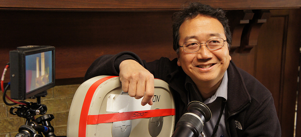
“My approach to shooting any scene is an internal one, in terms of how the main character in that scene feels about the situation that they’re in,” Goi explains. “I climb into the head of that character, and I depict the world as they see it. We might be in the same set four or five times in a movie, or every couple weeks on a television show, and [this approach] requires giving that set a different visual treatment — one that alludes to the mental state of the character — each time. It makes it more interesting to watch as a result. If the set looks the same every time you go into it, that’s monotonous and almost tends to be like white noise. The look should vary according to how the character is feeling in that scene.
“How we accomplish that is by using the color and angle of light to mix it up,” Goi continues. “Turn practicals on or off from one scene to the next. Light in a way that is completely, radically different than any way you’ve seen the room before — but have it all be motivated by how the character feels at that particular moment.”
“You always have all the tools at your disposal. Camera angles; the quality, color, intensity and direction of light; and lenses — the combinations of these tools are truly infinite.”
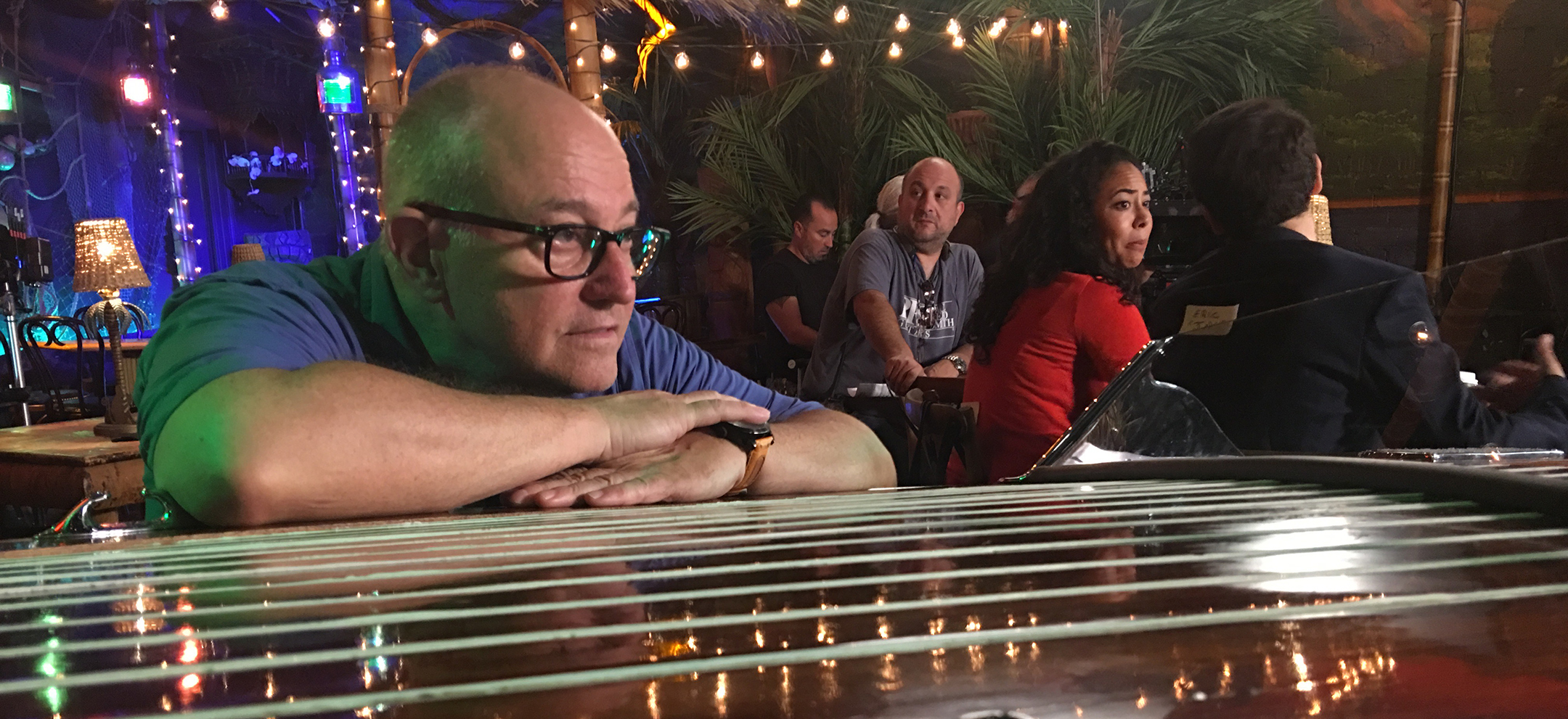
“When you’re shooting a feature or long-form TV, it can be an issue to keep it interesting if you’re in a set for a lot of time,” Caso attests. “If you’re doing 30 pages in one location, you’re going to have to find a way to see that place from a lot of different angles. You have to take something specific that is on the page — such as a moment where the characters are in a subdued or vulnerable position for whatever reason — and then maybe you pick a high angle looking at them like small rats in a lab. You pick something like that not because you do it for every scene, but because it’s right for this scene. In another scene with a lot of activity, you design a shot with a lot of movement, and you pass off the frame from one person to the next. In the next scene, maybe one of the characters is in a position of power, so you do a lower shot. Always look at what is on the page for inspiration. I have yet to fail from doing that.
“The next layer is to borrow from time-of-day,” Caso adds. “Nights are different than days, obviously, but days can also be very different from one another. Is it bright and sunny, or overcast and shadowy? Is it early morning, or high noon, or magic hour? Are there hot beams of sunlight streaming in, creating hard shadows on the walls and hot spots on people’s bodies? Is it just after sunset and before people turn on the lights, when the windows are a cold blue hue and the room is dim? [In the latter case] you can turn on the lights and change the look within the same scene.
“You always have all the tools at your disposal,” Caso continues. “Camera angles; the quality, color, intensity and direction of light; and lenses — the combinations of these tools are truly infinite. So you choose something that helps put the audience into the mood of the scene. Want to put them right into the scene, with the actors? You can choose wide lenses and shoot close to the talent if it is a really intimate scene. Is it more subjective and voyeuristic? Then you can use longer lenses from farther away; you can reduce depth of field and have only the character in sharp focus while everything else falls away. The choice of lenses and composition can make a whole set look completely different.”
This can beg the question: If the same location looks different each time it’s shown, how will viewers know where they are? Shouldn’t there be some degree of familiarity, or even a uniform look, to the set? “It depends on what you define as a ‘uniform look,’” Goi responds. “The set is going to be the set. Familiar furniture, wall coloring, the arrangement of things — you already have that familiarity for the audience, so you can vary the lighting and it will still be recognizable as the same set. It is the same set, but at a different time of day or in a different context.”
As an example, Goi cites an episode of Falling Water that he directed. “A character was being interrogated by two others in one of our recurring sets,” he explains. “I realized that they had never shot in one corner of this large set; it was always in the extreme background. There was a lot of junk piled up in that corner, and I thought it looked great and was perfectly appropriate for this scene. I chose that corner of the room instead of the high-tech area where the computer banks were because it felt right for the scene. It gave a look and feel to the set that we’d never seen before.”
While shooting the series For the People, Caso became well acquainted with a number of repeat sets. “We had a public defender’s office and a lot of courtrooms on the show,” he notes. “A lot of times I would use a high angle looking down because I wanted you to feel like you’re watching ants in a hill, observing the process of law and what happens in the court. It’s like a view from Mount Olympus, looking down and watching everything unfold. I specifically asked the production designer [Johnny Breedt] to build hard ceilings, but with sections that could come out. I like hard ceilings because you can’t manipulate them easily; it forces you to shoot the set like a practical location, using wide lenses to get the view of the whole set, making it look more like a real place. I also went the other way because these ceilings were beautiful. I would shoot a lot of low angles looking up to help show the grandeur of the U.S. legal system. Courts are meant to be intimidating; this is where decisions are made that affect the lives of many people.
“When it came to shooting the attorneys, I would shoot the ending arguments depending on what they were saying,” Caso continues. “If they were expressing personal emotions, I would pick longer lenses and make the focal plane very shallow so that we were in their world and only their world. Other times, when they were really making a plea and connecting with people, I’d go with wide lenses and get in very close to the actors. Doing that would force these scenes to look and feel different, even though the location was the same.”
As Caso notes, lens choice is a key creative tool that cinematographers should embrace. “So much TV is shot out of convenience rather than the filmmakers’ conscious choices,” he observes. “It’s convenient to snap on a zoom and shoot rather than picking prime lenses, which are each chosen for a deliberate reason. You can just zoom in and get a composition as opposed to using a prime that forces you to move the camera into the right composition for the shot. But we need to make these conscious choices, to consider lens choice alongside the placement of the camera and the key light. That’s not something that should just happen by default.”
“On the seventh season of Pretty Little Liars,” Goi recalls, “I had requested a lens that was wider than they had ever used on the show. I used it because I had several scenes where I had to incorporate the actions of several different characters in a single shot. I felt the wide lens would enable me to do that. In one of those scenes, the characters were wandering in a forest to find their missing car. I shot it from high above, extremely wide, so that they were just dots walking around with flashlights. This was to give the feeling of what they were experiencing: a sense of being lost. It was effective, and those kinds of shots became part of the visual lexicon of the show.
“I’ve never had resistance [from a director or production] about treating something differently,” Goi says. “I think the main concern is that the choices we make still feel like the show, and that the characters are presented in a way that is familiar to the audience. But within that context there is quite a bit that you can do.
“People will often say, ‘Well, in this room, the light has to come from that practical source,’ but that’s not much of a concern of mine,” Goi continues. “I’ll have the light coming from wherever it feels right. I’ll really put it anywhere to give the audience the feeling I want to convey.”
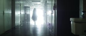
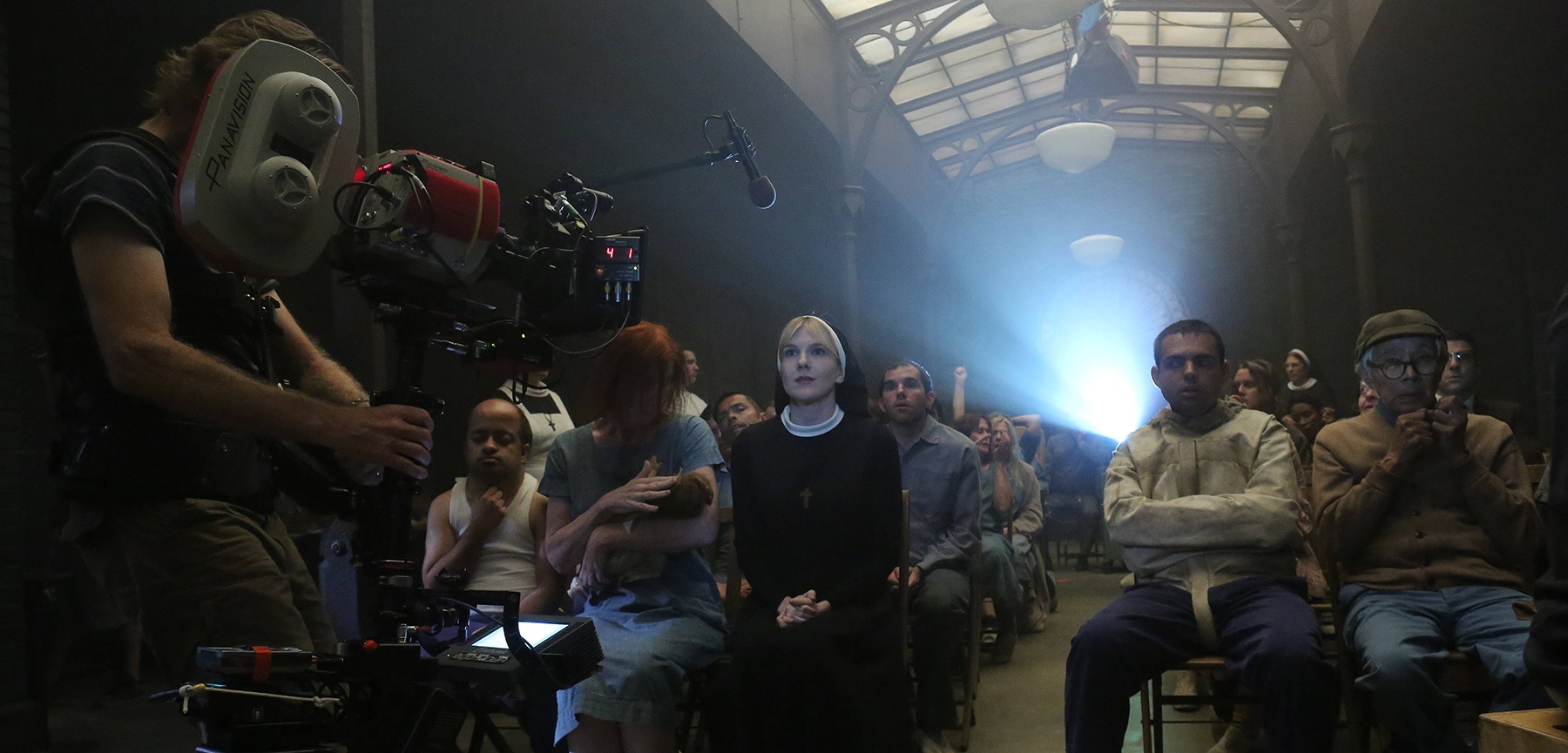
For example, Goi says that when he was shooting American Horror Story: Asylum (seen at top of this page), “We had a very small prison set with only one door and plain stone walls. Every time we went into that cell, it was different. One time I lit directly from the top, almost like a Gordon Willis [ASC] Godfather look. Another time I lit through the gap under the door — a glimpse of daylight that represented freedom to the character trapped in that dark space. Another time I used a hard light so that a prominent shadow fell onto the wall of the cell. It was completely unrealistic that any sunlight would permeate that cell, but the shadow gave me the image of someone who was stepping out of their own body and the feeling that there were two people in that room. Another time I lit it completely bizarrely, echoing Nosferatu — the door opened and the long, spidery shadow of the evil doctor fell on the woman cowering in the corner.”
Caso does concede that “by the end of a season, if you’ve got a main set that is used quite a bit, you’re going to run out of things to do. So you can use some motifs for certain times and moods — and maybe it’s not such a bad thing to reprise certain looks and feels. Again, if it’s coming from the page and helping to tell the story, then that’s what’s right for that scene. Ultimately, that’s the responsibility of the cinematographer: to help tell the visual story. If you do your due diligence to visually interpret what’s on the page, you can’t go wrong. If there aren’t a lot of things that are changing in the script and there’s not a lot of difference from scene to scene over a series’ season, then you need to stretch out a bit and take some creative license to shake it up for the purpose of shaking it up — as long as it still serves the story.”
“There’s always room to expand the visual vocabulary of a show,” Goi concludes. “As long as you’re motivating it narratively, you’re doing your job.”
