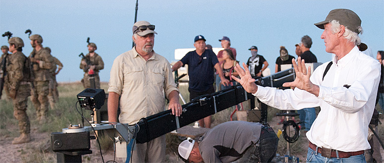
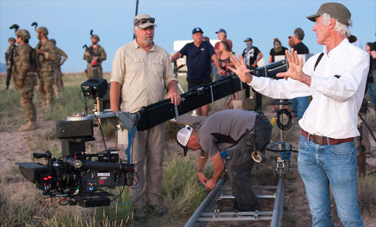
Roger Deakins, ASC, BSC: Lighting Sicario
This post complements my article about Sicario, directed by Denis Villeneuve with cinematography by Roger Deakins, ASC, BSC, in the October 2015 issue of American Cinematographer. In this interview, Roger focuses on several lighting examples from the film.

This post is about Sicario, directed by Denis Villeneuve with cinematography by Roger Deakins, ASC, BSC.
My previous post featured an interview with Denis Villeneuve. This interview is with Deakins, and focuses on lighting examples from Sicario.
+++
Roger Deakins
1. Villeneuve
2. Sicario Raid Scene Video
3. The Raid Set
4. Space Lights & Sunlight
5. Blondes
6. Red
7. Magic-Hour Rooftop
8. Immigrant Holding Area
9. Custom Top Lights
10. Color
11. Simple
12. Melville
+++
Roger Deakins
Roger Deakins is a world-famous cinematographer whose credits include 1984, Sid and Nancy, Barton Fink, The Shawshank Redemption, Fargo, The Big Lebowski, Jarhead, No Country for Old Men, The Assassination of Jesse James by the Coward Robert Ford, Skyfall, Prisoners and Unbroken.
Roger was awarded the ASC Lifetime Achievement Award in 2011. For his feature work, he has received three ASC Awards, three BAFTAs, and dozens of other awards and nominations. He has been nominated an amazing 12 times for the Academy Award, but has yet to bring home his long-deserved statuette. Sicario is his second film with Villeneuve, after Prisoners.
Roger's web site rogerdeakins.com features a lively forum where students and filmmakers can send him questions and comments about cinematography.
+++
1. Villeneuve
Benjamin B: Denis Villeneuve seems to be a very collaborative director.
Roger Deakins: Definitely, but he also knows what he wants. For instance, he’s got a very strong perspective on the script. Denis knows where he wants to take something, but he’s very collaborative in terms of getting there with the imagery and the shots and such. Denis is a great director; I love working with him.
+++
2. Sicario Raid Scene Video
watch on YouTube
+++
3. The Raid Set
In the film's first sequence, Kate [Emily Blunt] leads an FBI SWAT team in a truck that crashes into a house. Where did you shoot the interiors for the raid sequence?
Deakins: The scene is a mixture of shooting on location and shooting on set. We had a location that we really liked, but it was much more practical to just shoot the exteriors there, and to shoot the interiors on a soundstage in Albuquerque. We matched what was on location as best we could on the set, but we didn’t have a big enough space to match it completely, and it would have cost too much in terms of space lights and rigging, so we used false perspective.
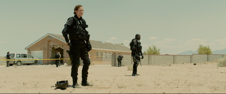
The house set had hard ceilings. I like to work with hard ceilings; it feels more like a location. I had long conversations with Patrice Vermette, the production designer, about sets and wall colors. He’s great. The color was light enough to help bounce, but not too white. There was an exterior garden, which was basically desert, and a false-perspective wall in front of a print backing, which was a photograph of the location. So we could actually shoot out of the living-room windows, and there are a couple of shots where you see a character outside. There was a wall 5 or 6 feet in front of the backing to hide the false perspective. The wall was right at the end of the space lights, and matched the exterior wall on the location. There might have been a 20K raking that wall.
+++
4. Space Lights & Sunlight
Your lighting diagram indicates the lighting units used. I must say, 65 space lights don’t seem very many for this day-exterior set.
Deakins: No, it’s not very much light, actually. I wish I’d had more, because I would have liked to shoot at a higher stop. But we were restricted by budget, and we couldn’t set up a huge amount of light just because I wanted to shoot at T5.6 instead of T2.8.
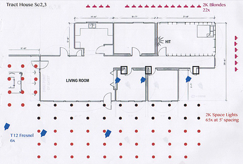
The six T12 Fresnels provide spots of hard sunlight inside the house, aimed through the garden windows and three skylights.
Deakins: The T12 actually gives you almost as much light as a 20K, and it’s a smaller bulb and smaller Fresnel lens, so it’s very hard, very sharp and very white as well. I had to calculate the spread of the T12s: one lamp hit where the truck crashes the wall, one spread across the big living-room windows, and the third lamp hit another room that you see momentarily as the SWAT team searches the house.
What made you decide on the “sunlight” angle of the T12s?
Deakins: The most important angle was the first wide shot, where the guy is watching television and you’re looking towards the wall, and the truck crashes through.
And you wanted the three-quarter backlight on that?
Deakins: Yeah, it seemed like the best light for the majority of the scene. Then we had the T12 come round to the side when we did the reverse.
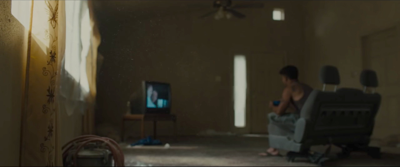
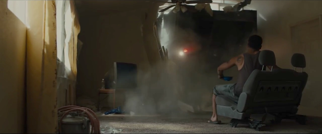
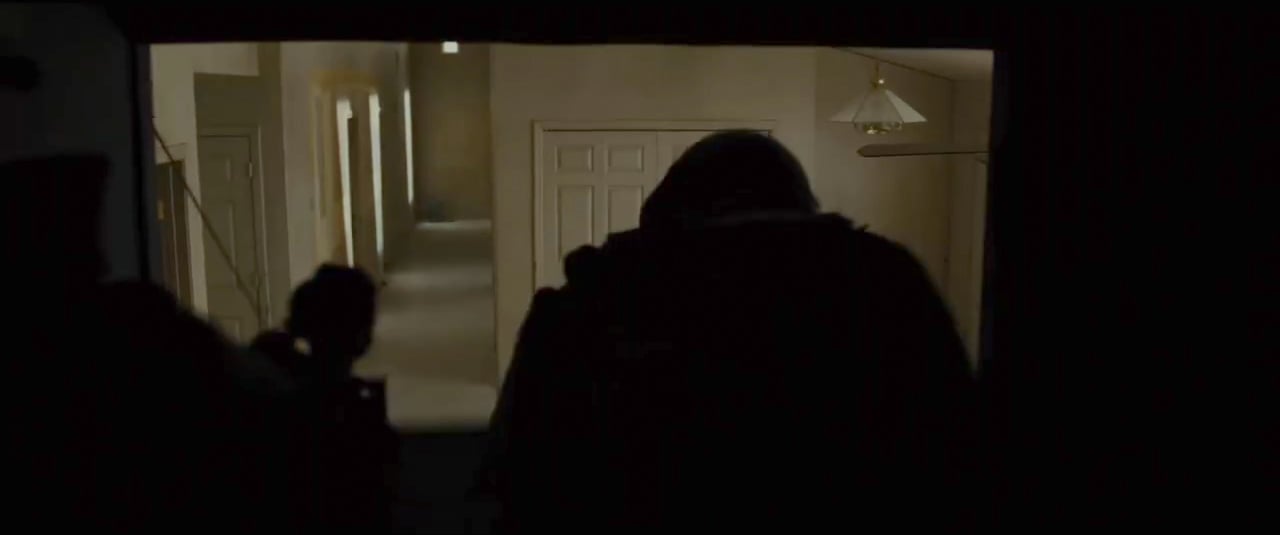
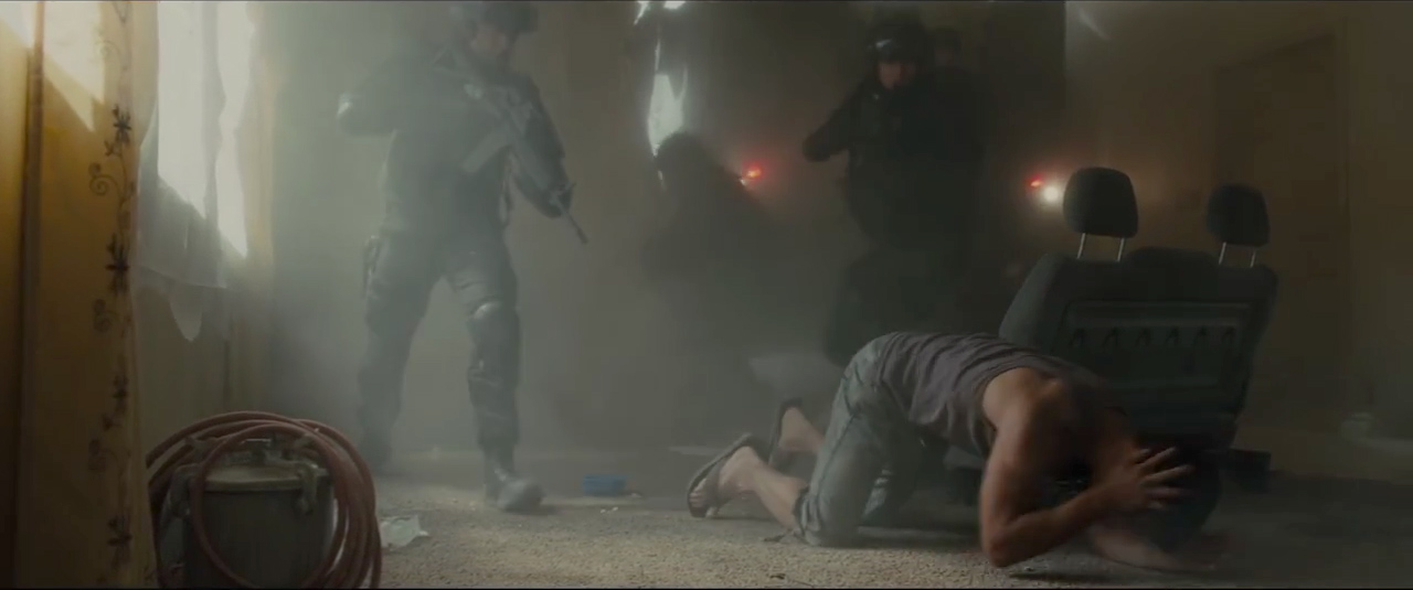
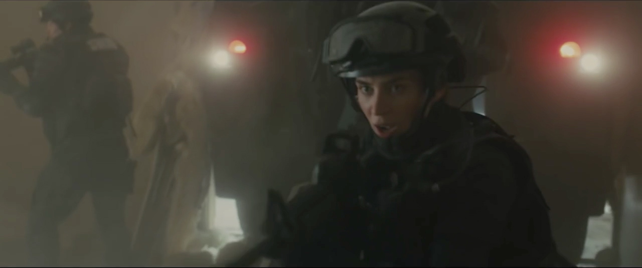
The smoke adds drama and diffusion.
Deakins: We had a little bit of atmosphere before the truck hits the wall. But when it hits the wall, it justified having a lot of dust come in, which we created with smoke.
+++
5. Blondes
I imagine it was important for you to keep the sources outside of the house interior.
Deakins: We had a lot of shots to do, so I wasn’t going to put lights inside the rooms. Also, if I had brought a source inside the room, it would have spilled everywhere. I was really using the windows as cutters, so that the light was coming through naturally and was shaped by the window, so you might get soft light on an actor, but the back wall would be down a bit.
What about the 22 2K Blondes?
Deakins: My diagram was a rough plan, just a way of communicating to my gaffer, Chris Napolitano, what I was thinking and where I needed equipment. The T12s and space lights were pre-rigged, but they weren’t the units that actually punched light on the actors through the windows; the T12s weren’t reaching that far into the space.
I use Blondes a lot; they’re simple, open-face lights that give a wide, smooth spread. They’re a very efficient light, and they’re very controllable if you want to bounce or go through diffusion. The Blondes shown in the diagram could be on a rail or on the floor. An actor inside might be lit by three or four Blondes rigged on a pipe above a set window and bounced on polystyrene or, conversely, on stands and punching through Light Grid diffusion.
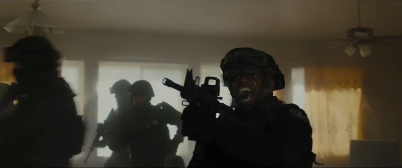
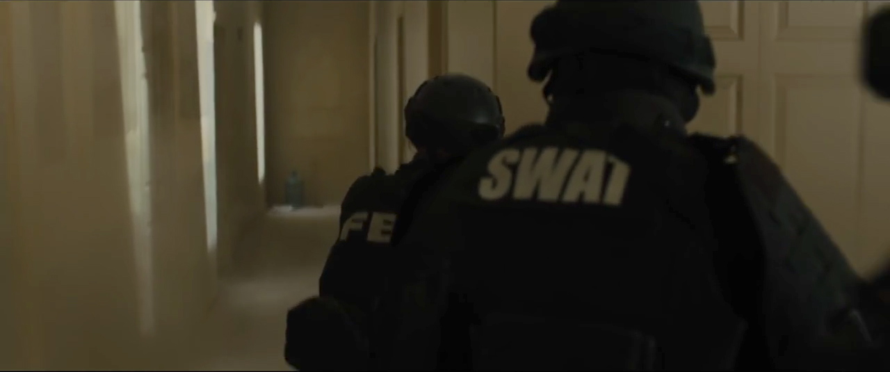
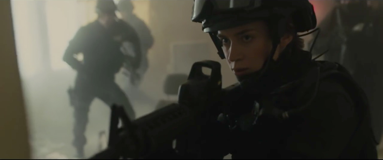
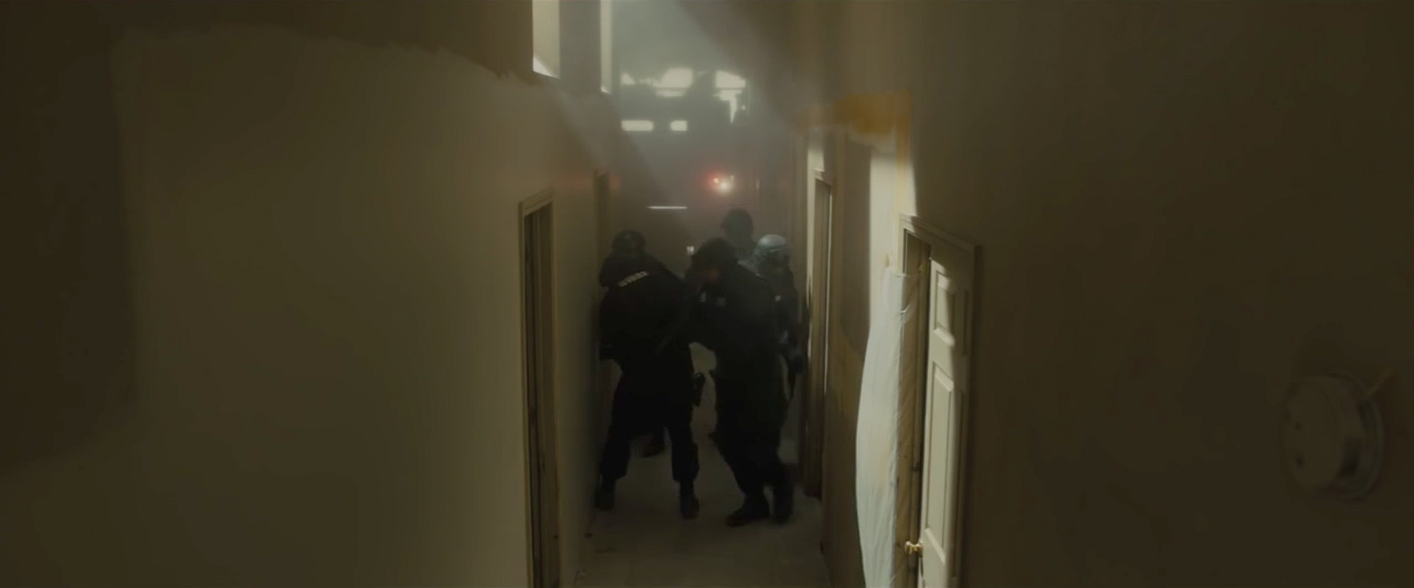
How did you decide whether to bounce or diffuse the Blondes on the actors?
Deakins: Intuition, I guess. If I wanted to punch light through a little further, or if I wanted it a little bit harder, then I went through diffusion. In the first shot of Emily inside the house, I had a side bounce, probably with three or four Blondes, a low-angle light coming through that window from below where the T12s were.
Do you often bounce several sources at once on a poly?
Deakins: If, for example, you bounce five Blondes onto a long white reflector, you can make it hot at one end and trail it off at the other. You can control where your main heat source is coming from.
+++
6. Red
The red curtain in the room where Kate shoots the guy adds a strong touch of color, and it also evokes the blood on the wall.
Deakins: Yeah. We wanted the red to really pop. The light from the curtain wasn’t red enough, so I used two red gels and ½ CTO to get the color, and some red gel on the window.
And there’s some red bounce when you shoot her looking at the body.
Deakins: To do the the reverses, I was bouncing red light off a reflector taped on the wall.
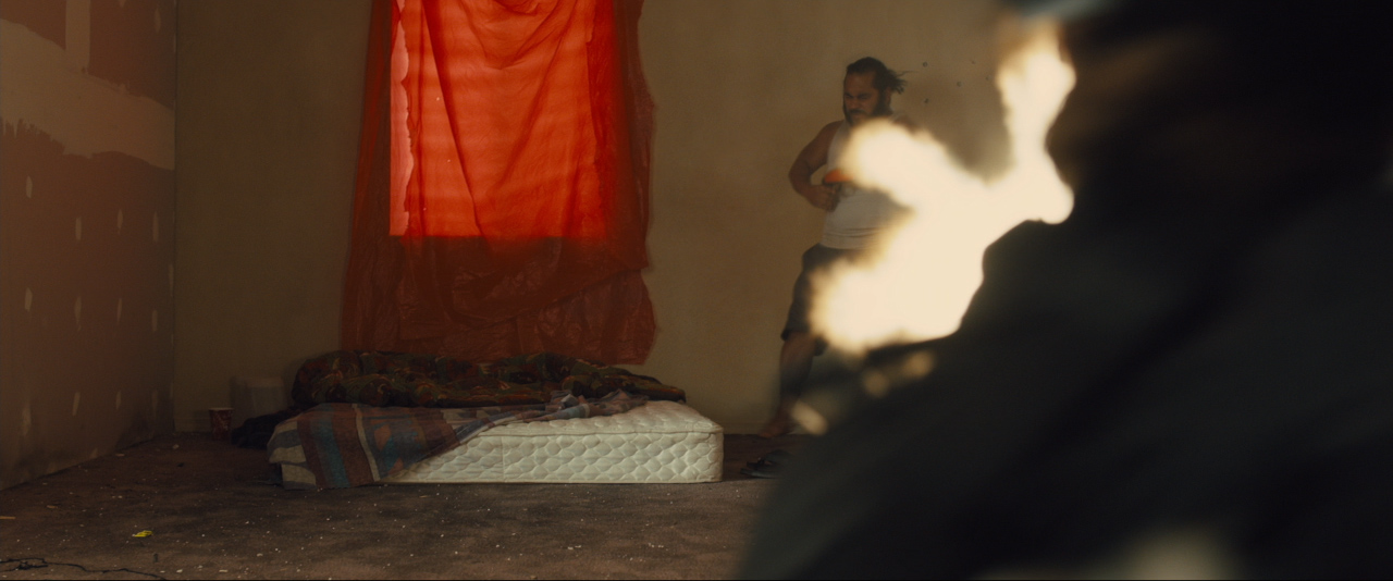
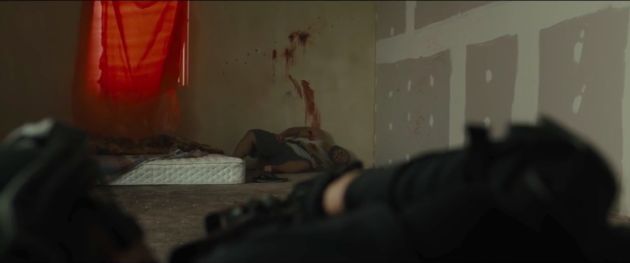
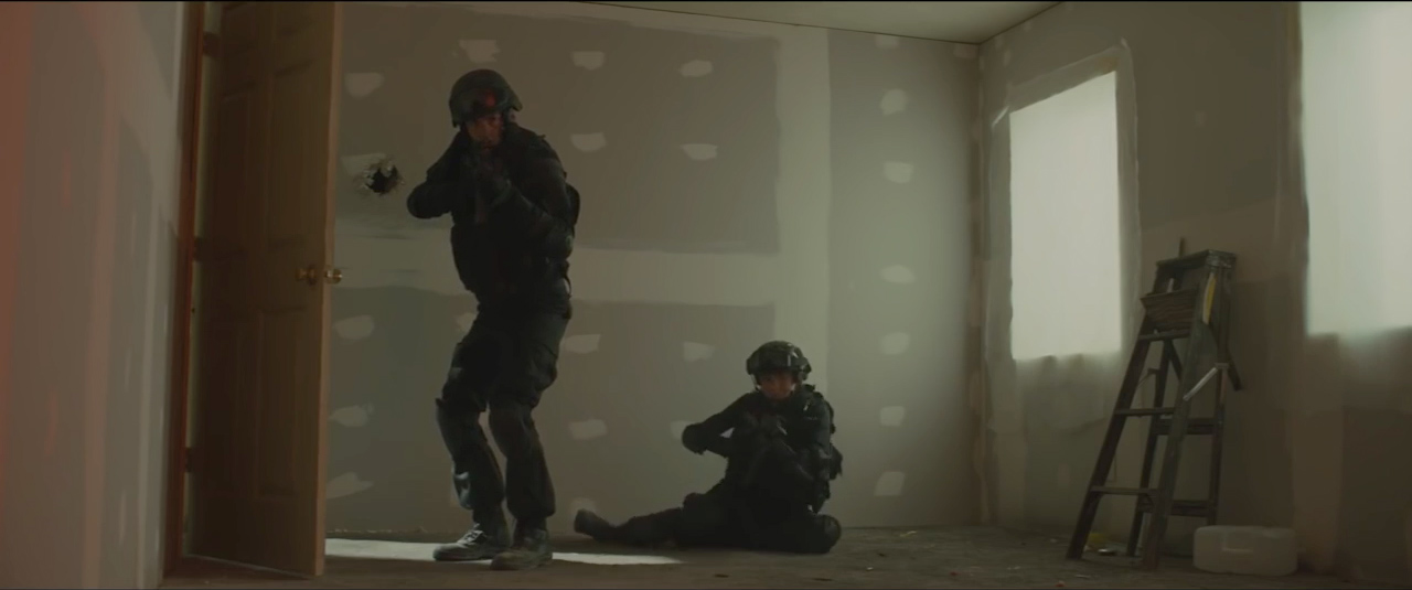
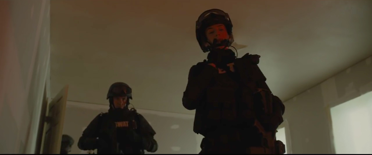
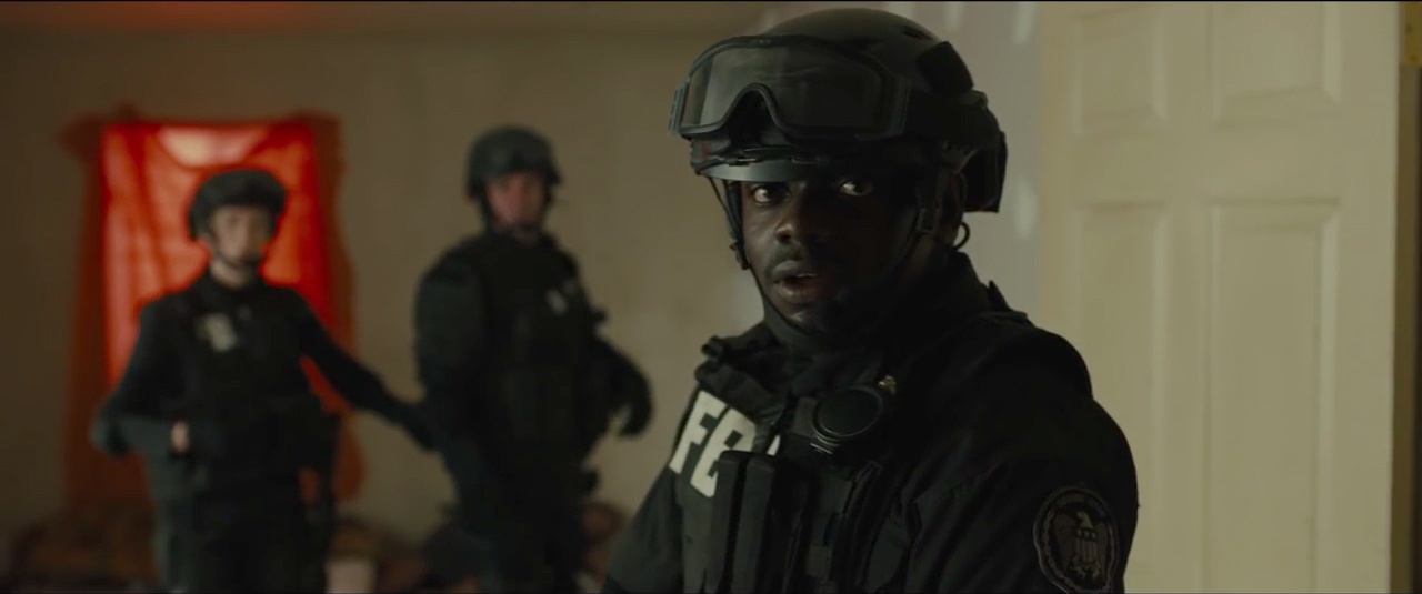
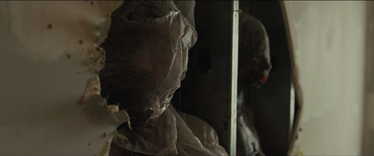
It struck me that red is the only strong color in this scene. There are red headlights on the truck, a red thermos in the kitchen, a red curtain, red blood on the wall, all preparing us for the red splatters on the wrapped corpses -- the blood spilled.
+++
7. Magic-Hour Rooftop
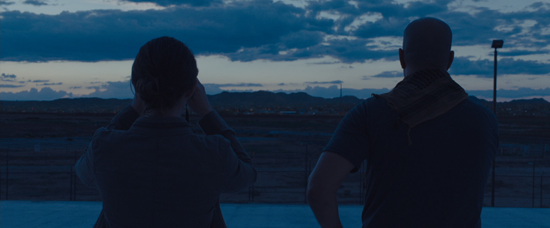
The magic-hour sequence, when Kate goes up on the rooftop to look at Juárez in the distance, is a stunning example of natural lighting.
Deakins: We carefully planned which shots we’d do, because we knew we’d only have 40 minutes to shoot every shot we wanted. So we set up three dolly tracks on the roof, and we just flipped the camera from one to the other.
Did you add any bounce?
Deakins: I don’t really use much on exteriors these days. For the border-crossing gunfight, I did use some big bounces around the car, but not a lot. I don’t remember using anything on that roof scene, but we were so lucky — we had that brilliant light. You didn’t want to do anything to it, really.
+++
8. Immigrant Holding Area
Can you talk about the location where the authorities hold a crowd of immigrants who are seated on the ground below a tall overhead cover?
Deakins: That was probably the most difficult location. It was a fertilizer plant, but it was a wonderful piece of architecture, and Denis was really stuck on it. This is where we spent more money than the production thought we were going to spend, but I think it paid off. Then, in other places, like the stage set for the raid, we spent less than expected. You have to choose your battles. This was big scene with all these extras, and we had to shoot everything in two nights. Sicario was not a big-budget picture, so we had to be prepared to go in there and shoot 15 or 20 shots in a night. You’ve got to give yourself a lot of flexibility and be able to shoot 360 degrees.
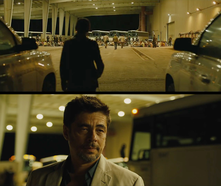
The existing lighting was blue-green mercury vapor, but there was no level. At the beginning of the scene, the shot is so wide that you see the entire thing. I figured out a rig to light the scene in a way I liked that also looked realistic in the location.
+++
9. Custom Top Lights
How did you set up the top lighting?
Deakins: It was a scene we couldn’t light conventionally. We physically fabricated all the practical top lights. Patrice and his crew made open housings, like bell lamps. We put a 2K Blonde in each one and a 10K gel frame with very light diffusion and ¼ CTO. They were all on dimmers as well. We rigged something like 45 2K Blondes under the roof, which was about 50 feet high. The grips had to lay in pipe and so on to give some security to these practicals. This took a bit of doing. I think it looks real, which is the main thing.
Did you do a pre-light?
Deakins: I went there twice before the shoot, first when the grips and electricians had put up half a dozen top lights. I wanted to see what 2K Blondes in those scoop fixtures would actually give me. I didn’t want to get there on the day and be screwed. Then, I went back when the whole thing had been rigged and played with the dimmers. I wanted the brightest space in the middle area, where most of the immigrants sat on the floor; we dimmed the ones on the outside and left the ones in the middle full up, so you had a slight fall-off as it went to the outside, and the color got a bit warmer. We left some existing sodium lights on the west wall; they were quite orange, and I liked that. By dimming the Blondes down a bit and adding ¼ CTO, the top practicals looked like sodium lights, but not quite as orange as real sodium.
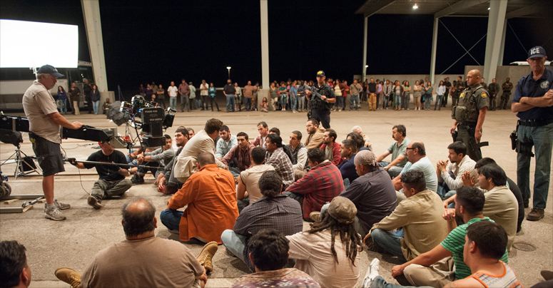
When you went in for the tighter shots, did you add a little bit of light on the ground?
Deakins: Yes, I had some bounce on the ground, but not too much. We had some low 1K Fresnels bouncing up into 8 x 4 sheets of poly. It was warmer than the top source.
+++
10. Color
It gives the right mood — institutional top lighting — but has this personality because of the color.
Deakins: I toyed with making it a kind of bluish world, but then I thought it was more of a sodium look, an orange color. I exaggerated the color a little bit in DI, and it’s a little green because we took out some red. But it was quite warm when we shot it.
You've said you believe a film's look should be created on set, and that the DI is just for enhancements.
Deakins: Yes, I really think so. I like to get as close as I can to the look on set, unless I’m doing something extreme like O Brother, Where Art Thou? On this location, the color is balanced to the existing sodium lights on the warehouse wall. We didn’t do much in DI.
+++
11. Simple
Did you really do the DI for Sicario in less than two weeks?
Deakins: Yes, it was actually one of the quickest projects I’ve ever timed — about seven days. But you think to yourself, ‘Something’s wrong. I must go through it again; there must be something I want to do.’ But a lot of the time I don’t like to fuss — on set or in the DI – because you can overthink things. You can play with the image and toy with it, and it becomes too overworked. With modern CGI techniques and the DI, you have so much power in the computer, and I think it’s overused. I like things to be simple and immediate.
+++
12. Melville
You often refer to director Jean-Pierre Melville, in particular to his film Army of Shadows. His work has a beautiful, classical simplicity.
Deakins: That’s what I really love about his films: they’re very simple. When you look at Melville’s work, you realize it’s all been done before. Today we can shoot with less light, our cameras are lighter and easier to handhold, and it’s easier to do tracking shots, but we’re not doing anything different, really.
Army of Shadows is one of my favorite films of all time. The power of his staging and choreography is amazing: starting with a wide shot, then the characters come into a close-up, and the camera slowly moves on, goes to another angle, then another character turns up and suddenly it becomes his close-up …. It’s just nice, simple stuff that you don’t really notice until you study the films.
I don’t like camerawork that draws attention to itself, which I think is too often done these days. Melville’s work is so simple and clean; it’s just about telling the story and bringing the characters to the audience.
+++
LINKS
thefilmbook: Sicario: Interview with Denis Villeneuve
+++
wikipedia: Sicario
rogerdeakins.com: Lighting Discussions
wikipedia: Roger Deakins
wikipedia: Denis Villeneuve
Collider YouTube channel: Sicario cast about working with Roger Deakins
wikipedia: Army of Shadows
YouTube: Roger Deakins speaks about his career at Cannes Angénieux Tribute.
+++
You may also be interested in:
thefilmbook: Storaro Muses, An Illustrated Video
thefilmbook: Lighting Spectre - Hoyte van Hoytema
thefilmbook: Eric Kress Lighting Workshop 1
thefilmbook: DPs & Gaffers: Who Does What?
thefilmbook: 3 Scenes from Ida
thefilmbook: 4 More Scenes from Ida
+++
Unit photography by Richard Foreman, SMPSP, and Luis Ricardo Montemayor Cisneros, courtesy of Lionsgate.
Thank you to gaffer Chris Napolitano for detailing some of the lighting.
A big thank you to Roger Deakins and to James Ellis Deakins for their help with the article and posts.
+++

