12 Monkeys: Time Independent
Collaborating in a way that only an episodic series allows, David Greene, ASC, CSC and Boris Mojsovski, CSC join forces for the Syfy time-traveling saga.
Additional behind-the-scenes photos by Boris Mojsovski, CSC. • Lighting diagram and renderings provided by David Greene, ASC, CSC. All images courtesy of Syfy.
When the final episode of the Syfy series 12 Monkeys is broadcast July 6, it will mark the end of a remarkably ambitious television narrative and, according to co-directors of photography David Greene, ASC, CSC and Boris Mojsovski, CSC, one of the richest creative opportunities yet presented to cinematographers working in that medium.
In fact, the ASC has so far recognized the show’s visual artistry with three ASC Award nominations. Greene, who began shooting the Toronto-based production in its first season, was nominated for the Season 1 episode “Mentally Divergent” and the Season 3 episode “Mother.” Mojsovski, who joined the production in Season 2 and — along with Greene — has stayed with it to its conclusion, won the ASC Award for the Season 3 episode “Thief.”
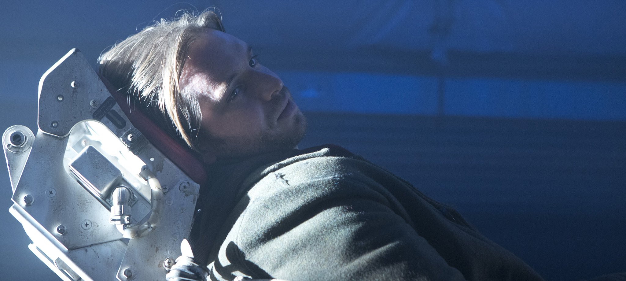
Created by Terry Matalas and Travis Fickett, 12 Monkeys premiered in 2015, and tracks James Cole (Aaron Stanford), one of a small group of survivors of a pandemic that has wiped out most of the world’s population. Using a time-traveling device invented by the group’s leader, Katarina Jones (Barbara Sukowa), Cole is transported to present-day Philadelphia to try to prevent the imminent release of the virus. Cole’s mission comes to include Cassandra Railly (Amanda Schull), a scientist who becomes his partner, and Jennifer Goines (Emily Hampshire), the brilliant but unstable daughter of the scientist who hatched the virus. When Cole learns the virus will be released by a time-traveling cult called the Army of the 12 Monkeys, the story becomes a cat-and-mouse pursuit that spans centuries.
12 Monkeys is loosely adapted from Terry Gilliam’s 1995 feature of the same name (AC Jan. ’96), but Matalas and Fickett have broadened the canvas considerably over the course of the show’s four seasons, moving beyond the initial parameters of 2015 and 2043 to include, among other eras, the early, middle and late 20th century, the 19th century and the 22nd century — as well as the 15th century in the current season, and even an alternate reality. This peripatetic premise has mandated a visual palette that is not just varied, but tirelessly so. “Boris and I got to do something new almost every episode, and that kept us on our toes and creatively engaged,” says Greene.
When AC caught up with Greene and Mojsovski, they had wrapped the show’s final season — about which they were necessarily tight-lipped — and were prepping their next projects. For Greene, it’s Season 2 of the Starz series American Gods, and for Mojsovski, it’s the new Warner Bros./DC Entertainment series Titans.
In separate interviews, the cinematographers discussed their collaboration on 12 Monkeys. What follows are excerpts from these conversations.
Season 1
David Greene, ASC, CSC: The biggest influence on my approach to the first season was Children of Men (AC Dec. ’06), which I referenced for the look of 2043. There was also the pilot [shot by Todd McMullen]. The only common thread between Terry Gilliam’s movie and our series was the basic premise.
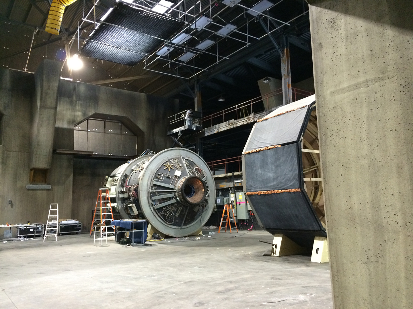
Lighting the temporal facility, where characters ‘splinter’ [the show’s term for time-travel], was a little unnerving. It’s one of the few sets we see consistently in the show, and the set was finished the day before we started shooting it. I had a chance to prelight it, but because of the production schedule, I didn’t have a chance to test it on camera. The main space is large and cavernous, and I wanted it to be moody; I didn’t want toplight. I wanted to literally outline the space in practicals to give a sense of the shape of the room, and [production designer] John Mott and I spent a lot of time discussing how to do that. We landed on a lot of fluorescents and China hats, and fixtures I call ‘marine lights’ — lamps in glass jars. [Click here for more detail including a lighting diagram.]
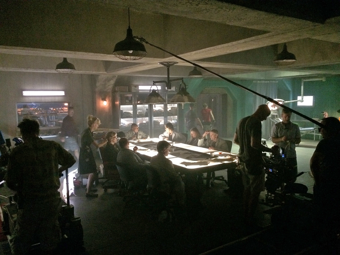
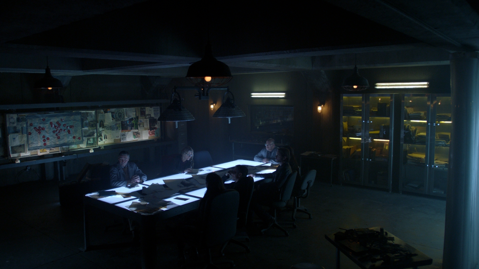
In the ‘ready room,’ which is right beside the splintering room, we used the same approach, encircling the space with practicals. There’s a table in there and I knew characters would be sitting around it all the time, and I knew immediately I wanted that to be a lit table — and I knew a director would want to do a 360 in that room. We actually did 360s in there several times, and even I did one when I directed an episode. [Laughs.] In the first season, we lit the table from below with daylight-balanced fluorescents through milk glass that was about a quarter-inch thick. Starting in Season 2, we replaced those with bicolor LED strips [set at 6,000K, the coolest end of the spectrum] from Moss LED in Toronto.
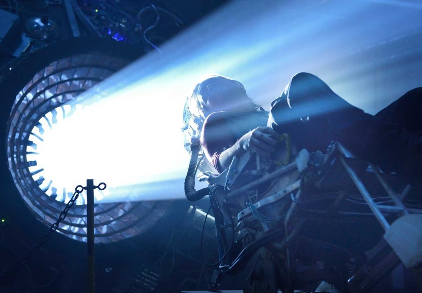
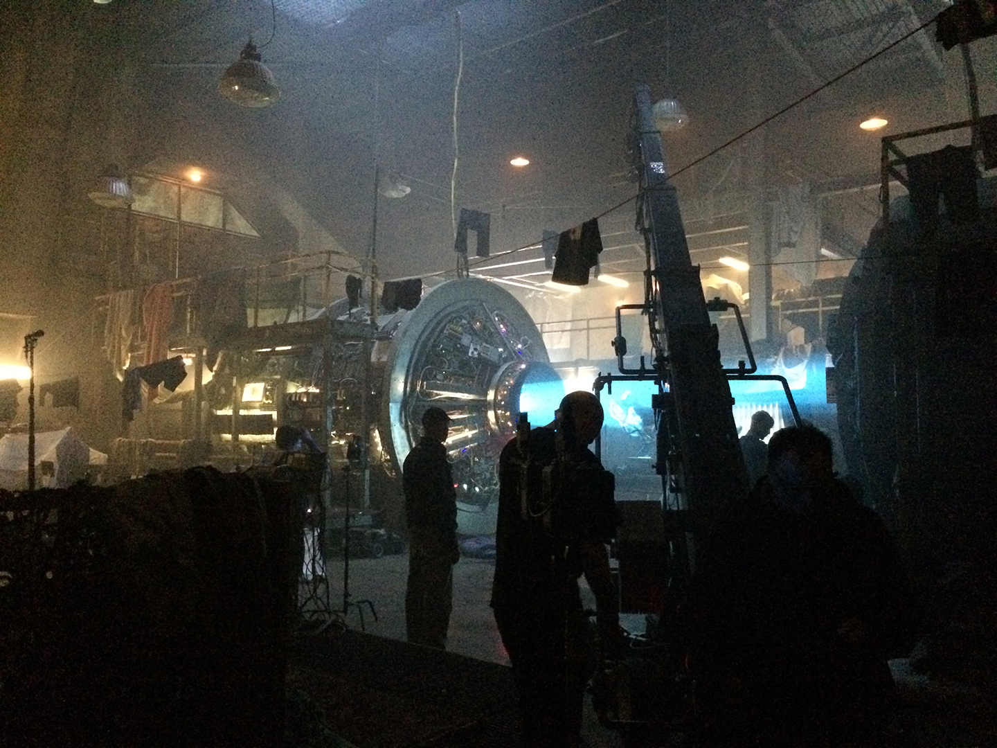
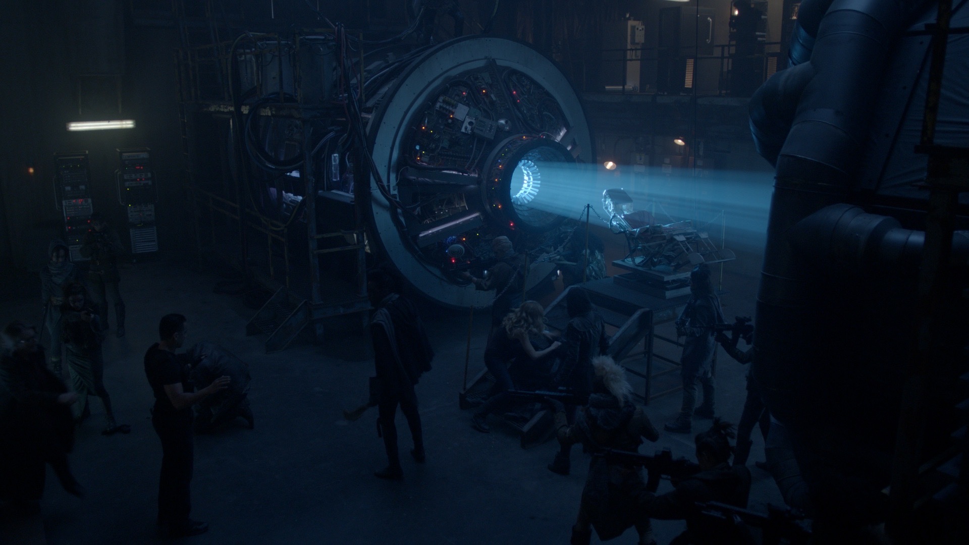
The time machine itself is riddled with LED bulbs and lines of light created by hidden fluorescents; again, the idea was not really to illuminate anything, but to define the space. For the beam of light inside the machine, we originally used a follow spot, and we had an electric in there flickering it when it was time to splinter! In Season 2, we changed to a Best Boy [4000 Spot Luminaire from PRG], a great tool. We could put all kinds of interesting patterns in the beam and change its color quite easily at the board. To give the time machine just a kiss of light, I put a 20-by-40-foot ‘cloud’ directly over it — daylight bulbs gelled with 3⁄4 CTB and heavily diffused. We had Lighttools on the cloud to direct the light toward the top of the time machine. The source was very soft, very cool and quite underexposed.
We lit the rest of the space from the floor, usually with 6-by-6 [Kino Flo] Blanket-Lites layered with Full Grid and white duvetyn and often fronted with another, slightly separate frame of diffusion. I like soft light close to frame, and there’s lots of movement in the show, so I put wheels on the Blanket-Lite, and I’d move the light as the camera and actors would move through the space. I’ve actually used that approach for a long time. It’s a great light source, and it frees up the camera.
For a similar soft sidelight when the actors were farther from camera, I designed something we called a ‘Tent.’ We used Kino Flo Flathead 80s on the ground on a 45-degree angle with muslin and white duvetyn on it, and we’d skim Light Grid on one side of it — like one side of a tent — so there was some separation between the Flathead 80 and the Light Grid.
Once we started using LEDs, we were more apt to use Arri SkyPanels with a Chimera to achieve similar effects. It’s great to be able to dial in color temperature instantly, because when you add layers of diffusion, a daylight source in a book light can look like a tungsten light quite easily [due to the warming effect of the color of the bounce material and subsequent diffusion layers].
The first season of a series often has really long hours because the show hasn’t quite figured out what it is yet, and that was true for12 Monkey sas well. I shot the first five episodes, and then I asked the producers if we could bring in another cinematographer with whom I could alternate. We brought in Tico Poulakakis, who shot three episodes that season.
Season 2
Boris Mojsovski, CSC: Joining David on 12 Monkeys in Season 2 was a dream come true for me. He was several years ahead of me at York University, and he was a legend there. He had won every student award possible. We were all trying to be David Greene, you know? Then, when I won a student award from Kodak, I had a chance to shadow a cinematographer of my choosing, and I chose David because I liked his style. People were surprised — David was young, and they thought I should shadow someone with a lot more experience — but I insisted, and David has been a mentor for me ever since.
Alternating episodes with another cinematographer really depends on finding someone you’re compatible with creatively, and that isn’t easy. If you look at a TV series as one long movie, then it should look like the same movie all the way through. It shouldn’t look different from episode to episode just because one cinematographer likes something and the other one doesn’t. David and I happen to love the same things: sidelight, soft light and never toplight. So, when I came onto 12 Monkeys, the style of the lighting and framing David had established was something we both naturally want to do: extremely soft light as close as possible to the actors, and then lots of darkness in the rest of the frame.
Greene: Boris and I are quite different people, but we have a very similar visual brain, and we respect each other. When I started looking for someone to alternate with in Season 2, he was a natural choice. While I was prepping Season 2, Boris happened to be shooting in the studio right beside ours, and he came over and said, ‘Davey, I built this LED light. Come take a look at it.’ It was a 4-by-4 box on wheels with bicolor LED ribbon going through various layers of diffusion — a small blanket light, basically. He’d built two of them, and he called them ‘Boris 1’ and ‘Boris 2.’ Gradually they just became ‘Boris Lights,’ but when I would take over the set, I’d call them ‘Super Daves.’ [Laughs.]
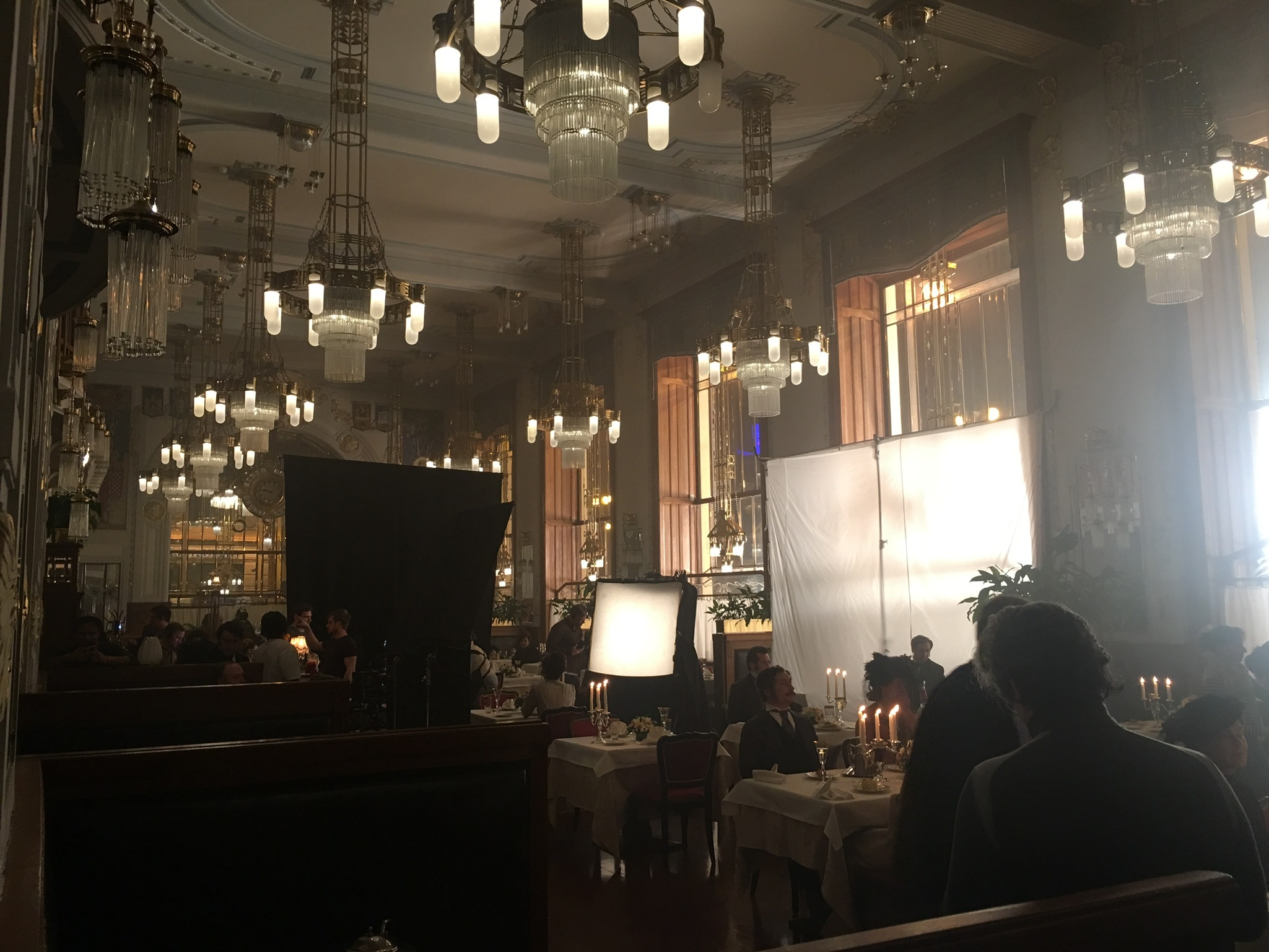
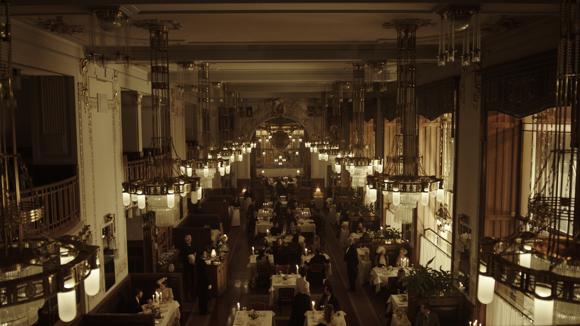
Mojsovski: For some reason, people think there is a light called a Super Dave. Not sure how this happened. The Boris light came from a need to have an instant soft light that one can lean or hang very easily. ‘Speed plus style’ was the engineering goal. It has two layers of [Lee] 129 [Heavy Frost] and white duvetyn, and sometimes I also put a frame of Light Grid in front of it. I made the first two at home, and when [gaffer] Bob McRae first saw them, he said, ‘Not a chance! Put those away and we’ll use the real lights.’ Now he builds Boris Lights himself! It made our show.
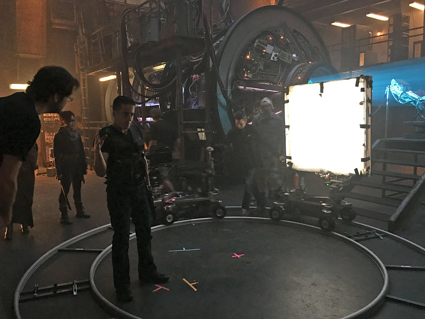
I learned how to ‘dance’ with lights from David. We’d give actor marks, dolly marks and lighting marks. We had more electricians than normal because they had to move lights on wheels all the time. The alternative would be to put in a toplight — that would be easy, but it’s the last thing we wanted to do. I’d go to David’s set and think, ‘How can a human being figure this out?’ When you look at the shot, it’s a person walking around the room in perfect light, but if you cut out of that to an objective camera, you’d see 30 crewmembers moving lights and diffusion around them. And it’s not enough to know how to do it — you gotta do it fast. I don’t know if anyone else in the world can do it as well as David can.
Greene: We always got scripts very early on 12 Monkeys. On most series, it’s unfortunately common to be prepping with an outline, but Terry Matalas and Travis Fickett ran the writing department very well and were always ahead. We started each season with three or four scripts ready to read, and they furnished us with synopses for episodes that were coming up, so we always understood the basic shape of a season and the time periods it would include. That helped us think ahead and work ahead.
I would always kick off a season, and then Boris and I would typically divide episodes roughly in half. We also had alternating gaffers, Bob McRae and Doug Reid, and that saved us because we had so much second-unit/crossover-unit work. These were seven- or eight-day episodes but would often board out at 10 or 11 days. So, for example, I’d start crossover unit, which was really another full main unit that would shoot the day before the main unit started; then I’d shoot seven to eight days of main unit; then I’d finish the episode with the crossover unit with that director. In general, the first AD and director would follow their respective episodes, and the episode’s cinematographer would be with them on the crossover unit. We’d often steal crew from main [unit] because it was so valuable to have a few faces that already got it.
We were also able to use the crossover unit to move some crew along. For example, one of our main focus pullers, Rob Mountjoy, wanted to start operating, and we brought him over to second unit a couple of times to do it. As cinematographers, we have to encourage our crew to move forward. It’s vital.
Mojsovski: David and I were constantly working in unison. I’d prelight his sets and he’d prelight mine; I’d shoot one-third of his episode, and he’d shoot one-third of mine. We got so good at that, today we don’t know who shot what! [Laughs.] We understood the look of the show, and that’s what we executed.
It was fun to challenge ourselves sometimes, and reinvent a ‘look inside our look.’ Terry Matalas and David Grossman would also help with look suggestions, and David [Greene] and I would appropriate that to the show’s feel. To have a chance to talk cinematography with another cinematographer, and form looks together, is the most rewarding, rarest experience. That’s something television provides that a movie never could.
Greene: We transitioned to [Arri] Alexa Minis in Season 2 after using the Alexa Classic for the first season. We used Cooke 5/i primes for the first two seasons, and we always carried two sets of lenses so we could cross-shoot. As a director, I know that approach is much better for the actors because they’re both ‘on,’ but it’s also efficient for a TV schedule. We always went to a 40mm for a close-up unless it was a B-camera shot and they couldn’t get in on the 40mm. The 40mm has a bit of shape to it, and it’s a ‘present’ lens — you feel like you’re there with the actors.
[The Alexa Classics recorded 1920x1080 HD to Sony SxS cards. The Alexa Minis recorded 1920x1080 HD to CFast 2.0 cards, with the exception of greenscreen and visual-effects elements, which were shot in Open Gate UHD. The production primarily shot ProRes 4:4:4:4, with ArriRaw employed in Season 3 for some visual-effects elements.]
We would like to acknowledge the work of our A-camera operators David Sheridan on Seasons 1, 2 and 3 and Joe Turner on Season 4, and B-camera operators Robert Stecko on Season 1, Cudah Andarawewa on Season 2, Jeremy Lyle on Season 3, and Michael Carr on Season 4. I also have to hand it to our focus pullers, Rob Mountjoy and Andrew Macklin, because we constantly challenged them with shallow focus. We were often shooting at T2 or even T1.4 in very dark sets, and they never disappointed us.
Mojsovski:12 Monkeys is probably the darkest show on television. My favorite observation came from Emily Hampshire, who asked Terry, ‘When they start lighting, why does it take so long to turn off all the lights?’
Season 3
Mojsovski: We switched to Leica Summilux-C primes in Season 3 because they gave us a nice hard flare, but didn’t flare as much with our big soft sources. We also needed a lighter lens because we wanted to use the Movi. We did a lot of Movi work in Season 3, especially on crossover unit. I think of the Movi as a Technocrane that’s carried by a human. It’s a very different feel from the Steadicam, but they’re each appropriate for certain things. The Movi is great when you need an exploratory shot that can be super low and very expressive, and then high and circling.
Greene: Sometimes, for logistical reasons, we would block-shoot two or three episodes together. When I started Season 3, I block-shot episodes 3-01, 3-02 and 3-03. Each day would be a mishmash of each episode, and I was changing the look on a daily basis. Often the look tended to be a patina. For example, the base elements of the lighting in the temporal facility are the same whether we’re seeing it in 2163 or in the 1920s, when Jennifer Goines is doing the Vaudeville thing — practicals define the space, and there’s a soft side source and maybe an architectural light in the background. One look is cool and brooding; the other is warm and inviting.
In the first episode I directed, ‘Immortal’ [Season 2, Episode 6], Boris applied a similar lighting style but with a color correction that introduced some green to the mid-tones and a bit of desaturation. For an episode he shot that was set in the 1960s, he went quite desaturated, almost black-and-white.
Two great assets on 12 Monkeys were our digital-imaging technician, Josh Jinchereau, and our colorist, James Garrow at [StudioPost on the Universal Studios lot in Los Angeles]. Josh has a great visual sense and a great eye; when Boris and I knew what we wanted, he’d always deliver it, and if we were struggling, he’d come up with a couple of options and we’d choose one. James always had a very good base to start with, and we were very happy with the work he did. We’d receive drives with his first pass on it and make notes. Doing color correction remotely is not a great way to work, but collaborating with a great colorist who knows what you’re thinking makes it easier. [The final grade was performed with Blackmagic Design DaVinci Resolve.]
Mojsovski: On-set color correction has been of utmost importance to me since the very beginnings of digital cinematography. I was a photographer who printed his own stills, so the process of color correction and manipulation of the image is a very big part of my way of thinking. Josh and I have worked together on numerous shows, and when we needed an on-set colorist for the third season, I didn’t hesitate to bring Josh in. I strongly believe in getting the look within 90 percent of the final image, so everyone sees where the visual story of the film/show is going.
We were always conscious of who our heroes were: They’re from modern times or the future and they travel into the past, so how do we bring that together visually? Sometimes we’d play with the romantic notion of a period, like making the 1970s look a little green, a little warm, or just go against it directly, like making the 1980s look crisp and present while the wardrobe was period. We often combined modern framing with period lighting. For instance, we might do short-sided frames to suggest the character doesn’t know what’s ahead, but combine it with warm, painterly tones because it’s 1896.
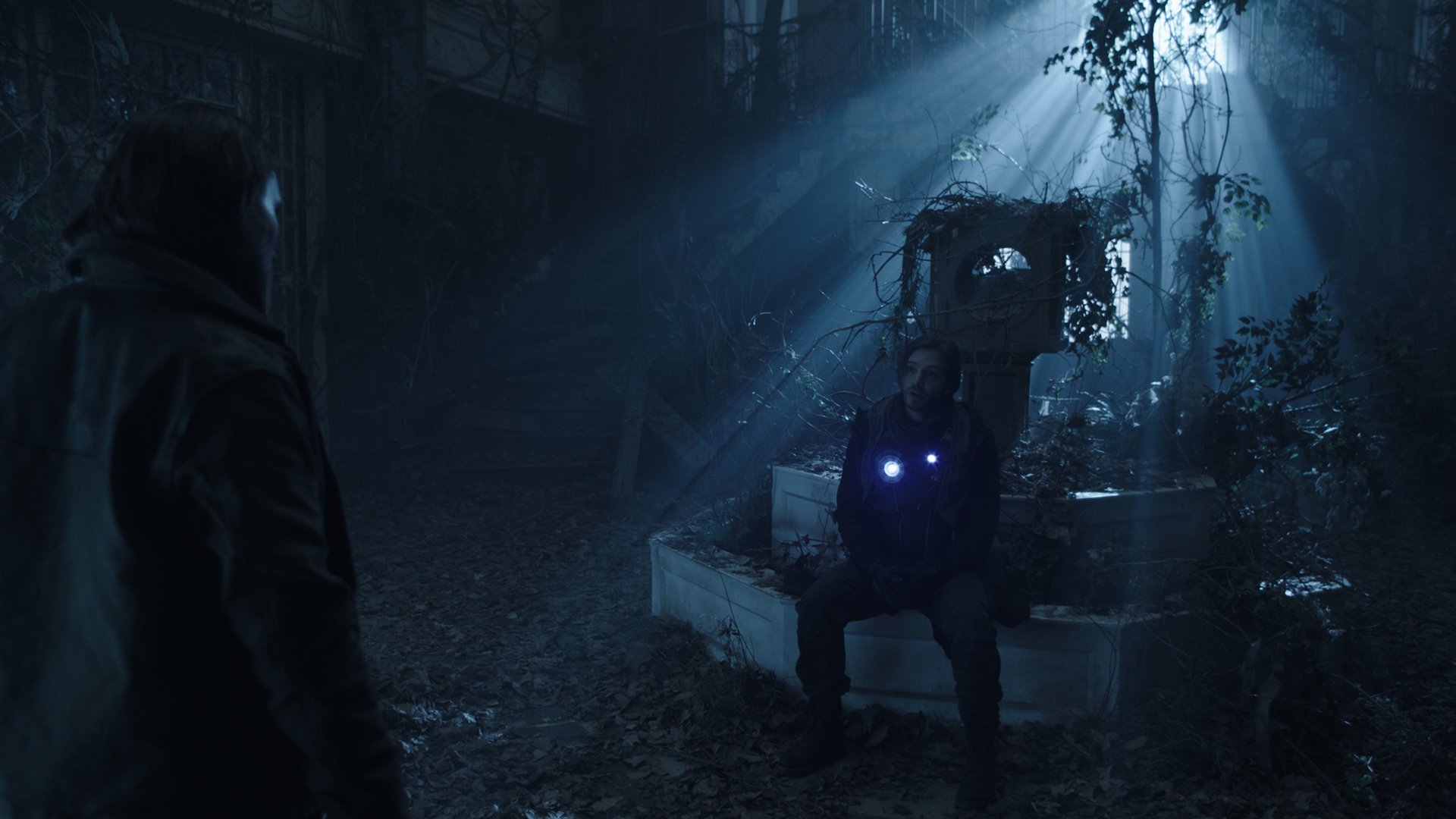
Greene: In the episode ‘Mother’ [Season 3, Episode 1], which was directed by Terry Matalas, ‘Future Cole’ and ‘Present-Day Cole’ meet in a surprise splinter to one of our sets, the lobby of the Emerson Hotel, in the year 2163. The building is in decay and seemingly uninhabited. It was crucial to Terry that we be able to do 180-degree camera moves in the space while the two Coles interacted with each other. We immediately turned to motion-control with the Technodolly and needed to adjust the lighting of the set to accommodate this. Normally we lit the show from the floor, embracing sidelight and backlight, but in this case, the masters could not be lit that way because we would start 180-degree sweeping shots looking north in the set and swing around to the south.
Fortunately, we had a skylight feature in the set where we’d installed half daylight and half tungsten LEDs that were controllable via our GrandMA board and completely dimmable. We heavily diffused this skylight source so it could be very soft. We dimmed these LED sources down to about 2 stops under as an overall kiss of light, and made the backgrounds brighter and bolder daylight sources. Towards the staircase, I put a 4K [Mole-Richardson] Molebeam gelled with 1⁄4 CTS to match what I was getting from the overhead source, and on the entrance side, we had an 18K on a 45-foot scissor lift through 129 hitting all the windows at the front entrance. We also had two 20-by-20 Claycoats [Ultrabounces] frontlit with diffused 4Ks for some day ambience.
I then ‘tricked’ the camera with color temperature to get a cooler look — I believe I put it at 2,800K, maybe 2,600K. Once we were finished with the wide masters on the Technodolly and were on more coverage shots, I was able to bring in some soft sidelight keys from the floor. The great thing about the Technodolly and motion-control is that on occasion, you can actually put lights in the shot — as long as they don’t intersect with the cast — and do a clean plate pass per shot to facilitate removal of the lights. I felt a bit spoiled with this ability.
We worked as follows: Once the shot was blocked with Aaron’s stunt double, Geoff Scovell, as Present Cole and Aaron as Future Cole, we could design the camera shot. Then we’d shoot a pass with Future Cole and our stand-in. Then Aaron would change into his Present Cole costume and makeup and do the scene with Geoff dressed as Future Cole. Then we’d do a clean plate pass for removing the Technodolly track — which was often framed in the shot — and other cleanup work, including eliminating Geoff from the scene, and any grip and electric gear in shot. Geoff is the best stunt match for an actor I’ve ever seen, and he gave a wonderful performance as both Coles. It helped Aaron tremendously to be able to perform this scene with someone.
Mojsovski: We shot all of ‘Thief’ [Season 3, Episode 9] in Prague, and that gave the show a great scope right away. Most of the story takes place in the late 1800s, and I liked the simplicity of it — it’s basically a love story between two people in the past, Eliza [Claire Cooper] and Athan [James Callis], who is also ‘The Witness,’ and one of them knows the future. We had to marry the two worlds through different visual choices. The director, David Grossman, and I agreed we should make the day material look bleak and desaturated and the interiors and night scenes warm because of the contrasting themes during the day and the night. We also used a studio dolly approach and went with classic framing to suggest a classic love story that just happened to involve a time traveler. We did a lot of north-south moves, coming closer to the character and arriving into a ‘cowboy’ frame so you can read the person’s emotion and also see the environment.
In the restaurant where Athan takes Eliza to dinner, we basically did wide shots and close-ups. We wanted to observe more and allow the actors to tell us where to go, visually. For lighting, we bounced Dinos into 12-by-20 Claycoats outside the windows to suggest the feel of gas lamps. Inside, we had Boris Lights with white duvetyn and 12-by frames of Light Grid on T-bars. That location had hundreds of practicals, all CFL bulbs that weren’t dimmable, so our Czech gaffer, Martin Granilla, had his crew replace them all with incandescent bulbs and wire those to dimmers. It was probably 3,000 bulbs! We dimmed them down completely. David and I never light with practicals — they’re ornaments. David Grossman would joke about it: ‘I count only seven practicals in this shot. You need another one.’
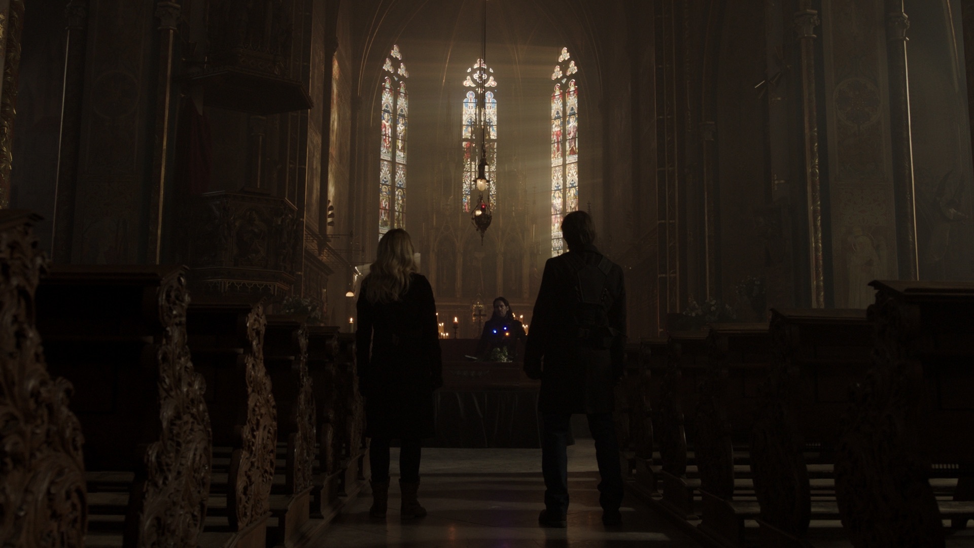
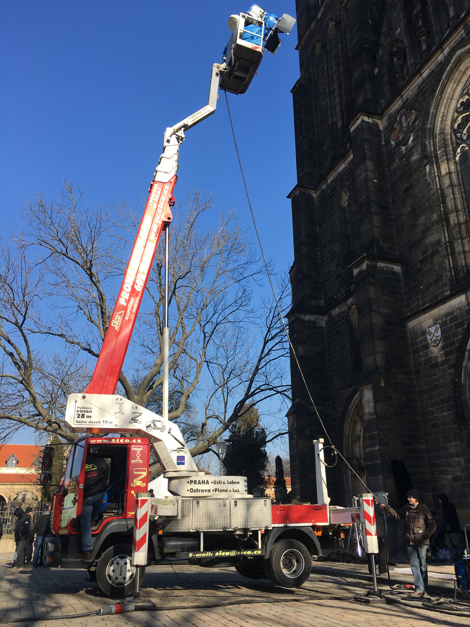
The episode ends in a grand cathedral where Railly and Cole finally meet Athan, who is standing over Eliza’s casket. The location was the Basilica of St. Peter and St. Paul, which is surrounded on two sides by a small cemetery where many Czech greats are buried. The cemetery cuts off exterior access to the large central window that dominates the interior. We knew we somehow had to push light through the stained-glass windows behind the altar, but no machinery could be put in the cemetery or on the small street alongside the cathedral — there was a maze of catacombs underneath it. We tried to figure out what could carry enough Arrimaxes at a reasonable height to pierce through the thick stained glass from a distance; Martin and I slaved over the challenge, and we finally found something that would work and submitted it for approval. At the same time, I lobbied the church officials to allow our special-effects supervisor, Pavel Sagner, to put light atmosphere inside the cathedral so we could see the streaks of ‘sunlight’ and create mood in the cool interior. For the large window, we found an LRX-type light in Germany and sent for it, but we discovered it wasn’t effective from the distance we had to maintain with it. So, the day of the shoot arrived; it was heavily overcast, and we had no solution for the dominant window.
Grant Harvey was directing his portion of the scene, which continued into the following episode. We set up the first shot away from the grand window, and as the Arrimaxes came to temp, I saw Pavel bring in the big smoke machines — the bishop had agreed to permit light atmosphere just minutes earlier. So, the light streaks showed up, and some balance returned to the universe! Then, as we completed our work in that direction, Martin and I turned to the grand window, and a glorious streak of unlikely natural sunshine hit it. We started yelling and the actors took their marks, and God lit the scene for us.”
