Doug Chiang on Rogue One’s Production Design: Part 2 of 2
The co-production designer of Rogue One: A Star Wars Story discusses the aesthetics of the galaxy far, far away.

The co-production designer of Rogue One: A Star Wars Story discusses the aesthetics of the galaxy far, far away.
Unit photography by Jonathan Olley, Giles Keyte and John Wilson. All images courtesy of Lucasfilm Ltd.
In Part 1 of this interview, Doug Chiang discussed his collaboration with his co-production designer, Neil Lamont, and detailed the design methodology for the Empire’s AT-ACT walker and TIE striker. Here, he digs deeper into the thought processes behind specific vehicles and locations.
American Cinematographer: Given your extensive background as a concept artist, when you’re serving as a production designer, how hands-on are you during the concept-art phase? Are you rolling up your sleeves and drawing, or are you serving in more of a supervisory capacity?
Doug Chiang: It’s the nature of production designers that your day is pulled in way too many directions, so I rarely have a couple of hours to focus on a design. But for Rogue One I really wanted to supervise the team as well as do hands-on work. It’s always a tough challenge to balance your schedule in that way; I wish I could have had more time to design personally, but the team was so strong and I loved working with them. Many times they design it better than I could and more clearly match what I see in my mind.
We had a great range of artists, including [Star Wars veterans] Ryan Church, Erik Tiemens, Thom Tenery — it was a good group. The challenge for us was that, during the first six months or so, a lot of the artists were tied up on other projects. So it was like a ragtag team, where I was begging and borrowing artists’ time. But it worked out well; besides the core team in San Francisco, I would contract certain artists over in Singapore for three days a week, and then I would hire a couple guys in London for a couple days a week, or a couple guys in Los Angeles, and collectively that formed the team. It was great because there were many different points of view. It was great to get a whole bunch of different ideas in a short amount of time.

Is there one design that stands out to you as having been the most difficult to figure out?
Chiang: [Laughs.] It would be the U-wing — and Kay-Tu, the robot [played by Alan Tudyk]. Our film needs to dovetail seamlessly with Episode IV, but we also wanted to add a component of new. I think it’s very important in a Star Wars film that you add that small percentage that’s fresh. Episode V had the walkers and Episode VI had the speeder bikes. You need that little bit to keep the audience engaged and to build the world more thoroughly, because it is an expansive universe.
What came first — the design for the U-wing or the name ‘U-wing’?
Chiang: [Laughs.] It was the design. Gareth had very specific ideas for what he wanted for this new ship. The design brief was that we wanted to create a troop-carrier version of the X-wing. In my mind the X-wing is a perfect design — it just looks so great — so we were raising the bar very high to say, ‘Let’s do our most iconic, memorable version of a ship, and tie it to the X-wing aesthetic.’ That was a tall challenge. But Gareth grounded it by describing it as, ‘Let’s think of these as Huey helicopters.’ So it’s the X-wing version of a Huey helicopter.

But that was the one design that we chased for a long time. I recently went back and counted. We did 781 individual designs for that ship. There were shapes that Gareth always navigated towards. He loved the idea of these two outstretched wings; I remember when I first showed him that design, he said it reminded him of Superman with his arms out. When he said that, something clicked in me; I saw where he was going with the symbolism of the design. It was important to maintain that, so that configuration stayed. And that configuration was also something that George was very fond of; if you go back to Episodes I, II and III, you’ll see a lot of ships with that same configuration. So we thought, ‘That’s a perfect design bridge. We’ll update it, using that configuration and tying it aesthetically with the X-wing.’


From there it was a matter of figuring out, ‘How do we make sure that this ship looks good from all angles?’ That’s a tough challenge, and this was where I really admired Gareth’s thoroughness in terms of the designs. We landed on the top view and the side view, but the bottom view — the view we were going to see the most — was lacking. That’s where we did many iterations, reworking it so that when we changed the bottom view it wouldn’t change the side view or the top view. I rarely work with directors who are that precise about design. I love that nuance.
We also wanted to explore the idea of transformation. Star Wars vehicles move, wings unfold, and so one thought was that if the wings are out front, maybe they should be able to sweep back. It goes back to creating these iconic, memorable shapes. When the wings are forward, it reminds you of Superman; when they’re swept back, it reminds you of an arrowhead. It’s that layering of subliminal ideas that I think really makes the design feel authentic. Once we landed on that configuration, that’s where the name came.
How did you begin to design Rogue One’s new planets?
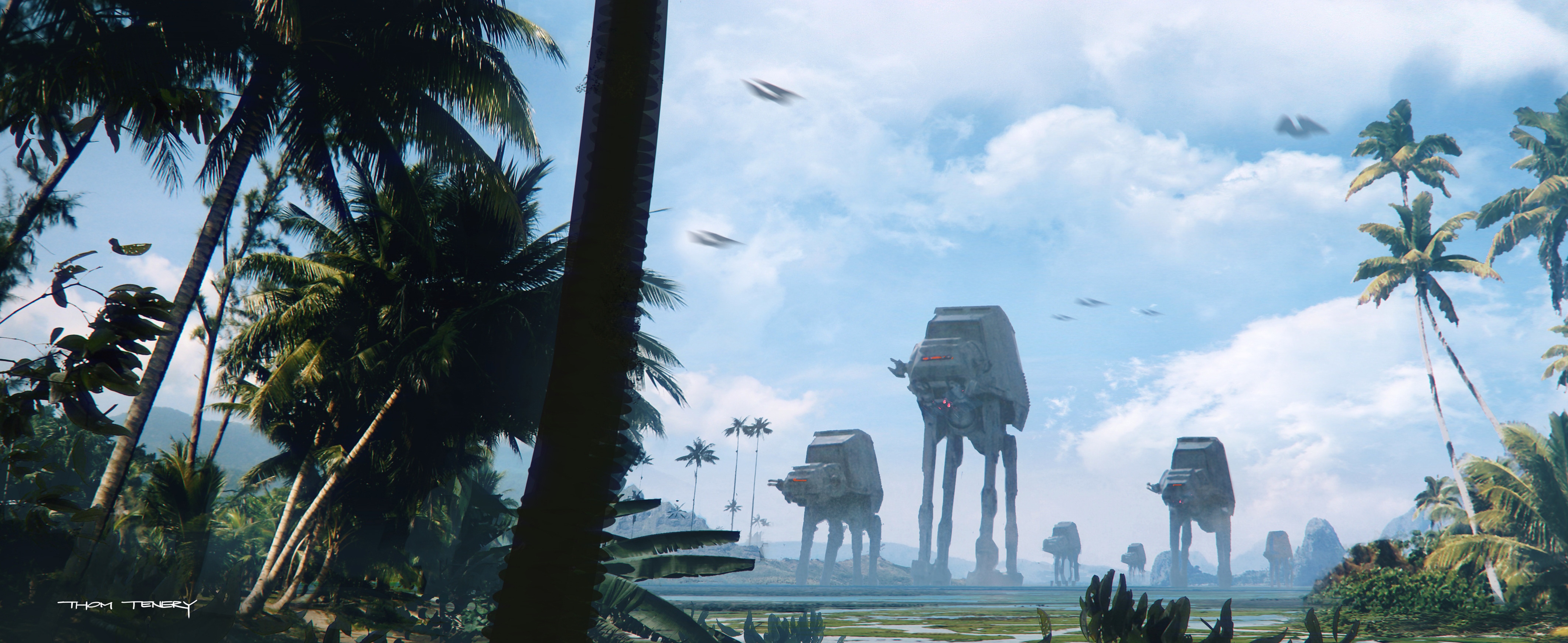
Chiang: There are certain themes that continue to pop up with Star Wars, such as planets with single ecosystems. So when we’re designing a new planet, we’re always trying to figure out, ‘What can be an iconic ecosystem that will define that world?’ With Scarif, Gareth felt strongly that we had to create a very distinct planet for the end [of the movie]. He loved the Maldives, and we thought that having the end battle set in this idyllic paradise was a really interesting contrast. That idea came up very early in the development process, and from there it was a matter of trying to figure out how to make the Maldives into a Star Wars world.


What was the impetus for Jedha, the Imperial-occupied moon where Rebel extremist Saw Gerrera [Forest Whitaker] has been hiding?
Chiang: As the script was being fine-tuned, it was decided that we should come up with something a little more iconic, story-wise, for why Saw’s here. The idea came up that maybe this is the religious center of the old Jedi religion, and that Jedha could be an ancient city almost like Jerusalem. So we started thinking it should look like Jerusalem, but we would try it as a cold desert. The idea that always stuck was that Jedha would be a walled city, and there would be an ancient temple that would signify the Jedi Order.
We’re planting seeds [for stories] that will be developed further in other media, but the idea was that this planet was the last remnant of the Jedi Order, and the Empire has come there to pillage the city for its kyber crystals. My thinking for why the city was built there was that perhaps a meteorite had crashed and deposited all these kyber crystals, and then the city was built on top of that crater. Thinking globally in those terms started to inform the design of the city and the outlying mountains. Why is it elevated? Why does it have this temple beacon?
Going further, when we designed Vader’s castle on Mustafar, we wanted to tie it to the Jedha temple. Put them side by side, and they almost mirror each other. Vader’s castle is very similar in style, but it represents the dark side of the Force while the Jedha temple represents the good. It’s a subtle way to visually reinforce that idea of the light and dark sides.


Ralph McQuarrie had designed Vader’s castle during preproduction for The Empire Strikes Back. His designs ultimately weren’t used there, but they were incorporated into Maz Kanata’s castle for The Force Awakens. Did you look back at Ralph’s designs, or did you start completely fresh for Vader’s castle?
Chiang: We looked at them, and Ralph had created some amazing designs of Vader’s castle, but because they were used for Maz’s castle, we knew we couldn’t do that. But we loved the idea of tying it to Jedha, and the idea of a temple that looks like a tuning fork. It’s going for the symbolism that maybe these temples are ‘tuning’ the Force, and Vader’s version is going to be tuning the dark side of the Force. That was the foundation that drove the design.
Was Jerusalem your primary inspiration for the architecture that surrounds the temple in Jedha City?
Chiang: A lot of the architecture was based on Jerusalem and the Middle East. It goes back to what George Lucas was doing with Tunisia and the dome architecture of Djerba [for Tatooine in A New Hope and The Phantom Menace]. There was an early pre-shoot where Gareth and Greig went and shot a bunch of plates in Morocco, and they became the underlying foundation for Jedha City on top of which we could overlay our Star Wars aesthetics. So the city felt very real and grounded in something that we’re very familiar with.

The production utilized London’s Canary Wharf Underground station to serve as part of the interior for the Empire’s Citadel facility on Scarif. What led to that decision?
Chiang: That was a real challenge. Star Wars films demand that you create some scope, but we’re always bumping up against the budget. This Imperial Citadel tower is quite large, and once we were inside, we wanted to establish that scale — but we obviously couldn’t build it. Gareth really wanted to go to a place where he could actually put a camera and get a sense of the depth, so we scouted the Tube station at Canary Wharf, and both aesthetically and scale-wise, he felt that it was in the zone. So the decision was made to augment as much as possible by re-dressing kiosks, and re-dressing walls with some Imperial ‘pill’ lights. The areas where we couldn’t do that, we could then tackle digitally.
What Canary Wharf gave us was that incredible sense of depth that was very real. The idea was to use that as a foundation, and I think that’s an important approach to designing anything for Star Wars. You have to ground it in reality. That was a useful trick I learned from George — 80 percent of a location should be real, and then you augment 20 percent. That was the idea for Canary Wharf, to augment what was there.
When you first started working on Star Wars more than two decades ago, could you have ever guessed you’d still be involved — or that there would be this seemingly unending stream of content in so many media?
Chiang: I know! No, I could never have imagined it. When I was working with George in 1995 on Episode I, I thought that was the fulfillment of my dream — I finally had a chance to work on Star Wars. When I heard that Disney was going to make more, I had to sign on again, because I just wanted to live in this universe more. It’s so big, and there’s so much to design. I love exploring this playground, which was set by George. It’s vast, and I think the possibilities are quite endless.

To read Part 1 of this interview, click here.
See the February issue of American Cinematographer magazine for the complete production story on Greig Fraser, ASC, ACS's cinematography in Rogue One.
