Fremont: A Black-and-White View of San Francisco’s Chinatown
Cinematographer Laura Valladao and director Babak Jalali’s feature offers a distinctly monochromatic look at an Afghan refugee’s life as a factory worker.
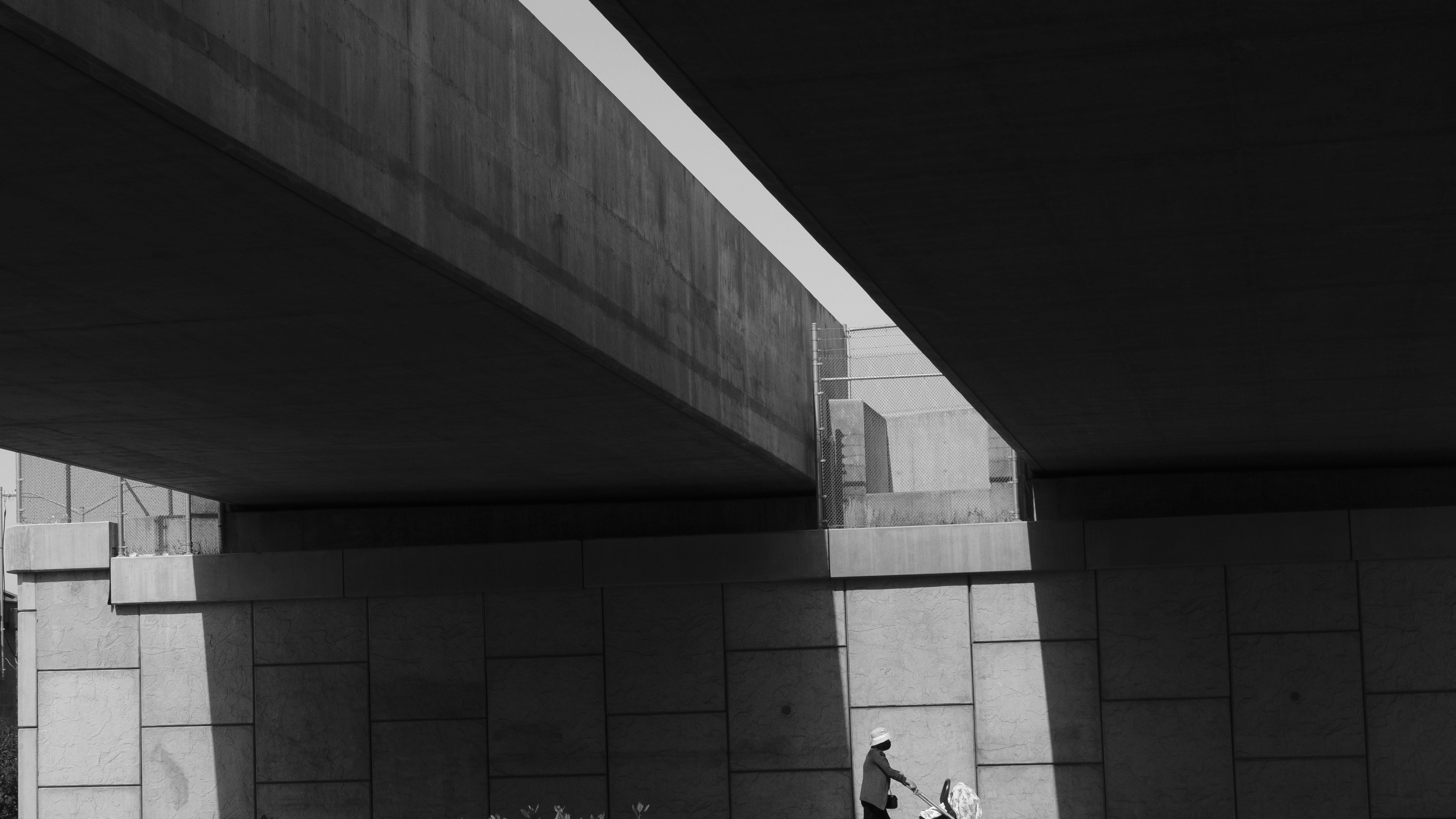
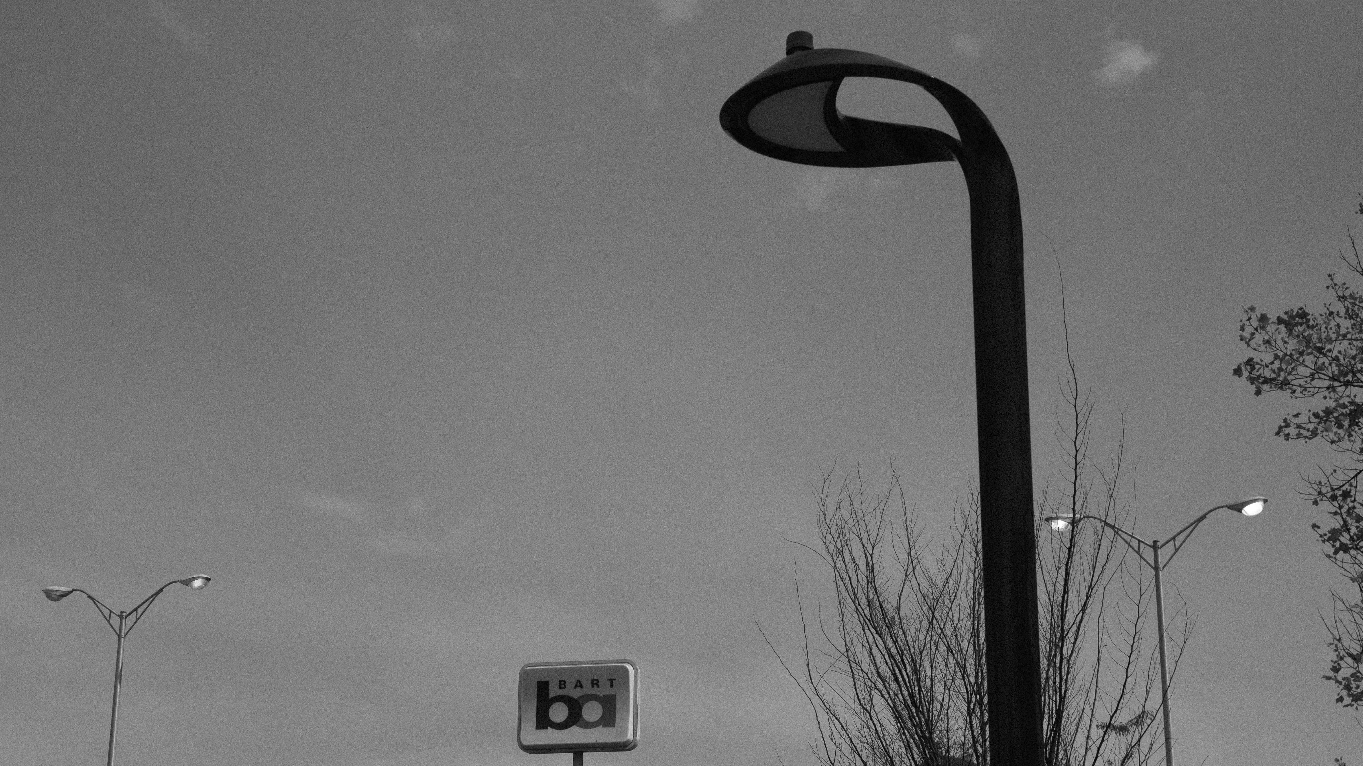
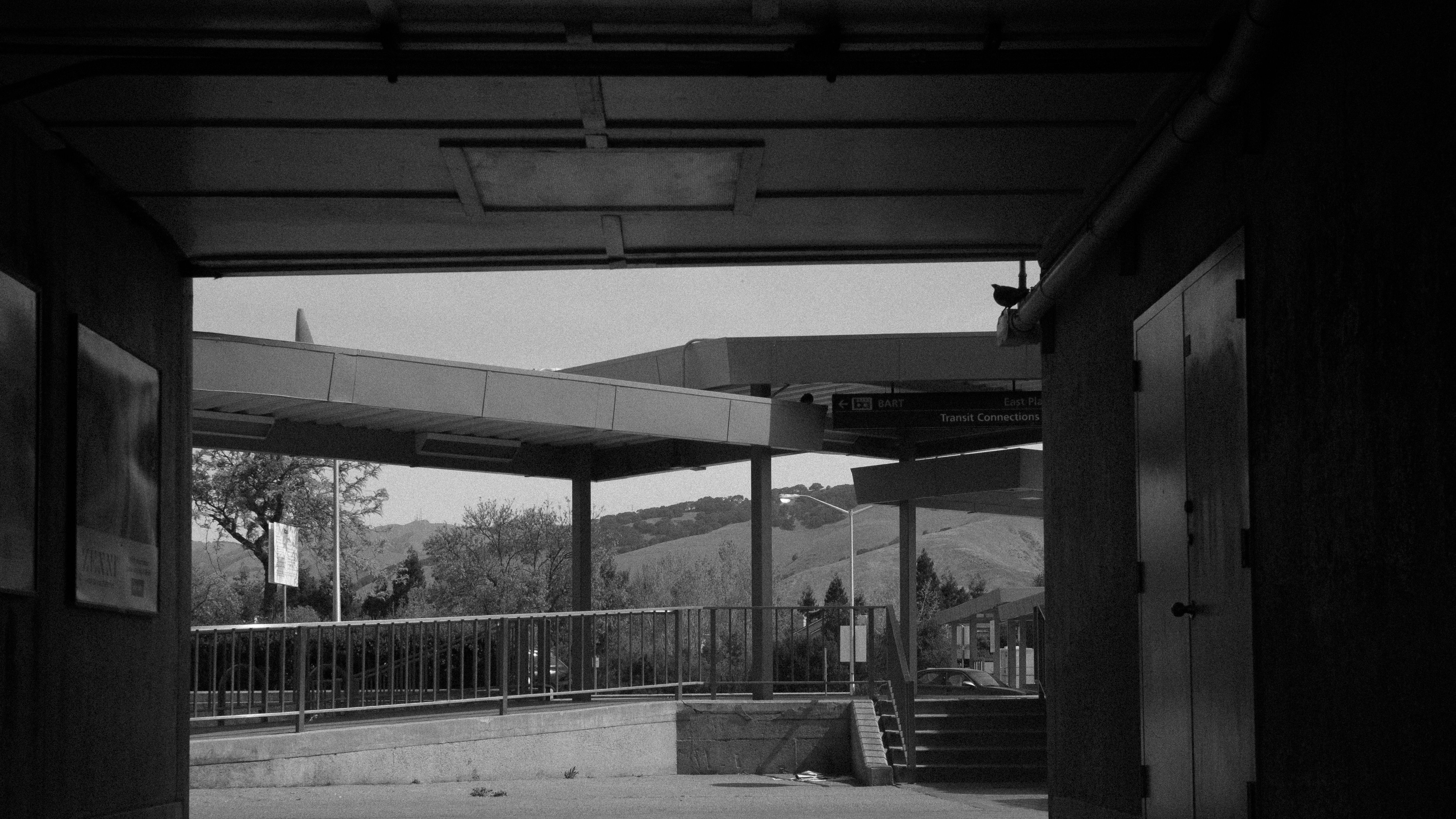
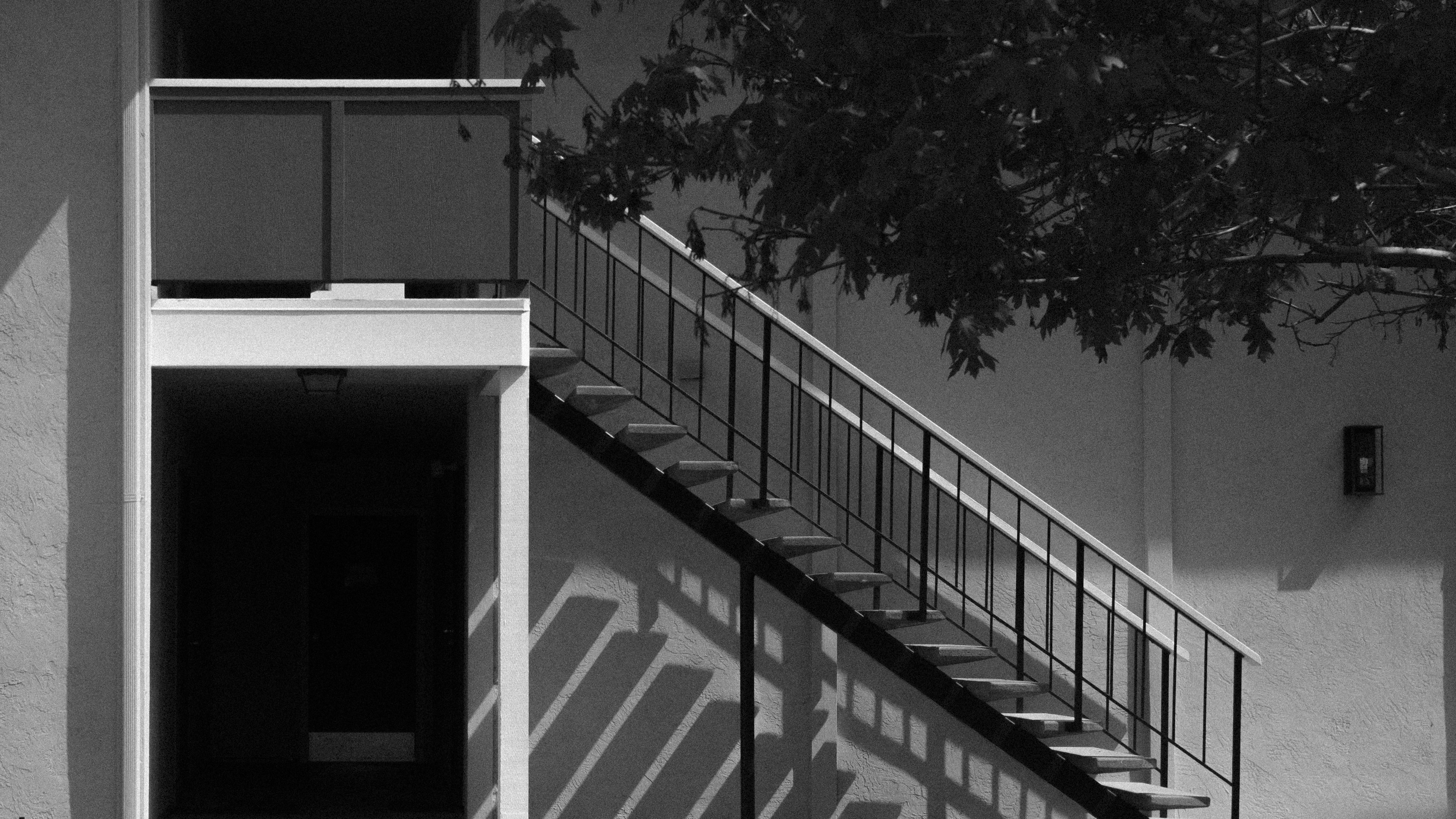
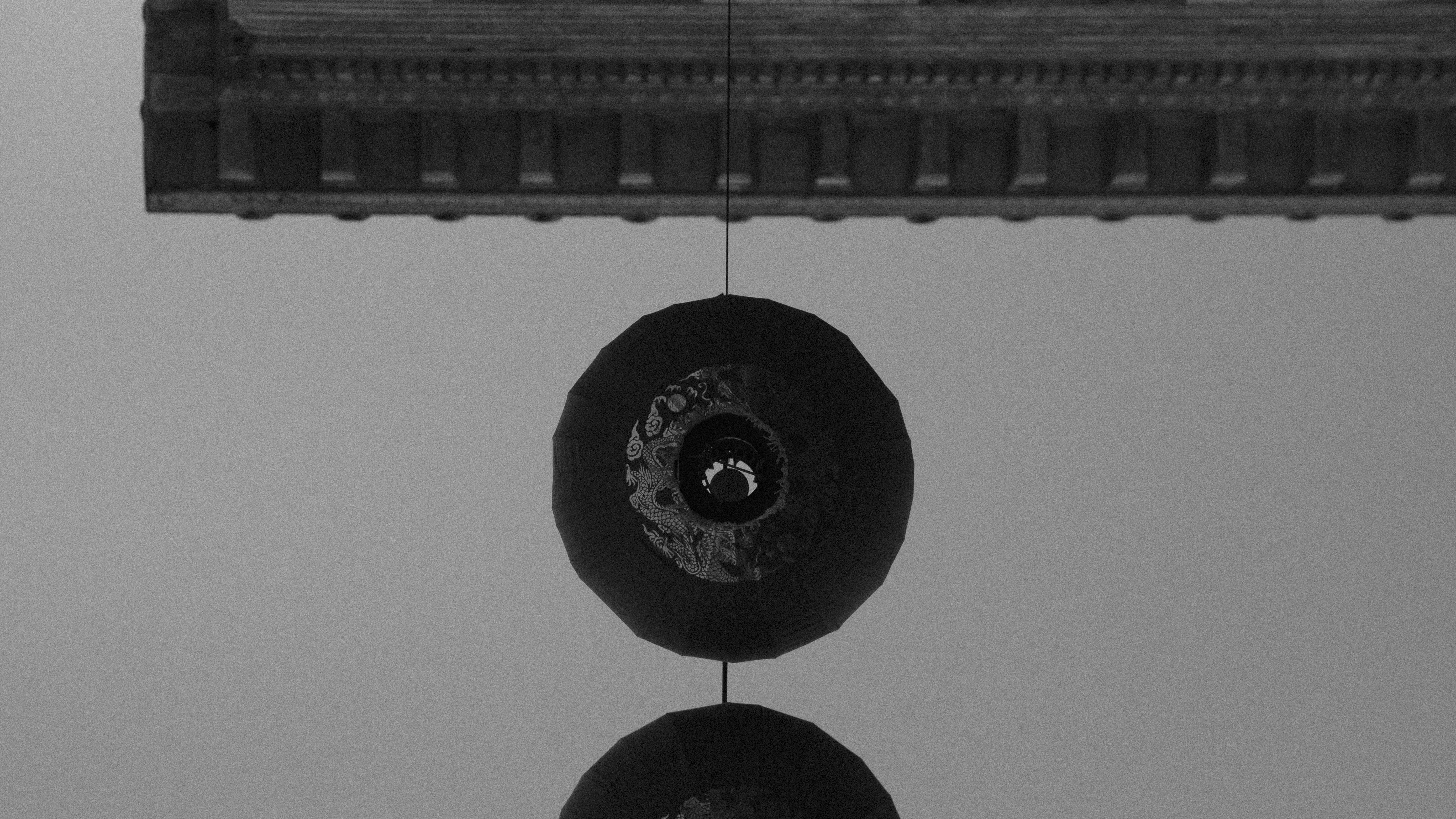
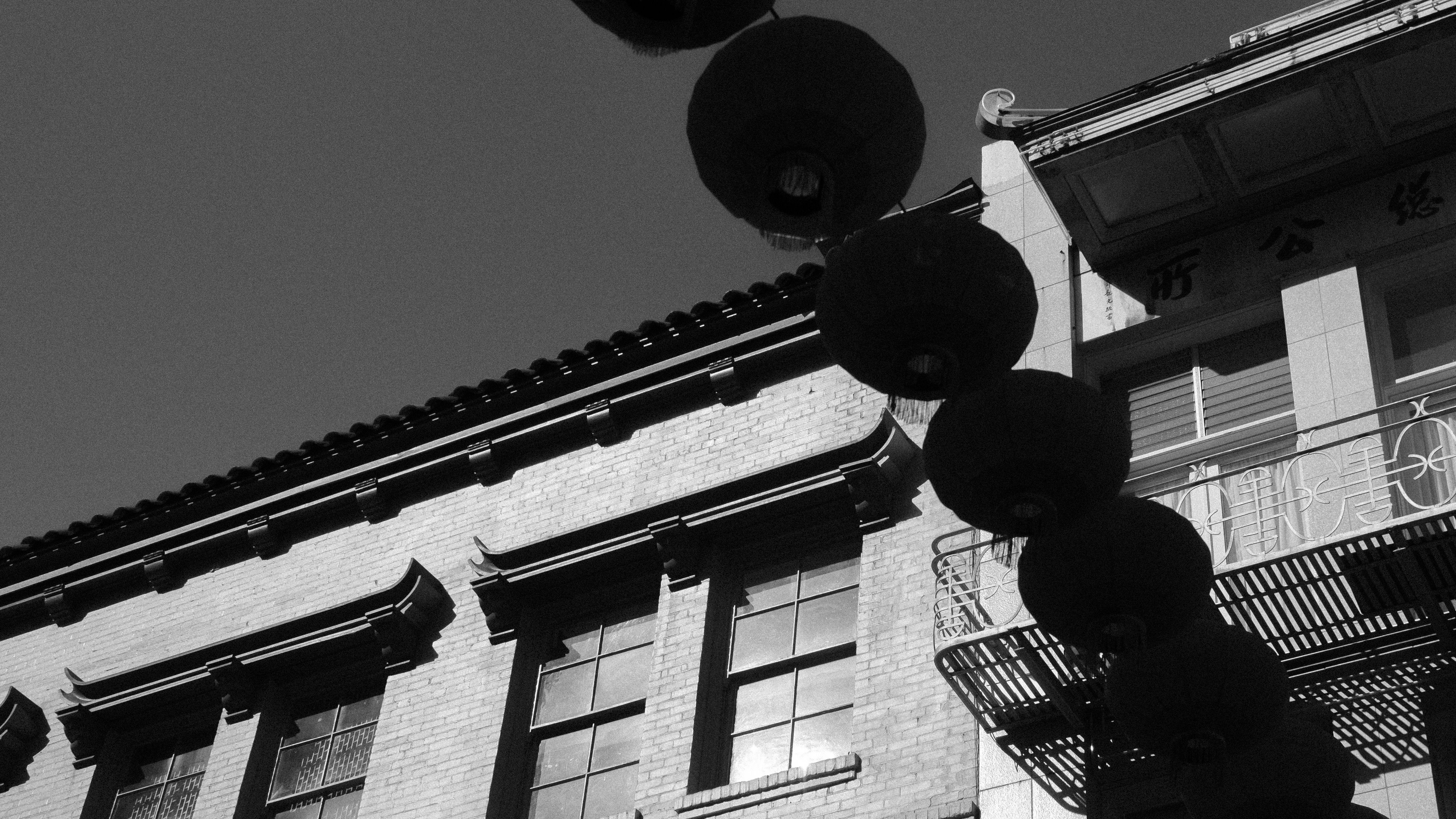
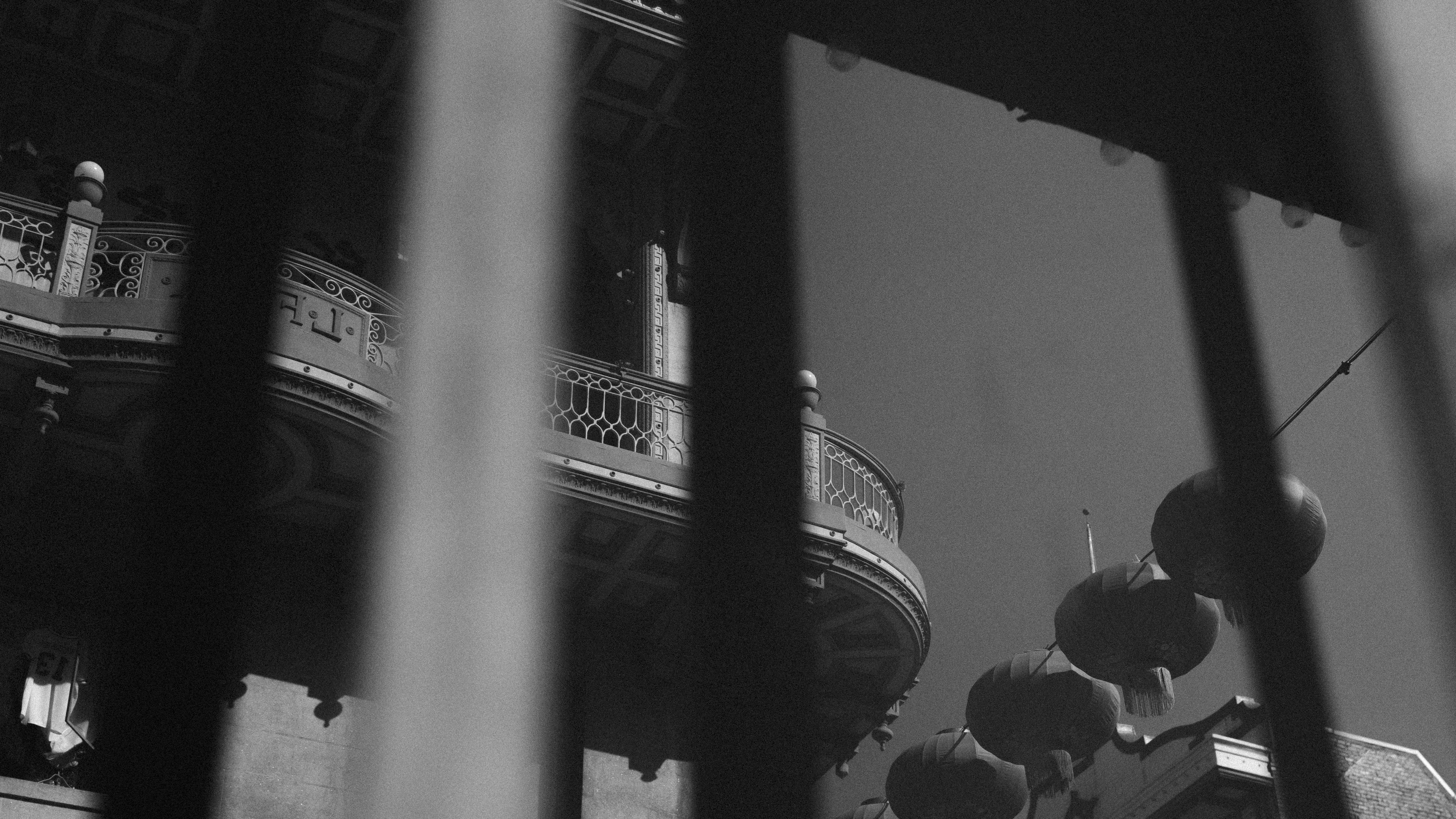
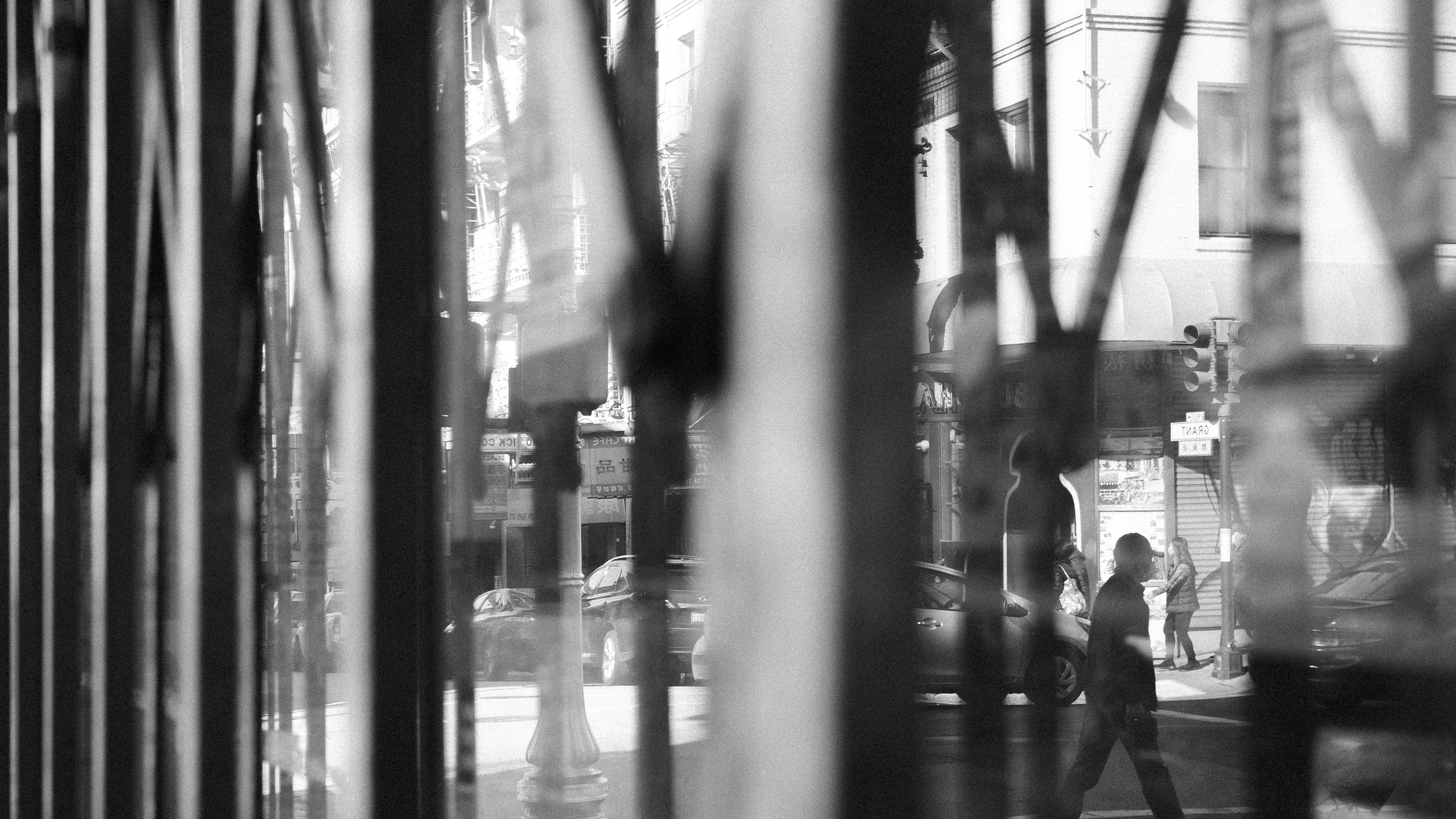
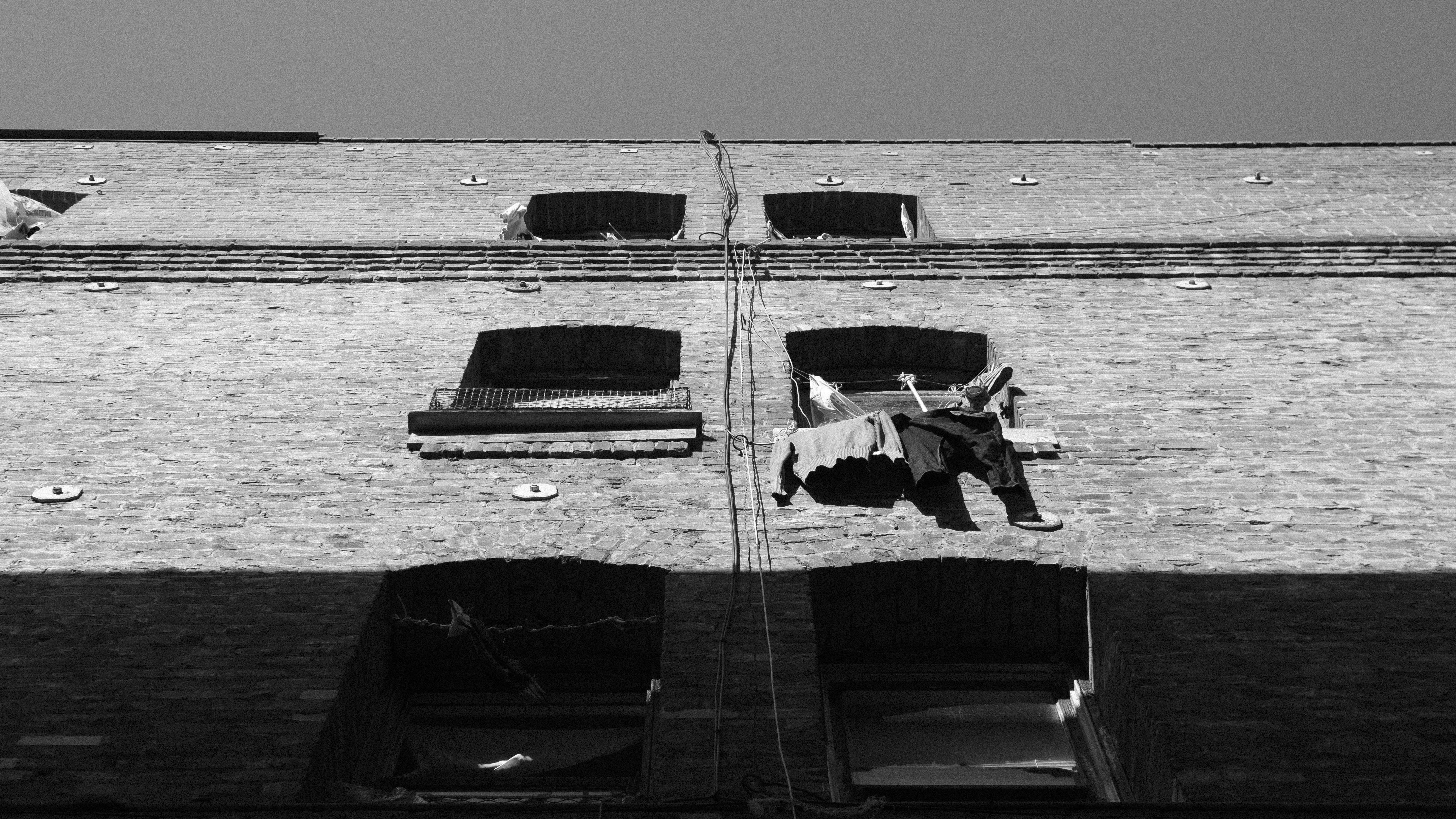
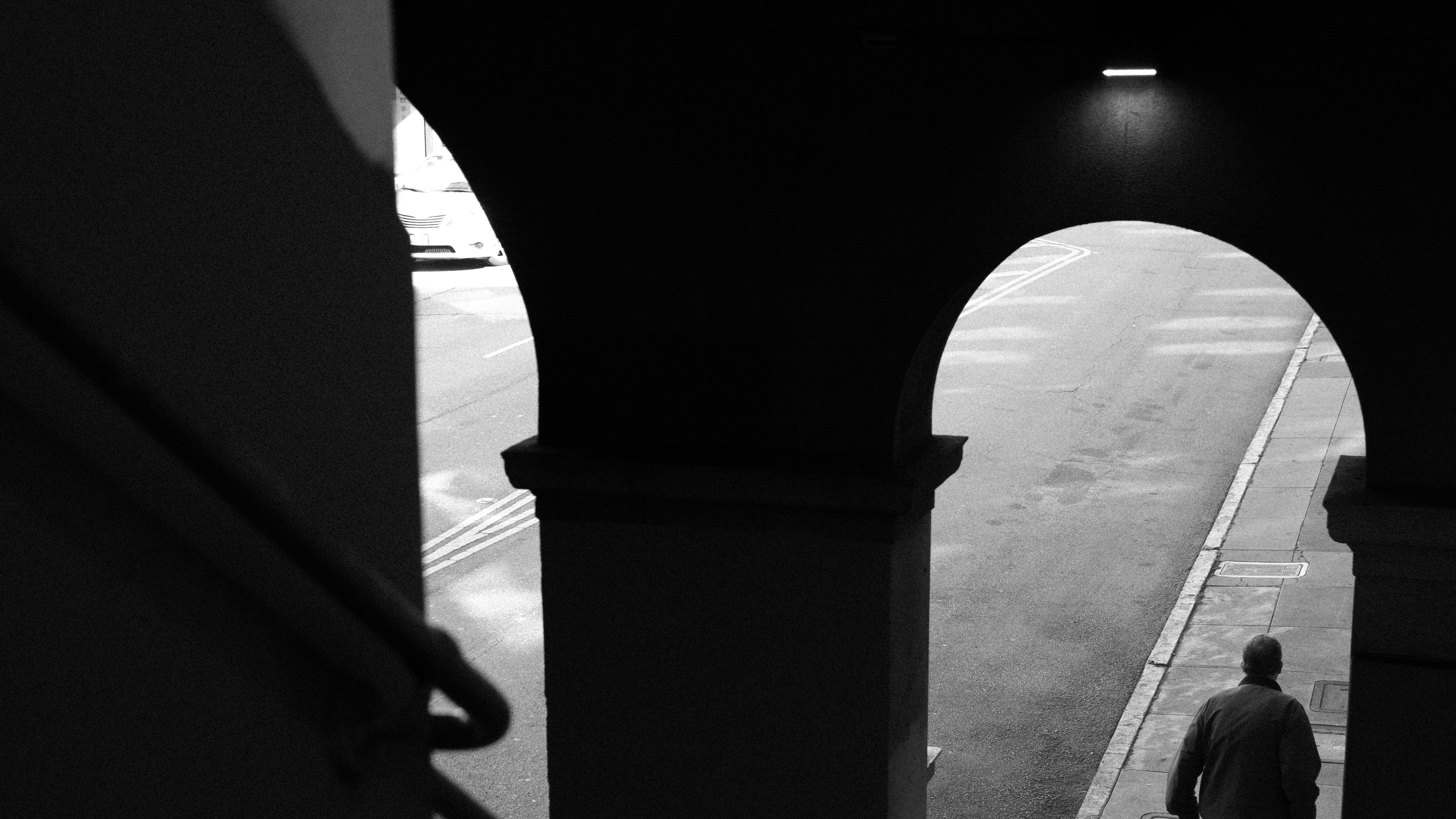
When cinematographer Laura Valladao first started snapping black-and-white photographs of San Francisco’s Chinatown in March of 2022, neither she nor director Babak Jalali knew for sure if they would be allowed to steep their latest feature, Fremont, in the same palette. What they did know was that these stills would be a key part of a robust pitch to producers — one that, to the filmmakers’ relief, was ultimately approved.
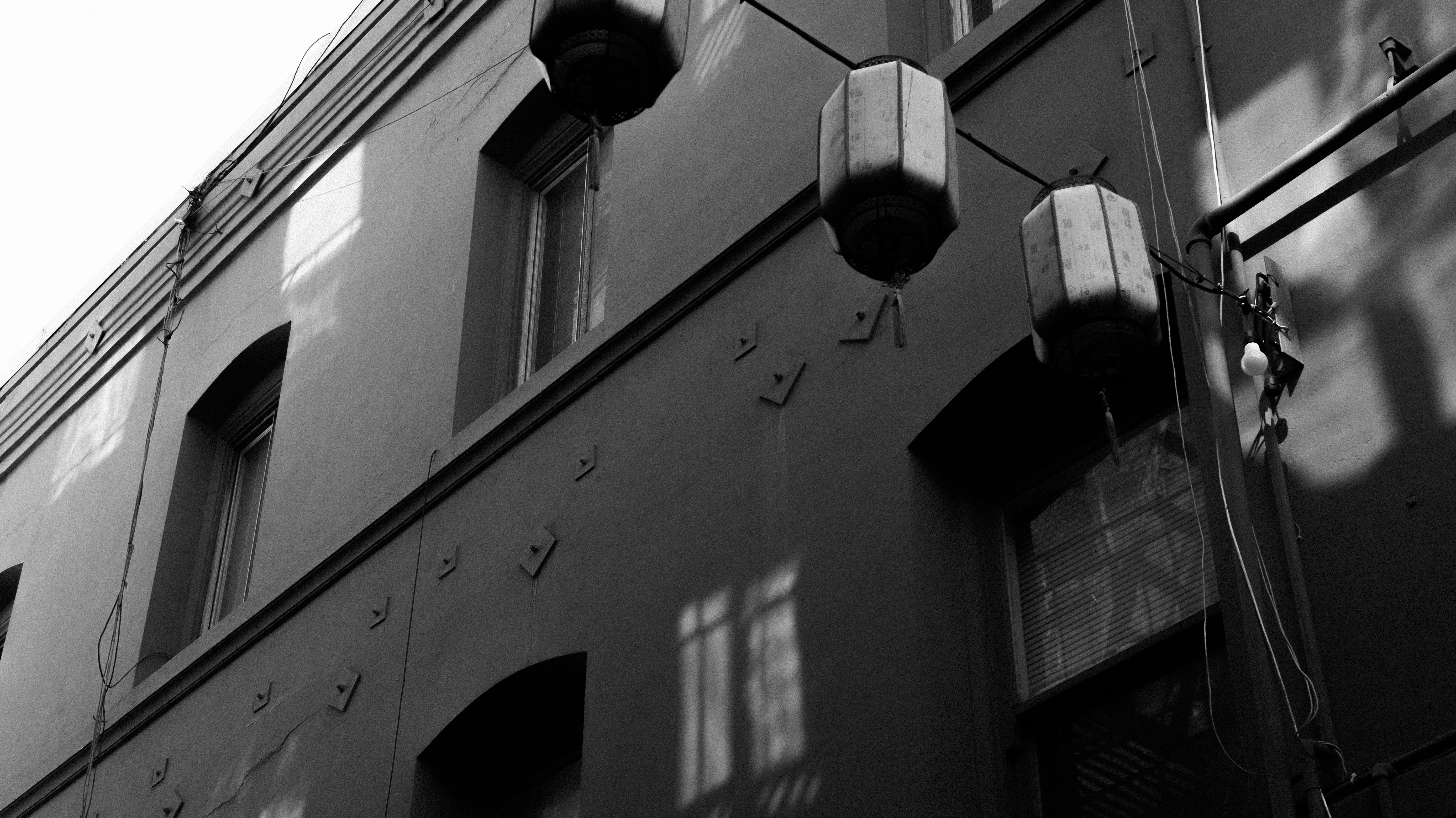
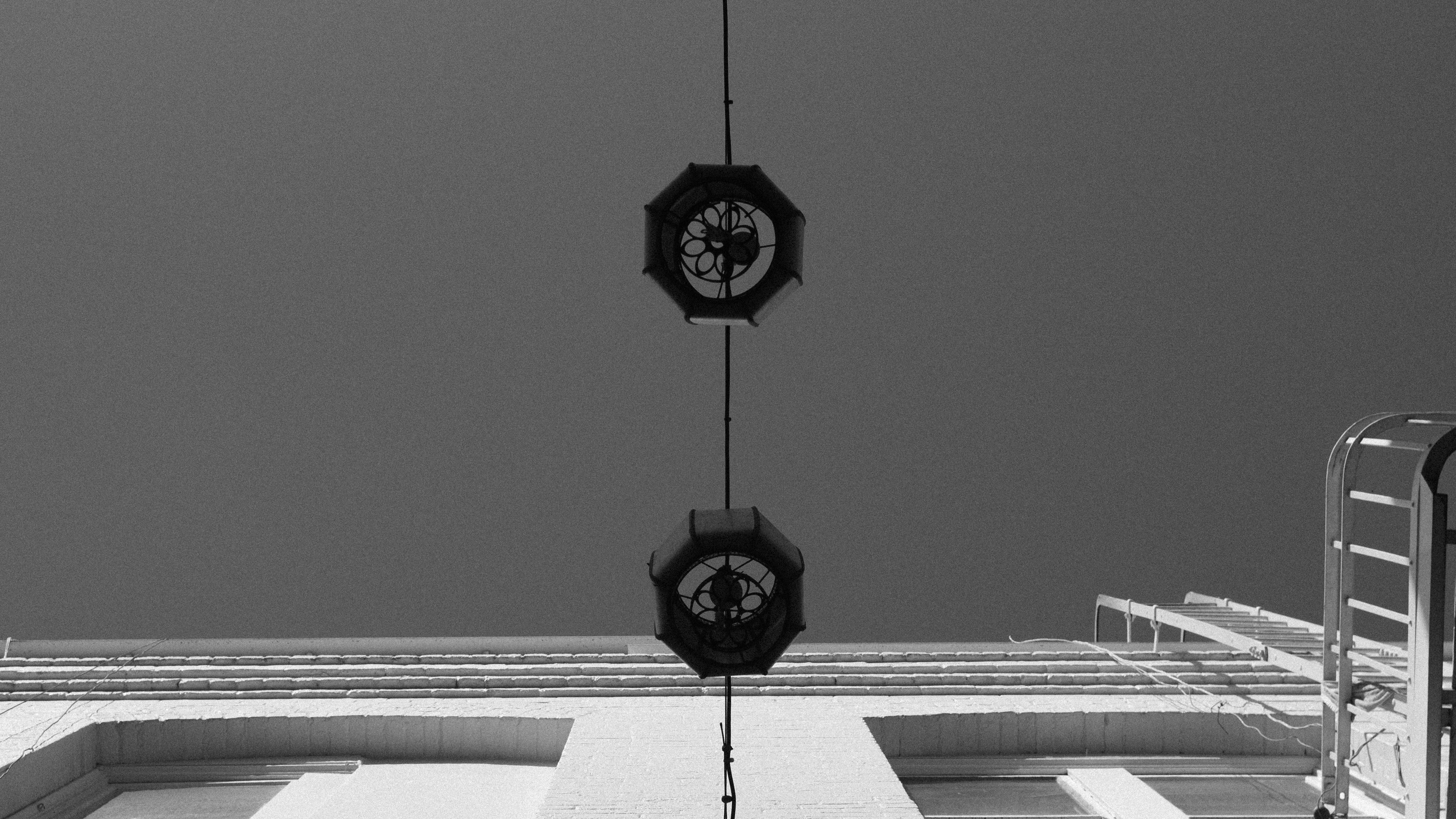
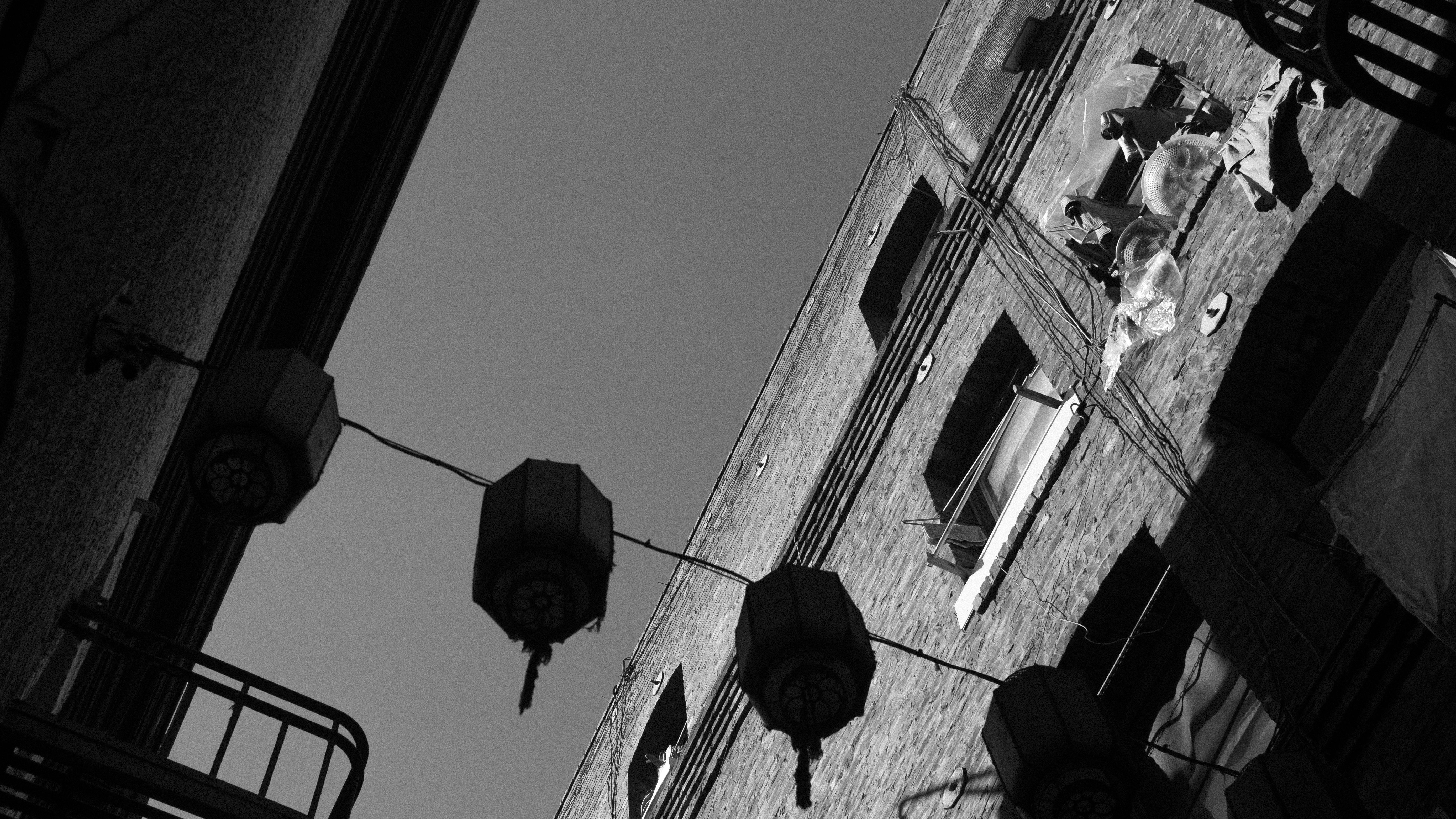
“We're very accustomed to seeing Chinatown in color, whether it's in photography or films,” Jalali says. “The stores, the people, the lanterns — all these things in Laura’s test photographs looked completely different from everything else I had seen myself in Chinatown.”

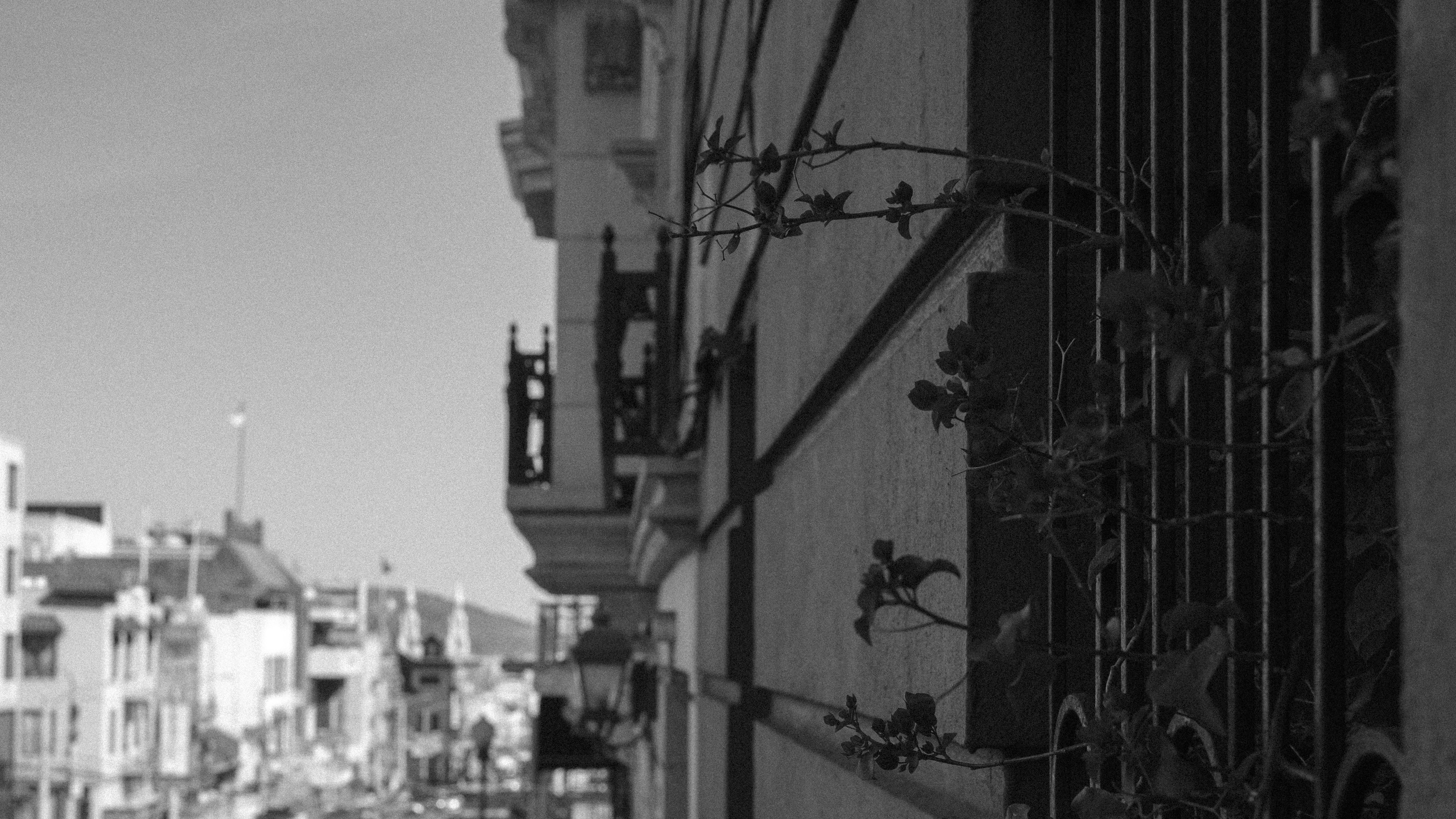
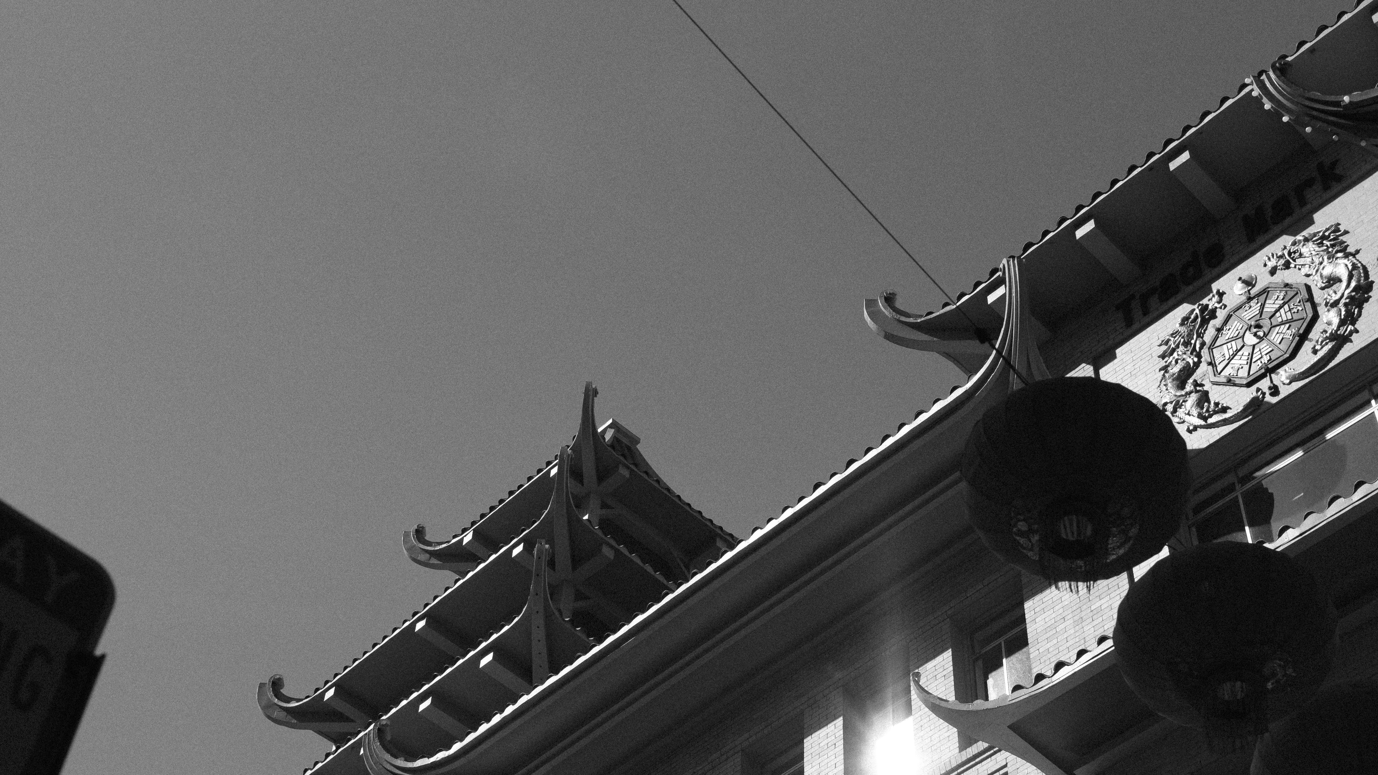
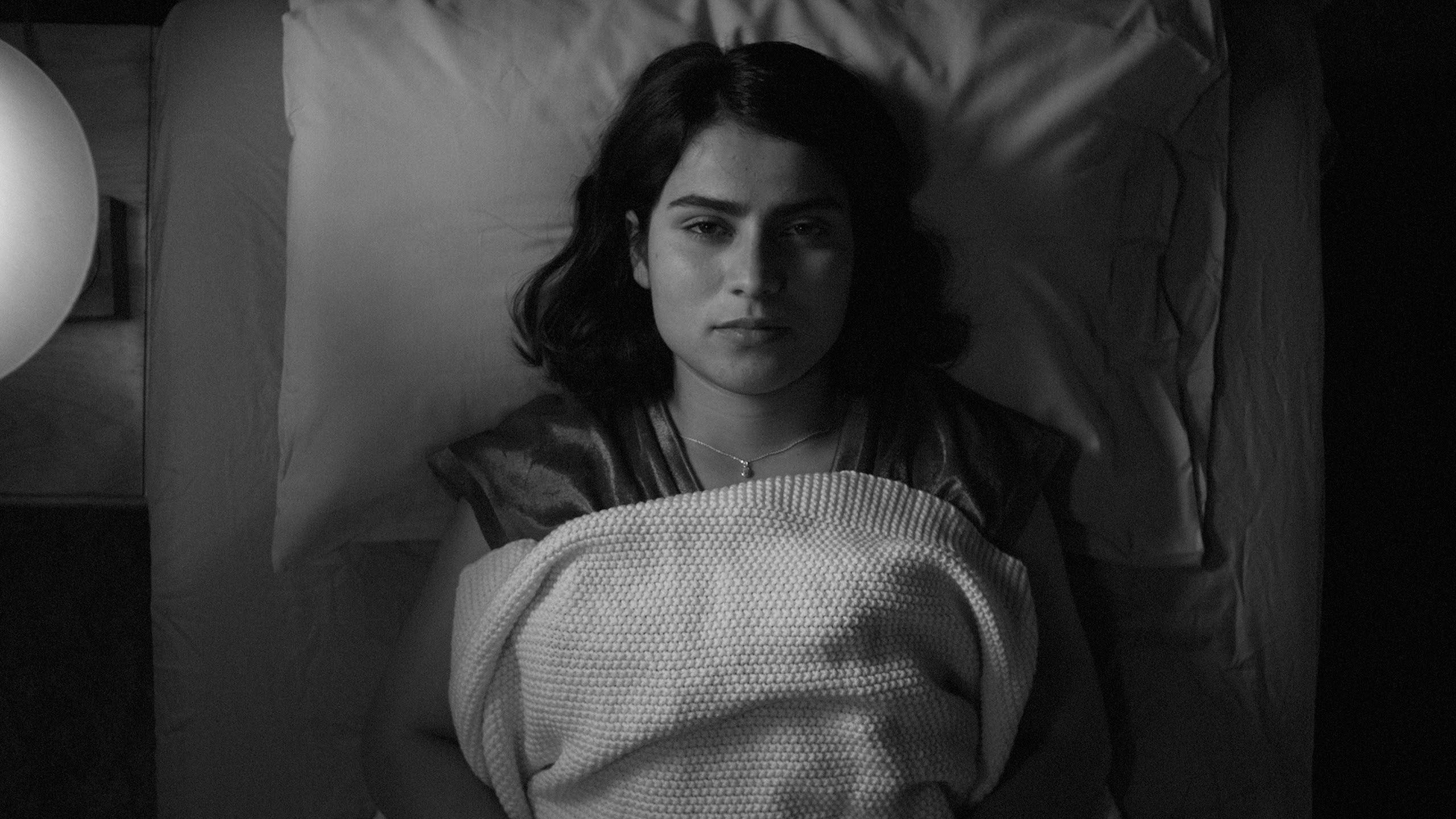
Fremont opens in a Chinatown fortune-cookie factory that was fully operational throughout the shoot, and the cinematographer captures the real-life process of how fortune cookies are made and packaged, with some actual employees appearing as extras. The film follows one of these workers — an Afghan refugee named Donya, played by non-professional actor Anaita Wali Zada — and largely consists of her conversations with a variety of oddball characters, including her co-worker Joanna, fellow refugees living in her apartment complex in Fremont, and Dr. Anthony (Gregg Turkington), a psychiatrist who carries a special affinity for Jack London’s White Fang.
Valladao frames this story in a static and deliberately stilted manner: Characters often seem as if they are addressing the camera directly, calling to mind the films of Jim Jarmusch, as well as Aki Kaurismäki. Jalali counts Jarmusch’s Stranger Than Paradise, Down by Law and Mystery Train as some of his favorite films, and states that Kaurismäki is “pound-for-pound, in terms of a body of work, my favorite director of all time.” (Kaurismäki’s 1990 feature The Match Factory Girl also tracks a factory worker through her daily life, though Jalali notes that this narrative connection to Fremont was more subconsciously made than it was a deliberative homage.)
“When you talk about black-and-white, that can mean so many things,” Valladao says of the process that led her and Jalali to hone Fremont’s visual language. Both Stranger Than Paradise and the Béla Tarr-directed Damnation served as seminal ’80s-era references for the project, but the filmmakers also aimed to get a sense of how their contemporaries approached black-and-white — studying such recent films as the digitally-shot Ida, C’mon C’mon and Passing, along with The Forty-Year-Old Version and Malcolm & Marie, which were both filmed on 35mm. “Our lookbook definitely had a lot of their photographs in them, a lot of portraiture,” Valladao adds, naming photographers Antanas Sutkus, Shelby Lee Adams and Graciela Iturbide as key influences on the film's 1.33:1 aspect ratio. That boxy ratio was ideally suited for the film’s frequent use of center-framed actors, which mimics the look of traditional portrait photography.
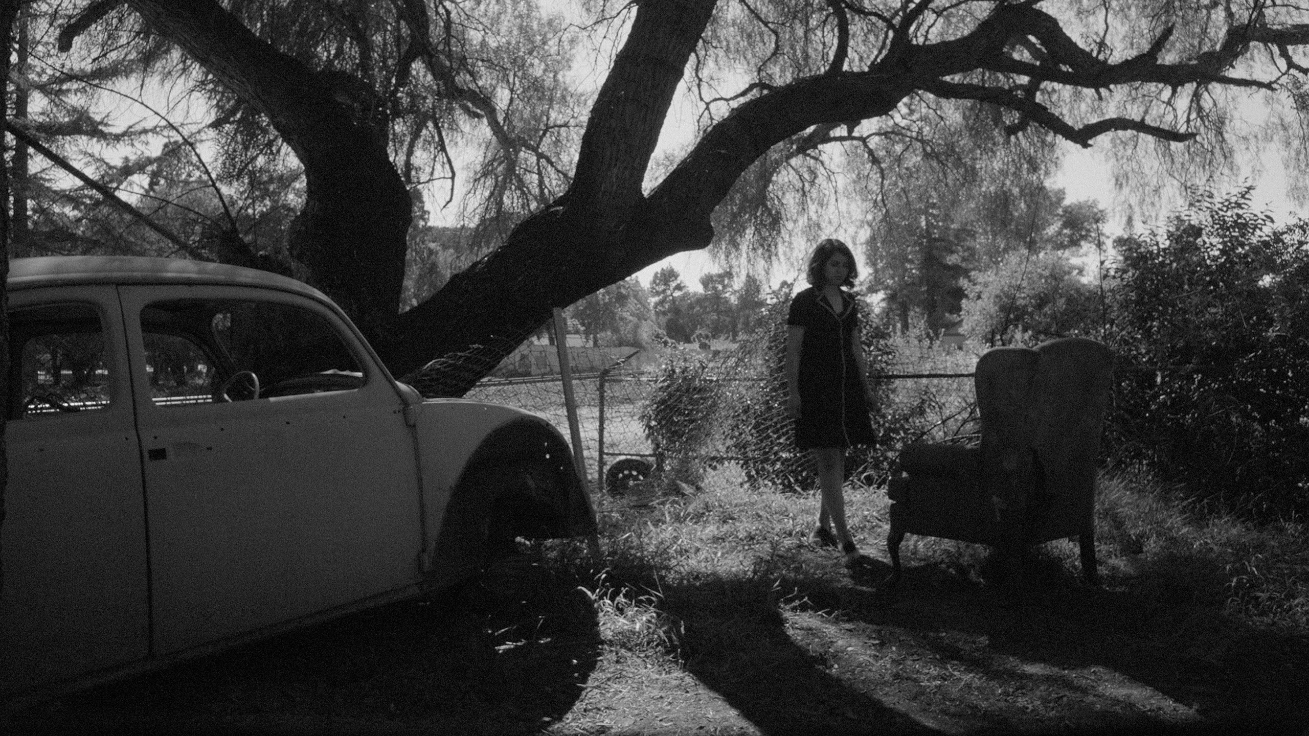
Valladao decided to shoot the picture with an Arri Alexa Mini, which was paired with Cooke Speed Panchro lenses. The Mini made sense “from a budget perspective, but also from a workflow perspective,” the cinematographer explains, as its size enabled a flexible shooting style within the tight quarters of the factory where their “footprint was quite small.” The camera also helped the filmmakers quickly add extra handheld shots as needed: “We would start on sticks, and then Babak would say, ‘What do you think about picking up these moments handheld?’ And we would go back and forth when it felt appropriate.” Jalali notes that the shots of the actual factory workers which open the film were unplanned — the byproduct of Valladao “thinking on her feet in getting the footage.”
Jalali admits to a complicated history with handheld: “When I was a pompous new film-school graduate, I was like, ‘No — no handheld.’ I wanted everything to be very composed — like photographs, essentially. But I've certainly developed a real soft spot for handheld photography.” It’s a testament to the film’s pacing, and Jalali’s editing, that these brief handheld interludes never stick out, but instead, blend in seamlessly alongside Fremont’s more rigidly composed, static setups.
Valladao knew from the jump why she wanted the Speed Panchros: "We were moving quickly, so I needed something which would allow me to control the amount of bloom in the highlights by either stopping down or opening up." She adds that the lenses are versatile and can play “very clean” when needed, or “soft and poetic” in other moments, and that they carried a “whimsical” quality in line with the tone of the narrative. “In Dr. Anthony's office, there is a wide two-shot, where Donya and the doctor are framed in front of windows, which fill most of the frame. The Speed Panchros at a 2.8/4 split allowed me to hold detail in the windows without too much bloom. In our handheld exteriors following Donya at the wetlands, shooting wide open, I was able to lean into flairs and bloom. The Speed Panchros gave us just enough for the dreamlike quality we were after, without feeling like a complete departure.”
While black-and-white photography often features walls with unnatural-looking painted colors, shadows in corners that are darkened with black or gray paint, or lighting angles adjusted for maximum drama, Fremont avoids these typical production-design touches. Rather than “augmenting locations for the black-and-white, by bringing in a lot of aggressive back lights and edge lights to create separation,” Valladao worked closely with production designer Rob Riutta, costume designer Caroline Sebastian and hair and makeup department head Holly Ruth to focus their attention on texture and color. Their philosophy, the cinematographer says, was not “to imagine black-and-white as an absence of color, but to think about it as a heightened sense of texture and a heightened sense of space. We leaned on that a lot, rather than doing it on the lighting side — which gave us the more naturalistic look we were going for.”
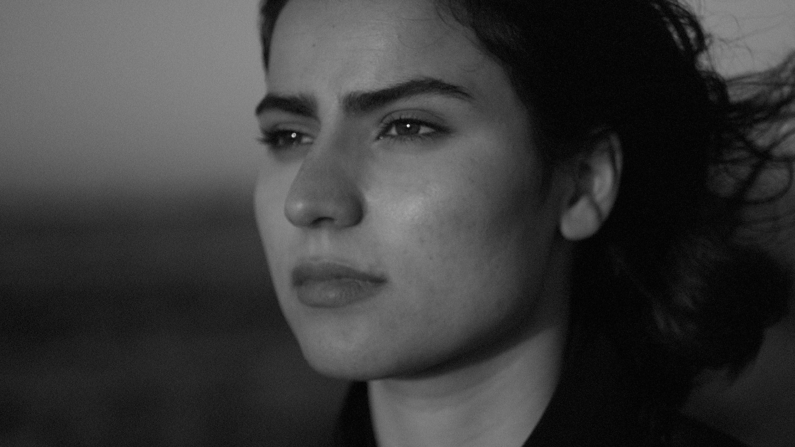
Because the filmmakers captured the footage in color, “there was room to make those adjustments in post,” Valladao says. “After extensive testing, using saturated red and yellow light and various colors in the frame, we decided that any benefits outweighed the consequence of having the actors in a potentially distracting environment. We did make color choices in production design, wardrobe and makeup based on these tests, sometimes using a red shirt in place of a black shirt, or a neon-yellow wardrobe piece instead of white, because we liked the way the color registered better — but nothing that seemed too strange to the eye." Capturing the footage in color also meant that a series of black-and-white LUTs would be necessary for on-set playback, dailies and editing. Skin tones were Valladao’s primary focus when shooting camera tests to create these LUTs.
“The LUTs we used were based on the way a handful of different medium-format Ilford film stock ASAs treated highlights and latitude," Valladao continues. These were "not scientifically based on these stocks," she notes, but by what she observed when creating them. "The LUT inspired by Ilford's 400 ASA was the default used in most circumstances. It allowed us to keep the Alexa rated at 800, while giving us the highlight roll-off and latitude we liked."
Once picture locked, colorist Mikey Rossiter helped Valladao push these LUTs to their creative limits. “He added some halation that really emphasized the highlights and almost luminous quality in the skin tones,” the cinematographer says. “This film has so many different people with so many different faces and so many different skin tones. It was really important that we got the black-and-white correct, and that was something that Mikey really leaned into with the color as well.”
TECH SPECS
1.33:1
Camera: Alexa Mini
Lenses: Cooke Speed Panchros
Fremont premiered at the 2023 Sundance Film Festival and is set to screen at the 2023 SXSW Film Festival.
