How Ballard's Cinematographers Crafted the Series' Vibrant-Noir Visuals
The show's cinematographers share how they collaborated to create a gritty-yet-colorful style for its L.A.-set detective story.
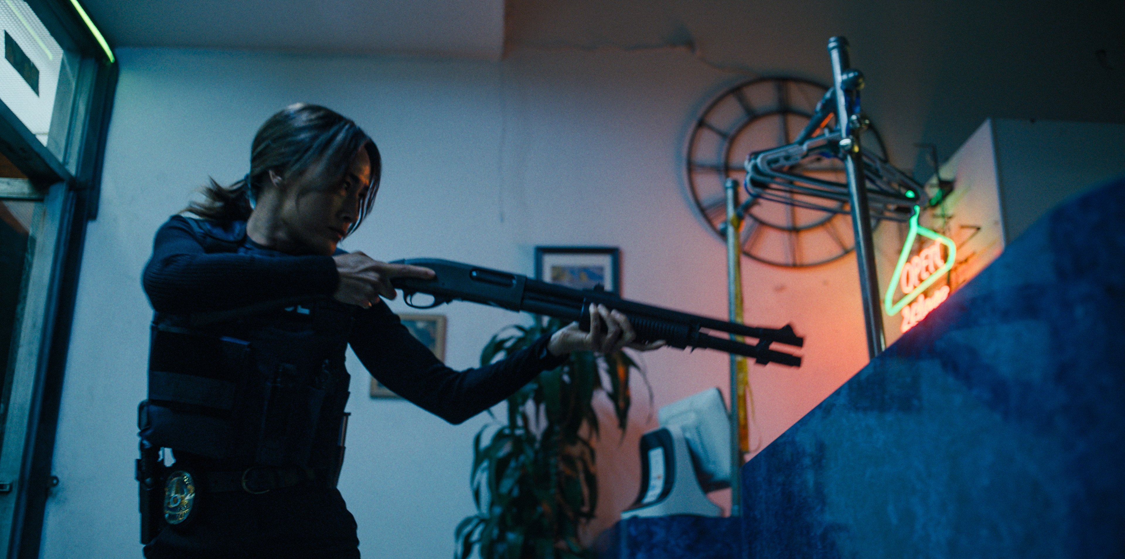
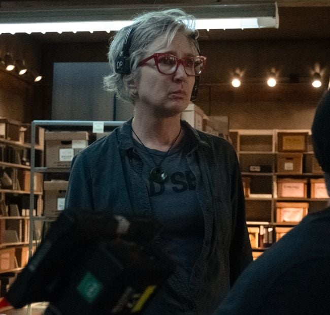
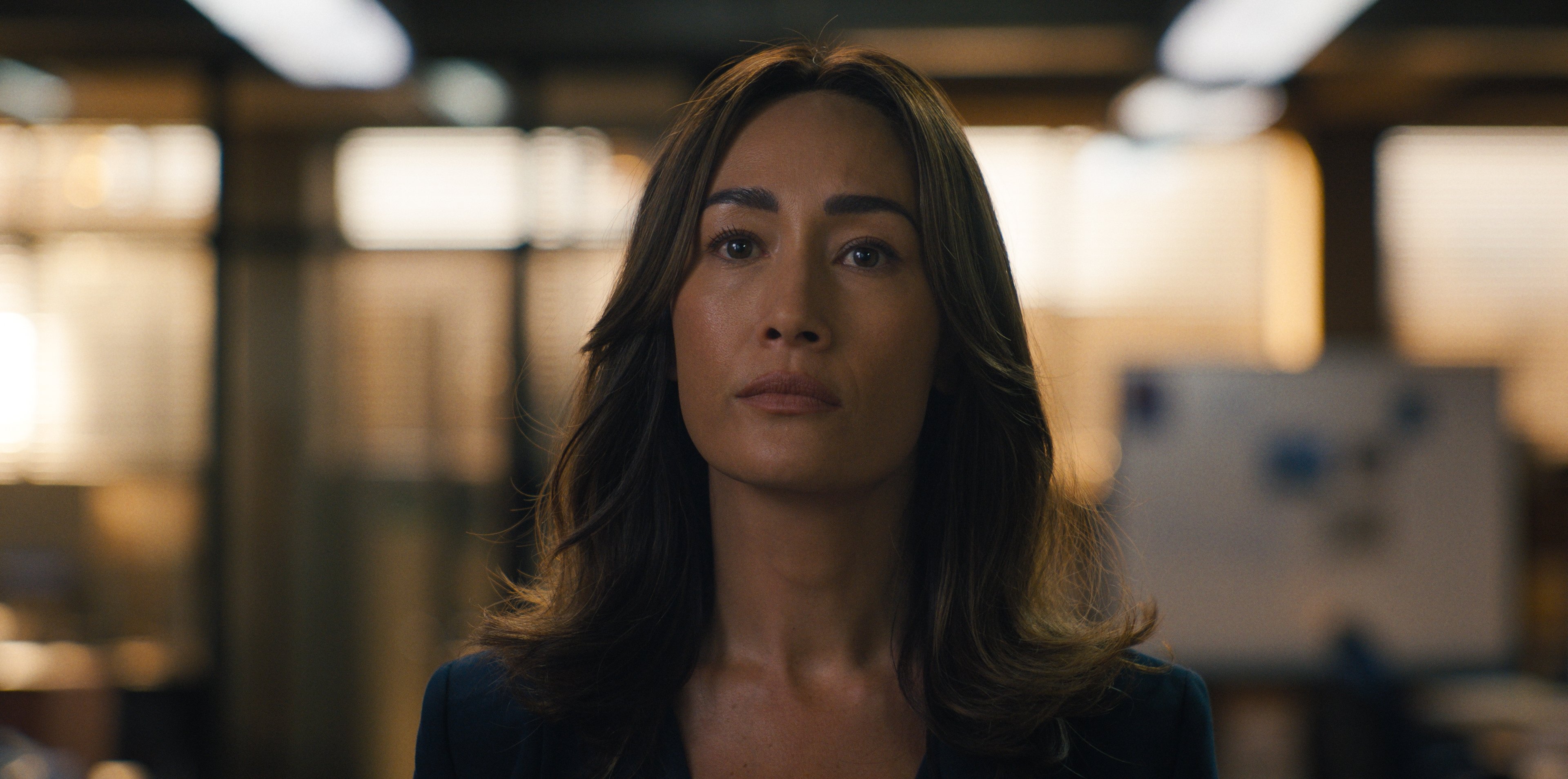
Ballard is the latest series adapted from Michael Connelly’s renowned crime novels, expanding the universe of its predecessor, Bosch, with a new protagonist: Detective Renée Ballard (Maggie Q). The show follows Ballard as she takes charge of the LAPD's newly formed, underfunded Cold Case Division — staffed by retirees, reserves, and civilian volunteers. In a first-hand account of the production below, ASC members Gavin Kelly and Cynthia Pusheck unpack how they worked together to create a cohesive visual style for Ballard's first season, while bringing their own distinct sensibilities to their respective episodes.
Envisioning Ballard's Los Angeles
Gavin Kelly, ASC: I was very intrigued when I first heard about the Michael Connolly series Ballard, and discussed it with pilot block director Jet Wilkinson. I was excited at the prospect of working with Jet to help establish the signature look and feel of this new show, which needed to share some stylistic and tonal DNA with the series Bosch and Bosch: Legacy, while also clearly defining its own signature look and feel, anchored to the perspective our new hero, Detective Renée Ballard.
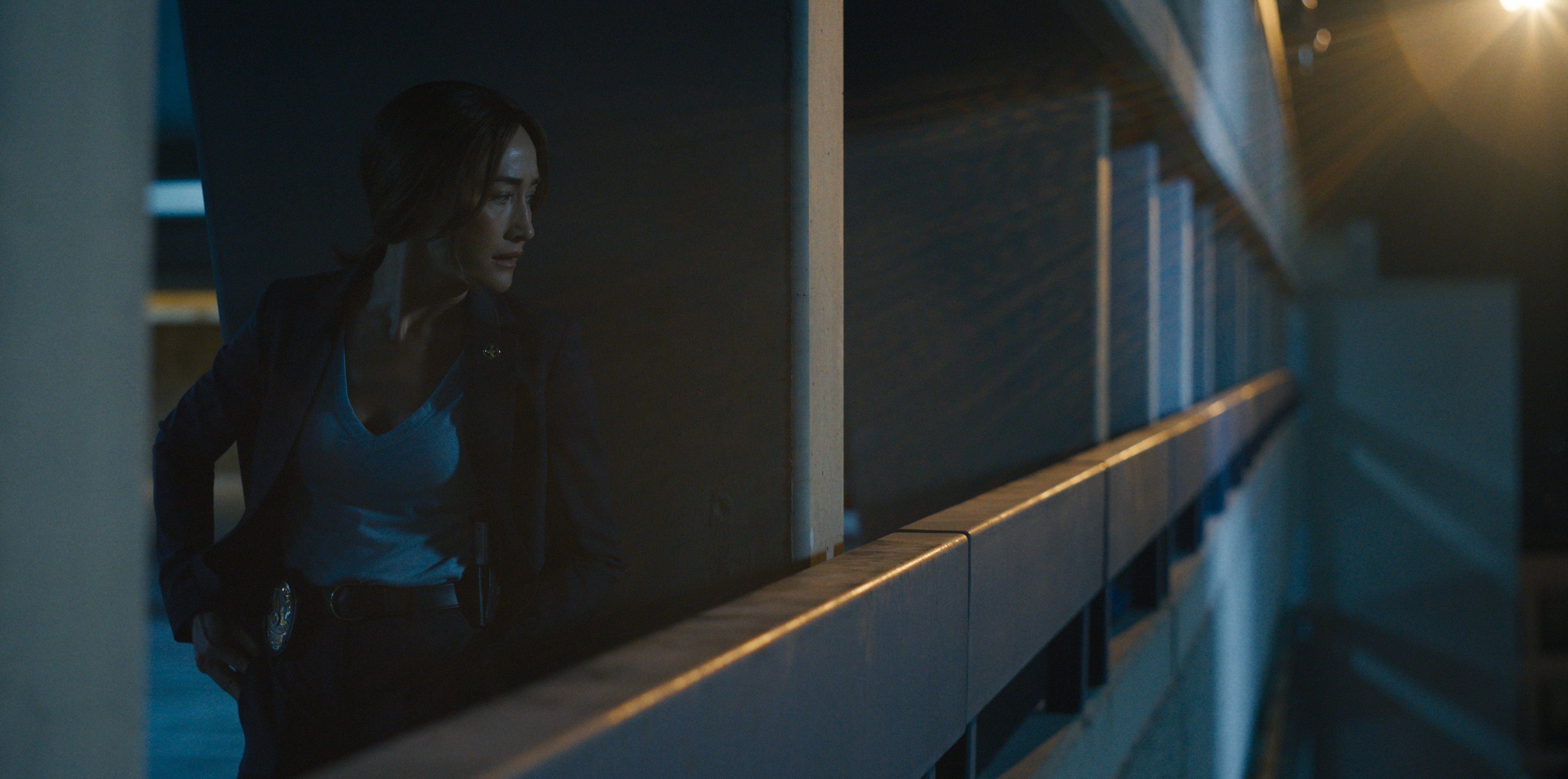
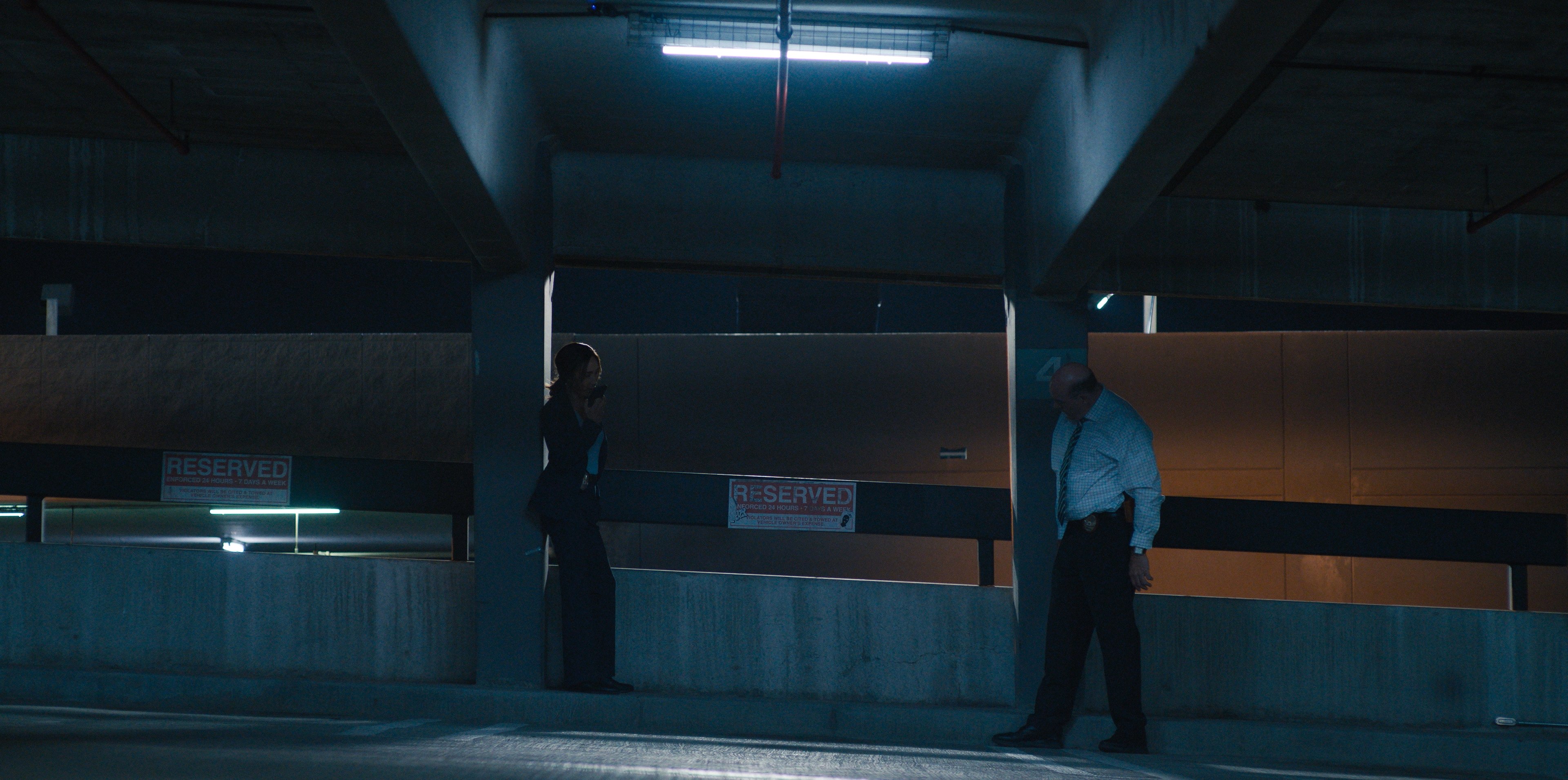
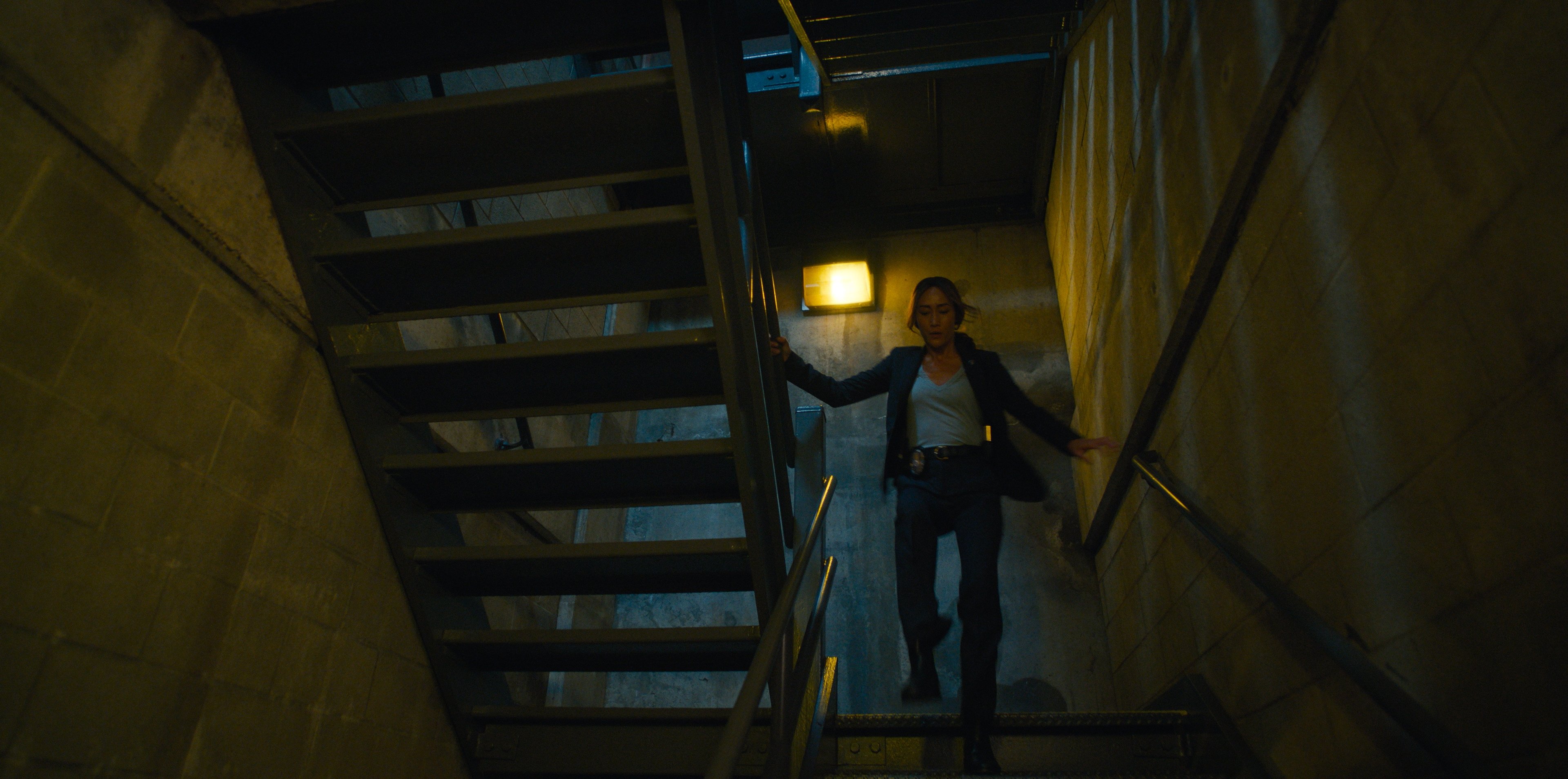
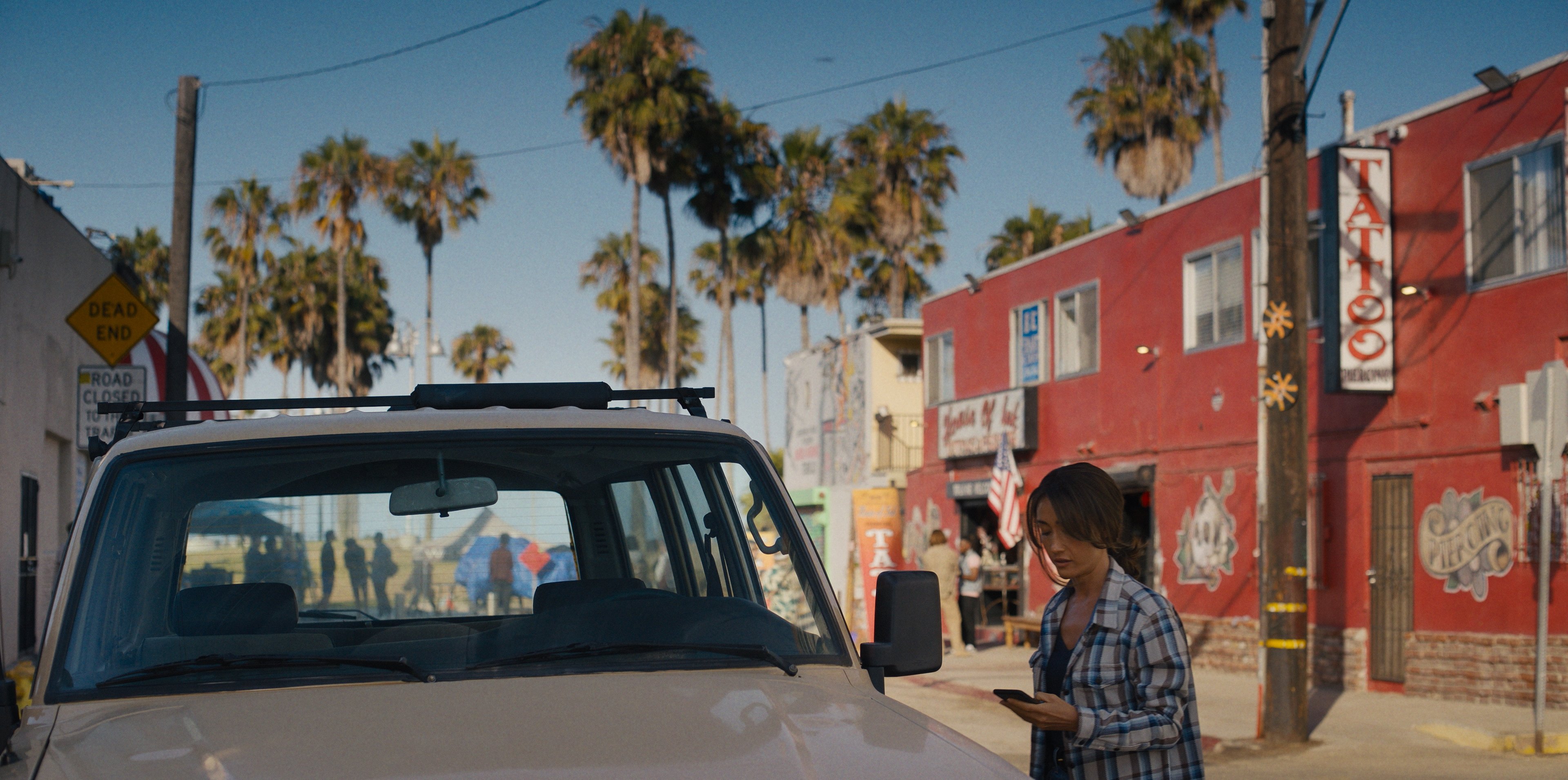
I composed a lookbook, pulling from a variety of visual references to help flesh out and communicate some of the stylistic touchstones we were laying out for the show. One of our central concepts was “vibrant noir,” an approach that could incorporate noir-ish lighting — rich contrast and depth, characters navigating through pools and angles of light and shadow — while layering in a mosaic of color and textures that collide, mix and bleed together in various alchemies for emotional impact. This approach was drawn from the authentic character and grounded realism of our locations across L.A. Color contrast, motivated by story and character, would be a primary aspect of our look.
I was excited when Cynthia came aboard the production. This was our first experience working together, and she was a great partner.
Cynthia Pusheck, ASC: My involvement with Ballard started when I shot an episode of Bosch: Legacy. The producers spoke with me about a spin-off and thought I’d be a good choice for one of the DP slots.
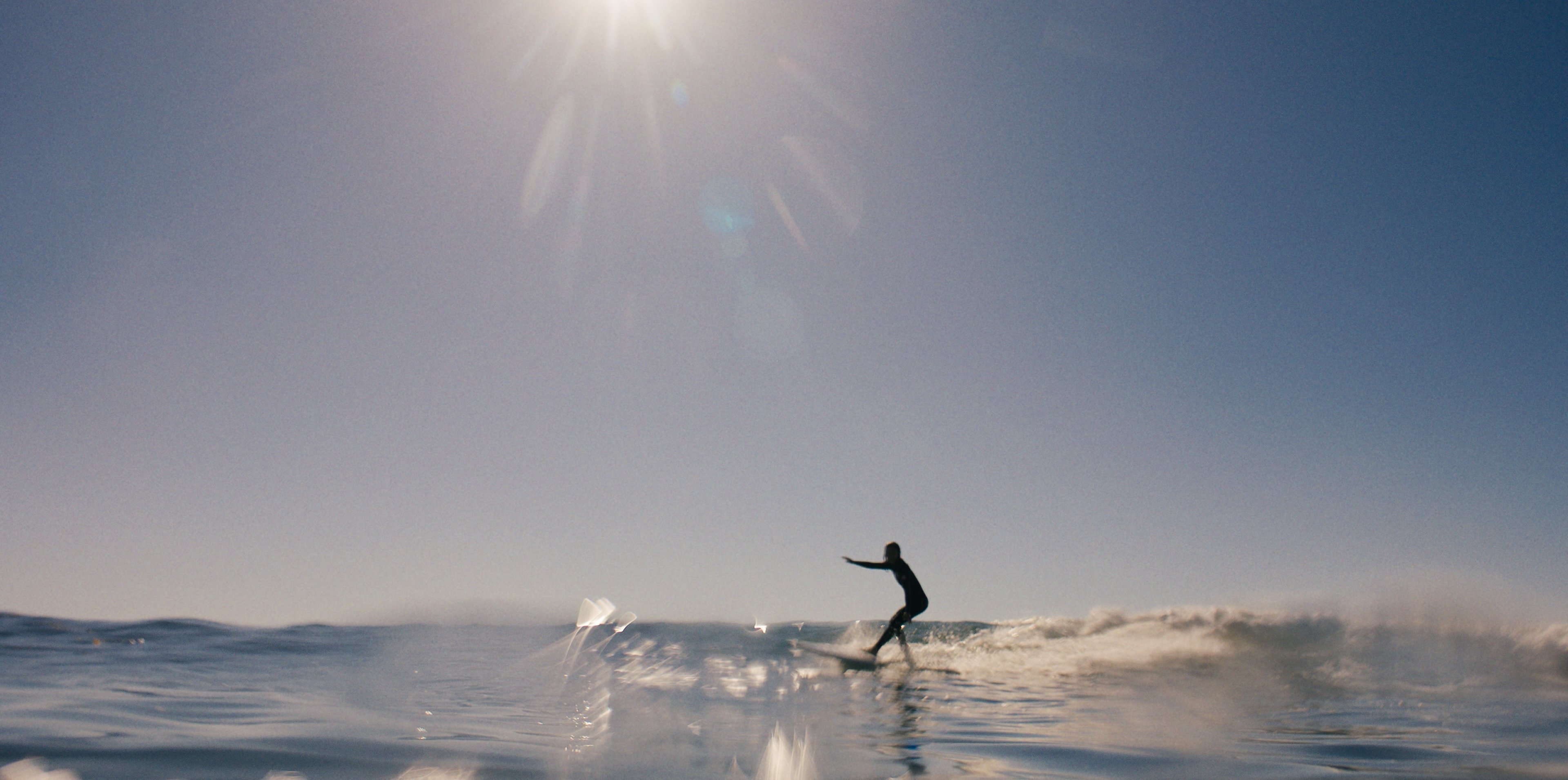
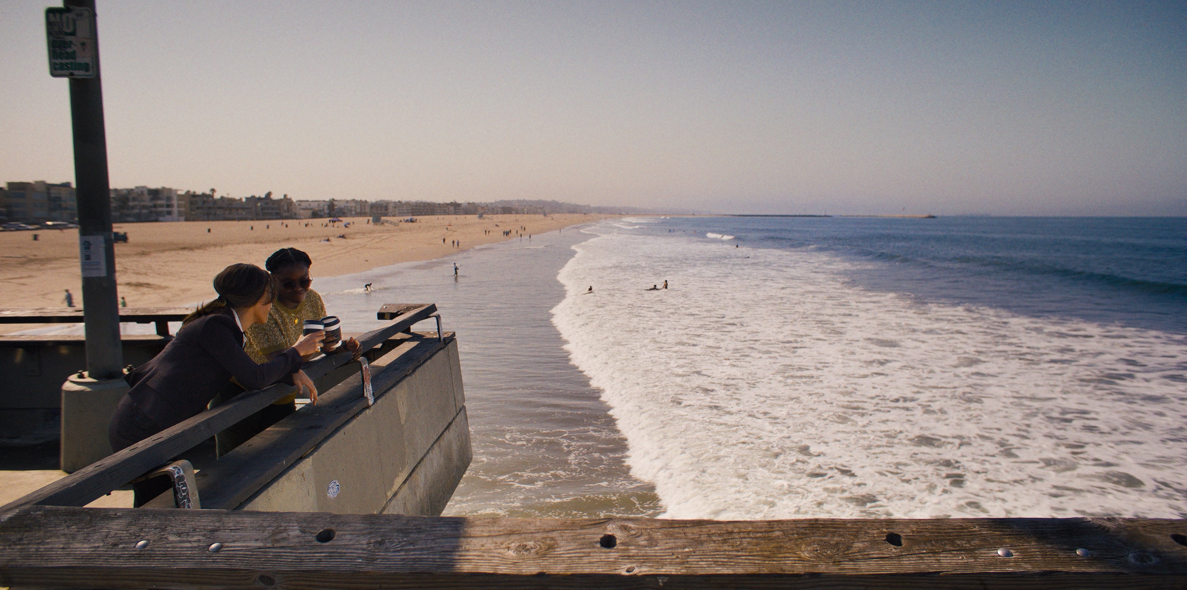
When I read the script, I immediately responded to the lead character and the world created on the page. You could sense the creative team's desire for L.A. to be shown in a vibrant, colorful way, while staying grounded and naturalistic at its core. I also loved that the Ballard character lived out at the beach; it opened up opportunities to play with tone and mood. For example, we could mix in sun-bleached hues when out on the beach that would contrast with our bolder choices for the look of the city.
Kelly: A big plus for both of us was that we were able to connect at the start of prep.
Pusheck: Up front, Gavin and I met to chat about the look of the show and he freely shared info and kept me in the loop, which was fantastic. I showed up early in prep as much as possible for camera tests, meetings and stage walkthroughs. It was important to keep up with everything, as things change so fast when sets are being built!
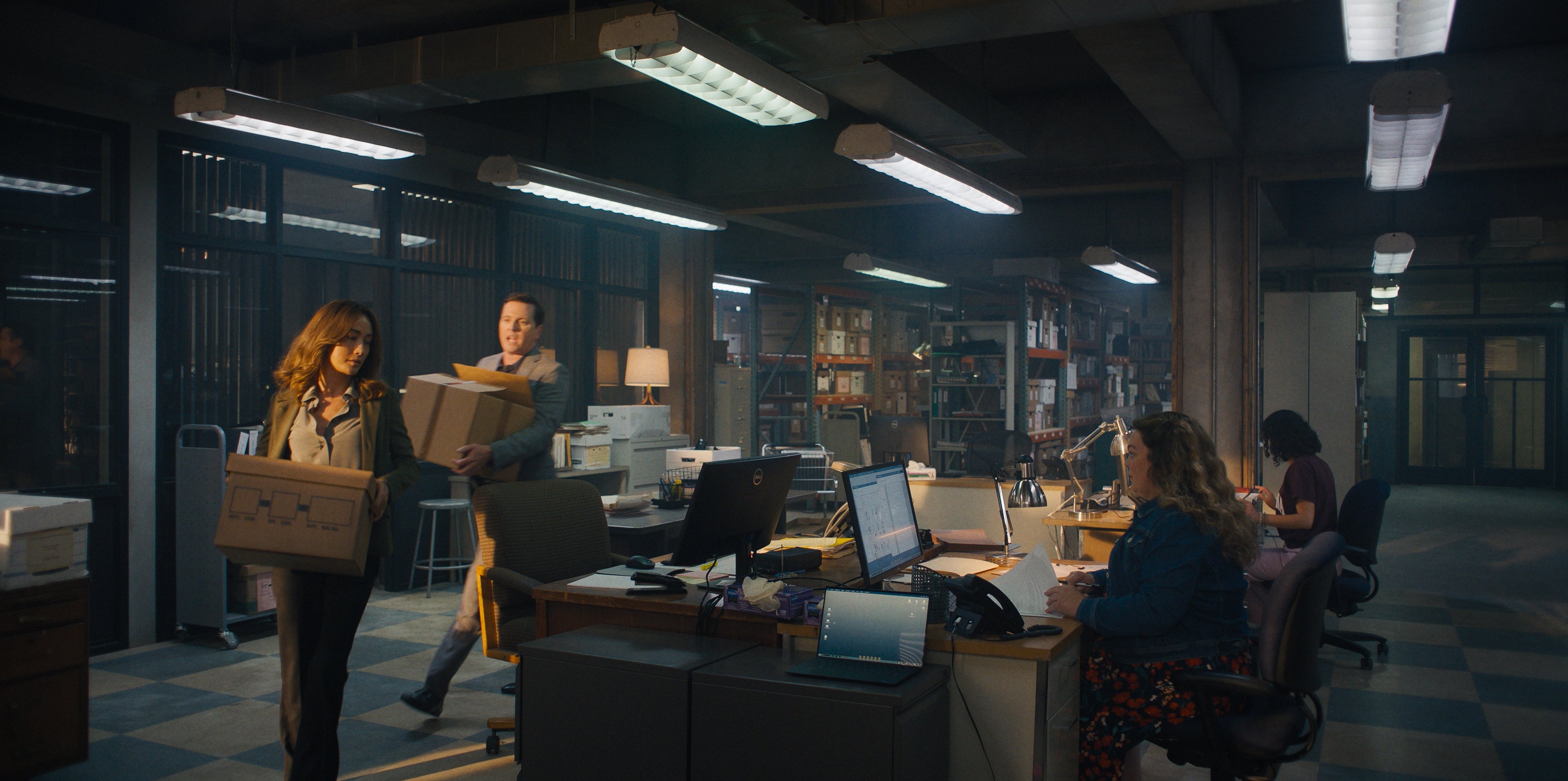
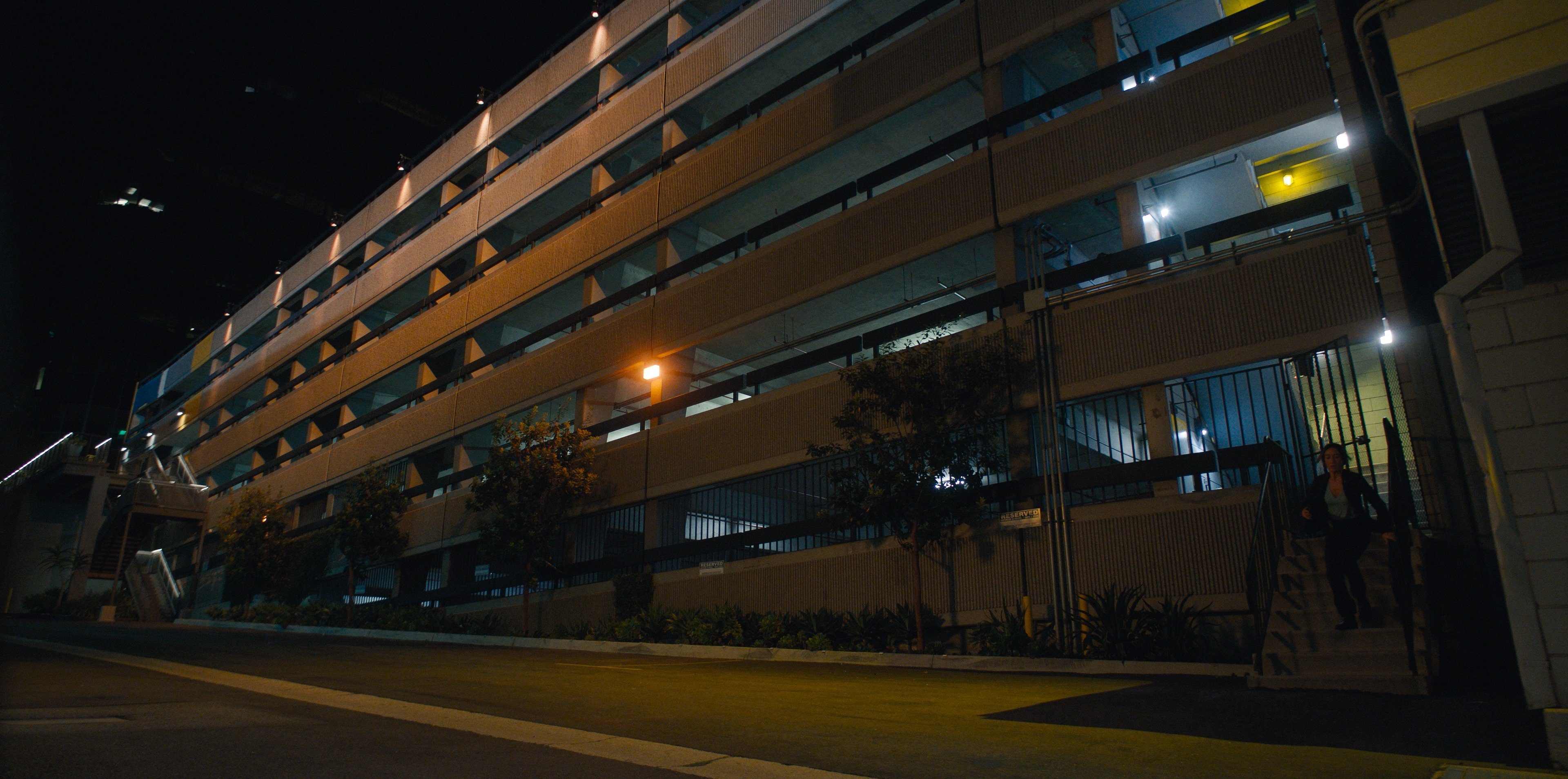
Kelly: The two primary sets being designed and constructed — the cold-case unit set, which is supposed to be in the basement of the Ahmanson Center, and Tutu’s trailer set, which overlooks Paradise Cove in Malibu — went through various design revisions during prep. Production designer Ray Yamagata was very generous and open to discussion about design choices that would complement our cinematography. Cynthia and I remained in contact as things progressed.
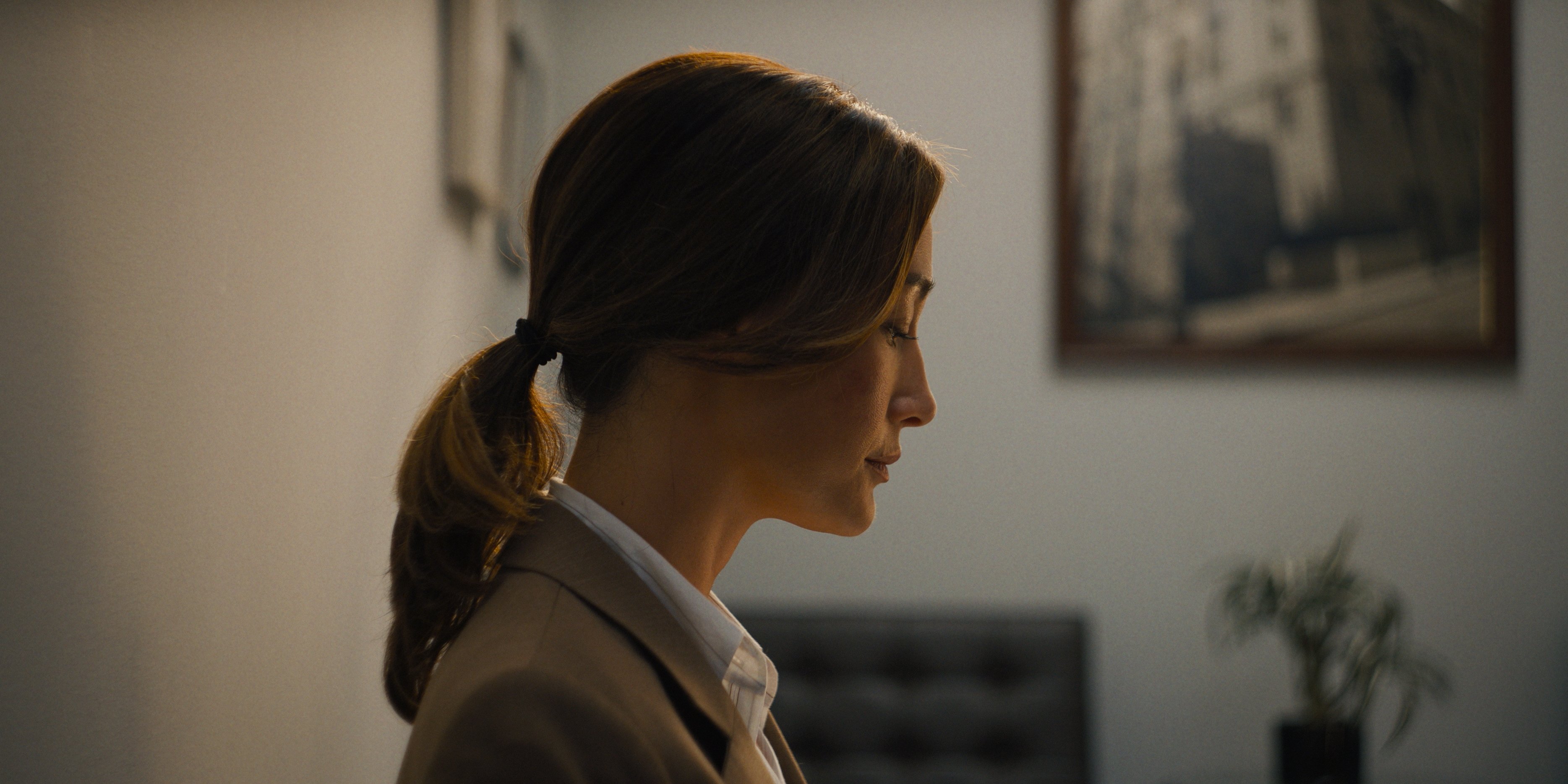
Pusheck: Gavin was open and receptive to any notes or ideas I might add. For example, I proposed that we add skylights to Tutu’s living room. He loved the idea and helped make it happen with Ray and the art department, and this choice helped establish the tone maintained throughout the show. We had a good rapport and open communication, which is so important as a season progresses and the need for double-ups and crew-sharing arises.
Lighting the Cold Case Unit
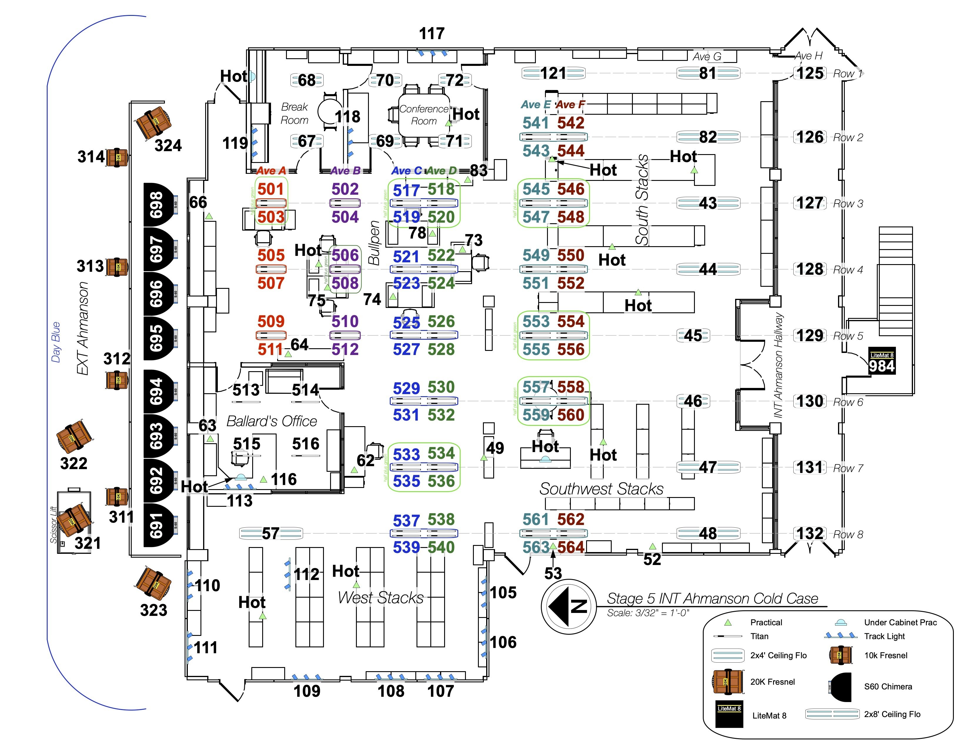
Kelly: We kept a close eye on the cold-case unit set to ensure it would be designed with enough versatility to be freely adjusted as needed, based on our camera and lighting needs for each episode. The overall conceit of this set, with respect to the story, is that it’s a partial, basement-level sub-space of the actual LAPD Ahmanson Recruit Training Center. It’s a bit of a forgotten space within the LAPD, where Ballard heads the cold-case unit. It had to feel disheveled and cacophonous, with remnants of old discarded furniture and endless stacks of dusty cold-case files that receded into the background. It was the opposite of a modern, clean, uniform space. Lighting-wise, we went with a hodgepodge of old fluorescent and incandescent fixtures, mixed with sunlight — a mix of 20Ks and Arri SkyPanel S60-Cs— that could partially pierce down into the set from one long set wall lined with high windows. We leaned heavily into this “imperfect” color contrast, with warm tungsten practicals and a variety of cooler tones from our “fluorescent” fixtures overhead. The advantage to this looser, imperfect lighting feel was that it afforded Cynthia and me a lot of flexibility to push the lighting color and quality in a variety of directions. Working with CLT Eric Sagot and his team, we had full control of all of the “fluorescent” and Tungsten fixtures in the primary part of the set — which were actually art-department-provided practical housings, outfitted with LED Astera Helios and Titan tubes, and NYX/Luna bulbs, whose color and luminance were completely controlled by the lighting department. During prep, we dialed in a base color range for the "fluorescent" look of the Astera tubes throughout the set, knowing that we could push further one way or another within those established parameters once we moved into production.
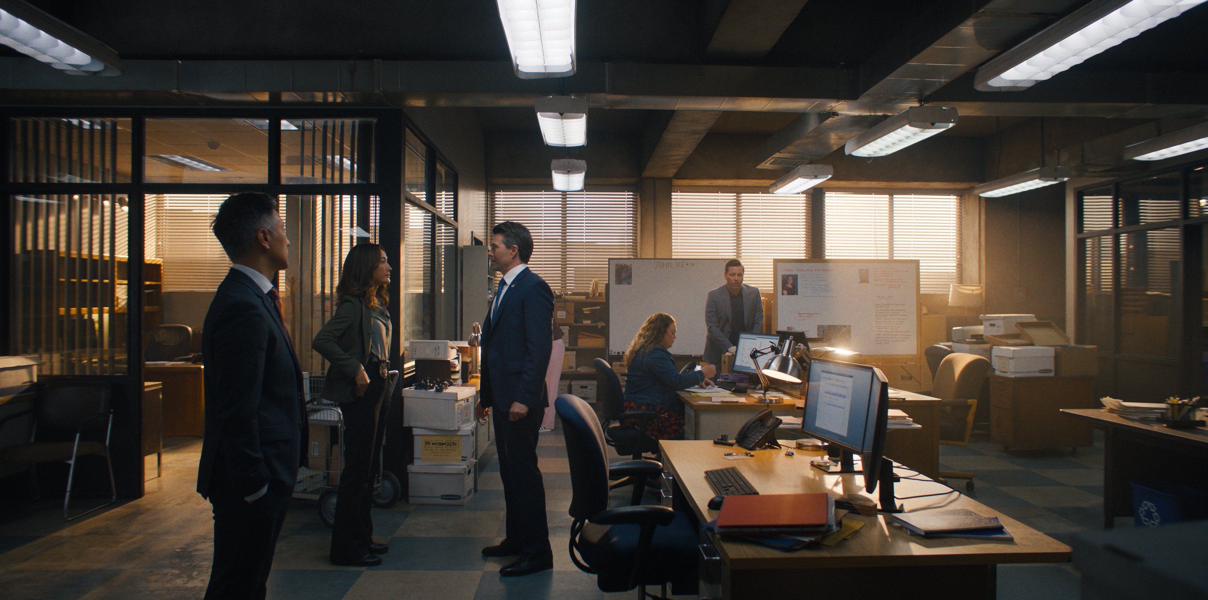
Pusheck: The lighting plan in the Ahmanson worked great in how it allowed us to be flexible, fast, and efficient. The push of daylight into the space, along with the ceiling practicals, created a mixed-color vibe that set the tone for our heroes in their beat-up basement offices — a bit gloomy and forgotten, but not hopeless.
After the first few episodes, Gavin, Eric and I met to discuss the need for a few more lighting units outside the windows to help achieve more variety in our “daylight” looks. This was part of the natural progression that often happens on shows, after the crew starts working in a space and learns what adjustments are needed.
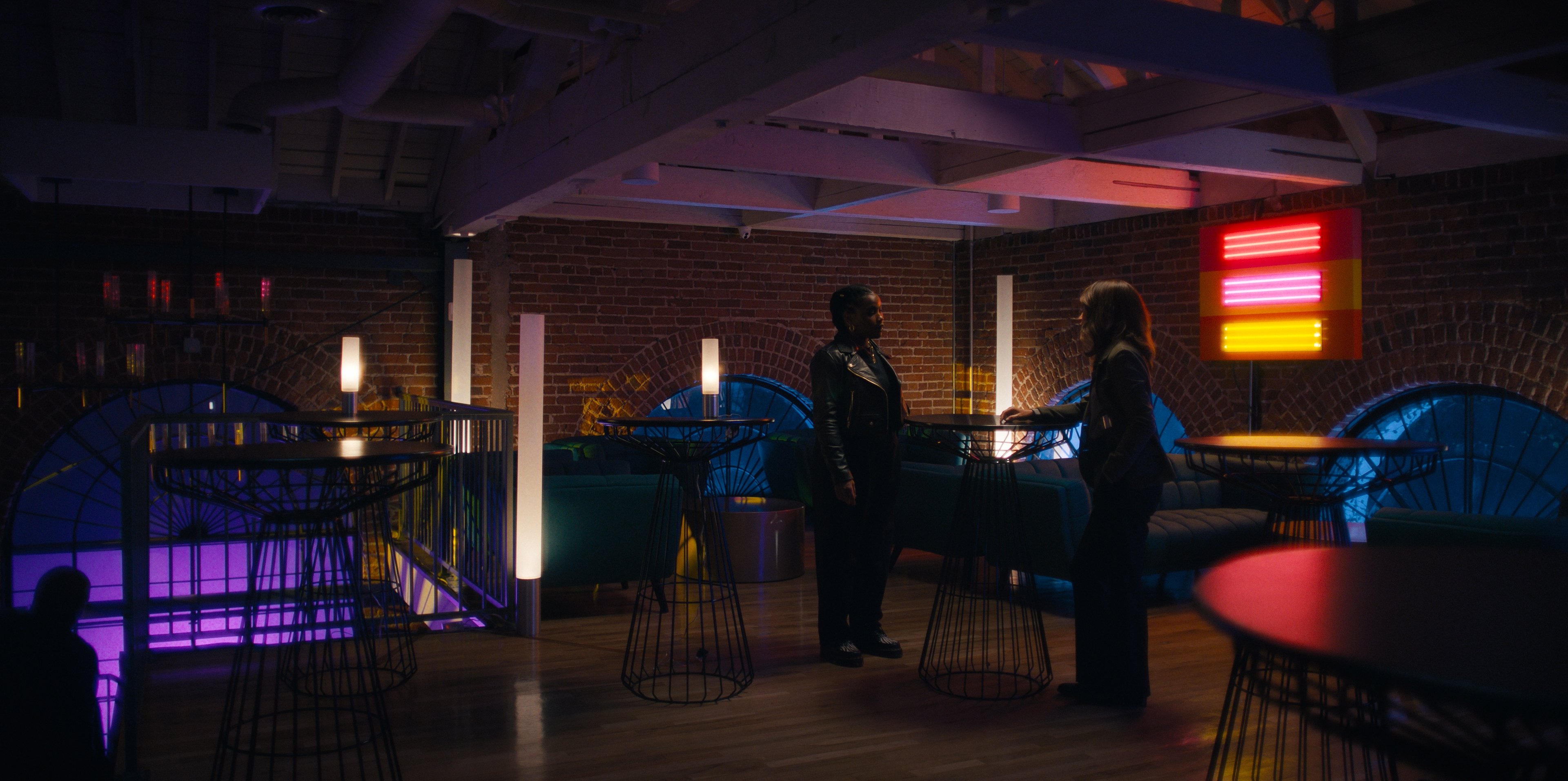
Bold, Not Bubble-Gum: Refining the Color Palette
Kelly: In developing the visual language of a new show, defining a specific color palette “gel pack” — a library of specific lighting colors to be used throughout the season — is an important part of the process for me, and this was especially true of our vibrant-noir approach for Ballard. During prep, we performed a test shoot with our CLT/gaffer Eric Sagot, in order to review a library of pre-selected colors. We tested each on-camera, then whittled our options down to select our hero colors, primarily to infuse color in our location work. I was looking to incorporate strong color choices without it feeling too candy-colored, “bubble-gum,” or saturated. We aimed for color contrast with some grit, complexity and “pollution.”
Our final color list was then loaded in and cataloged into our lighting/dimmer boards, so that we had any of these colors available to pull up into any of our arsenal of LED lighting units at a moment’s notice on set. This helped Cynthia and I build a foundation of color for the show’s world that we could pull from to paint in color as we moved between locations and episodes.
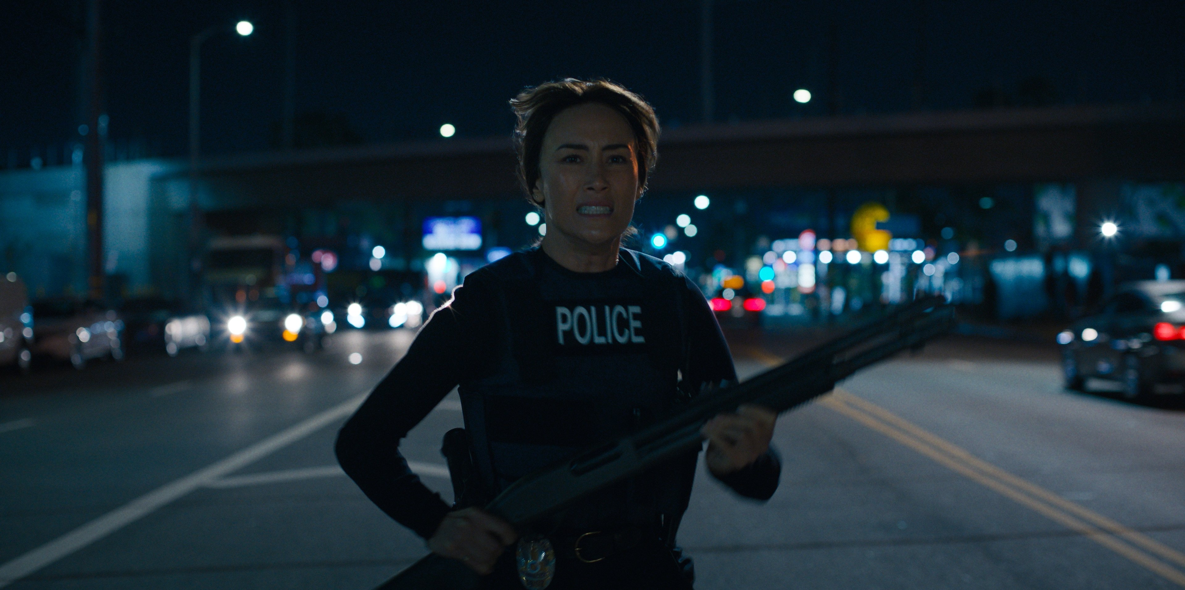
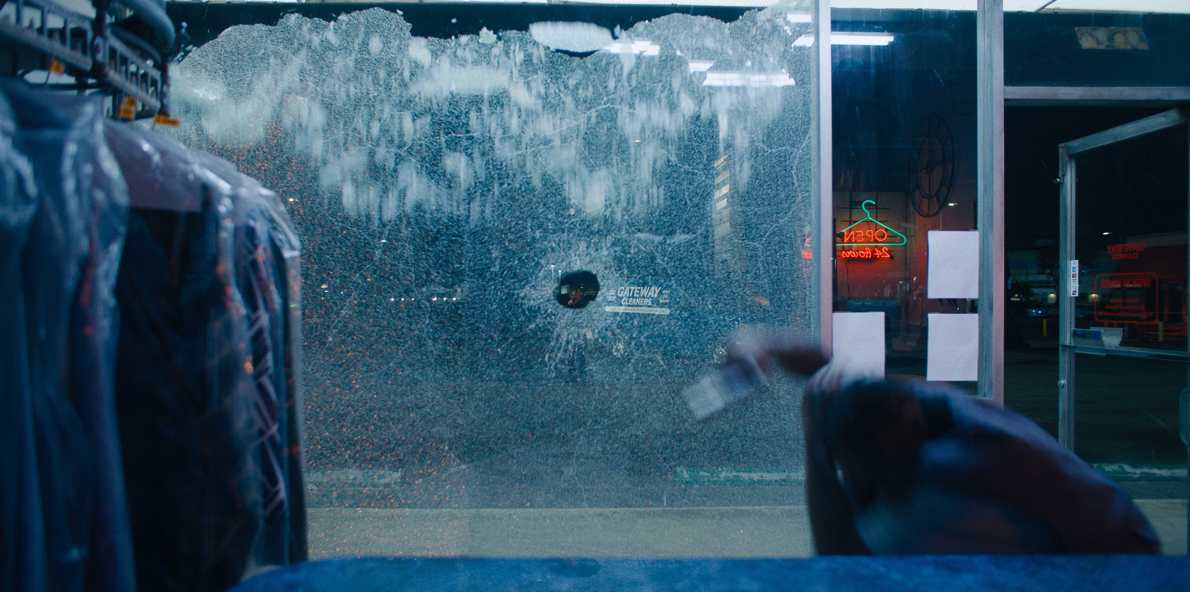
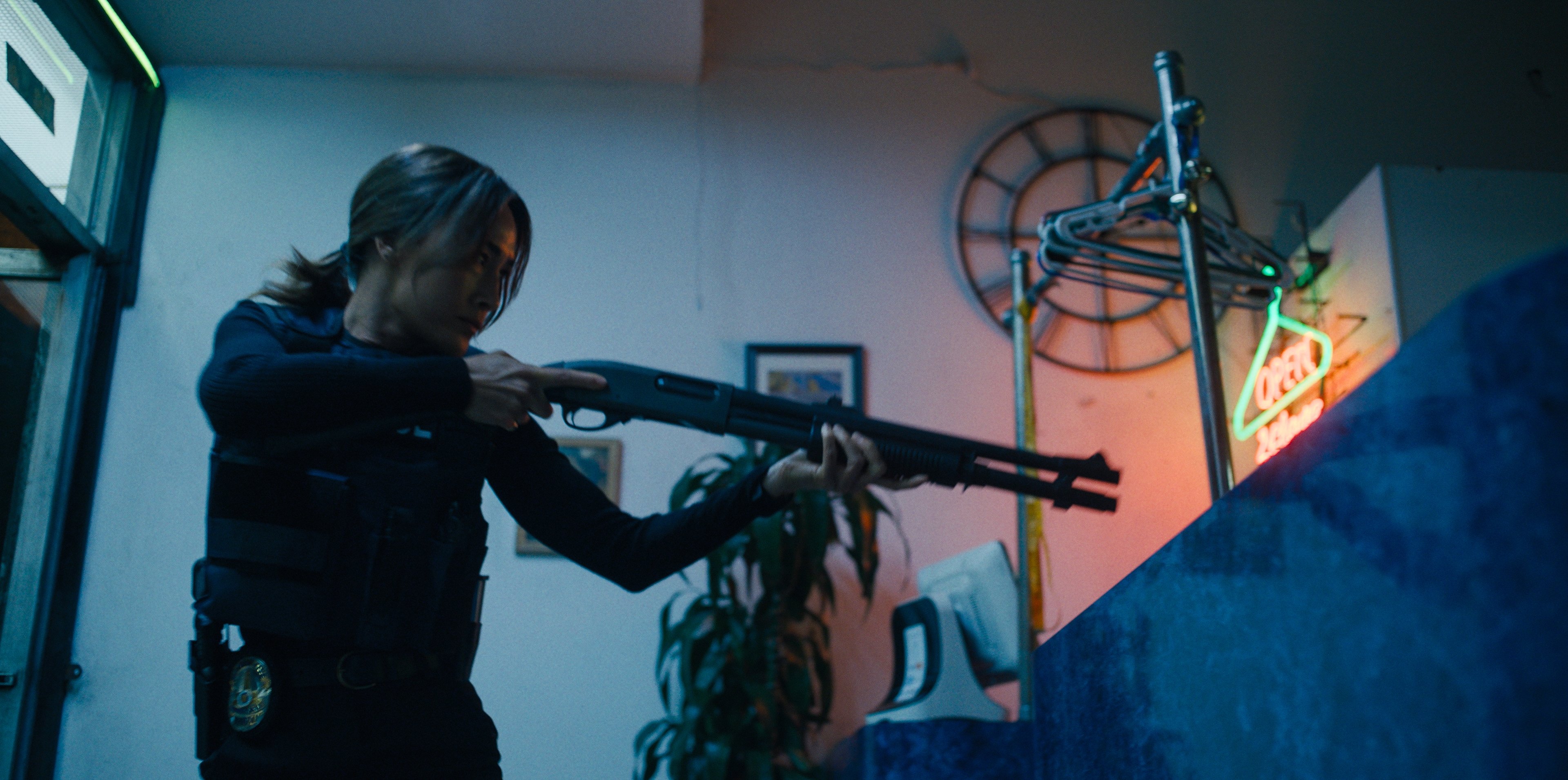
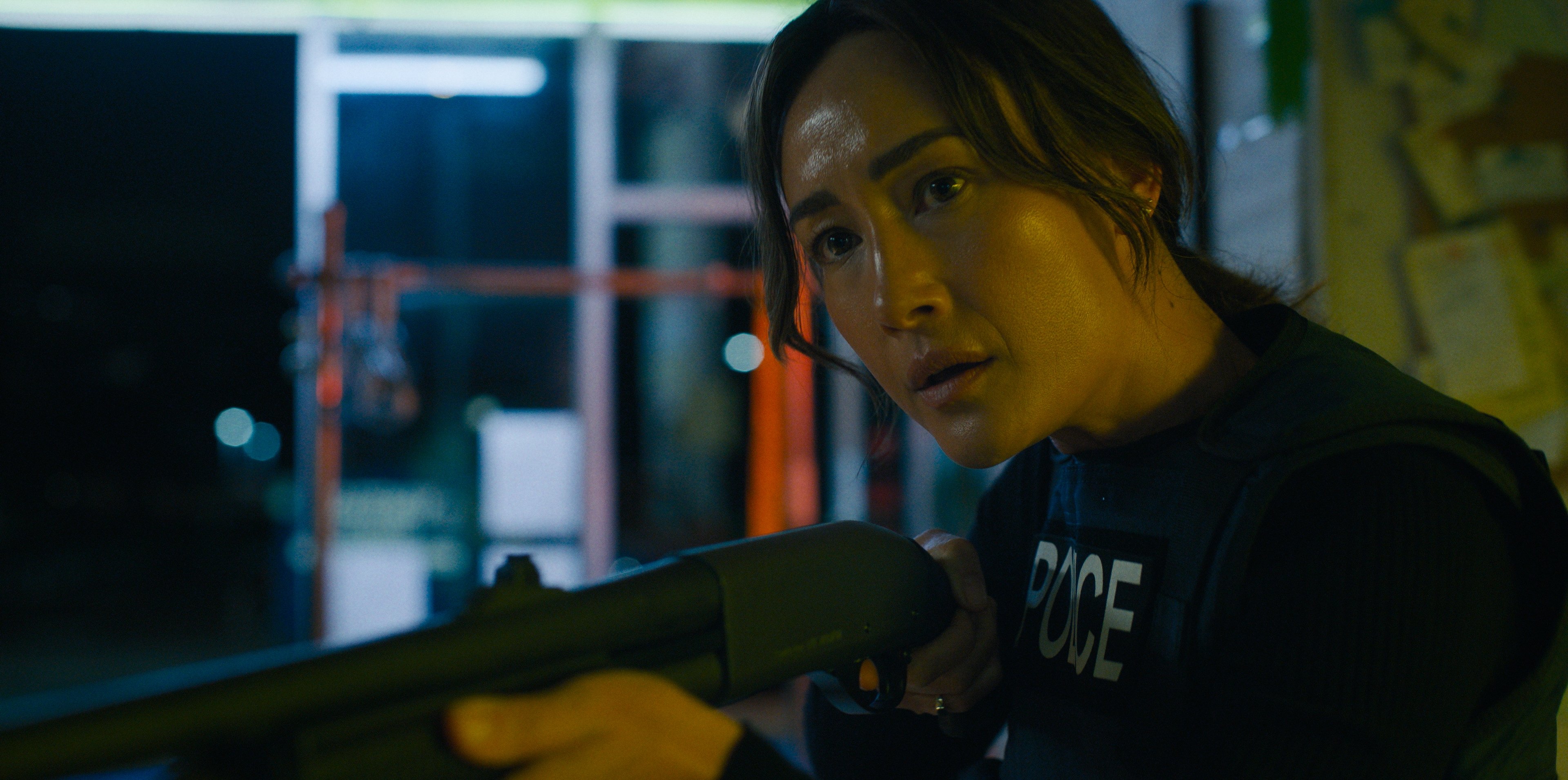
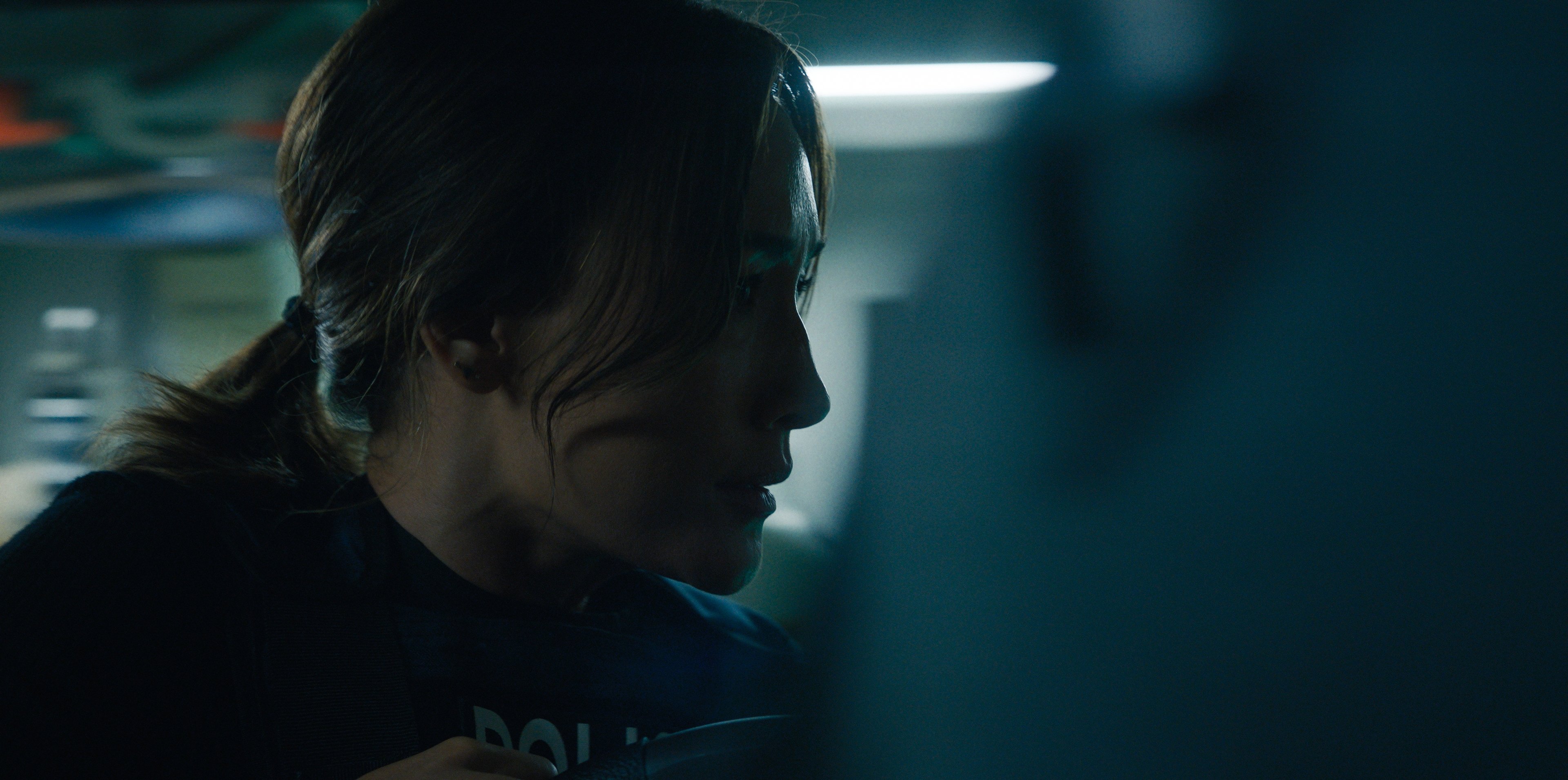
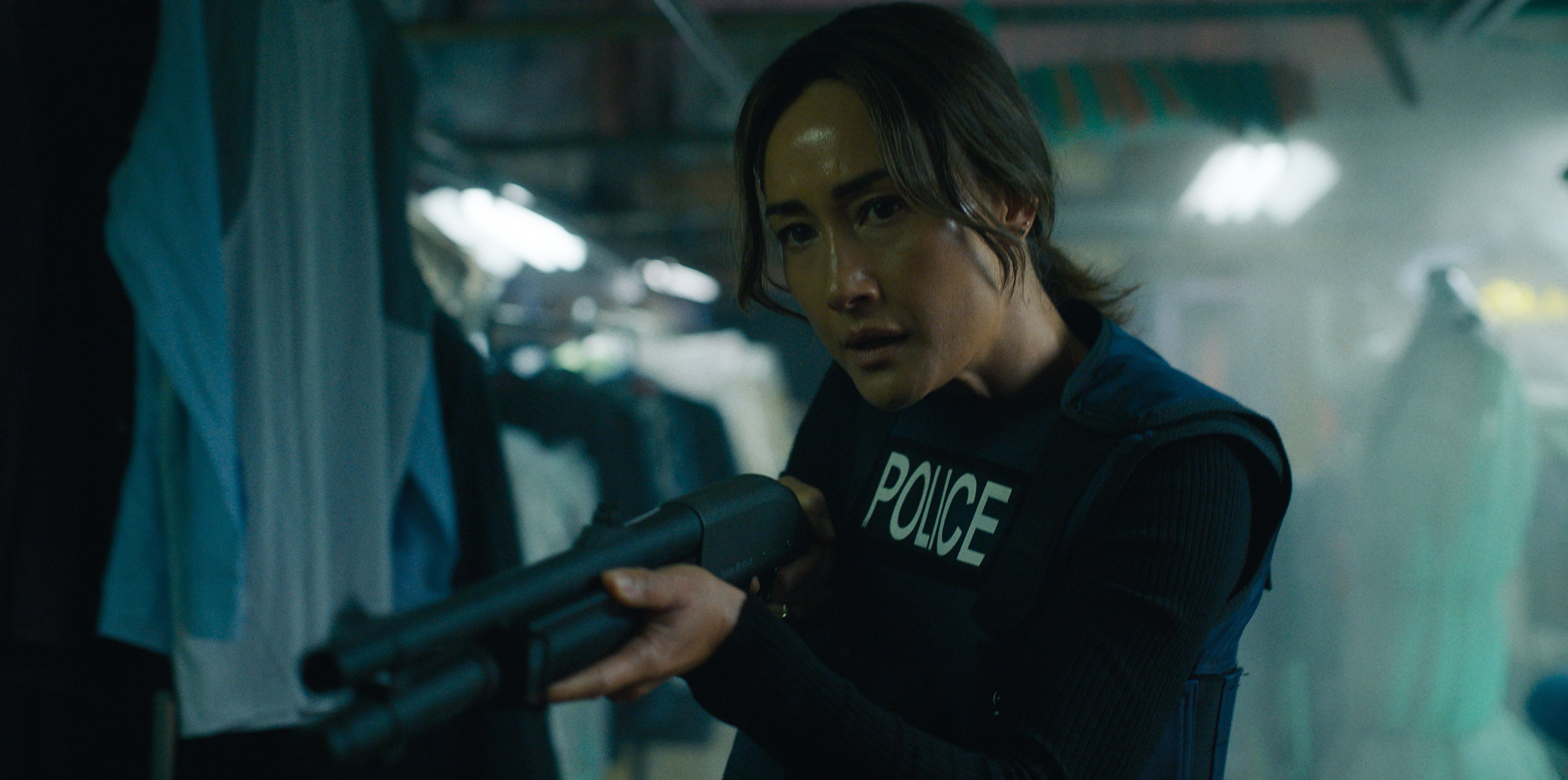
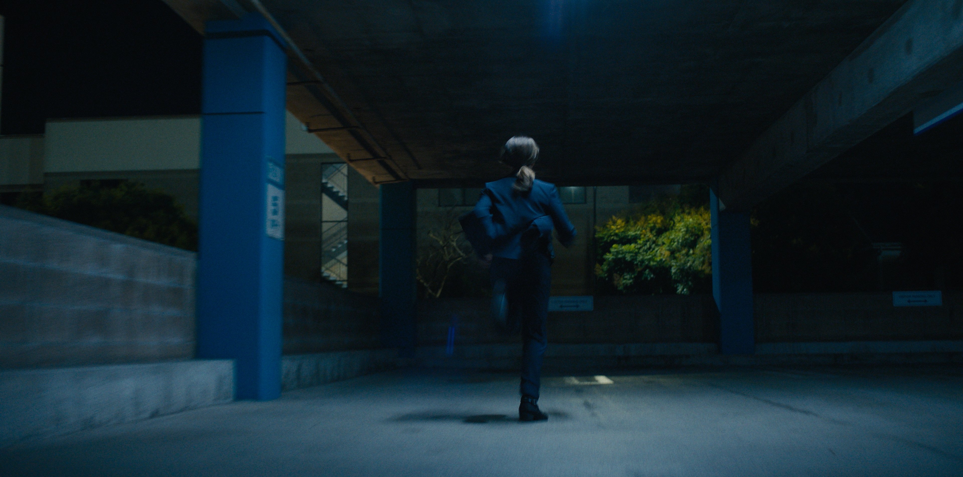
We aimed to establish this vibrant noir-color palette right at the start. In the opening sequence of the pilot episode, the viewer is dropped right in the middle of a footchase down Manchester Blvd., with Ballard in pursuit of a suspect through oncoming traffic. She corners him in a strip-mall dry cleaner’s, where she blows out the plate-glass window. I laid out a lighting plan with our electric and art departments for a staggered layering of hanging fluorescent practicals, which housed our Astera Tubes and the like. We built a web of color contrast for Ballard to maneuver through as we track with her through steam and racks of clothes, building tension towards a classic deep “danger red” at the rear of the store. While some of the cooler fluorescent tones were part of the existing location’s character, we pushed further dirty color into the scene to amplify the tension, and provide a color story for the emotional trajectory of the sequence.
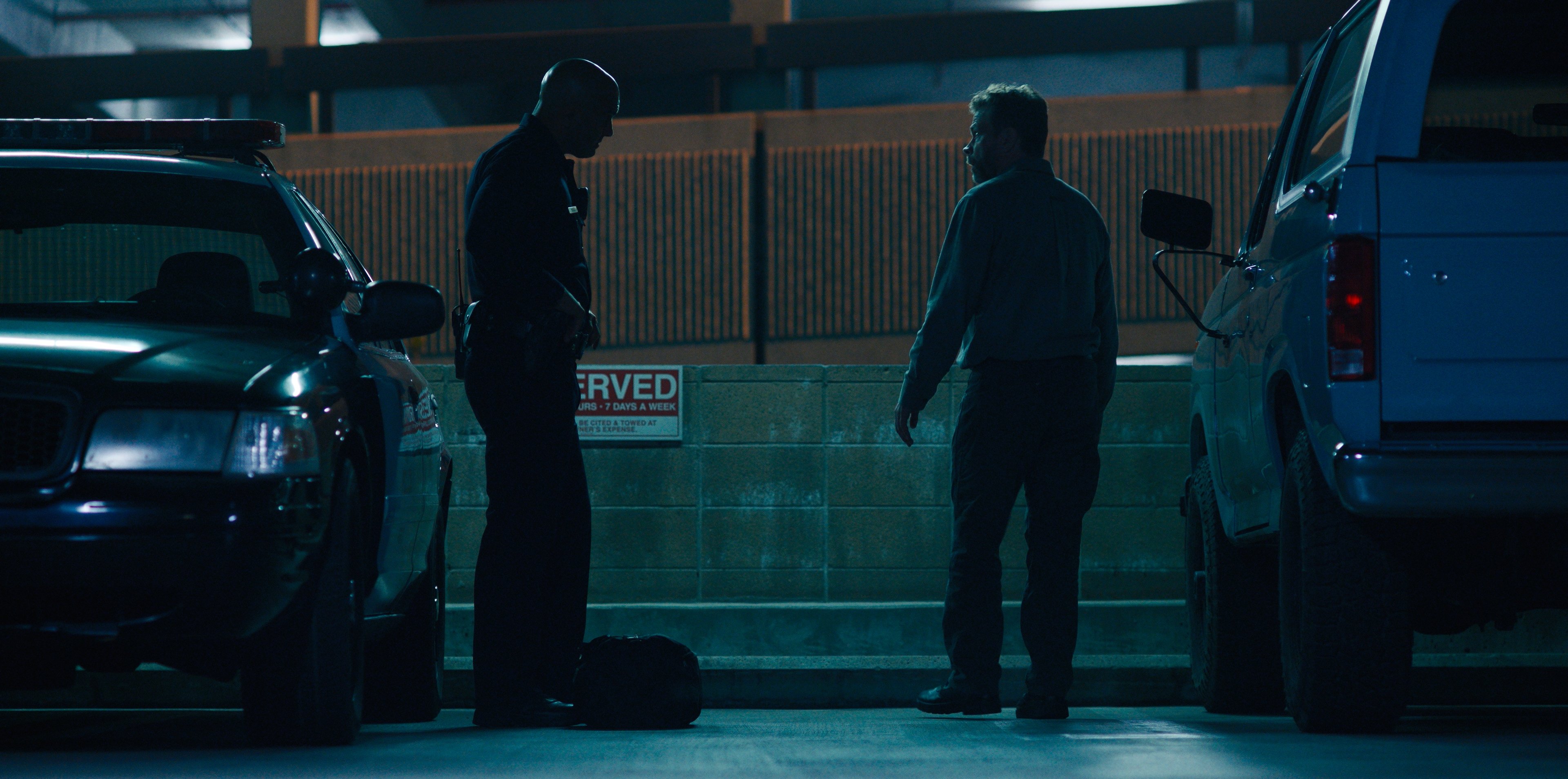
Pusheck: Those location sets are usually the ones you really want to dig into and play with. Like in Episode 6, for which we shot a number of scenes revealing more about Driscoll, including a nighttime surveillance sequence. The show presented a lot of fun visual opportunities: gritty prison sets, shadowy garages, action scenes with Ballard. Although there are always logistical challenges out on location, it's so great to see it all come together.
Camera and Lenses
Kelly: Having an ace rigging grip and electric crews were so vital to this show. With so much location work — often demanding multiple company moves per day — we really relied on our tightknit crew.
Lens choices are also a crucial of the process when designing the look of a series during the pilot-prep stage. The presence, character and eccentricities of particular lenses are crucial in defining the signature look of a show, so I’ll usually test a lot of lenses to feel out possible directions we could go in as I’m prepping — from lenses I’m already familiar with and want to look at again with this specific project in mind, to the latest new lenses (or older/vintage glass newly rehoused) that might end up being the right discovery.
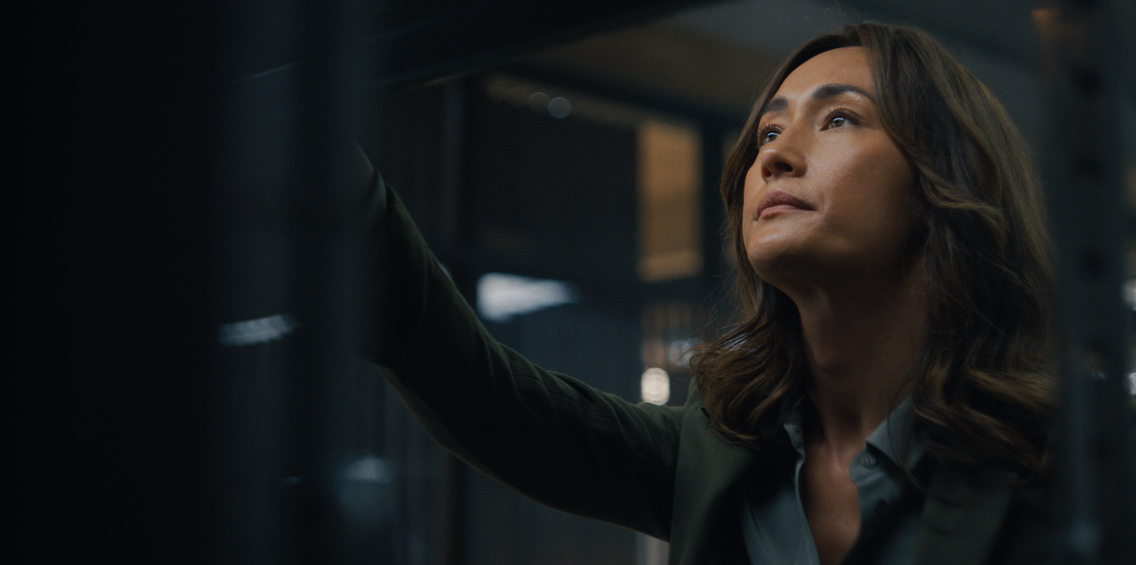
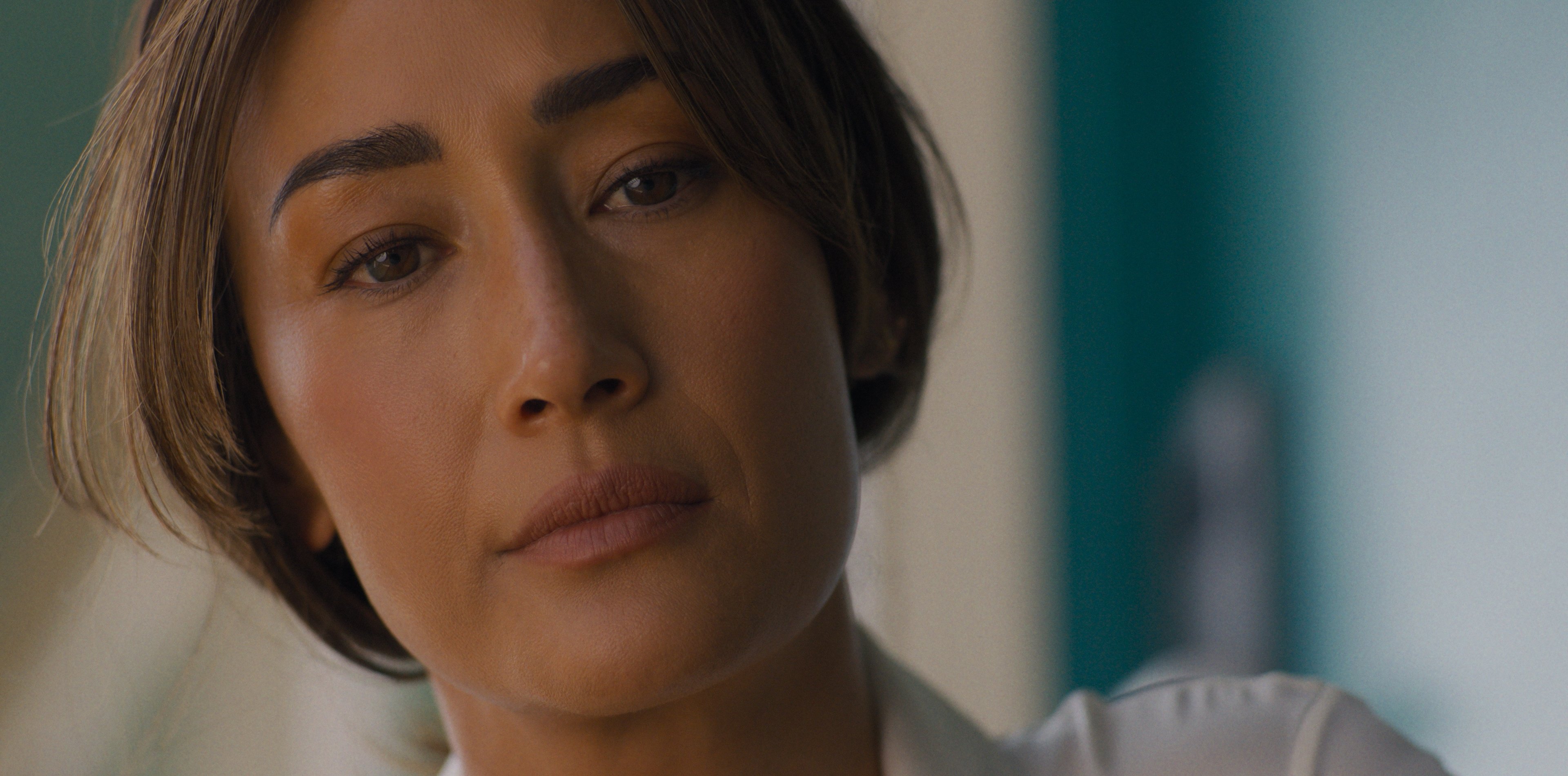
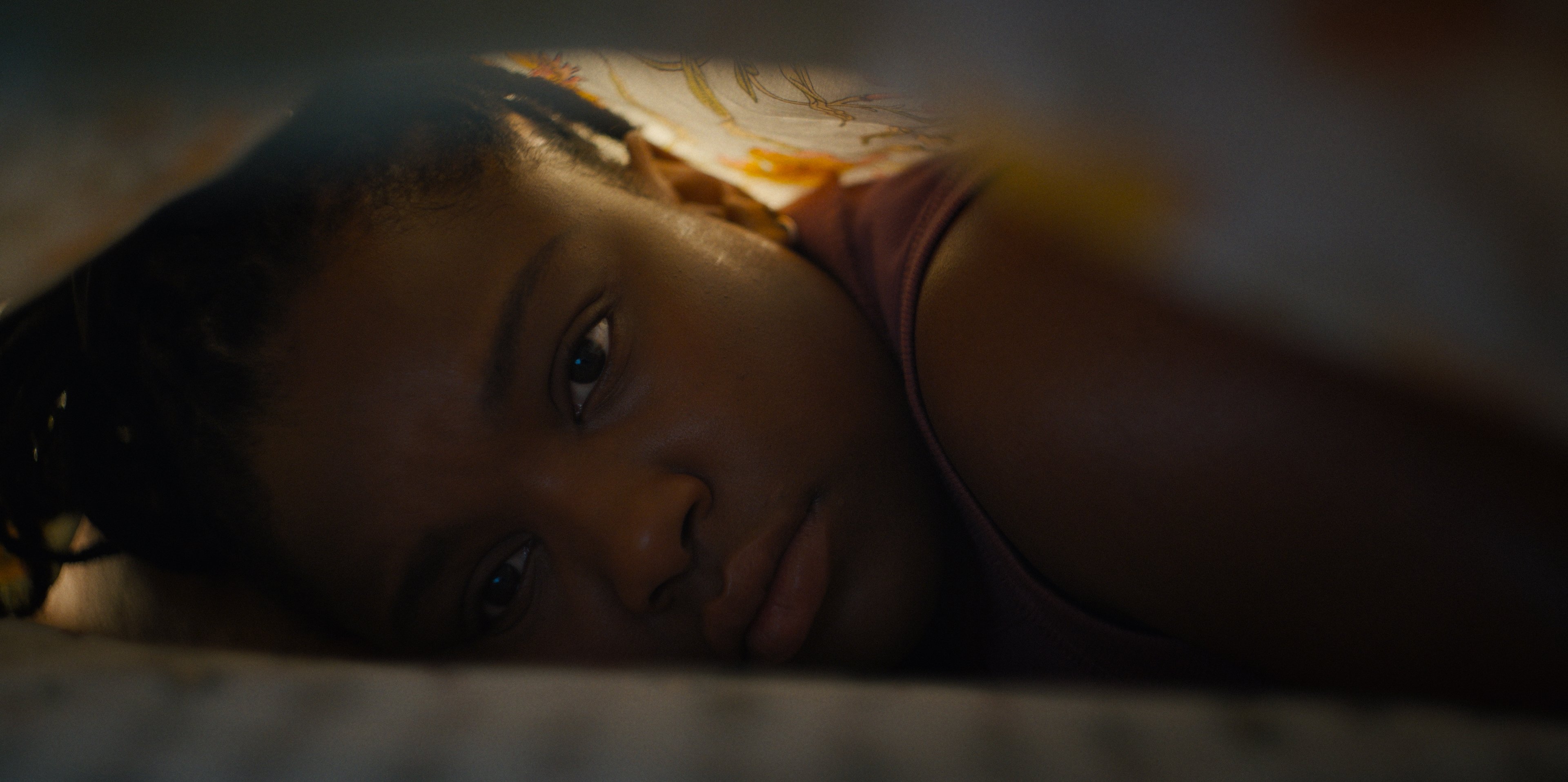
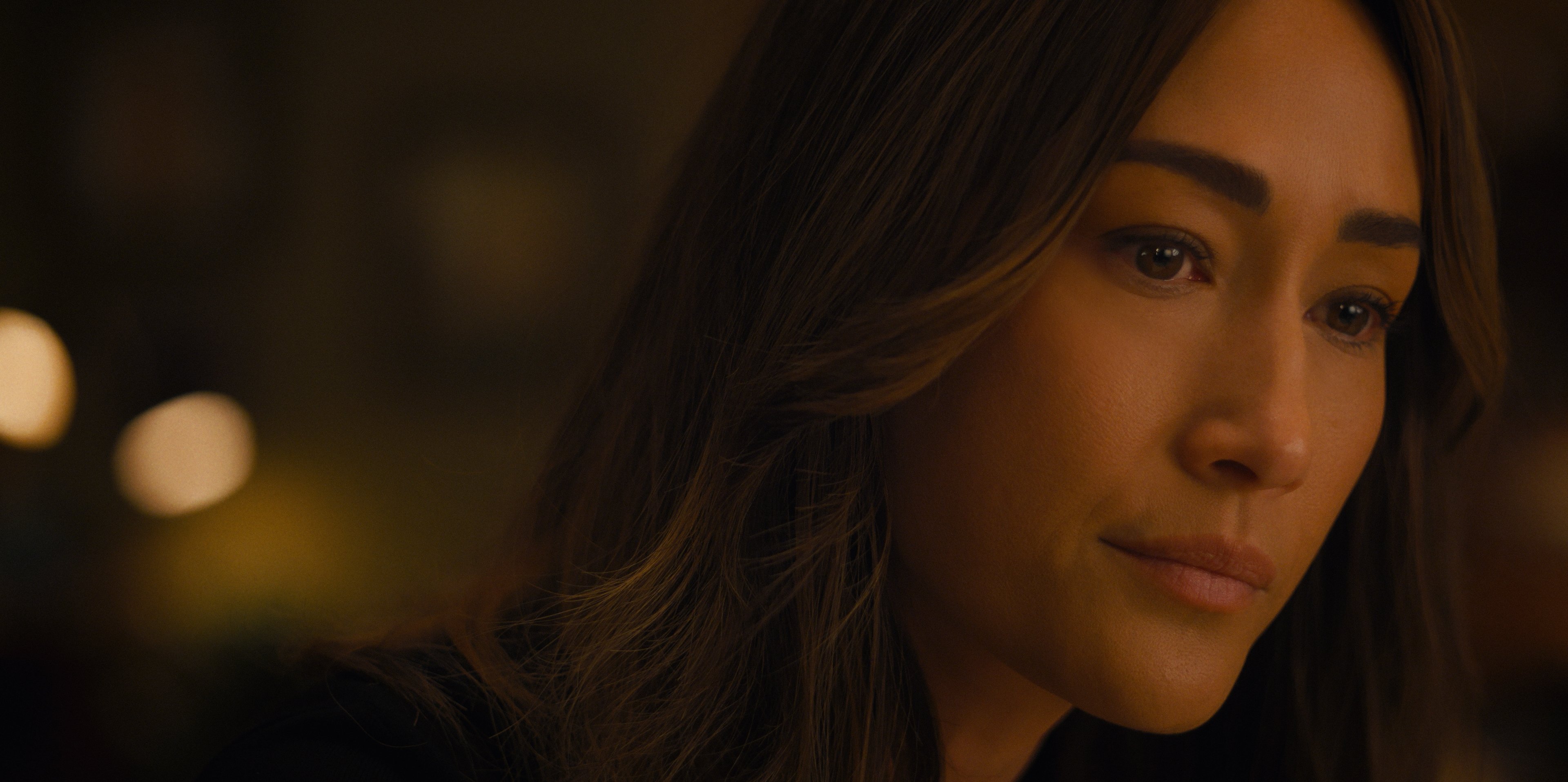
We decided to shoot on the Arri Alexa Mini LF, with the Arri DNA LFs as our primary lenses, which had the right combination of our desired characteristics. The DNAs provided a modern presence and drive to the image, while also rendering a bit of a softer touch, with a painterly quality; they helped us emphasize the human connection with Ballard that was central to the look of the series. We also had a 60mm Prime DNA, which was used often as a hero portrait lens for closeups, with its creamy character and nice round softness toward the edges. We rounded out the package with a three-set of Helios lenses, rehoused by Iron Glass, which were even more expressive in character and allowed us to push things further in certain subjective moments, to feel a bit more inside a character’s headspace. We used them quite a bit for our Ballard ‘headspace' moments in the first two episodes, to help align the audience with her perspective — nice, big, intimate closeups, whether frontal or in profile.
Cynthia and I also knew that there would be opportunities for incorporating other specialty lenses for given scenes and sequences as the season progressed.
Pusheck: Throughout the season, we would look for those emotional moments that could add a little more emphasis. Ballard is not a flashy show, so things needed to stay grounded and connected to the story. The DNAs and Helios gave us a lovely base to work from, and I only requested a special lens once or twice.
The first instance: When Ballard watches Rawls on a gurney, I added a center punch diopter filter to bloom and flare the edge of the frame. It felt like a good way to accentuate the moment, along with shooting at 48 frames, before we jumped back to normal speed. The second instance: For Episode 6, I used a tilt shift lens for Ballard’s point-of-view at the end of a fight, when she is close to passing out. But overall, I found our base lens kit covered most of our needs.
Meeting Any Challenge
Pusheck: A big challenge on every episode was shoehorning all the locations into our schedule. For the cinematographers, that often meant not being able to shoot a scene or location at the right time of day. We needed to be open and flexible, looking for other solutions and fixes.
Kelly: Yes — so much of our jobs as cinematographers is about creative problem-solving. That’s where the creative meets the technical, where the idea hits reality. On a series like this, every decision — from conceptualizing a scene visually with a director, to discussing schedule priorities and solutions with the 1st AD, to designing and executing shots and lighting plans with your crew — has to boil down to, “How are we telling the story in the most impactful, emotionally resonant and efficient way?” Working with such a talented, positive, dedicated team makes all the difference in the world. We all had each other’s backs, and that meant we could meet any challenge, day after day.
Ballard is now available to stream on Prime Video. Images courtesy of Prime Video and the filmmakers.