Slayin’ in the Rain: John Wick Chapter 3 — Parabellum
Dan Laustsen, ASC, DFF and his collaborators infuse this high-intensity action sequel with a rich color palette and “musical” camerawork
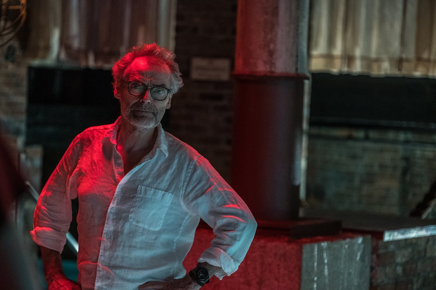
Unit photography by Niko Tavernise. All images courtesy of Lionsgate.
One or more of the following adjectives may cross viewers’ minds while watching John Wick: Chapter 3 – Parabellum: violent, colorful, theatrical, balletic, polished, baroque. Though reducing the film — photographed by Dan Laustsen, ASC, DFF and directed by Chad Stahelski — to its basic components seems akin to disassembling a luxury vehicle in lieu of driving it, its precision engineering is truly a marvel to consider.
Laustsen had just wrapped 2015’s Crimson Peak with Guillermo del Toro when Stahelski asked him to go behind the camera for 2017’s John Wick: Chapter 2. “Crimson Peak was a very dark and colorful movie,” says Laustsen, who received ASC and Academy Award nominations for his distinctive cinematography in del Toro’s The Shape of Water (AC Jan. ’18). “Chad wanted that for his film as well.”
Stahelski’s background is in martial-arts stunt work, with credits as martial-arts choreographer for Keanu Reeves’ Man of Tai Chi and martial-arts stunt coordinator for the Wachowski siblings’ Matrix sequels; 2014’s John Wick (co-directed with David Leitch and shot by Jonathan Sela) was his directorial debut.
“In Hollywood, action filmmaking was kind of looked down upon until The Matrix, and then people realized that action could also be part of the story,” Stahelski notes. “I come from a place of loving dance and theater and fine art — action can be all of those things — and one of my favorite painters is Caravaggio.” When he was looking for a cinematographer for John Wick: Chapter 2, Stahelski recalls, “I asked myself, ‘Who paints with light?’ The answer is Dan Laustsen.”
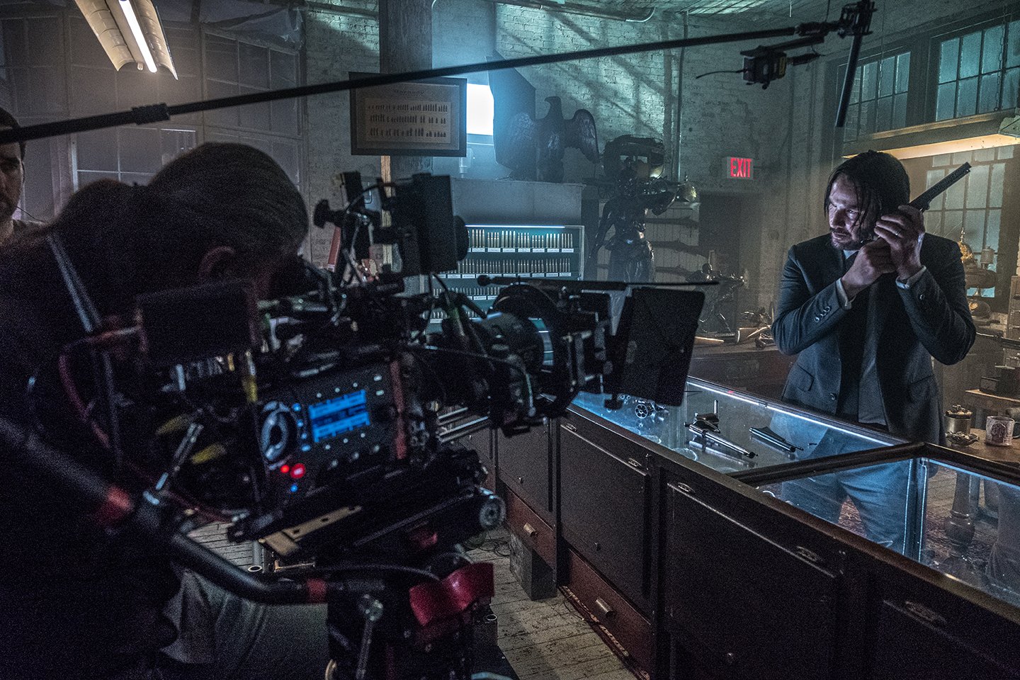
In strictly cinematographic terms, Parabellum functions less like an action movie and more like a Hollywood studio musical. The film’s first battle is a close-quarters knife fight in an antique weapons shop, where the camera cuts from wide shot to wide shot, sustaining the action in long takes so that the audience can better appreciate the physical prowess of Reeves’ performance — an elaborate fighting style that combines Japanese judo and jujitsu, Brazilian jujitsu, Russian sambo, Filipino kali, and Muay Thai, more for the benefit of show than for self-defense.
“Ninety-nine percent of high-level stunt work is dance — not pirouettes, but how you move your body,” asserts Stahelski, who continues to train stuntpeople with Leitch through their company 87eleven. “I love the aesthetic of motion. A lot of our shots [in Parabellum] are lifted straight from Singin’ in the Rain and West Side Story. We’re mixing Buster Keaton and Charlie Chaplin with Hong Kong cinema from John Woo, Jackie Chan and the Shaw Brothers.”
“We wanted to go wider than Hollywood action films normally do and really show off the choreography,” Laustsen agrees. “When the camera, lighting and actors are all moving together, it really is a dance.”
There’s something to relish in every razor-sharp frame of Parabellum, whether it’s the way Laustsen’s light rakes across a brick wall or wraps around an actor’s face, or the textures of Kevin Kavanaugh’s ornate production design, or costume designer Luca Mosca’s fashions, which range from the impeccable to the dilapidated. The movie possesses a coiled, thrumming energy — rain-soaked, neon-lit, and deeply textured, without a stray line or contour in its design. “Everyone had to be on the same page,” Stahelski says. “The first thing we do in preproduction is get all the department heads together in the same room. We’re all looking at the same reference images. Everyone goes to the stunt rehearsals. No one works in a bubble.”
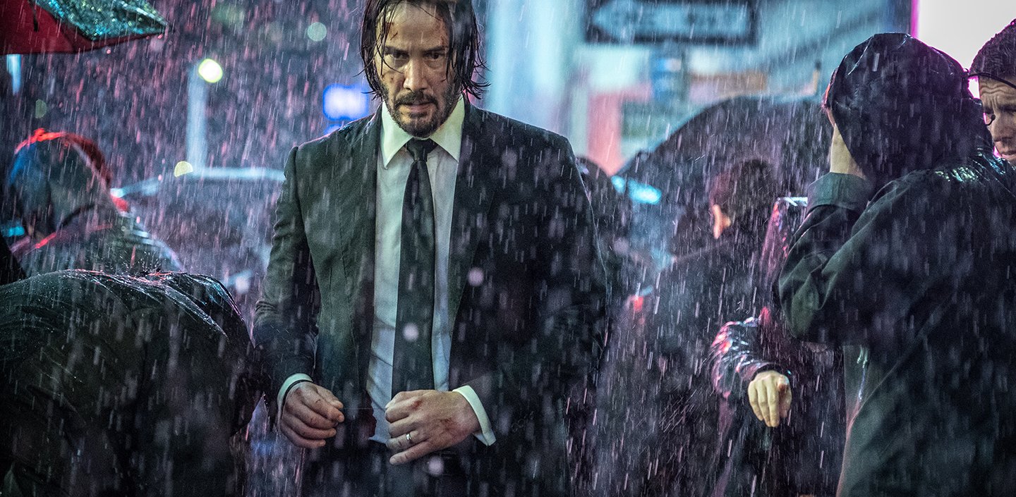
Picking up moments after the denouement of Chapter 2, Parabellum opens with the titular protagonist (Keanu Reeves), a deadly assassin with a price on his head, racing against the clock and fending off waves of lethal enemies as he attempts to clear his name and make a clean break from his dark past. “After we made Chapter 2,” Laustsen notes, “we discussed how we could make 3 even more visually powerful. The main setting was still New York, but we wanted to bring out the city even more forcefully. We decided to shoot all at night, with rain as much as possible. Rain is fantastic because it gives a third dimension to the picture, but it is a challenge to do it, especially in a city like New York.”
Laustsen used the same primary camera package to shoot both Chapter 2 and Chapter 3: Arri’s Alexa XT with Arri/Zeiss Master Anamorphic lenses, with two Alexa Minis added for the third film. Regarding the lenses, Laustsen offers, “They’re super-sharp and unforgiving, so if you make a mistake you can see it right away. There are no surprises.”
The Master Anamorphics’ low-distortion design also prevents dramatic, streaking lens flares, and so the technicians at Arri Rental in Secaucus, N.J., fashioned a flare filter — comprising three strands of nylon fishing line stretched across an empty filter frame — for the XT’s and Mini’s Internal Filter Modules. When a front-of-lens filter produces a flare, Laustsen observes, it “just looks like the light is catching on a piece of flat glass in front of the lens. It’s more beautiful when the flare comes from the lens itself” — and that’s the effect that was replicated with the behind-the-lens nylon lines. “With the filters inside the camera,” the cinematographer adds, “it was also easier for first assistant Craig Pressgrove to do the lens changes.”
Principal photography took place between May and July 2018 on location in Manhattan. The story begins in Times Square, with a wounded, disoriented Wick and his loyal pit bull navigating a sea of pedestrians. On location, A-camera/Steadicam operator Henry Tirl tracked Reeves through the rain while colorful electric billboards flashed overhead.
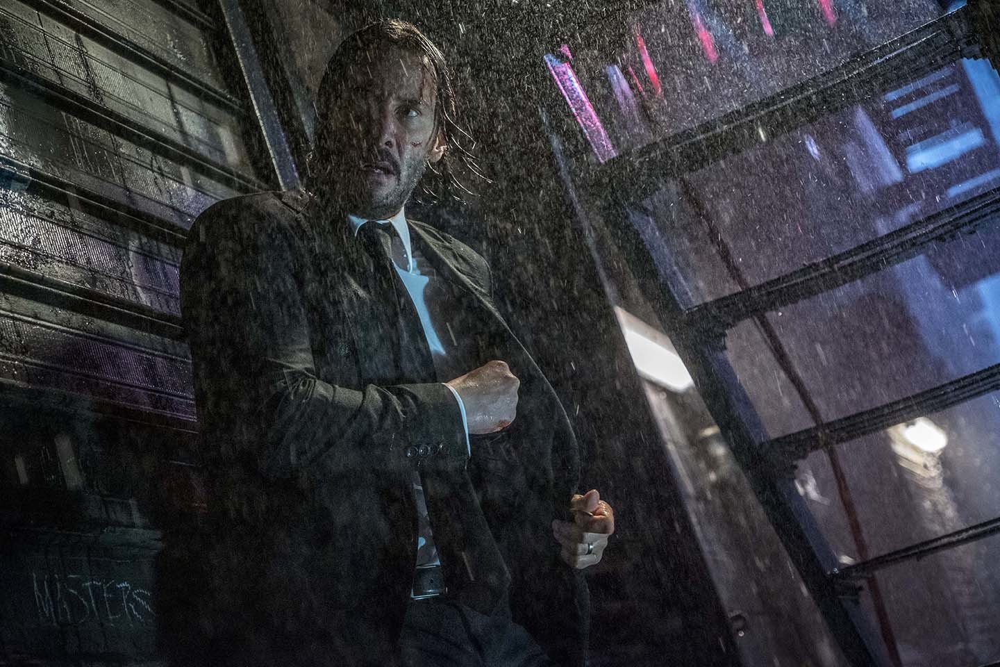
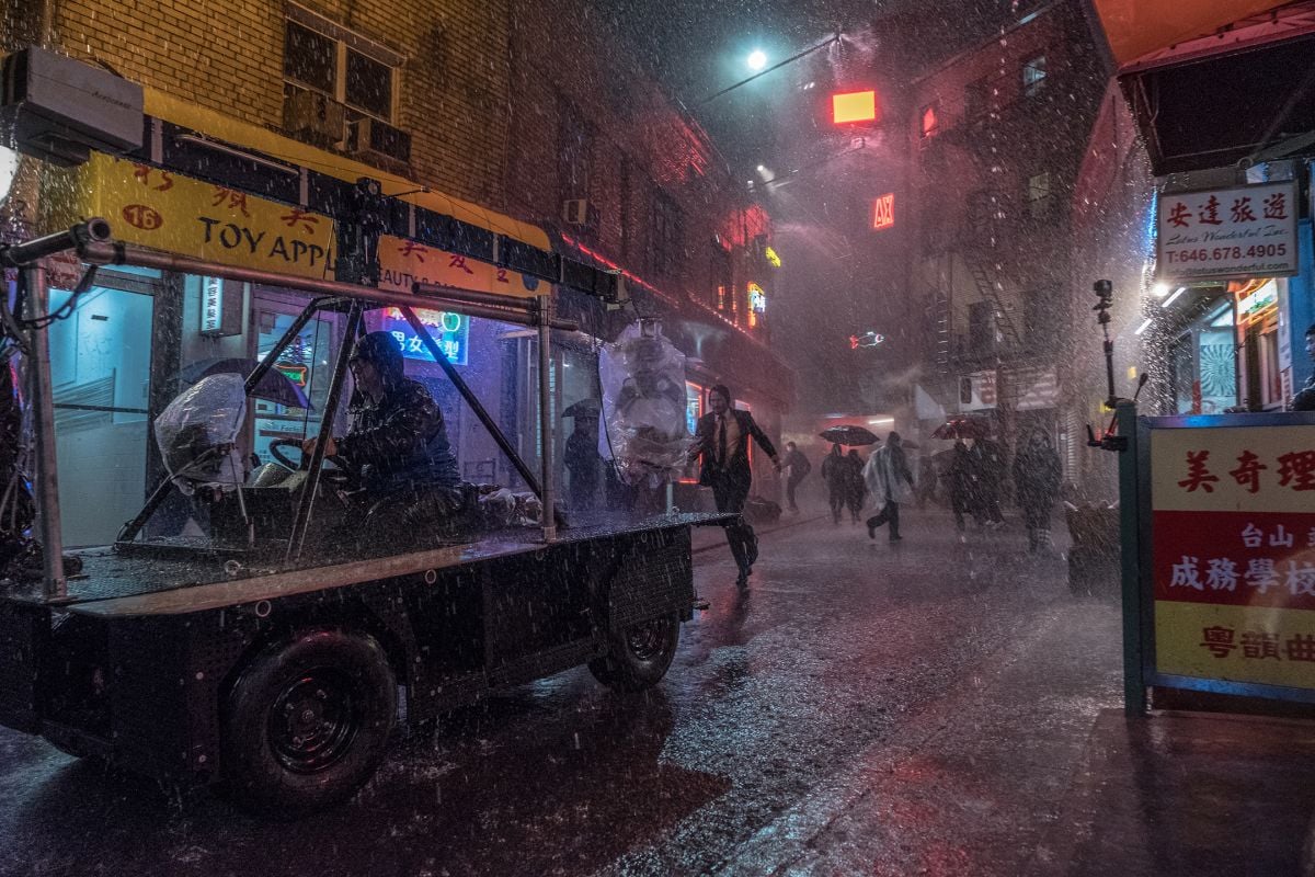
For this scene, the filmmakers’ task was more to control the abundance of light already present than it was to provide their own. Even still, according to key grip Charlie Marroquin, little was possible beyond flagging or creating negative fill with handheld 4'x4' solids. In addition to the Steadicam, Laustsen called on a MovieBird 45 or a Scorpio 23' crane — both sourced, along with a Libra remote head, from Monster Remotes — while gaffer Bill Almeida set up three Arri SkyPanel 360s powered by putt-putt generators for close-ups. SkyPanel 360s were also used to backlight the special-effects rain. “Times Square looks very cool, but lighting-wise for us it was a little more documentary,” Laustsen explains.
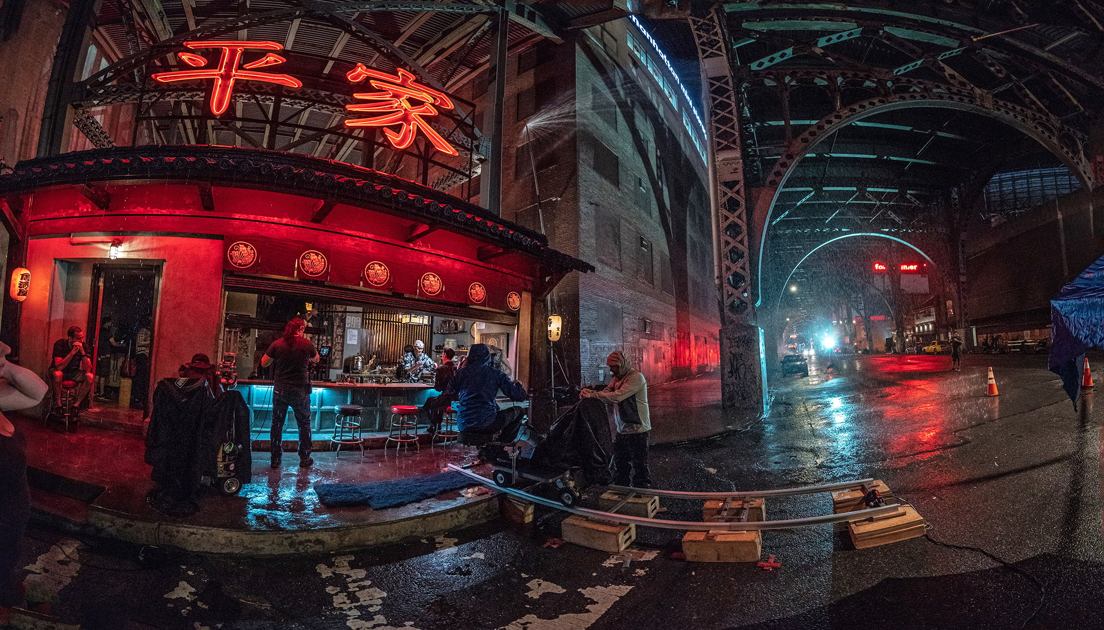
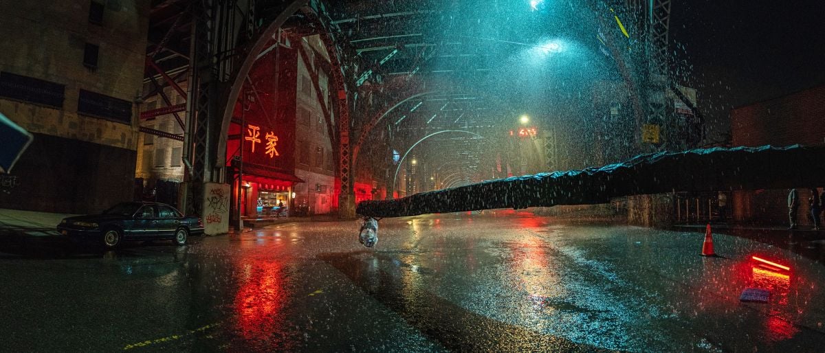
A few blocks to the east, the filmmakers secured the historic Grand Central Terminal’s Main Concourse for a tense standoff between Wick and a rival assassin named Zero (Mark Dacascos). The transit landmark represented something of a coup for Stahelski, who had wanted to shoot there while making the first two John Wick films, “but only if he was allowed to light it,” says Laustsen. “We didn’t want to do it like a documentary and only use whatever light was available. But it’s complicated to bring in lifts and big lights and to make it feel like your light is a part of the place.”
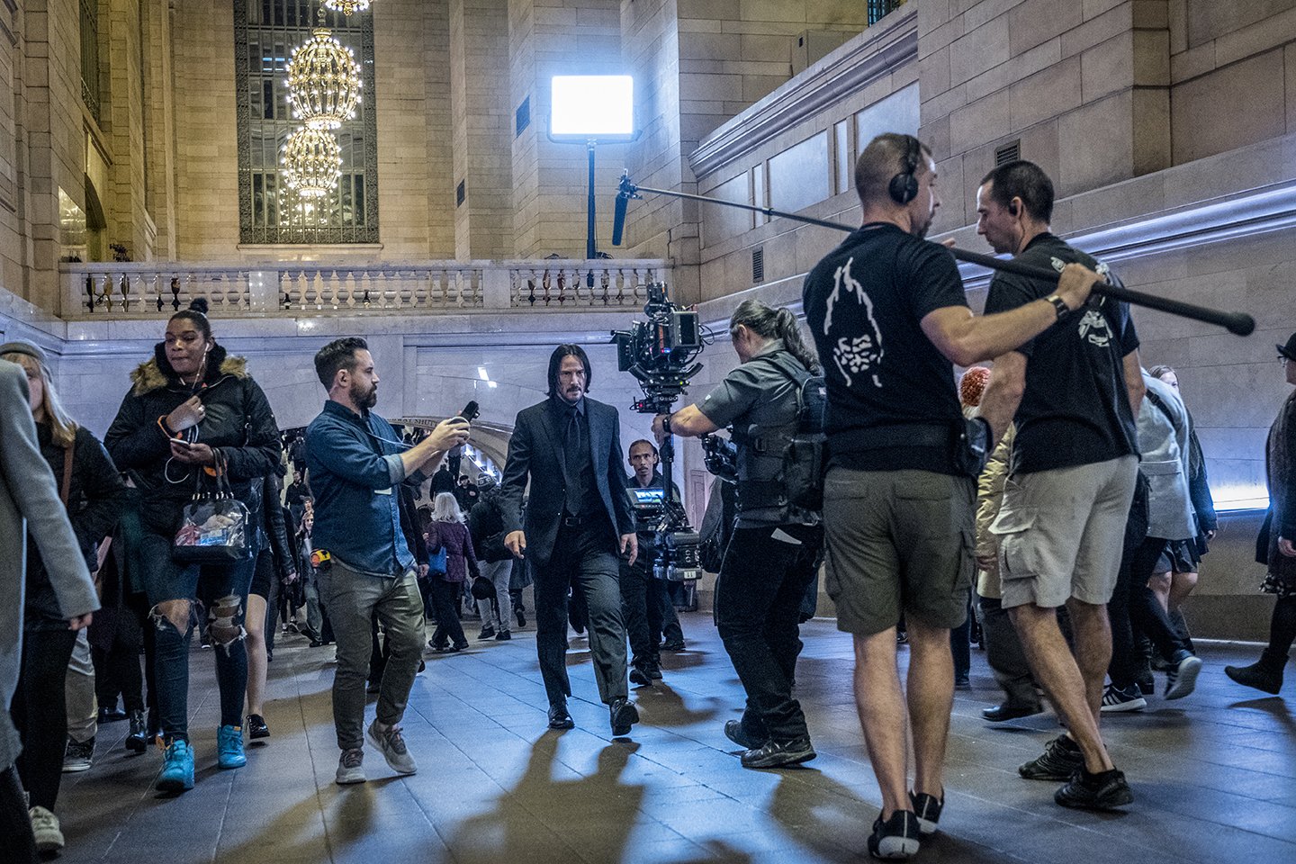
This time it worked out. To complement the concourse’s 10 globe-shaped Beaux-Arts chandeliers, each of which contains 110 bare compact-fluorescent bulbs, Laustsen directed Almeida to set up three Arri 12K tungsten Fresnels gelled with Lee 117 Steel Blue as a key light coming from the direction of the three 60' round-arched windows on the lobby’s west side, as well as two tungsten helium balloons that were sleeved with 1⁄4 Plus Green to lift the overall ambience. “I really like the Lee Steel Blue, and it works so well at night, especially when it’s contrasting with green or red,” Laustsen muses. “It’s fantastic on the skin tones, especially on Keanu. That was our background color most of the time.”
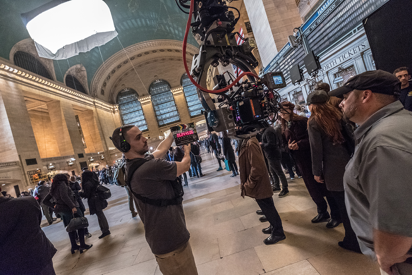
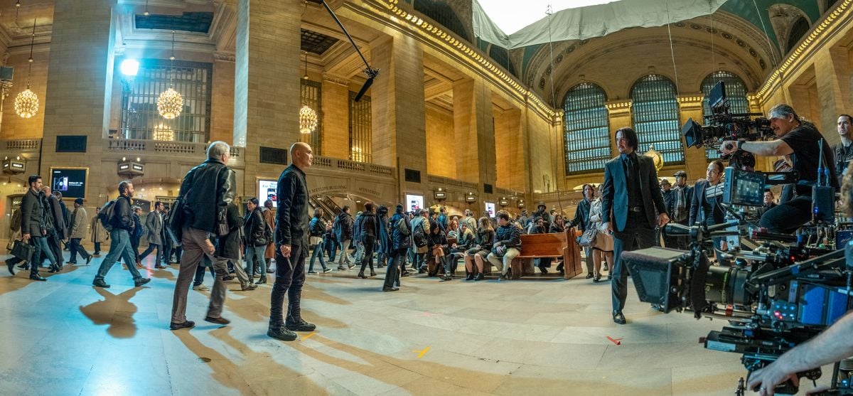
Almeida adds that the three windows on both the east and west sides of the concourse — six windows in total — “were lit with Arri T12s from the ground [outside the location], one light per window, each gelled with Lee 117 Steel Blue.”
Practicals played a key role in the visual design of the production, providing mood and tone as well as exposure. The filmmakers weren’t allowed to change any of the existing practicals in Grand Central, so instead they added to them — a technique they repeated throughout the film — mounting blue Astera AX1 wireless LED tubes to the concourse’s hand railings. “You can even see them in the shot,” the cinematographer points out. “We used practicals as often as possible because we wanted a dark movie with a lot of highlights and strong color contrast.”
Stahelski, Laustsen and Kavanaugh spent the first two months of a three-month preproduction schedule scouting locations. “We were looking for locations with texture, windows, staircases and odd, dramatic angles,” Laustsen describes.
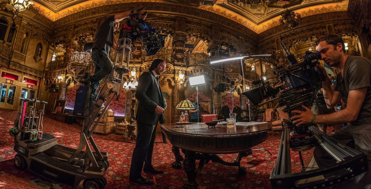
One of the movie’s most dramatic locations is the United Palace, which occupies an entire city block between West 175th and West 176th Streets in Manhattan’s Washington Heights neighborhood. Opened in 1930, the roughly 3,330-seat neoclassical theater was originally one of Loew’s five mega-cinema Wonder Theatres. In Parabellum it serves as the Tarkovsky Theater, home of a Russian ballet/assassin academy governed by a woman only known as the Director (Anjelica Huston).
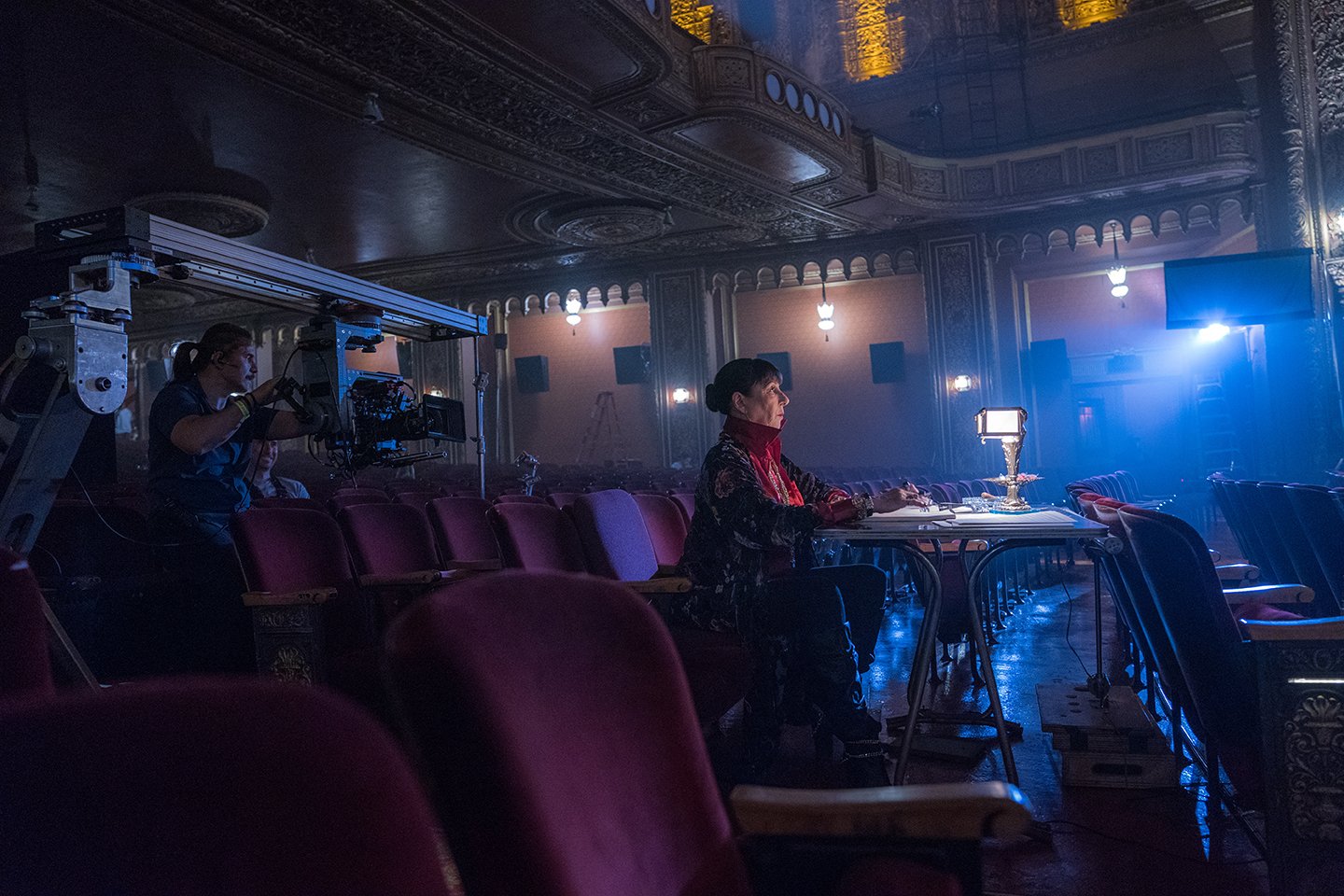
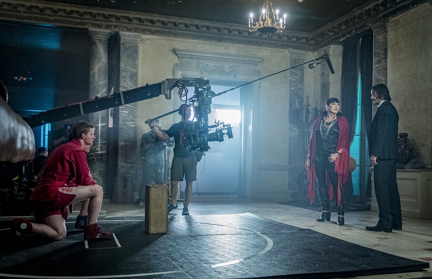
The filmmakers made use of the theater’s lobby and auditorium. When Wick first approaches the Director, she’s seated in the orchestra pit under dimmed house lights, rehearsing one of her students from behind a desk topped with a warm practical lamp. There wasn’t much about the location’s existing practicals that the production was able to change, so once again Laustsen used color to create separation within the space. The crew lined the aisles with AX1 LED tubes — and tucked another beneath the desk, unobtrusive but not entirely concealed — to provide a small amount of fill in the vast auditorium. A single Vari-Lite VL6 gelled with Lee 354 Special Steel Blue spotlighted the ballerina on stage. “I love that the key light on Keanu and Anjelica is warm, and the seats are red, but the dancer’s spotlight is blue-green,” the cinematographer notes. “We wanted to have contrasting colors all the time, and we looked for that in our locations, too.”
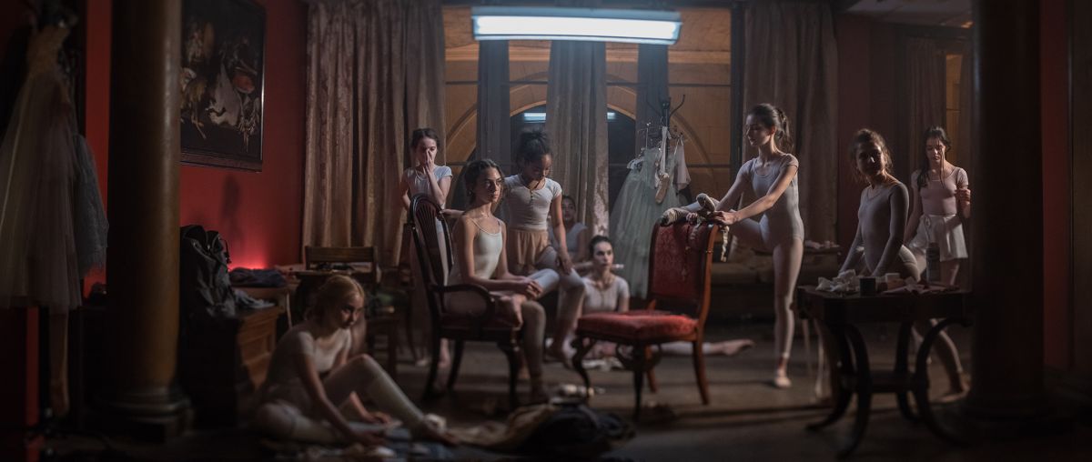
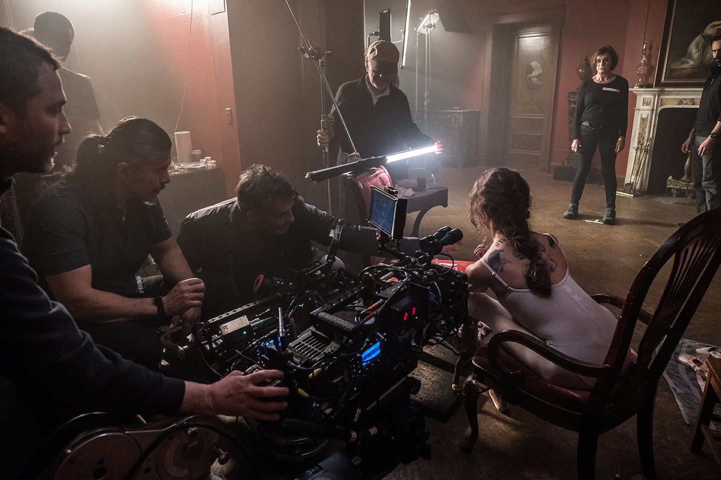
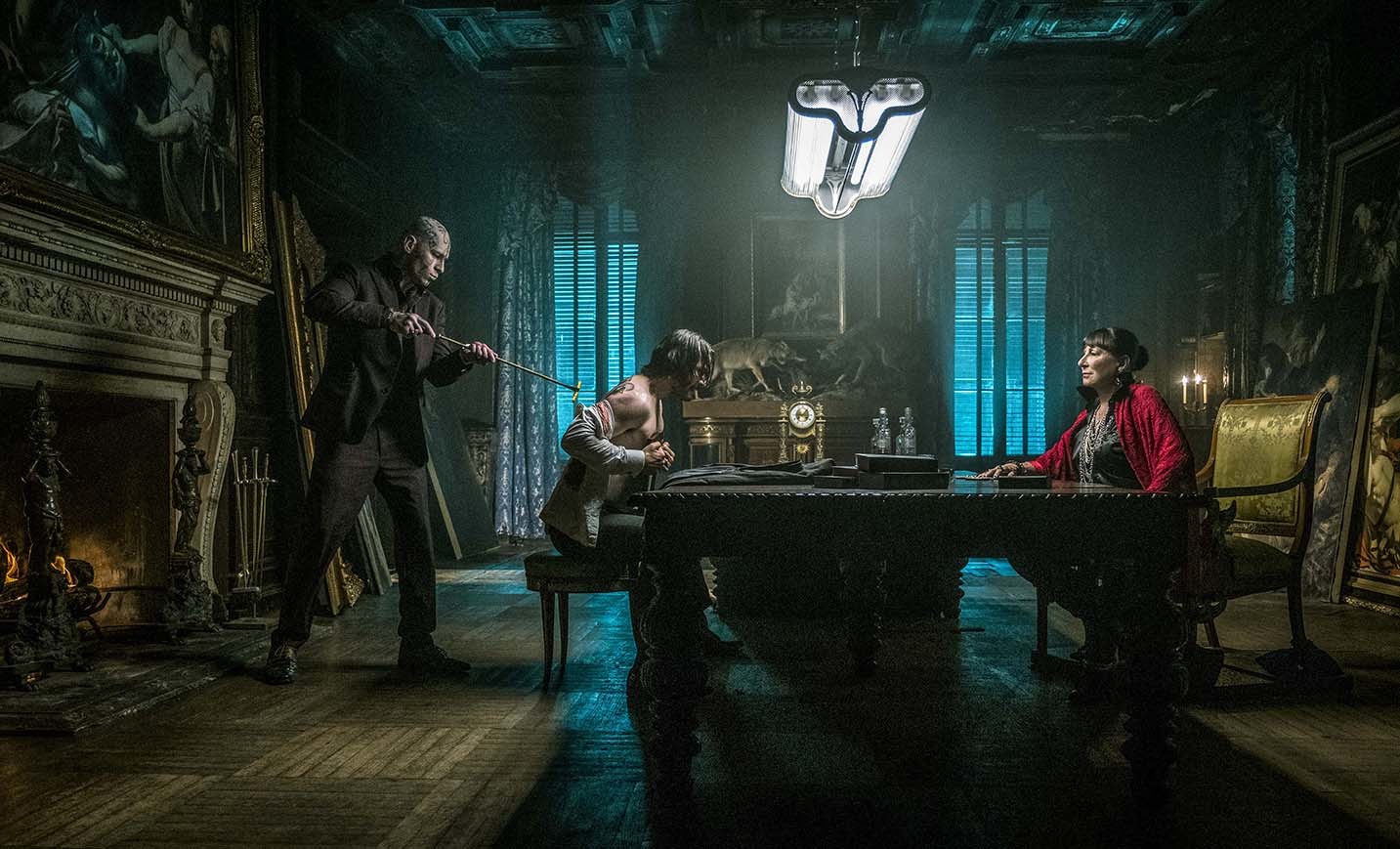
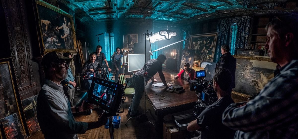
The Tarkovsky’s backstage rooms were actually shot in an empty estate house north of Manhattan, in Yonkers. In the Director’s office, a fire rages in the fireplace as Wick and his former mentor negotiate the terms of his safe passage. An industrial glass chandelier fitted with 4' Colt LED tubes hung over the wide table where Reeves and Huston sat, and the slatted background windows were lit by 5K tungsten Fresnels gelled with Special Steel Blue and Lee 250 diffusion. Caravaggio’s Judith Beheading Holofernes rested on the mantle over Reeves’ shoulder. “Those Renaissance paintings behind Keanu and Anjelica are in keeping with the palette of the rest of the scene,” Laustsen says. “Nothing is by accident. Every location, every shot is designed as precisely as we could make it.”
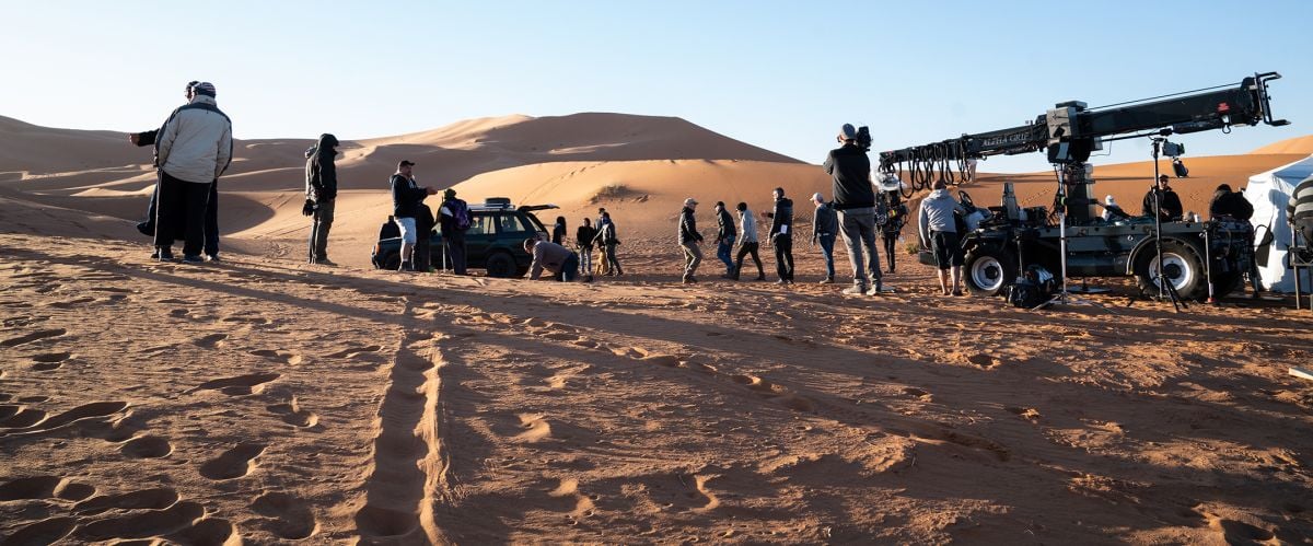
Wick learns that the only person who can absolve him of his crimes against the underworld is in Morocco. According to Laustsen, everything that was set in Morocco — the outdoor bazaar, the hotel, the coin foundry — was shot on location in the country’s coastal town of Essaouira, and on the Erg Chebbi dunes near Erfoud. “I loved shooting in Morocco, but organizing things was a little complicated,” Laustsen relates. “We brought some of our camera crew from New York, and we pulled an operator and 1st assistant from the U.K. Gaffer Francesco Zaccaria came from Italy.”
Wick’s path to redemption leads him deep into the desert, to the remote tent of the Elder (Saïd Taghmaoui), where a pact is made that frees Wick from the underworld’s death mark, but only at the expense of the one thing he holds most dear.
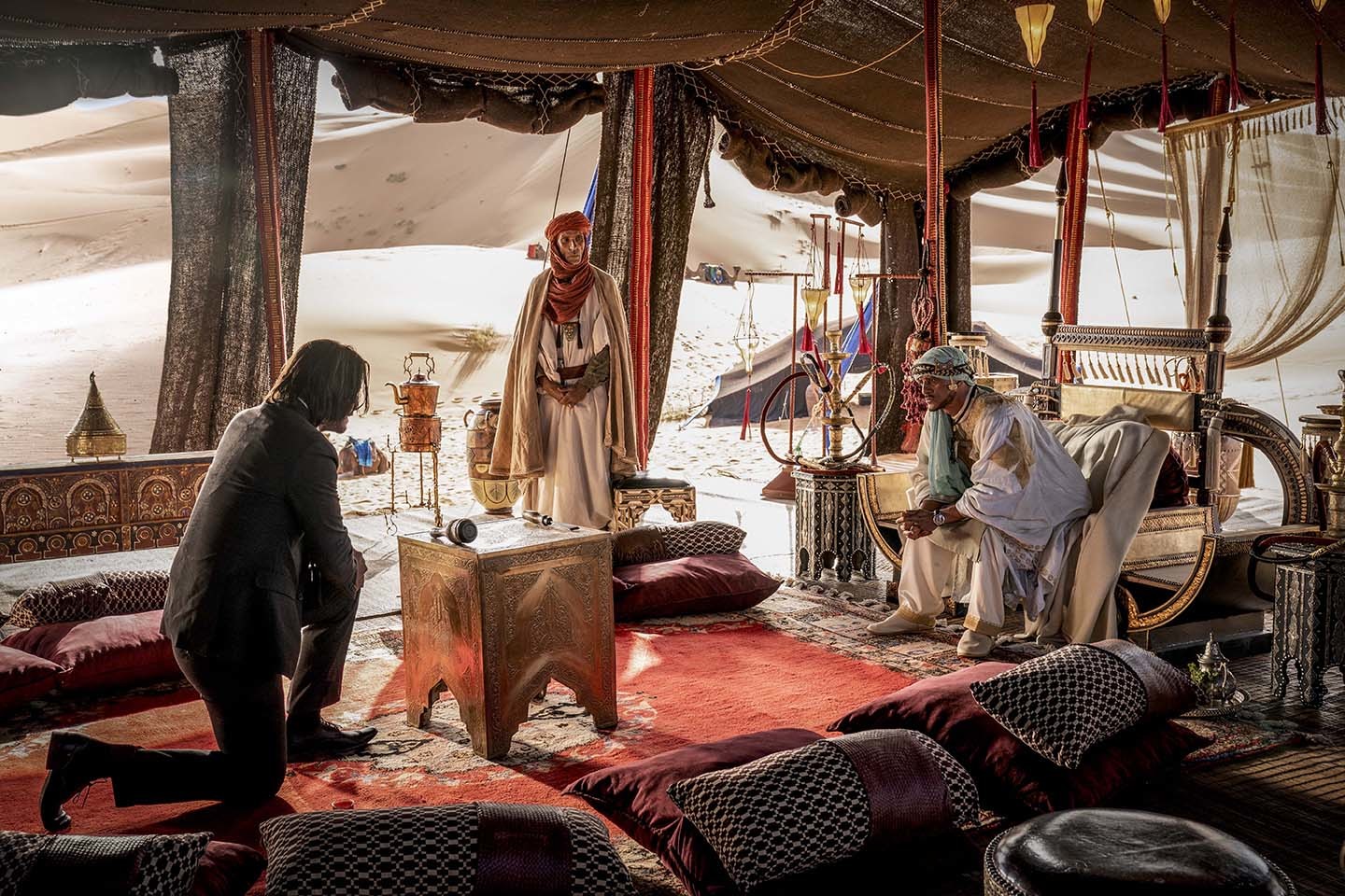
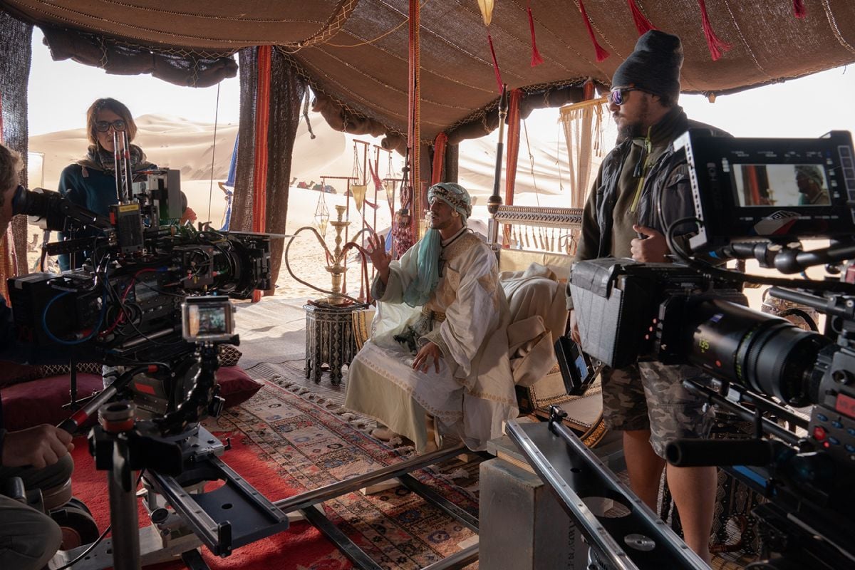
In order to expose for the open-sided, Bedouin-style tent’s interior without losing detail in the surrounding desert, Laustsen enlisted the combined strength of six 18K Arrimax HMIs gelled and diffused with various combinations of 1⁄4 and 1⁄2 CTO and Lee 251 and 250. While the 18Ks pushed light in from one side of the tent, four 9K Arri HMIs bounced additional light off the floor. “As the sun moved around the tent,” Zaccaria notes, “it was a question of controlling the sunlight with 12-by-12 diffusers or blacks.”
“We were shooting ISO 800 all the time,” Laustsen adds. For the tent scene, he notes that he was “lighting to a T16 [or] T18, then knocking it down to between T2.8 and T4 with ND filters in the camera.”
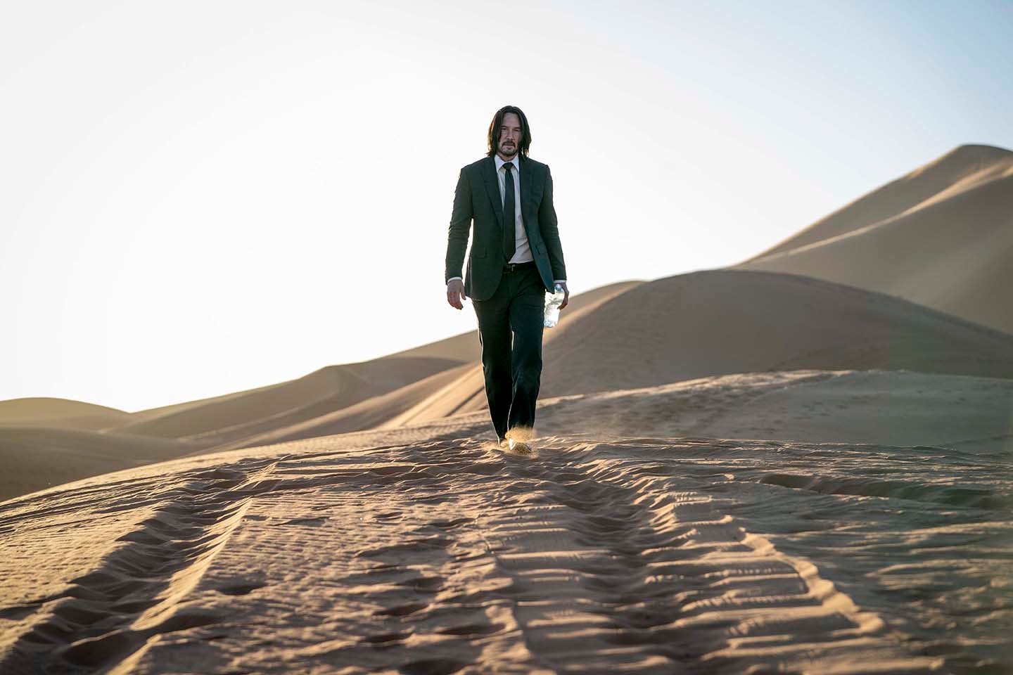
Upon his return to New York, Wick must fulfill his portion of the agreement by executing Winston (Ian McShane), a trusted confidant and the owner of the Continental Hotel, one of many secret, posh lodgings that cater to the underworld’s elite.
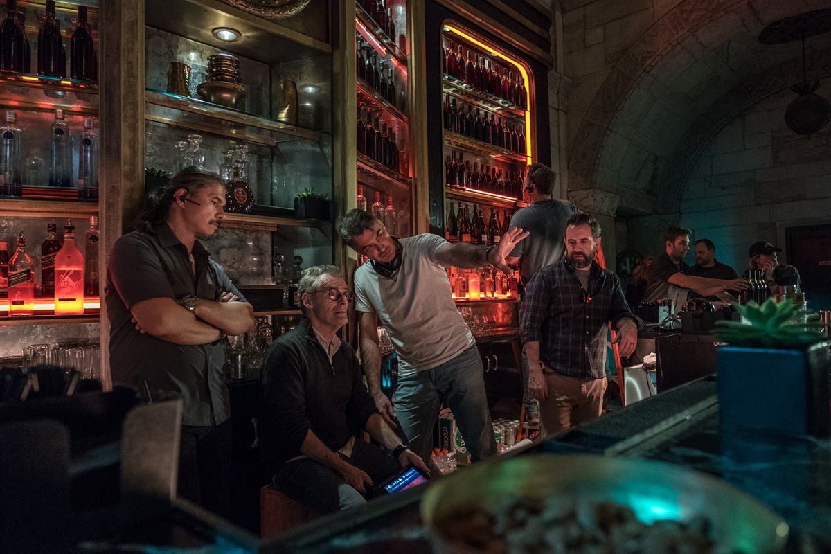
The exterior of the Continental was shot in lower Manhattan, but the hotel’s interiors were filmed in downtown Brooklyn, in the former Williamsburgh Savings Bank tower — which now serves as an event space —whose glass-and-wrought-iron front doors open to a 128'-long vaulted banking hall with limestone facing, marble floors, carved teller stations, and a 63'-high ceiling supported by Romanesque columns. For its role as the Continental’s lobby, the hall was furnished by Kavanaugh with two round settees crowned with statues of the Roman war gods Bellona and Mars, a fully-stocked bar, and a lounge on the mezzanine.
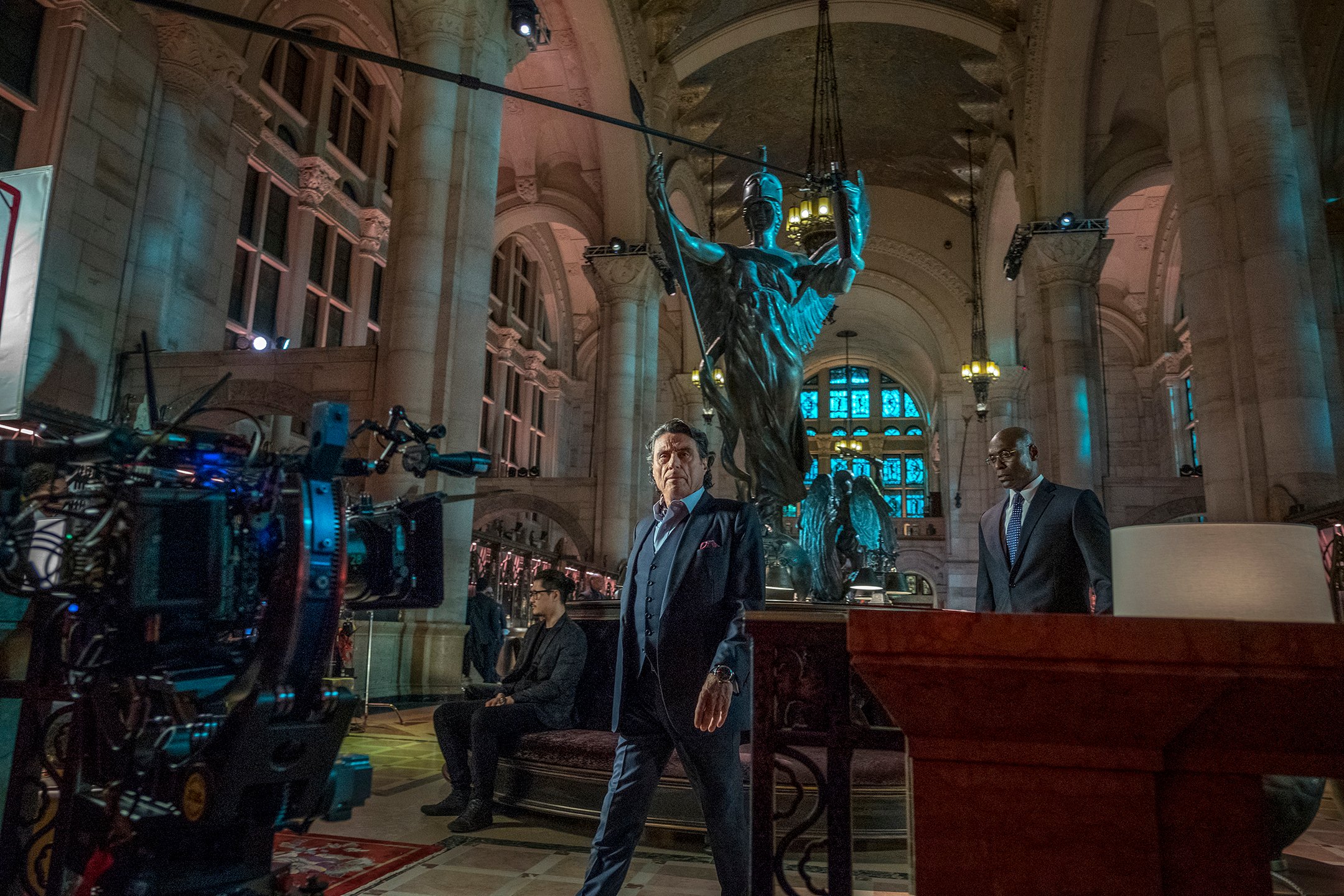
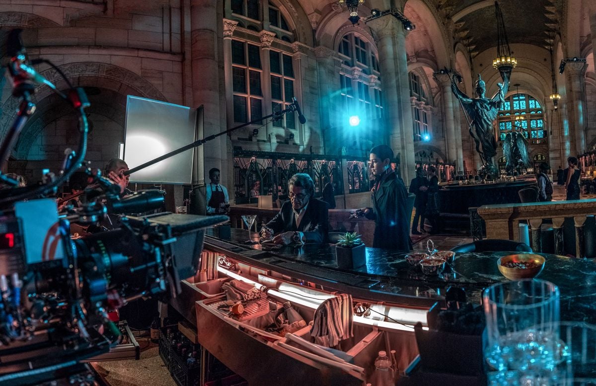
Day interiors were lit mostly from the exterior, with condors carrying Arrimax 18K HMI PARs that were aimed through the location’s long, tinted windows. Arri SkyPanel S60s were used to augment the window light for close-ups. Night interiors used the same setup but swapped the HMIs with 24K tungsten Fresnels gelled with Special Steel Blue. Additionally, Almeida and his team rigged Martin’s Mac Aura XB and Clay Paky’s Mythos and Sharpy Wash 330 moving lights from above, while Chroma-Q’s Color Force II and Astera’s AX3 LightDrop and AX5 TriplePar units provided architectural washes from the ground.
Despite his arrangement with the Elder, Wick decides to let Winston live. As a result, the army of the High Table, led by the Adjudicator (Asia Kate Dillon), descends upon the Continental to finish the job — and Wick — once and for all.
When the army arrives, they cut the hotel’s power, extinguishing the interior lights until a backup generator kicks in and activates an approximately 250' green-hued perimeter light, which the crew realized with Astera AX1 tubes. “We wanted to do something that we hadn’t tried before, something very dramatic,” Laustsen says. The result is a deadly dance as John Wick and the Continental’s concierge Charon (Lance Reddick) mow down wave after wave of gun-toting enemy fighters, with the green LED tubes flickering wildly and Vivaldi’s “Winter” and “Summer” concerti playing over the soundtrack.
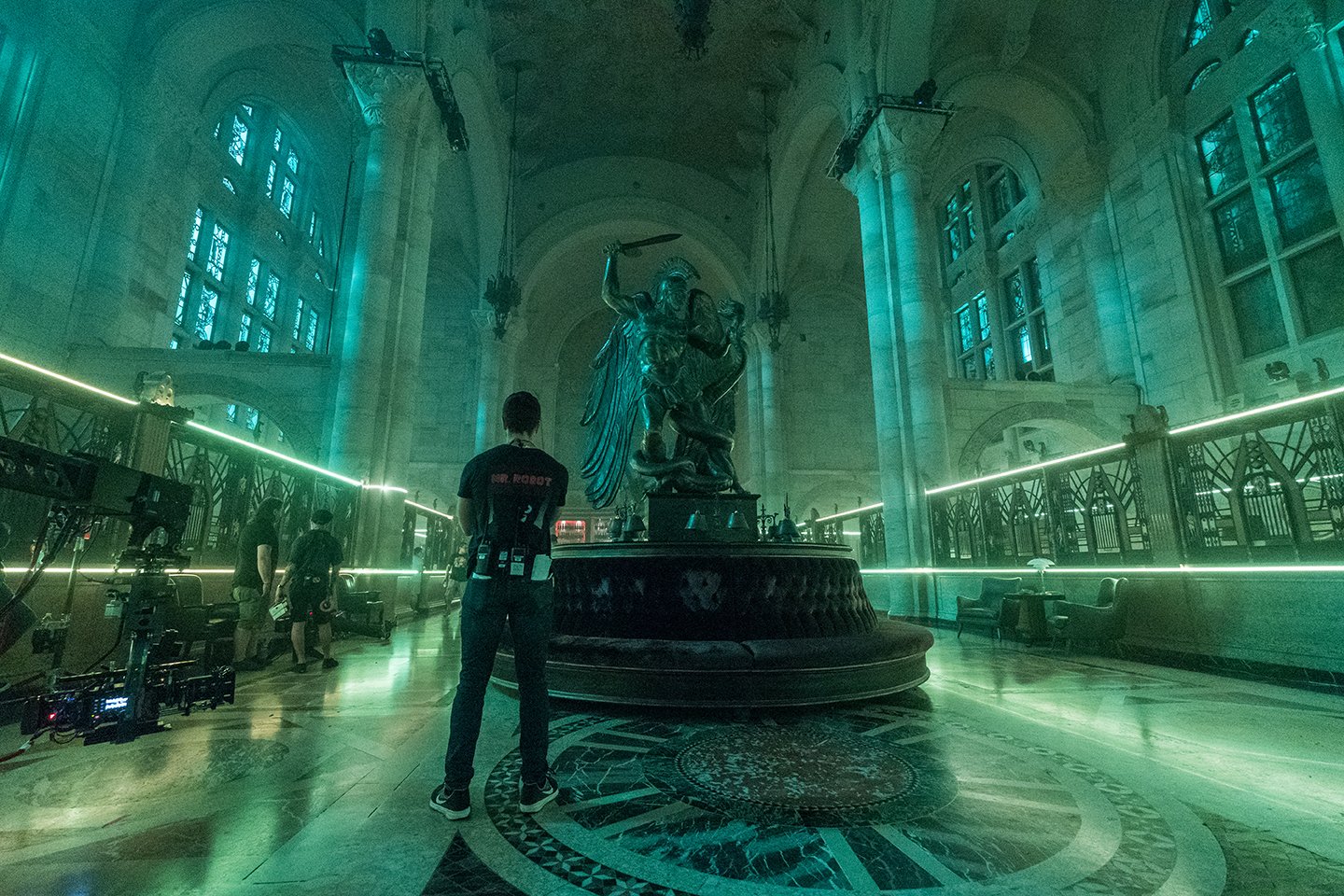
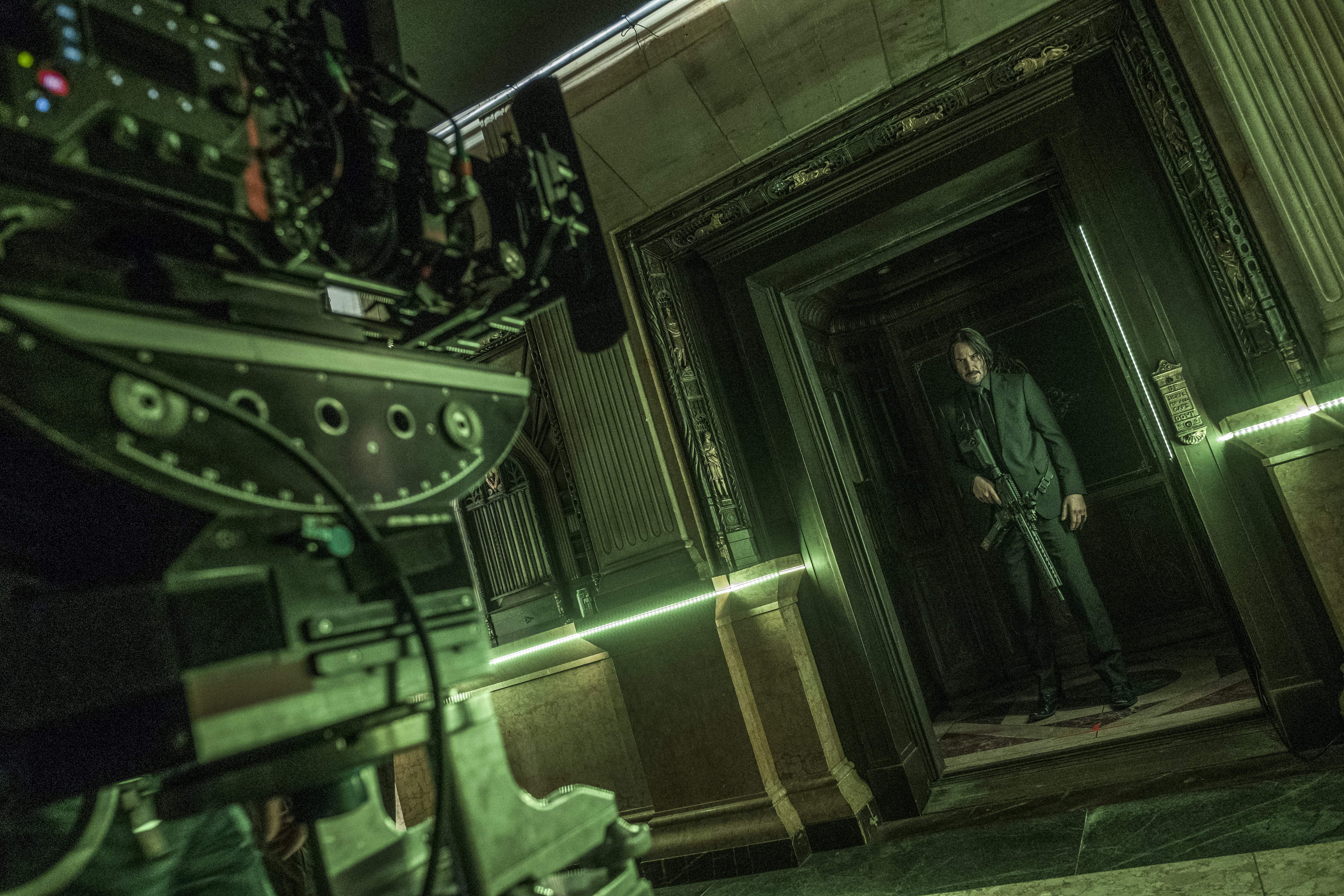
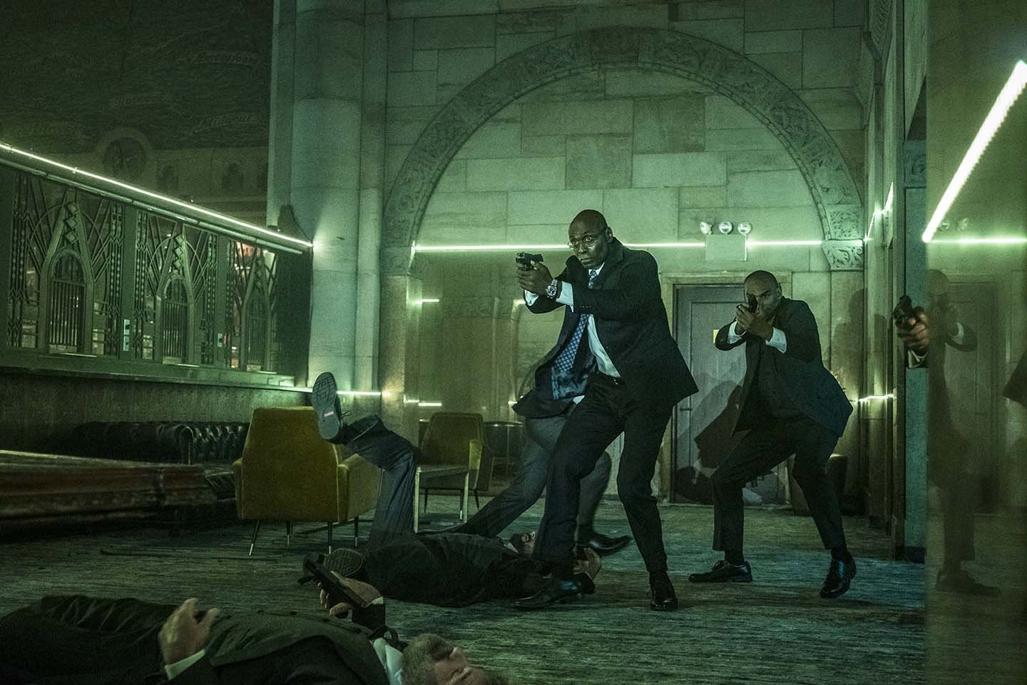
“I love the look of that scene,” Laustsen remarks. “With the blue light coming through the windows, the green LEDs, and the red in the background, you have the film’s three main colors in one big shootout.”
Parabellum’s stages were located at Gold Coast Studios in Long Island, N.Y. The first of the production’s two notable stage-bound sets is the Continental’s terrace, for which the Rockefeller Center rooftop garden was used in Chapter 2. The schedule didn’t allow for much time to shoot Parabellum’s scene, which takes place at sunrise. “You cannot make the sun rise [for] a movie,” Laustsen notes wryly. “It’s one or two shots, and then you have daylight, and then you’re fighting to control the light.”
So, for more control, the scene was moved onstage, where the set was surrounded with a sectional 45'x350' bluescreen lit with SkyPanel S120s; a 120' black velour curtain was used to control blue spill coming from off-camera. Early-morning ambience was provided by 176 overhead SkyPanel S60s, and the light of the rising sun was simulated by a 20K tungsten Fresnel and a 24K Dino light with medium bulbs, both gelled with 1⁄2 CTS.
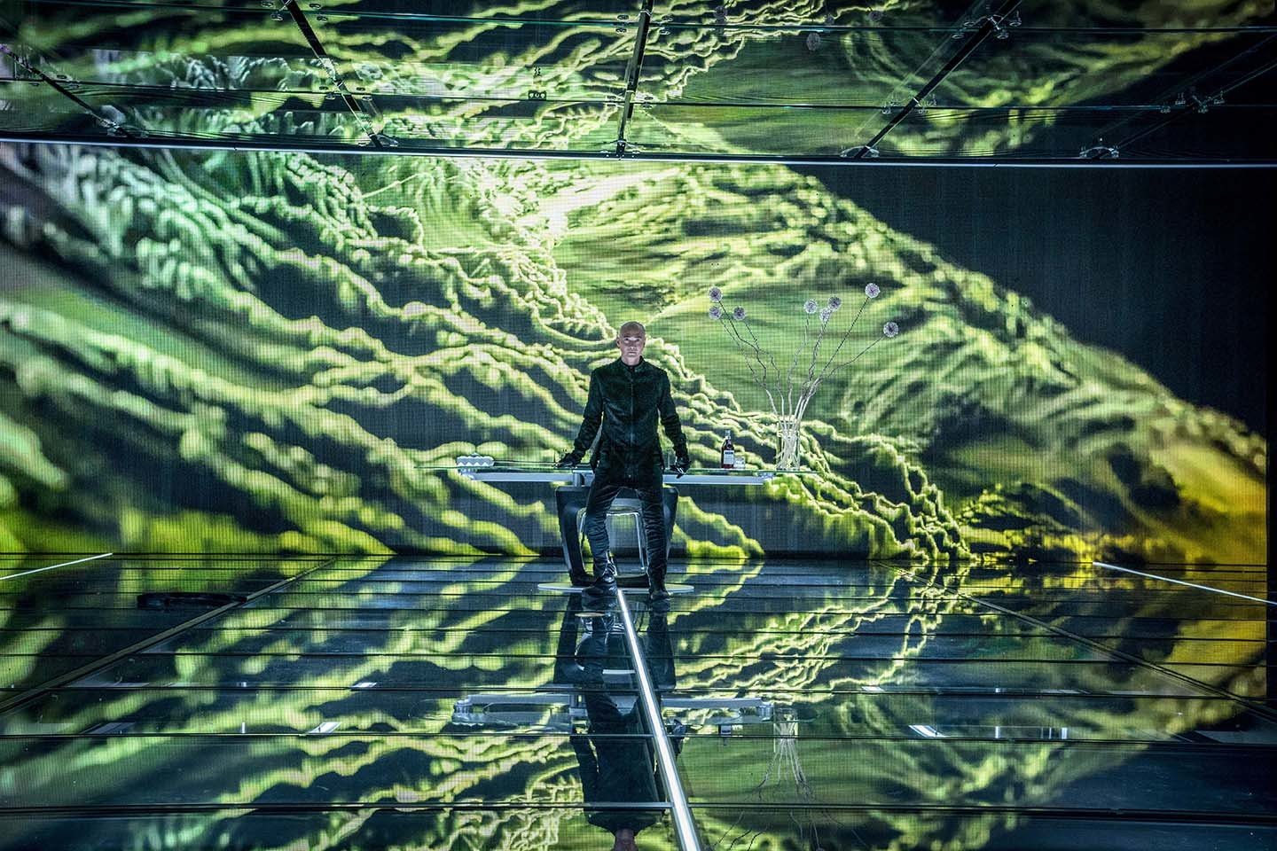
The other key set built at Gold Coast was the “manager’s office,” a labyrinthine two-story glass-and-steel structure meant to represent the top floors of the Continental, with a 270-degree view of the adjacent skyscrapers. It’s in this space that Wick and Zero ultimately face off mano a mano. “The concept was to create a space where everything is exposed, a place where there are no secrets,” Kavanaugh explains.
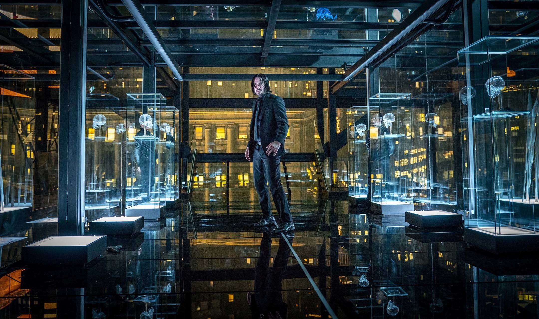
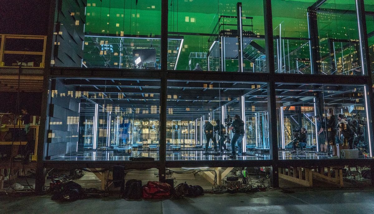
To help him integrate the lighting into the design of the set itself, Laustsen worked with a virtual-reality computer model based on Kavanaugh’s design. “Chad, Kevin and I had discussions about color — cool lights inside, warm light outside,” says the cinematographer, who wanted what he describes as an “organic” light element for both spaces. The art department therefore added a 35'x14' LED wall to the set’s second floor and a 28'x12' LED billboard to the rooftop; the latter was positioned between the glass structure and a 40'x440' Rosco SoftDrop that was backlit by 150 SkyPanel S60s through Magic Cloth sourced from The Rag Place.
Almeida and his rigging crew installed more than a mile of LiteGear Chroma-Correct RGB-Daylite LED LiteRibbon into the glass and steel set, using aluminum profile and plastic diffusers provided by Kavanaugh’s art department. Cues were orchestrated from an ETC Ion Xe console operated by Kent Arneson; Laustsen took advantage of that control to increase the intensity of the light over time — until the very end of the fight, when the two combatants are photographed primarily in silhouette against the LED walls.
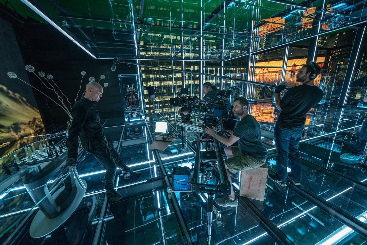
Wick literally fights his way through the set — alternately smashing his opponents and being smashed through glass pedestals, walls and floors — until he comes face to face with his nemesis. “We filmed this sequence with a [Chapman/Leonard Hustler IV] dolly and a Libra head, a Steadicam, and a couple of crane shots [with a MovieBird 45 and Aerocrane jib],” Laustsen details. “We didn’t want to go handheld because of all the straight lines. It would be a much more powerful look for the film if the frame was always parallel to the set.”
“When we did bring in lights for the close-ups, we used Arri SkyPanel S60s and Astera AX1 LED tubes that we could attach virtually anywhere using magnets and clips,” Almeida adds. “The Astera tubes worked out great because they’re easy to hide, and if you saw a reflection, it just looked like the lighting that was built-in already.”

Dailies were provided by Company 3 in New York. “I wanted [the dailies] to be as close to the final look as possible,” the cinematographer says. “The film’s color palette was specifically designed in-camera from scene to scene. Of course, everything will be more beautiful after the DI.”
Laustsen worked closely with DIT Patrick Cecilian on set to make sure the exposure was correct and to adjust the camera’s color temperature, “but we were capturing everything in ArriRaw anyway, so we could change it later,” Laustsen remarks. “Otherwise, I was doing most of the color as it was done in the old days, with my gaffer on the set.”
The final color grade was performed by ASC associate Jill Bogdanowicz at Company 3 in Santa Monica, Calif. “We were putting a bit more black into the picture, making it a touch more saturated, taking the red out of the actors’ faces when they’re fighting — just making it more consistent,” Laustsen explains. “Of course, we used power windows to make the set a little bit darker. When you’re shooting and running out of time, instead of flagging something off, you leave it for the DI. “It’s more or less a classical approach,” the cinematographer adds. “If you control your color on set as we did, you can have a more precise look.”
Living Color
The cinematographer digs deeper into his overall creative approach to employing richly hued lighting.
American Cinematographer: How do you define a project’s color palette? Does this come through testing, or from preconceived ideas that you or your other collaborators have?
Dan Laustsen, ASC, DFF: When I read a script I get a lot of images in my head, with color ideas and light ‘moods.’ I also get a lot of inspiration from my daily life and my still photography. Later, as we have more concrete and detailed talks about the script and we start finding locations, a more exact discussion evolves around colors and moods. This is always a deep collaboration between the director, the production designer and myself. We all try to give each scene an exact mood and color palette, unified by the style and mood of the whole picture.
Color- and exposure-testing is an integral part of the preparation process and helps us to communicate to all departments what we are aiming for. When I [perform] these tests, I always have my DIT with me, so that I’m sure that the exposure and the colors are exact. I want the colors and the lighting to be right on-set and in-camera. To me, it is not an option to change them later in the DI.
How did your color palette evolve from John Wick: Chapter 2 to Chapter 3?
In Chapter 2 our base color was more to the cold side for the backlights, and the contrasting colors were red, 3,200K tungsten with 1⁄4 or 1⁄2 85 gels on the lamps, and 4,500K clear white. In Chapter 3 our base color for the backlight was [Lee 117] Steel Blue, which is more to the green side, and our contrasting colors were Golden Amber, Deep Golden Amber, deep red, and 5,600K white fluorescent. The colors in Chapter 3 are more saturated, the blacks are deeper, and the lighting is more single-source and classic than in Chapter 2. This gives a more powerful and cleaner look, I think, and it works really well with Chapter 3’s action scenes.
In Chapter 3 we also used a lot more LED strips and tubes in the image, as part of the set design. This was a result of the tight collaboration between the director, the production designer, the gaffer and me. The LED light is fantastic, as you can create all colors and control the exposure easily and quickly from an iPad or a dimmer table. Our base color from the LEDs in-frame was greenish or clear white, 4,500K or daylight 5,600K.
At what point in your cinematography career did you start to develop a strong sense of color with your lighting?
I have always been fascinated with the Danish landscape painters from the Golden Age [circa 1800-1850] as well as the Norwegian painter Edvard Munch. When you look at his painting The Scream, you can really feel the power of color. But you need a story that can carry it and a director who loves it. In the early 2000s I had made many films that were very desaturated, ending with an eight-hour TV series called 1864 that unfortunately wasn’t black-and-white, but that had very little color. [After that] I needed to go in a different direction.
How has your work with color been influenced by your collaborations with different directors, particularly Guillermo del Toro?
When I made my first film with Guillermo, Mimic, in 1997, we wanted to make a very dark and colorful film. We used a lot of Steel Blue and Deep Amber on that movie. Then we didn’t work together for many years. When he called the next time, for Crimson Peak, I had just finished 1864. Guillermo had a strong vision of a very colorful movie. It was a huge inspiration for me and set me off in the direction I am heading now. In Crimson Peak, we went back to our favorite color palette, with steel blues and deep oranges.
The first time I heard about The Shape of Water [AC Jan. ’18], it was going to be a black-and-white movie. Now, a true black-and-white movie is every cinematographer’s dream — and especially mine, as I have been a black-and-white still photographer since I was 17. But in the end, Guillermo made the perfect decision for The Shape of Water, and we created a color palette that beautifully carries the story, with green, Steel Blue and very little red.
Can you share a bit more regarding your preference for achieving these colors on-set and in-camera, as opposed to in the color grade?
When a director has a vision and all departments work towards that goal, to me it is important that the camera image is precise and captures what we are striving for on the set. I think the DI is a fantastic tool, but I have always been inspired by great painters and photographers from around the world who have painted with light. In that vein, I want to create as much as possible in-camera, bringing forth the set design with my lighting and color.
