Network and How it Was Photographed
An interview with the Academy Award-nominated director of photography, who accepted a basically uncinematic feature assignment and succeeded in making it a visual work of art.
Owen Roizman, ASC, has received three Academy Award nominations in the “Best Cinematography” category, for his work on The French Connection, The Exorcist and Network. In the following interview for American Cinematographer, he discusses the techniques he used in photographing Network and the particular problems which that assignment presented:
American Cinematographer: What was your basic photographic style in shooting Network and how did you arrive at it?
Owen Roizman, ASC: The style evolved from my discussions with the director, Sidney Lumet. He thought that the style should develop in three phases. The first phase should be “naturalistic,” the second “realistic” and the third “commercial.”
Can you analyze each of those a bit more fully in terms of how they were actually expressed by your photography?
Well, in the naturalistic or “ultra-real” phase I would shoot with whatever light existed in the location. If it happened to be fluorescent, I’d go with the fluorescent — whatever light was there. In the realistic phase, if fluorescent light existed in the location, I’d go with the fluorescent, but I would then augment it, model it a little more to make it more pleasing, and do my own version of realism. I’d try to follow the actual light sources as much as possible, but if they weren’t pleasing, I’d make them pleasing. In the commercial phase, I’d create my own sources and my own moods, as far as lighting was concerned.
Was it the lighting alone that varied in these separate phases?
No, the degree of camera movement varied, also. For example, in the beginning, or naturalistic phase, there was quite a bit of camera movement, but that was cut down in the other phases until, at the end, there wasn’t much camera movement at all. In other words, at the very beginning, we tried to keep it a bit more frantic camerawise, a bit more exciting. Then slowly, slowly, slowly it came down to almost a standstill. The transitions from one phase to the other were very subtle, but Sidney Lumet feels that we accomplished what we set out to do.
What would you say presented your single most difficult problem in photographing Network?
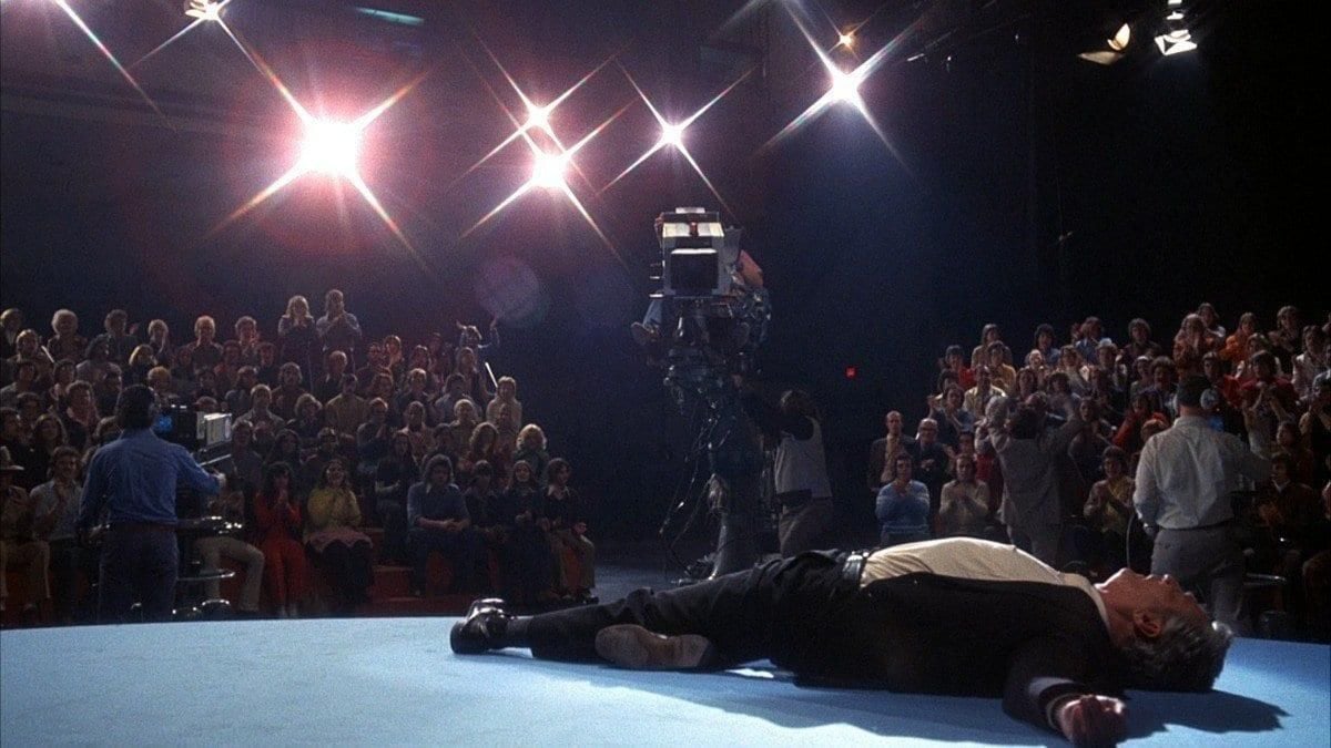
The fact that it was basically a script full of words — beautifully written words, but words rather than action, nevertheless. There were a lot of sequences with long speeches in them and the big challenge to me was how to take a basically uncinematic picture — one that really didn’t call for a tremendous amount of visuals — and give it a nice photographic flavor, a believable setting, and effective mood. My approach was one of trying to give each speech or statement its proper mood, a visual background that was correct for it.
Can you tell me a bit about the sets and locations that were used?
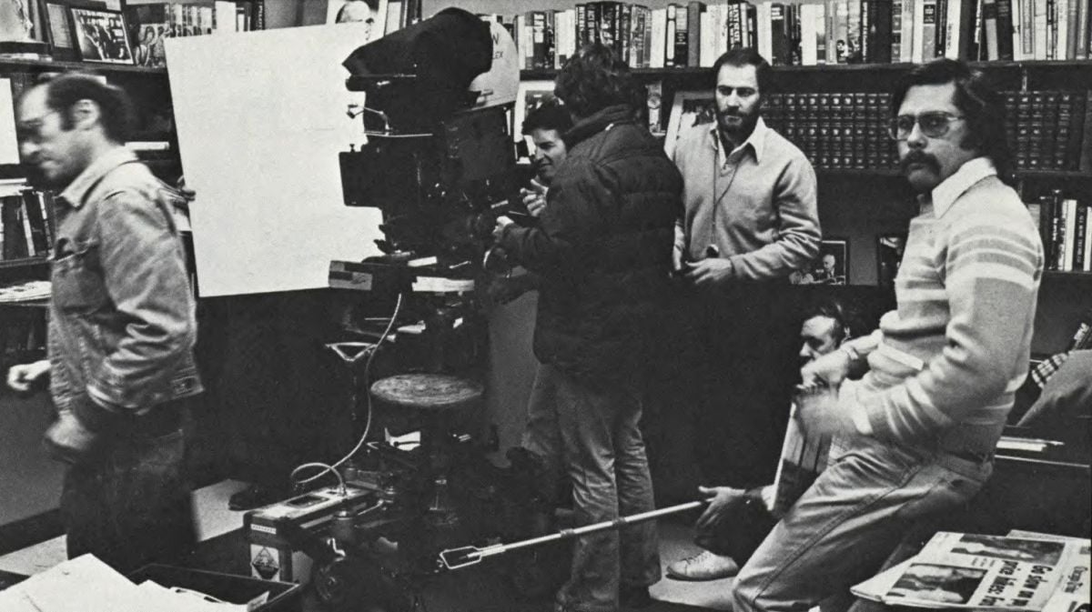
We shot most of the picture in the MGM Building in New York. There was one floor that was empty and that was being considered for rental. So we rented that whole floor and built all the office sets right there in the building, using the exteriors outside the windows of the building as backgrounds, rather than doing it on a sound stage with Translight backgrounds. So, actually, all those rooms were constructed by our production designer and we made them all practical — dressed them and shot them as though we had gone into actual interior locations. We had no wild walls, except for one room, Bill Holden’s office. In all the other sets we shot without wild walls; we just crammed the camera in the same as we would in an actual interior and no matter what the exterior conditions were outside the windows, we had to live with them, as far as balancing light was concerned.
What about the sequences that took place inside the television studio?
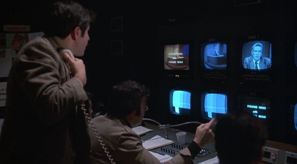
Those sequences were shot in Toronto in an actual television studio. We shot in their control rooms and on their stages, using all of their technical facilities and mixing their personnel with our own.
Was there anything at all that was shot on a sound stage?
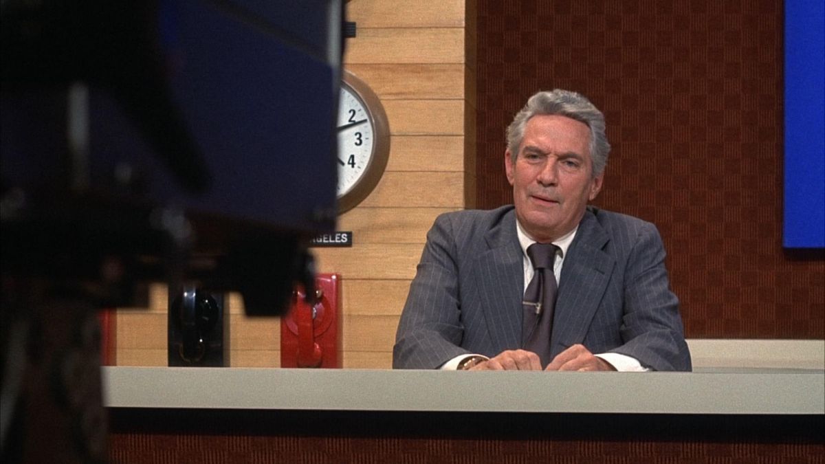
There was one set that was built on a stage. It was a motel room for the little sequence where Faye Dunaway and Bill Holden go up to the Hamptons for a weekend. The motel room was built on the sound stage so that they could have a bit of privacy. There was one more set that was constructed — the newsroom where Peter Finch’s office was located. That was built on the ground floor of some building, but not on a sound stage. The walls were up and the ceilings were there. All we did was dress it and put in some fluorescent lights.
What about the apartments — his and hers?
Those were actual interior locations. Her apartment was one that was in a hotel in New York. It was a duplex apartment — a very small, very challenging place to work in. We didn’t even dress it. Whatever furniture was there was what we used. We just shot it, and that was it. Those were very tiny rooms, however, and again we had the windows to deal with. Bill Holden’s apartment was in another building — another actual location.
What about lighting in these various locations?
One thing I had to bear in mind at all times was that in almost every place where we would shoot, because of the nature of the story, we would constantly have to deal with TV monitors. So everything had to be thought out and planned around the light that was coming off those monitors. Therefore, automatically, I was immediately locked into low-key lighting, as far as the intensity was concerned. So I shot the picture virtually at an average exposure of T/1.8 — something like that. Sometimes we would open up to T/1.1, even on interiors where I did the lighting and the most I ever stopped down to for an interior was T/2.3 — and that very rarely.
But, as you’ve told me before, you like to shoot wide-open. Isn’t that so?
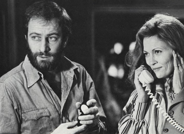
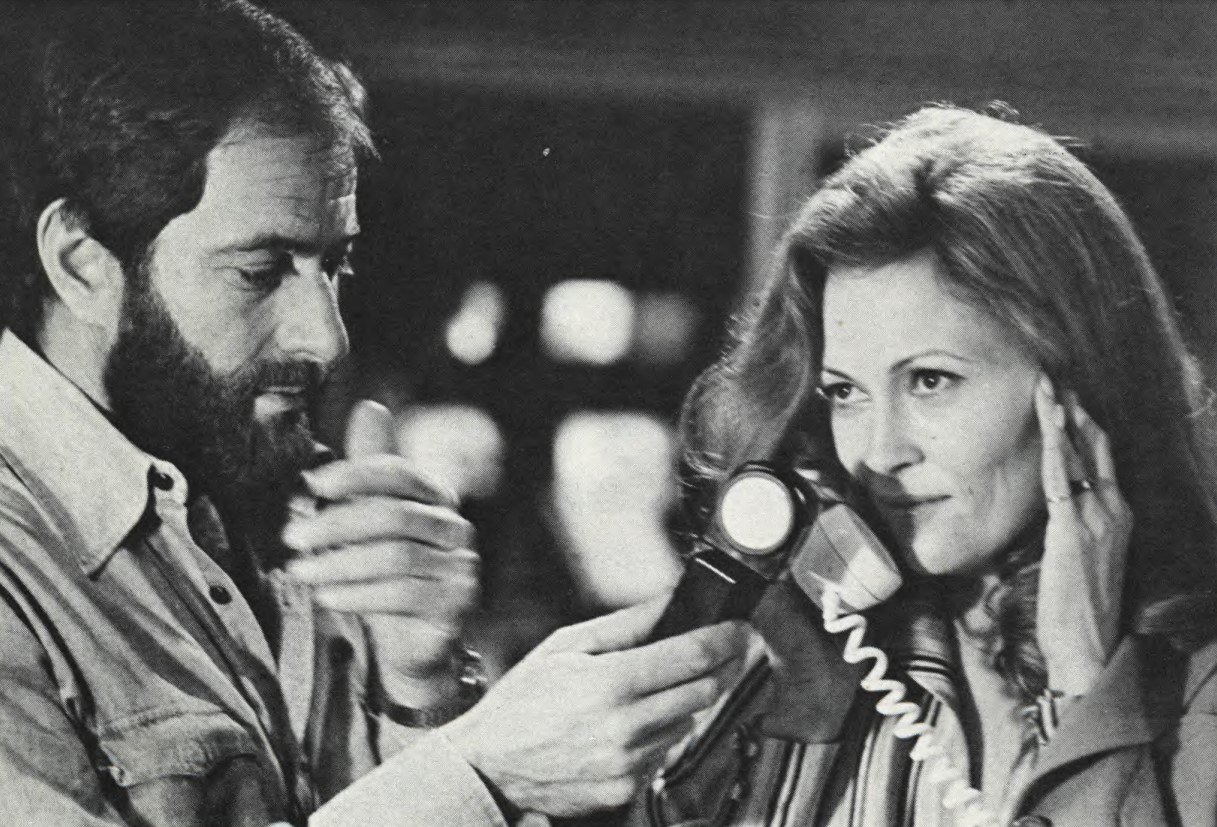
I do like to shoot wide-open, although it sometimes doesn’t work. I like the feeling of lack of depth and I prefer to work at low levels because I like the way the light sort of fills itself in — but on this picture I had to work that way for other reasons. My gaffer, Norman Leigh, is a very clever guy. Every time I threw a problem at him, he solved it immediately. I told him before the picture started that I wanted to work with very low light levels and that I wanted to be able to control the light, which meant working with really small units. If we were to use big units we would have to use so much diffusion in netting them that it would take a lot of time. Also, placing big units in some of the locations where we had to work would be impossible. Sometimes you have to nail units up, and there were places we went into where you couldn’t nail anything onto the ceiling or the walls. You had to do all your lighting off of stands or something like that. So what we came up with were little 25-watt bulbs, “gimmick” bulbs, that we kicked up on transformers. We used the old Colortran transformers and boosted them up to about 180 volts. This 25-watt gimmick light, which is like a little peanut light, has a color temperature of 2500°K to start with, but when you kick it up to 180 volts that becomes 3200°K. It also has a tremendous amount of output at that voltage, which meant that we were able to use the little bulb as a key light. It was terrific.
“Sidney [Lumet] is the kind of guy who is pretty hard not to get along with. He’s terrific. He knows his stuff and he’s so professional and so well-prepared that I can’t say enough for him.”
As a key light — really?
That’s what I used as a key in many of the sets. I used those little 25-watt bulbs.
What kind of luminaires did you use them in?
We would just screw them into Lowel-Light sockets and tape them to the ceiling or walls. You didn’t have to worry about nailing them up, because gaffer’s tape would hold anything of that weight. The problem then became one of how to control these lights, because in a lot of the areas where we were working, we wanted to keep the spill light from hitting the TV monitors and washing out the image. In order to control it, Norman built snoots. One night in Toronto, when I first got the idea of using those little bulbs, I asked, “How can we control them?” Norman went out and bought a bunch of spray deodorants in cans and spent the night spraying them empty and cutting off the tops and bottoms. He painted them black and put in set screws to fit them over the lighting units. Now, if he’d had the proper facilities, this would have been an easy thing to do, but he did it on a Saturday night on his own time in a hotel room, and Monday morning he had everything ready to go. It was terrific, and we used those things for the rest of the picture. It was a matter of using these small units and controlling the light. We didn’t use them all the time, but in the cramped locations, such as Faye’s apartment and the TV control rooms, we used them a lot. In the bigger locations, we could use more normal units.
That’s quite marvelous. It’s so Mickey Mouse — but it worked.
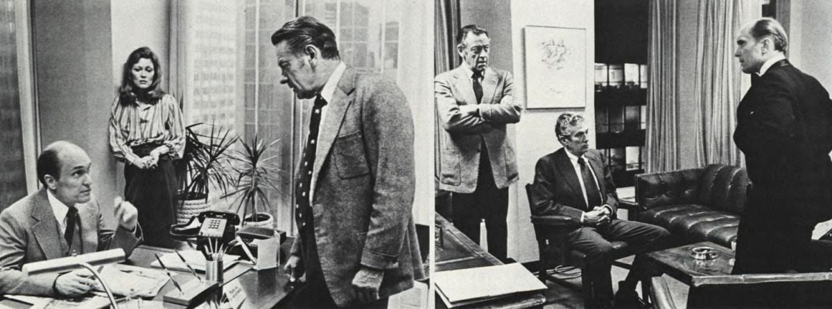
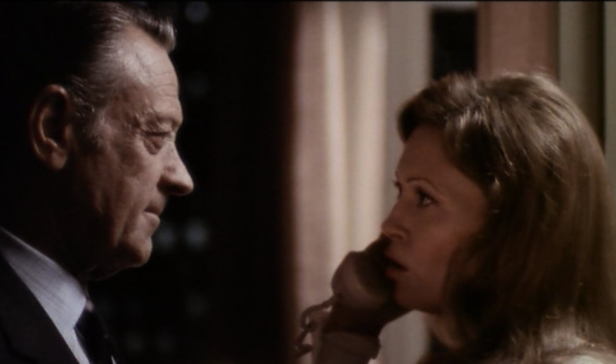
It was fun, too. But speaking of lighting problems, there was one sequence in the picture that was probably one of the most difficult things I’ve ever had to light. That was the sequence that takes place in Bill Holden’s office at night (above) when Faye Dunaway comes in and tries to seduce him. I had to deal with lighted buildings outside the large windows. Remember that this was not a set and those were not backings, but actual Manhattan buildings with lights in the windows. The glass in our windows was tinted to the equivalent of an ND6 filter — two stops, so there was automatically a great light loss as far as the background was concerned. I didn’t want to force develop anything, so I shot everything for normal development. The only way I could balance the interior to the exterior night background was to keep my light down inside to such a level that I could achieve the necessary lighting ratio and a decent exposure, without having to force anything. The big problem was that, in addition to the two glass windows, there was an interior wall that had glass in it. This meant that every time you panned the camera you picked up a reflection of something. Every time I would think of putting a light somewhere, I would look in the glass and there it was. I couldn’t avoid my own lights, so that's where we really started using those gimmick bulbs extensively. We hid them behind everything — up on the ceiling and behind posts. We lit the whole room with those lights and it worked out great because they were low enough in intensity to be able to balance with the lights of the city background. It was really a very challenging way to light.
In the past few years, it has become the vogue to force everything at least one stop, and sometimes two stops. Why didn’t you want to force anything, when you would have had a legitimate reason to do so?
It really goes back to a conversation I had with Sidney Pollack a couple of years ago when I was doing Three Days of the Condor. Sidney wanted me to shoot Condor with a look of realism, but he didn’t want that kind of deteriorated, gritty look that you get sometimes when you force develop. He had a fetish about force developing; he just hated the look of it, and I tried to convince him at the time that force developing was fine, because I had used it for everything up until then. But we made some tests and decided to shoot the film without forcing and I got to like the look of it so much that I decided to take chances in doing many different things that way. Whereas I’d always force developed, now I automatically did it without forcing, and I found that I could underexpose without forcing and get just as good a look as I had been getting by forcing.
You just underexpose and print it up a stop or two?
Well, I never like to go so far under that I have to print up two stops, but I find that, within certain tolerances, you can do it. I have forced certain shots at night where I knew that I could use a little extra punch in the highlights. But I’ve recently done a lot of tests with the new 5247 film and found that I didn’t like the results of the force developing as much as I did the normal developing. I find that the normal developing gives it a much softer look. At two stops the effect of forcing is almost a myth. Nothing happened for me, except that the stuff deteriorated. When you force 5247 it doesn’t grain up at all like the 5254 does, but you get a milkiness that’s not very nice. Consequently, when approaching Network, I knew that storywise it should have a good, clean, crisp look. I pictured full colors and rich blacks and a certain prettiness because I was photographing stars like Faye Dunaway who wanted to look good. Anything that would detract from that, I thought, would be detrimental to the picture. I found that it was just as easy to work at low light levels with the new fast Panavision lenses and not have to force develop. I knew that I could shoot at T/1.2 and not have to worry about it — that the result would be just as good as if Td shot at T/4. When you have equipment like that you don’t have to push the film.
Can you tell me about the night exteriors in the picture?
Actually, there weren’t many night exteriors, but for the opening drunk sequence, I made a wide shot with the 55mm lens at T/1.1 without forcing. The closeups I lit, but I used only about six footcandles of light, shooting at T/1.3, and found that it was enough. I was really bouncing light against the available light of the streets. I tried to do it without any added light, but I found that it didn’t look good that way. So I added what I needed, which was just a little bounce light to give modeling to the faces and make them look proper. Then we went into the bar of the Warwick Hotel to do the rest of the sequence and I lit the whole scene with two inky-dinks. I bounced one off a white card and shot the other one through a piece of diffusion as a kicker for separation. My key light there was five footcandles. That was one of the few times in the last couple of years that I’ve really been nervous about a scene because I thought maybe I overdid it this time. I shot it at T/1.3 and refused to force it — and it printed right in the middle of the scale. Because of all the blacks in the room, if it had printed any lighter, it would have gone grainy. You might say that I half-lucked out on it. It was a sort of calculated risk.
Can you tell me how you handled the sequences in the offices for daylight shooting with those huge expanses of glass in the background?
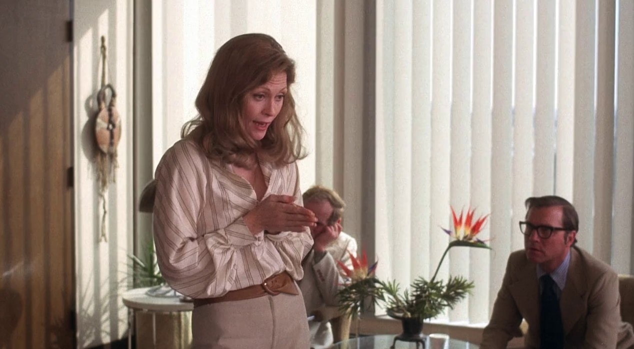
I find that we are so limited by what is available to put on windows that it’s really a crime. In this day of modernized equipment, we have some tools that are very antiquated and one of them is what’s available to put on windows. If you put an 85 gel on the windows you have to deal with wrinkles, and if you put on a piece of 85 acrylic it’s not the right color; it’s much too pale and the outside goes too blue. So, as a general rule, I try not to put 85s on the windows, unless I'm at a distance where the wrinkles won’t show. In the case of Network, we were right on top of the windows and the background was very important. I was also dealing with fluorescent light a lot, and it’s very difficult to balance fluorescent light to anything. Well, Norman came up with these fluorescent lamps that are an absolutely perfect match to daylight. So I used these lamps and NDs only and not 85s. I used acrylic neutrals, the hard plastic ones and, by cutting them to the exact size of the windows and then interchanging ND3s and ND6s and sometimes combining them to make ND9s, I was able to use the light in the room. I also used HMI lights to augment the fluorescents and found them to be a perfect daylight match. By using the combination of HMI lights, fluorescents, daylight and the NDs, I was able to keep everything in the kind of balance I wanted. I tried to vary it, however. Sometimes I’d go with the outside brighter and sometimes a little darker, just to give the feeling of different times of day. The acrylics were not the greatest either. Some of the neutrals were imperfect and I would have to cull the best of the lot and switch them around constantly. I hope that someday someone like Rosco or Lee will come up with perfect acrylics or gelatins in matched colors to shoot through — something we can use.
Did you have any flicker problem with the HMI lights?
No, none at all. I did some tests with them and had no problem. I found them to be a godsend. They were really wonderful. They threw out a lot of light and were easy to use. All you had to do was plug them into the wall. The only problem with them is that they’re enormously expensive to rent. However, if you can find a way to use them and only them, you can eliminate a lot of other things.
In a film like Network that calls for carefully articulated mood in various sequences, how handicapped were you by working in small rooms in actual locations where you could not really put lights exactly where you wanted them?
I never really felt hampered by it. Small locations don’t bother me. Once you learn to work with units the size of the ones we were working with, you can learn to shoot in a closet and there’s no problem in creating the mood. Creating a mood in a smaller room, especially if it is a low-key mood, is actually easier. I really didn’t find any places that presented any great challenge, as far as that goes. The bigger places were the great challenge.
Can you tell me about those?
We had a sequence to shoot in the Grand Ballroom of the Plaza Hotel. That’s the room in which Faye Dunaway gets up to give a pep talk to a group. It was a huge room with a load of extras and there was really no place to rig lights. In any case, rigging it would have been an enormous undertaking. So, as usual, when I go into places like that, I tried to devise a way that we could utilize a lot of the existing light and then just augment where necessary.
“I had the production designer get lamps for each table with red shades. We put gimmick bulbs inside those shades and kicked them up on a Variac to the right intensity so that there was at least a little light to focus your attention on — so that there wasn’t just a big black mass in the middle of the room.”
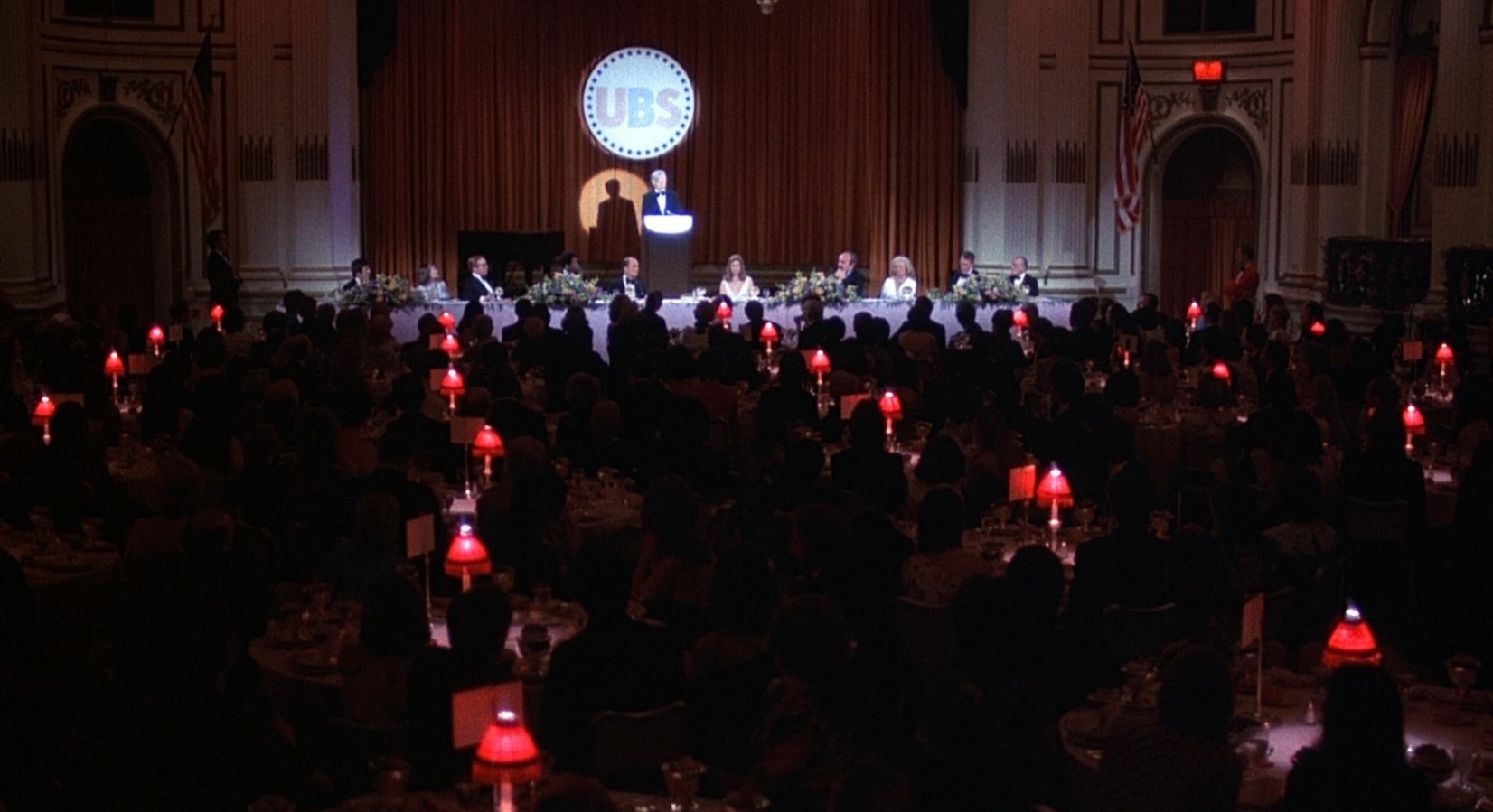
Then I used a couple of Super-Trouper follow-spots to light Faye and placed just a couple of other lights around to pick up the people on the dais. I bounced a couple of lights off the ceiling to inject a bit of spill light into the room. I discussed that one with Sidney Lumet and we decided to keep the room very dim, so that you knew people were there, you could feel them, but your eye wasn’t necessarily drawn to them. It was a challenging room to light. Sidney works so fast that you have to think fast and be fast to keep up with him. Otherwise, you can see him walking up and down behind you and, even though he never pushes you, he works at such an extraordinary pace that it’s always a challenge to keep up with him.
What about that huge exterior of the building where you had lightning and all that?
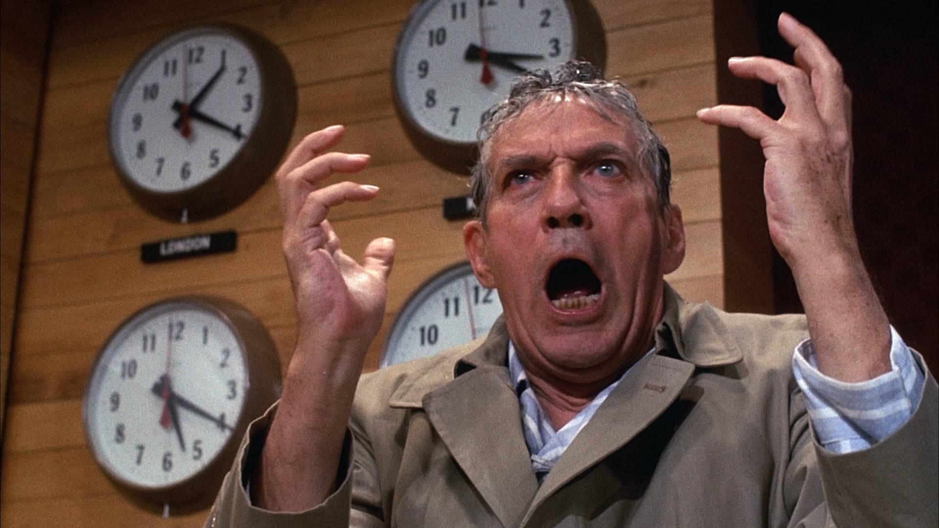
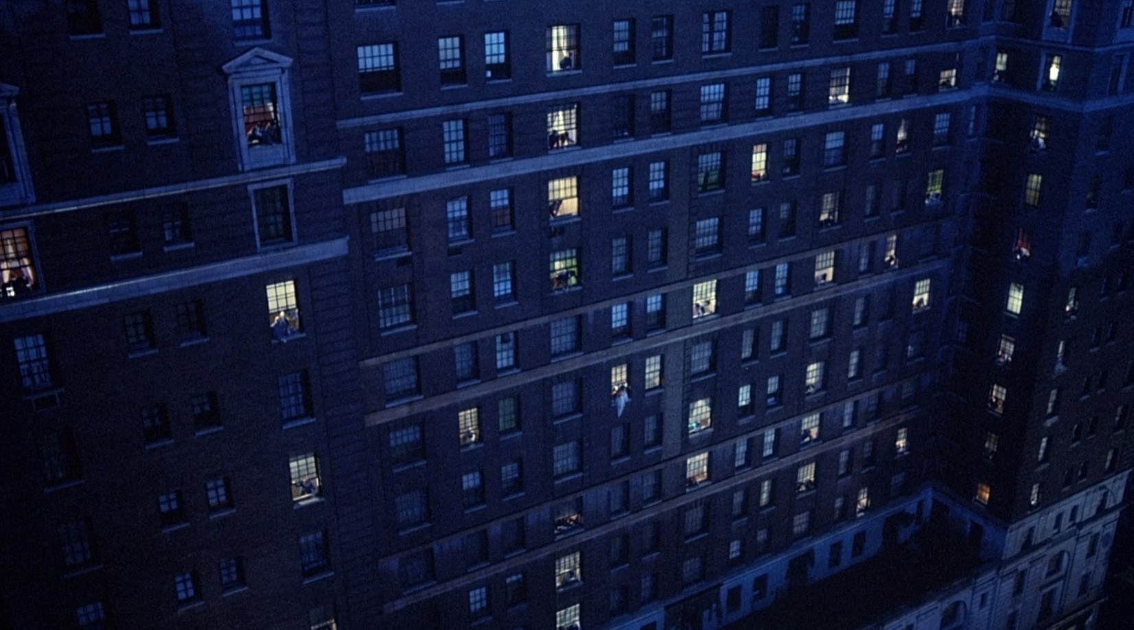
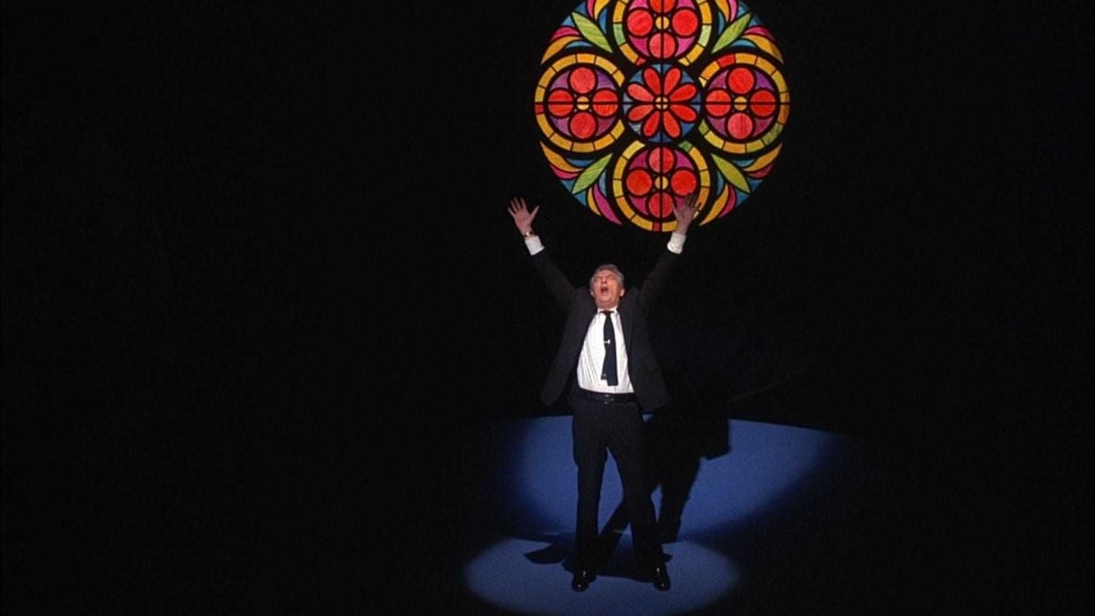
We actually did that after we’d finished the major shooting on the production. We did a sort of second unit thing and it was supposed to be a lot of intercuts for the sequence in which Peter Finch yells out the window, “I’m mad as hell and I’m not going to take it anymore!” We decided to give it a little extra visual punch by having it take place just after a rain, with lightning still in the distant sky. Well, that became the biggest shooting of the picture. We went out and did the whole thing in two or three nights and ended up by having fire trucks with water hoses to wet down all the buildings so that we could get a little sheen from the water dripping off the windowsills. There were huge cherry-pickers with lightning machines on them and we used one lightning machine to light each building. What you do is take a cluster of maybe five carbons and put them together on one machine, and when you strike that you could practically melt the generator with all the current that it draws. It really creates a terrific effect. Then I had to light the people in each room of the building, which wouldn’t have been so bad had it been a normally operating building. But our widest shot was of this huge building that was actually abandoned. There was no electricity and no elevator, so the electrical crew had to carry lights and cable all the way up to the top floor and spread out and get in there and put up lights in the rooms. What we used in there was strictly a Baby and a Lowel Light in each room — one to bounce off the ceiling and one to backlight the people at the window. There were a couple of arcs on the street just to wipe the buildings so that they had some light on them between lightning flashes. Then there were these huge lightning machines which we mounted either on a cherry-picker or on a roof across the street. We would shoot a section and then jump to another area and maybe do two or three a night. It was really a lot of fun because it was so well done, so well coordinated. Freddie Caruso, the production manager, had everything laid out perfectly. He always knew where the lightning machines should be, where we needed the wet-down and everything. It turned out to be a really massive job of coordination and it went very smoothly. We worked for just a couple of hours each night and knocked it off.
What kind of carbons did you use in the arcs and the lightning machines?
We used two different kinds — one for the arcs cross-lighting the building and another kind for the lightning machines. I had to keep the color temperatures a little different in order to go for a bit of extra effect. I would normally use yellow-flame carbon for the lightning effect, because it still goes a little cool without a correction and that’s probably a color that’s truer to what real lightning would be — if you could say that real lightning has a color. But, in this case, we used a little white flame carbon and made it blue, so that the lightning looked blue. Sometimes you go overboard and just go for an effect, and that’s what we did in this case. It’s something that I normally don’t like to do, but in this instance, it didn’t bother me. That’s a bizarre sequence anyway.
You mentioned camera movement earlier. Could you comment a bit more on that?
There was nothing extraordinary about the camera movement in Network. Most of the movement came in wherever we had the space, and that was mainly in the TV studio. We did a lot of it there. In general, Sidney likes to work a lot with cuts, but he will put in definite moves — and very important moves — when they’re dramatically called for. But he’s not a believer in moving the camera just to move it, and I agree with that theory totally. I don’t think the camera should ever move unless something makes it move, an actor or a situation. In that respect, our camera movement in this picture was very straightforward. I don’t think there was anything that would catch your attention so you would say; “Wow! What a great camera move that was!”
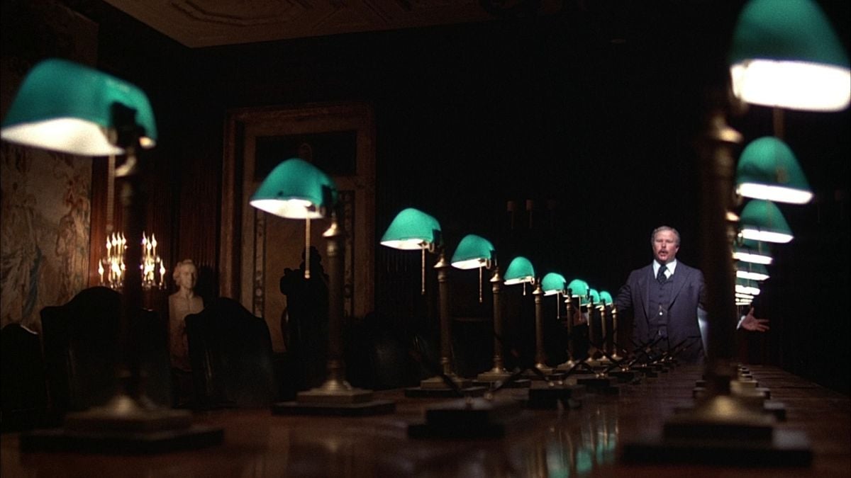
What about the more stylized aspects of the picture — like that stunning dramatic sequence between Ned Beatty and Peter Finch?
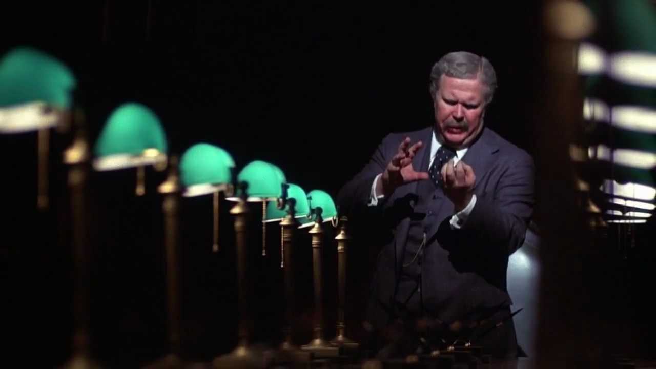
That was an interesting situation because we shot it in the conference room of the New York Public Library. It’s an old room with beautiful carved ceilings and tapestries on the walls. There are gorgeous chandeliers and furniture and rugs. One of the stipulations was that we couldn’t rig anything in there, so I couldn’t hang anything on the ceiling, which considering the size of the area, made things very difficult. So we again fell back on the theory of taking what was there and augmenting it. For example, there is a big light change at the start of the sequence, when he dims the lights down. For the initial lighting scheme, we clipped a couple of Lowel Lights onto the chandelier and bounced the light off the ceiling. Then we used a little bit bigger bulbs in the sconces to get more intensity, and we used lights on stands to pick up the tapestries in the room. We also had bulbs in those green lamps that were strewn along the table. That was the basic lighting before the lights went down. There were chandeliers all around the room and we had those lit with nothing extra, just what was in them. I was shooting at probably T/1.6. When the lights dimmed down, we just left the lamps glowing on the table, and I had one light, a SuperBaby, coming down on Beatty from the chandelier. It was like an inkie with a Baby-sized bulb in it — a small but powerful unit, just like a spotlight. In addition, we left the wall lights on and one chandelier on the wall. When Beatty walked down the length of the table I wanted to keep him in total darkness, but where he would go black against a black wall, I would just take a bit of light from the floor and backlight him. Where he walked past the marble fireplace I silhouetted him by throwing a little splash of light on the fireplace. Then when he came around and stood over Peter Finch and was supposedly lit by the big chandelier, we placed a light directly behind his head and put it on a Variac and when he stepped into position we brought it up so that his head was glowing like he might be God — as he was stating that he was. That sequence presented an interesting challenge — working with light and shadow and trying to get it very dramatic. That’s probably the one that I’m the most proud of in the picture. It was interesting and fun to do.
Earlier you mentioned the problem presented by having TV monitors in so many of the scenes. Could you discuss that a bit more?
The most difficult thing is to keep the proper balance of light on the faces while maintaining good color temperature on the TV tube. You have to keep the ambient light from hitting the tube also.
What have you found the color temperature of the average TV image to be?
It’s about 6500°K off a TV monitor — somewhere in that area. There are four different methods of handling the color temperature problem. One is to work with a color corrector. You can hook this device up to the set and balance up by eye. You can change your balance to 3200°K and then flip the switch back and forth from normal to 3200°K. However, I tried some tests with that and found that it's not that accurate. Another method is to adjust the controls on the TV monitor to 3200°K. You can just take them all the way down and make the picture very red. I’ve tried that method in the past and it works, but it’s not consistent. Then there is a third method of adding an 85 to the tube and that works fairly well, but it’s not quite a full-color correction, since you are correcting from 6500°K. I would suggest using an 85+ in the Rosco series. The method that we used in the TV studios was to take a video camera which is set at 3200°K and aim it at a TV monitor so that you have the image from the monitor on camera. Then you can adjust the TV monitor to 3200°K electronically by using a scope and match it perfectly to the camera. This method is very, very accurate.
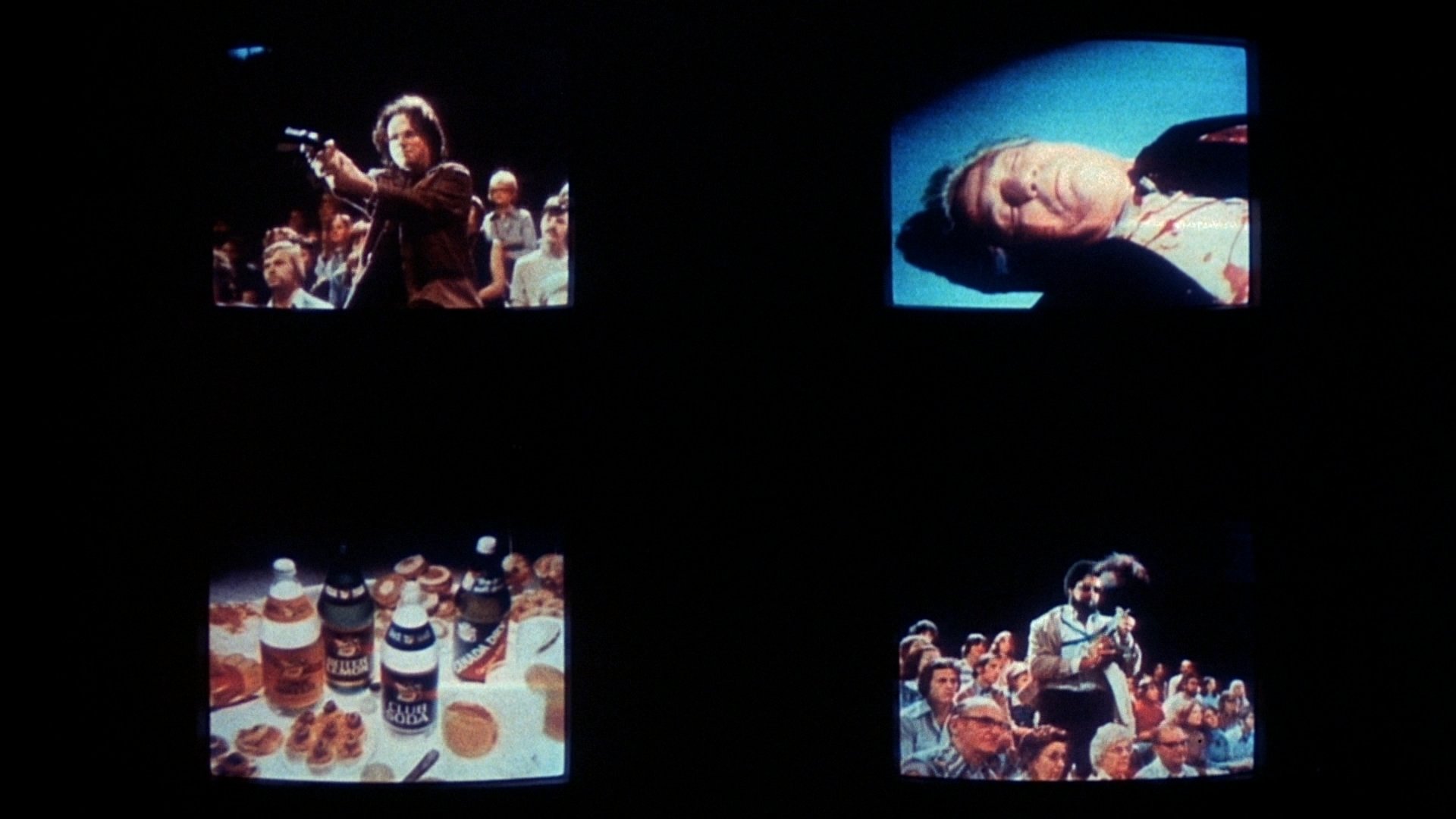
What about the flicker bar problem?
Well, that’s always a big problem, but the basic solution is to shoot with a 144° shutter. I’ve tried many different things to solve the problem and I finally settled for a 144° shutter that Panavision installed for me. Instead of simply adjusting the shutter down to 144°; they actually ground the shutter to exactly 144°. So we used that camera when we were shooting the monitors, which was most of the time anyway, to make sure that we always had 144°. But, even so, we would still see the bar every now and then. It was the craziest thing, but I think it was due to a variation in the frequency of the video system that occurred from time to time.
Were there any other photographic challenges on Network that we haven’t discussed?
Sometimes Lumet would want to do a very slow, difficult, concentrated moving shot in order to point up a strong story point. He’s the kind of director who, once he’s rehearsed and the actors are swinging, would love to get it in one take. He doesn’t need protection. He’s got a lot of confidence. So, when you shoot it, you’ve got to get it the first time. Fortunately, I had a great operator, Freddie Schuler, and a great assistant, Tommy Priestley, and between the two of them they could jump in and do the shot with one rehearsal, or without any, and they’d have it. It makes things so much easier when you have guys like that working with you.
And what kind of working rapport did you have with Sidney Lumet?
The very best. Sidney is the kind of guy who is pretty hard not to get along with. He’s terrific. He knows his stuff and he’s so professional and so well-prepared that I can’t say enough for him. He’s great fun and he controls everybody so well. Working with him is really a pleasure.
