Shooting Vortex: The Ultimate B-Movie
The cinematographer details his creative visual approach, created in the face of a tight budget and high goals.
This article was originally published in AC March 1983.
Editor’s Note: Vortex is a low-budget feature which premiered at the New York Film Festival in the fall of 1982, and received a great deal of critical acclaim because of its striking visuals. The images in this article are reproduced from frames of a 16mm print of the film.
The work of Scott and Beth B was slightly familiar to me at the time I was summoned to their loft in Soho. Their films had been shown all over the world, and The Village Voice had listed their latest, The Trap Door, as one of the 10 best films of 1980, sandwiching it right between the latest works of Godard and Resnais. This was despite the fact that all the B’s films had been shot on Super 8.
Now they were planning their first 16mm feature, Vortex. Having seen and liked The Trap Door, I was quite excited as they described a thriller chronicling the rise and fall of Anthony Demmer, a would-be successor to the throne of Frederick Fields, a Howard Hughes-like chairman of a large defense corporation. Paranoia would set the tone as Demmer’s quest for power led him to slowly cut off all communication between Fields and his employees. Such material, combined with the B’s desire for a severe visual style, provided the opportunity for very dramatic lighting.
The production would heavily utilize the B’s loft as a “studio.” We had a four-week shooting schedule, and the largest budget the B’s had ever worked with: $20,000.
Having just completed shooting a 16mm blow-up feature for $300,000, I had thought I knew everything about low-budget features; obviously, I still had a lot to learn.
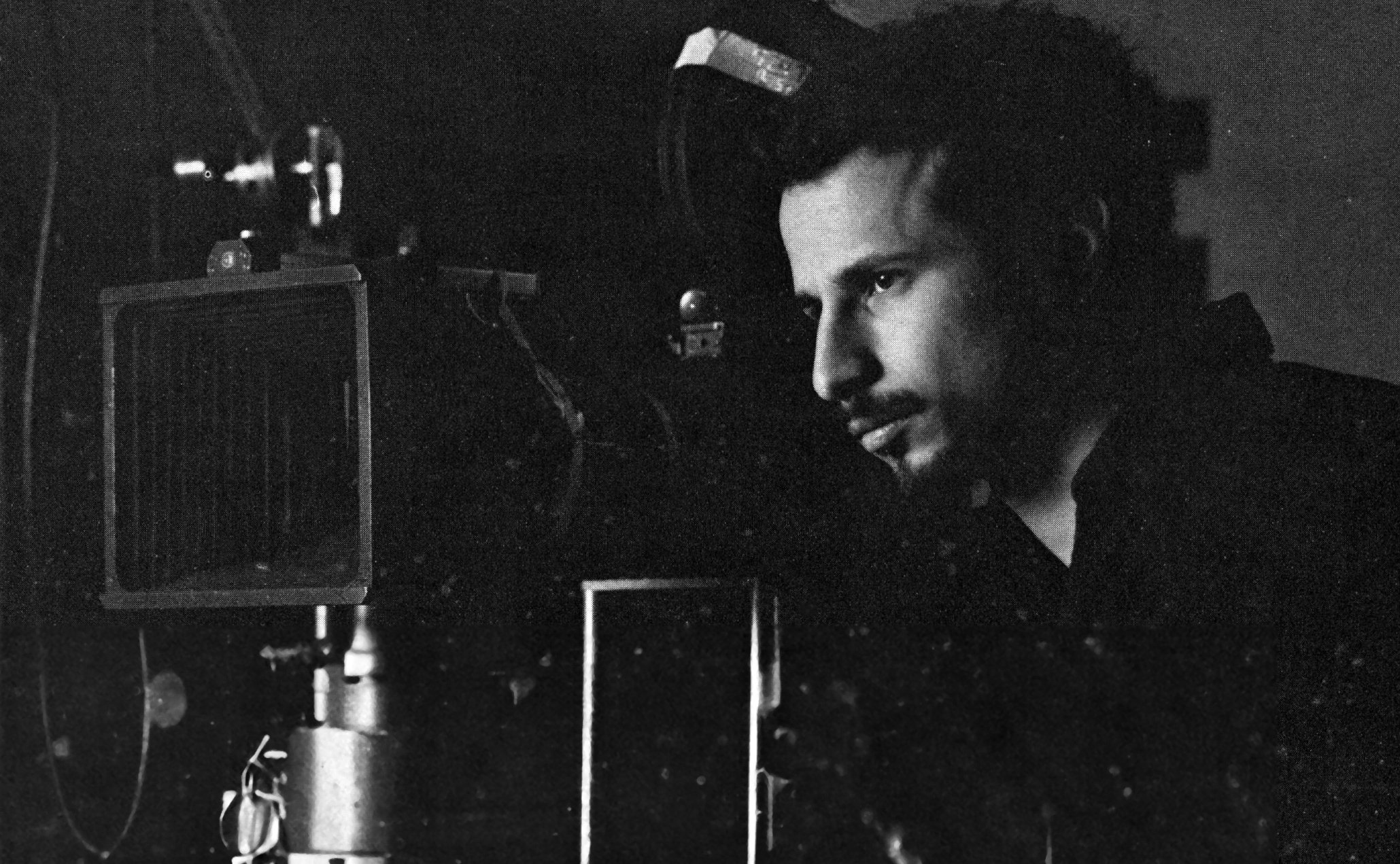
As with most New York based low-budget features, the director of photography must participate actively and aggressively in the budget and preproduction process in order to have a chance at squeezing some image quality from extremely limited financial resources. Getting decent equipment and an experienced crew were the immediate, yet concrete, problems; achieving sufficient production value might be more elusive.
Most of the films associated with the New York scene take advantage of the natural location of the city. For example, I achieved a great deal of texture photographing Forty-Deuce for Paul Morrissey, despite a miniscule amount of money, because we utilized the streets, subways, and other easily accessible public spaces of New York City. However, the action of Vortex took place in the world of multi-billion dollar conglomerates, locations we could neither afford to rent nor build in a convincingly realistic manner.
Fortunately, a creative approach to this situation was facilitated by the directors’ concept for the film. When I asked for examples of what they wanted the film to look like, Scott and Beth repeatedly discussed the expressionists archetypes of the early Fritz Lang films, implying that our emphasis would be on revealing the psychological subtext of the material in an abstract visual way. Realism became irrelevant; working with very simple set elements, our challenge would be to express the feel of a large, oppressively powerful corporation purely with light.
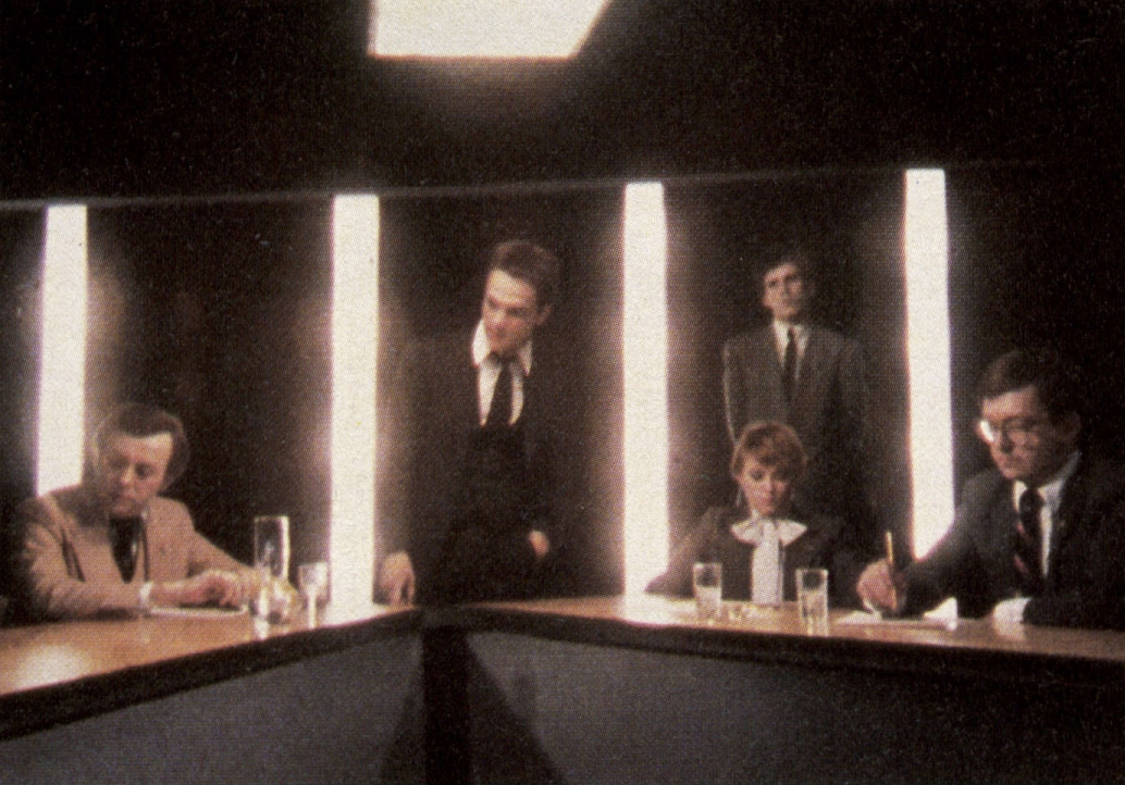
In addition, there would be the opportunity to create the feel of black-and-white images using color materials. Given my long-standing proclivity for the expressive use of light as a dramatic force, and the enthusiastic encouragement of the B’s, I hardly felt confined within the tight budget of Vortex, on the contrary, I felt as if I had just been unleashed.
A major concern was finding experienced crew members, since paying upfront for their labor was out of the question. Luckily, four experienced crew members with whom I regularly work agreed to join us on the project for a deferred payment contract and the “artistic satisfaction” to be found. They were: Mike Trim, gaffer; Arthur Blum, key grip; Dan Ehrenbard, best boy; and Maryse Alberti, assistant camera. These were the only people working under me with any experience beyond that of Super 8.
The lighting package which the B’s owned was consistent with the style of their films: minimal. It was composed of two antique 500-watt Fresnels with no provision for mounting on stands, a 1K Kliegl Fresnel and two Lowell D lights. Obviously, this would not be enough.
I turned to a person who has helped me out many times in the past, Nick Smith, who runs one of the more successful stages in Manhattan (my first job in the industry had been working for Nick as a stage manager). Nick was able to help by opening up his storeroom of old and rarely used equipment and offering the use of whatever we could clean or fix. We were able to salvage three inkies, three babies, one studio junior, one 2K cone, six grip stands, and an odd assortment of flags and silks. In addition, we were allowed the occasional use of a Worrall head and an Elemack dolly.
We purchased an old TV 2K Fresnel and, in order to simulate the effect of an overhead fluorescent fixture, built an instrument with FCM bulbs and diffusion material in a deep rectangular box. Along with gels and foamcore, this formed the lighting package for the entire film.
A state-supported arts agency supplied the camera and sound package and $1,200 got us an Arri BL, Zeiss 10-100mm zoom, tripod and Nagra IV sound outfit for four weeks. (Prime lenses were out of reach because of the necessity for a separate prime lens camera housing.) We used my own effect filters, and purchased our film at a discount from Rafik’s raw stock center. During production, processing and printing costs were reduced by downloading unacceptable takes of long-running shots whenever they were on the head of a roll. Two days of preproduction were used to build our “fluorescent” fixture, fix and clean the Fresnels, make a power distribution system, do filter, exposure and camera tests, and hang a rudimentary lighting grid in the B’s loft by expanding and reinforcing their sprinkler system.
As with many low-budget films, one of the larger budget items became the cost of meals, despite having them cooked by production assistants in the B’s own kitchen. Our goal was to use light expressively in a style similar to that of early silent films. This immediately suggested the use of a hard light technique, a method with which I had had considerable experience, particularly while working with Dean Cundey [ASC] in California.
I felt that hard lighting’s implicit use of a discreet instrument for each specific purpose was the correct approach for dramatizing the story of Vortex, yet it would have to be used in a heavily modified way. The short light-to-subject distances we were dealing with, and the inherently higher contrast of 16mm’s 7247, using Fresnel lights “clean” would have produced an uneven and excessively harsh beam. Consequently, we placed diffusion (at least on opal frost) over all the Fresnel instruments illuminating actors in the foreground. Two or three layers of spun glass on the inside of the barndoors of the studio 2K provide a “soft” key for actresses with a “hard” feel. Such a round soft source provided a gradual quality of light fall-off superior to that of the rectangular Mole Supersofts, while the barndoors afforded us the kind of control consistent with the other instruments we were using.
Also, we did not let the quest for a high contrast look eliminate the use of proper fill light. Any actor’s face close enough to be discernible was filled enough to give the glimmer of detail necessary for a richly textured image. I felt that other attempts to create a black-and-white feel with color materials by using clean hard light and/or eliminating the fill had an inappropriately harsh quality and, since the correctly exposed color areas tended to “pop,” actually worked against creating a seamless, subjective impression of black-and-white.
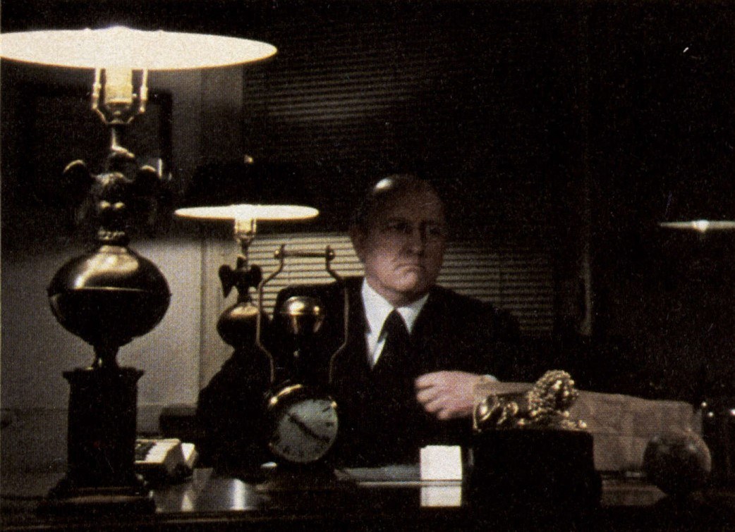
In Vortex, the main thrust of our attempt to recreate the stark, high-contrast feel of the old expressionistic movies was through the careful control, and frequent elimination, of all color in our subject matter. The wardrobe of most of the actors was limited to black, white, and shades of gray, as were the sets.
When faced with colored walls that couldn’t be altered, we would either allow them to fall into darkness or burn them out into white with light well over key level. This burning out and shadowing technique also allowed us to surround the actors with an environment of deep blacks and brilliant whites, creating an impression of high contrast without having to coarsen the middle tones of the actors’ faces by eliminating the fill. Having thus produced an image of rich skin tones surrounded by a patina of white, black and gray, we would then introduce a single color, frequently red or green, in order to set the tone of the scene and increase the visual interest. This would usually be done with a practical source, such as a fluorescent light (sometimes exaggerated by green tint applied over the tube) creating a highlight or color effect. In addition, the colors were roughly selected to correspond to dramatic elements of the script. For example, we used our green fluorescents, plus-green gel, and burning-to-the-edge-of-flaring practicals in scenes set within the corporation, in order to create a paranoid feeling that the light sources themselves were malevolent forces, powers that were corrupting and destroying everyone in the building.
One scene in which Anthony Demmer (played by James Russo) is shuffling around Frederick Fields (Bill Rice) to keep him out of touch with everyone else, is an example of the situations we found ourselves in and how we responded to them. Although the scene was supposed to take place deep within the corporate headquarters, the location was a stairwell in an old NYU building, which, with a rusted-out radiator on the wall, hardly suggested the wealth and power of a major defense corporation.
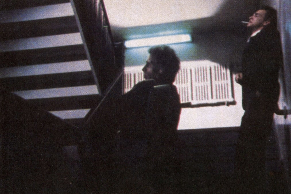
We placed a junior on the landing one flight above and directed it at the back wall. It was spotted up to a level well over our normal key of 125 footcandles, burning out the wall and turning the rusted radiator into a graphic pattern. In addition, it simulated the bottom half of a fictitious pattern that the fluorescent fixture might have created on the back wall (a baby with flags set on the landing completed the top half of the pattern), and threw a shadow of Demmer’s figure on the back wall as he climbed the stairs leading out of the frame.
Babies with diffusion were used to illuminate the speaking and static positions of characters in the foreground; as they would move toward the background, they would slide out of the key and into silhouette. Fill light was bounced off a card on the right wall next to camera so it would fill the characters without affecting the walls. In addition, green (Rosco plus green) backlight enveloped the characters, justified by the fluorescent in the shot and imaginary others hanging above. Because it was a backlight, it did not distractingly distort the characters’ skin tones, but nonetheless suggested a creeping evil quality, as if the fluorescent lights were insidiously eating away at these people, behind them at every step.
The final result, with its dark foreground and bright background creating a cavernous depth, gave the impression that they were within the huge, hostile environment of a fascistic corporation, within the style we set out to achieve.
A similar example was the group of scenes shot in what was to be the “company bar” of FieldsCo. The location available was the tackiest of bars, a bare-plywood version at Club 57 in the East Village. Art director Tom Surgal and set dresser John Loggia did a brilliant transformation with only some black paint, chrome tape, and the B’s mirror. With the addition of cross backlight, minimal fill, and a few effect lights (a gold under-the-bar light, and fluorescent tubes painted green receding into the background of the mirror), we achieved an expensive, high-tech look subverted by the ominous effect lights suggesting unknown dangers.
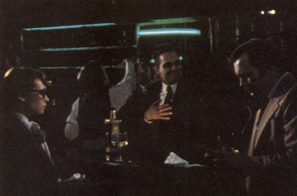
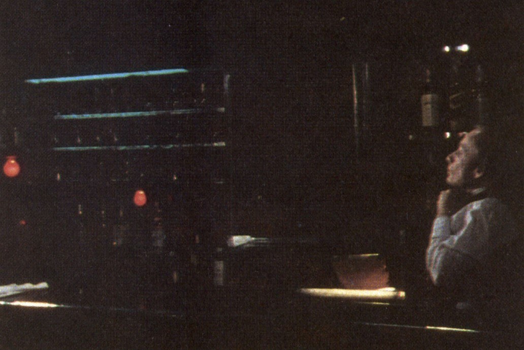
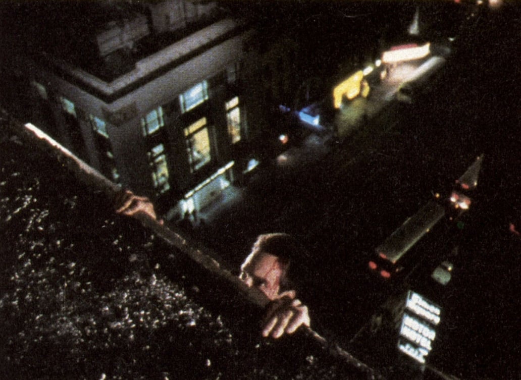
Some of the distinctive marks of the film are the extremely long takes. Each of the aforementioned shots ran over five minutes, and they were by no means unusual. On the longest take, we ran over eight minutes without cutting. The challenge, consequently, was to find staging concepts (and, occasionally, camera movements) and lighting that were dramatic yet dense enough in detail to remain interesting under such continuous scrutiny. The most effective and elegant use, I believe, of the extended take is a scene in which Demmer and Angel Powers (played by Lydia Lunch) hurl accusations at each other as the open-topped elevator in which they are riding rises slowly toward the camera. At the beginning of the shot, the elevator is so far away as to be only a tiny square of light within a black frame. As the elevator approaches, the arguments rises in pitch until, by the time the elevator has filled the frame, the characters are locked in a life-and-death struggle for control of Powers’ pistol.
The entire scene was lit with a photoflood bulb in the overhead fixture, streak-and-tipped and masked with showcard. By using such high contrast lighting and intense color in a film intended for blow-up to 35mm, we were pushing the 16mm stock to the edge. With highlights and shadow areas placed at the very limits in which detail would still be visible, printing became extremely difficult. Density and color variations of as little as two points critically affected what was visible and what was not.
Having already fixed an aperture and key level based on preproduction tests, we determined to similarly fix the printing lights within the first week of production. With the admirably consistent processing we were getting at Technicolor, we were now able to control all the variables affecting the final image. We could take risks and get immediate, true feedback on their success.
Being starved for light with our Zeiss zoom’s maximum aperture of T3.3, we determined that 125 foot-candles was the minimum key level necessary to give us the rich blacks we desired (at a printing light in the low 30s). This aperture and key level were subsequently maintained on every interior of the film. Having cleaned all of our instruments, and using Vs CTO and Vs CTB gels to fine-tune any imbalances, the fixed light procedure produced a rich workprint that was true to both flesh tones and the colored effect lights we were using.
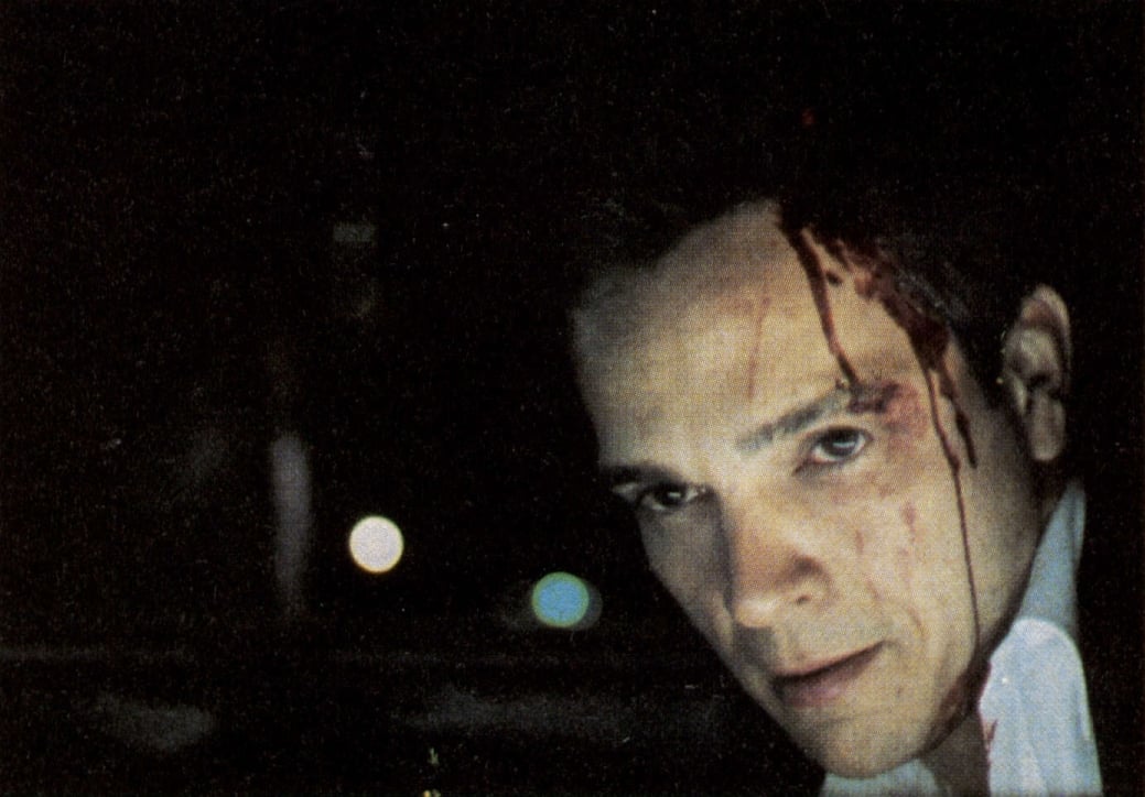
Ironically, given our rigorous control of exposure, the “fill” level on Vortex was set by eye. I feel that although meter reading can provide perspective on how far off one is getting (and can serve as a safety net when the eyes get tired after a long day), I have gotten better results when setting the fill level visually, so Vortex was lit accordingly.
As so often happens on independent films, the $20,000 initially available was only sufficient to get Vortex in the can. Although the principal photography was completed roughly on schedule in May of 1981, it was not until September, 1982, at a final cost of $80,000, that we had an acceptable answer print. In between, the B’s spent months just raising the money necessary to complete the film, in addition to tending the editing, music composing, recording, and other “normal” functions of post-production.
Perhaps the most cathartic moment for me occurred as a pick-up shot done in January of 1982. The B’s had decided that using stock footage of a burning building would not do justice to a scene in which FieldsCo uses its “beam field weapon” to destroy the factory of their competitor, NAVCO. Instead, the B’s returned to a suggestion I had made during production, which was to do the scene as a miniature.
Because of our non-existent budget, and the limits of 16mm grain and registration, opticals were out of the question. Our effects would be done in-camera.
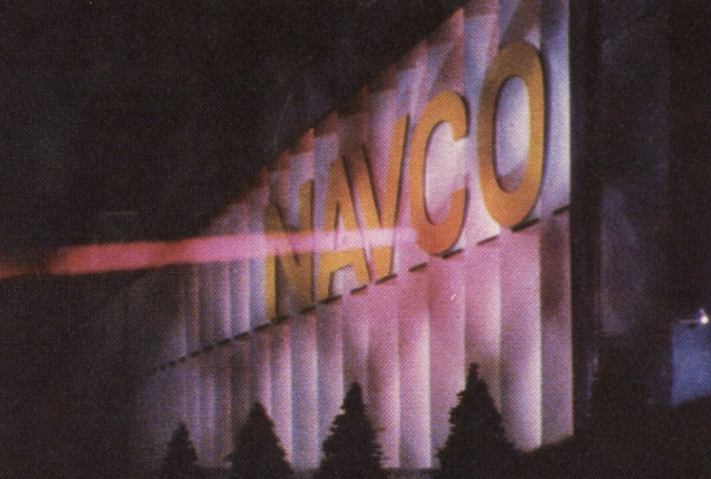
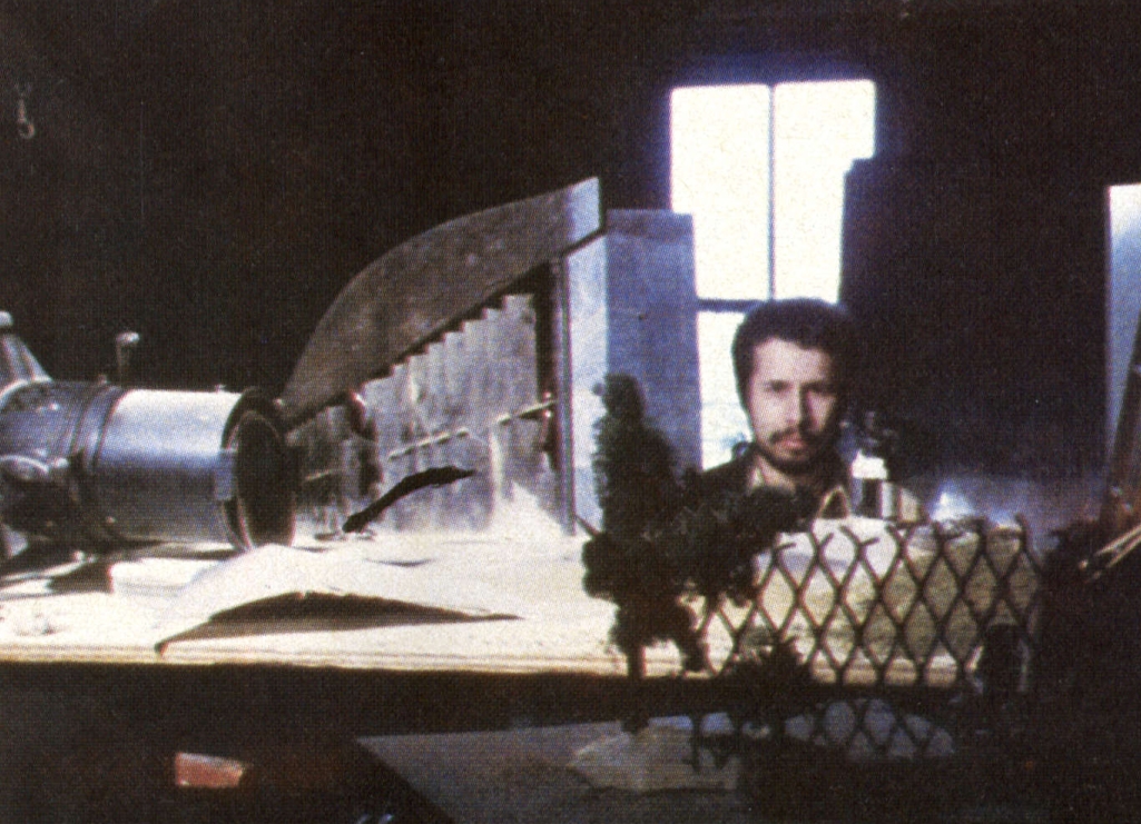
Scott made a two-foot long, perspective-distorted facade of the building out of balsa wood. Model-railroad gravel, clay, and trees (trimmed in perspective), plus a grating we found to serve as a fence, were the elements we used to construct the scene. The “ray” of the beam field weapon was a spike-shaped hole cut into a piece of showcard and backed with tough silk red gel. Lit by two Tota lights directly behind the cut-out, the ray image was carefully lined up in a semi-silvered mirror to appear as if it came from behind foreground trees to strike the building. To simulate the “scatter” of light around the point where the beam struck, a Lowel D with the ultra-spot reflector, snoot, and matching red gel was aimed at the corresponding spot on the buildings surface, and plugged into the same dimmer as the Totas. More red lights within the building were dimming up after the beam hit the front of the building, to suggest a rise in heat before the building actually exploded.
I desperately wanted to light the building as it had been lit by real sources on the ground. However, with the high key level we needed (8,000 fc at 500 fps only gave us T4, less than we desired), we had no small units that could do the job. As it was, we were using every instrument we had placed just off the edge of frame. The best we could do was to cut slits in the plywood “ground” just in front of the building and use two quartz lights underneath shining through onto the letters “NAVCO” on the front of the building. Despite using pieces of screen laid on top of the slits as scrims to break up the light, we were not quite able to get the kind of pattern created by multiple ground floodlights. In addition, we simply had no lights left to light the trees from the direction of the building, which would be the realistic source.
Pieces of screen and card were also used to break up the light coming from within the building. Despite our attempt at aluminum foil shielding, the incredible heat generated by open quartz units within inches of the wood models would begin to set them on fire, so the lights were kept off until just before the exposure.
Having done a rough film test beforehand of the standing model, we rented a Photosonics 1-PD for the weekend and “dug in.” No crew was around (or necessary) as we begun the incredibly painstaking work of positioning and repositioning miniature trees and “hills,” trimming, painting, and lighting; there would be no second chance to blow up this mode.
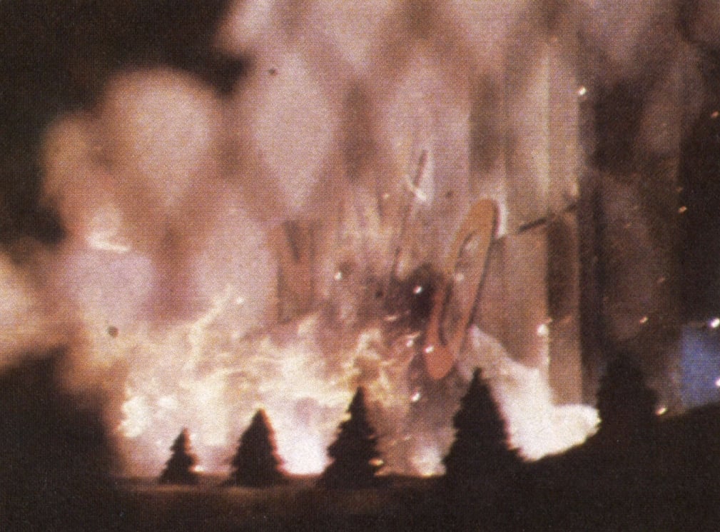
First we did the shot of the beam field weapon striking the building and the attendant light effects, shooting at 24 frames per second with an N9 filter. No problems occurred. We then carefully removed the mirror and filter without disturbing the camera, and prepared for the explosion.
Scott placed the electric fuses, flash paper, and gunpowder in a trough in front of the model. In addition, talcum powder was placed within the building, to be blown out the front by Scott wielding a can of Dust-Off. To ensure that all this would appear to happen simultaneously at 500 fps, we soldered the fuse contacts to the nozzle of the dust-off can so it would act as a trigger.
Originally, we had wanted the model to collapse, but the difficulties of draw pin-in-groove construction proved too formidable. We settled for the flames, talcum dust, and having the NAVCO letters fall off.
I had slept over in the B’s loft both Friday and Saturday nights, and it wasn’t until 3:30 a.m. Monday morning that we were ready. With the camera set at 500 frames per second, we turned on the lights and whined out the camera. Scott triggered the explosion, creating huge flames that set the building and our little trees on fire. In less than five seconds, real time, he was spraying the chemical fire extinguisher through the model and it was over.
By the time we had cleared the smoke and some of the dust out of the B’s loft (which they had to live in), it was dawn. The morning light filtering in seemed to be a signal to me, having not been outside for the last three days, that the movie was finally near an end.
Hope springs eternally in the naive mind. There was more editing to do, more money raising, and the shooting of a new final scene. Answer printing was extremely difficult; dirt and processing problems necessitated a wetgate printer, causing a last-minute change of labs, while the high contrast ratios made timing very critical, with errors of one point (in certain scenes) appearing objectionable to my eye.
In the end, it was almost a year after the exploding of NAVCO that I finally found myself looking at an acceptable print of Vortex — at the press screening three days prior to its world premiere at the New York Film Festival.
Fierberg later became a member of the American Society of Cinematographers and was honored with the ASC Career Achievement in Television Award in 2024.
