The Hate U Give: Meticulously Crafted Authenticity
Director of photography Mihai Mălaimare Jr. employs lenses, color, format and camera movement to visually differentiate the protagonist’s two conflicting worlds.

Unit photography by Erika Doss, courtesy of Twentieth Century Fox
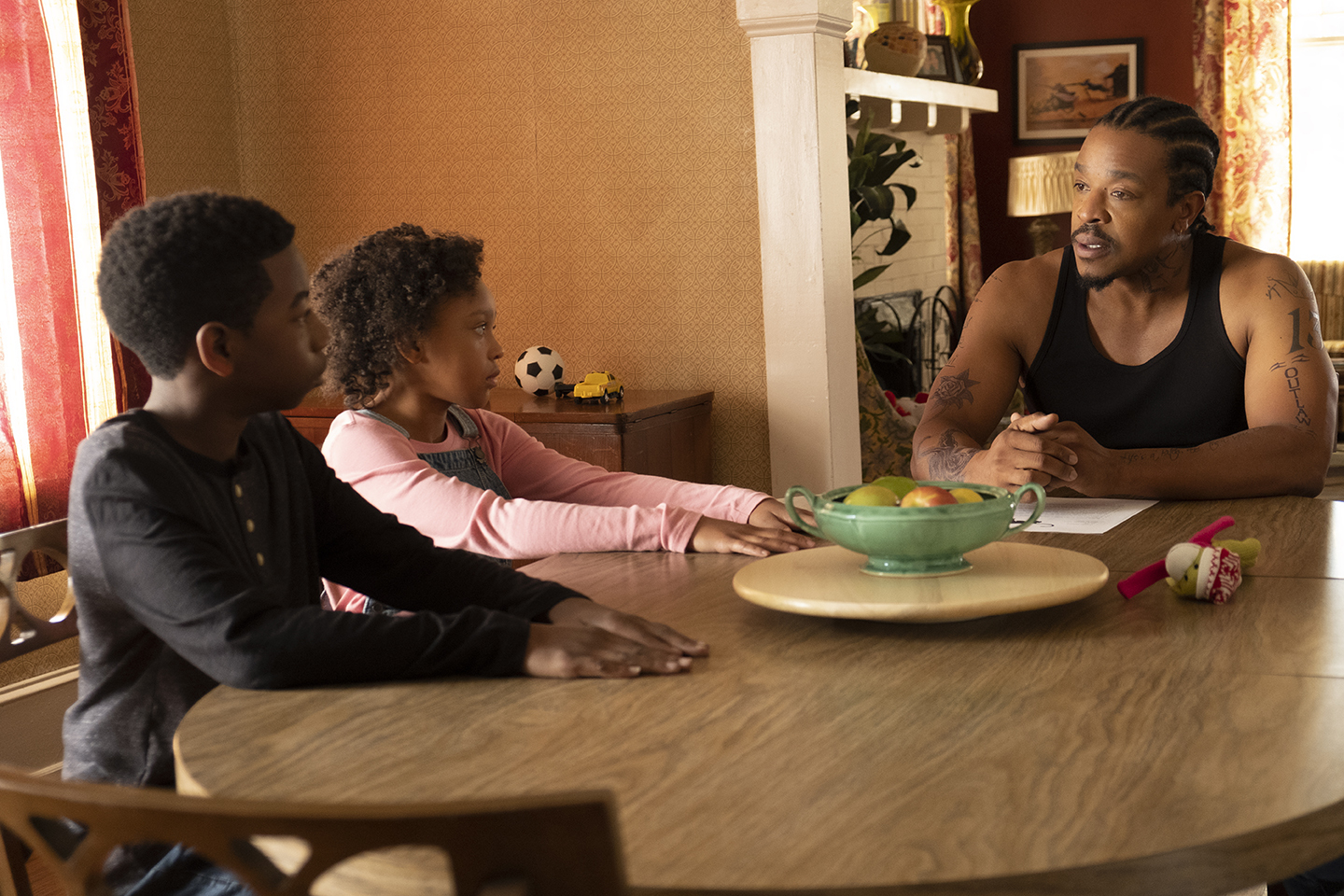
Starr Carter was a young child when she received “the talk.” Sitting at the kitchen table with her two brothers — one older and one younger — her father Maverick explained how the children must behave when they are stopped by the police. They will need to put their hands on the dashboard of a car as the officer approaches them. They must be quiet, listen and do what the officer tells them to do. When he inevitably gets stopped by the police, Maverick tells his children, this is how he will act. This is how they will stay alive.
The opening scene of The Hate U Give is one of the main reasons director of photography Mihai Mălaimare Jr. wanted to be a part of the project.
“It’s so hard for many people to imagine that you have to do that with your kids,” he says, sitting down for an interview at the ASC Clubhouse in Hollywood. “Can you imagine that?”
This scene — presented as matter of fact — is also what Mălaimare considers the most effective thematic scene in the film “because you know for sure that everything that happens [during the film] will generate other talks like this, unfortunately.” Setting the tone for the story about to unfold, it creates haunting visuals that resurface with weight as the film progresses.
The Hate U Give focuses on 16-year-old Starr, who is part of two very separate worlds and therefore has two different “versions” of herself. She lives in the mostly black suburban neighborhood of Garden Heights and attends Williamson Prep, a predominantly white and affluent private high school in a different city. Starr’s worlds come into sharp conflict after her childhood friend Khalil is pulled over — as Starr sits in the passenger seat — for changing lanes on an empty street without a turn signal. Instinctually, Starr places her hands on the dashboard — just as her father taught her. But Khalil doesn’t. Despite Starr’s pleas for him to do the same, Khalil is adamant that he shouldn’t have to. After the officer demands that Khalil step out of the car, Khalil reaches for a hair bush, and the officer — assuming it’s a gun — fatally shoots him.
Central to the theme is Starr’s struggle and eventual resolution of these opposing versions of herself, and one of the first conversations director George Tillman Jr. had with Mălaimare was about how to visually differentiate between Starr’s two worlds. Their options were plentiful — lenses, color, format, camera movement — and after extensive conversations, Mălaimare felt it would be best to utilize multiple tools. “Immediately, I thought if you only choose one [method of differentiation, you will inevitably] overdo it. But if you use all the elements, you can be subtle with some of them,” he says.
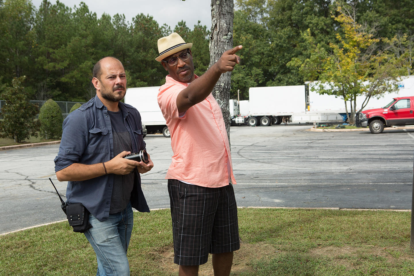
At six weeks, prep for the film was short, Mălaimare notes, “so I hit the ground running trying to make decisions and figure out the best way to tell this story. I knew I was interested in [shooting with] a larger sensor, but a lot of times you’re interested in a piece of equipment and you struggle because you’re in love with it, but [you have to ask], ‘Is this the best tool to tell this story?’”
The tools of still and motion-picture photography have fascinated Mălaimare — whose credits include Francis Ford Coppola’s Youth Without Youth, Tetro and Twixt and Paul Thomas Anderson’s The Master — since he was young. Drawn to still photography at 15 years old, as a child living in Romania, Mălaimare’s camera options were limited. His optics arsenal consisted of only two Russian Helios lenses that, at the time, he hated. He longed for a Nikon or any superior lens. In the years since, Mălaimare has amassed a substantial collection of 30 still cameras, and when on location, the cinematographer travels with up to 10 of them, which play a crucial role in prep to aid in determining the visual language of the project. Early in this process, Mălaimare shoots still photographs to capture interesting environments, visuals or interactions he sees in addition to scouting locations. He then prints the images as references — on luster, glossy and matte papers to visually showcase the look various lenses can provide — to garner the director’s reaction.
“I remember a conversation George and I had very early in prep,” Mălaimare offers. “We discussed how the audience would expect a very gritty look from this movie, and we both thought we should surprise everybody by going in a different direction. I had a lot of Eli Reed images on the walls in my office — he is such an amazing street photographer. At the end of that meeting, we decided that our movie should look like an Eli Reed photograph printed on high gloss paper.
“I think the best way to collaborate is to find early on what a director will hate or love,” he continues. “I think it’s more interesting to find what they hate and what they think is not appropriate for the story. That’s great because the earlier you learn about that, the better.”
Having recently completed an NBA 2K18 commercial called “Handshakes,” Mălaimare felt the camera and lenses he used would be appropriate for The Hate U Give: Panavision Millennium DXL with Ultra Panavision 70 anamorphic 1.3x lenses. The cinematographer says that he was initially drawn to this camera because it has a large 40.96mm x 21.6mm VistaVision-size sensor that could still be shot anamorphic.
In trying to determine the best way to visually separate Starr’s two worlds, Mălaimare reveals, he and Tillman initially struggled with the decision. “I wanted to mix anamorphic and spherical, but I wasn’t sure. It’s always tricky. I’ve done it before, and it’s [something] that the audience won’t necessarily notice right away, but they will feel it when you go from 2x anamorphic to spherical. But what’s interesting about a larger format is that when you go from 1.3x anamorphic to a spherical VistaVision, the jump is not as big. You still have the anamorphic flares and really great skin tones, but, also, the field of view on a VistaVison spherical is so close to the anamorphic 1.3x. It was a jump, but it wasn’t as big of a jump.”
The filmmakers were leaning toward anamorphic as the appropriate method to represent Garden Heights, and when Mălaimare showed Tillman “Handshakes,” the director said the commercial had a certain look and feel that he wanted to recreate. But it was when production designer William Arnold showed Mălaimare and Tillman a 2017 Procter & Gamble ad called “The Talk” that the visual language became clear.
Made for the P&G initiative “My Black Is Beautiful” and directed by Malik Vitthal and shot by Lasse Frank, the ad — which won a 2018 Emmy Award for Outstanding Commercial — centers on black American parents telling their children about prejudice and racism over several decades. “That was the ‘a-ha’ moment,” Mălaimare says. “The commercial is heartbreaking and amazing. I was so sure, as was George, [after watching it] that this is how we should tell this story.”

Mălaimare framed a 2.39:1 aspect ratio, and the collaborators decided that scenes in the neighborhood would primarily be shot anamorphic while scenes in Williamson Prep would be spherical.
To aid in the transition between focal length, Mălaimare employed an unconventional — and highly personal — tool: the Helios lenses he hated as a child. “I’m always interested in strange lenses,” he says, “so there are so many things that I try.” A few years ago, with the intention of revisiting the still work of his childhood, Mălaimare repurchased what were once the only lenses available to him. “I thought these lenses might look interesting with a digital camera, so I started testing them.”
Mălaimare took the lenses and stills he captured to Panavision and showed them to ASC associate member Dan Sasaki, Panavision’s vice president of optical engineering. “We projected them, and we both knew these lenses would look great on the DXL. So, we rehoused two of my childhood Russian lenses — 58mm and 85mm.
“They are very cheap, and the corners are fuzzy. It’s similar to an old anamorphic lens where you have to frame someone almost dead center because otherwise they might not resolve into the edges. But they have a certain quality, which I think is that, [at the time the lenses were made], they were using rare metals in the glass manufacturing process. If not that, then at least lead — like the windows in an old house where the glass distorts so nicely.
“They are not perfect at all — they are really far from perfect,” the cinematographer laughs, “but they are really, really interesting.”

Sasaki rehoused the Helios lenses — keeping only the original glass — and they became a staple in Mălaimare’s arsenal. “We were careful to try to use them when I knew we were cutting from an anamorphic to a spherical scene because they have very similar feeling at the edges of the frame,” he says.
This process, while seemingly unorthodox, is not entirely uncommon for Mălaimare. While shooting The Master, Mălaimare and Sasaki underwent a similar venture to rehouse an 80mm Zeiss Jena “zebra” lens of an East German Pentacon Six still camera Mălaimare owned that he remembers as “sort of a disaster” and broke a month after he purchased it. The lens, however, “was amazing and one of the most interesting uncoated but really sharp lenses.” After Sasaki rehoused the lens, it became an important tool on The Master.
In addition to his customized vintage lenses, Mălaimare primarily employed Ultra Panavision 70 anamorphic 1.3x lenses. “I love old lenses,” he says, “and a lot of times I try to not get caught up in the history of them — because I also love that.” The lenses, originally created in 1957 and used on such pictures as Ben-Hur and Mutiny on the Bounty in combination with 65mm cameras, were reconfigured by Panavision to be employed on The Hateful Eight. (For more information, see AC Dec. 2015.) Mălaimare adds that the lenses “take a 2.0 aspect ratio and squeeze it to a 2.70. [Despite being made for 65mm cameras], they work really well with the DXL because you’re dealing with the same aspect ratio even if the sensor is somewhat smaller, so these lenses will actually cover way more.
“They’re big and bulky and really hard to work with,” the cinematographer offers, but, he adds, both first assistant camera assistants — Max Junquera and Ryan Weisen — were great despite the difficulty the large lenses provided. “It was really hard on them because, in a modern lens kit, every lens will have the same diameter. So even just swapping a lens, you have to swap so many accessories, and it’s a whole process. But I’m so glad we did it, and [the ACs] were really happy watching dailies because they realized it’s such an interesting quality and all the extra work and pain pays off in the end.”
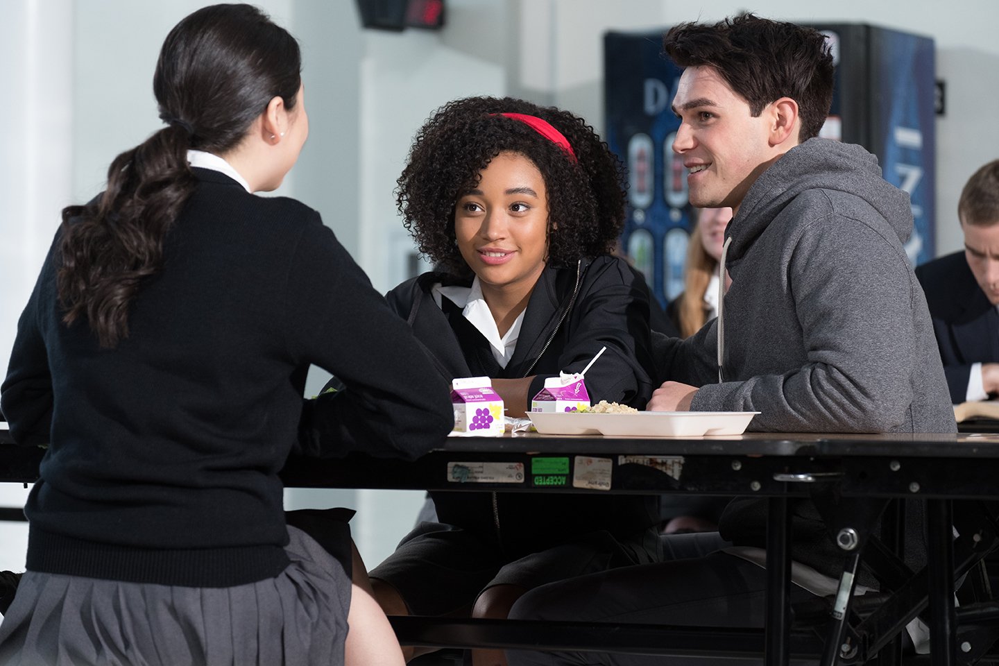
Having chosen the proper tools, the conversation then turned to color temperature. “We knew we wanted to go warm for Starr’s neighborhood and cold for the private school,” Mălaimare says, and that decision was based on color theory as well as their actual locations. The high school that served as Williamson Prep, for example, had blue lockers — something the filmmakers considered serendipitous — which contributed to a cool atmosphere. While scouting locations for Garden Heights in Atlanta, Georgia, Mălaimare adds, he noticed that a lot of homes had red and orange drapes, and when the sun shone through them, it created a warm light inside the homes. “It wasn’t just this idea that we wanted [specific] colors for the neighborhood or the school,” the cinematographer notes. “It was so much based in reality and in what we saw in all the locations.”
The team also employed color theory ideologies that warm colors appear closer in human perception whereas cool tones feel farther away. Projecting these colors onto Starr’s worlds played an important thematic visual to the film. The result is an inviting atmosphere in Garden Heights with lush backdrops contrasted against a muted Williamson Prep. Starr’s skin, which is rich and vibrant in Garden Heights, looks almost pallid at the private school and more closely matches that of her white peers than her family.
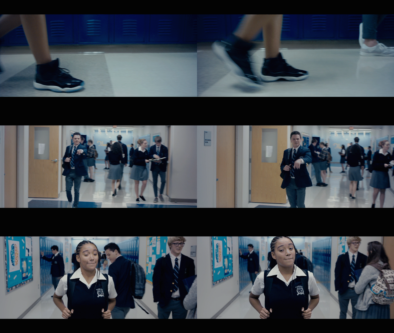
Mălaimare paid careful attention to transitioning between scenes as he didn’t want the changing color palettes to be jarring. Another factor to consider, he says, is that if one watches a warm scene for longer than one minute and then immediately sees a blue scene, “it will feel twice as blue as it actually is.” Mălaimare therefore based the gradations of color on scene sequence, transition and length.
The final element of differentiation the team employed was camera movement. Garden Heights was primarily filmed hand-held, and Williamson Prep utilized Steadicam. With all the components in place, the cinematographer then raised the question: Since the story revolves around Starr, when could these visual parameters be altered?
“I really like when a director — in this kind of collaboration — has rules,” the cinematographer says. “Just one rule will help so much throughout the process.”
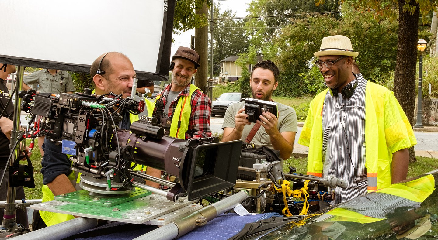
In addition to the mandate to keep the photography authentic, Tillman had one other essential rule: Starr’s emotions should guide the camera movements. This directive, especially, provided Mălaimare the freedom to occasionally deviate from certain elements of the neighborhood and private school visual languages.
“Because we had this rule that Starr’s feelings will dictate the camera movement, we never really thought about the percentage of hand-held at the beginning versus middle versus end of the movie. The progression of Starr’s character made us go either hand-held or Steadicam or keep things more static. There were moments where we decided initially to go hand-held, but when we saw the rehearsal, I said, ‘No, it doesn’t feel right. [Given her feelings in the scene], it feels more appropriate to be more static and just observe and be a little farther away.’
“Sometimes you can decide to use the camera movement as one of your tools, but I think if you let the character’s emotions dictate that, it makes your choices a lot easier. It doesn’t need to be progressive in moving the story. You don’t really think about it if you have this rule, and you just see where the character drives you,” he says.
One of the most striking examples of this is the sequence surrounding Khalil’s death. “That scene is divided into three,” the cinematographer explains. “It starts with the party, there’s a drive and long scene in the car and then the actual shooting.”
The sequence begins at a vibrant, warm-hued party in Garden Heights where Starr spots Kahlil. “Our gaffer Spike Simms and I decided to make this scene stand out and use really saturated colors,” Mălaimare notes, but given Tillman’s rule to keep the photography as naturalistic as possible, the team needed to find a way to make the saturation feel authentic. Knowing that red LED bulbs would give the cinematographer the saturated color he wanted, he also knew that the bulbs alone would create an artificial atmosphere. Collaborating with the production designer, the filmmakers found a practical lighting solution: placing a red cloth on top of a lamp shade fitted with a red LED bulb. “It made you believe that the whole light was filtered through a red scarf,” he explains.
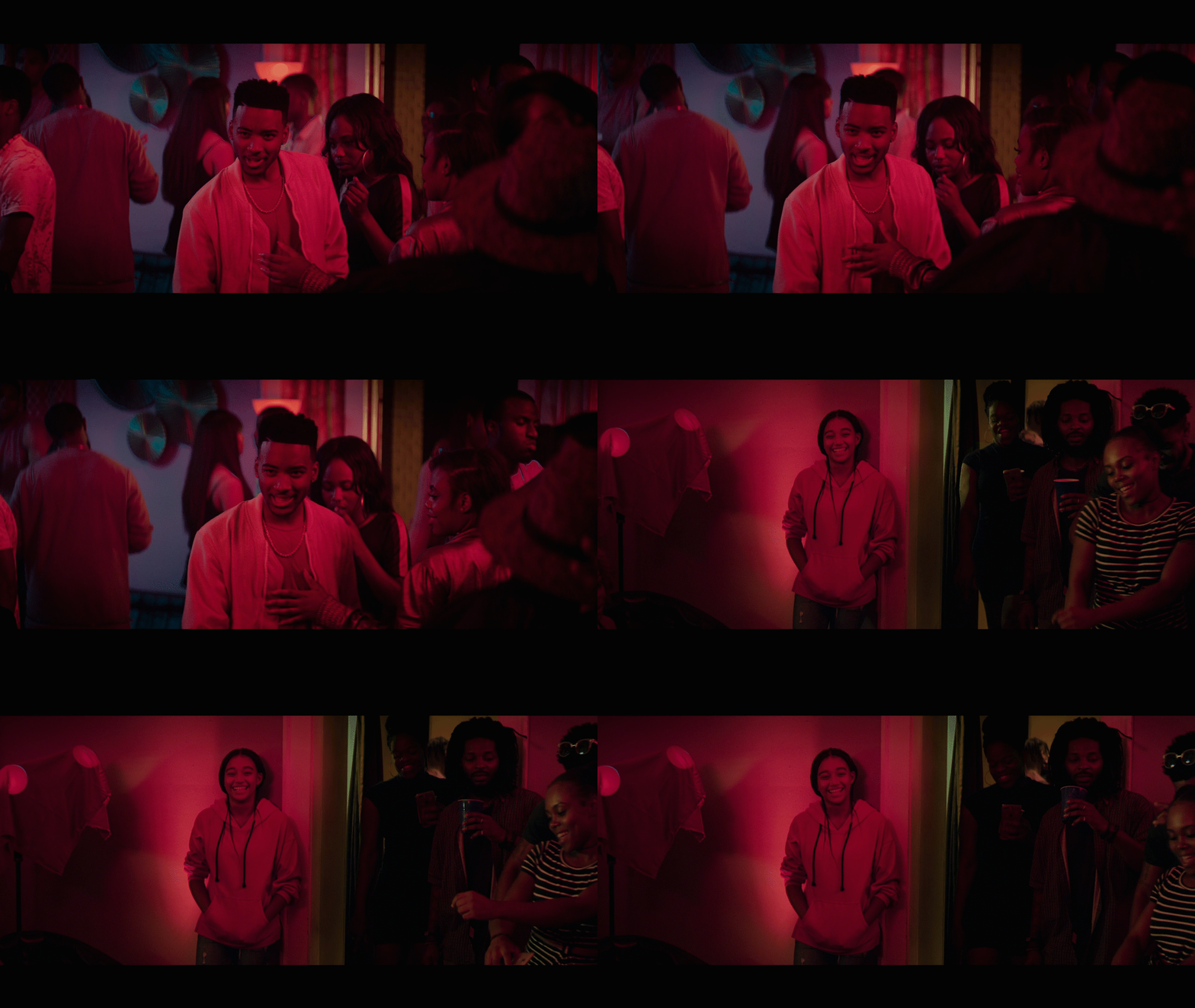
Because of this, the scene turned out to be Mălaimare’s favorite. “It [looked] really nice, and I asked everyone, and they never felt [like it seemed] artificial. It wasn’t just the right look for the party — it felt real. That’s why I was really happy with how that turned out.”
In the car, Starr and Khalil share a romantic moment. “It’s always a struggle to shoot a whole scene within a car,” Mălaimare notes — especially given that the car was moving for half of the scene, parked for the other half and the scene needed to be as romantic as possible. The camera movements evolve from Steadicam at the party and car mounts and static to hand-held as the scene progresses away from the romance and toward the eventual tragedy. “I think that was a natural evolution,” Mălaimare says, given Starr’s emotions.
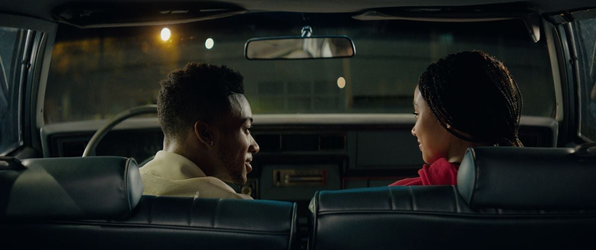
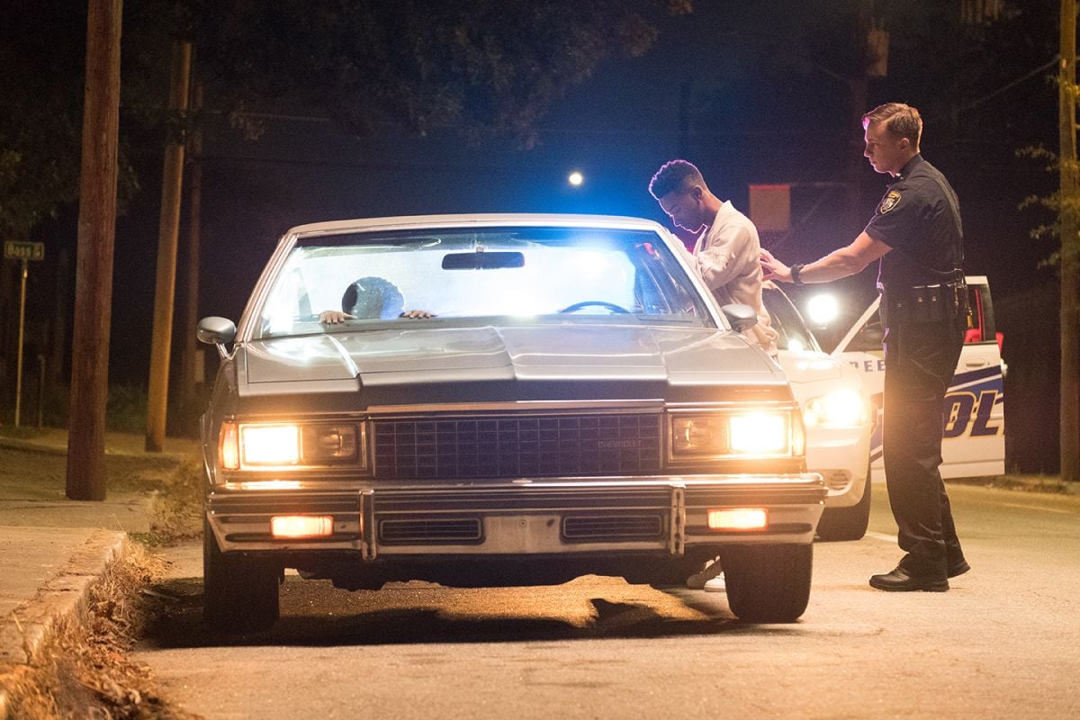
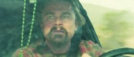
Approaching the sequence where Khalil is shot and killed, Mălaimare and Tillman agreed that it needed to be as accurate as possible. “Our main goal was to tell the story from Starr’s point of view and keep the camera inside the car for the entire scene,” he notes.
“We had only one exception to this rule — the only shots from outside the car are from [police] dashcam or bodycam footage. We actually used a real police dashcam system and a real bodycam. It came with tremendous technical challenges for our DIT Eli Berg, but the footage is so specific. Not only did it have the GPS coordinates on screen, but it also had infrared mode. It’s something everyone in the audience, unfortunately, is so familiar with, and it’s so real [that] no one would question the nature of it.”
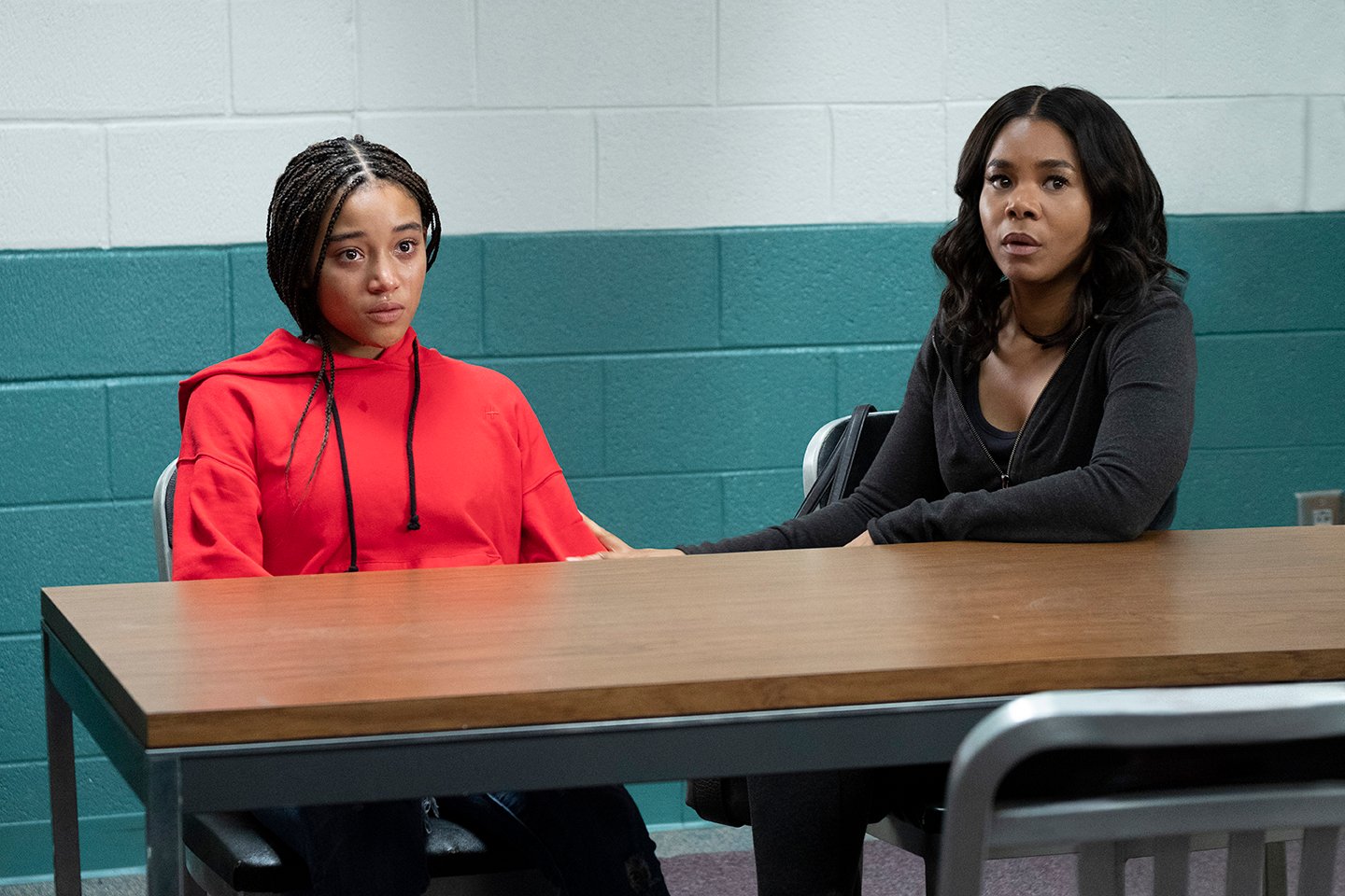
The sequence ends with Starr — in shock — in a police station. The atmosphere is blue and cold and a striking contrast from the warmth of the party Starr — along with the audience — experienced a just short time earlier.
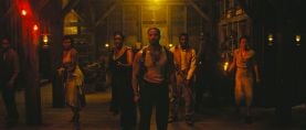
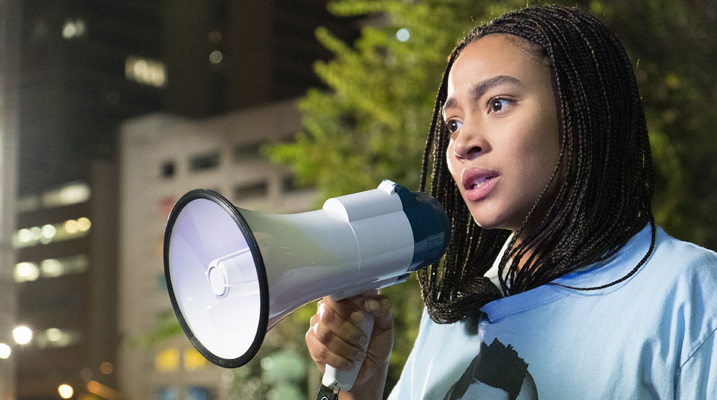
As the film progresses, the filmmakers’ commitment to authenticity proved to be a major component to the photography. In salient scenes, including a protest and riot, Mălaimare again sought out realistic filming equipment. For this sequence, which the cinematographer calls “the most complex,” of the film, he utilized three DXL units, three broadcast cameras — run by trained broadcast operators — and five iPhones, controlled by extras. “Taking any shortcuts and using a GoPro or some other camera would have made our life easier, but I think it paid off to use the real thing,” he says.
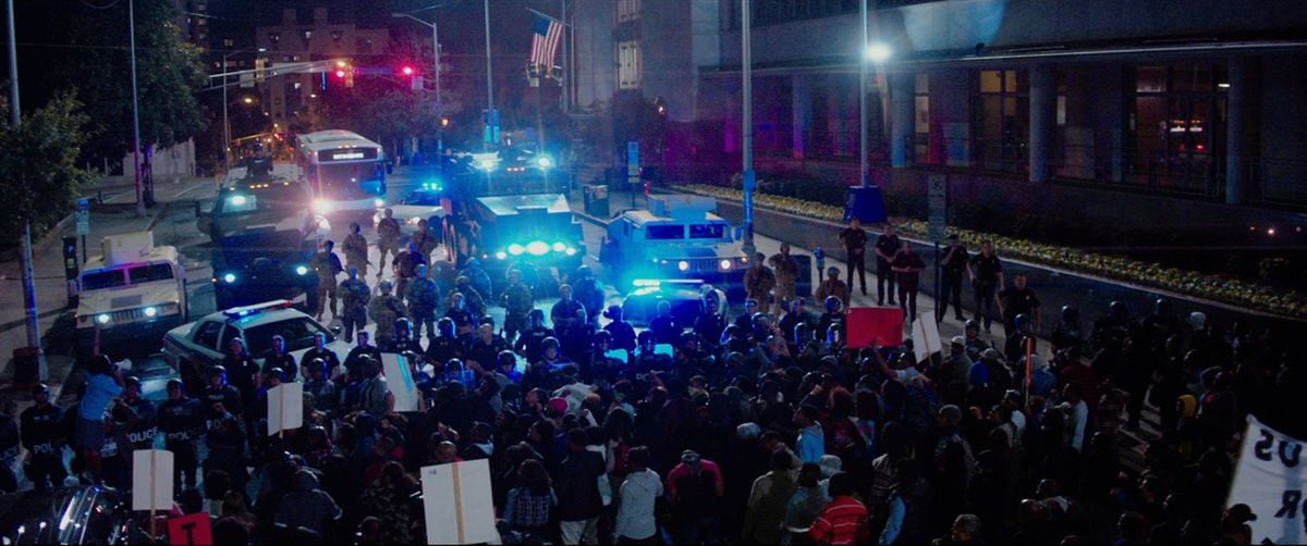
“You want to control everything visually,” Mălaimare adds of the iPhone footage, but the image was more genuine when shot from the perspective of a person filming as if they were actually there. “It’s exactly where your training might actually hurt you,” he stresses. “There’s no way that you would capture it like a normal person on the street.”
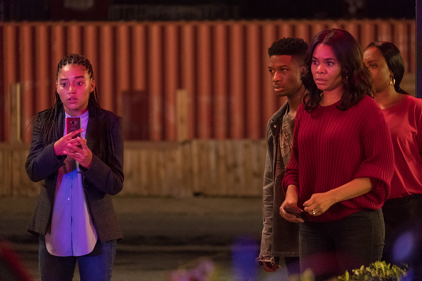
Prior to filming, Mălaimare and Tillman watched Whose Streets?, a 2017 documentary about the uprising in Ferguson, Missouri, following the fatal shooting of Michael Brown. “The documentary had plenty of phone and amateur camera footage that put you right in the middle of the events compared to the long lens observing from a safe distance [of] news footage we all know. One of the main discussions we had [after watching the documentary] was that as long as we keep it real, we succeed.
“[George and I] discussed that we couldn’t afford to lose the audience — not even for one second. That’s why we treated [all of these scenes] so carefully — so that they’re real.”
Mălaimare credits a lot of the film’s visual success to his collaboration with Tillman and the seriousness with which they both approached prep. Because of this harmonious methodology, Mălaimare says, they did something that is rarely seen: shot listing every scene with reference images or photos taken during prep. This was a great experience, the cinematographer says, because “you can change your mind later, but if you have a plan, you feel so much more confident about everything. It’s not that the other way doesn’t work — you can always improvise and get great scenes. But I think both of us felt that if we have that confidence, and if we have those shot lists with us, then no matter how we approach it, it will work.”
This planning, he continues, was crucial to successfully executing some of the film’s most complicated sequences, especially since Mălaimare was able to draw diagrams of where to put the cameras. In one scene, Starr sits in a hotel room with her family as she is interviewed on a live broadcast. “We decided those two cameras [filming her interview] should be real broadcast cameras shooting interlace, and our two DXLs would dance around them. We had four cameras rolling in a tiny hotel room with six actors. It was a really interesting dance, and we were able to achieve that in half a day, [which is] all we had for that scene.
“I’m always amazed when I go back and look at [my drawings and diagrams for that shoot]. We knew the angles we really wanted and divided everything into three or four cameras,” he says.
Shot listing all of the scenes was especially helpful for the crew, Mălaimare adds. “You sometimes forget that your crew was not there [during prep], and then you have to [relay] all the information. This was such an easy way of sharing with them. Everybody was so happy to see [the shot lists and diagrams] and realize that we have [a certain number of] setups to achieve each day.”
What was also valuable, Mălaimare notes, is that Company 3 has a facility in Atlanta, and editors Alex Blatt and Craig Hayes were on location. The cinematographer received feedback from the editors during production and watched certain scenes projected. “We would know right away if a scene worked,” he says. Mălaimare performed color correction with Siggy Ferstl remotely while in Prague during production of Taika Waititi’s upcoming feature Jojo Rabbit, but since Tillman was happy with the dailies and didn’t want to stray too far from that look, it made the long-distance process relatively simple.
In addition to the film’s opening scene, there was one other sequence that made Mălaimare greatly want to be a part of the project. In the midst of her struggle to resolve the conflict within her opposing worlds, Starr rejects her Caucasian boyfriend’s declaration that he doesn’t “see color.” Not seeing her blackness — and everything that it entails — she tells him, is not seeing her. “Starr’s point was, ‘I want you to see me for who I am and to see my heritage,’” the cinematographer says.
The Hate U Give, Mălaimare adds, speaks to specific problems that perpetuate systematic racism and police brutality, “but it’s also about how to be more curious and open and learn about others. It’s so easy for us to say, ‘I can treat everyone the same.’ But it’s so much better to see, learn and understand.”
