Whetting the Palette: Coloring The Taste of Things
Colorist Yov Moor helps cinematographer Jonathan Ricquebourg, AFC set the visual table for this romantic slice of culinary cinema.
Editor’s note: This short spotlight details the color process implemented for a scene from writer-director Trần Anh Hùng's The Taste of Things, shot by Jonathan Ricquebourg, AFC. Full coverage of the film can be found in AC's February 2024 issue.
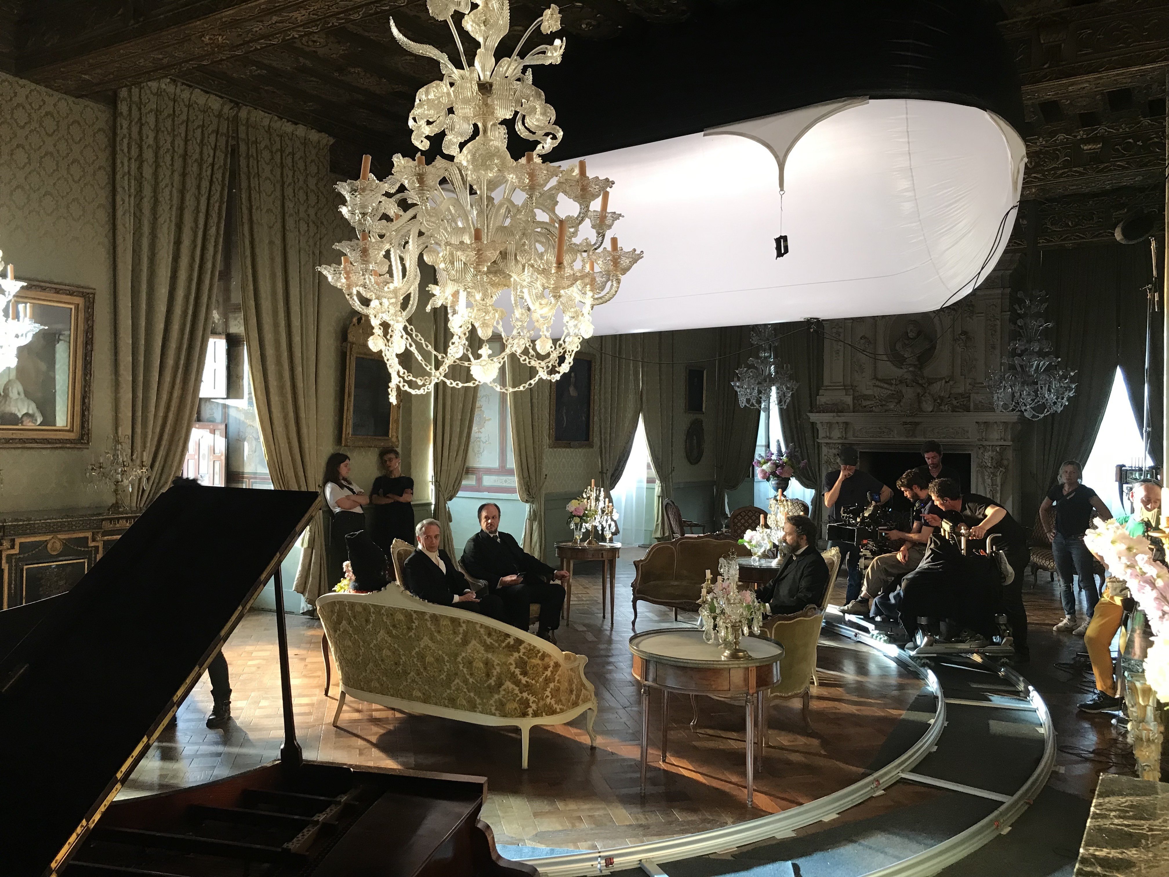
Jonathan Ricquebourg, AFC was first introduced to director Trần Anh Hùng by colorist Yov Moor, a longtime collaborator whom the cinematographer describes as “my right arm.” Moor — who has worked with Ricquebourg since their 2014 feature Eat Your Bones — helped make the match after serving as the colorist for Hùng’s 2016 feature Norwegian Wood. And the cinematographer says his influence was equally important in developing the approach to lighting and color for The Taste of Things.
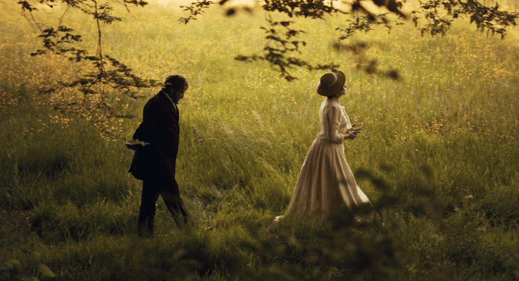
“Yov and I knew that Hùng is a big fan of a digital image,” Ricquebourg says, “but, at the same time, in Hùng's previous film, Eternitè, the color was really strong and saturated, and I didn’t want to go in that direction. So, when we lit the food in this film, we reduced the color contrast as much as we could.”
In the grading process, Moor and Ricquebourg utilized Filmlight Baselight, which the cinematographer says helped emulate a traditional film look to achieve this reduction in contrast. "Working on our Baselight station, we mixed an 'ACES' look together with a film look," he notes. "Our idea was to navigate between [what we called] our 'romantic look,' our 'feature look' and our 'reality look.' We would [gravitate] toward one look or another, according to each sequence. And we created a lot of anamorphic distortion to emphasize the way the kitchen appears [in scenes set within that space]. With that distortion, we could give viewers the sense that things are getting closer or further away."
Ricquebourg’s frequent use of color filters also factored heavily into this approach. “When you use the filters, it provokes something in your brain: It’s a way to gauge the image, like, ‘Okay, this is very reddish…’ And then we ‘erase’ some of it in postproduction. So, when you color grade, you bring the image back to something that feels more natural.”
The cinematographer relied upon a combination of Tobacco 1 and 2 and Coral 1 and 2 filters to “force the camera to go really red-ish, yellow-ish or orange” he says. “When we saw the filtered image, we knew that we’d need to cancel a little of the color in post, to retain more of the original color.”
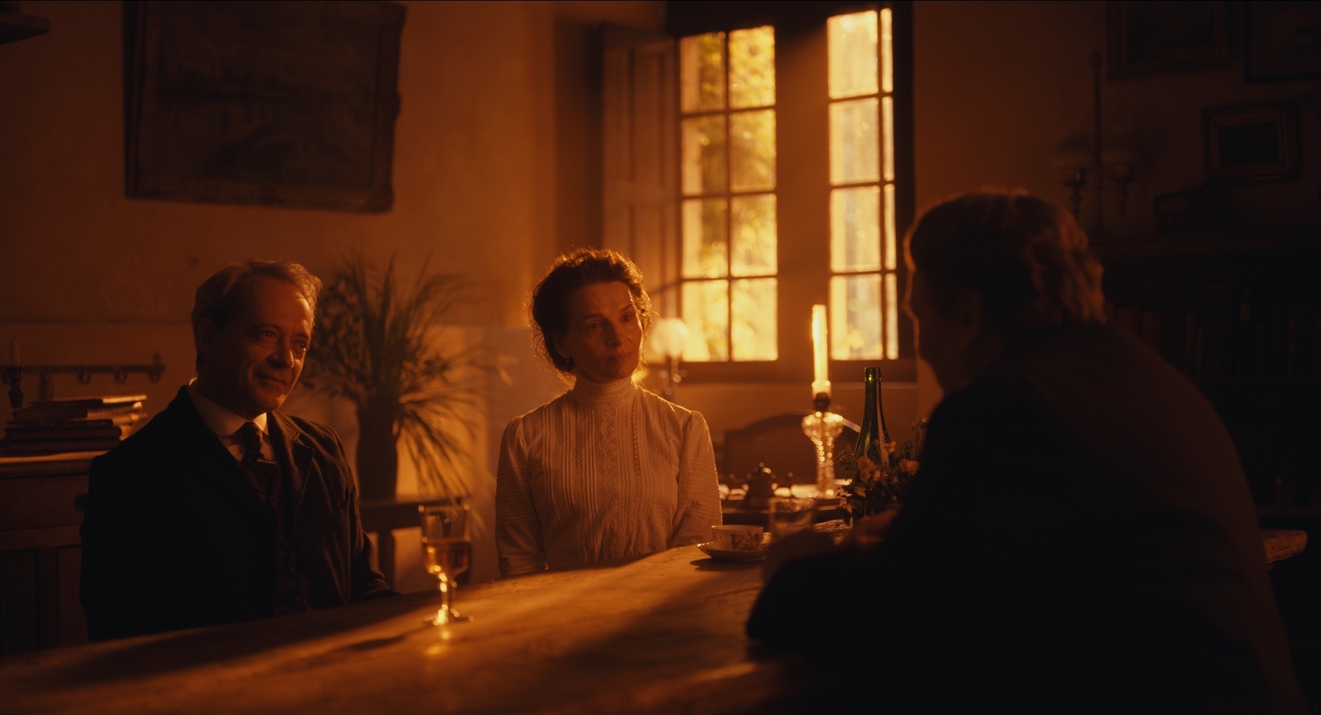
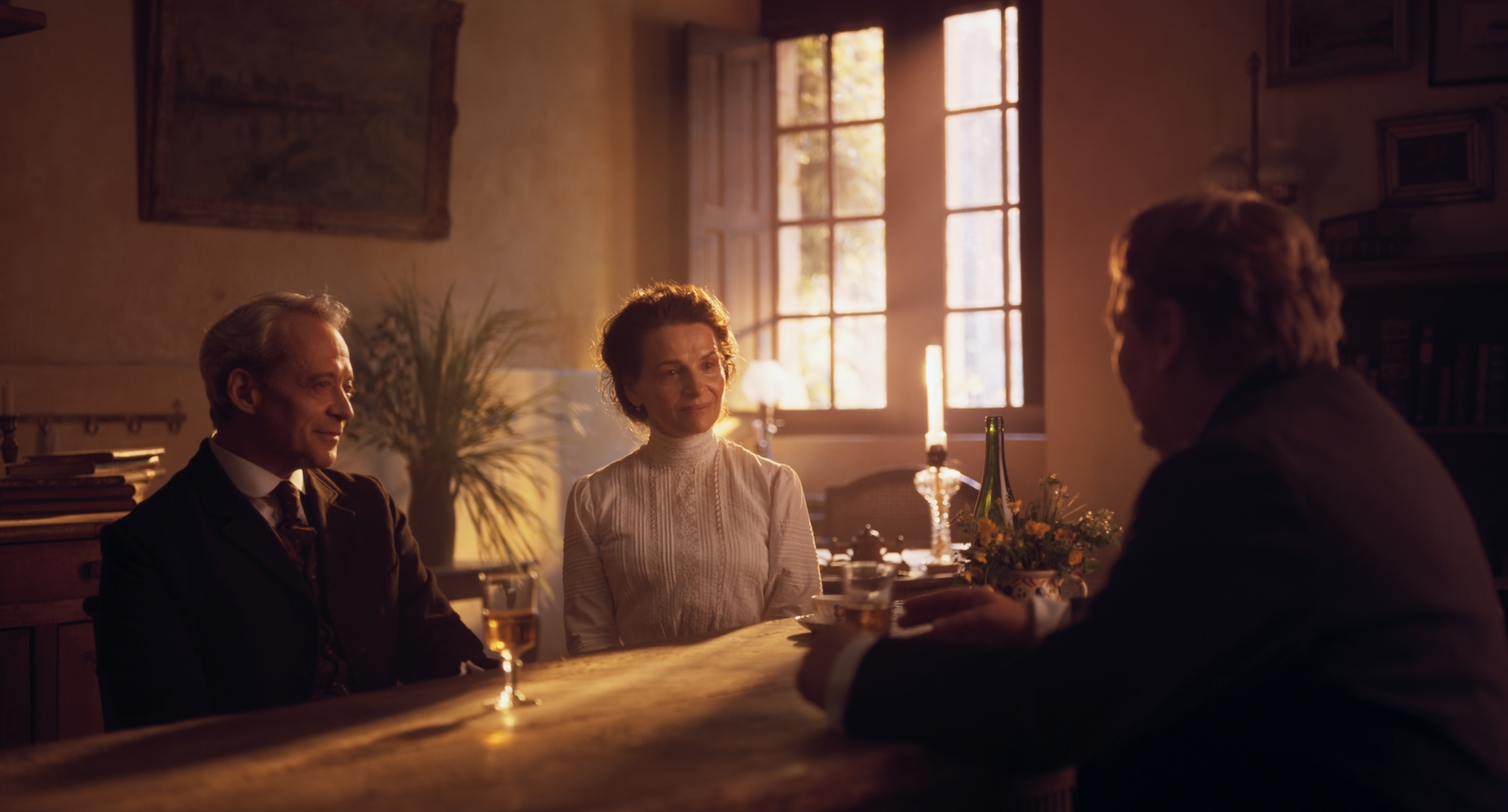
One of Ricquebourg’s favorite examples of this color manipulation is a scene in which chef Eugènie (Juliette Binoche) listens to her friends recount their extravagant meal with the Prince of Eurasia (Mhamed Arezki). “When Eugènie first asks them about the prince’s meal, you have parts of the light that are a bit purple-toned. You also have the backlight, which is yellow, and the characters’ skintone is a bit orange, which goes well with the ‘sunrise’ coming through the window. I actually shot that scene with a lot of Tobacco filtration — a lot of orange — and when we removed much of the filter’s effect in post, the parts of the image that were blue-toned in real life became really purple. So, that’s how you have this mix of purple and orange in that image.”
In Hùng, Ricquebourg and Moor found a director “who is not afraid of the use of color,” but he stresses that for the director, “It doesn’t really matter if the color is realistic or not. If it’s beautiful, if it’s poetic — that’s what’s important. If you look at every frame, you could say, ‘Those colors are not very realistic.’ But at the same time, I take most of my inspiration from reality. When you observe reality, it’s amazing — you have so [many] colors that are unexpected. And that’s something that I tried to [include] a lot.”