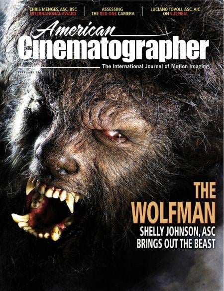
Bad Moon Rising: The Wolfman
“My initial instinct was to integrate opposing elements and have them share the same frame: light and dark, hard and soft, warm and cool, symmetry and asymmetry.”
Unit photography by Frank Connor, courtesy of Universal Pictures.
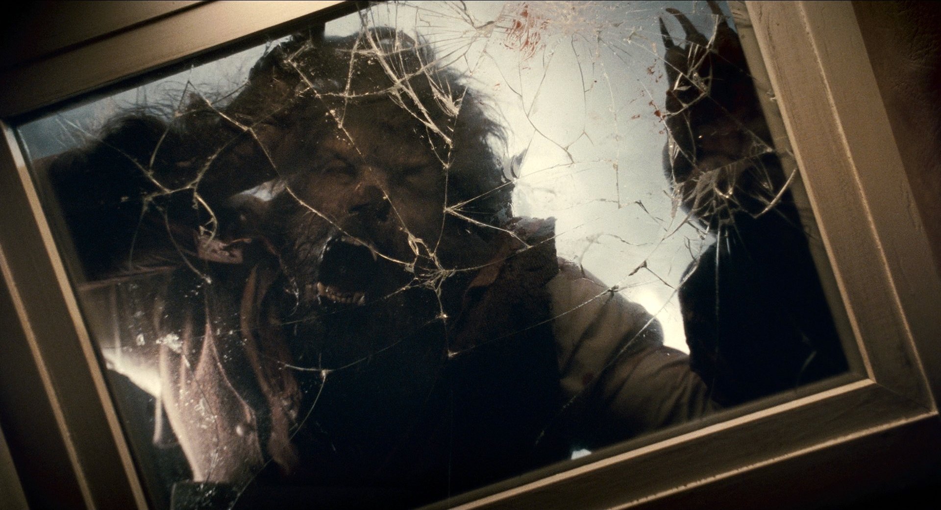
As I’m on my way to the airport to board a flight to London, my phone rings. It’s Donna Langley at Universal. “Shelly, I want you to know that this is a dark picture,” she says. “The images need to have atmosphere and texture, and we’re looking for a dark and moody look. I want to make sure you’re up for it.” This was the first time I recall a studio asking me to make a film dark — I’m usually the one trying to sell them on the idea. I assured Donna that I was indeed up to the task, and that I was excited about creating a uniquely dark world, a world in which the Wolfman could exist.
The Wolfman is the story of an estranged man’s journey home. Sent away to America as a child after witnessing his mother’s murder, Lawrence Talbot (Benicio Del Toro) returns to his family’s English estate decades later, following his brother’s violent death. There, he reconnects with his father (Anthony Hopkins) and learns the full breadth of the old man’s manipulations and about the family’s mysterious secret: the dark curse Lawrence will inherit through an attack by a mysterious creature. He also discovers, for the first time since his mother’s death, the true meaning of unconditional love, shown to him by Gwen (Emily Blunt), the fiancee of his departed brother.
“In thinking about the night photography, I knew the moon had to have a haunting, enigmatic presence. I chose to let the moonlight transform as the story progressed.”
— Shelly Johnson, ASC
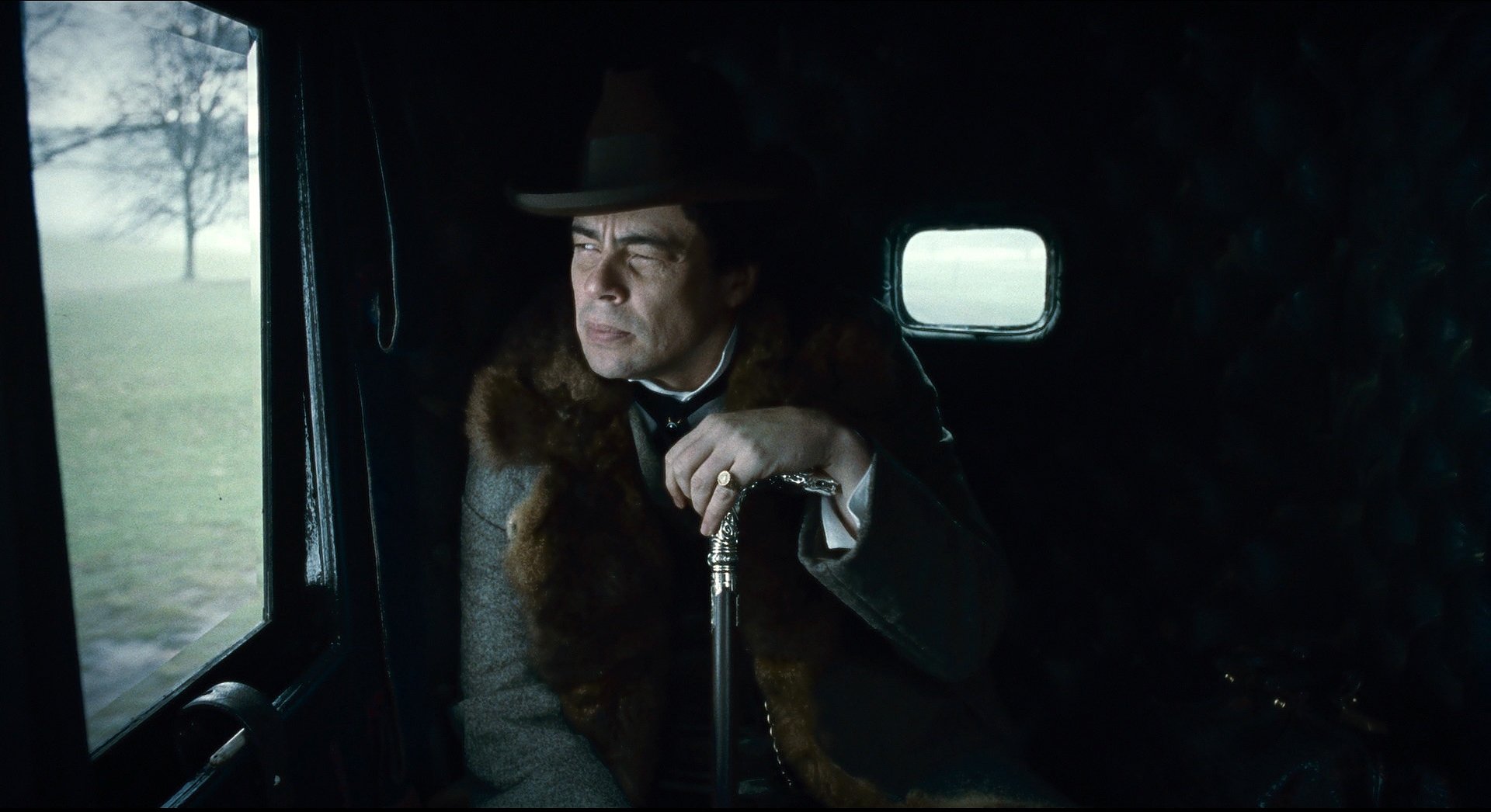
Upon reading the script, I was taken by the presence of conflicting elements sharing the same space in the storytelling: sanity and insanity, love and hate, selfishness and generosity, truth and lies. The story was constructed using these opposites to convey the characters’ complex emotions, their inner struggle to find balance between their feelings and desires and those affected by the curse of the werewolf. I wanted my visual plan to evoke these same complexities. My initial instinct was to integrate opposing elements and have them share the same frame: light and dark, hard and soft, warm and cool, symmetry and asymmetry.
The project had come to me only a few days prior to my arrival in London. Director Joe Johnston, with whom I had previously collaborated on Jurassic Park 3 and Hidalgo [AC April ’04), contacted me when he took over for the previous director, who had left the film. Joe was to have three weeks’ prep, and I was to have two — not a lot for a $ 100-million-plus undertaking of this scale.
Joe is a true author of his movies. By that I mean he works in detail with the production designer, cinematographer, actors, editor, composer and sound editors to create a whole experience for the audience. I think his greatest gift is to keep the production team focused on story so that all of our large-scale technical decisions have a clear reason to be; they are incorporated into the movie in the same manner story beats are represented in the script.
With so little prep time, I needed to find a way to connect with the production team, most of which had already been assembled, and also with the material. I began going through art books to cull ideas for my visual plan. I found my inspiration when I walked into the art department at Pinewood Studios on my first day: production designer Rick Heinrichs had developed an impressive amount of concept art that had a most haunting presence. Rick was also there to show me his plans and concepts, which were quite complex and meticulous. I appreciated his manner, as he was instrumental in getting me fully aligned with the vision he and Joe had been developing during their short time together.
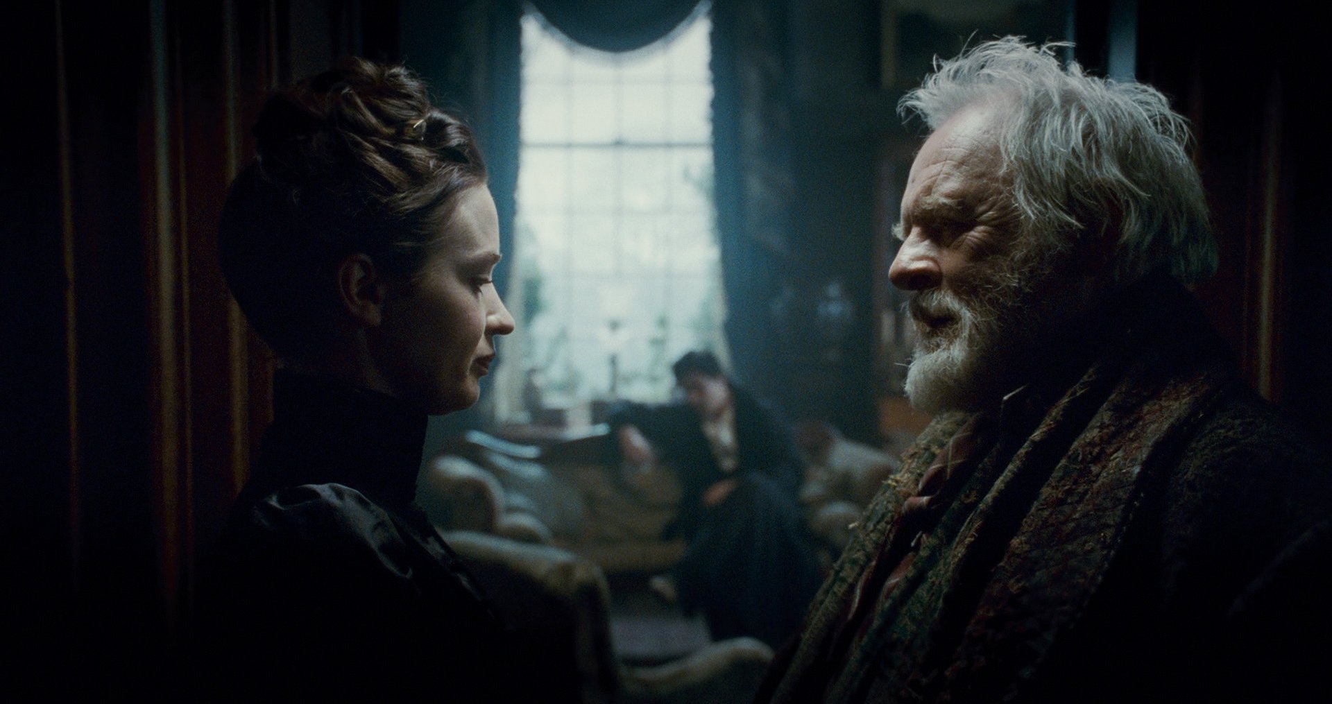
In the concept art, Rick envisioned telling the story within a world of shadows and evocative forms. He intended for many of his dark mansion sets to be lit by means of reflective light sources, such as large bounce flats, to give shape to the dark moldings as opposed to enormous amounts of incident light. This was something I was considering implementing, too, so I was inspired by Rick’s take on the material.
A key decision production made early on was to shoot a large portion of the film on location, a different stylistic approach than the one taken on the earlier, stagebound Universal classic. The idea was to ground the story in reality and integrate our storytelling elements into that setting. I liked this idea, particularly for our night scenes, which we wanted to shoot at a much larger scale than is possible onstage.
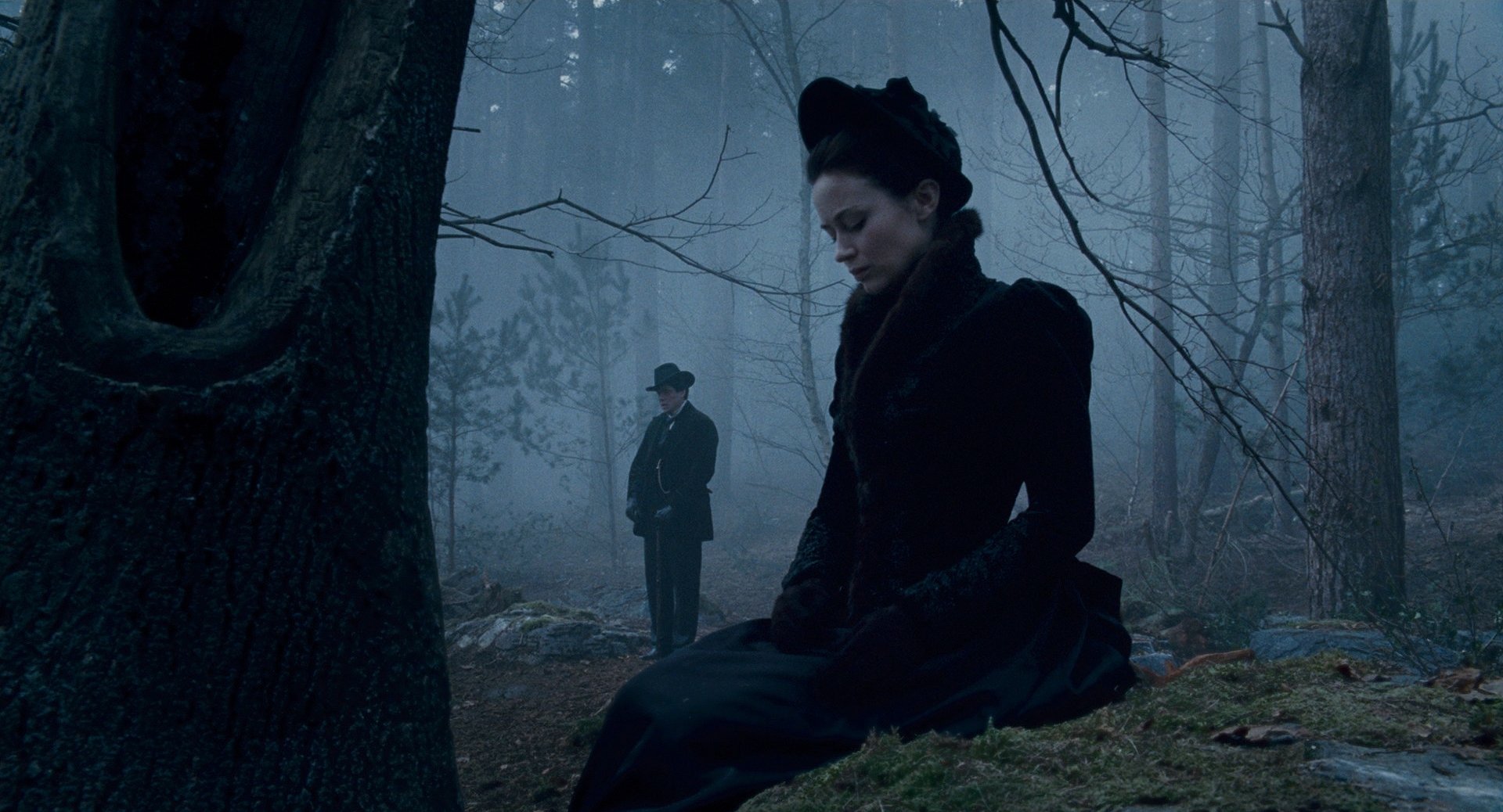
In thinking about the night photography, I knew the moon had to have a haunting, enigmatic presence. I chose to let the moonlight transform as the story progressed. I didn’t want to hang the same moon effect over each night scene; rather, I wanted to let the scene tell me what the moon should look like.
At one point in the story, Lawrence travels to a large gypsy camp at the edge of the woods to meet Maleva (Geraldine Chaplin), who warns him about the curse of the werewolf. In the camp, moonlight appears in different ways — as a soft source overhead, a 20'x20' soft box loaded with 30 space lights; as a silhouette source seen through the distant trees, created with rows of 20Ks backlighting ground fog; and, finally, as a lit sky, achieved by positioning an array of Dinos low and backlighting a night skyscape created by towering clouds of smoke. All of these hard and soft sources were able to co-exist within our world and create a single overall texture for night, when belief surrenders to superstition.
This type of idea extended to all of our large location shoots, many of which were planned for early in our production schedule. Our gaffer was John “Biggies” Higgins, who had come aboard with the prior team. He is a wonderful man, and he helped me enormously when it came to preparing efficiently. I talked to him a great deal about my desire to approach the lighting with a fearless mindset; I wanted to create an aggressive look that would emerge from darkness and focus on what the audience needed to see. It was my desire to have the sets and locations creep out of the shadows. I wanted to see into depth but wanted that depth to exist only in form, not detail, and I wanted to bring the scenes into light when it was appropriate.
To this end, I made detailed lighting diagrams for Biggies and his rigging crew. He was familiar with working on this scale and always allowed ample time to place large cranes and pre-rig. This was invaluable because our night locations were immense. With Biggies’ help, we were able to focus 50 or 60 light placements in advance. When the production company arrived, we only needed to supplement the base lighting after Joe had had a chance to rehearse the scene.
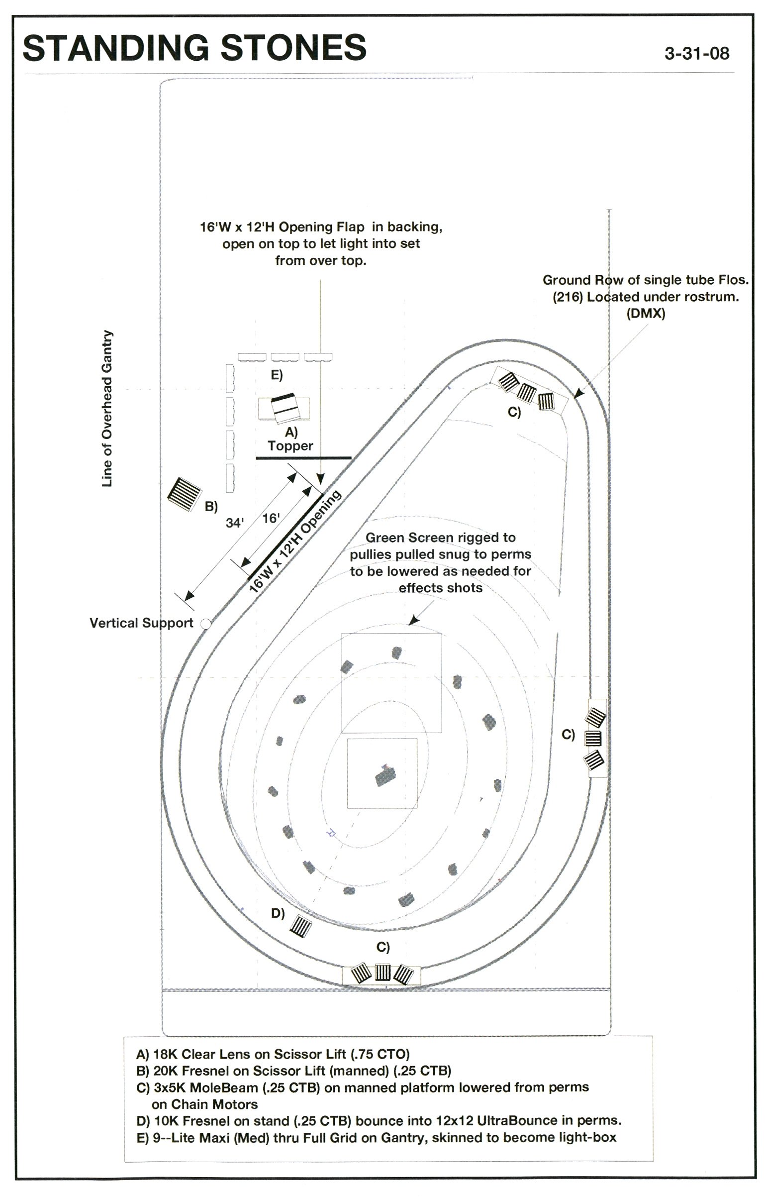
One of my favorite scenes takes place on a hilltop amid a primitive formation of standing stones. This is where Lawrence inherits the curse of the werewolf. It’s one of the few night scenes we shot onstage, and we did so because we needed to control fog effects — in the scene, the creature pursues Lawrence through a gray fog. A 360-degree set was constructed on H-Stage at Shepperton Studios; it featured a 360-degree painted backing and an exquisitely detailed foreground summit with Druid stones.
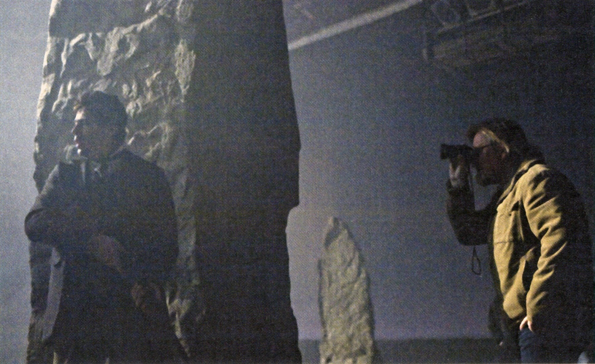
In keeping with my desire to have opposing elements coexist, I created a moonlight source to project through a 16'-wide cutout in the top portion of the backing that was both hard and soft from the same direction. I formed a hard shadow using an open-face 18K gelled with 3/4 CTO and created a soft source from the same placement with an array of diffused Maxi-Brutes gelled with 1/2 CTB. The soft light gave us the wrap we needed for the fog to carry the light into some shadows, and the 18K gave us the glint we needed to bring the moonlight to the fever pitch required for the content of the scene.
We shot most of the picture on Kodak Vision3 500T 5219, using Vision2 200T 5217 for day scenes. I was impressed with 5219 because it transitioned neatly to a nice, tight black that worked very well with the lighting style for The Wolfman. It’s my new favorite stock, and it reminds me of the first 160T 5293 stock that came out years ago and was discontinued after a very short run.
Many people might expect a film like The Wolfman to have a widescreen aspect ratio, but we shot it in Super 1.85:1. To me, 1.85 was appropriate because much of what is haunting Lawrence comes from above — the moon, the upper floors of Talbot Hall — and Rick had designed many of the sets with this vertical character. Framing for 1.85 was a nod to the style of the classic The Wolf Man (1941), and it also appeared to be the optimum choice for our storytelling.
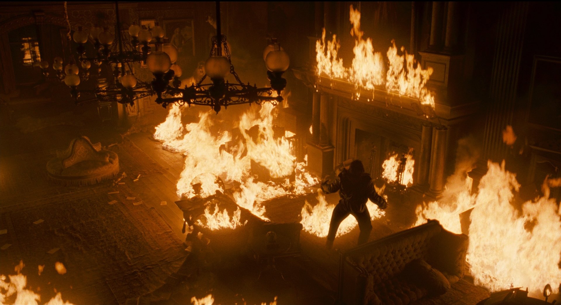
We worked with a crew of wonderful English collaborators. A-camera operator Des Whelan is an old friend who, fortunately, was available to join us on the show. Pete Cavaciuti operated the B camera, and Julian Bucknall and Craig Bloor were on focus. It’s not easy to go to a foreign country and work with people who are new to you, but this crew put a lot of themselves into this project, and they will always have my respect and gratitude.
Key grip Gary Hymns worked proficiently with the 30' Technocrane, from which we shot nearly everything. Joe prefers to work from the Technocrane because it’s flexible and fits perfectly into his directing style. He and I seem to understand that piece of equipment and have a way of finding expression while designing with it, whether on location or in a tight set.
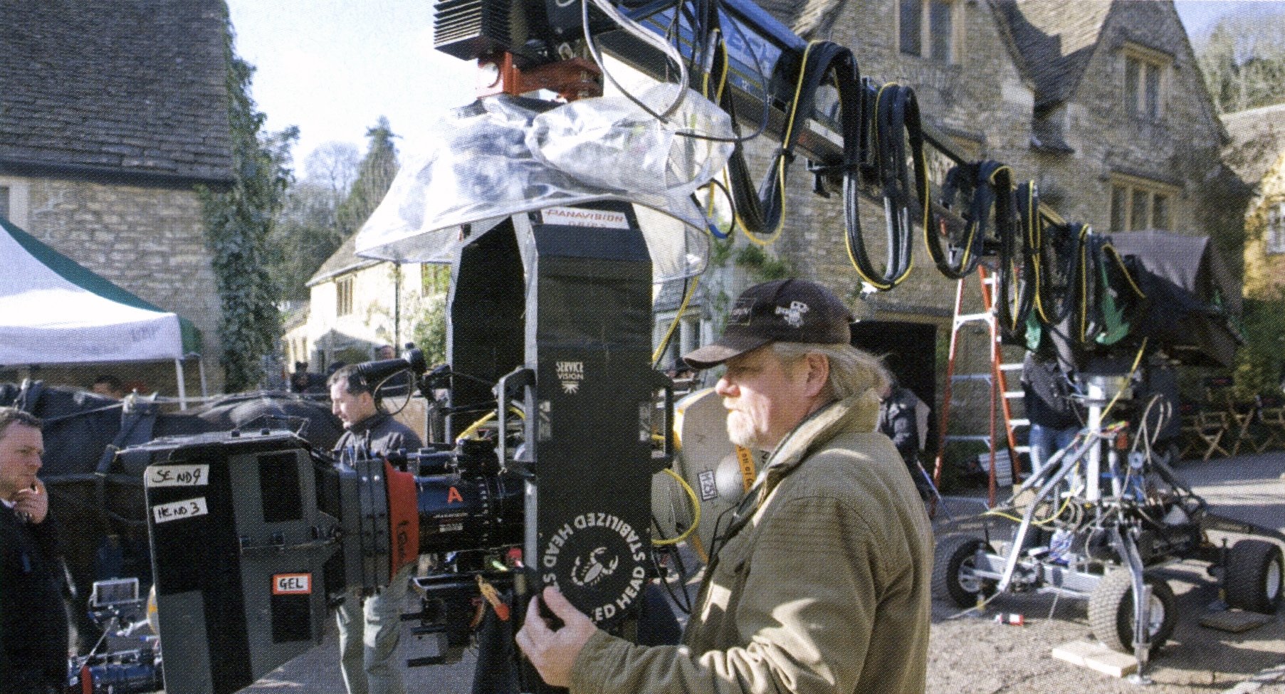
Panavision U.K. provided our camera gear, two Panaflex Millennium XLs and Primo prime and zoom lenses. Joe prefers to use the 4:1 zoom whenever possible so he can make small adjustments between takes as the scene evolves. This is the third film I’ve done with him, and I always try to give him space to create; I’ll always lay a little extra dance floor or make sure there is an extra foot or two to adjust, or place the Technocrane arm so he can move in tighter or extend more laterally as he sees fit. I’ll always make an effort to light a bit deeper and wider than we discussed as well, so that Joe can take the actors further without feeling the burden of waiting for technical adjustments. I always want the set to be a creative place for him, never a technical toy store.
Although The Wolfman is set in 1891, at the beginning of the electricity age, we decided that incandescent lighting would be present in the city, and candlelight would predominate in the countryside. Joe, Rick and I often discussed how this would serve as a visual representation of Lawrence’s journey into the past.
I was in a quandary as to how to shoot many of our candlelit scenes. We had planned a number of shots in which Benicio would walk the length of a long, dark hallway with a solitary candle illuminating the space. Because I’m not fond of shooting at a T1.3, I decided to look at options for believably electrifying some candles. I am not accustomed to pushing film, but one day in our first week, I found myself in a situation where Joe needed one more setup at magic hour and we were out of light. We were losing the location the next day, so I force-processed the 5219 by 1 stop and rated it at ASA 800. To my surprise, the film pushed beautifully; there was only a slight increase in grain and no real contrast issues under our lighting conditions. The printer lights showed we were getting a true ASA 800 rating from the process at Deluxe Laboratories in London. With that, I believed we had discovered how to shoot our candlelit scenes.
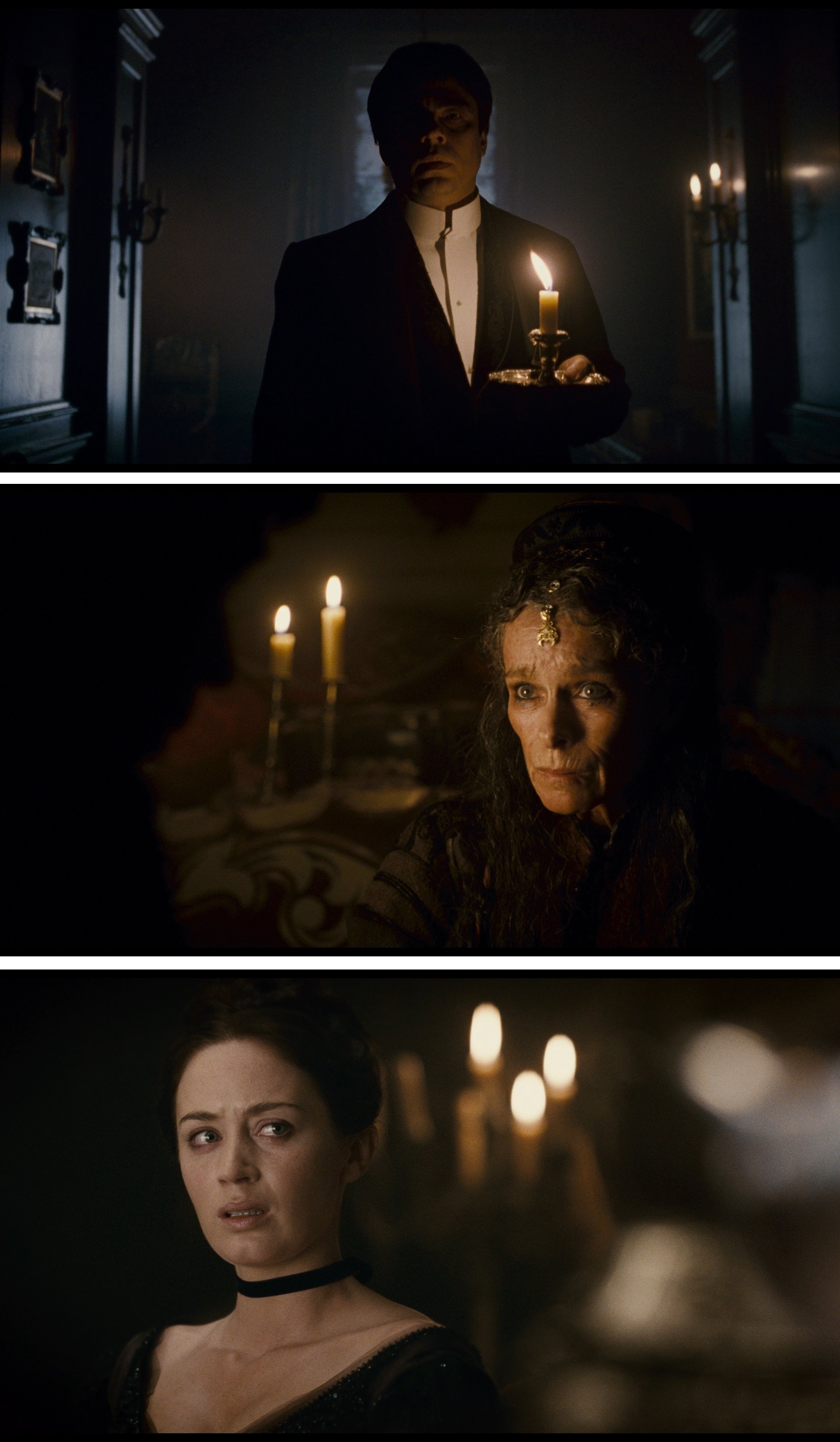
We shot a test and achieved our best look using double-wicked candles shot wide open on Primo prime lenses at T1.9 on our pushed 5219. It was such a simple solution that I might not have explored it so soon if I hadn’t had to push that one, post-magic-hour shot. I’m fortunate that I was in an environment that allowed for creative solutions to emerge and was collaborating with a crew that could back up these ideas with a mastery of their craft.
A central scene in the film takes place in an operating-room theater, where doctors who are trying to convince Lawrence that his afflictions are delusional are suddenly proved wrong when the full moon appears. The scene is sourced with gaslight, which has a natural falloff and an oddly discomforting appearance.
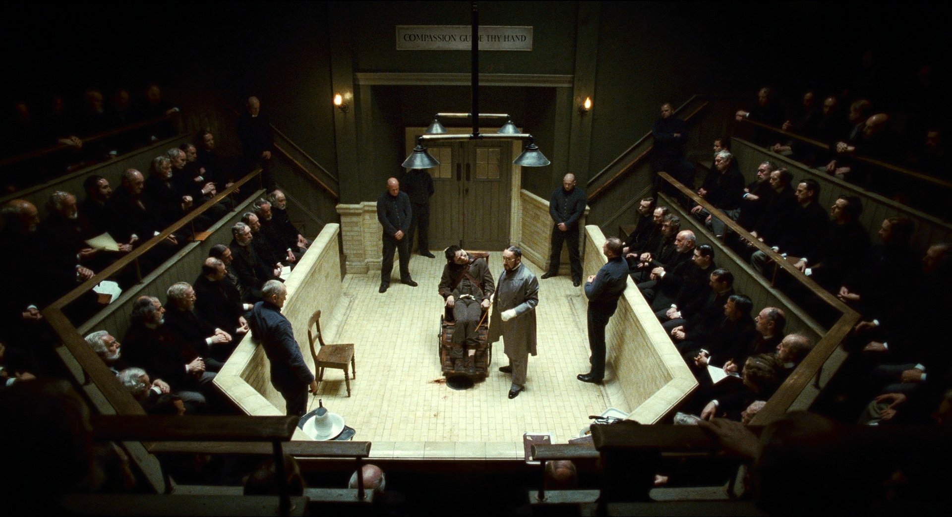
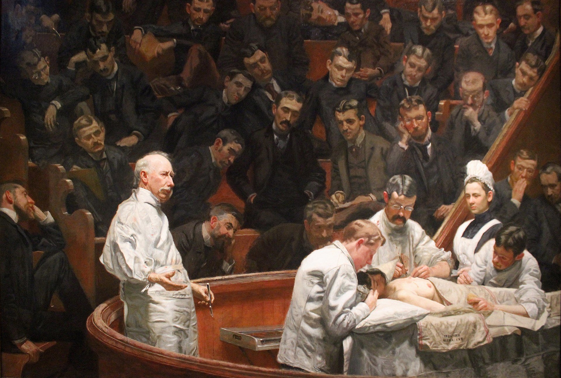
To help establish an eerie presence in our mental-institution scenes, we referenced Thomas Eakins’ 1889 painting The Agnew Clinic, which depicts a Victorian Era medical procedure using a lone, monochromatic gaslight source. The painting has a central subject under a full light that falls off quickly, rendering the audience members part of the glazed shadows. I emulated that type of light with two 8'x16' light boxes fitted with Light Control Grid. We suspended them from chain motors so we could remotely adjust the light level and angle as the scene unfolded. The set was built with a vertical aesthetic, which aided in recreating the feel of the Eakins painting.
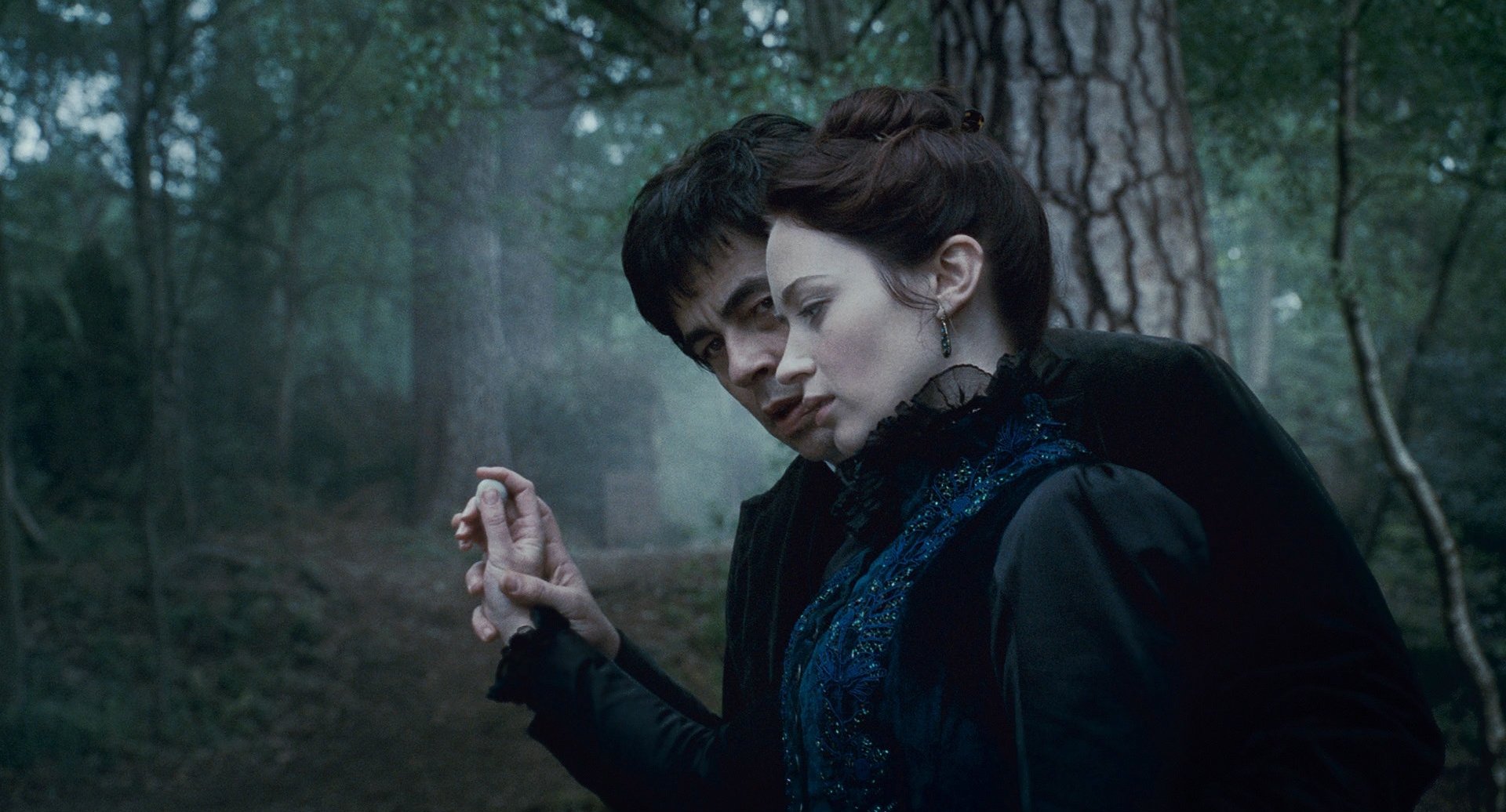
While scouting for a location for our climactic night pursuit through the woods, I found myself standing alone in Bourne Wood on a Sunday afternoon. Forests are always a bit of a challenge for cinematographers, because it’s difficult to light a thick forest without making it look like you’re using an array of movie lights. This particular forest had an extraordinary sculptural appearance, and I thought these forms could look particularly haunting at night. I found a spot of high ground where the forest floor descended and formed a small hill. I thought about using the low area as a light well; I believed I could underlight the entire forest with 20Ks placed there. This would be a new, exciting way to light night. The sequence could be built upon images of foreground forms moving before dramatic, tangled backgrounds. This lighting scheme allowed us to look up without limits and create a sense of scale for our characters within their surroundings. The final look is indeed an artificially lit forest, but I believe this type of aggressive source incorporated within the storytelling will engage the audience in an exciting way.
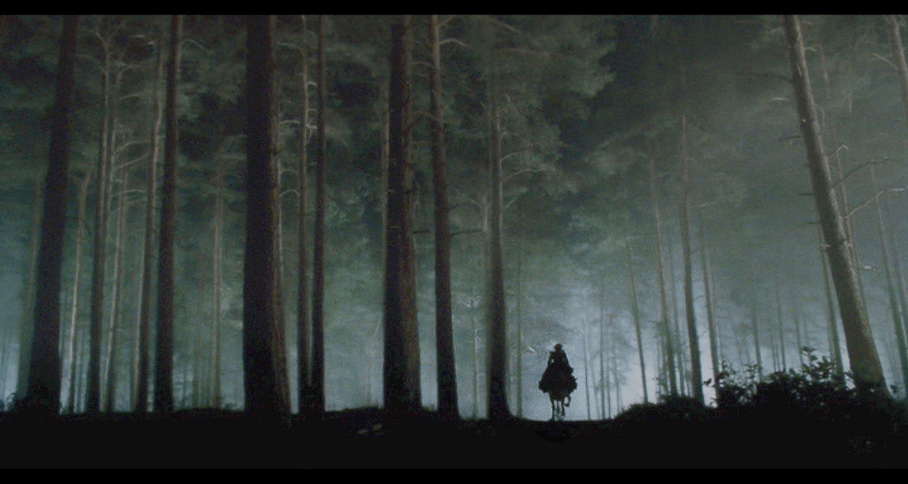
With so many components coming together to form an overall look, I wanted to have one consistent element that could be integrated throughout the film and anchor all our visual ideas. I wanted the highlights to have a pearlescent, glowing look, and the coexisting blacks to be rich, having an ominous effect on values that adjoined them in the frame. Using sample images and Photoshop, I devised a look called The Black Layer Luminance technique. I showed my technique to colorist Jill Bogdanowicz at Technicolor along with the steps needed to accomplish the effect in Photoshop. Jill translated that into something she could implement in the digital-intermediate bay. She is quite a genius. She takes a luminance key off the lower blacks and subtly de-focuses them, and then she punches through those areas with silvery highlights and comes very close to what I did in my samples. We are combining that with a certain amount of desturation, and the total look gives a sense of richness with the heightened impression of anguish I was hoping to achieve.
In discussing the cinematography on a project of this size and scale, one can spend hours discussing how many 20Ks were lined up in a given place, or the technical intricacies of shooting a complex sequence. A cinematographer can also speak in artistic terms, discussing the intensity a composition might bring to a screen moment, or the storytelling attributes found in the color spectrum. Ultimately, though, the cinematographer is just one of the people involved in the creation of a film. Certain moments in a script will evoke different emotions in me than they would in anybody else. Everyone involved with a film brings to it his or her own, unique history, and everyone’s passion must coalesce into a finished work. This, to me, is the great intangible of filmmaking: what happens when specific people come together to tell a specific story.
I believe that is one reason why crewmembers such as those we had in London can become emotionally attached to a project. Filmmaking is an interchange of creative ideas that either hits upon a point of collaboration or doesn’t. I believe that when minds come together who are meant to be together, that creatively charged atmosphere is conveyed on the screen and directly to the audience. That’s how truly great films have affected me. When I think back on the cinematography I’ve admired over the years, it’s usually not the prettiest film or the film with the most dazzling action footage that impresses me. Although I respect those types of movies, the films that get inside me with their emotional treatment of a story are the ones that hit home.
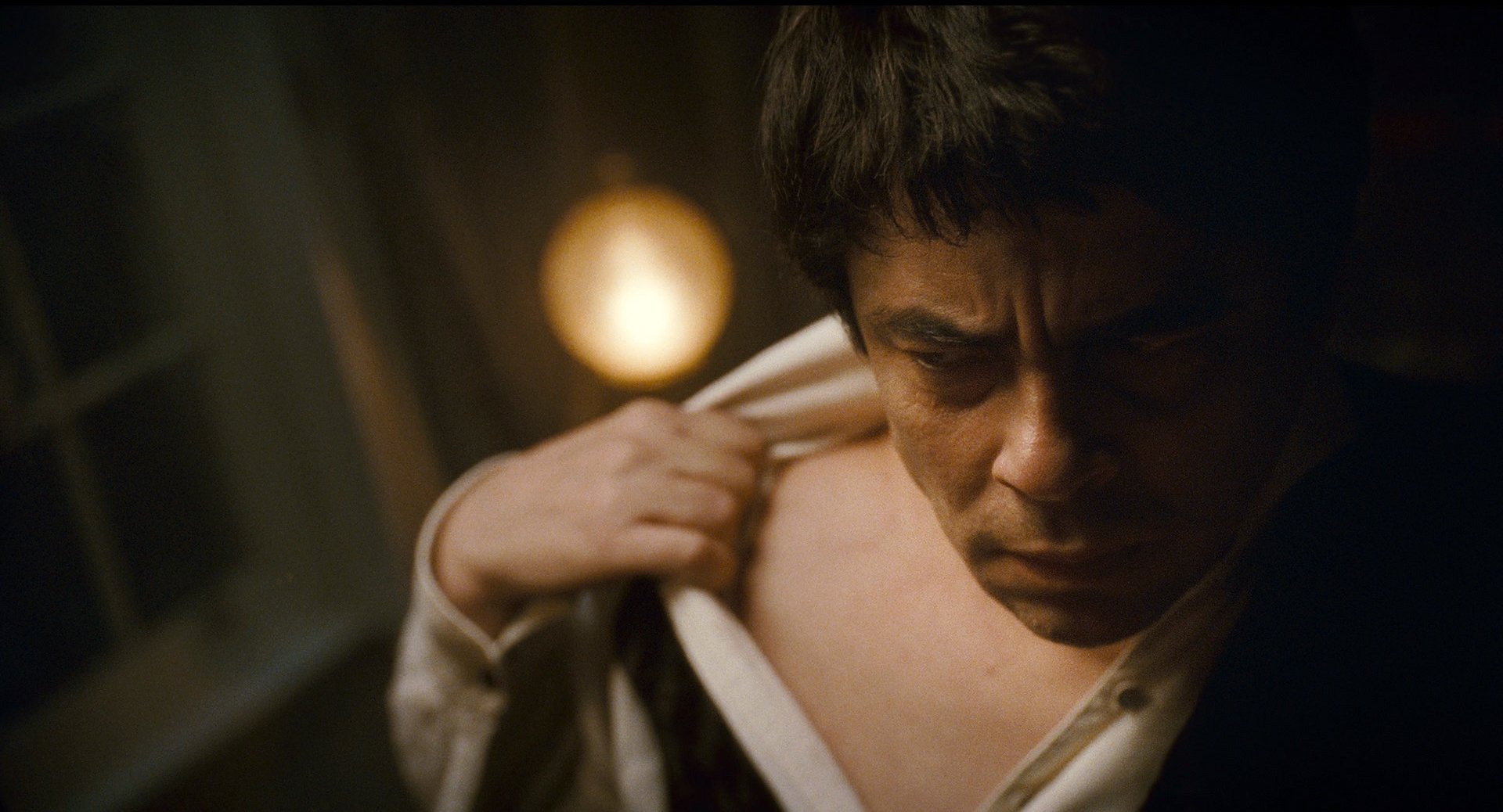
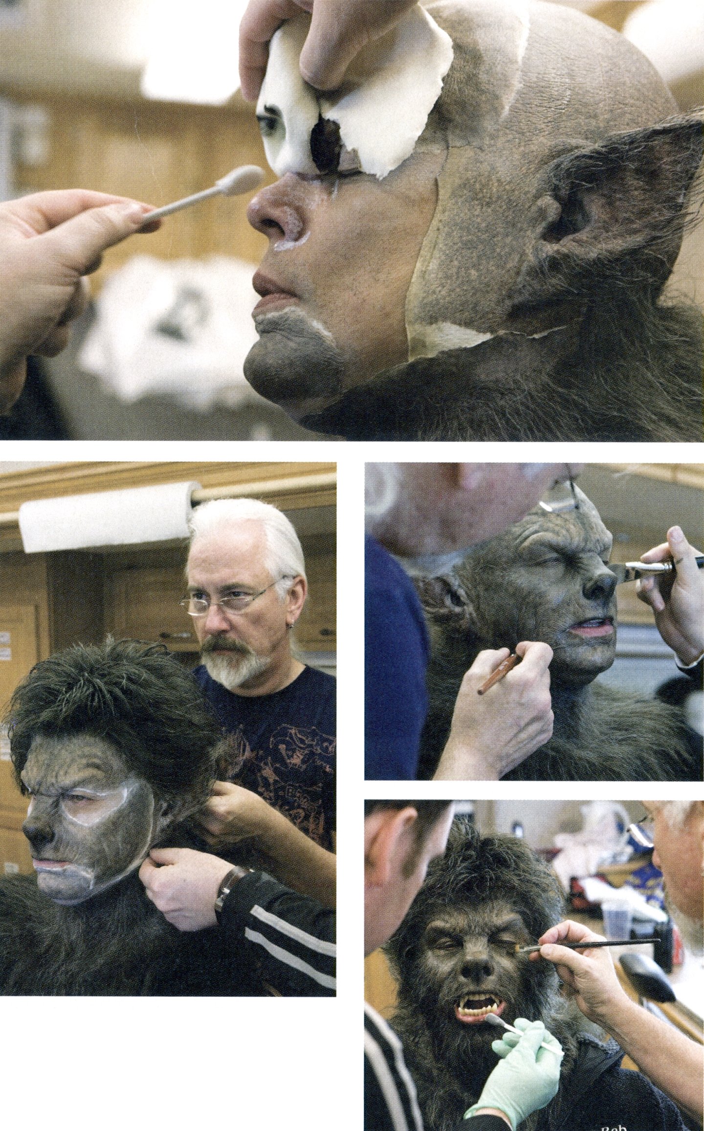
It’s a delicate phenomenon, because a cinematographer has to be ready to give of himself to an audience. Actually, I don’t think I was ready to do that, to step well outside of my safety zone in order to communicate an idea with the director and the actors, until just a few years ago. I had to learn how to take a risk without being 100-percent assured of the outcome, to trust the feeling that my concept was the appropriate direction to take.
When I see or read interviews with my favorite cinematographers — such as ASC members Gregg Toland, James Wong Howe, Conrad Hall and Allen Daviau — I notice that when they discuss their artistry, they almost always pass the credit for their accomplishments to another person. They shot some of the most incredible images in movie history, and they understood that they could not claim cinematography to be a solitary form, but rather an essential component of the art of film. I think the collective spirit of the entire production team is what makes great things happen on the screen. For me, The Wolfman is success will be measured by the truth with which it reaches the audience.
TECHNICAL SPECS
Super 1.85:1
Super 35mm
Panaflex Millennium XL
Primo lenses
Kodak Vision3 500T 5219, Vision2 200T 5217
Digital Intermediate
Printed on Kodak Vision 2383
