Uncanny Valley: Blade Runner 2049
Roger Deakins, ASC, BSC discusses his approach to the noir-inflected realms of this sci-fi thriller.
Unit photography by Stephen Vaughan and Kata Vermes, courtesy of Alcon Entertainment and Warner Bros. Pictures.
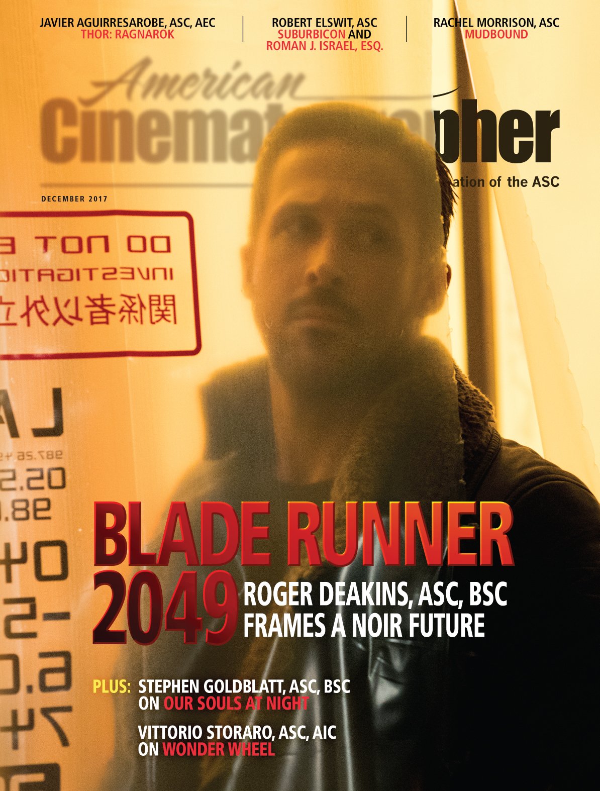
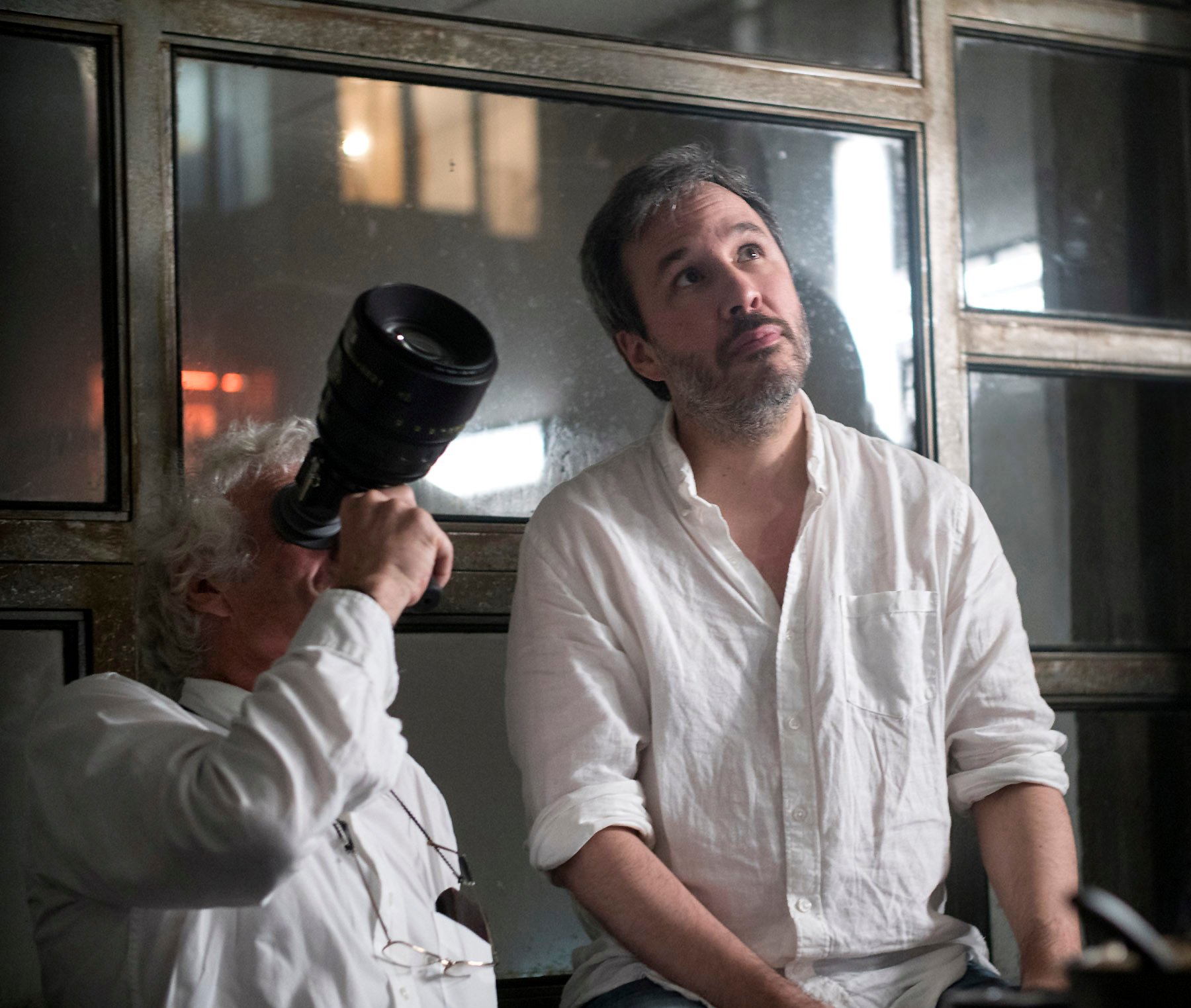
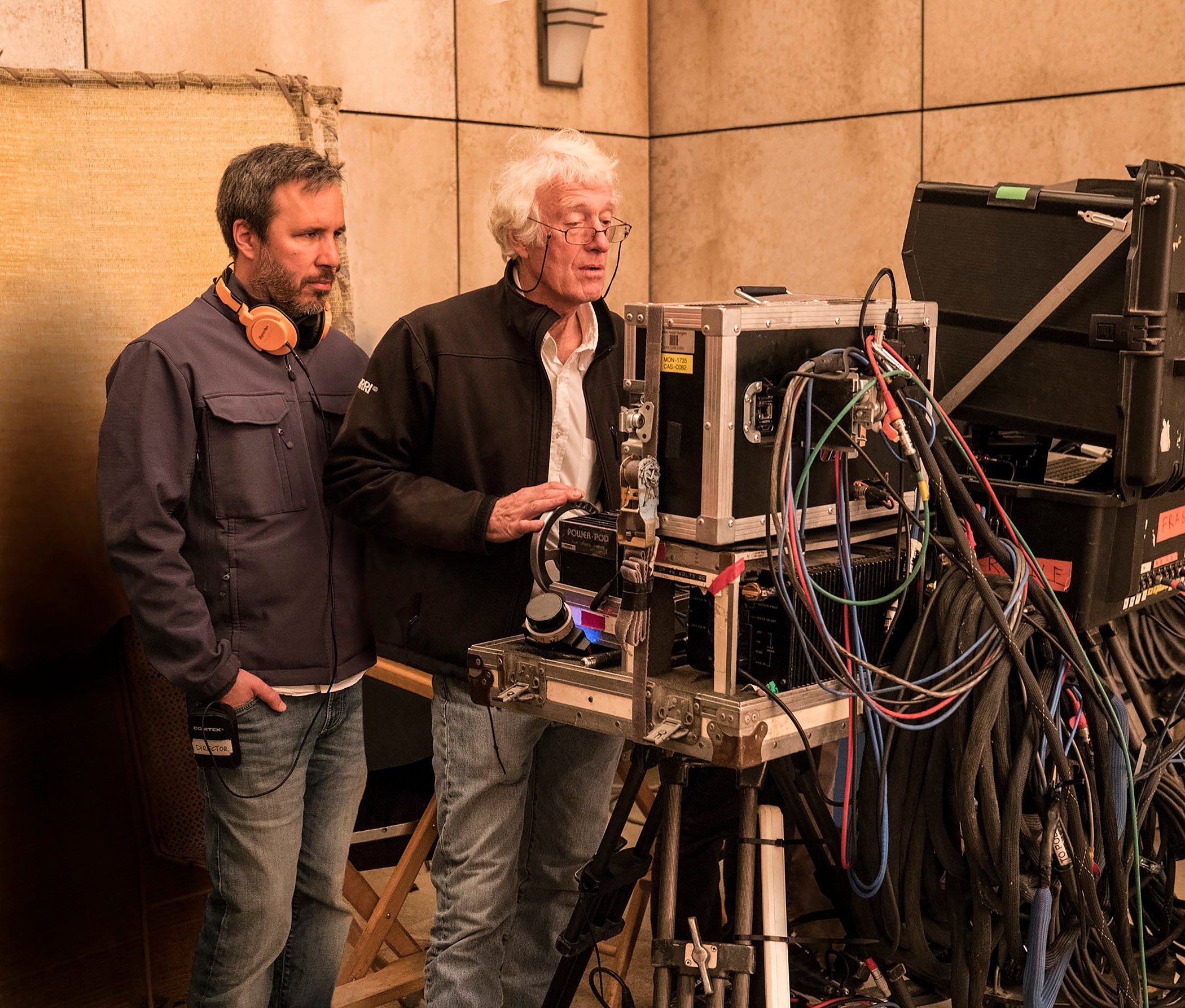
When director Denis Villeneuve asked him to shoot Blade Runner 2049, Roger Deakins, ASC, BSC jumped at the opportunity to make a science-fiction feature. The fact that the project was a sequel to an icon of the genre was almost incidental to its appeal. “I can’t say I was a big fan of Blade Runner, though I suppose it’s sort of grown on me since I first saw it,” says Deakins. “I love science fiction, but you’ve got to have a good story, and I wanted to make this movie because I thought the script was pretty damn good, and I wanted to work with Denis again.”
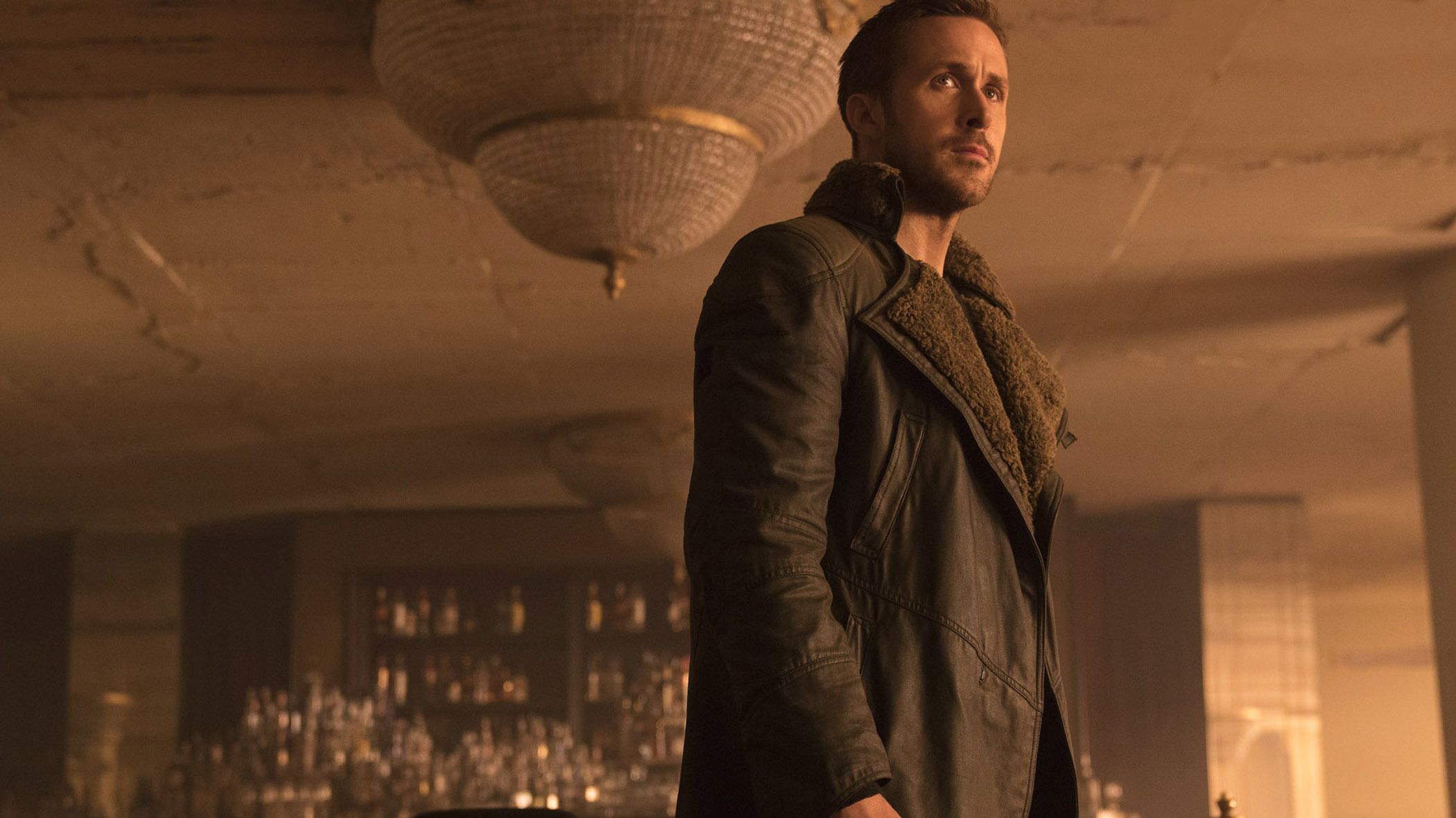
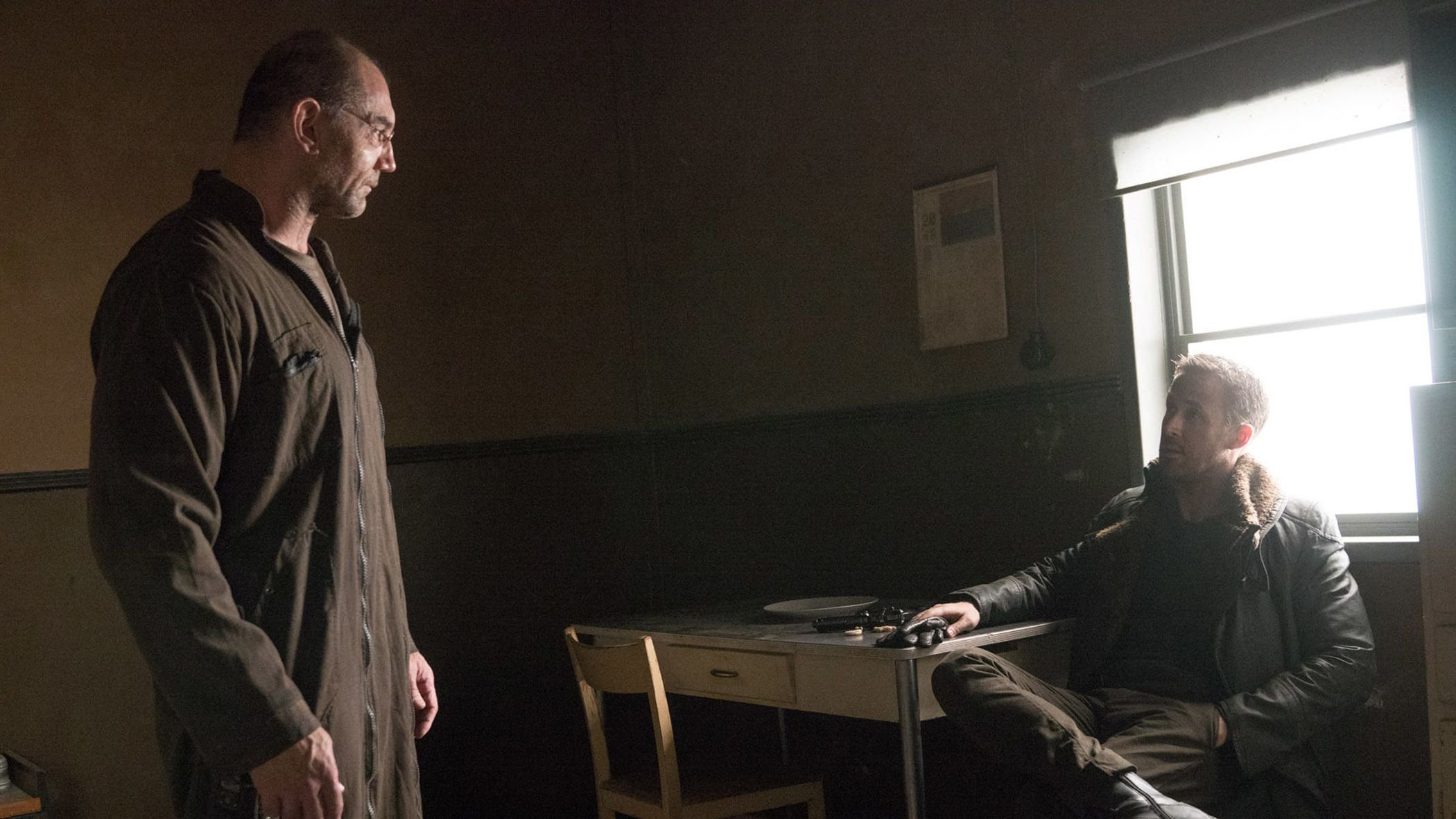
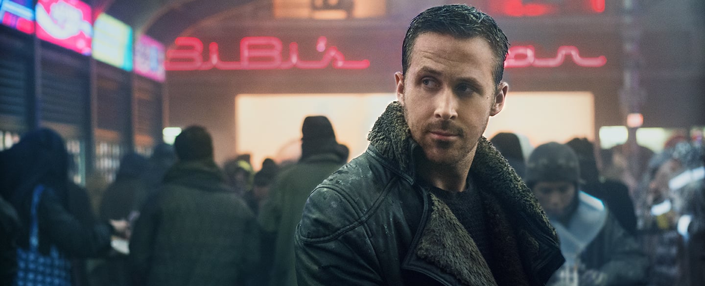
Set 30 years after the events depicted in Blade Runner — which was directed by Ridley Scott and shot by Jordan Cronenweth, ASC (AC July ’82) — the new film follows K (Ryan Gosling), who tracks down and “retires” wayward replicants for the Los Angeles Police Dept. When his latest assignment yields a surprising discovery, K begins an investigation that leads to Wallace (Jared Leto), a reclusive inventor who seems to have perfected replicant technology, and ultimately to Rick Deckard (Harrison Ford), K’s predecessor on the “blade runner” beat who has spent 30 years in hiding.
Blade Runner 2049’s scale and visual complexity exceeded that of Villeneuve and Deakins’ previous collaborations, the contemporary dramas Prisoners (AC Oct. ’13) and Sicario (AC Oct. ’15), but the duo strove to maintain the same close focus on character — whether replicant, human or hologram. This informed their decisions from the earliest stages of prep, which began in Montreal in late 2015; through 92 days of principal photography in Hungary, at Origo Studios and Korda Studios and on location; and in the final grade at EFilm.
For the production, EC3 (the dailies unit for EFilm and Company 3) established a dailies workflow in the P3 digital-cinema space and shipped the calibrated projection and monitoring equipment to Budapest, where dailies colorist Matt Wallach could work closely with Deakins on the look that went out to the other filmmakers, executives and picture editorial. Deakins then sat in for the entirety of the final grade, working alongside colorist Mitch Paulson, who used Autodesk’s Lustre grading platform. Paulson also worked with Deakins on passes for Dolby Cinema 2D and 3D and all home-entertainment deliverables.
AC connected with Deakins in September, shortly after he wrapped up at EFilm.
American Cinematographer: What sparked your interest in science fiction, and what are some of your favorite sci-fi films?
Roger Deakins, ASC, BSC: I read a lot of science fiction as a kid, mainly Asimov and Bradbury. I really liked the original Planet of the Apes, and I thought Soylent Green was an amazing movie. I think my favorite science-fiction film is Tarkovsky’s Solaris. I watch it every few years.
Did you and Denis tap the original Blade Runner for any particular visual references? Did you watch it together in prep?
No. [Blade Runner 2049] was always a film by itself as far as I was concerned. One of the early things Denis was very specific about was the look of K’s apartment. He wanted a severe prefab interior with a kind of plastic feel to it that would reflect that K is an android. A lot of the references for that look came from Japan and Hong Kong. In a bit of a throwback to the feel of Deckard’s apartment in the first film, the kitchen also had this modular quality, almost like a galley on a sailboat. But otherwise, no, we didn’t really reference Blade Runner.
How did your work with Denis begin, and what were some of your visual references?
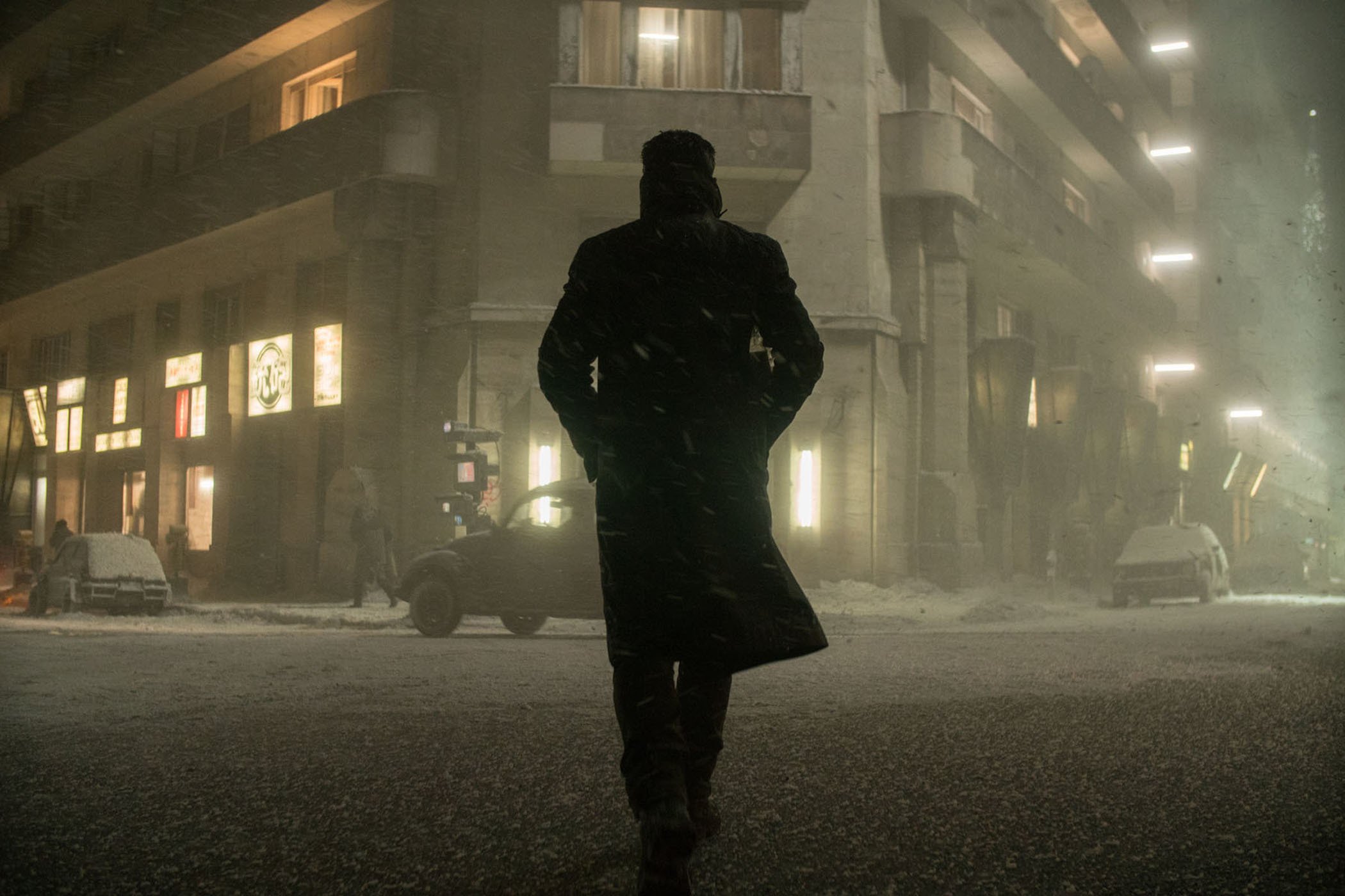
We worked in Montreal for quite some time at the end of 2015, while Denis was cutting Arrival [shot by Bradford Young, ASC; AC Dec. ’16], and we went through the script and started doing storyboards along with [production designer] Dennis Gassner. Many of our references were architecture, actually. One of the early references Denis gravitated toward was the architecture in Beijing and the look of the city in the smog; he liked the idea of L.A. being cold, with either rain or snow in exterior scenes. We wanted the environment to be a character in itself, and gradually we came to the idea of stark, minimal Brutalist architecture. Denis was particularly struck by some of the architecture we had seen in London, such as the South Bank arts complex, the Barbican Estate and Trellick Tower. I also spent a lot of time trawling the Internet, looking at different architects’ work and how they used light in their buildings.
At one point, I came back to L.A. and continued working with a storyboard artist here, and then I’d get together with Denis and we’d talk things through. We probably storyboarded this movie more precisely than anything I’ve ever done apart from the Coen brothers’ films, maybe more precisely because we previsualized some of it. The storyboards came in handy mainly for the visual-effects work, the aerial work and the second-unit work, though there wasn’t much of the latter.
What led you to Hungary?
Initially we thought we might shoot in London, and that was why we scouted there, but we knew we had to shoot about two-thirds of the movie on stage, and there was no stage space available in London. [Executive producer] Ridley Scott had shot The Martian [AC Nov. ’15] in Hungary, so he was familiar with the stages there. I went out to Budapest with Denis quite early on, and we scouted various locations in Hungary as well as some specific architecture in Slovakia.
I brought several of my key crew over from the States, but I have to say, our Hungarian crew was fantastic. For the day-to-day on-set lighting, I worked mostly with local gaffer Krisztián Paluch and his crew, whilst our supervising gaffer, Billy O’Leary, whom I have worked with on and off for more than 30 years, came over from New York to supervise. Local rigging gaffer Antal Berger and dimmer-board operator Titusz Badonics were terrific, but we had so many different sets that we called in a few people I’d worked with on other projects to help, including key grip Mitch Lillian, rigging key grip Charley Gilleran, rigging gaffer Patrick Bramucci and dimmer-board operator Steve Mathie. We also brought in our second camera and Steadicam operator, Peter Cavaciuti, whom I have worked with for years. So, I was surrounded by a great team.
Given the scope of the movie, did you consider shooting large format?
We tested the Arri 65, but neither Denis nor I wanted to go that far. We were happy with what we did on Sicario, so we stuck with that. We shot the Alexa open gate, but we kept the full frame [1.55:1] clean instead of cropping to 2.40 because we knew there would be an Imax version, which is between 1.70:1 and 1.90:1. A majority of the shoot was done fairly simply, the same way we approached Sicario — basically single camera, with the camera solid on a dolly or a crane arm. We used two of the new Alexa Minis quite a bit, especially in the spinner vehicles. [Digital-imaging technician] Josh Gollish and I used the same LUT on set that we used on Sicario. I don’t change much, really.
What inspired the artificial-sunlight motif in Wallace’s headquarters, and how did you create it?
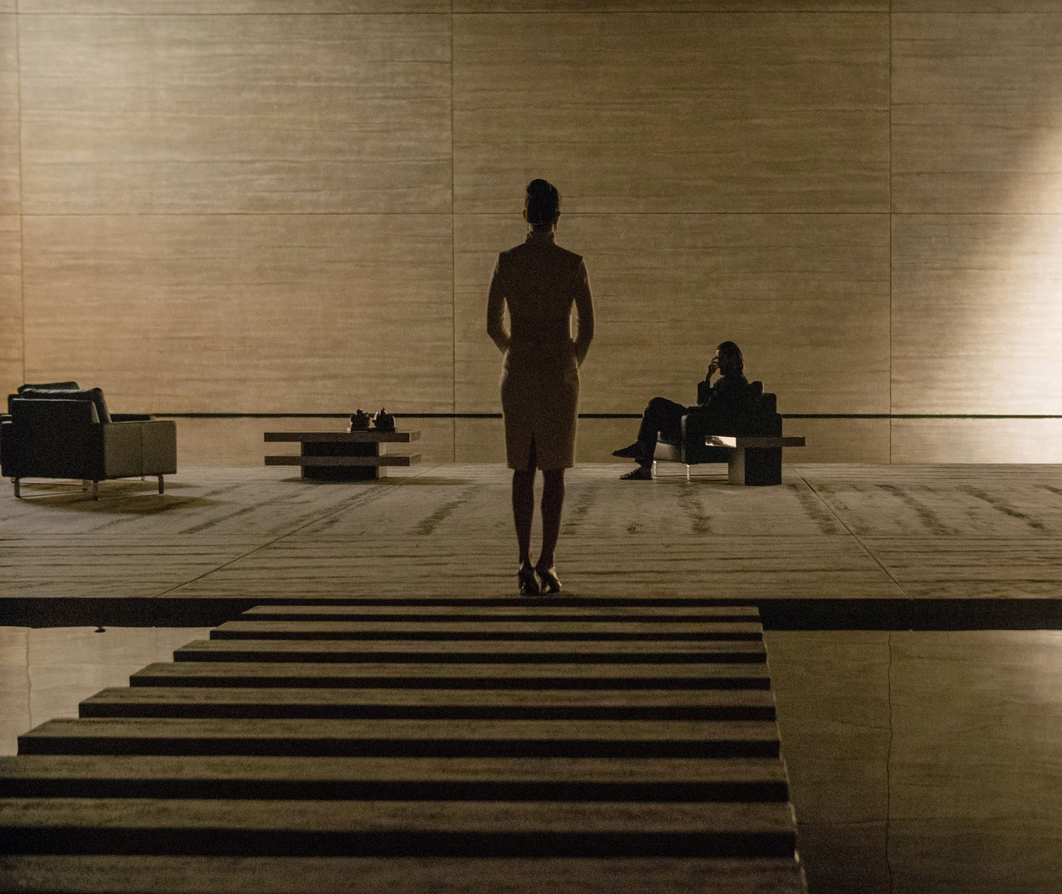
I thought it would be interesting if the interiors of this huge, monolithic building always had the feeling of moving sunlight. Some of those sets were very severe, just square walls with no windows or obvious light sources, so I looked for different ways to bring patterns of moving light into them.
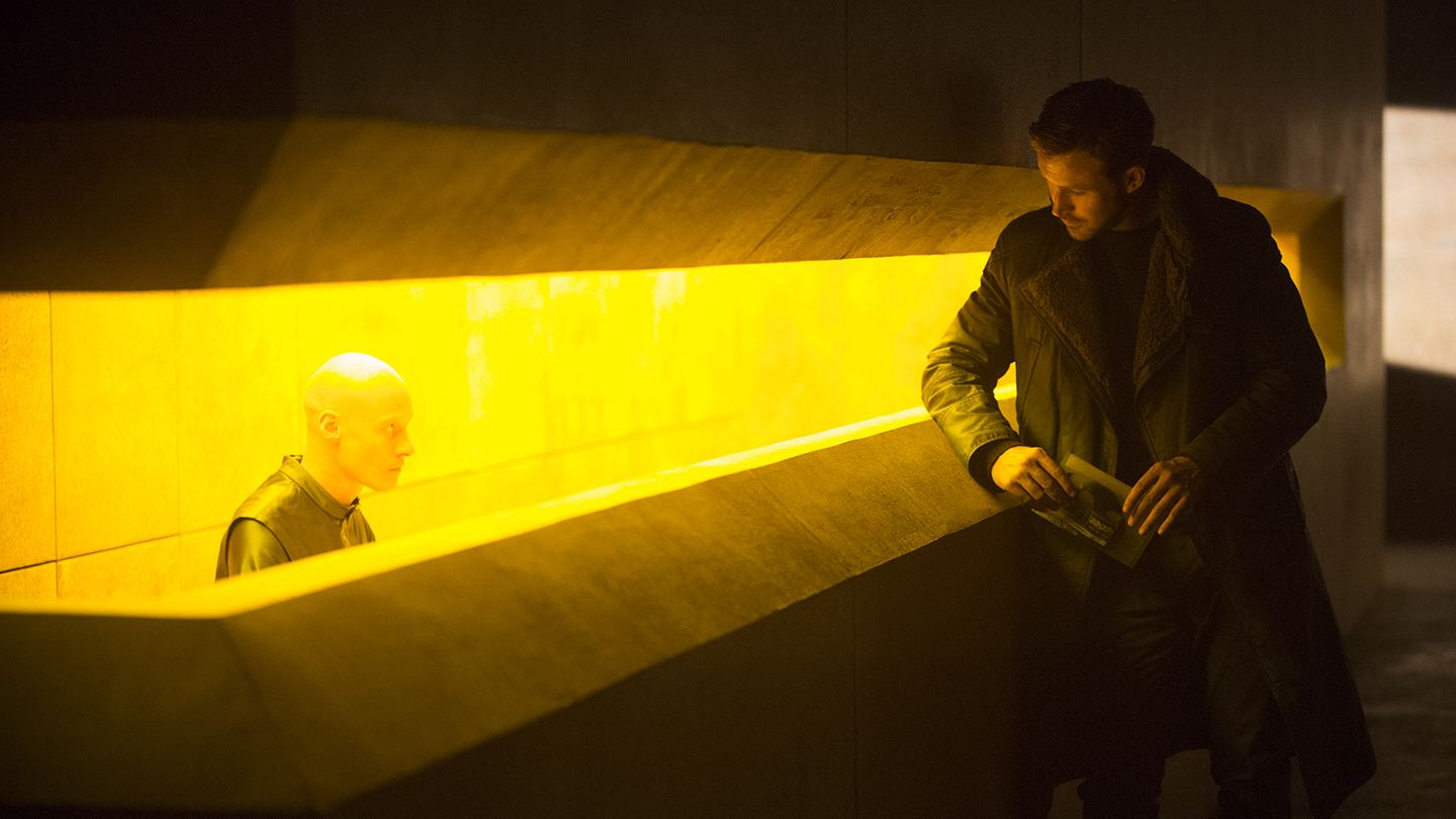
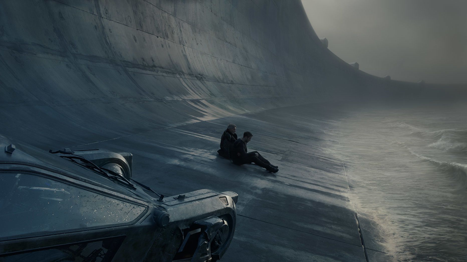
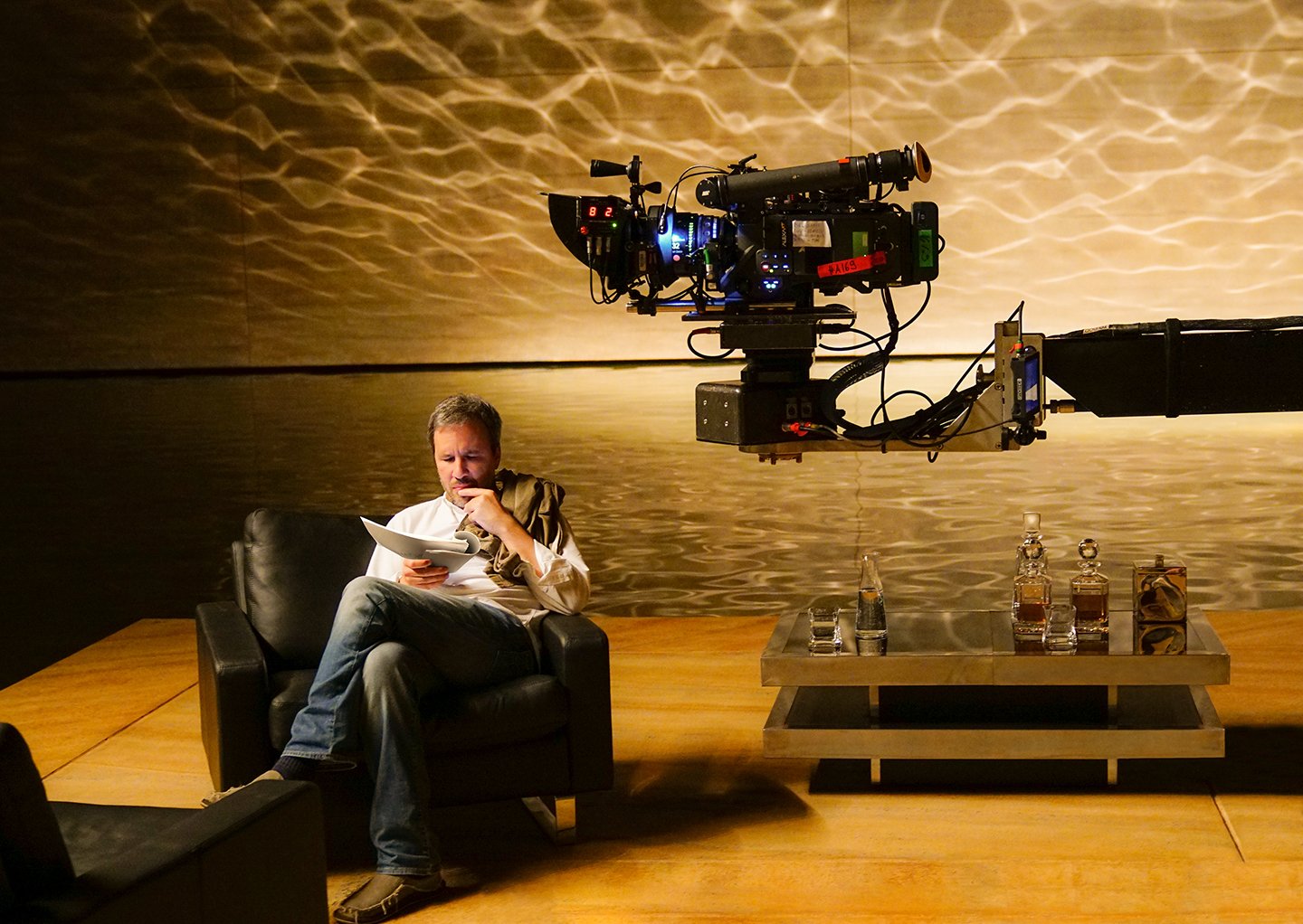
One architectural reference we liked used water as a ceiling piece to create a caustic light effect; we took that idea and embellished it. Two scenes in Wallace’s office, which is basically a platform surrounded by water in this big concrete box, were probably the most complicated bits of lighting. The first scene, which introduces Wallace, is actually not very long but needed to be quite impressive. For that we created three circles of light about 25 feet in circumference, with about 35 10K Fresnel lamps on each circle, and put them on a dimmer chaser to create a pattern of moving light. There were square cuts for the light some 15 feet below the lamps so that there were defined patterns across the walls.
When Deckard is brought to Wallace’s office toward the end of the film, we bounced 10Ks off the water, and by using wave machines to move the water very slightly, we created caustics on the wall. But this was just a background to the action; to actually light the characters, we used 285 Tweenies rigged in two concentric rigs directly above the center of the action. Thus, an ever-revolving circle of light passed across the actors throughout the scene and gradually grew in softness as more lights were added to the circle.
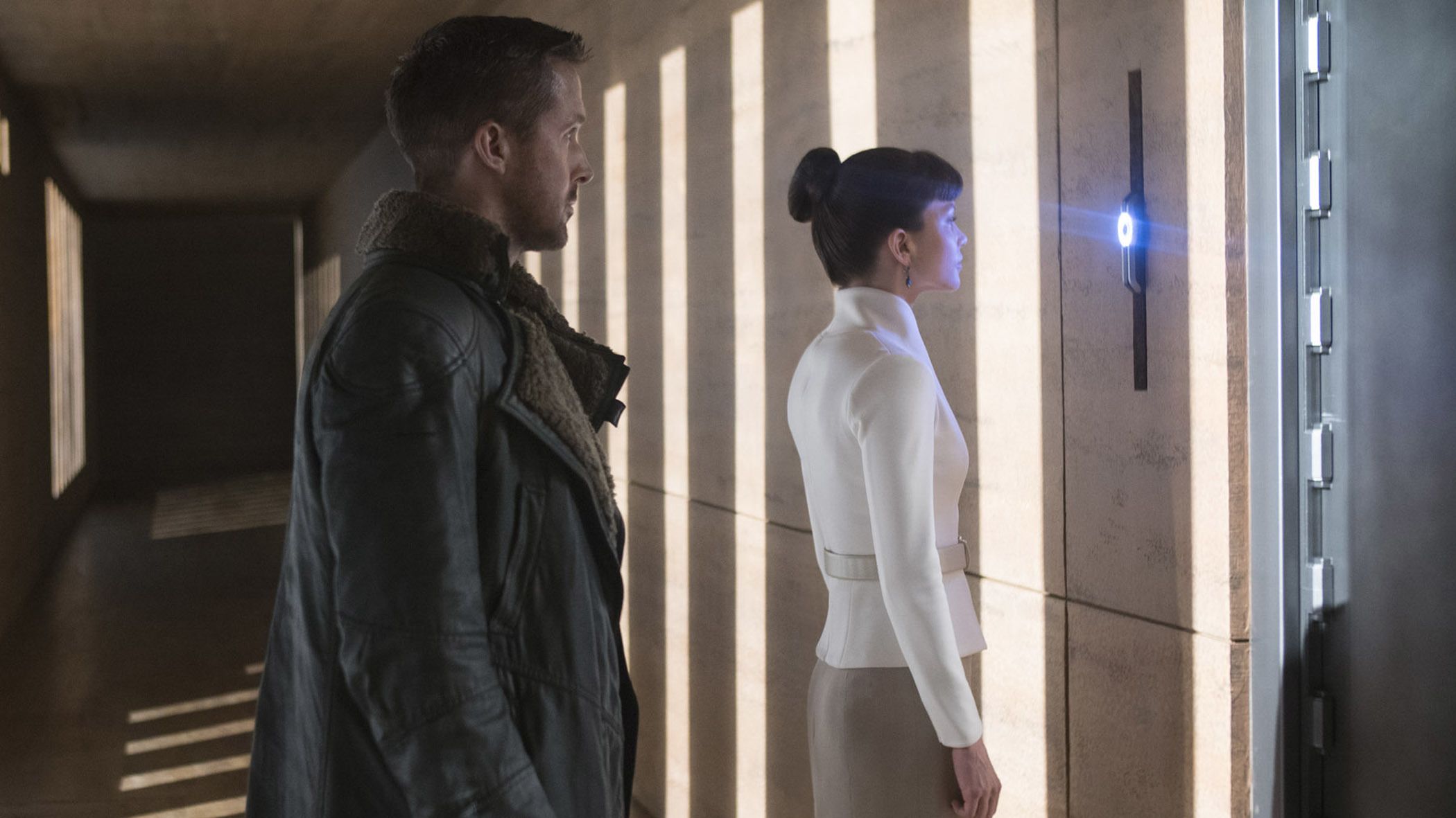
Some of what we did was very low-tech. We took a 24K bare bulb and three 10K bare bulbs to light the stairway, down which Luv [Sylvia Hoeks] and K walk through the replicant ‘museum.’ These bare bulbs, housed in safety protection, were rigged to a channel track above the set, and the electricians pulled them by hand to create a hard light that traversed the set as our characters descended. For the wide shot that follows this, in which K and Luv walk down a long passageway to the ‘memory library’ door, we rigged two 24K Skypans on a pulley system, which the grips slowly lowered during the scene to create a pattern of light that slowly grew up the wall.
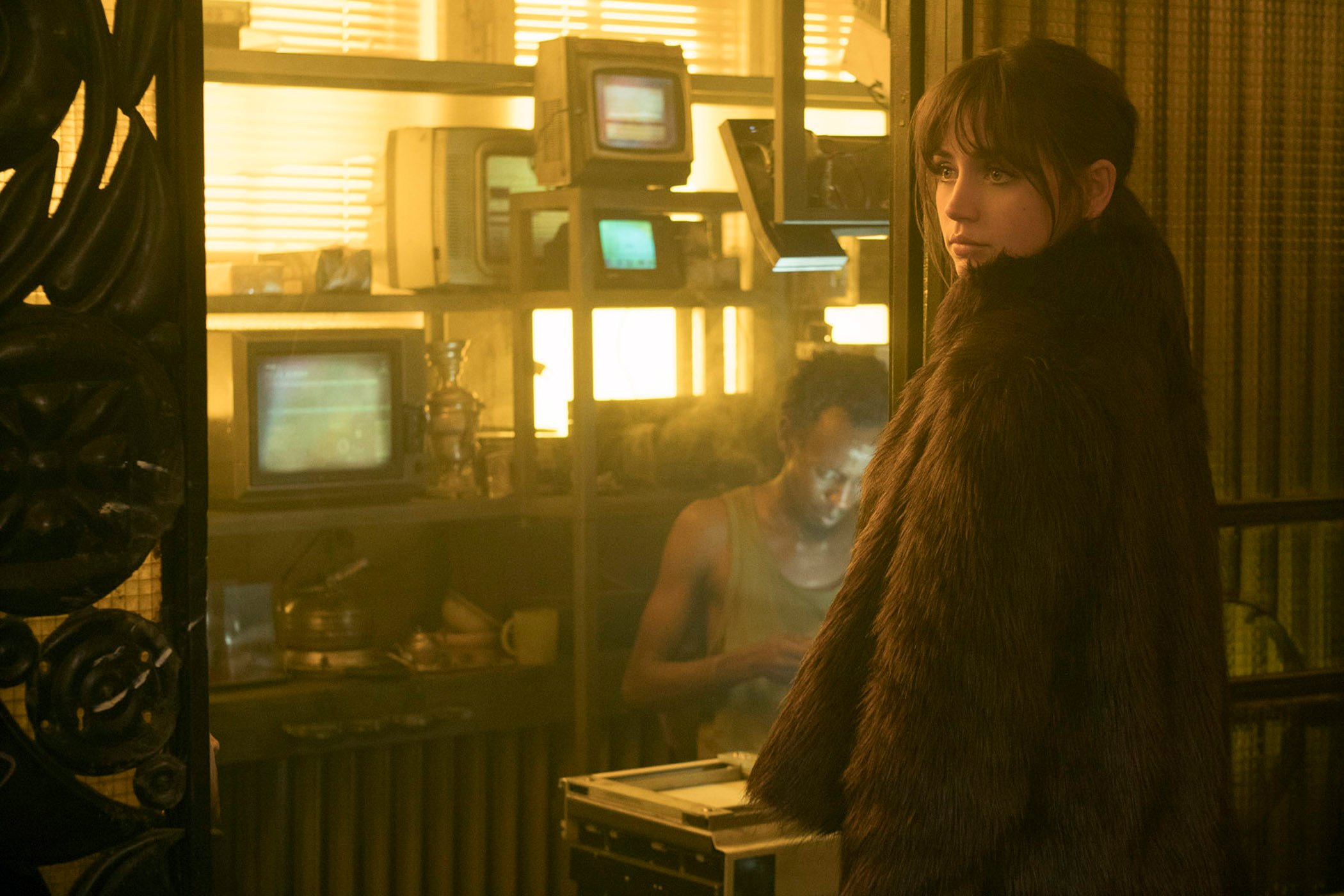
One of the subtlest uses of visual effects in the film is K’s holographic companion, Joi [Ana De Armas]. Most of the time she looks like a flesh-and-blood human, with just a slight shimmer or degree of transparency to suggest that she isn’t. How did you approach those scenes?
I was always arguing for less. You need to connect to Joi as a character, and I don’t think you would if she’d become this bit of effects wizardry. There was a lot of talk about how far we’d go with the transparency. You see some transparency when she’s against a highlight, but it’s subtle. Basically we shot the actress on the set, and for every shot we did we also shot a background plate. That way [visual-effects supervisor] John Nelson and his team always had that background that they could add or remove.
How did you accomplish the scene in which Joi merges with the escort [played by Mackenzie Davis] so she can physically connect with K?
That was kind of terrifying because if it didn’t have the right pitch, it could have turned into an Aladdin-type fantasy rather than something you could believe as real. It was a very hard balance, and we spent a lot of time in prep on that sequence. John Nelson originally wanted us to shoot the scene with one of the actresses and then shoot a greenscreen element of the other actress to replace it, but that proved to be less realistic. Effects companies did quite a few tests where they played with the idea of pixelation and distressing the image as the women combined, but it all became too fussy. In the end, we made tests of just shooting each actress in the same situation, in exactly the same poses or as close as we could get it, and then simply overlapped the images. We storyboarded it precisely, and that’s what we did.
It was time-consuming — we shot the scene with Ryan and one actress within the shot first, and then the other actress had to watch the playback and basically mimic what the first actress had done. But it actually worked much better that way because both actresses are in the same light; the light matches the environment perfectly, which would have been impossible to replicate with greenscreen, frankly. And the performances speak for themselves.
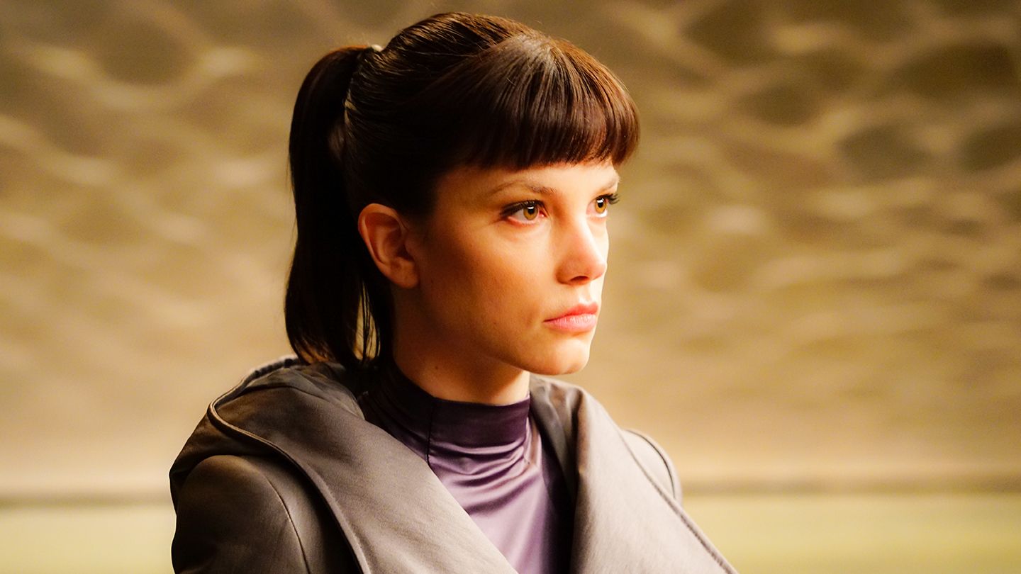
The dome-shaped lab where Ana [Carla Juri] creates replicants’ memory implants is one of the more unusual sets.
Yes, it’s a big egg with no light source! [Laughs.] The design was inspired by the Darwin Centre Cocoon of the Natural History Museum in London. The shots that introduce Ana, where you see her in the forest that then dissolves into her lab, were actually shot in prep, whilst the lab was a set we shot late in the schedule. So it was quite a long time between the shooting of the plate and the interior, and we had to choose our angles very early on. We lit the lab almost entirely with LED ribbons recessed into a cove in the floor. It doesn’t look like much, but it was an enormous amount of light. There was a hole in the top of the dome that doesn’t appear in shot, and we put a small amount of LED soft light there using [Arri] LED SkyPanels, but it’s very minimal.
Did the wall of glass separating Ana from her visitors present any concerns?
It was suggested we shoot without the glass and add CG reflections in post, but that wouldn’t have looked right. I had the camera on an Aerocrane and Power Pod remote head — the same system that I regularly use — and there were a few instances where [visual-effects artists] had to paint out the camera’s reflection because there was no way to shoot without getting it in shot, but it was fairly forgiving.
Ana’s creation of the birthday-party memory is a lovely bit of interactive lighting. How did you achieve that?
First, we storyboarded the scene to determine all the angles we needed. We shot the children as an element during preproduction, lining up our shots with our actress but always keeping the children as a clean element. I used a circular tray of 250-watt bulbs on flicker generators to mimic the light that would be coming from the candles on the cake. Some shots we made with multiple cameras for the moment when the kids freeze but the cake is still spinning; using multiple cameras enabled the visual-effects team to manipulate the kids in three dimensions. We shot the birthday cake as a totally separate element because the light level of the candles wouldn’t have lit the scene as I wanted it, and because the cake changes from shot to shot. Finally, at the end of our schedule, we shot the main work with Carla and Ryan. We had boarded the scene and mapped out our camera positions, camera height and lens, so we knew where the children would be matted into the frame. The main trick was making sure we had the right camera angles before we shot a frame of the scene.
How about the interactive lighting in the night scene where the giant advertisement for ‘Joi’ directly addresses K?
We shot the ‘Pink Joi’ element first. When we shot the scene with Ryan, I felt it important that we play the element at a true scale so that the lighting could be interactive between the advert and K. There’s rain and fog in the scene, so we filled the stage with mist and had this 40-by-30-foot LED screen playing back the image that we had shot during preproduction. The pink-and-blue advert was basically lighting the whole shot — the atmosphere and Ryan. The light changes as the advert changes. Of course, in post the visual-effects team altered Joi to make her look more three-dimensional and walk out of her screen, but the look is still closer to reality because the actual light and colors are all there.
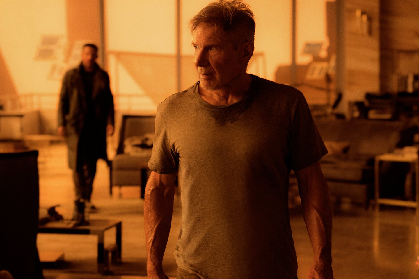
The striking dusky look of Las Vegas, where K meets Deckard, really sets those scenes apart from the rest of the film. How much of the look did you achieve in camera?
Both Denis and I always wanted to do as much as possible in camera. The wide shot that opens the sequence, which shows K looking at the CG city in the distance, was shot on a studio back lot, whilst the exterior shots showing K approaching the casino were shot on stage. This was the same stage and lighting rig we intended to use later for a different set, a day exterior that takes place in the snow. Both scenes involved CGI, so there was a gray cyc around the whole stage that worked for both sets. I decided to rig 250 space lights overhead and just leave them there to do both scenes. Space lights are fairly old-fashioned now, but we could get them locally quite easily. For the Vegas exterior, we didn’t gel the space lights, but we added 20 Maxi-Brutes gelled green at the sides of the stage to add a yellow highlight in the sky, and I had a filter pack on the front of the lens that Tiffen had made for me based on some lighting gels I’d chosen — in this case, a combination of [Lee] 790 Moroccan Pink and 105 Orange — which gave the image an overall red look. [Ed. note: According to Mike Fecik, lab manager at Tiffen, the company created three filter options for Deakins, one based on Lee 134 Golden Amber, one based on Lee 020 Medium Amber, and one that combined Lee 790 Moroccan Pink and 105 Orange. All were made in full and half density.]
We mapped out how we could do a number of different shots in the same stage by wheeling different set pieces — sections of large statues — into and out of the space to progress the scene as K approaches the hotel; we would have a quick turnaround and reset the stage in a different configuration. We also used atmosphere, quite a lot of smoke.
When K steps inside, it’s a practical location, an old stock-exchange building in Budapest. That was our largest practical location, and we were shooting on at least three floors there, so we had to wrap the whole building with light — something like 20 daylight-balanced 18K HMIs — and gel and diffuse all the windows to match the red look. We used Moroccan Pink plus 105 Orange on some lower windows, and the Golden Amber on the main skylight and some upper windows to get a sense of the light being less ‘heavy’ higher up.
The third part of the sequence, in Deckard’s penthouse apartment, is back on stage. We gelled all the lights at the foot of the set, some 10 T12s, with our heavier Amber filter. We set approximately 32 T12s gelled with a lighter Amber on a truss above the roof of the set, and they were bouncing off white reflectors on the stage ceiling and hung above the backing. The Vegas cityscape outside the window was a large painted backing lit with 75 2K Blondes that were gelled with alternating light and heavy Amber. There was talk of making this backing greenscreen, but I thought that was kind of ridiculous. Technology these days is so advanced you don’t really need to use greenscreen, and I think [the result] is not believable because there’s nothing real reflecting onto the set. So I argued for a painted backing. It was in gray tones, and we did a lot of testing to get the right feel. For most of the shots on the backing, John Nelson’s team went in and made a few buildings look more three-dimensional, more detailed, but in other shots it’s the original backing.
The holographic stage show that flickers in the background during Deckard and K’s fistfight in the casino must have presented a few question marks when you read the script.
[Laughs.] Part of the fun of signing on for a film like this is that you get to do certain things. You want to stretch yourself as much as you can, play with it — you’re not there to just bounce a lamp off the ceiling, though that might well have been a little less stressful! With this stage show, I really wanted to do as much as I could within the schedule and budget, but we only shot a couple of days with Harrison and Ryan, and [2nd-unit cinematographer] Pierre Gill [CSC] only shot a couple of days with the dancers, so we had to be really prepared. The idea was that it’s an Elvis concert and these other acts — Marilyn Monroe, go-go dancers, Bollywood dancers — sort of overlap and glitch in and out.
I worked with Dennis Gassner on the design of the set, and we storyboarded the sequence quite precisely. That evolved into a storyboard with music, a temporary guide track. I worked with a local concert-lighting company in Budapest, Lightdesign, to design a whole sequence for the show that fit this timeline, and then we previsualized the lighting plan. Tibor Kalla mapped the lighting pattern onto the set and then worked out exactly what lights we needed and where they would be rigged in relationship to the set. We only had a week to place the rig and a couple of days to program the lighting so, again, we had to be very prepared. The concert lighting lit the entire scene. Now and again we’d adjust the light based on where Harrison or Ryan was, but the basic plan went through the whole sequence.
In some shots of Harrison and Ryan, there’s an Elvis lookalike standing in Elvis’ spotlight in the background, and some of the lighting for the other acts, which Pierre shot as elements later, was also in the background. Pierre reproduced our camera angles to shoot the other acts in the same programmed lighting, and then those elements were laid in as holograms later on. It doesn’t look it, but that was probably the most complex scene because there were transparent elements and overlapping lighting. Integrating those things was kind of tricky.
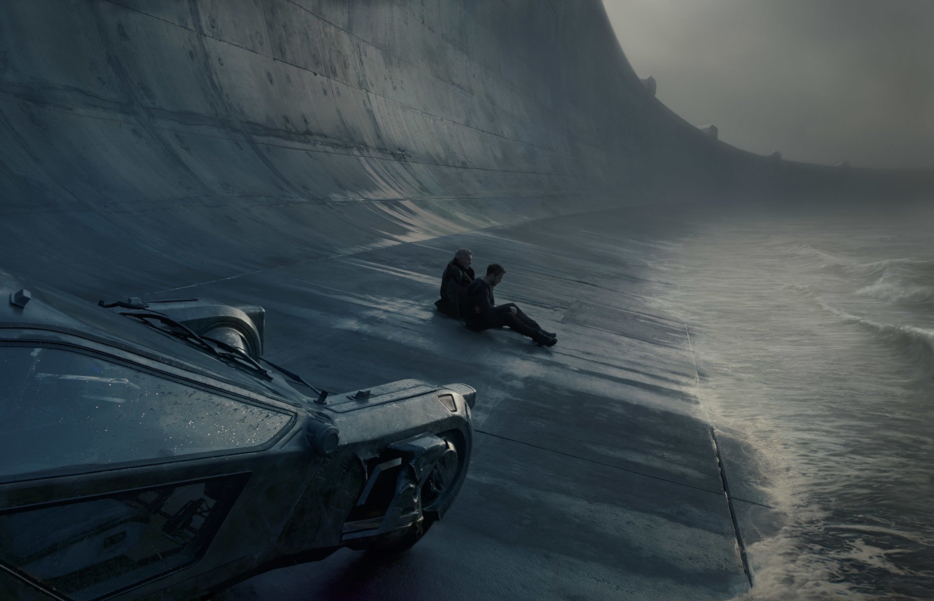
The night scene involving two spinners crash-landing in the ocean looks as though it’s lit entirely by the vehicles’ lighting.
It was. We originally planned to shoot that sequence in a tank in Malta at the end of the shoot, but that proved to be too problematic in terms of scheduling and expense, so we built a 150-by-150-foot water tank on a back lot in Hungary and shot it there. That was much more practical because we could prep and shoot without losing travel time.
We had to see a lot of action, but I didn’t want to light the whole place up. I wanted something sketchy, sort of pools of light surrounded by darkness. We built LED lighting into the spinners, whose original design was done by Dennis Gassner and [supervising art director] Paul Inglis in prep, and we designed the LEDs in the larger spinner to change color over the course of the scene. I wanted it warm and dark when they’re flying and then bright, white emergency lighting when they crash. That way I could justify brighter lighting for the body of the sequence.
For the action outside the vehicle, we maneuvered the lighting so the headlights, taillights or interior lights would appear to be all that was lighting Ryan and Sylvia, and we chose angles that placed the actors either in beams of light or in silhouette. To boost the light level, we added LED spotlight rigs — simple off-the-shelf units that Billy had found locally — to the headlights, and orange LEDs to the taillights. There’s a lot of atmosphere, too. We were outside at night in late October, so it was pretty damn cold. The water was heated for the actors, so we sometimes got a little more steam than we wanted!
You do your own operating, so was that you down there underwater?
Well, the camera was always on a remote, so either Peter Cavaciuti or I was operating, but no. I can’t swim. I wasn’t getting in the water for anybody!
Did this project whet your appetite to shoot more science fiction anytime soon?
Actually, the next movie I’m going to do is The Goldfinch with [director] John Crowley. It’s based on a novel by Donna Tartt, and it’s a really wonderful story that’s very much about characters.
You can learn more about Deakins’ ASC Award- and Oscar-winning camerawork in Blade Runner 2049 with our seven-part interview with the cinematographer, available here.
