Wonderstruck: Imagination for All Ages
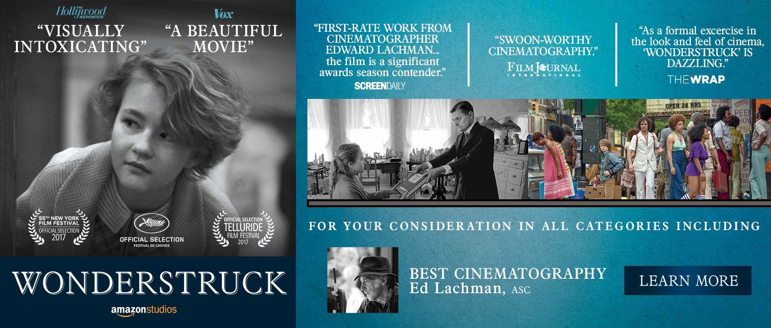
A deaf protagonist and a story set in two time periods were just two of the challenges cinematographer Ed Lachman, ASC and director Todd Haynes faced on this unique drama. (Sponsored by Amazon Studios)
A deaf protagonist and a story set in two time periods were just two of the challenges director Todd Haynes and I faced on this unique drama.
By Ed Lachman, ASC with Jon D. Witmer and Benjamin B
Unit photography by Mary Cybulski, courtesy of Amazon Studios and Roadside Attractions
(Article sponsored by Amazon Studios)
Based on Brian Selznick’s partially illustrated youth-oriented novel of the same name, Wonderstruck masterfully interweaves the stories of two 12-year-olds in two separate cinematic languages and time periods: Ben (Oakes Fegley) in 1977 and Rose (Millicent Simmonds) in 1927. Rose was born deaf, and Ben becomes deaf following an accident. Both children run away to New York City, tracing the clues within their personal histories to find what they’re missing and longing for in their lives — for Rose, her estranged mother (Julianne Moore), and for Ben, the father he’s never known.
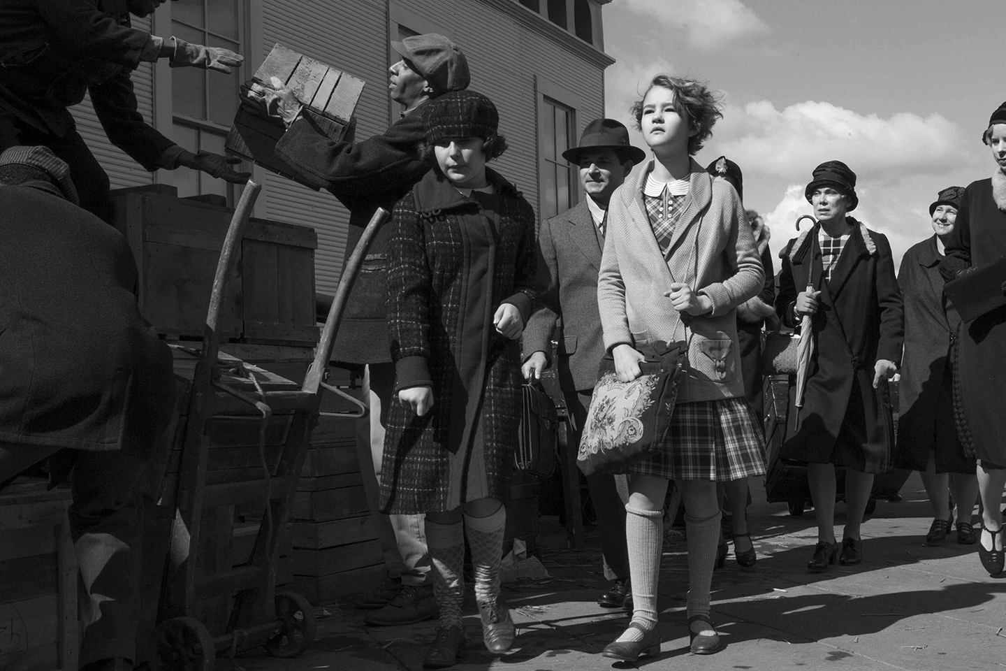
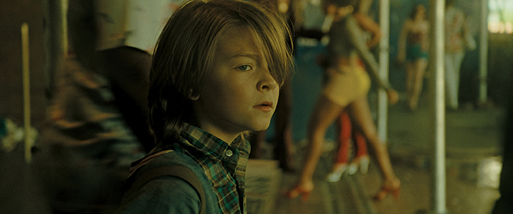
“Deaf culture is a visual culture,” says Selznick, who also authored the film’s screenplay. “Even their language is visual. That got me thinking about how I would approach Rose’s story with the drawings in my book. I wanted to tell the story of a deaf character through the ‘silence’ of black-and-white drawings, as they parallel her point of view.” This approach would also use the silent period of 1920s cinema as a metaphor for her world. Selznick added, “Reading Wonderstruck and getting her story only through pictures would make the readers feel like they were Rose, herself. This idea excited me. The other story, the one in words, about Ben in the Seventies, would be about a hearing boy who becomes deaf. And so, by going back and forth we’d be able to have each story parallel and illuminate the other.”
Best known for his book The Invention of Hugo Cabret — which director Martin Scorsese translated to the screen as Hugo, working with cinematographer Robert Richardson, ASC (AC Dec. ’11) — Selznick here again imbues the story with the language of cinema history while turning his attentions to the collective memory of curating and museums.
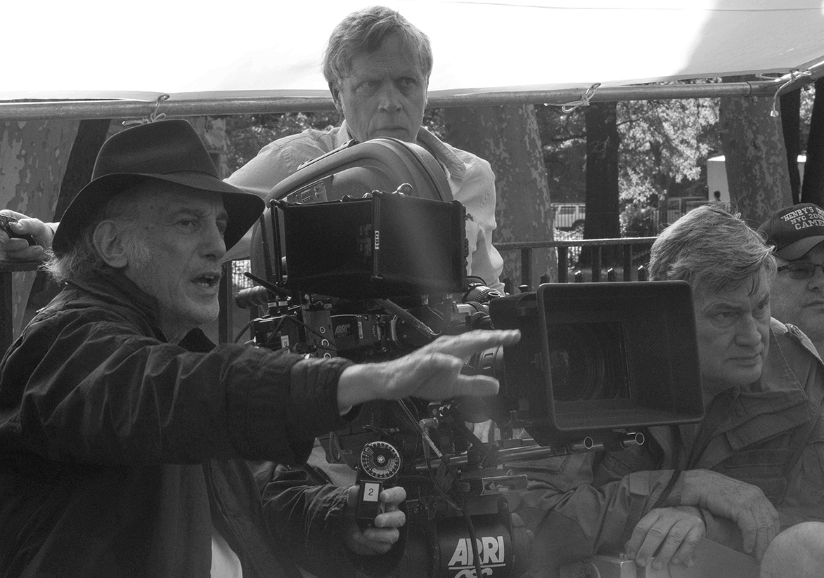
For Wonderstruck, director Todd Haynes reteamed with me, continuing our collaboration, which started with Far From Heaven (AC Dec. ’02), and continued with I’m Not There (AC Nov. ’07), Mildred Pierce (AC April ’11) and Carol (AC Nov. ’15). Haynes describes Selznick’s story as an “intensely cinematic” idea that takes the form of a mystery — accumulating clues, answering questions and posing new ones — all while leading to final discoveries. “The film is structured as a dual narrative with the two stories paralleling each other and driving the mystery of the film alongside the answers each central character is seeking,” the director says. “Why are these two stories, set 50 years apart, being paired? What is their connection? Why do they interweave in these ways? We observe the events of the two characters’ journeys mirrored in their deafness — fleeing their homes for New York City and ending up at the [American] Museum of Natural History.”
Indeed, the way the two stories interconnect through two different time periods creates the mystery at the core of the story. When you’re watching it, you’re asking, “Why are these two stories sharing one movie?” All the relevant questions come out of that uncertainty.
Todd’s film is also a tribute to what language is and what you can do with your hands: the sign language; Rose’s paper cutout-and-glued miniature buildings; the handmade live-action miniatures that give form to Ben’s imagination; and the scenes at the Queens Museum, with its handcrafted Panorama of the City of New York.
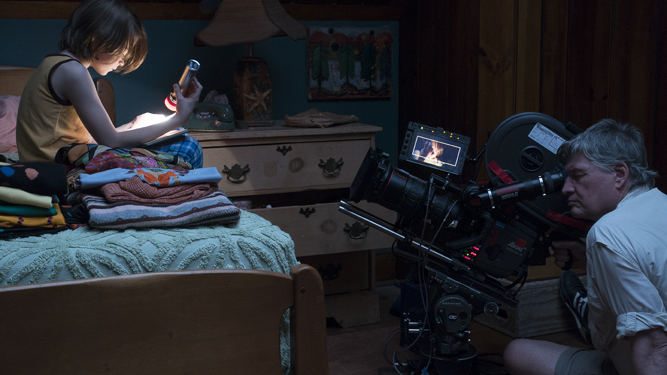
The cinematography presents each story with a look that evokes the cinema of its period, with 1927 depicted in the black-and-white of silent-era cinema, and 1977 in the chroma of 1970s urban street realism. We worked with 35mm Kodak motion-picture negative — black-and-white Double-X negative for the ’20s, and two Vision3 color stocks for the ’70s — shooting primarily in 3-perf with Arricam Studio cameras; for one key location, we opted to shoot digitally. Through editing, sound and music, our two stories coalesce as one.
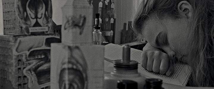
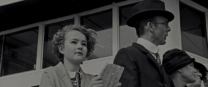
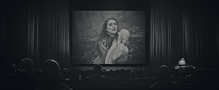
The 1920s
We looked to create visual metaphors for deafness, both for Rose in 1927 and for Ben in 1977. I like to think that Rose “hears with images.” Rose’s story takes place during the silent period of movies; you learn that the character of Rose is deaf, and you realize the movie is silent because it’s from her point of view. Ben’s story, in color, in 1977, is about him becoming deaf. So the theme of deafness permeates the entire film in content and style.
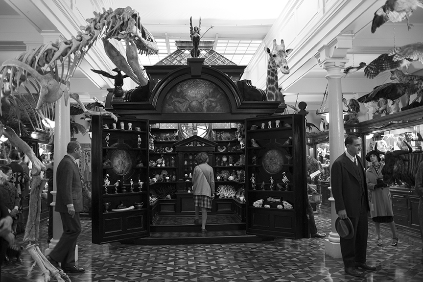
Rose’s story in the 1920s is presented as a silent movie. It’s a metaphor, mirroring the world that Rose lives in. She immerses herself in the city, but you see the city in silence, which helps the viewer share in her perception of the world she’s living in. The story takes place in 1927, the height of the silent black-and-white era, coming out of the German Expressionism movement; Todd and I referenced F.W. Murnau’s The Last Laugh, Victor Sjöström’s The Wind, and King Vidor’s The Crowd. We tried to be true to the cinematography tools of the time, so for the ’20s I used my older Cooke Speed Panchro lenses, which could have been used back in the silent films of that period.
I lit the black-and-white scenes with harder, direct light from Fresnel tungsten lamps, even exteriors, the way studio lighting would have been. I used yellow, orange and red filters on the camera to enhance the contrast in the monochromatic negative for the exteriors. For interiors, I used the Tiffen LL-D filter that I had on I’m Not There. It was originally designed to be used with tungsten color film for color correction, without a stop loss, in low-light daylight situations. Double-X negative is slower compared to modern stocks, so I didn’t want to lose any ASA with a black-and-white filter. I came up with the idea of using the LL-D, which has warmth in the filter without a stop loss, to enhance the blacks in my interior scenes.
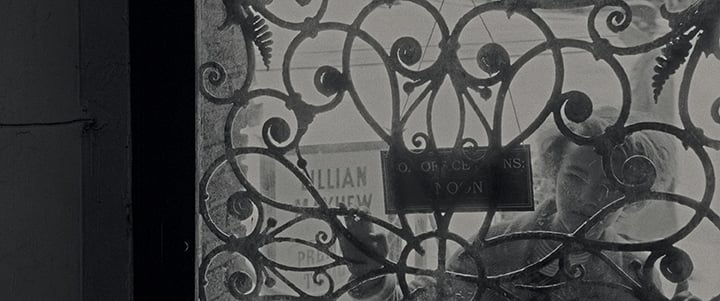
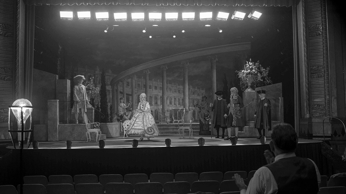
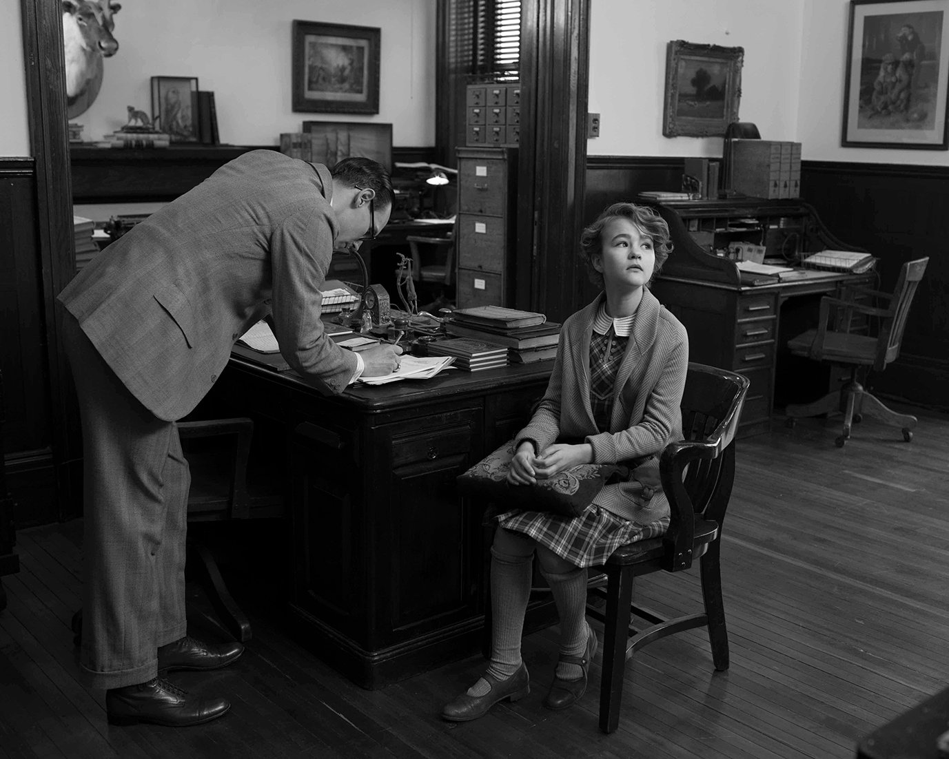
We wanted to tell the story through film negative because of the cinematic times we were representing. I know people now shoot digitally for black-and-white, or shoot on color film and then create a monochromatic image, but I realized from working on I’m Not There with Todd that the exposure latitude, contrast and grain structure of black-and-white negative is totally different to my eye. We also wanted the texture of what film could have looked like back then. The rating for Double-X is 250 in daylight and 200 in tungsten, and its exposure latitude is only about 2 to 3 stops — which also creates its look.
Obviously, shooting on black-and-white film today created some difficulties. The stock had to be a special order from Kodak, and I had to find a lab that would develop black-and-white negative again. I reached out to FotoKem and ASC associate Mark van Horne; they were very supportive and did an incredible job.
The 1970s
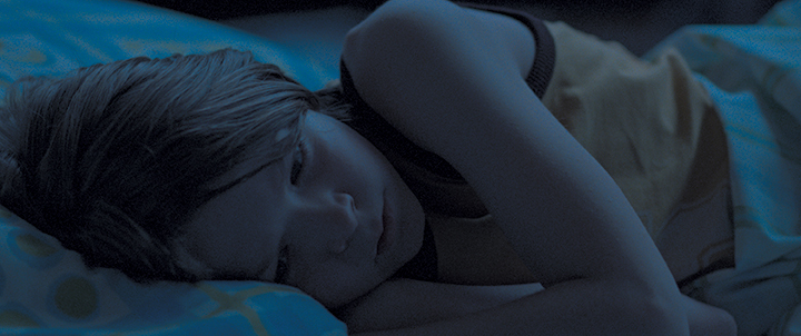
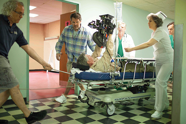
For Ben’s story in the ’70s, we were attentive to describing his subjective experience, taking in the world as a newly deaf person — as opposed to Rose, whose entire “genre” is deaf, you might say. Ben’s point of view is manifested at many points in the story: his experience in the hospital, on the bus, in the Port Authority, stepping out into Manhattan, and his discovery of the wolf diorama at the Natural History Museum.
Todd states, “We tried to create a visual language to emulate his point of view as a newly deaf person. We used a visual language of floating shots, over-cranked, on various suspension devices, combined with music, cutting, and sound design to help remove us from the objective experience of the hearing world.” To create those floating shots, we used Western dollies instead of track, and we made a “rickshaw dolly” — a sort of wheelchair that the camera operator sat in — combined with the use of handheld camera on those devices.
It was also important for Todd to look at the social and historical context of the two periods. The Golden ’20s, before the Great Depression, were about growth and prosperity, while in the ’70s the U.S. economy was in recession and stagnation, and New York City was in economic decline and physical deterioration.
For that part of the story we referenced the way films looked in the 1970s. There was a street realism to the films shot in New York at that time, with an urban grit. We were inspired in particular by Midnight Cowboy, directed by John Schlesinger and shot by Adam Holender, ASC, and The French Connection [AC Feb. ’72], which Owen Roizman, ASC shot for Billy Friedkin and which captured the street reality of New York’s run-down urban landscape in its documented style.
I reached out to Owen about his use of zooms, which are so prevalent in that film and were part of the style in New York in the 1970s — and all these years later, he was still unhappy about Friedkin wanting to use zooms as punctuation! To reference that period, Todd wanted to use zooms also, so I shot with my older zooms: the Cooke 20-60mm (T3.1) and 20-100mm (T3.1), and Angenieux 25-250mm (T3.5). In talking to Angenieux I discovered that the glass in the ’70s had more lead in the elements, and it could possibly have contributed to the contrast and overall look and feel of the image.
We used the zooms’ longer focal lengths — as well as an Olympus 180mm and Canon 200, 300 and 400mm telephoto still lenses converted to PL mount — to isolate Ben in New York City. I also used Canon K-35 primes, which I had used back then; they have more color shift and flare, and aren’t as color-corrected as modern lenses.
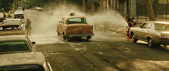
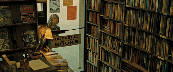
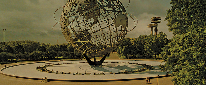
We shot with two contemporary color film stocks. I used Kodak Vision3 500T 5219 and 250D 5207, both pushed one stop to emulate a grain structure similar to the earlier film stocks used in the ’70s — i.e., 5254, which only had an ASA of 100T, so it often had to be pushed. The color rendition often went green in the shadow detail and magenta in the highlights, especially when 5254 was pushed; I tried to emulate that by pushing the more modern T-grain stocks and shifting the color temperature of the stocks, sometimes by shooting tungsten film outdoors with an 85C filter or shooting the 250D indoors under mixed lighting without correction. I also played with that in the DI with our colorist Joe Gawler at Harbor Picture Co. Joe is absolutely brilliant and was totally committed to the project, as was his company.
I wanted the saturation of colors and the mixed color temperatures that I remembered from the ’70s. I looked at the work of still photographers of the time — including Richard Misrach, Joel Meyerowitz, Joel Sternfeld, Mitch Epstein, Len Jenshel and William Eggleston — who were all experimenting with color. The other reference that was still in our minds was the poetic realism of Saul Leiter, who was our inspiration for Mildred Pierce and Carol.
Combining the Two Periods
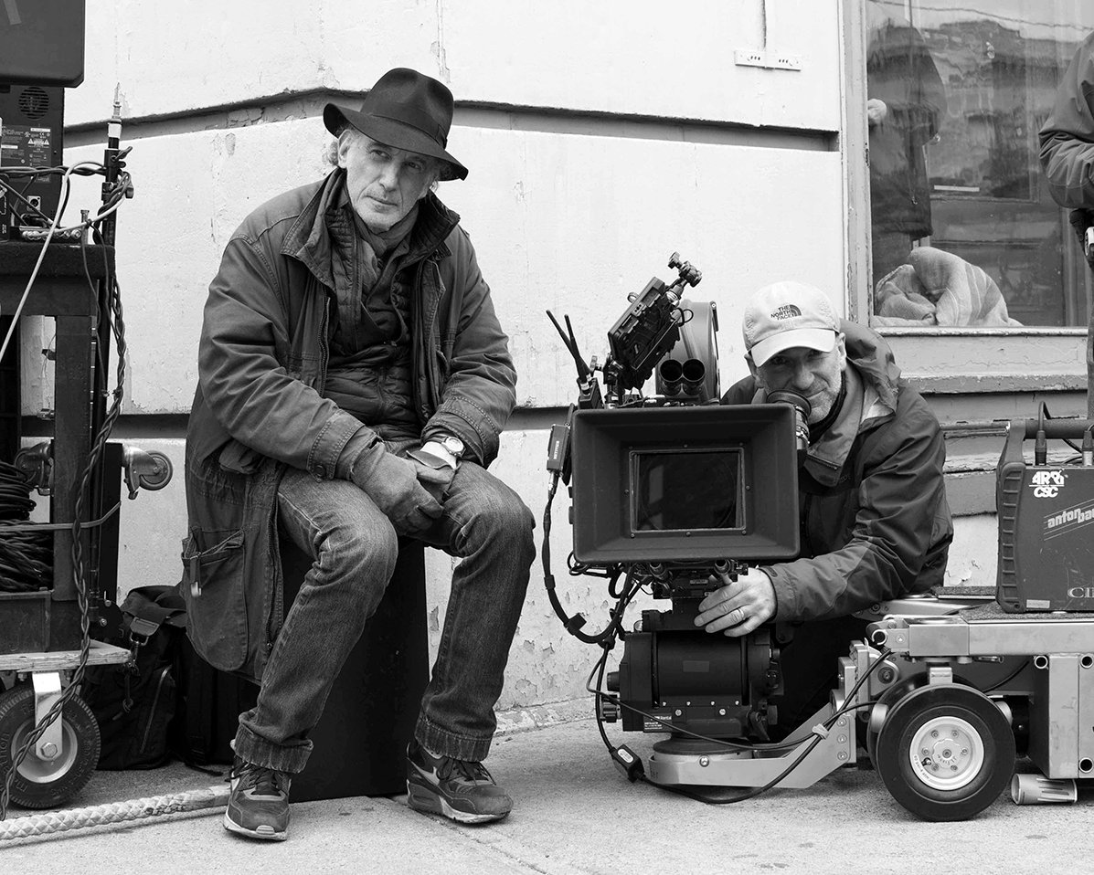
Todd wanted to connect the two cinematic periods and worlds with a single aspect ratio of 2.40 [2.39:1]. The general conceit would have been that you frame the black-and-white in the 1.33:1 aspect ratio of the silent period, but he wanted to connect the two stories as one. So the ’20s and the ’70s are connected through 2.40, which he felt gave a fluidity to the one interweaving story.
Todd expresses, “The 1.33 ratio would have been traditional for a silent film — and we do preserve that in the film-within-the-film, Daughter of the Storm — but we were making one movie, and it’s very important to have the fluidity and the conversant freedom formally and stylistically between the two. It was never meant to be a rigidly academic simulation of a silent film and its vernacular. At the end of the Twenties, before sound came in, silent cinema had basically established any and every form of filmmaking that you can imagine today — so there were no rules.”
The gritty ’70s look of realism and raw camera movement was contrasted to the black-and-white studio chiaroscuro lighting, balanced formalism, and orchestrated movement in the style of silent motion pictures from the ’20s.
Inside the Museum
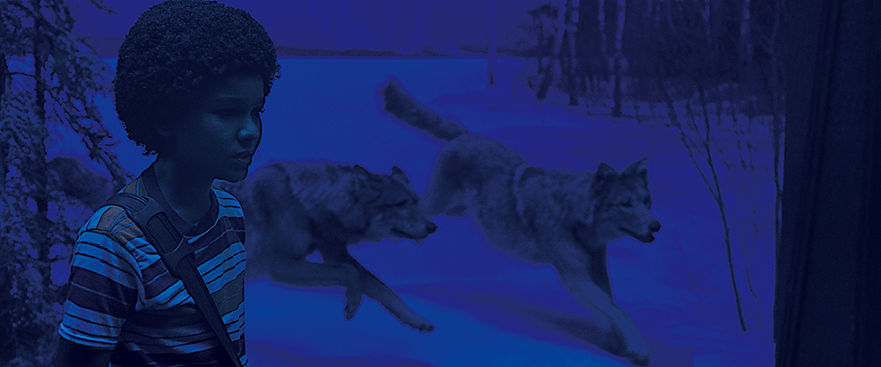
The Museum of Natural History rarely lets film crews shoot inside, but they admired the book Wonderstruck and they agreed to let us film there — under many restrictions. We had to film all our scenes at night, whether they were day or night, and we had to bring in all of our equipment after the museum closed and then remove it in the morning.
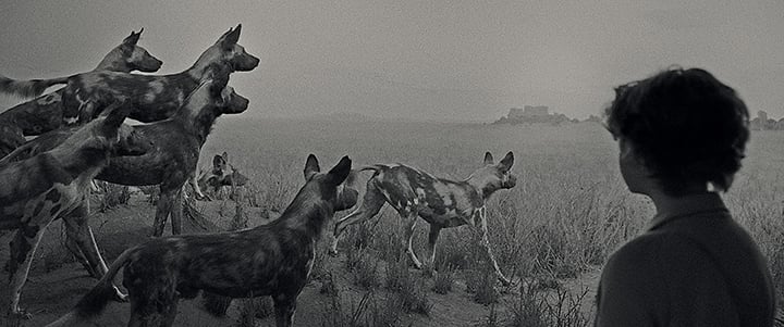
The dioramas were the most important set pieces in the museum for us — specifically the Gunflint, Minn., wolf diorama, which echoed Ben’s recurring nightmare. Incredibly, it took two months of negotiation with the museum to obtain permission for the house electricians to add six 2' Cool White fluorescent tubes gelled with Lee 075 Evening Blue to match the nocturnal light inside the wolf display; the dioramas are hermetically sealed, so the Museum is very sensitive to any intrusion in the environments. I had to set my lighting level in the museum to the dioramas so they would be the brightest focal point in the exhibition rooms, the way they are to our eye.
I did tests with 5219 pushed a stop, a stop-and-a-half, and 2 stops, and I could have shot there with minimal lighting — i.e., Kino Flos, 2K open faces, and PAR cans. But I wanted to give Todd the flexibility of being able to see in different areas of the museum that we couldn’t light, so we ultimately decided on shooting digitally with Arri’s Alexa Mini, recording ProRes 4:2:2 and rating the camera at 1,280 with the Canon K-35s mostly wide open. By combining that look with LiveGrain in post, I was pleased with the results, though in terms of color, depth and rendition, the image wasn’t the same as what I could expect to get from a film negative.
The effect of LiveGrain is that it tracks highlights and shadows from frame to frame. The tighter, smaller grain is in the highlights, with the larger, coarser grain in the shadows. That mimics how film grain responds to exposure — which is pretty ingenious and makes a real difference compared to laying one grain structure over a whole image.
Dioramas and Miniatures
Todd always likes to create a look book that he gives to all the department heads, illustrating his ideas regarding the politics, history, demographics, art, fashion and cinematic language of the film’s time periods. That, for me, creates the emotional structure of the film. I had the opportunity to work again with the masterful and gifted production designer Mark Friedberg, who also collects visual references and creates renderings and models for all of our sets and locations. As Mark says, “It’s always about building and discovering.”
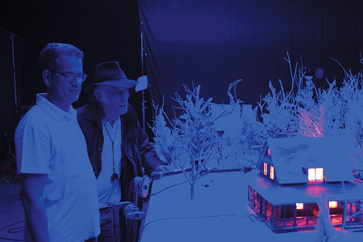
The essential part of the storytelling is what honors the imagination of a child. Todd also felt the film is a tribute to what children can do with their hands. The worlds that Ben and Rose come from — their rooms, their belongings and the tactile things that they’ve created — culminate for Ben in the miniatures, which unlock the mysteries of the movie. The miniatures were like mini dioramas of his mind, which help us connect to his feelings through his memory and imagination. The miniatures many times were of sets or locations that we had seen in the film, or the objects in Ben’s room that he was collecting.
As Todd says, “There are the dioramas, the miniatures, the cardboard buildings and scale models — the ‘secret collecting of special objects’ for Rose and Ben. Their emotional attachment to tactile things emanates in their dreams and imaginations. We referenced the artist Joseph Cornell, who in a sense made mini museums with his art, with architectural memory boxes that connected to longing in his fragments, and traces of desire in his found objects. Brian Selznick’s concept of the wolf diorama containing the mystery of the father’s life and Ben’s nightmare condenses all the themes of the film.”
To shoot the miniatures, I worked with director of photography Ivan Abel, a talented Slovakian cinematographer living in New York. I helped Ivan match the lighting to our actual sets with my longtime main-unit gaffer and friend John DeBlau. Ivan used Zeiss Super Speeds and Cooke Speed Panchros with a Revolution snorkel lens on an Alexa Mini, as well as a Technodolly motion-control dolly system. These were “live-action” miniatures, similar to puppetry; the miniature characters were maneuvered through the miniature sets on strings and rollers as the camera rolled at 24 fps. Ivan states, “We wanted everything to look authentic — without stop-motion or computers. Everything was in the camera.”
Locations and Sets
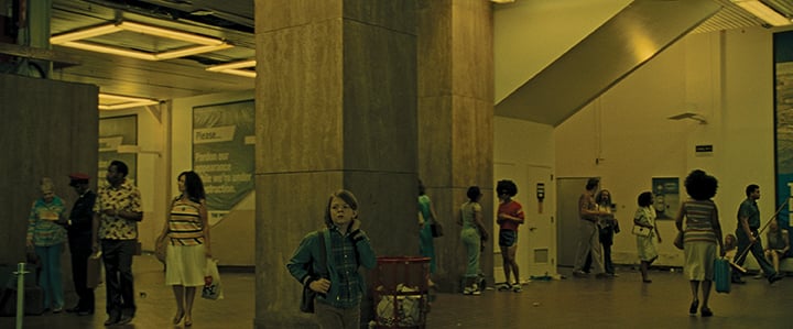
We shot Ben’s arrival at New York City’s Port Authority Bus Terminal on the vacant piers of Manhattan’s West Side, in what used to be a passenger-departure terminal for cruise liners coming in and out of New York. I liked the “found reality” of the location — I thought it was very close to my recollection of the actual Port Authority Terminal in the ’70s — and Mark Friedberg and his team did an incredible job transforming the space.
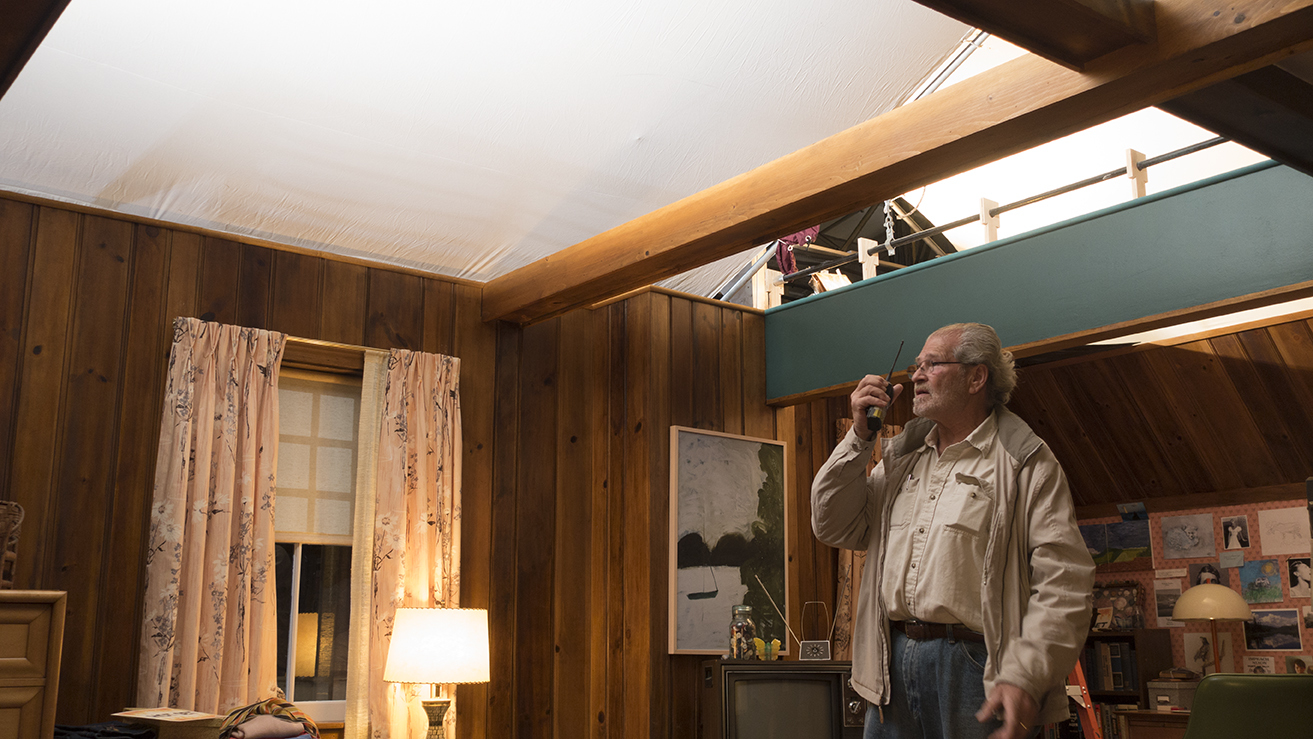
I wanted the lighting in the Port Authority to feel like it actually had in the ’70s. I asked the production-design team to build fluorescent units that would provide our source lighting and that we would be able to see in-shot, and Mark designed these 8' squares, with two 8' Cool White T12 fluorescents on each side so we got that cyan and yellow fluorescent look. The look and style were great, and they felt like part of the ’70s architecture. We combined those with tungsten sources that contributed to the realistic look of mixed-color-temperature lighting. We wanted Ben’s arrival to New York to feel both foreboding and enticing.
When Ben exits the Port Authority and enters the New York streets, we were shooting in Brooklyn on Flatbush Avenue. We couldn’t shoot in the actual Port Authority because of the limitations of closing it down, and the surrounding area has changed so much since the ’70s; on Flatbush Avenue, we could dress and stylize the street to capture the seediness and deterioration of New York in that decade.
One of my favorite shots is when Rose gets off the ferry and walks into frame amid a crowd of people. I set my exposure for the shot with the sun behind the clouds, but just as she moved into frame to walk down the street, the sun came out, so she became overexposed; even though I was riding a stop change, it happened so quickly that I couldn’t compensate for it. I started to adjust it in the DI, but Todd said, “No, I like it that way.” I realized it dramatically accentuates her entrance into New York. It’s one of those “mistakes” that can reinforce the storytelling — serendipity. That’s what’s wonderful about working with Todd and his editor, Affonso Gonçalves: They’re always looking for those happenstance moments — or my mistakes!
We had limited time with the kids, so we always relied on two cameras. The talented Craig Haagensen was my A-camera operator, and Peter Agliata contributed greatly on the B camera. The danger with two cameras is that you can jeopardize one angle for the other, so it’s obviously better to figure out what’s important for your A camera and then fit in your B camera in an improvisational way. That worked out very well for us.
Another part of the difficulty at the Museum of Natural History was the massive entrance rotunda. Ben enters through the front door, and it’s supposed to be daytime, but it had to be shot at night. Key grip Jim McMillan and his crew positioned a 40x40 Half Grid that just covered the doors and the large framed windows above, but we weren’t allowed on the sidewalk in front of the museum with our lights because of the weight, so we had to work from the street. In order to reach the front door with any amount of light and burn-out the 40x40 for a daylight-exterior feel, we had two 120' articulating-arm condors, with two ArriMax 18K PARs in each, plus two 18K Fresnels on the ground closer to the door on each side — all with ¼ CTO. Inside the rotunda, we had six 12-light Maxi-Brutes bouncing off the ceiling on Crank-O-Vators.
For daylight scenes in areas of the museum where we couldn’t get a light outside, we used 4x4 and 8x8 LED Blankets from SourceMaker that we laid against the windows down the hallway. Because the blankets were so low-profile and had a low energy requirement, I could plug them in wherever we were and didn’t have to run cable down the hallway.
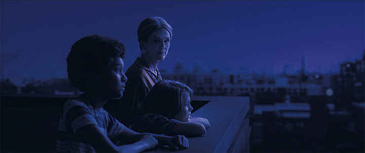
For night scenes in the museum, I created a feeling of sodium-vapor security lights coming through the windows mixed with fluorescents inside. I played with the cyan-green color temperature of the Cool White fluorescents, and I created the sodium-vapor look with Lee 104 Deep Amber mixed with Half Plus Green on Mini-Brutes. You can see this when Ben and his newfound friend Jamie (played by Jaden Michael) walk through the workshop where the animal dioramas are created and maintained.
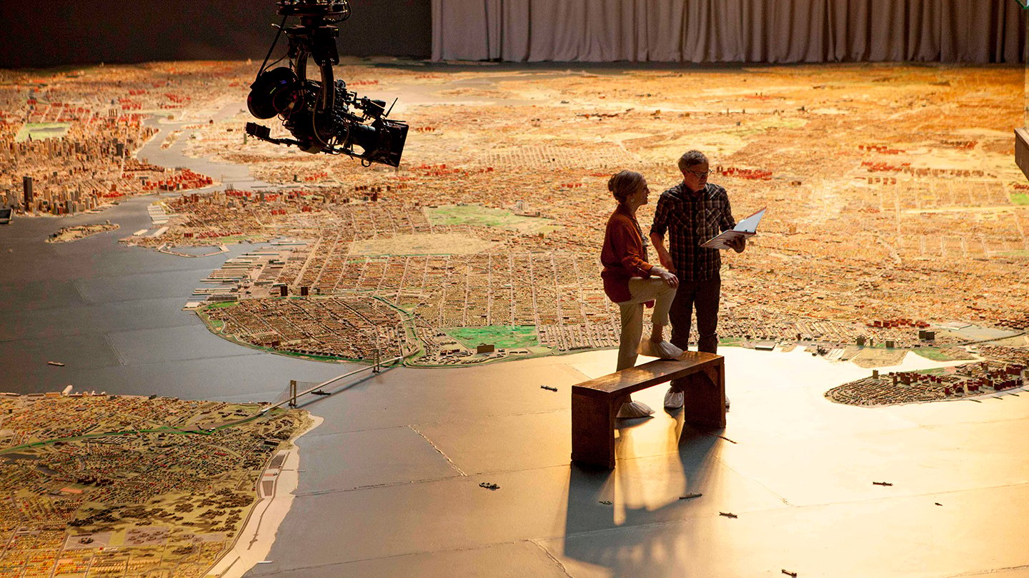
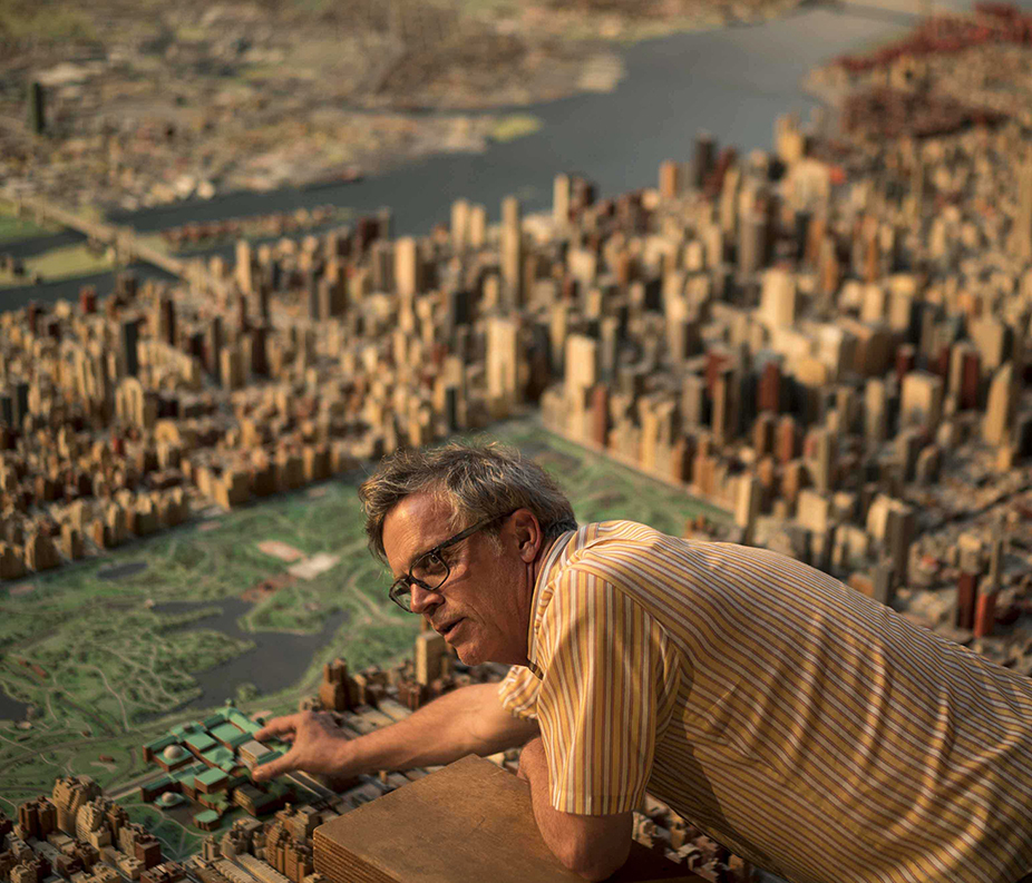
The Queens Museum presented other challenges. Ben ends up there with his grandmother — played by Julianne Moore, her second role in the film — who finally tells him about his father as they stand in the midst of the New York City Panorama that had originally been built for the 1964 World’s Fair. It’s a massive, 9,335-square-foot three-dimensional map that includes a miniature model of every building and street in Manhattan and its bordering boroughs, with a lighting cycle that changes from morning, to day, to evening, to night that Todd wanted to re-create.
Originally it was going to be a massive lighting rig, with 2K soft lights and 5K Fresnels with different gels for each part of the day, all wired through a dimmer and rigged from a second-level walkway that overlooks the map. Gaffer John DeBlau and I went out to Arri Rental in New Jersey, and they showed us the capabilities of the Arri S60-C SkyPanel LEDs, which allowed us to change the color temperature for each period of the day via DMX.
We rigged 36 SkyPanels from the second-floor walkway, which reduced our lights by a third. We also ended up using two 12x26 40K tungsten balloons over the Panorama — wrapped in a Half Blue “sock” to create a daylight ambience, and skirted to keep their light off the walls — as well as 36 Lekos to accent highlights on the map. Everything was on a dimmer system.
The next obstacle we had to overcome was getting overhead shots of this Panorama map. We only had room for a 15' Technocrane, which we used with a Revolution snorkel lens for the macro photography over the buildings — and where we had to reach out farther than 15', we were given permission to use a drone, which was provided by Aerobo.
On a personal note, my brother Robert actually built all the bridges for that three-dimensional Panorama when he was a model maker in the ’60s. He later was known for his expertise and exceptional talent in mechanical special effects on commercials in New York.
***
For me, Todd Haynes has honored the imagination and intelligence of children. Todd felt Brian’s book and script offered him a chance to do something sophisticated, nuanced and mature for kids — showing how children gain access to their imagination and language of communication, be it through hearing or deafness.
It was a pleasure and honor to be able to work again with Todd and such valued collaborators, including production designer Mark Friedberg, costume designer Sandy Powell, editor Affonso Gonçalves, composer Carter Burwell, and all my crew. I know my work wouldn’t be the same without them.
An additional gallery of Wonderstruck production images can be found here.
TECHNICAL SPECS
| Aspect Ratio | 2.39:1 |
| Stock | 3- and 4-perf 35mm |
| Digital Capture | |
| Cameras | Arricam Studio |
| Arriflex 435 | |
| Arri Alexa Mini | |
| Lenses | Cooke Speed Panchro zooms |
| Angenieux | |
| Canon K-35 PL-mount telephotos | |
| Zeiss High Speed Super Speed | |
| Olympus | |
| Film Stock | Eastman Double-X 5222 |
| Kodak Vision3 500T 5219 250D 5207 |
