After the Wedding: Secrets and Lies
Julio Macat, ASC embraces large-format cinematography for writer-director Bart Freundlich’s heartfelt drama.
Julio Macat, ASC embraces large-format cinematography for writer-director Bart Freundlich’s heartfelt drama.
Photos and frame grabs courtesy of Sony Pictures Classics.
By Michael Kogge

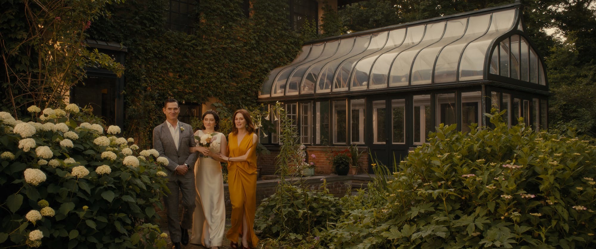
Good people can be selfish, and even selfish acts can lead to good deeds. The repercussions of such actions shake the lives of the characters in writer-director Bart Freundlich’s After the Wedding, shot by Julio Macat, ASC.
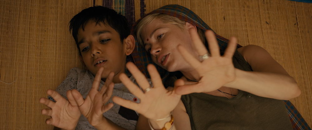
Based on the 2006 Danish film of the same name, which was directed by Susanne Bier and photographed by Morten Søborg, this 2019 version shares its predecessor’s basic plot: The director of an Indian orphanage returns home to the West to accept a large grant for the children, only to discover that the benefactor has ulterior motives that lay bare a secret in the orphan director’s past. In a significant twist, though, Freundlich switches the genders of the two protagonists. Michelle Williams plays orphanage director Isabel, a role originated by Mads Mikkelsen in the Danish film, while Julianne Moore is cast as Theresa in Rolf Lassgård’s part as the wealthy benefactor. Caught in the middle of Theresa and Isabel’s conflict are Theresa’s husband, Oscar (Billy Crudup), and his daughter,
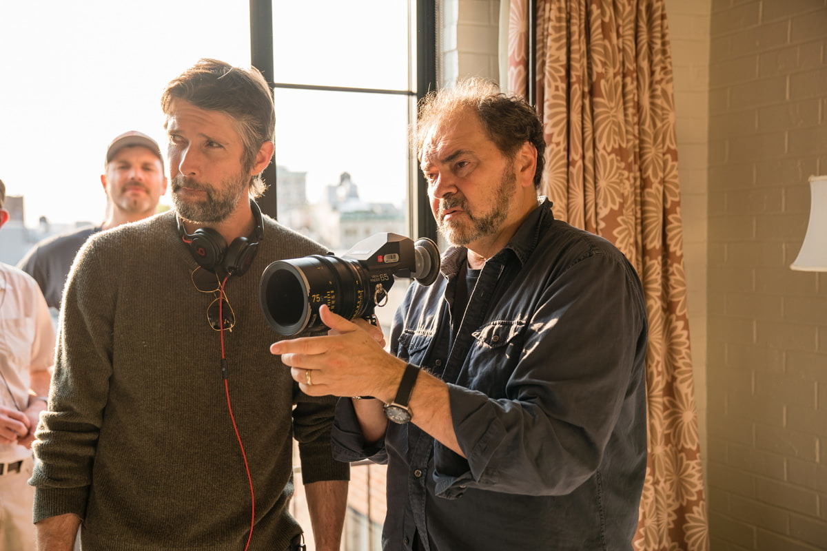
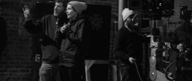
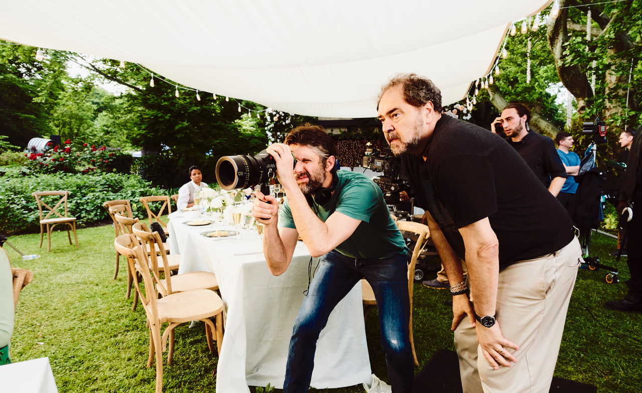
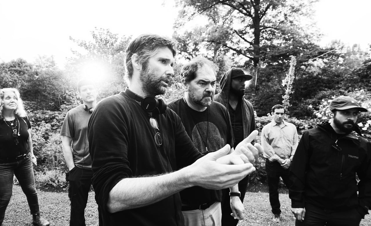
Julio Macat, ASC (right)
and writer-director Bart
Freundlich.
Grace (Abby Quinn), neither of whom are wholly innocent bystanders — or scheming enablers. Ultimately, these characters are connected in their shared desire to do what’s right while simultaneously trying to redress past mistakes or assuage deep-seated guilt.
Macat also found a new angle on the story through his cinematography. Rather than duplicating Søborg’s raw, handheld camera, Macat took a classical approach, capturing primarily static shots with Arri’s Alexa 65 camera. The production provided a departure in both style and genre for the director of photography, who spoke with AC about his work on the picture.
American Cinematographer: You’re known for your work in comedy. What drew you to such an intense character drama?
Julio Macat, ASC: Bart Freundlich and I have been friends for 20 years. We met on a movie called Catch That Kid, and we’ve always wanted to work with each other again, so when Bart called me and told me about this film, I jumped in immediately. I love Bart; he’s a great artist. The way that he adapted the story, with two leading women, changed the dynamics of the film and made it a different version that stood on its own, with strong visual possibilities.
I don’t think we make enough films that are from the heart like this one is, films like Ordinary People or Kramer vs. Kramer. I said to Bart, ‘Please let me see what I can bring.’ That’s when I called in all of my favors from places where I usually work, like EFilm and Arri. Everyone saw our enthusiasm. Over my career, I haven’t had many opportunities to do a dramatic piece like this one. I’ve done a lot of comedies, so for me to do a drama again — like I did with Crazy in Alabama, where I could create dark, moody lighting — I jumped at the chance.
Why did you feel a large format was the right choice for this story?
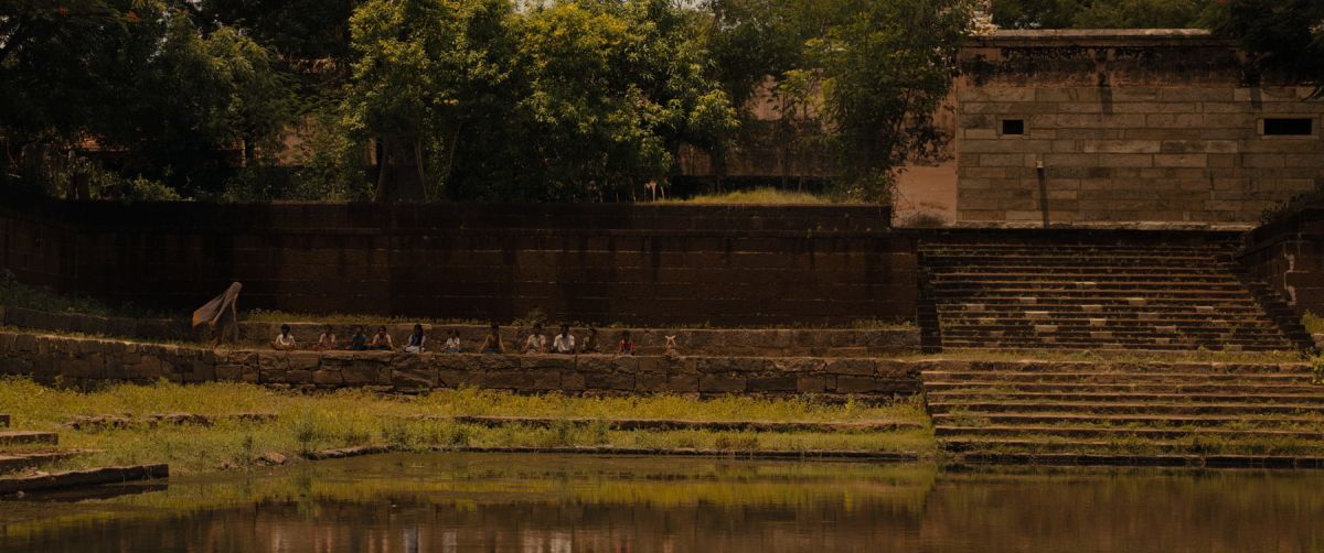
I had wanted to try the Alexa 65 because, prior to seeing the film, I had heard about the wonderful results that [Alfonso] Cuarón obtained when he shot Roma [AC Jan. ’19]. When the original [version of After the Wedding] came out in 2006, it was done with a ‘you are there’ kinetic, handheld camera. It was an interesting way to engage with and feel like you were in the story, and it was done so well that to try and imitate the same thing over again seemed instinctively wrong, both for Bart and me. So we tried to go in completely the opposite direction. Even though this was a smaller story and an indie film, we wanted moments where, when you saw it on the screen, you would go, ‘Yeah, this is a big picture,’ because it has those emotions of a big picture. We wanted to create frames that would draw the attention to what’s important in the scene. As the film comes together, you see where the highlights and the visual dramatic focus are going to be.
Those highlights come from the performances.
They do. I wanted to be respectful of the actors and do whatever I could as a cinematographer to accentuate their performances. A lot of our decisions were made to ensure that the camera didn’t get in the way of their performances, and instead actually enhanced them.
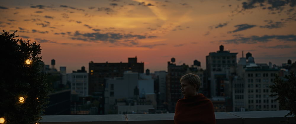
For a format that naturally enhances wide vistas, I wondered what [the Alexa 65] might be like if we took it in the opposite direction. I could use the format to enhance the blocking, with positions for the actors that were strong dramatically, concentrating on their faces — and the wide vistas could serve as ‘bumpers’ to make sure that the movie didn’t get too claustrophobic or become too ‘talky.’ I thought that would work well in order to give the film some breathing space and not bog down the audience’s attention.
Did anything surprise you about the 65mm format?
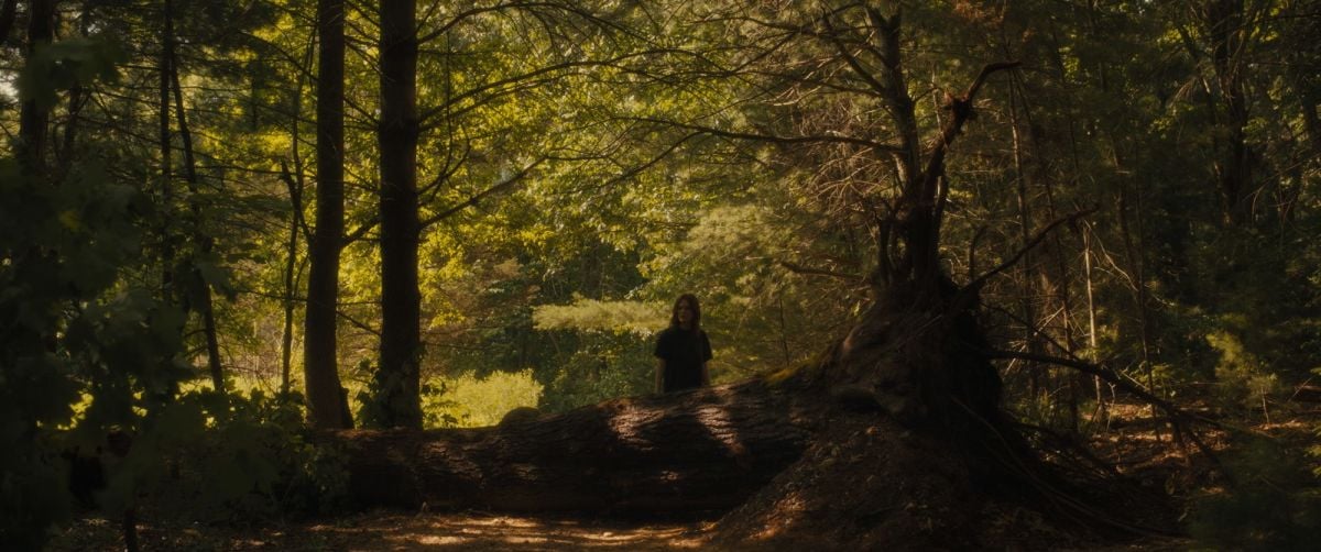
I noticed a couple of things when we tested the Alexa 65. The wide shots were incredible, especially with the Prime DNA 28mm lens, which is just amazing — it’s so wide and sees so much detail. But the focus drops off differently than it would with a [Super 35mm] lens. I always try to shoot exteriors around a 5.6 — and in this format, shooting exteriors around a 5.6 feels sort of equivalent to shooting spherical Super 35mm around 2.8. This has the effect of drawing the audience’s focus into the areas of the frame that are sharper, and making the rest of the picture drop off in focus in a way that’s like an impressionistic painting. I thought that could be an interesting way to highlight the performers. We used this selective focus to our advantage in scenes like the wedding, when Michelle Williams recognizes that the father of the bride is the person she’d had a relationship with when she was young. Even though there’s a sea of people in the shot, the eye and the audience is drawn to discovering just [Crudup’s character].
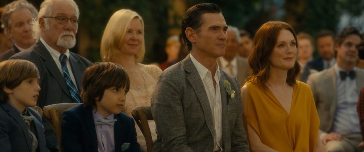
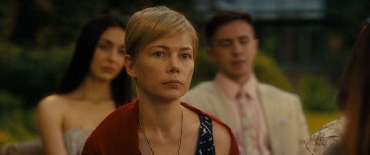
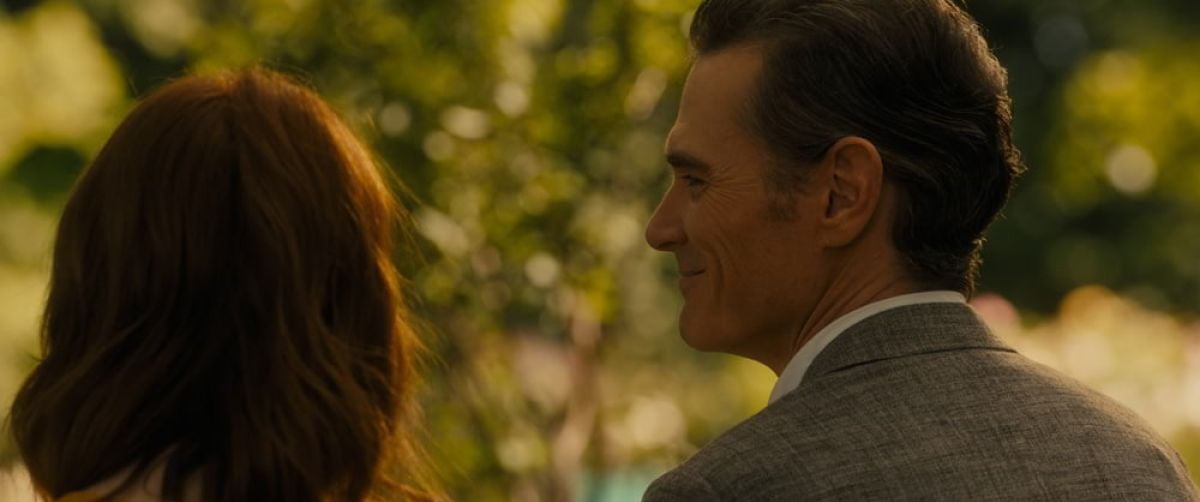
That’s one of the most memorable shots in the movie. Without any dialogue, the viewer immediately recognizes the reveal — and Isabel’s shock.
That’s an example of using the format to the advantage of the storytelling. I was really enamored with trying to guide the audience, but in a way that doesn’t call attention to itself, so that it’s not gimmicky and it goes unnoticed. I think those are the most successful things you can do as a cinematographer, both in composition and with lighting.
I truly enjoyed working in this format with the Alexa 65, but I can also see how this format wouldn’t be the right call in a situation where a film required more depth of field. I learned that at times, a lot of the information in the frame can be more out of focus than desired, even more so than anamorphic. But once I committed to the format, I fell in love with the wide-angle lenses, the amount of detail they show, and of course all that resolution.
The camera’s [photosite count] is 6.5K [in Open Gate mode], yet being an Alexa, it’s not overly digitized. Often when you’re shooting 6K or 8K, you don’t want all that resolution, especially photographing faces — everything looks too sharp. But there’s something about the Alexa cameras that makes everything feel more like film. Maybe I’m just biased. Maybe I really miss film!
In a lot of the close-ups, I used the same netting material that I’ve used since Home Alone. On lenses that are 50mm or longer, I place a very faint tulle type of material in front of the lens — that’s the filtration I used throughout on all close-ups, but not on the wider-angle lenses. It takes a bit of the edge off when you’re photographing faces, especially when you’re trying to get more of a ‘beauty look.
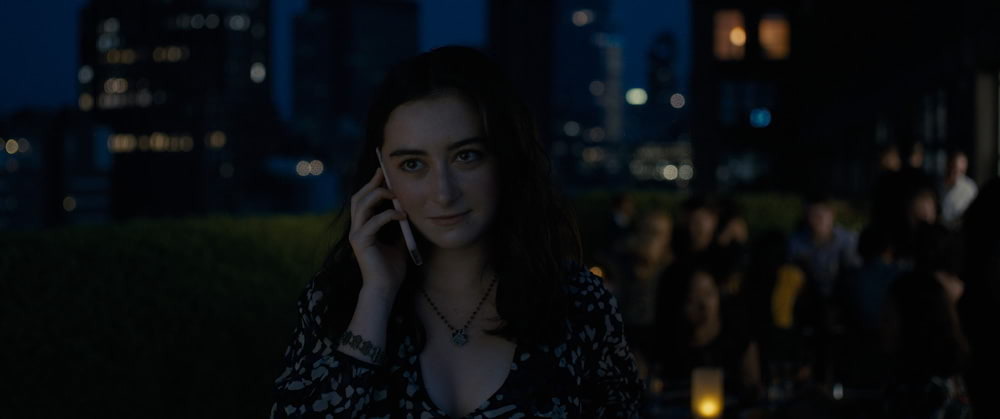
draws nearer.
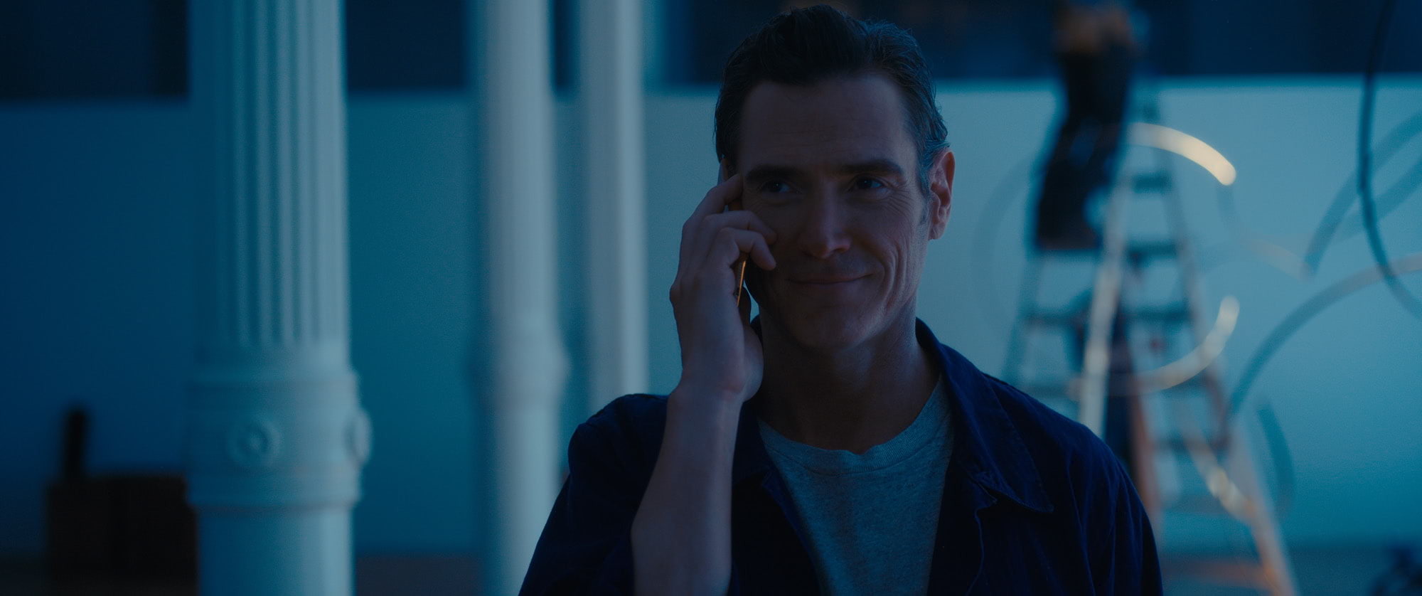
What’s your process when it comes to lighting close-ups?
Ideally, before every shoot, you have a test day where you check filters, lighting quality and direction — especially in close-ups — and it’s a nice way of getting to know the actors. In this case, I already knew Julianne, but I didn’t know Michelle.
Many actors have an idiosyncrasy, a worry about how they will look and what type of relationship they will have with the DP. I know from being married to an actress [Elizabeth Perkins] that this is not unwarranted. In our current fast-paced or low-budget productions, it’s understandable that actors would be a bit defensive about how they will look. They should be concerned about how they’re going to be lit — or, as is often the case, not lit at all.
On that test day, I like to establish a relationship so the actors won’t be worried about that. I want them to feel like they have someone on their side behind the camera — and if there are any concerns, or if they see something they don’t like, they can talk to me about it. A lot of times the makeup artist is working for that actor, and they’re watching the monitor and reporting back. If something is happening that they don’t like, you can have this weird dynamic where the makeup artist and the actor are in one camp and the cinematographer is in another. I don’t want that to be an issue at all. I want the actors to feel that they’re safe with someone who’s going to do the best they can to [support] whatever the actor’s trying to do.
For lighting close-ups on this film, I used something for the first time that a friend of mine, John Tindall, has been developing, called the Brokeh System. [Ed. Note: See secondary story below.] We’re still testing it, but I started using it, and it worked nicely on Michelle. It chiseled her face more, modeling the light so that it would drop off into the dark side of her face sooner. With her short hair, her face tends to feel more rounded, and the Brokeh System helped to counteract that. I showed Michelle the test, and she really liked it. Psychologically, I think it helped her to feel like she was more gaunt, with her character having lived in a third-world country.
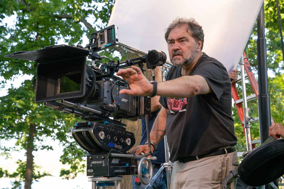
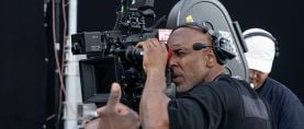
Alexa 65 camera. “Once I committed to the
format, I fell in love with the wide-angle lenses,
the amount of detail they show, and of course all
that resolution,” he says.
How many days did you have to shoot?
Four days in India and 26 or so in New York. We had a lot to do in New York with a small crew. In total, we had seven Steadicam days, beautifully done by Billy Green; otherwise I operated the camera myself. It was a one-camera crew with four and four: my great New York gaffer Richard Ulivella and three electricians, and a terrific key grip, Jesse Saviola, and three grips. The budget could not afford a DIT, so I looked through the lens and set exposure through the eyepiece and with my meter, the old-fashioned way, as if I was shooting film. We didn’t mess around playing with color or density with the monitors on the set; it was just like working with a one-light print at the lab. It brought back memories of the old days of film, and that great excitement and worry of not knowing exactly what you really got until dailies!
Most of the shooting in New York was at Theresa’s office space and Isabel’s hotel. It was all supposed to be upscale and rich, so it made sense that it would be a cooler world, and the whites would be cleaner. We introduced more blues in the office, and fortunately the location we found had a lot of high-tech, cooler, modern fluorescent-type lights. We balanced our lighting to what was there, and made our LED lights about 4000°K. We dialed a bit of minus-green on the color-temperature setting of the camera. Theresa’s offices were big, on a ninth floor, and I didn’t have resources to light much of those interiors, so I had to plan well and shoot in the right direction at the right time of day, taking advantage of when they would be lit naturally. When you’re shooting an indie, you have to be smart about picking locations that are almost self-lit — you don’t have the ability to have condors outside the windows, or the crew to maneuver many big lights.
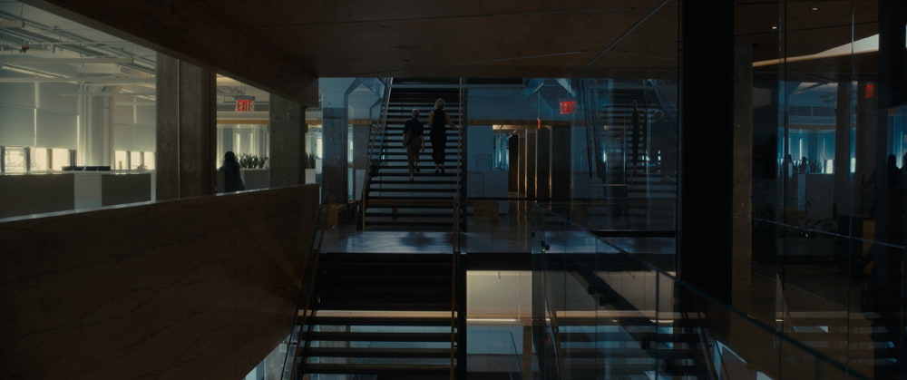
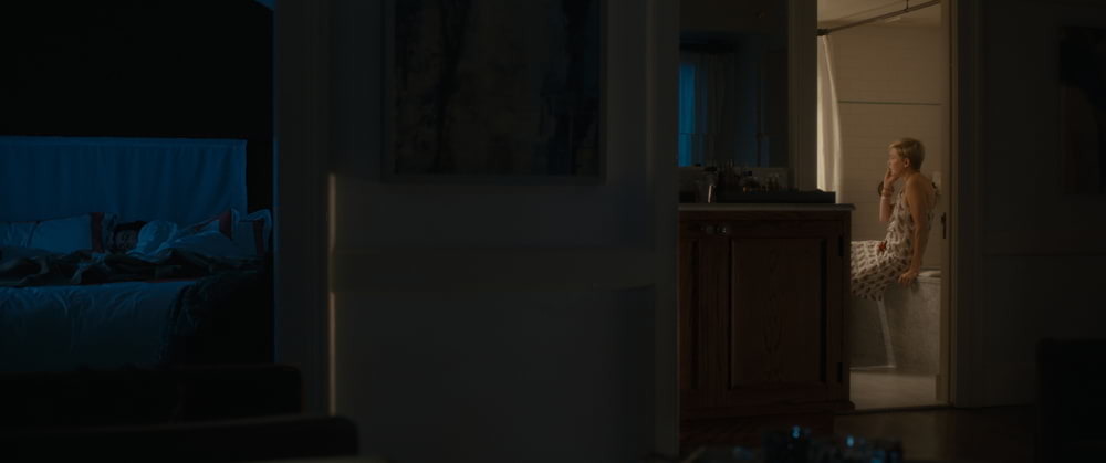
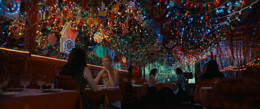
I went warmer in the interior of Isabel’s hotel. There’s a shot I love where Isabel’s lying in bed with her daughter, and then she walks over to the bathroom. The bathroom has a warm, clean, white tone, while the bed has this cobalt-blue color, reminding you that she’s in another world. And we went a bit over the top in the Indian restaurant, when Isabel has dinner with Grace, over Grace’s version of great Indian food. There were a massive number of decorative Christmas-type bulbs hanging from the ceiling in a space that was 6 feet wide — an insane place to try to film, but it seemed to be right for the moment in the story. All the lights were already there; first AC Glenn Kaplan, who is always really on top of every technical aspect, adjusted the shutter on the camera to make sure that the twinkled lights didn’t strobe. I just added a little bit of light for the faces in the close-ups with LiteGear’s LiteMat with a Brokeh gel in front of it to blend it in.
How did you manage to get what you needed with only four shooting days in India?
It was a real challenge. We went to this little place in the south of India called Karaikudi. Even though we were in this very remote place, I was so impressed with how beautifully everyone dressed! The colors of their clothes were so stunning and vibrant. Education is very important to their culture. We saw a lot of schools, and students walking to schools, but we couldn’t find an orphanage that was poor and downscale enough, so we had to build it. The India production designer, Manisha Khandelwal, took an empty building and constructed the orphanage in record time — I believe it was three days.
I ended up lighting everything with two very small, lightweight, handheld soft lights I made up called “pillow lights,” with LiteGear bi-color LiteRibbon — on a dimmer — inside a lightweight Home Depot bathroom-fixture housing. Thank God I brought those from the States. There’s a built-in warmth in how the red earth reflects on objects and people in India, and I was trying to capture that. I love the fact that people in India just treasure their colors. I was trying to grasp that tone, the richness of reds and the radiance of the people.
You also managed to capture some truly grand establishing shots of both the orphanage in India and Theresa’s house in New York.
They were shot with the Zenmuse X7 camera on the DJI Inspire 2 drone. [Ed. Note: See Shot Craft, AC May ’19.] I used [DJI’s DL-mount] prime lenses when shooting from the drone, which I think was key, and I was very careful to expose properly using neutral-density filters, right between 5.6 and 8, in the lens’ sweet spot. Then, [ASC associate member] Mitch Paulson, who is one of the best colorists in the world, and Dave Grove at EFilm helped me to [match the drone footage with the Alexa 65] in the right way. It has a great feel to it.
How do you view After the Wedding within your overall filmography?
Home Alone is a favorite, because it was one of my first films as DP. That started my career in 1990. I’m not even sure how I did some of it! [Laughs.] But After the Wedding is my other favorite. Making a special film requires having a great story, a great script, great actors, and then everything else that falls into place with it — photography that fits, music that fits, editorial that fits. It’s rare in your career that you get all the parts working together, like an orchestra. It’s only happened to me a couple of times. And I’ve got to be honest, it mostly has to do with actors. You can do a film that has all the other parts, but if the performances are not great, even with a great script, it’s not satisfying. But I hope you can leave this film thinking, ‘This is one of those movies where the parts stand on their own as good — and all together as great.’
Q&A: Director Bart Freundlich
The filmmaker made his feature directorial debut with the 1997 film The Myth of Fingerprints, and has since helmed such projects as World Traveler, Trust the Man, The Rebound and Wolves. After the Wedding is his second feature with cinematographer Julio Macat, ASC.
American Cinematographer: What inspired the gender swap of the two leads from Susanne Bier’s original Danish movie?
Bart Freundlich: My wife [Julianne Moore] and I watched the [Danish] movie together, and she was very attracted to the role that she ended up playing, of this billionaire business person who’s a real control freak. She kept saying, ‘I would love to play that role.’ It was kind of anecdotal until one of the producers said, ‘Well, what if you did switch it?’ So I followed the story to see what that would mean. I kept waiting for the big hiccup, the thing that was not going to work. But the more I followed the story, the more interesting it became. Once I understood the structure, it gave me a green light to go ahead and write because there was a fundamental difference between the two films.
How did you come to reteam with Julio?
Julio and I worked together in 2002 on a movie called Catch That Kid. Besides having a great time, we shared an artistic sensibility, and we’ve been looking for something to do together for a long time. He’s the king of the comedy world, but I know how much more he has to offer and how much more he wanted to explore. So I just made a call. He was on a road trip with his wife. I said to him, ‘Would you be free to do it?’ And he goes, ‘I’ve been waiting for this call.’ He had known the Danish movie, and I sent him the script, and he read it in the hotel room that night.
How did you two approach the visual style of this movie?
Julio and I had very direct conversations about what our agenda was with the film. And the agenda was the actors’ faces and performances. From there, we began to build frames that would put the actors in their world but wouldn’t draw too much attention to the camera. We tended to use lenses and selective focus as opposed to camera moves, just so we weren’t drawing attention to the camera. In Susanne’s movie it’s vérité, really, almost Dogme-esque, very plain and unadorned. We tried to do our own version, painting these really beautiful portraits. Julio spent a lot of time getting everyone’s skin tones and working with our production designer, Grace Yun, to figure out simple yet layered ways to show the characters. Occasionally, one of us would go off the beaten path, but we would encourage each other to remember our mantra about the emotion on the faces, which I was very grateful for. Sometimes cinematographers don’t want to prioritize the face. The biggest thing that the actors and I were able to give Julio was trust. He earned it. We understood that if he needed a bit longer to light something, it wasn’t because he was trying to show off or to light the grandfather clock in the background. It was because he wanted to express something, to echo something in their performance with the light.
Do you remember any specific moments when you had to steer one another back toward your mantra?
There are two examples I can think of. One is a big confrontation in the kitchen with Billy [Crudup], Michelle [Williams] and Julie. The actors didn’t want to rehearse it because they didn’t want to blow out the emotion of it; they wanted to discover stuff on the day. Initially Julio and I did not want to shoot with the Steadicam because we wanted to have more composed frames the actors could move around in. But then, when we got into the kitchen and saw what the actors were doing with the free flow of their performance, Julio came to me and said, ‘Let me call the Steadicam in, and let’s do it that way.’ It might have been less precise than what we had imagined, but he kept me on the track of giving what we needed for the performances. We wouldn’t have been able to do that if we were moving dolly tracks and flipping lighting around from one side of the room to the other. The other example is the opening drone shot in India — which was also our first shot in India. It was a challenging shot. The drone [was supposed to] come in close to Michelle, shut off, and then a grip would grab it and use it as a dolly to push into Michelle’s face. We could get 95 percent of the move beautifully, but we just couldn’t get that last piece — as the drone shut off, it kept bumping hard. We knew we had days of intense work in front of us, and I had to say to Julio, ‘We can’t do it.’ We complained about it over a beer that night, but then it was over.
Brokeh Lighting System Explained
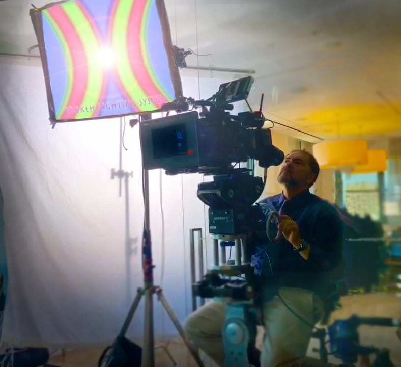
Created by director John Tindall, the Brokeh lighting system owes its name to the Japanese term “boke” — meaning “blur” or “haze,” and in English referred to as “bokeh” — and to the “broken” colors of Impressionist painting. “The idea is that you’re creating a pattern — in front of a white light — that looks like a party gel gone crazy, with stripes that break the light into color strands,” cinematographer Julio Macat, ASC explains. “It breaks down all of the elements of white light into color strands, yet still ends up delivering white light in the end and somehow giving the light more of a drop-off. It’s almost as if the same light, adding up to the same color, has a different quality to it and drops off the shadow side of the face faster.”
To break the visible light spectrum into different colors, the Brokeh System’s patterns can be placed like a gel in front of a soft light or can be printed on a soft cloth. When actors are lit with Brokeh, although the white light is filtered through different hues, the overall color of the light remains white. The intended effect is that of a greater sense of depth to facial modeling.
On After the Wedding, Macat primarily used Brokeh F Series patterns — with F standing for “facial” — which feature dominant and complementary skin tones in pronounced hourglass-shaped patterns designed with the intention of enhancing the curves of a face while also softening imperfections.
Macat also used Brokeh N Series (Nature) patterns, which bear a “camouflage” design and are used on large reflection and lighting sources. “The N Series has a dual purpose,” Macat notes. “It can be used in the shot as an out-of-focus ‘impressionistic’ background for close-ups or background shapes, and it can also be used as a non-white reflective surface when you’re photographing something very reflective, such as a glass of wine or a car. The surface of the reflecting material is a multi-color pattern, but if you bounce a standard white light into it, the output of the reflection is a white light.”
