Animal Kingdom: Isle of Dogs
Cinematographer Tristan Oliver illuminates the whimsical futurescape of director Wes Anderson’s stop-motion feature.
Cinematographer Tristan Oliver illuminates the whimsical futurescape of director Wes Anderson’s stop-motion feature.
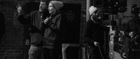
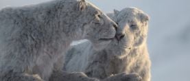
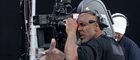
Photos by Emilie Dubois, Valérie Sadoun and Ray Lewis, courtesy of Fox Searchlight Pictures.
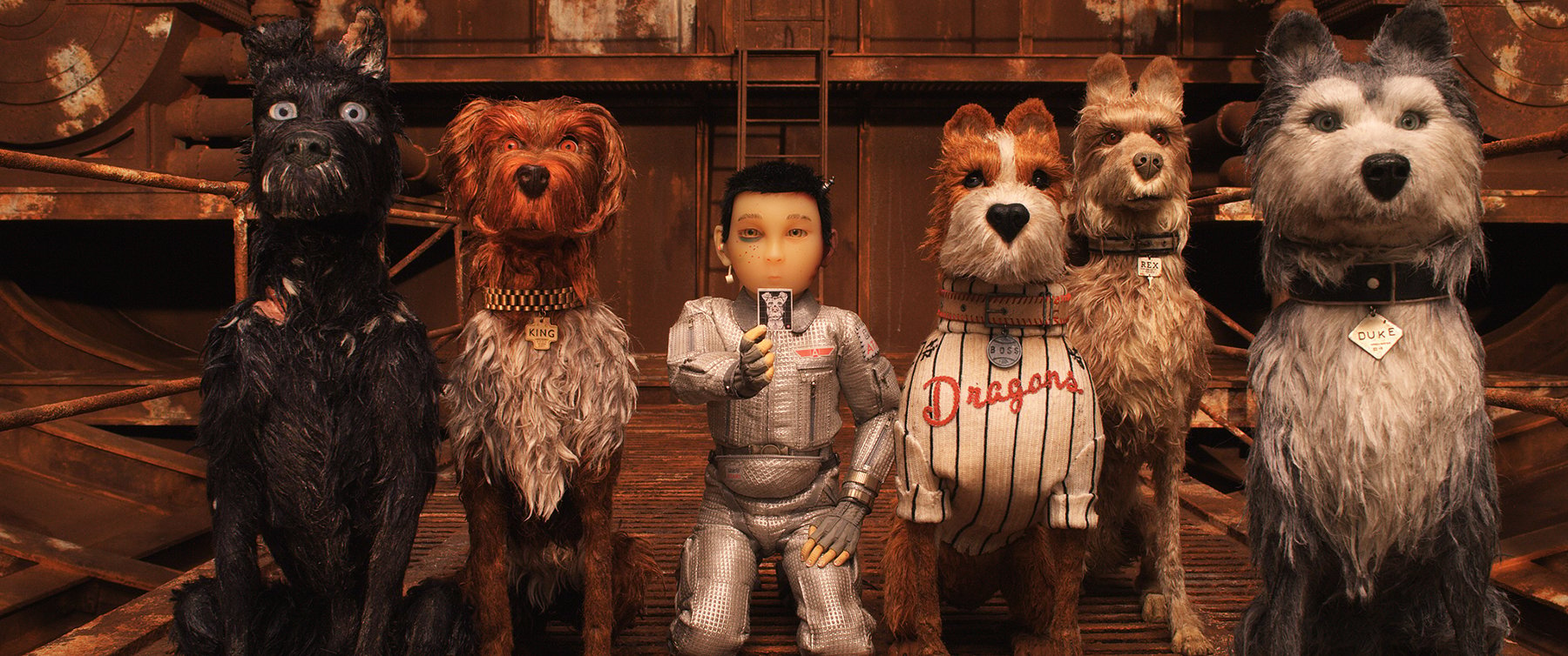
Set in Japan at an indeterminate point in the future, Isle of Dogs marks a return to stop-motion animation for writer-director Wes Anderson, whose first foray into the genre was Fantastic Mr. Fox (AC Dec. ’09). For the new film, Anderson returned to London and reassembled some of the same key crew, notably director of photography Tristan Oliver. Over the course of the 87-week shoot, Oliver supervised three lighting cameramen, and at the peak of production, there were 44 units running simultaneously on stages at 3 Mills Studios.
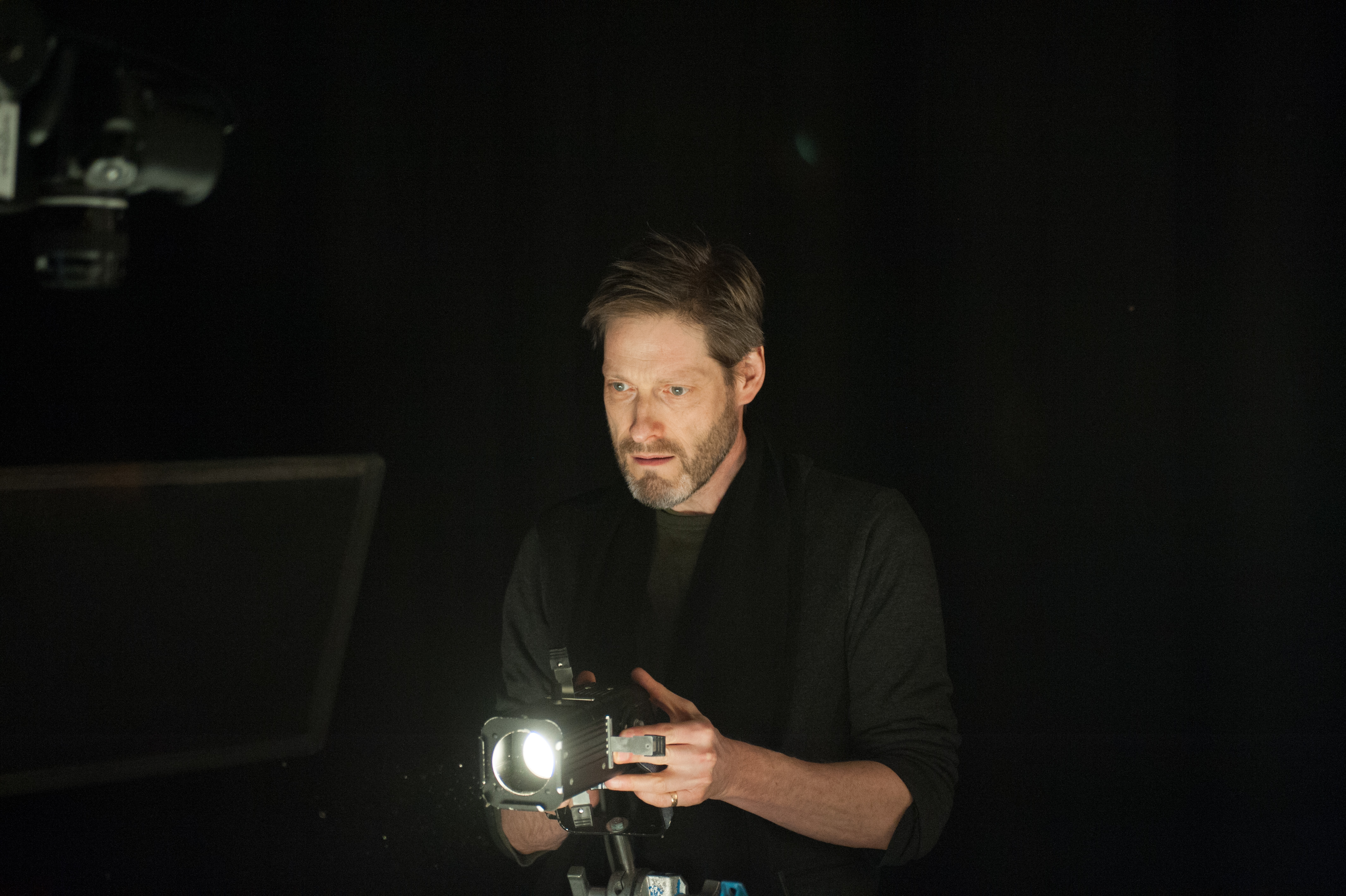
With roots going back to Aardman’s acclaimed Wallace & Gromit films, Oliver has been honing his craft for nearly 30 years, and his work so far includes the 2017 Academy Award nominee Loving Vincent, the Academy Award-winning The Curse of the Were-Rabbit (AC Oct. ’05), and the widescreen 3D stop-motion feature ParaNorman (AC Sept. ’12). Technically and stylistically, Isle of Dogs was less complex than all of those projects, but “it wasn’t easy by any means,” says Oliver. “Working with Wes is very different than the highly collaborative environments I’ve experienced on other films. He is very exacting, and the process is more reactive than proactive.”
Oliver connected with AC via FaceTime in January to discuss the movie, which follows a pack of dogs that has been banished to an island of garbage following an outbreak of canine influenza.
American Cinematographer: This movie situates Anderson’s picture-book aesthetic in an unusual environment, one that isn’t immediately recognizable. How did he describe the look he was after?
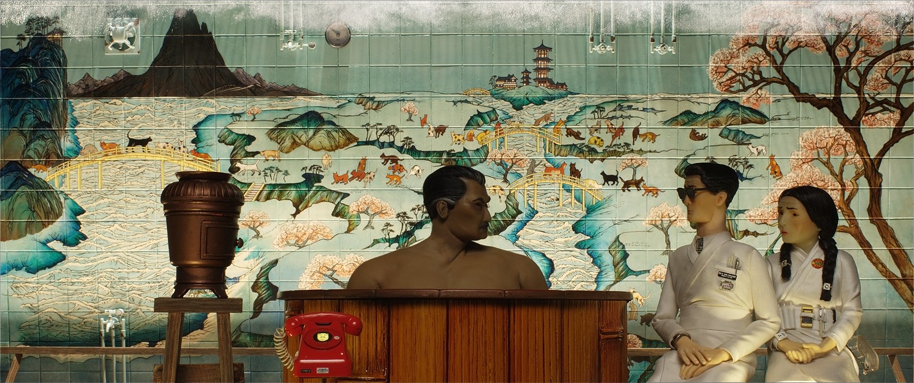
Tristan Oliver: He was looking for an aesthetic based on a lot of old Japanese movies he’d been watching. What we ended up with doesn’t look like any of those, I suppose, but there’s a distillation that settles somewhere in your brain. He described the setting as Japan in the near future, but the sort of future people in the 1950s would have imagined. The state of society is somewhat bizarre and alien, but most things within that society appear familiar.
Were some of those Japanese films more influential than others? Was it more Kurosawa than Ozu?
[Laughs.] Definitely. Kurosawa is the most accessible, and everything else is a bit more aggressively Japanese, if you will. Wes was keen to push a Seven Samurai feeling with the pack of dogs. They’re ropey characters coming together for a mission to do something. It’s not an essentially Japanese story, but it’s that kind of vibe.
Did he reference Fantastic Mr. Fox much when discussing what he wanted for Isle of Dogs?
He was very fond of what we did on Fox, but this film is different in some key ways. Fox has a fairly simple narrative arc, and Isle of Dogs is infinitely more complicated; you really don’t want to blink while you’re watching it, or you’ll miss something. And the environment is very different, so there were some things we did on Fox that just didn’t work this time around. For example, Wes was fond of forcing the size of the characters down as small as possible — [on Fox] we’d set up a shot, and he would pull the camera farther and farther away and shrink the puppets down till we ended up with these very tiny sets and tiny characters. Sometimes they were just bits of scrap, little oblongs and triangles glued together and painted the right color, that were just skittering around in the background.
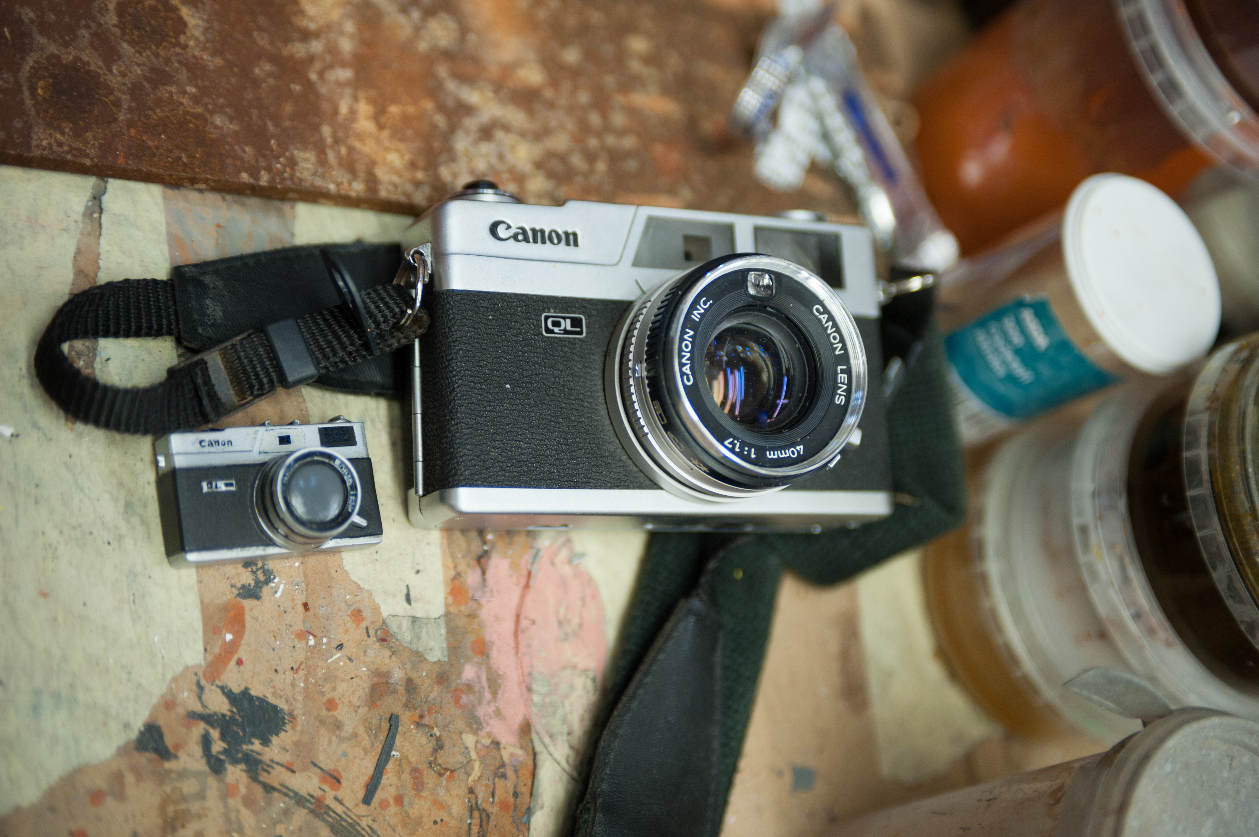
When we started Isle of Dogs, he was very keen on pursuing this. We had many scales: small, medium and large, and then tiny, super tiny and super tiny tiny. He’d say, ‘This next shot is going to be in our super tiny tiny scale.’ But once we started to play with that, it was obvious it wasn’t working within the visual aesthetic of this movie. It’s a very different kind of landscape, and the charm of having little characters running around in woods and fields wasn’t there. We also found that although our main-character dogs worked beautifully at full size, they started to look rather puppyish at half size. There’s a lot of character in the key dogs. So, although we had a lot of sizes made, we shot most of the movie in just one scale because it fit together much better that way.
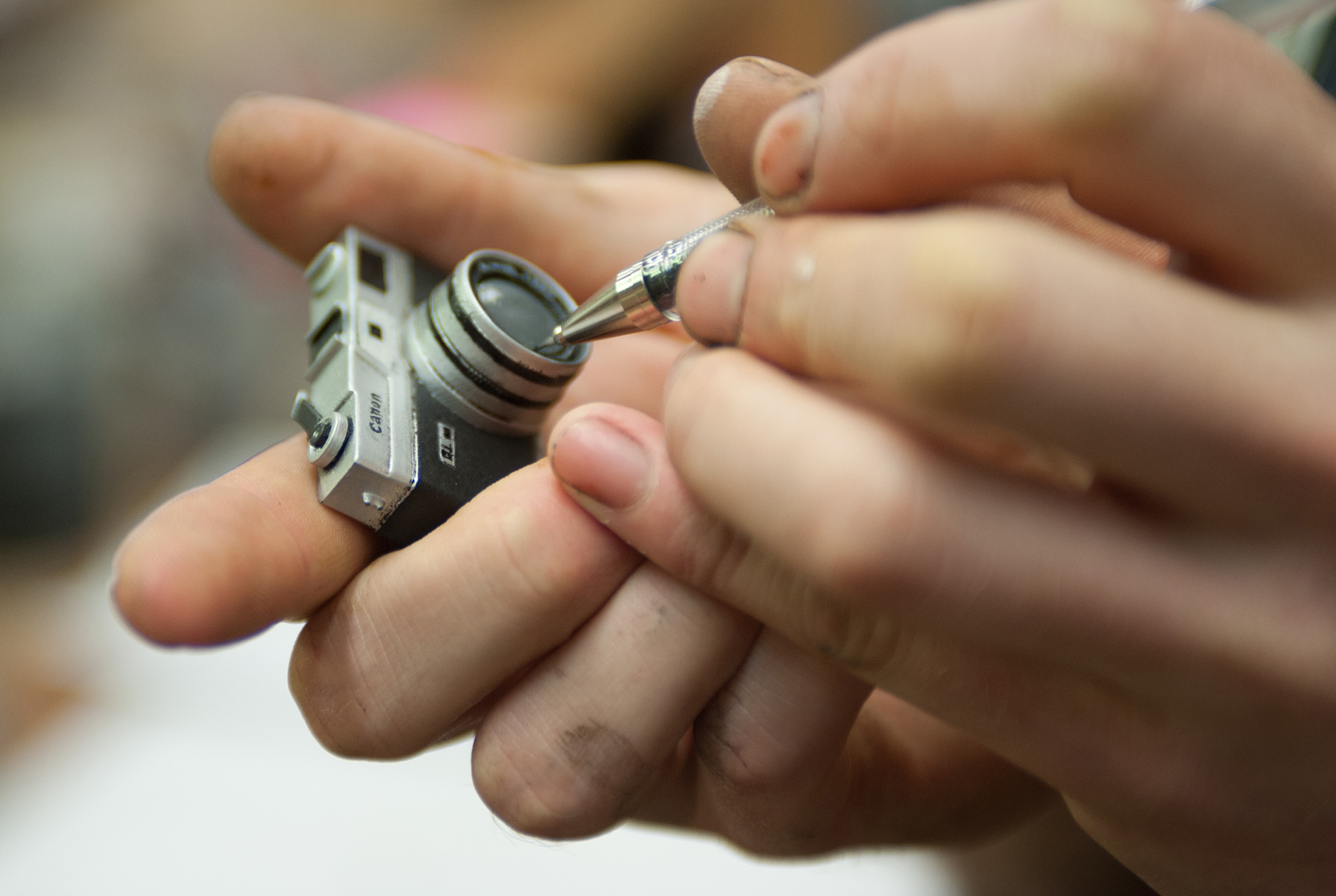
Also, we used a huge amount of colored light in Fox, but on this film Wes wanted a lighting palette that was very restrictive — sort of washed out, almost monochrome. He wanted to instead use set color to create what he wanted color-wise. So, in the human world, the sets are very brightly colored, but the light is always white and nearly always quite flat. The days are all heavily overcast with almost no shadows. We used almost no key light for the exteriors; if we were keying, we were keying just slightly stronger off the fill board on one side than we were on the other. Wes recently invited me to look at the work he has done in the DI — he’s been grading in New York via a remote linkup to Molinare [in London] — and he has added a lot of saturation to combat the overall monochrome feel.
How did you balance the flat lighting scheme with the need to model the puppets?
We really had to concentrate on that. With all this flat light, it was tricky to get some degree of readability and modeling into the faces without making them look too keyed or contrasty. We built a lot of special eye lights and rigged them very, very close to the lens. It’s a convention in animation that human heads are slightly oversized, but these were made to human proportions, so they were about the size of the top joint of my thumb; consequently, their eyes were very small and quite far back in the head, and finding the reflection point on them was difficult.
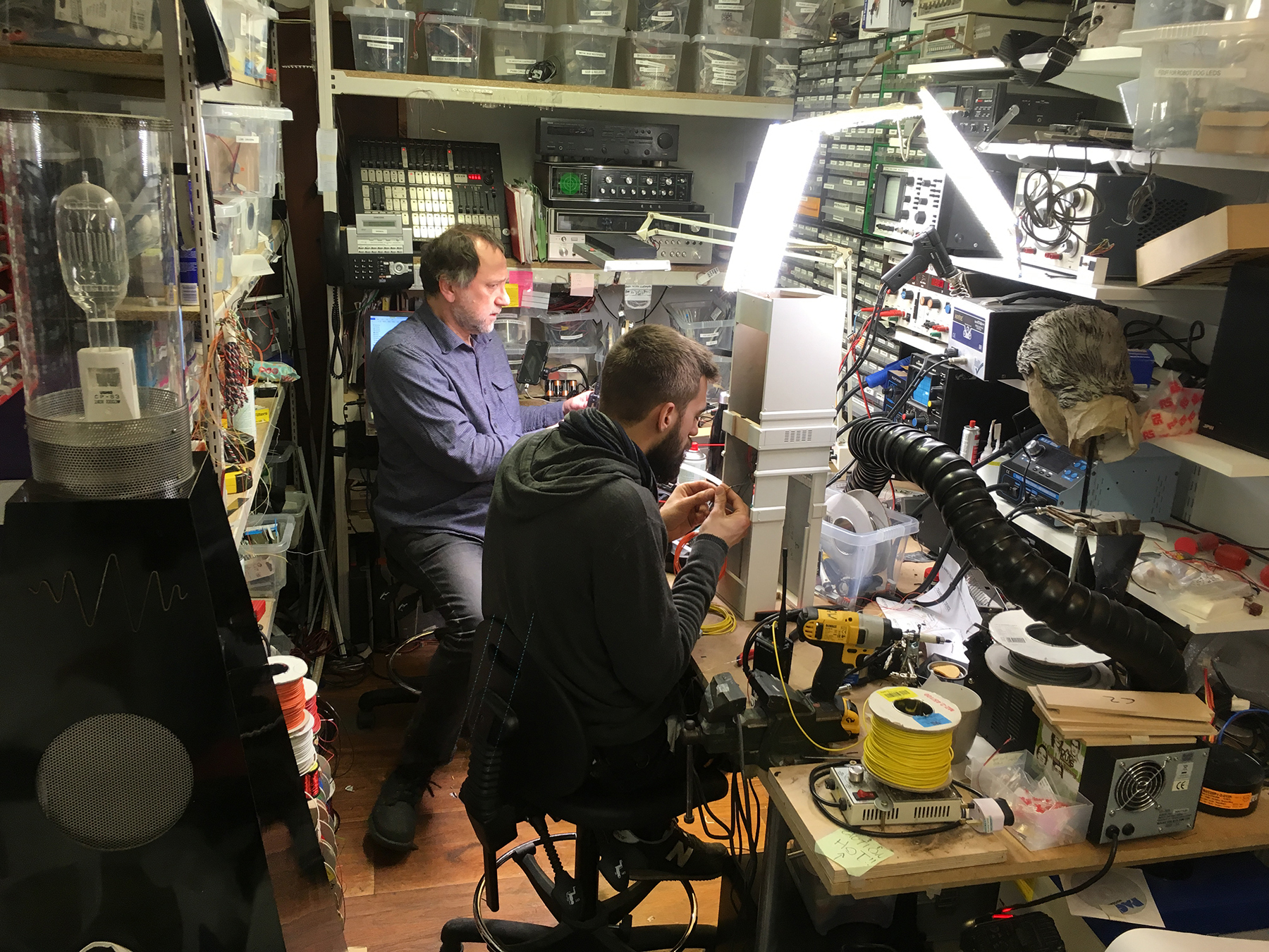
Eye lights need to be very small for puppets because puppet eyes are close together and don’t have the wetness of the human eye, and you often have to put in an eye light for each eyeball. We tried all kinds of things, and we finally arrived at placing Power LEDs in ping-pong balls. We got a degree of sourcey-ness out of them, but also a degree of ambient fill because of the plastic covering. Seated on top of or just under the lens, they normally had enough spread to accommodate both eyes. We mounted them on the camera because they had to be as near the lens axis as possible, and if the camera was moving, we’d have them on dimmers so we could dim them as the camera moved.
What did you use for your motion-control work?
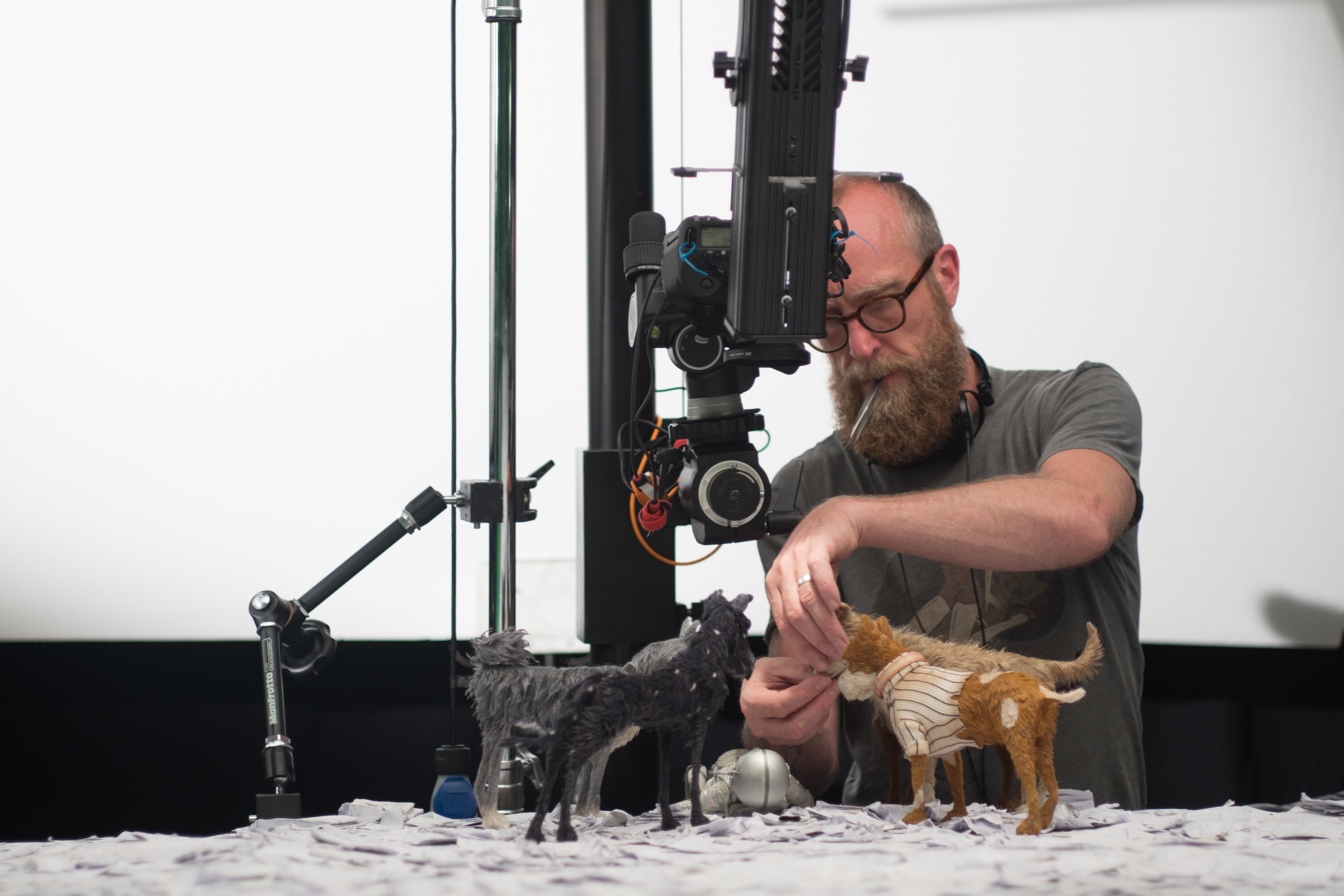
We had to build our own rigs and do it inexpensively. We’re a single-production setup, so we’re not investing for the future. I brought in Justin Pentecost, who’d worked on Under the Skin, and he built what we needed with off-the-shelf components from China. We were able to assemble a library of modular motion-control heads, trackers and risers, all of which could be bolted together because they were made to my specs. The quality of the engineering is astonishing, and it costs just a few hundred bucks to make multiples of things. Also, because the components are substantially aluminum-based rather than steel, they’re much lighter. A 3-meter tracker that would have taken six people to lift is now a two-man lift.
We used Australian software, Mantis, which Justin recommended. It’s substantially cheaper than the Flair system, and [Mantis’] developer, Gerald Thompson, was on hand to rewrite the code for us. It wasn’t an innately bad piece of software; it’s just that Gerald thought it did what it needed to do, and it didn’t do what we needed it to do.
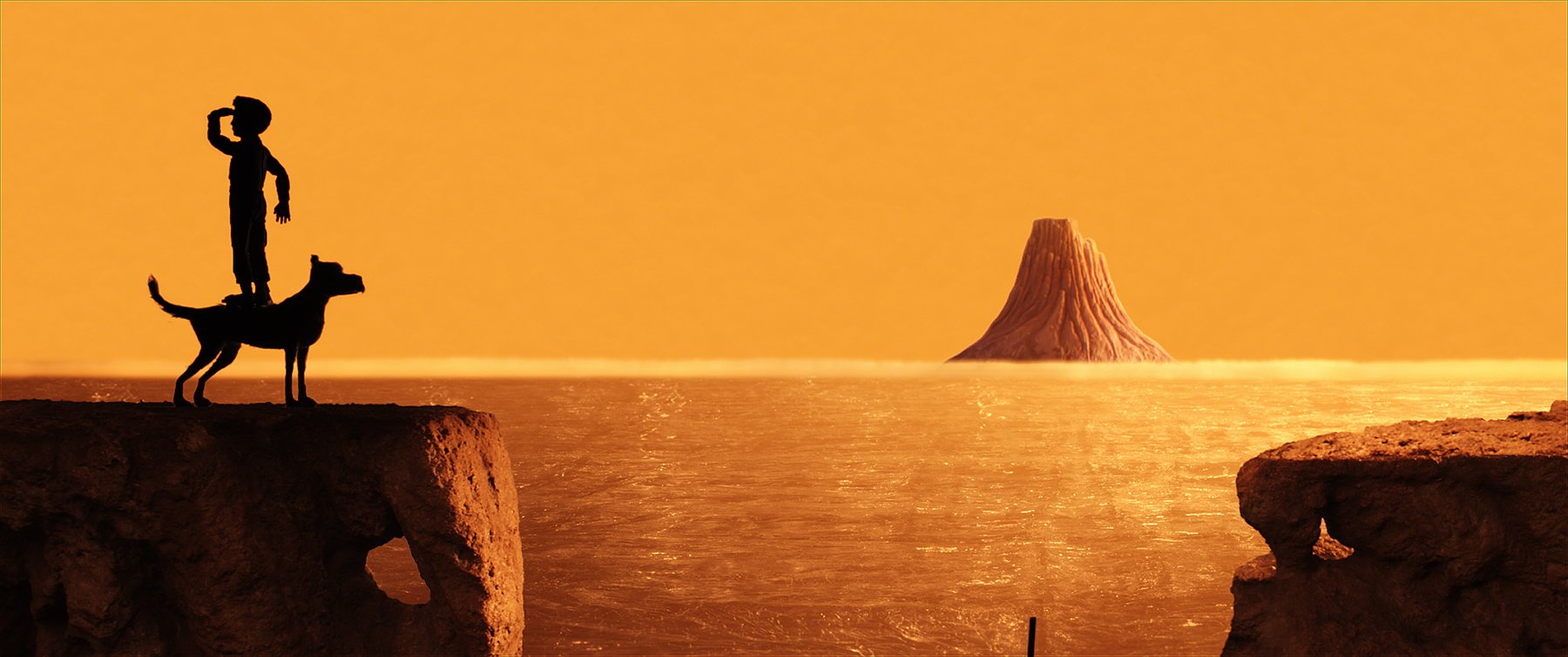
Given that stop-motion is a fairly small niche, was it difficult to crew up? Did you run the trainee program you’ve run on past shows?
Yes. It’s very hard to get camerapeople with the necessary skill set; many are now lighting commercials or have moved on to other things. We took on more trainees than normal, and, as on ParaNorman, the female trainees were far and away the best of the bunch. More than half my crew was female on this job, actually. Our motion-control operator, Ayumi Ishikawa, had worked on productions in Japan, and she could also weld and run the lathe. She came in as a trainee and was promoted very quickly.
Two of my lighting cameramen, James Lewis and Malcolm Hadley, were already very experienced. I found the other one, Max Williams, through mentoring Daisy Jacobs, a student at the National Film and Television School, who had hired Max to shoot her stop-frame film [The Bigger Picture], which was nominated for an Academy Award. Max has a very good eye and did great work for me. I was working with first AC Mark Swaffield for the first time, and he was brilliant. Our great electrics crew, led by my regular gaffer, Toby Farrar, also featured many trainees
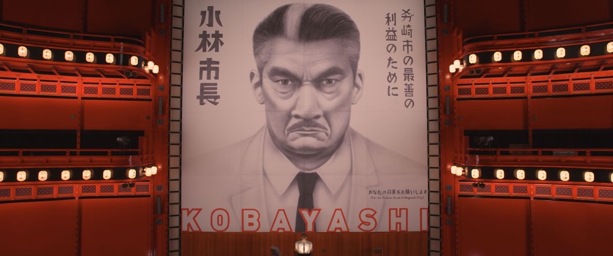
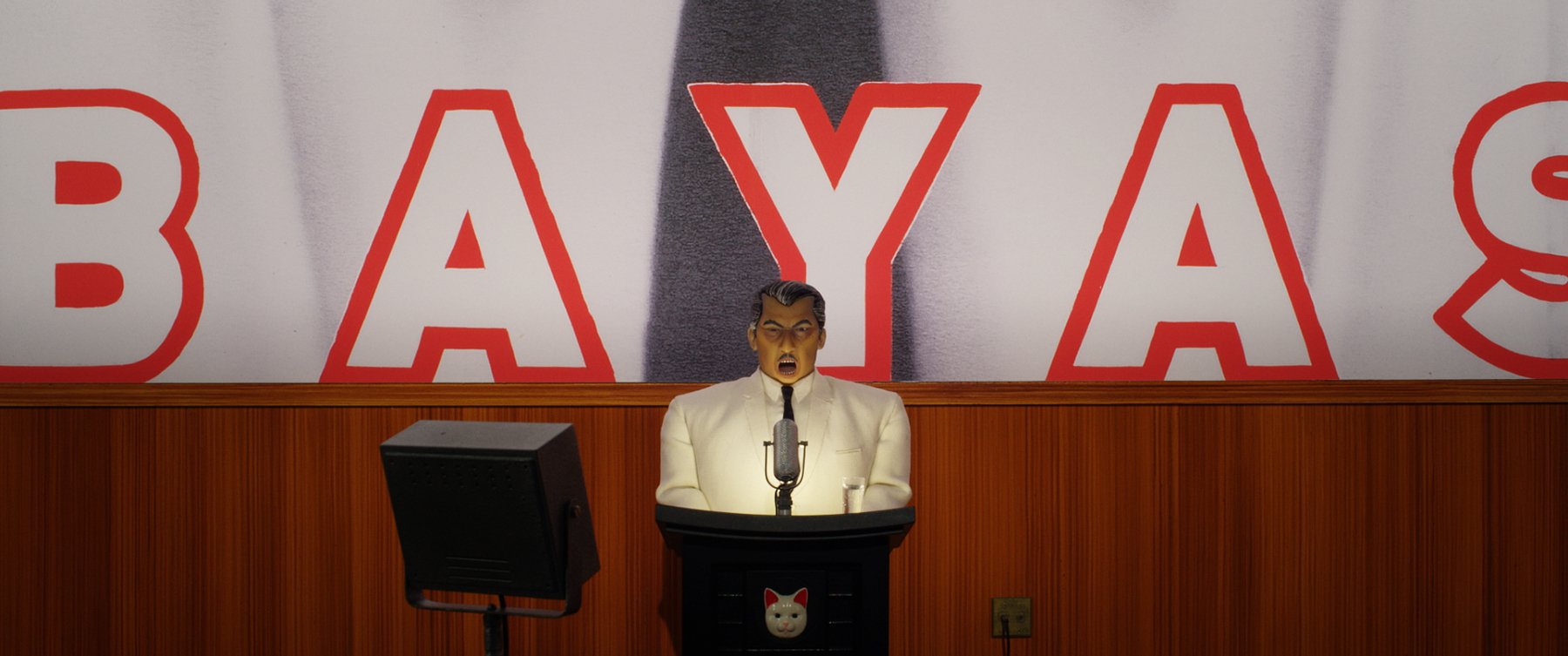
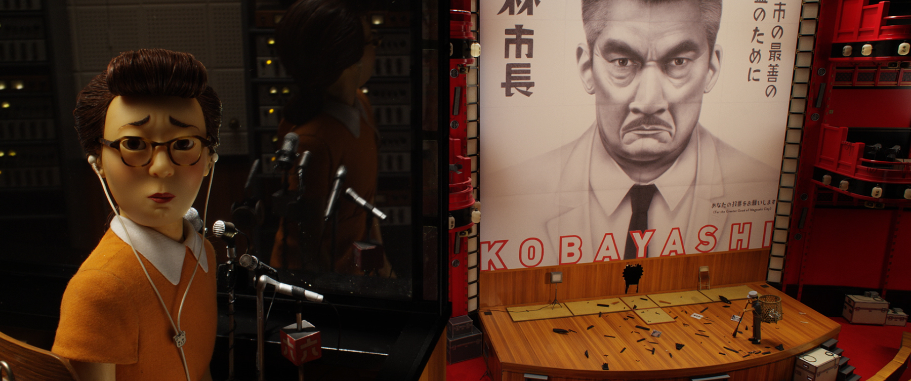
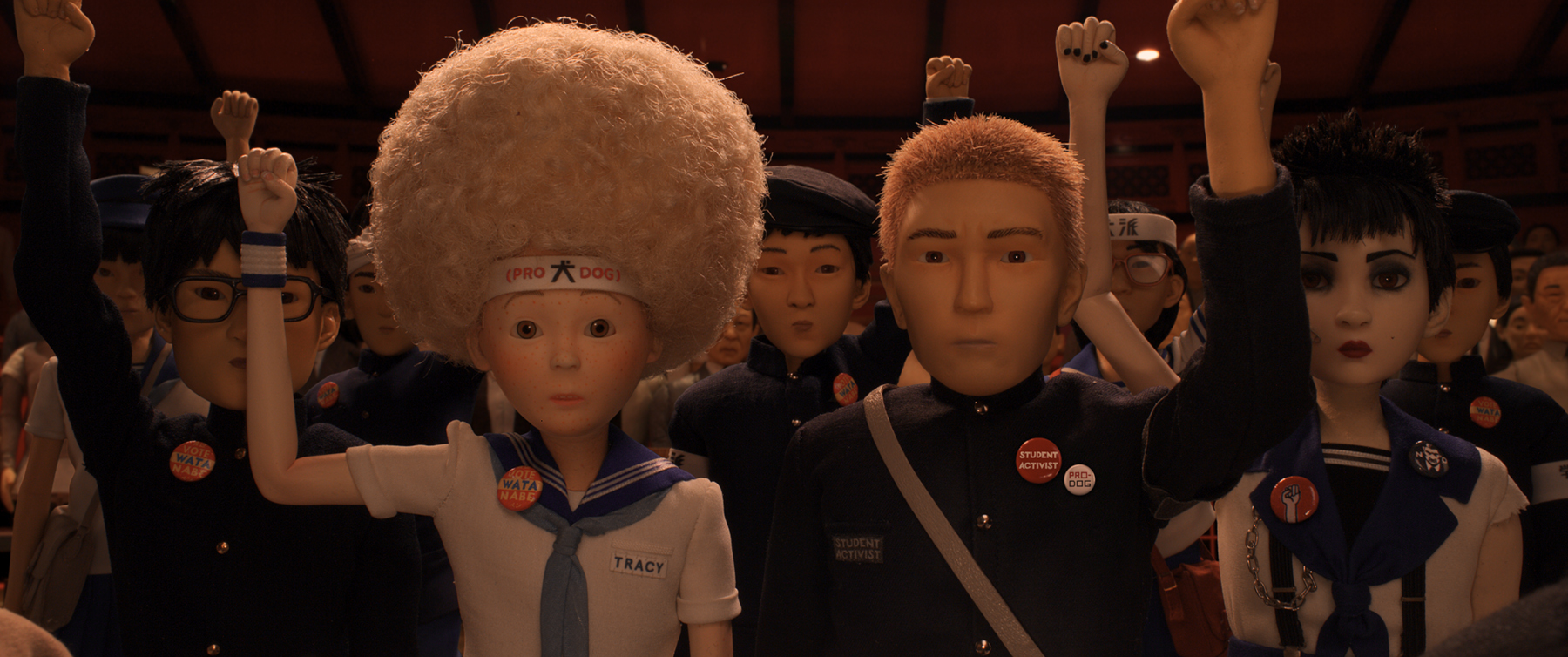
How did you approach the lighting in the Municipal Dome, where the mayor stages a Citizen Kane-style political rally?
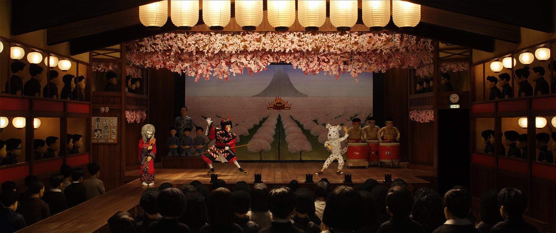
We had so many shots on that set I think it ran for well over a year. It’s a huge, octagonal theater with a domed roof and gorgeous red-lacquer and black-lacquer walls that were highly reflective. There were so many angles in there that it was challenging just working out where to place lights so you weren’t constantly seeing them. It’s meant to look as though there are 3,000 people in the audience, so we had dozens of [motion-control] passes on audience characters. The sequence starts with the camera looking up at the night sky through the glass dome, and then the camera tilts down, jibs down past gallery after gallery of applauding people, and comes to rest behind the podium. Then the mayor steps into the frame and addresses the crowd. The wall behind the mayor is a massive graphic of his face, just like in Citizen Kane, and that had to double as a projection screen, which meant we had a lot of lighting changes within that environment. It was quite fun in that respect.
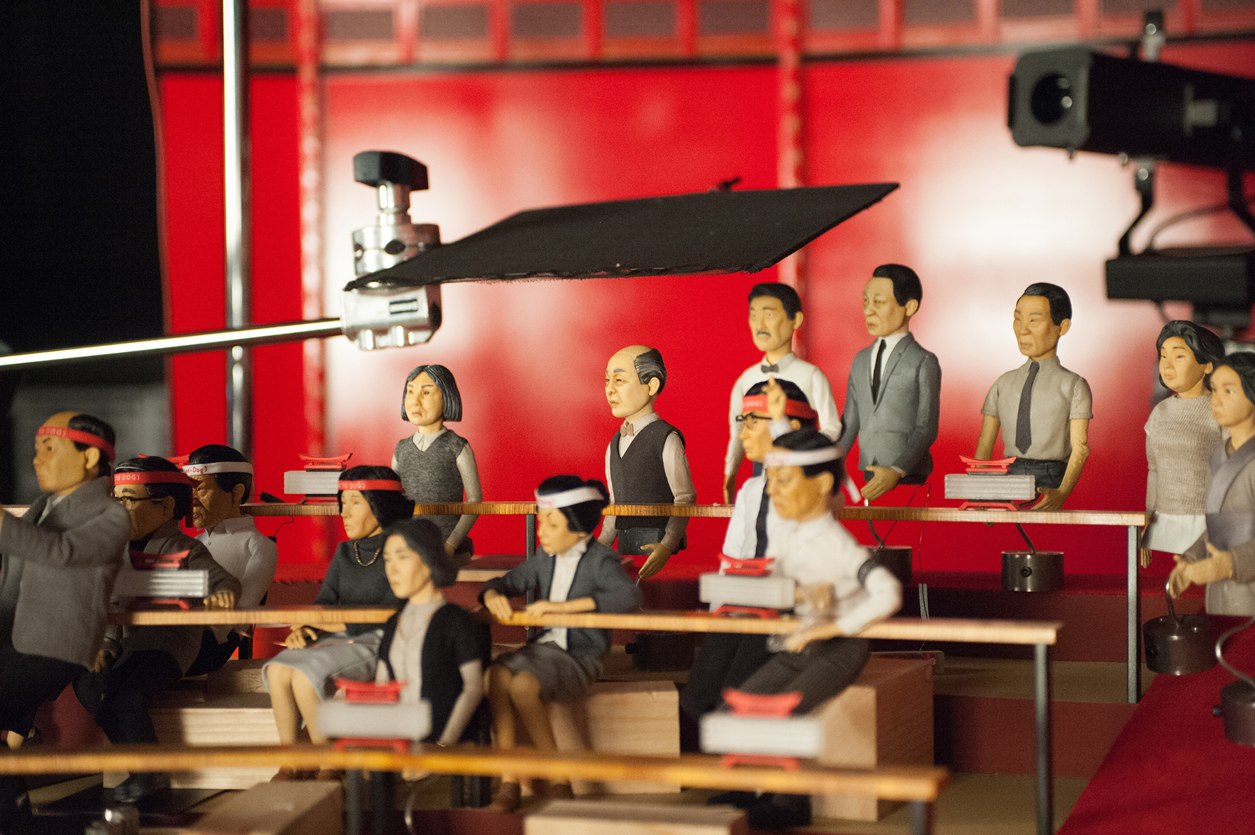
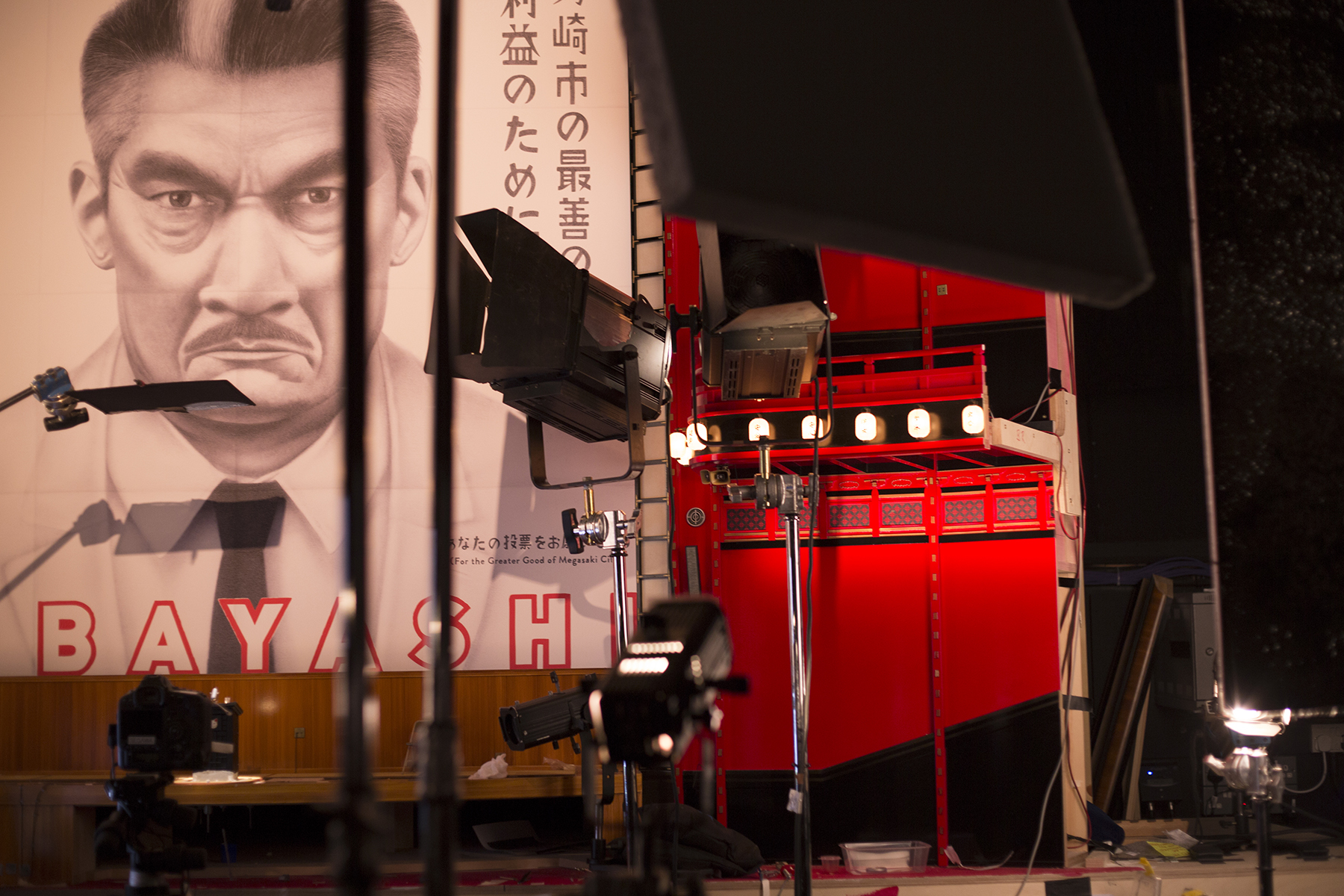
The hundreds of tiny Japanese lanterns illuminating the set were made of cast resin and then sandblasted to give the effect of a tissue finish, and the ribs were hand-painted onto the outside. We drilled a hole in the back of those and pushed in a tiny 12-volt tungsten taillight bulb. We ran everything back to dimmers; we could dim those quite low so they glowed with warm light. The temptation is to go with LEDs on everything, but LEDs stay white no matter how much you dim them. We also had some 1-inch-long Fresnel spotlights on stands, and we did put LEDs in those. We used various other 12-volt fixtures, including down-lighters across the top of the stage.
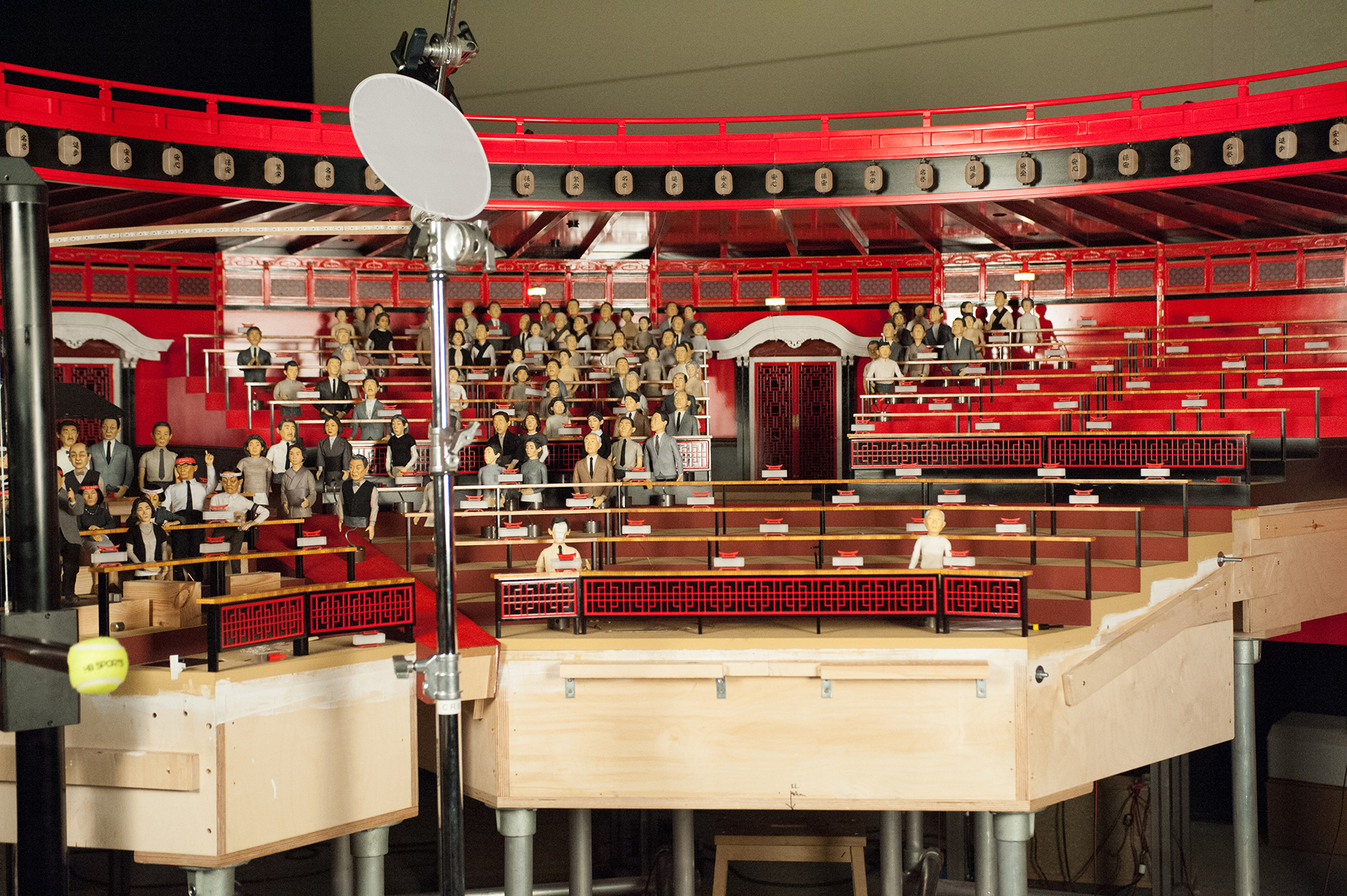
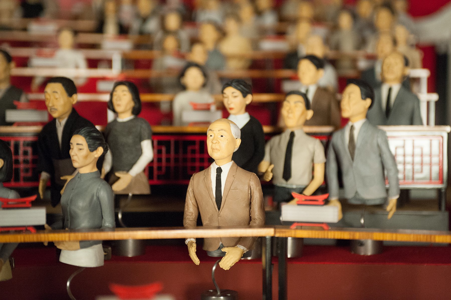
There are a lot of people and dogs getting in each other’s way on the stage, so there was a lot of shadowing going on, and I had to find ways to feed the light in. Quite often I was flying little LED strips off the front of the camera to each side just to fill in bits and pieces, to keep it as clean as possible. The huge graphic of the mayor’s head was very useful as an ambient fill source; I fired a profile [ellipsoidal reflector] spotlight at it and shuttered it in so you couldn’t really see where the edges were — it just became a white square. That provided back-fill, and when we turned ’round to film the audience, that motivated the light coming from the stage.
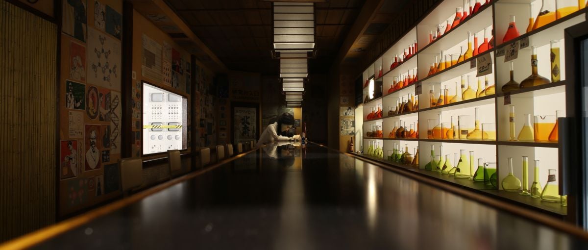
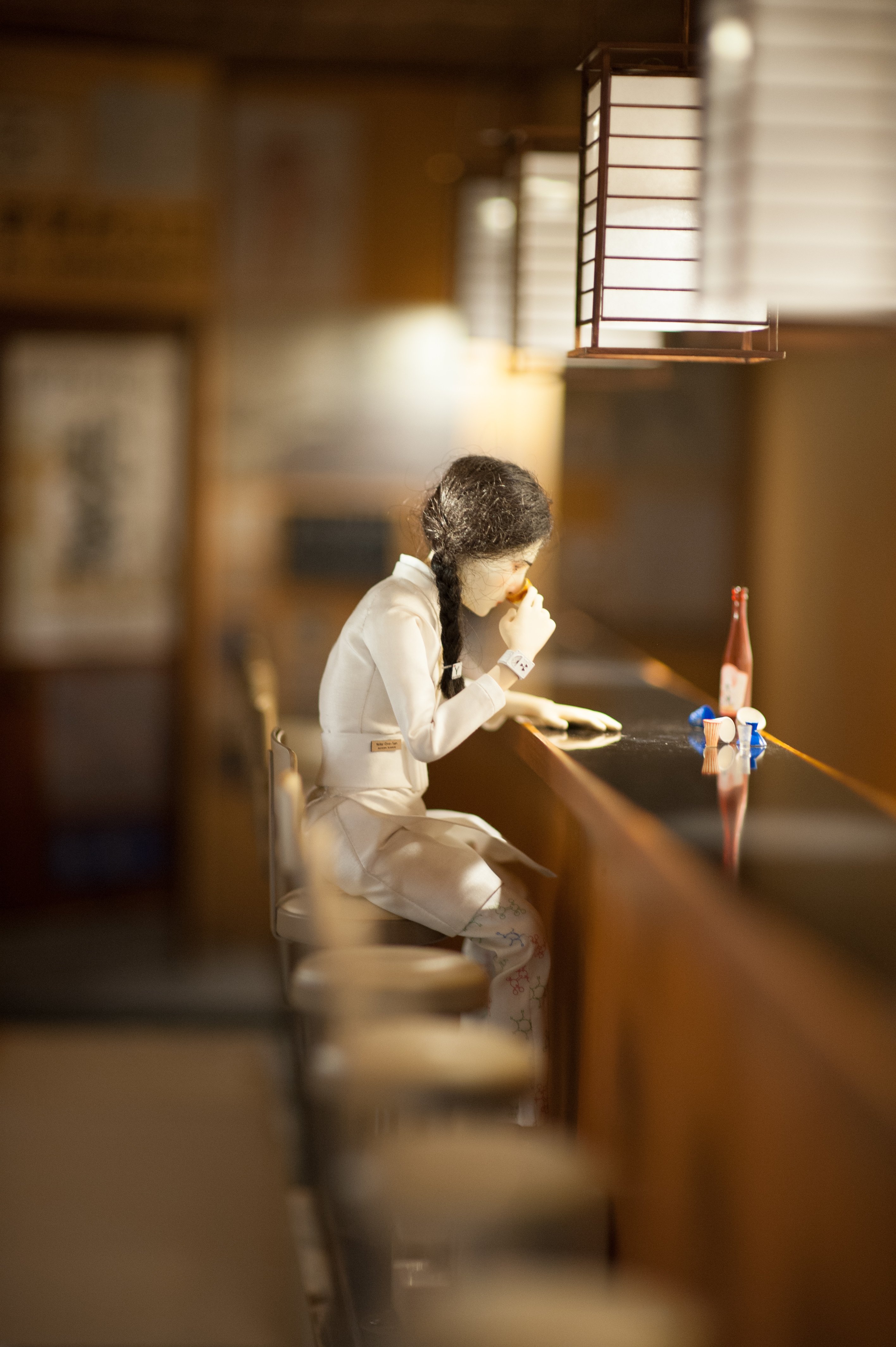
The sake bar where we meet the character Yoko Ono looks like the polar opposite in terms of scale.
It was! That set was extremely narrow, and we had to shoot down the bar in both directions. It’s meant to be a Japanese interpretation of the classic Western bar scene, where you see a glass of liquor pushed down the length of the bar toward a character. The walls at both ends of the bar flew out, as did the wall behind characters seated at the bar. I wanted it nice and moody in there. The main source is the milk Perspex behind the shelves of colored flasks behind the bar; I fired a load of cyc lights into a huge bounce board behind that wall to create super-soft light. Above Yoko are square paper lanterns, but Wes wanted to project circles of light onto the bar, not squares, so we cut down some pieces of 1⁄3-inch steel tubing and attached them to the Power LED in each lantern so it would project a circle of light.
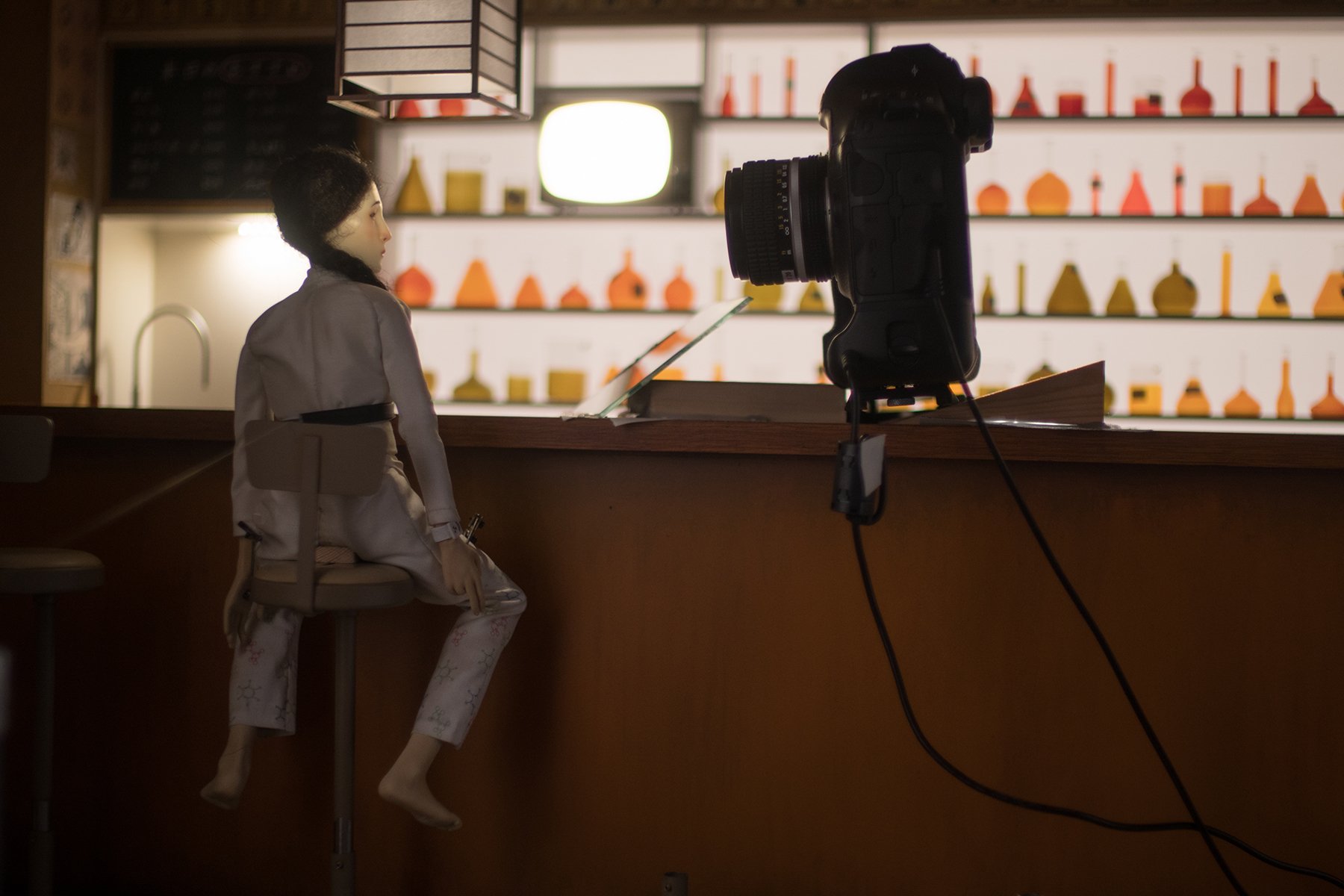
There’s a very unusual shot in that set, an extreme close-up of Yoko and Tracy, an American exchange student, as they sit at the bar and look through a book of documents. The shot starts as a very tight two-shot, and then the camera pushes in slightly as the girls bring their heads together over the book. Wes wanted to reference the shot in The Color of Money where Tom Cruise leans down over the pool table with his cue and the table rises up to meet him. We couldn’t move the bar because it was only two inches wide, and moving it even slightly threw everything out of kilter. So we sawed out the wall behind the girls and mounted it on motion-control risers, and as their heads come together, the wall behind them jacks up.
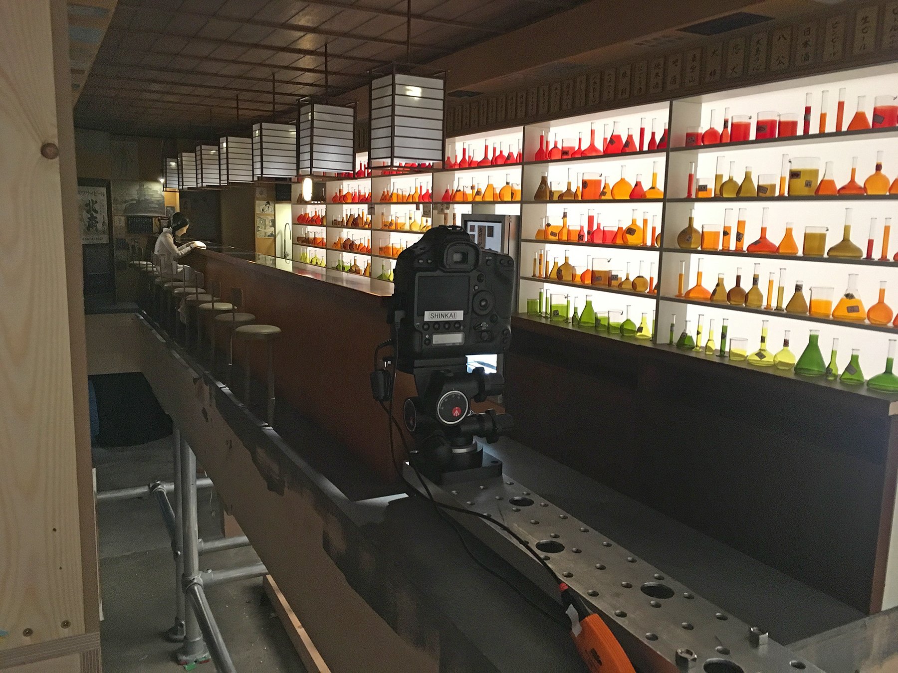
We actually had quite a lot of motion-control in that set. There’s another shot that tracks the entire length of the bar and finds a frame-filling close-up at the end. I was having trouble making that work, and Stuart Galloway, our head of motion-control, built a tracker rig we placed way outside the set with a long Ubangi on it, and a little idler wheel came down off it and rested on a tiny track hidden behind the bar, just to bear the weight of the camera. We used a 24mm macro Sigma lens because it was the only one we could rack far enough to get a close-up of this character and the wide of the bar at the other end.
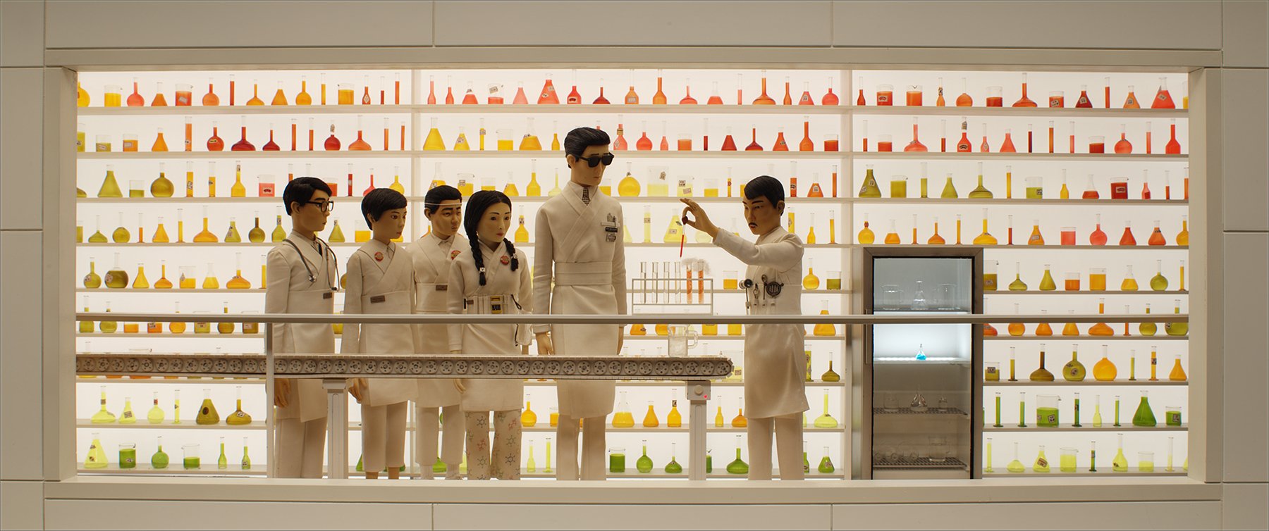
The long tracking shot in the laboratory adjacent to the sake bar involves a lot of lighting effects. How did you approach that?
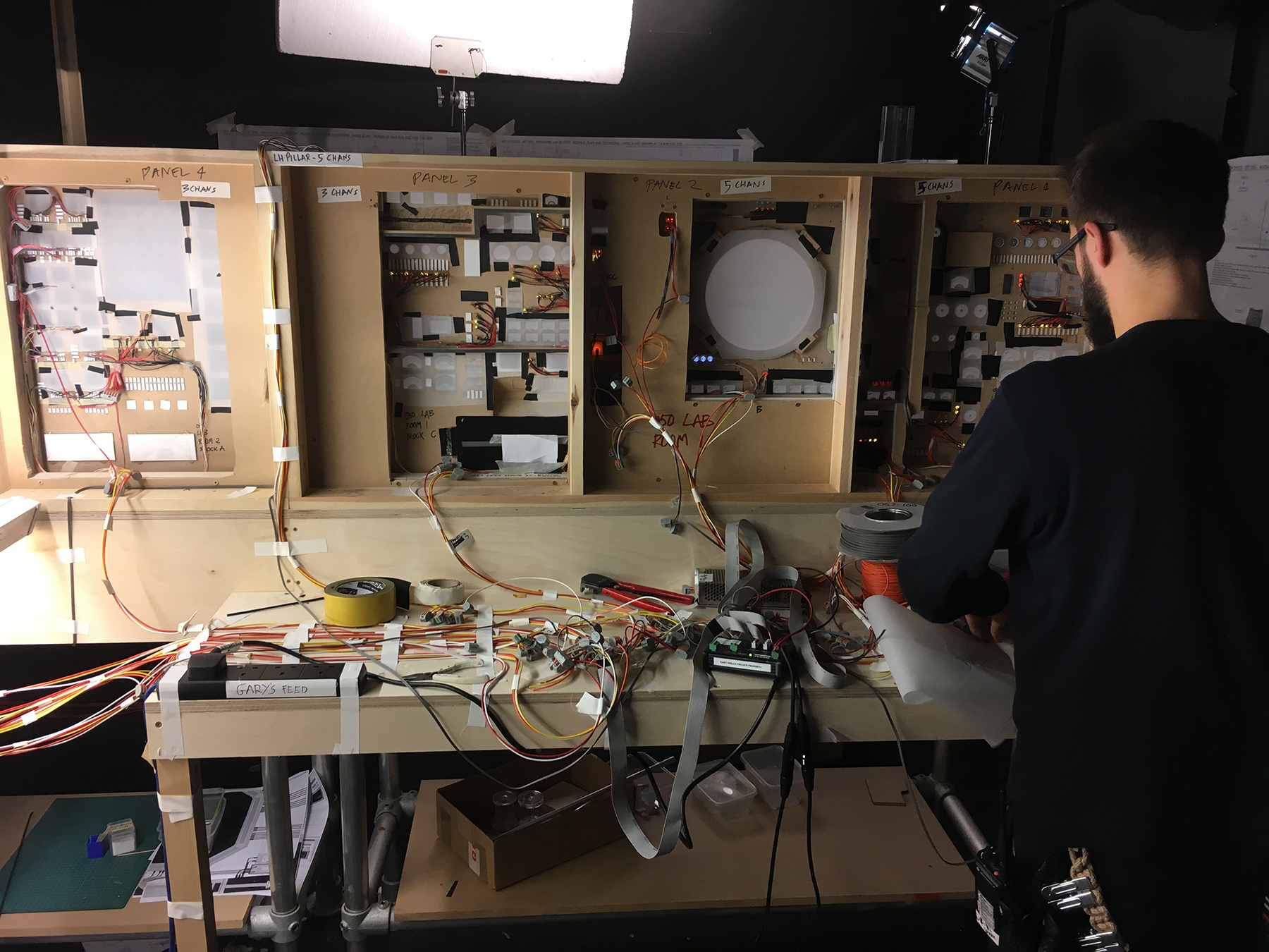
That set was about 30 feet long, and it was absolutely covered in LED practicals that were all on individual channels running back to dimmers. There are gauges, flashing lights, and also a large tube built off the back of the set that pulses with light. As the chief scientist walks along and stops to confer with other scientists at various points, some extraordinary thing happens at each stop — something spins and lights up or explodes. Wes loves to tinker with the timing on stuff, and he preferred to work off site, so we captured 16 iterations of every frame in that sequence to give him all the options he wanted for the lighting effects. So, whereas the animator would typically press the button, capture the frame and then move on to animate the next frame, in this case the animator would press the button, the camera would fire, and then the lights would change and the animator would capture the other 15 options [for that same frame]. After viewing all the options, Wes would decide what flash rate or explosion point he wanted.
That process sounds like it would lengthen your schedule, but 87 weeks is fairly typical for a stop-motion feature, isn’t it?
Yes. It did take longer to set up all the iterations, and the animator had several minutes of wait time, but this film is less cutty than a lot of movies. Several shots run over a minute. ParaNorman took about 85 weeks, and this film has two-thirds of the shots that film had. We were generating a vast amount of data on the set, and Wes was on top of it all. After shooting two films for him, I’ve come to understand that viewing material on a flat screen, removed from the geography and logistics of the set, is somehow essential to his process.
How did you ensure consistency across all the monitoring devices?
We shot with the Canon [EOS] 1D X and [visual-effects supervisor] Lev Kolobov built a LUT for us that worked on the floor, in our projection area, and in the DI. On the floor, we mostly worked to calibrated Eizo flat-screen monitors. Wes worked with a large iMac at home.
How did you arrive at the look of the animal-testing facility where the climactic action occurs?
I sent Wes some of Christopher Payne’s photos of North Brother Island [from North Brother Island: The Last Unknown Place in New York City], the site of an old tuberculosis hospital that’s now totally overgrown with vines, and some photos of St. Peter’s Seminary in Scotland, a masterpiece of Brutalist concrete architecture that was built in the 1960s and is now also totally overgrown. Wes liked these references, so that’s what we worked towards.
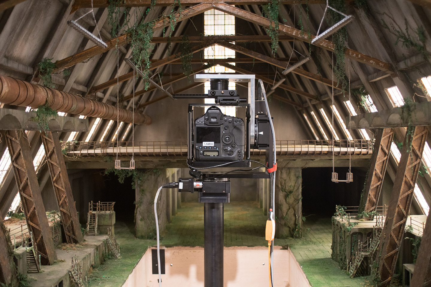
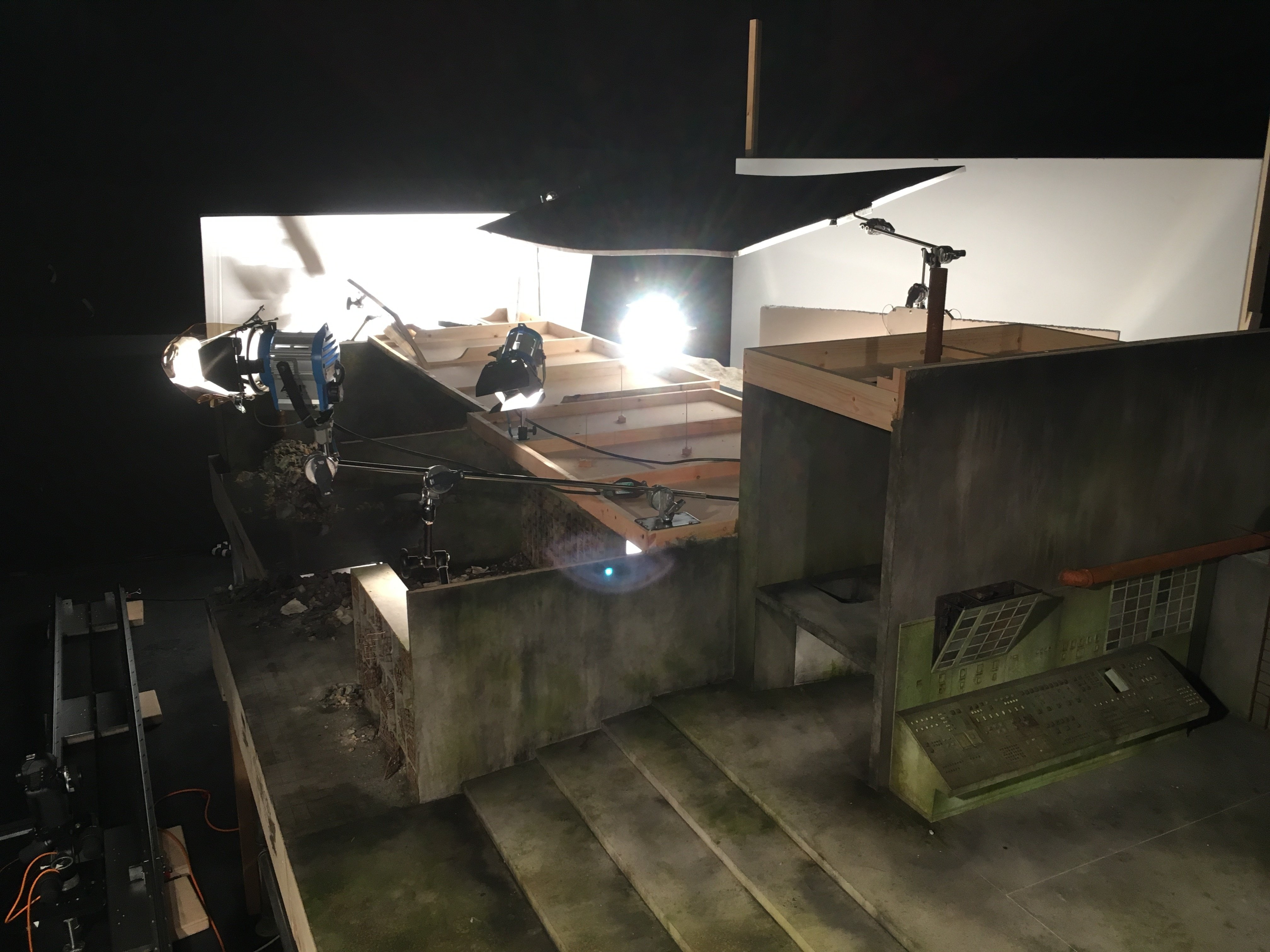
The sequence begins with a shot of our hero pack of dogs, and once the boy steps into frame, the camera starts moving and reveals the rest of the facility with a tracking shot that lasts about 50 seconds. Each room is bigger than the last and filled with more dogs, and the shot ends in the space where a showdown takes place. The tracking shot involved a variety of scales, so we had to rescale the camera move and the distance from the set in order to create a final shot that would have one coherent size.
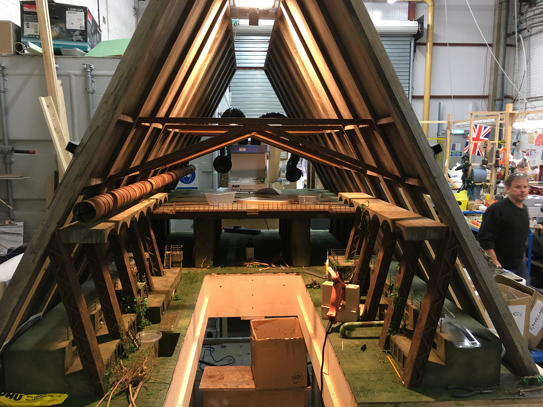
I used very large soft sources throughout this set, and for the space where the showdown occurs, I was also able to create atmosphere with some smoke because there’s no animation in the set — it’s a beautiful miniature we used to create a set of background plates to lay in behind the action. It was about 4 feet wide, 4 feet tall and 8 feet long, and we photographed the hell out of it with every lens at every height. We shot it with and without smoke just to give it some proper depth. I lit it very simply with big bounced soft sources at left and at right, slightly brighter on the right, and also had soft light coming through a glazed panel in the roof. I aimed a profile spotlight straight down at the area of the floor where the action would take place, and I stuck a few LED strips under the platform visible at the back of the space just to lift the darkness away a bit.
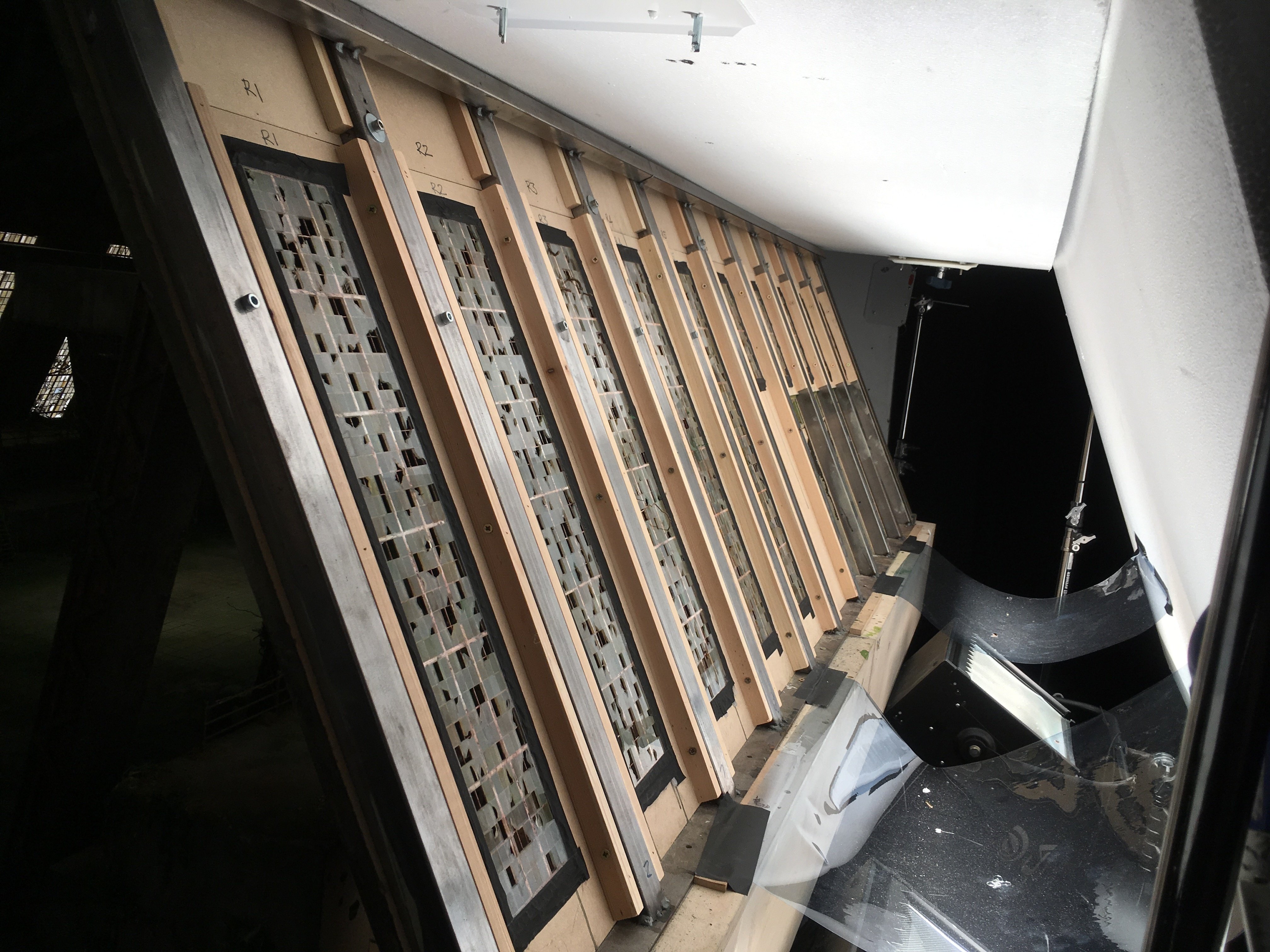
The [showdown] action was, for the most part, shot against greenscreen using the full-size dogs — although we did have some scaled-up floor planes made to give the right kind of shadow and fill detail on the dogs. I created large versions of the [set’s] windows by cutting holes in 8-by-4 sheets of beadboard, covering them in Hi Lite diffusion, and then rigging them in a kind of tented-roof shape over the floor. We lit with a combination of [Quartzcolor] Iris 1 cyc lights directly through the holes and 650-watt Arri tungsten Fresnels bounced off more beadboard to match the look of the miniature.
Apart from the Sigma macro lens, did you source anything unusual for your lens kit?
We mostly used old Nikon manual prime lenses with a Leitax adapter hard-mounted on the back of the lens. We needed about 150 of them, and Grays of Westminster got us the lot in very short measure. We had a fairly catholic selection of focal lengths, but our default lens was the 20mm, and we shot most of our close-ups with the 28mm. We had a few 16mm fisheye lenses because Wes was very struck with the look of Seconds [shot by James Wong Howe, ASC; AC Nov. ’97], and he wanted some shots to look like that. The 16mm has very bad minimum focus, so we had some of them shimmed out. But compositionally, we weren’t making the most of it, because in order for that lens to look as bendy as possible, you need a diagonal of receding size in the frame. Wes wants symmetrical compositions, so we were only seeing the distortion in the set at the edges of the frame. Eventually, he found a way of working with that.
He also wanted to do some zooms, so we had some really good, lightweight Canon cine zooms, the [CN-E] 15.5-47mm and 30-105mm [both T2.8], which we had adapted to cover our full-frame sensor. Of course, we were immediately compromised in terms of depth of field, and Wes wanted crisp depth of field while zooming. With Wes, there’s always a conflict with Newton. [Laughs.]
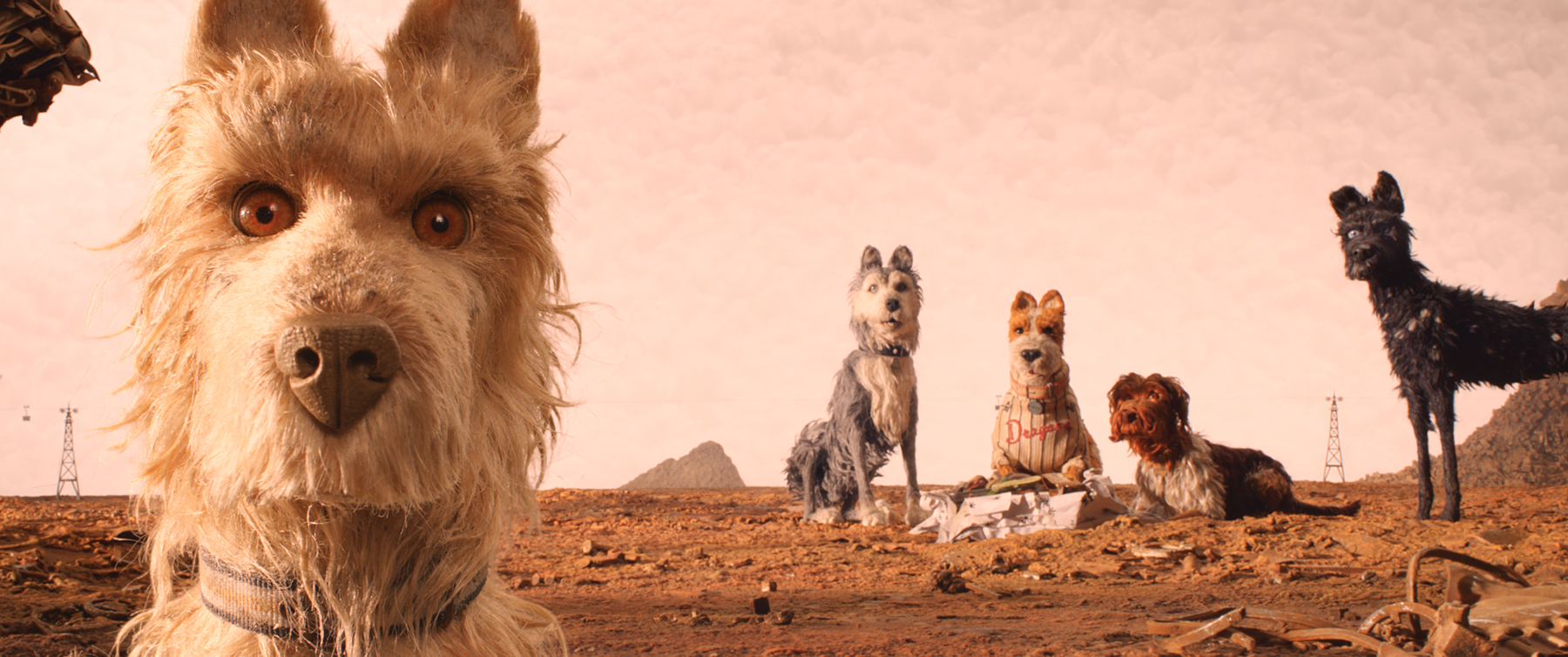
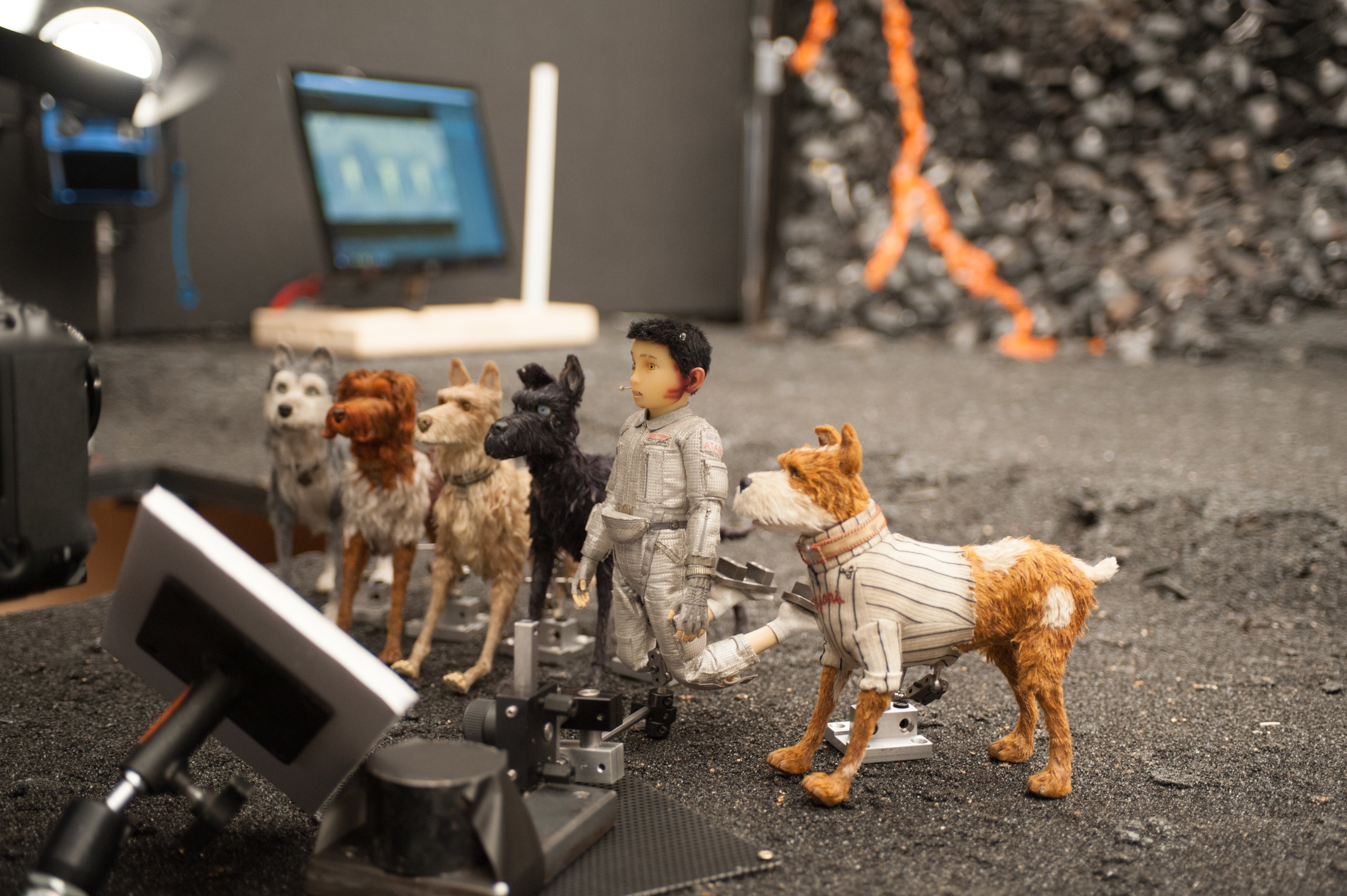
We arrived at a solution that we applied to zooms and even occasionally to shots we made with primes: we broke the shot into planes and shot each plane separately. For example, if we were filming a dog close with other dogs behind, we’d shoot the close-up with greenscreen and then refocus on the mid-ground and shoot the rest of the shot to get both a sharp mid-ground and a sharp foreground. Because the dogs were hairy and getting a key off the green was so difficult, every close-up involved shooting a frame with greenscreen and a frame without; we had greenscreens on rails that could be pulled in and out like curtains. That way the visual-effects team could extract the hair detail from the non-greenscreen frame and then use the greenscreen as a match to sort of soft-edge it back into the image.
How do those look comped together?
Your eye senses something strange, but you’re not quite sure what it is. However, I’m sure that won’t detract from people’s pleasure in watching the movie. Isle of Dogs is an absolute distillation of Wes Anderson. If you like his movies, you will love this one.
Technical Specifications
| Aspect Ratio | 2.39:1 |
| Sensor | Digital Capture |
| Cameras | Canon EOS-1D X |
| Lenses | Nikon, Canon, Sigma |
