Dark Comedy: What We Do in the Shadows
Cinematographers D.J. Stipsen and Christian Sprenger help craft a comic portrait of a group of vampires making their way in the modern world.
By Simon Gray
Unit photography by Byron Cohen, John P. Johnson and Russ Martin. Additional images provided by D.J. Stipsen. All images courtesy of FX.
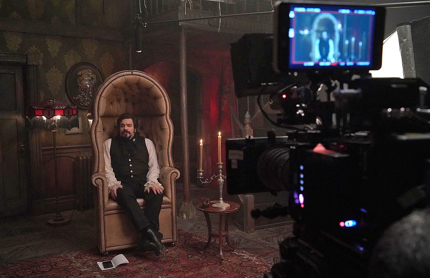
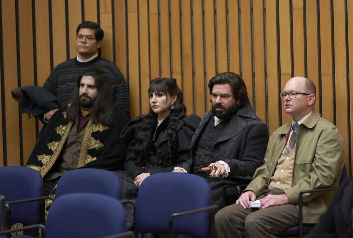
The FX series What We Do in the Shadows offers a unique blend of situational comedy, supernatural horror and observational “documentary.” Created by Jemaine Clement and Taika Waititi, the series debuted in March 2019 and follows a quartet of vampires living in Staten Island, N.Y. — the least populous borough of “the city that never sleeps.” Ostensibly led by Nandor the Relentless (Kayvan Novak), the hapless group also includes Laszlo (Matt Berry); Nadja (Natasia Demetriou); Guillermo (Harvey Guillén), Nandor’s “familiar”; and Colin Robinson (Mark Proksch), a “daywalker” who drains the energy of humans and vampires alike, mostly by boring them with his inane monologues.
The vampires spend much of their time in their dilapidated mansion, bickering as only housemates who have been together for hundreds of years can. When they do venture outside, their activities include decimating the local raccoon population, attending council meetings, picking fights with werewolves, and shopping for their groceries in 24-hour convenience stores.
The series is based on the 2014 feature co-written and co-directed by Waititi and Clement; cinematographer D.J. Stipsen shot the feature and returned for the series after Christian Sprenger served as director of photography for the pilot episode. “This was a particularly interesting show visually,” Sprenger reflects. “It’s about vampires, so most of the hair, makeup, wardrobe and production design are dark and stylized. It’s important that the characters exist in a moody, gothic, nighttime world, but it’s also a situational comedy, and it’s equally important not to trample the comedy with the look — and it also should feel like a realistic observational documentary. Juggling those disparate but necessary aesthetics was a challenge.
“Taika and Jemaine really enjoyed the look of the on-camera light, which D.J. used quite a bit on the film,” Sprenger continues. “We embraced that concept for the pilot’s night-exterior scenes. When the characters came close and interacted with the camera, we used a custom-built, wirelessly controlled LED mounted on the camera.” The custom fixture was controlled by the pilot’s gaffer, Cody Jacobs, via the Luminair app on an iPad.
For one of the pilot’s night-exterior scenes, the art department sourced a few dozen street lamps with 500-watt frosted incandescent bulbs to line the walking paths of a park. “At the deep end of all of our hero directions were three 80-foot condors, each one outfitted with two Arri M90s — gelled with 1⁄2 CTO and 1⁄4 Plus Green — to provide some depth to the tree line,” Sprenger explains. “The special-effects department also lined haze tubes throughout the park to accentuate the pools of light from the streetlights.”
Improvisation is a key element of the show’s style. “We didn’t do strict setups as such,” Stipsen says. “We shot both rehearsals and takes, which were then built upon with improvised ideas from the cast and Jemaine. To create the space for this to happen, Jemaine wanted to be able to shoot with as few restrictions as possible so the actors felt free to react to each other in any manner they saw fit.”
Camera operating was paramount to the success of this improvisational approach. “Operators Bradley Crosbie and Kaelin McCowan, with focus pullers David Orton and Johnathan Holmes, were thrown in at the deep end, but they were on-point every day,” Stipsen says. “I needed operators who could tell a story, as the only guidance they would get on set would be, ‘You’ve read the script, you’ve watched the block, now go and sort out what you want to shoot.’ Operating and focus pulling is very hard under those circumstances, but they didn’t miss a beat — they were actually too good, and I had to ask them to ‘try’ to find the frame and sharps more, as it looked too slick when they nailed it right away every time.”
Following the pilot episode, which Sprenger shot with Arri’s Alexa Mini camera at 3.2K, the series was primarily shot with two Sony Venice cameras, one handheld by Crosbie, and the second operated on an Easyrig by McCowan. Both cameras were framed for the show’s 1.78:1 aspect ratio. Most footage was captured at 4K 17:9 with Sony’s 16-bit X-OCN codec, but 6K 17:9 was occasionally used for specific visual-effects shots.
Stipsen maintained a shooting stop around T2.8, with the camera set to its high base ISO of 2,500 and then dialed-down to 1,600 ISO in the menu. “The 1,600 ISO setting had a little less noise in the shadows,” the cinematographer observes. “Knowing how much night work and how many available-light setups we would be doing, having a bit more bias in the shadow end was desirable.”
Angénieux Optimo zooms — 15-40mm (T2.6), 28-76mm (T2.6) and 45-120mm (T2.8) — were most often on the cameras, with 30-90mm (T2) Angénieux Type EZ-1 zooms used for shots requiring 6K capture for visual effects. A set of Arri/Zeiss Master Primes was also carried for greenscreen work or setups that required a closer minimum focus.
For filtration, Stipsen carried Tiffen 1⁄8 and 1⁄4 Black Satin and made occasional use of a Smoque 1 filter. “I used the 1⁄8 Black Satin most of the time to just take the edge off the sensor, but I’d remove it if we wanted a harder look to the scene, [such as] when we shot in convenience stores,” Stipsen shares. “The Smoque 1 was employed when we couldn’t use atmosphere in a location or scene. Luckily, that didn’t happen very often — we used atmosphere heavily throughout the show, except when we wanted a hard edge for the scene, again like with a convenience store. The Black Satins also helped to soften the [vampires’] house interior and make it feel a little more old and run-down. The Satins were a kind of visual nod to the era and world the vampires had come from — Old Europe, or at least our perception of that era.”
Among the filmmakers’ influences for the series was the work of Michael Ballhaus, ASC and production designer Thomas Sanders on the Francis Ford Coppola-directed Bram Stoker’s Dracula (AC Nov. ’92). “We referenced that film for the general sumptuousness of the vampires’ mansion, which was our main set,” Stipsen recalls. “Our take, however, was that the Staten Island vampires have let their place go. The former glory is evident but now exists in a worn, faded and distressed state. Production designer Kate Bunch and I had a lot of conversations about striking the right balance between sumptuousness and neglect. There are strong reds, but also yellow that has faded to the point of being a warm brown.” [Ed. Note: Ra Vincent served as production designer for the feature and the pilot, after which Bunch — who worked as art director on the pilot — took over for the remainder of Season 1.]
The expansive mansion set was constructed onstage at Cinespace’s Kipling Avenue Studios in Toronto. It featured a two-story foyer framed by two semicircular staircases that led up to a balcony; on the ground floor, off the foyer, were the library and the dining room. Two bedrooms — one shared by Laszlo and Nadja and a collection of stuffed animals in glass cabinets, and the other belonging to Nandor — were accessed off of the long main corridor.
Behind one of the foyer’s staircases was Guillermo’s hovel, and behind the other was Nadja’s darkroom. “Those two rooms motivated the blue-light ambience and the rich red ambience [respectively] that edged the foyer, providing some color contrast and relief from all of its yellows and greens,” Stipsen notes. Colin’s bedroom and the attic, meanwhile, were created as separate standalone sets, while the cellar was a found location.
“There were also sections of narrow corridors connecting the ‘fancy room,’ as Laszlo calls the dining room, to the foyer, so that we could confuse the audience a bit and make the house appear bigger when following the vampires from one room to another,” Stipsen adds. The interconnectedness of the primary set’s corridors and rooms allowed for the staging of extended takes, sometimes lasting up to 20 minutes, as the “documentary crew” would follow the vampires through the mansion. The majority of the set’s lighting was controlled by board operator Peter Molnar, who often performed live cues in response to those long, evolving takes.
Since the mansion’s inhabitants wouldn’t want any sunlight to penetrate their abode, the set’s windows were painted and covered with paper; streetlight nevertheless seeps through the cracks, an effect created with Kino Flo Celeb 400Qs gelled with Rosco 3152 Urban Vapor. Additionally, four Arri SkyPanel S60-Cs in soft boxes were positioned for ambience in the foyer. “Two of them were colored green to enhance the throw from the green chandelier hanging above the stairs in the foyer, and the other two pushed either ‘moonlight’ or ‘daylight’ ambience through the foyer skylight,” Stipsen explains.
The soft boxes that housed the LED units were custom configurations “that had interchangeable panels underneath, about 2 feet from the face of the lamp, with a 3-foot-deep skirt of duvetyn dropping below that to control spill,” Stipsen details. “We could run unbleached muslin or any diffusion we wished by swapping out the panels.
“I am not a big fan of toplight, so the lamps over the set were often at low levels or not on at all,” he continues. “The lanterns, candles and all the built-in practicals did most of the work for us, which was particularly useful as we wanted the cameras to be able to look almost anywhere in the main set at any given time. It was an exciting way to work; it isn’t an easy method to tackle. A lot of time was spent hiding small lights, taping LED strips to tables — that kind of thing.”
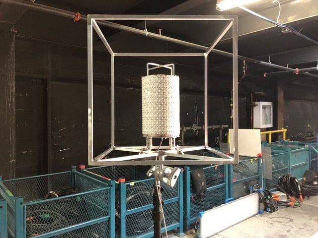
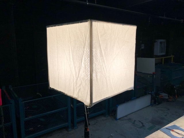
Stipsen also asked rigging gaffer Sean Anicic “to build an LED version of a very useful lamp I had constructed and used in New Zealand,” the cinematographer explains. Featuring a cube-shaped aluminum frame, the original version contained a lantern lock for an incandescent bulb, while the updated iteration instead incorporated a bespoke LED “barrel” positioned in the center; the frame, Stipsen says, was skinned with “independently removable or foldable muslin or duvetyn panels so we could accurately control the amount of light — and also the spill — coming out of the cube.” He adds that series gaffer “Andrew Sneyd loved these lamps. The quality of light is so soft and creamy — it’s almost ‘sourceless.’ We built sizes from 1-foot-square upwards. Because they are a cube with a spigot, you can rig them or just pop them onto a flat surface. We could hide them easily on set.”
For scenes outside of the mansion, the filmmakers strove to emphasize just how incongruous the vampires are in the city environment. “They are fish out of water, completely out of their element,” Stipsen observes. “We showed that by using inherently unattractive locations, such as multistory car parks, late-night convenience centers, public buses — all lit with aggressively bright fluorescent sources. We want the viewers to feel as if they themselves are in the supermarket at 2 a.m., buying milk.”
Night-exterior scenes are abundant throughout the series. When appropriate, Stipsen would adopt what he calls a “gothic” aesthetic. “If we felt it was the right thing to do, in park locations or on quiet streets, we would bring in atmosphere, do wet-downs and set up a ‘full moon’ with some Arrimax 18Ks on condors. If we were closer [to the actors] or we had no trees to break up the 18Ks, we dropped to [Arri] M90s.
“We also had a base ‘broad strokes’ palette for the night exteriors,” he continues. That palette incorporated “a Pale Lavender gel on our 18K ‘moon,’ with Urban Vapor gel on any tungsten units, and mercury vapor — 1⁄2 CTO and 1⁄4 Plus Green — on any other daylight-balanced units.
“On other occasions I leaned heavily on practical lighting for night-exterior scenes,” the cinematographer adds. “We would utilize a combination of set-decorated streetlights, M90s rigged just out of the top of frame, and often one of our cube lights on a fish pole either under camera or just above, tracking with the actors.”
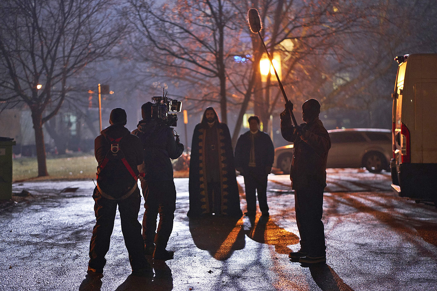
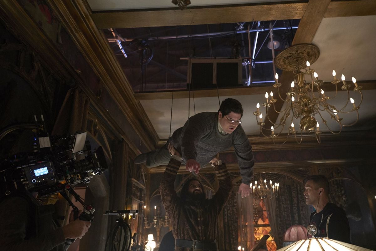
The supernatural elements of What We Do in the Shadows have called for their fair share of visual effects and stunt work. For example, the first season has featured levitation, aerial vampiric combat, 9' werewolves, copious blood effects, and vampires changing form to and from bats.
“There is quite a lot of stunt, wire, and special- and visual-effects work in each episode, but we cannot break the central premise that a crew is shooting an observational documentary about vampires,” Stipsen says. “Strange, unnatural things just so happen to occur in front of the camera. To maintain that onscreen premise, the camera treats the complex wire-work almost casually, often ‘glancing’ momentarily at something that took the stunt team considerable effort.”
Stipsen identifies a particular set-piece as exemplifying the combined talents of the stunt performers and special- and visual-effects departments. Attempting to use her glamor charms on the hapless Jeff (Jake McDorman) — a human she believes to be the reincarnation of her former lover Gregor — Nadja miswords the spell, sending Jeff insane; the hapless mortal is then locked in an asylum, from which he escapes in dramatic fashion.
Though the escape sequence was shot with the Venice cameras at 6K to accommodate the extensive visual effects in the sequence, the premise is that the events have actually been witnessed by several teenagers out on the town, one of whom captures Jeff’s rampage with a cell-phone camera. “The sequence is presented as one continuous shot,” Stipsen says. “VFX had quite a complex amount of stitching and painting-out to do to put the scene together, as it was also a one-shot event on the night.” The visual-effects workflow also included degrading the footage to create a cell-phone aesthetic, and, the cinematographer adds, “Taika even put a vertical mask on the final footage to enhance the cell-phone camera feel.
“The kids are outside a convenience store, posting videos of themselves on a cell phone, as Jeff’s car screeches around the corner on its rims, sparks flying, and takes out a newspaper dispenser — sending paper and pieces of metal everywhere — and then collides with a power pole,” Stipsen explains. “Jeff flies through the windscreen, landing hard on the road. As the kids run up to see if he’s okay, Jeff gets up and lurches toward them. A motorcyclist exits the store only to be thrown to the ground and have his motorbike stolen by the love-insane Jeff. It’s such a great, over-the-top sequence.
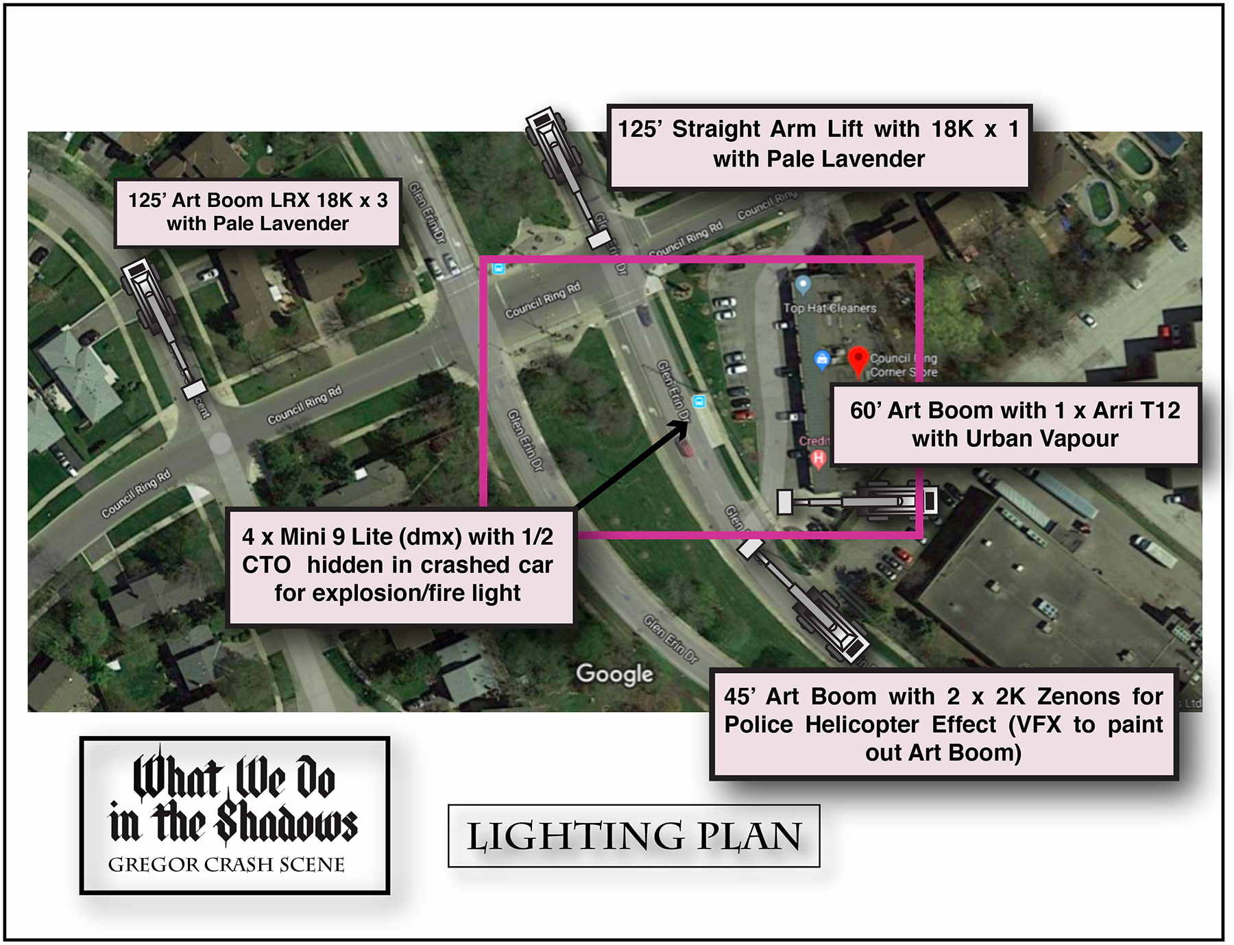
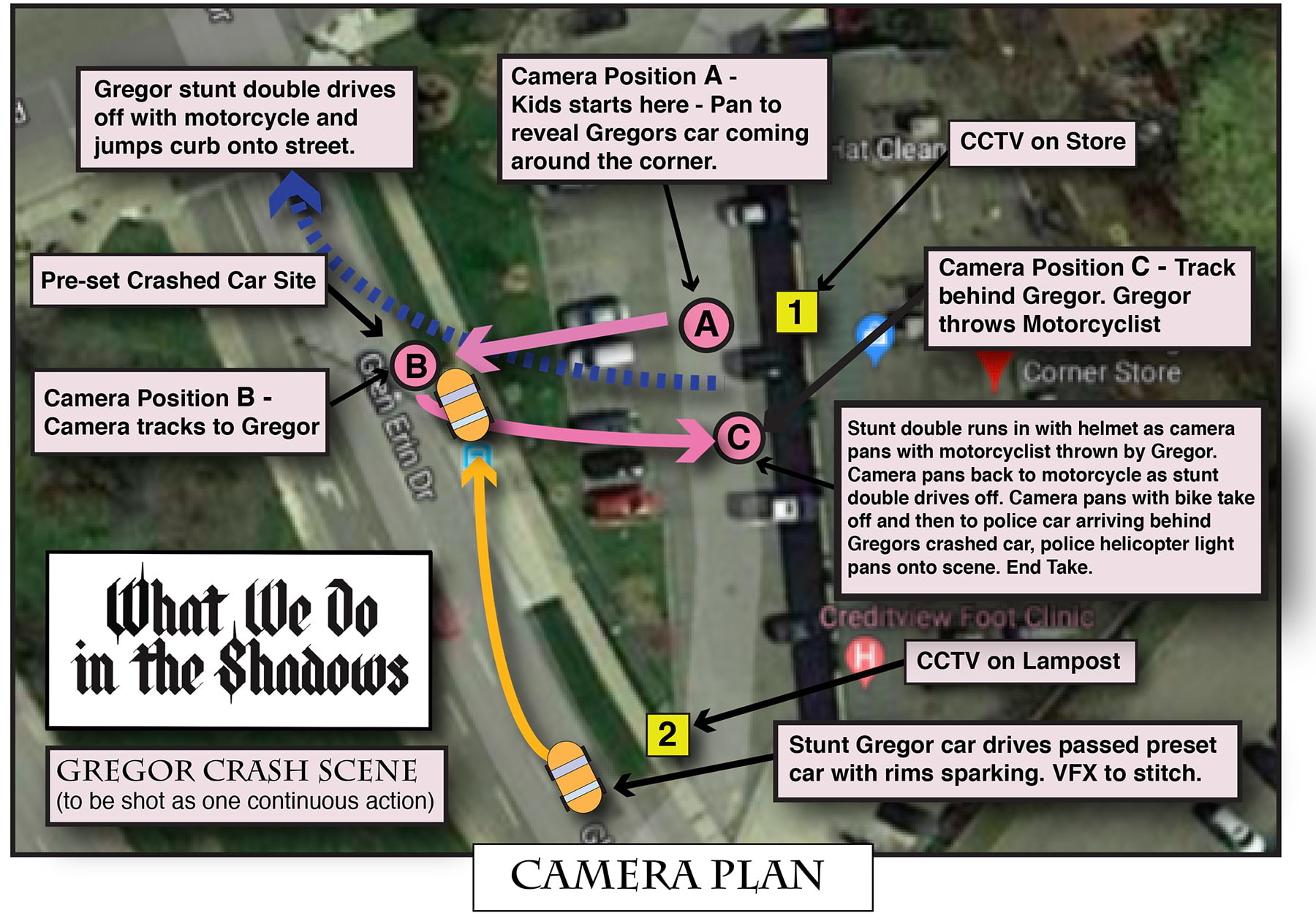
“The stunt crew, led by coordinators Tig Fong and Jean-Francois Lachapelle, were always enthusiastic, and loved involving everyone in how they were going to achieve each stunt,” the cinematographer adds. “Mavericks, the visual-effects company, and VFX supervisors Brendan Taylor and Rian McNamara were also amazing at allowing us to keep the documentary aesthetic when we were shooting complex stunts or wirework. If they said we couldn’t do it, we knew it was impossible.”
