Doug Chiang on Rogue One’s Production Design: Part 1 of 2
The co-production designer of Rogue One: A Star Wars Story discusses the aesthetics of the galaxy far, far away.

The co-production designer of Rogue One: A Star Wars Story discusses the aesthetics of the galaxy far, far away.
Unit photography by Jonathan Olley, Giles Keyte and John Wilson. All images courtesy of Lucasfilm Ltd.
In 1995, Doug Chiang transitioned from creative director at Industrial Light & Magic to design director for Star Wars: Episode I – The Phantom Menace. “When I first started working with George Lucas, it was a good year of world-building, designing things very thoroughly, and at the end he cherry-picked designs [that would appear in the movie],” Chiang recalls of his initial work on Episode I (AC Sept. ’99). He remained with Lucasfilm to serve as a concept-design supervisor for Episode II – Attack of the Clones (AC Sept. ’02), and he notes, “All of that world-building homework laid the foundation for the films to follow.
“Part of our job as production designers is that we have to do all that homework,” he continues. “Ultimately maybe 5 or 10 percent winds up on screen, but all that homework allows the designs that the audience sees to relate and tie together. It makes the world feel very authentic.”
Chiang — who began his career as a stop-motion animator for the series Pee-wee’s Playhouse and went on to receive an Academy Award for his contributions as visual-effects art director on Death Becomes Her — founded his own design studio in 2002, but returned to Lucasfilm in 2013 to contribute as a concept artist to Star Wars: Episode VII – The Force Awakens (AC Feb. ’16) and to serve as Lucasfilm’s head of design; he now serves as the company’s vice president and executive creative director. For Rogue One: A Star Wars Story, he and Neil Lamont shared production-design duties, working alongside director Gareth Edwards and cinematographer Greig Fraser, ASC, ACS.
“Gareth has such clarity of vision as a director,” Chiang enthuses. “He loves and appreciates strong design — which made my job hard, because I was trying to please somebody who was as meticulous as myself.” As postproduction on Rogue One neared the finish line, Chiang spoke with AC over the phone from Lucasfilm’s San Francisco base of operations.
American Cinematographer: How did you come to join the Rogue One production?
Doug Chiang: It was [late] 2013, prior to Gareth’s coming aboard and right when Gary Whitta came on board as the writer. John Knoll [ILM’s senior visual-effects supervisor, who pitched the idea that became Rogue One] really wanted to get some art development, so there was a month or two where we kick-started the art under John’s direction, because we were working with his treatment. That kept going into early 2014, and that was roughly when Gareth signed on board to direct the film. I had a meeting with Gareth in London, and it was fantastic — I saw a kindred spirit. We both admired Episode IV quite a bit, and we had the same influences and the same visual sensibility.
I really connected with Gareth, and that’s when I decided that I wanted to take on a bigger role for this film; I wanted to actually be a production designer for it. I asked Kathy [Kennedy, Lucasfilm’s president], and she agreed. Then it was a matter of finding a partner to help me, because I couldn’t be in London full-time. So we modeled it after Episode VII — the idea of a co-production designer. And it was [The Force Awakens’ co-production designer] Rick Carter who suggested that Neil Lamont could be that person. I’d admired Neil’s work for ages, and I knew that he would be the guy to really complement our partnership.

How did the two of you define your roles? Were you together, sharing the same tasks? Were you dividing and conquering?
Chiang: It was a little bit of both. The scale of these films is so large that it’s great to have a partner to bounce ideas off of, and Neil has an amazing sensibility. After working on Episode VII, he totally understands Star Wars; we could really discuss, ‘Would this element be right for this set?’ It’s great to have a partner like that to work with.
Once the overall landscape of the design had been set, then we did divide and conquer. Neil is fantastic at knowing how to build things practically in terms of efficiently getting them on stage. He took on a lot of the legacy sets, like the Star Destroyer bridge — things that we were very familiar with, but reinterpreting them to hold up for our film. I ventured off into the more global areas, coming up with the overall design aesthetic for the planets. And then we would partner on the designs of many sets as well, things like the Yavin hangar. I found it to be a really wonderful partnership; we augmented each other’s strengths.
When was it that Neil joined you?
Chiang: I really started the designs for Rogue One in July of 2014. Neil was still finishing up the Force Awakens, so he didn’t join until about four to six months afterwards.
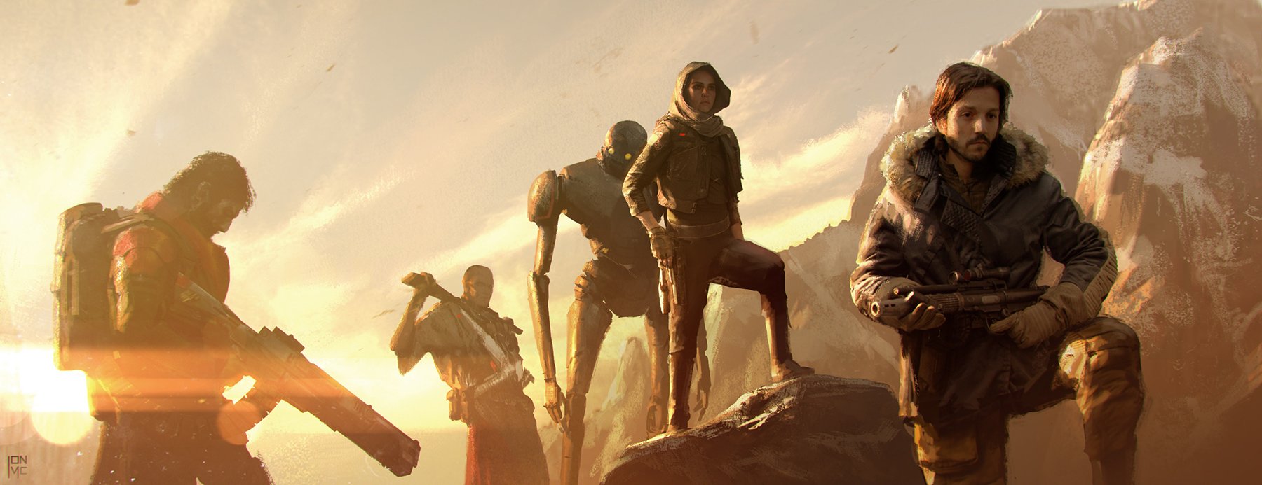
Generally, when I production-design a film, I like to think of it in three stages. The first stage is to come up with the overall global view of what the film is. I think it’s very important that as much as possible you tie the production design to the story and to the characters — that the designs on a global level support the character arc. When you do that, I think the production design becomes a foundation to developing the overall mood and atmosphere. We knew early on that we were going to be following Jyn [Felicity Jones] and her character arc. Gareth thought that Jyn was going to be very conflicted and confused after the prologue sequence — she doesn’t quite know where she’s going, what her directive is — and then as the story progresses, she becomes clearer and clearer, until we get to the end, where she knows exactly what she has to do. I thought it would be really interesting to try and parallel that visually. And so, after the prologue, when we cut into the development of her conflicted character as an adult, I wanted to set the palette of the worlds to be very murky, very foggy, very rainy, to reflect her thinking and her character at that moment. Then, as the film progresses, each of the planets that we visit is a little bit clearer [than the one before], and we end up on Scarif — this bright, tropical paradise, where everything is very clear. It’s to mirror the fact that she now knows her mission really well.
The second phase is really getting into the nuts and bolts of designing the sets, and figuring out, ‘What are the vehicles? What are the creatures? What are the environments?’ And then the last piece is figuring out practically, given our schedule, ‘How much can we build and how much should we build?’ Those are the three phases.

Having worked on the prequels and then jumped ahead to the sequel era for The Force Awakens, did you have any trouble reorienting yourself to the Episode IV aesthetic?
Chiang: No! No, that’s what I’ve been drawing and designing my whole career, essentially. Episode IV was such a huge influence for me. When I first started working on the prequels with George Lucas, I really wanted to design Episodes IV, V and VI, because that was what I grew up with — I love those aesthetics from [original trilogy concept artists] Ralph McQuarrie and Joe Johnston. Now, with Gareth, I finally had an opportunity to actually do that.
I’ve been designing in Star Wars now for over 20 years, and a good seven of those were spent working directly with George, which gave me a really strong understanding of what makes a Star Wars design. What he told me on that very first day when I started working with him was, ‘Forget everything that you thought you knew about Star Wars. We’re going to start over.’ It allowed me a glimpse into George’s world-building in terms of the design timeline that he was creating with Star Wars. That was fantastic for me as a designer, to go through that process, because I got to understand the foundation of the design for Episode IV. And so, when I started working with Gareth, I knew how far we could bend the rules and what we should do to anchor this film with Episode IV. It was like coming back home with the design.

Regarding Rogue One’s visual effects, John Knoll mentioned that, in re-creating Episode IV vehicles such as the Star Destroyers, it was more beneficial to capture your memory of what those things looked like rather than exactly what they were. Was it a similar philosophy that you followed in the art department?
Chiang: Yes, exactly. Before we start to film we obviously do a lot of homework, and I took Gareth up to the archives [at Skywalker Ranch], where we got to look at the original models and costumes. Both he and I were surprised that a lot of what we remember from seeing the film was very different from what actually existed. For example, I remember the chest piece on Luke Skywalker’s flight jacket as being a really sophisticated piece of technology. But when you look at the actual prop, it’s painted wood!
We wanted to introduce a new Imperial walker, and it was interesting because when we started to design it, we instinctually started to draw it how we remembered the walkers [in The Empire Strikes Back]: being a little bit taller, a little bit leaner, a little bit sexier. And then when we went to the archives, I was surprised at how armored and chunky the AT-ATs were from Episode V. That’s when we decided, ‘Okay, maybe we don’t copy it exactly. We can take a little bit of license and do our version of it.’ Our excuse was that our version predated the AT-ATs in Empire, so that ours were a little thinner, a little more frail. And then the Empire essentially beefed them up, made them more armored, and that was why they were different.
Another area that was really interesting was the costumes of the stormtroopers. When you see them on the screen in Episode IV, you read into certain things. You think, ‘Those vents [on the helmets] are real,’ but when you look at the real costume, they’re just painted. We knew early on that if we stayed true to how they were fabricated back in the late-Seventies, it wouldn’t hold up for the modern audience. So we wanted to go back to the original intent, and we refined elements to look very practical, so that when you photographed it, it looked the same but had a foundation of reality that underlined the construction.


In a similar vein to the AT-ACT walker, the TIE striker offers a new variation on the classic TIE fighter design.
Chiang: The genesis for the TIE striker was that Gareth wanted this visceral, war-film vibe, and he wanted an Imperial version of a helicopter. We thought, ‘Okay, maybe we should reconfigure the TIE fighters so that the wings are above the cockpit, simulating the rotor blades of a helicopter, and they could actually move depending on the attack formation.’ I think it’s very important to always ground Star Wars design in something that we’re familiar with. Even though you may not know right away what it is, the foundation is there.

During your first days on Rogue One, when you were kicking ideas around with John Knoll, was that a ‘blue-sky period’ for the design, similar to the early concept phase for The Force Awakens, or were you working with a more solidified story?
Chiang: John had a strong outline, and we followed that closely. His story at that time was structured differently [than the final movie]. A majority of the film was going to be this cat-and-mouse chase, but when Gareth came on board the script shifted and focused more on Jyn’s character. We had two blue-sky phases — one with John Knoll, based on his original treatment, and the second with Gareth as he developed the initial draft of the story with [screenwriter] Gary Whitta. As the story continued to evolve and solidify, the designs shifted as well. Thankfully the major elements of the locations and the sets weren’t changing; it was more about character direction and clarity. It’s like many productions of this scale: It was about being as flexible as possible to augment where the narrative was going. The advantage that we had [when the story shifted] was that we had done our homework already, so we knew the foundation of the world; even if a set had to change because a different moment now happened there, we could move quickly.
One of the great things about filmmaking now is that it’s a very fluid process. So for our pickup shoots, when new scenes were being written, we had saved a lot of sets and we could quickly reconstruct them. There were also new scenes written for sets that didn’t exist, and that’s where, once we had a piece of the set to ground it in reality, we could then augment it digitally. The process now is so seamless from preproduction to production to postproduction; it all looks the same, and I find it wonderful. We’re deep in postproduction now, and I can’t tell which sets were built practically and which are completely digital. They blend together so well.

To that point, with only four weeks remaining before the movie’s premiere, are you still spending your days working on Rogue One, or has your job as a production designer wrapped?
Chiang: It still continues, although it’s definitely lightened up. There are little things, little changes that Gareth wants — things like matte-painting establishers. But there are also some bigger changes, like creating new sets based on initial ideas conceived during preproduction that were then sidelined. For example, Vader’s castle interior, where he meets Krennic [Ben Mendelsohn], or the mining outpost, where we meet Cassian [Diego Luna]. A majority of these are things that were always planned for the tail end of the design because they were obviously going to be digital effects. But they tie in very importantly to the physical sets, so they have to correlate. A lot of my job now is to make sure that those big, establishing visual-effects shots or new digital sets tie in with the original production design.


In Part 2 of this interview, Chiang details the Rebel U-wing fighter, Darth Vader’s castle, and augmenting the Canary Wharf Underground station to serve as a portion of the Empire’s Citadel facility on Scarif. See the February issue of American Cinematographer for the complete production story on Greig Fraser, ASC, ACS's cinematography.
