Blue Velvet — Small Town Horror Tale
Fred Elmes, ASC lent a distinct photographic style to David Lynch’s disturbing tale of an unsettling underworld.
Unit photography by Umberto Montiroli
No one understands the landscapes of nightmares like David Lynch. Heavily psychological and dreamlike images combine to create a mood of almost unendurable dread, yet his dark visuals are infused with a peculiar beauty and humor. Lynch’s very personal style was almost entirely established by the time he completed his first feature: the enigmatic and controversial cult film Eraserhead, billed as “A dream of dark and troubling things.”
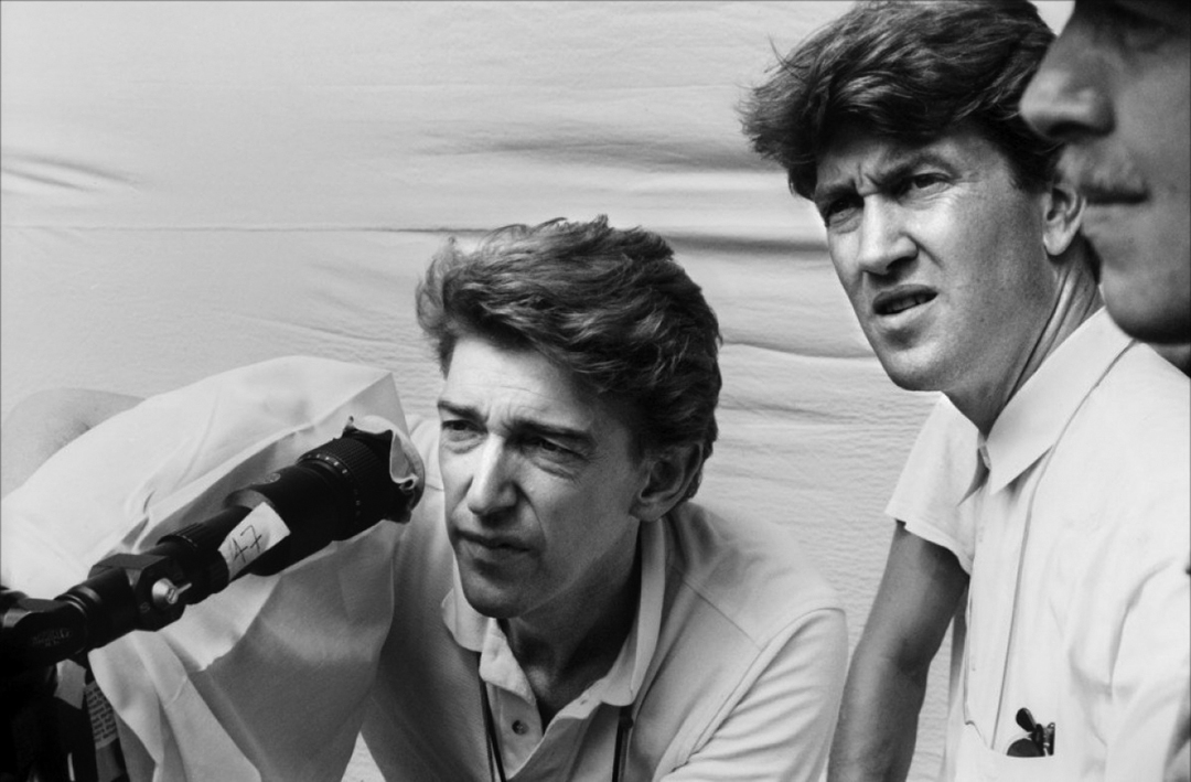
Though Lynch’s subsequent visions tended to be somewhat less dark, less troubling, both The Elephant Man and Dune reflect his perverse fascination with the grotesque and his unique ability to make that which is innately horrific compelling, even lyrical.
Blue Velvet, his latest effort, is Lynch’s most personal project since Eraserhead, a merciless dissection of the disturbing incongruities of small town American life. Despite its more naturalistic setting, Blue Velvet is as close to Eraserhead as any studio film can get. “It is,” Lynch agrees. “It’s a neighborhood picture, but in a way, Eraserhead is a neighborhood picture as well; it’s just a different neighborhood. They don’t ever connect with the government or Washington D.C. or world problems. Their problems are problems within a small area of the world, and a lot of the problems are inside the people themselves, so in that way, both films deal with sort of similar things. I think that Eraserhead was unsettling to some people because it might trigger things that were inside their subconscious, somehow it would get under people’s skin, but that’s what it’s all about. Blue Velvet could have the same effect on people, but it is, on the other hand, quite different. It’s more of a surface picture than Eraserhead, and it’s in color and it’s got cars in it!”
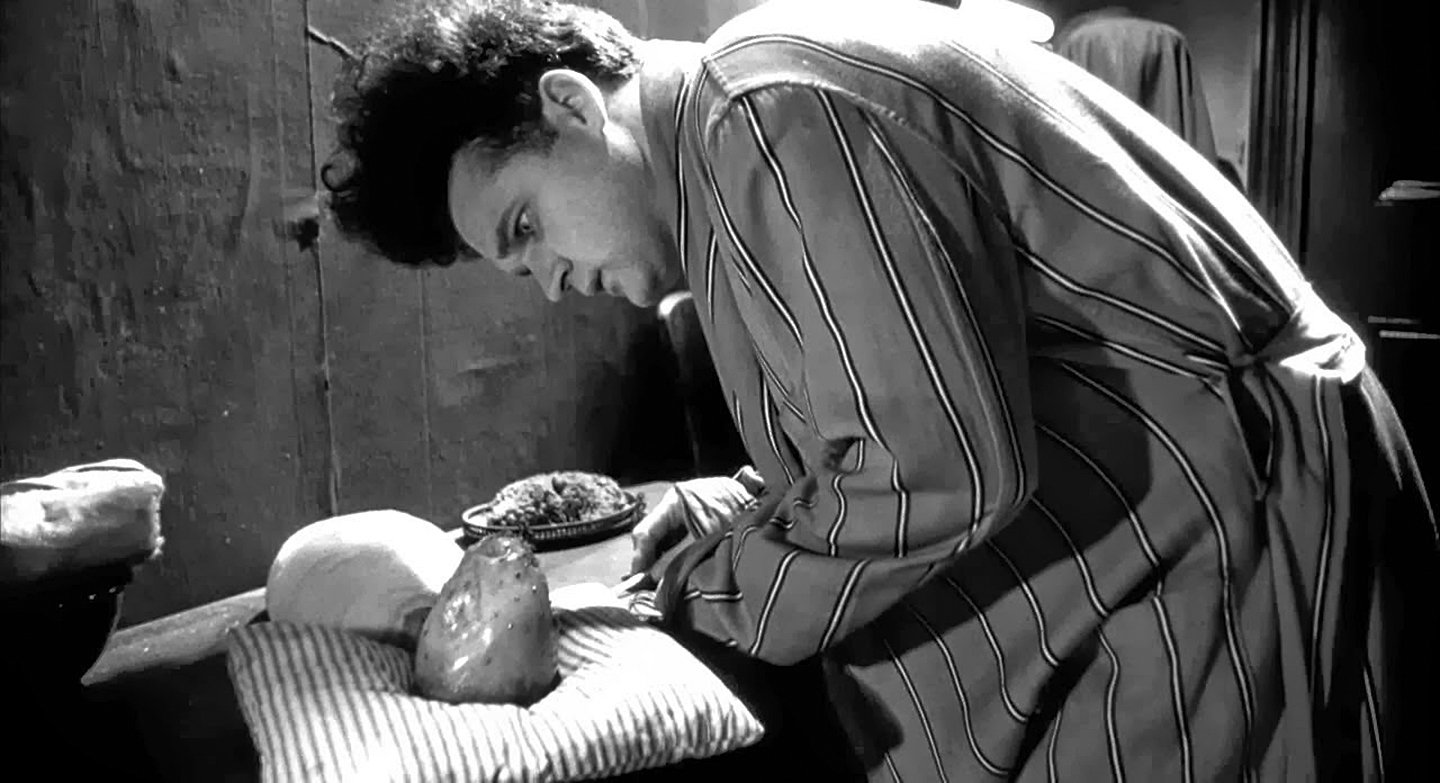
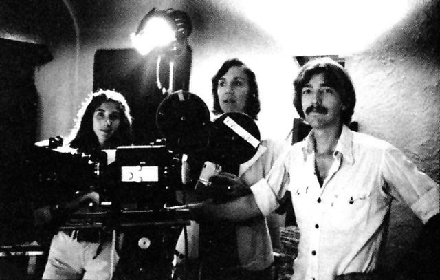
Both films share another vital element in common that Lynch feels contributed greatly to the similar mood of Eraserhead and Blue Velvet: cinematography by Fred Elmes. His association with Lynch began when he agreed to assist Eraserhead’s original director of photography, Herb Cardwell, but when the film ran months over schedule, Cardwell left the project and Elmes finished the picture. Since then, Elmes has done the second unit photography for Dune — where Lynch entrusted him with devising effects for the elaborate dream sequences; oddly enough, those sequences seemed like the most like a David Lynch film. But for both Elmes and Lynch, bringing Blue Velvet to the screen was a common dream, “I’d read the script years ago,” Elmes says, “and we talked about it then: how we would go about it if it should happen, and what we did was to establish a point of view and a look for Blue Velvet even before Dune. We were dreaming, but it was always a fantasy of ours to go out and do it. I think that David and I learned a lot on Dune in terms of story and writing and he was able to use that when rewriting Blue Velvet. So the story evolved and I think our vision changed.”
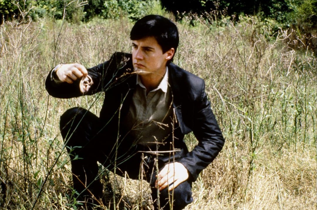
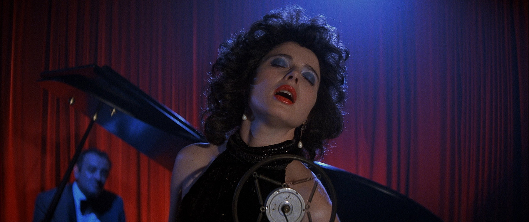
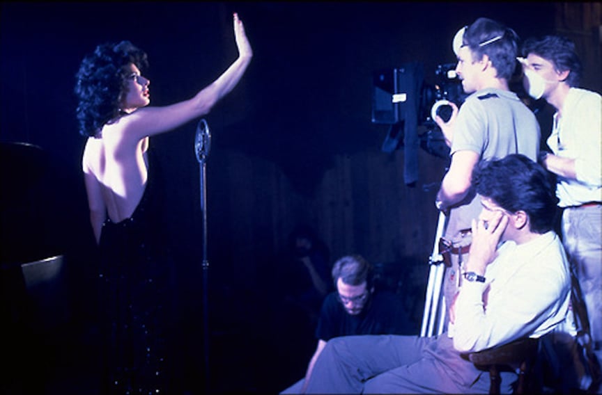
Lynch’s unusual murder mystery follows a naïve young man’s descent into a sordid underworld lurking just beneath the cheery façade of Lumberton, the small North Carolina town in which the hero lives. Jeffrey’s (Kyle McLachlan) bizarre right of passage begins when he discovers a severed human ear in a field. Though he immediately takes the gruesome evidence to his neighbor, a police detective, Jeffrey soon becomes obsessed with investigating the mystery on his own. After enlisting the aid of the detective’s daughter (Laura Dern), Jeffrey breaks into the apartment of the chief suspect in the case, a cabaret singer named Dorothy (Isabella Rossellini), who performs as The Blue Lady. When Dorothy returns unexpectedly, Jeffrey is forced to hide in her front room closet, where he witnesses a brutal rape/seduction involving a sleazy hood named Frank (Dennis Hopper). It appears as though Frank and his gang (Brad Dourif and Jack Nance) have kidnapped Dorothy’s husband and son.
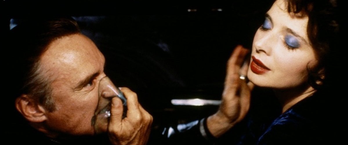
Blue Velvet’s story, while controversial, is only a means to an end for Lynch, whose major strength as a filmmaker is in his ability to evoke a powerful mood. As soon as Lynch is able to delve into the unseen forces at work in Jeffrey’s personality, the mystery takes a backseat to the psychological descent the young man makes into the perverse Lumberton underworld. Because the film does deal, at least on the surface, with smalltime gangsters and corruption, Lynch employed a very dark, film noir style for most of the picture, though it is noir laced with numerous subtleties of style and mood.
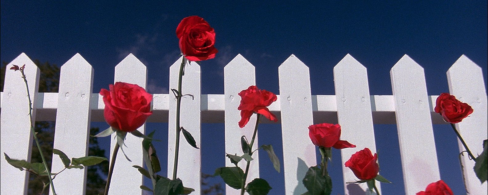
Before Jeffrey’s descent into darkness even begins, Lynch offers his audience a brilliantly conceived series of dissolves which perfectly foreshadow the piercing dissection of middle America that is to follow. The sequence, which commences after the opening titles, first encompasses number of images whose roots lie somewhere in that middle ground between the empty cheeriness of Norman Rockwell paintings and the vividly colored, ironic still life works of Paul Outbridge: blue skies, a white picket fence, red and yellow flowers: a red fire truck and an aged firefighter on its running board, waving; Jeffrey’s father lazily watering the front lawn.
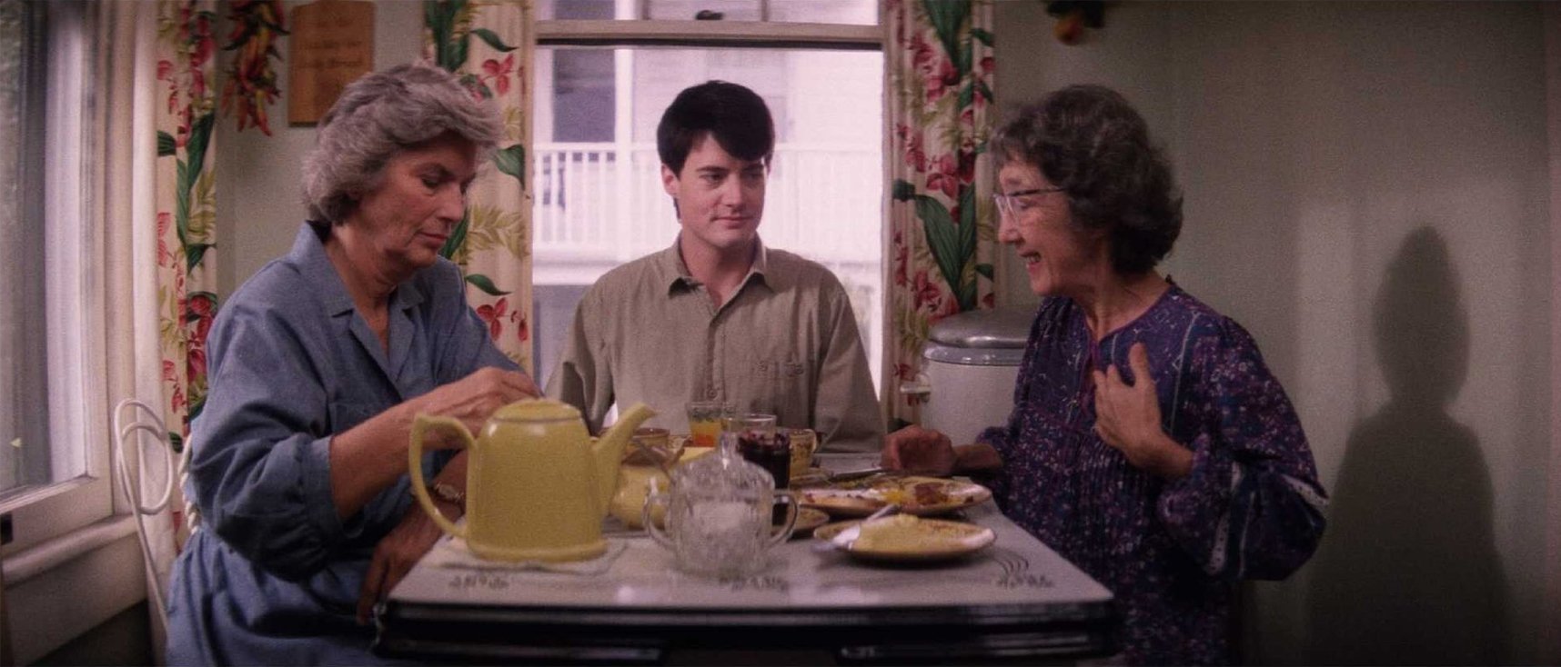
Without warning, the tone suddenly changes, becoming more violent: a gun fills a TV screen as Jeffrey’s mother watches an old detective film; the man on the lawn collapses in the throes of a strange seizure, the water shooting up in the air as his dog leaps happily through the spray; and then the grass descends to the grass at the fallen man’s feet, revealing the crawling flood of insect life teeming just below its surface.
“The whole idea of the film is going underneath the surface of a supposedly peaceful neighborhood in a small American town,” Lynch says. “It’s a real American film and it starts, because it’s so personal to me, with that first image of blue skies and a picket fence and the roses and the angle looking up I don’t know if Fred and I even talked about the angle, but it’s something that had to be looking up because it’s a childhood sort of image. It had to start with that kind of thing, but then it had to go from there and there’s a transition from the blue skies to things that are connected to plants and watering, and then that became pressure and then it had to do with introducing certain people. The image of the mother watching television and the image of the gun on TV didn’t happen until the very end, but it said something about Jeffrey and his love for a detective thing — it gives it a mood.”
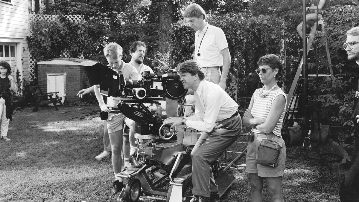
For Lynch, whose films are filled with bizarre imagery centered upon the act of delving deeper into the sensual textures of decay, the opening sequence’s depiction of swarming insects in a suburban lawn was especially compelling. Fred Elmes, conversely, is not attracted to this sort of imagery, but he is intrigued by the progression inherent in both the opening sequence and the rest of the film. “David loves to go through things,” Elmes says, “and I find that fascinating. I don’t think I could ever compete with David because his imagination goes that way. We did that on Eraserhead and I learned a lot about his style by just making those transitions work. I’ve noticed he does that in all his films, whether I’m involved or not. My goal is to take the audience through a story in such a way that there’s a change, so that there’s a beginning, a middle and an end visually. So I think we work along the same lines: I love to make things progress and to change style. Since the story, to me, is about a young man’s descent into a world he’s never been exposed to, a world that is frightening and intriguing in the same sentence, I somehow had to capture the fact that he’s going through a change. He’s getting into a situation deeper than he wants to be, over his head, and then has to find his way out again. It was my job to set up a situation visually where you went along with him on that trip. It’s a dark film because when he gets down under the surface and in over his head, he’s in the muck and mire of this other world that he doesn’t want to be in, but he’s still intrigued and caught up in it — so I tried to create a style that would fit that mood.”
Part of the contrast Elmes was seeking was built right into the film’s structure from the outset. Both Lynch and Elmes had agreed that the opening and closing sequences of the film should be mirror images of each other in overly bright, cheery tones — a sandwich made with Wonder Bread surrounding the dark meat that makes up the film’s disturbing middle section. “We had always planned to have the beginning and the end look like this very cheerful — slightly too cheerful — a little-bit-more-than-real world that David wanted to create,” Elmes says. “We designed it with that in mind. We didn’t do anything to manipulate it, except to light it in such a way that the colors really appeared to be saturated. That, contrasted with the middle part of the film, gives you that sense of difference.”
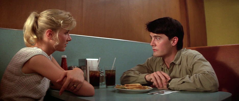
Originally, Elmes had anticipated tampering with the negative to achieve the look Lynch wanted, but credits production designer Patty Norris with imposing a supersaturated look through her fine use of vivid color. “We did some optical tests first,” Elmes recalls, “and we tried to intensify the color and then desaturate the color, but when we looked at both on the screen, we decided that ‘normal’ was actually the best for us. Patty created the world that David wanted to see and yet brought something more to it. Even though it’s basically a location film — there are only a couple of sets — she managed to get in there and control what was in front of the camera in a really wonderful way that I think helped the style along. It always makes the job easier when what’s in front of the camera is right.”
Elmes knew that the small North Carolina city of Wilmington where they were shooting was perfect for creating the look of Lumberton, but when he and Lynch found the streets they wanted to use for night exteriors, it turned out that there were no street lights with which to light the scenes. “The existing streets and trees gave us the sense of the neighborhood we were looking for. My gaffer, Michael Katz, came up with creating warm colored pools of light all the way down the street. It turned out the simplest way to realize that was to have the city go in and install utility poles in the places we selected along the street. So when it came time to do those scenes in the neighborhoods, we had our existing poles. Donny Daniels, my key grip, built special rigs so we could hang our movie lights out on the end of the poles, which gave us the flexibility to aim the lights where we really needed them to get the sense that there really are street lamps up in the trees.
“We’d taken a vision of what the street should look like and executed it correctly, and the street lights became most of my light for those shots. Also, it gave us the ability to have a real street light that was up to proper exposure and tow a car underneath it for a dialogue scene that took place in the car.”
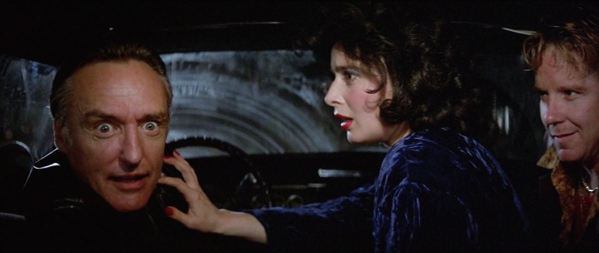
This proved particularly valuable for a lengthy “joyride” sequence wherein Jeffrey is taken for a ride by Frank and his cronies; yet, despite the ability to film some of the car scenes on the streets afforded by the presence of the lamps, Elmes had to come up with another way to film some of the dialogue scenes in which the car seems to travel very fast. “I’ve worked in films that had a bit of car photography, but this film allowed us to do a sort of hell ride; It’s like Mr. Toad’s Wild Ride! We decided that because of the fact that they needed to appear to be driving very fast the best way to give the impression of speed was to actually to keep the car stationary and move the lights very quickly past the car while we jiggled the car and the camera. That sequence was all done with the camera hand held and the car standing still while bouncing up and down as a lot of people worked lights that moved past very quickly. It was all choreographed in such a way that we gave the feeling that they’re out on the road. It turned out to be the best way to do that scene, to make a kind of impressionistic ride feeling, and it allowed us to create the illusion that they were going faster than they ever could have to pull off that effect. We couldn’t drive a car that fast, safely, and made the effect we ultimately achieved. Much easier to do it sitting still, and then, you have the element of control. The grips were all very quiet, and the dialogue was very clean.”
The joyride upon which Frank and his cronies have taken young Jeffrey pauses for a brief time at Ben’s club, undoubtedly the film’s most bizarre location, not so much because of the setting itself, but due to the unusual clientele the place attracts. Then again, Ben, as played by Dean Stockwell, is an effete counterpoint to Hopper’s brutal Frank, and the usual byplay between these two characters is largely responsible for building the perverse mood of this sequence.
Just as the scene at Ben’s club was too dark at first, Elmes and Lynch realized it was becoming overly complicated. Simplicity became the key to their approach, and then the true horror and humor of the situation became apparent. Simplicity is a deceptive word because it tends to make things sound easy; Elmes’ photography in the sequence is flawless, and its apparent artlessness is so artful that the scene becomes painfully real. The audience is made to feel that they’re in a horrible, claustrophobic environment with some very unsavory though oddly amusing types, and Elmes does nothing photographically to make it look the least bit inviting. “What’s interesting about this scene is that we have this group of very strange characters in one room,” Elmes remarks. “Depressing isn’t the word really, but it’s certainly not a normal situation, it’s a very unreal situation. We originally planned some complex blocking and some complex shots in the scene and realized after rehearsing it thoroughly on location that all you did was complicate it. In fact, what played very well was having the characters in one wide shot. You saw clearly what was happening, and they did it so well, that it took something away to clutter it with a camera move or to try to do something tricky with the lighting. There’s a kind of awkwardness that is intentional. I think that it’s meant to put everyone on the edge of their seat a bit.”
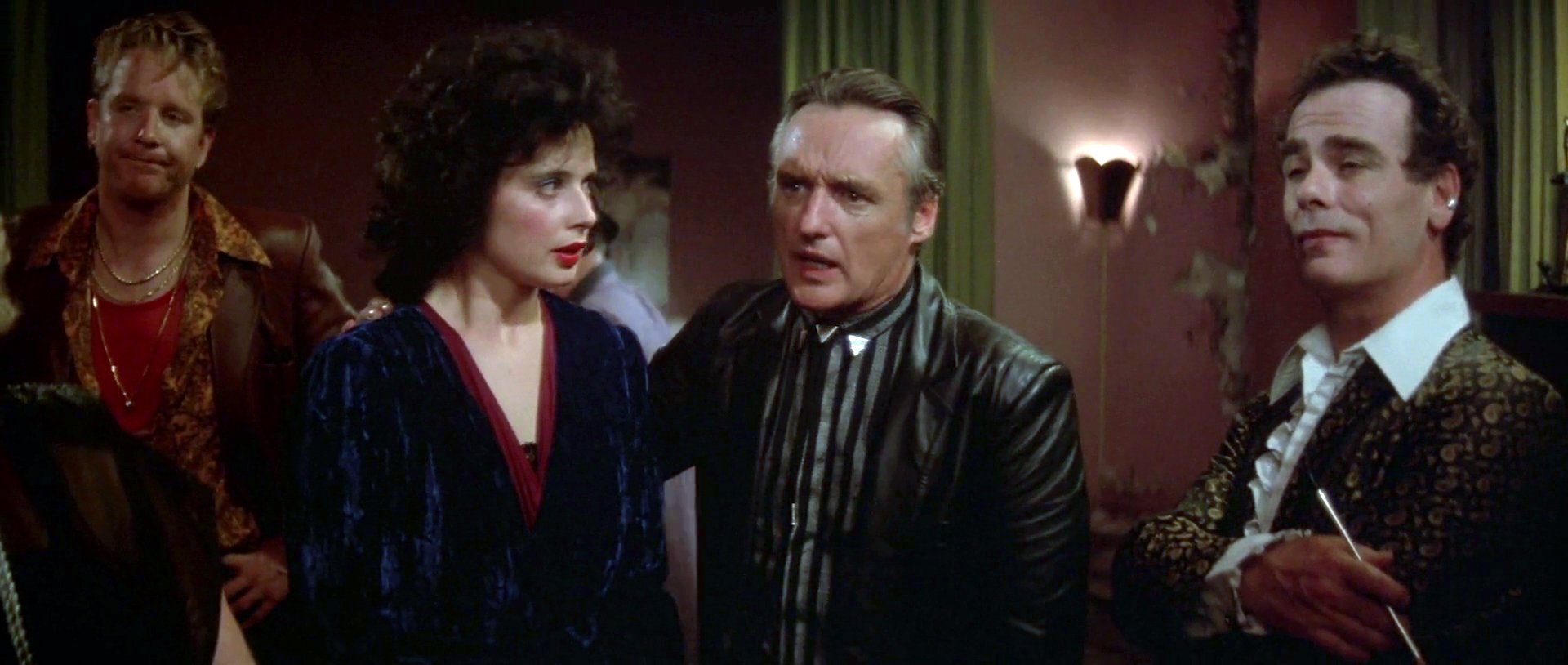
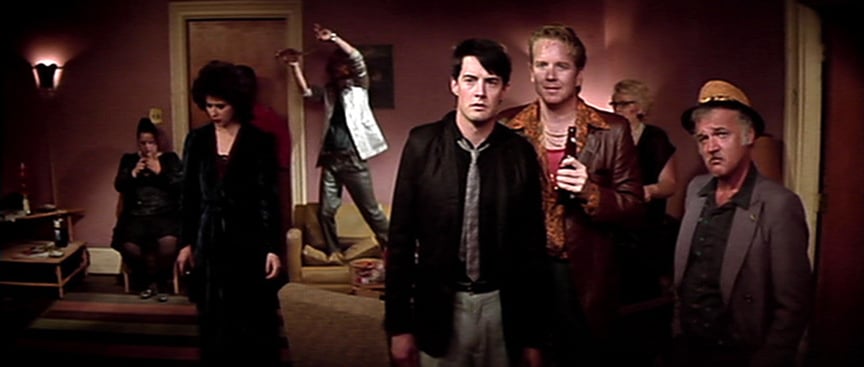
One of the many tensions that arises during this particular scene is the odd homosexual attraction between Ben and Frank. For Frank, the effeminate, made up Ben is an ideal, a man he idolizes perhaps because he’s found a legitimate way to make money, and a man who is able to touch Frank’s heart with a song! Though it’s done for comedic effort, there is something disturbing underlying Frank’s desperation as he watches Ben lipsync “Candy Colored Clown” while holding a worklight underneath his vampiric features. “The lamp that Ben holds as a microphone grew out of a rehearsal that we did one afternoon,” Elmes recollects. “Basically, we went to see the location and Dean Stockwell picked up a work light to mimic a microphone because we had talked about having him sing a song — so it was just a work light that the construction crew had been using at the location. Then we got the idea of having him sing with the work light instead of ever having a microphone, and all he ever does is mouth the words to the tape that Frank carries instead of really singing. It became something of a routine that the Dennis Hopper character and Dean did, and we wanted it to seem as though they’d done this before, which makes it a little stranger. Dean hooked into that very well, using the light.
“We took it from there, showed Dean where the light had to be on his face, and then my gaffer, Michael Katz, ran the light on a dimmer so it was always the correct intensity no matter where Dean held it. Another electrician was hidden in the back of the room with another lamp and a cardboard cutout of Dean’s head, which was used to project his shadow on the back wall. We found when we rehearsed it that it was wonderful to see the work light throw his shadow on the wall when he moved around, but there was now way to do it photographically with only that one lamp, so we had the electrician watch where Dean was standing and move the cardboard cutout around.”
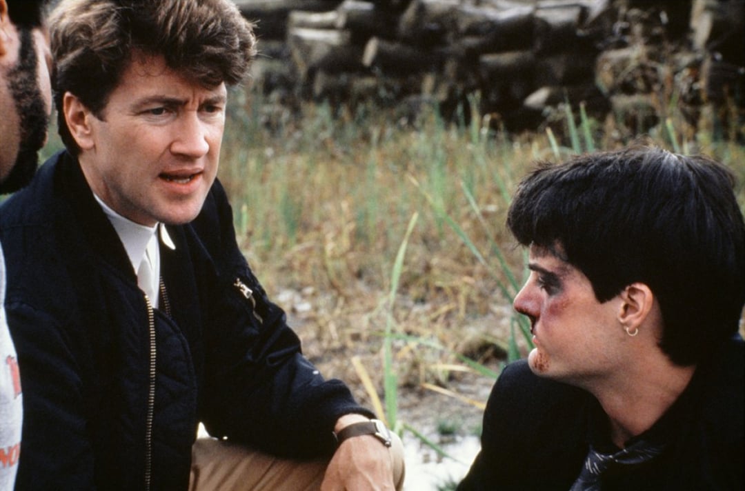
The most difficult location of all, however, was the apartment set located by Isabella Rossellini’s character, Dorothy the Blue Lady. Though the set was designed specifically to fit all of the needs of the script, it was entirely practical. While this made certain demands on Elmes and his crew, the greatest challenge was to pull off the emotional situations that occur in virtually every scene there. “That location was a very key place in the movie,” Elmes confirms, “and we’d always known it would be the main set we’d build. The idea was to build it in such a way that we’d get the most out of it for the story, so that all the rooms and the hallway outside the apartment were connected. It was quite a wonderful set and the detail was all there, it was functional, the bathroom worked!
“We’d already chosen the exterior of the building, so we knew what the interior should look like and then David and Patty Norris spent a lot of time talking about it and I think she came up with a wonderful design for the apartment. It was quite fabulous and styled after the era. Also, the palette of colors in there is very well chosen and sets a real mood for the things that happen.”
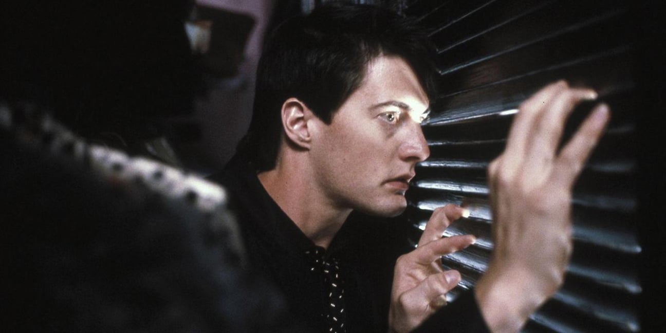
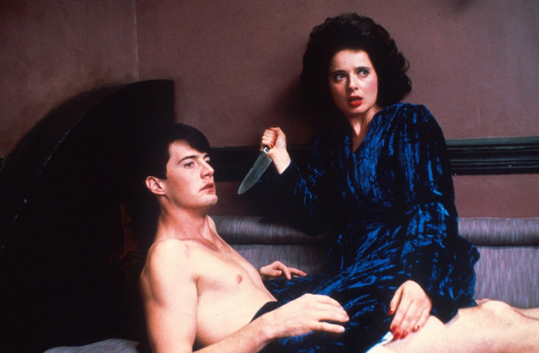
Because of the great variety of events that occur inside Dorothy’s apartment, the set was lit in such a way as to make each room, and sometimes parts of rooms, as distinct from each other as possible in terms of mood. Much of the action centers around a closet bordering both the kitchen and the living room, in which Jeffrey is forced to hide on several occasions. We see Jeffrey’s frightened face illuminated through the slats of the closet door, which is an amusing and unlikely way for Elmes and Lynch to have created their most striking film noir lighting effect, and one which caused them some trouble in regard to the proper light pattern. Another consideration was that many of the scenes in which Jeffrey is in the closet take place from his point of view. A suitable arrangement was necessary so the audience would believe that he could see as much as he does from such a constrained vantage point.
“We chose our slats carefully because we knew we’d be spending some time in the closet, and we knew this element of his voyeurism was important to the script,” Elmes explains. “We tried a couple of different things and this one seemed to be the one that gave him the best visibility and also gave us the opportunity to do an interesting light that we knew we’d have to live with for awhile once we established it. We never shot anything that he couldn’t actually see from the closet. The set was designed in such a way that the closet was in a special spot where Jeffrey can see the living room, he can see down the hall to the bathroom, and he can see part of the kitchen, but he can’t see around the corner which is the place Dorothy sneaks up on him with a knife.
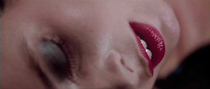
“The ending,” Elmes says, “was a situation where we wanted the set to look a little different. It’s lit more brightly than it was through most of the film, and we decided that it was best to see what was there, to really see what had happened clearly. It’s a tableau; it’s handled in a wide shot and you see from Jeffrey’s point of view what’s out there and it’s very terrifying in itself. We’d done the parts that were supposed to be moody and dim, so I think to do anything tricky with this would’ve been to take away from David’s intent.”
The brighter visuals of the last sequence in Dorothy’s apartment also help Blue Velvet segue gracefully into its framing series of images at the film’s end. This sequence opens with a tight shot of Jeffrey’s ear, which at first we suspect might be the severed ear appearing once again, until the camera quickly pulls out to reveal the boy lying on a hammock in the garden of the home he now shares with the detective’s daughter, as the parents prepare a barbeque. The overly bright look of these scenes after the grimly dark scenes of the film’s middle section makes the wholesomeness of this sequence seem somehow perverse, especially when we see Jeffrey’s mother rejoicing as an obviously artificial robin devours one of the cockroaches from the film’s opening scenes! As the film draws to a close, we are treated to the same series of images, in reverse order, from the first half of the framing sequence: flowers against a picket fence and blue skies, a fireman waving from a passing fire truck. But the film’s final images remind us that, despite the fairytale quality of the storybook ending, Jeffrey has been indelibly marked by his descent into darkness.
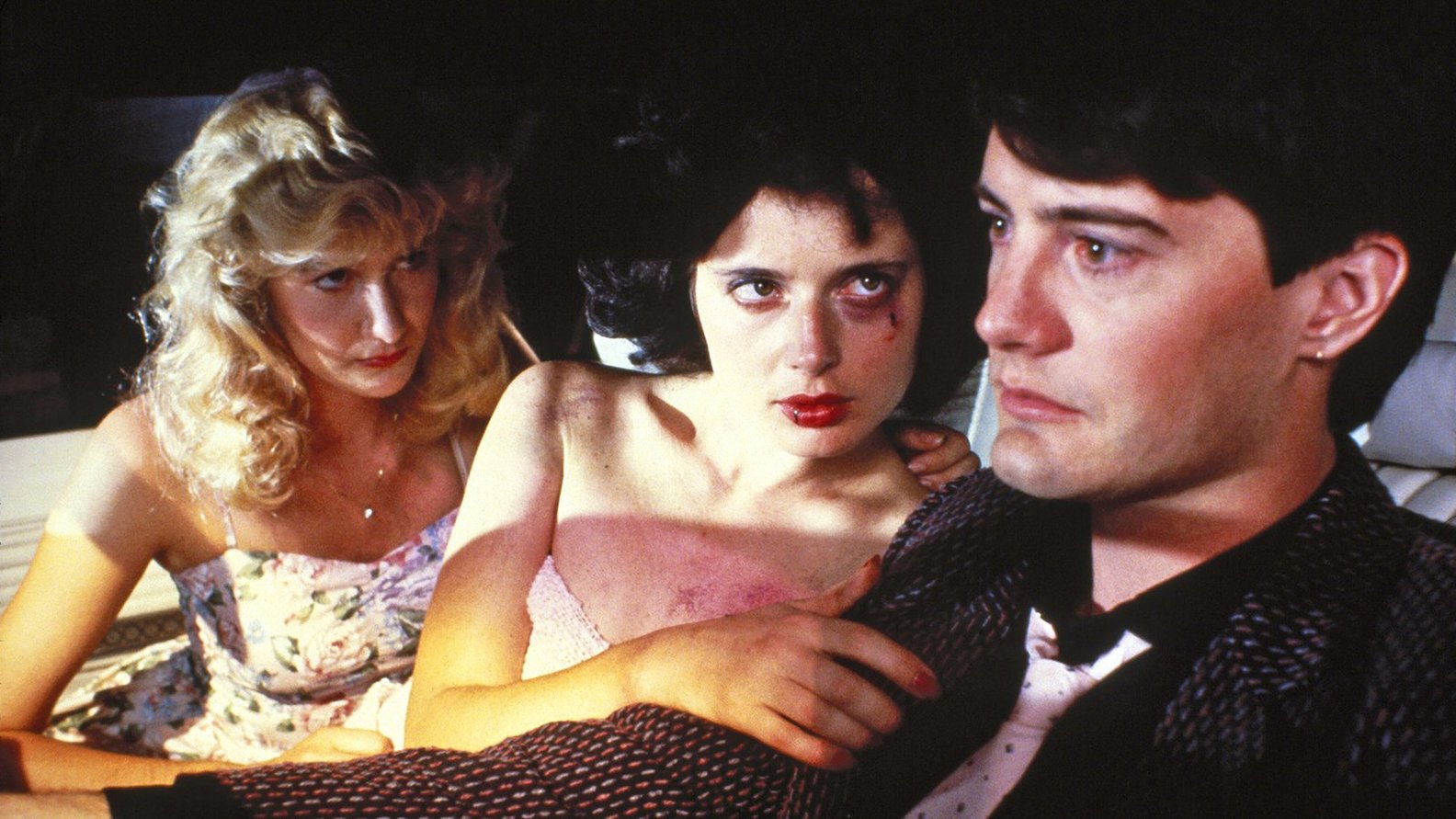
For Lynch, once a film has finished shooting, the real work begins: the building of his remarkably detailed and complex music and soundtrack. Blue Velvet draws much of its powerful mood from the eerie noises that subtly fill Alan Splett’s sound design, and this film marks Lynch’s fourth feature film collaboration with this fine artist. For Lynch, who seems to hear his movies rather than see them, the Blue Velvet soundtrack grew naturally from the dictates of each of the film’s scenes. “The material dictates the mood and it also dictates the sound,” he explains. “We tried to get the sounds that make the right mood and it’s so simple, it’s so logical. The rest is just train and error in the blending of those things, and it has to be just right, but you know when it is and you know when it isn’t.”
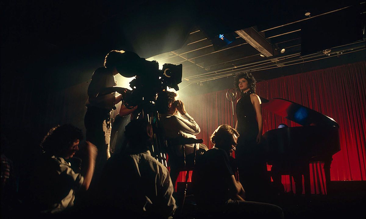
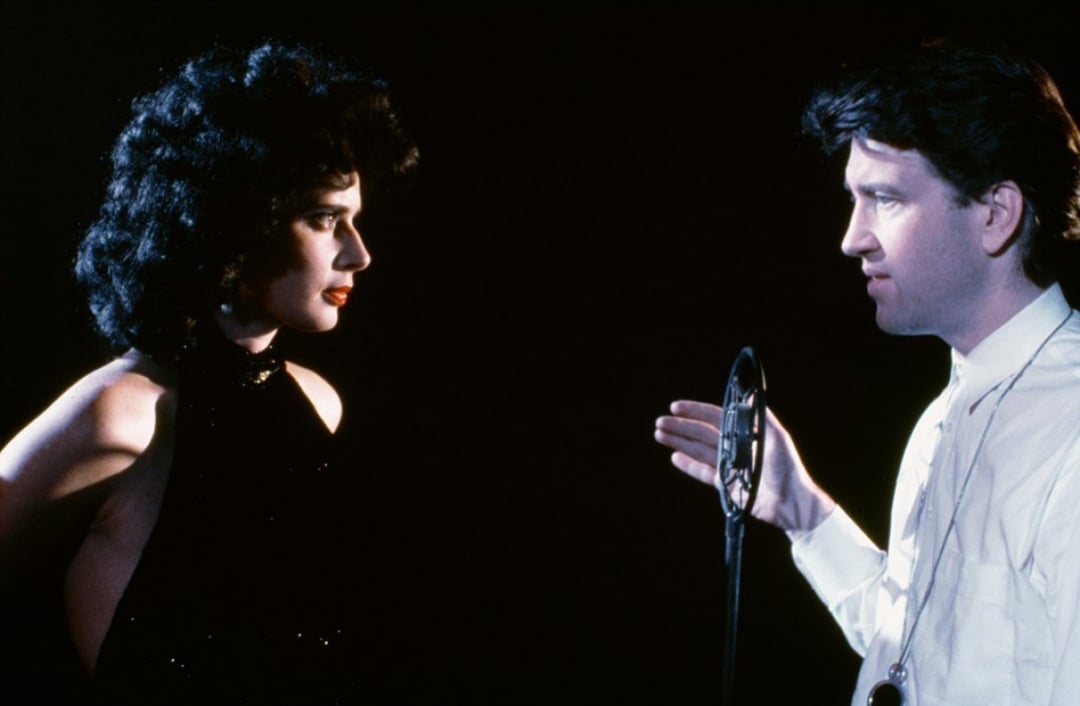
For Elmes, the greatest challenge on Blue Velvet was to insure that the liquid blacks that Lynch demanded were preserved in the release prints of the film. “That was one of the things that I was most concerned about,” Elmes concurs. “It’s a dark story — and we knew that there were a lot of night exteriors and there were a lot of times in Dorothy’s apartment where there wasn’t much light because the mood required it to be dim. We needed to maintain a quality in the negative that in the final release print would give us a rich black that duplicated what we saw when we photographed the scene. I think we did it very well. It required that we establish a really strong communication with the laboratory so we knew what we were getting back as our daily print reflected directly what we were shooting and so we knew that we’d have the same degree of quality after it went through the interpositive and dupe negative generations. Technicolor did a good job. During the first weeks of shooting, we took a couple of outtakes and had the lab essentially do the release process — make an IP and a dupe neg and release print, and match that as closely as possible to the daily print of the same take. They sent them back and we A and B compared them on the screen and we were quite impressed with the fact that they could maintain the quality. Since we wanted to be able to keep a nice quality of black in the shadows when we lit down a street at night, we had to plan it right from the beginning.”
This archival article originally appeared in AC, November, 1986. The text appears as it was published; some images are additional or alternate.
In 2017, Elmes was honored by the American Film Institute for his exemplary body of work.
He was honored in 2020 with the ASC Lifetime Achievement Award.
The documentary Blue Velvet Revisited offers a unique look at the production of the film and can be found here.
For access to 100 years of American Cinematographer reporting, subscribers can visit the AC Archive. Not a subscriber? Do it today.
