The Photography of Hud
James Wong Howe, ASC reveals some highlights of photographing this monochrome production — most of it on location in remote Texas cattle country.
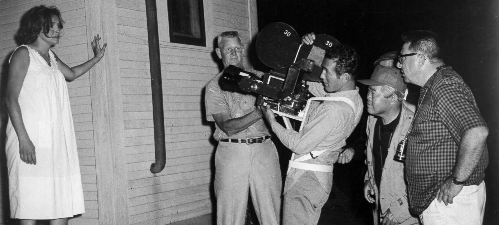
All of the exteriors and many of the interior scenes for Hud were shot on location in the Texas Panhandle. Even before the picture had been completed, it had made a tremendous impact on the citizens of Claude, Texas, and also on many touring motorists who were confused by the temporary change wrought by the filmmakers. For the production company had moved into Claude, renamed it temporarily, repainted some of its oldest and most reliable landmarks, and even gave new names to prominent stores and buildings on the town’s main street. Claude, with the kind consent of the town’s administration, suddenly became Vernal, Texas — story locale of Hud — and remained so for the five weeks the company was in production there.
Claude is a picturesque little cattle country community, 29 miles east of Amarillo, which the film producers found afforded just about every location site needed for the picture. There was the vacant two-story ranch home on the 100-year-old Henderson Ranch, 12 miles east of Claude, which was used to represent the Bannon Ranch house of the story. Unoccupied for 10 years, the house, which stands in lonely solitude on the barren plains, was repainted, a front porch added, and otherwise modernized to the period by Paramount studio workmen to serve as the principal set for the film.
Hud is a realistic film drama of contemporary Texas, produced by Salem-Dover Productions for Paramount release. To photograph it in Panavision, the producers chose veteran director of photography James Wong Howe, ASC, noted for many outstanding photographic achievements in black-and-white — among them The Rose Tattoo for which he received an Academy Award in 1955. Hud proved a highly challenging assignment for Howe and his ability to photograph a picture in black-and-white with unique pictorial impact.
Following a preview of the picture in Hollywood, I talked to Jimmy Howe about the photography. Some of his cinematographic theories and techniques, as applied to the filming of Hud, are revealed in the following interview with him:
American Cinematographer: Was this your first experience in working with director Martin Ritt?
James Wong Howe: Yes, and I enjoyed very much working with him. He is completely honest in his work and he has a fine sense of camera. I find that the cameraman’s job is so much easier when working with a director who understands the use of the camera and appreciates the cameraman’s problems. I have worked with directors who seemed never to consider the camera at all. They were mainly concerned with directing and considered the camera merely an instrument. Well, it is an instrument, a wonderful instrument, but it had to be used properly as an integral part of motion picture and television production. It is the element most directly concerned with telling the story and everything must answer to it. A creative director and cameraman can do important things with camera angles and lights that may be quite subtle, but if the audience is made aware of them, their impact is lost. I think the whole secret of good photography and lighting is never to be too obvious.
That area of Texas in which the location scenes were filmed, it sees to me, doesn’t have much to offer pictorially. How did you manage to inject visual impact into scenes filmed there?
It is true that part of Texas is flat as a pancake, with not a tree in sight — and this is enough to discourage any cameraman. However, we took advantage of the barren land and made it pictorial. For example, for one important scene we elevated the camera crane so that when Hud pulled away in his car and moved down the long, receding ribbon of road, we were shooting down at a very low horizon line which accentuated the feeling of space and the vast land area. This became a motif and a symbol of the man’s character. It is many small details like this that, when put together correctly, create visual impact in drama.
The use of high camera angles, I felt, was quite effective. I was somewhat surprised, however, that you did not use many low camera angles outside on exteriors.
No, we used them more indoors because we wanted to show the ceilings of the rooms. We had hoped to get dramatic skies in our exteriors but with production schedules the way they are today, you can’t wait for them. We briefly considered printing clouds into these scenes optically, which can be done easily enough. But this presents a handicap in that you can’t pan in such scenes and must keep the actors free of the areas where clouds are later to be superimposed, so they do not cross in front of the effect. So, we simply forgot about it and let nature take its course. The ranch house in the film is supposed to be miles from nowhere — in an area of vast desolation — so we had to be careful not to show other ranches that were close by. Although there were houses only a mile or so away, we effectively pushed them way back by using a 25mm wide-angle lens. Some of the photography was done in a violent windstorm, and proved very difficult. Then, the wind died down before shooting was completed and we had to have a wind machine fill in and blow dust through the background so that the remaining scenes would match those filmed earlier.
I understand that between 50% and 60% of the film was shot on location.
Yes — we shot all exteriors there and some of the interiors — places like the theater, the church [which sequence has since been deleted] and a variety store.
Were there any special problems peculiar to location filming encountered on this picture?
Shooting on location, where we work in actual sets, always involves special problems, but I like it. You may not have the catwalks overhead to hang lights as in a studio, but this can be good. If you have them you automatically use them. They are handy and save time, but using such conveniences becomes a habit. After many years in the motion picture business, of course, you become very conscious of time, so that when you work in location sets you have to maintain schedule by changing your methods accordingly, but not necessarily your style.
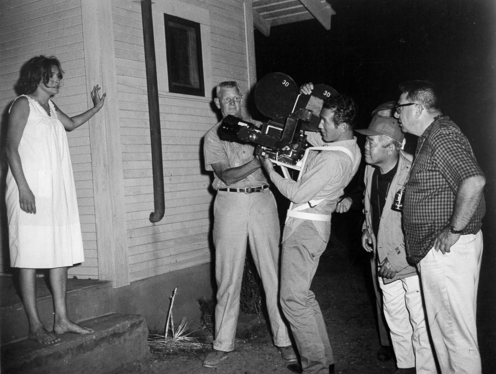
What are the main adaptations in technique which you must make when shooting on location?
In the first place, you invariably can’t hang lights up high, so you have to light from the floor. You can’t use much backlight, but I think that can be to your advantage, because backlight is often overused. It became popular in earlier days and the chief reason we backlighted then was to separate the actor from the background. But now there are other ways of getting separation — like playing a light background against a darker image in the foreground, or vice versa. However, we don’t always need a halo following the actors around. Sometimes you look down when you are making a long shot and you discover there are four or five shadows of the actor on the floor, created by all the backlights. It spoils the illusion. The audience may not know why, but they are conscious that something is wrong. Also, if you have pan and dolly shots to make, it is a problem keeping all those lights out of the lens; the only way you can do it is to play the lights off camera — to one side. You can’t tell the director that he must not pan or dolly there, because the shot may demand camera movement. Certain directors and art directors fully understand the potentials of the camera, the different lenses and camera movement. They justify camera movement not for the sake of movement alone, but because the actors move and the camera properly should follow their action. The story dictates the action and the camera movement. On Hud, Martin Ritt wanted certain pan shots. They were necessary — and it was up to me to find ways to rearrange the lights to get them out of the way of the camera while still making everything seem simple.
What about the problems of making dolly shots in some of those interior location sets?
Some of these interiors were so small that we had to use a wide-angle lens to get any sort of establishing shot. We didn’t use too many dolly shots inside — nor did the director want to use a zoom lens as a substitute, which may seem surprising since he comes from live TV. He simply has found that the zoom lens has been overworked. I don’t care for it either because it produces just a flat frame coming toward you. In a zoom shot the perspective is static — the camera doesn’t pass anything and you have no sense of true movement. It is just a set composition being blown up larger by degrees.
I noted that there was an absence of projected shadows in the interiors you filmed on location. Was this due to any lack of cukaloris or other devices on the location site?
On this picture I didn’t use a single artificial shadow produced by devices such as the cukaloris or gobo. Often, when I see such shadows on the walls of a set I wonder what their source is supposed to be. They are decorative, but I seldom use them, because I believe in creating mood through gradiation of light — varying textures and tone values — rather than by throwing in artificial shadows. I want more purity in my lighting and camerawork.
Do you feel that you can achieve this purity in technique when filming on location?
Yes, I think that working in location sets can actually simplify things — mainly by eliminating the need for a lot of backlight and overhead light. You have to stay away from flatness, of course, but you can take a key light and put it right over the camera just above the actor’s eye level and get sufficient roundness. For example, if you light a round bottle and hit it right in front, it doesn’t look flat because the light follows the contour of the bottle and falls off gradually at either side. Many of our biggest stars, because of facial structure, must have their key light directly above the camera lens, with just a little soft light added to fill in. Any cameraman who knows lighting technique can always light a set somehow. But you will find that when you have space problems, for example, your set tends to come out better with simpler lighting that is invariably more effective, too. It looks well — it looks real. I think no matter what you light — a night club, a circus or a nice home — you should light it as naturally as you can. I have come to realize that the best lighting is true to the subject, but it took me many years to find this out. I used to do a lot of things with lights that I shouldn’t have been doing. You believe at the time that is the thing to do and that it shows what a fine cameraman you are. You want to demonstrate what you can do with all those tricky lights, but the tendency sometimes is to get carried away with lighting, to over-dramatize.
Do you still have to fight this tendency?
Not so much any more. Our problem on Hud, for example, was to make our interiors not look like movie sets. I could have lighted the location sets and very easily made them look like studio sets by using cookies and other lighting effects gadgets, but I resisted the impulse. To illustrate my point the actual store interior seen in this picture was lighted more or less like a country store is actually lighted. I had them turn on the regular store lights to get the feeling of how it was illuminated. Then I simply built up the established lighting a bit more and shot it that way. In other words, I didn’t give the lighting my “special touch” to make that store look like I wanted it to look — but the way it actually looked. When we got back to the studio, of course, the interiors shot on the stage had to be lighted to match our location lighting. To make sure it would, ceilings were included on all the sets whether they were to show in the photograpy or not, so that I would automatically have to light in the same way. I didn’t find that the use of ceilings slowed me down at all. I think there is a growing trend toward utilizing more actual locations rather than so many studio sets. Motion picture art directors are very good at creating authentic sets and usually manage to get very real character into them — but it is the lighting of those sets that often makes them look stagey.
In Hud, I noticed that there was no obvious use of reflectors or booster lights to provide fill light in exteriors. Was this a deliberate effect, part of your photographic style on this picture?
Yes, I did not want audiences to be aware of light coming from any particular place, but to feel that the light was naturally reflected from the ground. I used both sunlight reflectors and booster lights, of course, but I avoided as much as possible showing them at work, and I tried to be especially careful not to wash out the shadow side of actors’ faces.
I noticed that you kept both the sky and faces in good, rich tones. What filter or combination of filters did you use to achieve this result?
The characters portrayed in the picture were western outdoor people and they naturally would be tanned by the sun. I don’t believe in the kind of photography where everything must balance and where all the faces are made up in the same skin tone. In real life it is not that way — some people are more tanned than others. Those who are out in the sun a great deal are darker than, say, bank clerks who work indoors. I did want good rich skies, but I knew that if I used a yellow, orange or light red filter it would darken the sky and also tend to lighten skin tones. So I used a light green filter which darkened the sky and also kept the faces dark. Paul Newman has very light blue eyes and you have to be very careful not to “lose” them photographically. So you have to light him a little higher to keep the key light out of his eyes and then use a very soft fill for a catch light. If you are not careful and get both the key light and fill in his eyes, you may wash them out.
I noticed that all the night sequences in the picture were actually shot night-for-night. What advantage was this over day-for-night filming?
Shooting day-for-night is the easier way to do it, but not the most effective. At certain times and under certain conditions you can filter the sky down, underexpose slightly and get a good light effect; but where a big sequence is to be played where it is necessary to change angles sharply it is not possible. You can never match the skies because whenever you shoot against the sun the sky is always lighter than when you shoot away from the sun. If you pan all the way around, the sky changes from deep blue to pale blue. It is jolting to an audience when you cut suddenly from one angle to the other and the skies don’t match.
I was especially impressed with the night sequence in which Hud bumps the younger brother’s truck off the road and they discover the father’s body lying in the glare of the headlights. What special problems did you encounter in lighting that?
I had to have an excuse for a light source so that the father’s body could be seen in the dark. We motivated this by having the truck go off the road. The boy gets excited, and jumps out, leaving the headlights on. We now have an excuse for a light source. This sequence was shot in the dead of night on an absolutely black country road. In order to light the faces as the characters drove along in their vehicles I tried to simulate the natural spill from the dashboard light. I used one photoflood lamp, mounted under the dash. Then I hung a light on the opposite side so that it would create a feeling of flare from the headlights bouncing back off the road. We shot many of our closeups for this sequence actually in the car without the use of process, and they were very difficult to photograph; others were shot later in the studio against a process screen.
The greased-pig chase contest was a very funny sequence in the film. However, I imagine it offered some special lighting problems. Can you describe some of them?
Yes. The sequence was filmed in Griffith Park, at one of the riding academies. We were shooting in a large ring and we didn’t know which way the pigs were going to run, so I had to light the entire area. Small bulbs were strong around the ring to show in the picture and establish a light source. I mounted several sky pans up high on several poles that surrounded the ring to produce a more or less overall flat lighting. On the roof of one of the buildings, I placed a few 10KW lamps concentrated on the people in the grandstand. I just lighted the area rather generally because I couldn’t outguess the pigs. Besides, there is only so much you can do by way of artistically lighting a greased-pig chase. We used several cameras on the event equipped with a range of lenses from wide-angles to telephotos for closeups. The main problem here was avoiding picking up the other cameras.
Now that you’ve seen the completed film, do you feel that the photography came out the way you hoped it would?
There is one sequence that disappointed me a little — the one involving the shooting of the cattle. There wasn’t supposed to be anything beautiful about that action. But on the day that we started filming it a lot of fluffy clouds decorated the sky. Every time I looked up and saw those clouds I hated them. What I really wanted was a bleak, early morning sky, but the clouds remained so we had to go ahead and shoot anyway. Everytime I look at that sequence now and see those pretty clouds there it frustrates me because it’s too beautiful to be in keeping with the scene. I personally can’t believe that sequence at all.
Hud was selected as one of the ASC 100 Milestone Films in Cinematography of the 20th Century.
Learn more about Howe in this archival profile.
If you enjoy archival and retrospective articles on classic and influential films, you'll find more AC historical coverage here.
