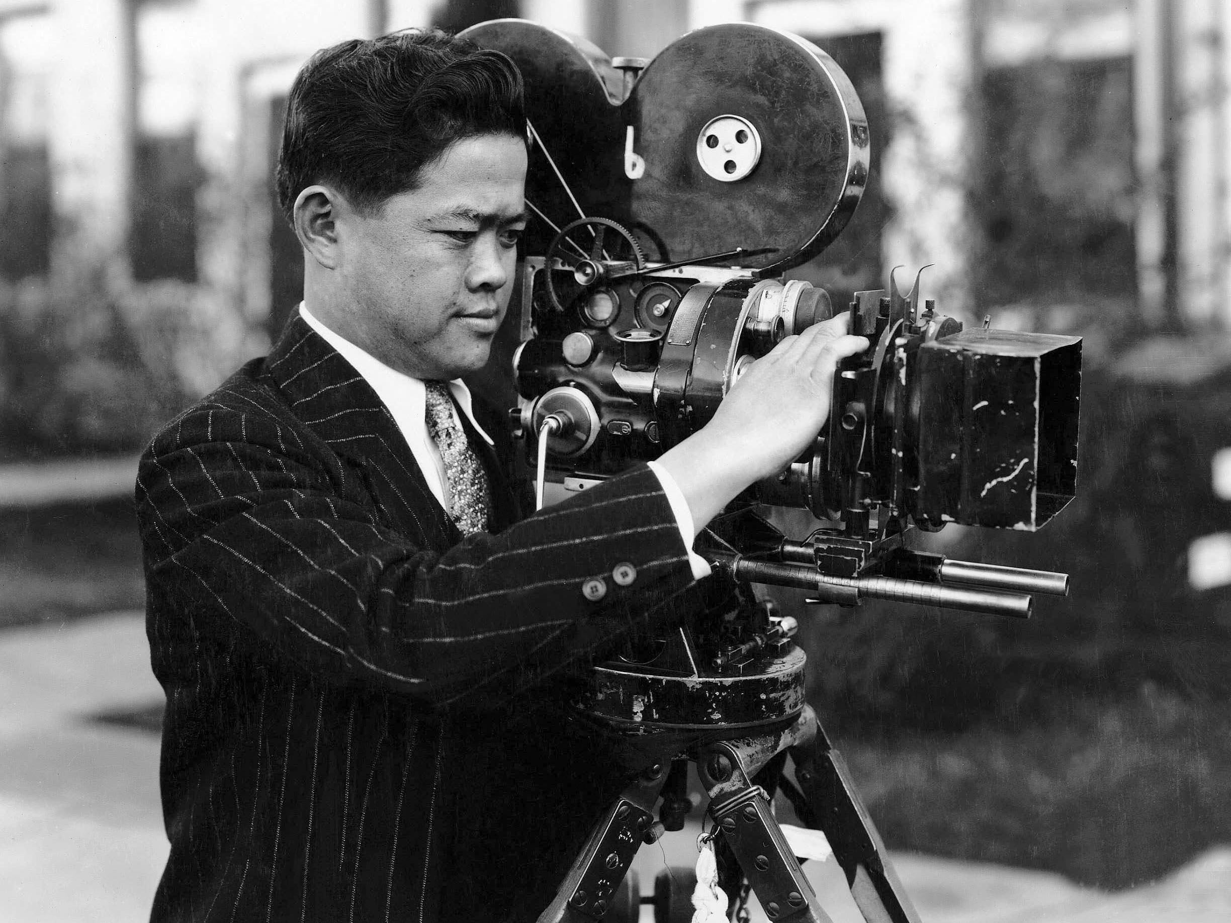
Aces of the Camera: James Wong Howe, ASC
“We all recognize that what we would have termed a well-photographed picture 10 years ago does not seem nearly so good an example of photography today.”
“Aces of the Camera” was a profile series that ran in AC for several years starting in the early 1940s. This article was originally published in AC July 1941.
The fact that James Wong Howe, ASC is Hollywood’s only Chinese director of photography is of only secondary importance. What is really significant is that, without reference to race or any considerations other than what he puts on the screen, he is universally recognized as ranking high among the half-dozen greatest camera-artists of the world. And he has held that ranking for close on 20 years.
Psychologists who debate the respective influences of heredity and environment would find endless interest in Jimmie Howe, who is at once oriental and occidental. Born in the Chinese province of Kwangtung, he came to America as a child when his parents came to the Pacific northwest. There, young Wong Tung Jim captivated the attention of a well-to-do Irish-American family, and his early years were spent largely in this far-from-Chinese environment. As a result, Howe’s character is a curious blending of the best qualities of the Irish, the American and the Chinese, overlaid and interwoven to produce a thoughtful and sensitive artist, combining the keen imagination of the Irish, the directness of the American, and the Chinese passion for simplicity and good taste.
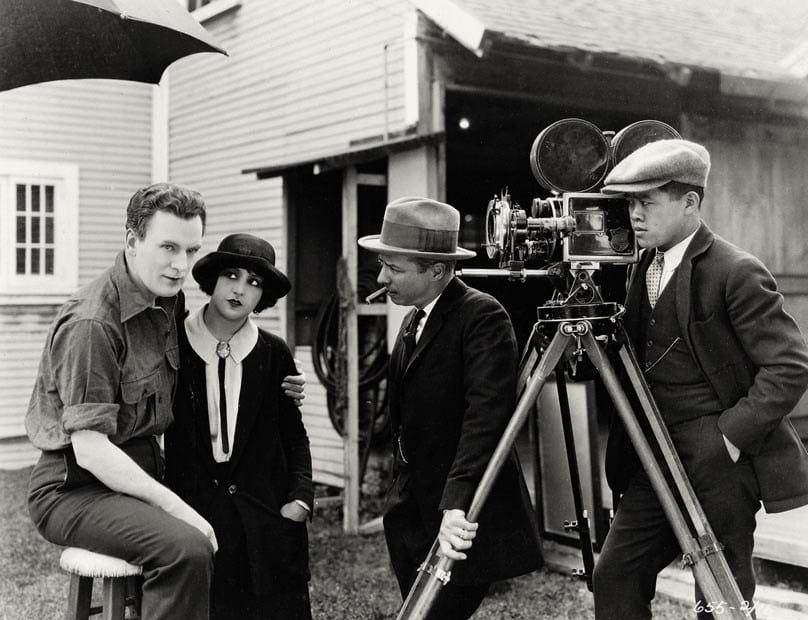
The latter characteristic is perhaps most strongly marked in his approach to lighting. Recognized as an outstanding master of low-key lighting, he has an uncanny knack of getting the maximum effectiveness not merely from a minimum amount of light, but from a minimum number of sources.
“Why,” he asks, “should we think our lighting has to be complicated? In real life, the lighting effects we see in a room or outdoors aren’t complicated. Why should we, striving to duplicate their effect on the screen, inject added complications?"
“Fifteen or 20 years ago, we had to, in order to get adequate exposure with the slow emulsions and lenses we then had. But today we have infinitely faster films, better lenses, and more efficient lighting equipment. Our photographic exposure-levels are drawing increasingly closer to the actual room-illumination levels whose effects we are trying to duplicate. We have an opportunity, therefore, to simplify our lighting, too, to a closer approximation of the realistic effects we want to reproduce.
“This matter of exposure levels, incidentally, is something that can very easily be overestimated. Surveys have shown that cinematographers in almost every major studio may light at levels differing from each other by several hundred percent — yet each gets satisfactory results on the screen. The real secret of lighting is balance: if you maintain the correct relative balance between highlights, intermediate tones and shadows, it does not matter greatly if you use a key-light level of 50 foot-candles, 100, 150 or even more.
“The advantage of using lower lighting-levels, as I see it, is this: employing less light, from fewer and smaller units, one is able to achieve a closer approximation of the actual effect he is trying to reproduce. He simplifies his lighting, and: in the process, achieves better effects and gives the actors more comfortable and natural surroundings in which to work.
“With today’s fast films, set lighting can often be simplified to putting in the desired highlights where the composition needs them, and then letting the ‘spilled light’ from these units and those illuminating the people take care of most of the filler-lighting.”
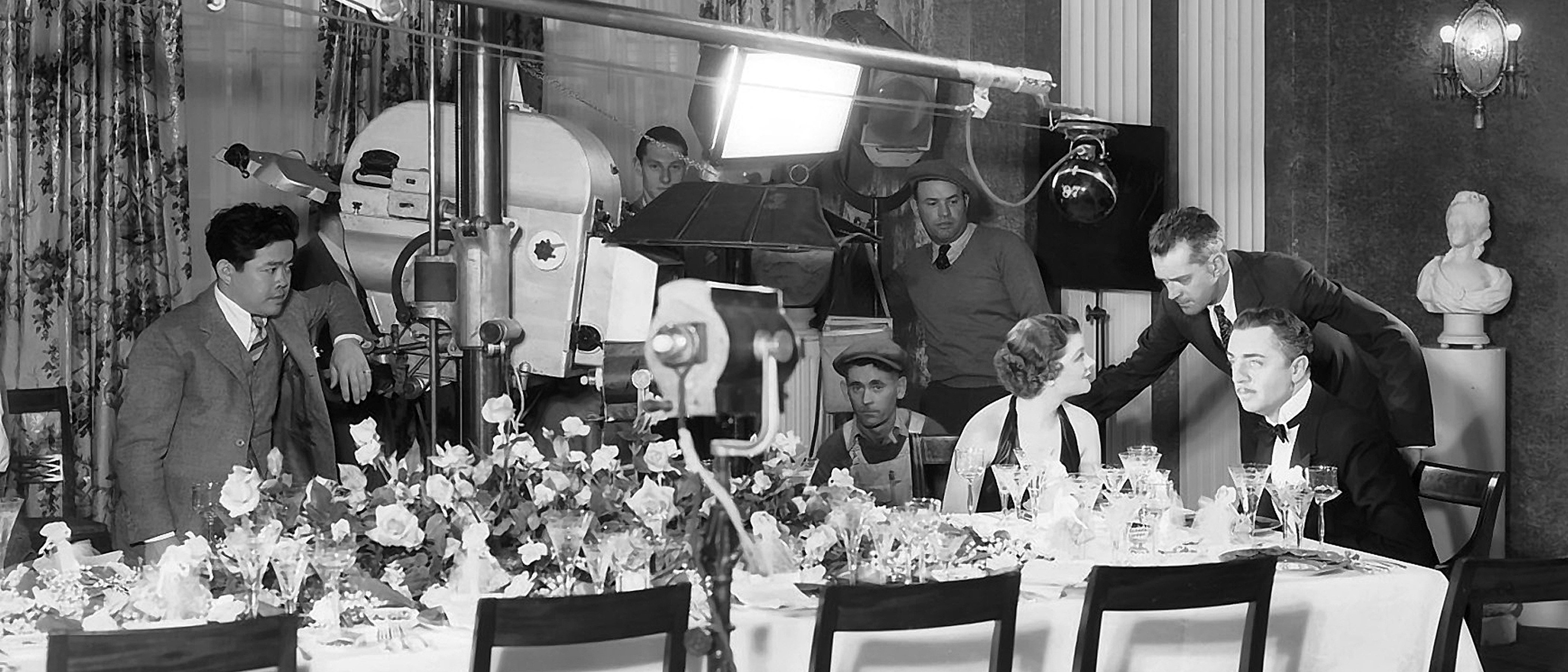
“Personally,” he continues, “I like to approach lighting from the viewpoint of composition, rather than lighting. There is always one important detail of each composition which is the key to the whole meaning of the scene — and which can be the key to your lighting as well. Sometimes it may be the face of a principal player; sometimes it might be part of the set, or even a small hand-prop. Find that key detail, and make it the keynote of your composition. It will become the keynote of your lighting as well. Light it. Then light the people, striving for the simplest and most pleasing modellings. Then light the set as needed to complete your composition — and as your composition is completed, your lighting will be, too.
“With today’s fast films, set lighting can often be simplified to putting in the desired highlights where the composition needs them, and then letting the ‘spilled light’ from these units and those illuminating the people take care of most of the filler-lighting.
“I have found this particularly true in some experiments I have recently made with the use of Super-XX. Opinions as to the best way to utilize this super-fast emulsion for production camerawork differ. Some cinematographers like to employ substantially normal lighting, with shortened development, using the film largely for the softer gradations it gives. Others like to over-light considerably and then stop down for extreme depth. My own inclination is to give the film virtually full normal development, and to utilize its additional speed to make possible still lower levels of illumination. Using the conventional Plus-X negative, my normal average key-light level is about 70 foot-candles. In my experiments with Super-XX, I have cut this to approximately 35 foot-candles, and obtained a beautiful negative of thoroughly normal density and beautiful quality.
“There is one thing about modern cinematography,” Howe remarks, “which I feel no one has emphasized sufficiently. This is the profound influence the photographic and picture magazines which have become so popular during the last 10 years have had on styles in studio camerawork. We all recognize that what we would have termed a well-photographed picture 10 years ago does not seem nearly so good an example of photography today. Where, for example, 10 years ago nearly all of us employed really heavy optical diffusion, and lighting that was, to say the least, inclined to be splotchy, today our work is entirely different.
“Even before Gregg Toland, ASC came along with his Citizen Kane, there was a marked tendency in every studio toward crisper definition and greater depth, sometimes accompanied by increased contrast. Better lenses — coated and otherwise — have played their part; so have the snappier contrast of modern emulsions and the improved definition obtainable from fine-grain positive. But to my mind, the biggest factor in this transition has been the change in the public taste. This is directly traceable to the growth in popularity of miniature-camera photography, and to the big picture magazines like Life, Look, and the rest, and such modern photographic magazines as U.S. Camera, Popular Photography, and the others. The public has seen the stark realism of the news picture reporters, and the pictorial strength of the work of the modern miniature-camera photo-illustrators and pictorialists.
“It wants something of that type of realism — modified to suit the motion-picture medium, perhaps — but still maintaining the same realistic tone, in its movies. We — cinematographers, directors and producers alike — must necessarily give it to them. Therefore our style of cinematography has changed, so slowly and subtly that we ourselves have scarcely been conscious of it, but very definitely none the less.
“I doubt if cinematography can ever go quite as far in this direction as still photography; it would be difficult to capture consistently with a movie camera and the ever-changing requirements of a picture’s dramatic action, the f:128 crispness Edward Weston, for example, gets into his stills. But when I compare the ultra-fuzzy scenes we made 15 and 20 years ago with the vastly more natural effects to be found in any well-photographed picture today, I cannot help feeling we have advanced.”
From all of which it can be deduced that Jimmie Howe is a photographic progressive. He is; that Irish-schooled imagination of his has kept him exploring new methods and ideas, both technical and artistic. He was among the first cinematographers to make use of panchromatic film, back in the days when the whole world was on an ortho film basis. He was one of the first to use panchromatic for both exteriors and interiors alike. He was one of the first to use incandescent lighting. He was one of the first to admit he could satisfactorily photograph a rugged leading man without the questionable aid of makeup. And he was one of the first production cinematographers to make a film with the three-color Technicolor process.
In that film — it was Selznick’s picturization of The Adventures of Tom Sawyer (1938) — Howe pioneered in a direction which is just now being re-explored: the elimination of unnecessary color from a Technicolor production, in order that it might be more effective — and more natural. Tom Sawyer, it will be remembered, was begun as a black-and-white picture. Only after several weeks of production was it decided to finish the film in Technicolor.
“Then,” Jimmie reminisces, “they wanted to rebuild and repaint the sets — to make them more colorful, because the picture was to be in color. I fought that idea to a standstill, and finally persuaded them to let me continue with the same sets and costumes that had been designed for the black-and-white production. The only concession made to color was in replacing such table-cloths, sheets, collars and similar fabrics which, for the monochrome version, had been tinted light amber or blue to minimize halation, with actual gray-white materials.
“The result was one of the most natural-appearing color pictures that had been released up to that time. But one sequence in it was specially ‘designed for color’ — and it, instead of being a strong point in the film, became one of the weak ones. The scenes the audiences seem to remember were those where we used the identical sets and costumes made for the black-and-white production.
“I can’t help feeling flattered that it is only now that such noted art directors as Cedric Gibbons, with Blossoms in the Dust, and Richard Day, with the various recent musicals from 20th Century-Fox, are beginning to stress this same idea of minimizing color — of letting the Technicolor camera capture a ‘natural’ effect rather than something ‘specially designed for color!’”
There’s another side of the matter that Jimmie Howe is too modest to mention. That is that he made his Technicolor production — using, of course, the old, slow-speed Technicolor negative film — using in many cases less light than is generally being used in today’s Technicolor filming with much faster film and improved laboratory methods. And his mastery of the color medium may be best expressed by one of his associates on Tom Sawyer — a distinguished cinematographer in his own right, who declared: “I’ve been photographing Technicolor for many years, and thought I knew something about it. But I didn’t really begin to learn what could be done in lighting Technicolor until I made that picture with Jimmie Howe!”
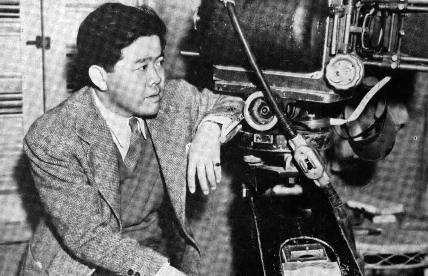
Howe continued to make well-received films all the way to the end of his career, including such classics as Body and Soul, The Old Man and the Sea and Seconds.
Before his death in 1976, Howe won two Academy Awards for Best Cinematography — The Rose Tattoo (1956) and Hud (1964) — to go along with his other eight nominations, including one for Funny Girl just months prior to his passing.
Here, the cinematographer accepts his Oscar for The Rose Tattoo:
If you enjoy archival and retrospective articles on classic and influential films, you'll find more AC historical coverage here.
