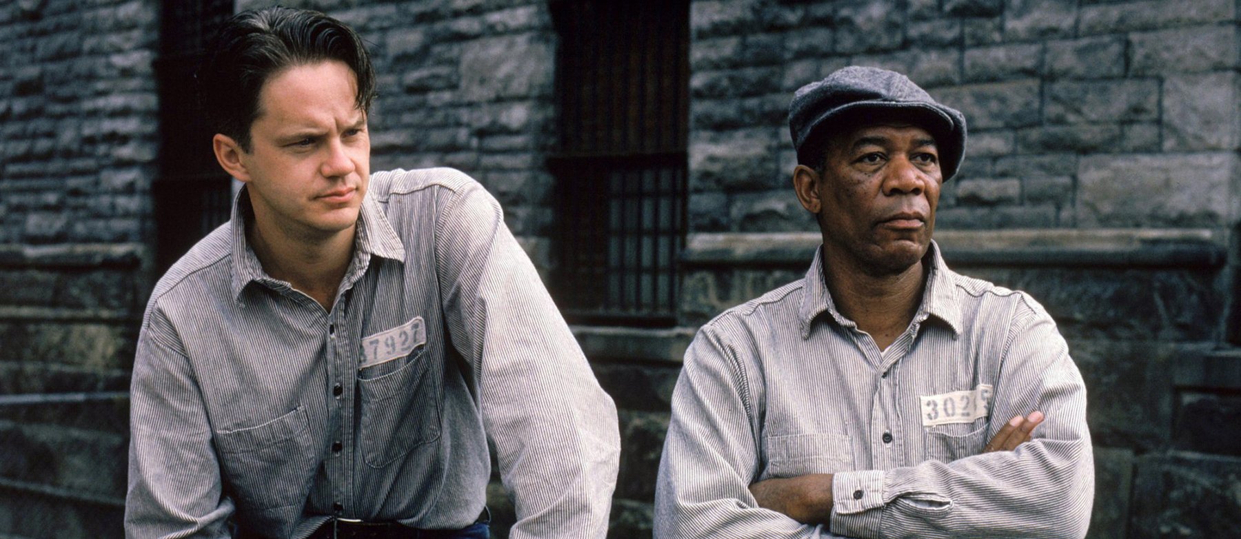
Photographing The Shawshank Redemption
Roger Deakins, ASC, BSC, writer-director Frank Darabont and crew discuss the making of this classic tale of hope and human endurance.
An inspirational story about the endurance of the human spirit and a renewed sense of hope, set in a prison, wouldn’t exactly come to mind when one thinks about the work of horror novelist Stephen King. But when director Frank Darabont read the novella “Rita Hayworth and the Shawshank Redemption,” which appeared in the King collection Different Seasons, he knew that the intimate tale of friendship was perfect for the big screen.
Adapting the screenplay himself, Darabont teamed up with producer Niki Marvin. Together, the duo assembled a cast of some of Hollywood’s most respected actors, enlisted the expertise of Academy Award-winning production designer Terence Marsh, and locked down a collaboration with expert director of photography Roger Deakins, ASC, BSC.
The Shawshank Redemption depicts the life of Andy Dufresne (Tim Robbins) after his incarceration into the Shawshank State Prison for the alleged murder of his unfaithful wife and her lover. Inside the prison, Dufresne, an introverted banker, meets fellow convict “Red” (Morgan Freeman), a cynical veteran of life inside the walls. The two men soon embark upon a lifelong friendship that dramatically changes their views of life.
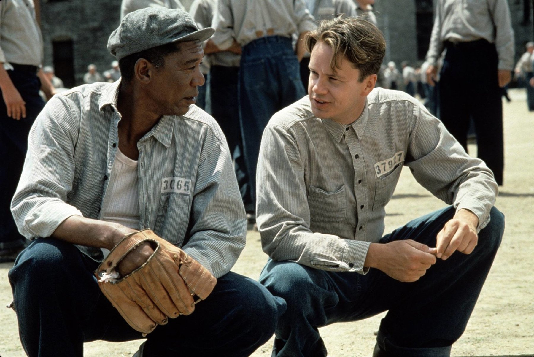
“What I found compelling about this story was the underlying message about the human spirit,” says Darabont, who says that Deakins’ sense of narrative was a key to the film’s success. “What’s great about Roger is that he tends to think like a storyteller. He’s not just a guy who lights and shoots. [Roger viewed] the film from the storyteller’s standpoint and tried to create a visual journey that would match the journey that the story took.”
Critical to this approach was the photographic rendering of the prison. Laden with morose colors and foreboding shades of gray, the film’s look immediately sets the tone for Dufresne’s feeling of despair and isolation. “The whole approach,” says Deakins, “was a sort of cool, gray light and cool, gray exteriors.”
Darabont agrees, “Certainly in a film like this, the look of it is dictated in some measure by the location that you’ve chosen. Obviously, if you’re shooting in a prison, you’re going to go for a lot of grays and browns. You’re going to reinforce that as much as possible. However, there was a great collaboration between Terry [Marsh] and Roger — doing paint tests! When the new prisoners are marched in and the warden (Bob Gunton) comes out and gives his welcome speech, [you can see the results]. The paint for the wall behind him was painstakingly chosen for color because Roger wanted a very specific look. He wanted to light that in such a way that it almost dropped off into black, but not quite. They went through I don’t know how many paint chips finding the right shade of gray that was going to kick enough to give the effect that Roger wanted.”
For the filming of The Shawshank Redemption, the production conducted a nationwide search for a facility that would serve the visual needs of the story, which takes place between 1947 and 1967 in a Maine prison. The filmmakers eventually chose the Ohio State Reformatory, a gothic, century-old prison located in the town of Mansfield. Scheduled to be demolished after being deemed inhumane, the facility had been dormant for almost four years.
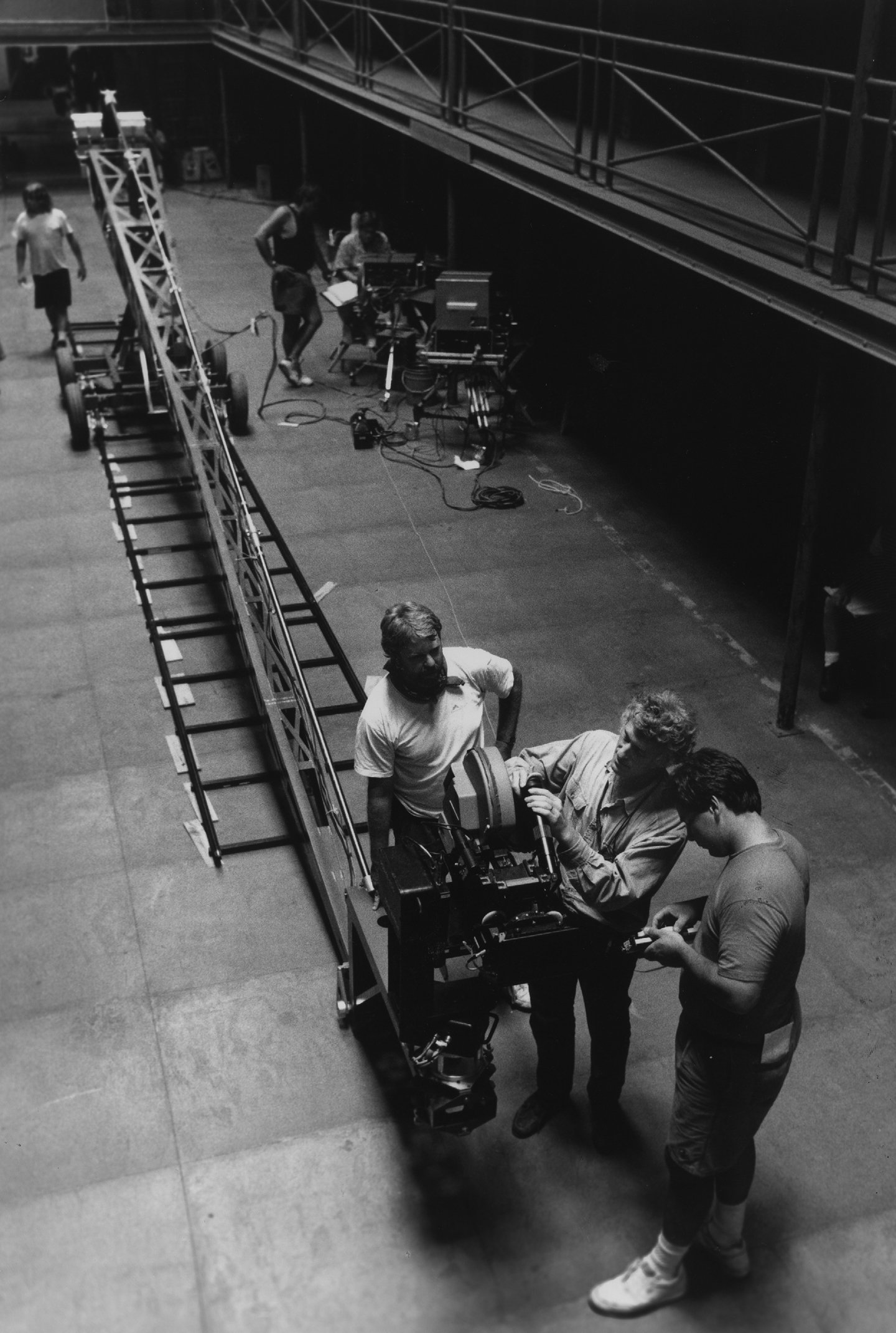
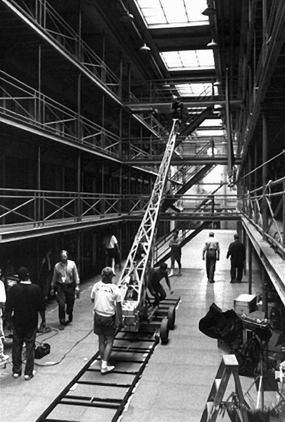
Deakins admits, “We wanted to feel the prison, the harshness of the environment, and that’s why they chose that particular prison, which was a very archetypal, nasty place. But I was still trying to be naturalistic to a degree. I’m really pleased with the fact that I don’t think things stand out; if something stands out, then it’s wrong. In films now, people are seduced by images, but those images are not necessarily right for a story. Something can be ugly and still be interesting.”
Deakins photographed the film primarily on Eastman Kodak 5293 rated at 200 ASA (except for some day exteriors shot on Eastman’s 100 ASA 5248). He shot the film under daylight-balanced sources, but didn’t correct the color temperature to the stock’s 3200-degree rating. “I shot the whole thing without correction filters,” admits Deakins. “[This strategy] gives you a slightly enhanced contrast, and the shadows always remain cool, even if you print it back; if you time it in the lab to correct for the lack of the 85 filter, it never comes back the same. But we deliberately didn’t print it back all the way. We wanted that sort of gray, cool look.”
The prison interiors ranged from an entire four-story cell block set to individual 7’ X 9’ cells. Deakins employed a style of lighting he describes as “heightened naturalism.” He explains, “Basically, everything is lit with a lot of light that’s soft but directional. I didn’t use a tremendous amount of fill. Rather than shooting wide open, I lit to about T2.8 of T3.5 — a reasonable stop to get decent sharpness and clarity.
“The guys always have a joke with me,” he adds, “because my meter seems to stick on T2.8. Actually, I don’t meter a lot. Recently, my meter broke down while I was doing the Coen brothers’ upcoming film Fargo. I didn’t realize it until the end of the day, and I thought, ‘Oh my God, my meter broke down!’ I was really worried about the dailies, but it was stupid. Everything was fine — it was T2.8 anyway!”
Deakins’ first assistant, Eric Swanek, confirms, “He tends to be from a T2.5 to T3.2, which is a perfect place to be. You have enough depth that you can play with it a little bit, but not [so little] that you have to worry about which eye is in focus. It makes it interesting for the assistant too, much more than a T4 or T5.6. You have to pay attention.”
The main cellblock set, designed by Terence Marsh, basically functioned as a practical location. Built in a warehouse a mile from the prison, the set housed more than 200 separate cells on four floors, each with air-pressure-driven doors. Practical fixtures were worked into the design to facilitate the lighting. “A lot of people thought that main cellblock was an actual location shot with almost available light,” says Deakins’ longtime gaffer, Bill O’Leary. “Other cinematographers have said that and we were very surprised.”
“The whole set was built to within 10 feet of the actual walls of the warehouse,” recalls Deakins. “There were a lot of discussions about how to create enough space [to shoot] and how big we needed to make the skylights so that we could get the right kind of light through.” Additionally, we discussed the practical lights and the color of the walls so that they wouldn’t be too bright or too dark. I had more than 25 Maxi-brutes [fixtures consisting of nine PAR 64 lamps] above the skylights through slightly staggered layers of diffusion. When you looked up, you were actually looking right into the lights. That’s basically how I lit the place. The only problem with it was the overhangs of the walkways. With the top-light, it was too shadowed to read the cell doors, so I had blondes with 1/2 CTB coming in from the walkways just out of frame to fill it in. If there was a practical on, then it was dimmed so that it would go to around 2800 degrees Kelvin.”
The employment of practical fixtures into the constructed cellblock set required considerable effort and planning by Marsh and O’Leary. Recalls O’Leary, “Every cell — and I believe there were 120 of them that we were prepared to look into, which was the whole half of the set closest to Tim’s cell — had boosted-up practicals on dimmers. We had gutted everything that was there, run Teflon wire in and put larger bulbs — 200-watt and 250-watt bulbs — inside the actual fixtures. Then we ran another system into every single cell: a feed behind the existing fixture, so that we could add small gag lights behind all of the practicals to boost our levels if necessary. Generally, we’d use 1000-watt FCM quartz bulbs which were also placed on dimmers and were separated from the actual bulb inside the fixture. We could dim down the actual glass fixture bulb and look at it with the lens, but behind it we’d have the 1K FCM to actually light that part of the cell, walkway or stairway.
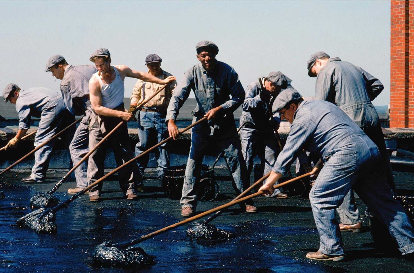
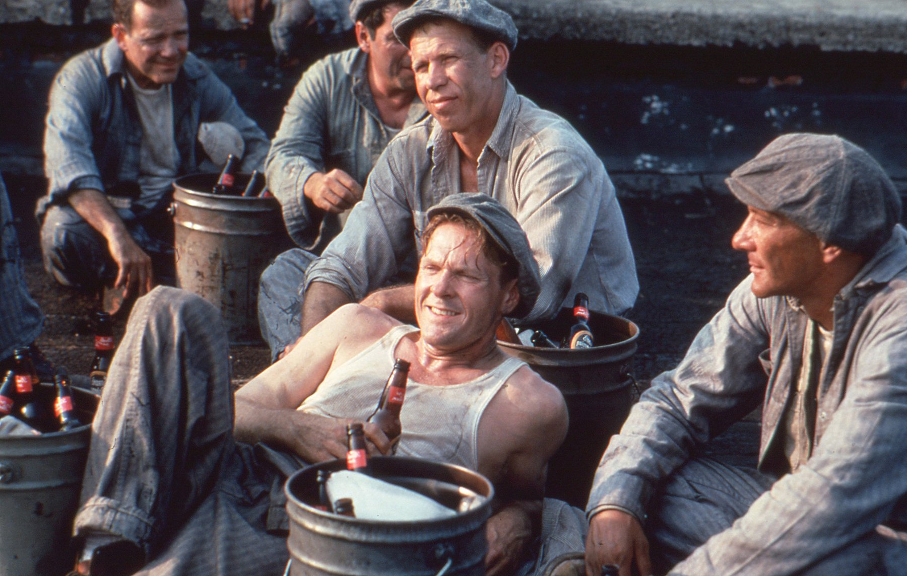
“For the day scenes,” he adds, “we lit with the Maxi-brutes through the skylights. We had more than 25 Maxis above, and 120 Mighties outside the main cells ready for when we looked in. And for the hero cells, we had a couple Mighties coming through those windows. Outside the large arch-windows at the opposite end of the block in the background we had several Maxis and a ‘Wendy’ light — which contains 198 PAR 36 bulbs broken down into four panels of 49 bulbs each — coming through those windows.”
For the tungsten units used outside the large windows and the skylights, Deakins used 1/2 CTB correction, which was in stark contrast to the dimmed quartz units in the practical fixtures on the set. “With the dimmed tungsten on the interiors,” says Deakins, “we wanted a kind of nasty oppressive yellow light. Then later on that yellow light becomes richer and nicer and the prison itself becomes slightly less cold.
“We always had full correction between the coolest and warmest lights,” he adds. “If you’re shooting a daylight scene and the practicals are on, I hate it when you cut to a night scene and the practical is suddenly very different from what it was in the day scene.”
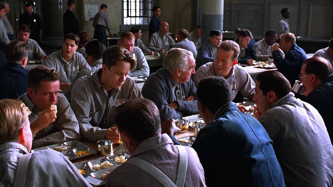
Another substantial set in the film is the mess hall, which was a redressed location inside the Ohio Reformatory building. “We had 12K HMIs outside most of those windows,” Deakins recalls. “We shot them straight at the windows and diffused them with a couple layers of 250 [Lee Half-White] diffusion which were staggered away from the windows.
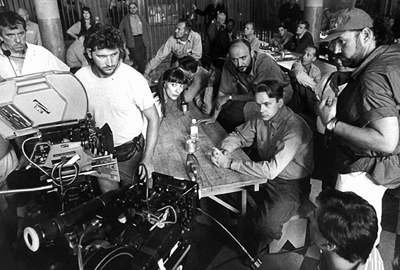
“There were about 50 12K HMIs burning for that set. A large part of the lamps were in the wings that receded away from you, but there was also quite a bit of light just because of the size of the windows and the space in the actual eating area. For that whole setup we did a very large scaffolding rig down the whole side of the prison and used an industrial forklift to lift the lamps up — the tops of those windows were a good 25 to 30 feet.”
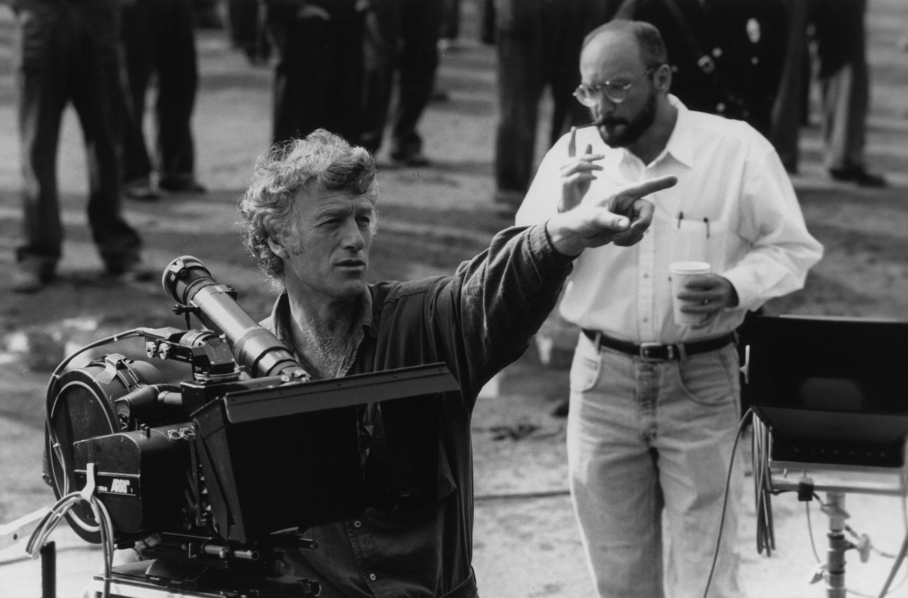
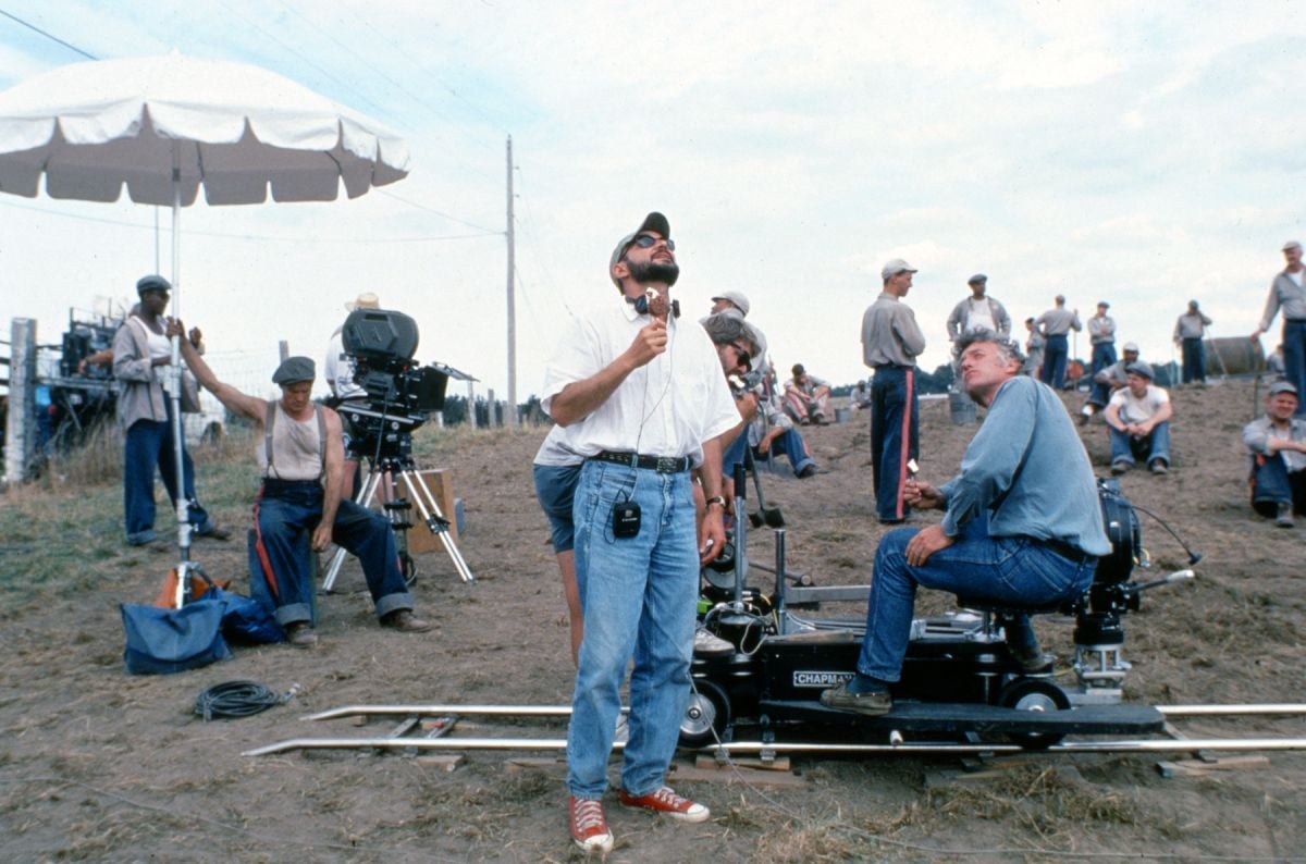
Deakins, who operates on his films, is actively involved in designing the compositions, blocking and movement of the camera. “Roger was diligent about composing shots to always remind you where you were,” says Darabont. “If we were out in the yard shooting dialogue, he was always trying to tweak the angle just so that it would reveal some intriguing architectural detail looming above the characters. He was cognizant about not letting too much sky in at the top of the frame to give you a background that was mostly wall — which we had talked about doing in prep and he was good about maintaining as we were going along.”
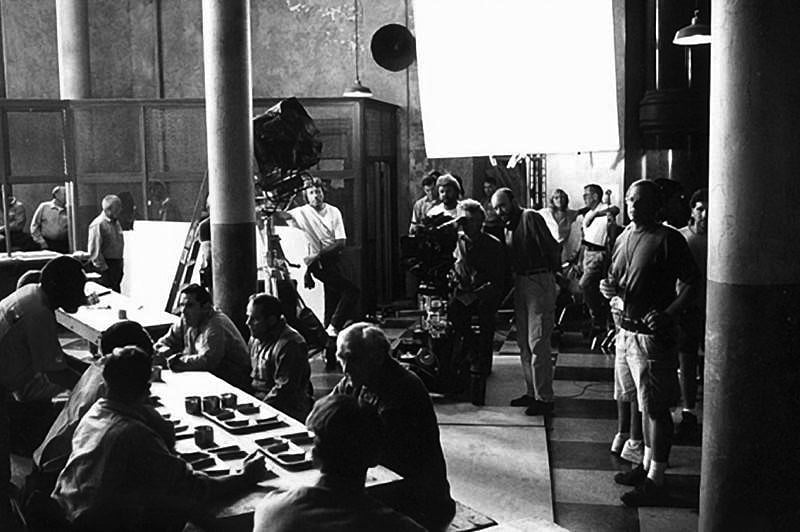
For The Shawshank Redemption, Deakins rarely used a zoom lens. “I don’t think people think about lens lengths enough,” he admits. “That’s why I really like shooting on prime lenses. It makes you think, ‘Why do I want to be close to somebody on a wide lens as opposed to being a long way away on a long lens?’ Many people say, ‘Well, it’s the same size shot,’ but it’s not the same effect. You’re telling the audience a totally different thing. I think that’s really important.”
Deakins prefers to be in focal lengths close to that of the human eye’s natural field of view, which he feels lend a more naturalistic feel to the images. “The wider group shots we shot on a 32mm or 28mm,” he says, “and on close-ups we’d shoot on a 40mm or sometimes a 50mm. Rarely would I go past an 85mm lens. In that range I think you get a sort of presence.”
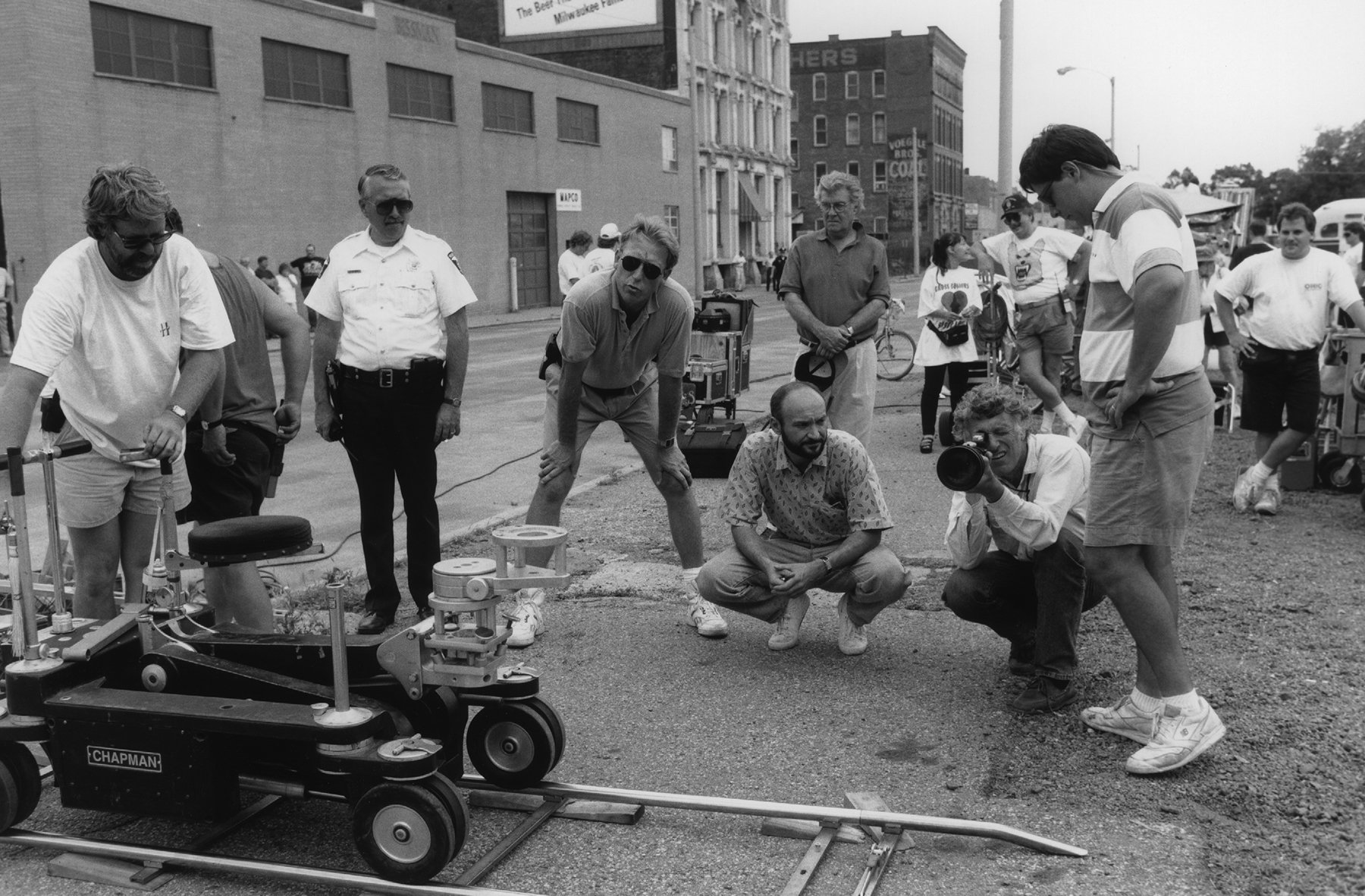
“We used an Arri BL-4S for A-camera with an Arri head,” recalls Swanek, “and a MovieCam Compact for B-camera/Steadicam [Gerrit Dangremond]. We also extensively used the Giraffe crane, owned by Roger’s dolly grip Bruce Hamme, with a Power-pod remote head and an Aero-crane. It was very versatile for doing any kind of crane shots in an enclosed space and basically overlapped the shortest height that the Giraffe could do.”
One of the most memorable shots in the film occurs in the opening minutes, showing Dufresne’s prison bus arriving at Shawshank for the first time. Captured with a Spacecam mounted on a helicopter piloted by Robert “Bobby Z” Zajonc, the sweeping aerial shot covered the entire facility and grounds, which were filled with inmates. The shot pans sideways as the camera looms down over a rooftop to reveal the bus turning into the entrance.
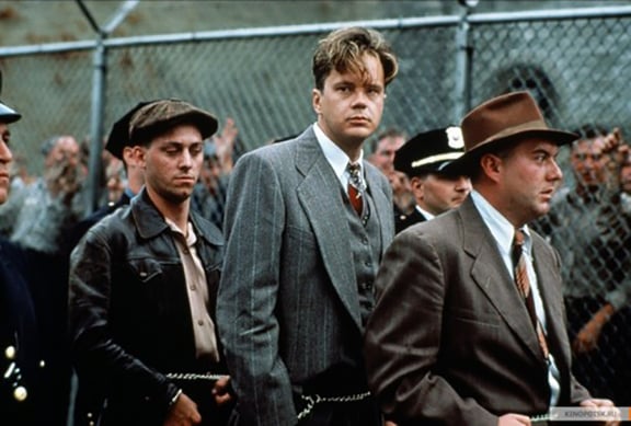
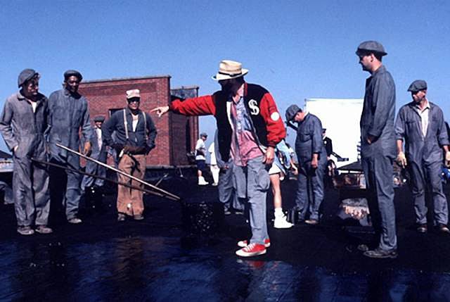
The exterior shots of Shawshank Prison were lit to match the feeling of the interiors. “In the quest to keep it looking natural,” says O’Leary, “we don’t do a lot of heavy lighting for exteriors. You’ll notice that Deakins’ day exteriors never look lit, and I believe that is actually one of the hardest things to do, to light and make it look un-lit. A lot of times the key to that is the blocking, getting people and the lens in the right spot. When we have a backlight situation, we might use an 8’ X 8’ or 12’ X 12’ silk or grid-cloth bounce as a fill, positioned to catch the available light, and then we’ll have a lamp behind it coming through the silk or the diffusion frame just to boost what we’re catching.”
As Shawshank’s narrative twist unfolds, Deakins and Darabont wanted to visually cue a change in the mood. “Because of the direction the story went,” Darabont explains, “we wanted to start off in tight, cramped spaces and end finally in an endless horizon. We wanted to go from grays and monochrome to this blazing color. It’s interesting how color creeps into this story more and more as you go on and how the spaces start widening out.”
“Roger is very astute on an emotional level as well as a technical level,” says O’Leary. “That’s the key to success. The whole idea of the technical part of it can be brushed aside once you’re completely comfortable with that and move to the next level.”
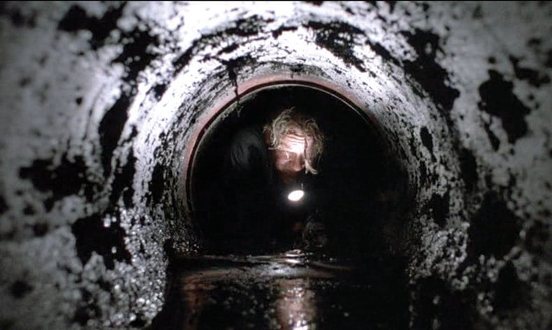
Deakins lit the climactic escape scene, in which Dufresne crawls to his freedom through 500 yards of sewage pipe, in a very practical manner. “The tunnel was lit with the flashlight,” says Deakins. “When Tim first looks down the tunnel and puts the flashlight in, you’re meant to see the distance down the tunnel. I got the scenic artist to paint a piece of card with concentric rings and put it in the background, because our tunnel was only about ten feet long. It was a trick I had done on Barton Fink when the camera went down into a plug hole in a sink.”
“The tunnel was lit with a small 12-volt peanut bulb rigged into the flashlight that Tim was holding,” explains O’Leary. “He was lit from the ambient bounce coming off the walls of the tunnel as he moved the flashlight around, and we also had a small white card around the lens as the camera snaked back on the Aero-crane.”
“Recently I finally got to see the film and I was totally blown away,” Swanek confesses. “I couldn’t stop talking about it. Everything about the film, every little move, told something. The camera work never distracted. It was always telling the story without distracting you from the heart of the story, which was the relationship between these two guys. It never over-emphasized, it never under-emphasized. It reinforced the story without becoming apparent.”
That about sums up Deakins’ philosophy about cinematography. “Everything hangs together and does relate to the story,” he adds. “Nothing stands out and disrupts the story. It’s not about the damn photography, it’s about the audience getting seduced into the story and these characters.”
Deakins earned his first Academy Award nomination for his cinematography in this picture and won the ASC Award for Outstanding Cinematography in a Theatrical Release, among other honors, for his work.
Below is an insightful interview with Deakins discussing his work in the film, conducted by BSC President John de Borman.
Author Christopher Probst became a member of the ASC in 2018.
The Shawshank Redemption was selected as one of the ASC 100 Milestone Films in Cinematography of the 20th Century.
If you enjoy archival and retrospective articles on classic and influential films, you'll find more AC historical coverage here.
