The Untouchables: A Search for Period Flavor
Stephen H. Burum, ASC details his visual approach to Brian De Palma’s gangster epic.
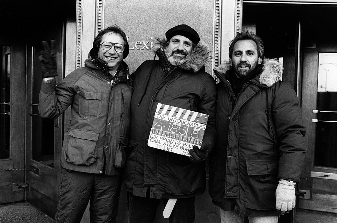
Unit photography by Zade Rosenthal
Early into the shooting of Who’s Afraid of Virginia Woolf, then first-time director Mike Nichols made an interesting discovery about the filmmaking process. According to Nichols, “…you begin to discover that most of the technical things are rather like that — they can be explained, they can be understood, and they can be dealt with. The big decision, the hard decision, is how to use them.”
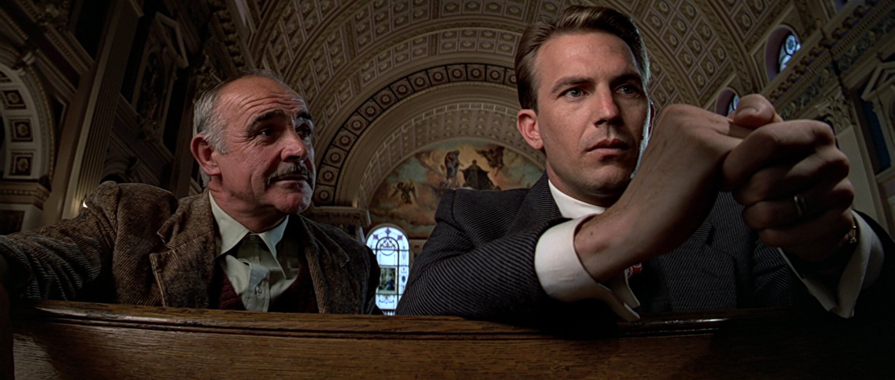
The big decision, the hard decision, how to use the technical tools of filmmaking, has always intrigued cinematographer Stephen H. Burum, ASC. His latest film, The Untouchables, directed by Brian De Palma, and starring Kevin Costner as Elliot Ness and Robert De Niro as Al Capone, gave Burum an opportunity to tackle that decision.
The movie, a true story that was the basis of an early 1960s hit TV series by Desilu Studios, is set in the prohibition era in Chicago. The story dramatizes the efforts of special government investigator Elliot Ness and his crime unit, The Untouchables, as they try to bring to justice bootlegger and mobster Al Capone, the unofficial mayor of Chicago.
The Untouchables was filmed on location in Chicago and Great Falls, Montana. The Montana location subbed for Canada. “The script demanded a certain type of physical layout,” Burum says. “So that the audience understands what the feds and the mounties are going to do.”
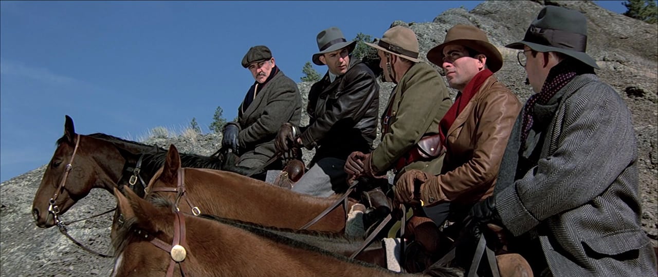
What they do is ambush one of Capone’s bootlegging convoys on horseback. This sequence captures all the excitement of a Western posse chase, with Ness and his men cutting off Capone’s trucks at the pass. In this case the pass was a bridge that funneled the trucks into one area and restricted them, so that the Untouchables and the Canadian Mounties could pinch the trucks off and grab them.
Like some of the old classic Westerns, the sequence was shot using the north-south shooting axes. “That way,” Burum says, “in the morning, you start out with the shooting area cross lit. Then, in the afternoon, the light is high; so you silk over the shooting area and do your close-ups and coverage. When the light starts to flip over and come up from the west, you pull off the silks, and the shooting area is cross lit again.”
The Chicago locations, though not difficult to light, provided Burum and production designer Patricia Brandenstein with a unique set of problems.
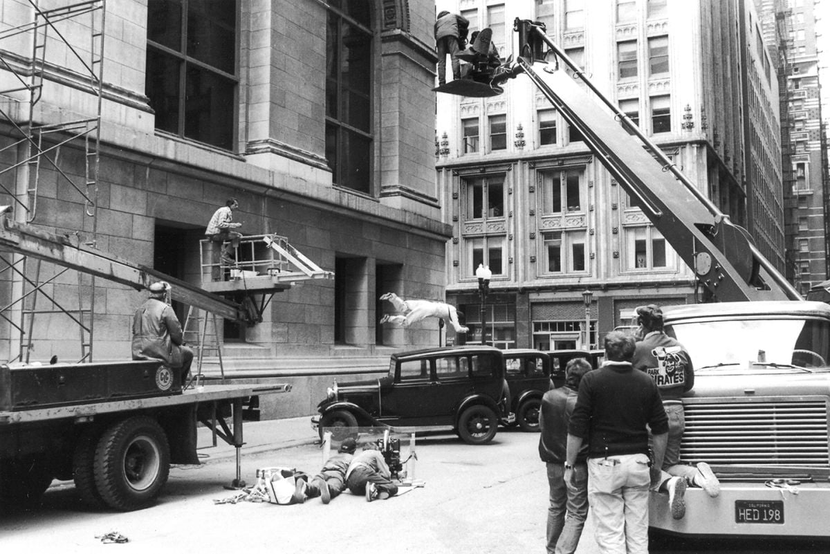
“In Chicago it’s almost impossible to shoot a period picture,” Burum says. “The city has always been in the architectural forefront, and there are so many new buildings, that no matter in what direction you shoot you see a modern building.”
Despite the lack of genuine period architecture, Burum and Brandenstein were able to create a Prohibition Era Chicago. Shooting as ASA 100, using Eastman 5247 stock for the exteriors, and ASA 400 using 5294 stock for the interiors, Burum and Brandenstein were able to re-dress interiors and find neighborhoods that gave the period flavor that DePalma was after. It was easier to get this period flavor during the night sequences.
“At night, we flagged off the tall buildings that had fluorescent lights that weren’t from the period,” Burum says, “and when we did that we couldn’t move the camera because you’d see the difference between the night sky and the flagged area.
“We shot a lot of the night sequences in a little residential area that was three blocks long. So, we had to replace all the light poles and remove the TV antennas. Finding period lamp fixtures was enormously expensive and time consuming.”
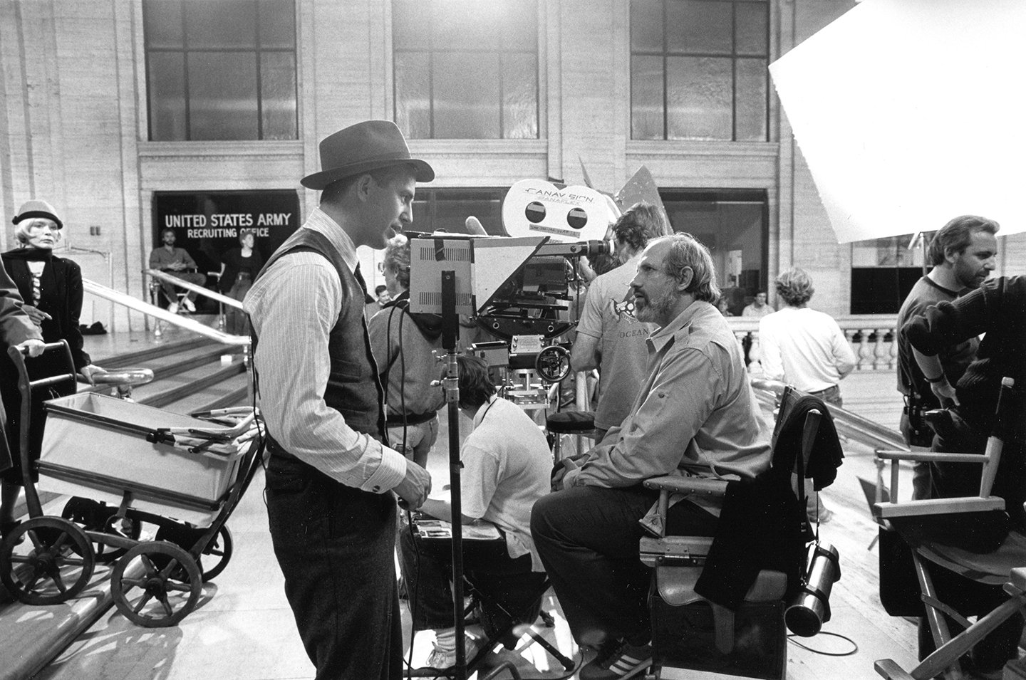
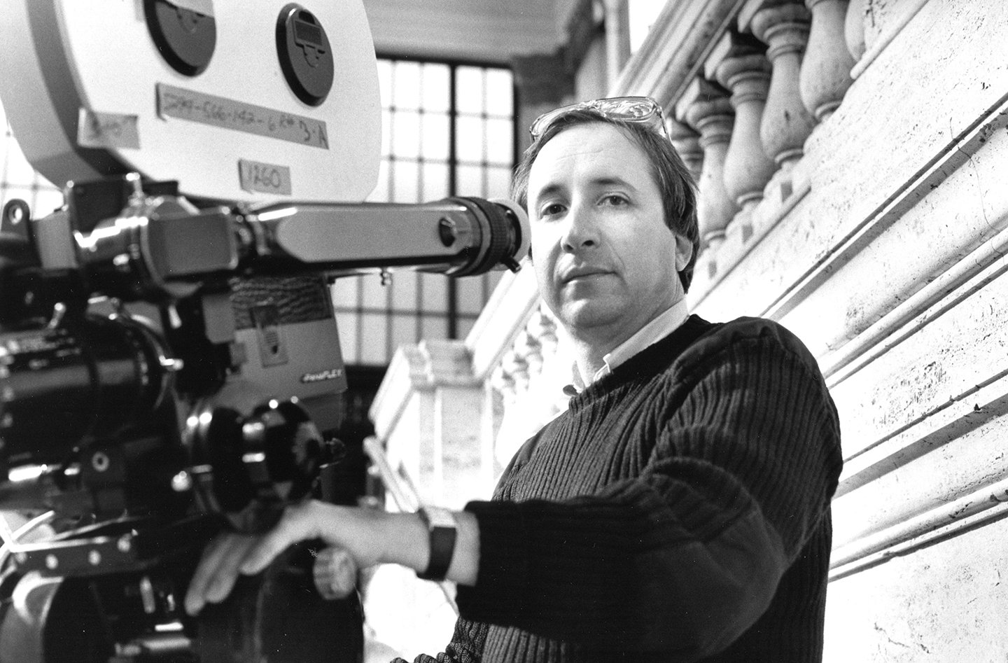
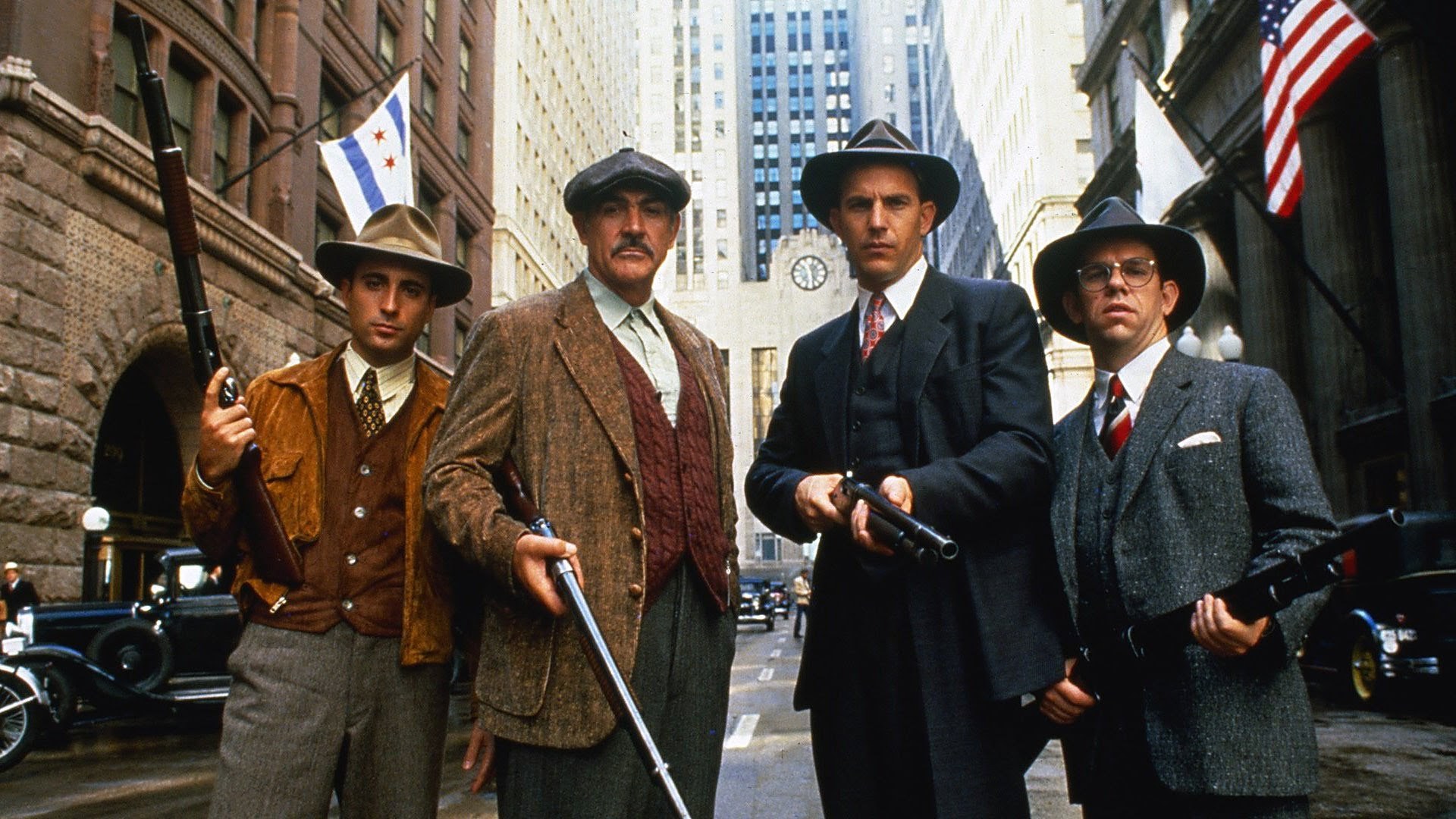
Capturing the sense of period was crucial to the look and feel that De Palma, Brandenstein and Burum were trying to create. Burum began his preparation for the production by looking at the work of photographers from the period, such as Margret Bourke-White, Alfred Eisenstaedt and Alfred Stieglitz, all photojournalists and industrial photographers of the time.
“After looking at a lot of the photographic style of the period, we decided that one of the key design elements of the picture would be repetitive images. In the works of fine art photographers like Bourke-White, there are pictures of many objects that are the same shape and tone and that go on forever.
“In the movie,” Burum says, “we did things with short lenses, like stack black Model A Fords in the repetitive images. In fact, we tried to have these images in most frames.”
Perhaps the most crucial decision in the making of the movie, was determining the format. Burum and DePalma opted for anamorphic as opposed to the 1:85 format. Burum wanted more space in his framing and wanted to “protect the compositional integrity of the film when it was projected on theater screens.
“By shooting anamorphic, you can hold the compositional integrity better, so that when the film is projected, the top and bottom of the frame is maintained, though in some theaters the sides get slightly clipped.” The compositional integrity in The Untouchablesis carefully preserved even in the 70mm blow ups, by using Technicolor’s full 70AR process. The choice of using the anamorphic format was essential to the shooting strategy Burum had formulated, and is the philosophical key to how he approaches shooting this period film.
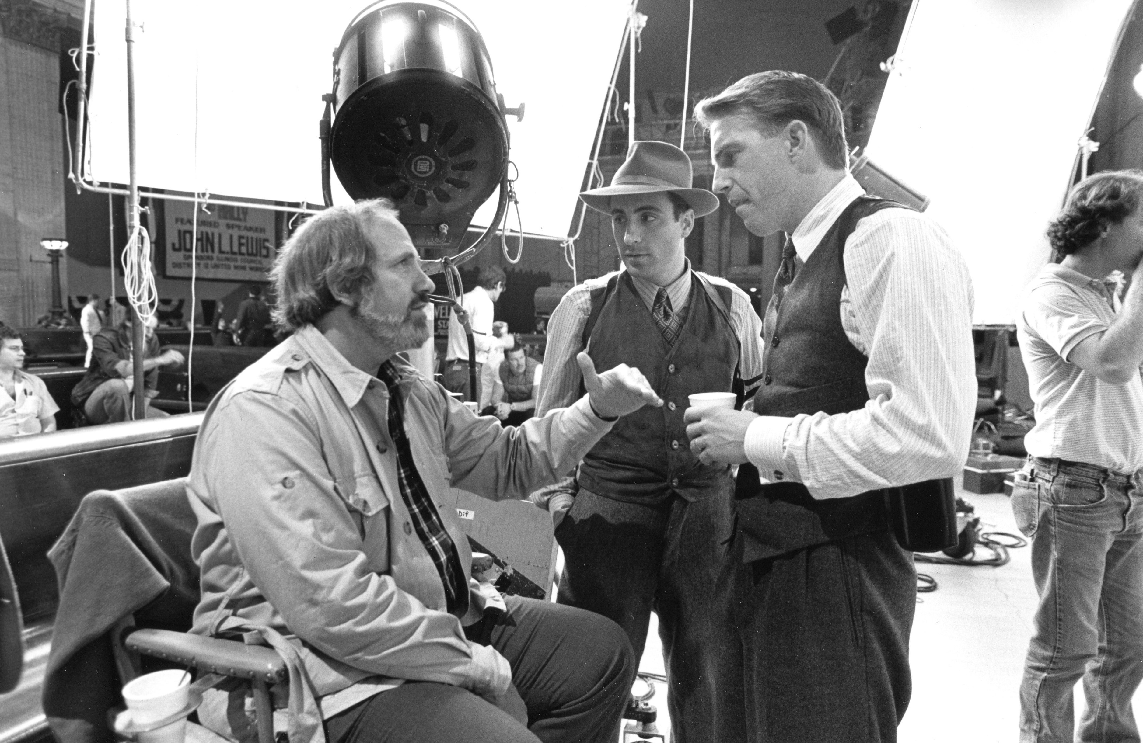
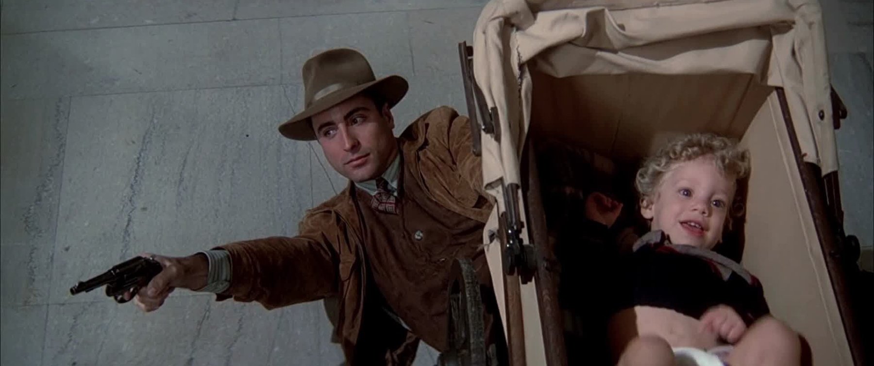
“People’s conception of period, usually extends to proper costuming. But it also should include movement,” Burum says. “Today so much time is spent with people in cars; people move faster, and things are constantly moving. You have a real feeling of movement in pictures now. You have a lot of long lenses. There’s a kind of claustrophobic sense, and that’s because people who are making pictures come from urban areas, where you get a sense of everything being compressed. You can’t see space. So it’s starting to be reflected in picture making, because it’s the thing that people perceive as the ambience of our times.
“In a simpler time, there weren’t as many people and there was more space. So, we tried to represent that fact in the way we framed things. We have a lot of space around people and the shots aren’t so tight. We use shorter focal length lenses. You always have a feeling of the environment of the people.
“If you’re going to show period or a certain time or place, one of the things that indicates this is what is around the people. You need some visual cue to tell you what the period is. So, it’s the architecture, it’s the props, it’s all those things, and you want to show them so the audience can feel they’re inundated by the environment. The surroundings are a dramatic element. We had to let the environment play.”
Just how the environment was to play led to discussions in pre-production. Those discussions led to trips to the Santa Monica bookshop, Hennessey and Ingalls Art and Architecture Books, where photos and art from the period were acquired as part of the research process.
“After reading the script, everyone does a lot of book work,” Burum says. “We used the books as visual references, because it’s difficult to talk about visual things and just use words.”
One of the visual elements that also allowed the surroundings to play was the use of color. Like the still photographer George Hoyningen-Huene, color consultant for George Cukor, Burum was acutely sensitive, not only of how to use color, but also how to take out color.
“When most people think of period pictures, they think of black-and-white, because that’s the way the pictures are represented to us historically. I think that the whole hypothesis that black-and-white immediately represents period is a little bogus. Now, I think black-and-white is a wonderful medium to be used, but it is rare to be allowed to shoot black-and-white anymore, so you must do period pictures in color.”
It should be noted that Burum shot a black-and-white feature for Francis Coppola — Rumble Fish, which was visually stunning; one he enjoyed doing very much.
Burum continues on this use of color in The Untouchables, saying, “Now you can’t try to do black-and-white in color. It doesn’t work. It’s a whole different type of medium. But you can subdue the color, so it doesn’t bounce out at you. You can limit the palette.
“For example, Ness’s world — his home, the police station — are very drab and subdued, while Capone’s world is opulent and shows his power. You can see the texture of the fabrics in Capone’s world, where there are a lot of satins and brocades. Ness’s world is simple worsted suits, plain white shirts and black shoes.”
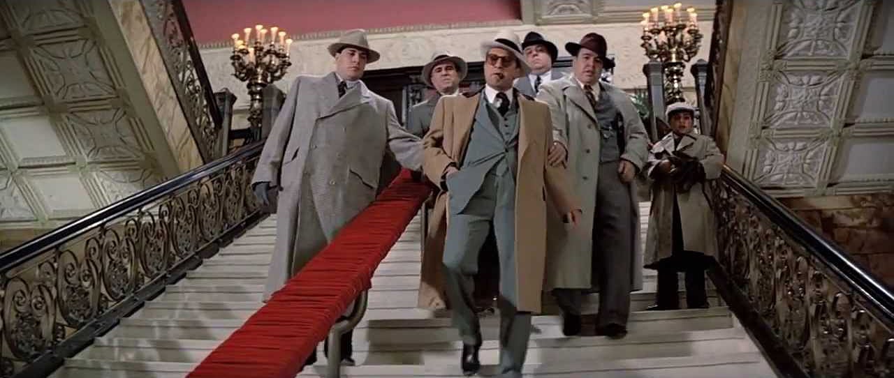
Burum was also able to “limit the palette,” by controlling the color temperature of his lighting scheme, as he points out, “There’s been a tendency for about 15 years to make everything golden and wonderful through the whole picture; it’s attractive. So, you see a lot of golden people on the screen. I wanted to do something a little more naturalistic.”
This meant that the light was cooler and close to the quality of light in Chicago, where almost seven months out of the year people are inside, protected from the cold, and maintaining what Burum calls their “soundstage pallor.”
“If things are golden,” Burum says, “there should be a reason for it, like a sunset.” Burum then uses two sequences from the picture to illustrate his point. “The last sequence in the picture is all done at sunset. Ness is remembering about everyone who has been killed, particularly his comrades.
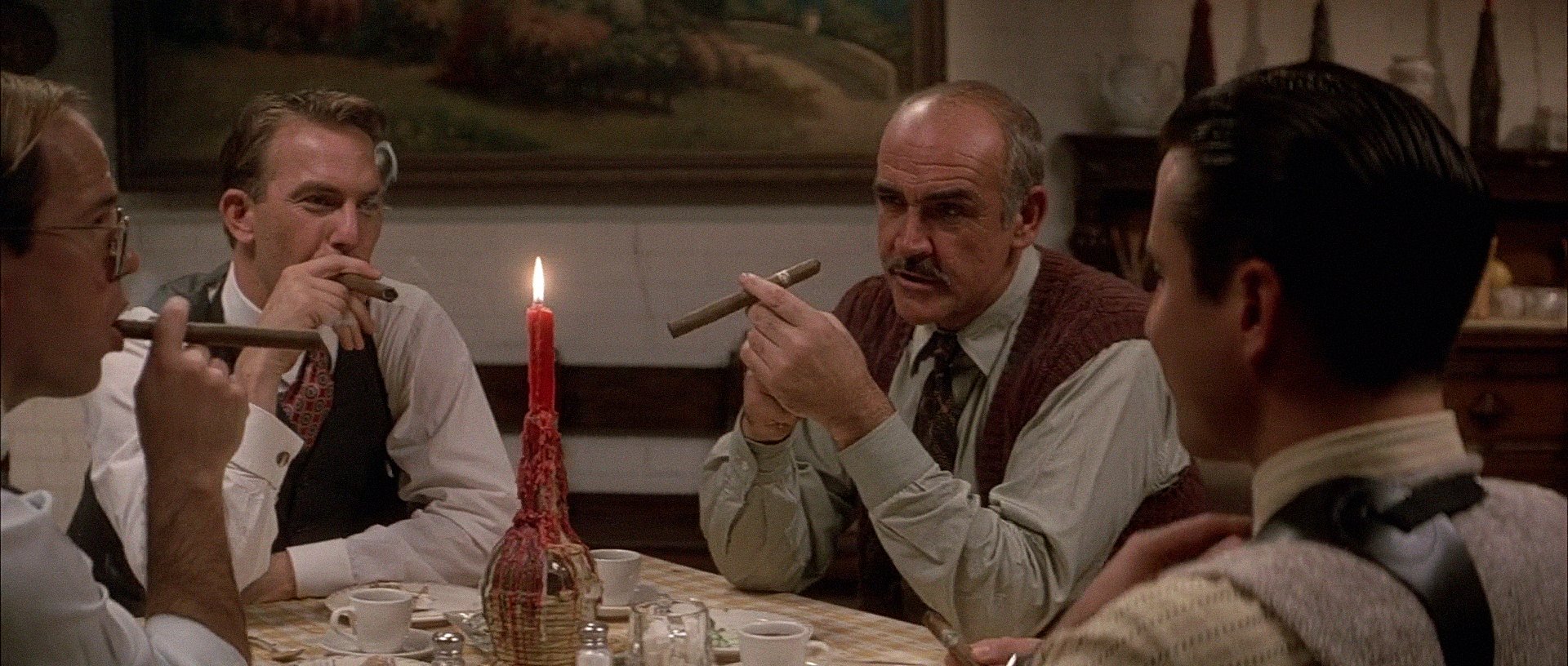
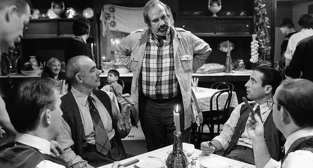
“The other sequence involves the Untouchables celebrating at dinner after their first successful raid on one of Capone’s operations. They have dinner at an Italian restaurant, and the sequence is done in candlelight. You feel the warmth and camaraderie. It’s a primal thing. Everybody is sitting around the campfire after the hunt and everybody feels they’ve accomplished something.
“Visually, we tried to tie those two scenes together. Those scenes are the first time we have the warm golden light.”
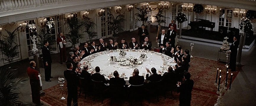
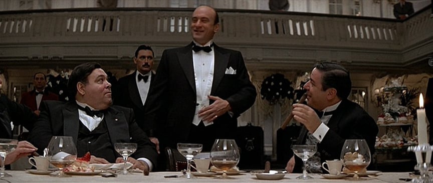
Realizing that a movie is more than composition, lighting and production design, Burum, like most good cinematographers, is profoundly aware of performance. When talking about performance and working on location, where sound problems often affect performance, Burum notes that “sound is always a real consideration, because you want the live performance of the people talking. Because, if the actors have to go in and redub their lines, its not going to be as good as the live performance. I don’t care how good any of the ADR works is, ADR is a fix-up.
“So, in the locations we used, I tried to give the sound people a break in difficult situations.”
Location and sound weren’t the only considerations that affected how Burum shot the actors’ performances. Their physical acting choices, no matter how small, were taken into account.
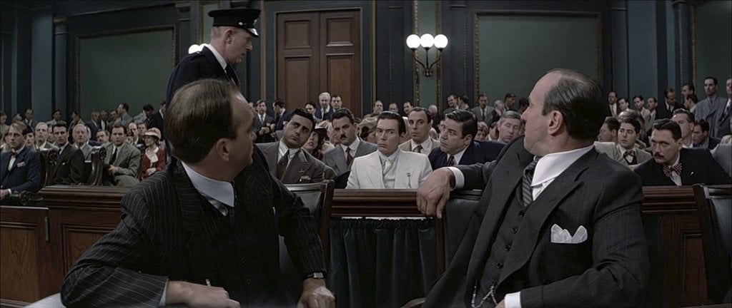
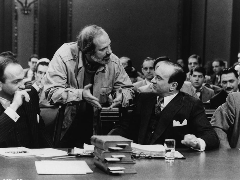
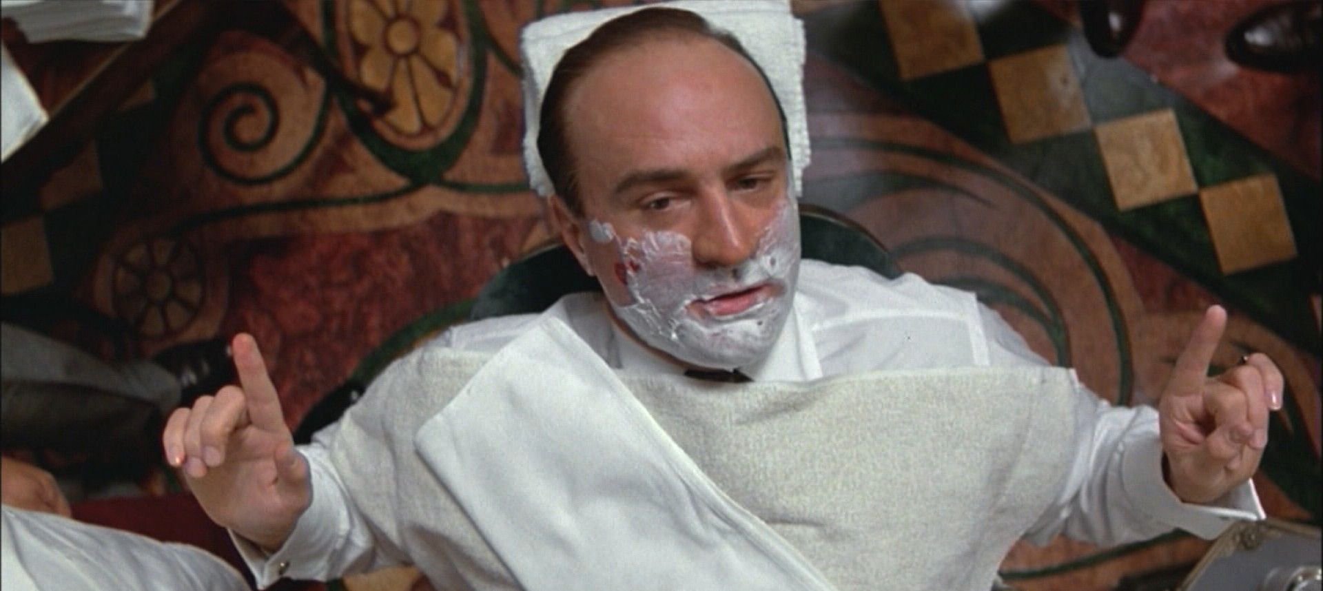
“De Niro, as Capone, did some very interesting things with this hands, and used a lot of body language. He needed space, an area for the audience to see the body language work,” Burum explained.
“As a cinematographer, you have to respect elements like De Niro’s use of body language and gesture, and use those elements in framing shots. If you don’t do that, you’re cheating the actor and you’re cheating the audience. As a cinematographer, you have to recognize what the dramatic values are in order to show them. The actor and director point you to where the important elements of emphasis are and you have to recognize that emphasis. So, watching rehearsals is important.”
As are the storyboards, Burum adds, then goes on to describe De Palma’s unique storyboarding methods. “What he does,” Burum says, “is go on locations with a still camera, and he’ll play the whole scene out with assistant directors and other production people, and shoot the whole scene with the still camera. If there aren’t enough people, or he wants to show something, he’ll draw it in with a marking pen. They are not beautifully drawn storyboards — if someone is supposed to be happy, he’ll draw a ‘happy face’; or a frown if they’re supposed to be sad — but these storyboards show where everybody is and what the relationship is, and what coverage you’re going to need and how much you’re going to need physically to do the shot. It gives everybody a blueprint of what’s going to happen.
“He’ll vary from it, but the big broad strokes are there, and we refine what the shots are.”
De Palma’s still camera storyboards revealed a specific cutting rhythm — or rather lack of cuts. The Untouchablesis a movie of camera movements. Burum talks about two scenes that reveal the reliance on camera movement (part of the reason to use camera movements over cuts, was two-fold — to avoid the talking heads look of TV and to maintain a certain integrity and pace to the performance.) These scenes and the camera moves they contain, introduce the two main characters — Capone and Ness — and washes both characters in a sense of myth. This sense of myth is in marked contrast to the cutting rhythms of the TV show, which borrowed much of its visual style from Water Winchell’s staccato voiceover narration.
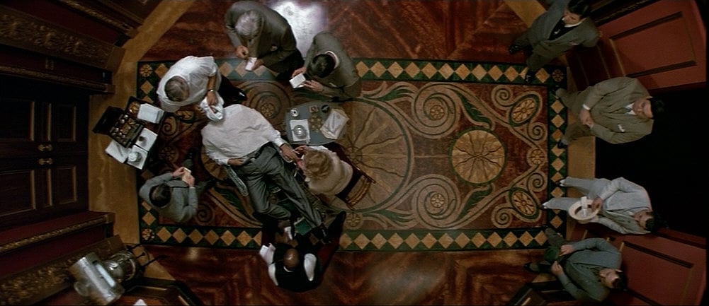
“The opening shot,” Burum says, “is a crane shot looking straight down on Capone, sitting in his barber chair in his opulent hotel suite and surrounded by reporters. The camera moves in to a close shot of Capone’s face, as he gives a speech to the press that justifies his bootlegging operations.”
In this shot Capone is presented as a man of “charm, charisma, and folksy urbanity.” Burum continues, “The reason we did the big top shot of Capone, is not only because it’s graphic and interesting, but it also gives the audience the feeling of a special point of view. It’s a psychological angle.”
The camera moves that reveal Costner’s Elliot Ness, also create a psychological impression on the audience. Ness is seen with his back to the camera, as his wife prepares a box lunch for him, and sends him off to work, as though he were a typical suburban office worker. The next shot is a close shot of the police chief who introduces “Elliot Ness, special investigator.”
The camera dollies sideways revealing Ness for the first time, standing before the reporters just as Capone had done previously.
“Because you don’t see Ness’s face in the first of the shot,” Burum says, “this lends him the same kind of mythic stature that Capone has.
“The whole idea of emphasis and moving the attention of the audience is very important. One of the best ways to learn this is theater. Strong moves in theater have their equivalents in movies. A lot of the same rules of staging and performance apply to film.
“Reading and eyescan determine strong and weak moves both in theater and film.
“It’s interesting to see a Chinese or Japanese movie, where their eyescan is totally different from ours — going from right to left in up and down motions, as opposed to Western reading eyescan that goes from left to right in downward motions. They compose differently, in most cases, than we would.”
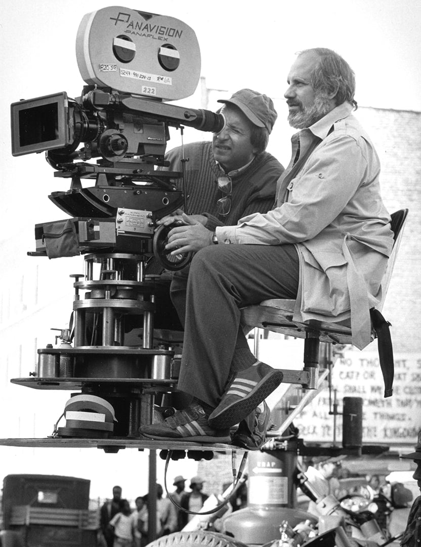
Working with Panavision equipment, Burum kept his lens relatively clean, using diffusion only on his close-up work with actors. Though in this picture, he notes, “there aren’t many closeups. We have only two extreme close-ups in the movie. They are between Elliot Ness and his wife. It is a warm, intimate moment, that later emphasizes how Ness has changed in the course of the movie. He becomes, because of the loss of his friends and the violence of Capone, like Capone in his ruthless pursuit of the bootlegger and racketeer.”
Like Scarface, The Untouchables is an interesting change from what is thought of as the usual De Palma genre. Burum, who worked on De Palma’s Body Double, is especially fond of the working relationship he’s developed with the director; and admires the his stylistic storytelling techniques.
“Every morning, when you come in, you talk to the director about the scenes to be shot; and I feel it’s part of my responsibility to present him with another approach from what we have already talked about. So, when the Italian restaurant scene came up, I said to Brian I have a new idea about the scene. We have this warm, golden wonderful feeling; and you have a long shot with tables stacked up in the foreground. It’s dark. These guys, the Untouchables, are alone. They’re talking. We dissolve from position to position, moving close and closer, so you feel that time is passing and they’ve been there for a long time.
“Brian said it’s a good idea, but he’d like to circle around them. I realized, by knowing his other pictures and working with him before, that this is one of his visual symbols. It represents love and camaraderie. He’s done this in Carrie and Obsession and in Body Double. It’s one of his visual signatures.”
The De Palma/Burum working team is based on Mike Nichols’ “big, hard decision” about how to use the technology to tell a story, or, as in the case of The Untouchables, to create a sense of mythic confrontation between good and evil — which is at the core of all of De Palma’s movies.
“Creatively, Brian makes it very easy for you,” Burum says, “mechanically, it’s very difficult to do what he wants. The thing that makes it easy to work for and with Brian, is that he knows what he wants to say. He has a fresh way of communicating that point of view. It’s all very unspoken. You recognize this.”
The ability to recognize is a concept that is a mainstay of Steve Burum’s photographic philosophy. It is how he is able to discern the actors’ and the director’s intent and visually dramatize that intent for an audience. It is a variation of critic John Ciardi’s question “How does the film mean, not what does it mean?” The “how” is grounded in not only a thorough understanding of the technology of moviemaking — lenses, aspect ratio, lighting, etc. — but also in a deeper understanding of how the technology shapes and propels the story. Or, as Burum simply puts it, “It isn’t about the tools, it’s about how you use those tools to tell a story. We’re all storytellers in this business.”
If you enjoy archival and retrospective articles on classic and influential films, you'll find more AC historical coverage here.
