I’m Dying Up Here: Designing the Seventies
Production designer Ruth Ammon discusses re-creating the 1970s and her collaboration with the show's creative team.
Production designer Ruth Ammon details her approach to creating a period-correct setting for this era-specific drama.
Images courtesy of Ruth Ammon
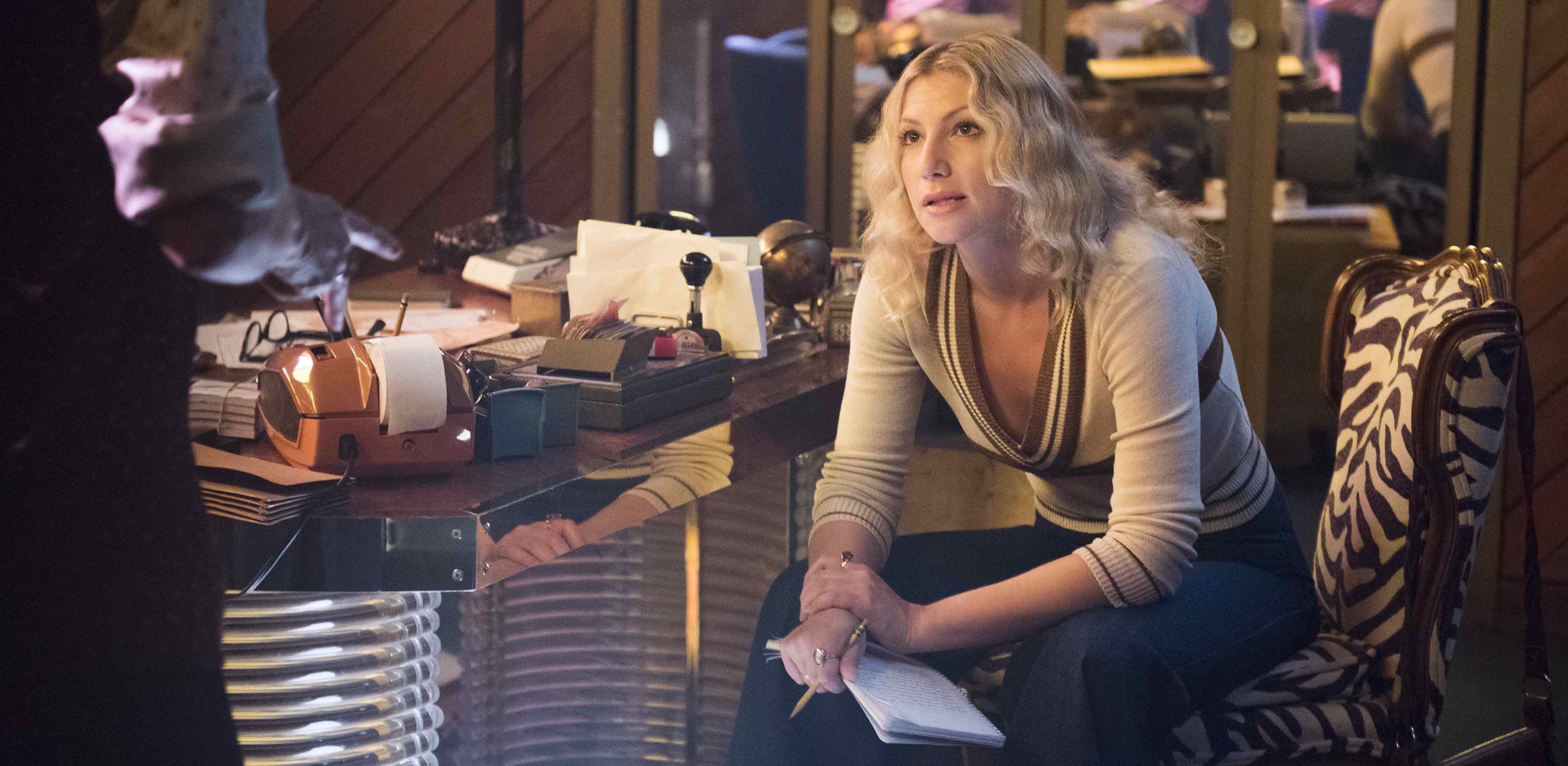
In our September issue, AC featured an in-depth piece on our set visit to Showtime’s scripted series I’m Dying Up Here, which follows the lives of struggling stand-up comedians in 1970s Los Angeles. Our visit took place on wrap-day for Season 1, during which cinematographer Peter Flinckenberg, FSC (who shot episodes 6-10) made special mention of production designer Ruth Ammon, with whom we chatted briefly while on set. Following our visit, we had the pleasure of chatting on the phone with Ammon — whose credits include Heroes, The Following, 12 Monkeys, Manhattan and the upcoming Tom Clancy's Jack Ryan — to discuss her contributions to the show.
American Cinematographer: Tell us about your experience working with cinematographer Peter Flinckenberg.
Ruth Ammon: Peter’s process started with collaboration and building the creative team. I want to give him the kudos that he deserves. Often, with the staggered hiring process and the general ‘it’s all too fast’ nature of television, the cinematographer and the [production] designer are not given enough quality time to work together. We often orbit in two different worlds once we are in ‘series mode.’ Those aren’t the shows that I want to work on. I want to work on shows where we develop a look, and for each episode we all do our unique jobs [and develop] the pathos together. I always appreciated Peter’s asking, ‘What’s your thought here?’ And then he would go with it, and bring in his work.
He made it a collaborative process?
Ammon: Yes, very much so. And when he came on board the show, it really changed the whole thing. He has his style, and he wants to know what everyone else is thinking in order to move forward. We don’t have that much time on a television show — we only have eight days per episode. When you do a feature, you can sit around the table and talk about stuff a little bit longer — but on a television show, to keep it feeling like a cohesive story with a cohesive look, you need everyone to work together.
What about your collaboration with costume designer Christie Wittenborn?
Ammon: The best. That was so key. So much of what we do is share research, references and ideas. I would find reference photographs and Christie and Peter would both ‘get it,’ and they would offer feedback. It kept us all understanding and building the characters together — along with executive producers David Flebotte and Michael Aguilar. I think Peter, Christie and I were a very cohesive unit. We are all building characters and the story with the tools we have.
What specific elements of the show did you discuss with Peter?
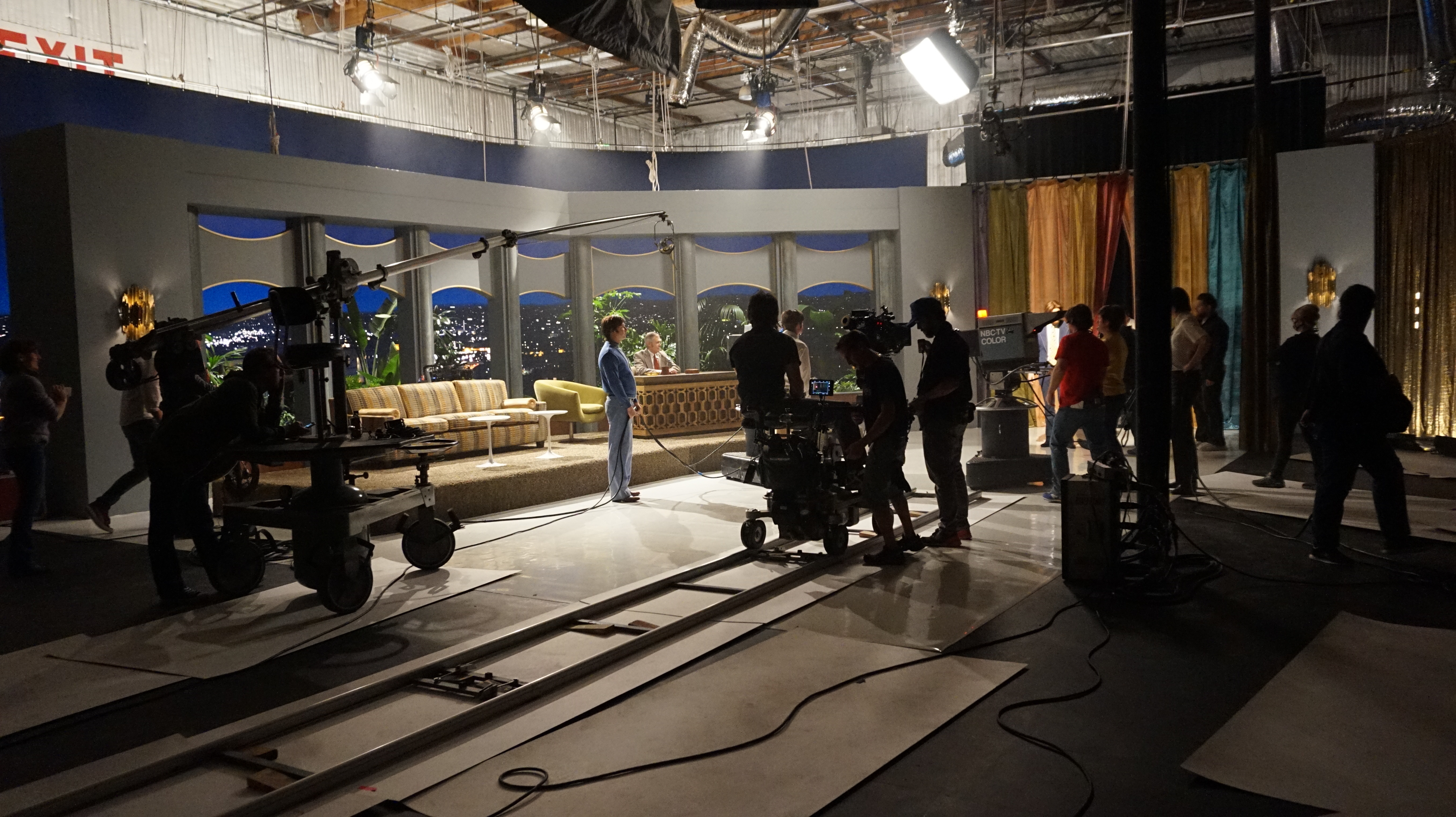
Ammon: One of the first things I remember is when Nick [Jake Lacy] comes back to town and he gets a call to go on The Tonight Show [Starring Johnny Carson]. [The character has] just done heroin, and he walks through the studio, behind the curtain, down the hall, and then [it’s revealed that] he’s on The Tonight Show. What we talked about a lot [for this sequence] is whose point of view it is — who is ‘the camera’ at that moment. Peter made it about Nick and his being high, and what he would see. One way I helped was by putting mirrors and lights in certain situations to help create that [perspective] — that feeling of being untouchable, and higher than everyone. Peter brought that. This was also a [situation] where we didn’t have a lot of scenery, so we had to create scenery through lighting and reflection. Light is such a critical part of this story. Theatrical light, natural light, lack of light. We all worked on that together.
[Lighting] was something with which I had more success with Peter than anyone. [The show is] about people who are striving for the light. They are driven to perform, so the finding of light is such an important metaphor for what we are trying to do. And when you see a lot of the characters, the interiors are kind of dark and natural — and the light only got pushed up as we went toward the corporate level.
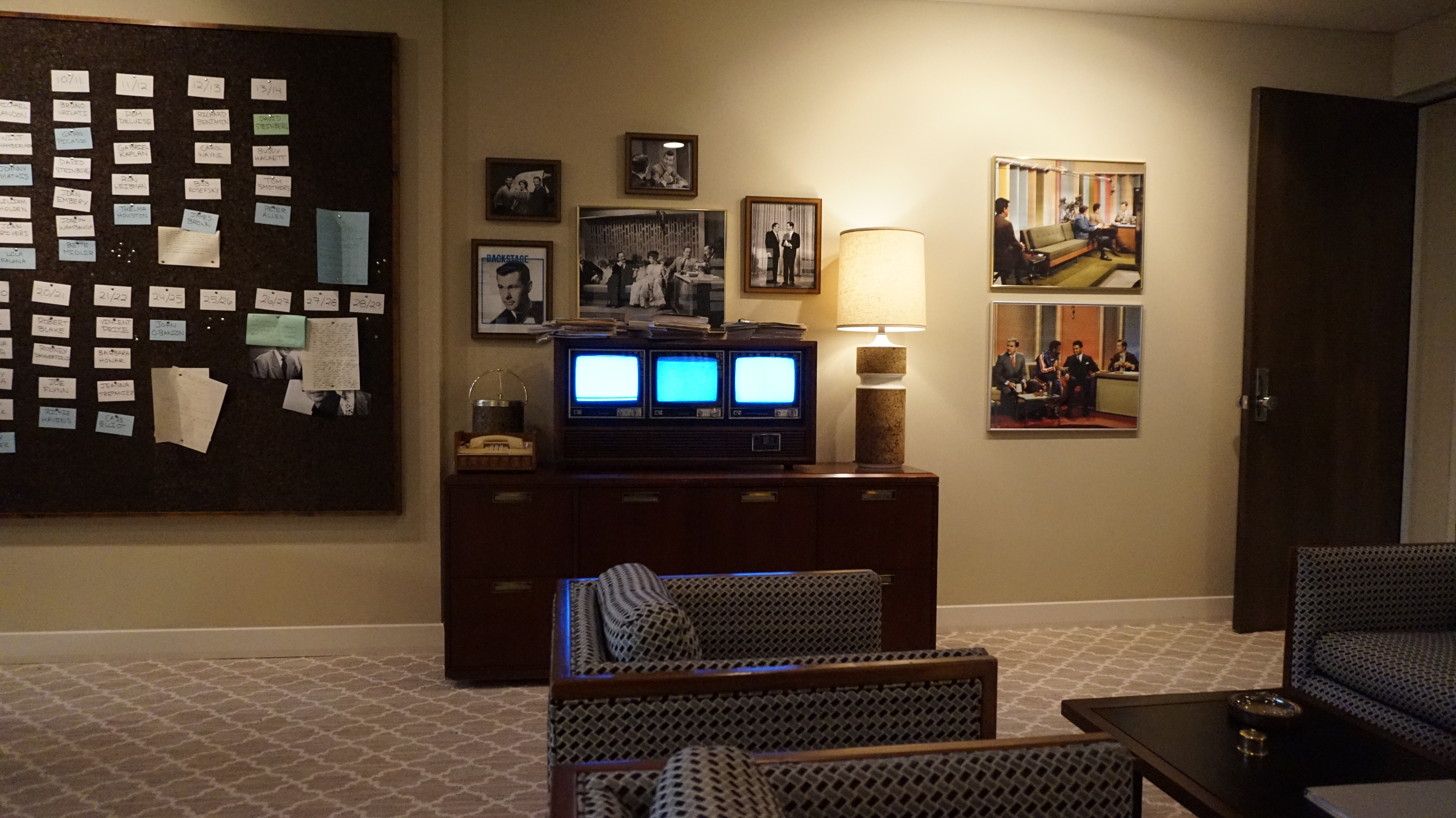
The Tonight Show Starring Johnny Carson was a very bright, corporate look. As comedians, the characters’ world starts pretty dark, gritty and complicated. But when you finally reach that apotheosis — The Tonight Show, the top level of every comedian’s dream — it should be cleaner and sleeker. So I felt like the whiteness is what would make it ‘less interesting,’ in a way. It was about paring down the light, paring down the choices, and paring down the detail, so that it has a cleaner, corporate, almost dreamlike quality.
What are your responsibilities in situations like the one you mentioned, when there is minimal scenery?
Ammon: I usually have to pitch something — like, ‘How are we going to do this scene?’ and ‘Where can we do it within our time frame?’ Because there’s always too much to do and not enough time. You can’t move stage to stage, so I have to find a location and walk through it myself, and kind of feel the story through. Then I try to convince everyone that it’s going to work. Sometimes you have drawings, and sometimes you just have to go off the cuff and say, ‘We could put a curtain here, a mirror here and a light here. We’ll have someone walking by with the clipboard.’ And when you work together with a cinematographer, they can say, ‘Okay — you don’t have to complete that edge of it, because I’m going to put a big light here, like a big flare, because this guy has done a lot of drugs and he’s out of his mind.’ And [we discuss] where we want darkness and light. My responsibility is to pick something to see if, together, we can make that thing work. Then you work together with the practical elements. This [sequence] was a particularly psychological moment — and the best part of working together is those kinds of moments.
How did you scout locations for I’m Dying Up Here?
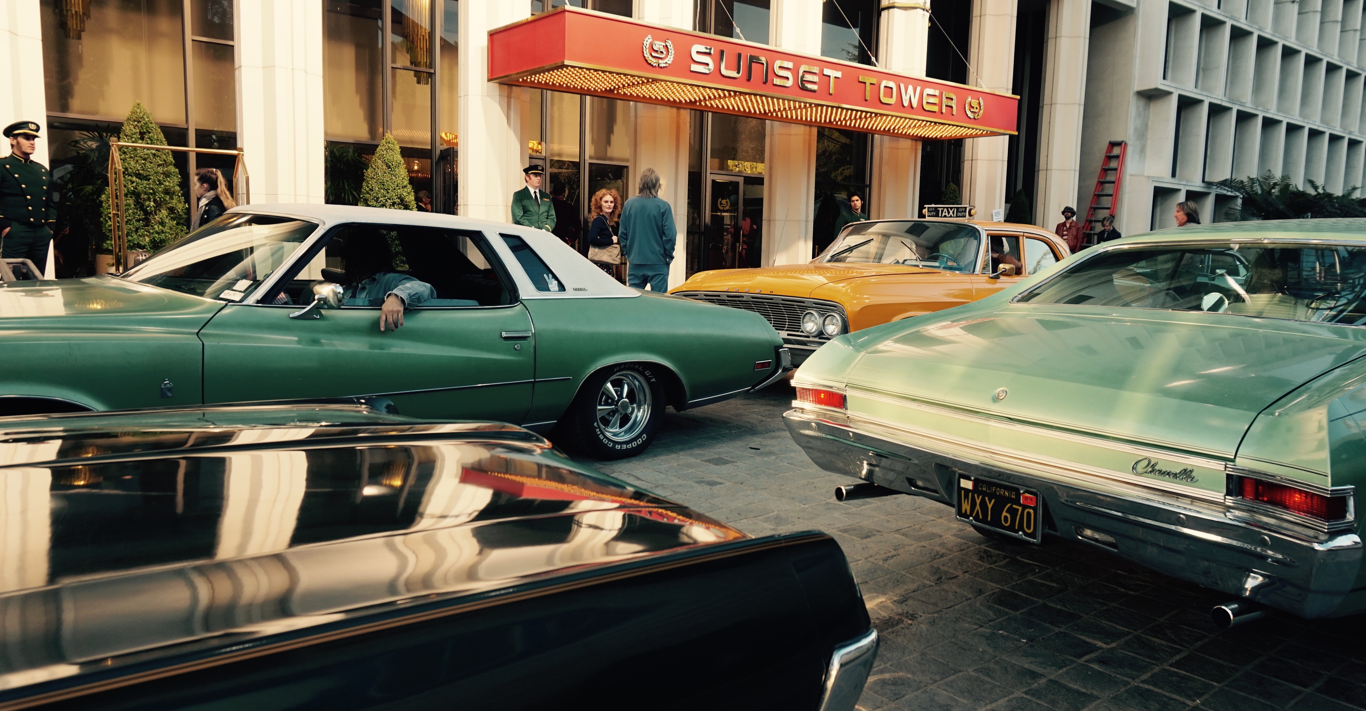
Ammon: Together, the locations team and I bring them to the director and the cinematographer. I’ll pitch an idea like, ‘He comes out this door and then he goes over there.’ Because we’re doing a period show, [we have to consider] how much of the world we can see, and how much — if at all — we can control the road. We want to see Sunset Boulevard, for example, or we want to feel the back of the hills. I need to give them a wider frame in which they can find their frame. They’ll frequently ask me what’s period, what’s not period, and what we need to avoid, because it comes down to [those elements], as well as what the look of our show is, and what we are able to control. What can we decorate, or dress with cars — or can we bring in a bus? That mainly starts with me.
Then you collaborate from there to make it all work?
Ammon: Yes — then we’ll scout it together. I remember a sequence on Echo Park Avenue and Sunset. We used that area quite a bit. It’s on its last legs of being vintage, but it had that feeling of Sunset in the Seventies. It had a lot of buildings from the Twenties and Thirties, and it’s kind of run-down and layered with an accumulation of periods and signage. There are even bits of the Sixties in there. We just liked the overall vibe. I found a taco stand that they loved. At the end of it, Peter and the director decided the best angles. The cinematographer sets the tone and the mood with the choices of lens, lighting and camera movement. We discussed ideas like, ‘Let’s use fluorescence in here, because that way the inside will be lighter than the outside.’ You’re always collaborating, especially at those moments on tech scouts. You want to make everyone’s job faster, so they can actually get the wider shots. You try to give them a little bit more than they’re expecting, so they can move with a little bit more ease.
Tell me about this idea that locations in Los Angeles are on their ‘last legs of vintage.’ Are you referring to the old landmarks and bits of vintage L.A. that are being torn down in favor of modernity?
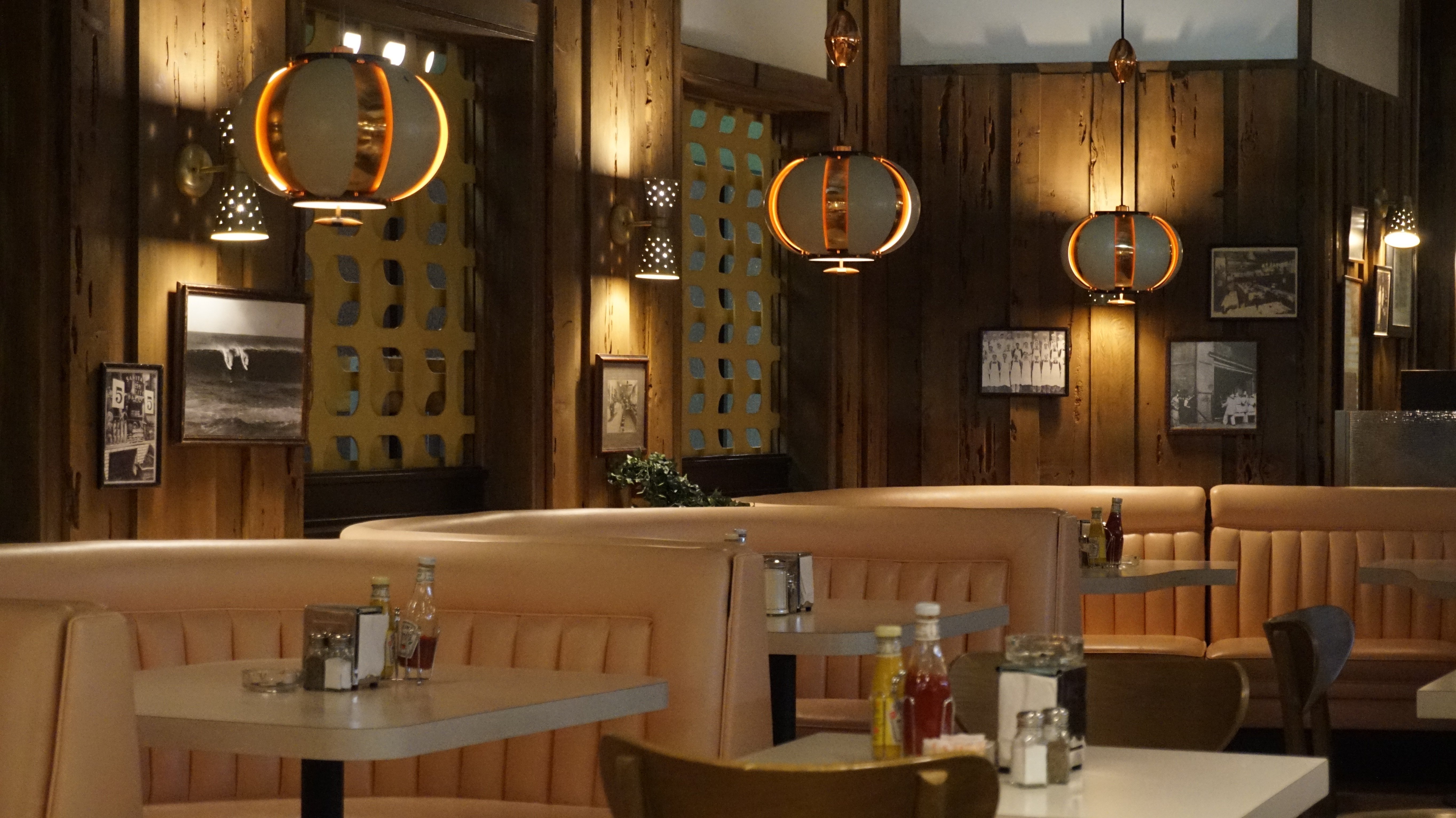
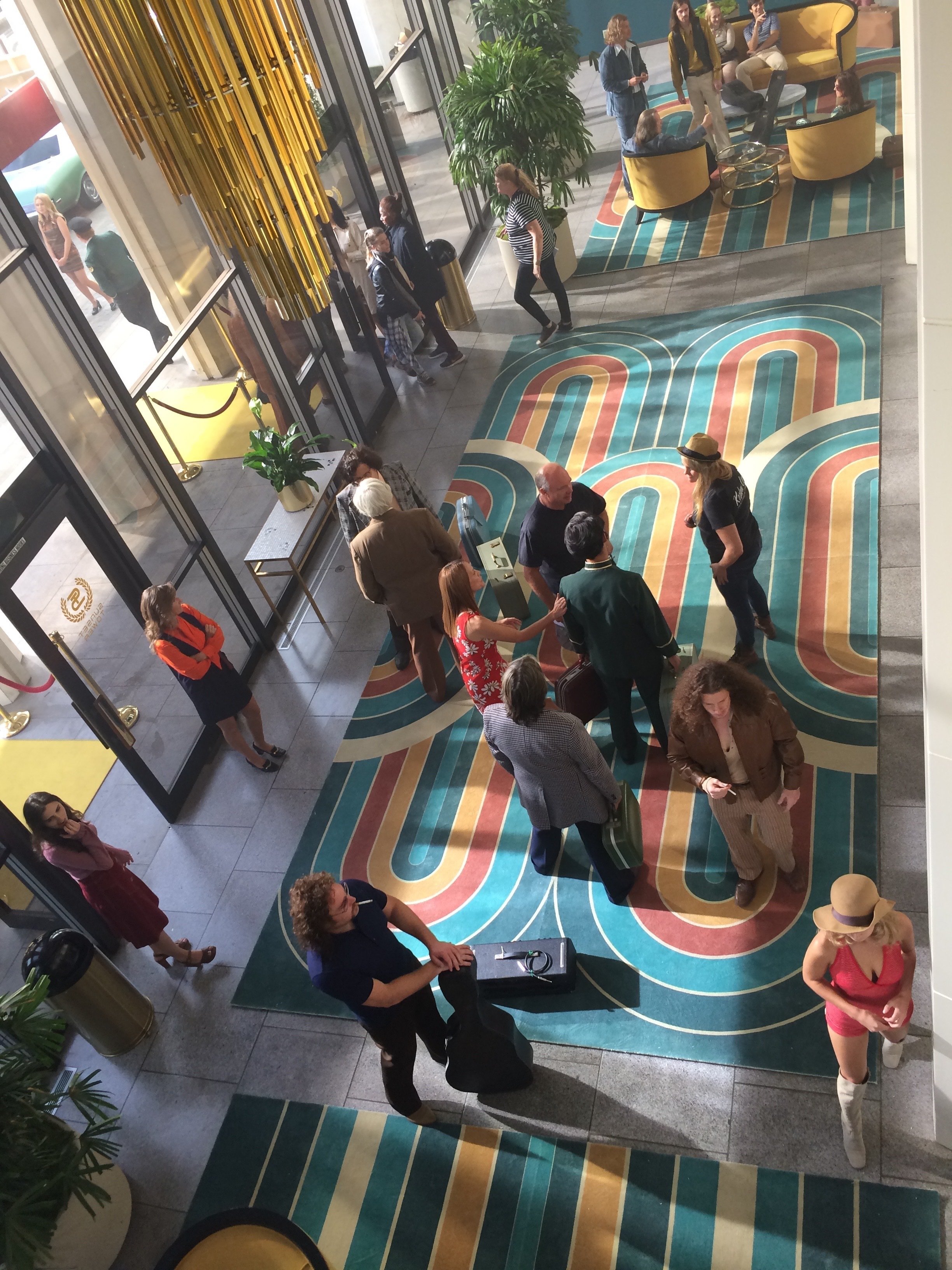
Ammon: Yes, or just becoming the next theme park. I’ve lived in [the Silver Lake and Echo Park neighborhoods] for around 20 years, and my husband has lived here for around 35 years. It reminds me of all those Ed Ruscha photographs of Hollywood Boulevard and Sunset Boulevard in the Seventies. There’s no other city with these really wide boulevards. There’s no urban environment here — it’s this really strange urban-ness that I think is unique to L.A. In Silver Lake, there are lots of nice, interesting buildings from the Twenties and Thirties, but now they’re being torn down for cheap condos and more expensive housing. The authentic cafés and coffee shops are [being replaced by] five-dollar-a-cup coffee places. Diner cafés and breakfast places that were the staples of that generation — where you get a cup of coffee for 25 cents and hang out all day long — those kinds of environments don’t exist anymore.
How do you continue to create vintage environments for a period show like this, when these places are disappearing?
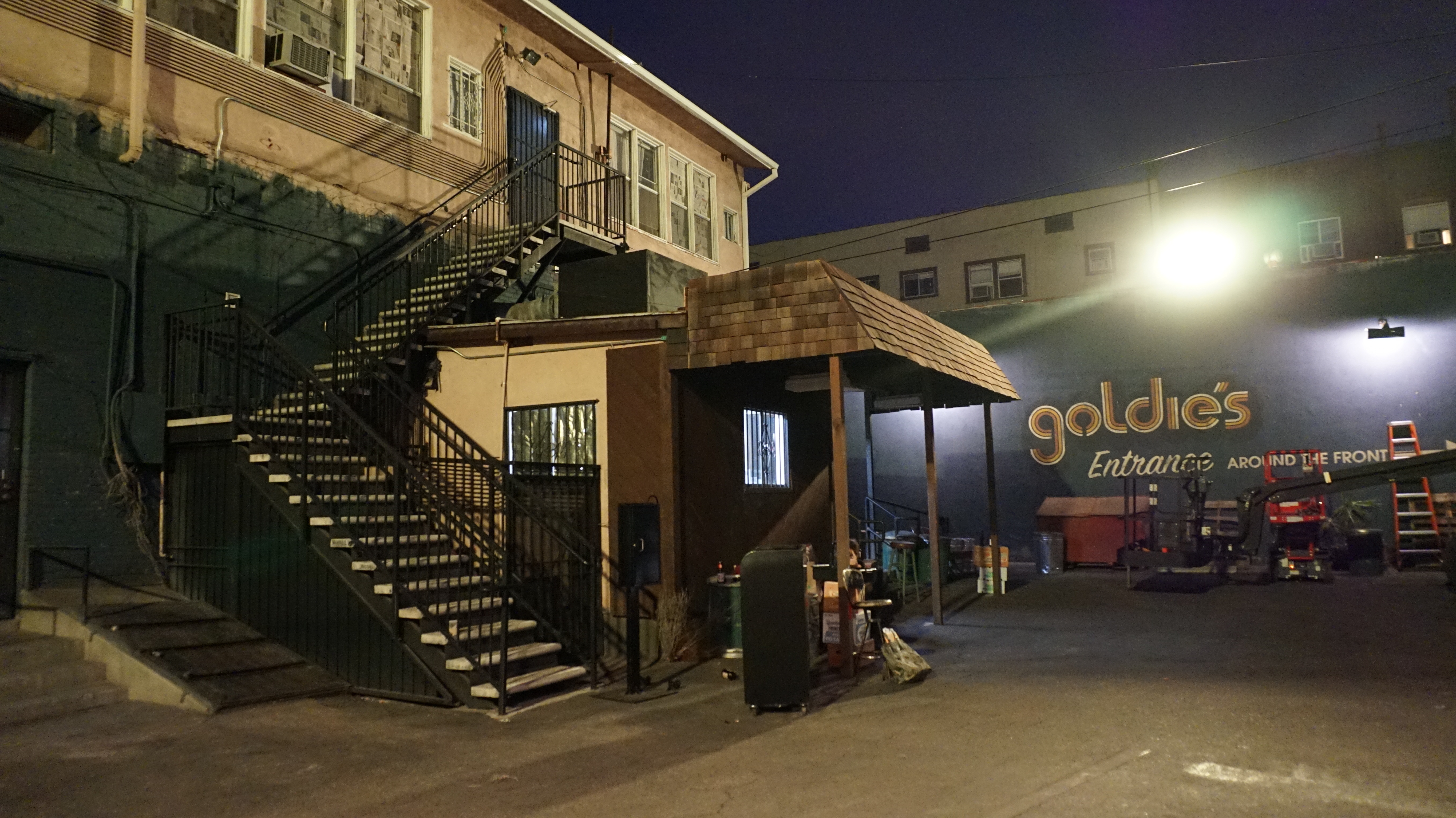
Ammon: At the end of the [Season 1 shoot], I was like, ‘Oh my God, if this show comes back, how am I gonna do this?’ But I think you just keep moving, and keep reinventing how you do it. On the pilot, for example, we could not figure out how to do Sunset Boulevard, and eventually we came up with this crazy idea of doing it up in the [San Fernando] Valley [on wide streets to simulate Sunset Boulevard]. We found all these empty storefronts that had that feeling, and we dressed them. Then when I went back on the series, those shops were all coming down. L.A. is a place of constant renewal.
It sounds like it’s going to become more of a challenge moving forward.
Ammon: It is. When I first came here, downtown was empty and you could do whatever you wanted, and there were all these wonderful turn-of-the-century and older buildings that you could film in, and dress, and do what you needed. Those are gone, and people are figuring it out. Unfortunately, what’s happening is people are going to other countries — but I don't think you can create Los Angeles in another country very well. It has such a specific vernacular that I think would be hard to re-create. There are still pockets, because I found more of them toward the end of the series. I didn’t know the whole [season’s plot], so each week I was making new discoveries about what we needed and where the story was going. This show was always moving, and we were always developing a new character each week — or the characters were going somewhere else, or to another club. It was constantly evolving. You have a language that you set from the beginning [of a project], but you also have to adjust it as you go on.
In Culver City — where we actually had our studios — and the nearby areas, I think there is a lot of Sixties stuff [still standing]. I’d like to explore that in the future.
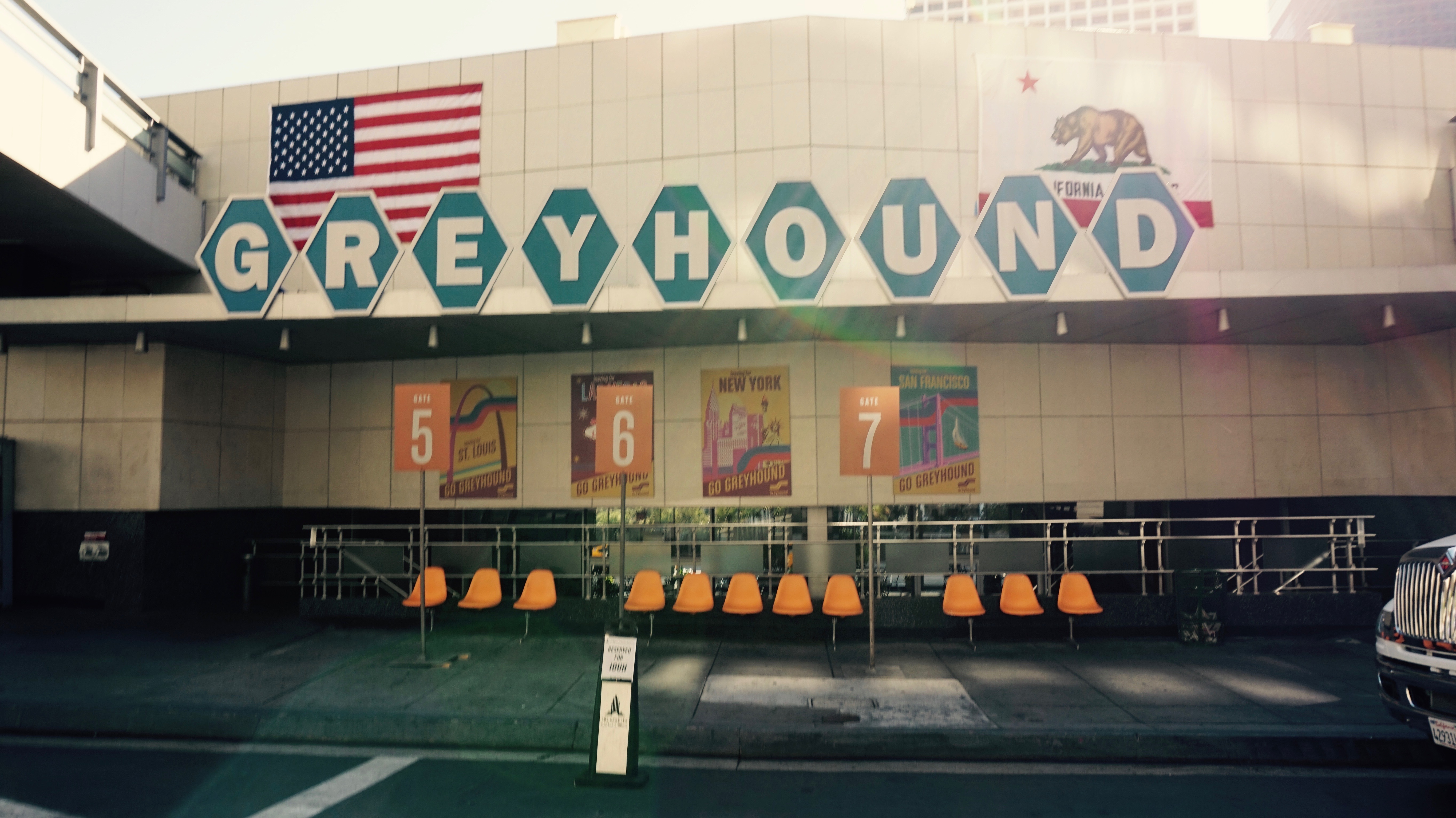
What was the overall production mandate when it came to the vintage look of the show?
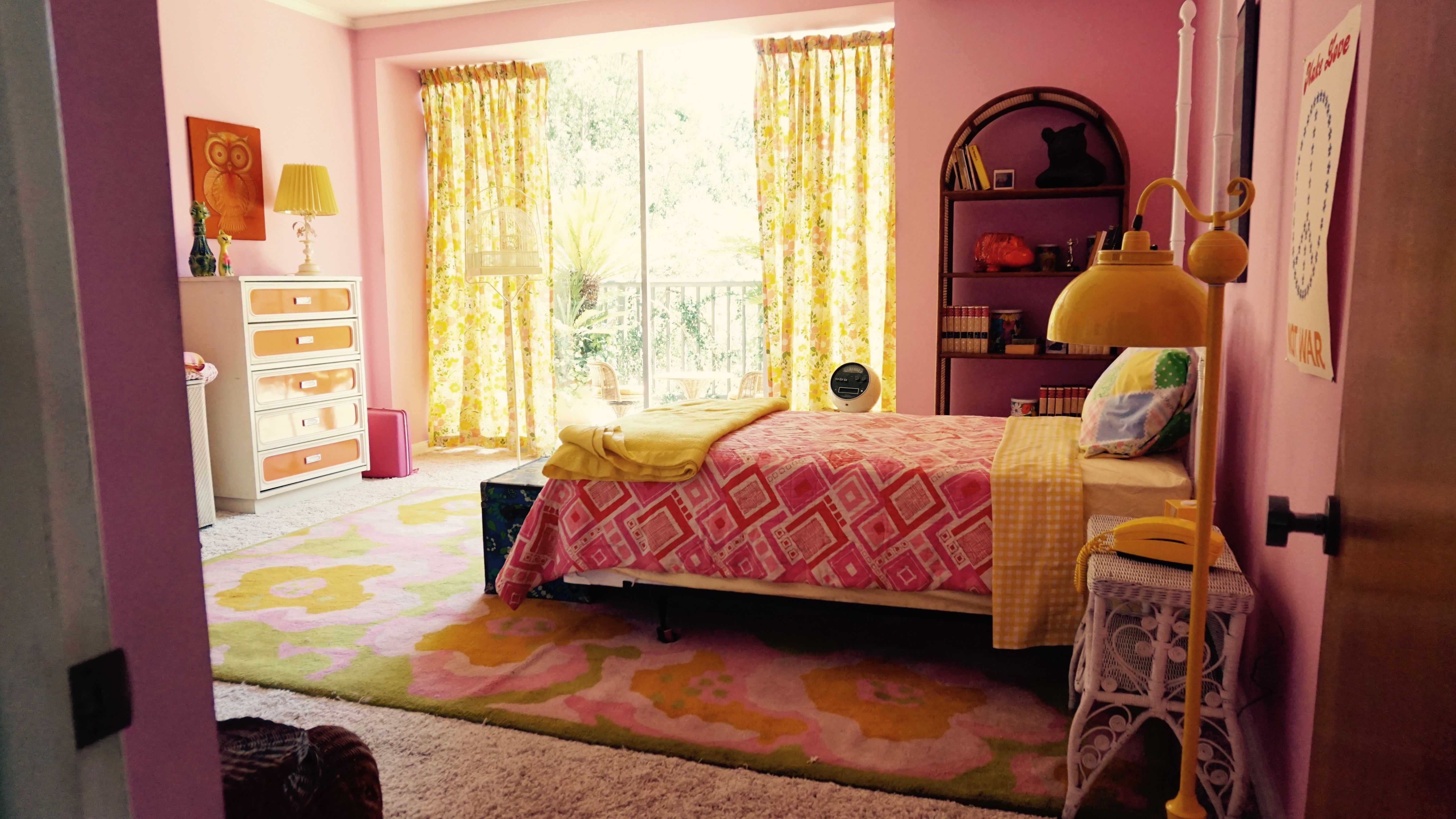
When I had my first meeting with David Flebotte and Michael Aguilar, they [told me they] didn’t want it to be a goofy Seventies show. They wanted to make sure that it felt normal outside, like a regular place and not screaming ‘Seventies’ all the time — because the Seventies were changing so much over that period. I think what they were mostly interested in was [when] all these people came to L.A. to start this new dream. There were all these rock-star wannabes, entertainment people and comedians. It was kind of a Wild West.
What was your process for designing the Let’s Make a Deal set?
Ammon: For that set, we discussed which colors we were going to use and what kind of movement would occur, and we worked on lighting queues together. I had an assistant who helped me put together little clips of the shows we were [re-creating] to show them how the lighting queues worked. We had to have that kind of communication. You had to be prepared for this kind of theatrical and vintage lighting.
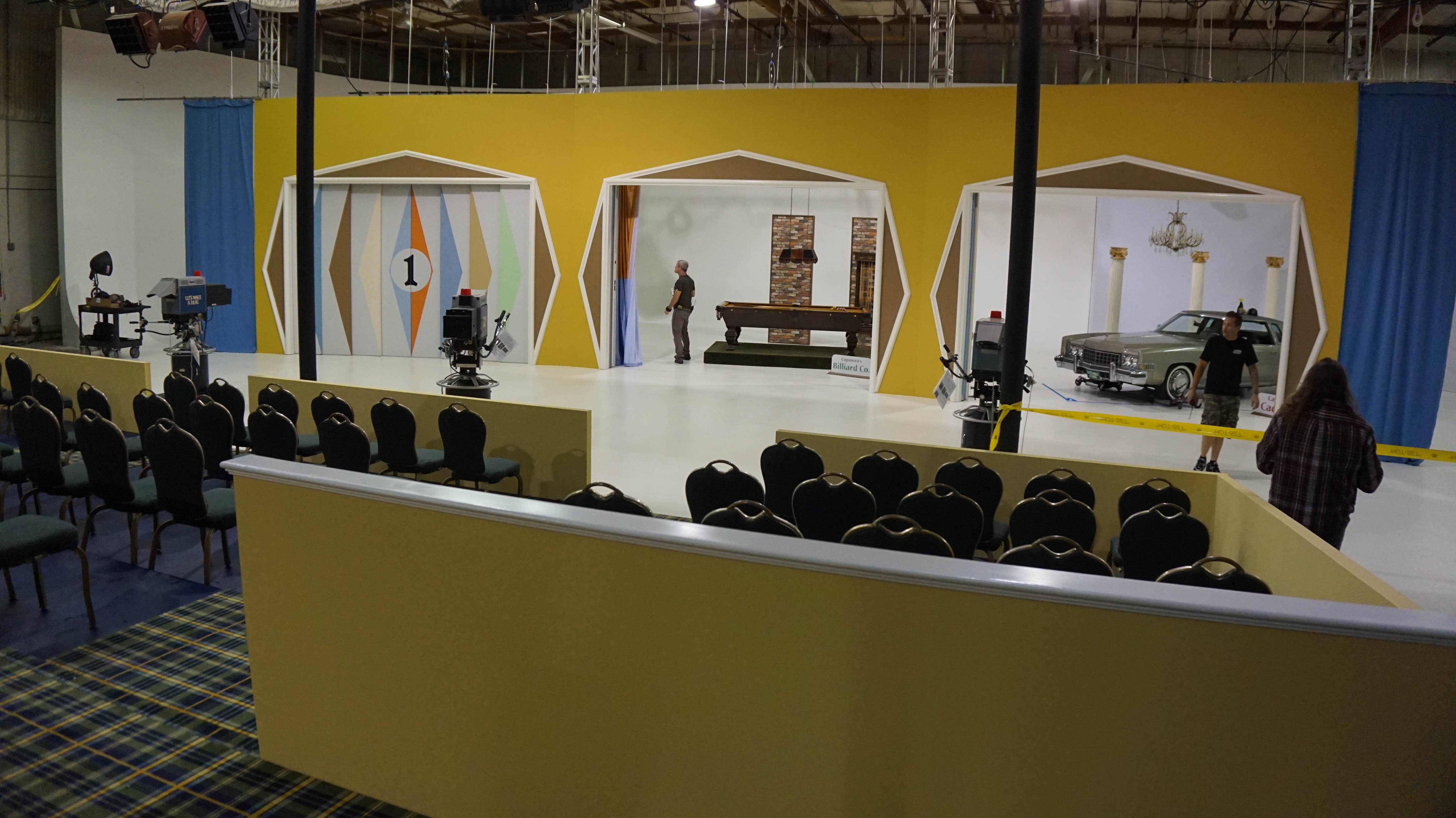
Do you usually have that kind of input and collaboration in terms of lighting in the work that you do?
Ammon: I do. As a production designer, I know that light is what shapes everything you bring to the set. Light shapes the architecture and light shapes the furniture. The kind of light, the source of light, the shade on the light — they’re all [part] of the immediate storytelling. I have to be very mindful, from the get-go, of where the light is coming from and what kind of light it is, and to [assist] in giving a cinematographer opportunities to change that lighting for the emotion of the scene.
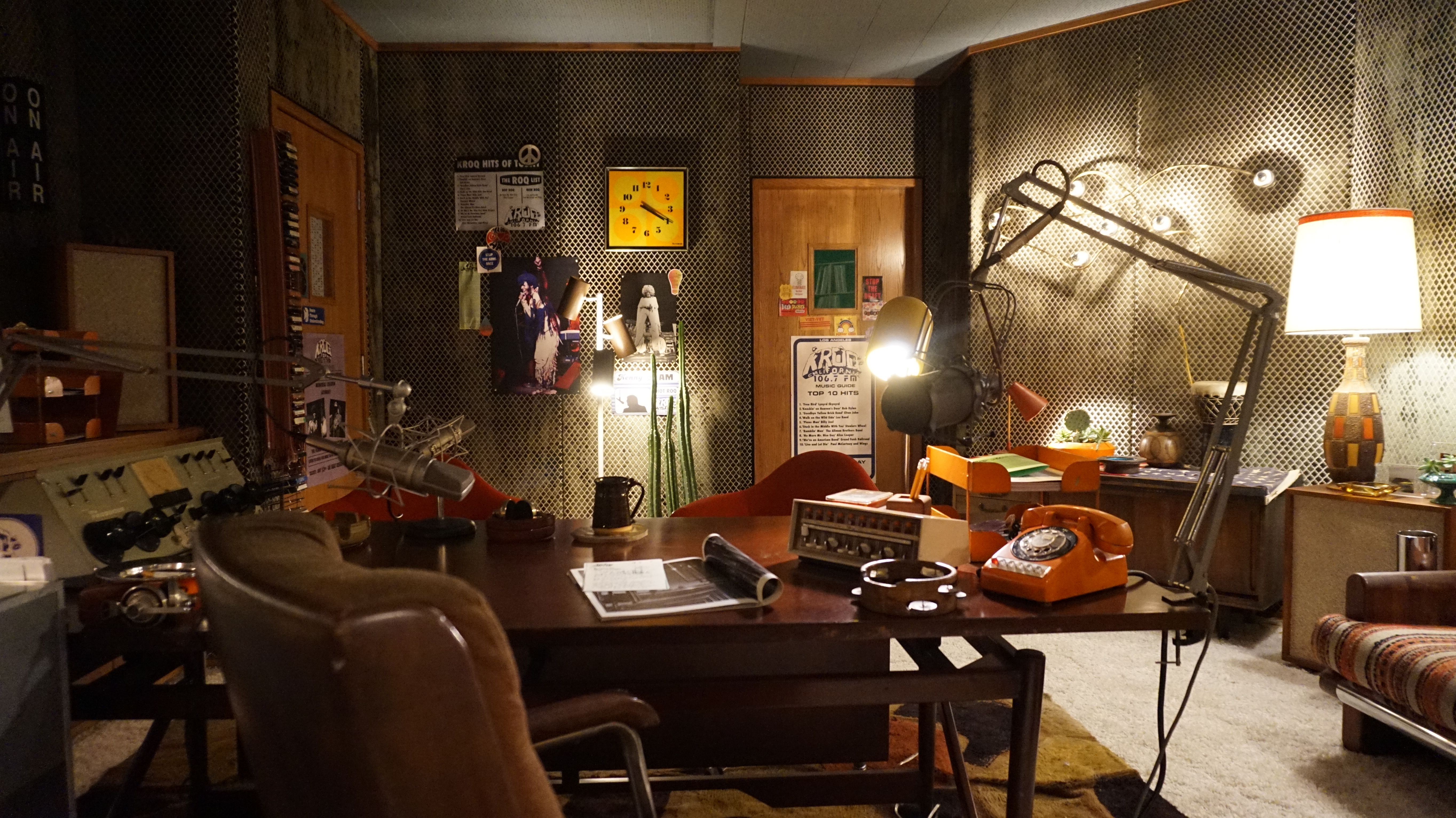
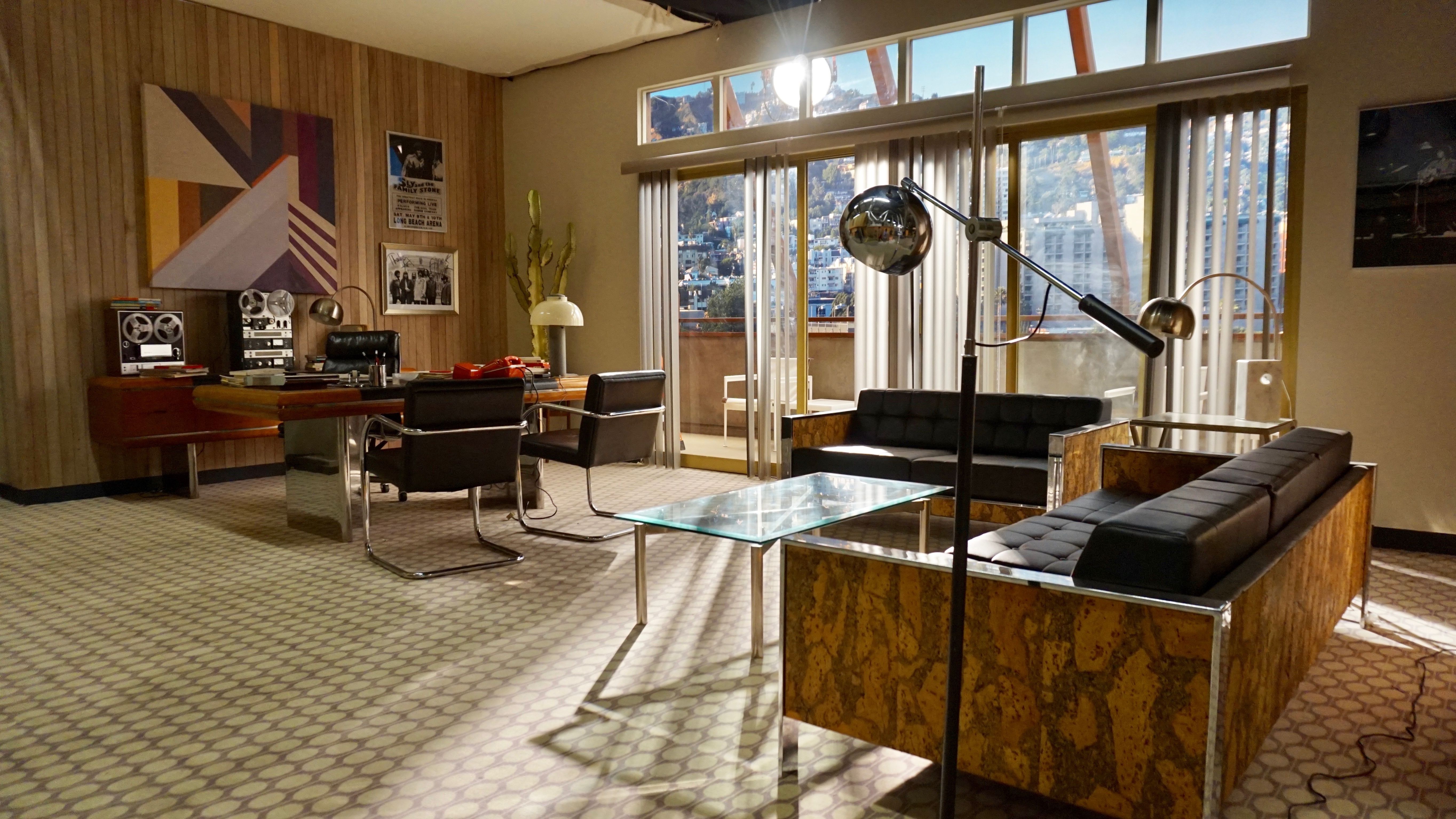
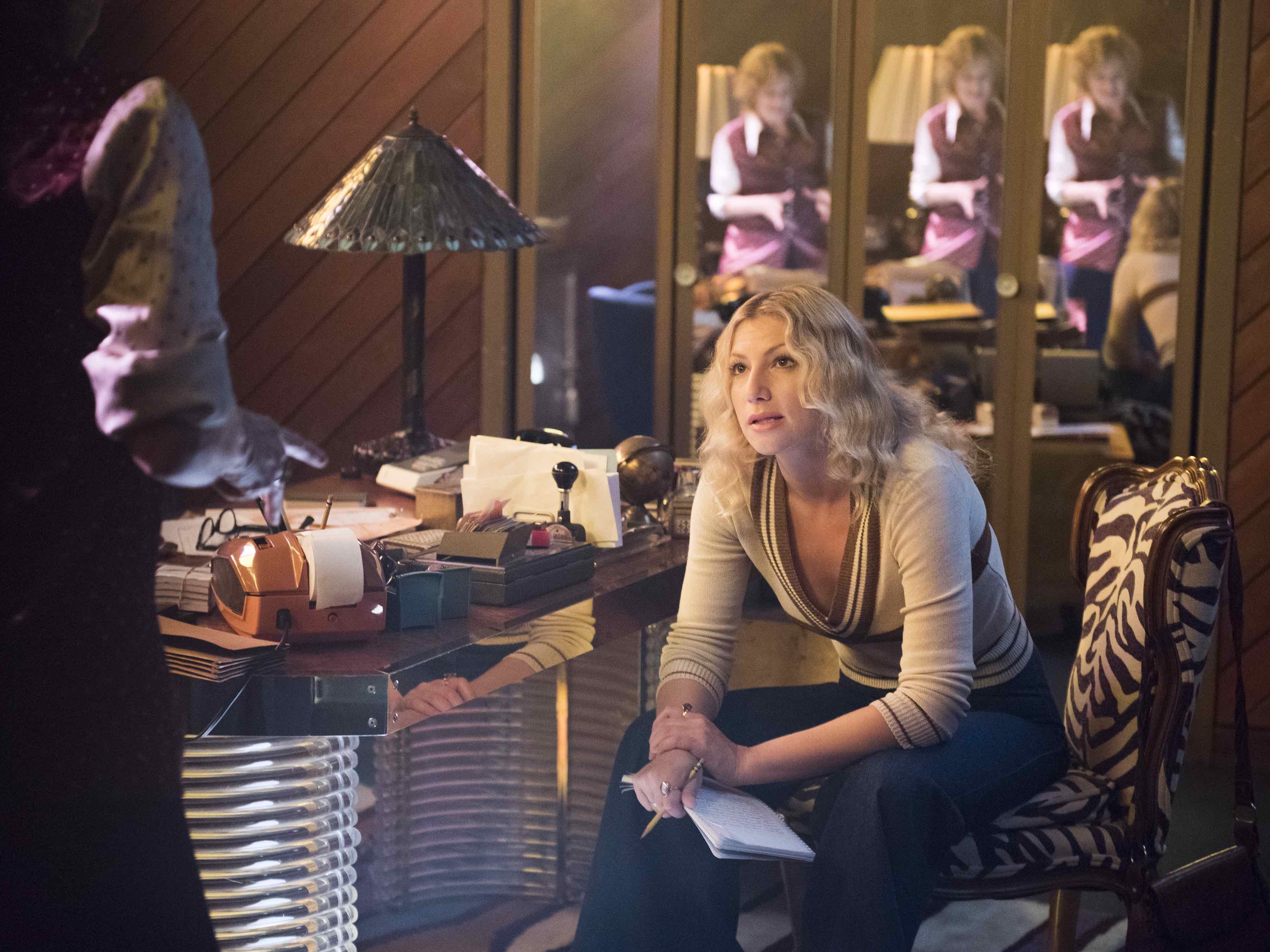
For Goldie’s office, we had those really high-up clerestory windows, so you could either have daytime blaring in or they could just be kind of glowing. That would give the cinematographer the option to change the lighting depending on what emotion he was trying to create.
Were you involved with the design and placement of those windows?
Ammon: Yes, that was definitely something that I pitched, and [Episode 1 cinematographer] Ken Seng thought it was great, and [Episode 1 director] Jonathan Levine really liked it. Peter really took it to another level, because he had so much more storytelling in that room, and he had Goldie [Melissa Leo] at many different emotions. I saw a reference to those windows, and I thought, ‘It makes it feel like you’re in a club — some kind of commercial building, but you don’t want to see the world outside. It was there to create a den, and also to bring in options for color.
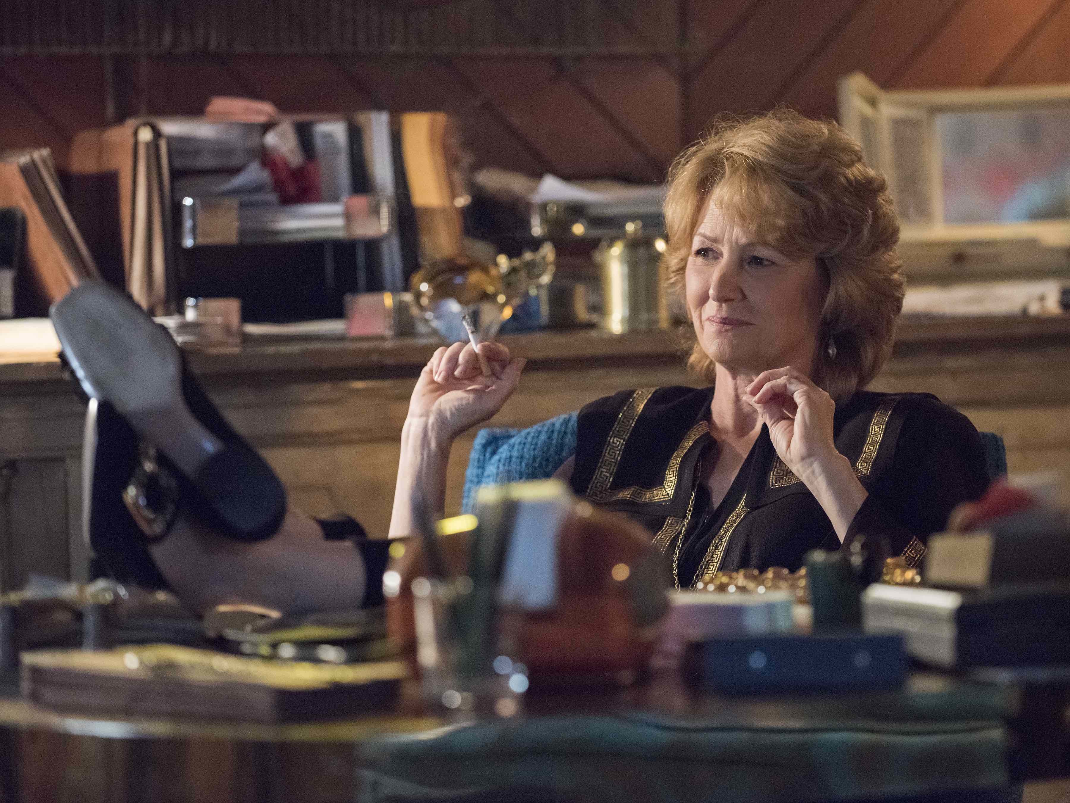
It looks like you increased your color options in the office with the stained-glass practicals as well.
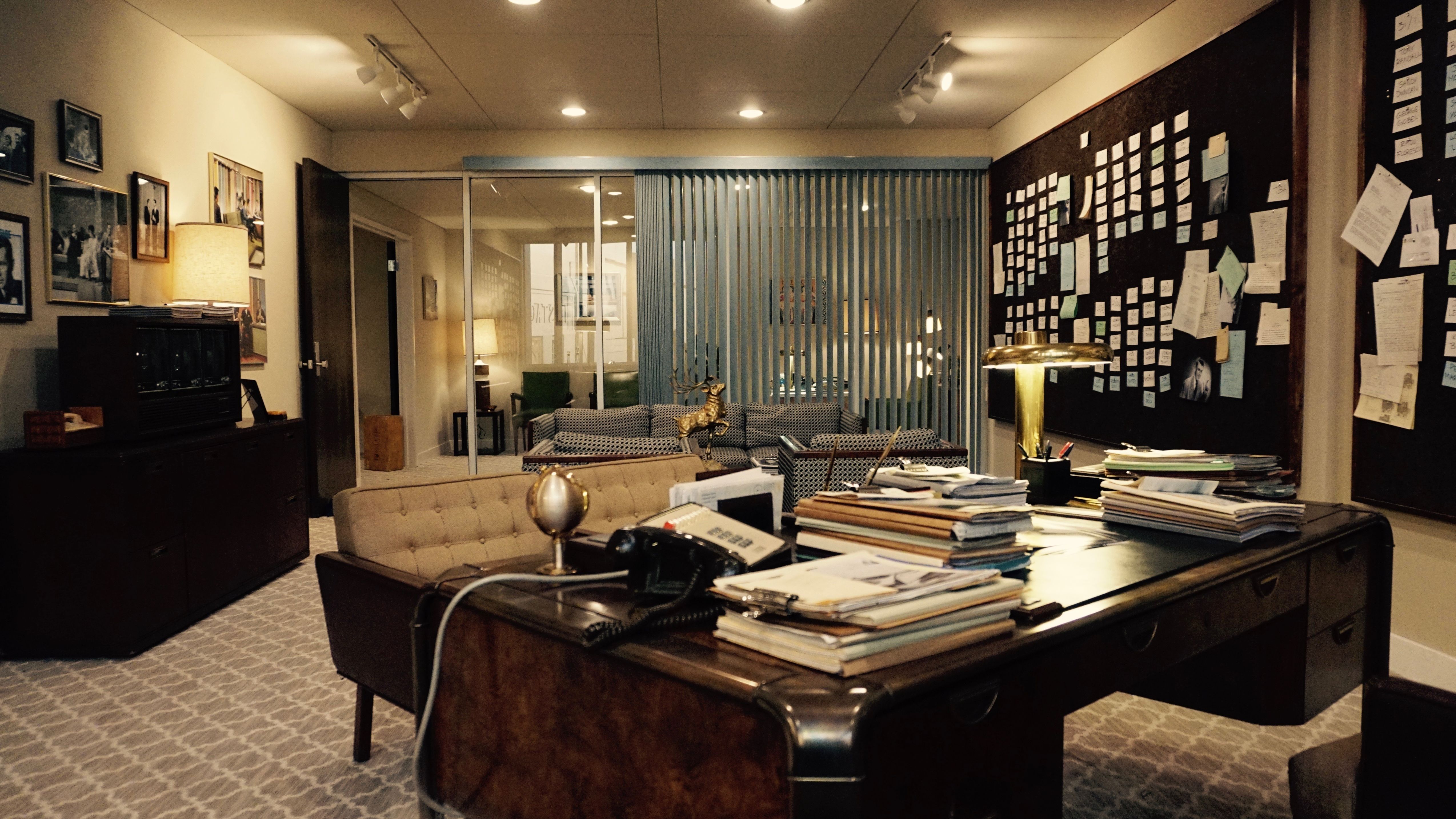
Ammon: The Tiffany lamp, yes. Goldie isn’t as young as the rest of [the cast], so I wanted to show her history. A Tiffany lamp is something from the Sixties more than the Seventies, [and in that regard it was used] to show that she had evolved in her tastes and styles, but she was still the same. It was also about having both feminine and masculine lighting in that room, as well as feminine and masculine set [decoration]. Goldie has the role of a man, and also of a den mother.
What were some of the elements you brought to the Goldie’s bar set?
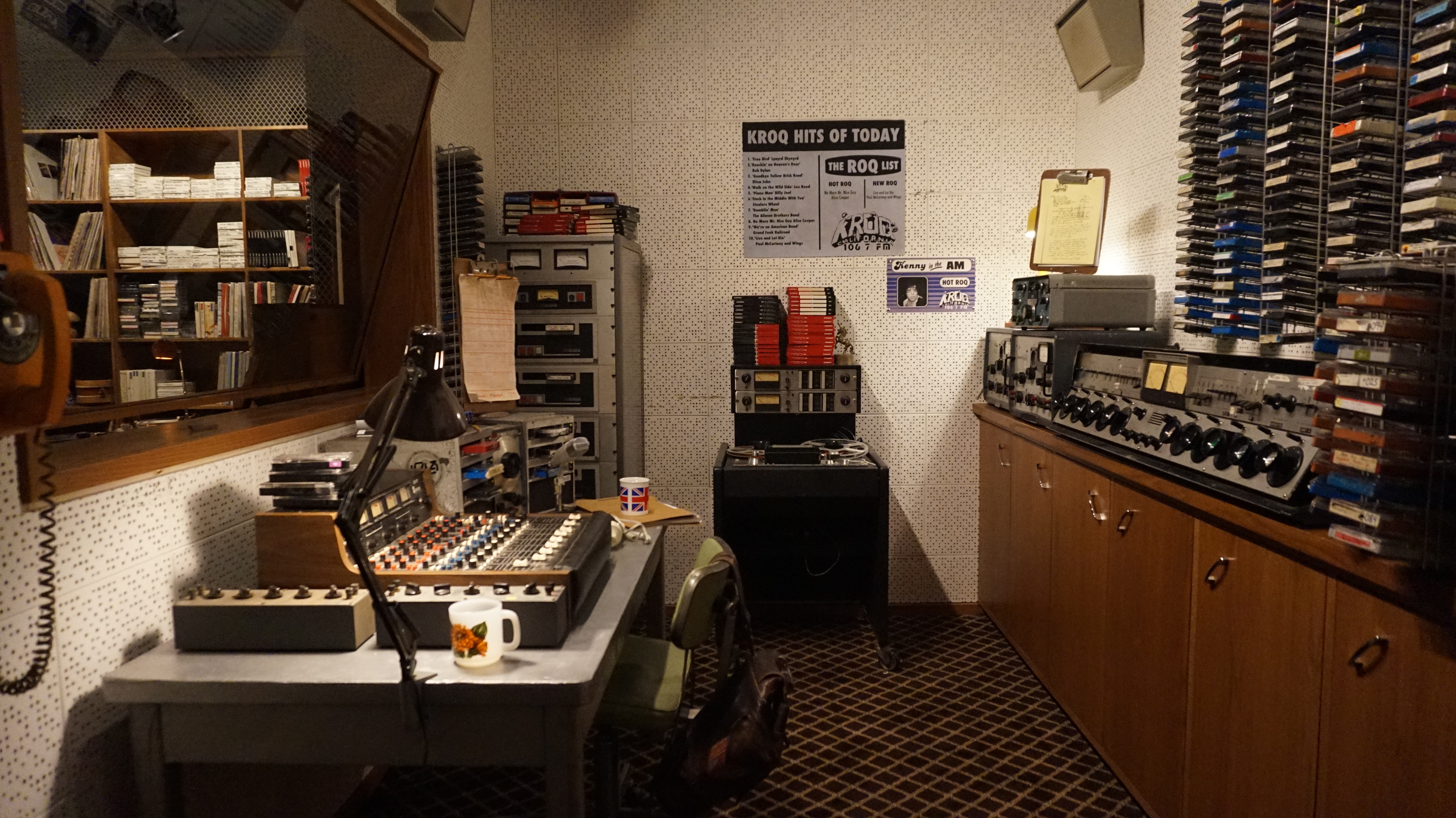
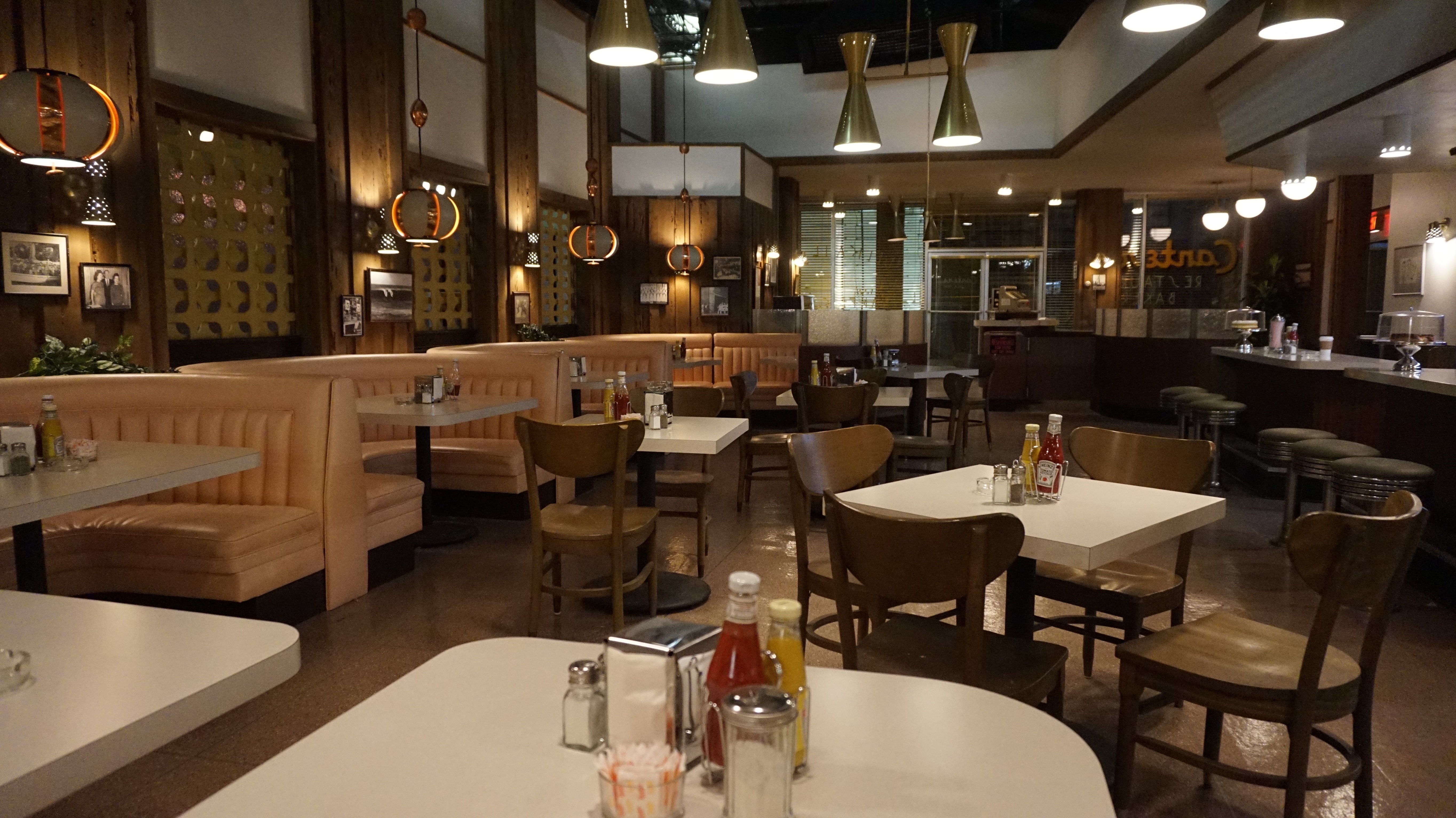
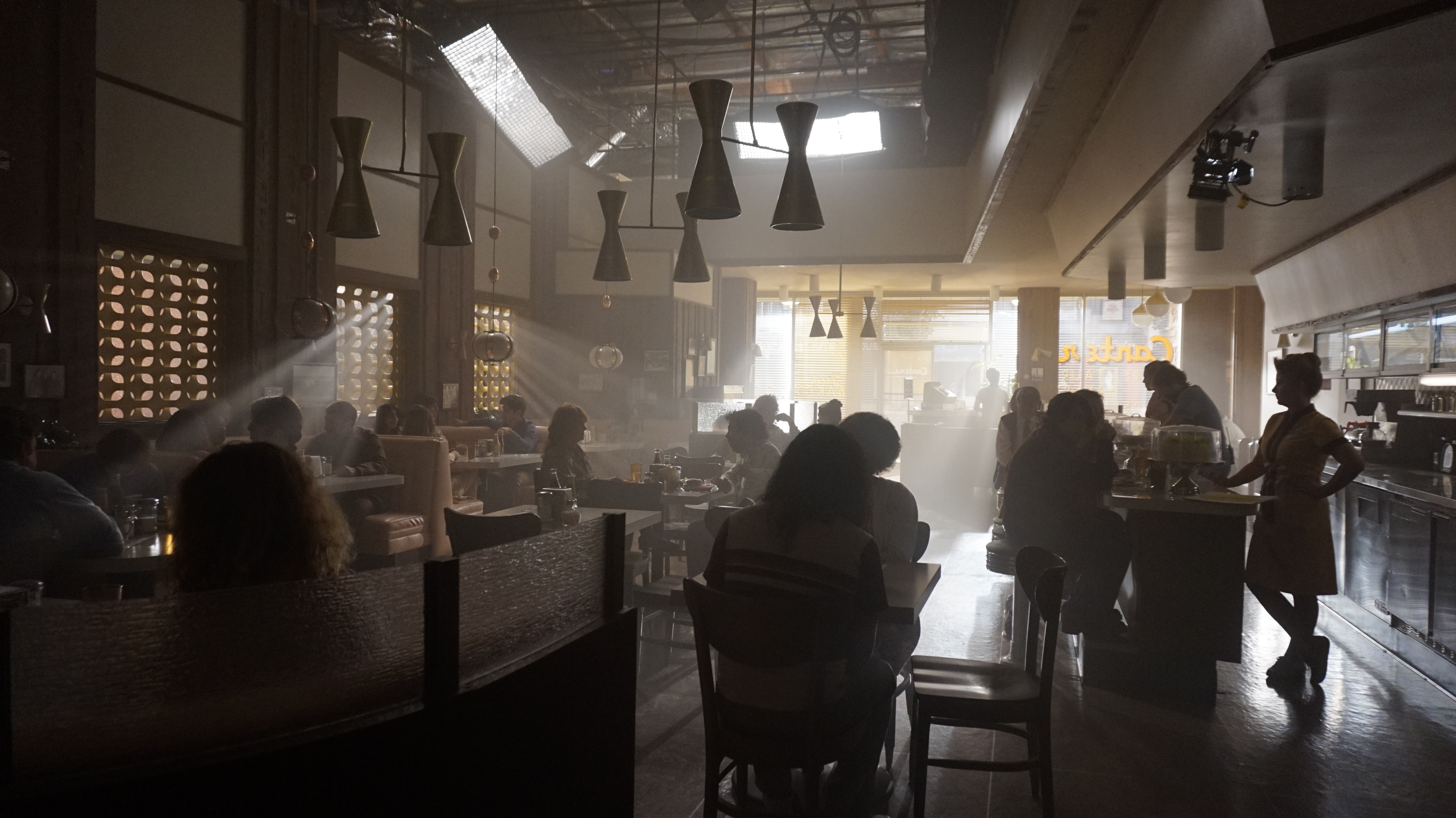
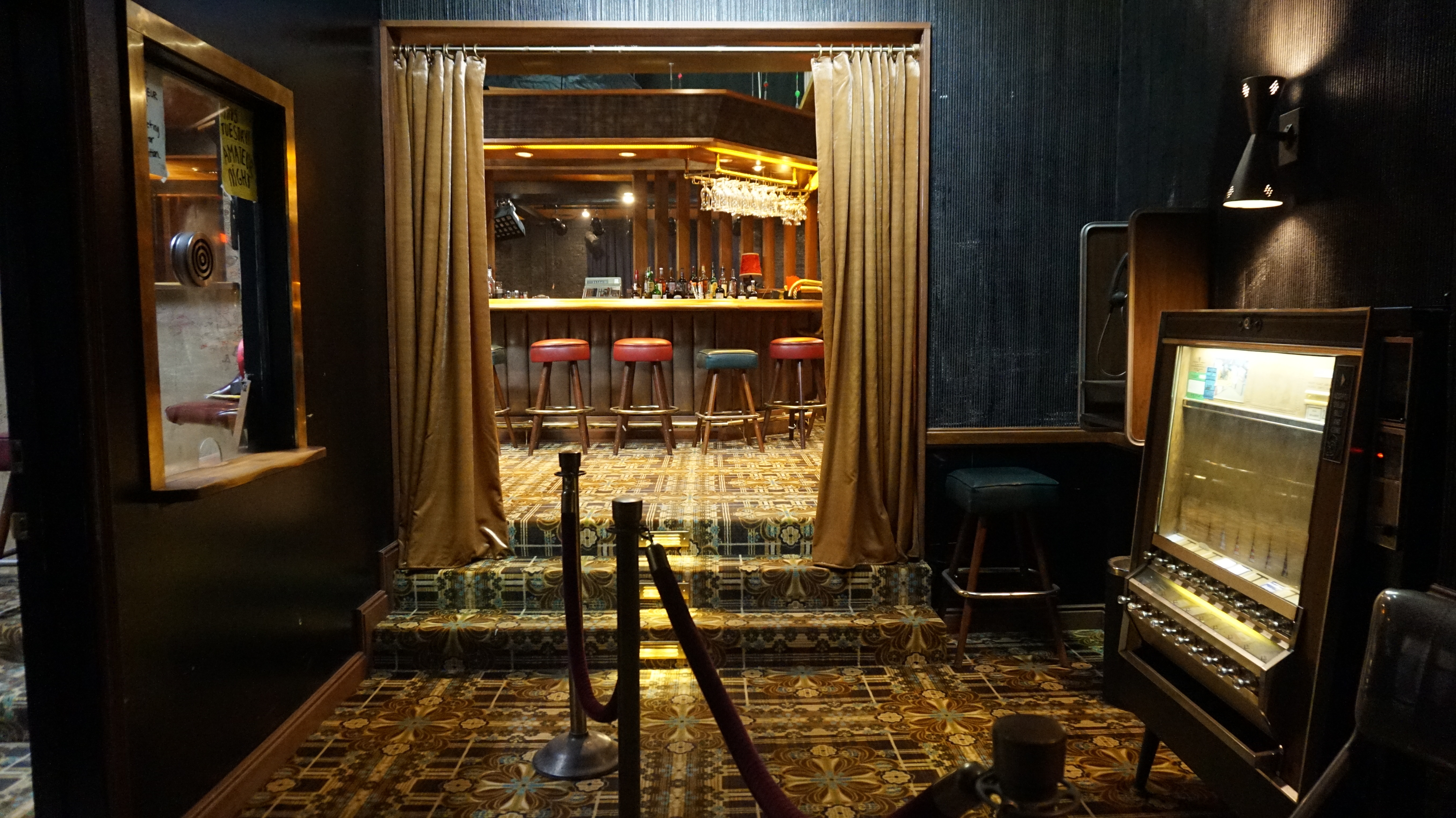
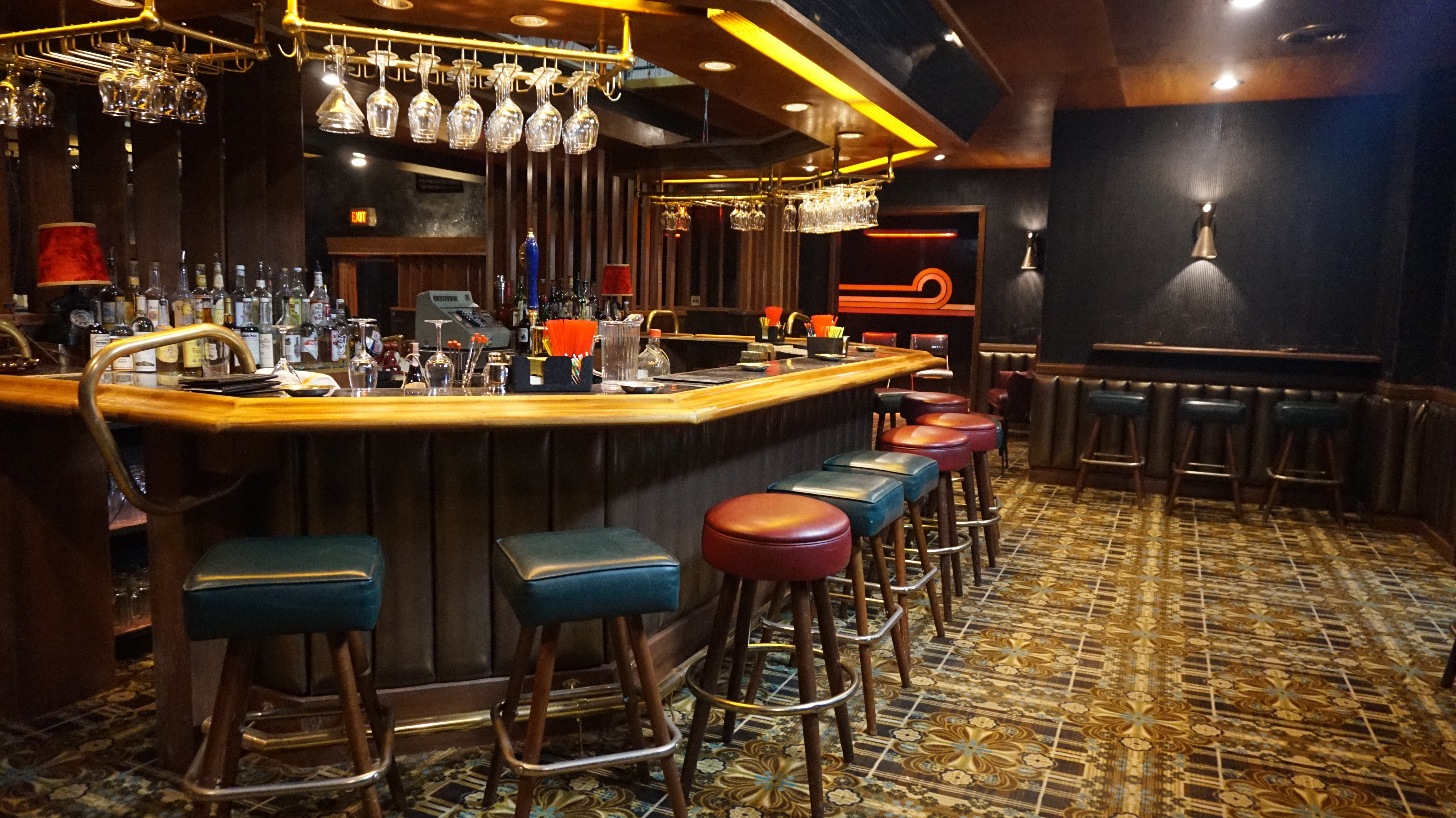
The bar in the back was sort of a ‘mistake.’ David Flebotte didn’t think there should be a bar there, because in comedy clubs you don’t have a bar — you don’t want people going there; you want them in the seat. But we decided to keep it because it was another hangout for [the characters], and a way that the team — the competitors, the friends, the allies — could be in the room with the performances, but the performance would be a background element. That was probably the most Seventies-looking set we designed for the club.
I built some overhead lighting, and both Peter and Ken got involved as well. Ken wanted to use soffit lighting that created a line of light going around the overhead of the bar, and I was horrified, like, ‘It’s not period!’ And then I thought, ‘You know what? It’s going to look good, and it’s not so different that it’s going to ruin the show.’ It was actually a great idea.
Tell us about the creative choices that went into designing Goldie’s Main Stage.
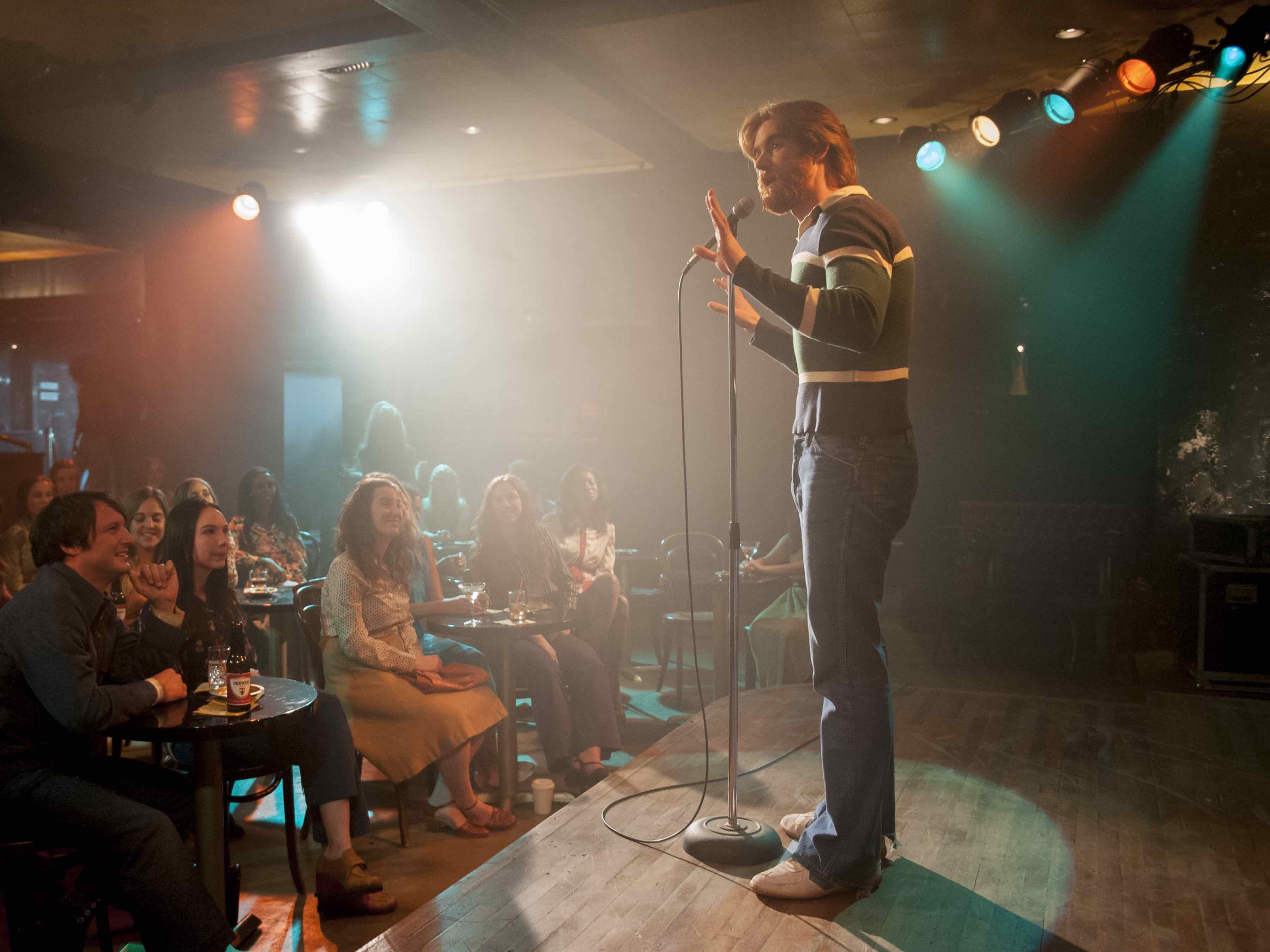
Ammon: We were creating this performance space that should be really simple. It was meant to pare down [to] the individual and have one light on the performer, and not a whole lot else. It wasn’t a ‘song and dance’; it was a guy or gal delivering his or her heart and soul, so we kept it as clean as possible. Once Peter came on board, all of a sudden there were all these nuances that I hadn’t seen before. He really developed the lighting for the stage and the audience [for his episodes] — and the movement of the camera, which was really a big part of that as well.
Seeing Goldie’s restaurant kitchen in person was breathtaking. From little details like a piece of yellowed Scotch tape on the wall to the vintage refrigerators and fluorescent lighting, it was quite an accomplishment. Tell us about the design of that set.
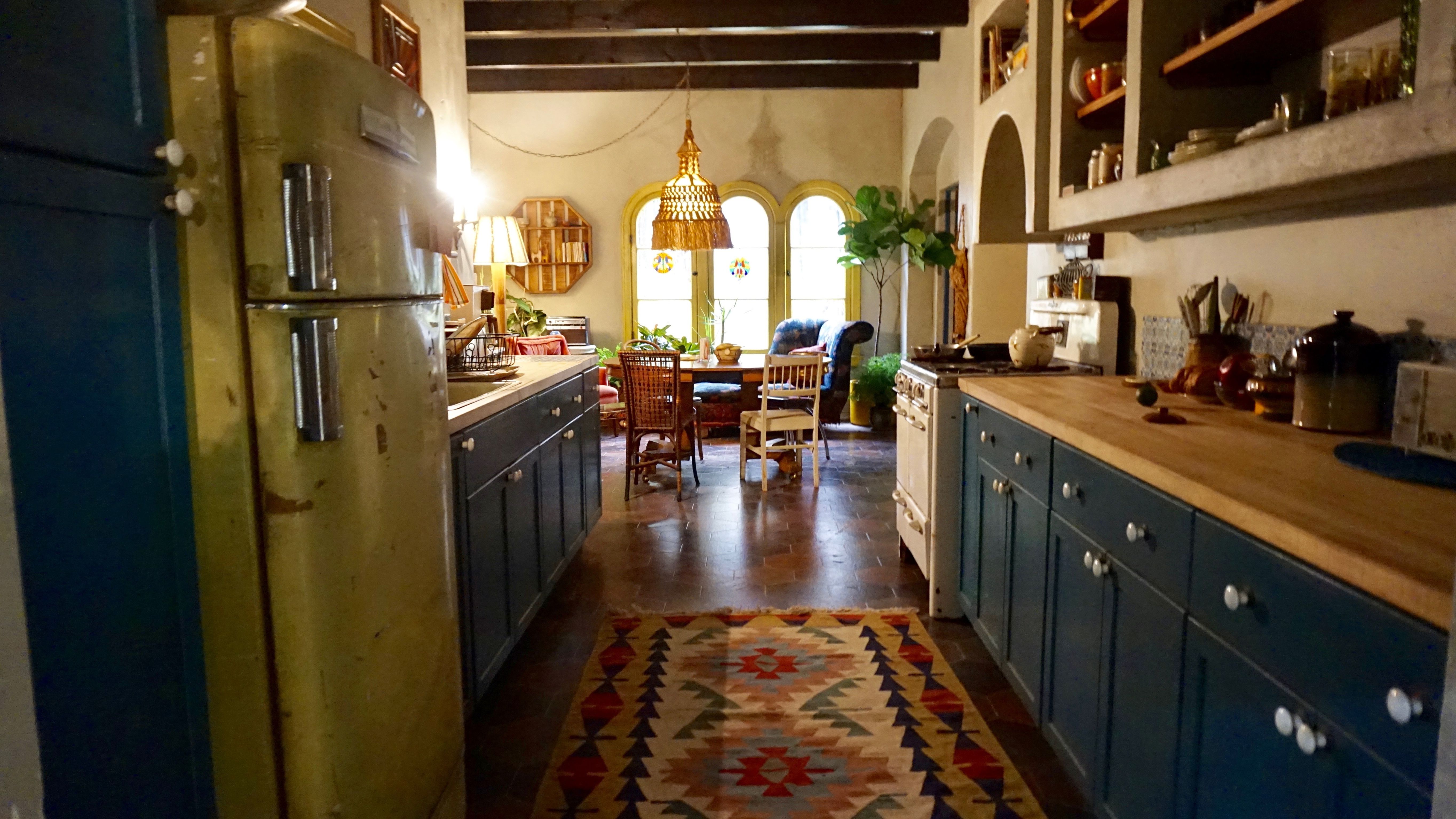
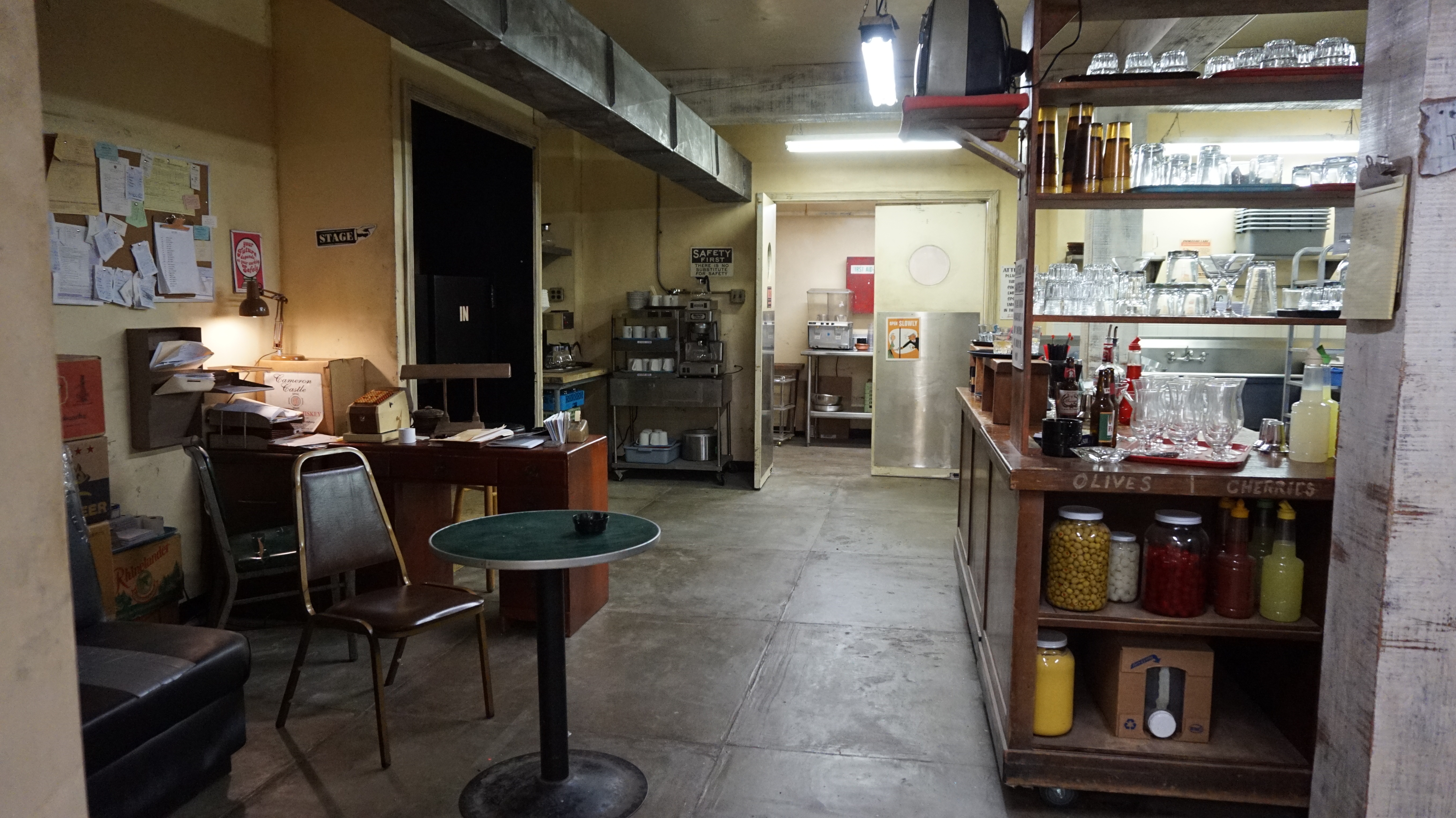
Ammon: I will tell you the honest truth about that: one of the things I love is a kitchen, especially an industrial kitchen. My grandfather and grandmother owned a restaurant tavern in Philadelphia, where there was a big bar in one room and dining area in another, and a great big kitchen just like that. My grandmother would sit in the back and make hams and soups, and it just felt exactly like that. The other reference — which we also used for Goldie’s office — was The King of Marvin Gardens [shot by Laszlo Kovacs] with Jack Nicholson and Scatman Crothers. There’s this scene in the back of a nightclub in the kitchen — and I nearly jumped out of my chair when I saw it, because it was exactly the feeling we were going for. It’s an old-style establishment, probably from the Forties, where the kitchen and the bar are out of the way from the people coming to enjoy their evening. You don’t see the kitchen, like at a hotel. That’s how we all thought about Goldie’s — like having another life. There was very little ‘cooking’ going on — just a lot of frying.
It looked like there was a little break room in the kitchen, too, with half a glass of whisky on the table.
Ammon: Absolutely — and drinking for free, which was a big part of it. It was their place to perform, but it was also their place to hang out. [It was about] camaraderie. I think L.A. is a very lonely city. People traveled from New York and Boston, from anywhere they could, to follow a dream. When you’re alone in your little hotel room, the club is a place you could go and be somebody.
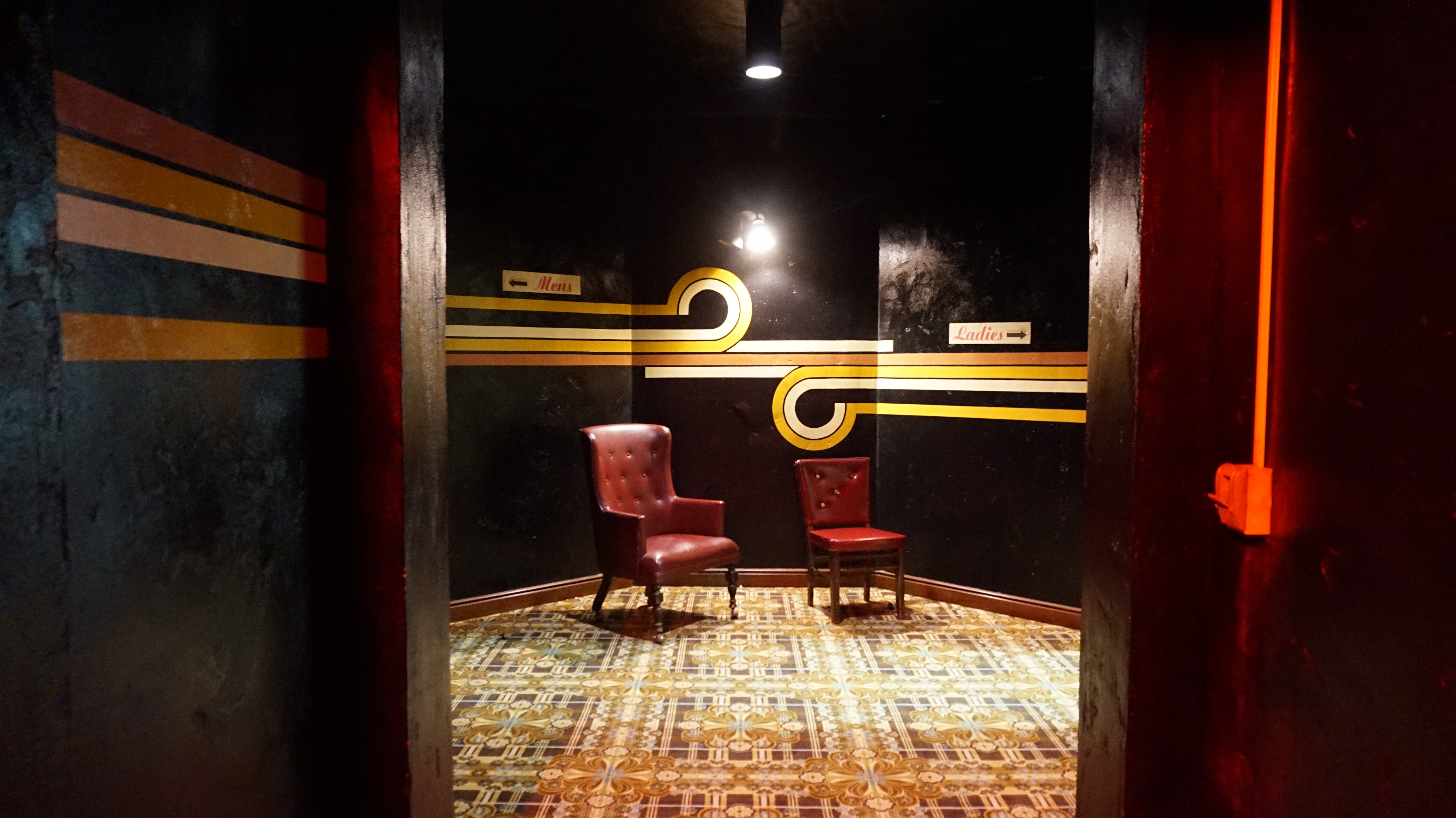
When you’re designing a set, do you draw it out first?
Ammon: Yes, I do really rough sketches — and sometimes they’re really, really bad. [Laughs.] I start with layouts of how things will flow, and run them by the director and cinematographer, and then we have set designers that take those sketches and make them into real working drawings, and flesh out the specific details of how a ceiling connects to a wall, and how that ceiling can move, and how the doors work, and what kind of floor and what kind of molding. I [start with] the general flow, and then I back it up with research photos of textures, surfaces and lighting. Ken Seng, for example, would say, ‘We have to use fluorescent lighting in [the kitchen].’ That made sense, of course, because that separates it from all the incandescent lighting on the stage and audience.
Did you visit real-world comedy clubs to help design your on-set performance spaces?
Ammon: When I booked the meeting [for the position on I’m Dying Up Here], I’d never been to a comedy club — so of course I went to The Comedy Store and I had a great time. Later on, we all went together and got the feel of it. [Throughout the season’s shoot], if I got tired and lost my juice, I would go to a performance at The Comedy Store just to remember these people, because that’s what it’s about. Marc Maron just showed up one night and he was great. Another night, Arsenio Hall popped in. They are driven to get up on the stage and deliver their act — they’re all kind of addicted to it, and it’s really fascinating. There were several women who do television shows doing really raunchy, really funny acts that they could never do on CBS or ABC. I always like to do something new, and dig into another lifestyle or another culture or another time — and this was the trifecta: I was home in Los Angeles doing a period Los Angeles piece about comedians.
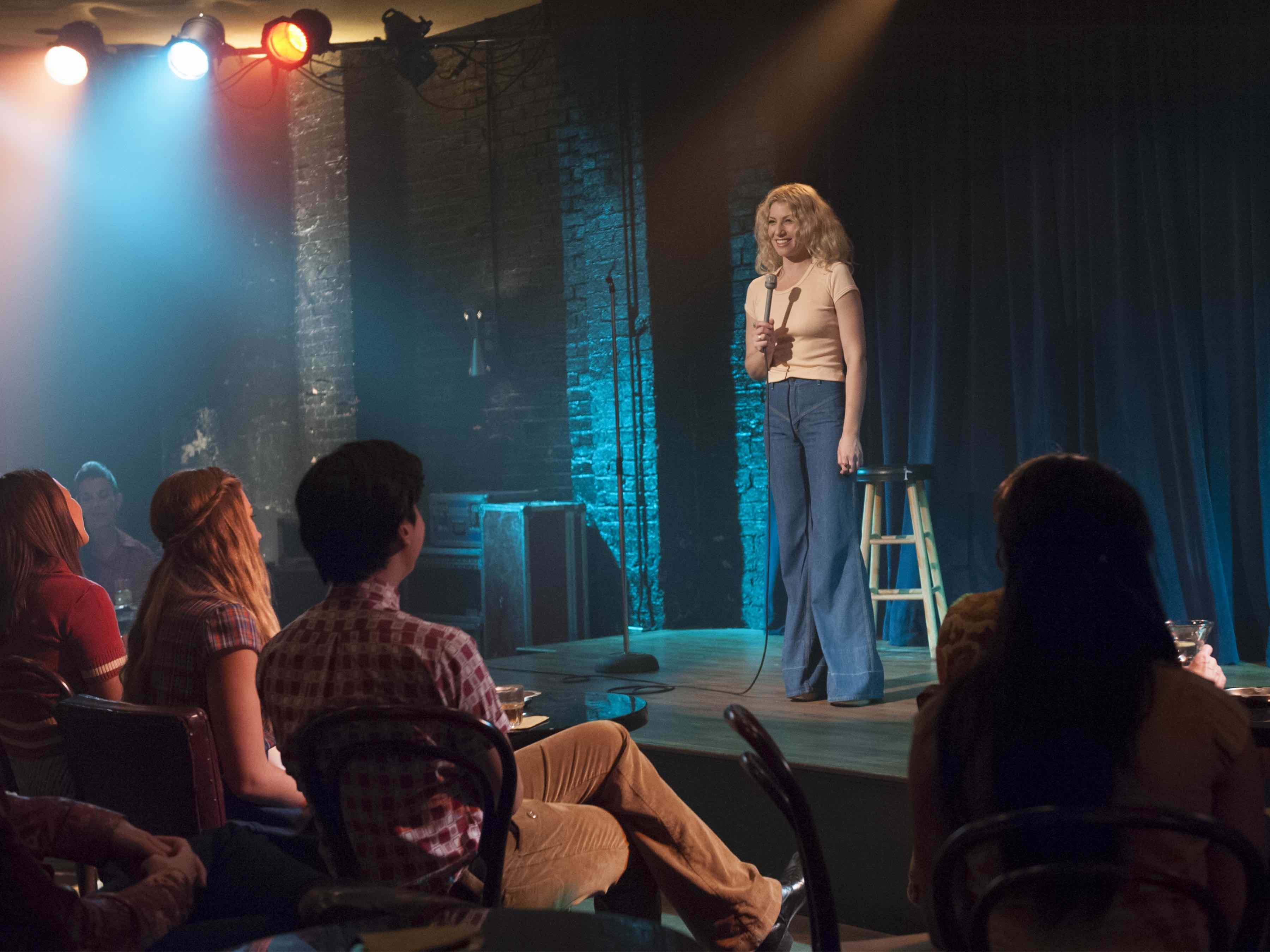
[I enjoyed] exploring this new territory, and David Flebotte and [executive producer] Jim Carrey’s storytelling was just fascinating to me. We’re in Hollywood, and it’s such a specific story [that could] really only happen here. Sometimes it’s nice to have something that is so specific that you don’t have that many choices — you just hone in to what that moment is.
How did you go about designing The Dating Game set, which had to feature both on-stage and off-stage action.
Ammon: It was a show within a show, so we had to turn a stage into a television studio. There wasn’t much of an actual audience; [rather, the sequence employed] all these interesting angles of entertainment and performance. I grew up with these game shows, so they are kind of iconic to me, but when you start studying how they work, it’s more complex. They’re not as big as you think, and they’re very specific. They seem so simple — ‘oh, it’s just a curved wall and another one’ — and then you start drawing it out and trying to figure out how it all fits into the frame. It’s quite a design exercise. We knew we didn’t have to have every element of that set, but we knew we had to create an area of void, so that it felt like a set within a studio. [For that] I think we just turned all the lights off. We used the audience as a foreground piece. In dealing with the lack of an audience, the director — Adam Davidson — and Peter suggested that if we just had a set of chairs on a riser, we can move it to each shot that we need, because that’s not what this set is about; it’s about Nick and his performance. [See AC’s interview with Davidson here.] Those are choices that we all make together as a team.
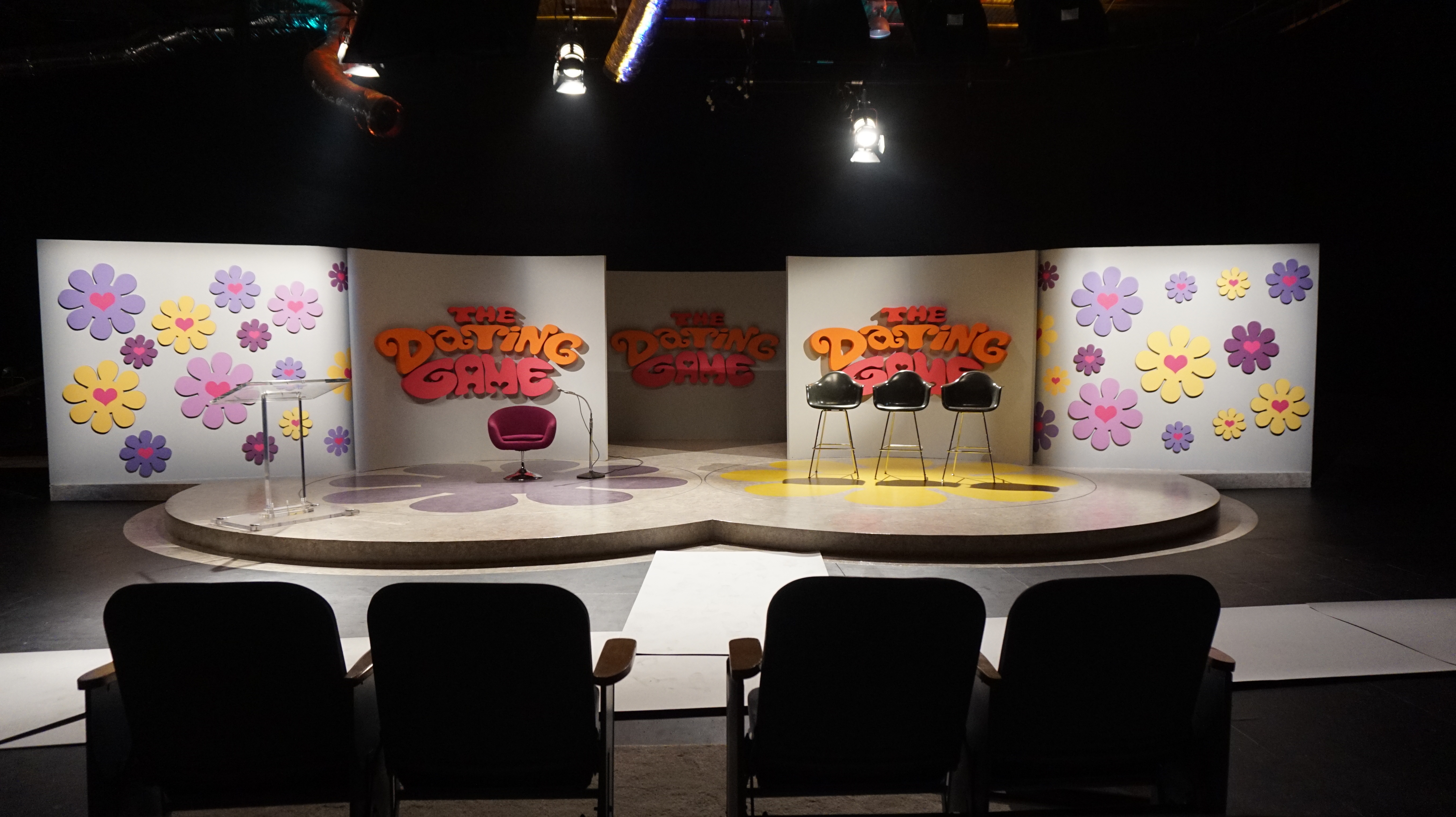
I wish cinematographers and production designers were part of the same union, in a guild together — or just had an opportunity to dialogue outside of work when there isn’t so much time and money pressure, which can frequently put you at odds. I’m nostalgic for my early indie feature days, going to dailies as a team and hanging out afterwards to discuss the work.
I’m Dying Up Here has been renewed for a 10-episode second season, to air in 2018. You'll find detailed lighting diagrams from the production here, and an interview with series director Adam Davidson here.
