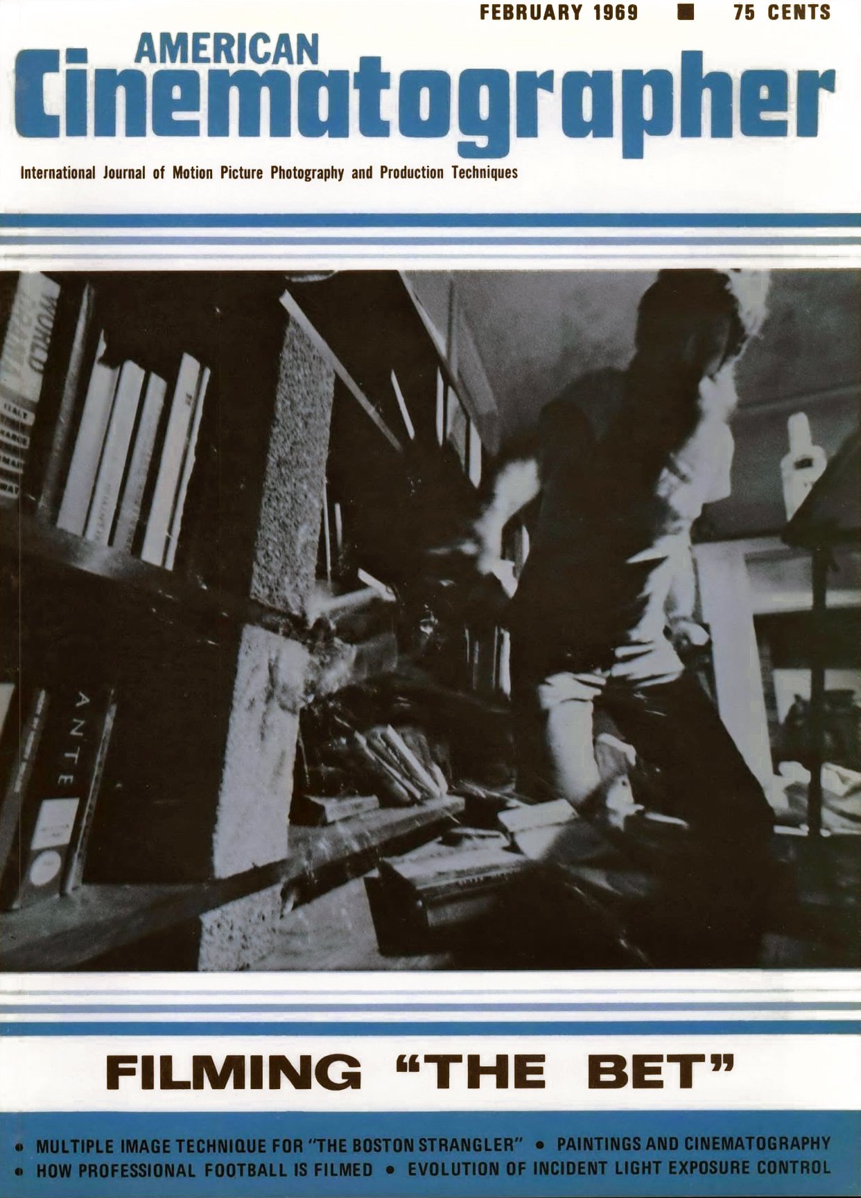
Multiple-Image Technique for The Boston Strangler
System of presenting several scenes in panels on the screen simultaneously adds up to exciting method for telling a complex story on film.

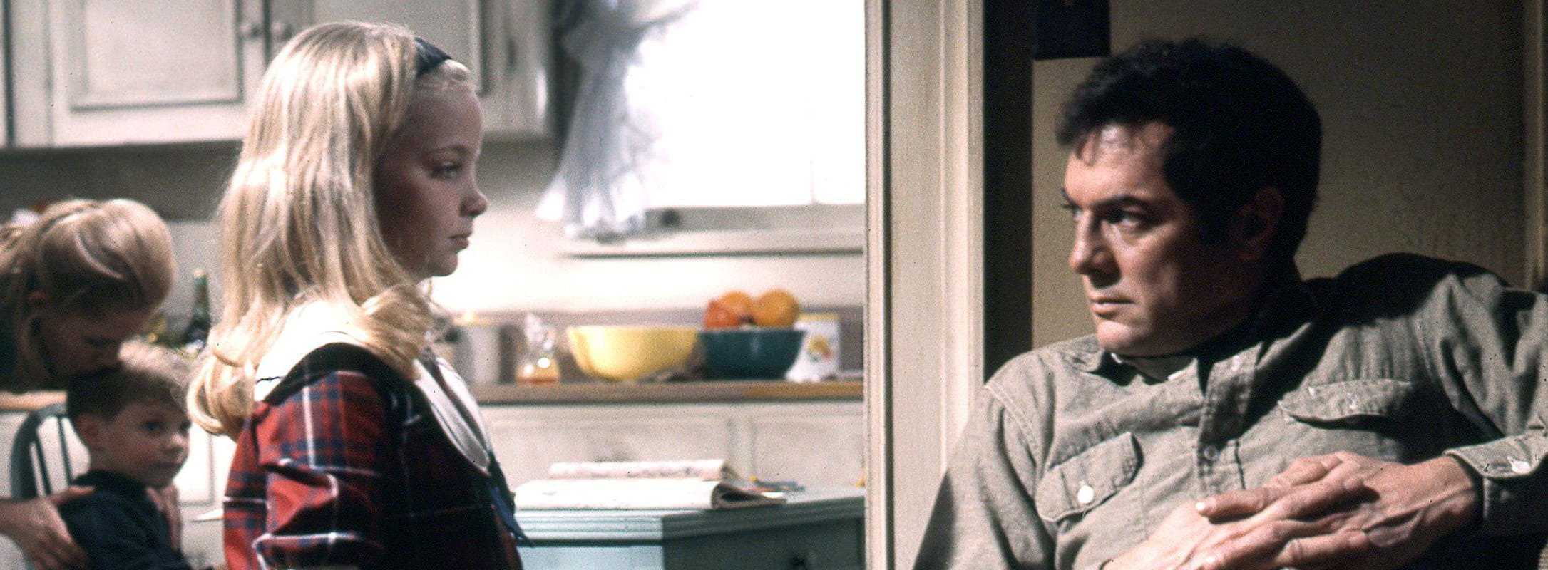
The Boston Strangler is an exceptionally well-made film version of Gerold Frank’s book dealing with the case history of Albert DeSalvo who, by his own admission, brutally murdered 13 women in and around Boston during the period of June of 1962 to January of 1964.
As produced by 20th Century-Fox in Panavision and subdued color it makes striking and creative use of an intricate technique in which multiple images appear simultaneously in varying configurations upon the wide-screen frame. The technique has been used before most notably in the 17-minute short film A Place To Stand, which was one of the cinematic sensations of Expo ’67 in Montreal:
The technique has also been employed sparsely of late, and with no great degree of imagination, in a few feature films, usually as a montage interspersed with titles.
But The Boston Strangler is the first Hollywood feature to use it extensively (about 35% of the total footage) and as an integral part of the filmic narrative. Its considerable audience impact and technical excellence has resulted from the dedication and skill of a team of key technicians, which includes director Richard Fleischer; visual designer Fred Harpman; director of photography Richard H. Kline, ASC; editor Marion Rothman; and special photographic effects expert L.B. Abbott, ASC.
In the sections that follow, each of these technicians discusses their own work role in creating the exciting multiple-image sequences that make The Boston Strangler a most unusual thriller.
I have been interested in multi-image and multiple-screen processes for many years, having first seen such presentations in Czechoslovakia in 1942, where they have, in Prague, a theatre called Laterna Magica, and I was so enamored with it that I imported the show to New York and presented it in Carnegie Hall, where it ran, in 1944, for about three weeks. So I had a chance to study it and analyze its values and complications, and when I got back to Hollywood I always looked for a project for which I thought it would be applicable.
It was very difficult to explain what the process was like without demonstrating it. So there was a double problem. One was finding the right subject, a picture that would be suitable for it, and the other problem was, after you found the subject, to convince everybody that this was the way to do it.
Expo ’67 came to the rescue because there it was actually to be seen and it was a great demonstration of all the things I had been lecturing about here. So I convinced the right people that it did have a tremendous value, if the story was right. Then along came The Boston Strangler and I felt it lent itself very well to all of the possibilities of multiple-image presentation. I felt that the requisites for using it were all present in this story, because one of the main requisites is simultaneous action — many actions, or more than one action, happening simultaneously on the screen, or within the same time in the story so that you don’t have to cut back and forth in a conventional manner from one action to the other. You can show them both together.
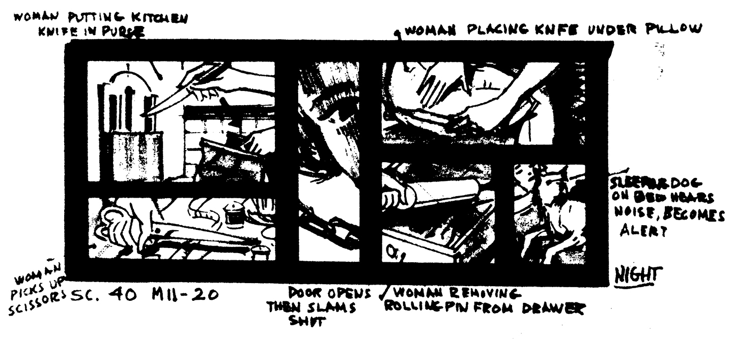
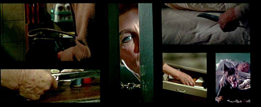
It is used most obviously in some of the sequences building up to the actual murders, but I also use it in several other places and in several other ways. For example, it is employed in place of a conventional montage to quickly establish a trend of similar, simultaneous occurrences. There are two important montages in the film. One is a round-up of all known sex offenders in Boston. As a matter of documented fact, this all happened very quickly — and I show it on the screen happening very quickly.
The second montage applies to the treatment of another kind of situation, that in which women are shown being molested by sex offenders. This happened all over the city, to all different types of women. I was able to show these individual actions happening simultaneously.
Then there was a lengthy sequence showing women being terrified at night, taking all sorts of precautions against the strangler. The multiple-image technique was a very effective way to show the mood of terror pervading the entire city. You really got the feeling of the whole city being involved at the same time.
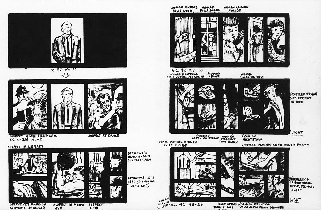
to indicate development of multi-image sequences. This book served as a blueprint for key
technicians during each phase of production.
Of course, the secret of making it work is not to put too much information into any one panel or to try to tell a complete story in any one segment.
One great challenge on the project evolved from the fact that the suspense which you normally have in a “murder film” does not exist in The Boston Strangler, because — first of all, you know who did it right from the start and, secondly, you know that there's going to be a series of murders. So there is no great surprise about discovering another murder. Faced with a problem like that, as a director, I concluded that what I would have to play for would be the anticipation and suspense. I used the split screen to enhance both of those elements.
For instance, for anticipation we see, on one side of the screen, a group of innocent people going about their everyday tasks, unaware that in the next room there is a dead body. Then we see, on the other side of the screen, what they are about to discover. So, we are anticipating their discovery of the body, and there is great feeling and great mood built up when you see it that way.
To build suspense, of course, one sequence that comes to mind is where you see the prospective victim going about her daily chores unmindful of the fate that is about to befall her, while on the other side of the screen you see the strangler approaching, and there’s no way to stop it. It's like a juggernaut of fate bearing down upon her. There’s no way out.
You have to be very well prepared for using such a technique. It’s not something that you can just keep in your mind. You have to blueprint it in great detail, because the panels themselves each have a shape and they keep changing their shapes on the screen. Each time they do, the entire composition changes. The panels, even without an image inside of them, have a composition of their own on the screen, so that has to be very carefully planned. You can’t change the shape of one panel without balancing everything else to it. And then, the image that goes inside the panel also has to be carefully planned, particularly in terms of timing, so that the climax of the action of one panel doesn’t interfere with the climax of the action of another. They don’t happen simultaneously; they happen very closely together, but never exactly together.
In planning all this, I had a great deal of help from the visual designer assigned to the film, Fred Harpman. Fred is an extremely clever young man and we collaborated very closely in working out the details for every sequence, so that we would know exactly what our shape was going to be for each panel, and which bit of action would be placed inside of that shape. This took about eight months of pre-planning.
In filming scenes for the various panels, we used not only diagrams but special mattes which were manufactured to fit into the camera’s viewfinder, and we framed for the image that was enclosed by the matte. What actually appeared on the film filled the entire frame, but we knew that we were only going to use a certain portion of it, the segment we had lighted to fit the particular matte we were framing to. The significant action was centered during shooting, and later it was moved optically to its proper position within the frame.
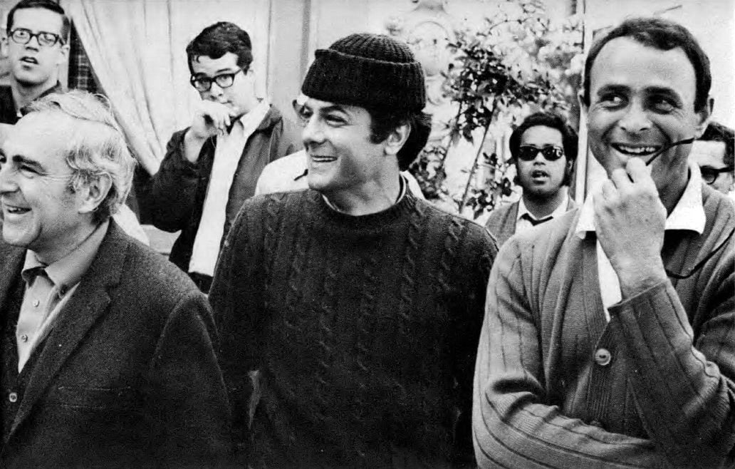
technique required an extraordinary number of separate setups.
We were very careful to frame each image to its proper size and perspective so that it would not be necessary to blow up or reduce anything in making the final multiple-image composite. We were already suffering with one extra generation and we didn’t want to go into more than that. As it turned out, I feel that we ended up with terrific technical quality.
While it might seem that this technique would consume three or four times as much footage as that used in a conventional film, in actuality it required only a little more film. However, it did take more time, because after the main action of the film had been completed, I had to continue on for another week of shooting just the images that would go into the panels. They were little tiny bits and pieces, but each one required a separate camera setup. The length of time each panel-image remains on the screen is very short. They usually run about three feet, and more often about a foot and a half — which means that in order to sustain a sequence that runs for a minute on the screen, you have to shoot a lot of setups. Sometimes you have as many as 12 images appearing on the screen simultaneously — each one changing every foot and a half. In that week during which we shot fragmentary scenes for the panels, we averaged about 50 setups a day.
In getting a multiple-screen or multi-image technique to work, the critical phase is the editing. I worked very closely with the editor, Marion Rothman, on this, and Fred Harpman was very helpful, too. This was Marion’s first feature as an editor and she worked under the most difficult circumstances. It was the most complicated sort of thing to cut, but she came through beautifully. We had graphed each shot so that we could match things by counting the squares on a graph superimposed on a sketch of the scene and then counting them again through the matte in the viewfinder. This was the method we used to make sure the separate images would end up in the right places within the total wide-screen composition. Marion had to be aware of every shot we made and where it was to go. Then she had to order all this material in print form and get all of the timings right. She had to use a tremendous amount of imagination in ordering all of these materials so that it would come out right, and it did about 90% of the time. She understood exactly what we wanted, and she did a fantastic job.
So did the cameraman, Richard Kline. He understood so well what we were after and he was extraordinarily good at getting it onto film. We made a lot of tests before we started shooting and we learned a lot from those tests about the lighting of areas. Dick had to change some of his thinking in regard to how he was going to do it, but he really came up with some wonderful things. Because he is so imaginative, he was exactly the right man to photograph this picture — “perfect casting,” I would say.
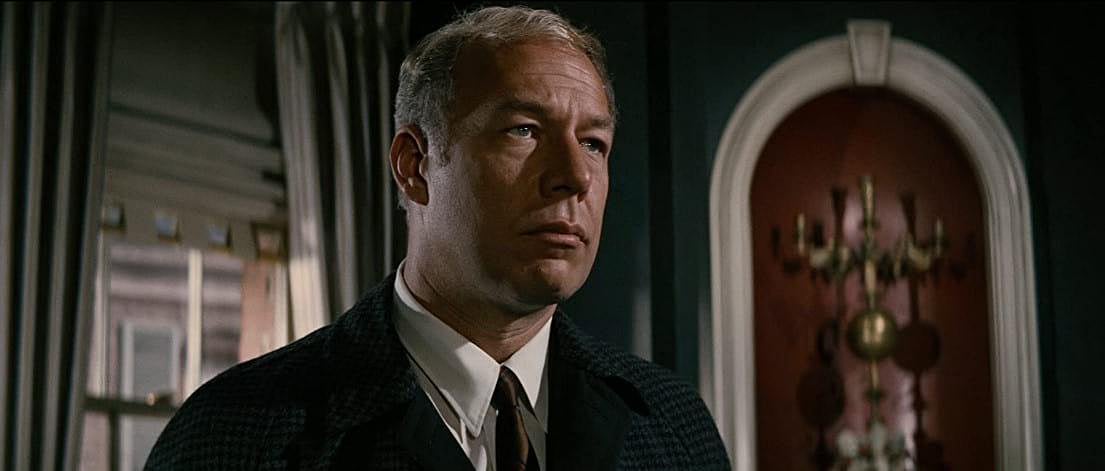
I feel that the multiple-image technique should be more widely used in feature production, but it must be used cautiously. It has great applicability to some subjects, but not to all subjects. I think it would be a great mistake to use it simply as a gimmick and that’s very easy to do, because it’s a kind of “show-off” thing in its own way, a means of showing how clever and versatile you are. But if it has no real value to the film other than as a flashy technique, then it can only hurt the film.
As for the ability of the audience to absorb so many images simultaneously, I can only say that the mind and eye have been proved to be capable of tremendous speed and versatility in accepting multiple impressions — to a far greater extent than most people would believe possible. The eyes see everything and the mind takes it all in. Viewers in the audience may feel that they are just on the verge of missing something, which is fine, but the total effect on the audience is wonderful, because it makes them work. It makes their eyes and ears explore the entire screen and keeps them very conscious of what is happening. So there’s an added excitement in trying to follow and keep up with it, which is something you just don't get in a conventional film. We know this technique stimulates the audience, because 90% of the preview cards mentioned the multiple-image effect in a favorable way. The audience thought it was smashing.
I think that for The Boston Strangler, this was the best, the most powerful way to tell the story. I don’t know of a better way. We could have used conventional filming techniques, certainly, but I’m sure we would have lost a great plus value.

One of the reasons I became so excited about this project from the very beginning was that Dick Fleischer explained to me that we were going to progress three different stories, on three different levels, simultaneously, in such a way that they would eventually come together and overlap — and that we would do it by means of multiple-images appearing in separate panels on a single widescreen frame.
One story would be that of the murders told from an objective viewpoint, that of the police. It would concern itself with their search, pursuit and apprehension of the killer.
The second story would concentrate on the overall growing terror of the people of Boston, their panic and how it developed.
The third story would focus in on the strange double life of DeSalvo — that of an ordinary family man, on the one hand, and the notorious “Boston Strangler” in his other splinter of personality.
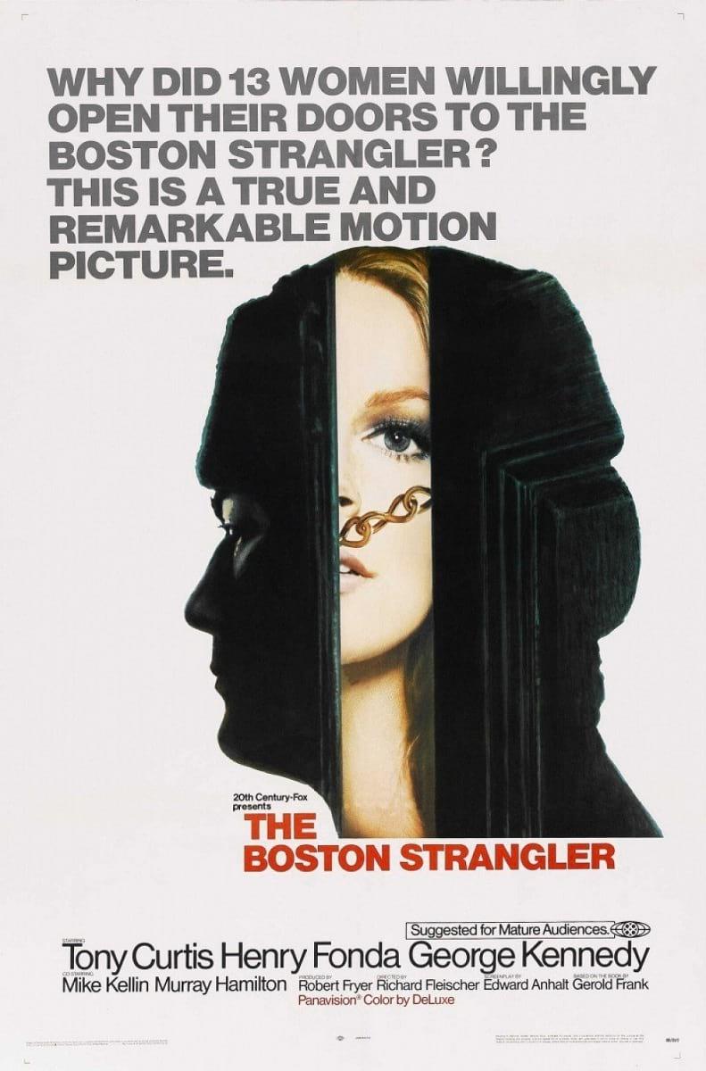
Designing the visuals approach to the multiple-image sequences was a great (and fascinating) challenge. In my area there were two basic problems. One had to do with the design and progression of individual scenes in terms of how people move and travel on the screen — the same problem you encounter in designing an ordinary film. But in addition, there was a much more complex problem of graphics — concerning such things as: in what areas of the frame the panels should appear, their individual sizes and scales, how many there should be on the screen at any given time, when and how panels should pop on or off (or should they do that at all?), in what manner and with what timing should they travel across the frame, etc.
We went up together to Expo ’67 to see the unusual film presentations, and we got all excited over them. However, the one big difference we noted was that none of these formats were used as devices to tell, or progress, an actual story. For that reason they could get much more mechanical purely for effect, much more graphic in the true sense of the word, than we could. We knew that if we were to go that mechanically graphic, purely for the sake of surface decoration or to create visual excitement, we would lose our audience.
We had to concern ourselves, at all times, with how the separate panels inter-related dramatically. Let us say that, at a given moment, there are three separate panels on the screen — two on the right, one on the left. Where is our center of interest? How are the panels tied together so that they don't conflict? Where is the eye? Is it reading all three scenes at once? Two scenes? Or does one scene become so important that it takes over from the other two? Then, too, how do we "lose” these panels when they are no longer significant?
In actual practice we found that we had to simplify. We found that we could not be mechanical just for effect. We started out that way and soon learned that the more mechanical you become with your panels — like animating them across the screen or opening them up — the more the mechanics become the most important thing, and the more your audience grows aware that you are manipulating the panels.
One thing I feel that we achieved successfully is the fact that the audience doesn’t become self-consciously aware of the technique, because they are so involved in the story.
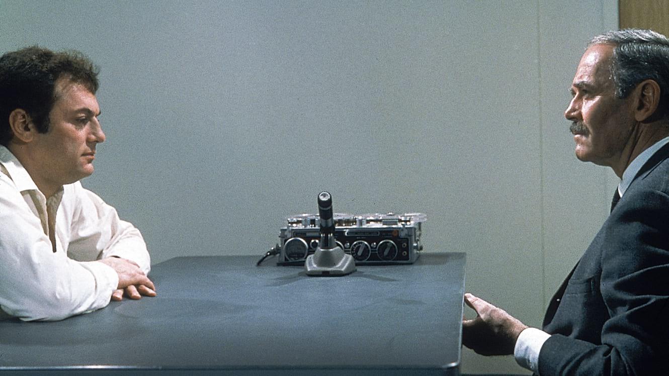
In designing the panels for the multiple-image sequences I kept in mind a basic philosophy which Dick Fleischer had expressed. Fundamentally, he doesn’t like the anamorphic aspect ratio matte position at the right or left and pan it toward the center — or vice versa. This was in order to avoid having to go to a traveling matte later. It was especially valuable when we would start with a full frame and then narrow down to a fragment of the scene in a small panel, or the other way around.
What he said made sense, and the panel system lent itself perfectly to the expression of that philosophy. Many of our scenes were fragmentary closeups (inserts, actually) that fit quite nicely into a small, square frame. Then, when we needed scope in a particular scene, the full wide frame was available. Fleischer’s thought was: “Let’s make the ‘’ the size they should be and then frame them properly. Let’s not let this widescreen proportion dictate anything. It’s just a field of operation.”
It was my job to design a “panel plot” (complete with accurate compositional sketches) for each separate phase of each multiple-image sequence — and this is where Fleischer and I worked very closely together. Edward Anhalt, who wrote the screenplay, could not write it the way we would eventually interpret it; this would have been an impossible thing to do. So he said, “I’ll just write a straight screenplay and you, in essence, will be orchestrating the picture.”
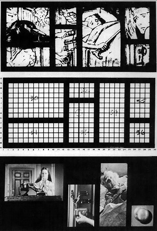
relationships are the same. Bottom, a frame blow-up showing four panels in composition.
Others appear as the sequence develops.
We would take each sequence as written and start to pull it apart into separate elements, which we laid out graphically in terms of individual panels.
This was done using a grid that covered the full frame. Then we established mattes of several sizes and shapes that could be fitted into that grid — and designated them as A, B, C, etc. Matching mattes were made to fit into the viewfinders of the reflex cameras that Dick Kline was using.
A compositional sketch was made of each scene as it would fit into its specific panel, and this sketch was used as a reference when the scene was actually set up for shooting. All of the sketches were bound in sequence into a book, which became our production “Bible,” and all the key people concerned were given copies of the book.
While each of our panel sketches was set with mathematical precision in advance, we had to allow for a certain amount of flexibility, because some of the scenes had to be sketched before we could know exactly what the location would be. Then there were times when we would get to a location and find that because of weather or the light or an actor commitment you couldn’t use that location and would have to shoot the scene somewhere else. In a case like that we would re-sketch the scene according to how it was finally shot, so that editing and special effects would have an accurate blueprint to follow.
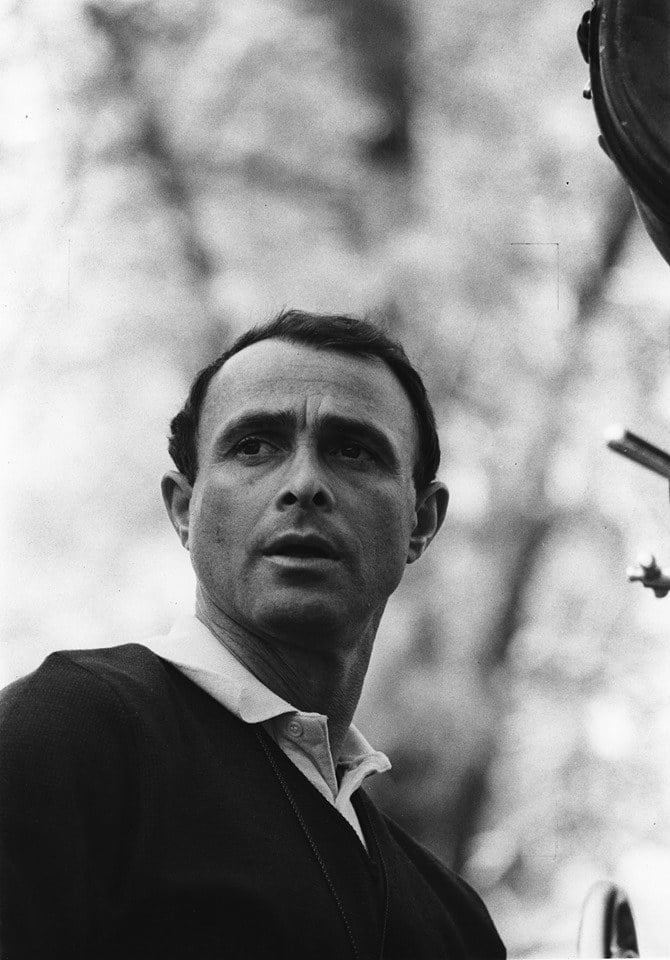
Using the Panavision format was a great aid in shooting the multiple-image sequences, not only because of the widescreen configuration, but because of the sophisticated equipment available, especially the lenses. We used zoom lenses almost exclusively, with occasional use of the 35mm (for wide-angle shots) and their macro lens to get in very close for some of the inserts.
We worked inside many very small actual interiors in Boston, where you couldn't possibly use a dolly, so we used the zoom in place of a dolly. We did have a very small ColorTran dolly and that, in conjunction with the zoom lens, worked out very well.
We used the Panafocal lens (which is a short zoom) and the Angenieux 50-500mm lens, but we rarely used them for zooming. They served more as variable-focal-length lenses. There are only a couple of times in the film when we used fast zooms for shock effect.
In order to light the cramped location interiors, I eliminated big lights, using no Brutes. We had a 150-amp generator and used quartz lamps and small incandescent lights exclusively. We tried to use source lighting and low-key as much as possible. Keeping most everything in low-key not only enhanced the mood, but made it easier for us to go into the black matted multiple-image sequences without too much of a visual jump.
Because we worked in low-key throughout almost the entire picture, and also because the zoom lens had a maximum aperture of F/4.5, we had to force develop practically everything one stop.
We used reflex cameras exclusively on this picture — Panavision cameras, Mitchell Mark IIs and Arriflexes — so that we could get an accurate line-up of our mattes, which were placed in the viewing portion of the reflex system only.
We would, however, shoot full-frame, with the area in dead center that would be matted for a panel later on and moved to the area of the frame where it was designed to be. I would usually light only that area that was to be used in the panel and let the rest fall off. Also, in centering a small area that would eventually appear at the extreme right or left of the frame we would sometimes run off the set at the edges.
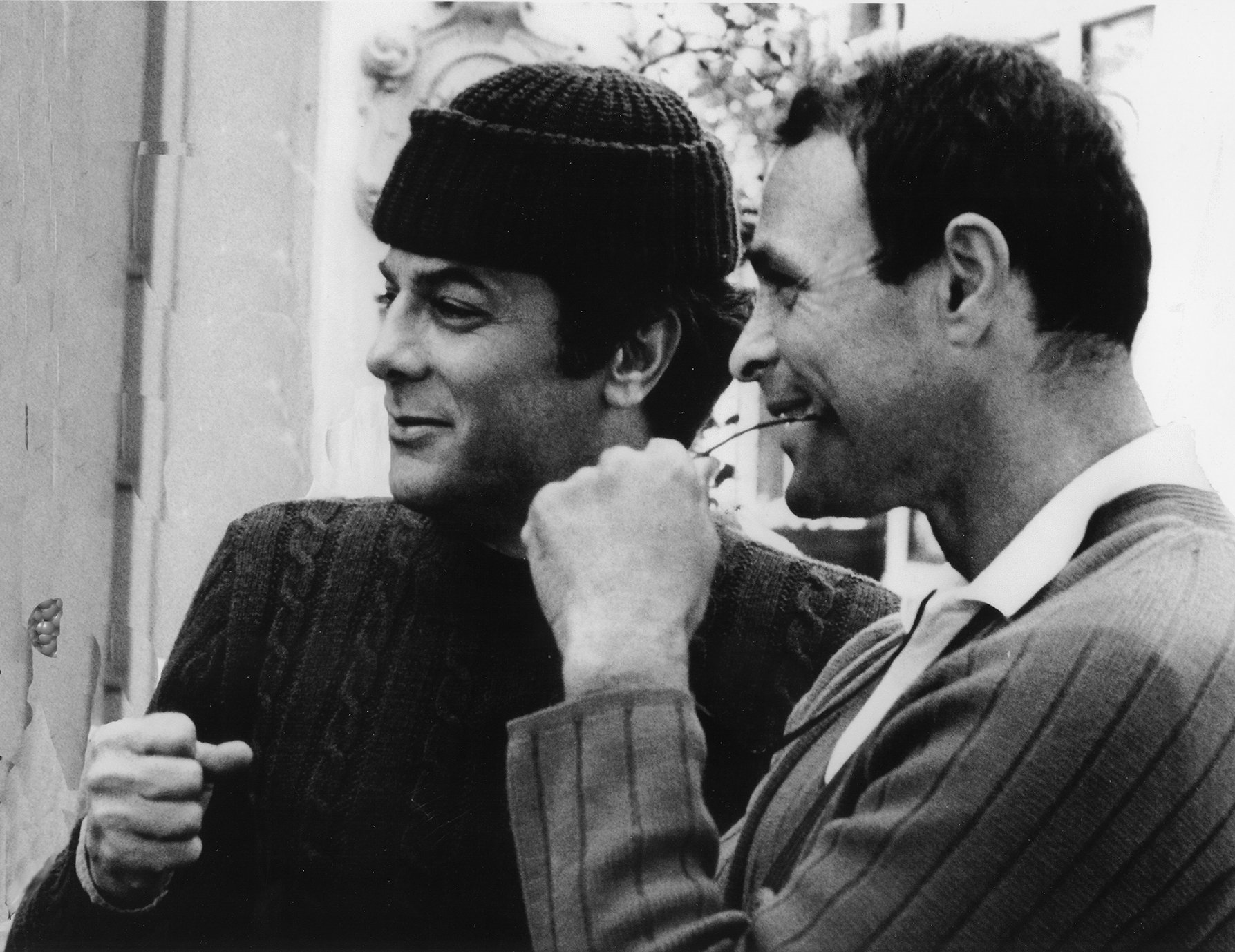
This caused a certain amount of consternation back at the studio. People watching our dailies would say, “My God, the scene’s too dark!” — not taking into consideration the fact that we were only going to use the perfectly well-lighted doorknob in the center of the frame. It also unnerved them to see sound booms and lights and grips hanging in at the edges. Even though they knew very well what we were doing, they could never quite get used to this.
Occasionally, instead of shooting a panel scene framed at dead center, we would position the subject in its precise matte position at the right or left and pan it toward the center — or vice versa. This was in order to avoid having to go to a traveling matte later. It was especially valuable when we would start with a full frame and then narrow down to a fragment of the scene in a small panel, or the other way around.
For example, in a chase sequence we started on a full-frame shot of the strangler running toward the camera with a man pursuing him in the background. The idea was to zoom in on the man pursuing, and then have the matte focus in on a closeup of him as he screams. It was a very tough job to zoom with the matte in the camera and make sure that he would end up in precisely the right spot in the grid — so, in this case, we used a grid made of transparent film and marked on that film the area where he had to end up. It took several takes and great coordination for the operator to end up with him precisely centered, but we did it over until it was perfect, and all on one continuous piece of film.
One of the things I learned through testing was that it was very easy to lose the matte line, especially in low-key scenes, if I did not light so that all four sides of the matte had some highlight or information to preserve the shape of the panel. Since the matte was black, the edges would blend into any truly dark area in the scene and this really created a problem, especially in the night scenes where it was so dark that there just wasn't any separation between the edges of the matte and the darkest areas of the scene.
For a while, we even thought of using a white matte, but the white matte overpowered the scenes. I just had to find ways to light the edges so that you could determine where the matte stopped and the scene began.
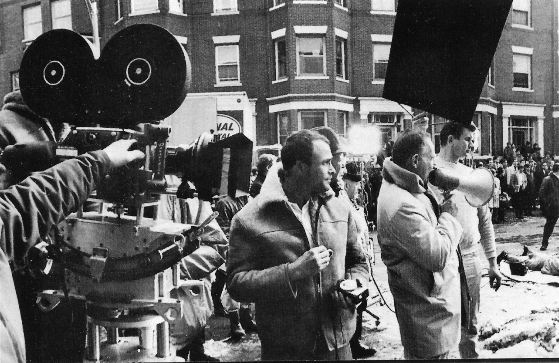
Boston. Only reflex cameras (Panavision, Mitchell Mark II, Arriflex) were used for shooting, with
mattes placed in viewing tube for each panel scene.
In the full-frame scene that was on the screen just before transition to a multiple-image sequence, I would usually set a composition that had a huge, bold framing piece in the foreground, with generally no light on it at all. This framing piece would be positioned to match precisely so that it would become a panel or part of one as we went into the multi-image montage.
In the exteriors, for example, we used the bold trunk of a tree in the foreground, the side of a car, a fire hydrant, a mailbox — whatever form we could find to fill one side of the frame, outlining an area that would eventually become a panel.
We used two cameras in shooting most of the location scenes, and on some, as many as five.
Sometimes we would use the linear elements of a full-frame scene as a compositional base for panels coming up in the next scene. For example, there's one sequence that takes place in a lonely Boston park. Positioned behind a fence, the camera picks up a woman walking along. Then we see a man walking. Suspicious and fearful, she scurries along the minute she passes him. The camera dollies in closer and closer until it arrives so near to the fence that there are five bars filling the frame. These bars become frames for panels showing activity going on in different parts of the city.
This took a bit of care in lighting and matching, for here you have five scenes that have to go into one frame of film side by side eventually. Color values and density values become important, because if one of the five scenes is lighted more brightly than the others, or has more vivid color, your eye will go to that panel and ignore the others. We went by the rule that color values were important throughout the whole show.
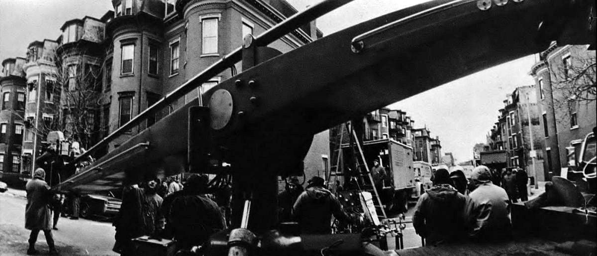
The Boston Strangler is my first feature as an editor, but I had worked with Richard Fleischer as an assistant editor on Fantastic Voyage and Doctor Dolittle.
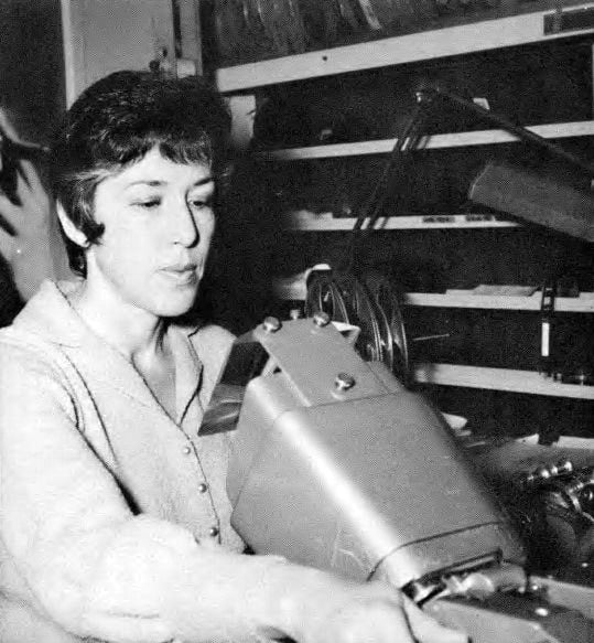
He asked me to cut this film and I started working on it in the very early stages of planning. I was relatively new to editing, but I have a feeling he felt that this would be an advantage, because I did not have fixed ideas and rules limiting me. I have talked to some highly experienced editors who told me, quite frankly, that they would have been floored by the challenge. I probably didn’t know enough to be floored by it — which is great, because I wasn't inclined to say, “You can't do that.”
The truth is that we can do many things that may not have been done before. With the multiple-image technique, for example, I think that, to a certain extent, you have to set your own rules and conventions.
The pre-planning done by Dick Fleischer, Fred Harpman and Dick Kline was a great advantage to me in the editing phase, because they shot everything to the proper size for the final panel composites. The only problem was the sideways or up and down shifting within the frame.
They would put these dailies through their optical printer according to the sequence plan and give me a very quick black-and-white composite with the scenes printed in their respective panels.
In effect, they would go through the same procedure that would be necessary to produce the final composite, except that they would not have to go to all the trouble of making separation masters or interpositives.
In my optical order, I would have indicated which particular shot would go into which panel, the size and shape of the matte to be used, the scene’s duration on the screen, how it came in and went out, whether it was a direct cut from black or a dissolve or a fade. The black-and-white composite which they gave me back would tell me if my timing was correct, whether certain scenes looked well together and whether I would have to make any adjustments. Using the dailies in this way made it possible to get these answers practically overnight, instead of having to wait several weeks for a finished color composite.
The main problem of editing multiple-image sequences is the fact that, as the sketches which were made ahead of time made it possible to eliminate almost all of the dialogue an editor would ordinarily have to engage in with the photo effects department, because they had the same sketches that I had. I did have to give certain instructions, of course, but normally they could tell from the sketches just how each scene should be positioned within the frame.
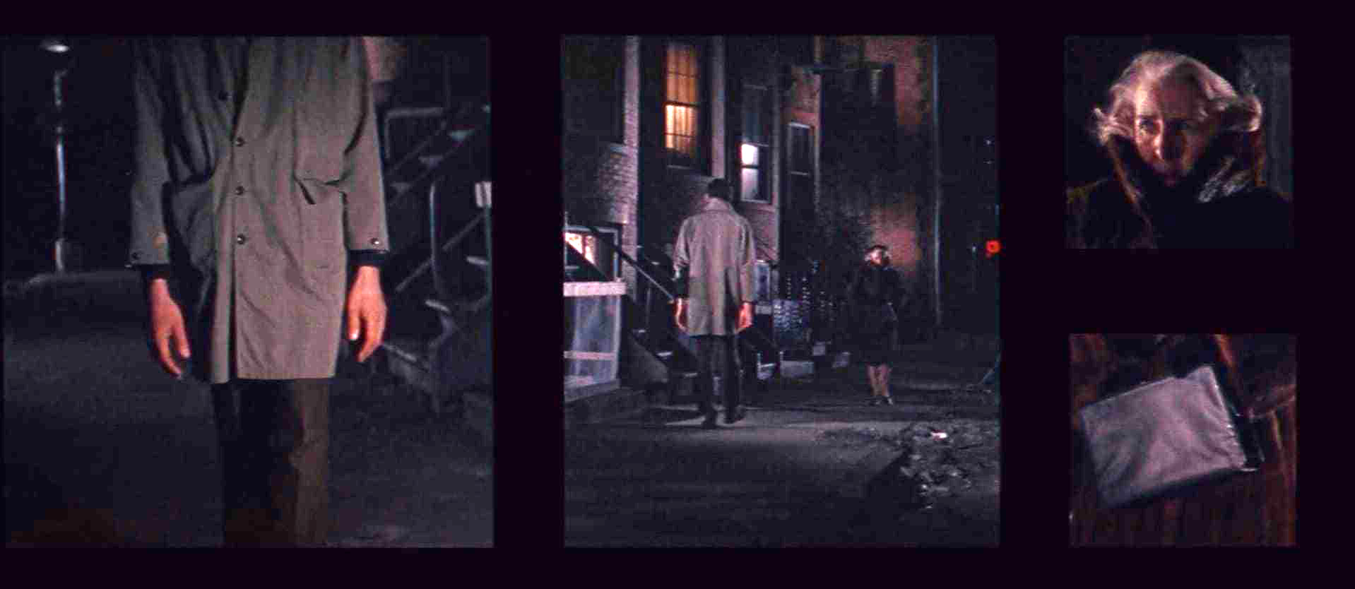
To me, the biggest problem in cutting multiple-image footage has to do with something you can't very well pre-plan. It is not the selection of the significant action, but how to get from one group of panels to the next group of panels. You cannot simply make direct cuts. You have to achieve a flow of smooth panel transitions. You must preserve a pleasing design, while considering where the eye is going to go within the frame. Laying out the opticals is very much like working a puzzle. You have to enjoy puzzles in order to enjoy working on this kind of film — and, luckily, I do.
We hit upon an idea that speeded the editing up considerably. It involved using the color daily as a sort of negative to make a trial composite. For example, I would plan out a multiple-image sequence that had several panels working within it. Then I would write out the optical order and give it to the photo effects department along with the separate scenes in color daily form.
As far as I know, there has never been developed any suitable apparatus for handling several strips of film at once. You have all these strips of film and a Moviola through which you can run only one strip at a time. You also have a synchronizer that you are lucky if you can get more than four strips into.
The truth is that you just can’t sit at the Moviola and imagine 12, or even 7, scenes on the screen together. You do your best to visualize where the significant action in each panel is and how it will relate to the others. You try to retain it all in your mind, but you’re never sure whether it will work until you see it in composite form. I think that until someone dreams up some sort of more elaborate viewing apparatus, this is the way it will have to work.
Our department became involved with The Boston Strangler at the onset of the pre-planning stage. The multiple-image approach was a product of Richard Fleischer’s thinking and it was backed up with an excellent storyboard by Fred Harpman, who is a very talented designer. He and the director worked things out so well in advance that we were able to go “by the numbers” in doing our part of it. We manufactured a grid they could put into the viewing tube of the camera in order to line up the shots directly with the panels on the storyboard.
The picture was shot in Panavision which, of course, is an anamorphic system, but for technical reasons many of the multiple-image scenes were shot with spherical lenses. This was all right, because we knew about it in advance and had planned for it. We were able to optically squeeze these scenes and set them in nicely.
We used a double-head optical printer for all of the multiple-image work, which was a great help. It enabled us to carry a matte in the prime head and the subject matter film strip in the aerial image head. This head can zoom and relocate an image in the frame and do everything a normal single-head optical printer can do. You design your mattes to open or close or do whatever you want them to do. This leaves you free to locate the subject matter you are trying to put into a particular panel, in any dimension you may want it.
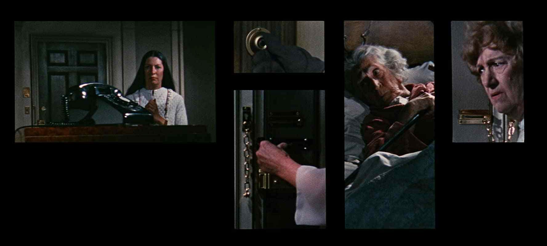
We did all of our duping with separations, which produces a much better quality of dupe. If, for example, six panels were to appear in the frame at the same time, we would Cinex for color and density each of the six separate scenes, lay them out on a timing board and then go up and down the Cinex strips until we found compatible matches. Then a technician would sit at the optical printer for four hours and put it all together.
There is one multiple-image sequence in the picture which involves several TV screens, some in black-and-white and others in color. We set up a closed-circuit television chain and photographed the material right off of it. This closed-circuit system was designed to run at 24 frames per second, instead of the normal 30, so that the phasing problem was eliminated.
One thing that helped very much, especially since editing of the multiple-image sequences was such a problem, was the practice of making what we called “quick and dirty” black-and-white assemblages of the panels into composites, using the color dailies. We’d throw these together very quickly and everyone would look at them and say, “Let’s make this a one-foot dissolve instead of two,” or “Let’s slip this action eight frames forward, or two feet backward.”
This was a really practical way of checking simply for the mechanics of the sequence. We didn't have to get involved with color or balance or anything like that.
The use of the multiple panels, especially in this film, is very effective. It makes possible the progression of several story lines simultaneously and you can tell so much story in such a short space of time. The technique has its own special sense of excitement which seems to exhilarate the audience. What amazes me is the ability of the viewer to scan so many images and absorb so much. I wouldn't have believed it if I hadn't experienced it myself.
I really believe that the success of this multiple-image technique depends mainly upon the designer and the director. Fleischer is marvelous at this sort of thing. He really is a great pre-planner. Once he gets it set he doesn’t change his mind. He goes that route. Which means that when we get all the parts, they actually fit together. With such careful preparation, the mechanics at my end — though tedious— become relatively simple.
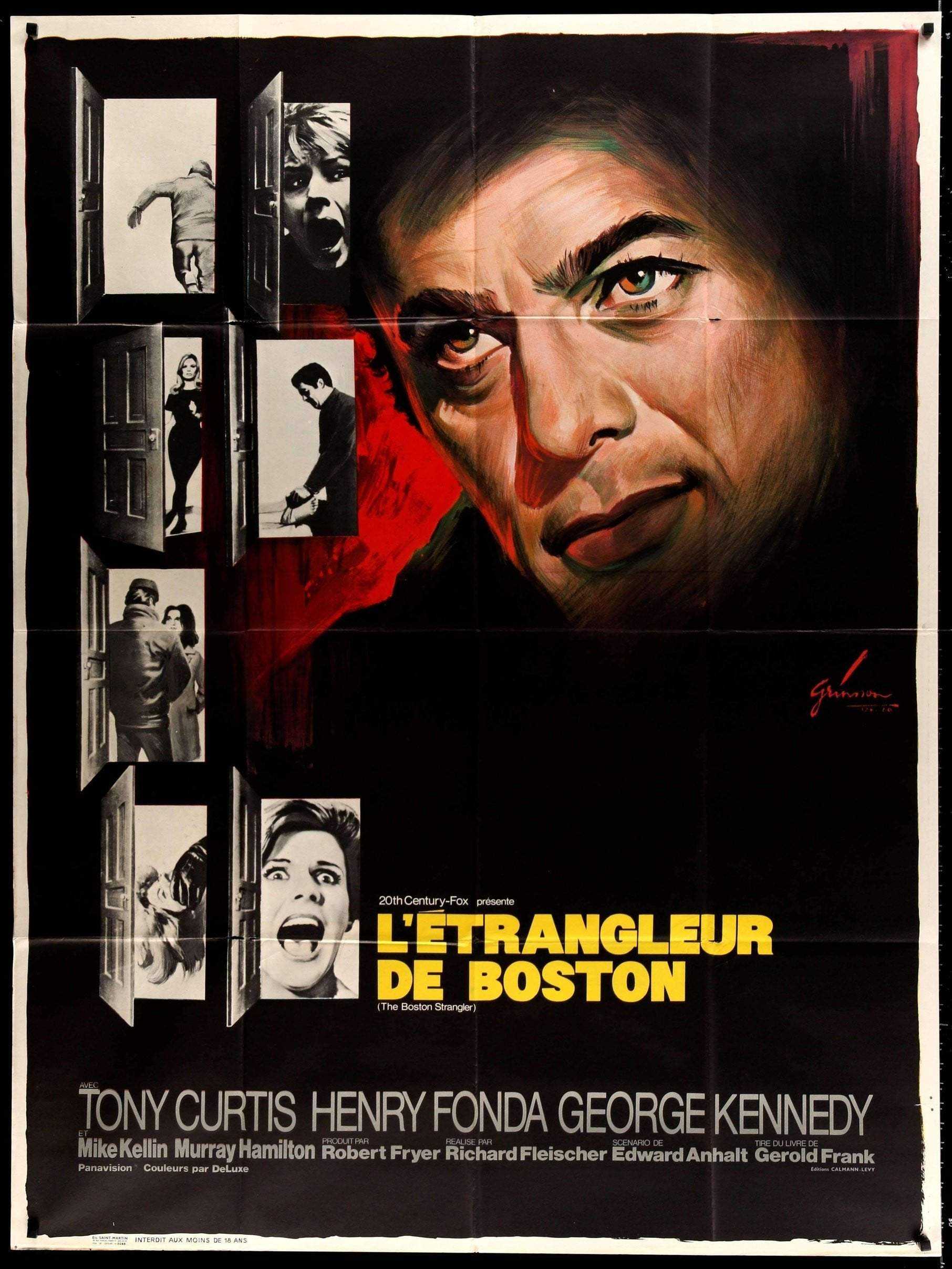
Of note, Fleischer would revisit the true-crime genre with the serial killer drama 10 Rillington Place (1971).
Kline and Fleischer would collaborate again on the the dystopian sci-fi classic Soylent Green (1973), the action film Mr. Majestyk (1974) and the historical drama Mandingo (1975).
One of Kline’s camera assistants on The Boston Strangler, Thomas Del Ruth, would later become a noted cinematographer himself, and a member of the ASC.
If you enjoy archival and retrospective articles on classic and influential films, you'll find more AC historical coverage here.
