Nightmare Fuel: Experts on Creating Eerie Images
ASC cinematographers on creating iconic horror imagery for 10 outstanding examples of the genre.
Editor’s note: AC subscribers can click through to extended articles on most of these entries.
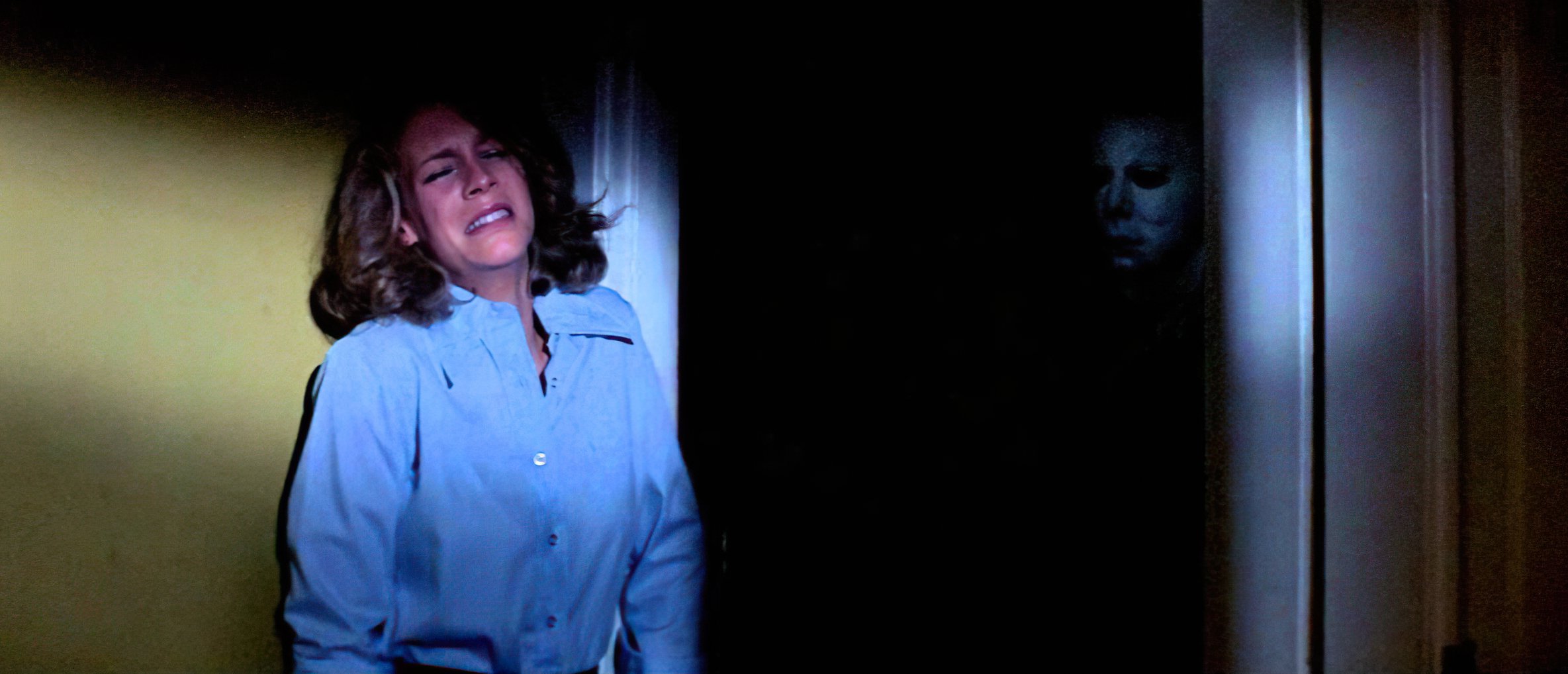
Halloween (1978) - Dean Cundey, ASC
“One of the things that [director] John Carpenter and I talked about [in prep] was the visual mechanics of scaring the audience — red herrings, double scares, misdirection — which had all been around long before, but we organized them as a set of techniques. One of the great things about the anamorphic frame is that there’s a lot you can do with the edges of compositions — creating ‘lurking space’ of shadows around the subject, like in darkened doorways where something might or might not be hiding — that are psychologically stressful and create tension. Audiences are more used to this grammar now, so it’s a matter of figuring out how to twist that a little bit.”
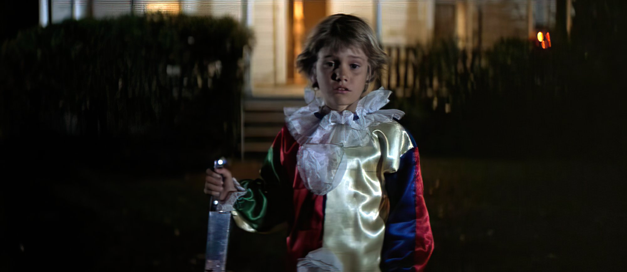
(Compass International Pictures, 1978)
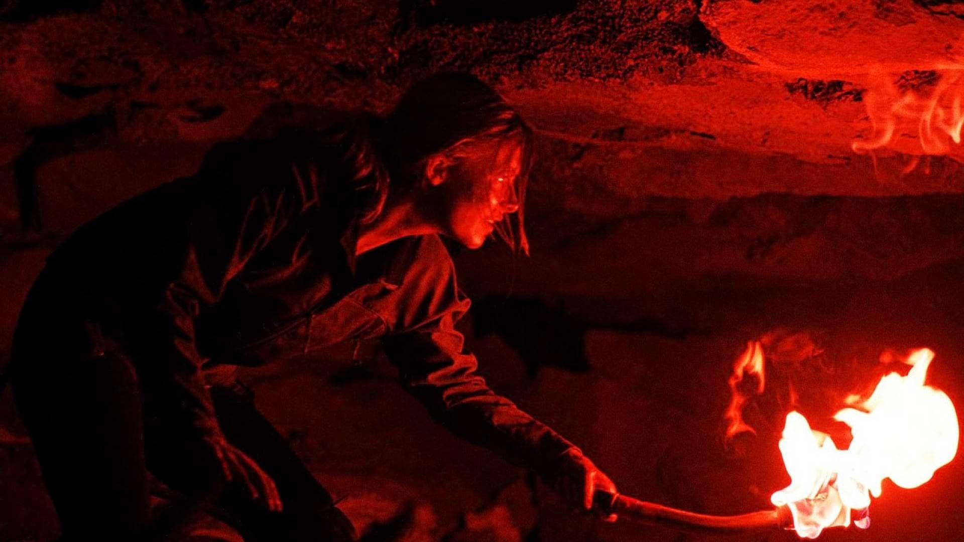
The Descent (2006) - Sam McCurdy, ASC, BSC
“[Dean Cundey, ASC’s camerawork in] Halloween has a graphic simplicity. [Director] Neil Marshall and I wanted that same feeling for The Descent — that simplicity. We didn’t want any visual clutter, just a straight-ahead look that delivered the story. There was a quality to the horror films of the late 1970s largely based on suspense; they didn’t use gore, fancy lighting or overly clever camera moves, just strong images.”
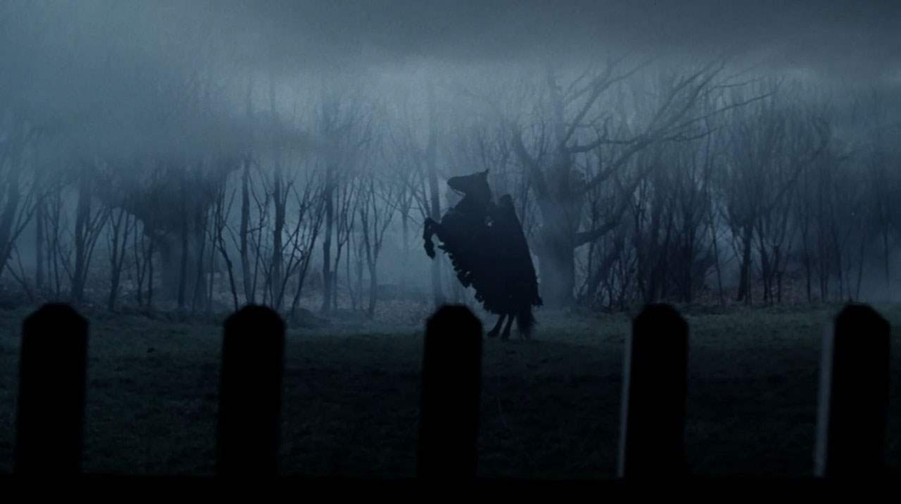
Sleepy Hollow (1999) - Emmanuel Lubezki, ASC, AMC
“I was familiar with the most famous Hammer films, like their Frankenstein and Dracula movies, but I’ve never been as big a fan of them as [director] Tim [Burton] is. I don’t think Sleepy Hollow resembles the Hammer films, except in the way that it was made. We did a lot of work on soundstages, and we tried to emulate that ‘classic movie’ feel. The Hammer films were made that way because the filmmakers didn’t have a lot of money. We did it because Tim liked the idea of creating a synthetic, pictorial look. That also gave us control of the various visual elements, such as the color and contrast, as well as the seasonal elements, like fog and wind. We also wanted to control the amount of reality in the movie. It’s not a historical reconstruction, it’s a fantastic tale. Our biggest frame of reference was Black Sunday [1960, photographed by Mario Bava and Ubaldo Terzano]. That film is interesting because the images are very clear and strong.”
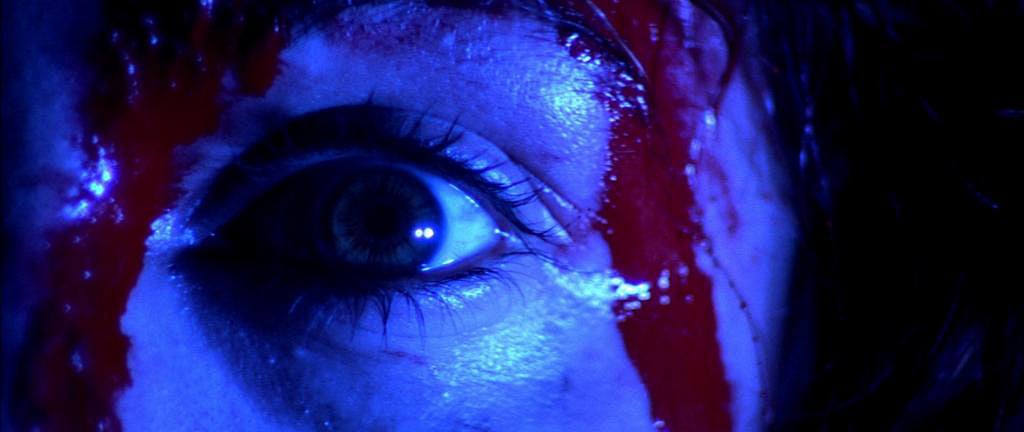
Suspiria (1977) - Luciano Tovoli, ASC, AIC
“A horror film brings to the surface some of the ancestral fears that we hide deep inside us, and Suspiria would not have had the same cathartic function if I had utilized the fullness and consolatory sweetness of the full color spectrum. To immediately make Suspiria a total abstraction from what we call ‘everyday reality,’ I used the usually reassuring primary colors only in their purest essence, making them immediately, surprisingly violent and provocative. I decided to intensively utilize primary colors — blue, green and red — to identify the normal flow of life, and then apply a complementary color, mainly yellow, to contaminate them. This brings the audience into the world of Suspiria. You say to yourself, ‘This will never happen to me because I have never seen such intense colors in my life. This makes you feel reassured and, at the same time, strangely attracted to proceed deeper and deeper into this colorful journey.”
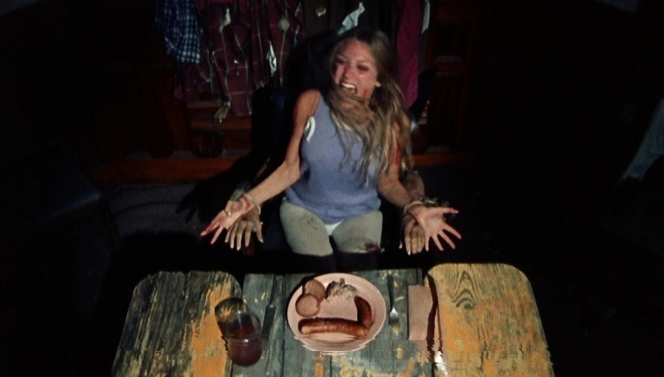
The Texas Chain Saw Massacre (1974) - Daniel Pearl, ASC
“[Director] Tobe Hooper and I talked about how less is more in terms of lighting and what we should see. But there are three primary things that resulted in the realistic, almost documentary, look of the film. They were the compositions — which are sometimes more ambitious and creative, but generally simple — the generally basic lighting — because I was inexperienced and had very few lights to work with — and the photographic tools we had — which were an Éclair NPR 16mm camera and [ISO 25] color reversal film [generally used for news and documentaries]. There was also the limitation of our [production] time, which was very tight.”
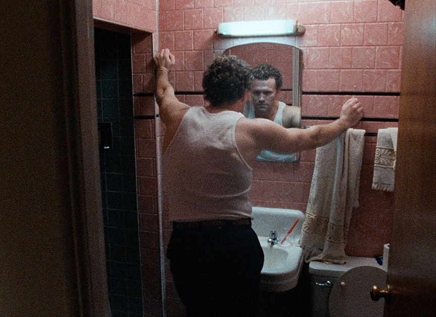
Henry: Portrait of a Serial Killer (1986) - Charlie Lieberman, ASC
“Each night, before the next day’s work, I would try to figure out how to make the scene scary. I had no money, so I developed this method of revealing certain things in these long, seeking shots. I wanted the audience to think ‘Please don’t go around that corner’ and ‘Please don’t show me what you’re going to show me — but show me.’ It’s what’s around the corner that’s the scariest thing. The budget limitations meant that we couldn’t shoot ‘action horror.’ We didn’t have the time or resources for makeup effects, and, in most cases, we only had one costume for the actors, so getting fake blood everywhere was not practical. We instead created this way of slowly revealing the aftermath of a crime while hearing the audio of what had taken place. You hear the gunshots and screams as we gradually reveal these gruesome scenes. Our editor [Elena Maganini] did a fantastic job.”
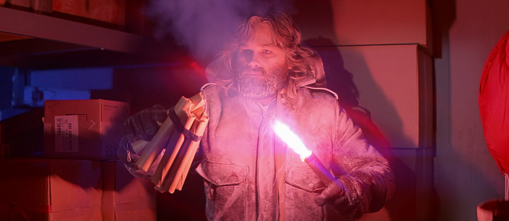
The Thing (1982) - Dean Cundey, ASC
“It was evident to me that [special makeup effects supervisor Rob Bottin’s] work was so great that we needed to see the creature. I hated to relegate it to silhouettes or something like that, but I also knew that if we went too far, we could give away the fact that it was a lump of plastic with paint on it. I worked with Rob to develop this idea that we would set up each encounter in an area where we could justify using a number of very small lights that would highlight areas, surfaces and textures. Then I would light the back wall of the set so that you could see the shape of the creature. It became a very interesting game of showing just enough for the audience to understand what was happening while still keeping the creature a little mysterious.”
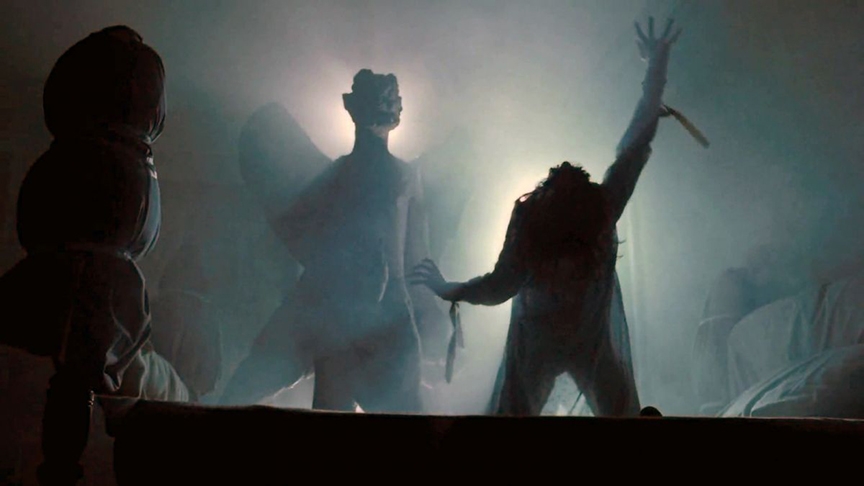
The Exorcist (1973) - Owen Roizman, ASC
“There is a part during the exorcism scene when the demon causes the lamps to go a little crazy. They would flicker and dim and do weird things and the lighting pattern would change completely. The one fundamental lighting change occurs when the room shakes and one of the lamps falls over. From that point on, one lamp is on the floor and the other one is still on the night table. This gave the set an entirely different look for the rest of the exorcism — and added to all of the problems. At the very end of the sequence, [director] William Friedkin wanted the room to have a completely different feeling, even though the basic source lighting remained the same. He wanted it to have an ethereal quality — a very soft, glowing, cool sort of thing. We tried, at that point, to work with absolutely no shadows in the room, using just bounce light — and I think we achieved the correct overall effect.”
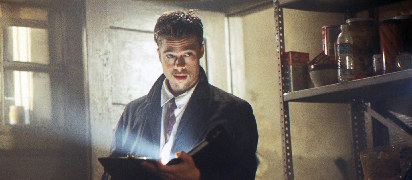
Seven (1995) - Darius Khondji, ASC, AFC
“[I’d] wanted to do a film like Seven for a long time; I grew up dreaming about it. I was introduced to cinematography by going to horror films. Films like Dracula starring Christopher Lee were very important to me when I was a kid. [Director] David Fincher and I believed the film should be scary, but very modern. One of the first [visual examples] I brought with me was The Americans by Robert Frank. It became a bible for me. It’s all black-and-white, but the photos have the spirit of modernity. You feel the dynamic in Frank’s photography — which also helped me decide on the Primo lenses. The Panavision system is great, but I wanted the Primos which I knew would give me that same feeling. So we shot the movie on Primo lenses in Super 35. We wanted to have this tough, handheld image mixed with some Steadicam — in the spirit of The French Connection, but also stylized and scary with spiritual lighting, like Klute.”
28 Days Later (2003) - Anthony Dod Mantle, ASC, BSC, DFF
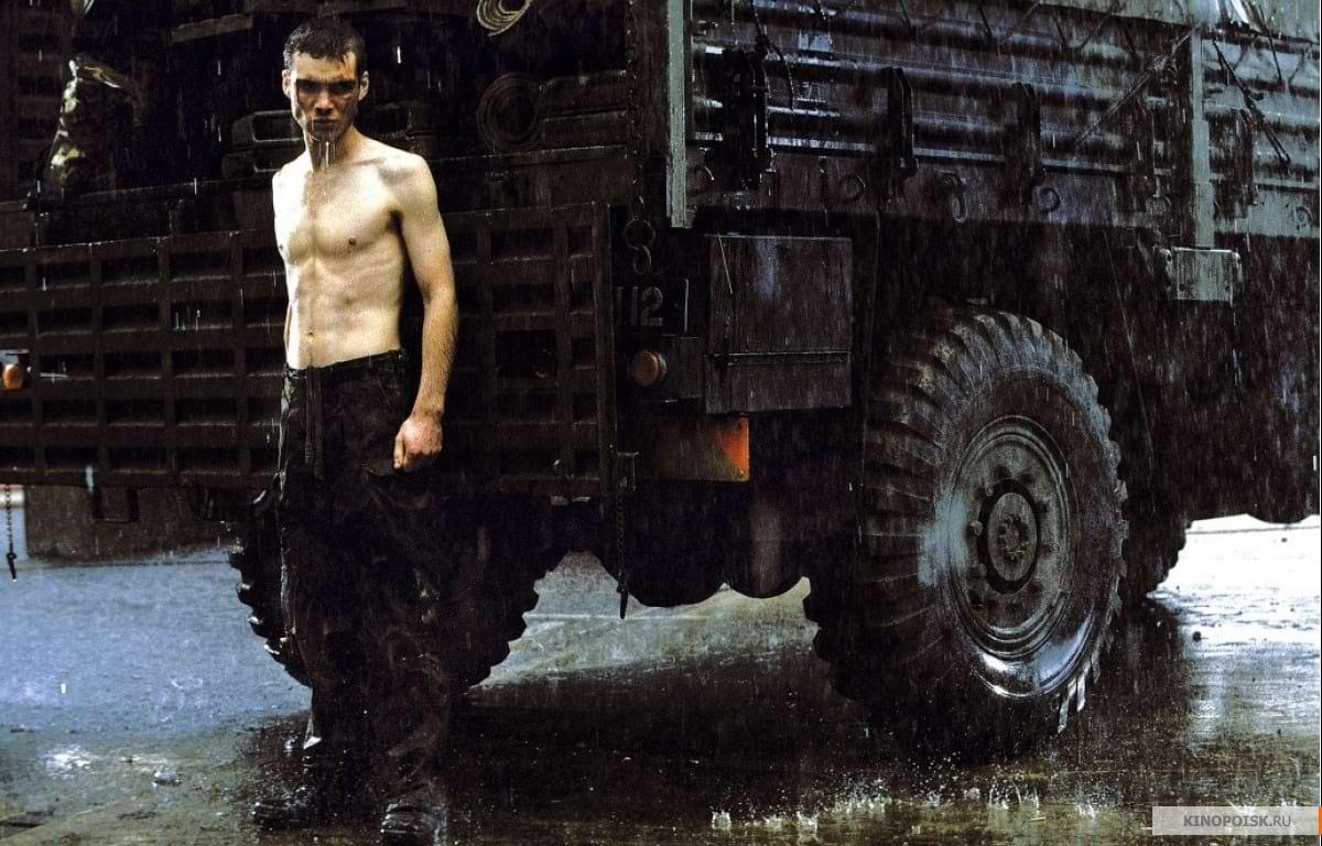
“You can’t avoid the parallels [with other zombie outbreak films], but we didn’t pull out any genre movie of that kind and sit down like good boys and look at it. Looking at one piece of work of the same genre can send you off on a kind of secondhand journey, so I think it’s best to create your own world.”
