Roger Deakins, ASC, BSC: Six Favorite Films
The renowned cinematographer selects and discusses some masterful features that have left a lasting impression — and influenced his own work.
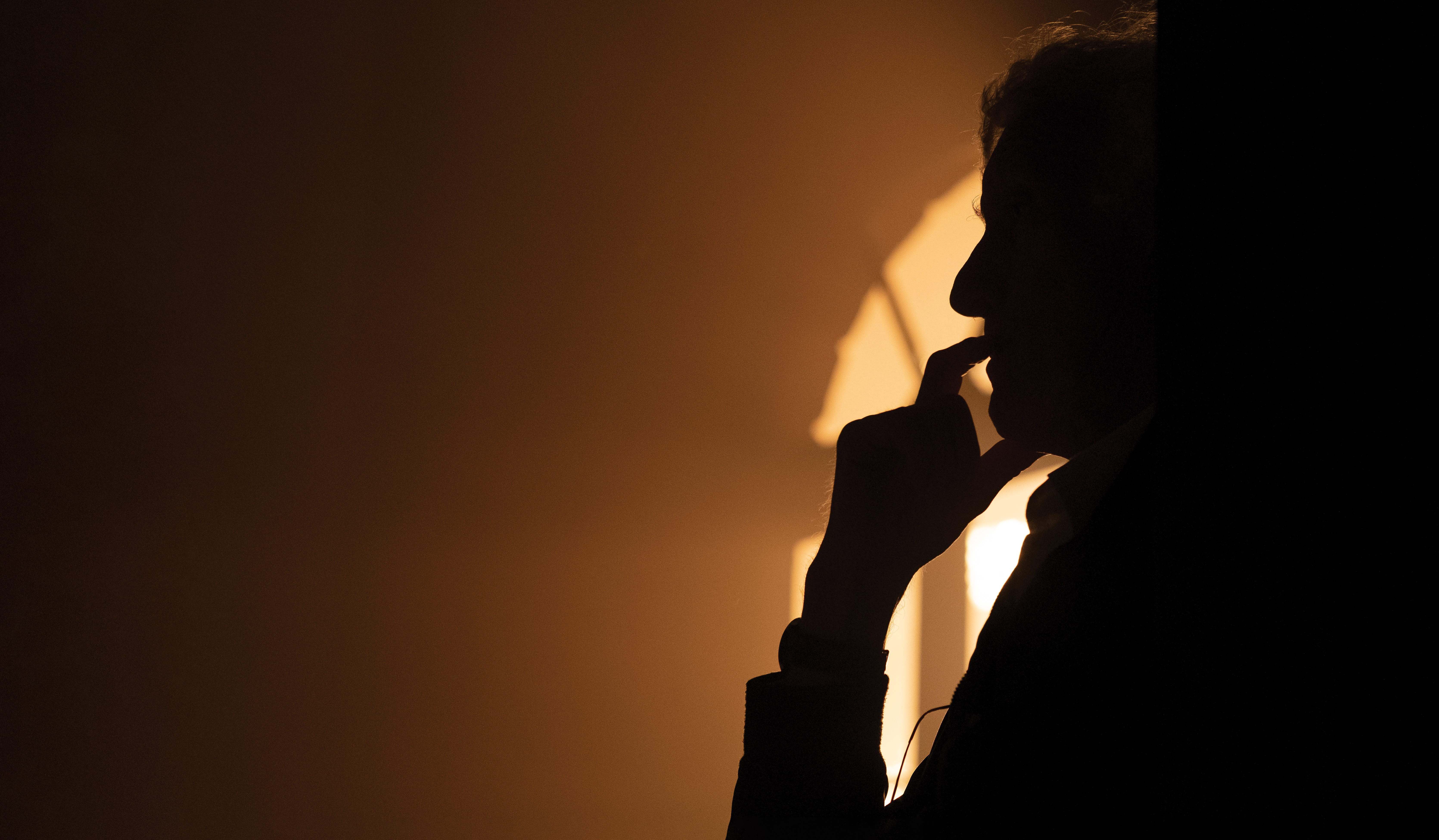
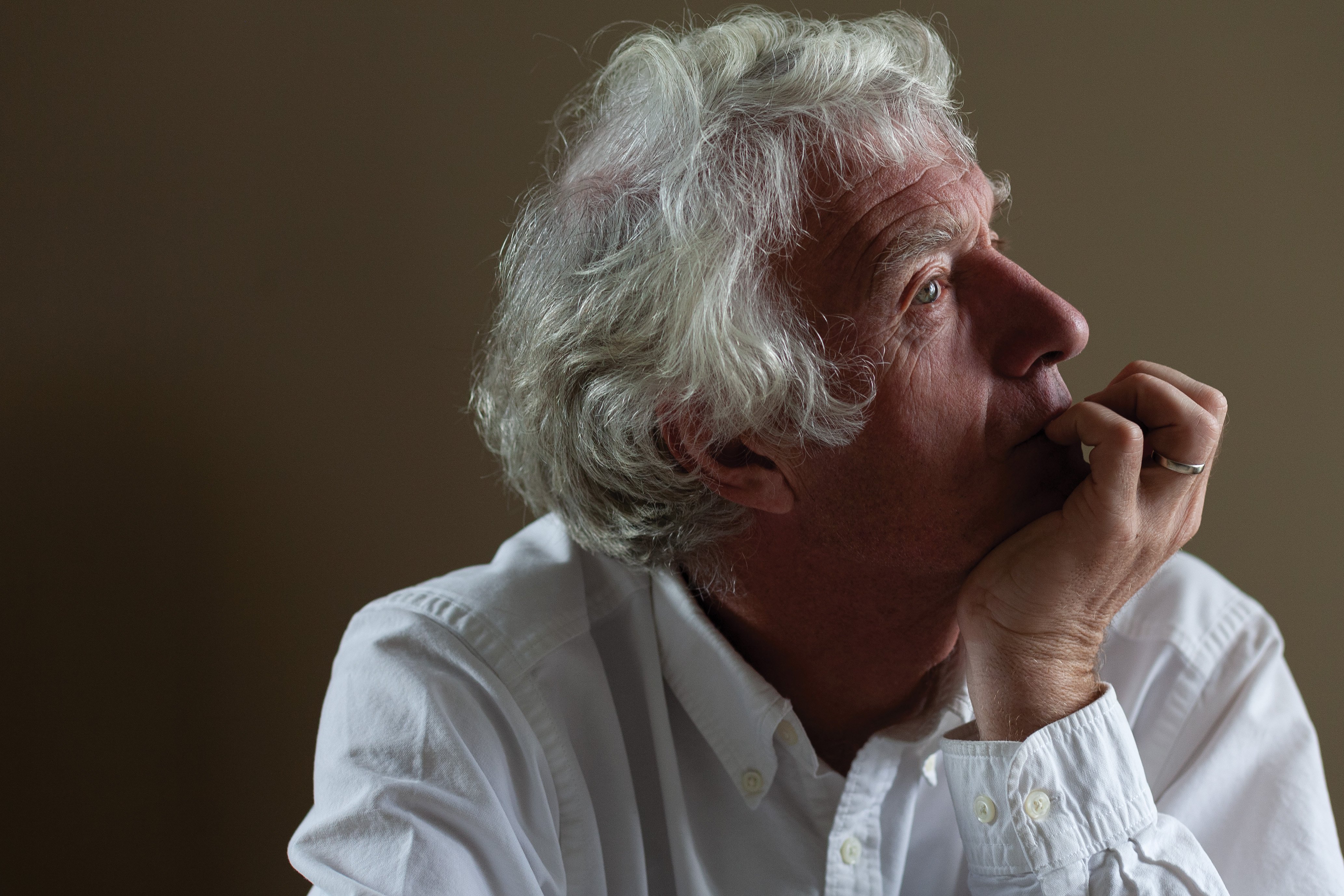
Roger Deakins, ASC, BSC has reached a rare altitude for practitioners of his craft. His mantlepiece is crowded with cinematography honors; his name is familiar even to non-industry movie lovers; he’s been knighted by Queen Elizabeth II. But despite all the acclaim, Deakins remains, at heart, a passionate connoisseur of cinema who revels in the art form’s ability to transport viewers to higher planes of emotional, spiritual and intellectual engagement. Put more plainly, he’s a huge fan of movies, just like the rest of us. As one might expect, Deakins is a discerning buff whose knowledge encompasses films from every era and all regions of the world. When AC asked him to select and assess six films that have inspired him as both a film buff and a cinematographer, he quickly agreed and sent the magazine a list of six titles.
Pondering the list reveals some common threads. European perspectives abound, as three of the directors are Russian, two are Italian and one is French. Faces and environments, rather than overt action, are key to the storytelling. Each film subscribes to the cinematic philosophy of “show, don’t tell,” with meditative atmospheres that encourage audiences to truly ponder the imagery. Active viewership is required to fully grasp the stories being told, and their underlying themes. Finally, the specter of death, and a sense of foreboding, looms in each narrative.
Collectively, the films in this mini “Deakins Festival” comprise a rigorous but rewarding journey. Five of the six are commonly acknowledged by film scholars as timeless masterpieces; the most recent, released in 2011, may be less familiar but enjoyed a wave of critical acclaim.
Acknowledging the heavy themes that prevail in his selections, Deakins says, “I go to the cinema like everybody else, to escape, and I enjoy some fluffy movies. But if you ask which of my favorites have really meant something to me over the years, then these are the kind of films that resonate with me.” With a rueful chuckle, he adds, “Sadly, I have a very jaundiced view of mankind, and frankly, the filmmakers I’ve worked best with tend to have a similar perspective. I gravitate toward movies that challenge the viewer’s beliefs or question the nature of reality. The films that really stick with me are the kind that make me consider my opinions.”
Here are Deakins’ selections, in chronological order and accompanied by his observations.
L’Avventura (1960)
Director: Michelangelo Antonioni / Cinematographer: Aldo Scavarda
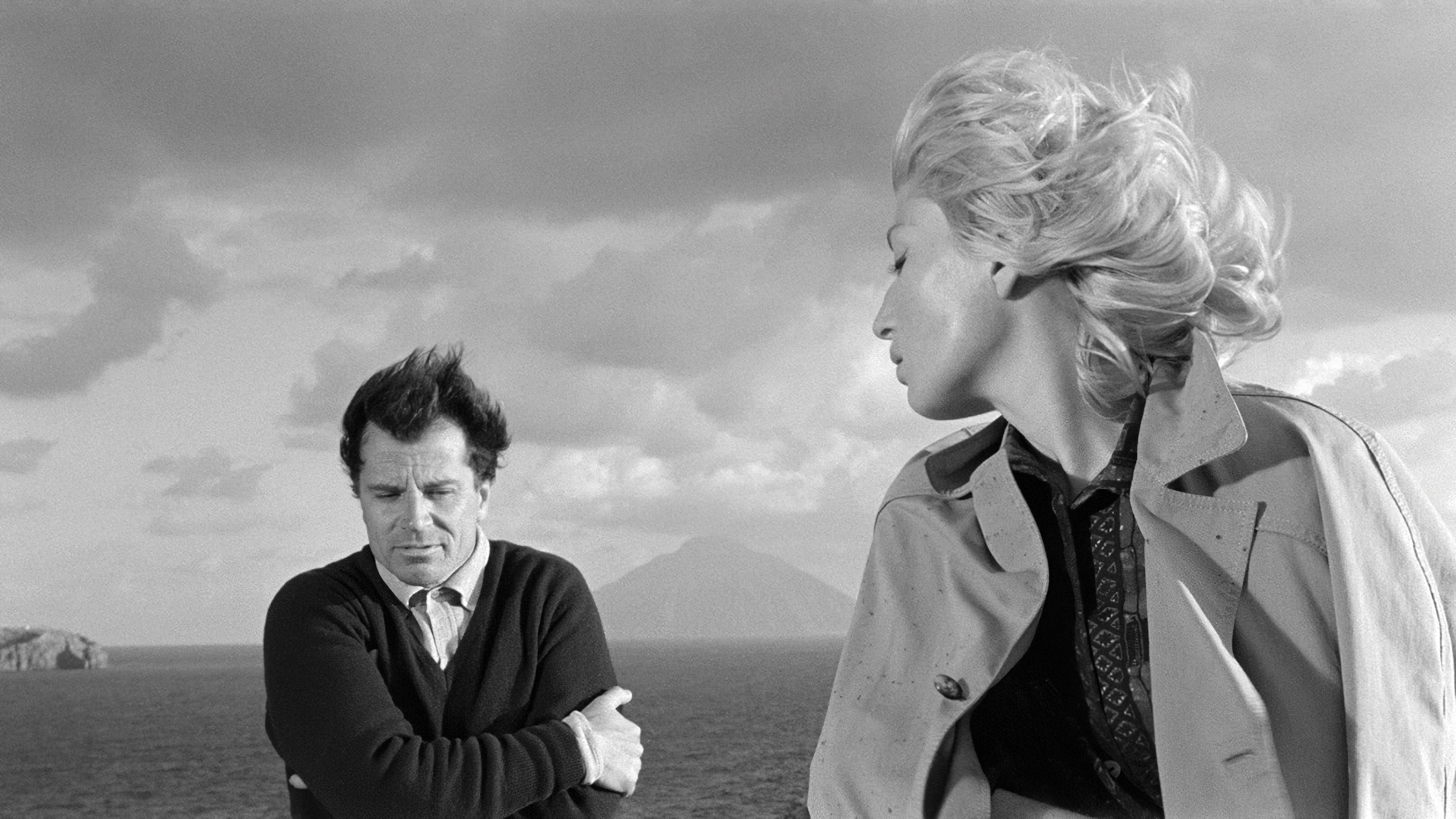
When it premiered at Cannes, Antonioni’s early masterwork was scorned by audiences frustrated by its languid pacing and abandonment of traditional storytelling, but its audacity was still rewarded with the festival’s Jury Prize. Many of the director’s narrative strategies and techniques represent a radical, sophisticated advance in cinematic language, aided by cinematographer Scavarda’s striking black-and-white cinematography.
The film’s plot superficially concerns a woman’s mysterious disappearance during a Mediterranean boating trip, and the subsequent relationship that develops between her lover and her best friend. But Italian neorealism was giving way to movies that addressed the inner psychologies of characters, and the settings and imagery in L’Avventura are used to subtly telegraph the internal turmoil of its key protagonists as they become distracted from the supposedly urgent mission to find their missing intimate.
“I probably saw L’Avventura for the first time when I was in my teens,” Deakins recalls. “At that point in my life, I was watching it through different eyes, so I didn’t really relate so much to the story — I think I was just taken by the imagery and the construction of the shots. I was always interested in the cultural differences between films from different countries, and how approaches to international films developed and varied — so I was aware of Italian neorealism, and I found it interesting to see how Antonioni approached the characters and settings [in a new way].
“There are so many things in the film that are not driving a [traditional] narrative, and that’s what I like about it...”
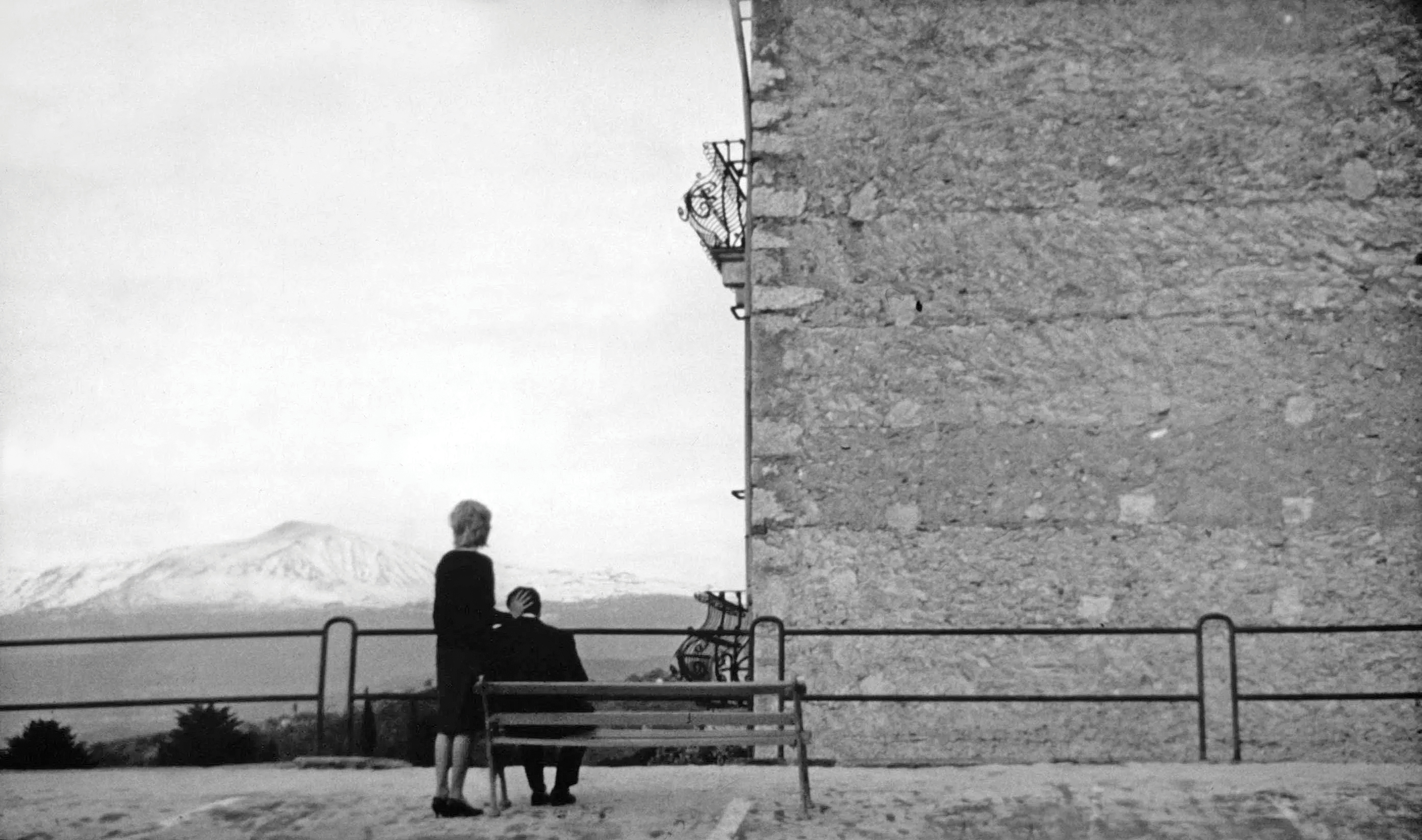
Around the same time, Deakins was absorbing other films that sprang from experimental, avant-garde sensibilities, including Alphaville and Last Year at Marienbad. “I didn’t always understand them completely, but I really admired those kinds of movies as film art — the images, sound and camera movement were so compelling that you couldn’t avoid being drawn in.”
In L’Avventura, he points out, “there are so many things in the film that are not driving a [traditional] narrative, and that’s what I like about it — the approach seems more true to life. Maybe that approach makes the film more challenging for an audience, but I like being taken through the story in a different way.” Citing an example, he notes, “There’s a scene in the film where the couple stop at this little village, and it’s empty. They’re surrounded by Fascist architecture, and there’s a church in the middle of town. They just stop there and walk around — you don’t know what they’re doing, or why they’re there. And then they leave. But there’s something about the scene that’s really engaging. You may not grasp the full meaning on your first viewing, but personally, I enjoy the kinds of films that have enough subtext to make you think and inspire you to watch them again.
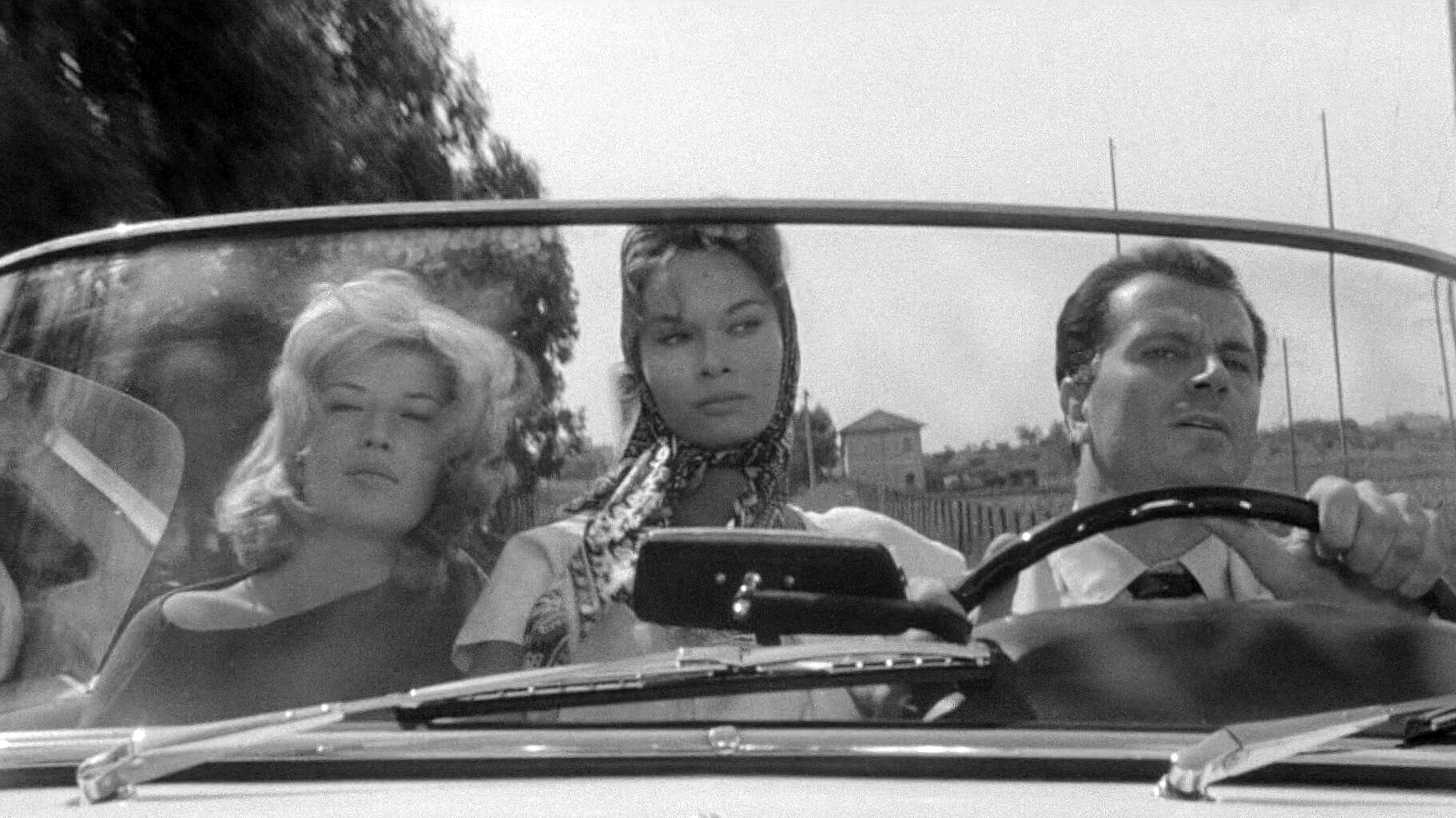
Occasionally, the lessons Deakins gleans from a film are at odds with elements praised by academics, or that film scholars may embrace or find intriguing. L’Avventura is often hailed for breaking cinematic rules to illustrate the characters’ alienation from each other — as in cuts where protagonists who are speaking to each other are shown facing in opposite directions, abandoning the traditional rules of screen grammar. “It’s interesting to me that people do that all the time now, but I don’t subscribe to it,” Deakins asserts. “You’ll see a film where characters on the left of frame are looking left, and it’s cut against a shot of somebody on the other side of the frame looking the other way.
Personally, I find that very disorienting, and it’s so overdone now that it’s become an affectation. But I think the way Antonioni uses those techniques helps you feel the disconnect between the characters on a subconscious level.
Once Upon a Time in the West (1968)
Director: Sergio Leone / Cinematographer: Tonino Delli Colli, AIC
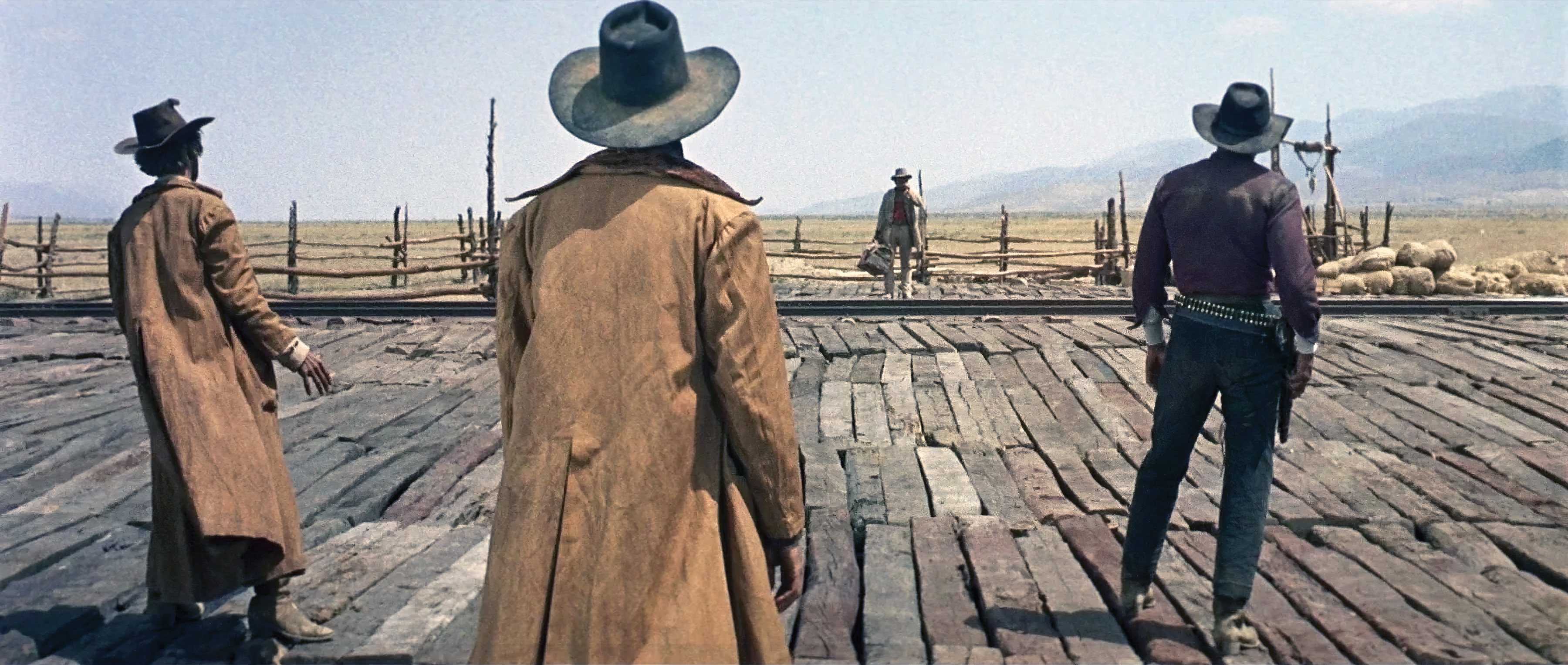
Leone’s ambitious, atmospheric Western is memorably presented in glorious, widescreen Techniscope. Introduced by Technicolor Italia in 1960, the format utilized a two-perforation negative pulldown per frame instead of the standard four-perf frame common to 35mm photography. Its 2.32:1 aspect ratio could easily be cropped to the 2.35:1 widescreen ratio because it used half the amount of 35mm film stock and standard spherical lenses. Distribution prints for theatrical venues were made by enlarging the frame from a two-perf flat ratio to a four-perf anamorphic ratio. According to cinematographer Delli Colli, this choice suited Leone’s style and saved the production a lot of raw film stock, despite the director’s penchant for shooting plenty of takes.
The movie’s central theme is the fading of the Old West amid relentless modernization and greed, but the narrative can also be viewed as an elegy for the Western genre itself. Each of the characters symbolizes an aspect of the main theme, and while the picture is a veritable mixtape of homages to other famous Westerns, the classic tropes are often revised and reconfigured in new and unexpected ways — like casting Henry Fonda, known for his famous roles as Western heroes, as the baddest of black-hat bad guys. “Thematically, it’s similar to The Assassination of Jesse James [by the Coward Robert Ford], or The Wild Bunch,” Deakins says. “All are about characters whose time is passing on. They can’t keep up, and they feel disconnected with the way the world has gone.”
“A film works best when it’s images and sound — it doesn’t have to be done with dialogue, or linear narrative storytelling.”
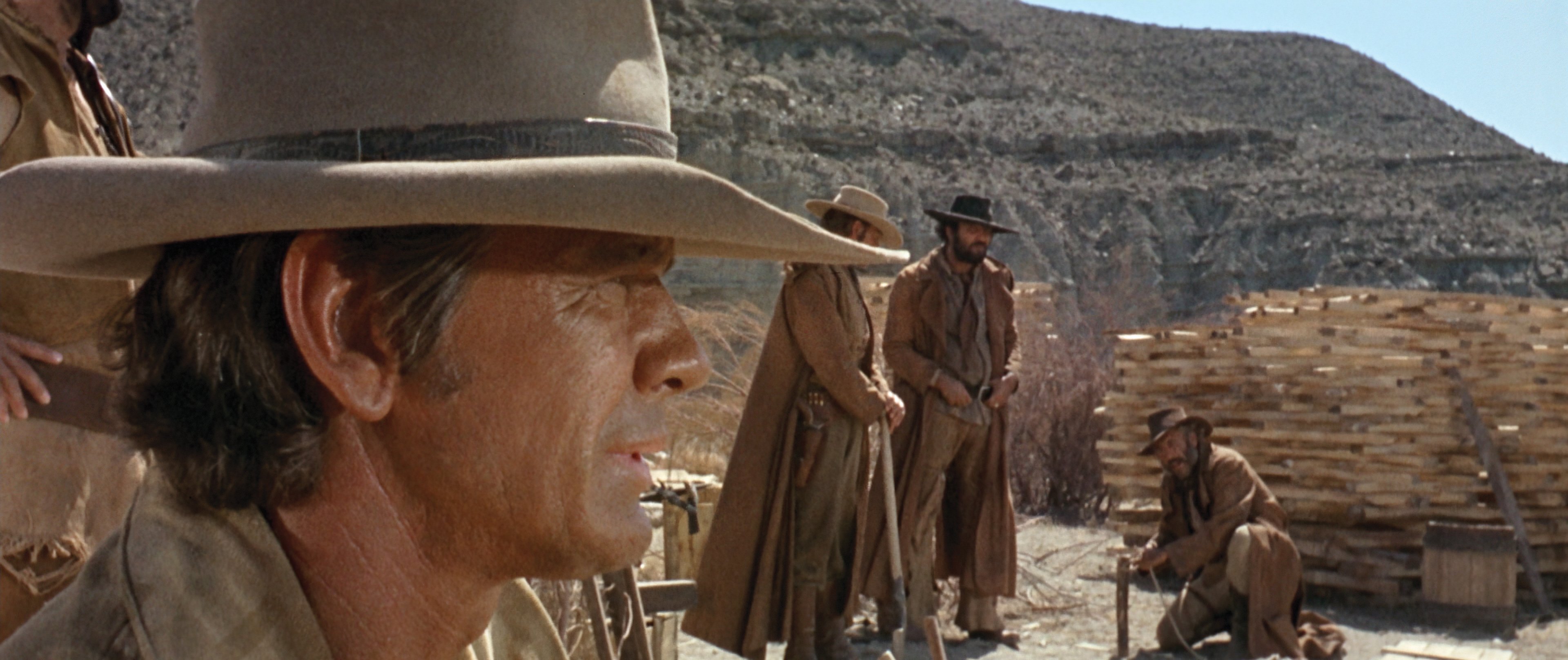
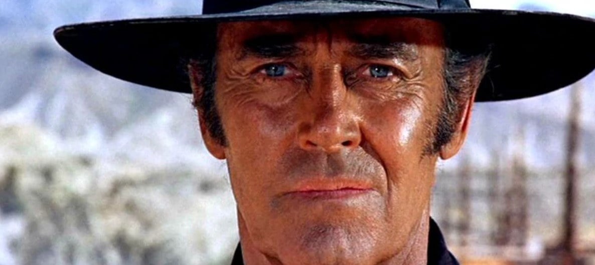
Deakins notes that the elements of Leone’s signature style, further magnified by composer Ennio Morricone’s immortal score, transform the story into grand opera: iconic set pieces rendered in spectacular widescreen compositions; extremely dynamic close-ups, many featuring solidly center-framed faces or an intense focus on eyes; meticulous staging and blocking; masterful use of depth of field to marry foregrounds and backgrounds; and compelling use of zoom lenses to reframe scenes on the fly. Above all, the narrative is presented visually, with a bounty of small details and some sequences that play out with minimal dialogue. “It’s a film — it’s not a novel, and it’s not a radio play,” Deakins observes. “A film works best when it’s images and sound — it doesn’t have to be done with dialogue, or linear narrative storytelling. When I’m working on a film, I’m always looking for ways to remove dialogue — if it’s not needed — and do a scene visually. I love that.” Citing one of his favorite moments in the film, Deakins says. “I’ve always enjoyed the initial reveal of Henry Fonda as the bad guy. I read somewhere that Fonda never understood why Leone chose him for the role until the camera came around in that shot to reveal his face. He had played the hero in Young Mr. Lincoln and many other films, yet now he’s this villain telling one of his henchmen to kill a young kid!"
“I also love the sequence where Claudia Cardinale arrives at the railway station and gets into a wagon, and then the camera cranes up majestically. I don’t usually like those kinds of grand, elaborate shots, but Leone is really creating an opera, so that kind of larger-than-life camera movement works. Throughout the movie, he shoots Monument Valley in such a huge way that it’s nowhere near realism — it’s almost over-the-top. When you combine that kind of style with the magnificent score, it goes beyond simple narrative storytelling and becomes a kind of poetry. It’s magical what film can do sometimes, and no other medium can do that, really.”
Army of Shadows (1969)
Director: Jean-Pierre Melville / Cinematographers: Pierre Lhomme, AFC and Walter Wottitz
This World War II drama about an elite group of French Resistance operatives languished in obscurity for many years until it was restored and re-released, to wide acclaim, in 2006. The film’s somber, serious tone reflects the high stakes of the story, which concerns nothing less than the fate of France and of Western civilization in general — as reflected in the startling opening shot of Nazi soldiers marching in front of the Arc de Triomphe and moving straight toward the camera. (Obtaining permission to shoot this sequence was in itself a triumph, and the sequence required the filmmakers to choreograph a group of dancers who had spent many hours practicing military marches.)
Melville initially wanted to shoot the film in black-and-white, but the production’s financiers mandated color. The director and his primary cinematographer, Lhomme, subsequently strove for images that were as desaturated as possible, leaning toward blue tones. According to Lhomme, Melville hated warm colors, so the filmmakers tried to avoid them at all costs, as well as bright colors in general. A thin orange-yellow wash of paint was sometimes added to set walls and later timed out by adding blue, allowing the filmmakers to achieve paler skin tones for the actors while keeping the walls gray.
When the film was restored, there was no absolute reference for the original 1969 print, because early prints had faded. But in a July 2007 AC interview, Lhomme noted that the digital-intermediate process allowed him to create a restored negative that may have been more faithful to Melville’s vision than the original print because he was able to further desaturate the images and decrease the blue tonalities.
“It’s just breathtaking the way it’s all done — it looks effortless, but to get that sense of reality, and the kind of pacing the film has, must have been extraordinarily difficult.”
“There are certain films that do history justice more than others, and I feel this is one of them,” Deakins says. “Melville himself had been in the Resistance, and so had Joseph Kessel, who wrote the novel the movie is based on. Together I think they constructed something that is absolutely true to the period and to the feeling of being in France during the war. I think Army of Shadows is closer to what I imagine the reality was than any other film I’ve seen. From the beginning of the story, you feel that these characters are doomed — that whatever they do, somebody more clever is going to betray them.”
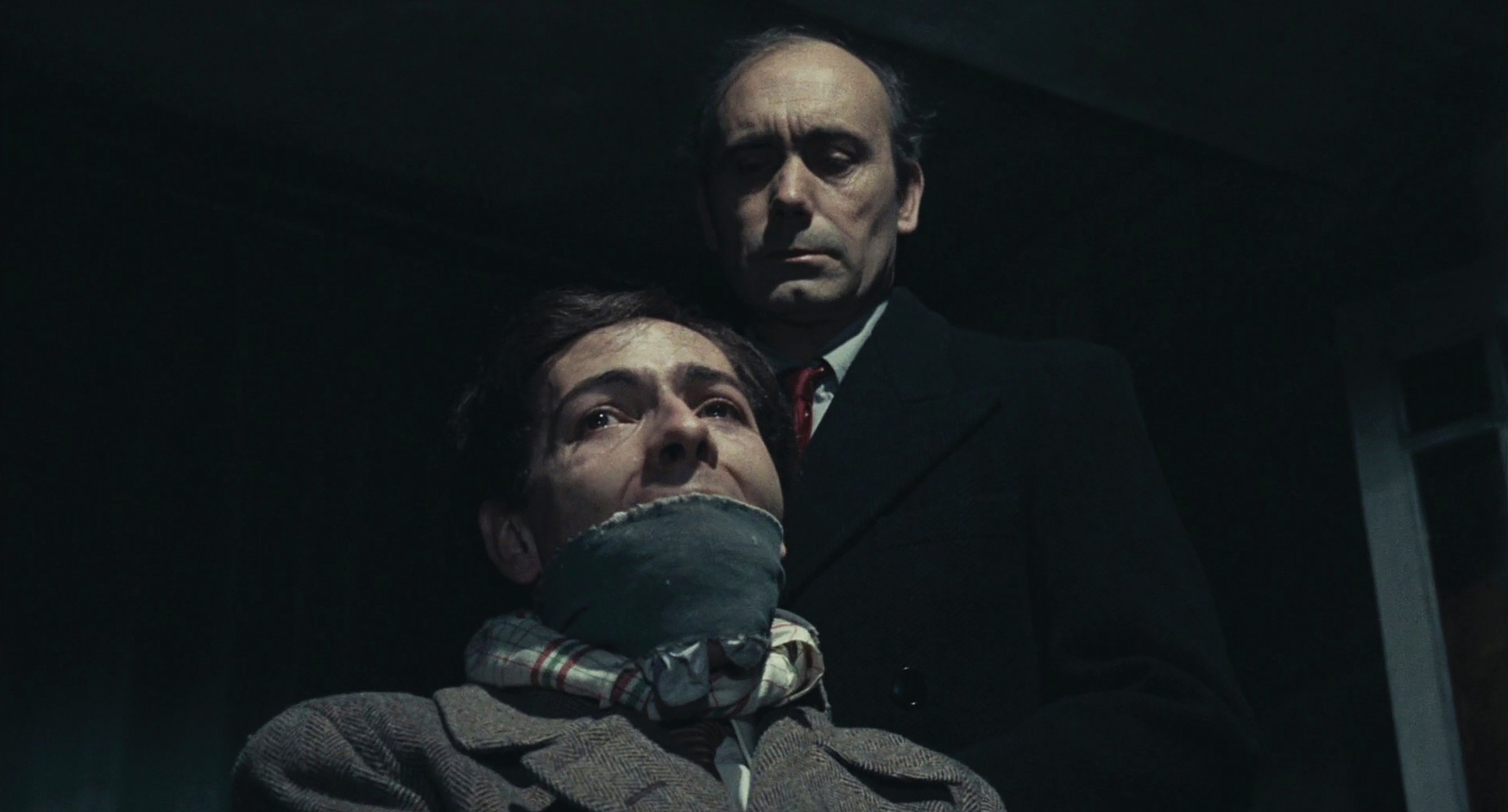
While Deakins admires the actors’ remarkable performances, he finds the staging of various sequences just as compelling. “The long sequence where the Resistance team takes an informer to a secluded house, ties him up to a chair and then discusses how they’re going to kill him — right in front of the guy — is incredibly bleak. The movie has a number of incredible set pieces that are so well crafted. Sometimes the camera doesn’t move at all, and sometimes it moves in a very elaborate way. It’s just breathtaking the way it’s all done — it looks effortless, but to get that sense of reality, and the kind of pacing the film has, must have been extraordinarily difficult.”
While the film has its share of dodgy-looking effects shots — a plane flying across the English Channel at night, a submarine surfacing in a bay — Deakins surmises that these were cost-saving measures. “I recall Melville being quoted as saying, ‘I’m not going to spend the money on the effects shots. I’m telling a story, and what’s important is the characters. Those shots are just there to tell the viewer what’s happening.’”
Solaris (1972)
Director: Andrei Tarkovsky / Cinematographer: Vadim Yusov
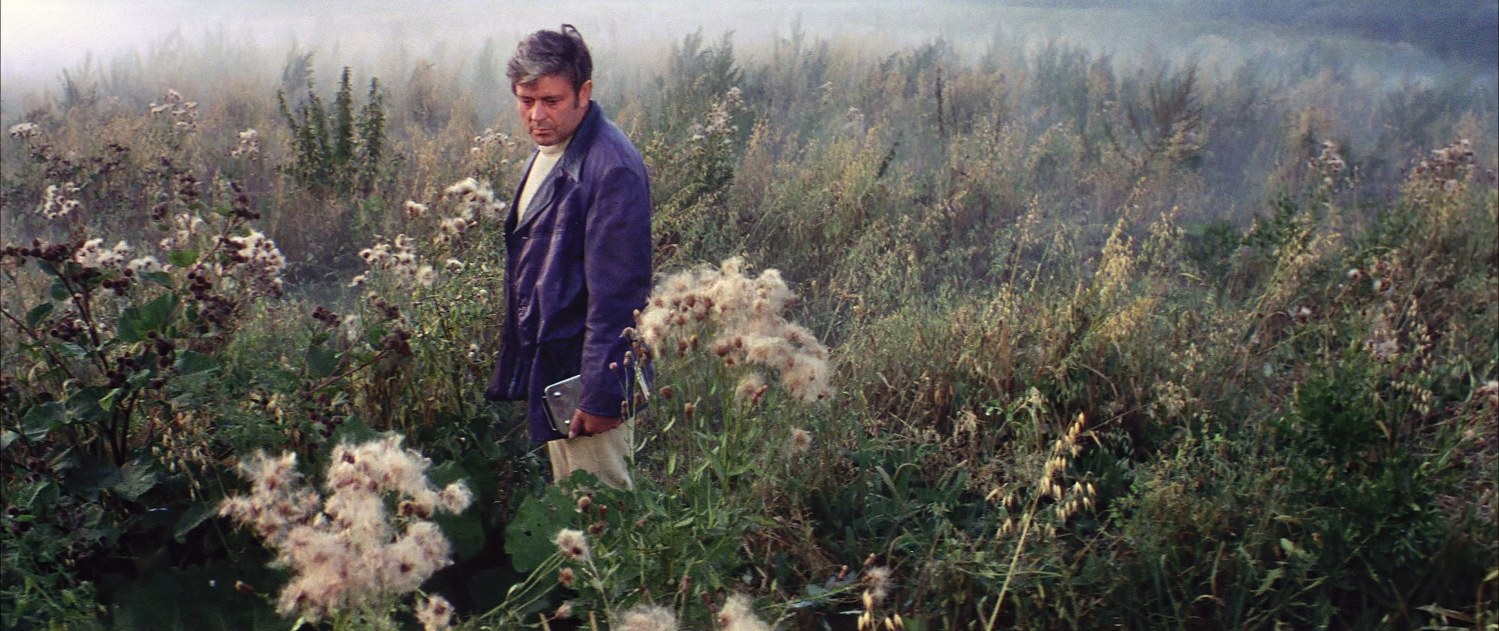
Although Tarkovsky’s metaphysical science-fiction epic became known as “the Russian 2001,” its director famously criticized Stanley Kubrick’s 2001: A Space Odyssey as cold and clinical, noting that Solaris is more focused on human memories, emotions, moral conscience, and destiny. While cinematographer Yusov echoed Tarkovsky’s issues with the underlying concepts in 2001, he conceded that they both admired Kubrick’s impressive technical and visual achievements.
Philosophical differences aside, the two landmark productions share many similarities: In both pictures, an aura of interstellar mystery prevails as brilliant camera moves maneuver the viewer through sets rife with inspired production design, and both are extremely meticulous in terms of their execution. “One thing all of the films I chose have in common is that they’re very precise,” Deakins observes. “They’re very thought out, you know? While watching them I never think, ‘Oh, well, the camera could have been somewhere else.’ It’s there in a specific spot because the director has clearly and purposefully chosen that point of view to show the audience certain things. The directors I work with tend to think and work that way.
“[Tarkovsky] made the story into his own meditation on our belief in reality, our belief in our senses and what we see.”
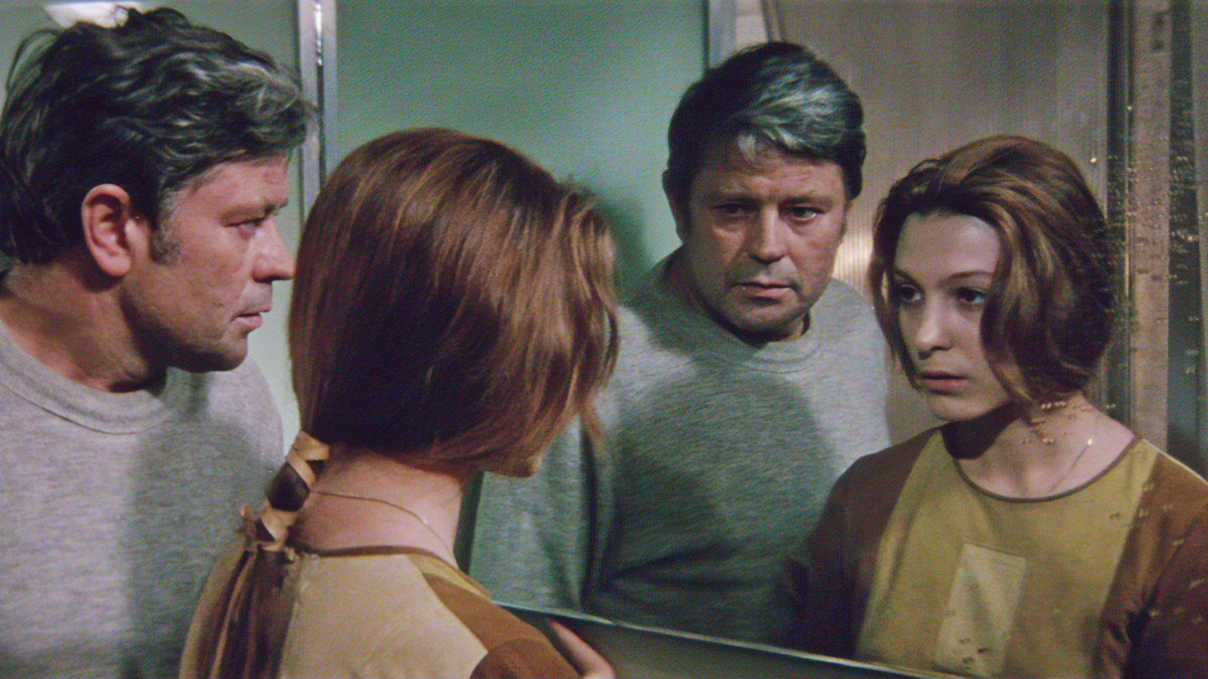
dead wife, Hari (Natalya Bondarchuk).
However, he adds, “I do think that the more you plan, the more you can improvise. If you’ve planned a scene and you know its essence — the shots you really need to cover the basic story points — it can leave you feeling open for other ideas and different opportunities on the set. Those ideas could come from an actor, or from anybody who’s working on the film. If everything is pre-planned, I find it a bit stultifying.
Deakins points out that while Tarkovsky took some liberties with Stanisław Lem’s source novel, the director “worked with the bits that inspired him” and didn’t feel inhibited in presenting his own interpretation of the text. This strategy was in keeping with Tarkovsky’s general philosophy on adapting source material: unless you invest something of yourself in the film version, the onscreen result might not transcend mere replication to achieve the staying power of true art. “Tarkovsky fell out with Lem because he introduced other elements into the story — like the house on the real Earth where the father lives,” Deakins says. “He made the story into his own meditation on our belief in reality, our belief in our senses and what we see. I found that approach really interesting. A book and a film can be different, and you can’t always say one’s better than the other. Tarkovsky took the essential idea and created something brilliant of his own.”
Come and See (1985)
Director: Elem Klimov / Cinematographer: Aleksei Rodionov
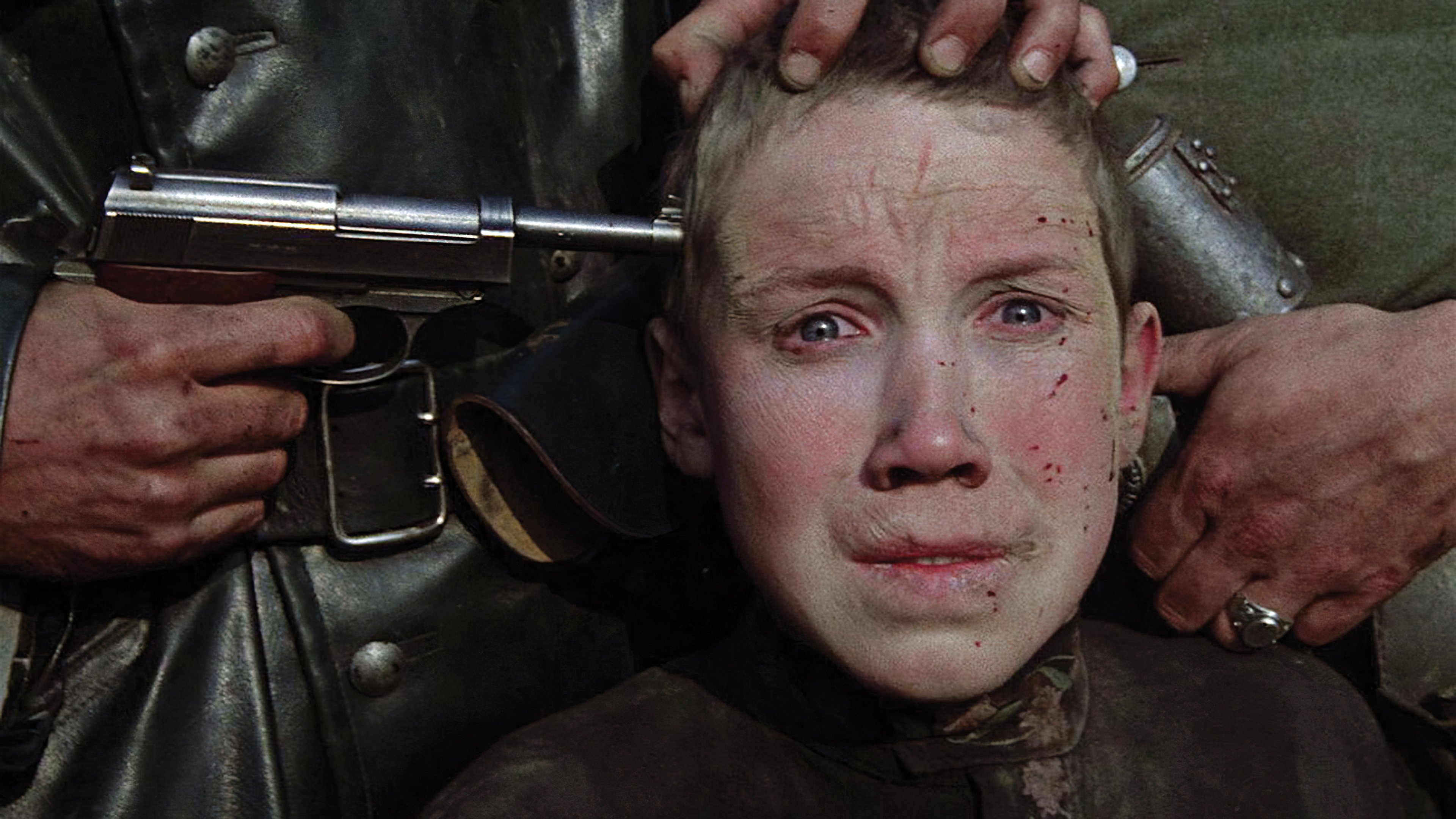
This brutal, unrelentingly grim masterpiece brings viewers face to face with one of the most horrific incidents of World War II: the massacre of an entire Belarusian village by a merciless Nazi Einsatzkommando unit. Director Klimov and his cinematographer, Rodionov, opted to shoot in the 1:37:1 aspect ratio, exploiting the boxy frame to maximum effect — even in shots that depict wider vistas. Their manipulation of screen space is masterful; lateral camera movement is not as critical as forward or backward moves, creating a spatial sense of three dimensions. Steadicam is utilized brilliantly throughout, especially during a tour-de-force POV shot that wends through a group of villagers before the story’s young protagonist, a boy named Flyora (played with remarkable emotional range and intensity by 13-year-old first-time actor Alexei Kravchenko), is confronted by a village elder who’s nearly been burned alive by the Nazis.
Early scenes of Flyora and his friends playing make-believe war games in battle-ravaged Belarus — and subsequent scenes of the boy relishing his first taste of pre-combat camaraderie after joining a group of partisan fighters — soon give way to a nightmarish descent into hell. Klimov never shies away from the brutality on display, transcending safe or stagy representations of wartime atrocities — he does not trivialize, sentimentalize or soften the real horrors of war. Characters often gaze straight into the camera, breaking the fourth wall and confronting the viewer head-on, with out-of-focus backgrounds enhancing the effect. The result is a harrowing and haunting work of visual grandeur that devastated audiences and earned the Golden Prize at the 1985 Moscow International Film Festival.
“It’s a child’s perspective of a devastating event, and to think that it’s based on things that actually happened is really horrific.”
Deakins notes that director Klimov drew on some of his childhood recollections of World War II’s Battle of Stalingrad, which he survived when he, his mother and his infant brother were safely evacuated across the Volga River on a large raft. Indeed, the filmmaker has said that what he filmed, as gut-wrenching as it may seem to viewers, was “a lightened-up version of the truth. Had I included everything I knew and shown the whole truth, even I could not have watched it.”
Assessing his reaction to Come and See, Deakins says, “It’s a child’s perspective of a devastating event, and to think that it’s based on things that actually happened is really horrific. But I’m always drawn to films that provide authentic, fairly accurate depictions of historical events. Like some of the other films on this list, Come and See is not really a traditional narrative movie — it’s more experiential, and it puts you in the shoes of this boy who’s enduring a nightmare. There are some very memorable passages — like the sequence when the boy and a girl are together in a forest, enjoying a few idyllic moments together before a bombardment. It’s very poetic. Then, when the bombing comes, the boy loses his hearing, which is conveyed through some wonderful uses of sound and other techniques.
Deakins has always been impressed with the variety of strategies the filmmakers applied to create an unforgettably immersive viewing experience: handheld work, dolly shots, zooms, split diopters, and especially the incredible Steadicam work. “My wife and I did a podcast with Aleksei, and he told us he’d operated all of the Steadicam footage himself — even though he’d never used a Steadicam before, and had had just a few days of training for these huge, challenging sequences,” he marvels. “There are several Steadicam shots in the film that are quite long and quite brilliant.
“He also told us that they shot everything in sequence, with non-professional actors playing primary characters — and that the film was very much improvised as they went along, although they had a year to prep for a nine-month shoot,” Deakins reveals. “So, they kept revisiting the same locations, many of which were the real places where the atrocities had actually occurred. Aleksei told me this gave everyone a real sense of place, and that working in story order was very helpful for the non-professional actors.
Elena (2011)
Director: Andrey Zvyagintsev / Cinematographer: Mikhail Krichman
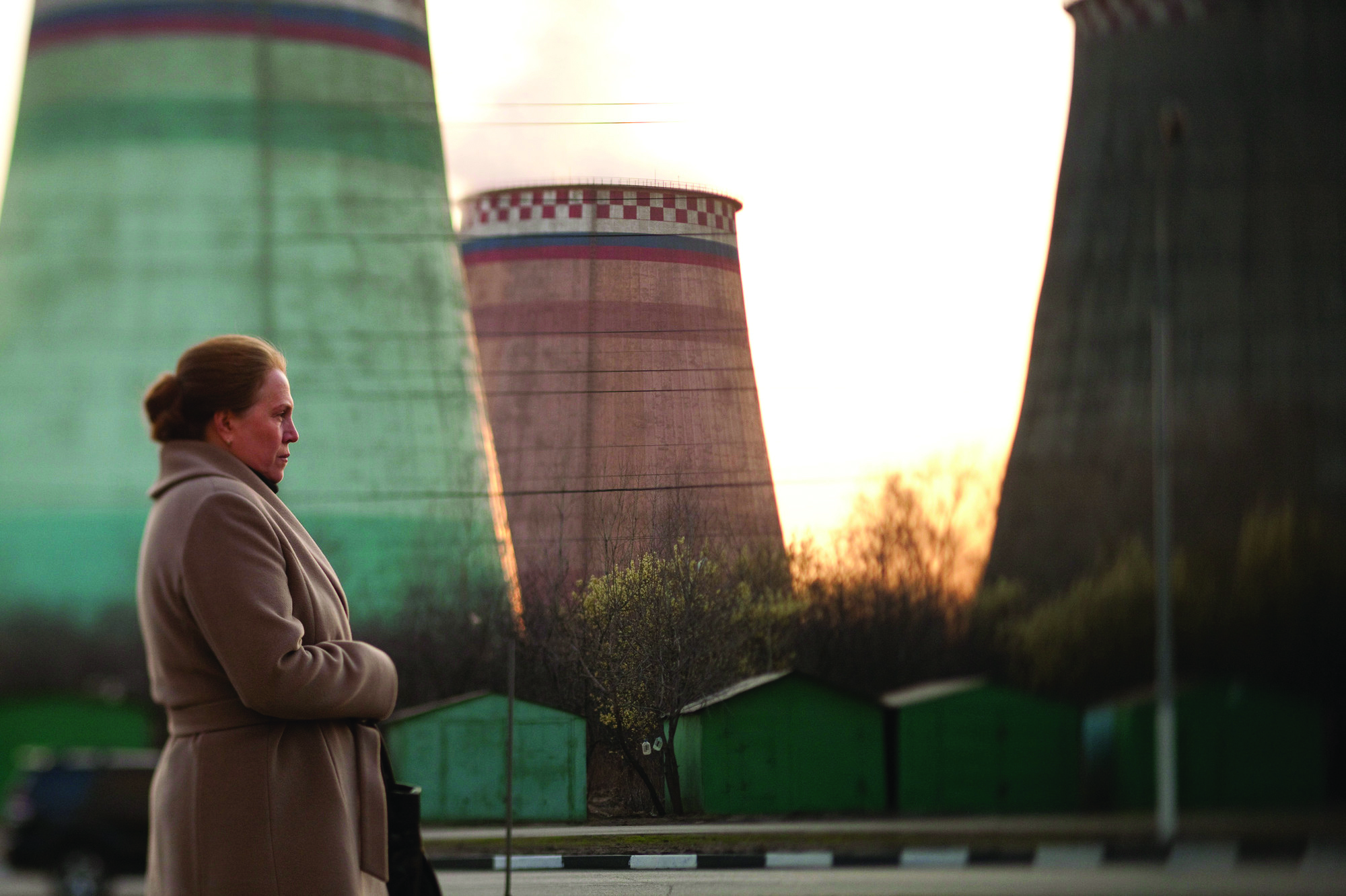
A meditation on social classes and the cultural divides they create, Elena encapsulates these themes within a Russian family’s corroding dynamic, centering on the relationship between an elderly couple and their respective offspring. Elena (Nadezhda Markina) is a former nurse from a working-class background who’s married one of her patients, the wealthy businessman Vladimir (Andrey Smirnov). When a familial conflict arises, Vladimir threatens to amend his will and leave the bulk of his estate to his daughter from a former marriage, prompting Elena to take drastic action with a dark scheme that draws upon her medical knowledge.
Shot in just 42 days, Zvyagintsev’s film is a masterclass in creating tone and ambiance, with a brooding quality that produces a slowly rising tension. Architecture and other compositional elements are used to subtly direct the viewer’s eye, and the story is told primarily through small gestures and facial expressions.
Most of the film’s action takes place in the characters’ living spaces, which clearly illustrate the stark contrast between Vladimir’s life of luxury and the bleak circumstances of his in-laws. During a podcast interview with Deakins, Zvyagintsev and Krichman revealed that the wholly persuasive naturalism of these seemingly “real” interiors was in fact painstakingly crafted on sets that are married seamlessly to exterior views created with photographic backings. The impressively organic-looking light was sculpted from fixtures positioned outside the sets’ windows, keeping the interiors clear so the actors could move about freely.
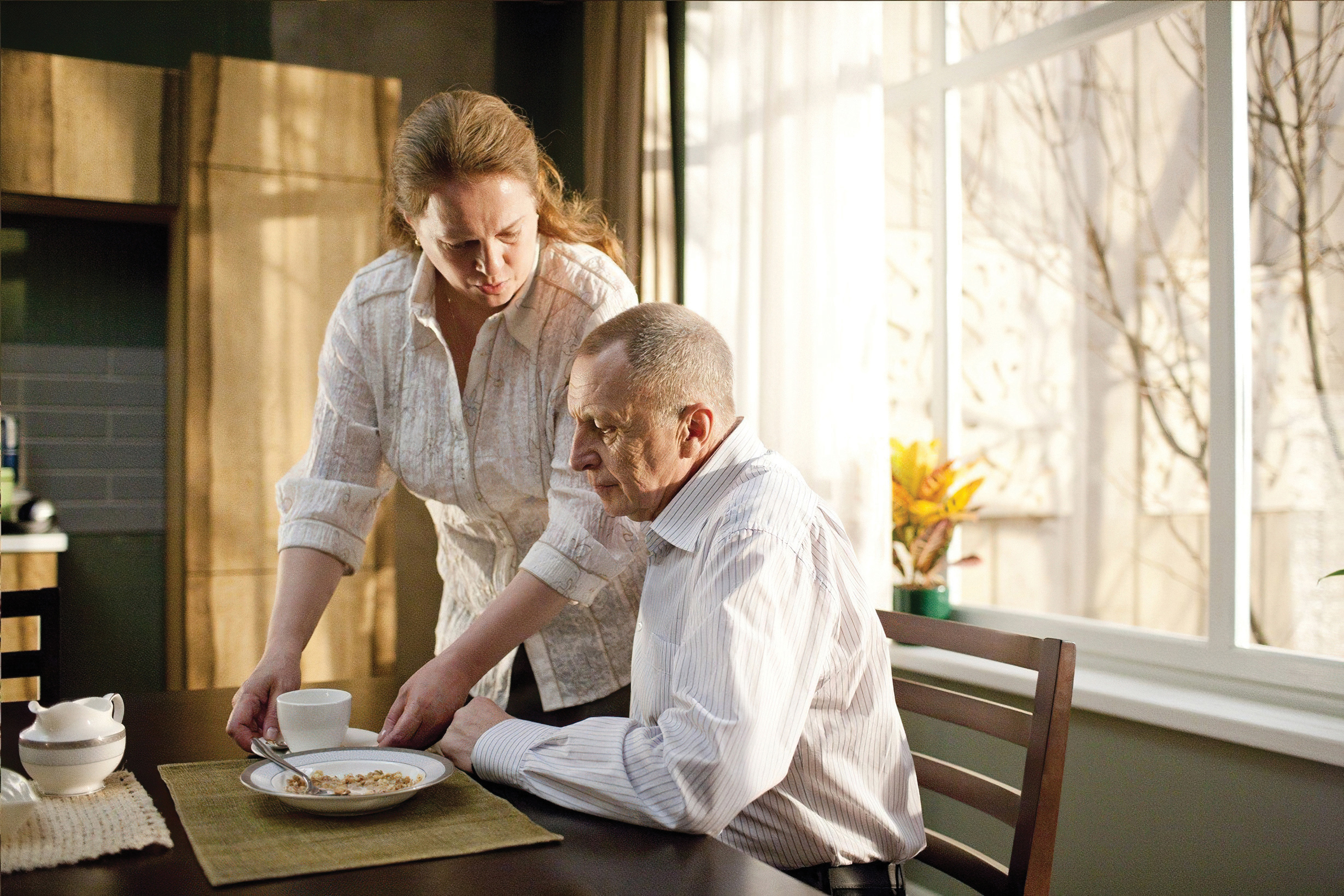
Deakins was duly impressed by Krichman’s cinematography, especially since he knows firsthand that work that can appear effortless onscreen usually involves a great deal of meticulous planning. “After I shot The Shawshank Redemption, I was at the ASC Clubhouse and a very famous cinematographer was saying, ‘Yeah, it’s really well shot, but there’s no lighting in it.’ Well, the interiors in that film are totally lit, and a lot of the movie was shot on sets. So, in a way, what he said was actually a really nice compliment, because it meant I’d done my job well!
“Until I spoke with Mikhail about Elena, for the life of me I couldn’t really tell whether it was shot in real apartments or on sets. I guessed that it was probably done on sets because it all seemed so controlled; the shots were so specifically designed that I thought, ‘How could you find a location that would allow you to do all of those things?’ Once Mikhail confirmed that, yes, they’d shot on sets, I felt it was amazing how they’d managed to connect those sets to the exterior locations. Finding those joins while maintaining the mood and the feel of the story was a really brilliant achievement.”
In a prime example of how a singular film’s influence can transcend generations and international borders, Zvyagintsev told Deakins that he shares the latter’s high regard for L’Avventura, which the director credits as a key inspiration for his own career path. “After I saw it,” he said, “I started dreaming about film.” Like Antonioni, Zvyagintsev earned a Jury Prize at Cannes, bringing the inspiration full circle.
More Deakins, Online and in Print
In addition to shooting films, the ever-industrious Deakins has kept busy with several side projects. In April of 2020, he and his wife and professional partner, James, began producing their popular Team Deakins podcast, an ongoing conversation in which the couple discusses cinematography, the film business and a wide range of other topics. The duo has also interviewed an impressive roster of filmmaker guests, including directors, producers, cinematographers, actors, production designers, editors and many other professionals who work on set, as well as influential figures from leading industry companies and organizations. The podcast is currently on hiatus, but all past episodes can be accessed via their website, rogerdeakins.com, and the recordings include interviews with several of the filmmakers mentioned in this piece, including a two-parter with the director/cinematographer team of Andrey Zvyagintsev and Mikhail Krichman (Episodes 65 and 66) and one with cinematographer Aleksei Rodionov (Episode 100).
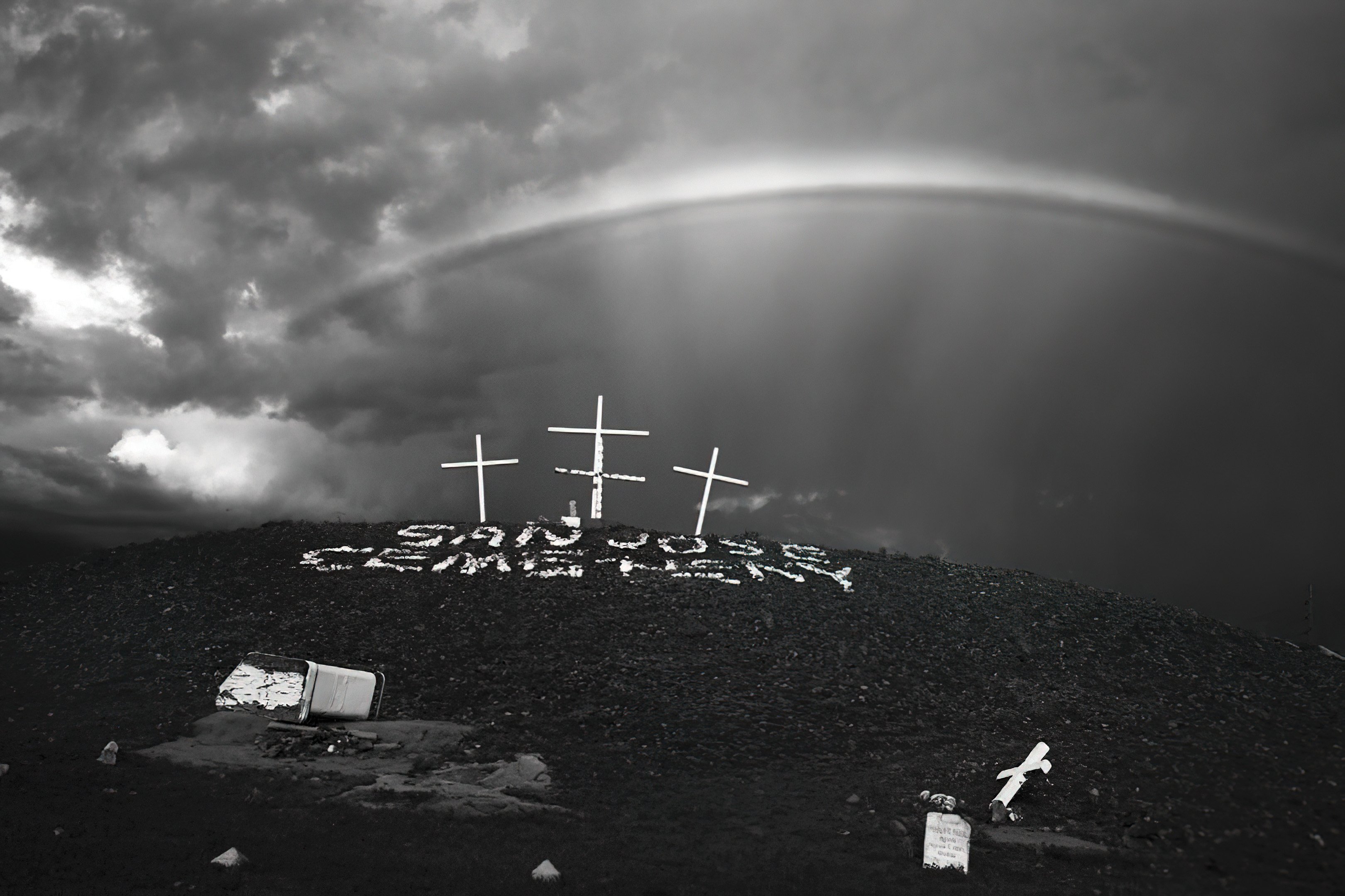
Cemetery in Albuquerque, N.M.
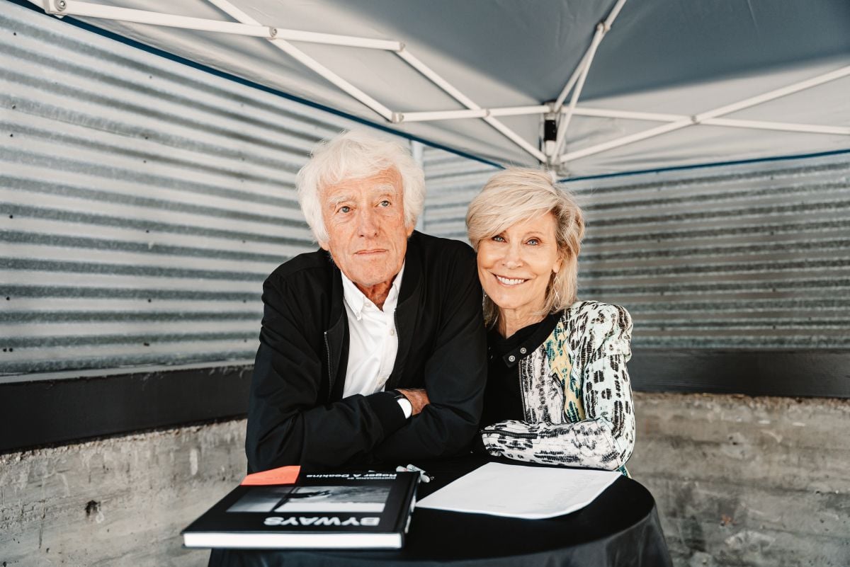
Recently, Deakins unveiled Byways, a book of previously unpublished black-and-white still photographs he has taken since 1971, during an October 2021 launch event held at the United Talent Agency in Beverly Hills, where he signed copies and mingled with guests. The cinematographer started out as a photographer for an art center in North Devon, England, and some of those photos are in the book alongside others he took locally in his hometown of Torquay or while “wandering about” during his career travels. He’s described the book as an “unpretentious sketchbook” that sprang to life after his initial application to England’s National Film and Television School was rejected. (He was later accepted to the school in 1972.) Through these photographs, “I think I started to develop my own personality in terms of images,” he says in Episode 163 of the Team Deakins podcast. “I like observing things, and I like exploring new places. I can spend days or weeks wandering around a new city and just exploring.
“These are just some of the images that grabbed my attention,” he says. “Some of the photographs are 50 years old. I’ve always liked them, and maybe I feel nostalgic for them, and I wanted to include them so they don’t just get lost.”
