The Tragedy of Macbeth: Palace Intrigue
Bruno Delbonnel, ASC, AFC and director Joel Coen discuss their collaboration on this striking, innovative adaptation of Shakespeare’s masterpiece.
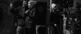
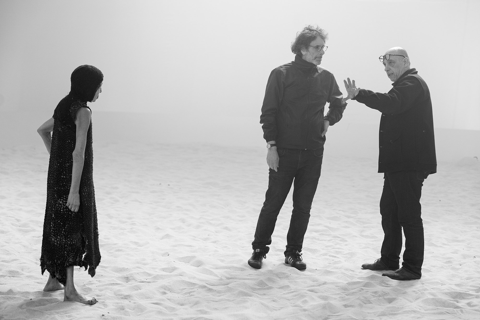
All the images in this article are frame captures from the film, except for the photograph of the filmmakers. All images courtesy of Apple
This is an expanded version of the article published in our Jan. 2022 print edition.
The Tragedy of Macbeth, directed by Joel Coen with cinematography by Bruno Delbonnel, ASC, AFC, reinvents Shakespeare’s masterpiece in a brilliant, innovative blend of cinema and theater. The stark, stunning black-and-white cinematography results from a close collaboration between the director and cinematographer that permeated many other aspects of the film’s conception.
The plot will be familiar to most readers. Witches tell Macbeth (Denzel Washington), a Scottish warlord, that he will become king. Macbeth shares the prophecy with his wife (Frances McDormand), who persuades him to murder the benevolent King Duncan (Brendan Gleeson) and take his place. After attaining the throne, Macbeth feels compelled to kill others to preserve his crown, but is deeply haunted by his crimes, while Lady Macbeth’s own guilt pushes her toward madness.
This highly stylized Macbeth narrows the frame (within a 1.37:1 aspect ratio) and simplifies the sets to place the actors in an evocative, imagined cinematic space. Delbonnel’s poetic lighting helps to reveal the emotions of the characters, and to frame the power of Shakespeare’s verse.
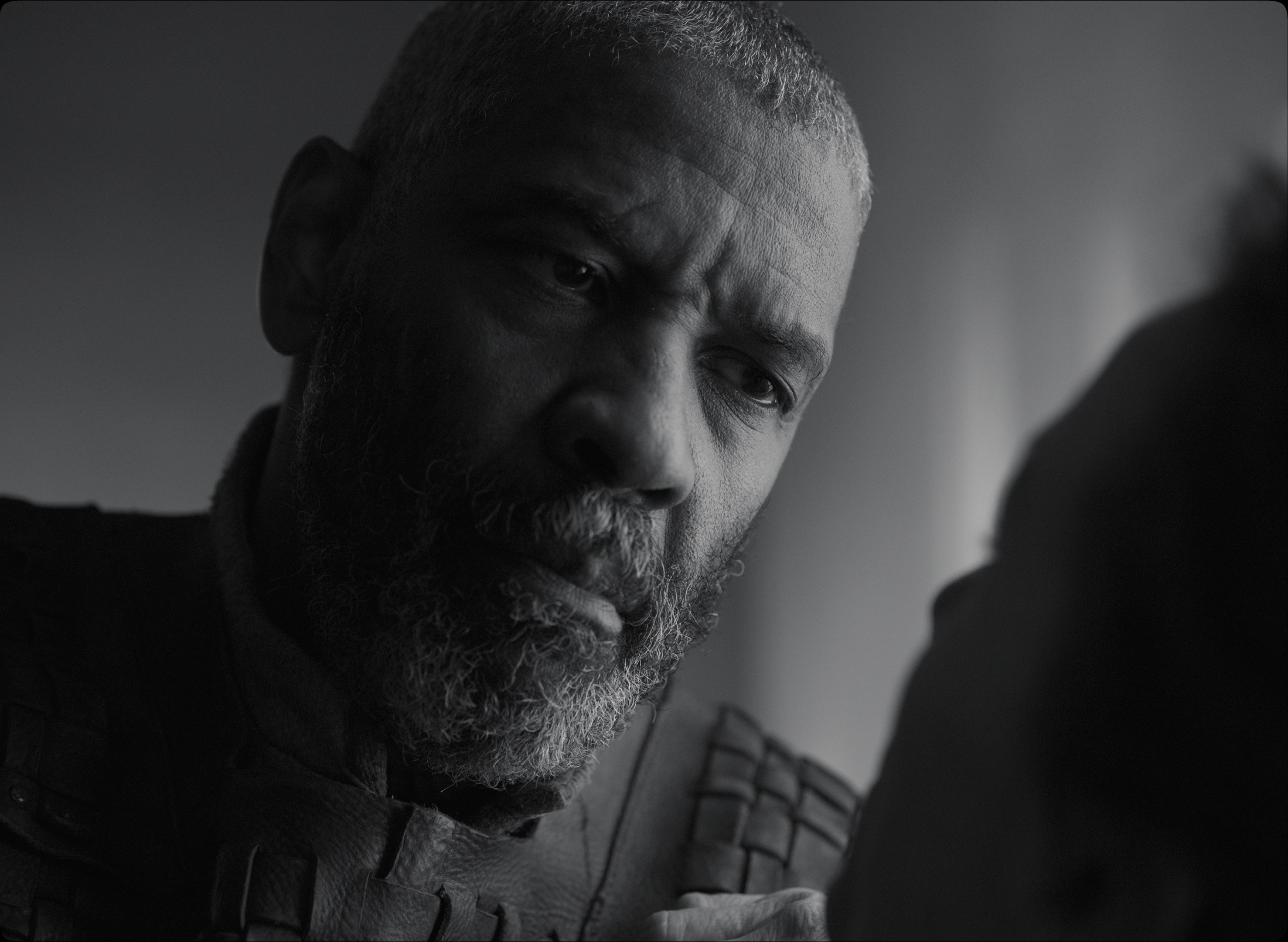
Joel Coen has written, directed and edited 18 motion pictures with his brother Ethan — productions that have earned the duo four Academy Awards and 14 nominations — but The Tragedy of Macbeth is the first project he’s directed on his own (even though he’s been credited as sole director on some of the brothers’ past projects).
Delbonnel has earned five Academy Award nominations and four ASC Award nominations. He previously worked with the Coen brothers on Inside Llewyn Davis and The Ballad of Buster Scruggs.
The following interview combines separate conversations with each filmmaker.
American Cinematographer: Your version of Macbeth creates a new cinematic space, a kind of no man’s land between theater and cinema.
Joel Coen: The ambition for myself and for Bruno — without really knowing how to go about doing it — was to preserve the ‘play’-ness of Macbeth, but still make something that is, moment by moment [and] in every way, designed for a camera. That was the starting point, [but] conceptually we were groping around in the darkness, going: ‘Okay, what does that mean? How do we do it?’ The last thing we were interested in doing was a realistic adaptation of the play: you know, renting a castle in Scotland and people riding around on the heath, that sort of thing...
Bruno Delbonnel, ASC, AFC: The initial question with Joel was how to put the theatrical form inside a film. We arrived at the idea of a “haiku”: to strip everything down to essentials, taking out all ornaments. Then we started to think about applying that idea to the form, the narrative, the set.
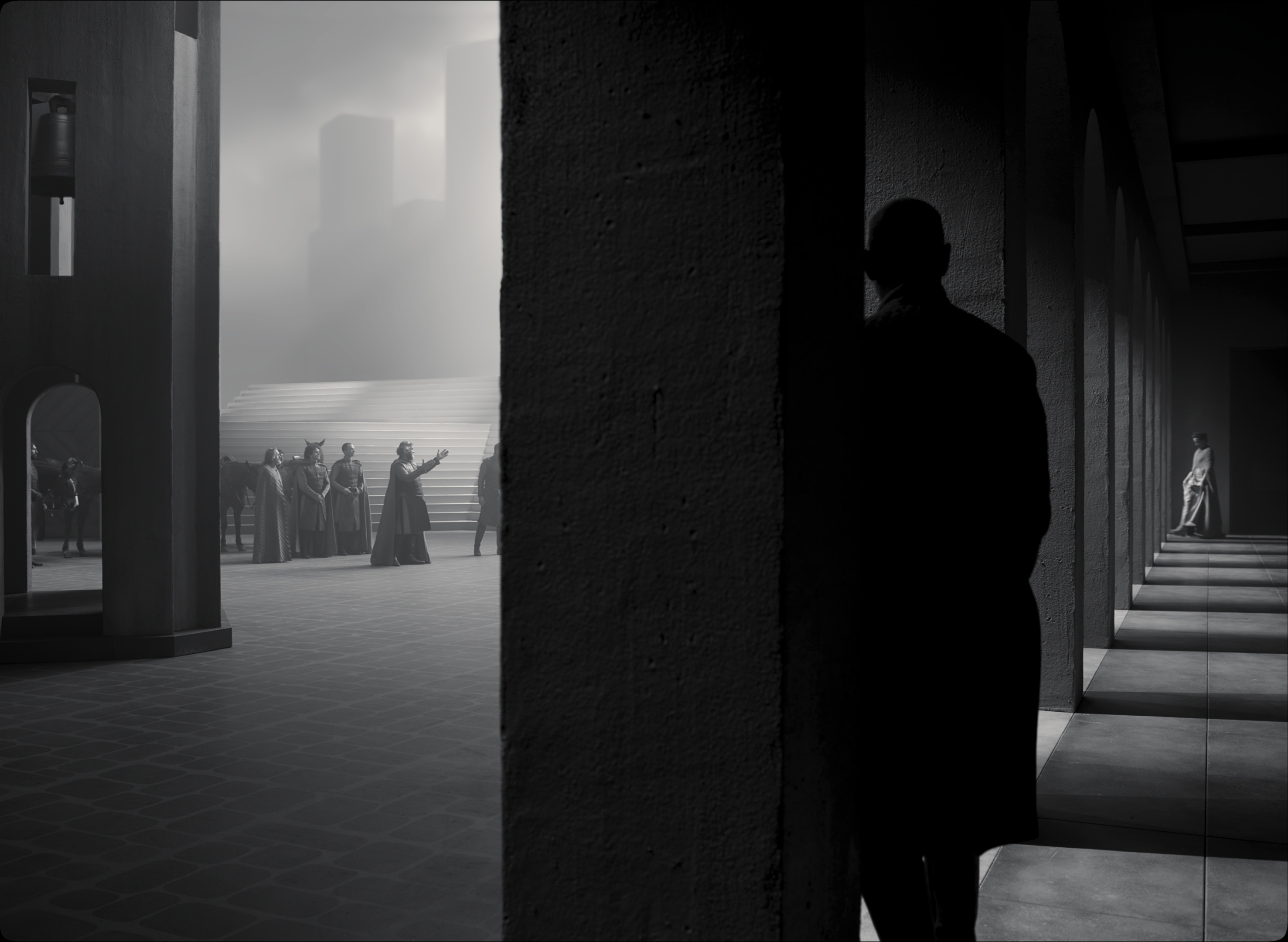
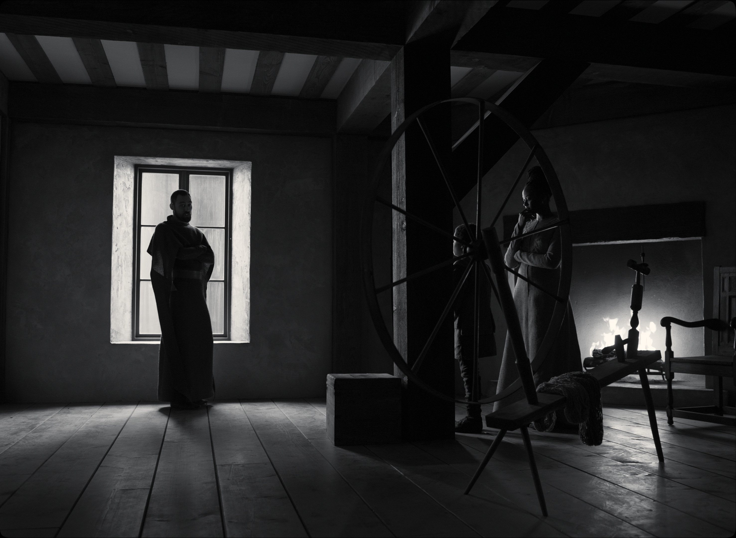
We tried to reduce spaces to their purest simplicity, just like a haiku. We would ask, ‘What is a room?’ It’s four walls, a door, a window, and nothing else. We sought the simplest forms of a staircase, a corridor, a wall. There is almost no furniture in Macbeth’s castle.
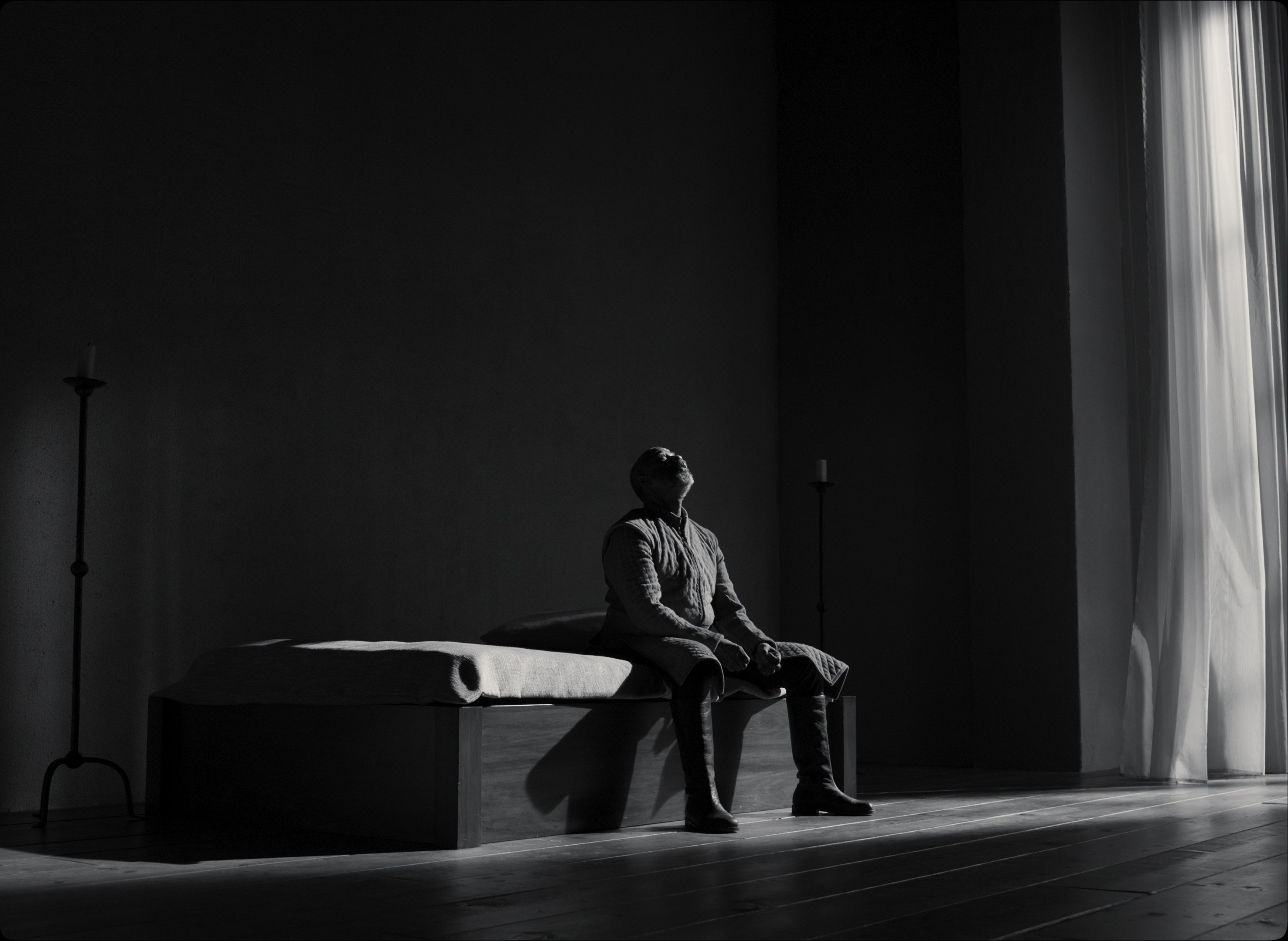
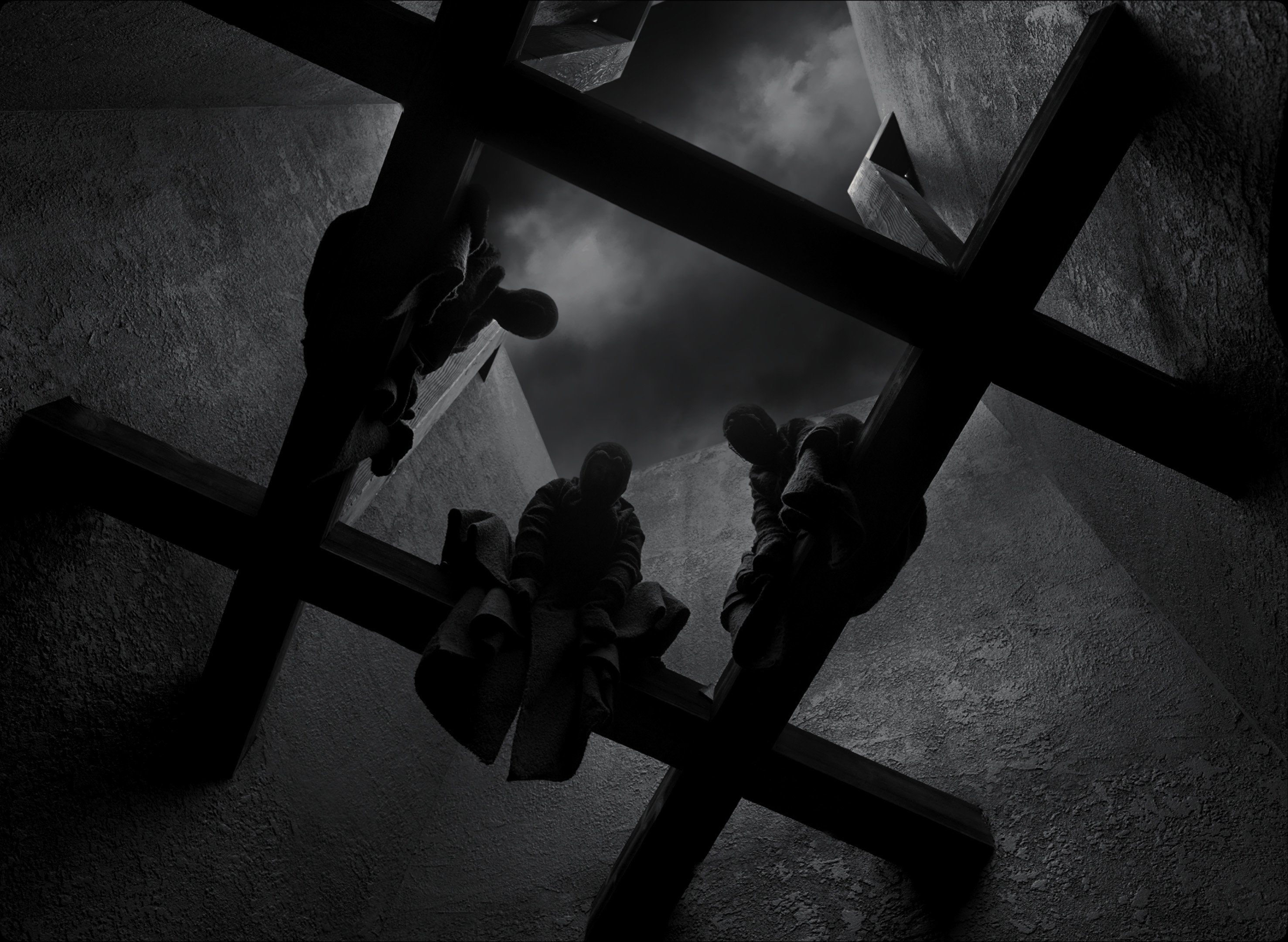
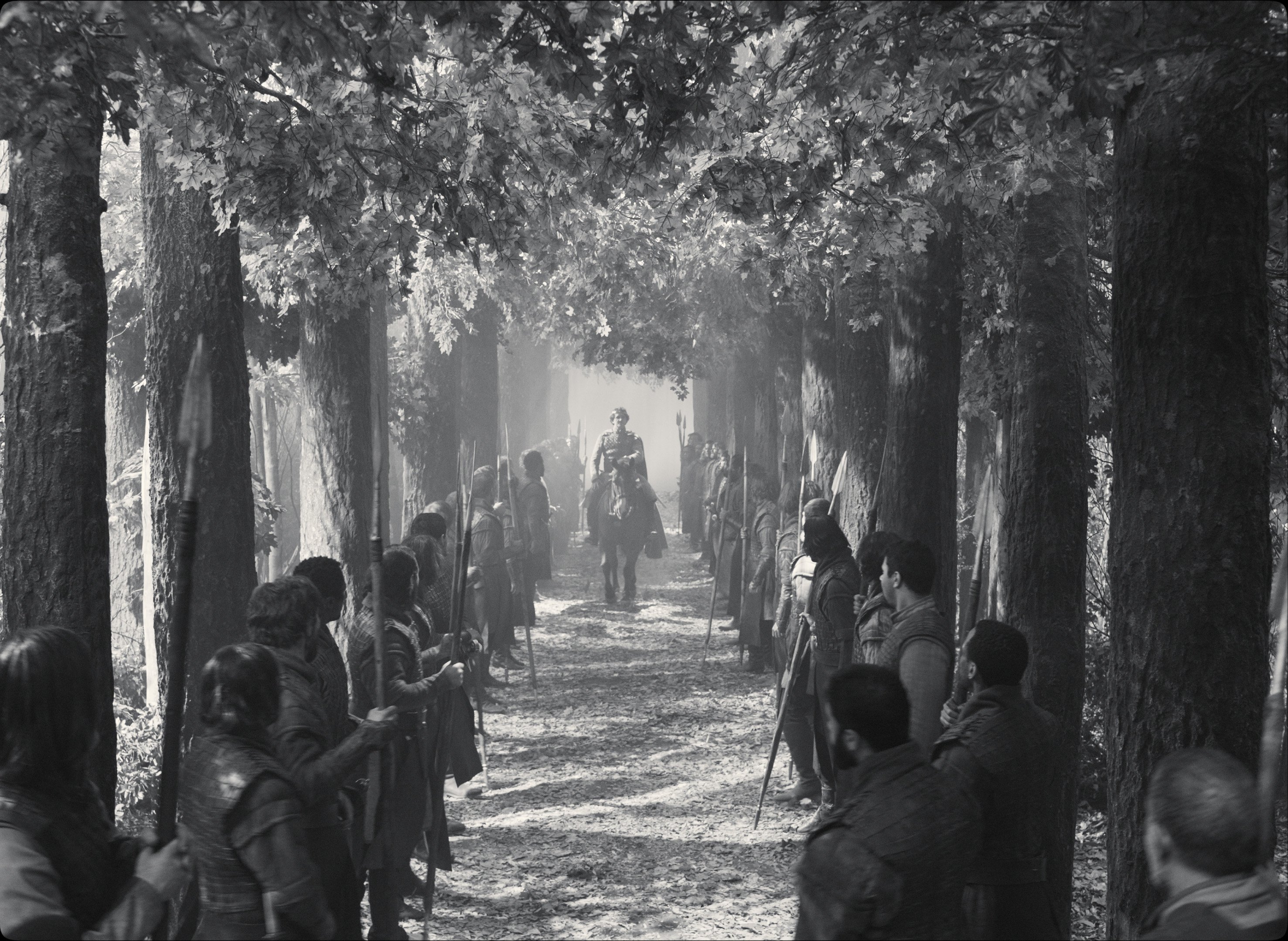
We also wanted to include some of the artifice of the theater, like painted backdrops in exteriors, and having no ceilings in interiors. We wanted this sobriety to avoid the image competing with Shakespeare’s poetry, to leave room for his text.
One of the things that eliminates realism immediately is the choice of shooting in black-and-white, which alerts the viewer to look at the film differently.
Coen: Yeah, I agree. It’s so hard to articulate what black-and-white does, compared to color. It’s partly abstraction, partly just how you enter the texture of the piece. Black-and-white completes certain visual ideas without having to build them in. It’s more like a drawing than a painting, and your mind fills in the blank parts.
It makes you imagine more?
Coen: Exactly. It’s an important part of accomplishing what we were trying to do. Also, it’s very useful in a movie like this. There were places where we would frame up a shot in this movie, and the top of the set just went into darkness. In color, you would see that as the limits of the set, but in black and white, it’s just another texture.
You’re also shooting in black-and-white while using the 1.37:1 ‘Academy’ aspect ratio.
Delbonnel: Those were the first two decisions. An important reference for us was Carl Theodor Dreyer’s The Passion of Joan of Arc [1928, shot by Rudolph Maté, ASC], with its many close-ups. Dreyer’s sets also have a magnificent sobriety.
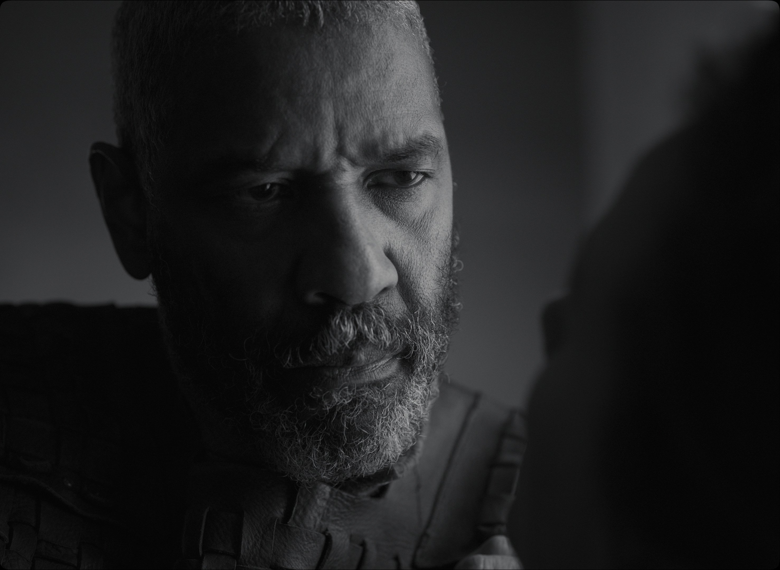
But I didn’t want to be ‘nostalgic’ about old black-and-white movies. Quite the opposite: I was looking for the intensity that a very sharp image gives to close-ups. We used large format because I wanted to get a very sharp 4K image.
When you do a close-up in 1.37, you fill the screen. The set disappears, and you bring the face and the text to the forefront. Of course, close-ups don’t exist in theater — they are pure cinema.
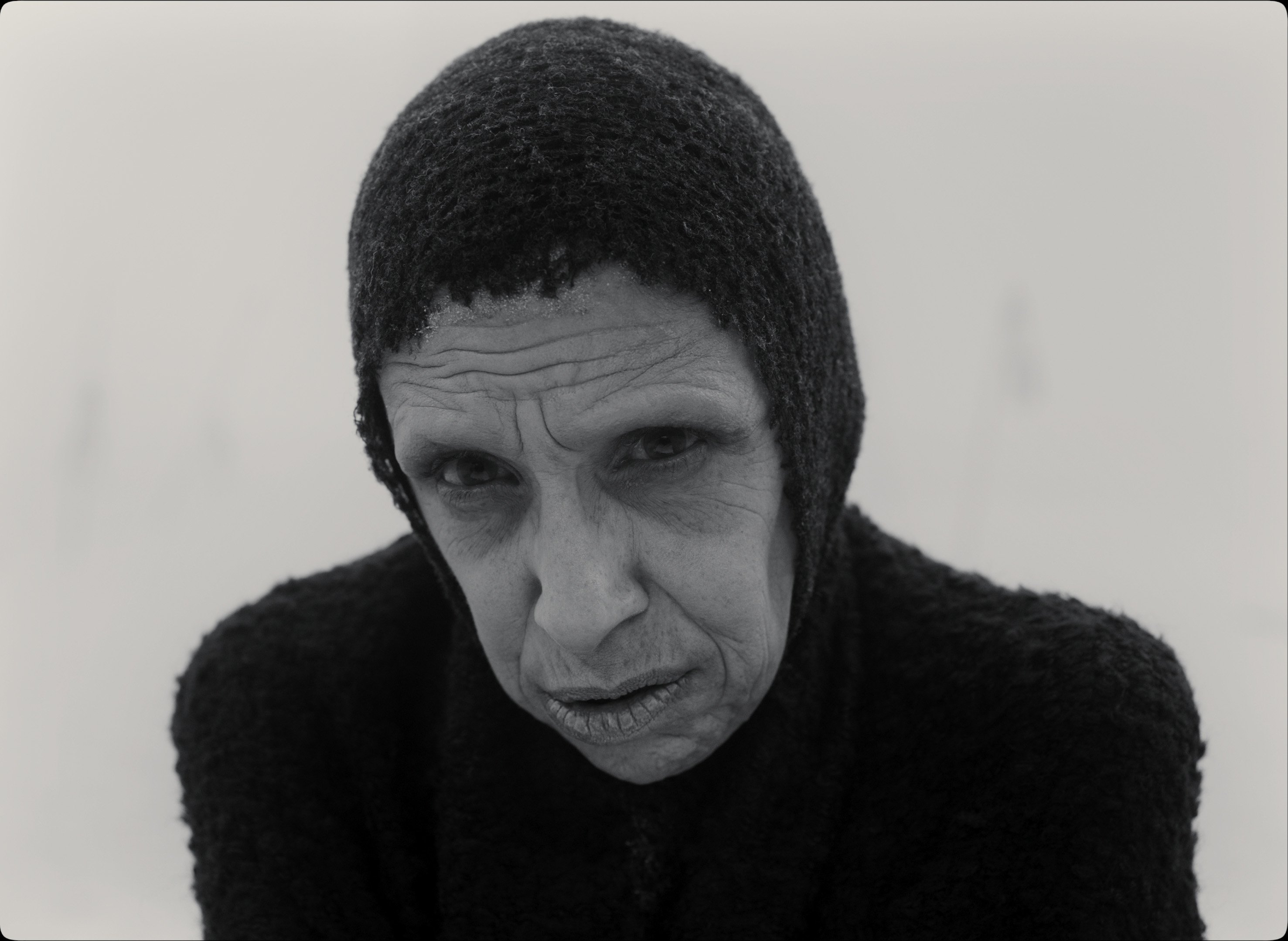
Coen: Close-ups are so interesting in this aspect ratio. You can have the character in close-up smack in the middle of the frame, which has a completely different feeling.
The exteriors you shot on soundstages are striking: the ‘beach’, that smoke-filled environment where Macbeth meets the witches, and the huge ‘crossroads’ landscape contribute to this new kind of cinematic space that you’ve created.
Coen: Right, I guess it’s theater-movie space. There’s something that’s really liberating about being able to control your environment that way. On the last day of shooting the previous movie with Bruno [The Ballad of Buster Scruggs] I said to Fran: “This is the first day in four months that I haven’t had anxiety about the weather.”
In this movie, we would create our own weather, and put the sun where we wanted to put it. We weren’t concerned at all with motivating light from a direction, or in being consistent with it. Something that’s mentioned over and over again in the play is that it’s hard to tell whether it’s day or night.
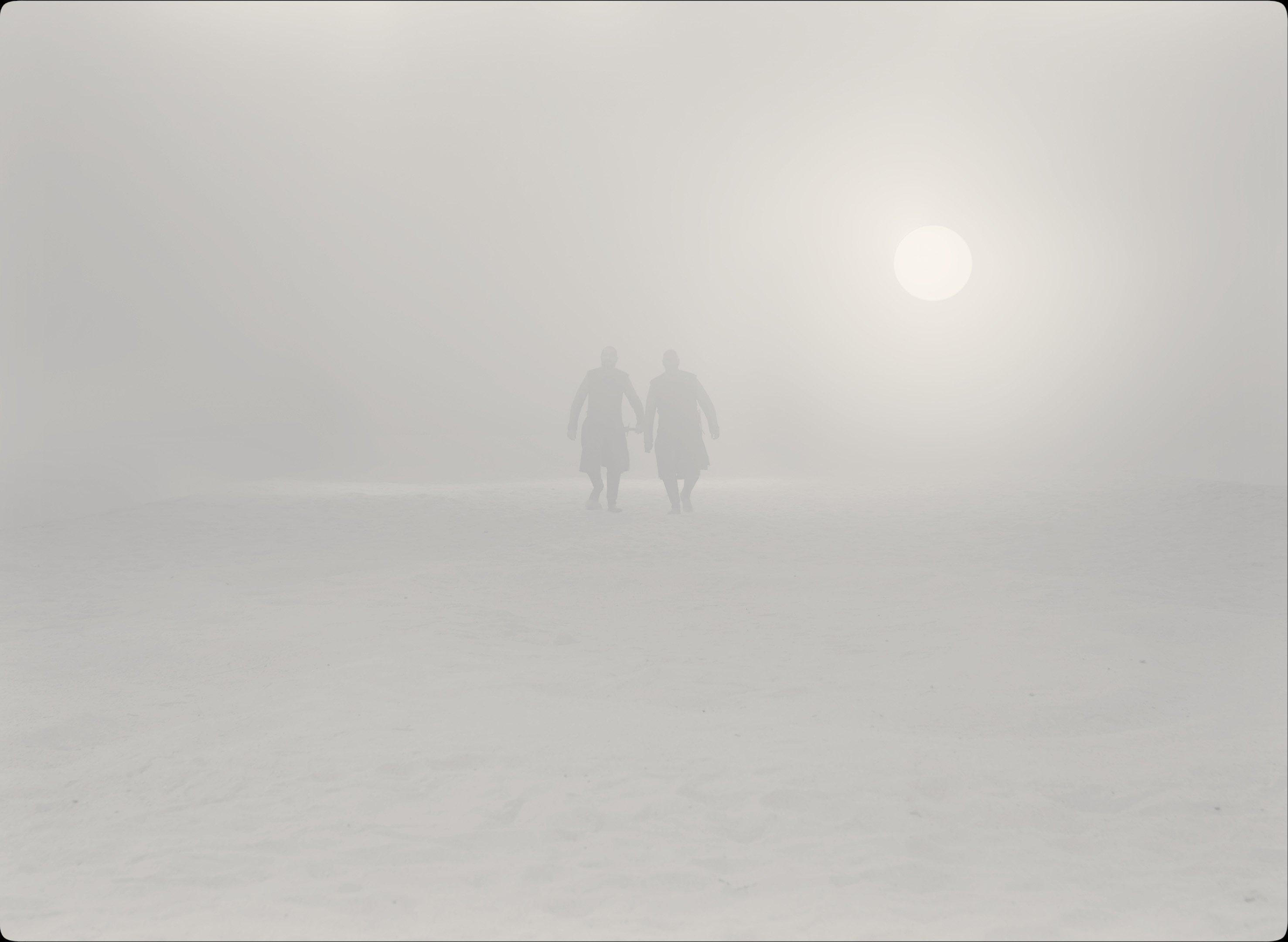
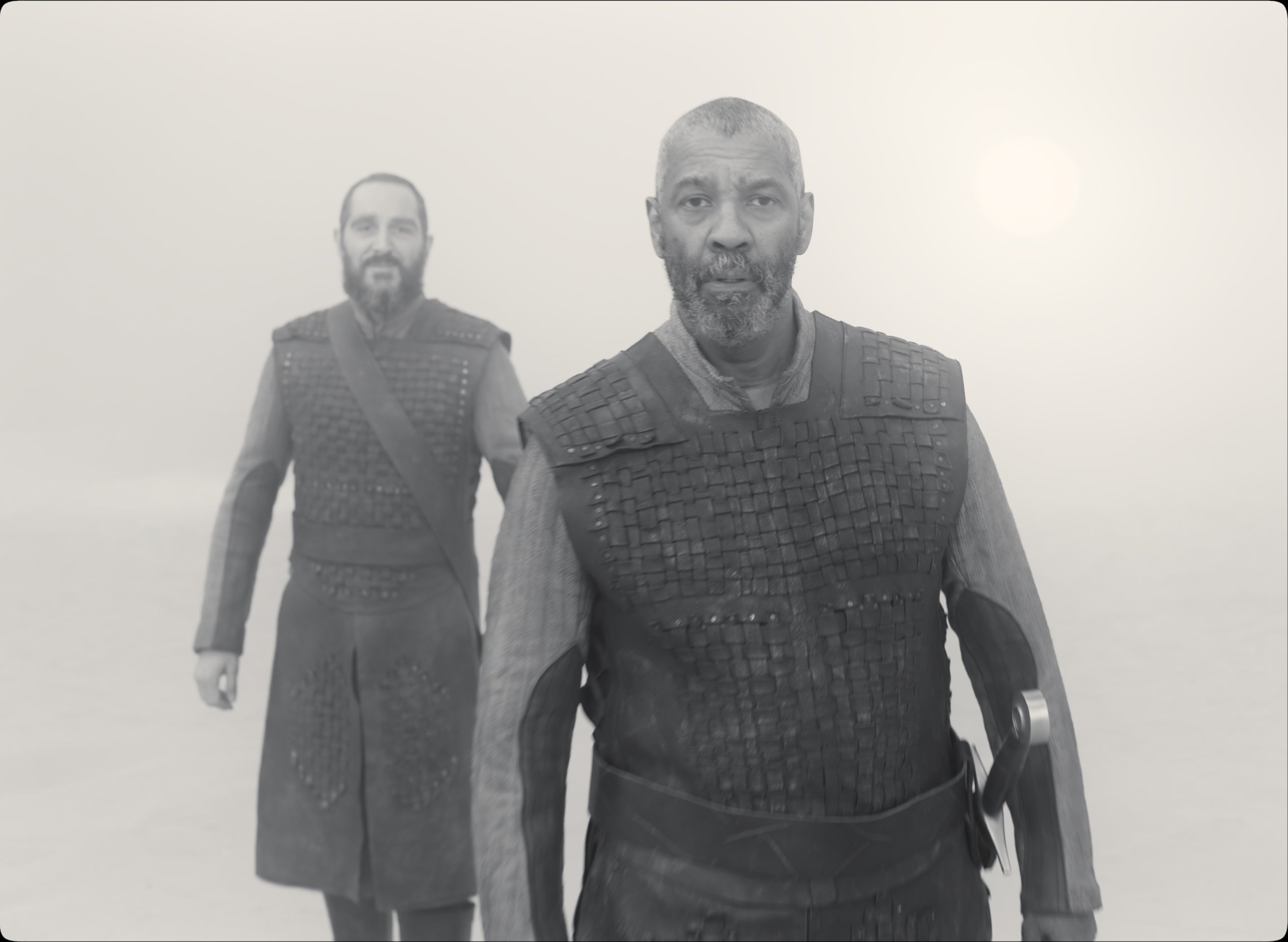
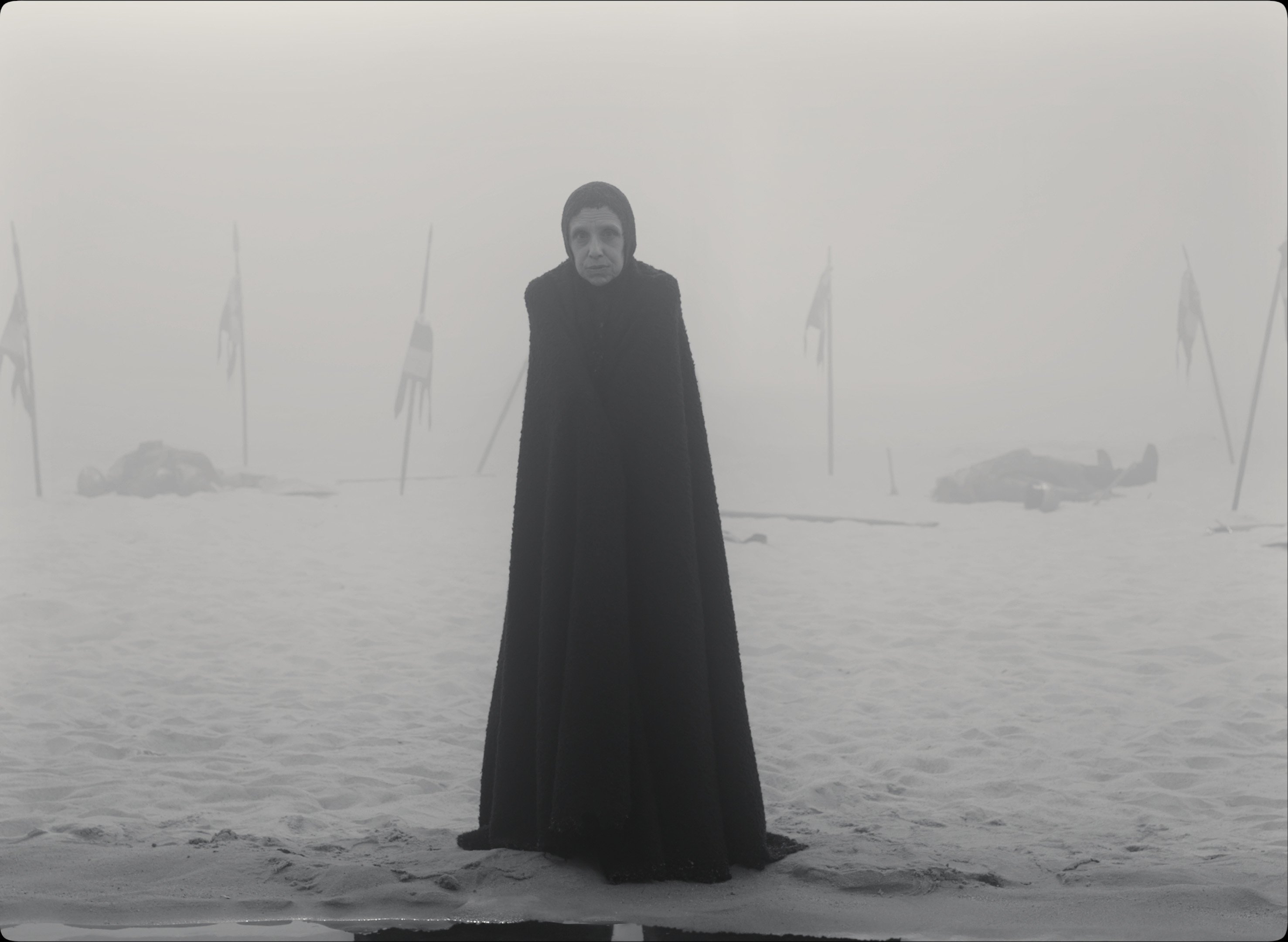
Delbonnel: The light is never justified. It sometimes comes through windows, but often you don’t know where it’s coming from. Light in this film becomes an artifice. It interested us to have light be a narrative element, a graphic element, often with this ambiguity about whether it’s day or night. During prep, Joel and I spoke a lot, and we shared many images. I couldn’t have done the lighting without Joel.
There’s also a simplified architecture for Macbeth’s castle: tall rectangles and arches, crisscrossing diagonals in the frame. It almost feels like Fritz Lang’s Metropolis.
Coen: There was an image from Metropolis that we were looking at, just in terms of volumes. Absolutely.
We were able to move those volumes around on the set to the camera frame. So, if we had a wall that was just a very reduced abstract notion of a wall, or arches, or a tower, those were on wheels, and we could move them back and forth out of the corners of frames, to create the frame we wanted on the stage floor.
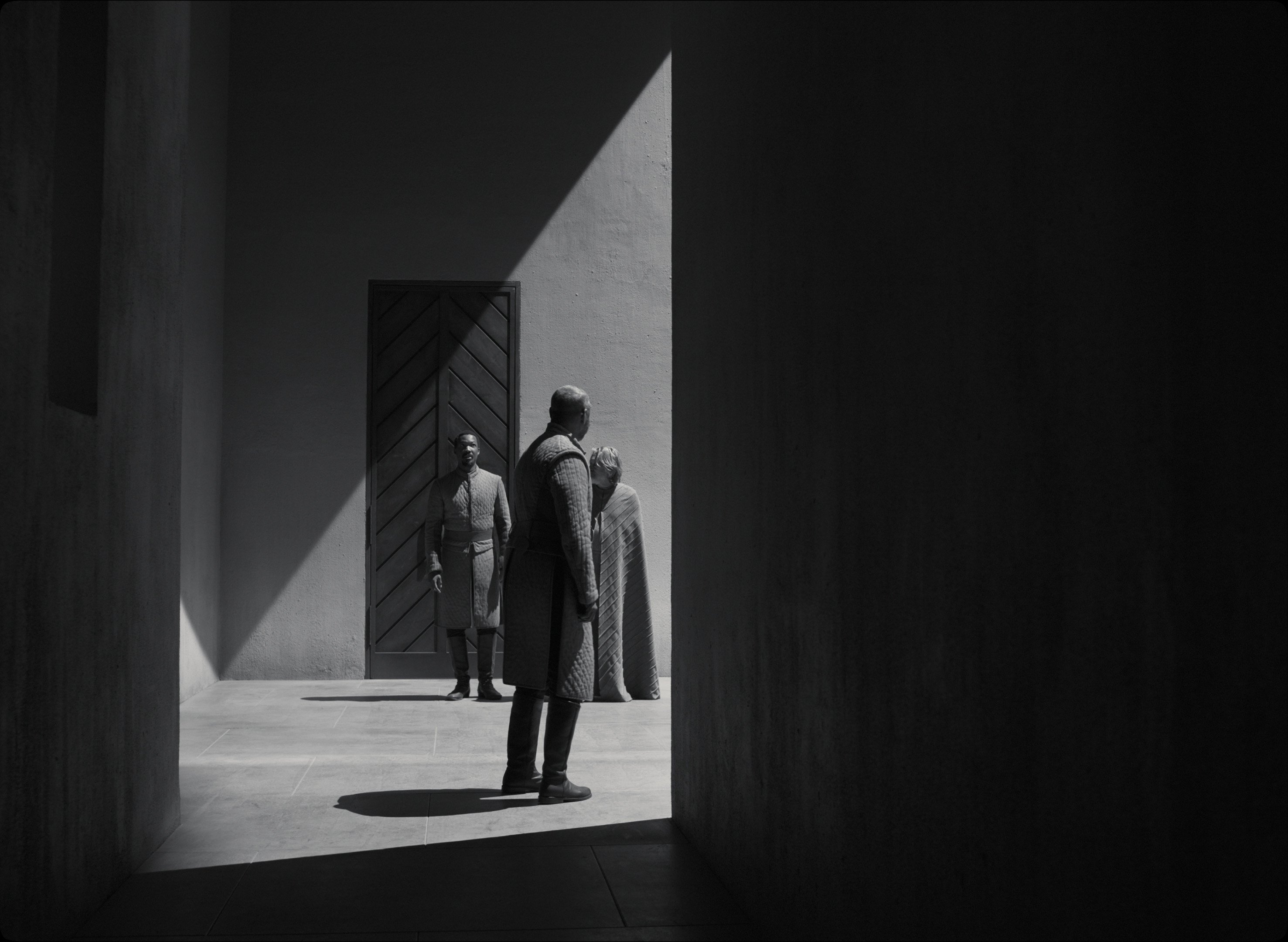
I feel that your graphical design in Macbeth's castle, these strong diagonals, and the open ceiling above, weigh down on the characters, and sometimes feel oppressive.
Coen: I think that’s true. A very big influence on the set design was Edward Gordon Craig, who did a lot of Shakespeare production design at the turn of the [twentieth] century, and was the guy who pioneered the use of screens on stage.
Delbonnel: Another part of the visual language was sharp shadows. We used rock-and-roll-concert-style ‘mover’ fixtures to create those — the quiet SolaFrame Theatres, and other ETC fixtures.
Your gaffer, Michael Bauman, explained that the crew made some custom gobo cut-outs in the form of an arch, which they put inside a series of SolaFrame movers to simulate fake shadows for each arch in the colonnade.
Delbonnel: That was the only way to get the sharpest shadow. We did a lot of that kind of geometry on the film. We also created lines and stripes on the set with the mover shutter blades. And we even aligned the edges of the beams of several movers in a courtyard scene so that it seemed like one big source with sharp shadows.
For the colonnade, we used 13 SolaFrame Theatres. In each of them there was a gobo we designed in the shape of the arch and the column. What you see onscreen is not the actual shadow of the arch, but the projected gobos, which are pin-sharp.
Why was it so important for you to have those very sharp shadows?
Delbonnel: Because that is what the sun casts, but also what the moon casts. We don’t always know which is which — the only difference is the quantity of fill light that I would add to go from one to another.
And there’s another level. Here’s Macbeth, who is going to commit a murder. He’s not sure he wants to go through with it, but at the same time, he wants to do it — and then he doesn’t want to anymore. He is constantly changing his mind, alternating between shadow and light.
So it’s also a matter of rhythm. This complemented Joel’s idea of this recurring knocking sound: ‘boom, boom.’ The visual correspondence is shadow, light, shadow, light. There is no soft transition.
We see a perfect illustration of this as Macbeth walks across your sharp shadows in the colonnade before he murders the king. And as he approaches the bedroom door, he imagines the bright door handle as a dagger.
Coen: From the beginning, in thinking about that scene, I wanted it to play in the rhythm with his walking. There’s the meter of the Shakespearean language, and the rhythm of his footsteps. So we cut the sound of the footsteps, and we could play with their placement. Then there’s the visual rhythm of when we cut and when we don’t cut. And those three things — the meter, the footsteps, the visual cuts — made it a really fun scene to cut.
So yeah, a lot of it is about rhythm, and of course a huge part of the movie is the other element that is very present in the play: ‘Whence is that knocking?’
Joel, you write, direct and edit. It feels like the film’s editing rhythm makes Shakespeare's iambic pentameter (10-syllable) verse more accessible to the audience.
Coen: Well, that’s interesting. The whole play is in that time signature, verse in a particular meter. Shakespeare himself, and actors interpreting their roles, all play with that meter, and break the meter in all kinds of ways — it’s not totally rigid. But the idea of those things being in a meter and having a rhythm was important, and it did inform certain scenes.
There is a wonderful visual range to the film.
Delbonnel: It’s like a musical score, with different movements to accompany the text. The first 10 minutes are completely gray because we don’t know exactly where we are; and we added fog to evoke witchcraft. You could compare it to an intro to a piece of music. Then the film becomes more and more black-and-white, as if we were in the heart of the melody. In the scene where Macbeth mulls over murdering the king, day changes quickly into night in the same shot.
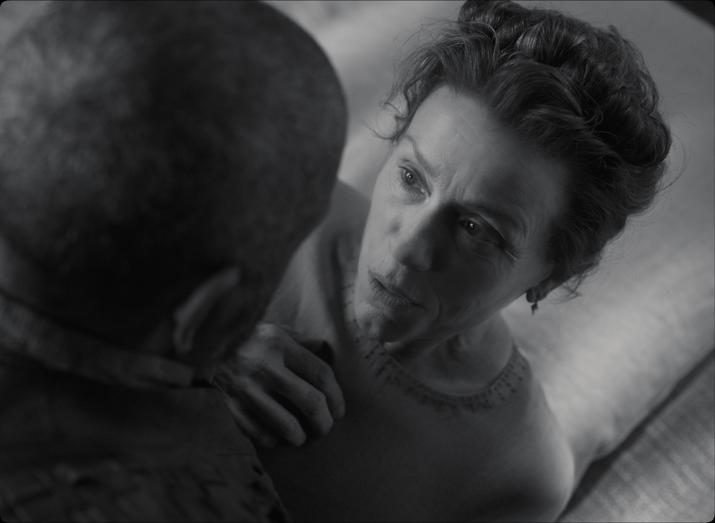
When Lady Macbeth persuades her husband to murder Duncan, she and Macbeth are almost entirely in silhouette. At one point there’s just a single spot of light around Lady Macbeth’s eye. It’s striking, and it’s definitely ‘old school.’
Delbonnel: I’m completely old school. I love Gunnar Fischer’s cinematography in The Seventh Seal... [Laughs.]

Delbonnel: When Joel saw that shot, he said, “It’s great, I love it, but there is one moment when I have to see him, and one moment her.”
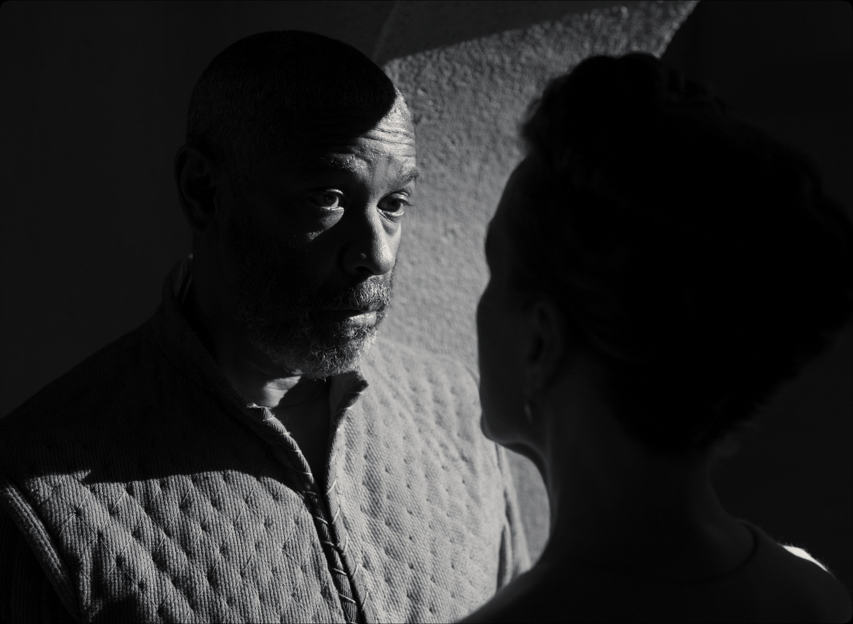
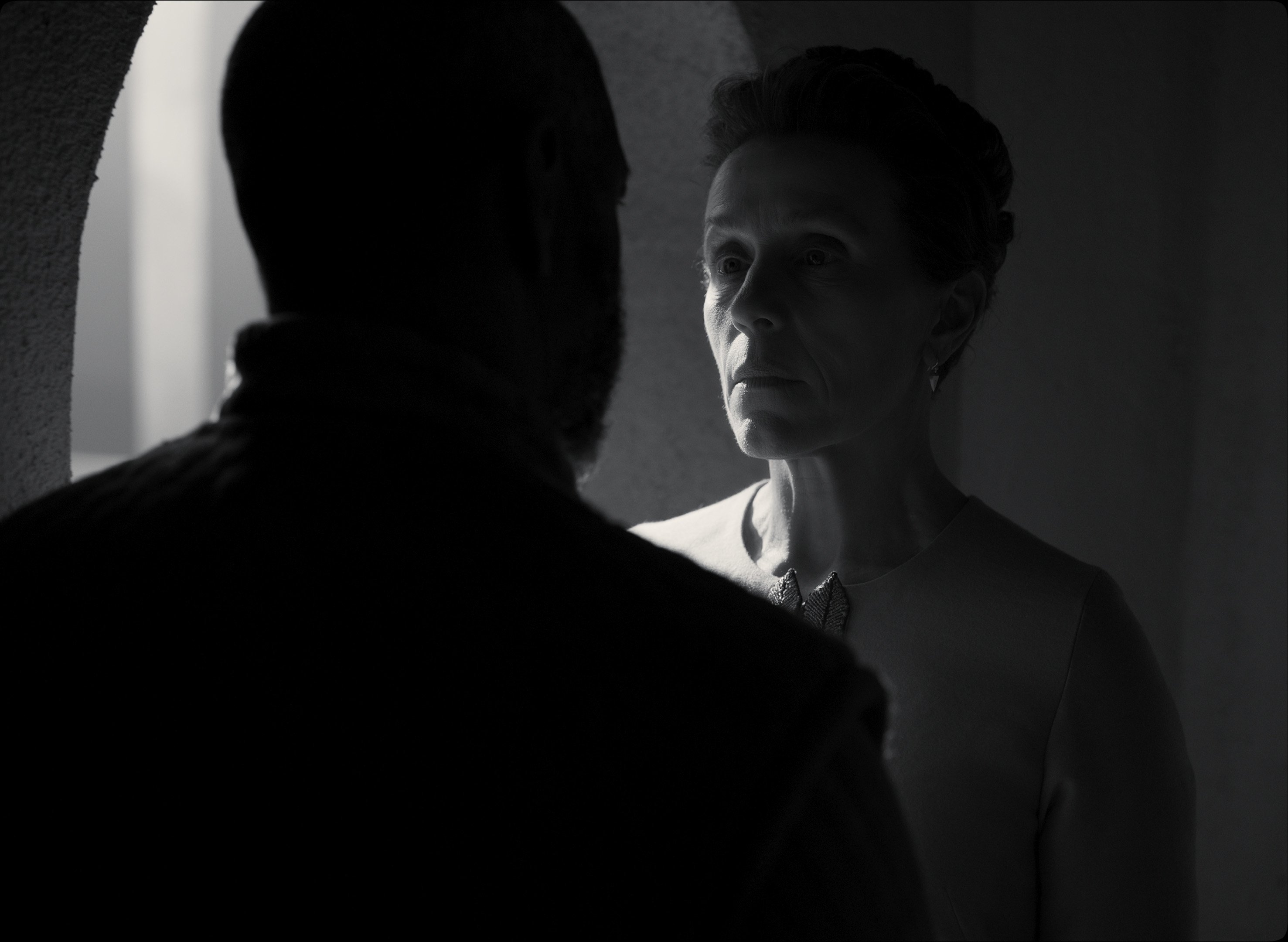
Delbonnel: After that moment, we stay in high-contrast night until the king’s murder. The “crossroads” exterior is gray during the day, and it becomes contrasty again with the murder at night. And we return to gray for the ending.
The Crossroad exterior was massive.
Delbonnel: We shot it on Stage 16 at Warners, which is about 30,000 square feet. We built a landscape which is not a naturalistic reproduction of Scotland, but more a feeling of Scotland. We used a painted backing, designed by production designer Stefan Dechant, that was 150 meters long to make it more theatrical. That was costly, but cheaper than bluescreens or LED. There’s no clear sun. I feel that the fact that the lighting is vague adds poetry.
We added movers to simulate moving clouds. I played with that very carefully, because as soon as you start moving lights, you can mess up the editor.
You mean Joel? [Laughter]
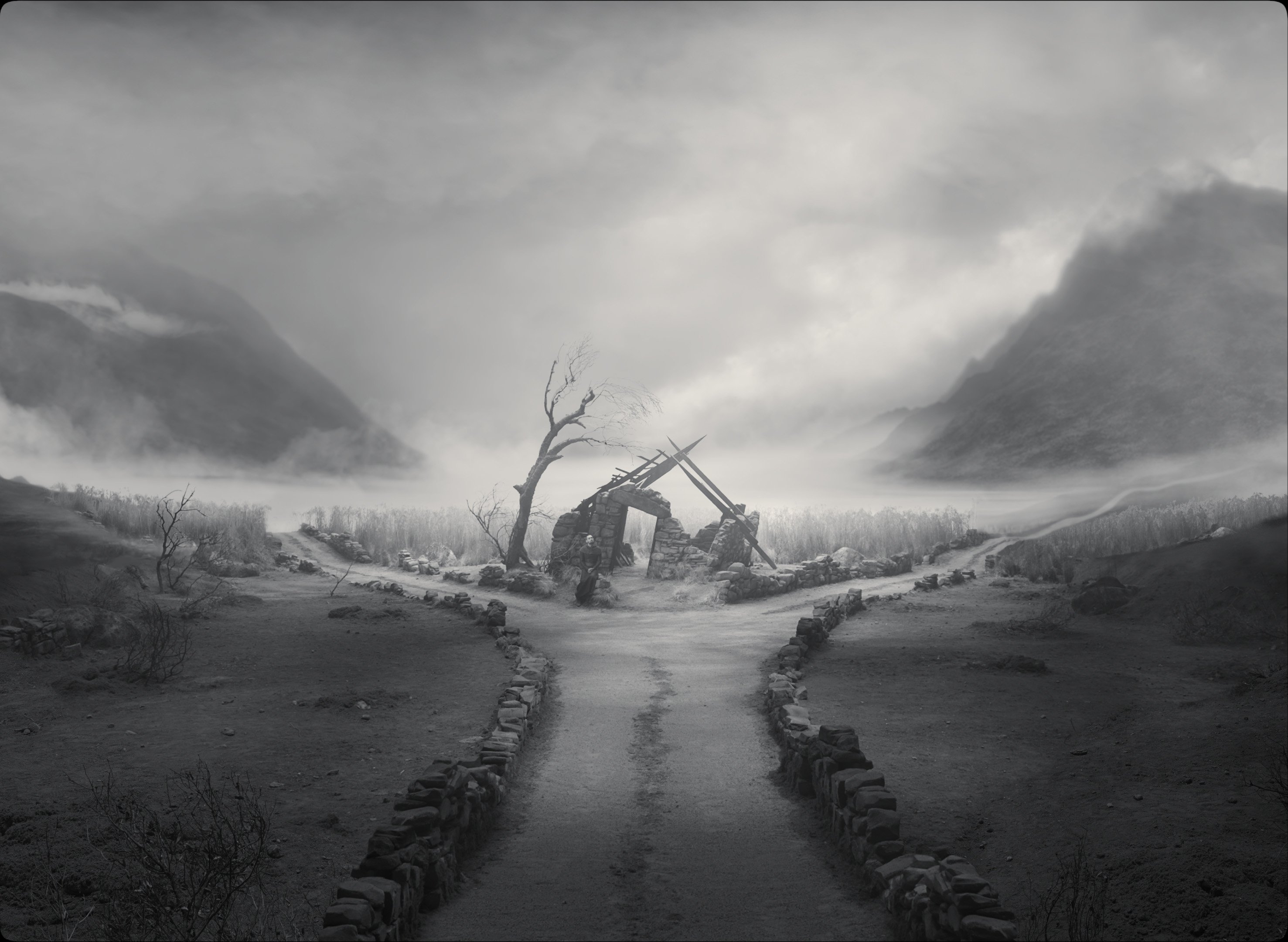
Some of the gray images with creamy whites instantly reminded me of a platinum print.
Delbonnel: Platinum prints were a reference I shared with my longtime colorist collaborator, [ASC associate] Peter Doyle. Peter and I wanted texture in the whites, so I never overexposed whites, and Peter stretched the grays.
Throughout the film, as we’ve discussed, there are many scenes that could be either day or night. We were combining old techniques, like painted backgrounds, with the latest lighting technology.
You flipped the crossroads set to night for the scene where Banquo is ambushed and fights his attackers with his torch. Afterwards, Ross [played by Alex Hassell] searches through a nearby wheat field holding a sword and a torch.
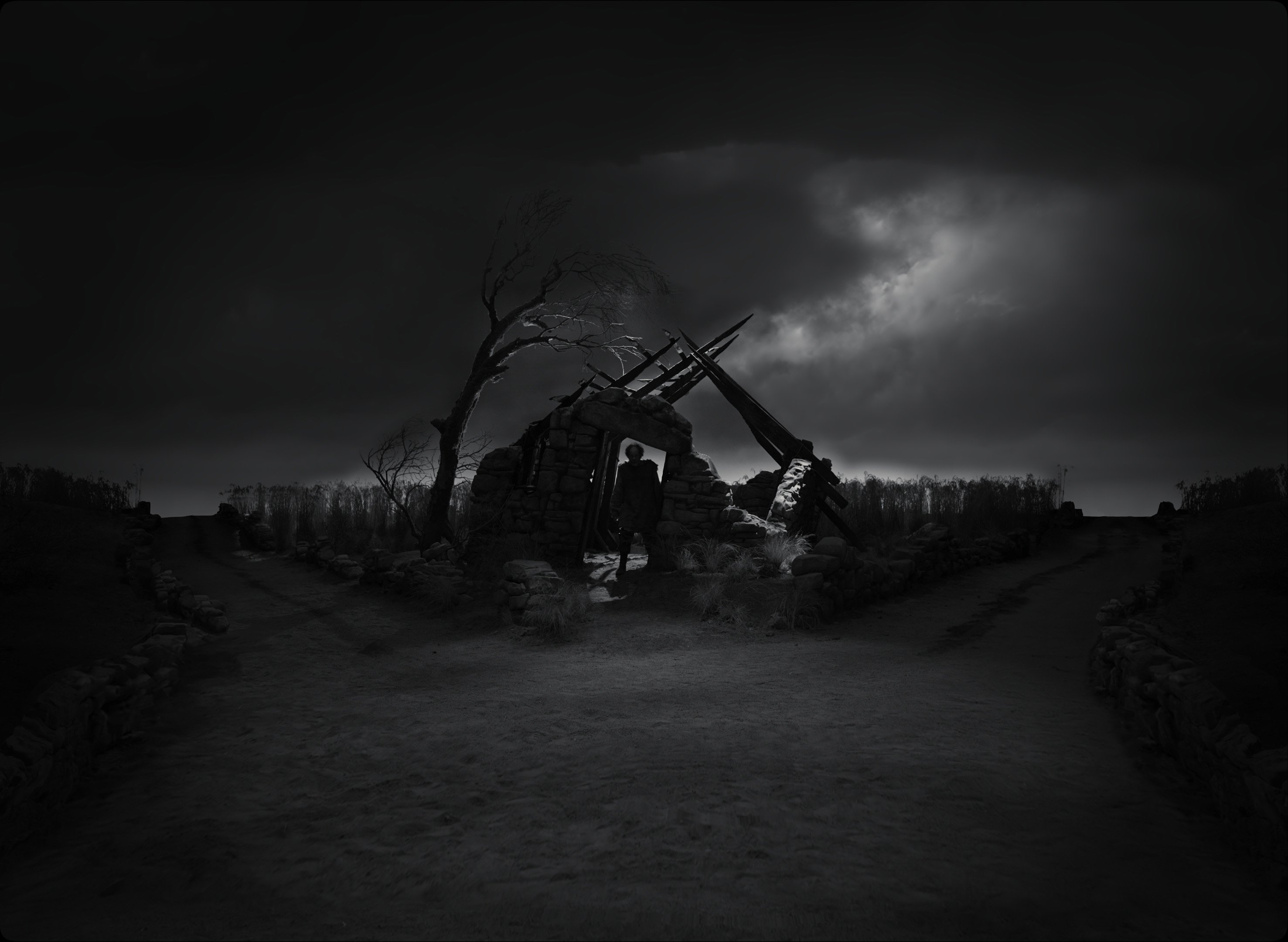
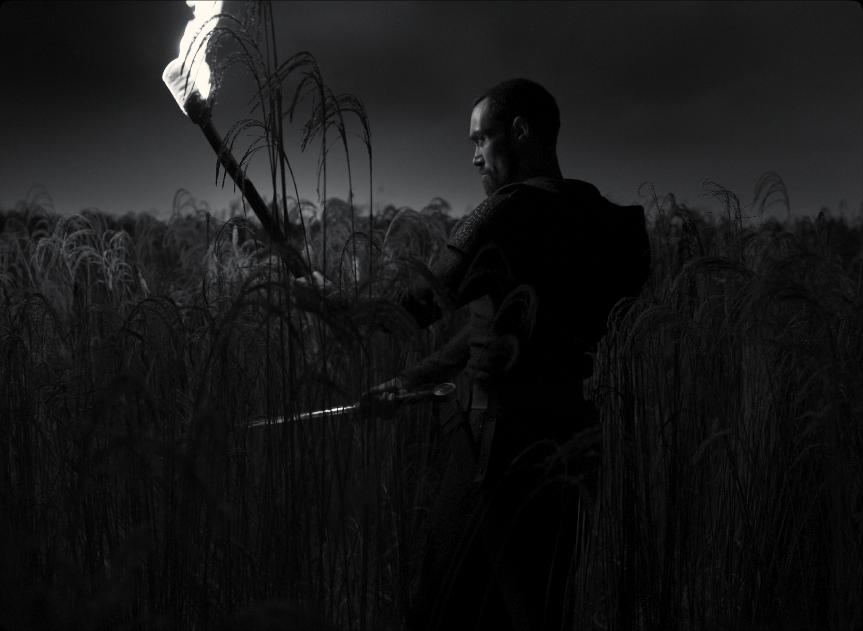
Delbonnel: At night, we dimmed the light boxes way down, and the movers took over. Then, during the torch fight, there was almost nothing. We had a real torch, and for some shots I asked an electrician to swing a fake torch, equipped with LEDs, offscreen. The electrician was swinging the torch in a random way, not trying to follow the actor’s movement. We did that both for exposure and to create another rhythm with light.
Joel, in your version of Macbeth you give the Ross character a sense of mystery, which adds some new suspense to a plot everyone knows.
Coen: Yeah, Ross is the one guy you can’t read. You don’t quite know what his motivations are. He’s obviously up to something, but you don’t quite know what.
There’s a scene where Lady Macbeth sits on the bed, invoking spirits, with these changing shadows behind her as she speaks. It’s a stunning moment, along with the scene when she walks toward the balcony with the burning letter. The whole room seems alive with the wind and moving shadows on the curtains. Both of these scenes show how a varying light can help tell the story.
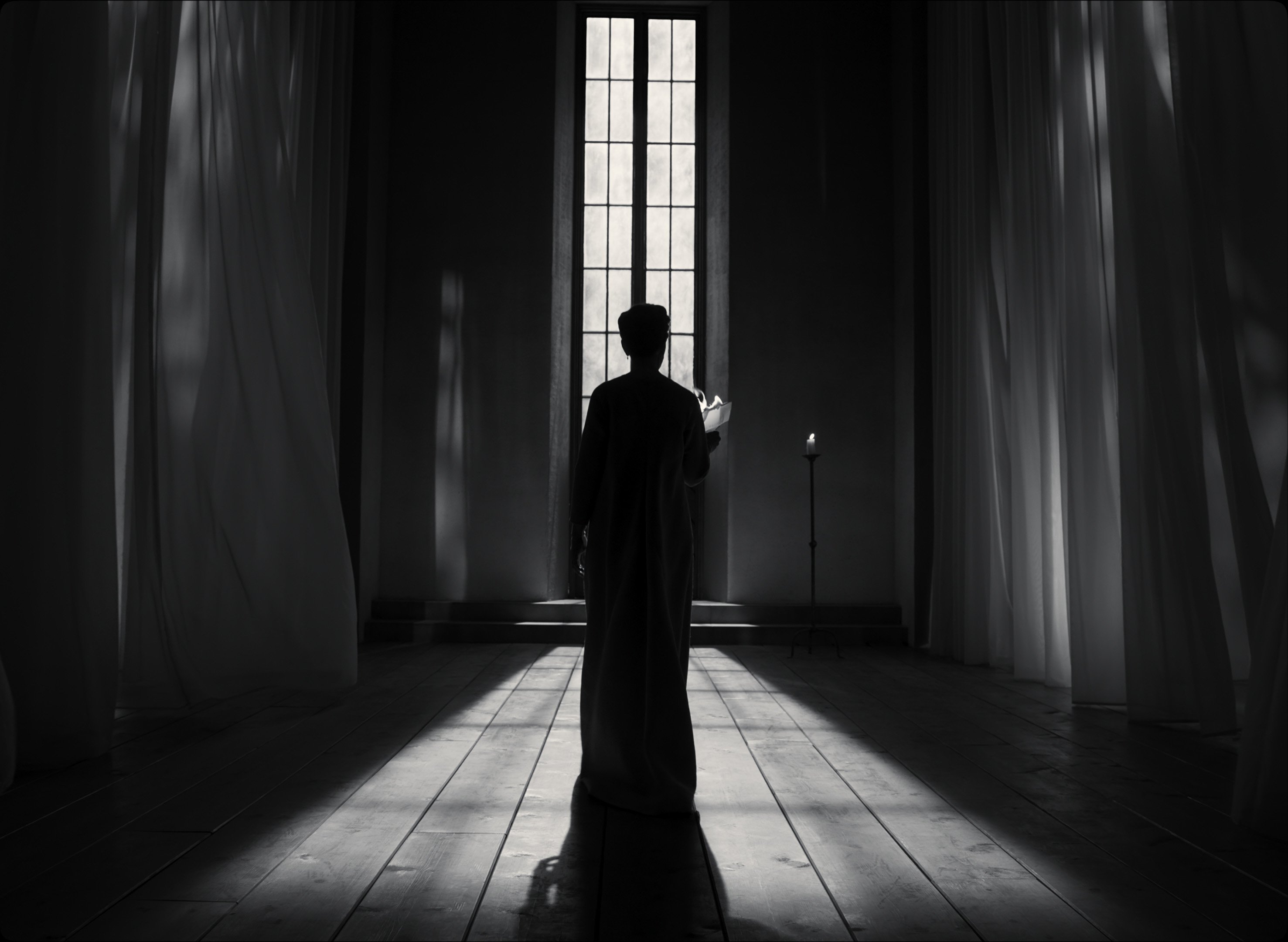
Delbonnel: The shadows are from a mover fixture above. We could combine rotations of a gobo, a prism and an animation layer to create all these abstract moving patterns that you can soften; there are so many possibilities.
Do you want to continue to pursue this moving-light technique in the future?
Delbonnel: Yes, that certainly interests me: moving shadows and lights that change. I want to try alternatives to static lighting, with light changing during the length of a shot or a scene to add another layer to the dramaturgy.
Joel, Bruno told me that he has never worked with a director as closely as he has with you.
Coen: That’s true for me, too. It was an extremely close design collaboration between me and Bruno, in a way that’s special to this project. Bruno was involved months and months before we were in preproduction on the movie. We would get together, not so much about cinematography, but about the conceptual and visual design, and even the thematic aspects of what we were trying to do: what the right language was for the piece.
Bruno, is there anything you’d like to add?
Delbonnel: I want to thank my crew for their help — especially gaffer Mike Bauman, key grip Ray Garcia, rigging gaffer Adam Harrison, dimmer-board operator Dave Kane, rigging grip Matt Floyd, 1st AC Andy Harris, DIT Josh Gollish and my longtime colorist, Peter Doyle. But most of all, I want to say how fortunate I was to collaborate with Joel Coen!
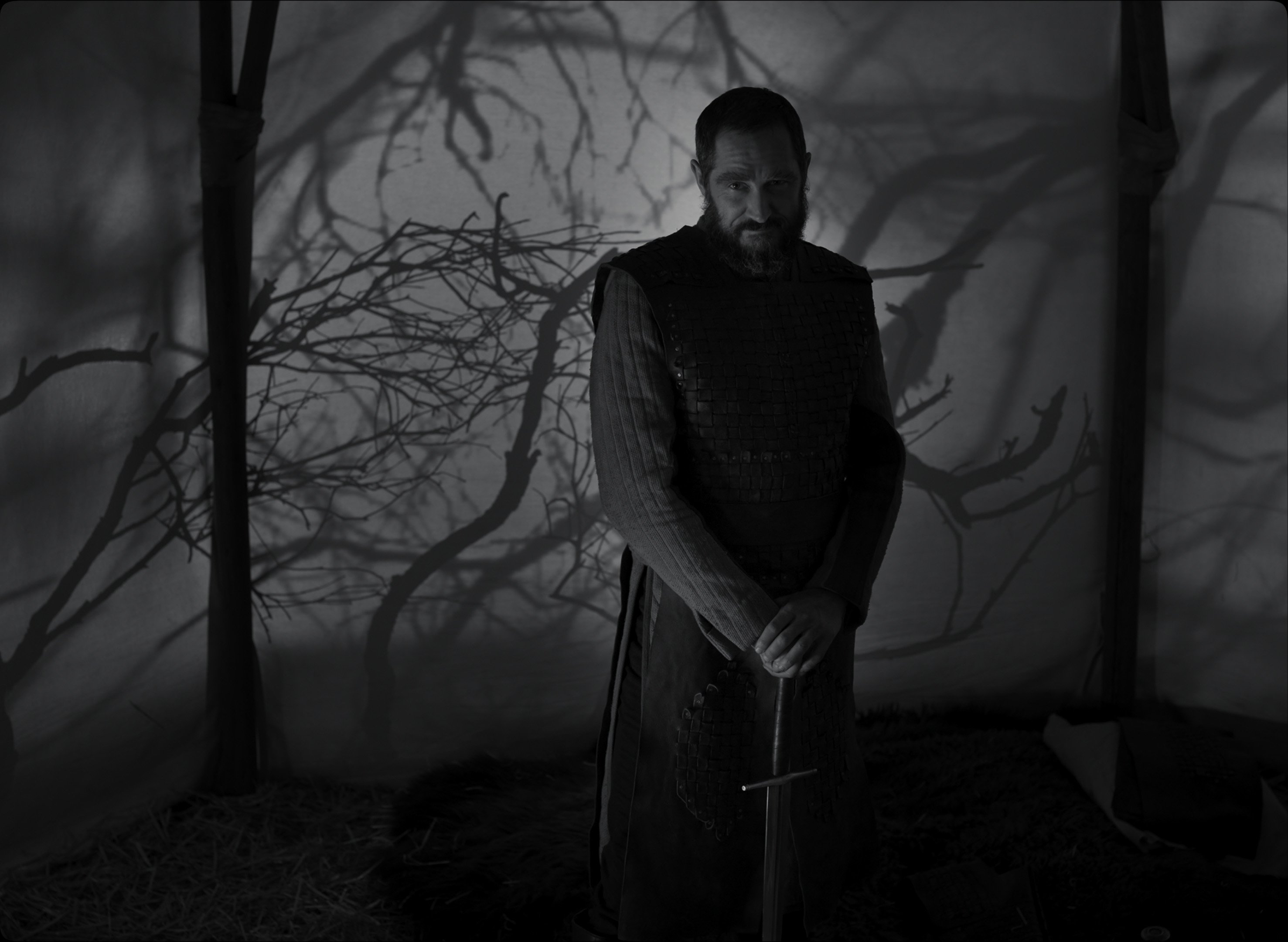
1.37:1
Cameras: Arri Alexa LF, Mini LF
Lenses: Cooke S7/I, Fujifilm Fujinon Premista
The author wishes to thank Michael Bauman and Peter Doyle for their help in preparing this article. Thanks also to Jack Spellberg, Apple, A24 and Strategy PR.
Delbonnel subsequently discussed Macbeth in an episode of ASC Clubhouse Conversations, with interviewer Shelly Johnson, ASC:
