Wrap Shot: Somewhere In Time
Looking back at the romantic 1980 time-travel fantasy, photographed by Isidore Mankofsky, ASC.
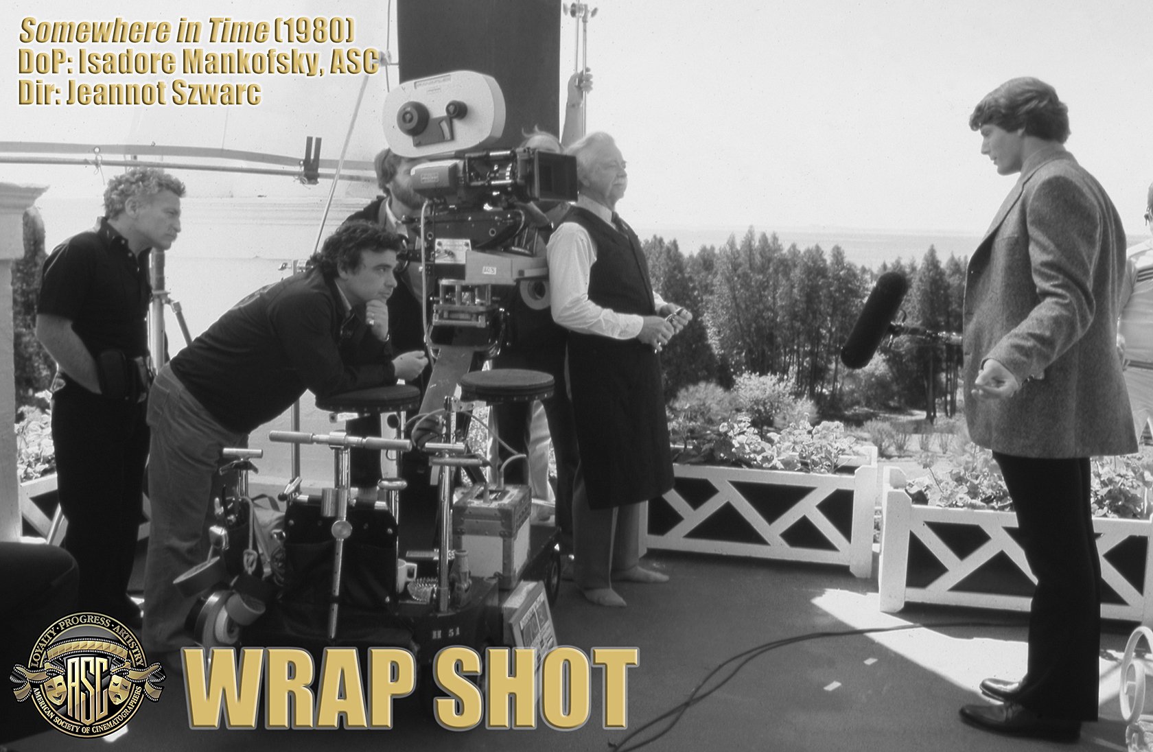
Cinematographer Isidore Mankofsky, ASC (far left) observes from behind the camera as it rolls on actor Christopher Reeve while filming the ethereal romance Somewhere in Time (1980), directed by Jeannot Szwarc (second from left). That’s Reeve’s co-star Bill Erwin just off camera.
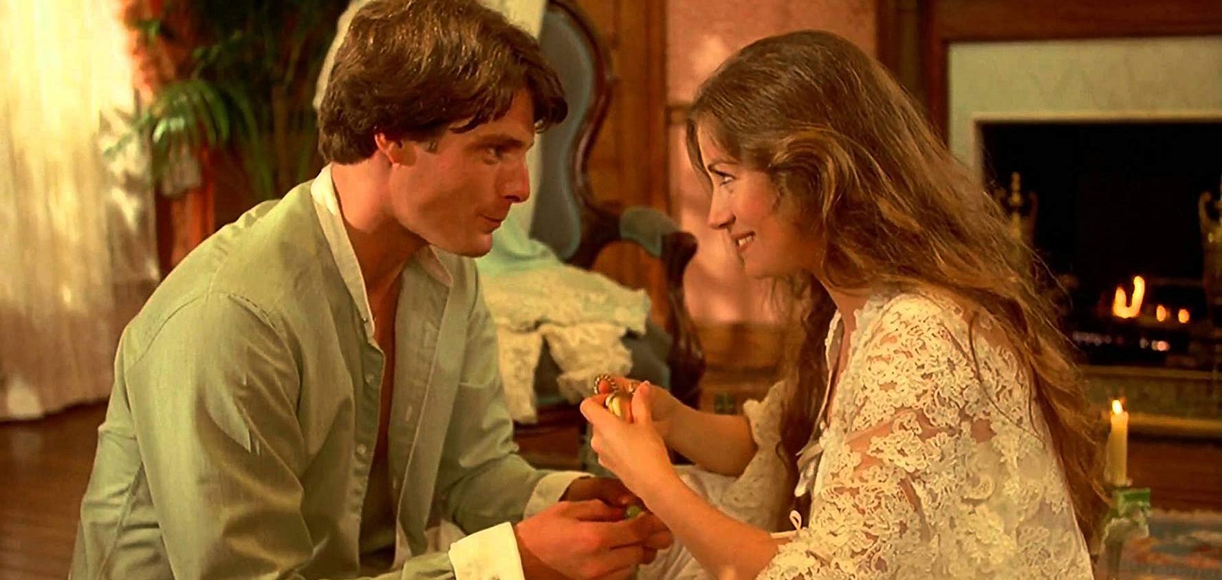
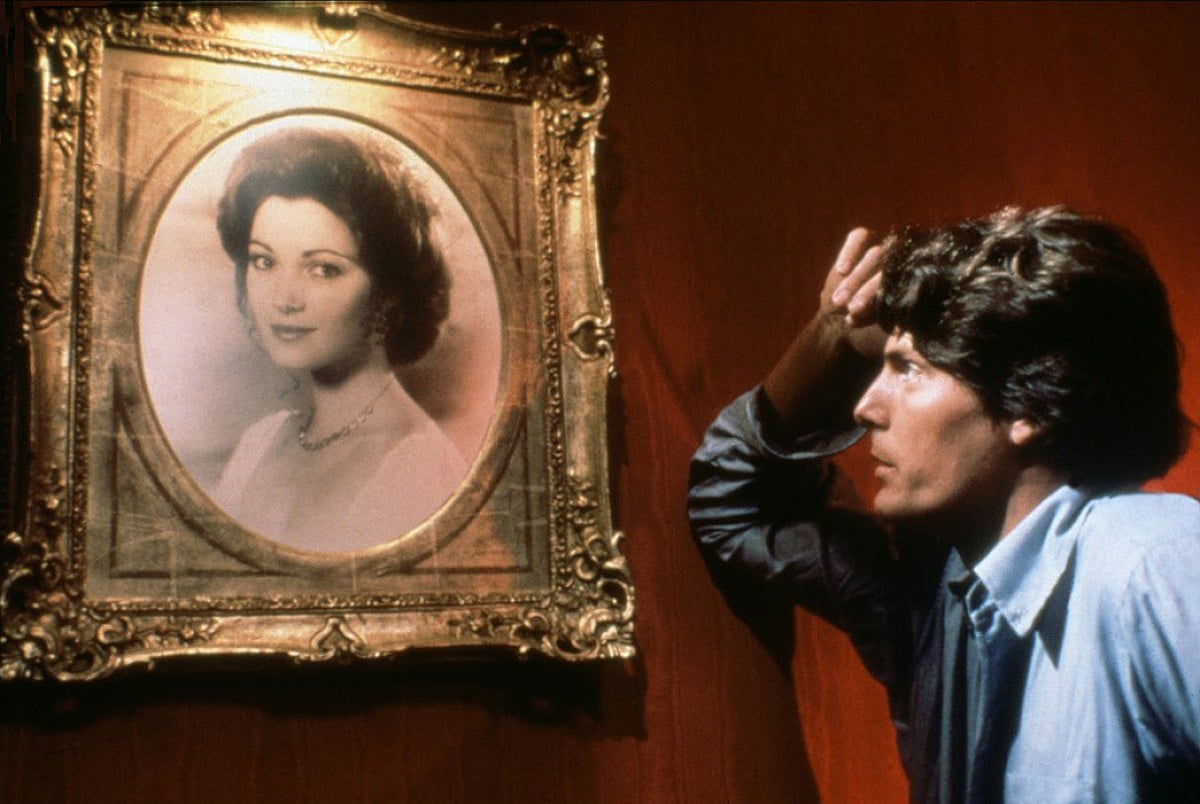
In the film, a playwright (portrayed by Reeve) reaches back in time to connect with an actress (Jane Seymour) whose vintage portrait hangs in a historic hotel.
Mankofsky famously photographed much of the picture at the historic 132-year-old Grand Hotel on the picturesque Mackinac Island in Michigan. He shot contemporary scenes with longer lenses using more-contrasty Eastman film stocks, while scenes set in the 1920s were filmed with wide-angle optics on Fuji emulsions for a different color palette and visual effect.
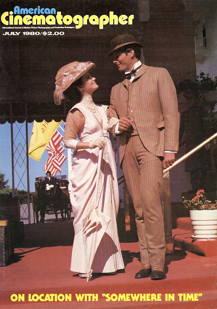
The project was covered in detail in the July 1980 edition of American Cinematographer.
Mackinac Island sits in Lake Huron near the northern tip of Lake Michigan, a few miles south of the Canadian border. No motorized vehicles are allowed on the island, which has a timeless feel as a result. Getting there isn’t easy — the final leg of the journey involves a horse-and-buggy ride to the hotel.
Ironically, perhaps, the story does not take place on an island. In the science-fiction novel from which the film was adapted, Richard Matheson’s Bid Time Return, the setting is the Hotel del Coronado in San Diego. But when the filmmakers scouted that hotel, it was deemed too busy and modernized. So, they opted for the Grand Hotel on Mackinac Island, converting a large building into soundstages to house sets that augmented the practical locations.
Asked about this idea of creating two distinctly different looks for the picture, Mankofsky replied, “According to the original concept of the film — arrived at through discussions with our director, Jeannot Szwarc — there was to be a very definite difference in look and texture between the period part of the picture and the contemporary. To begin with, the story takes place in two very distinct time frames; 1912 and 1979, and in order to make the film work dramatically, we had to make sure that, in terms of visual presentation, these two periods would not look the same. The objective was to carry the audience back in time subtly, but with a definite difference in the ‘look’ from one era to the other.”
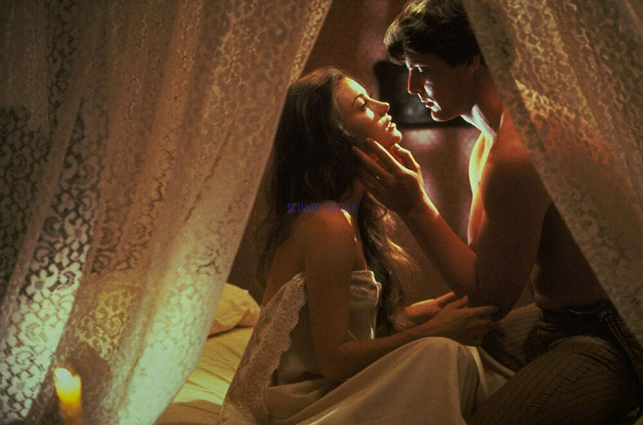
“We used Eastman color negative for the contemporary sequences, because it tends to be a little harder in the shadows and to have a crisper, more solid look to it. It seems to resolve better and to be sharper all the way through. Likewise, we decided to go with Fuji color negative for the period sequences because it seems to be a bit more pastel. It doesn’t appear to have quite the resolving power of the Kodak stock or the really black blacks. After making a number of tests using the same subject and the same lighting and going all the way through an interpositive to release print, we proved to our satisfaction that this approach of using two different film stocks could be very effective.”

Noted Szwarc, “Izzy and I went over the whole script and I told him from the beginning that I wanted two different, separate looks for the picture — one for the present and one for the past. I ran some films for Izzy and the key people, films like Death In Venice [shot by Pasqualino De Santis] — and I bought a lot of art books, especially with the work of the French Impressionist painters, like Manet and Monet.
“We agreed that for the sequences taking place in the present we would go for a very cold, monochromatic look — long lenses, Eastman stock and no primary colors. For the sequences in the past we would use Fuji stock — which is a little bit softer and less contrasty — and go for wide-angle lenses and diopters and deep focus and a very pastel look.
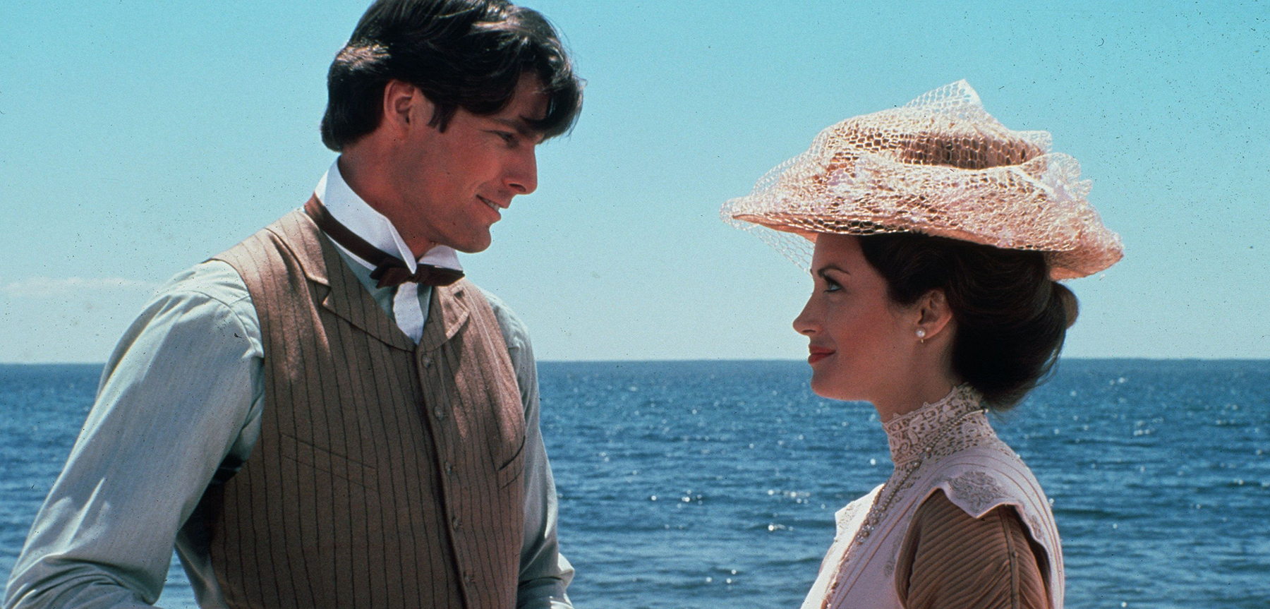
“We followed that concept through in everything — in set dressing, the colors of the walls of the sets, and also in wardrobe. We tried to avoid primary colors everywhere, and particularly in the sequences of the past. Our basic approach to the film was to subconsciously make a visual statement that would move the audience to fall in love with the past— but we didn’t want it to be obvious; we didn’t want to do a pamphlet. From the beginning we all agreed that we were going to make a love story that would be a classic.”
Asked about his use of filters on the production, Mankofsky noted, “We really didn’t use very many or very heavy filters on the show, because the difference in film stock did more or less what certain filters might have done. Though we did use filters to some extent on Jane Seymour, because she was supposed to look almost ethereal. We used some of our black nets. In order to work into the nets — so that the change in image characteristics would not be quite so sudden — in all the scenes leading up to her close-ups we would use a lighter black and then go to a heavier black for the actual close-up.”
“However, for the contemporary sequences we did use low-contrast filters to some extent, but only because some of the exteriors were getting a little harsh, due to the extremely clear air on Mackinac Island, which made everything come through very crisp and sharp. Paradoxically, we wanted a crisp-looking picture. We didn’t want the look of a film that had been filtered too much. It got enough softening through the use of the Fuji stock alone, without going to heavy diffusion. I had a coral attenuator that I used on some sunset shots and I used a few coral filters here and there for late afternoon. But, other than that, no filters.”
In regard to his overall lighting approach, the cinematographer explained, “In the contemporary sequences the lighting is a little harsher and less ‘source,’ you might say. The light appears to be coming from overhead and it’s a bit on the flat side. For the period sequence we used very, very soft lighting — a lot of lamps and candles, with source lights appearing in the shots as often as possible.”
Years after the release of the picture in 1980, Mankofsky frequently traveled to Mackinac Island to take part in the annual Somewhere in Time Weekend at the Grand Hotel. The event, which draws hundreds of fans of the romantic film, includes screenings, costume promenades and formal dinners. As an honored guest of the reunion, the cinematographer traditionally made a popular presentation titled “The Making of the Film.”
You can read more about the production here.
If you enjoy archival and retrospective articles on classic and influential films, you'll find more AC historical coverage here.
