12 Monkeys: Speed of Light
Cinematographers David Greene, ASC, CSC and Boris Mojsovski, CSC offer a detailed look at the principal sets for the time-traveling Syfy series.
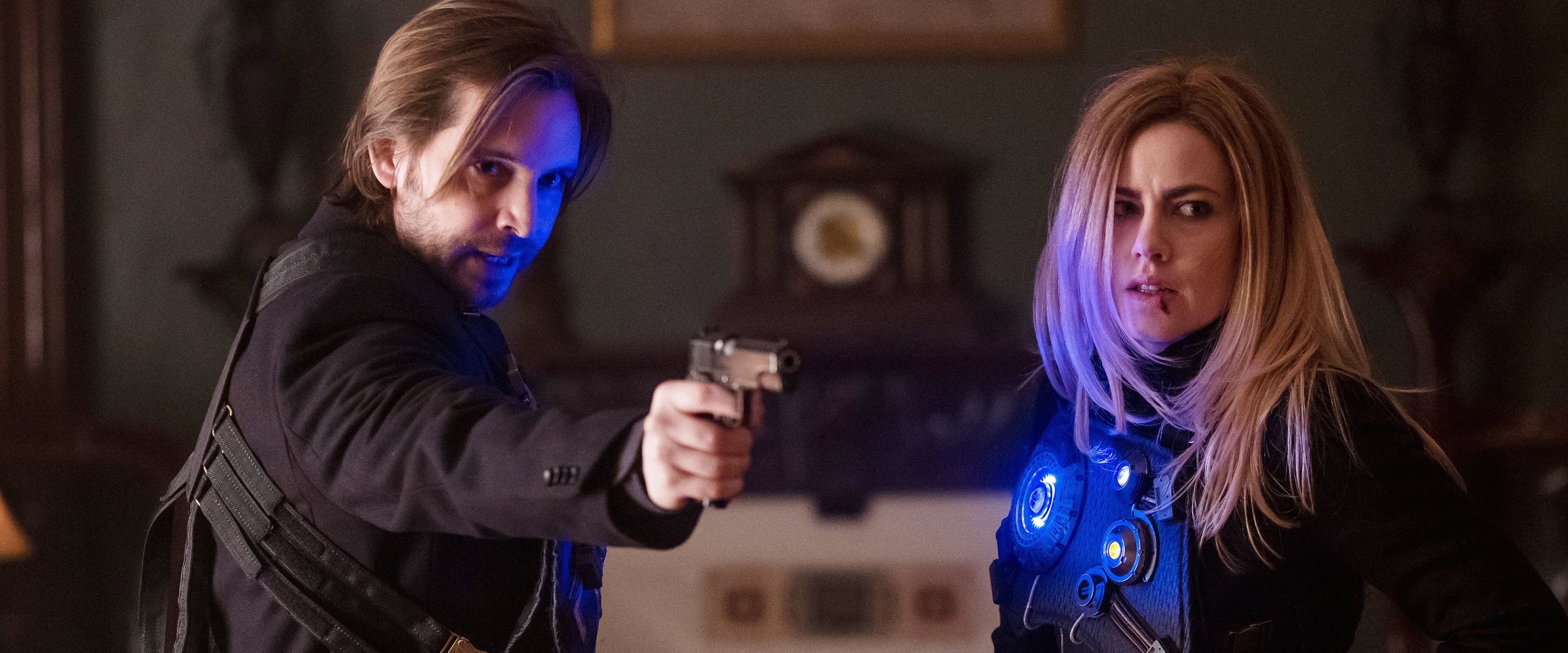
Image at top by Brooke Palmer. Lighting diagram courtesy of David Greene, ASC, CSC. Additional photos by Boris Mojsovski, CSC. All images courtesy of Syfy.
When the final episode of the Syfy series 12 Monkeys is broadcast July 6, it will mark the end of a remarkably ambitious television narrative and — according to co-directors of photography David Greene, ASC, CSC and Boris Mojsovski, CSC — one of the richest creative opportunities yet presented to cinematographers working in that medium.
AC's July issue offers readers an in-depth look at the show and the collaboration between the two cinematographers, who have notched a combined three ASC Award nominations for their work on the series. Greene, who began shooting the Toronto-based production in its first season, was nominated for the Season 1 episode “Mentally Divergent" and the Season 3 episode "Mother." Mojsovski, who joined the production in Season 2 and — along with Greene — has stayed with it to its conclusion, won the ASC Award for the Season 3 episode "Thief."
To complement the magazine's coverage, we here offer a look at the production's lighting diagram for what Greene describes as "the temporal facility, where characters 'splinter' [the show's term for time-travel]." As Greene notes, given the story's time-hopping narrative, this is "one of the few sets we see consistently in the show."
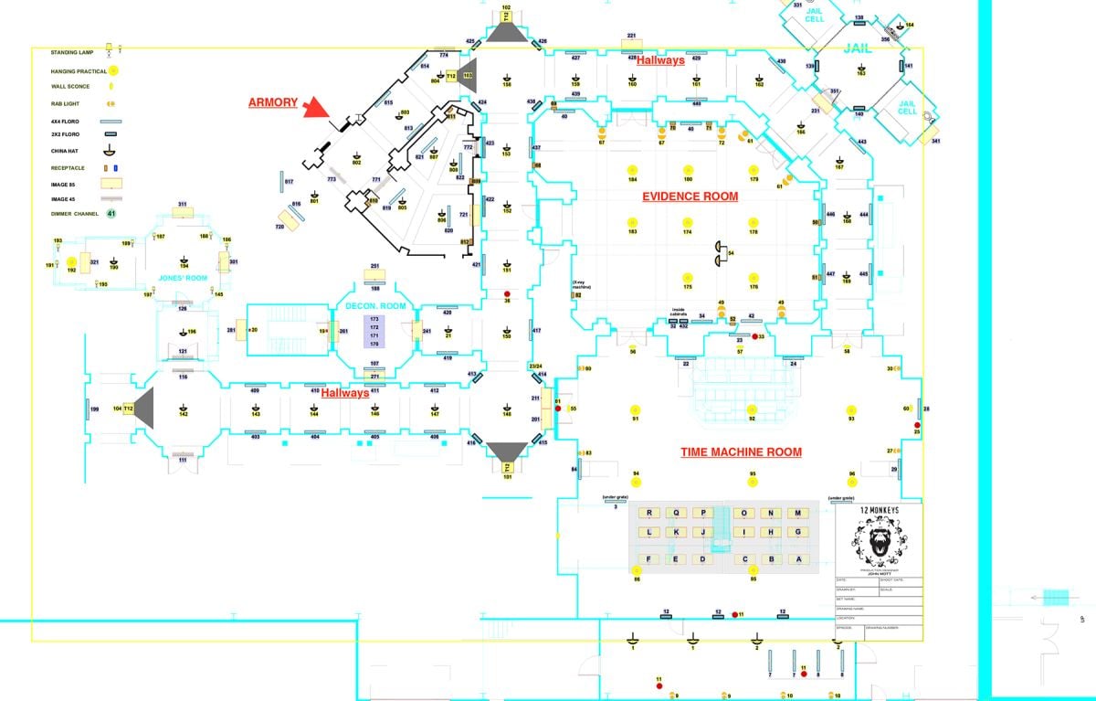
"The main space is large and cavernous," Greene explains, "and I wanted it to be moody; I didn't want toplight. I wanted to literally outline the space in practicals to give a sense of the shape of the room, and [production designer] John Mott and I spent a lot of time discussing how to do that. We landed on a lot of fluorescents and China hats, and fixtures I call 'marine lights' — lamps in glass jars.
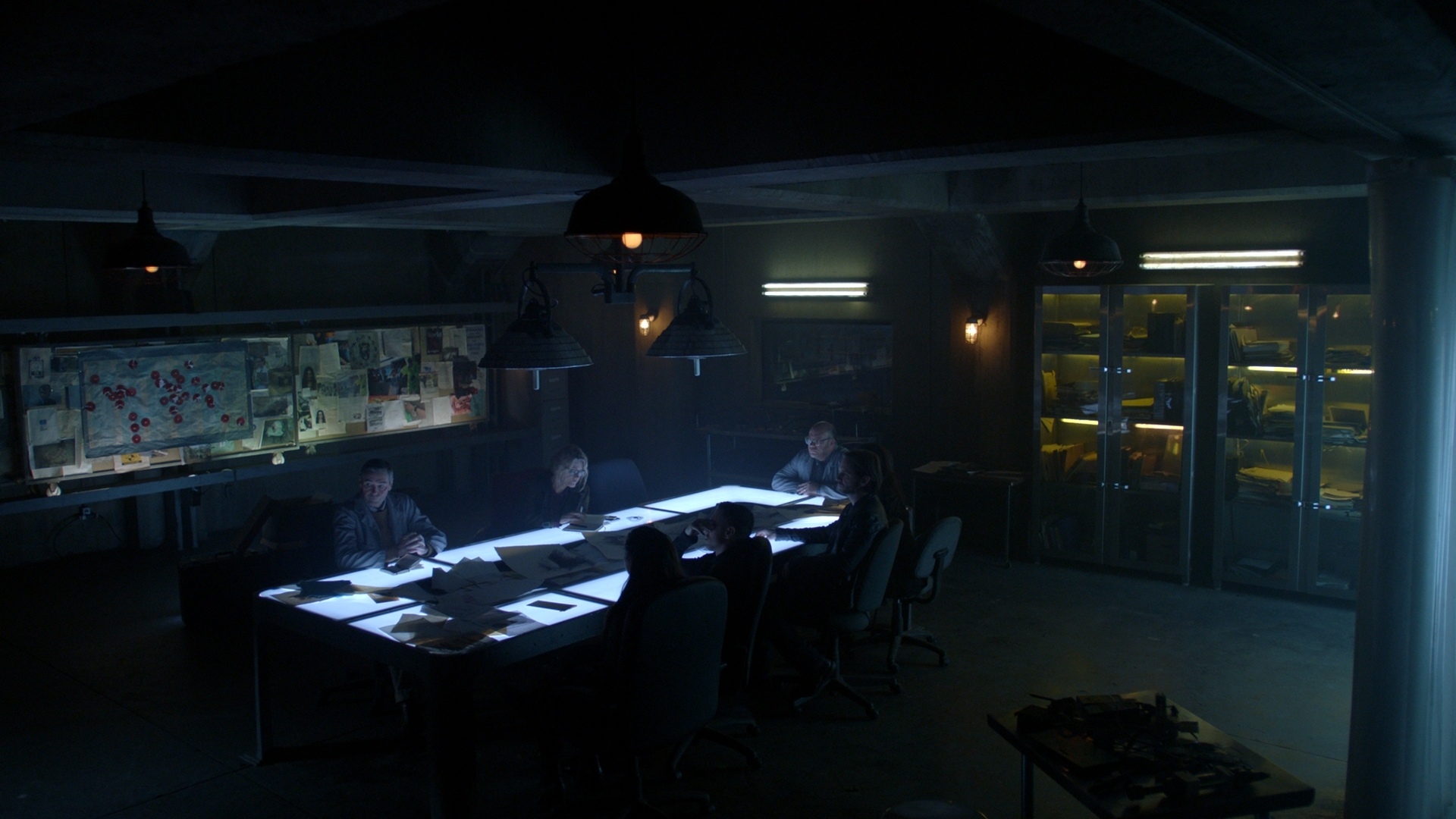
"In the 'ready room' [aka the evidence room], which is right beside the splintering room [aka the time-machine room], we used the same approach, encircling the space with practicals," he continues. "There's a table in there and I knew characters would be sitting around it all the time, and I knew immediately I wanted that to be a lit table. ... In the first season, we lit the table from below with daylight-balanced fluorescents through milk glass that was about a 1/4" thick. Starting in Season 2, we replaced those with bicolor LED strips from Moss LED in Toronto.
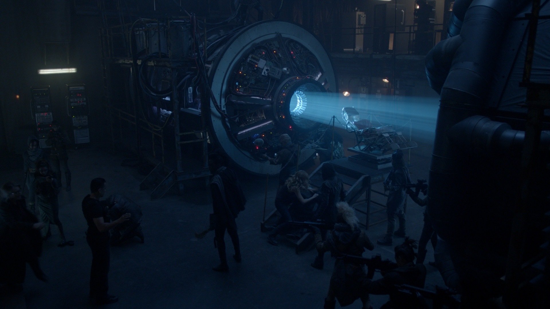
"The time machine itself is riddled with LED bulbs and lines of light created by hidden fluorescents," Greene adds. "Again, the idea was not really to illuminate the anything, but to define the space. For the beam of light inside the machine, we originally used a follow spot, and we had an electric in there flickering it when it was time to splinter! In Season 2, we changed to a Best Boy [4000 Spot Luminaire from PRG], a great tool. We could put all kinds of interesting patterns in the beam and change its color quite easily at the board."
Pick up the July issue of AC for much more from the making of 12 Monkeys.
