Conversations with Darius Khondji
In this excerpt, the esteemed ASC member reflects on his breakthrough feature Se7en, which helped change the face of Hollywood horror and suspense features and remains a cinematic touchstone.
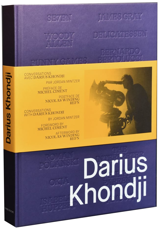
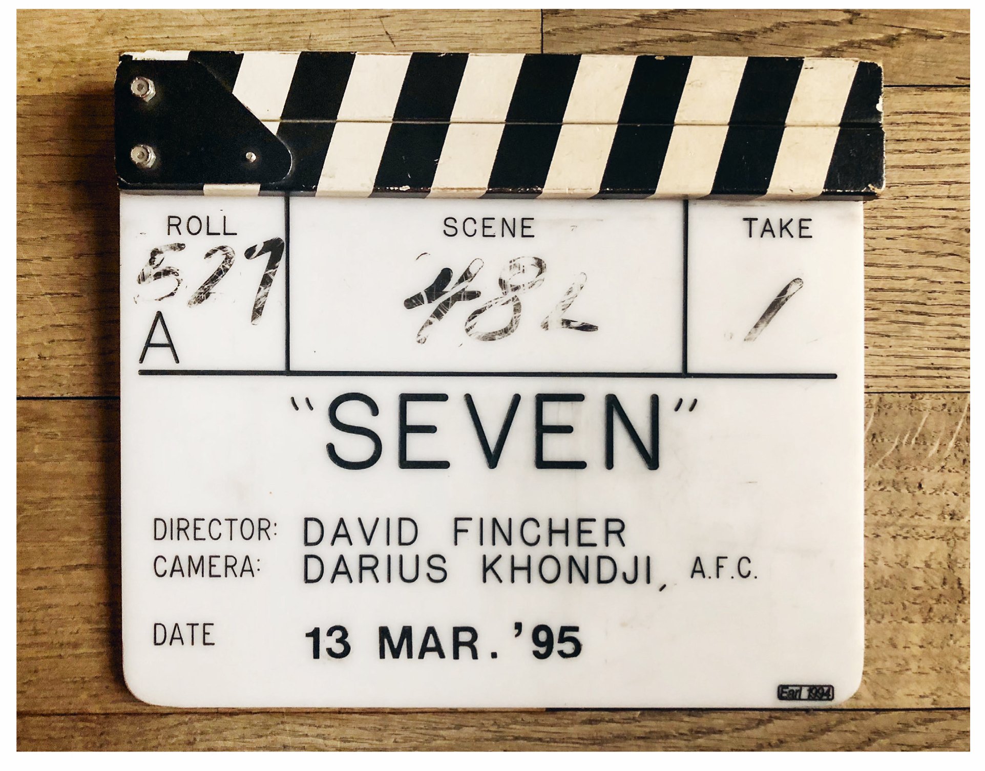
The following is an excerpt from the book Conversations with Darius Khondji, written by The Hollywood Reporter film critic Jordan Mintzer and published in a French-English bilingual edition by Synecdoche in Paris. The excerpt is taken from the chapter “Out of the Shadows,” which begins with Khondji describing his work on David Fincher’s Se7en (1995) — the first feature he shot for a Hollywood studio.
A limited-edition hardcover version of Conversations with Darius Khondji is now available for purchase directly from the ASC.
Khondji is the recipient of the 2023 ASC International Award, and his recent work in Bardo, False Chronicle of a Handful of Truths has earned both Academy and ASC Award nominations, among other honors.
•••
When you take on a project, how do you begin to visualize it in terms of the framing, the lighting and the overall look you want to give the film?
I would say that’s one of the hardest things for me as a cinematographer: finding the key that unlocks the film in a visual sense, that will illuminate the story so you’re inspired and excited about shooting it everyday for a long time — because when you decide to do a movie it can take anywhere from three months to a year of your life. When I find that key, it ignites what I call the “big bang.”
Is the big bang an idea that comes to mind when you read the script?
I don’t usually find it there because I’m honestly not a great script reader, though sometimes the characters in a story do help me visualize the movie. But when I start a project, the look of the film often remains hidden to me, sort of like an animal hiding in the shadows that’s going to come out eventually, that’s going to show part of its face or body as it emerges from the shade. That’s the look of the film, the mood and soul of the film.
So where do you find the big bang if it’s not in the screenplay?
The big bang is often triggered by something that comes from the director, because I try to communicate with them as much as possible from the very start. For instance, on The Immigrant, James Gray sent me lots of images by email very early on, including the Polaroids of Carlo Molino. And when I saw those photos, I understood he wanted the image to have a religious feel to it — that there was to be a visual link between the religious convictions of the main character and the sensual world of the prostitutes. The big bang can also come from something the director says to me, even if it’s only a single word or sentence. On Se7en, it came when I talked to David Fincher on the phone about the script and he said to me: “Darius, it has to be scary.”
It must have been clear from the script that Se7en was supposed to be scary…
Of course, but it was the way David said it that helped, because it literally sounded like a serial killer was talking to me. When I read the script, which was probably around 1994, my English wasn’t great and many of the words in it were still obscure to me. But hearing the color and tone of David’s voice, along with some of the things he said about the story, I finally got it. I was in New York at the time and, after our conversation, I took a long walk around the city as the sun was going down — walking and thinking about the film, with David’s words resounding in my head.
You actually first met Fincher while shooting one of his commercials.
It was on a Nike commercial he had directed in Paris. I remember that one of the scenes was an exterior of a girl running in a park, and even though we were shooting in daylight, I lit it in a way that was darker and more stylized. And I think David appreciated the way I was ambitiously working the image.
When you began working together on Se7en, what kinds of movies did you and Fincher look at as you started to prep for the production?
We watched several films, including Bob Fosse’s All That Jazz, which was one of David’s favorite movies at the time, and also The French Connection, whose grittiness you can definitely see at times in Se7en. Another movie we looked at was Jonathan Demme’s The Silence of the Lambs, which had been made a few years before and which posed a problem since it had placed the bar so high. I remember thinking: “How can you shoot a story about a serial killer after The Silence of the Lambs?” There was something so real about that film, the way the skies were always overcast and how the interiors looked very simple and mundane, like in a news report. Something David really liked was how factually the horror was described, and so he thought we should start from there: Lambs had been done and we had to go somewhere else.
Another important film — and one that would be important for me for the rest of my career — I even watched it again recently before shooting Woody Allen’s Irrational Man — was Alan Pakula’s Klute. Back when we were doing Se7en it was a major discovery for me since Gordon Willis’ work on that movie has everything in it: the use of toplight, using widescreen compositions for intimacy rather than big vistas, the way that vertical strips of the city are shown in horizontal mode, the fragments of faces and bodies...
The look of Se7en has this heightened sense of realism — a realism that’s been kicked up several notches and becomes its own style.
So much of that came from David, who had a very sophisticated eye, a very discriminating eye. He had this immense knowledge of art photography and one of his major references was William Eggleston, who was not as well known in the early ’90s as he is now. He also had a real sense of coolness that came from fashion photography, and I think we managed to find a really good balance between a narrative way of telling the story, of keeping the suspense going, and a poetic way of making images that were at the same time gritty and stylized, classic and contemporary.
The look of Se7en also came out of this tight working “cell” we created between David, myself, the production designer Arthur Max, and the costume designer Michael Kaplan. The four of us would meet together to discuss the art direction and visual scope of the movie, and we did several sessions like that to establish a unified plan. I remember hearing how Coppola, Storaro and the production designer Dean Tavoularis did that on Apocalypse Now. Or how Bertolucci, Storaro and Ferdinando Scarfiotti were doing that kind of thing on The Conformist and 1900. So we did that on Se7en and we did it again most recently with James Gray on both The Immigrant and The Lost City of Z.
When discussing the look of Se7en you often refer to the photographs of Robert Frank in his book The Americans (1958). At first blush, it’s hard to see what the link is between Frank’s black-and-white photographs and the imagery of the Fincher film.
The Americans was already a big inspiration for the first feature I shot, Treasure of the Bitch Islands, [1] which was done in black-and-white. For David’s film, there was something else about Frank’s photos that interested me, which was more related to the grittiness of them, the blandness, the loneliness of a past era and the texture of death. At the same time, there’s something monumental about the way Frank captured such loneliness and grittiness, and he really made those Americans of the ’50s look like giants.
“There was some pressure from the studio, but [David Fincher] wouldn’t compromise on anything, which I found very admirable.”
Did Frank’s photographs specifically influence the lighting on Se7en?
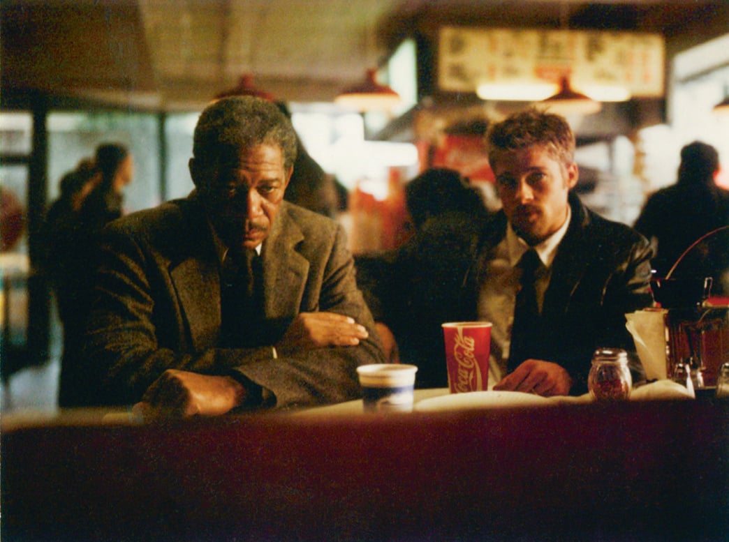
Well, if you look at the interior scenes — for instance, the scenes shot inside the car — you can see that there are usually very bright exteriors and very dark interiors. That comes from Frank’s photos. What we did on Se7en was underexpose many of the interiors by two stops on a film negative that was quite contrasty. And underexposing by two stops really made the exteriors come alive, whether in the desert or the city, so that the brightness is always coming from the outside. In many of the interior scenes, there’s hardly any light except for a few fluorescents, with reflections running to your eye through all the shiny surfaces. If you look at Frank’s photos, such as the one he shot in a bar in Las Vegas, you can see the same thing.
The difference is that Frank just showed up and shot his photos off the cuff, while on a production like Se7en you have to create that look.
And it requires a lot of work. We had to wet down floors everywhere, scout all the hotels in downtown L.A. to find ones that had the kind of walls we were looking for, or else use surface paint on the walls to both darken them and allow for the light to be reflected. To get the blacks the way we wanted—to make them that India ink black — we used a bleach bypass process on the prints, working with Beverly Wood at Deluxe. The process was called CCE [2] and was similar to what we were doing in France, or to the ENR process [3] that I later used in Italy. CCE was a little more radical than the others, and to get those beautiful blacks, it would drain out a lot of the color.
Se7en is certainly very dark, especially for this kind of Hollywood movie.
It was definitely risky in terms of the lighting, and there were rumors that the producers were unhappy with the rushes they were seeing. I remember asking David if he wanted to print the dailies a bit brighter and he said “no.” There was some pressure from the studio but he wouldn’t compromise on anything, which I found very admirable. Then about halfway through the shoot, they cut together a promo reel to screen at ShoWest in Las Vegas. It became a sensation and every buyer suddenly wanted the movie, which meant that from then on the studio gave us more freedom. We also had a very supportive line producer named Dan Kolsrud who stood behind us.
“It’s funny, because when you’re working on a movie like that, you don’t really know what it’s going to look like or who it’s going to interest.”
Some of the visual highlights in Se7en come from the murder scenes, each of which is rather unique in terms of both the look and content.
I really saw the Kevin Spacey character as a sort of conceptual artist making installations with each murder, and there were different references for every scene — from the photographs of Joel-Peter Witkin, which David suggested I look at, to certain paintings by Edvard Munch where the green, claustrophobic images influenced scenes like the ‘Sloth’ sequence. I remember we shot that scene in this really inspiring downtown location that was the real deal. There were condoms and crack vials all over the floor, which we had to clean up, but then we put in our own crack vials and hung green fragrance trees all around. And we lit the location very brutally, with green-gelled HMIs planted on the building across the street so that the light could come through the windows.
Do you recall a scene that was particularly complicated to shoot?
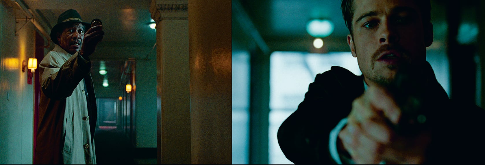
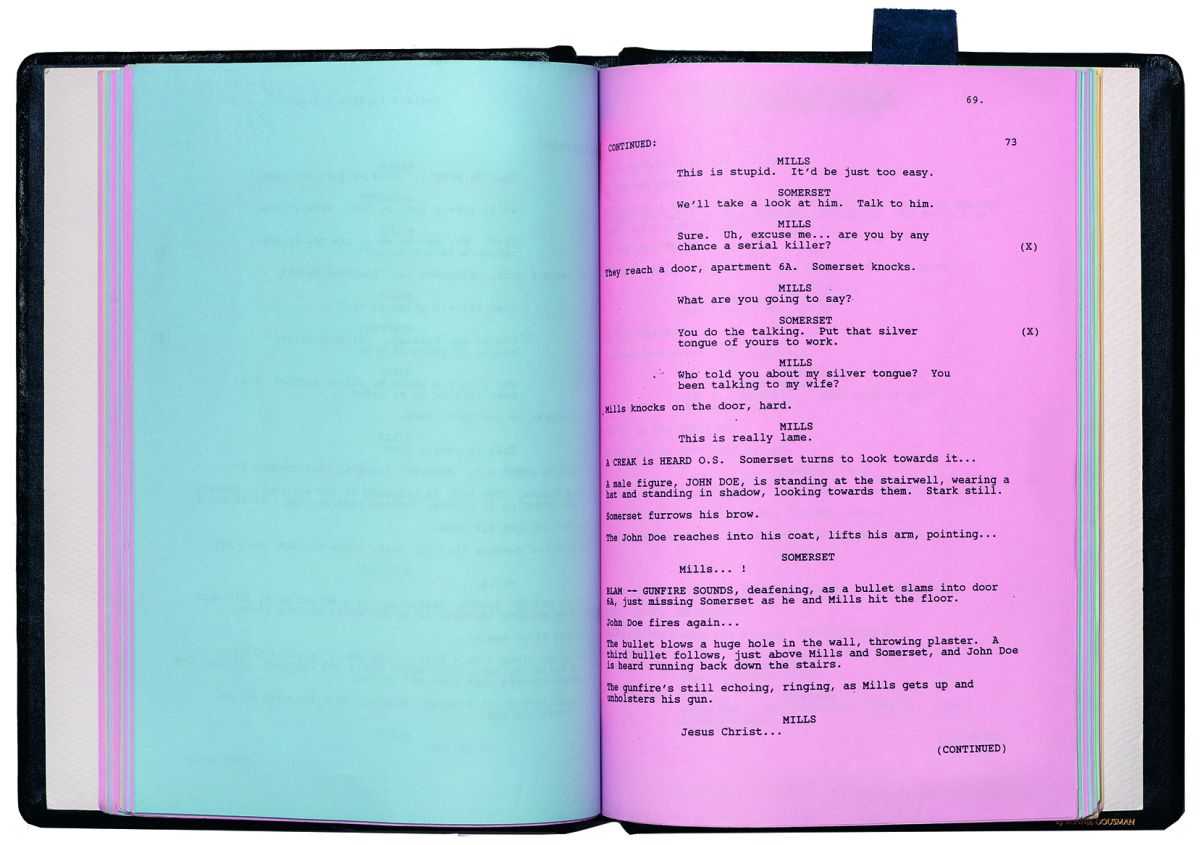
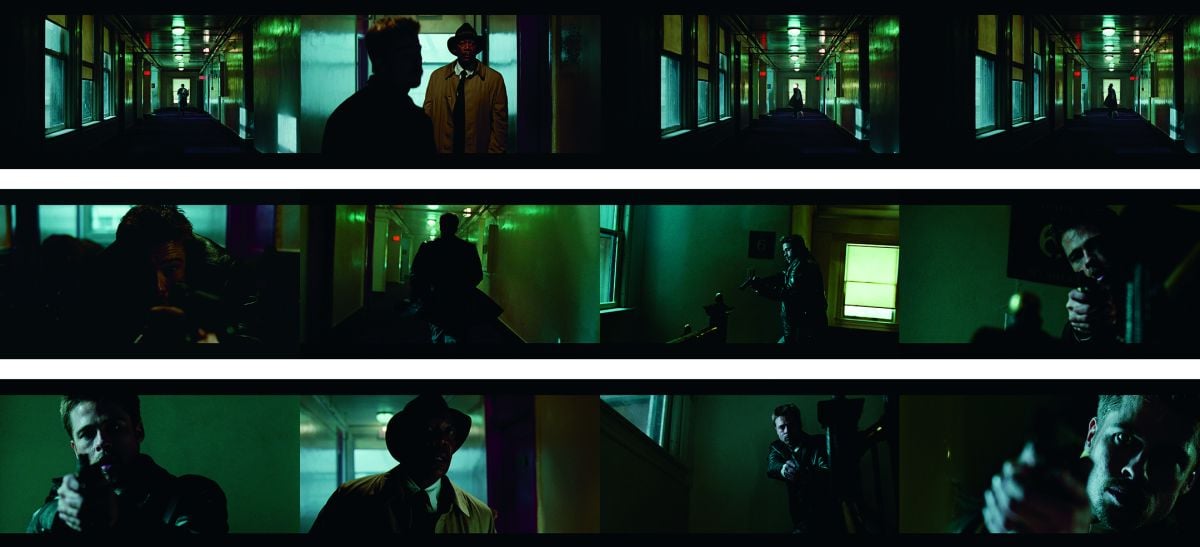
The chase scene was definitely one of the hardest for us, because it was extremely lengthy and difficult, and we had to shoot it very fast in hallways, in stairways, or outside in the rain. The hallways were always dark, with the characters backlit in silhouettes or else half-lit with just a little bit of toplight. They were so dark that we actually had to reshoot one scene because we couldn’t see Morgan Freeman’s face. I felt really bad about it but David told me not to worry because we were going so far into underexposure already.
I also remember when we were shooting the exterior part of that scene, where Brad Pitt is running in the rain on top of cars stuck in traffic. He wanted to do the stunt himself, and I was behind one of the cameras in another car, looking through the window in the pouring rain. I said to myself: “Oh god, we’re doing another take again...” And then Brad went right through the windshield. He cut his arm pretty bad and we had to stop shooting.
Compared to the chase scene, the closing sequence takes place in broad daylight, yet it’s still a very dark and claustrophobic moment.
To get that effect we exposed for the highlights and then printed everything down, which really gives the film the look of a photographic print. During the final standoff, we used very long lenses and also backlit everything, always putting the sun behind the characters, even when they were standing in different places. If you actually look at the light direction in that sequence, it’s a bit of a nightmare and never realistic in terms of continuity.
“Combining the warm light of Chinese lanterns with the colder light of Kino Flos was essential to the look of Se7en...”
Fincher has a reputation for being a demanding director, especially in terms of craft. What was it like working with him on that movie?
He was honestly very supportive and courageously defended the look we were going for. I would spend all of my time with him and I felt back then that we were very much in sync. We would prep and scout on weekends, then storyboard the shots. During the week, we’d shoot all day and then watch the dailies together at night. He could be very hands-on in terms of the image, and the framing was almost entirely his: if you look at certain dialogue scenes, you can see how the eyelines are very pure and well placed, very close to the line, which is something David did when setting up the shots. But he gave me a certain amount of freedom with the lighting and processing.
Se7en had a huge influence on the look of films that followed. It felt like many movies were trying to copy it, from the use of Chinese lanterns or Kino Flos, to the bleach bypass process at the printing stage.
Combining the warm light of Chinese lanterns with the colder light of Kino Flos was essential to the look of Se7en, and in a way they represented a crossroads for me: Kino Flos were the lights of the future, while Chinese lanterns were the lights of the past and present... It’s funny, because when you’re working on a movie like that, you don’t really know what it’s going to look like or who it’s going to interest. I mean, you see the dailies and parts of the edit, so you have a certain idea of the final result, but you’re clueless that it might be a hit. You’re just following a path — and you don’t even know if it’s the right path. You have no idea if it’s going to be influential, or anything… Even recently, I was watching the first season of True Detective and it reminded me of what we were trying to do back on Se7en. But when you’re shooting, you never think about those things. It’s only after the shoot that the film takes on a life of its own, almost as if you were never involved in it at all.
[1] Directed by F.J. Ossang (1990).
[2] Color Contrast Enhancement.
[3] ENR was named after Ernesto Novelli Rimo, the colorist at Technicolor Rome who developed the process.
You'll find AC's complete 1995 story on the making of Se7en here.