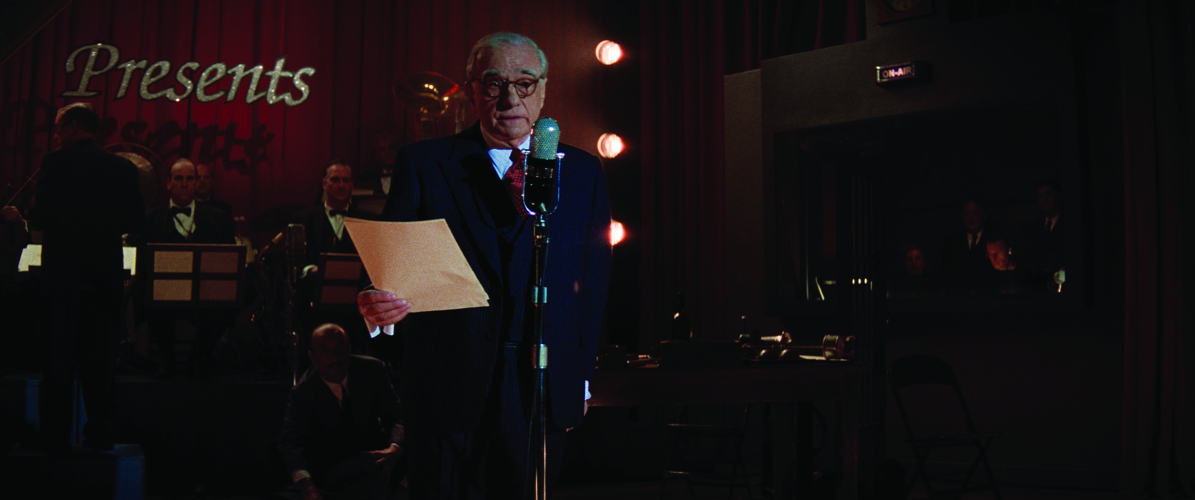
Finessing Killers of the Flower Moon at Company 3
Cinematographer Rodrigo Prieto, ASC, AMC worked with senior colorist Yvan Lucas of Company 3 on the film’s lookup tables (LUTS) and grading. Here, Lucas offers AC some additional details about this work.
American Cinematographer: You and Rodrigo Prieto ASC, AMC have worked together on quite a few films. How did that creative relationship start out?
Yvan Lucas: I spent many years as a timer in Paris at Éclair and I've always loved the whole process of working with film. Cinematographers could do so much by choosing the film stock and the timer could contribute quite a bit just through printer lights. And there was even more you can do with different processing techniques, like bleach bypass and ENR. When I went into color grading, where you can alter lift, gamma, gain and so much more, I still preferred to work the way I did as a timer. We can create custom LUTs that are very much like custom “film stocks,” and I still start out using just printer points within Baselight, because it retains the qualities of a film finish. You aren't affecting contrast or adding windows or keys. You can do all those things at the end, but I prefer to do a lot of the work upfront with the LUTs. Rodrigo likes to work the same way. We think in very similar ways about color for films, and that’s why he's wanted to work with me all these years.
Can you give us a sense of what was involved in building the LUTs for Killers?
The process goes back a long way, even before we worked on The Irishman together. We’d been speaking about the difficulty involved in creating a LUT that could affect images’ response to specific colors in order to push them in a specific direction. It was very difficult, especially at that time, to really isolate, say, red and push it towards maybe a more yellow-orange, or [work with] the kinds of electric blues we see today and make them look more like the colors of dyes and pigments of a different era. It could be done, but it wouldn't be as clean as we'd like. You'd push the reds, but skin tones that you wanted to leave alone would also get altered. Rodrigo and I and the very talented image scientist Philippe Panzini developed a tool for using sliders that had the kind of control we were looking for. Internally, we call it the PPL, for Prieto, Panzini and Lucas. Then we turned it into a functional plug-in for my Baselight system, which gave us the control we needed to really create some very precise custom LUTs.
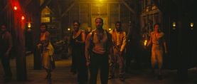
Rodrigo and I used this for the LUTs on Barbie, too. For Killers, we had built several layers of LUTs. For the early part of the film, we created one that responds to colors like the old Autochrome and Photochrom processes. It involved a lot of research by Rodrigo, Philippe Panzini and me to really understand exactly how those processes rendered various colors. Then, when the tension and violence start to build, we replaced the Autochrome/Photochrom look with a LUT based on Technicolor's ENR photochemical process, which yields less saturated colors and introduces more contrast. Finally, for the coda, we used a LUT we designed to emulate the look of three-strip Technicolor.
Combined with these, we also used another LUT that emulates Kodak 5219 precisely, down to the characteristics it has when processed at FotoKem. This LUT brought all the material — from what Rodrigo shot on 5219 and processed at FotoKem, to the Sony Venice and Phantom high-speed footage — into the same space, so that it all felt consistent and so our grading would subsequently affect these images in similar ways.
Tell us a bit about getting imagery from the film scans and the digital files into the post pipeline.
Company 3 dailies colorist Rich Flores would get the files, apply the appropriate LUTs in BaseLight and then do a dailies grade using only printer lights for the reason I mentioned earlier. He had actually never worked with printer lights before, so I taught him, and he loved it! I oversaw his work for the first few months, and that was the version Thelma Schoonmaker and Martin Scorsese worked with as they edited the film.
So, even though you've done so much at the front end to build these custom looks, you still make use of everything that digital color has to offer at this stage?
Absolutely — and it is still a simpler process than it would be going in immediately and affecting contrast and color and everything else. There are colorists who do work that way with beautiful results, but Rodrigo and I prefer waiting until we’ve gotten to this point [in the workflow].
Can you give an example of something where you'd go in and use secondary color correction to change something?
There are quite a few examples, but one that comes to mind is the drone shot of the large tract of land that Leonardo DiCaprio’s character, Ernest Burkhart, is driven through at the beginning of the film — that ride gives him his first sense of how vast the Osage’s land holdings are. Rodrigo, Martin, Thelma and I were all in the color-grading theater at Company 3 New York. Scorsese felt that the green of the grass should be a little bit purer than it was showing up. With the Autochrome LUT applied, it was more a desaturated yellow-green. So, even though that green could never really be represented in Autochrome, we isolated the grass and pulled back on the LUT to let the more saturated green come through for that shot. There are a lot of examples of this type of thing throughout the film. Ultimately, none of us wants the LUTs to constrain the artistry.
You do a lot of work preparing very specific LUTs for the films you grade. What makes some LUTs better than others?
It's very important to make something that can handle every different type of input you might get, and every type of deliverable. There are many ways a LUT can break. At Company 3 we check our LUTs with our dedicated color-science team here. We want it to work in unusual exposure conditions and with every kind of color that might be shot. And when you're working with people like Rodrigo Prieto and Martin Scorsese, the looks they want in their films can be very sophisticated, so you want the LUT to work artistically in a special way for the story they're telling.
Of course, if we encounter any kind of problem during final color, or if it seems that the LUT is too strong for a particular shot or scene, I can always go in and make adjustments in Baselight before the LUT and fine-tune the look. But the stronger your LUTs are in the first place, the more time we can spend in the final grade refining and perfecting the look.
Do you do a lot of work like that — where you use the tools exclusive to digital grading to further refine the look once it's gone as far as possible with the LUTs and printer lights?
Oh yes! Very much. Everything I’ve just said is about the work method Rodrigo and I use and our philosophy, but once we are in the final grading process with Martin Scorsese and Thelma, we’ll go through [the film] scene by scene and discuss important story points. Then I’ll use tools like windows and keys to refine the image, and these decisions are often more about feeling and meaning — like the saturation of the grass that I mentioned, or the very important scene where a group of men strike oil. That was shot day-for-night, and the idea was to soften the sunlight and make it colder, like moonlight — but Marty saw the footage, and he loved the look of the golden light on the scene, so even though it wasn't ‘motivated’ technically, we did quite a bit of work on that sequence to keep what he loved but still make it feel organic.
Another example is when Lily Gladstone must ask a white business owner for an advance on her own money. Behind him, there’s a photo of Ku Klux Klan members. There is no mention of the photo in the scene, but Marty really wanted to make sure audiences would notice it. There are things like that throughout the movie, where I’ll do secondary corrections to make little adjustments of exposure or contrast or saturation in one portion of the frame. We love what film-style color grading can do, but that doesn’t mean we don’t also embrace all the digital tools that are available when it’s appropriate to do so.
Our complete production story on Flower Moon with Prieto and Scorsese is available in our December 2023 issue.
