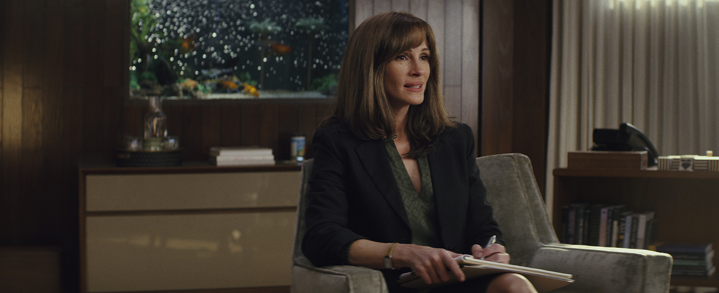
Homecoming: Broken Memories
Tod Campbell welcomes AC to the large-scale set of the Amazon series, where he and director Sam Esmail have reteamed to frame two disparate time periods and states of mind.
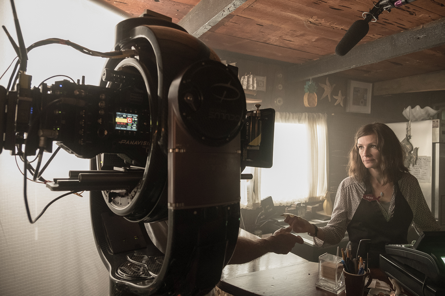
Tod Campbell welcomes AC to the large-scale set of the Amazon series, where he and director Sam Esmail have reteamed to frame two disparate time periods and states of mind.
Unit photography by Jessica Brooks and Hilary Bronwyn Gayle, SMPSP, courtesy of Amazon Studios
It’s March of 2018. We’re on a sprawling, two-story set constructed on Stages 24 and 25 at the Universal Studios Lot, where a busy crew scurries to make sure the opening tracking shot of the first episode of Homecoming — the new psychological-thriller series from Amazon Prime Video — works out exactly as visualized by director-producer Sam Esmail. The show, whose 10 half-hour episodes drop this month, explores the mysteries swirling beneath the surface of a Florida-based, state-of-the-art treatment center for emotionally damaged veterans of the Iraq War. The so-called “Homecoming” program is not all it seems, however, as the show’s main character, caseworker Heidi Bergman (Julia Roberts), will eventually discover as she struggles to assemble her experiences inside the facility into a coherent picture.
The project, produced in association with Universal Cable Productions, is based on a fictional serialized podcast series created by writers Eli Horowitz and Micah Bloomberg, who now serve as showrunners — along with Esmail, creator of the critically acclaimed show Mr. Robot. Here, Esmail once again teams with Mr. Robot’s ASC Award-winning cinematographer, Tod Campbell, and other members of that show’s production team.
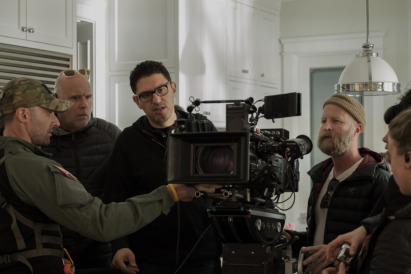
The crew is shooting what Campbell calls “a big oner” — an extended tracking shot, which follows Heidi through a walk-and-talk as she explains the facility to someone on the phone while the audience views what she’s describing. The sequence serves as an intimate introduction to the opulent set — designed by production designer Anastasia White, also a Mr. Robot veteran — where more than 60 percent of all action takes place.
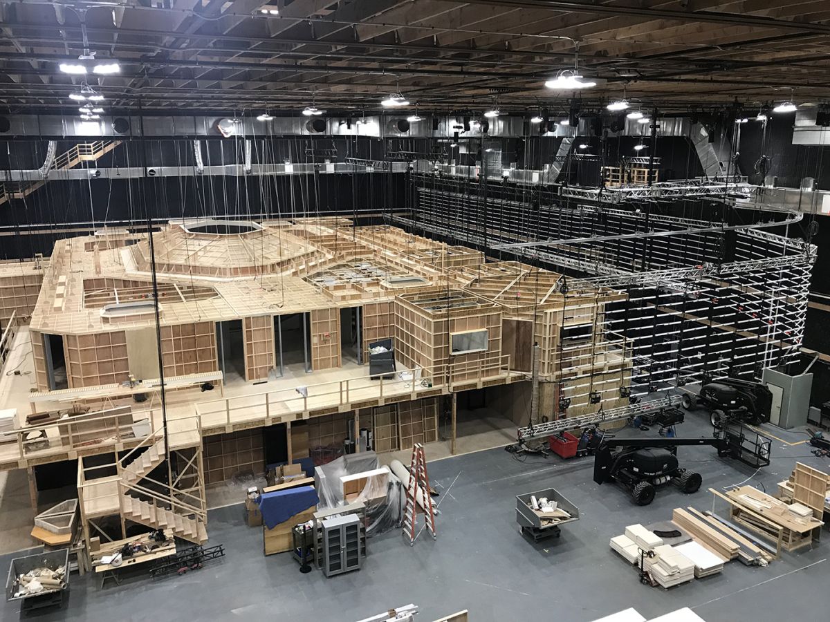
The set was devised to accommodate a 73' Chapman/Leonard Hydrascope Telescopic Crane, which today is taking the camera through virtually the entire length of the custom build as the filmmakers capture the set-based elements of a four-part, three-stitch shot. The Hydrascope starts out traveling from Heidi’s office and follows her all the way to the cafeteria. From there, a SpaceCam Oculus head, provided by CineMoves, on a Chapman Pee Wee dolly seamlessly takes over the sequence and continues following her through the cafeteria and dorm rooms, and then out a door.
“When Sam first approached me about this show and we started hashing out ideas together, one of the first things he wanted to discuss was doing the big oner to introduce Heidi, the set and the facility,” Campbell explains. “In the earliest stages, he said he wanted to be able to pull the entire ceiling off this 24,000-square-foot set and fly the camera over the top of it. We wanted that 73' crane to be able to essentially reach every corner and section of the set. We put a lot of effort and many meetings into that one shot.
“The set we built is the second and third floor of a building that exists near San Pedro,” Campbell continues. “We used the real building for everything exterior and [for the] first-floor lobby and stairwell, with a transition to our stage build.” With the aid of this setup, the shot we witness on-set today will ultimately transition to footage captured on location. As Campbell explains, “The Hydrascope transitions to the PeeWee/Oculus, that then transitions [to] the practical location, where the Oculus was mounted to a speed-rail dolly — with John Mang as the dolly grip — which tracked backwards through a hallway and onto a platform [that was] built on the crane. Then the crane backs up 80 feet and booms down as Heidi descends the stairs, ultimately pushing in. [Then the sequence] stitches to a Steadicam shot taking her outside to her car. That was a massive undertaking.”
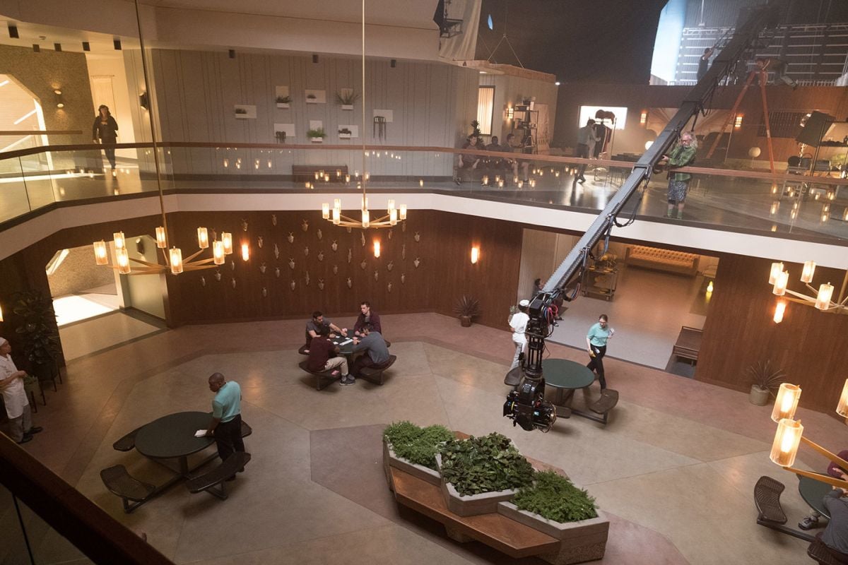
Campbell notes that this tracking shot exemplifies the filmmakers’ aim to make a show that “feels like a feature film.” He also attests that the ambitious approach to creating the shot is typical of this project, with the production regularly featuring highly complex, choreographed camera moves across and through the facility set — designed to Esmail’s specifications.
At the center of the set is a massive atrium lit up by a skylight designed to emulate Florida sunlight pouring into the lobby. Since the facility is itself “a character in the story, needing a range of light and color to express itself,” as gaffer Chris Culliton describes, skylight illumination ended up being a key visual element.
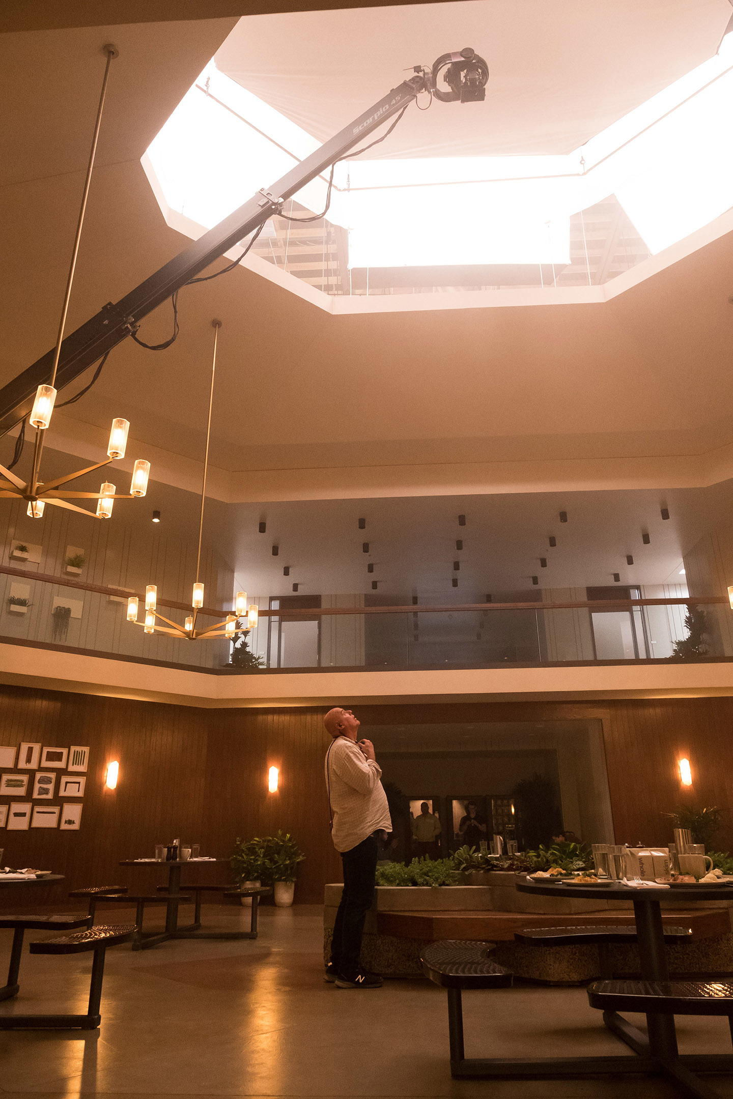
two-story set, which was designed by production designer Anastasia White and incorporates a
large “skylight” in its ceiling. “When we designed the set, we knew to make that big skylight
really important,” Campbell says.
“In the design phase, we realized how important the skylight was going to be to create not only a visual piece, but also the workhorse of our lighting scheme,” Campbell says. “We went through different sizes, trying to get to a place where we could get enough light up there to feel as if we were in sunny Florida.”
The filmmakers further note that the atrium lighting scheme as a whole was pivotal to creating the show’s aesthetic. Campbell explains that it was imperative “to create a place that makes the veterans feel at home at the facility, a place that appears warm and welcoming, as well as real. There are other things going on, as we eventually learn, but on the [surface] — the façade of it — it is a warm and inviting place.”
Culliton adds that the skylight “opens the facility to the Florida sky. The challenge was to get a source that is both bright enough and big enough that you can create the sense of scale and ‘wrap’ that a natural skylight offers. The advent of large LED lighting fixtures with good color and CRI has allowed us to move away from the Maxi or Dino soft boxes that used to dominate these kinds of lighting scenarios.
“We used a line of fixtures that [NBCUniversal] and Cineo [Lighting] created called LightBlades,” the gaffer adds, “including the LB1K, which is a 4-by-4 flat panel. LightBlades feature full hybrid color temperature from 2,700 to [6,500] Kelvin — but with the ability to add true RGB color with saturation from 1 to 100 percent. The color or saturation is mixed on top of the chosen [temperature of the hybrid light]. These types of color control are becoming standard for most new LED fixtures, and they allow for some very soft and subtle shifts in tone.”
Culliton later relates that key grip Jim Kwiatkowski built eight large “Lekki” soft boxes populated with six LB1Ks and skinned with Magic Cloth. “We used that to ring the opening of the atrium,” the gaffer says. “The boxes — I believe their dimensions were 10-by-10 and 6 feet deep — were all on chain motors for control.” Solids measuring 20'x20', as well as 1⁄2 Soft Frost layers, were mounted to pipes — which were in turn rigged to motor controls — “in front of the soft boxes, so that the boxes could be further softened or shaped,” Culliton adds. “The soft boxes were large enough so that there was no place on the set where you didn’t ‘see’ sky, which is a crucial part of making the source believable and soft. The center box, called the ‘jewel box’ because of its unusual [hexagonal] shape, could be lowered into the middle of the atrium volume. We used this setup, with lights running in the 2,700 Kelvin range, and with large teasers on the edge of the box, to give a warm and directional quality to night sequences.”
In regard to creating the hot Florida sun that streams in, Culliton explains, “After we figured out which part of the sky would be south, we found five positions for the sun along that side. Our hot sun source was Mole 20Ks — [fitted] with 24K bulbs — which were operated from a flying greenbed suspended over the set. The 24K Fresnels were approximately 25 feet back from the opening in order to try and keep shadows sharp and not get too toppy. When a 24K was working, we would raise the soft box in front of it, and the sun could pour in through the opening without compromising ambience. To get that combination of a warm hard sun, the 24Ks were usually dimmed to 70 percent, with soft boxes glowing at 5,600K or 6,000K, creating nice color contrast and depth. The soft boxes provided the ambient skylight and the 24Ks worked as a hot sun source.”
“We also designed the set so that we could be on a crane and roll across the floors with a dolly on a stabilized head,” Campbell says, “so the floors were built extra thick and smooth, so we could roll along without having to lay track or dance floor. And then there was the width of the halls. Because it’s a two-story set with big expanses, it was challenging for [White] to come up with a way of building it so we could pull walls [on the first floor] while we still had 80 crewmembers on the floor above. We needed the ability to ‘Hollywood’ walls in and out on the bottom floor [mid]-shot, while keeping the structural integrity of the floor above.
“We could also ‘drop’ the camera from the top of the stage, all the way down, with lots of room to spare,” the cinematographer adds. “And we could bring cranes up and down these chain-motor elevators the riggers put in, to get them up to the second floor. We also have a lot of top-down shots with descender rigs in the facility; we wanted to put the characters under a microscope.”
The concept of pulling viewers into the psychology of the characters was central to Esmail’s approach. The director emphasizes that the overall visual aesthetic and pacing of the show has its roots in the original podcast, in the sense that “the podcast is a thriller, steeped in characters and relationships.” More generally, though, he wanted the show to evoke “old-school thrillers from Hitchcock and his successor Brian De Palma — not to mention all the classic conspiracy thrillers from the 1970s. That’s where the inspiration came from in terms of how to move the camera, and what the lenses should be.”
Among the more distinctive features of Homecoming’s visuals is the periodic jump between 2018 and 2022. In the earlier time period, Heidi works at the Homecoming Facility, while in the latter, she has left that job and is now working as a waitress — with an unusually foggy memory of her time working on the program. To create a clear delineation, the filmmakers “rejected the typical trope of desaturating one versus the other, or doing anything we have typically seen before when people are dealing with shifting timelines,” Esmail notes.
Instead, Esmail and Campbell decided to employ two aspect ratios to juxtapose the two sides of the evolving story — 16:9 in 2018 when Heidi has a clear understanding of developing events, and 1:1 in 2022 when Heidi has an unclear memory. “We [changed] aspect ratios to delineate the time [period],” Campbell relates, “as well as to emphasize that Heidi doesn’t have the full picture, and neither do we.” He adds that the show also features frequent use of 1.78:1 split-screens, as well as one instance of the 2.39:1 aspect ratio.
Campbell turned to Panavision to make Homecoming one of the first episodic shows to use Panavision’s new Millennium DXL2 camera, with Red’s Monstro 8K large-format sensor capturing image data in Redcode Raw 8K format to Red Mini-Mags. He then chosePanavision G Series anamorphic lenses, ranging from 25mm to 100mm — and sometimes pressed into service an 11:1 ALZ11 Primo Anamorphic Zoom (T4.5) “to achieve the 1970s [style] zooms,” the cinematographer says. First AC Sergius Nafa adds that a 14mm Panavision Primo 70 was used occasionally for special circumstances.
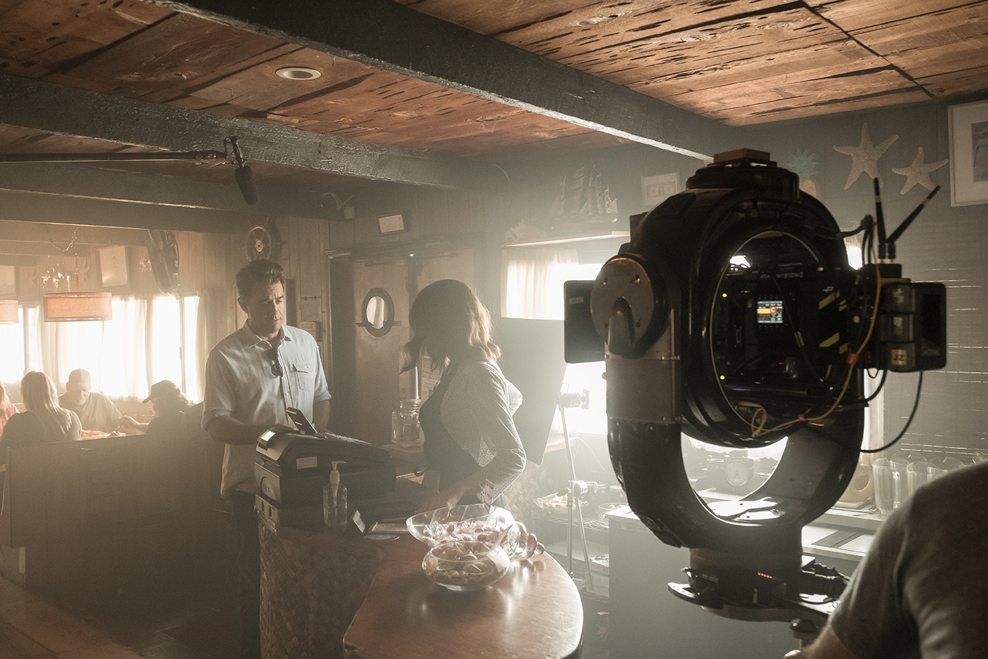
“I felt like the [Monstro] sensor has a unique characteristic to it when you put the [G Series] lenses on it,” Campbell says. “That’s the reason I chose the camera. Amazon will air the show in 4K, but I wanted a large-format sensor because I thought it would be interesting on this set with these anamorphic lenses to create a unique look. I didn’t really care as much about the resolution as I cared about the camera and its speed. I was able to shoot everything at about 1,600 ISO.”
Panavision’s vice president of optical engineering, ASC associate Dan Sasaki, modified the G Series lenses “to de-focus them so that they were a bit softer,” Campbell says. The cinematographer notes that Sasaki’s manipulation of the lenses involved “changing where the crispness of the focus might lie. I wanted the top and bottom of the frame to be obliterated, focus-wise. I didn’t want any real detail in the deep background or foreground. So Dan played with moving the area of focus to a specific place in the frame. I wanted to embrace this idea by moving the focus to a [slightly] different place than it normally lies. Moving it just a little lower than center felt right after discussions with Sam about the majority of the work.
“I chose to push [things] into a place [that would] feel uncomfortable, like the characters in the show,” the cinematographer continues. “It pushed us into certain compositions and situations that made for a unique shot. Additionally, anamorphic was new for me, and a little unnerving; composition is a very big deal for Sam and me, and clearly for everyone. On Mr. Robot, I found lenses that would let us make straight lines in our compositions. Going in this direction [on Homecoming], I knew we would have to contend with the bend. It’s something I had thought would emphasize the off-balance [nature] of each of the characters’ stories. I have to admit it was very challenging to get anything straight — you have to get on board with the bend.”
Nafa reports that Panavision, “under Tod’s direction, realized they could push the limits by center-punching the G Series anamorphics even further than their off-shelf standard. Granted, a 1.78 aspect ratio with an occasional 1:1 [both extracted from a 2.39:1 native image, which the cameras captured consistently throughout the shoot] reined some of that in, but the end result is quite lovely. As a viewer, it feels like a warped reality, fitting for this subject matter.” Nafa further notes that the production “used contra zooms to go to and from 1:1 or 16:9 aspect ratios in scenes where Heidi lost or regained her memory,” and that an Angenieux Optimo 28-76mm was used for one contra-zoom shot.
“I played the rest of my photography in subtleties,” Campbell says. “We wanted everything to be diffused and blunted for 2022, like her memory is. Then in 2018, we wanted to have more specular highlights and hard light, while the whole time using a fair amount of zooms.”
Campbell attests that he was so concerned about making sure the 1:1 segments were cropped correctly and held up, that he “would put stands and flags right up to the edges of 1:1, so that the frame lines wouldn’t be opened up later [in post] — to make sure we carried through with our mission.”
This sort of approach, along with Homecoming’s framing choices, are reminiscent of the compositional techniques the director and cinematographer have frequently explored on Mr. Robot, such as placing characters low in frames, leaving lots of headroom. Though the framing decisions on the two shows are not nearly identical, “a little of that does linger from time to time,” Campbell says.
Esmail adds, “We do try, in an innovative way, to reflect the inner lives of these characters. Our job is to cover a scene from a point of view and explore the inner life of the character in that scene, and do that with camera, lighting and composition. In that sense, filmmaking is like dream logic to a certain extent. We are inviting an audience not to tell them a math formula; we want them to have an out-of-body experience, into the lives of other people.”
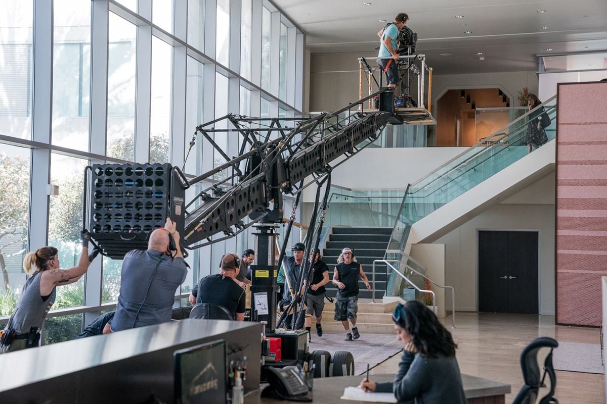
On set throughout production, digital-imaging technician Robert Howie monitored and managed the camera signal from his DIT station, which included two calibrated 25" Sony OLED monitors, one calibrated 25" Flanders DM250 OLED monitor, and one Sony PVM-A170 OLED monitor, “and of course, a few Leader 5333 waveform monitors,” Howie notes. During shooting, he employed Pomfort LiveGrade Pro and IS-Mini LUT boxes to apply first a basic CDL, and then a proprietary LUT to serve as what Howie calls “a solid base” for instituting the color palette chosen by the filmmakers.
Howie emphasizes that the idea was to limit the project to a single LUT, which was based on FotoKem’s film-emulation approach. “You can always make CDL changes and decisions as the project evolves for different scenes and different looks, but in the end the ‘base LUT’ stays the same,” he says. The LUT was a slightly adjusted version of one originally developed at FotoKem which mirrors Kodak 5219 stock.
Campbell calls it “an amazing, filmic LUT — it’s quite heavy and soaks up a lot of light. I lifted the bottom by 1 percent and desaturated by 25 percent. It was awesome to light night interiors and exteriors this way, and not rely on a fast ISO and a ton of atmosphere — and still know that there’s room on top and bottom. At first it was a little intimidating, but it was nice to move back to the idea of shooting like [one would with] a film stock, and lighting to that. I wanted to treat it as such, and take away the idea of constantly using the stop changer as a way of getting by. We maintained the one LUT the entire time, treating it as a film stock.”
He adds that FotoKem, which handled dailies with colorist Mark Nakamine and final color correction with colorist Walter Volpatto, “worked really hard to make our color pipeline bulletproof. I’m in color sessions right now, and for the first time in my career, what we shot on the day is arriving in the color suite exactly as we shot it.”
Howie notes that he managed data as he typically would on a feature film, preferring “camera-mag movement instead of offloading to hard drives and moving them back and forth. The reason I did that was to allow for the most efficient workflow on-set and in the lab at FotoKem. I make a single [checksum-verified] archive copy on-set, [and then the] mags are put into Pelican cases and transferred to FotoKem. There they make another checksum-verified copy off the mag, and [upload it] onto their system. This way, we know that at each of these points, each person is making a copy off the camera ‘negative.’”
In terms of camera movement, Campbell says, “The camera tends to move a lot or is completely static. In Heidi’s office, we don’t want the camera to move at all. When we are in the facility outside her office, we want the camera to be in motion quite a bit. We always want to be with her.” Hence, the production’s extensive use of cranes, dollies and the Oculus head, among other tools.
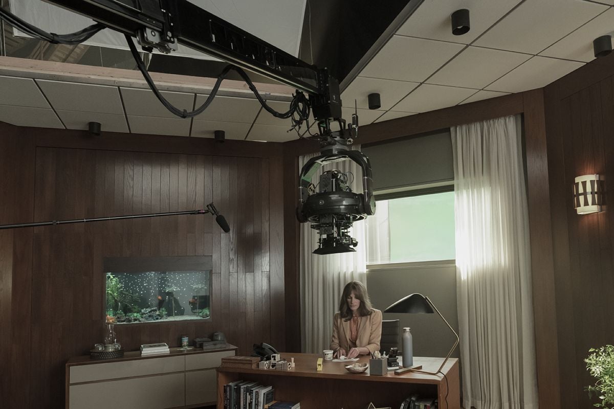
A-camera/Steadicam operator Will Arnot notes that Esmail is deeply involved in compositional choices on the show, and that the director’s visual sensibilities “are driven by off-center framing, and operating that is totally invisible.” Arnot adds that it remains “a fundamental tenet of good operating to find good camera height for a shot, so that you don’t have to tilt.
“Thought must be given to setting up the mechanics to only do what is absolutely necessary,” he continues. “This was paramount for Sam. And from there, we would combine physical camera movement to hide any panning or tilting as much as possible.” Arnot further relates that the production would “generally try to widen a shot, rather than pan, which Sam absolutely avoids doing at all costs.”
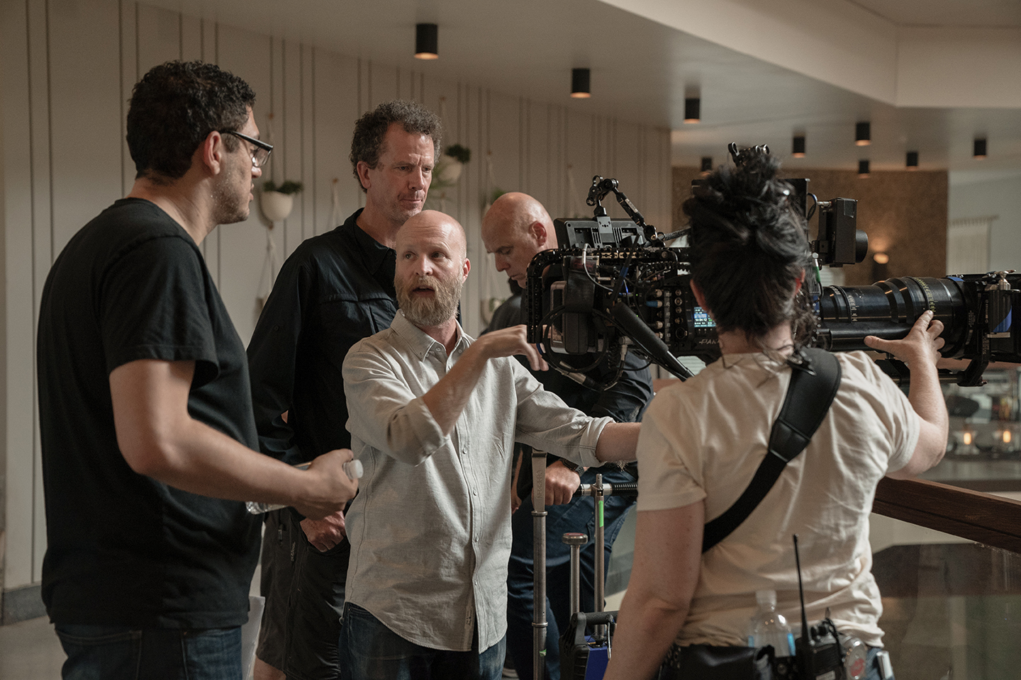
Arnot notes that, in keeping with Esmail’s preferred aesthetic, the show’s composition for locked-down shots remained “flat to the architectural lines.” He calls this “the building block of how we approached each frame. [The operators] need to know that your horizontal lines will only be parallel to the top and bottom of the frame if you are exactly perpendicular to the architecture on the pan axis. If your frame is not flat to the architecture, it is keystoned, and your horizontals will not look horizontal.
“Equally, the verticals will only appear parallel to the sides of the frame if you are flat on the tilt, neither up nor down,” Arnot continues. “So in order to achieve flat horizons and straight vertical lines, you quickly arrive at a camera’s height [tilt] and position [pan] on the set, which contains the actors and their blocking and honors the architectural lines. Within these parameters, Sam would choose to place an actor often in unconventional parts of the frame, in order to keep the audience’s eye questioning what is going on. ‘Why are things not normal?’ This played directly into the narrative, which deals with memory loss and brainwashing.”
Culliton reports that each patient room in the facility featured a large window, as well as four to six onscreen, recessed, 2'x2' troffer fixtures in the ceiling, with each troffer affixed with Paracube diffusers. Hybrid LiteGear LiteRibbon — which provided the light that emanated from the troffer fixtures — was placed in 2'x10' Coroplast boxes, which sat above the troffers, giving the filmmakers significant control during shots that required toplight. “It was a way to actually control costs and afford us flexibility in lighting,” the gaffer says. “A rare confluence, indeed.”
Typically, the dominant light source in those rooms was the window that opened to the exterior of the facility. To provide the exterior seen through those windows, Culliton says that “after much deliberation, it was determined that we would use a Translight, rather than having bluescreen out the windows. The obvious advantage of the Translight is that you are capturing a final image in camera, but it also lets you embrace or augment sky reflections, colors and sheens that naturally occur with [this] window source.”
Culliton adds that the Translight was backlit with hundreds of LightBlade Ladder Lights. “Not only did the Ladder Lights allow us to minimize the distance between the Translight and the source [which was less than 2 feet], but we could fade color and intensity in the Translight image itself for different parts of the sky,” he says. “We also had large 24-by-10-foot soft boxes packed with 12 Cineo 410s and skinned with Full Grid, in order to give us top ambience outside the windows. And for hard sun sources, we used my favorite light of all time — the Arri T12, which we hung on a traveler rig with modernized pantographs for height adjustment. Given that [in the show] we never see out the windows on both levels in the same shot, we were able to use half the Ladder Lights, soft boxes and T12s, because we could raise them with motors, depending on the shot. This had the advantage of somewhat simplifying rigging, as well.”
The experience of shooting the first season of Homecoming “clearly made me a better cinematographer,” Campbell attests. “The scope was bigger than anything I had done in the past. I learned a lot from my gaffer, DIT, key grip and dolly grip, among others. [They] opened my eyes up to a lot of new things. It was also nice to be with Sam, but get outside of Mr. Robot for a minute. I had the luxury of a little bit more money and time than usual, so we didn’t have to cut as many corners as you might normally have to in television. I feel very fortunate to have had this opportunity to work with a crew who all brought so much to this production. The next challenge is all of their availability for the next one.”
