Manhattan: Black-and-White Romantic Realism
Gordon Willis, ASC details his visual approach to this monochrome love letter to the Big Apple.
This article was originally published in AC Nov. 1982.
“To him,” says Woody Allen’s voice-over during the opening montage of Manhattan, “no matter what the season, this was still a town that existed in black-and-white and pulsated to the great tunes of George Gershwin.”
The line was written when the film was in postproduction, but it reflects a sentiment that Woody and his long-time collaborator Gordon Willis, ASC shared; one that crystallized as they began pre-production on a film that is, perhaps, the most romantic big-screen vision of life in the Big Apple that anyone has ever made.
“There are all kinds of ways to shoot the city of New York. In the case of Manhattan, the concept was to lay the picture out in what I call romantic reality.”
— Gordon Willis, ASC
Gordon Willis is so good at finding the right look for any given story, that one could easily assume it’s second nature to him. But, that is simply not true. “I’ve always found that the hardest part of making a movie is making a decision on what’s supposed to happen photographically in the picture,” he said. “I tend to think about it for weeks before I start, sometimes up until the final day, and even sometimes up until the first shot, before the final idea settles. A lot of it, obviously, has to do with the story and the location where the story takes place; and then, finally, what is the picture supposed to be — not photographically, but the totality of the picture — what is the final feel of the whole movie put together supposed to be?
“There are all kinds of ways to shoot the city of New York. In the case of Manhattan, the concept was to lay the picture out in what I call romantic reality. The second decision after coming to that was how to graphically get the best visual structure on the screen. I felt that Panavision widescreen, 2.35 to 1, was the most appropriate form. I like widescreen, because of the way you can use it graphically. That was superimposed on the basic idea of romantic reality. Put them together and you have something that was, in my opinion, very workable and quite good looking at times. It was a better way to deal with scale; people in the city, and the city in itself. One thing leads to another until you can finally build a case for what you’re doing and make it appropriate for a picture.”
How did he convert the general concept of romantic reality to the specifics of lighting and composition? “Well,” Willis said, “everything is based on selectivity. I mean you can look at one thing one way and it’s going to be something, and you look at it another way it’s going to be something else, so you make the choices that are going to enhance the story. You look for the things that are going to be charming, and you look for the things that will transpose well at the level that you’re trying to speak to the audience. You look for all the things in this movie that were by nature the romanticized visions of Manhattan. Then, within that structure, you have to interpret properly related to lighting and camera work. You don’t set out to make things ugly; you set out to make things romantic, charming and good looking. I would say that your major tool in any movie is selectivity, the choices that you make. Once you make the right choice, then the rest is a fait accompli.”
“Intimate movies can be shot really well in ’Scope because you have so many choices related to using people in space — that’s where it’s quite wonderful.”
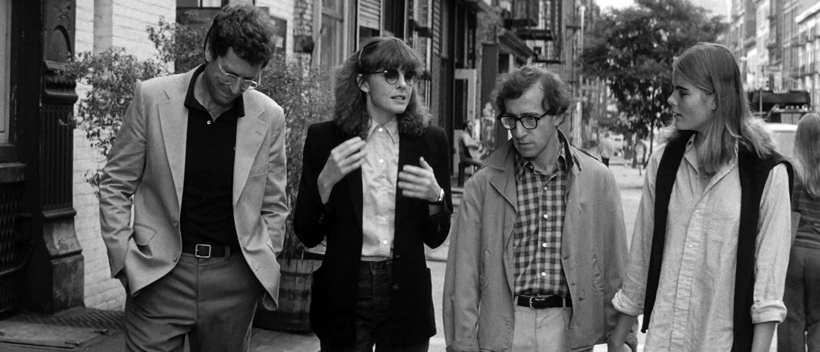
By shooting this kind of an intimate film in ’Scope, Gordon Willis put the lie, once again, to one of those tired old saws — that CinemaScope is not for intimate or personal films. As he puts it: “That’s a concept made up by people who sit in studio offices. You know, I shot a lot of pictures in ’Scope. I shot Klute in ’Scope, I shot Paper Chase in ’Scope. On all of those I had to sell the people I was shooting for because I, personally, thought there was great value in the format for the movie. It had nothing to do with seeing it wider; there was probably only one picture I shot where I felt ’Scope meant something in that category [Comes a Horseman]. Intimate movies can be shot really well in ’Scope because you have so many choices related to using people in space — that’s where it’s quite wonderful. The closeup in ’Scope is a close-up. You can make it better in many instances. It’s the graphics that mean something to me that can mean something in a little room between two people and it can mean something in a large shot of a city with two little people. ’Scope is a very, very good medium when it’s not used to machine-gun horses on a hillside.”
Willis’ vision for Manhattan involved a number of situations where he wanted good depth of field. That can be a problem with anamorphic lenses which have somewhat shallow depth of field. Willis makes it a policy to pick a stop for any given picture and stick to it all the way through the show. On Manhattan, given all of the above criteria, the stop was 5.6 for interiors, though “some of the night work was shot at wider stops,” he admitted.
Because of his need for this relatively fat stop, he picked Kodak’s Double-X as his negative stock. It’s their fastest black-and-white stock — 250 ASA in daylight, 200 tungsten. Even with a stop like 5.6, anamorphic lenses do not produce great depth of field. “You can stop those lenses down all the way and still not get anything depth-wise, depending on what the shot is. But, you use it to your advantage, aesthetically. You tend to structure things so you can get the most out of it.”
Gordon Willis likes to use Mitchell-type diffusers, “to just soften the optical quality of the lens on occasion.” Pancro manufactured the filters he used on Manhattan. On exteriors, he also used K2 filters for minor black-and-white tonal correction, as well as various neutral densities when necessary.
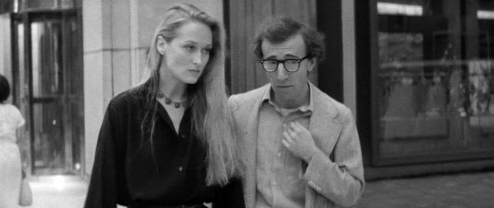
It is common knowledge that, since black-and-white is rarely used these days, there are certain problems with the laboratories when one sets out to do a feature that way. According to Willis, “You always have trouble with laboratories no matter what film you’re shooting. Black-and-white tends to be a lost art, even though, in my opinion, it’s the simplest form of lab chemistry, you don’t have the people around that had the experience of doing black-and-white. The reason you don’t is based on economics, because laboratories don’t make that much money on black-and-white, so it doesn’t pay for them to keep a black-and-white operation going for original negatives. They all have them for dupes and things. When you start out to do a black-and-white movie you’re sort of digging coal for awhile until you get it all together. I’ve been fortunate because I've been able to go through several laboratories and get basically what was necessary, but, I'm fairly knowledgeable in the lab area. With Manhattan, a laboratory in New York by the name of Guffanti — basically a duping lab — did the negative. Technicolor, in New York, did the printing.”
Interestingly, though he shot Manhattan on Kodak’s Double-X, Willis specified that release prints be made of Agfa’s positive stock. It is a mixture common to many top still photographers working in black-and-white. Agfa’s black-and-white motion picture print stock, like their enlarging paper for still use, contains more silver and produces noticeably richer blacks.
SELECTED SCENES
FRAME 1

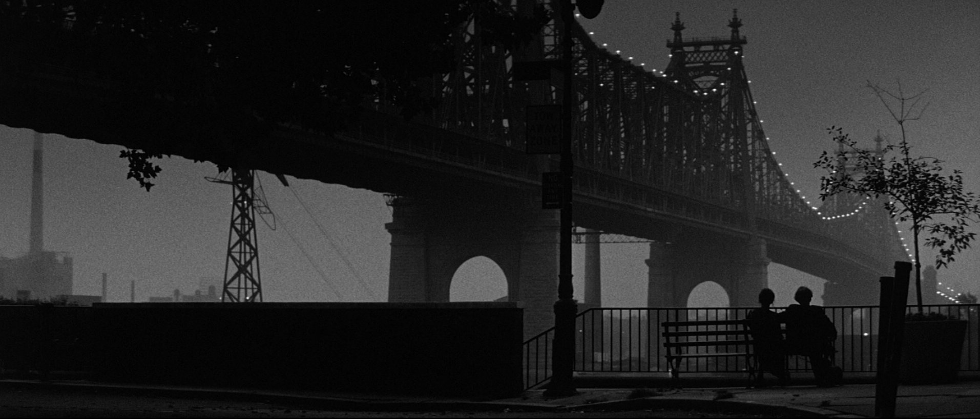
This is the logo of the film, “It was shot at about 4:30 in the morning, just as it started to get light. We did about six takes within a 20-minute period. The only thing [added to the natural lighting] is we had the bridge lights left on. Some of them I did without a grad, some I did with a grad, because, as the sky got lighter I started to use the grad to hold the sky down. But it’s all obviously played for silhouette. The exposures were laid more or less on the sky and the sidewalk, that’s where the keys were related to determining what the exposure would be. Now that’s not an exposure that we take literally. The shot was two stops underexposed — two and a half, actually.” This was one of many instances where Willis had indicated shooting well under what would have been considered the correct, or “key” exposure. “You can’t reproduce, literally reproduce, an exposure on the screen if you want a given effect. It’s based on relativity because your eye is selective; film isn’t. I mean, you can put it wherever you want it. So, in order to get it down, you’ve got to underexpose. It is not possible to get the same result simply by printing it down according to Willis, “Because you only have a certain range that you can print something down. Even if you do print it down, you’re not going to get the same thing. Your negative is going to be too fat and you’re not going to achieve the basic quality of what it is that you’re trying to get on the screen.”
FRAMES 2 THRU 6
This is the beginning of a night exterior scene that covers one and one-half city blocks in one shot with no coverage. To illustrate the lighting of this scene, five frames from different moments were chosen. The lens, to the best of Gordon’s recollection, was a 100mm. The camera was mounted on a gimbal, a device consisting of a ring or base on an axis which permits an object, like a ship’s compass, mounted in or on it to tilt freely in any direction, in effect, suspending the object so that it will remain horizontal even when its support is tipped. This, in turn, was lashed to a Western dolly [essentially a plywood platform with four, wide balloon tires]. The image was protected against vibration with a Dynalens, a gyro-driven optical device that instantly corrects any bump with an equal but opposite bump.
If he were doing the shot again now, Willis feels sure he would move the camera the same way; he would not do it with a Steadicam. Why, I asked? “It’s a tool, and there’s an immediacy about that tool, the Steadicam, that was not something that I felt was appropriate for the shot. First of all, I didn’t want that kind of floating going on in the shot. Yes, you can do it that way, but the bottom line is, what does it feel like when you see it on the screen.”
Willis had never used that sort of rig before, and, he said, “I never have since. I mean, the sidewalks in the city are not level; and this one happened to be going downhill as well, and then around the corner on this specific shot I had a traveling light on a dimmer which I had to deal with as well. Those things could be done without a Western, and without a gimbal and without a Dynalens, all of them. You could simply take a Steadicam and walk the light but you’re walking for a block and a half with human beings. Somebody has to carry the camera. Somebody has to carry the light at night. If you get into 10, 15 or 20 takes, someone’s going to get tired. The actors are tired after walking that long. So, you’re not going to get the same improvement from take to take mechanically. If anything, it’ll go downhill, not uphill.
“What you’re looking for is how best to accomplish the shot and achieve what you want. Then, finally, what is it you want? I mean, do you want it not to become camera conscious, or do you want to get it done in 10 minutes and get on the bus and leave? The bottom line on this decision is I wanted to be very specific about how we dealt with it. There’s a lot of lighting in it. We needed an easygoing shot with two people that were walking and talking.”
FRAME 2
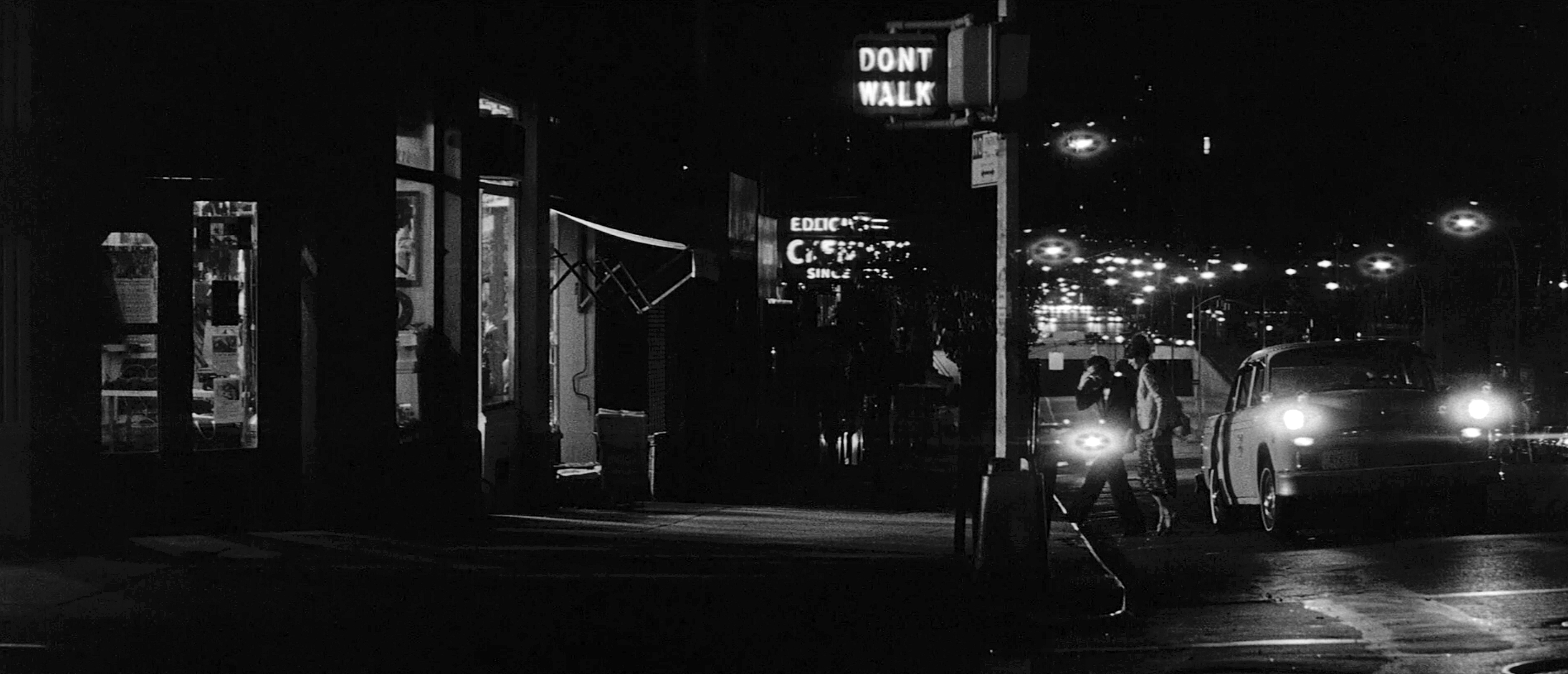
This frame is taken from a point shortly after the scene begins. Woody and Diane Keaton have just gotten out of the taxi on the right and are just walking toward the sidewalk. The only thing that Willis did was to put a 2K in the store to light their exit from the cab and their walk up onto the sidewalk. Other than that, the rest of the light is available street lighting and the natural source light in the store. “But it doesn’t necessarily mean that I was working on key,” he is quick to point out, “I may have decided, in this particular case, people may have been a stop underexposed. It’s all based on relativity. You want to give the impression that the light that’s in the store is brighter than the one that’s lighting them. But generally my approach would be to use the basic exposure more on the store lighting itself, and only use what’s necessary to augment them, but in a lower key. I’ll set a given exposure level of where I want to function with my meter and from that point on I go down and set this one and that and that and that, and that and that, etc., etc. But generally the philosophy is to use relativity; meaning, where the source is should be brighter.”
That means that if they’re say, a stop and a half “under key” where they’re standing now, just heading for the curb, by the time they reach the pool of light in front of the store they ought to be about a stop under. The “correct” exposure exists only inside the store [into which the actors never go], produced by the natural source light. The hidden 2K within the store simply augments that light so that the actors on the sidewalk are realistically lit within the latitude of the film. The human eye could see them without such augmentation but, of course, the human eye has vastly greater latitude than any film yet produced.
FRAME 3
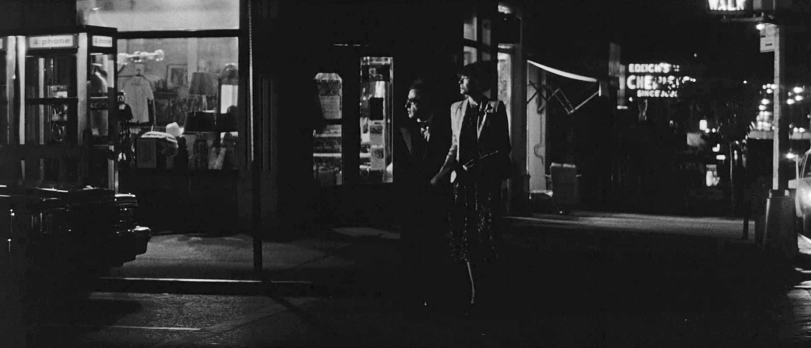
They have already moved across the sidewalk and toward camera to where they’re now crossing the street. The camera has not yet started to move, but the operator has trimmed up on the action as they came forward by tilting down and panning left. This is, of course, the same store as in FRAME 1, and all the light within it and the telephone booths on the sidewalk is natural source light. However, the actors (Woody and Diane Keaton) are now crossing the street. Without some help they would be in distant silhouette for a long time. They will be allowed to go into darkness on a number of occasions later in the scene, but now is not the time. They are too far away and it is too early in the scene to allow that. So, Willis placed a 10K down the street to the left. This particular frame was chosen to illustrate this lighting because they happen, for this brief moment, to be looking toward the light. For most of their walk across the street, however, they were looking straight ahead, so that only half of their faces were lit. But again, they were probably about a stop to a stop-and-a-half under; “nowhere near key, so to speak.”
FRAME 4
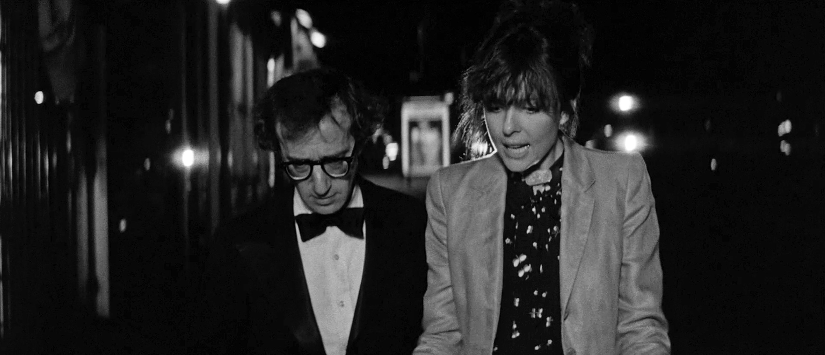
Woody and Diane have now walked onto the sidewalk, the camera has been moving for some time, and they’re going in and out of pools of light sourced from the shops on the left. Willis had made arrangements with several of the shop owners to leave their lights on for the night. Sometimes, Willis augmented source light with 750s when he thought it appropriate. There is also some backlight on Diane that is coming from passing cars which was not always happening in the shot. In addition, remember that he had mounted a 4K softlight on a dimmer, traveling with the camera.
“So, what I've done principally is, where I want to change the lighting pattern, for instance, when they get deeper in the shot — and FRAME 3 is an example of it — is that the light you’re looking at, the primary light you’re looking at there, is actually a camera light which is being worked on that dimmer all the way down the street. In some cases, as in 4 and 5 for instance, that light’s not functioning, it’s down on the dimmer. Then, in some spots, where they hit very dark areas in the streets I let ‘em go dark, but in other cases I brought the camera light up to an appropriate level.”
FRAME 5
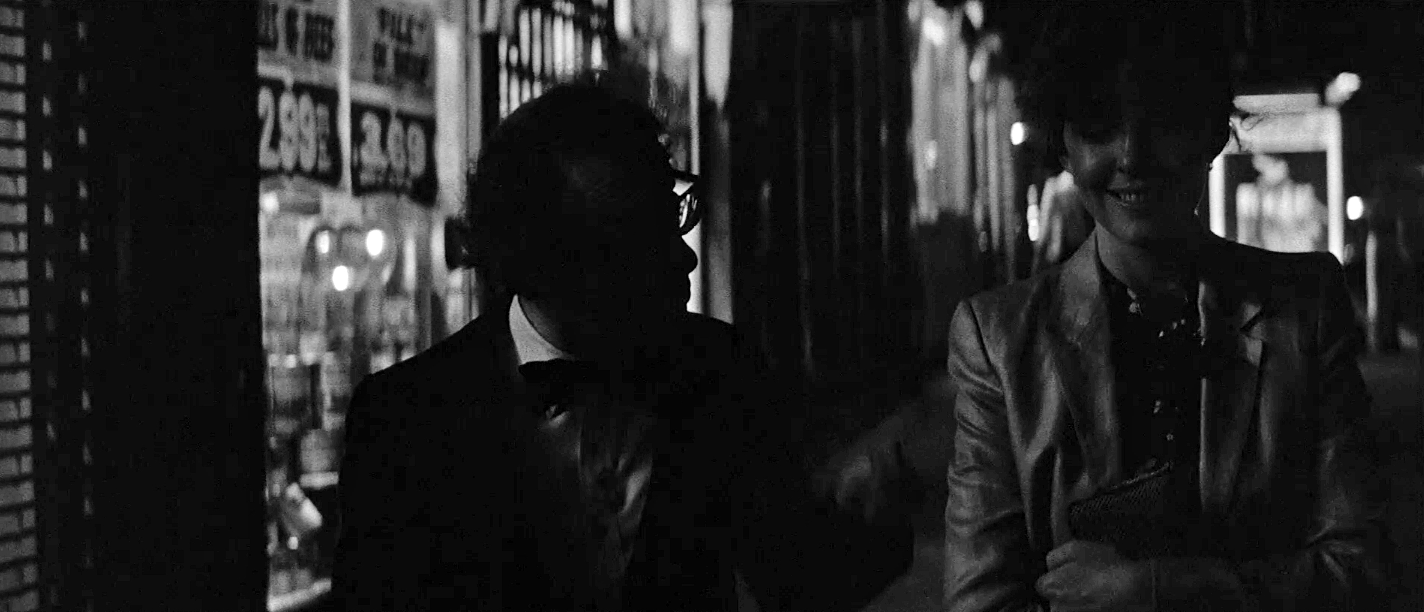
Woody is completely in silhouette and there’s just a tiny little bit of light on Diane’s face from the store to the left. Only a few steps further, they will come into considerably more light. “In some sections, I just let ’em go black for a little bit and then bring the light up on the dimmer for a beat or two, and then back down again as they come into other lighting.” Willis planned when and how much the camera light would be on, and ran it for Woody with stand-ins. Then, if Woody approved, it was set.
FRAME 6
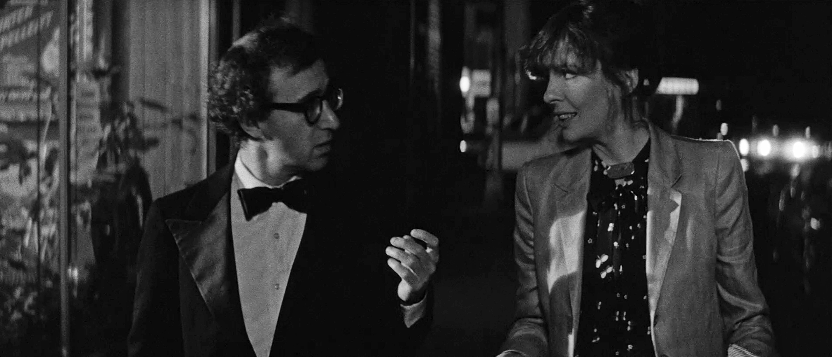
This is the end of the scene. Woody and Diane have walked a full block, turned the corner (the blur of a taxi is visible at the corner in the background here) and are halfway down this block as the scene ends. In this situation the highlight that we’re seeing on Diane Keaton’s cheek is coming from the store (a deuce with some spun on it, in this instance because it had to be back deep). The fill is coming from the light that’s traveling.
FRAME 7
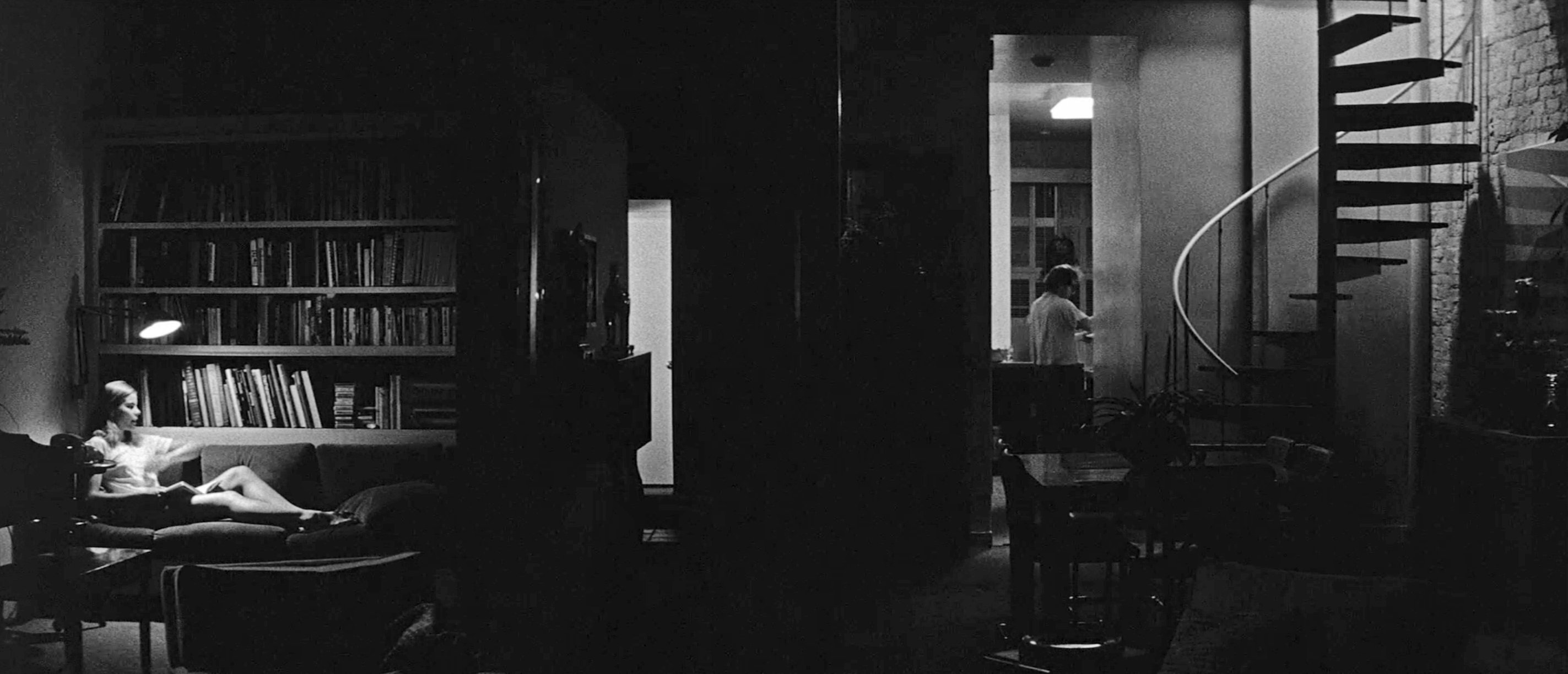
In the beginning of this scene, Woody Allen comes down the spiral stairs to the right. The kitchen lights are off at that point. He walks into the kitchen, flips on the lights, goes to the refrigerator, which is where he is in this frame. All of this time there is dialogue with Mariel Hemingway, who is over on the lift, and it’s all played in one static shot with no coverage. When he walks over to Mariel Hemingway, the camera does not make any adjustment at all, they just play it in that area. This is an excellent example of using space in the widescreen format. “It’s fun to put people at opposite ends on occasion.” Willis commented, “and especially in this case, where you have one person talking to another where they can’t see the other person. It has a tone and an emotion to it which is fun for an audience. It’s quite wonderful to sort of reveal things piece by piece in a shot like this, where one person is established way on the left and then you finally start revealing other people on the right related to the lighting. It’s just a good graphic, in my opinion.”
The lighting way very simple. There was a unit at the top of the stairs, bounced off the ceiling to create a soft, general overall light washing down the spiral stairs. A second unit was placed in the kitchen, bounced off the wall to the right (out of frame, of course). This unit acted in conjunction with the practical ceiling light that is visible. Generally, Willis has his gaffer disconnect the cue switch and tie the practical and the augmenting unit together so that they can come on at the same time, when the actor flips the (now disconnected) switch. Looking to the left of Woody, there’s a light in the background on a door which was on from the beginning of the scene and provided a sense of depth and proportion. The lighting on Mariel Hemingway is, for the most part, the practical that’s visible overhead. There is just a little bit of fill, visible on the bookcase now that fills Woody when he crosses to Mariel and sits. To the best of Willis’ recollection, that unit was a 750 placed well back and to the left, with cutters and barndoors to keep it from spilling too wide. As to the bulb in the practical, Willis reveals a distinct lack of mystery. “What I do is, I’ll take house bulbs, any standard house bulbs — 100, 150, 75 watts — I carry a whole selection of them, depending on what I need exposure-wise when I'm working, that’s what I put in there.”
FRAME 8
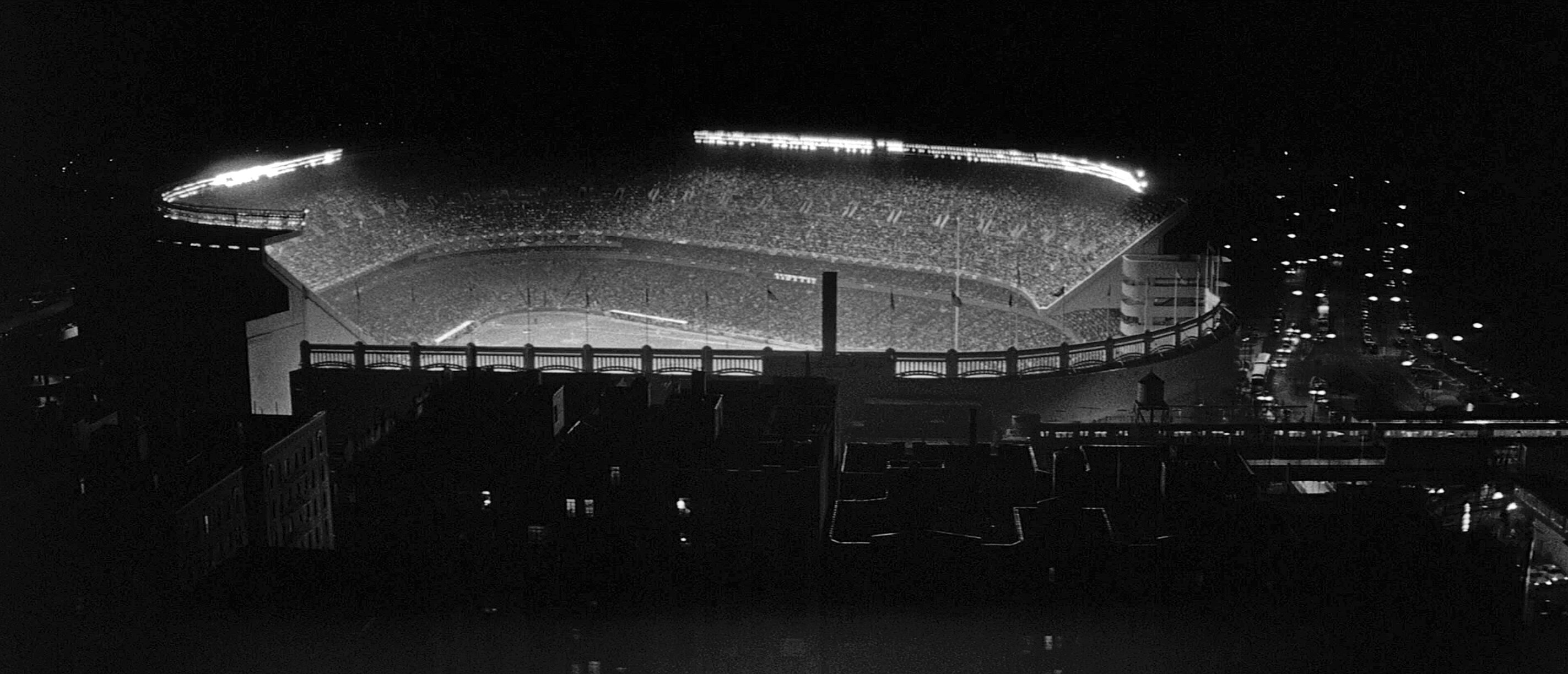
This was one of many spectacular shots from the opening montage of the film. Rhapsody in Blue, which is playing under the entire montage is, at this moment, reaching a rhythmic climax. The movement of the subway with the stadium in the background makes for a really unforgettable moment. It was shot from the room of a building overlooking Yankee Stadium. Clearly, the big challenge here had to do with exposure balance between the bright light in the stadium and the dim light in the subway and on the street.
“All you’ve got to do,” Willis reported, “is cut the exposure in the stadium down so that you can expose for the subway and the street and then, finally, end up with both of them on the screen. The quickest way to do it — and I do it all the time with this kind of thing — is to simply use a graduated filter or a piece of neutral gelatine in the spot that I have to use it, depending upon how much exposure I want to cut down on a given object. If it’s a gel, it is taped to the matte box. If it’s a grad it’s put in the matte box into the level that has to be held down.” There is no problem about seeing the sharp line of a gel as long as the aperture is fairly wide and the gel is sufficiently close. “If you don’t have a stop that’s lean enough for that, then you go to apply enough neutral density within the camera to bring a stop up so that you can do it. Then, you’re talking about daylight problems. This shot was made wide open, and I believe the ND that I used on the stadium was an N6.” Sometimes, Willis will cut get with a scissors to make an edge ragged, but in this case it wasn’t necessary. Once again, the graphic qualities of the ’Scope aspect ratio are obvious here.
FRAME 9
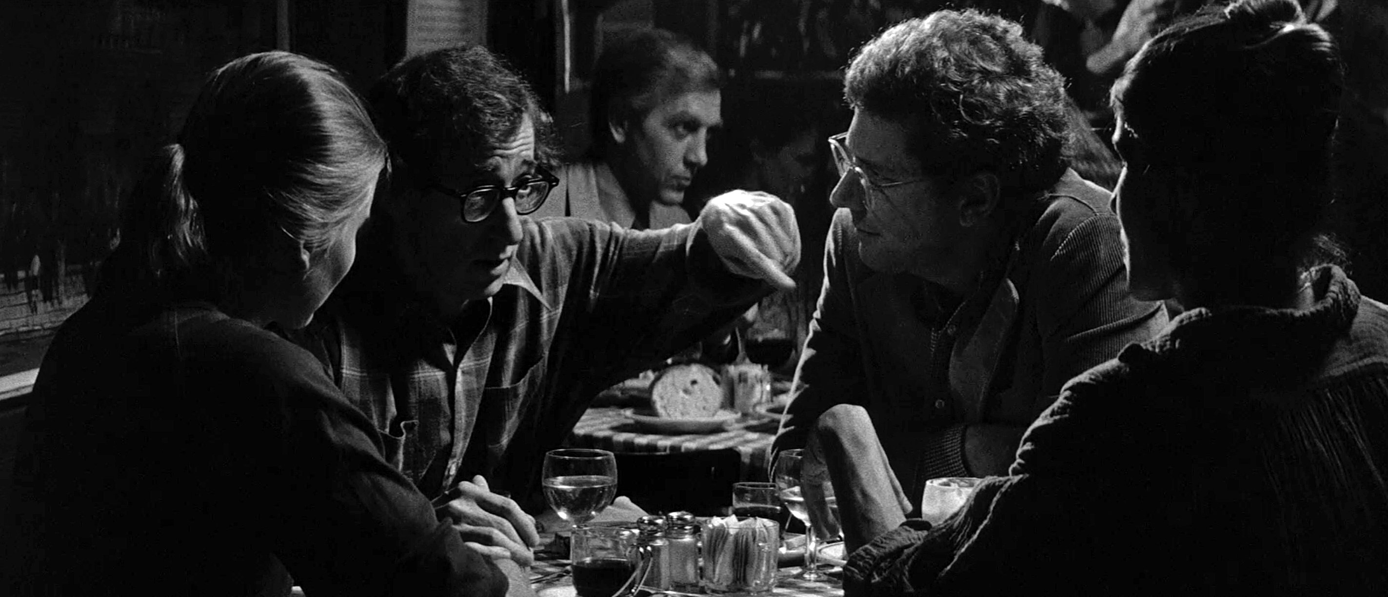
This is the first scene after the montage at the beginning of the film. It was photographed in Elaine’s, a popular Manhattan restaurant. From the left, we are looking at Mariel Hemingway. Woody Allen, Michael Murphy and Anne Bryne.
The lighting, as Willis is quick to suggest, is relatively conventional. He used a unit over the whole table called a “baylight,” a rig he developed in the middle of shooting Godfather II that has “broken out like the plague all over the business now.” In its most primitive form, it looked like a chicken coop [in fact, many cameramen now call them “coops”] with any number of photofloods inside, and a layer of diffusing material beneath. A duvetyn [heavy black cloth] skirt surrounds the unit and can be set at different heights around its perimeter so that the light’s spread can be controlled. “It started out that way, then was redesigned. It can be moved around and hung up on ceilings or bolted directly into a ceiling, or strung over a set. The basic design — as it has now developed — is two frames which are roughly four by four. One frame contains the lighting unit. The second frame, which contains the diffuser, is suspended on four chains below the units. It can be moved up and down, relative to the lights, not only to accommodate the diffusion and make the lights harder or softer; but the primary reason [for this mobility] was, at first, to be able to move the bottom unit up, if necessary, if we needed more headroom. We used chain similar to a toilet chain — you can just move it up link by link to give you enough headroom so that it’s out of the picture. All kinds of refinements have been made to them. A lot of grips in the business now have added their own little touches; like the skirts can be held on by Velcro — that way they just rip right off if you don’t need them.”
The scene was photographed at a 5.6 stop with a 100mm lens. But everything was deliberately a stop under; so the “actual key” (the “correct” exposure) came from the crosslights at a 4-stop. He was getting a 2.8 from his overhead baylight. The light for Woody and Mariel is from a floor unit behind Michael Murphy. The unit that takes care of Michael Murphy and Anne Byrne comes from high on the wall to the left behind Woody. Another unit back to the right takes care of the people in the background. All of that cross lighting was “glued together” with various nets and cutters so that it falls at the appropriate levels.
FRAME 10
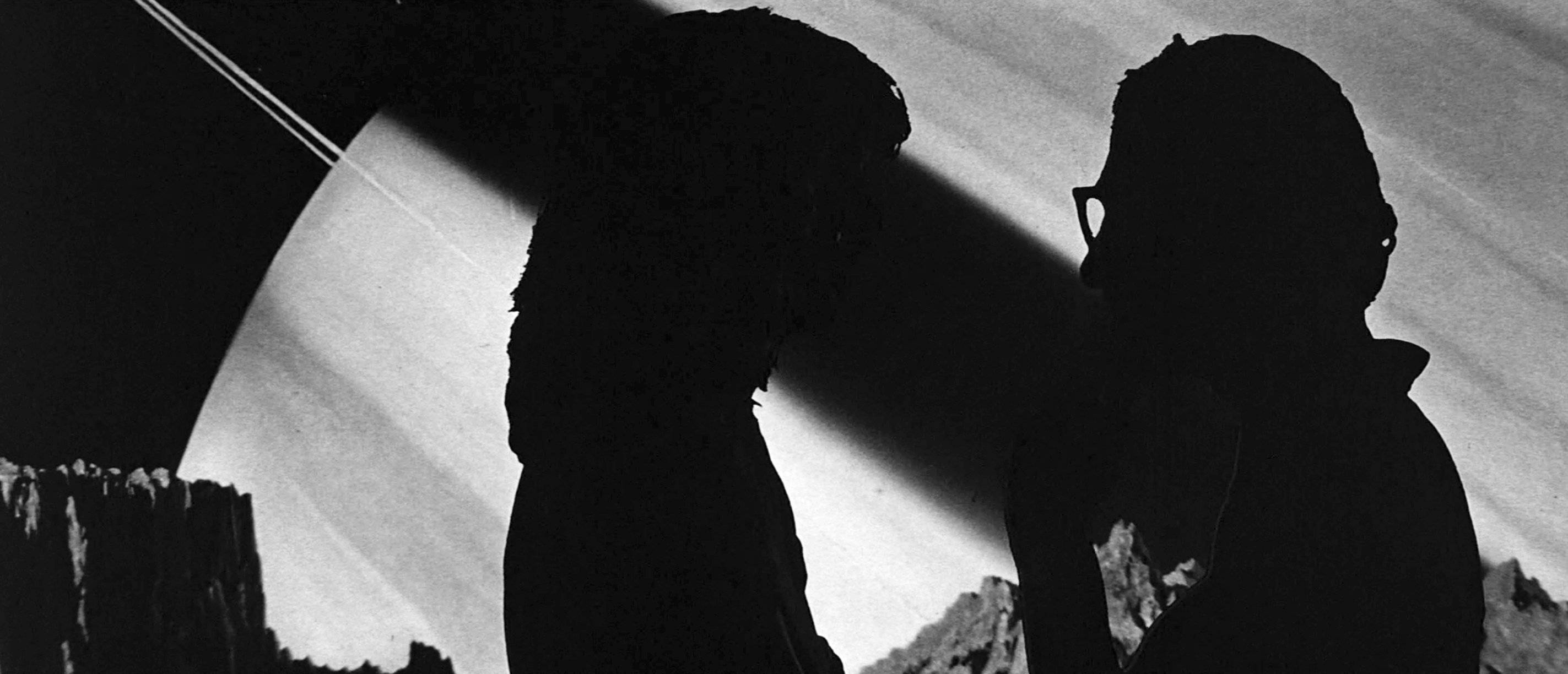
This sequence, the interior of a planetarium where Woody and Diane Keaton have been driven after a sudden rain storm, was particularly interesting in many ways. It was a series of visual vignettes strung together by a continuum of dialogue. The characters would appear in outer space settings that were, in every instance, brighter and more commanding than they were. After a few moments, they disappeared again into the blackness of a fade-out or a cut. It made one feel that these were two small people, “strangers in the night,” as it were, suspended in space and time. It was a sequence that managed to be otherworldly without falling into self-consciously, surreal stylization. It was, after all, the purported interior of a planetarium. Technically, this sequence looked simple. It was as if the filmmakers had simply entered the planetarium, set a few lights and shot the scene. Nothing could be further from the truth. Gordon Willis discussed it in some detail.
“These graphics aren’t really in the planetarium. We wanted to create a bigger-than-life illusion on something that was fun and fatter than real life. So, the sequence is built out of props and mirrors and stars and mirrors, and big models of the moon and things like that.
“This particular shot is a matte shot. What we did is, I photographed them in silhouette against a blue backing. In doing a thing like that, and all the matte work that I have done, the general thing is to shoot the background first. Then, I used the background in the camera to position the foreground. In other words, you cut a matte of whatever the background is and you physically install it inside the camera so that you’re looking through a positive, so you know what you’re putting your foreground against. They — the backgrounds — could have been anything, in subject matter or actual size. But in this particular case, I took this graphic of Venus and used it to play this section in silhouette.
In the first vignette, Willis used a mirror to put stars in the sky above a seemingly vast, barren moonscape. Mirror shots are nothing new to him. “I use a mirror on occasion to do certain things because it’s better than laying an optical on it, and adding another generation. Depending on what it is you want to do, usually a 60% mirror, sometimes a 30% mirror — meaning that it’s partially silvered. You put it in front of the camera so that you’re shooting the action through the mirror. Now, what you want to impose in front of the action is reflected into the mirror. So, in this particular case we sprinkled some stars — actually small Christmas tree lights — on a dead black background. The mirror is vertically correct. I mean, it’s turned at a 45-degree angle, in this case, so that you can pick up the reflection of what you’re trying to superimpose either to your left or to your right; depending upon how you set the mirror. The actors are where they would normally be while you’re shooting. The star field, or whatever else you might choose, is over to the left or to the right, reflected in the mirror.
“It’s the same thing as simple matte work, which is a foreground process,” he explained. He used a mirror in Annie Hall, too; there’s a sequence in the bedroom where Woody is trying to make love to Diane Keaton, and in the middle of the sequence, her “ghost” gets out of bed, commenting on the action. “It’s an interesting sequence if you know it’s been done with a mirror, because it all takes place in one shot.”
Click here for more archival stories from American Cinematographer.
