Saul Bass: A Modern Approach to Film Titling
A look at the work of the industry legend in the midst of his career, forever changing opening title sequences.
This article originally appeared in AC Aug. 1960.
With the continually increasing list of technical and administrative credits displayed at the opening of each motion picture made today, a marked trend has developed to make titles more interesting, and as a result, more useful in enhancing the plot of the film.
The content of titles at the beginning of a theatrical motion picture is regulated by a number of powerful guilds and accepted trade practices. The credits cannot be done away with. Though the main and credit titles of a film are usually the last things made, they are the first part of a picture which the viewer will see, and the producer is generally concerned with making the best possible impression on him at that time.
Titles Designed By Saul Bass
In coping with the audience’s idea that during the screening of the titles is a time to make small talk, go for popcorn or change seats, a number of directors and artists have taken a new approach to titling their productions— 1) let titles serve as a positive introduction to the story by setting an appropriate mood, or tempo; 2) make them interesting; and 3) make them easily readable.
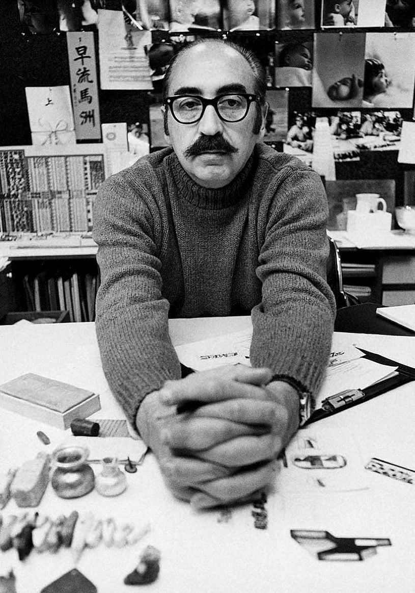
Outstanding in the field of title design is Saul Bass. A versatile and highly imaginative graphic artist, he has executed titles and trailers for a number of successful motion pictures. In his work, Bass stresses an approach with the objective of making titles sufficiently provocative and entertaining to compel theatre audiences to pay attention, and to realize that something important is happening on the screen.
In the Michael Todd production, Around the World in 80 Days, the story proper ends with one of the characters saying: “This is the end!” There is a brief fade-out, and then the first of a number of unique and beautiful animated scenes which comprise the titles of the film. The titles were handled in such a manner as to represent a condensed recapitulation of the preceding three hours of film. The various incidents, locations and characters in the story are portrayed in a six-minute epilogue through the use of caricatures and stylized drawings of the 19th century. Interesting movements of vividly colored backgrounds and pen-and-ink drawings of the dozens of characters appearing in the film aid in overcoming the lack of desire to watch a great many titles after having viewed the preceding several hours of film. Anyone who has seen the picture will agree that the result was quite impressive.
In Around the World in 80 Days, Saul Bass presented a classic in title design. He had at his disposal a vast subject matter, the use of color film, and the benefit of the 70mm Todd-AO process to add to the feeling of his work when displayed to the theatre audience. It is true that the cost of such an elaborate series of titles is so high as to discourage all but the most ambitious of producers. However, it is by all means possible to gain the same degree of audience rapport through a far less expensive treatment and even with black-and-and-white film.
Bell Symbolizes Saint Joan Titles
Otto Preminger’s screen version of Saint Joan opens with bell symbols in the form of crudely animated clappers swinging across the screen. As they advance toward the viewer and enlarge to screen-filling size they fade out to reveal new clappers in the background. These too advance and fade out. As the titles continue the number of bells increases until among them a white clapper appears, advances, and dominates the entire screen. At the apex of its swinging motion a figure holding a broken sword materializes within it and the final credit appears. The music accompanying the titles contains a strong bell-sound motif which is timed to the action of the bell clappers and the appearance of the credits.
In this case, Bass sought to create a strong dramatic atmosphere with spirit-like overtones. While the artwork is not elaborate, nor detailed, it is highly appropriate and forceful.
For Man With the Golden Arm and Anatomy of a Murder, also Preminger pictures, highly rhythmic jazz themes are played against simple, but meaningful, black-and-white designs which serve to reflect the emotional qualities of the films. For Man With the Golden Arm a group of white bars is seen rapidly changing position against a black background as various groups of credits appear. The bars finally animate into the “arm” symbol and the final credit is flashed on the screen. In Anatomy of a Murder a fragmented figure is developed in close coordination with the music and an abstract handling of the various body elements then follows.
So we see that music is an integral part of an effective title. There may be a composite of the various themes heard in the picture, as with Around the World in 80 Days, or a taut and staccatoed jazz score to promote certain dramatic effects, as in Man With the Golden Arm.
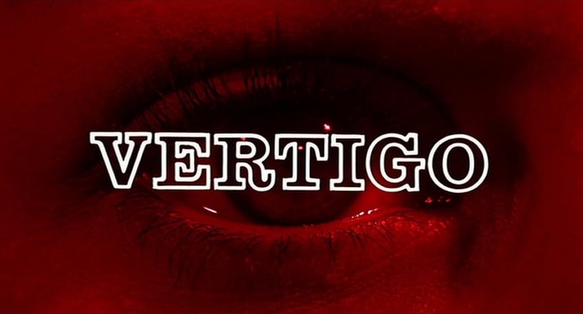
Alfred Hitchcock’s Vertigo is a psychological thriller which demanded a skillful combination of unusual visual effects, color, and a pulsating musical tempo. Bass solved the problem by having the titles open in black-and-white, and panning slowly over closeups of a woman’s face. Several credits zoom in and out of the camera field at this time. As the camera comes to rest on a shot of the eye the title of the film emerges from the center and zooms forward out of the frame. The screen is suffused with red as the first of a
series of abstract forms emerges from the pupil and enlarges out of the film area. With the remainder of the credits appearing over these spiraling designs the feeling of dizziness, known as vertigo, is suggested.
The examples thus far described all contain either animation of some kind or an unusual optical effect. There are still other methods of providing a film with excellent titles which require little or no artwork. William Wyler’s The Big Country opens with a montage of closeups and long shots of various aspects of a coach traveling across the plains. The sequence is in a brownish tint rather than full color and the credits are superimposed in white. Displayed in conjunction with a thrilling western musical score, the desired feeling of speed is achieved.
Delayed Title Technique
Delayed appearance of titles, or having them spread out over the first few minutes of a film is another technique practiced in dramatic productions, as in the recent Andrew L. Stone film The Last Voyage. However, the usefulness of this practice is limited, as it may tend to lessen the effect of the credits, and at the same draw attention away from whatever action is taking place on the screen.
Hollywood might well take a lesson from the small TV producers whose openings seldom include credits titles, but which are designed to capture the viewer’s interest in the first half-minute of the program. This season, Spartan Productions’ Peter Gunn and Mr. Lucky featured catchy, animated introductions, each including a playful handling of the symbol of that show. Other noteworthy main titles include those of The Twilight Zone, by U.P.A., and Small World, by Saul Bass.
In addition to developing the character of the immediate presentation, a form or design appearing in a set of titles can serve as a trademark for the film, for use in advertising and publicity.
Certainly there must be no assumption on the part of the producer that his production is merely an excuse for an attractive, eye-catching title, but rather that his production does deserve a suitable title which will fit the style and subject matter of the film and at the same time introduce his audience to the mood prevailing throughout the ensuing story. There will surely come a time when the simple credit lettered against a drab or lifeless background will be as much a thing of the past as a silent movie.
If you enjoy archival and retrospective articles on classic and influential films, you'll find more AC historical coverage here.


