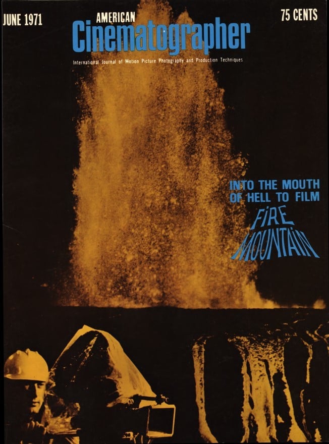
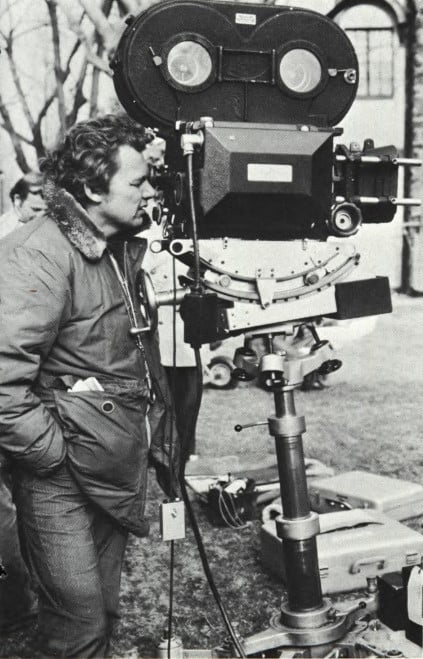
On Location with The Godfather: A Discussion with Gordon Willis
On the sidewalks of New York (and Hollywood and Sicily), rules are broken as off-beat photographic techniques are applied to filming of best-selling novel.
By Gregg Steele

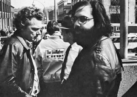
En route to farther-off places, American Cinematographer editor Herb A. Lightman stopped off in New York to observe filming on the Paramount production of The Godfather, adapted from Mario Puzo’s best-selling novel and directed by Francis Ford Coppola.
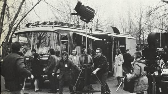
To be photographed mainly on locations in New York, Sicily, Hollywood and Las Vegas, this production is the first to use the new Mark VI Cinemobile. Originally, at Paramount's request, this new model of a “studio on wheels” had The Godfather painted on its sides in gigantic letters, but the identification attracted such huge crowds of onlookers, that the inscription had to be painted over.
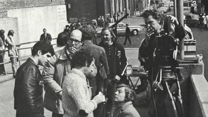
Filming observed by Lightman included various locations on the streets of Manhattan (including the exterior of Bellevue Hospital), plus an important sequence on Staten Island, where several large houses had been enclosed by a stone wall to simulate “the Mall,” stronghold of the gangster chieftains who are the main characters of the story.
In the following interview, director of photography Gordon Willis explains his visual approach to this particular assignment and details some of the unusual and rule-breaking techniques which he is utilizing:
American Cinematographer: I understand that you are using a rather unusual photographic style in this film. Can you tell me a bit about the effects that you’re after and the mechanical means you’re using to achieve them?
Gordon Willis: Yes. When I first received this assignment I thought about all kinds of sophisticated ways to introduce this and that, but I finally came to the basic realization that this film, especially because it’s a period film, should be kept mechanically simple — and Francis Coppola feels the same way about it. In all of the films I’ve shot I’ve tended to do the same thing philosophically — but none of them look the same, even though the attack is the same.
If I understand your meaning correctly, you’re saying that you can arrive at a number of different results by using the same basic philosophy as a common denominator. If you were to sum up that philosophy in a sentence or two, how would you state it?
I think I would say: “See what you’re looking at. Don’t walk into a situation and re-manipulate it. Look at it!” There are too many people in this business who find a location that is exciting and then instantly proceed to rebuild it photographically. They forget why they chose that location in the first place. I don't mean that you shouldn't light anything. I simply mean that you should light it so that you still have what you came there to get. It may mean that you won’t have to do any lighting at all. But then again, it may take you quite a while to work it all out so that it still looks the same. But see what you are looking at. Retain what’s there.
In applying your philosophy to The Godfather, what kind of style have you arrived at and what are the mechanics involved?
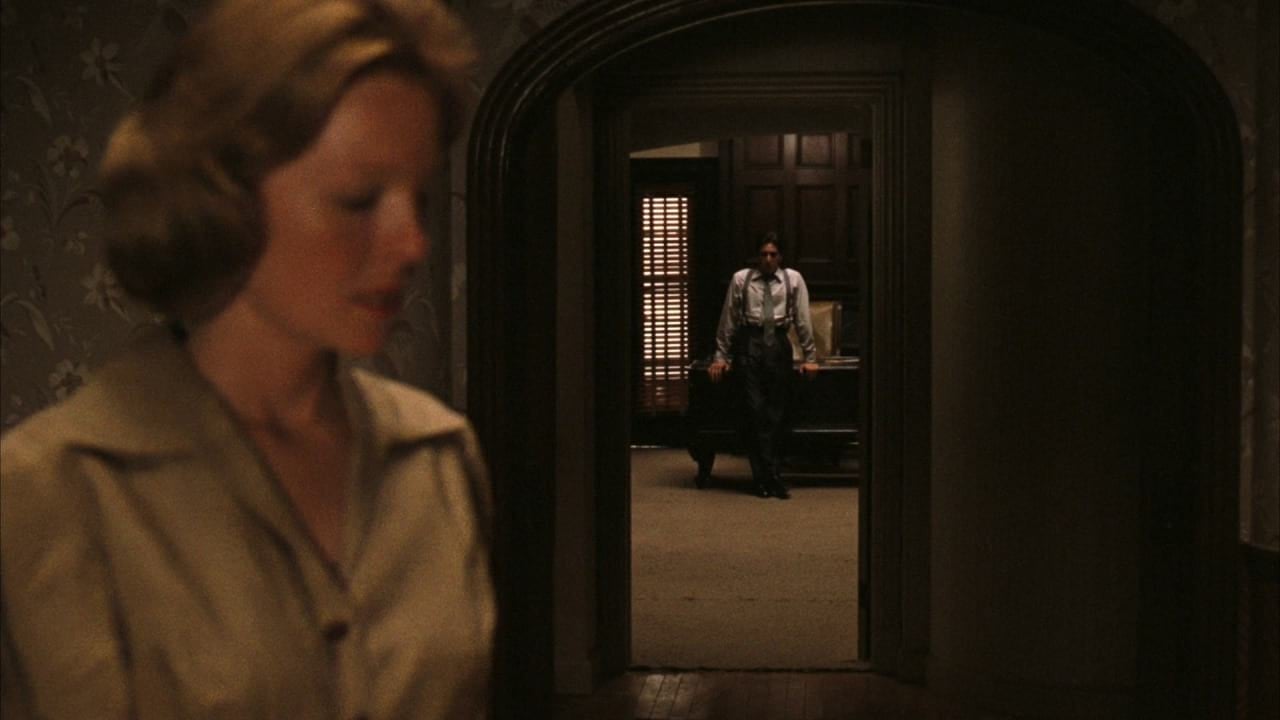
In this particular case, I felt that the film should be brown-and-black in feeling, and that occasionally it should be hanging on the edge from the standpoint of what you see and what you don’t see. A lot of cameramen work to increase the quality of an image, but in this specific case I’m working to decrease it. Most cameramen work to make the image as structurally sound and smooth as possible, but it’s been my personal feeling that this isn’t the best way to handle a contemporary story — and now that I’ve thought about it, I’m convinced that it’s absolutely the wrong way to photograph a period story.
what you're looking at. Don't walk into a
situation and re-manipulate it. Look at it!”
Translating that conviction into sheer mechanics in this case, what are you doing mechanically to follow it through?
I’ve photographed all of the material so far — and will continue to photograph it — so that the negative is not a super-heavy, thick type of negative. Theoretically, the negative is about one-half-stop underexposed, but it's even more than that, according to the way that I rate the Eastman color negative. But getting back to the point, I feel that this film should have a brown look to it, with occasionally a bit of that 1945 blue-black in it. I think it should look like a newspaper photograph in bad color — a black-and-white print out of the New York Times, with a little color introduced.
Something like a bad rotogravure?
Right! That's exactly what I mean — but it should be well thought out, so that the effect means something on the screen. Before we started shooting, I sent Technicolor some material and told them to print it several different ways in terms of dye-transfer and duping, so that we could find the area in which it would print well according to what we've just discussed. They were very co-operative and came up with some nice things. When I got the material back I picked one dupe that I thought would do the job and, hopefully, when the shooting is finished, the entire film will be duped in that manner, using the dye-transfer process, and it will look right.
What is your feeling about visible grain in this particular picture?
I feel that the grain structure should be more prominent that usual. Now, this is nothing new. A lot of people have said, “I want everything to look messy.'” But there is a very thin line between “different” and “lousy.” I mean, you can get so abstract that you have no point of view, and everything you do is really meaningless. It’s just sloppy work and nothing more. I’m not a believer in using grain structure and things like that to cover up something that is essentially not good to begin with. I believe that if you start at the bottom and make everything very good — and then use such things as grain properly — it’ll work.
This unusual “bad rotogravure” visual style we’ve been discussing — do you intend to use that consistently throughout the entire picture?
No — it wouldn’t be right to do that, because the action of the story moves from New York to Hollywood to Sicily. This brown, sort of broken-down quality I’ve described relates to the New York sequences, but not to those that take place in Hollywood. I plan to emphasize the contrast between the two locales by giving the Hollywood sequences a cleaner, crisper, sort of West Coast-y, California quality — which should be a bright, hard image. In juxtaposing the two — in cutting from New York to California — there should be a very definitive difference in relation to the atmosphere and the people.
“Film material is designed to be printed in one range and one range only. I don’t like giving a lab the flexibility to print it up and down, because sooner or later someone, somewhere, in some little room will decide that it should be a little more this way or that. He’ll straighten it out for you. Everything will be just perfect — and it will be a disaster.”
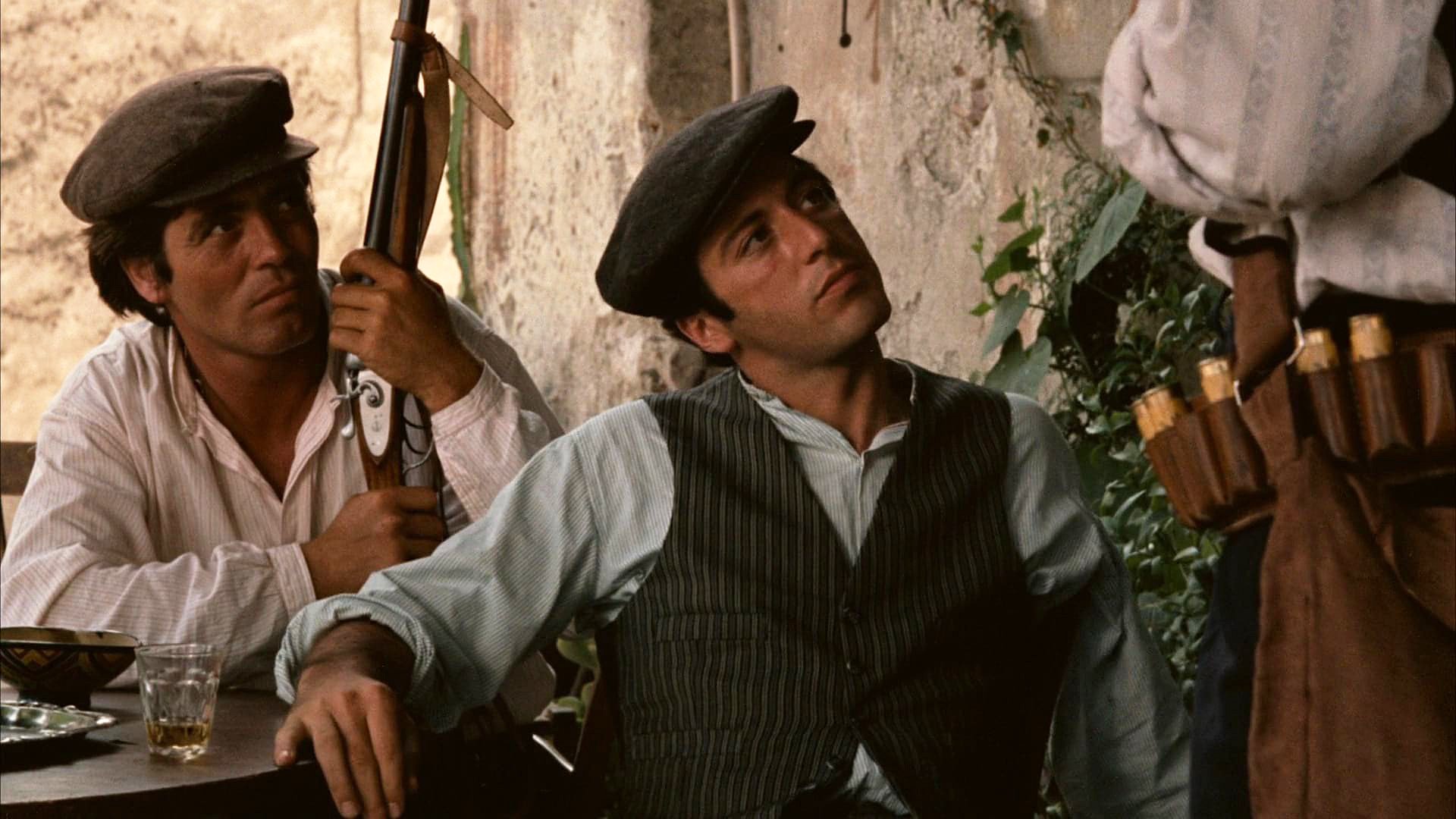
How, then, do you intend to handle the Sicily sequences?
In terms of the dramatics of the story, the feeling of New York carries over to Sicily — but not exactly. It will be brown, but smoother. The color quality will be the only thing I’ll carry over to Sicily. In other words, when we deal with the family in New York, it’s like a broken-down, melted-down Sicily — but the essence of it is there. Sicily will be olive and nice and warm and sunny.
What mechanical method do you intend to use in order to achieve that effect?
Well, I’ve never been to Sicily, but after doing some research I’ve arrived at the conclusion that the Sicilian sequences should be very rich and very brown — with a very creamy kind of feeling. It seems to me that the way to attack a thing like that is to over-state it. So, I plan to photograph Sicily through rather heavy chocolate brownish filters. Brown is a nebulous color, but there are times when it can be very beautiful on the screen because it tends to make everything very rich, in a monotone sort of way. It de-saturates the primary colors. I plan to photograph all of the Sicilian exteriors that way.
What about the interiors?
I’ll use chocolate filters, but they won’t be nearly as heavy as the ones I use outdoors. I’ve had a series of gelatin filters made up in varying densities of the chocolate tone, and I’ll use the lighter ones inside. This should give me a good relativity between the interiors and the exteriors in Sicily.
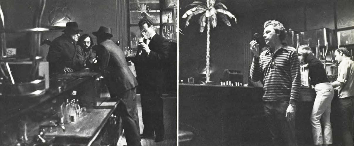
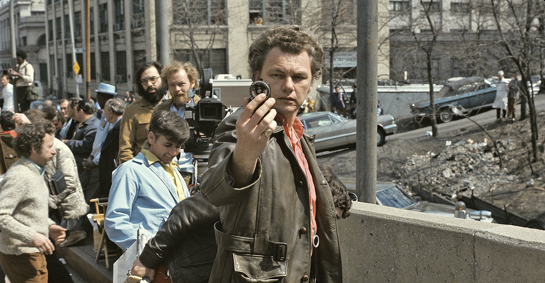
Brooklyn bar. He calculates exposure critically, but resultant negative must be printed precisely right to preserve desired visual effect.
You mentioned earlier something about the way you rate the Eastman color negative — implying that this is different from the normal rating. Can you explain that?
Well, for example, if you take a roll of Eastman color and expose it under the conditions that Eastman recommends — which is ASA 100 for interiors and ASA 64 for exteriors — you’ll get very nice photography and it will certainly print well. But Eastman has built a margin for error into the film. It allows for my error, for the laboratory’s error, for everybody’s error. It’s right for Eastman to build the material like that, because if they cut it too dose a lot of people would make mistakes in using the film. So I can understand and appreciate why they rate their film the way they do. However, I started out by shooting the film at the established rating several years ago. Then I began to experiment with lowering the ratings. First I dropped it one stop and rated it at ASA 200. I had the lab push it an extra stop and everything looked fine. Then I exposed it at ASA 200 and had them process it normally, without any pushing. When I saw it on the screen I thought it looked terrific. I mean, it was a lovely image and I liked it. So, I shot all of the interiors for The Landlord and for Loving with the film rated at ASA 200 and no pushing in the lab. The result has a very specific quality.
But what did you mean before when you said that you would be one-half-stop underexposed, according to your method of rating the film?
What I meant was that right now I am using a variation of the formula. I’m exposing at ASA 250, and having the film pushed one stop in the lab, which means that, theoretically, I’m underexposing half a stop. The truth of the matter is that I like the look of that result. It appeals to me because the film becomes more translucent. You can see through the colors, rather than having them just sticking on the screen. Because the fog level is raised slightly in the pushing, the material tends to have a kind of foggy, not-quite-there look which, at times, is quite nice.
Doesn’t this method leave very little latitude in printing?
Exactly. It means that once I’ve got the basic quality I want on the negative, the lab can do very little to jerk it around. I can expose it for the way I want it to end up on the screen. Some people complain that the way I expose it they can’t do this and they can’t do that with it. They can’t print it up, for example — and that’s exactly why I expose it that way. Film material is designed to be printed in one range and one range only. I don’t like giving a lab the flexibility to print it up and down, because sooner or later someone, somewhere, in some little room will decide that it should be a little more this way or that. He’ll straighten it out for you. Everything will be just perfect — and it will be a disaster. So, I don't like to give the lab a full negative for two reasons. The first is an aesthetic reason; I don’t like the way it looks on the screen. Secondly, it gives me the security of knowing that they won’t be able to do anything to it because they can’t print it up. If they try to print up what I’ve shot, it will fall apart.
“I’m very proud of the fact that I’m very meticulous in the way I expose film. That doesn’t mean that I take hours. I’m actually very quick, but quite consistent in the way I expose material.”
On the other hand, that means that you have to be very exact in your exposure. Isn’t that so?
Yes, I certainly have to be — but I’m very proud of the fact that I’m very meticulous in the way I expose film. That doesn't mean that I take hours. I’m actually very quick, but quite consistent in the way I expose material. I’m very sure of relativity. In other words, I know what something is going to look like a stop over the key or a stop and a half under the key. I never make general exposures. I always expose for something specific in the scene — always — and everything else in the scene relates to what I expose for. I know how the material is going to print, and it prints on one light throughout the movie. I tell the lab the pack to use and the light to use, and if they’ll do it that same way from day to day they’ll be pleasantly surprised. The relationship of underexposure to overexposure to normal exposure will all fall in properly. It's when they try to level everything anything to it because they can't print it up. If they try to print up what I've shot, it will fall apart.
I notice that you’re using the new Mark VI Cinemobile on this picture, which is the first time it has been used by anyone. How’s it working out?
I’ve never used a Cinemobile before on any movie. I wish I had. When I sat down and thought things out prior to starting this film, I realized that, of all the films I've worked on, if I didn’t keep my end of this movie relatively tight and simple, it would look like the Normandy invasion. There would be trucks and bodies strewn all over the place. It’s not that I’m using more equipment than I usually use. I’m using the same amount. It’s just that there’s a tendency for things to grow out of proportion on a “big” movie, or one that’s had a lot of publicity. I wanted to keep my part simple.
How did you happen to decide upon using the Cinemobile?
I went out to California to talk to [company owner] Fouad Said because I thought he might have something to offer that would help me keep things fast and simple. After talking and thinking and working with him for a week I was very impressed and decided that what he had to offer was terrific. We've been using it for some time now and have found it to be excellent. The people he sends along with the truck are excellent, too.
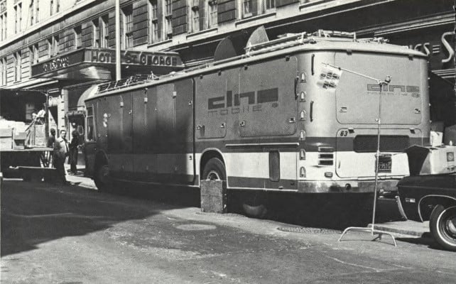
Do you find that you can carry everything you need for a big picture like this?
We’ve packed more firepower, so to speak, into that Mark VI than most people have got strewn over 8 or 10 trucks on the average movie. What I’m saying is, of course, based on my philosophy of making a movie. There are a lot of people in this business who still haven’t given up using arcs. I gave them up long ago. So, even though the Cinemobile provides much room for arcs, if you choose to use them, I don’t. I use that space for other types of lamps and things which I feel are of more value in shooting a picture. I’ve found the unit to be excellent. It’s contemporary. It’s well-thought-out. It’s a very meaningful piece of equipment for any cameraman, any producer. You can load and unload from both sides of the vehicle. The way it’s designed, you can pull things off as you need them, without having to unload the whole truck to get at one thing.
Is there anything it doesn’t have that it should have?
Not really, even though there is one thing that we hadn’t planned on. I happen to use hundreds of feet of Elemack dolly track, because I believe that if you’re going to make dolly shots, you’d better be able to make them fast. Anyway, we hadn’t planned on taking along 200 feet of Elemack track. However, we’ve got it stacked on top of the van and it fits fine, because he provided for that with a railing area. I’m very delighted with the way Said has extended himself. He listens well and he’ll incorporate your suggestions into his equipment. He’ll keep making design changes, too, which I'm very happy about. I don’t presume to speak for other people, but in my department I feel that he’s made a major step forward in helping to modernize the business. He’s made it easier and less costly for people to shoot, and that’s very important. Movies cost enough money. There’s no point in spending your entire day working as a parking lot attendant so that you can make a shot. I’m delighted with these trucks and I’ll use them whenever I can — forever, if I can get ahold of them.
Willis was invited to join the ASC in 1975, and was honored with the Society’s Lifetime Achievement Award in 1995.
Our other posts on the legendary cinematographer include Gordon Willis Tribute — The Godfather and Gordon Willis, ASC: Supervising a Set.
The Godfather was selected by the ASC as one of the 100 Milestone Films in Cinematography of the 20th Century.