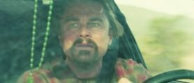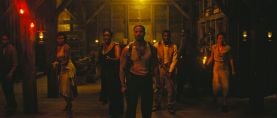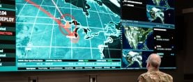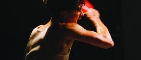
Scare Tactics: Shooting The Invitation, Men and Crimes of the Future
Three cinematographers dissect the chilling imagery they created for this trio of unsettling feature projects.
Introduction by Michael Goi, ASC, ISC
Horror is personal. It’s a genre that relies on the filmmaker forming a connection with the viewer in a way that exposes the deepest parts of both their fears. More than any other form of filmmaking, a horror movie requires the cinematographer to tap into primal emotions — the kind we normally suppress as being irrational. But it’s the irrational that lies at the heart of true horror, the deviation from what we know and accept as real and controllable. Therein lies the key element of horror: dread.
Dread as a visual device can take many forms. Director-cinematographer Mario Bava often used the image of children smiling outside dirty windows to invoke a feeling of dread. Also, Bava’s groundbreaking use of color as a motif for the presence of evil was never more effective than in the segment of his anthology film Black Sabbath titled “The Drop of Water,” in which the increasingly garish color scheme portended the arrival of gruesome death.
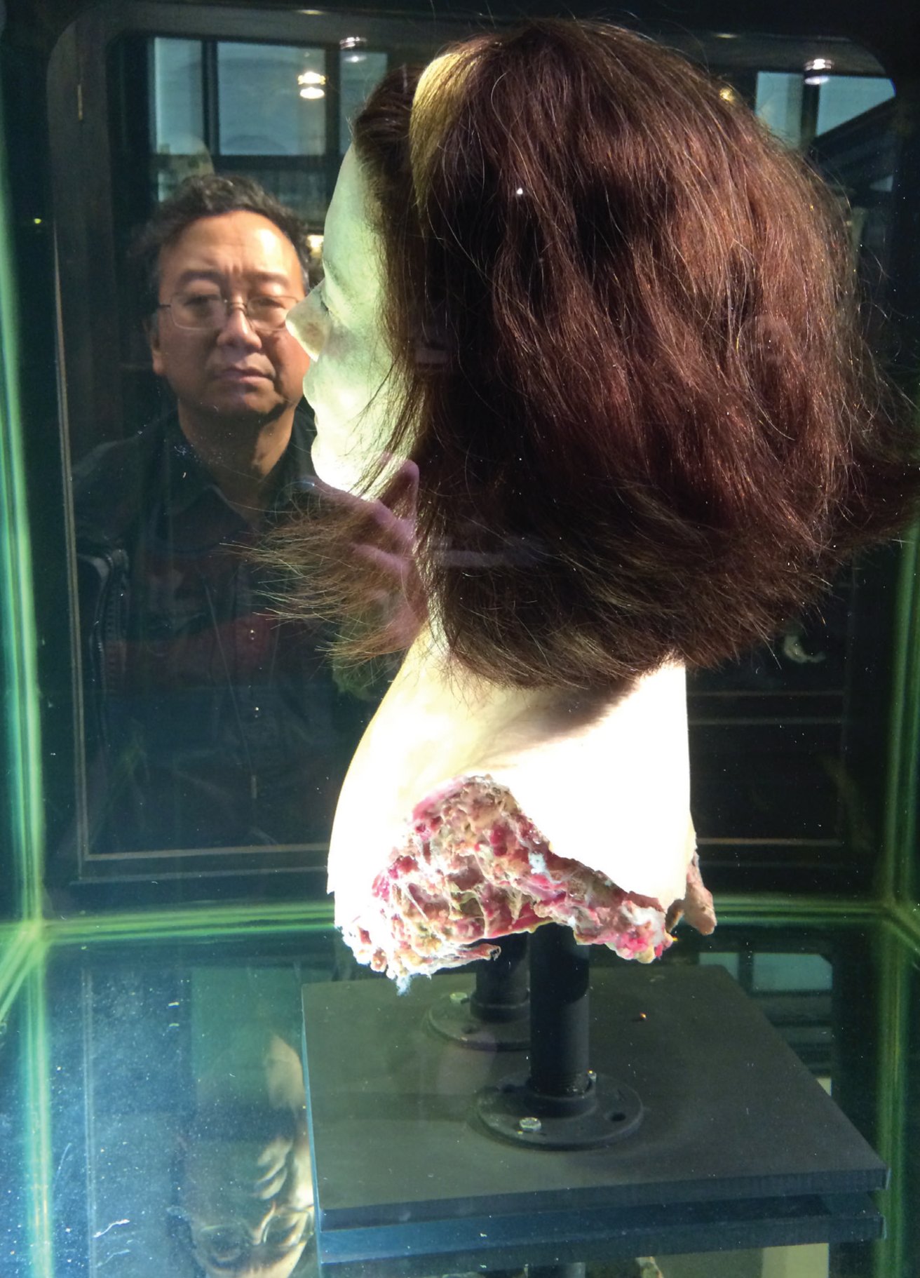
It’s not enough to be visually audacious when you’re shooting a horror film. The kinds of visual pyrotechnics that might work in an action film will ring hollow in a horror movie if they’re not connected in a very insular way with the characters. So, the cinematographer must be faithful to reality — not the reality of what something would logically look like, but the reality of what it would feel like in the character’s mind. That goal requires the cinematographer to recognize and accept what they felt during traumatizing events in their life, and to work up the courage to put that experience onscreen. Those real, lived, firsthand experiences are where the true horror comes from.
For example, in one episode of American Horror Story: Asylum that I shot, there is a sequence in which Sarah Paulson’s character, Lana Winters, wakes up in a room with white tile floors, stainless-steel operating instruments and plastic curtains stained with blood — the lair of the multiple murderer “Bloody Face.” The crew assumed I would light that room with heavy shadows and pockets of threatening darkness, but instead, I chose to light it entirely with bright fluorescent lights in the ceiling. The idea was to make viewers feel as if they were taking a trip to their dentist’s office to have a painful procedure performed. I felt this strategy would make the experience of watching the scene more deeply personal for the audience because they might associate it with their own experiences.
The pages that follow detail how three innovative cinematographers put their own stamp on the horror genre. Perhaps their thoughts and observations will inspire you to put your own nightmares onscreen for the world to experience.
— M.G.
The Invitation | At the Table
By Sarah Fensom
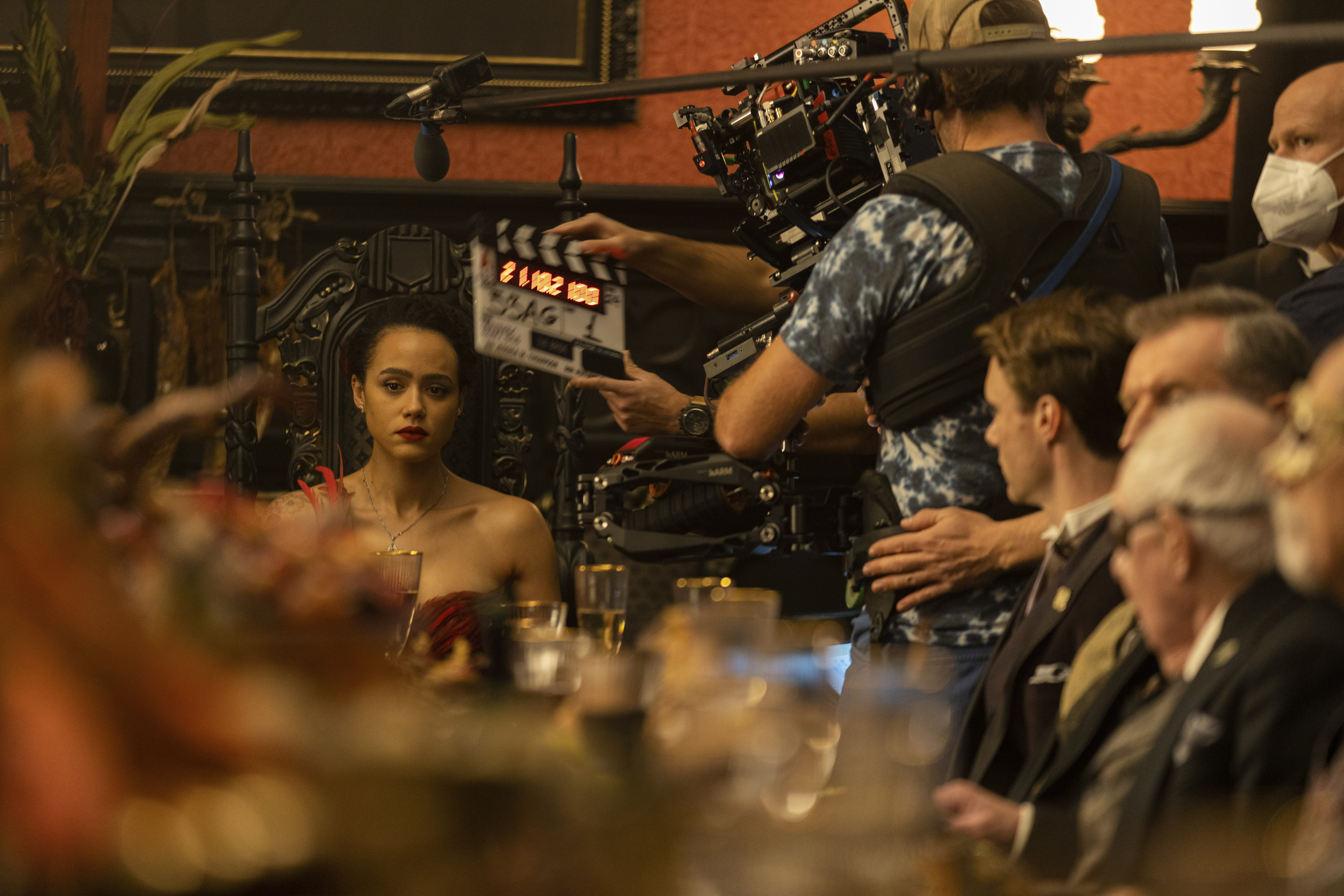
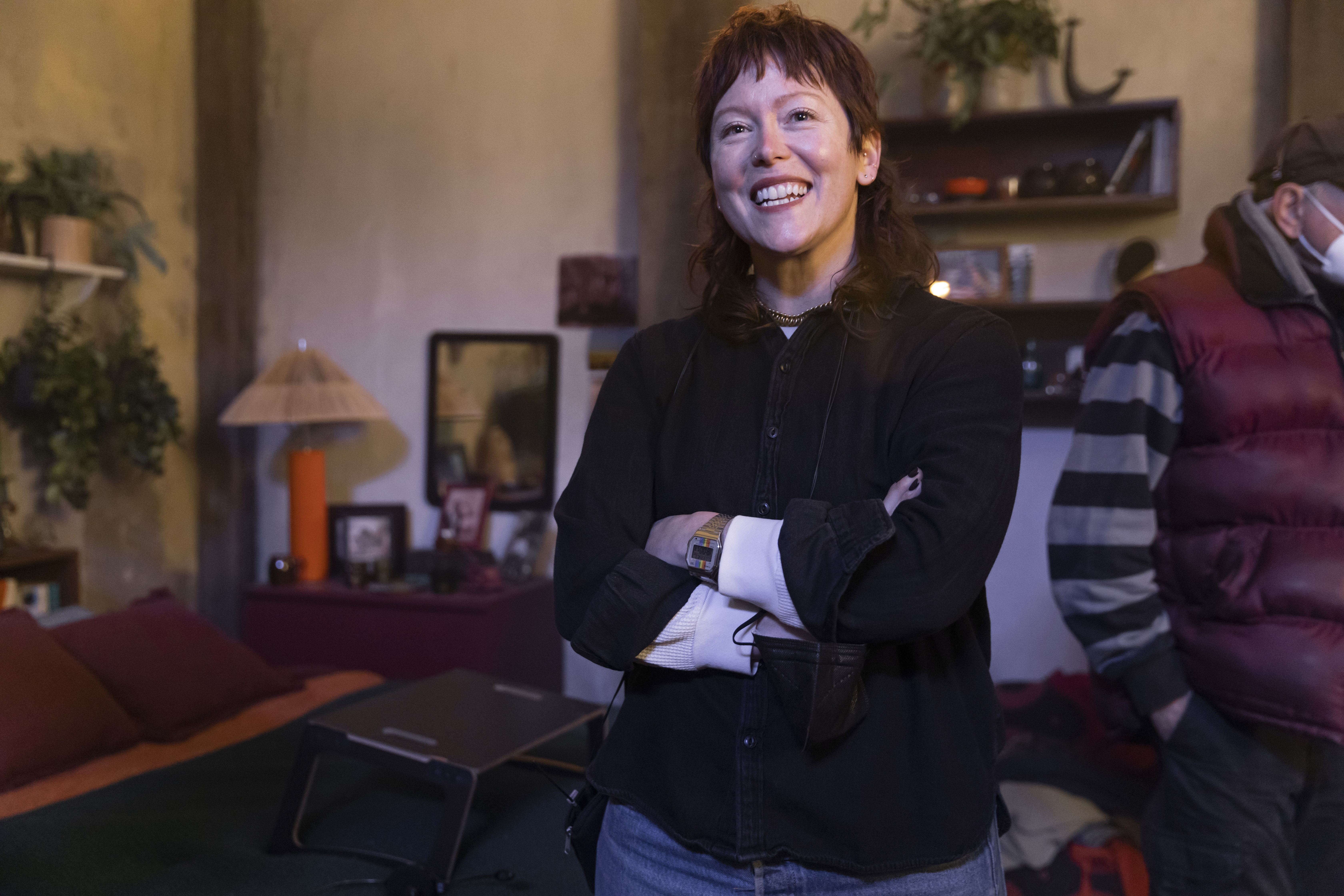
Cinematographer Autumn Eakin maintains that a sense of authenticity is essential to horror filmmaking. “The jump scares and things like that have to work,” she says, “but you also have to showcase the story, the characters, and their chemistry in a way that the viewer deeply cares about, too.”
To that end, Eakin feels that her experience in documentary work helped inspire her creative approach to the horror feature The Invitation — and her dynamic with director Jessica M. Thompson (The End, Unstoppable), whose resumé also includes a substantial number of non-fiction credits. “Jessica and I are both big proponents of having an authentic feel when it comes to capturing actors and their performances,” Eakin says. “So, even with a movie like The Invitation — a fantastic, fictional story — I think having a documentary background can inform that narrative work.”
The movie’s plot follows Evie (Nathalie Emmanuel), a young woman living in New York who has just lost her mother — her last known family member. After taking a 23andMe-style DNA test, Oliver (Hugh Skinner), a long-lost second cousin, pops into her life as if by magic. He invites her to a family wedding at a sprawling estate in the English countryside, and suddenly Evie has relatives, a brighter future ahead, and a romantic interest in Walter (Thomas Doherty), a mysterious family friend. But the event and its participants turn sinister, leaving Evie to fight for survival and make sense of her predicament.
Bending Genre
“We wanted the film to create a sort of genre-bend,” says Eakin (Someone Great, Modern Love), who spent about nine weeks shooting the film in Budapest, Hungary. “Most of the movie is really a fairy tale with Evie falling in love, but it becomes this Dracula story with an old-world visual sense.”
The gothic influence on the film’s narrative inspired vintage trappings. “The story is set in England, so there are castles and lots of luxury,” Eakins observes. “It’s this ideal world — a kind of ‘period piece’ that’s actually set in modern times.”
The film’s departure from the rigid constraints of genre and period proved creatively fertile for Eakin. In the past, she’d shied away from shooting horror, but The Invitation changed her perspective on such material, and she’s currently shooting another scare-filled feature, Insidious: Fear the Dark. “I’ve found that I like shooting horror films, because you don’t have to stick to the ‘real world’ — you get to explore things visually that don’t have the same limitations as everyday conversations, or a modern dinner party.”
In fact, a “beautiful, epic dinner party,” as Eakin describes it, is a pivotal scene in The Invitation. It’s at this lavish dinner that Evie learns the dark truth about the wedding she’s attending, and the fairy-tale tone of the film descends more completely into horror.
Ominous Optics
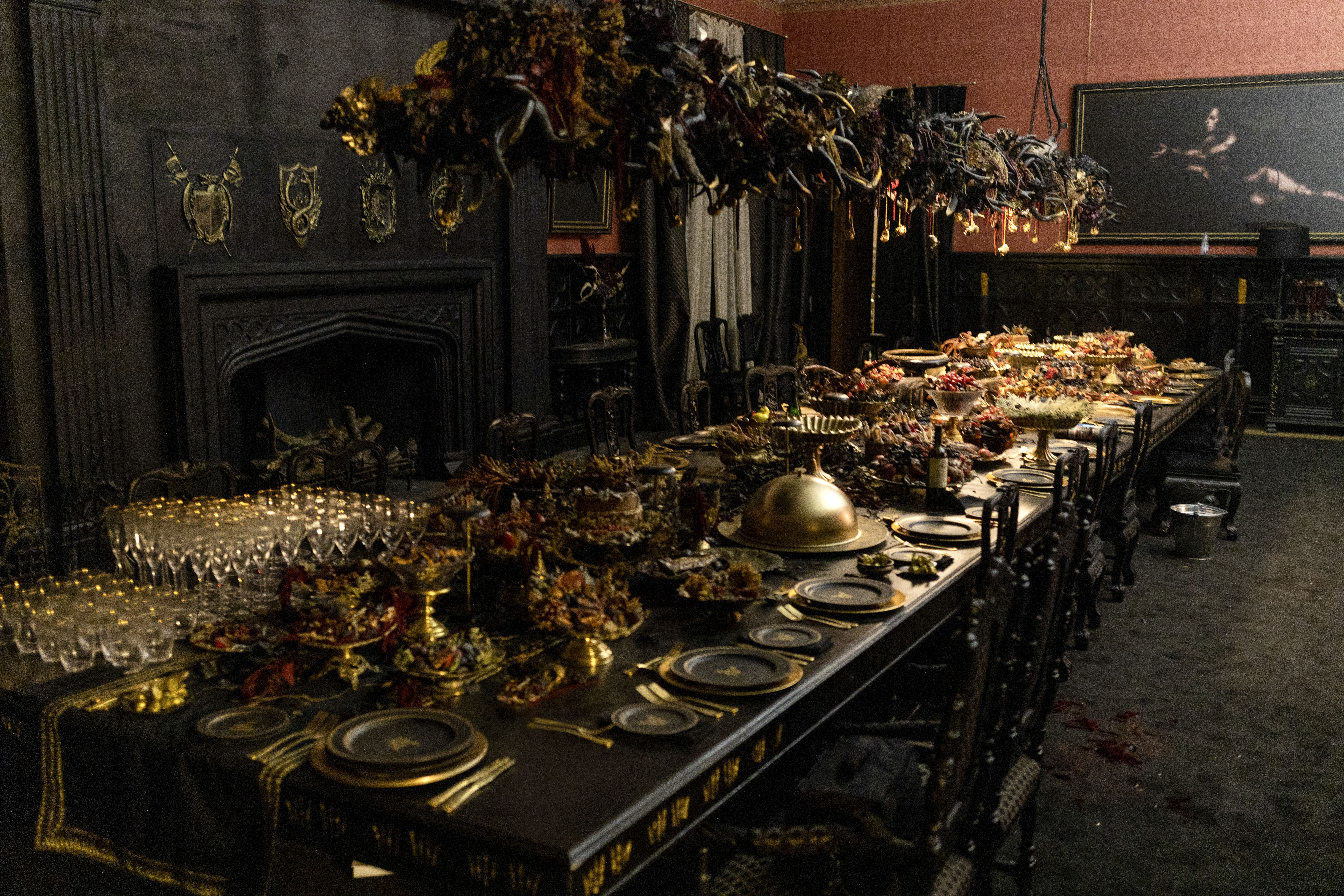
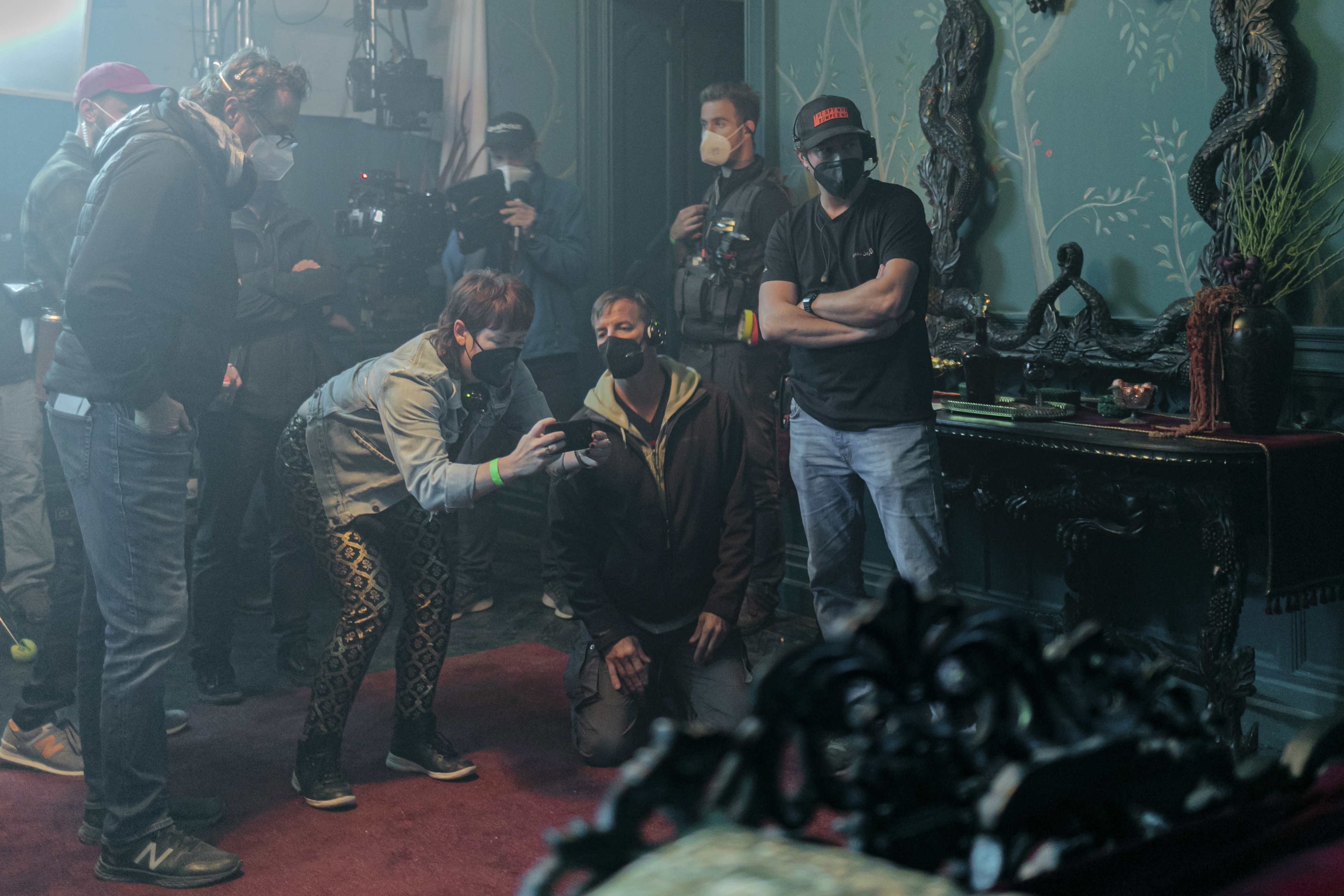
Recognizing the importance of the scene — which was shot on location in a partial set built over the course of three days — Eakin approached the sequence with a thoughtful yet dramatic approach. “Normally as a cinematographer you think, ‘Okay, cool, dinner party: We’re going to have 12 people sitting around a table, there’s a main key light over the top, and then you just get coverage, coverage, coverage,’” Eakin says. The Invitation’s dinner party, however, required something more: The cinematographer estimates that the setup included about 25 to 30 guests, all in intricate costumes and masks, surrounded by elaborate production design that begged to be seen. “I just wanted to get out over the table,” Eakin says. Doing so led her to use “a lot of jib arm, and specialty lenses — particularly a Lensbaby.”
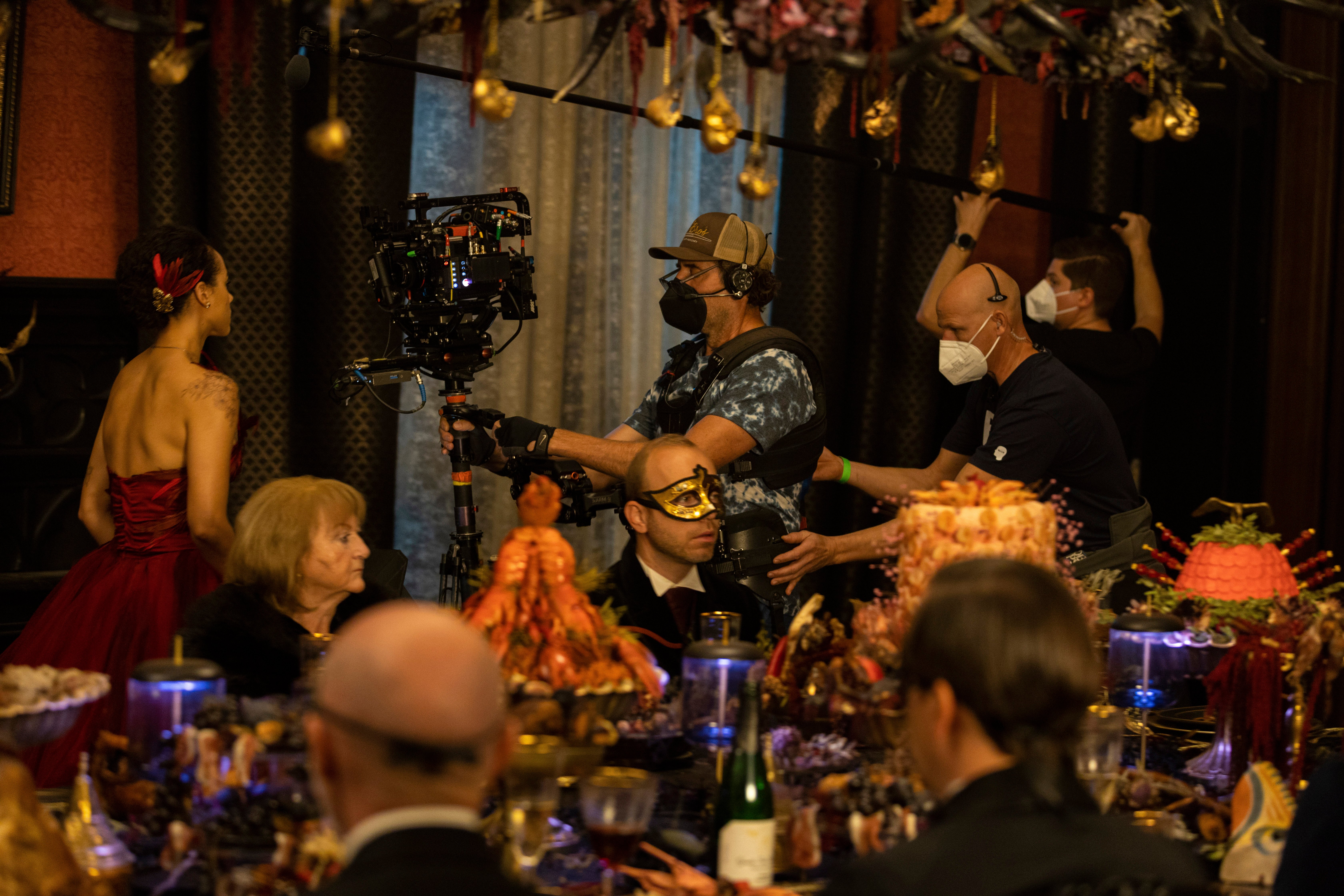
Throughout the film, Eakin used the Arri Alexa Mini LF as her A camera and a standard LF as her B camera, in combination with Arri Rental DNA LF lenses. “I was looking for something that had a clean quality but still had character,” Eakin says. “I like the way the DNAs render faces, and the fall-off as well.” Eakin also used the Lensbaby Composer Pro — a 35mm and 50mm — at various points during shooting, including “the moment when Evie realizes she’s trapped in a nightmare of false pretenses.”
Doherty’s character, Walter, undergoes a significant transformation during the dinner party. “Up till that point, we want you to believe that Evie is falling head over heels for this guy, so I wanted to shoot Thomas — this very chiseled, handsome gentleman — in a way that would help the audience feel him making a transition visually,” says Eakin. “So, we shot him with a wide lens and went tight on his face — using a 29mm DNA lens.”
Throughout the film, Eakin adopted the somewhat unorthodox strategy of using wider lenses when capturing close-ups of Emmanuel. “Because of the beauty of the locations and production design, I wanted to be able to see around her, even in close-ups,” Eakin says. This choice also furthers the sinister fairy-tale tone of the film, making Evie seem surrounded — at times, even dwarfed — by her ominous environment.
Shadows and Darkness
In dressing the set for the party scene, the production-design team installed an enormous elk-horn chandelier over the dining table. One of Eakin’s major innovations was to rig the chandelier to serve both a practical and decorative purpose. “It spanned most of the table, which was probably about 15 feet long,” she recalls. “I had production design and my electricians work together to hang something that could be seen on camera and still work as my main lighting source. Gaffer Gábor “Hevke” Hevesi worked with production designer Felicity Abbott and set decorator Zsusi Sipos to rig seven or eight LiteMatPlus 2L units within the long chandelier, and the art department embellished the edges with garish garnishings to help add visual interest while hiding our units.”
To enhance the dinner’s ambience, Eakin also deployed Jem balls for underlighting, as well as SkyPanel S60s positioned “only on the ground since we were shooting in a historical location,” she says. “In general, I wanted soft, soft lighting for the film that would then get harder when we were less in the fantasy world,” she says, “but the dinner party is a transitional point. I wanted the lighting for the dinner to make that scene feel like it was wrapped in a velvet blanket. I just made a choice to double- and triple-break with frames of muslin and 250, even though the SkyPanels and Jem balls we utilized were already soft sources.”
Eakin’s cinematic references for The Invitation helped guide her bold vision for the film. “I always come back to No Country for Old Men — a completely different kind of movie, but a great reference for not being afraid of shadows and darkness,” she says with a laugh. “I also looked at Gretel & Hansel, because it’s a great interpretation of the Brothers Grimm folktale that didn’t shy away from implementing bold colors.”
Recent horror films like Ready or Not (2019) and Don’t Breathe (2016) further influenced Eakin’s low-key approach. “They made me think, ‘Don’t be afraid to go too dark.’ You just need a little highlight in the eye and it’s fine!”
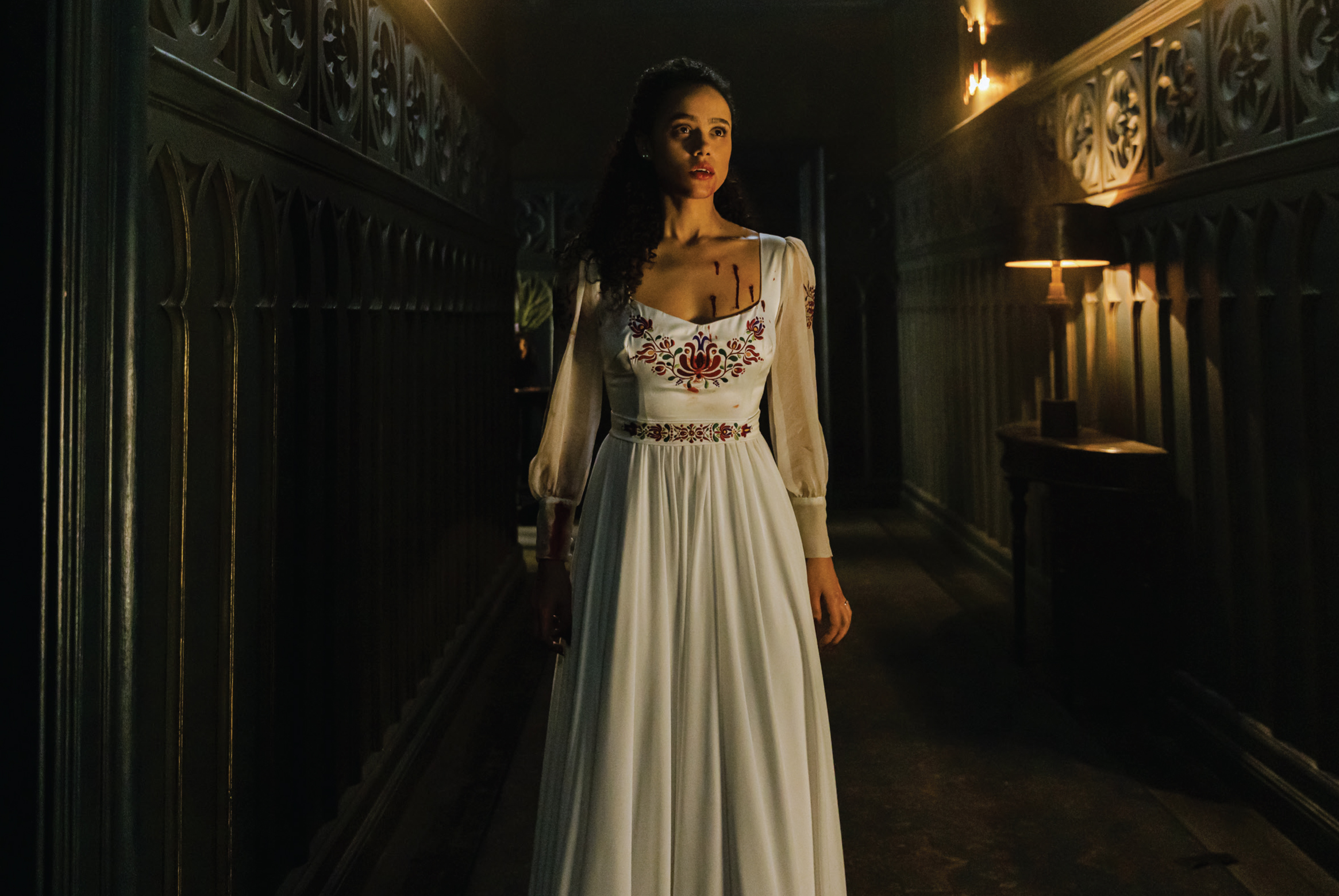
Often, the key light Eakin used on Emmanuel was simply a bi-color Jem ball that was double-diffused or double-broken, with two stages of diffusion frames in front of a fixture. “Shooting horror and shooting darker, you don’t actually need a lot of punch,” the cinematographer notes. “In fact, a lot of times we were bringing our light levels way down — like going down to two percent on the Astera tubes.”
Eakin is quick to admit that she had a great DIT, Dávid Vécsey, who would let her know “if things might be getting a little too crunchy.” If so, she and her crew would raise the levels slightly, knowing she could bring them back down later in the DI. “David kept me in line and wouldn’t let me get too ‘blocky in my blacks,’ as he liked to say,” she notes. “He would watch my contrast levels, and if he was worried, I knew I should be, too. So I would raise the lighting levels slightly to protect myself.”
Lasting Partnership
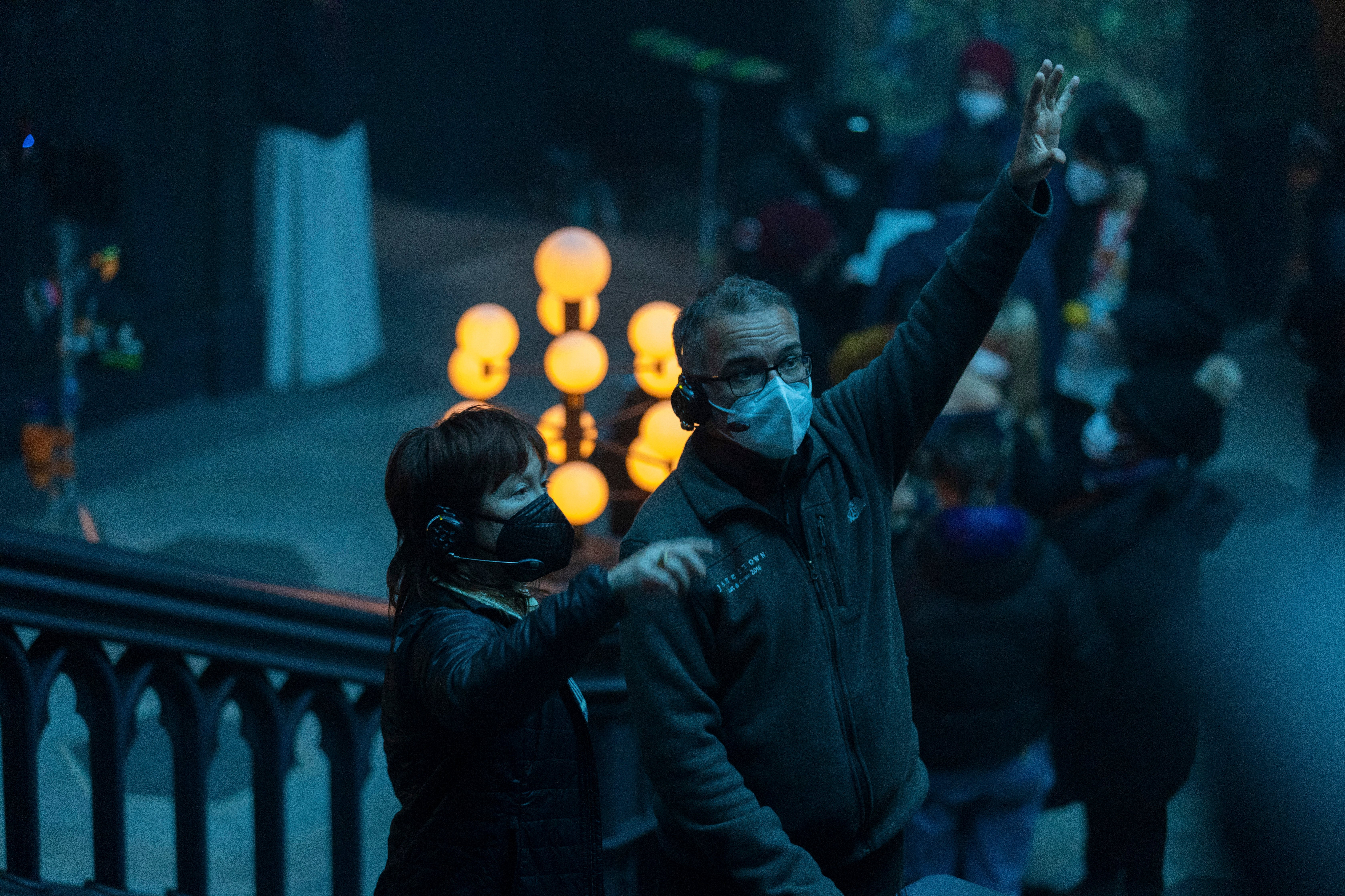
Eakin had a great ally in Thompson. The filmmakers met a decade ago while working on Liz Garbus’ 2012 documentary Love, Marilyn. On that project, Eakin served as a camera operator under her mentor Maryse Alberti (Creed, The Wrestler), while Thompson was an associate editor. “Unbeknownst to me, Jessica had been kind of stalking me since we first worked together on Love, Marilyn,” Eakin recalls with amusement. Thompson closely monitored Eakin’s career, and in 2016, she enlisted her to shoot The Light of the Moon — the writer-director’s debut feature, which had its world premiere at SXSW 2017 and went on to win the festival’s Audience Award.
“We tend to have the same sensibilities, so on The Invitation I never had to fight hard for a different kind of angle, or anything that was a bit weirder,” Eakin says. For example, Thompson was open to changing her mind when Eakin suggested other ideas, such as shooting in the 1.85:1 aspect ratio instead of in 2.39:1, or anamorphic. “Usually, it’s the cinematographer pushing for a wider aspect ratio, but I lobbied for 1.85:1. We had such beautiful sets and builds that it felt like we would lose some of the film’s grandness and production value if we had less verticality in the frame.”
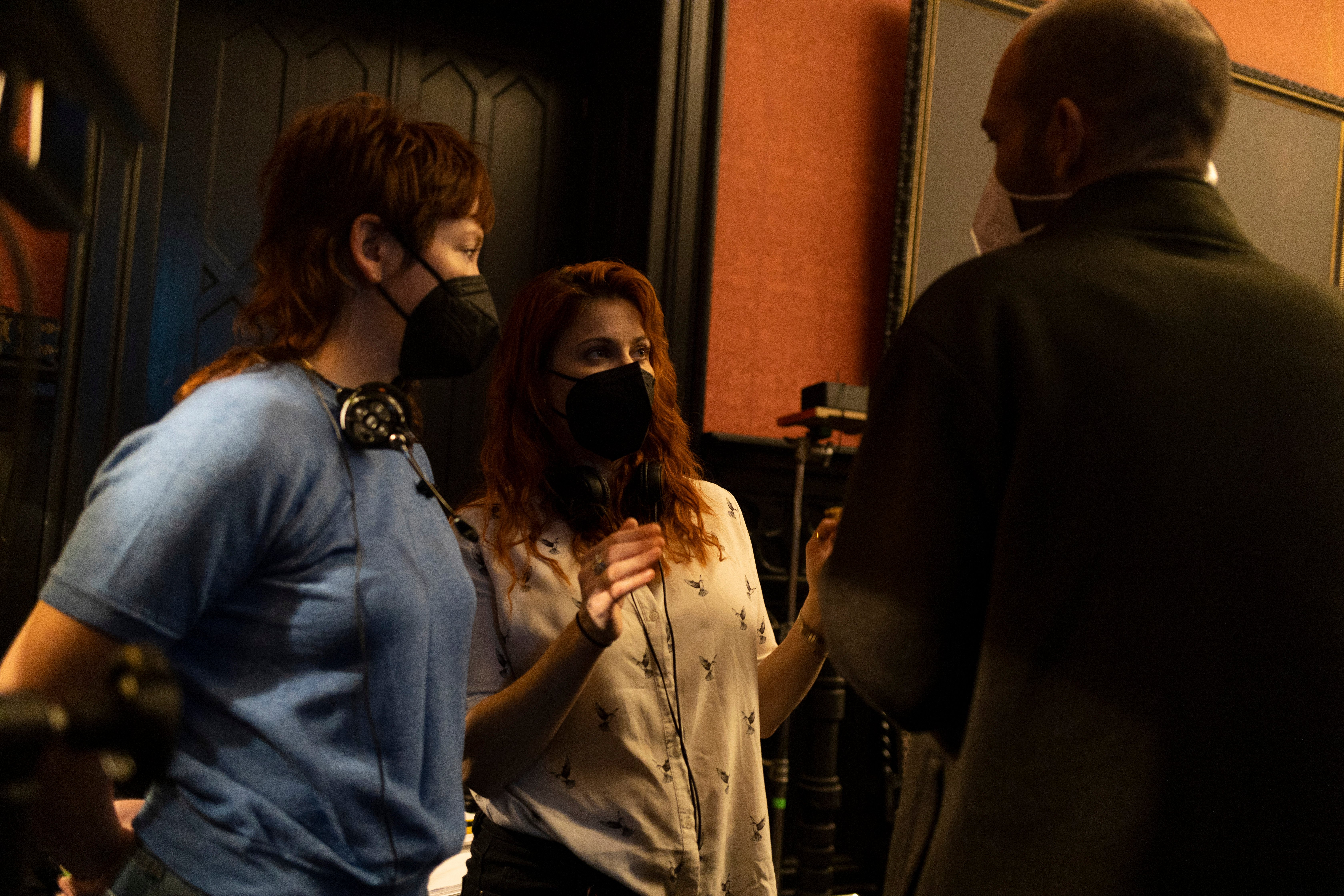
Tech Specs: The Invitation
1.85:1
Cameras | Arri Alexa Mini LF, Alexa LF
Lenses | Arri Rental DNA LF, Lensbaby Composer Pro
Men | Birthing a Horror Scene
By Mark Dillon
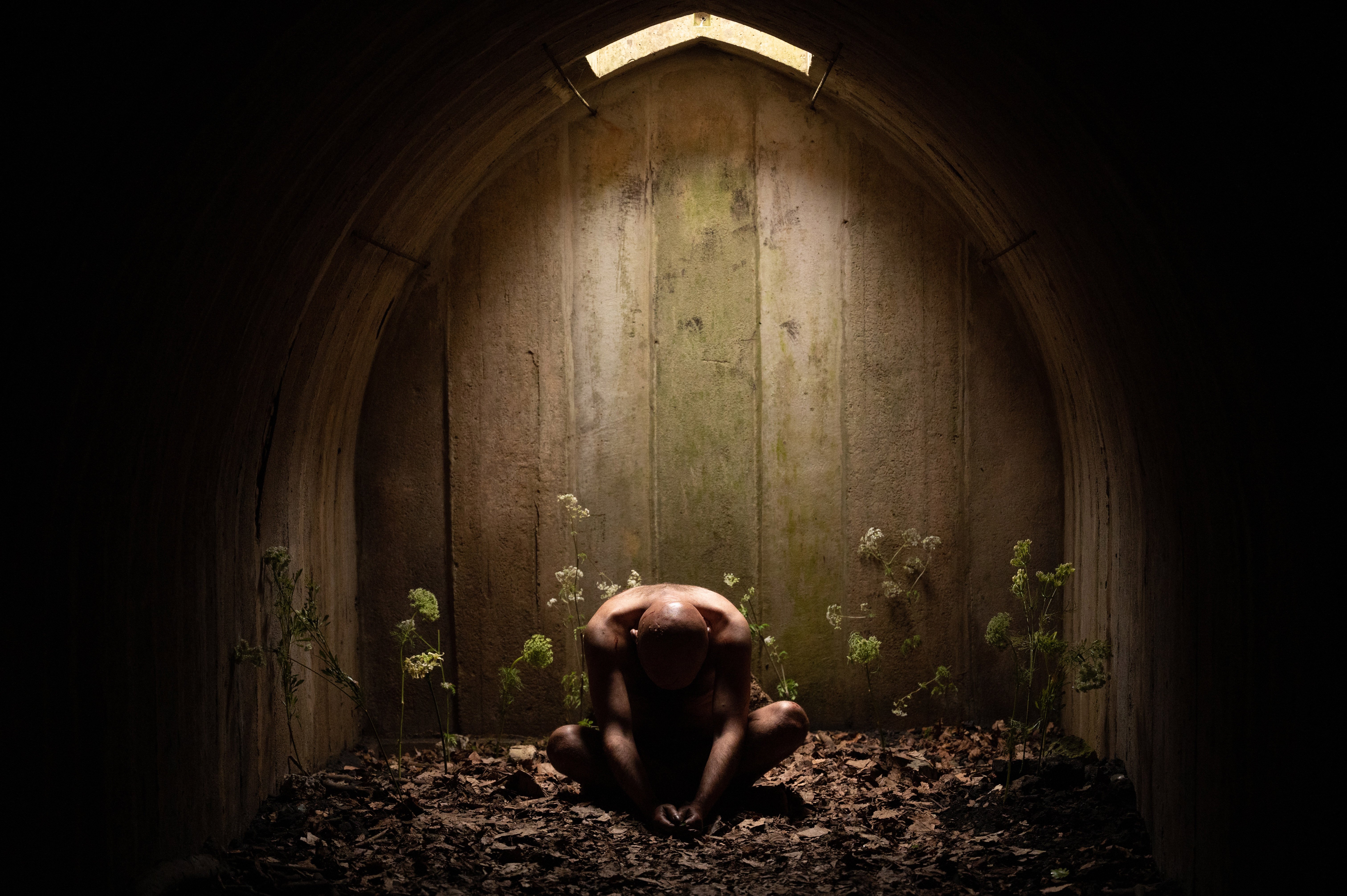
The British feature Men takes the viewer into a strange and visceral place through a combination of old-school prosthetics, visual effects, and the careful lighting plan of cinematographer Rob Hardy, ASC, BSC.
Men is the latest collaboration between Hardy and writer-director Alex Garland, following the recent sci-fi series Devs (AC July ’20) and features Ex Machina (AC May ’15) and Annihilation (AC March ’18). The psychological horror film follows Harper (Jessie Buckley) as she grieves the sudden death of her husband, James (Paapa Essiedu) — whom she intended to divorce — and rents an English country home from its nattering owner, Geoffrey (Rory Kinnear).
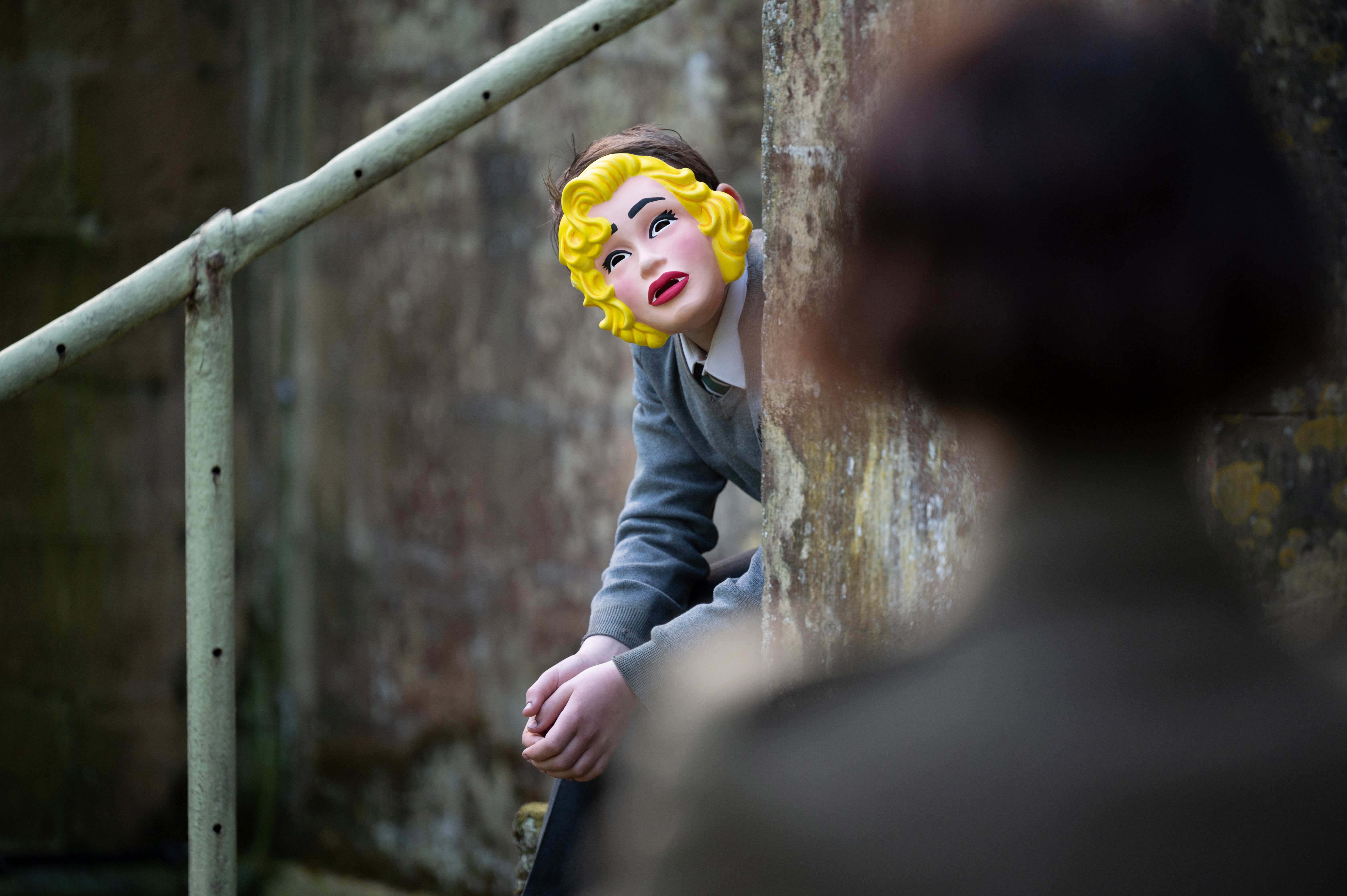
The idyllic setting is spoiled by Harper’s disturbing encounters with various men, including a strange naked man in the woods, an unsympathetic police officer, an aggressive nine-year-old, and a vicar who blames Harper for her husband’s passing. (Adding to the weirdness, each of these characters is played by Kinnear — with visual-effects studio Framestore replacing young actor Zak Rothera-Oxley’s face with Kinnear’s, and adjusting the features to match the boy’s head shape and complexion.)
Another Realm
One particular scene takes the story into another realm of surrealism. At night, Harper is attacked at the house by a figure that shifts into the forms of the men who have confronted her. She tries to escape, but finds herself being chased by her own car until it crashes into a stone pillar on the estate grounds.
The naked man — now transformed into a demonic, foliage-masked “Green Man” — emerges from the hedges and, right before Harper’s eyes, plops down with a suddenly gigantic belly. From an orifice, he births the boy seen earlier … who, in turn, births the vicar … who crawls after Harper into the house and births Geoffrey … who finally births James.
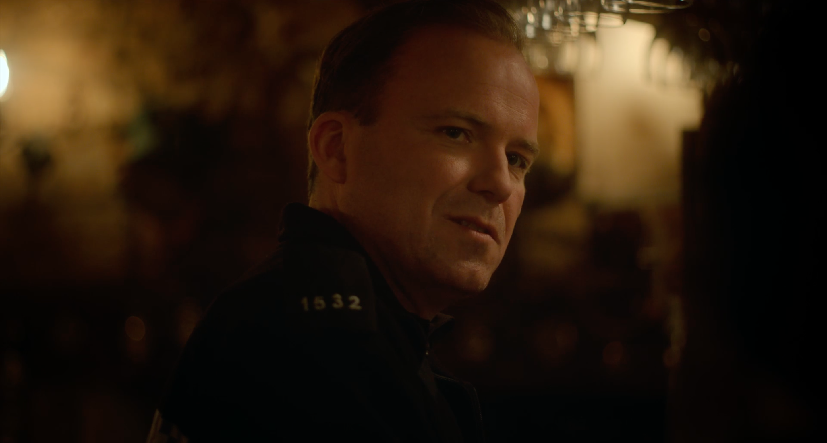
“Everybody loved the idea, so it [became] a case of exactly how to do it,” Hardy recalls. “We were shooting nights, and May nights in the U.K. are short. Each night had six hours to shoot this complex sequence. We knew there would be a hand-off between special effects and VFX, or a fusing of the two. So, there was always something physical for the actor to interact with and for VFX to hang onto.”
Imposing Entrance
The Green Man’s entrance was backlit by Fiilex Q8 Color LEDs motivated by the car headlights. Gaffer Jonny Franklin notes that the units “could match the color of the headlights using x, y coordinates,” and could also match the headlights’ hard beams, since the Q8 is a Fresnel-style fixture.
The crew used three suspended light boxes containing Creamsource Vortex8 LEDs to create ambient moonlight using a combination of the units’ daylight and tungsten hues.
“We would turn on one light box at a time depending on the camera angle,” Franklin says.” Close to the camera, the crew used the Vortex8s through Full Grid Cloth frames — or, more rarely, Astera tubes through diffusion — “to help lift the actors faces,” but try and maintain as much contrast as possible.
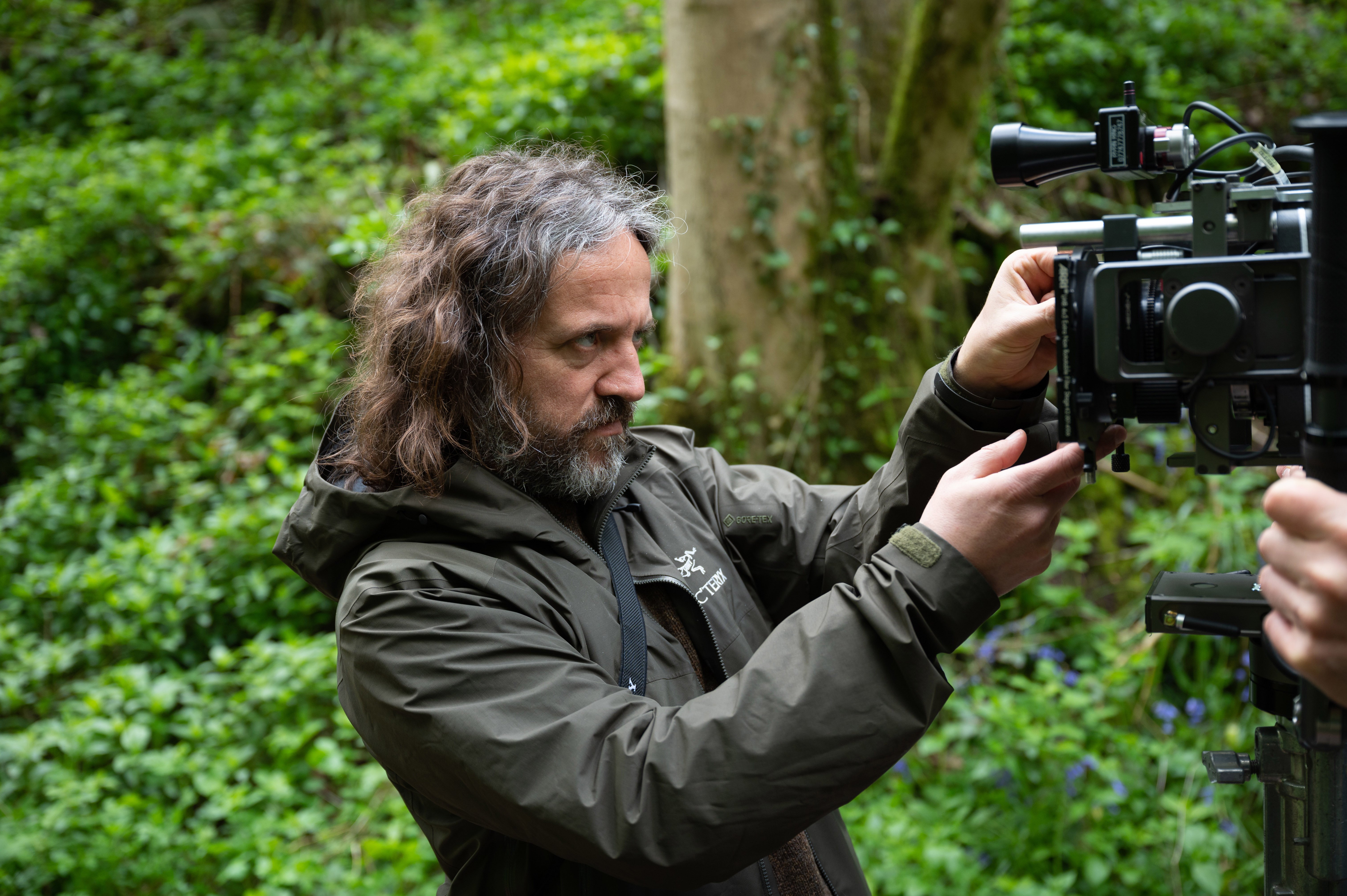
Frightening Exteriors
After the Green Man drops to the ground, the scene cuts to a close-up of his belly (made by prosthetics designer Tristan Versluis), out of which the boy emerges, crawling across the shadowy lawn. As he stops and gets to his knees, the house security lights flash on, revealing his face and another very pregnant belly.
Providing that source were a combination of 650-watt, 1K and 2K tungsten floodlights, which were “standard hardware-store-bought security lights,” Hardy says. “I liked the authenticity of them.” When the camera faced away from the house, Vortex8s were used for enhancement. “My idea was to have a different ‘light state’ for each birth,” the cinematographer notes. “The harshness of the backlight moves into something moodier, then opens up into the white light from the security lights — something so stark that the viewer can’t look away.”
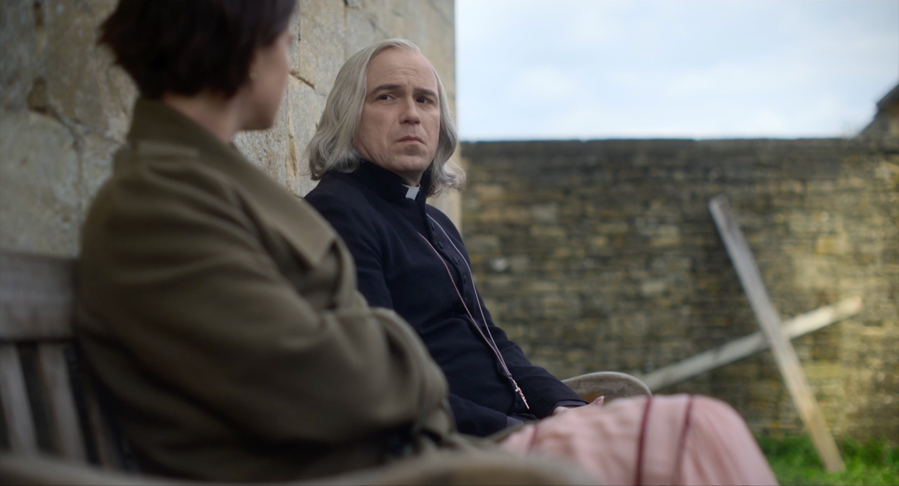
For the vicar’s birth, Kinnear, covered in K-Y Jelly and fake blood, stood in a trench underneath the boy’s supine prosthetic belly, from which the actor surfaces. (Visual effects added detail to augment the gruesomeness.) For Hardy, capturing this sequence recalled the golden era of practical effects in such films as John Carpenter’s The Thing (1982, shot by Dean Cundey) — a movie he calls a key influence — and also reminded him of how challenging working with practical effects can be. “The hole was too deep, so when Rory stood up, [only] his head would appear from the belly,” Hardy says. “The belly was also too small. We had to cut into it, fashion a larger version, and cover it with blood — real seat-of-your-pants kind of stuff.”
As the vicar appears, the security lights dim. “Now, he’s a bit more backlit and there’s a much softer light coming from the house,” Hardy notes. “It felt more elegant for another quick transition.”
In the House
The filmmakers wanted each birth to top the previous one. The next one occurs in the house — its red-painted walls illuminated by practical lamps and sconces — as Harper retreats inside, dumbfounded, and the vicar slowly crawls after her.
Hardy framed Buckley sharp in the foreground and Kinnear soft as he crawls through the doorway behind her, to draw viewers’ attention to our hero as she processes these inexplicable events.
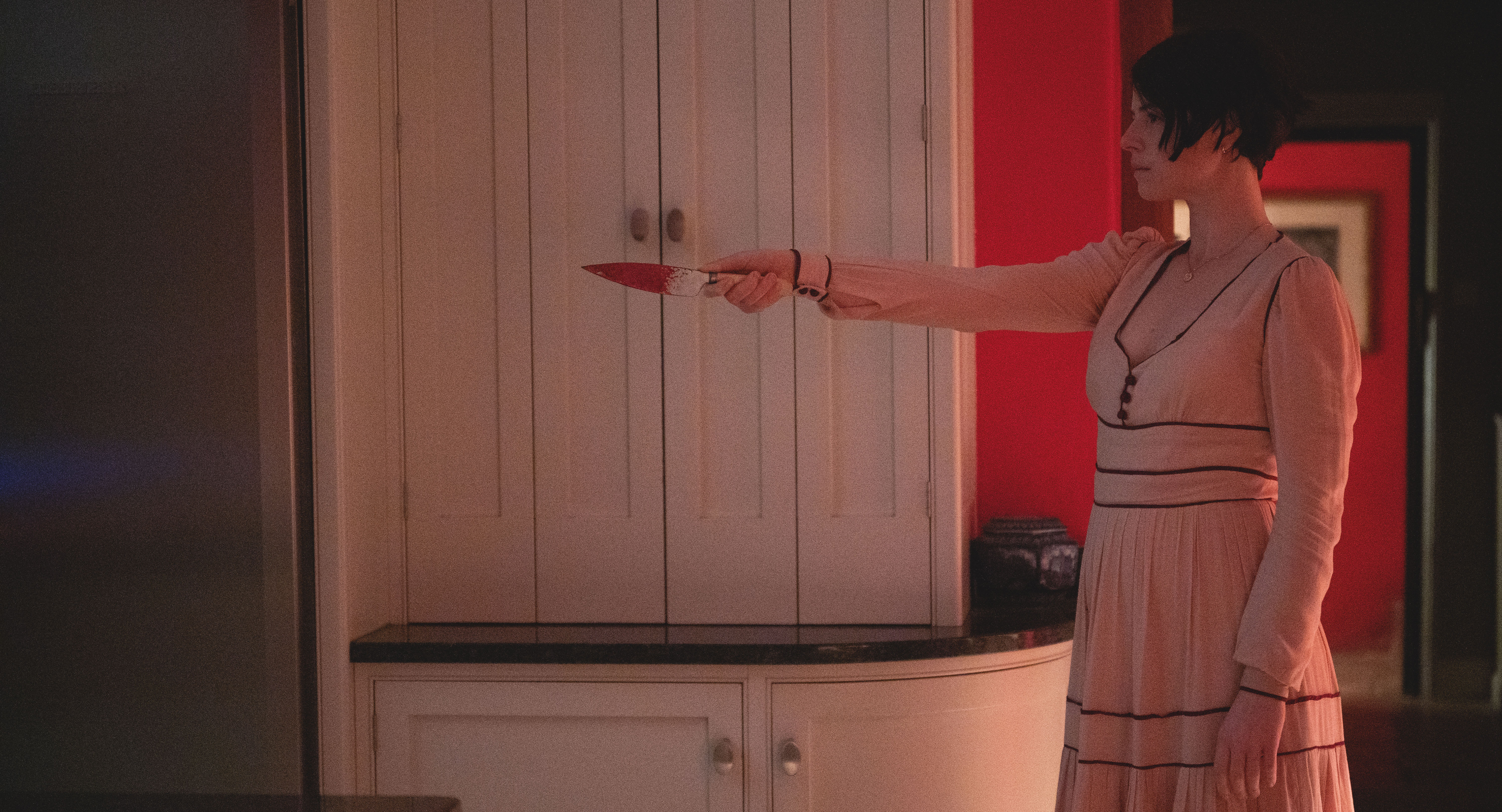
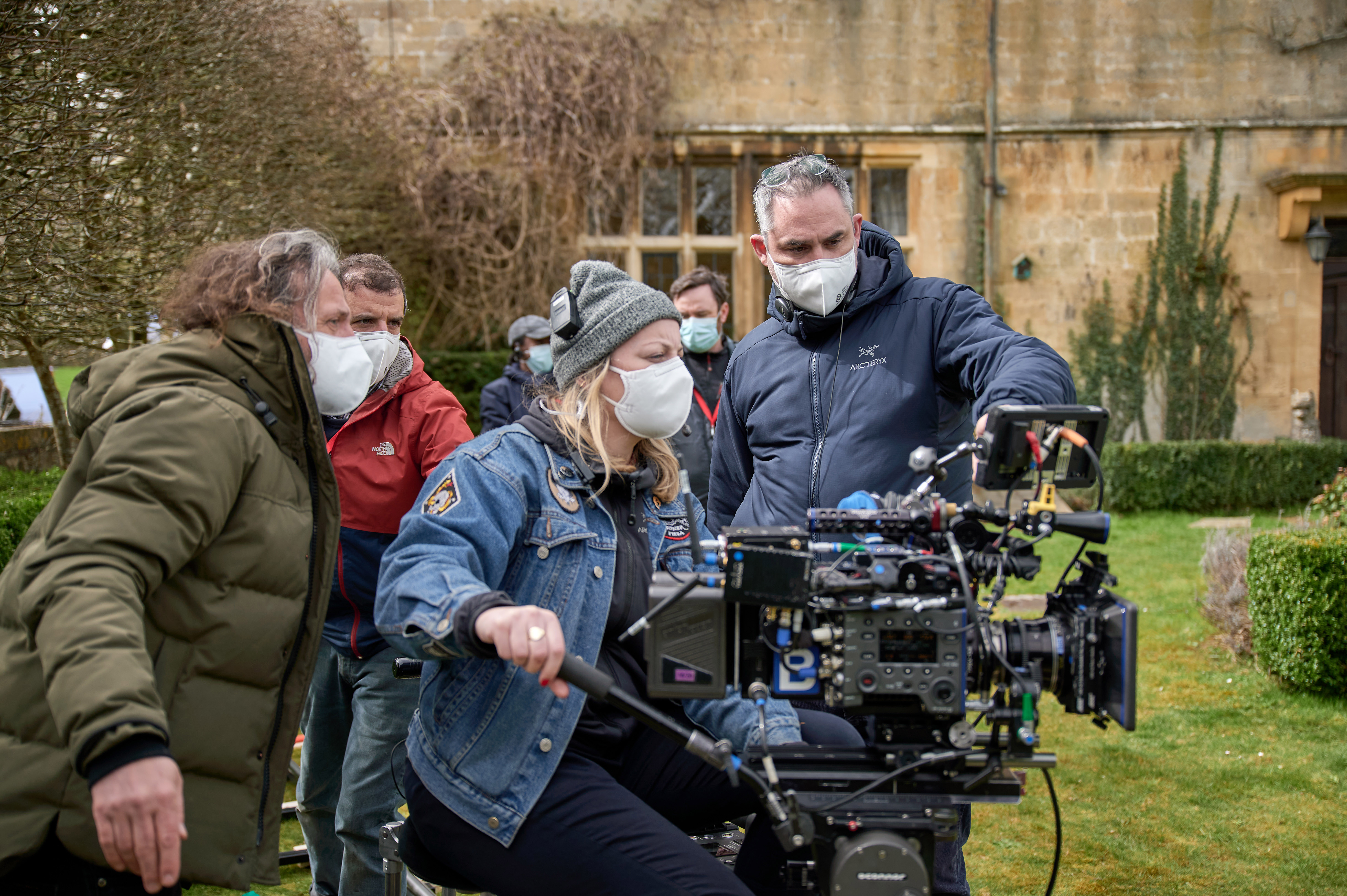
The vicar stops and, on all fours, births Geoffrey through the back of his neck — an effect that was largely achieved with VFX. Designing this segment required close collaboration with visual-effects supervisor David Simpson of Framestore. “I remember a lot of Zoom calls with VFX back in London in preproduction and the references that were coming out,” says Hardy — who shot Men primarily with Sony’s Venice, paired with Panavision H Series lenses (the 35mm and 55mm being his go-tos), and used the Sony Rialto option when employing a Stabileye rig.
Slow Reveal
The final phase of the scene is the breach birth of James. A pair of feet and shins emerges — from Geoffrey’s mouth — after which Geoffrey collapses behind the doorway in the hall and out of Harper’s view. After a pause, a fully formed James appears and walks into the room toward her — a clever way to not show the complete birth.
For this segment, the filmmakers obscured the action to keep audiences guessing. As the birth of James commences, “I wanted [Kinnear] to be in shadow, and as he moves forward, he would lean into light being emitted from the living room,” Hardy explains. “He’d move back and forth, so you aren’t quite sure what you are watching, and it would slowly reveal itself.” Franklin recalls that the crew had to be inventive within the cramped location, precisely placing practical lamps and mounting interconnected LED panels to the ceiling between its wooden beams.
Due to the logistical constraints of practical effects, Hardy notes, this birth was the most VFX-heavy section of the sequence. “There were some prosthetic feet we could hold up as a reference for light, but we never shot them. We just had Rory acting as if something was emerging from his mouth.”
Quiet Reflection
The result is a sequence that will likely have viewers talking for a long time — or perhaps, Hardy suggests, not at all.
“At the beginning of this process, Alex said to me, ‘I want to make the kind of horror movie that, when a young couple leaves the cinema, they vow never to speak about ever again,’” the cinematographer recalls with a laugh. “He said, ‘If we can achieve that, then for good or bad, we’ve achieved something.’”
Tech Specs: Men
1.85:1
Cameras | Sony Venice, a7S III; Phantom Flex4K (for slow-motion work)
Lenses | Panavision H Series, Normal Speed
Crimes of the Future | Deep Cuts
by Iain Marcks
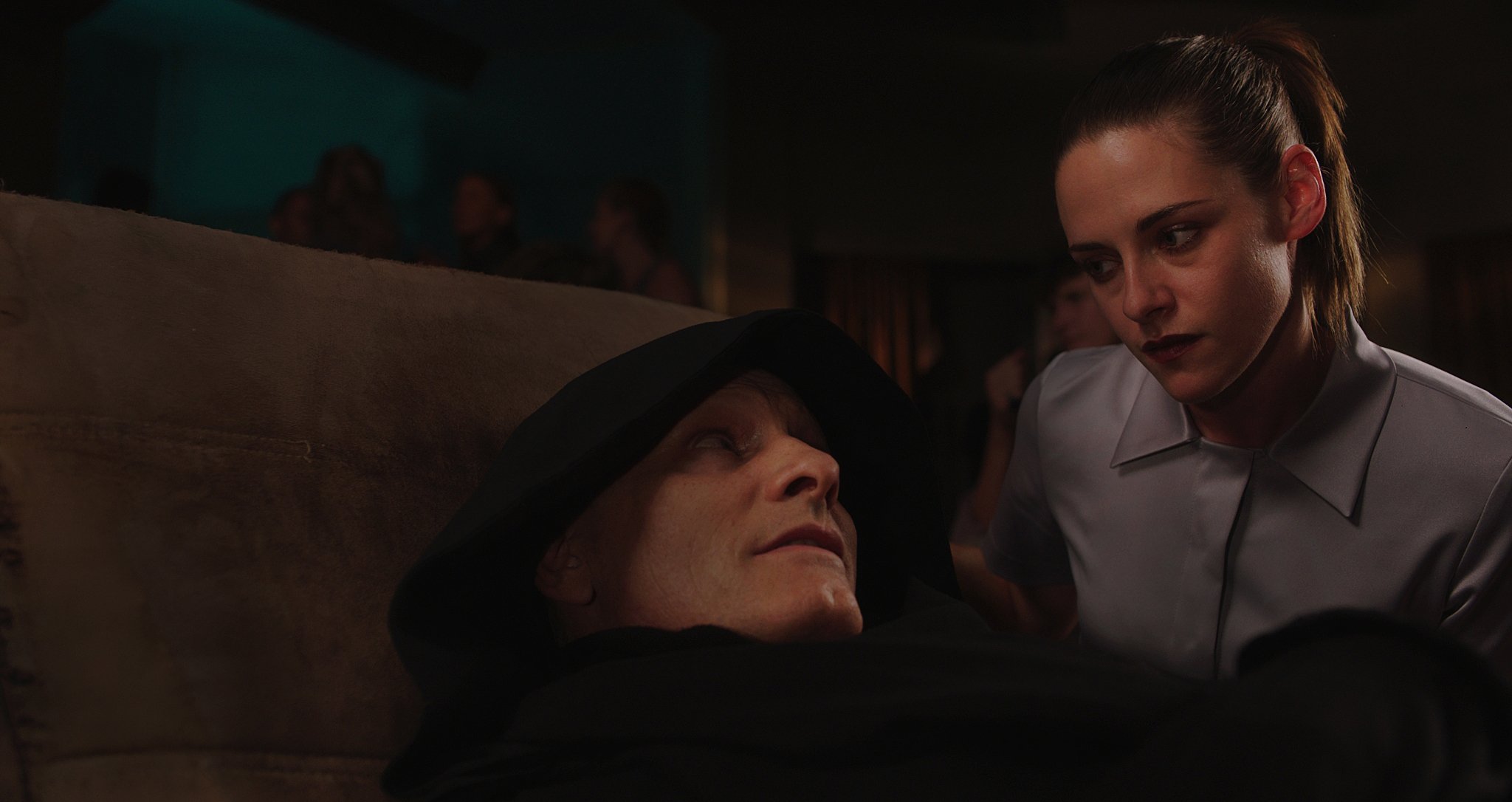
For cinematographer Douglas Koch, CSC, creating the dysfunctional dystopia of David Cronenberg’s Crimes of the Future on location in Athens, Greece, was a matter of selective framing, imperfect lighting and carefully controlled color.
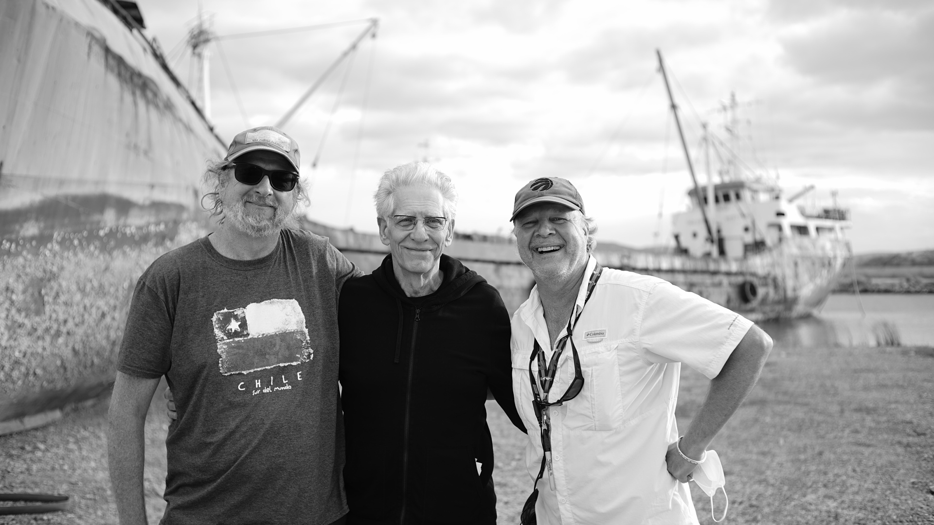
Koch first worked with Cronenberg when the director, who also acts, was playing a role in Don McKellar’s Last Night (1998), an experience that ended with the cinematographer standing over the bloody, lifeless form of Cronenberg’s character. Nevertheless, Koch was surprised when, 23 years later, Cronenberg called to ask if he was interested in shooting Crimes of the Future. Peter Suschitzky, ASC, Cronenberg’s regular collaborator since Dead Ringers, was unavailable, and the director had been impressed by Koch’s recent work on McKellan’s Through Black Spruce (2018). “It was a fairly serious film with a heavy tone,” notes Koch.
Classical and Controlled
To prepare for his meeting with Cronenberg, Koch re-watched several of the director’s films. “You pick up a lot of stuff, and it gives you some common ground to talk about things,” he says. Koch describes Cronenberg’s visual style as “classical,” with a preference for spherical lenses and controlled, deliberate camera moves. “You won’t find handheld shots in any of his work, not even POVs,” says Koch. “He said to me, ‘I don’t want the camera to be so self-conscious.’
“Two of my favorites of his are Naked Lunch and Spider,” the cinematographer continues. “I went back to those because I liked the way they were shot, and I thought they might be close in tone to what Crimes of the Future could be. One thing I really loved about Spider was the use of wider lenses in close-ups; you can read the actors’ expressions, and you can also feel their body language and a bit of the environment. Naked Lunch has these really interesting narrative tones that shift throughout the film. It’s funny, then it’s freaky; it’s science fiction, then it’s a detective story.”
Return to Sci-Fi
Crimes of the Future marks Cronenberg’s return to science fiction after a 23-year hiatus from the genre following eXistenZ (1999). The story is set in a future wherein climate change and biotechnology have significantly advanced, and humans’ vulnerability to pain and infectious diseases has all but disappeared. Some people, like performance artist Saul Tenser (Viggo Mortensen), have begun to evolve new internal organs with mysterious functions. Others, known as “evolutionists,” have modified their organs to digest toxic waste. Tenser and his partner, Caprice (Léa Seydoux), take advantage of his mutation by staging public surgeries to remove presumably vestigial organs, and when they are approached by Lang (Scott Speedman), the leader of an underground evolutionist cell, with a grim request, they are drawn into a game of intrigue.
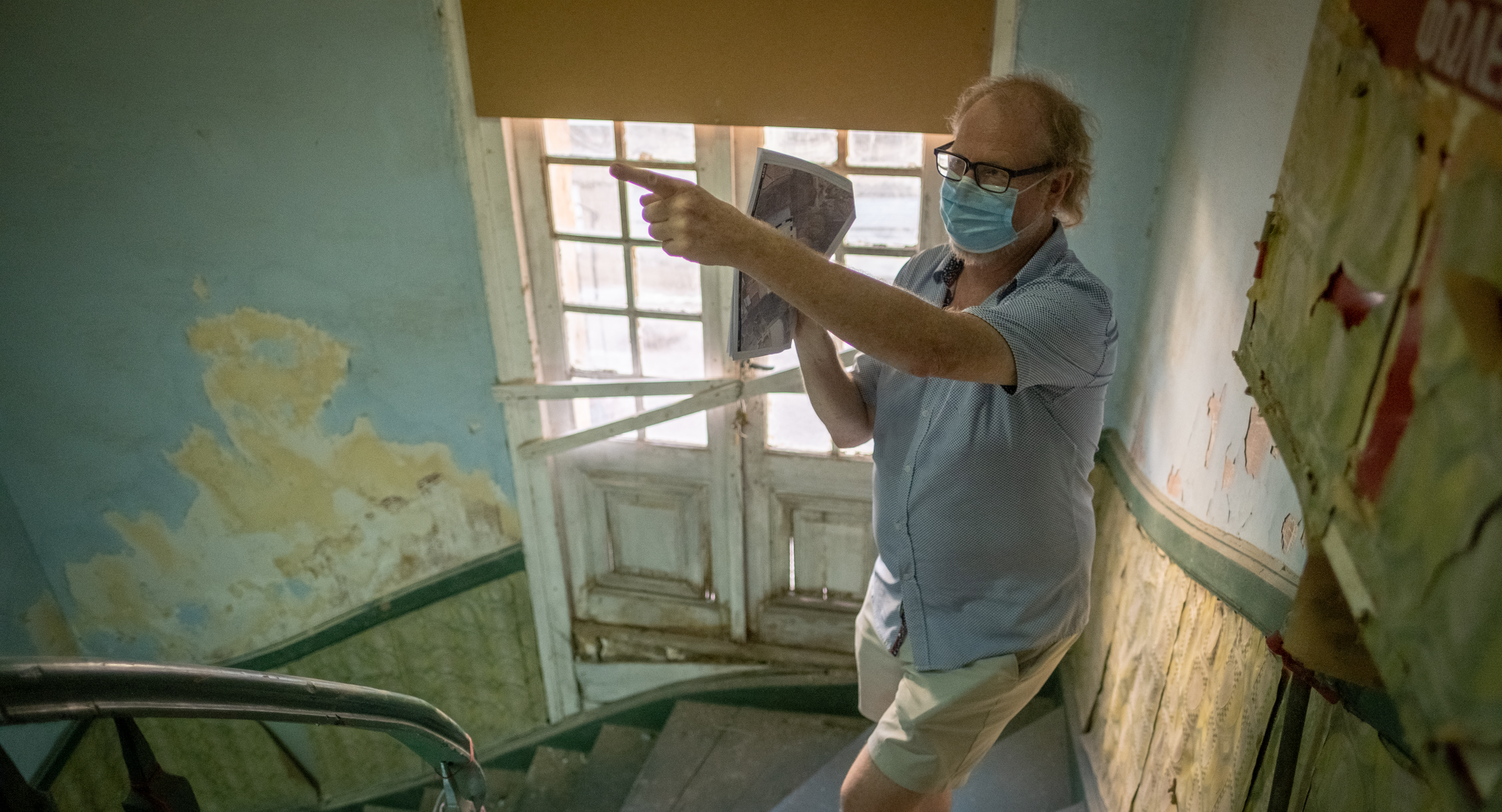
The film was shot mostly on location in Athens and at Kapa 2 Studios in Markopoulo over the summer of 2021. “The reason Greece was initially suggested was purely financial,” Koch says. “Then David was shown some films that had recently been made in Athens — in particular, the excellent Pari by Siamak Etemadi — and this convinced him [our film] could be done there. The place has a neat vibe to it, a combination of classical architecture and industrial decay.”
Selective Views
Cronenberg wanted the world of the film to appear dysfunctional and dystopic, devoid of slick technology and skinned with low-resolution industrial and biomechanical textures. One way to achieve this, says Koch, was to limit what the camera saw without calling viewers’ attention to any elements that were missing. “It was a matter of getting rid of things that didn’t fit in the world,” he explains. “In fact, we weren’t even going to see a lot of people. There’s the audience that shows up for the performances; there’s the evolutionist cell, and there are the people cutting themselves and each other in the alleyways. That’s it.”
In the decrepit boat graveyard where Tenser has furtive nighttime rendezvous with government agent Cope (Welket Bungué), Koch found himself framing out anything that hinted at the slightest functionality. “There was this gigantic, Blade Runner-esque oil refinery off to the right when you’re facing the sea, and the ships were all in silhouette,” he says. “We could have staged those scenes beautifully with the two men under the ships, but as tempting as that was, David thought it would have looked too functional for the world we were creating.”
Lighting for Dysfunction
Koch also had to consider how lighting could underscore the strangeness of this world. For instance, an early scene in the script described a character in her room, staring into the distance by the light of a television. This prompted Koch to explore a moody TV glow that Cronenberg ultimately vetoed, as it implied a normally functioning broadcast signal. “Instead, ” Koch says, “I created low-level lighting motivated by a few practical lamps in the space.”
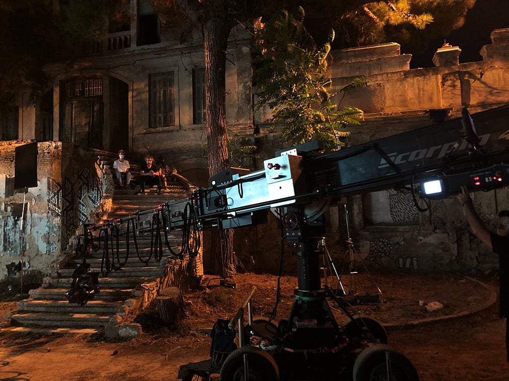
Likewise, Tenser and Caprice’s industrial performance space, filmed on location at Athenian University, needed to look “found” rather than bespoke. Koch recalls, “I asked David about this in prep, and after he thought about it a little bit, he said, ‘You should light the scene, but it shouldn’t look like they have their act together.’”
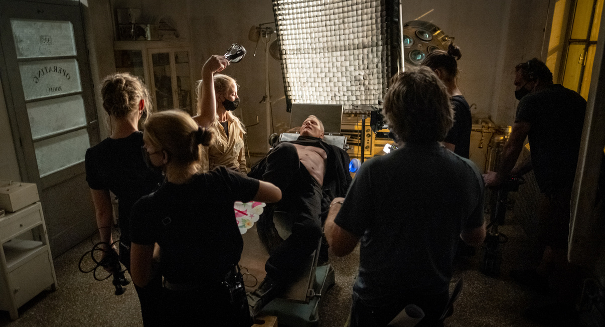
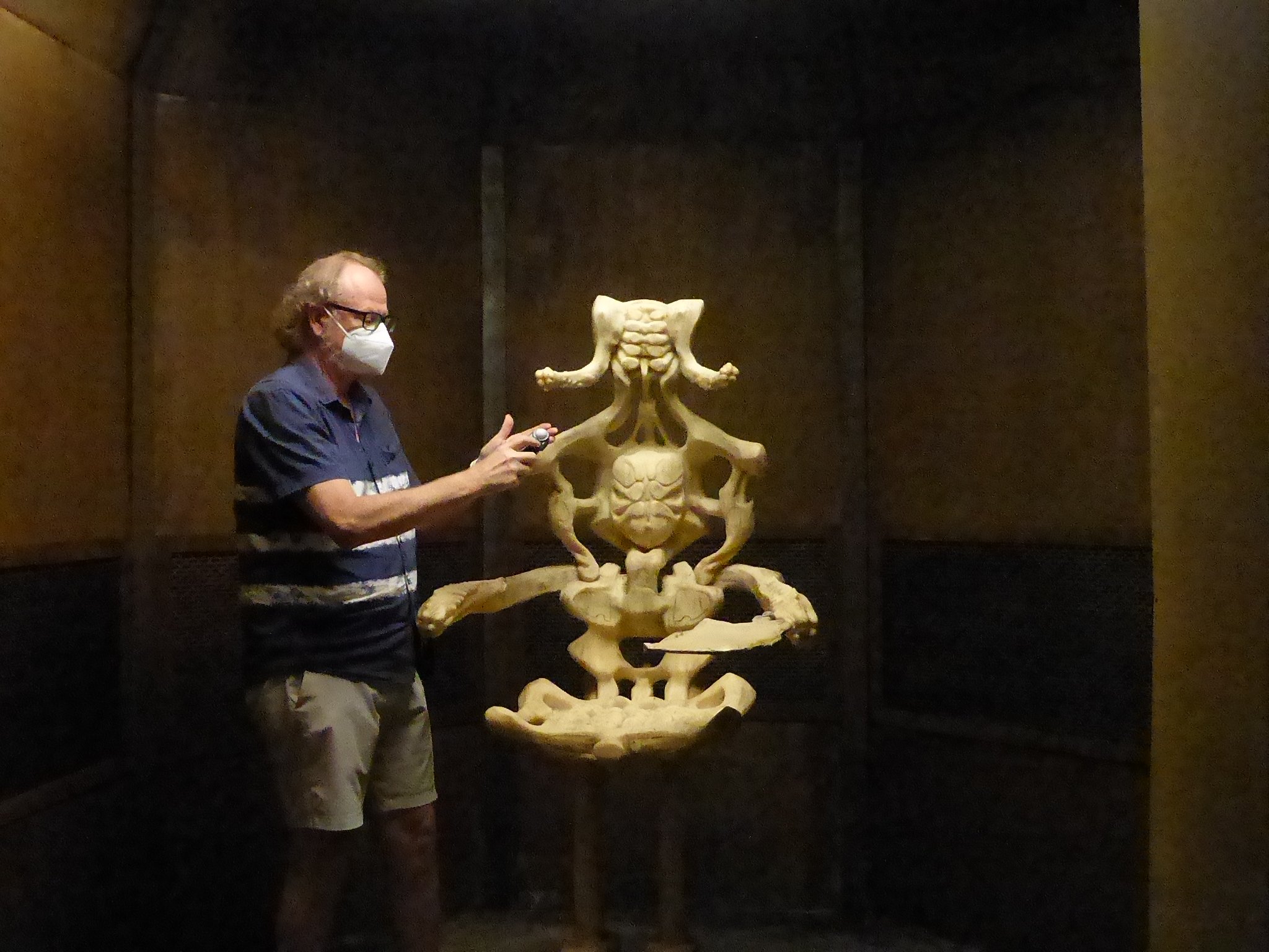
Koch made it a point to avoid obviously theatrical lighting, “although, ironically, some of this look was achieved with carefully focused ETC Source 4 ellipsoidal fixtures and gobo patterns to create warm tungsten spots on the audience in the galleries,” he says. “The main performance area was lit by dimmed overhead soft boxes, and Caprice was to look as if she were lit by the glow of the SARK, Tenser’s strange surgical pod. For that effect I used a mixture [of units] depending on the setup; sometimes we used diffused LED strip lights hidden in the SARK, but really I was just using more conventional lighting techniques.”
For some of the surgery sequences, the filmmakers employed endoscopic cameras purchased by the production’s prop builders. “We played with them and liked them, so we got our DIT and AC to figure out how we could record [with] them. We experimented with different high-end LEDs that we could put on the front of the surgical arms to create the kind of shadowless work light used in endoscopy.”
“Black on Black on Black”
This selective approach extended to the use of color as well. Production designer Carol Spier adopted Athens’ structural palette of neutral colors for the film, adding earth tones inspired by the Grecian landscape, sea blues after the Mediterranean waters and the rusty amber of post-apocalyptic ruin. Koch’s methodology was based on the tungsten, fluorescent and high-pressure sodium lights extant in the locations, but highly controlled, with the goal of refining the look in the final grade with senior colorist Bill Ferwerda at Company 3 Toronto. “The sodium-vapor streetlights were either turned off or sometimes modified with cinefoil to shape their spread,” Koch explains.
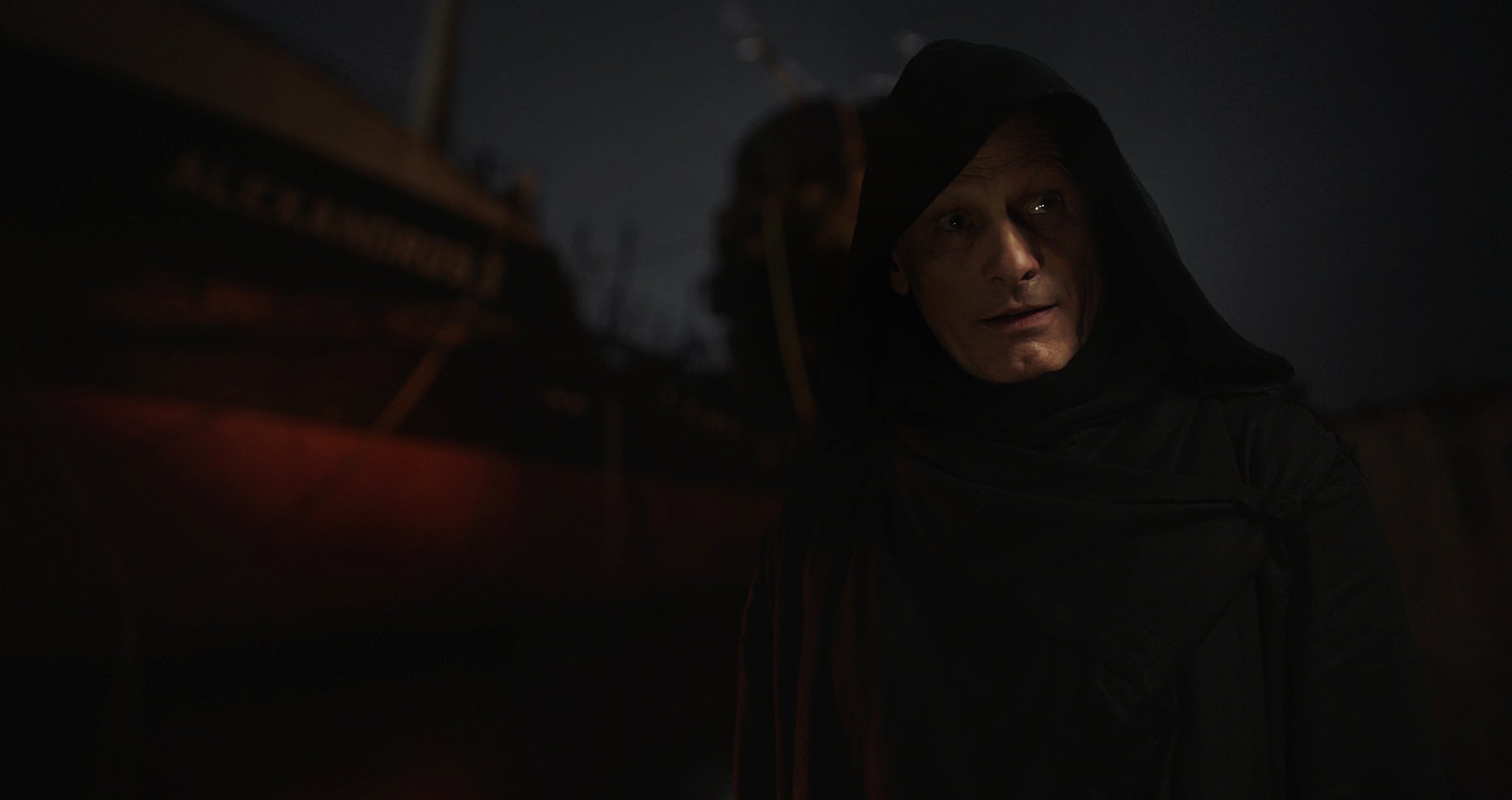
“A lot of the film was shot at 400 and 500 ISO on an Arri Alexa Mini in Super 35 mode,” explains Koch, who chose Arri/Zeiss Master Primes as his lenses. “I knew a lot of scenes were just going to be black on black on black, and I’d found in testing that deliberately overexposing by about one stop on average would get you up off the noise floor. We would lower the ISO of the camera from its native 800 down to 400-500, effectively recording more detail in the shadow regions. That way, when you go hunting for details in post, you end up with a lot of information to work with.”
Koch and Ferwerda have a 30-year relationship going back to their music-video days, and Koch describes their collaboration on Crimes of the Future — which included direct input from Cronenberg — as “a very enjoyable” process.
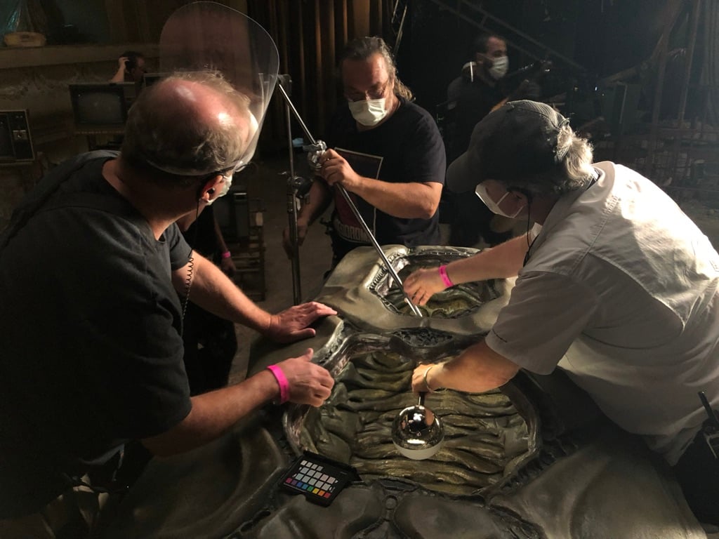
“Color-grading tools have become so unbelievably powerful,” he marvels. “What I find really amazing now is that while I’m shooting, I can light for the future, and in the grade, I can do things I didn’t have the time or the ability to handle on set with real light. Sometimes it’s just as simple as floors; when I light a scene with top light, the floors often end up brighter than I’d like, and that can be hard to control. But now, it’s easy to go in and pull it down tastefully, and the viewer is unaware of it. The trick is knowing what to spend your time on.”
The experience of making Crimes of the Future still feels like a dream for Koch. “I’ve never worked on something that was created from the ground up on every level,” he says. “When you have that degree of control over the production design, lighting and composition, you can really create your own weird world.”
Tech Specs: Crimes of the Future
1.85:1
Cameras | Alexa Mini, endoscopic medical cameras
Lenses | Arri/Zeiss Master Prime
You’ll find our related podcast with Koch discussing Crimes of the Future here.
