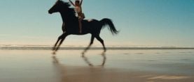
ShotDeck Drop: Sidewalk Stories
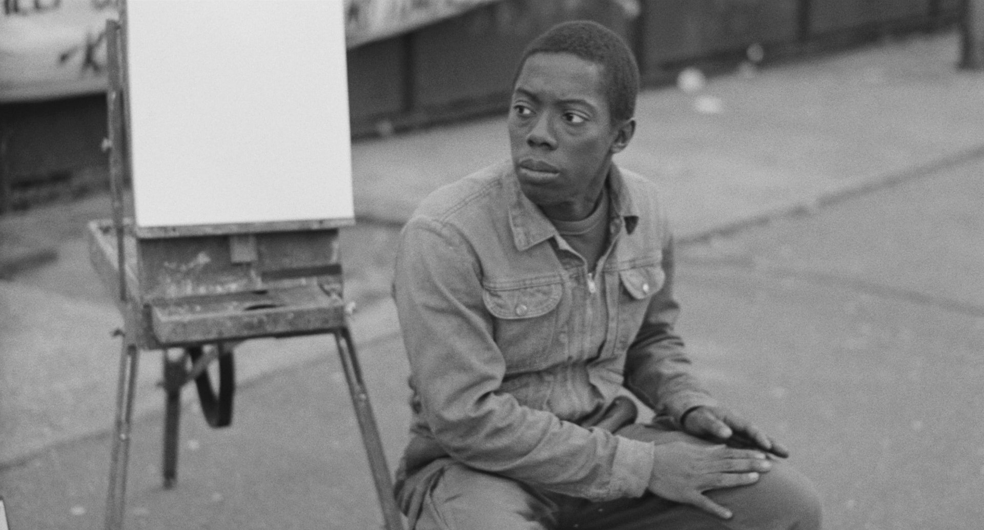
Photographed by Bill Dill, ASC and directed by Charles Lane, this homage to Charles Chaplin's The Kid has become a classic in its own right.
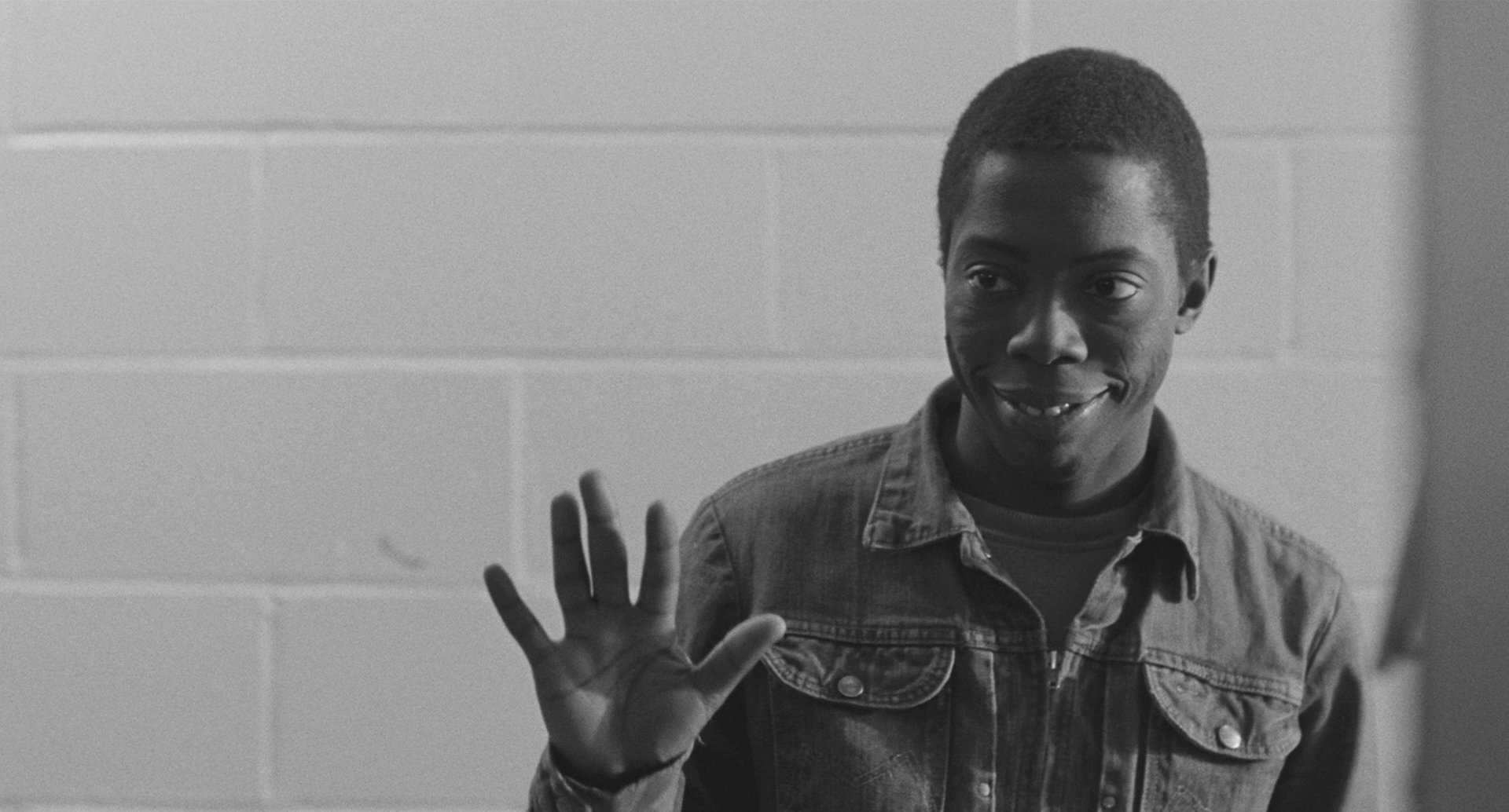
The visual research resource ShotDeck recently examined the indie feature Sidewalk Stories (1989) director Charles Lane's non-dialogue film about a gentle street artist (played by Lane) who suddenly finds himself the caretaker of a lost little girl. Since the film's Chaplin-esque charm and earnest performances delighted audiences at Cannes Director's Fortnight, it has continued to screen around the world — thanks to a 2K restoration from the original camera negative in 2013 — and pass from humble homage into the pantheon of great American films.
In a 2004 interview with AC, cinematographer Bill Dill, ASC noted, “[Making this film] required careful thought about every aspect of the image to ensure it is powerfully yet subtly conveying your true
meaning to the audience. It's also important that the image work on a fundamentally emotional level because merely understanding isn't enough. Feeling the image is more important than understanding it.”
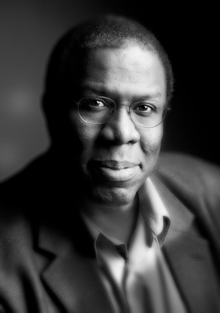
Today, Dill is the Chair of Visual Storytelling at the AFI Conservatory, and here reflects on the film's origins and longevity, along with some of his favorite scenes.
"I remember shooting Sidewalk Stories like it was yesterday..."
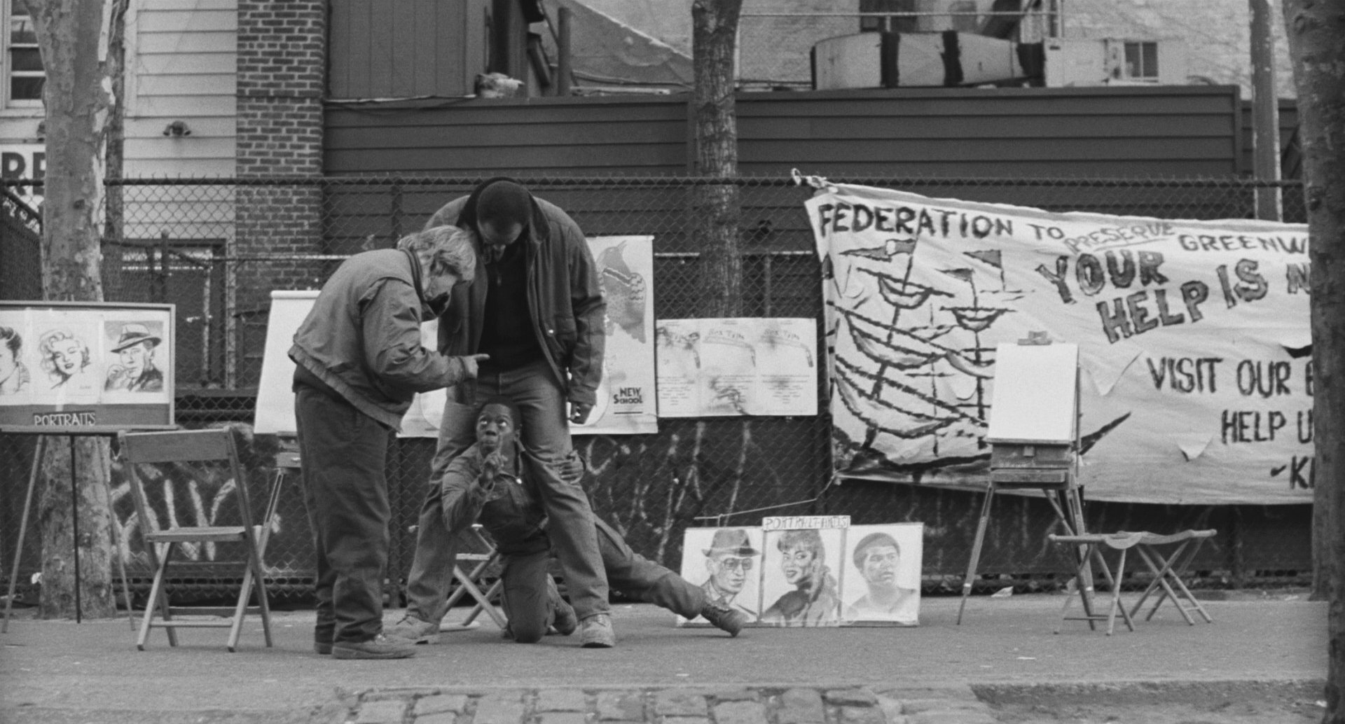
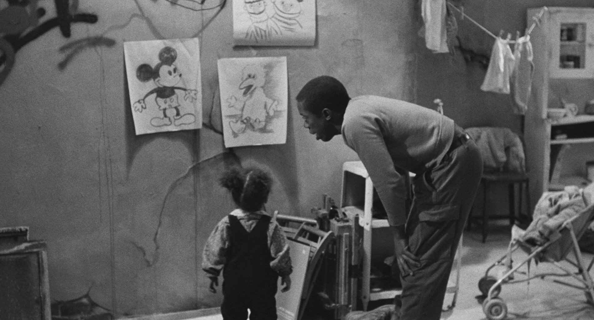
...We were filming in late ’87, mostly in Manhattan. Harlem. Downtown. A lot of the action took place on Sixth Avenue, right at West 4th Street. There was a playground there, along with a few other locations.
The work on that movie was physically brutal. It was New York, in the winter, on the street, with no real production support. No holding areas, no trailers. I can still picture us huddled around this hair dryer I had mounted on a C-stand and plugged into the base of a streetlight — your only source of electricity. It was the only heat we had, and I used it to keep the viewfinder on our Arri BL4 from fogging up because I was operating, and if I couldn’t see, I couldn’t shoot.
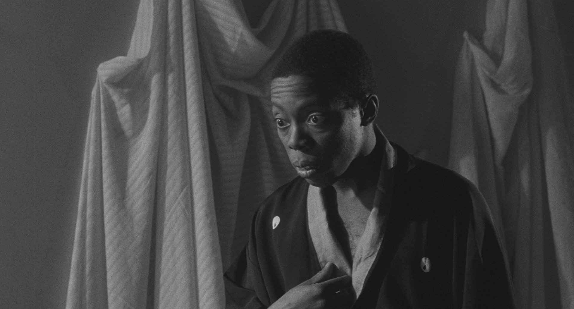
When I was first contacted about shooting this film, Charles Lane and his producer, Howard Brickner, already had a vision for how they wanted to shoot it: Color Super 16 transferred to black-and-white. I told them, "No, that’s not how you do this movie." It’s a classic story, a clear reference to The Kid, and I love Chaplin’s work. It would have dishonored that legacy to shoot this as a low-budget, sorry-looking 16mm color film transferred to black-and-white. I told them, "This film needs to be shot on 35mm, in real black-and-white."
There’s a tangible difference between 16mm and 35mm, and between color stock and true black-and-white emulsions. The silver in black-and-white film creates a quality you can’t fake — it has a real metallic presence. You can’t replicate that with color stock. To their credit, they agreed to a test. We did it at DuArt's black-and-white lab in New York, and when those prints hit the screen, I looked over at Howard. I don’t even remember what I said, but you could feel the impact of those images. It was undeniable.
Influences
One of our main visual inspirations for Sidewalk Stories was Night of the Hunter [shot by Stanley Cortez, ASC]. It was amazing how often Charles and I would would be on set and just look at each other and know the reference. The biggest influence on the look of the film for me was Stanley Cortez — my ultimate hero as a cinematographer. My God, I love Stanley’s work. It reminds me of great still photographers like Edward Weston, Edward Steichen, and the great Ebony photographer Moneta Sleet, Jr., who I later got to work with. Then there was Jamal Shabazz, Roy DeCarava, and James Van Der Zee — these were the artists who shaped how I saw images.
So for me, Sidewalk Stories was an endless tribute to these greats. Every time I looked through the viewfinder, they were present in my mind. And Charles understood that language instinctively. We didn’t know each other before this film, but we spoke the same language through our mutual love of these giants — both in motion pictures and still photography. We had spent years immersing ourselves in this glorious work.
Graphic Weight
Whenever possible, I used Kodak Plus-X 125 ASA film, rather than the higher-speed Double-X 200T/250D ASA. Even for night scenes, I tried to light to a level where I could maintain that crisp contrast — that “snap.” That’s why a lot of those night exteriors have such a hard, distinct contrast: whites that are really white, blacks that are really black, and everything in between precisely defined.
The biggest challenge was training myself to think in black-and-white, especially on interiors. All day, I had to remind myself to focus on value differences rather than color contrasts. To help, I used a yellow contrast filter — it kept me in the right mindset.
Black-and-white is fundamentally a different medium from color, and if you light for color the same way you do for black-and-white, it looks artificial. If a film is lit incorrectly for black-and-white, it feels staged, like “movie lighting.” It can take you out of the story. A good example is Smash-Up, one of Stanley Cortez’s early color films. It looks so lit. All the lighting tricks that were stunning in black-and-white felt artificial in color. Flip that around, and something that works in color can look completely flat and lifeless in black-and-white. It’s not just about contrast; it’s about graphic weight. In black-and-white, you have to be deliberate about how you guide the eye through the frame. It’s a whole different discipline.
Deep Space
My favorite image in the movie is the alley scene where the father gets stabbed. The whole sequence — the gambling, the desperation, the death — it's poignant, tragic. It speaks to the depth of his addiction, that even in his final moments, he’s still gambling. That scene stayed with me.
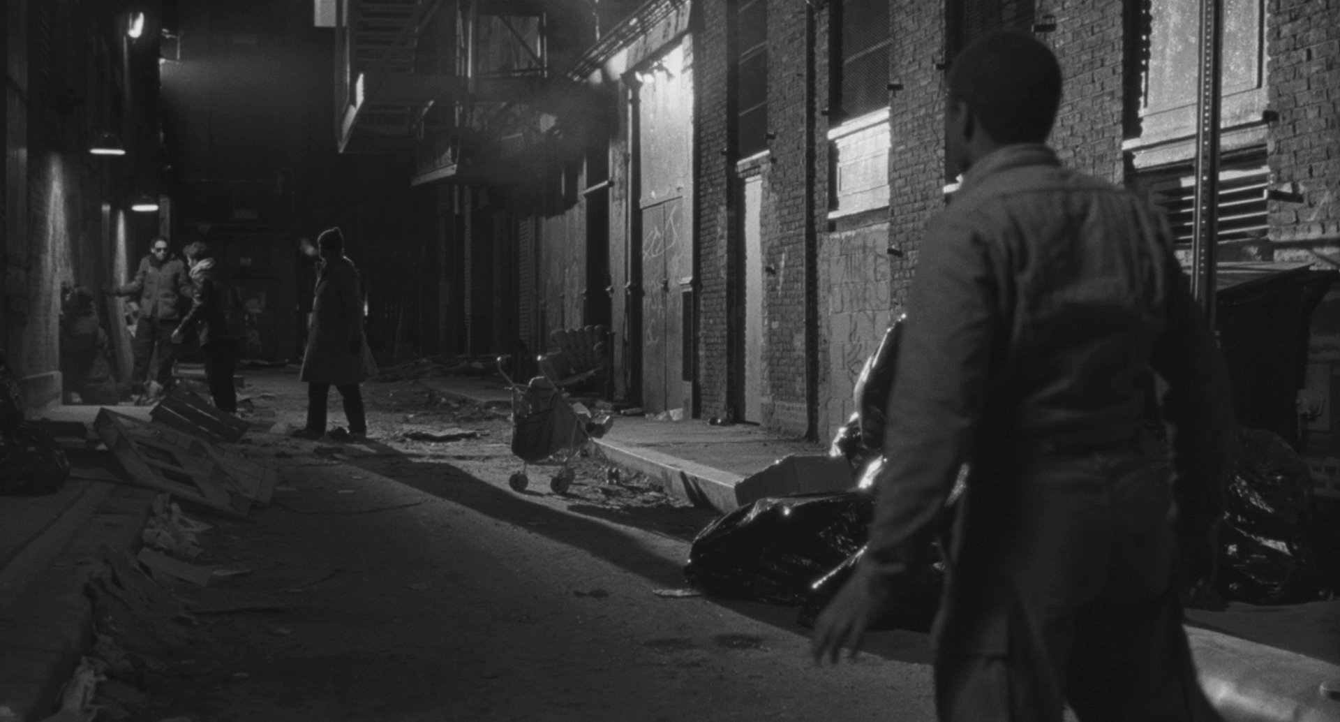

Here, Night of the Hunter was going to be our key visual reference. The thing about Night of the Hunter is its visual language — the clash between flat and deep space. The world of the child is flat; the world of the adult is deep. The film follows the boy John Harper's perspective, and when he and his sister encounter something truly horrific, something beyond their comprehension, it visually shifts. The depth becomes overwhelming, surreal. Children do that — they take something horrible and turn it into something beautiful because their minds need to process it in a way that makes sense.
Visual Language
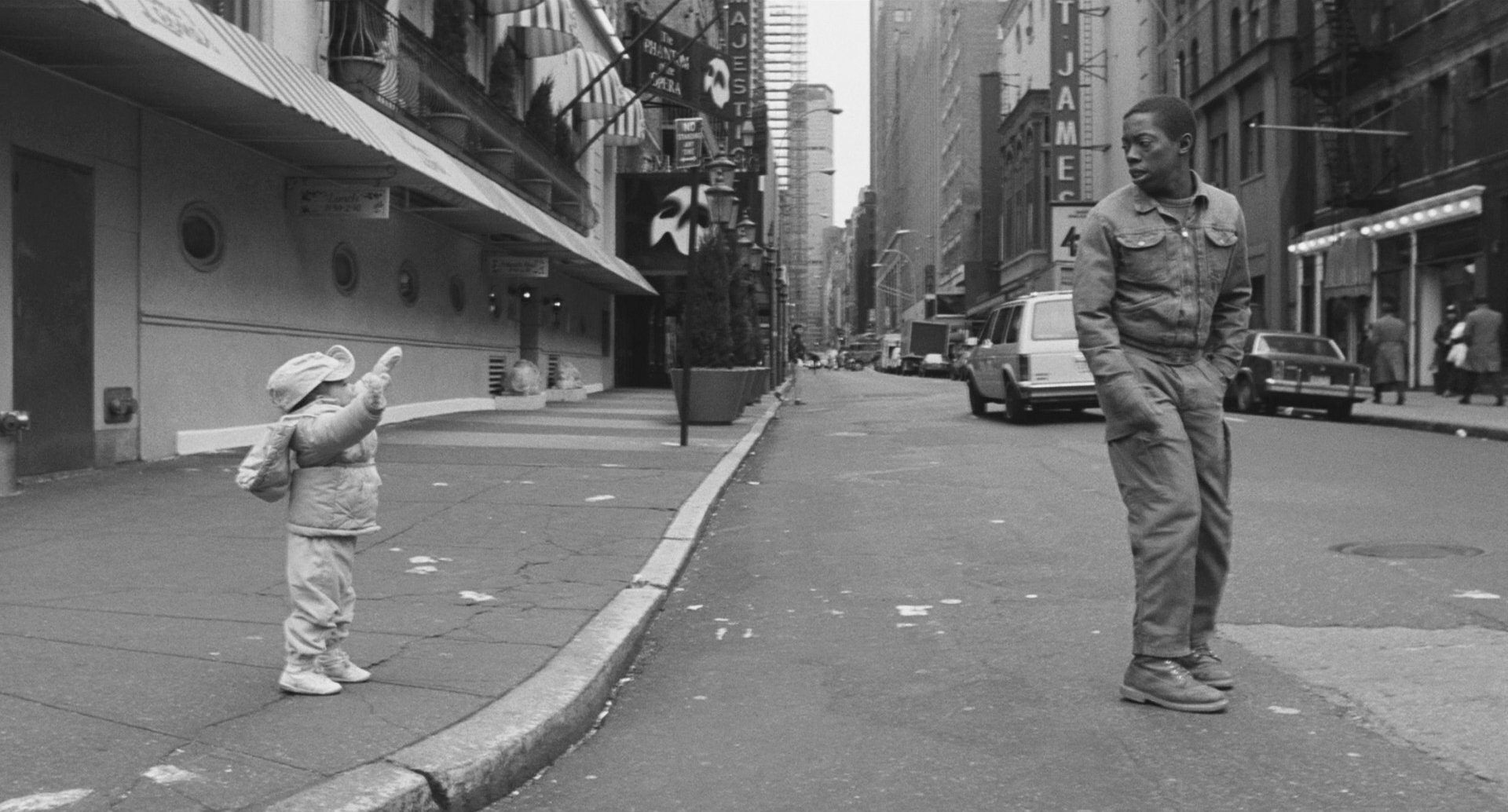
The biggest challenge I faced on this movie was maintaining the visual language of a silent film. We couldn’t assume the audience would understand things the way they would in a film with dialogue — we had to make every idea explicit through imagery alone. This meant working hard on every shot, every day, ensuring that everything the audience needed to know was communicated visually.
For example, there’s a trial sequence that unfolds in Charles's character's mind: he sees a cop on the street, and we needed to visually express that he has no faith in the judicial system. That idea had to be unmistakable.
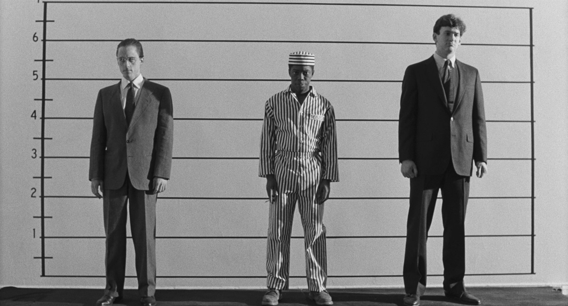
A quality film has to say things without saying them outright. That’s what we aimed for in the lineup scene, where we had two white men in business suits while Charles is in prison stripes, smoking a cigarette. Who do you think is going to be picked? Charles knew already.
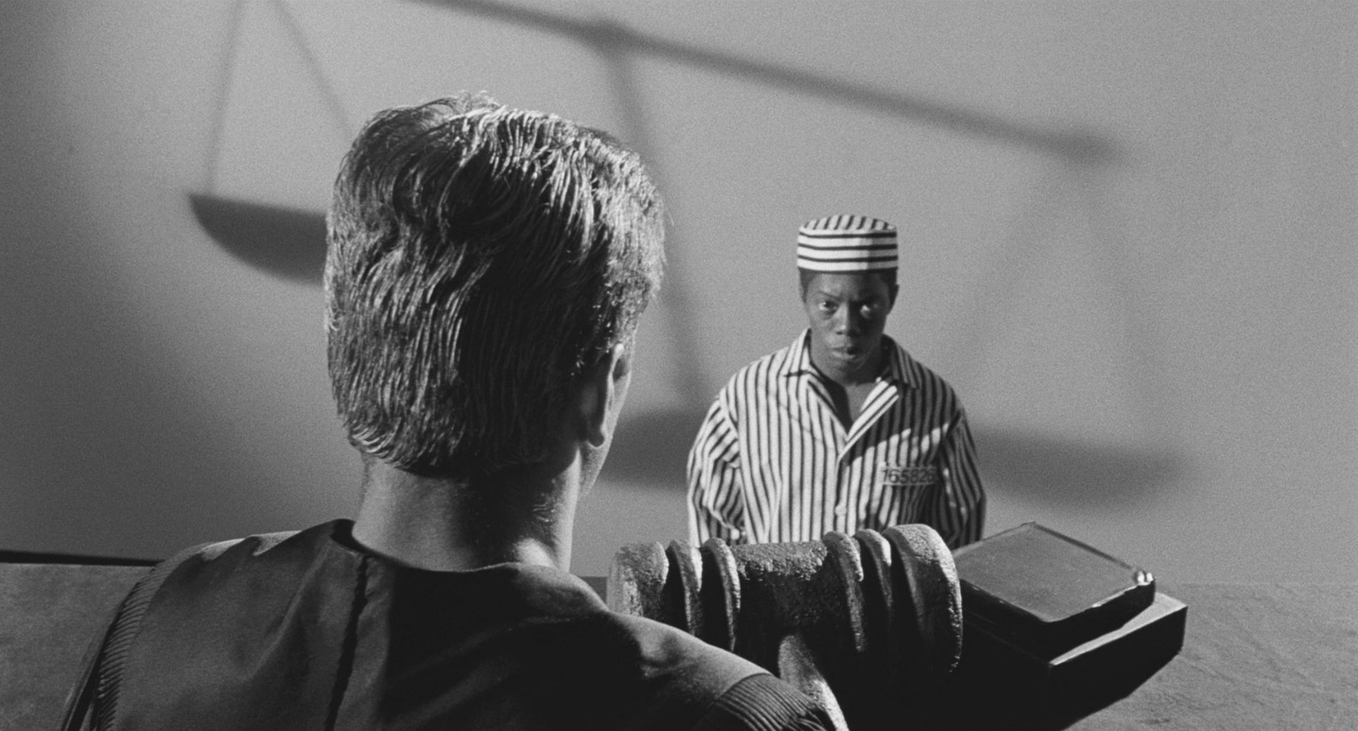
So, in the language of silent cinema, the judge looms huge above him, high on a bench, draped in black robes. Shadows stretch across the wall, and if you look closely, you’ll see the scales of justice — literally tipped against him.
Emotion Pictures
When you reach the core of who a person is, you’ve tapped into something real. And let me be clear: the audience is not stupid. They’re incredibly smart. If they don’t connect with a film, it’s not because they’re unworthy of it. It’s because the film didn’t reach them. And if a film isn’t striking a chord — reminding people of something real in their own lives — it won’t last.
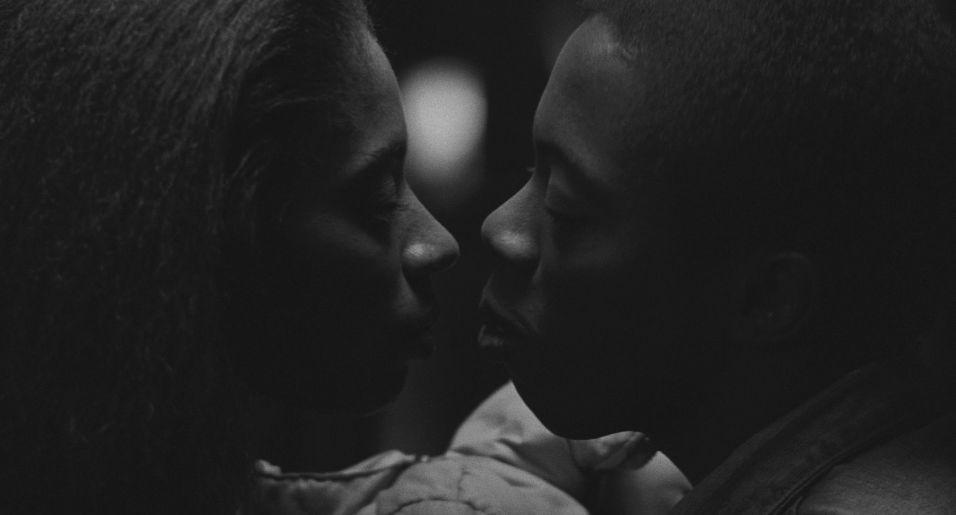
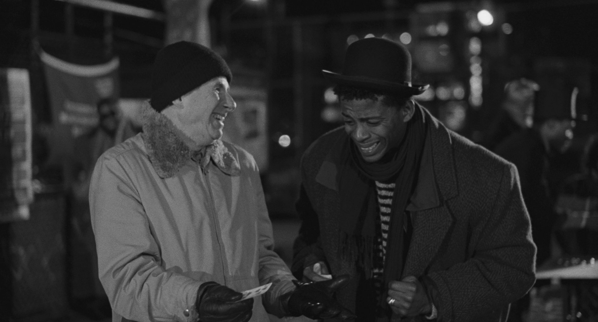
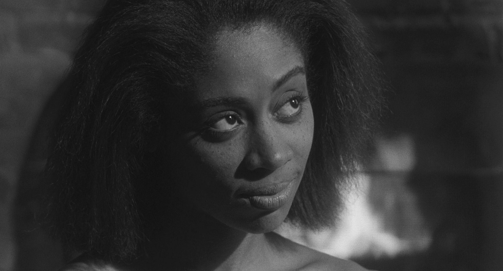
I'm reminded of the first kiss between Charles Lane’s character and Sandye Wilson's character, and we spent a good amount of time making sure it was right. It was important that it feel gentle, loving, and erotic, as well as physically satisfying and emotionally true.
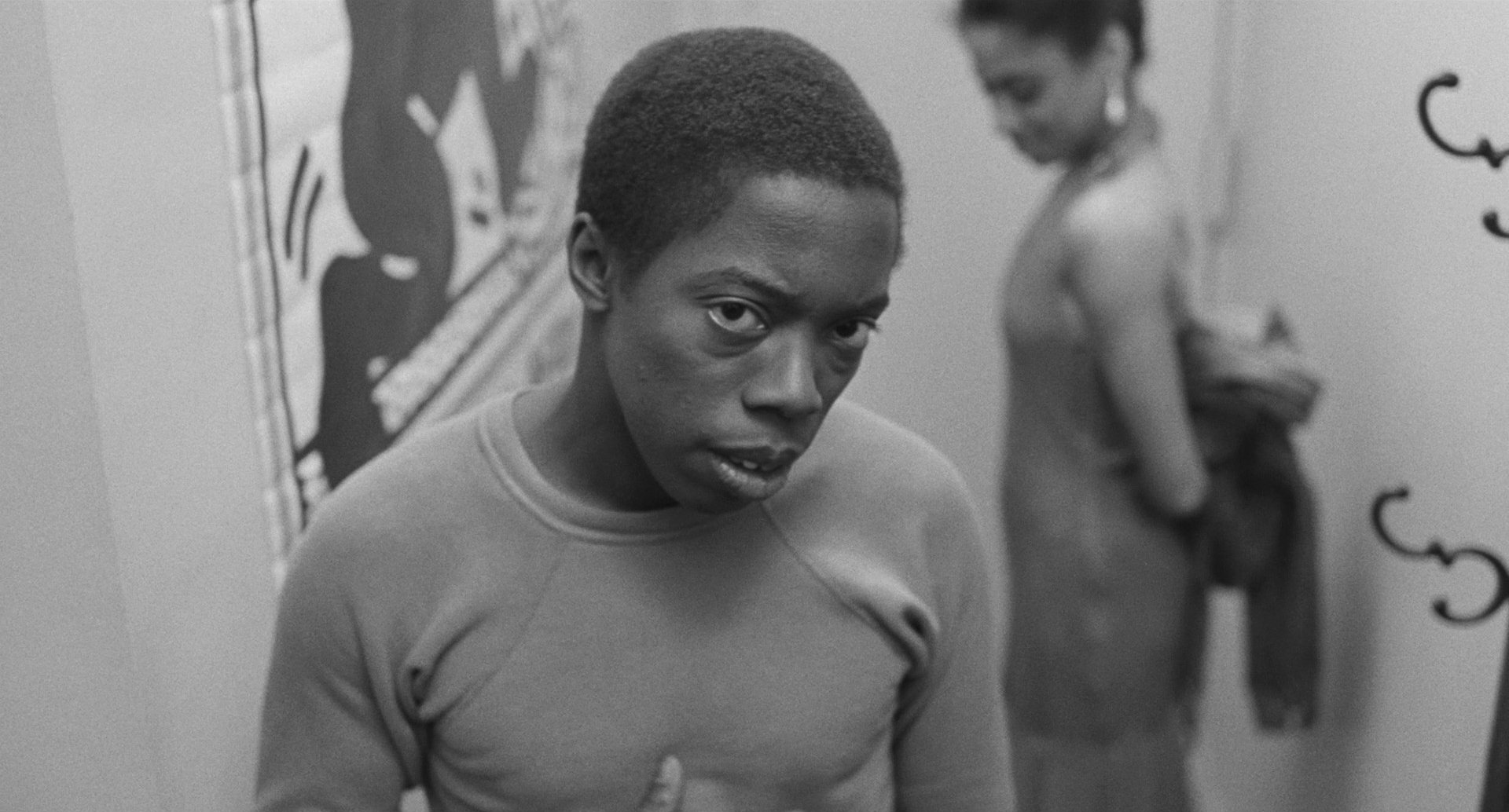
Later in the film, Charles comes up to Sandye's apartment for dinner, and when he’s about to leave, there’s another fantasy sequence in his head. That was the one time in production when Charles and I strongly disagreed. In the fantasy, he sees a torrid love scene between himself and Sandye's character. Then, he turns and breaks the fourth wall, looking directly at the camera.
I had lit and color-graded the sequence with high contrast, aiming to show that this was an intimidating moment — this overtly sexual woman was something he wasn’t entirely comfortable with.
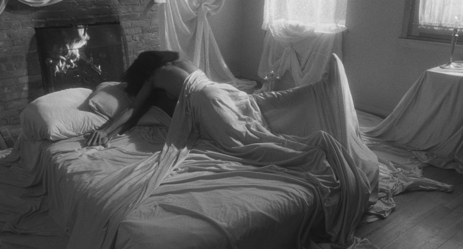
But Charles didn’t want the character to come off as intimidated by a strong woman — because he wasn’t. Charles’s intention was much more nuanced: he wanted the moment to say, simply, "not right now." And he was absolutely right. At Cannes, that moment got the biggest laugh of the entire movie. That was a brilliant call on Charles’s part. It spoke volumes about his instincts as a filmmaker. He's a brilliant director, and I realized that more and more every single day working with him.
The World of the Film

Homelessness was one of the things that motivated Charles to make Sidewalk Stories. It was everywhere — on the streets and in the playgrounds; the shelters and libraries were filled with people just trying to stay warm. I think that's what makes the film so timeless — it's a problem that hasn't gone away, even if the world of the film doesn't exist anymore.
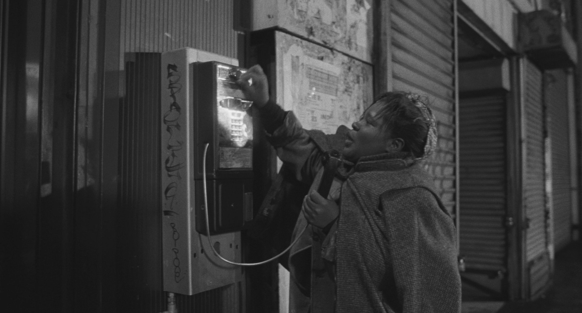
I'm reminded of one memorable scene we shot on the street in Harlem, with a woman going from payphone to payphone looking for change in the return slots.
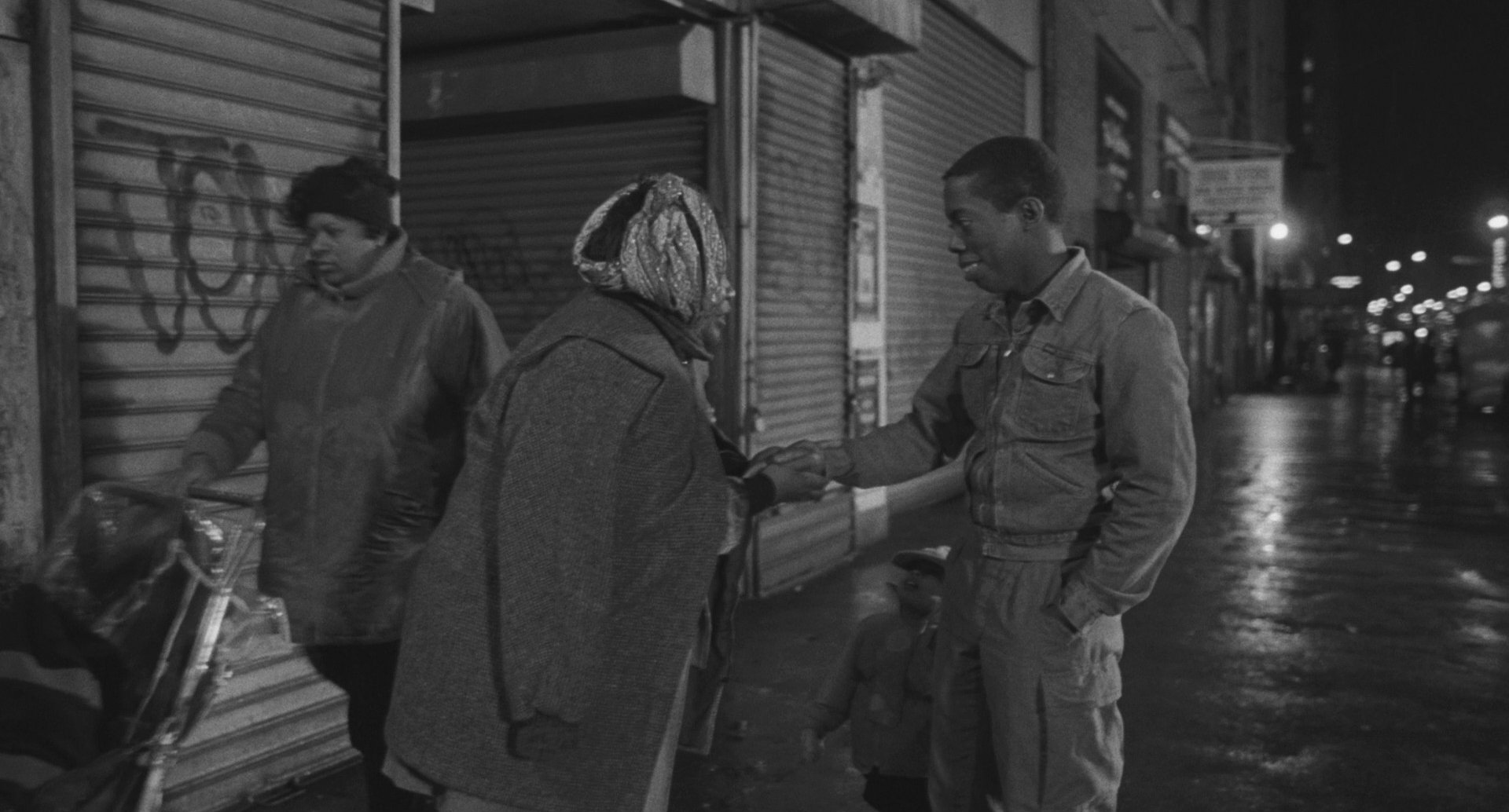
I framed it straight down the sidewalk, with a 2K open-face light about a block away. I wanted to bounce light off the wet pavement without making the light itself visible, so I used black tape to hide the stand, and put it far enough back so as to be out of focus. I relied on my spot meter to ensure the values were right along the street and its reflections.
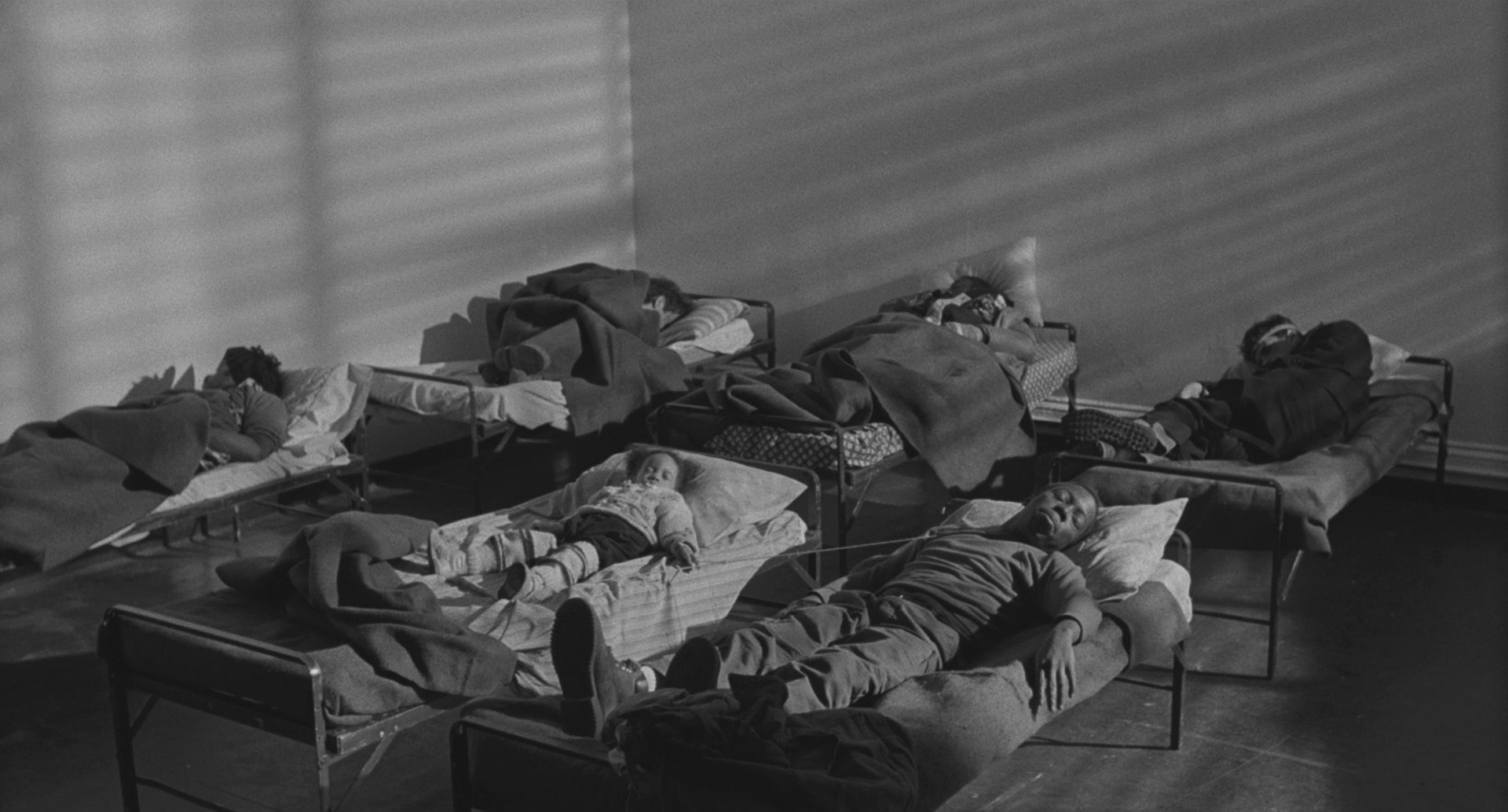
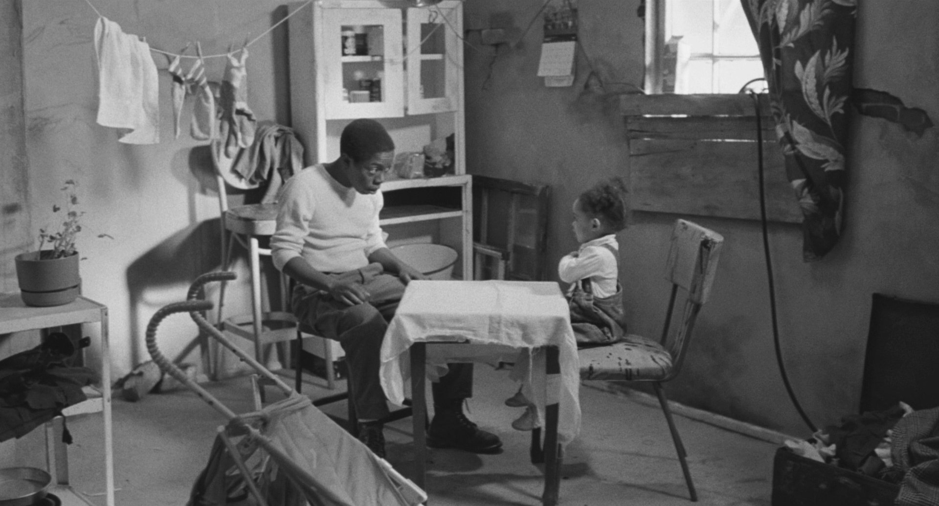
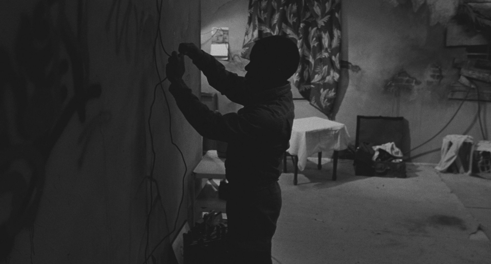
We also shot an interior night scene in a homeless shelter. Charles ties a string to the little girl’s wrist so that if she moves, it will wake him up. Since we didn’t have an actual location, we built that set in our production offices. I lit it using mirrors to take advantage of the inverse-square law — it made the space feel bigger, as though the light source was coming from far away. I placed 4x4 mirrors near the windows and bounced light as if it were coming from outside, even though it was really just coming from down the hall.
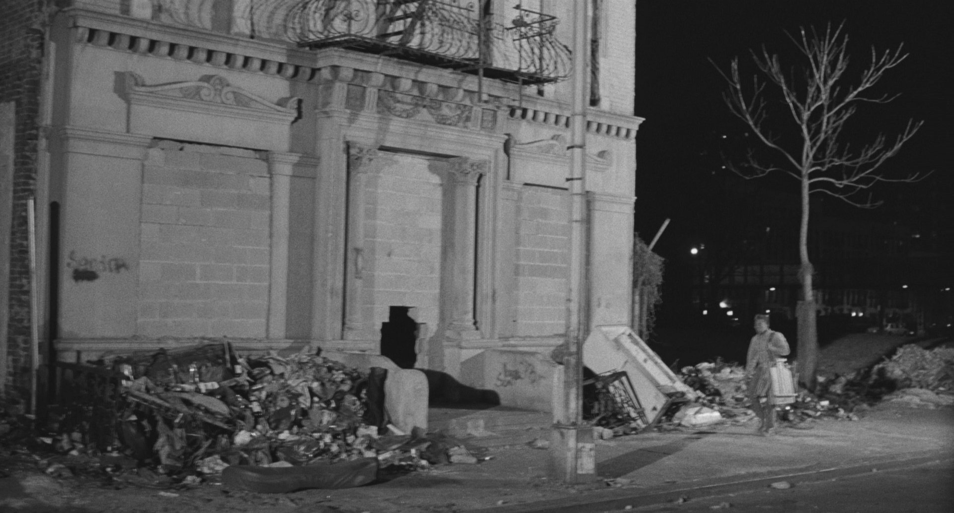
There’s a big master shot of Charles’s character entering an abandoned building in the Lower East Side. That place was disgusting. Before we rolled, my gaffer had to run inside with the lights off. Once he was in position, he plugged them in, and streams of rats came pouring out of the building. We thought of filming them, but one of our biggest concerns throughout the production was making sure there was no sense of threat to the child. Every choice had to reinforce the idea that Charles was careful, cautious, and above all, protective of her. That’s why we included details like the string in the shelter.
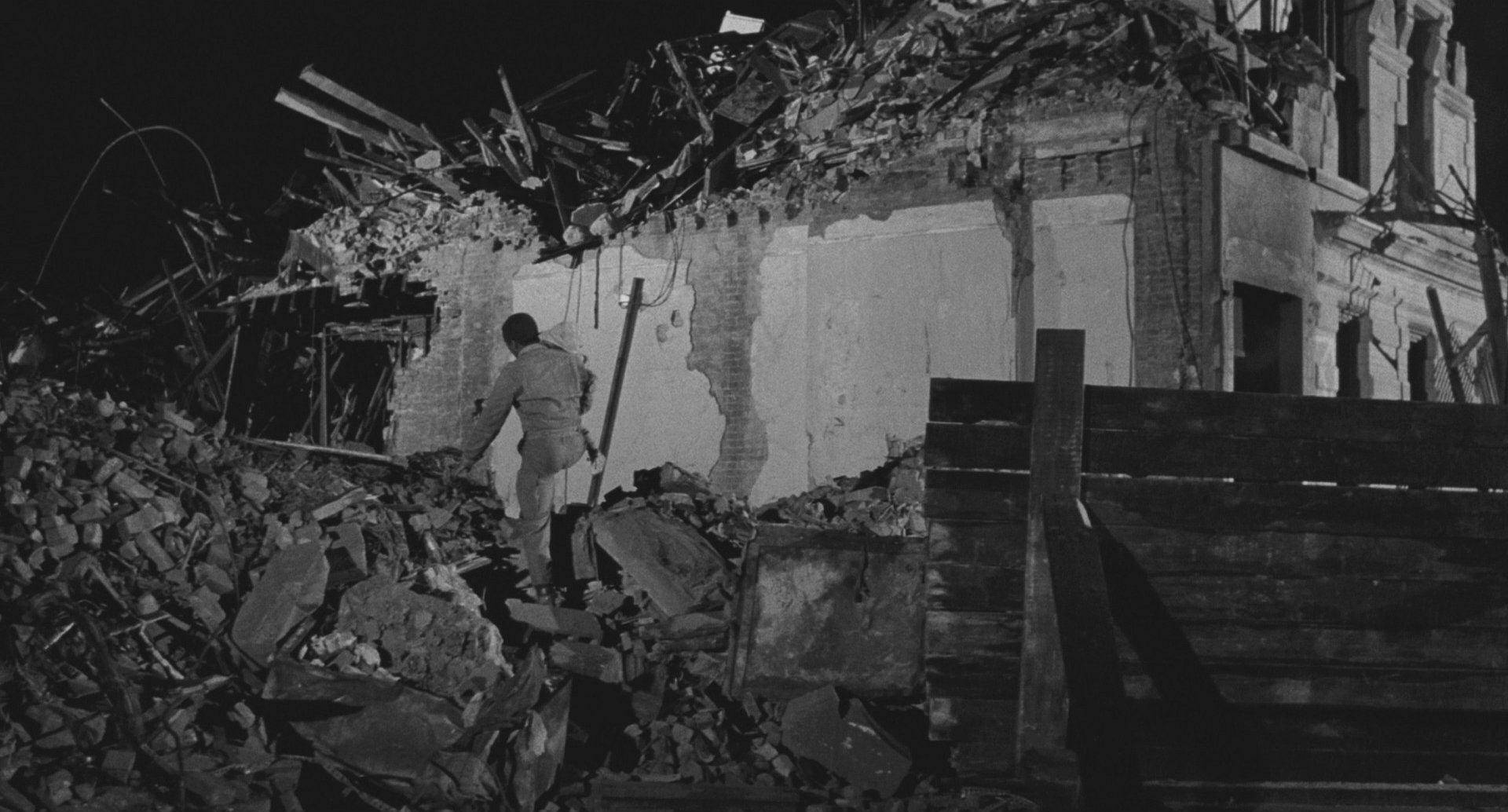
Later in the story, the building is torn down. For that, we had to shoot a different location. In one of the shots, the characters are just a small part of the frame, dwarfed by the massive, decaying structure around them. That was intentional — we wanted to emphasize their vulnerability. They weren’t weak, but they were small in the face of this overwhelming world. That building was intimidating, eerie, almost grotesque. And lighting a structure that huge on a small budget was a real challenge. But we made it work.
An Amazing Year
1989 was an amazing year at Cannes: Sex, Lies, and Videotape, Do the Right Thing. Jane Campion's first feature, Sweetie, was there. Thirty-six years later, I find it extraordinary that someone of Charles Lane's talent isn't known by everyone. I think he is one of America's finest filmmakers. His SUNY Purchase thesis film A Place in Time won the Student Academy Award. He deserves far better than this industry has afforded him. It's a massive loss to audiences everywhere that more people haven't had an opportunity to see the remarkable work I know he's capable of.
Founded by Lawrence Sher, ASC (cinematographer of Joker: Folie à Deux, The Hangover Trilogy, Garden State), ShotDeck is the world’s largest library of fully-searchable high-definition cinematic images. With over 1.6 Million shots and now an App for iPhone and iPad access, ShotDeck is an invaluable reference, planning, and collaboration tool for filmmakers, students and creatives of any kind.
Each week, ShotDeck makes hundreds of new, high-quality images available to users. AC will be regularly examining these projects with additional context and input from the cinematographers and other filmmakers involved in their creation.