Photographing The Thing
Dean Cundey, ASC discusses the making of director John Carpenter’s 1982 sci-fi horror classic.
INTRODUCTION
By Rob Hardy, ASC, BSC
There have been a few pivotal moments that informed my approach to cinematography and to filmmaking as a whole, certain influences that have inspired me along this beautiful road: 1) My introduction to the world of Stanley Kubrick, 2) Discovering the challenging and peerless work of the writer J.G Ballard, and 3) Hearing the extraordinary way in which anarchic genius Steve Albini masterfully records sound.
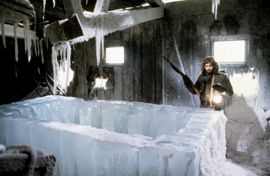
All have made an indelible mark on me, but none has had the lasting impact of my first viewing of John Carpenter’s The Thing. It was during that first viewing — those long corridors, that relentlessly creeping camera, and the almost surreal performances framed within what I can only describe as a fantastical sub-surreal realism unique to that film — that I was marked by my first epiphany. At the tender age of 15, I became aware of the “cinematographer,” and the name Dean Cundey suddenly found its way into the pantheon of filmmakers on my mental wall of fame, which included Sergio Leone, David Lynch and, bizarrely, Terry Gilliam. (No offense, Terry.)
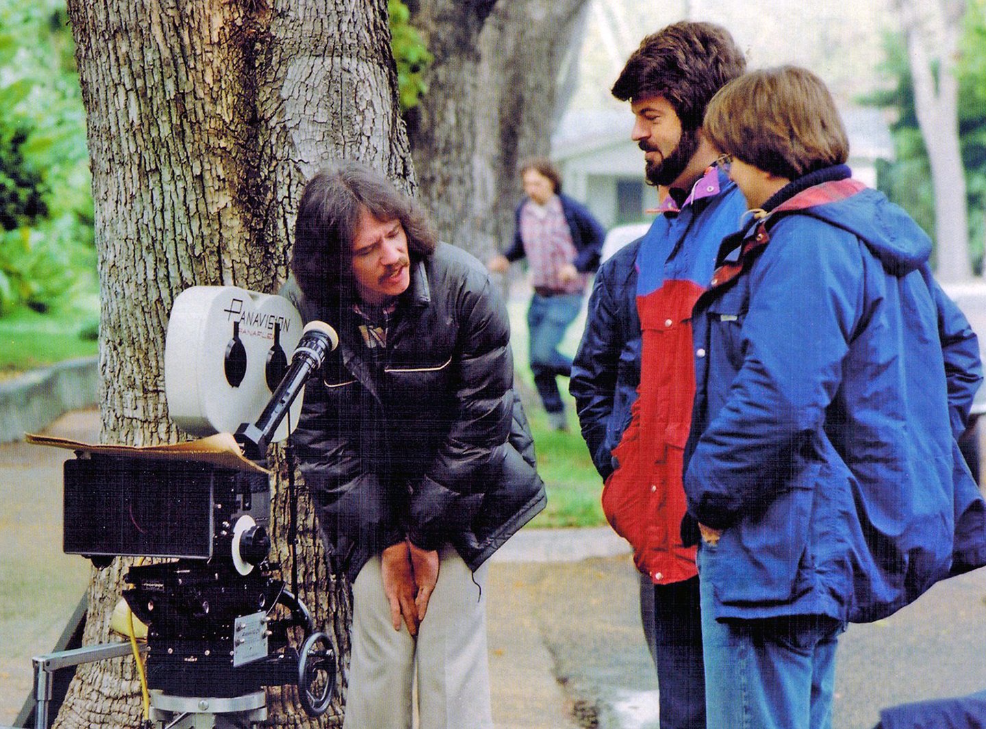
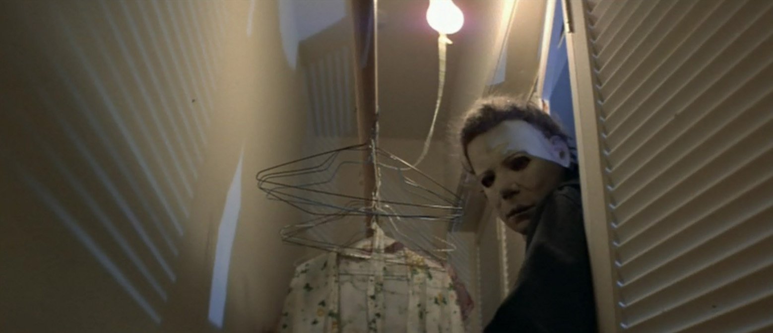
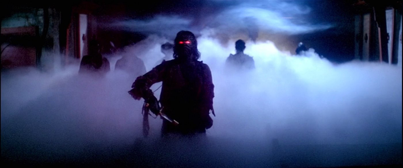
A certain instinct led me to watch the other Carpenter/Cundey collaborations, and I devoured with a passion the suburban William Eggleston-inspired mood of Halloween; the sparse atmosphere of The Fog; the extraordinarily theatrical beauty of Escape from New York; and, of course, the insurmountable perfection that is The Thing. All were connected by a distinct, elegant, smoky naturalism that, for me, sat outside the mainstream and the common conception of what makes great cinematography.
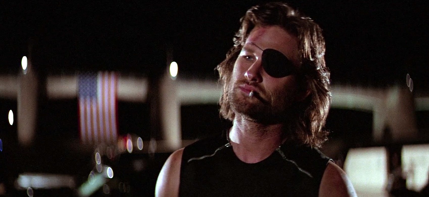
Cundey’s work on these films inspired me to pursue the mystical path that is cinematography, and for that I am indebted to him. I don’t know the man, and I have never met him, but his work from that time still speaks to me. As a consequence, I regularly make the claim that every film I shoot, regardless of genre, is my humble attempt to re-create the feeling — and that’s what it is, a feeling — that the sublime beauty of The Thing gives me over and over again when I watch it.
AC recently covered Hardy’s work in the sci-fi horror film Annihilation.
INTERVIEW
By Jim Hemphill
Dean Cundey, ASC was already an experienced cinematographer in the low-budget world when he and director John Carpenter changed horror forever with Halloween (1978). Four years later, they jumped from the indie realm into big-budget studio filmmaking with their remake of The Thing (1982), which went on to become a genre classic and still inspires young filmmakers today.
AC recently spoke with Cundey about the project. Here are some excerpts from the conversation:
American Cinematographer: The original The Thing [The Thing from Another World, 1951] is one of the movies the kids watch on television in Halloween, so I assume it was a film you and Carpenter liked. Did you revisit it when you were preparing for the remake?
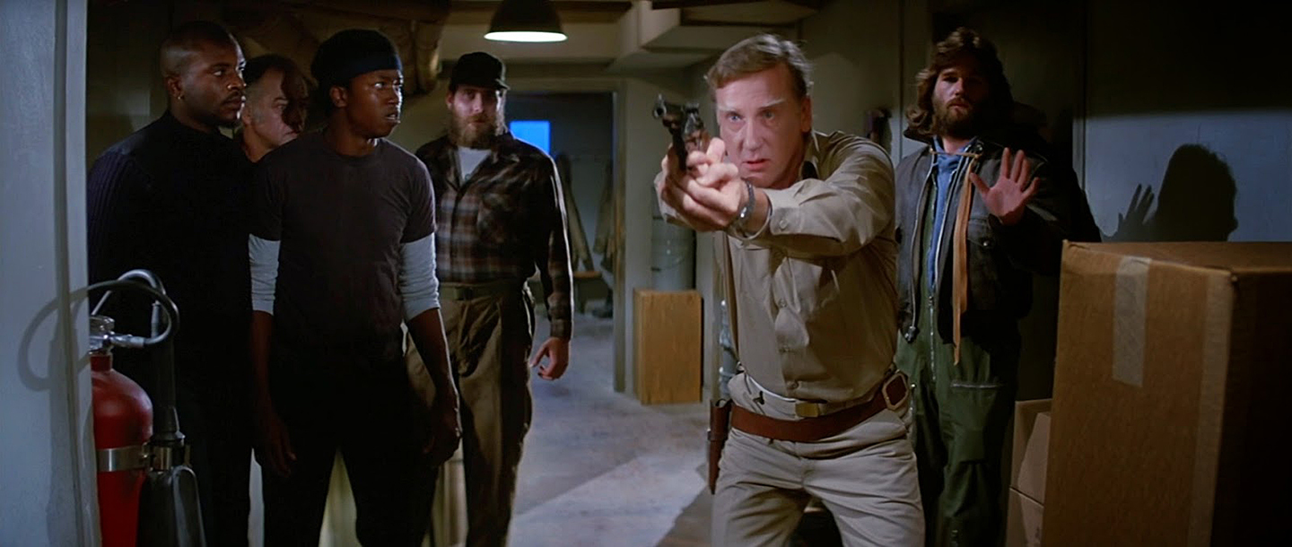
Dean Cundey, ASC: John was a big Howard Hawks fan, and The Thing was one of his favorites, which is why he paid homage to it in Halloween. When we were getting ready to shoot our version, we ran it a couple of times for inspiration — John had this newfangled thing that he called a videotape player — but a lot of what we wanted to do developed as we were prepping. One point of departure was that John wanted to use very authentic-looking locations as opposed to just building exteriors on the studio lot. The success of Halloween and The Fog gave John the clout and credibility to take on a more sizable project compared to the schedules and budgets we had had previously. I was really fortunate to be able to work on that larger canvas, and we tried to give the movie a lot of production value right from the start.
Where did you shoot the exteriors?
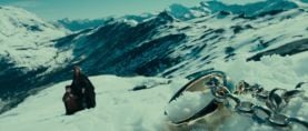
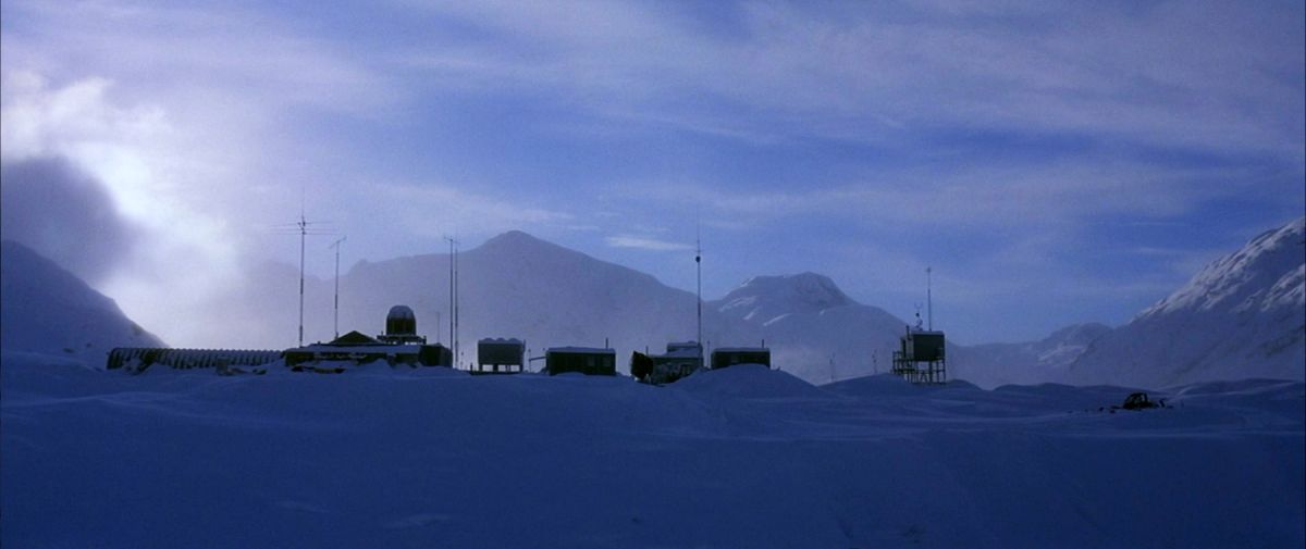
A scout found a place outside of Stewart, British Columbia, which was the last ice-free port up the coast of Canada. The area was chosen not only for the scenic value it added to the few daytime shots we had, but also for its accessibility. It was an isolated little mining town, sort of like the Old West, with small wooden buildings and a culture of miners who would come down from the mine on this winding, precarious road. We stayed in the town and would ride up this twisty, very narrow road to the location up on top of some rocks that overlooked a glacier. They built the set on these rocks during the summer, and then we waited until it got snowed in to shoot there
That set was designed by John Lloyd, right?
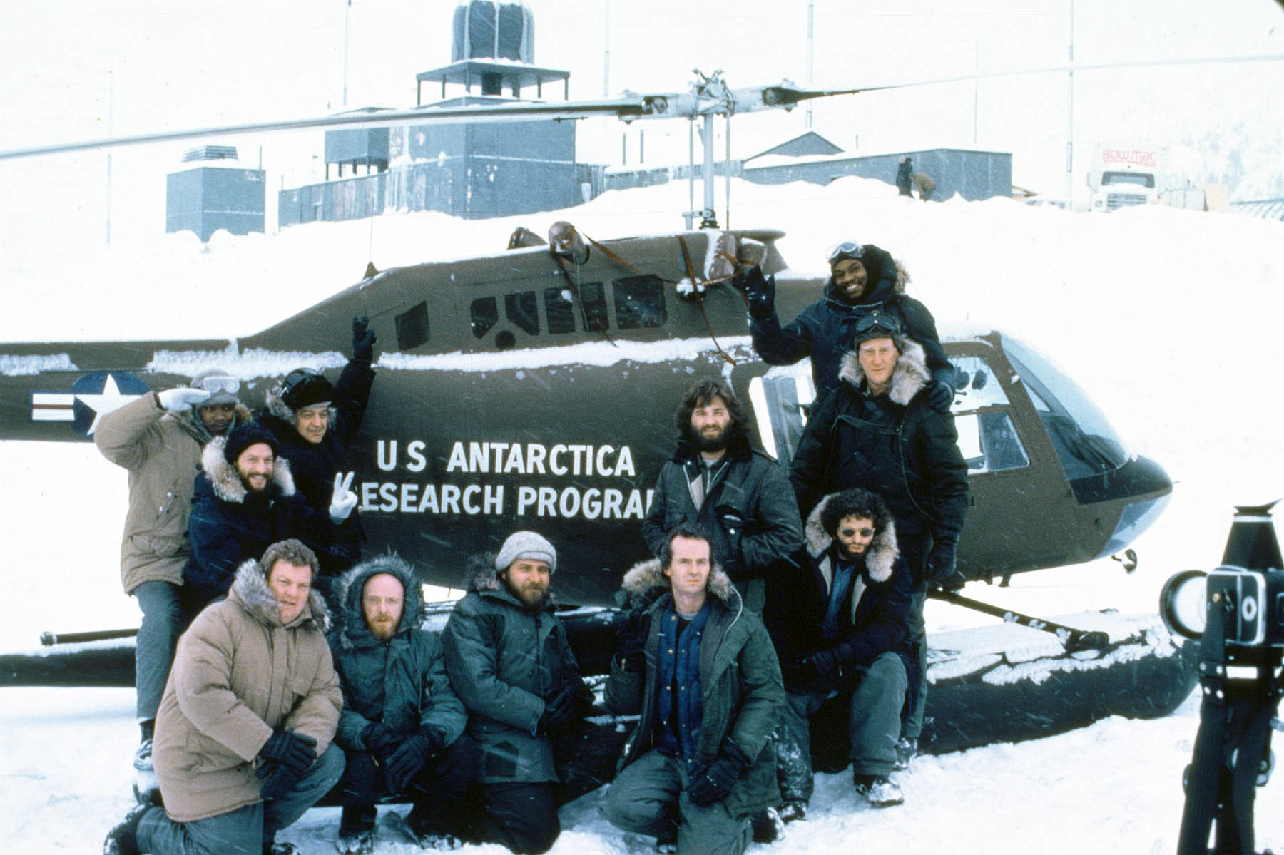
Yes. John was a great production designer with a huge amount of experience and history behind him. He was great at being able to access exactly what was needed for the story while also constructing for really good camera angles and scenic value. It was my first experience with old-school art directing, where your questions and thoughts are considered in a really advanced way. It was a revelation to me.
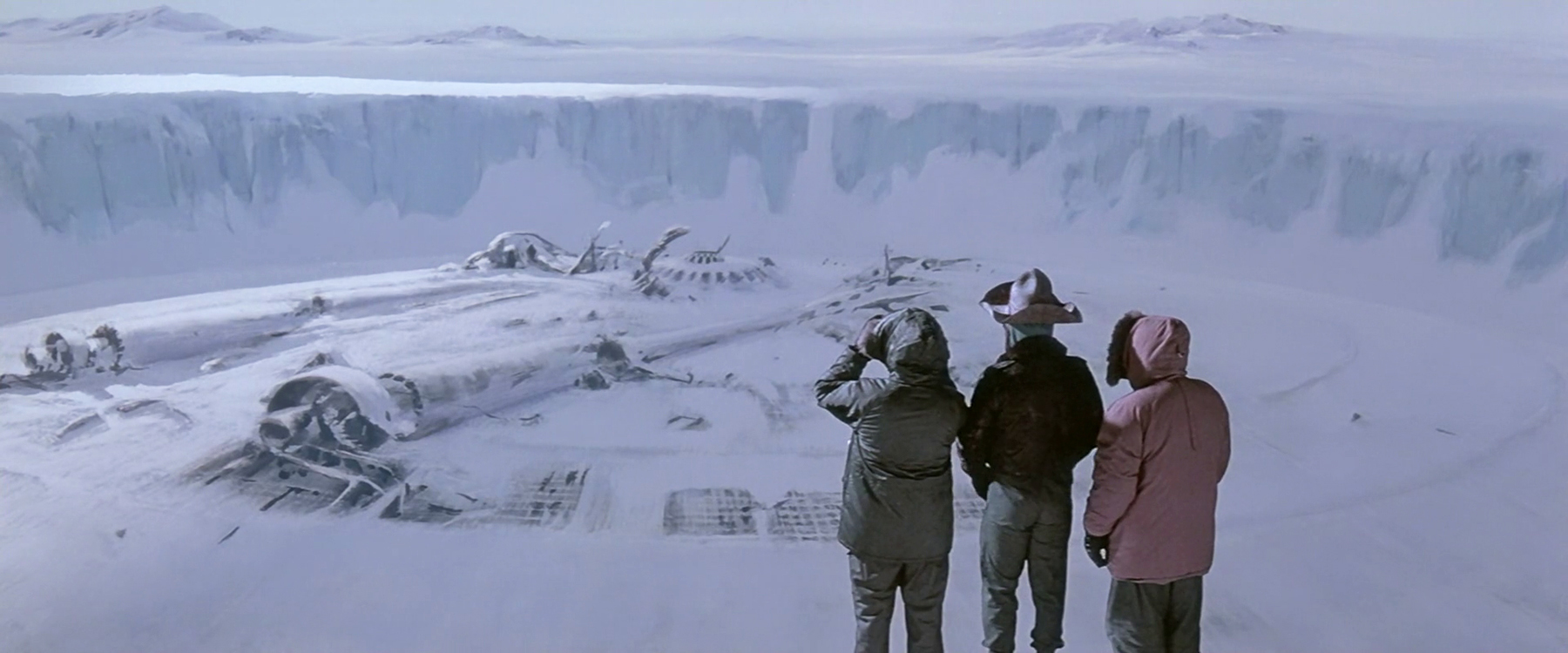
You also got to work with the legendary matte painter Albert Whitlock, who did so much innovative work with Hitchcock and on films like Earthquake and The Hindenburg.
Whitlock had been on staff at Universal and had his own shop there, and I would go over to his studio and talk to his cameraman, Bill Taylor [ASC]. Whitlock was another old-school guy who knew how to take a painting that had no real life and make it look real with little touches here and there — shadows, clouds that appeared to be moving, things like that. As with John Lloyd, it was a window into the kind of skill and artistry that had developed over years and years in the business
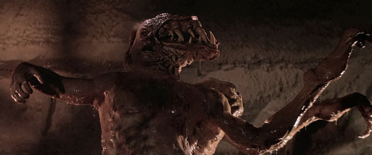
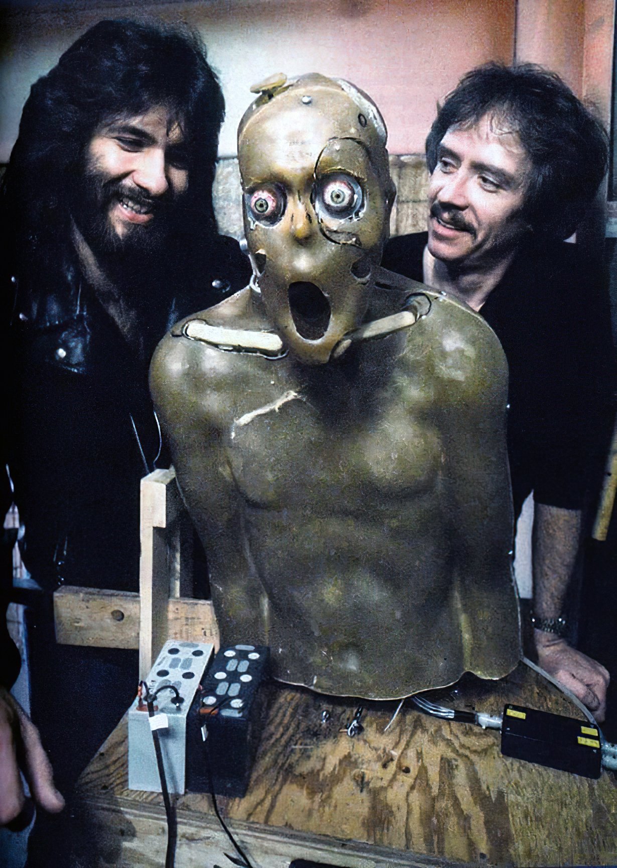
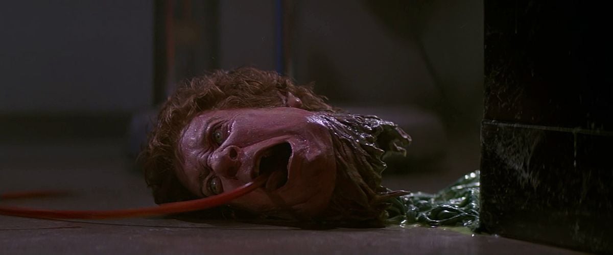
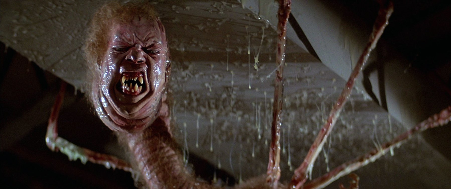
One interesting aspect of The Thing is that you had veterans like that on the team, and there’s a real reverence for classical studio filmmaking, yet the movie also looks forward in terms of effects with the work of special makeup effects creator and designer Rob Bottin, who was young and quite modern in his approach. I think one of the innovations The Thing brought to the genre was the idea that what you see can be scarier than what you don’t see. You lit the transformation scenes with a lot of clarity and detail, showing the effects instead of obscuring them.
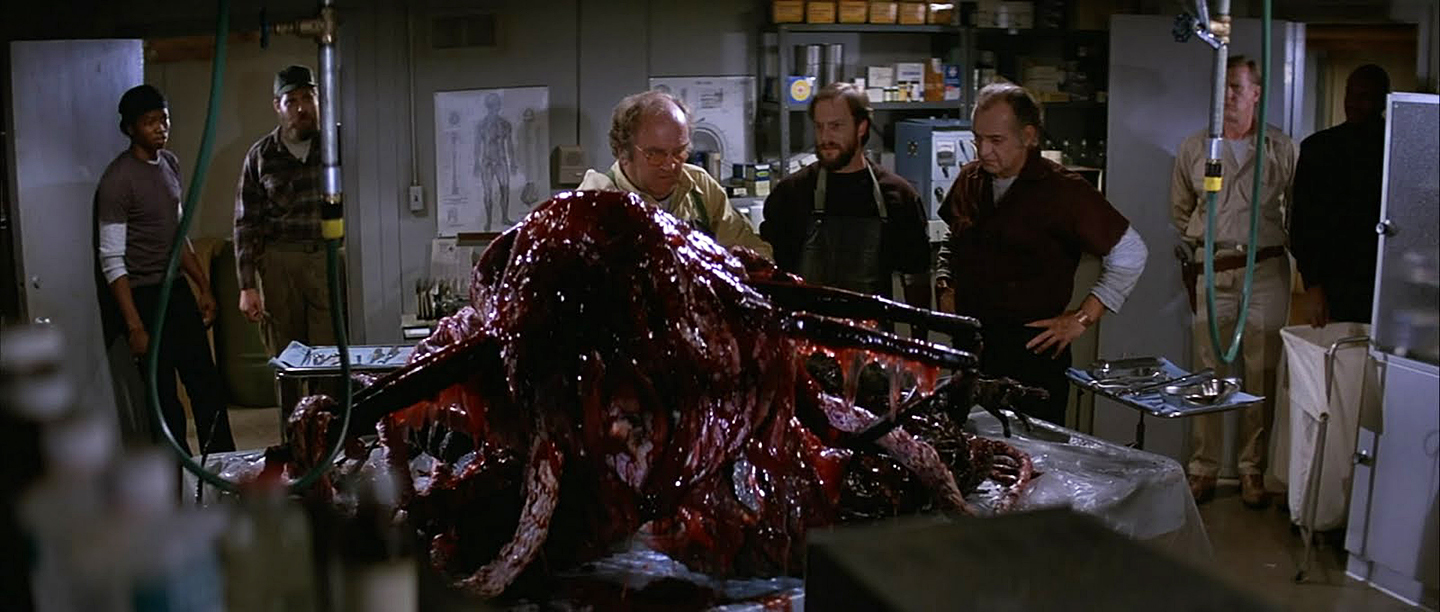
That evolved when Rob started working and I saw him sculpt some of the first creatures. When he made the transforming dog, he said, ‘I can only do so much to make this look real. The rest of it is up to you.’
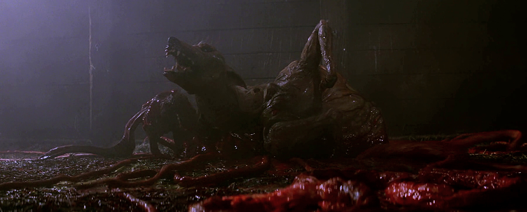
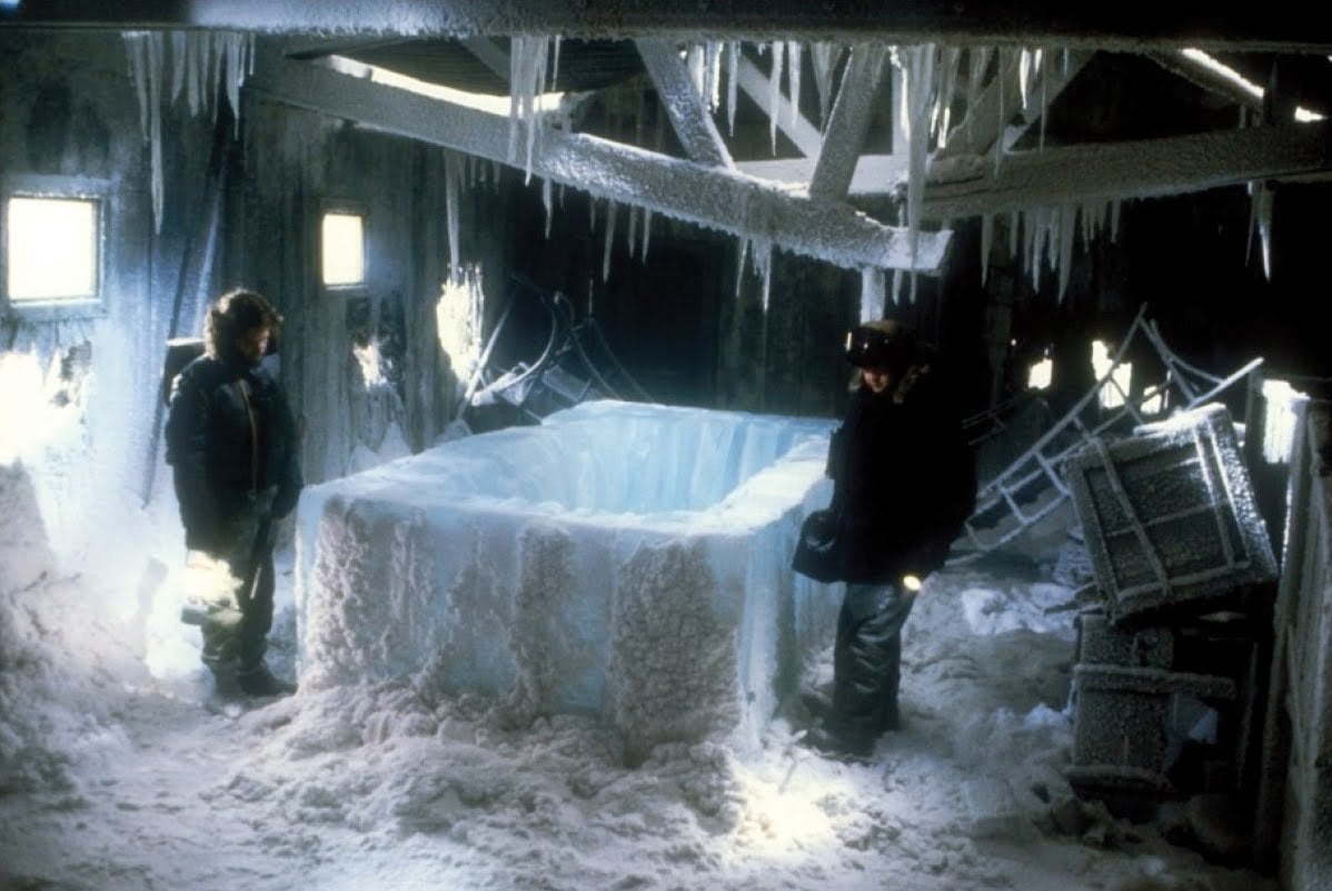
It was evident to me that his sculpting was so great that we needed to see the creature. I hated to relegate it to silhouettes or something like that, but I also knew that if we went too far, we could give away the fact that it was a lump of plastic with paint on it. I worked with Rob to develop this idea that we would set up each encounter in an area where we could justify using a number of very, very small lights that would highlight areas, surfaces and textures. Then I would light the back wall of the set so that you could see the shape of the creature. It became a very interesting game of showing just enough for the audience to understand what was happening while still keeping the creature a little mysterious.
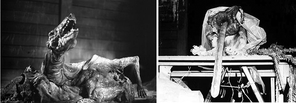
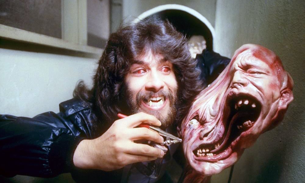
Originally, I wanted to vary the camera speed during the transformations because Rob and I thought they might be more interesting if we didn’t shoot them at regular speed. We went through a couple of iterations, trying to vary the speed from very fast motion to slow motion all in one shot, and, of course, the technical challenge was that as you vary the frame rate, the exposure changes. As you increase the speed to slow the image down, everything gets darker because the negative is seeing less light. We worked with Panavision and a couple other companies to try to develop a camera that would automatically adjust the exposure, and we got kind of close, but we never succeeded. Of course, now that kind of thing is relatively easy
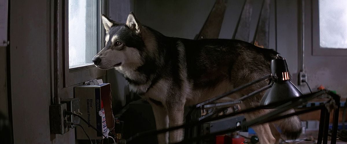
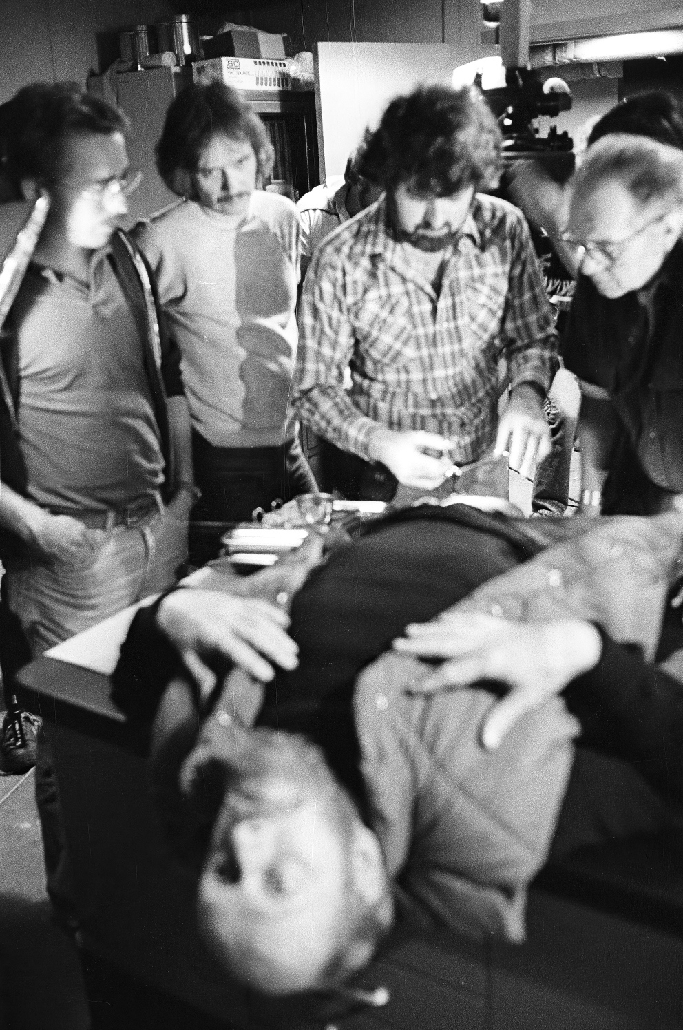
Another reason The Thing endures is that it’s scary even when nothing is happening. You use the frame to set up an atmosphere of dread in scenes where the camera is moving without a clear sense of whose perspective we’re seeing, and there’s a great use of negative space to give the impression that something or someone might be lurking just off camera.
John and I were certainly very interested in that sort of technique, and we wanted the audience to experience the atmosphere as the characters were experiencing it. We wanted to create an unsettling mood even before anything bad happens. Part of that was accomplished with the help of the dog, who was very attached to his trainer and gave a very controlled performance. Every time you see the dog, he’s not just sitting there — there’s an odd sense of light and a slow camera move. The dog could move slowly and stare in a very piercing way, so we took advantage of that with our own slow camera moves to create a feeling that there was something ‘off’ right from the beginning.
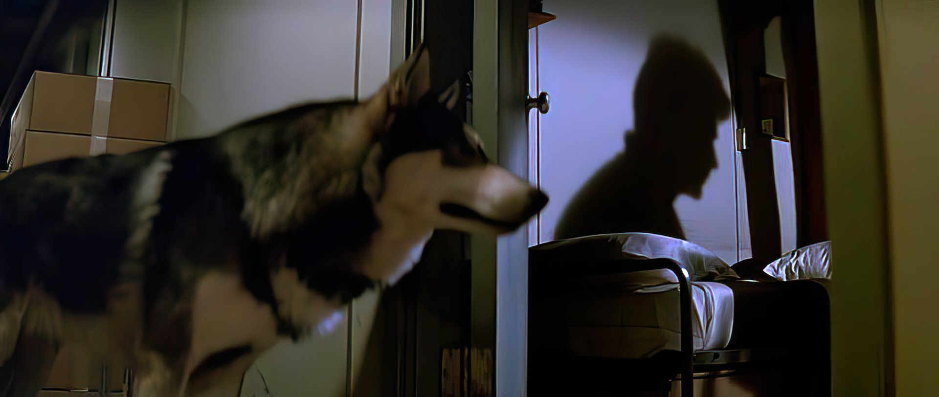
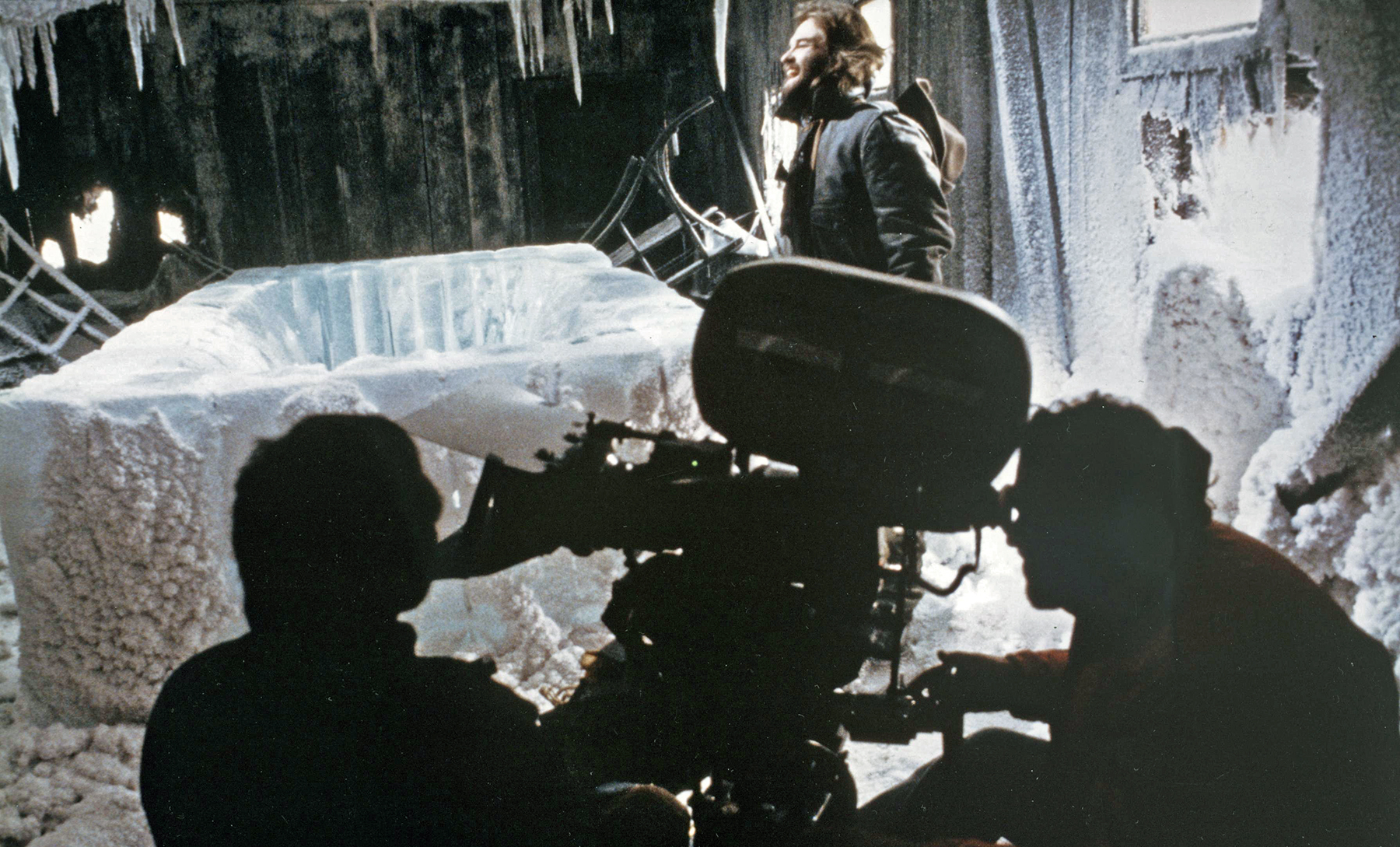
In terms of the compositions, well, I was a big fan of the anamorphic aspect ratio and had tried to convince some of the directors I’d worked with previously to use it. There was always this resistance, with guys saying it was too wide and you couldn’t really get close-ups of the actors. John believed, as I did, that filmmaking wasn’t always about close-ups, and that you could use that wide aspect ratio to place the characters in an environment. Even when we weren’t using the frame to imply that something might be about to happen, as you say, we were using it to create a whole world. There are these big wide vistas at the beginning, but with the snow and the mountains and things in the foreground, we still made the frame claustrophobic and used it to confine the characters.
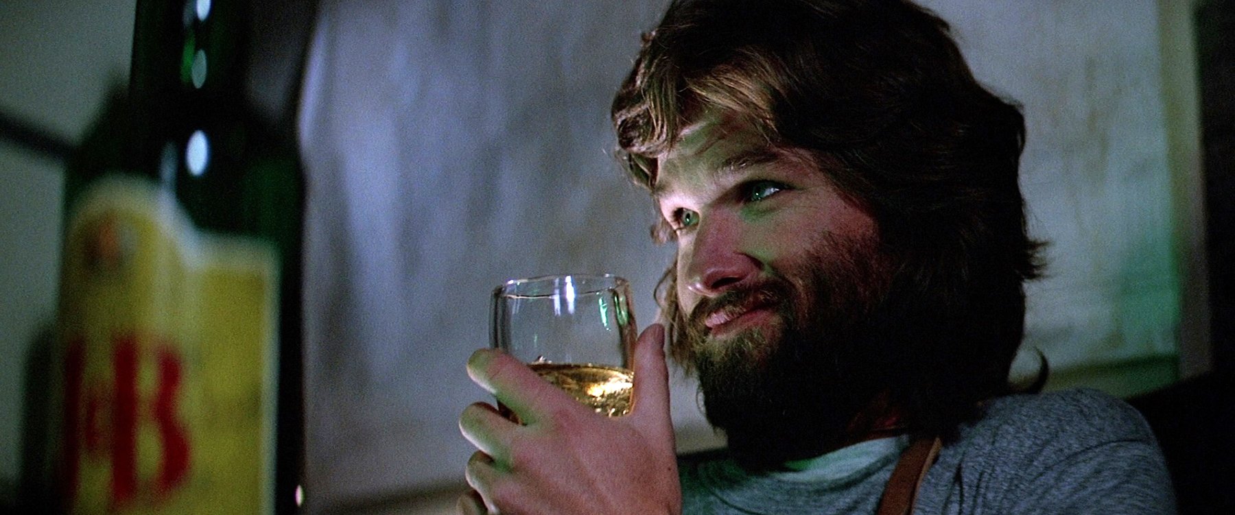
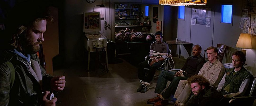
The wide frame also helps because it’s an ensemble movie, and several characters are often interacting in the frame. It’s such a strong actors’ film, yet there’s also a very precise visual design. Did you and Carpenter do a lot of storyboards, or did you respond more to the location and the actors on the day?
The anamorphic aspect ratio was very consciously discussed as an effective way to capture so many characters and make them feel confined in the frame. John was a very big proponent of trying to get one shot to fulfill the needs of the scene.
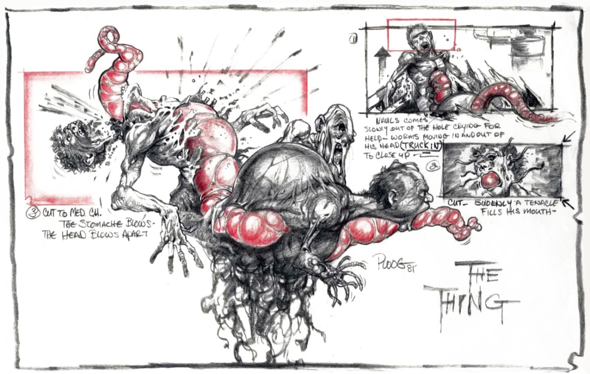
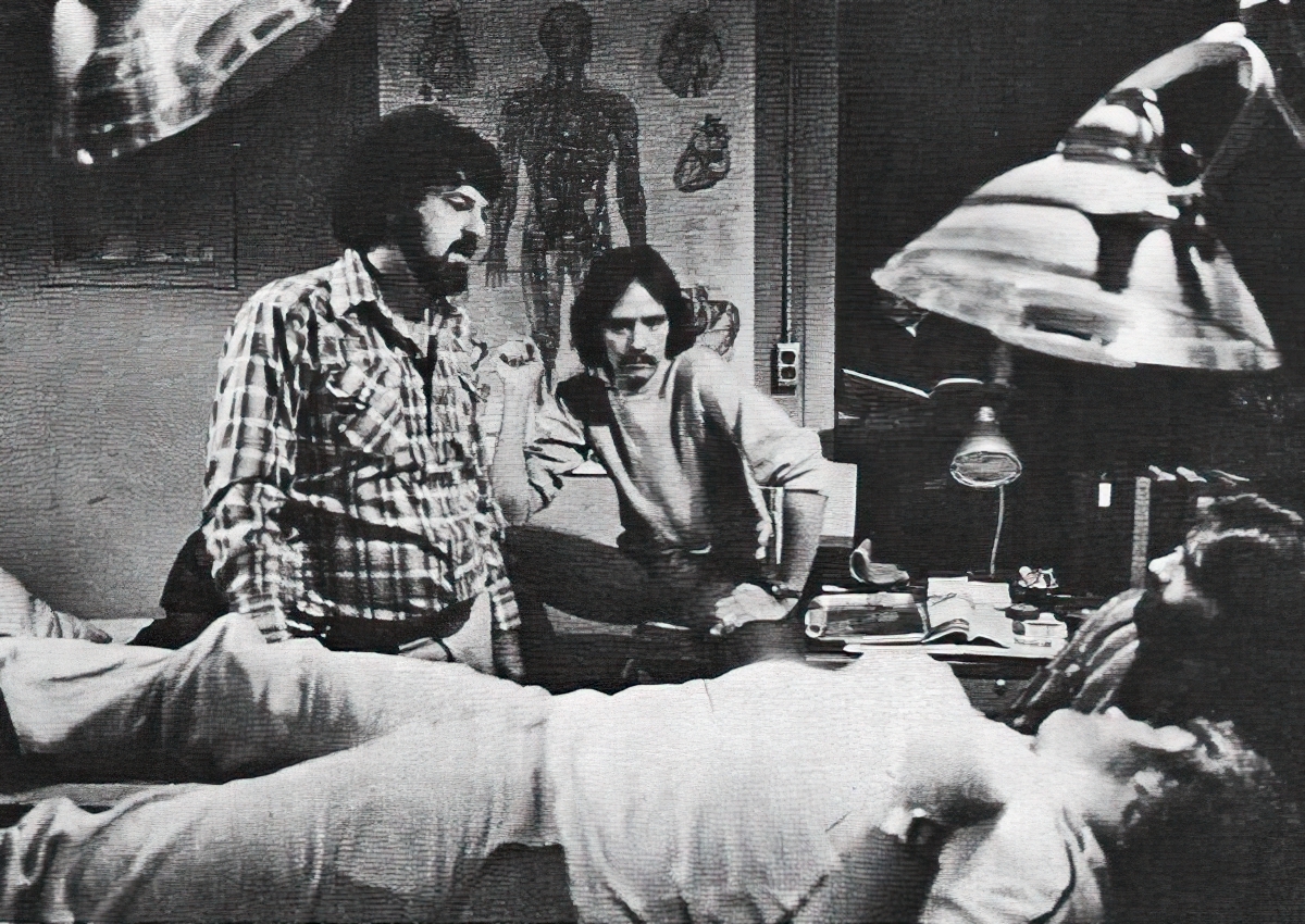
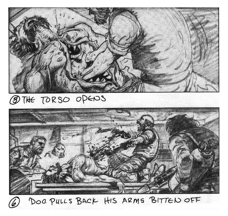
I would say our approach was somewhere in between having storyboards and just making it up as you go. We had some excellent storyboards by Mike Ploog, a well-known comic-book artist; he created great jumping-off points that served as inspiration for us.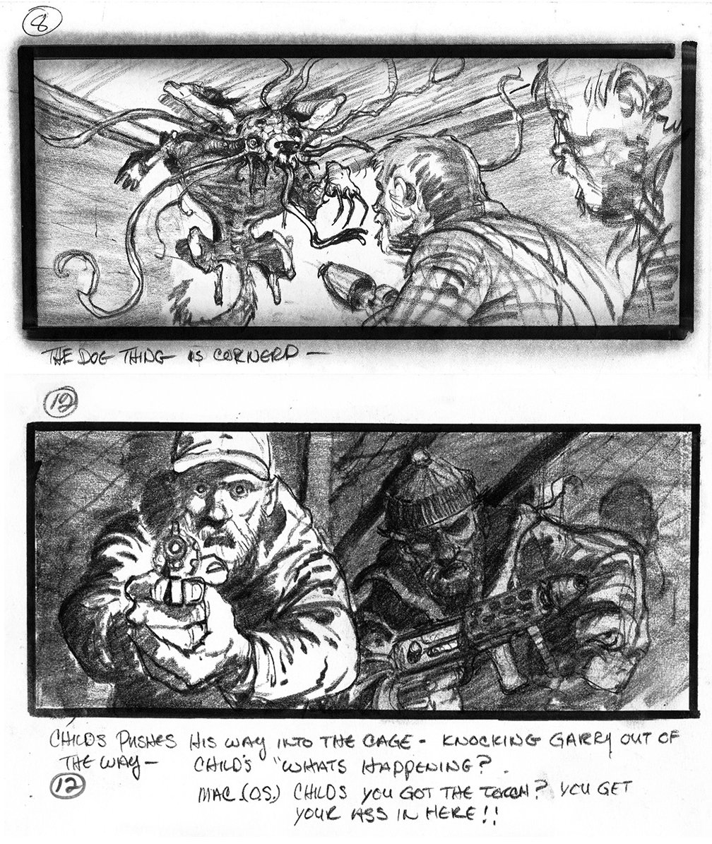
Another key component of the visual design is the way you use light to convey temperature, specifically the icy chill that surrounds the characters.
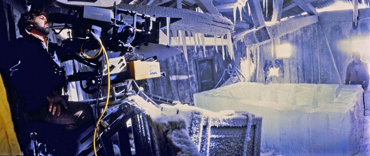
I tried to create a strong sense of the cold by creating some contrast — the interiors were often lit with a warmer light so the audience would notice the difference between that and the exteriors, which we kept in blue tones, particularly at night.
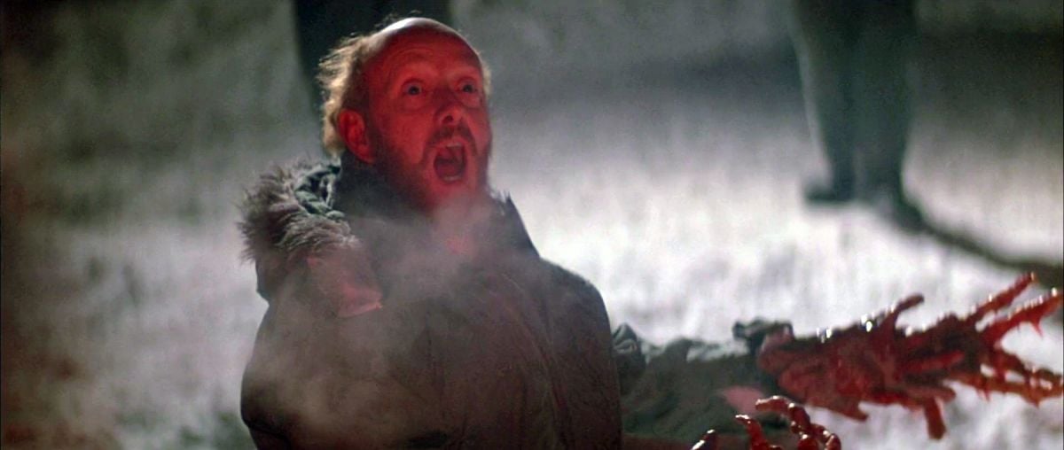
I found these very intense blue lights used on airport runways; they were balls covered with this very blue glass envelope, and they threw off an otherworldly blue light. The snow would reflect any color we put on it, so that made the outside even bluer and cooler. For the interiors, I had the crew build and hang overhead lights with conical shades, with the idea that we could control the light and not have the rooms completely illuminated. China hats would direct the cone of light down and allow you to have areas of darkness while still seeing the characters, and that enabled us to shape the light to create the mood we wanted. There were a lot of decisions and discussions involved in trying to control the pools of light while keeping the colors warm inside and cool outside.
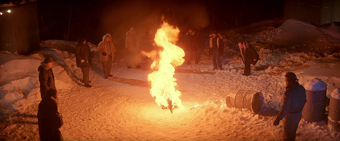
And then there’s fire as both a story element and a visual motif.
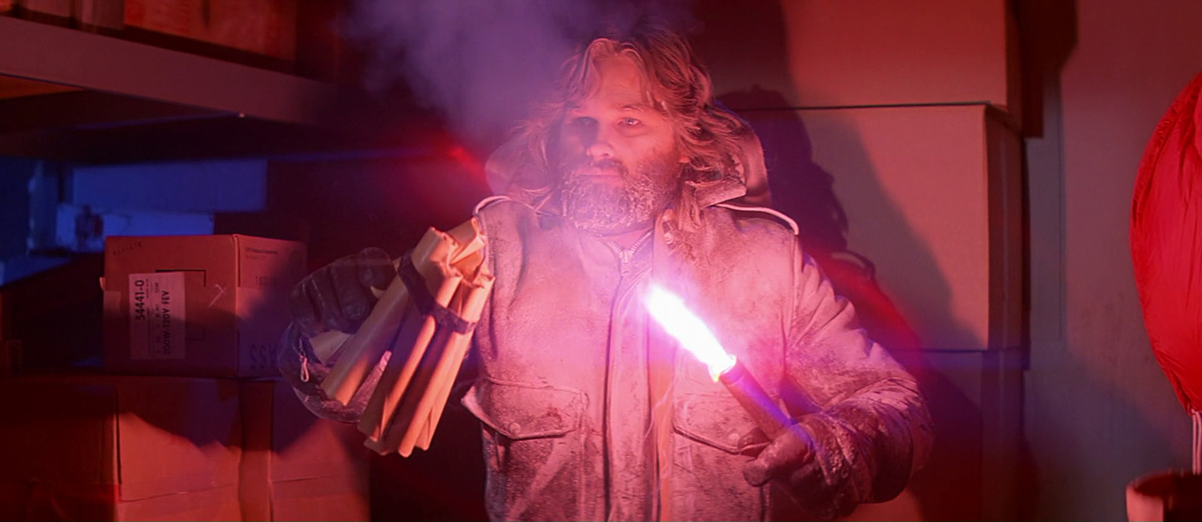
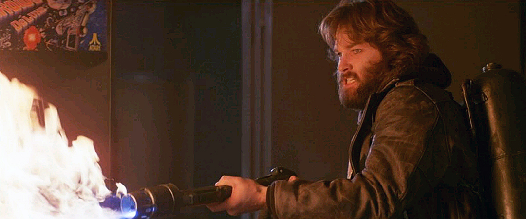
We tried to use the flamethrowers and the flares the characters carry as sources of light, in some sense allowing the actors to do their own lighting. The flares had an amazing color, a very unique sort of magenta. We’d probably never do something like that now because there are concerns about the kind of smoke they give off.
Did the fact that this was your first big studio movie change your approach?
I remember walking onto those huge sets and thinking, this is going to be very challenging. But I tried to break the big challenges into smaller, more manageable and understandable pieces so I wouldn’t get overwhelmed. It was different and bigger than anything I had ever worked on before, but my idea was to see how I could apply my experience to creating this new world over which we had total control. The big satisfaction was that we were all working on the same movie and had a lot invested in doing it properly. The studio and all of the departments I worked with were very supportive, eager to help out these relatively new guys with this very large project.
Cundey was honored with the ASC Lifetime Achievement Award in 2014.
AC also covered Cundey and Carpenter’s collaboration on Big Trouble in Little China (1986).
Rob Hardy became a member of the ASC in 2021.
If you enjoy archival and retrospective articles on classic and influential films, you'll find more AC historical coverage here.
