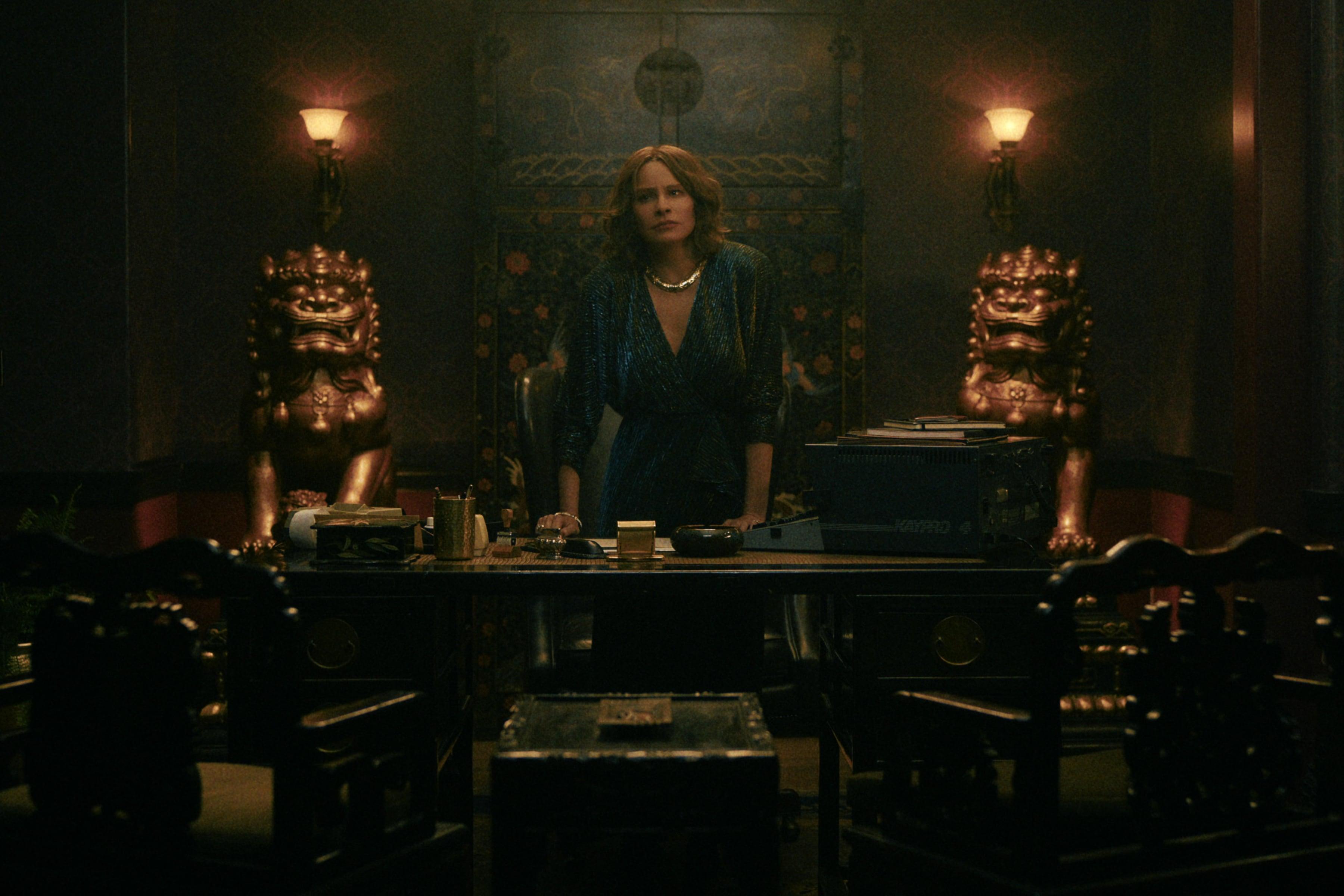
Griselda: Rise of “The Godmother”
Armando Salas, ASC teams with director Andrés Baiz to tell the tale of a Colombian drug kingpin.
The dangerous lifestyle of a drug lord would not seem worth the potentially deadly risks to most normal, law-abiding people. But in designing the look of Griselda, ASC member Armando Salas understood that audiences always seem to find vicarious thrills in characters who flout the law with reckless abandon.
The six-episode Netflix miniseries, directed and produced by Andrés Baiz, tells the story of an unlikely super-criminal who rose to prominence in Miami’s cocaine-trafficking scene during the late 1970s: Griselda Blanco, a former prostitute who soon became known as “The Godmother.” The illegal enterprise she led became so successful that it inspired the creation of the Centac 26, a joint effort by the Drug Enforcement Agency and Miami-Dade police to crack down on the flood of narcotics streaming into Florida.
While acknowledging that Blanco’s saga “is full of bleakness, death and destruction,” Salas points out that Baiz wanted the focus of her story to be that of an aspirational antihero, “a woman breaking boundaries and taking control and agency in her life. We didn’t want to create a bleak show; there’s a kind of joy in her quest to succeed as an entrepreneur in this insane world of narco traffickers that we wanted to capture.
Not “Narcos: Miami”
With episodes of Narcos and Narcos: Mexico among his directing credits, Baiz seemed a natural choice for the project, which was also produced by and stars Sofía Vergara. Also onboard was Narcos producer Eric Newman. Baiz recalls, “They came to us thinking we would basically do ‘Narcos: Miami,’ but we were interested in something completely separate from the Narcos series — something more character-driven, with its own distinct voice, so we worked with Sofía to develop that concept.”
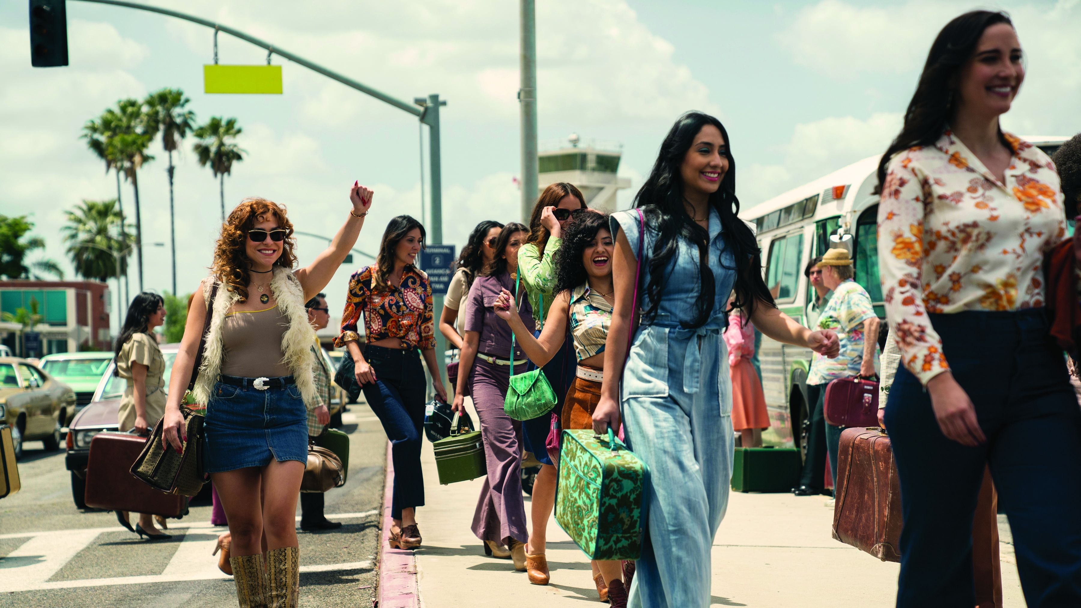
The Covid-19 pandemic interrupted preproduction, which allowed Baiz and Salas more time to discuss their approach. “We had the luxury of time to discover and develop the right aesthetic,” Salas recalls. “Andi would bring an assortment of Polaroid instant cameras to early director’s scouts and shoot the locations and crew as a hobby. At first it was just for fun, but we quickly fell in love with some of the characteristics of the images, and we started being more serious about how we arranged and composed the photographs. I created a grid of all the best shots on the wall of my office, and it became a source of inspiration for our look. The Polaroids distilled the colors down to a painterly essence, while maintaining pleasing skin tones. They all felt very ‘1970s.’”
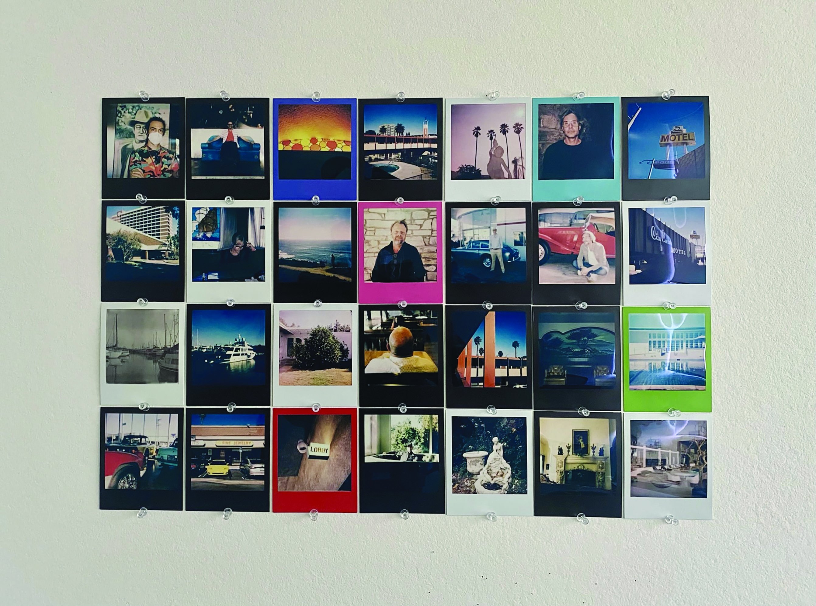
Baiz says he always starts prepping by looking at still photography. “For Griselda, we looked at Andy Sweet, a photographer from Miami in the ’70s; William Eggleston, for his composition and colors; and Larry Sultan and his work in California,” he says. “All of these were very strong inspirations. They all had a nostalgic sensibility, which might be strange for a ’70s crime show about drug dealing, but we didn’t want this to look like Scarface.”
Speed and Precision
After testing multiple camera-and-lens combinations and screening the results on Netflix’s CLED wall, the filmmakers decided to shoot with the Red V-Raptor 8K VV and Panavision Panaspeed lenses. The Raptor was so new at the time that “our focus puller, Neil Chartier, was building and 3D-printing accessories with the help of Panavision,” Salas recalls.
“This show was about 75-percent single-camera, with a Panavision [Millennium] DXL2 working as our B camera the rest of the time,” the cinematographer continues. “Our A camera lived on an Arri SRH-360 head most of the time. The fully accessorized camera and head topped out at 35 pounds, so Neil could jump it from a dolly to a telescoping crane to a Chapman MiniScope, and back, very quickly. It allowed for an efficient way of working while maintaining the precision we wanted.”
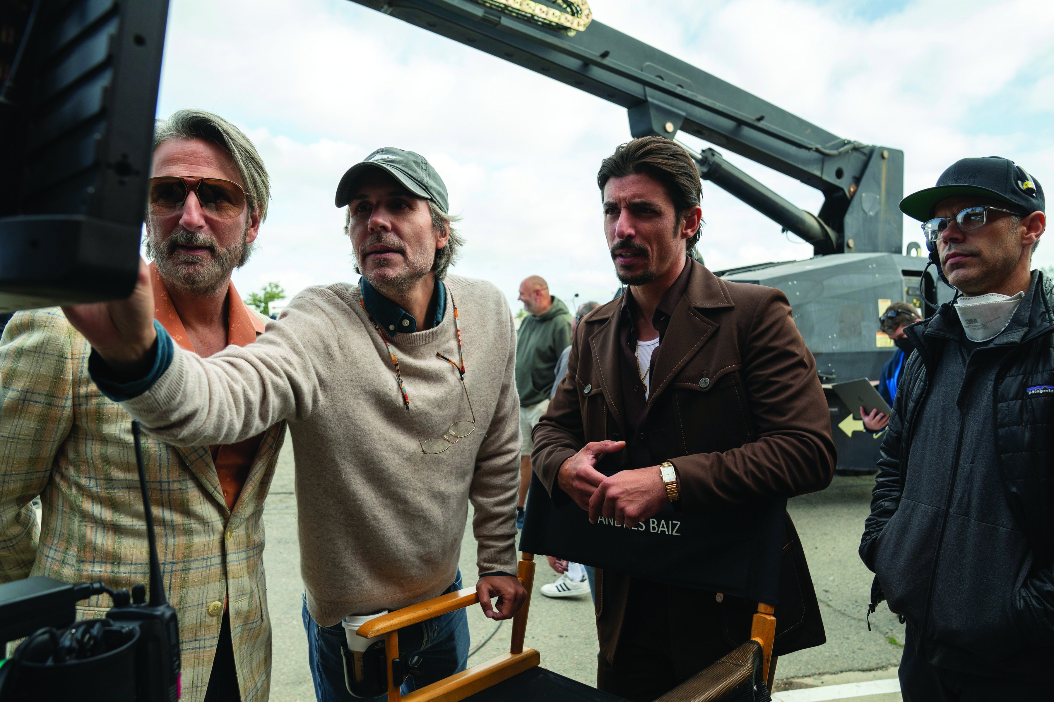
Salas says he appreciates the Panaspeeds’ ability to “hit the sweet spot between mechanical performance and organic image rendition. They have the right amount of sharpness and resolution, with a gentle fall-off toward the edges of the larger-format sensor. They are also very consistent from lens to lens. I didn’t want to fight color shifts and changes in aberrations from one lens to another, which can happen with vintage glass.”
Codeword: “Revanche”
Baiz and Salas’ prep also included screening several movies — “films that were actually completely different from what we were thinking, but provided some kind of inspiration,” Salas says.
The Academy Award-nominated Austrian drama Revanche (2008), directed by Götz Spielmann and shot by Martin Gschlacht, AAC, was particularly influential because of the filmmakers’ “ability to simplify coverage to the most effective single positions where the camera could possibly have been to tell the story,” Salas says. “We thought it was brilliant.
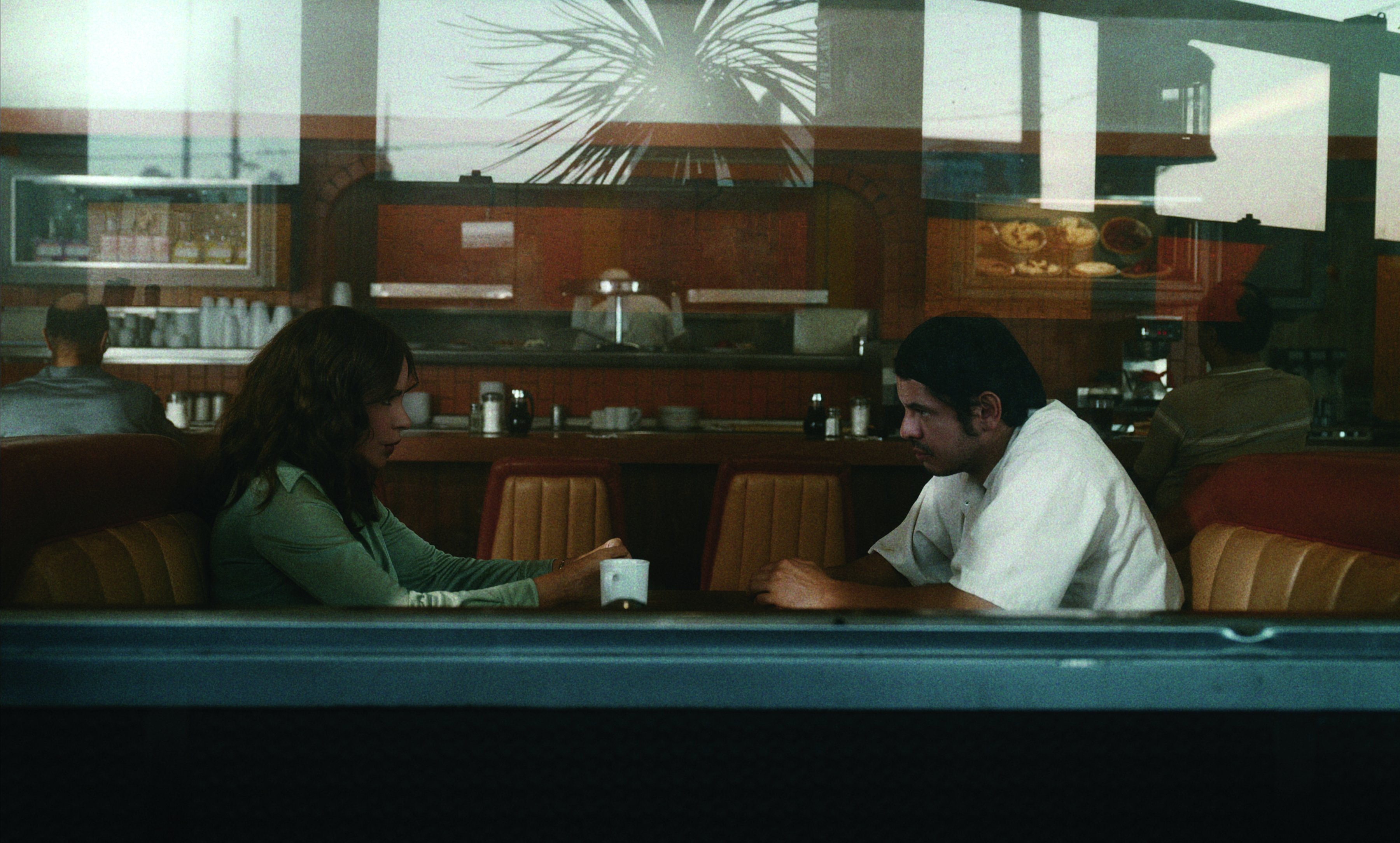
‘Revanche’ became our codeword, reminding us on a daily basis to simplify our approach where we could. We wanted to have a unique discipline for where the camera would be for any scene, making sure we stayed true to the perspective of each scene, while always evoking the rise and fall of Griselda. There’s a unifying principle, but every episode is a different part of her arc and progression. We refined as much as possible and didn’t do much coverage at all.”
Baiz says the effort to “simplify to the best possible approach” took different forms, depending on the scene. “We have one episode that opens in a car wash with a scene that has no dialogue but required many shots to get us into Griselda’s psyche. Then, in the same episode, we have an action sequence in a liquor store where multiple people are killed, and that’s all done in a single shot,” the director says. “I feel I’m doing my best when it feels like I’m standing on a tightrope. I don’t want to feel safe in editorial, but I also don’t want to shoot myself in the foot.
“David Bowie said the best place to create is like when you wade into the ocean and you’re just at the point where your feet are almost touching the bottom — you’re not too deep, but you’re not too comfortable,” he continues. “That’s when the best magic happens.”
The Perfect Frame
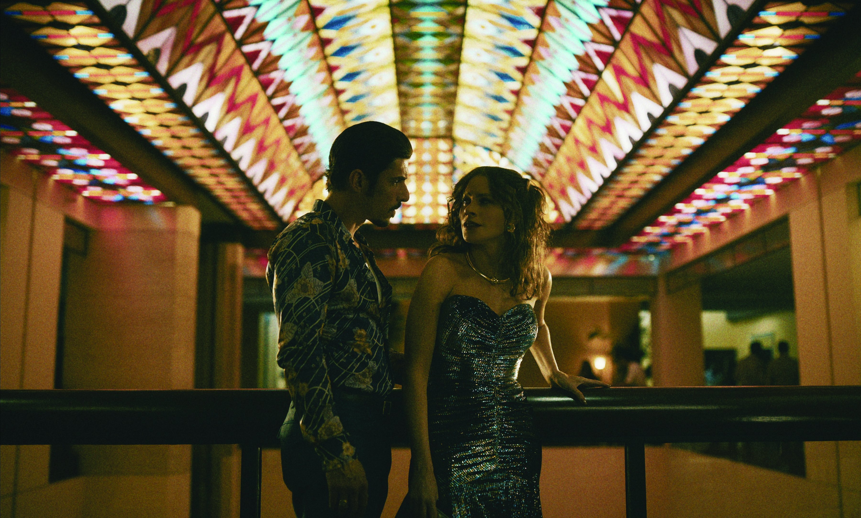
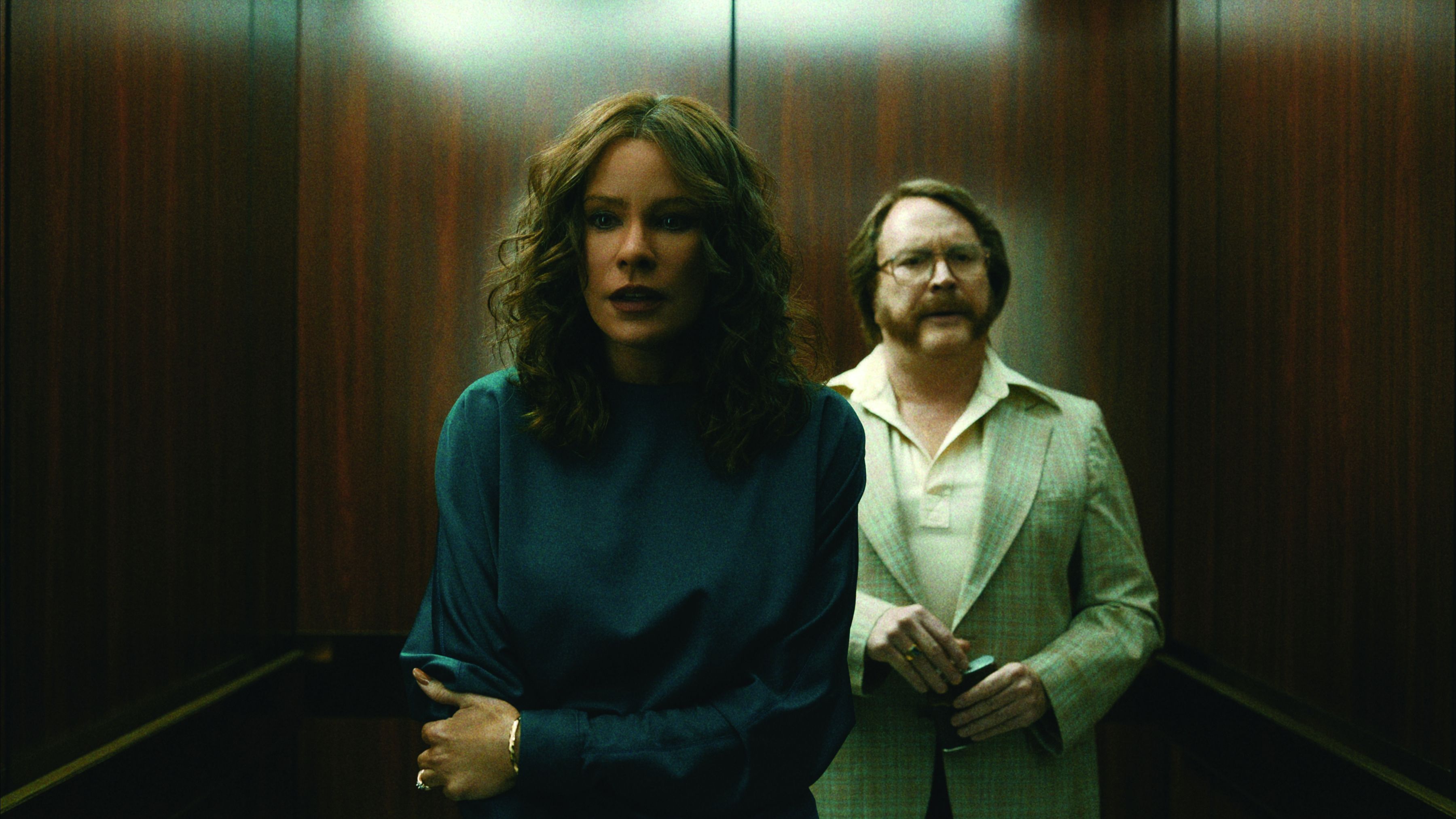
Salas and Baiz also made the unconventional decision to frame Griselda in the 1.66:1 aspect ratio. “Much of the photography we responded to was medium-format, and 1.66 just gave us the feeling of that reference material,” Salas explains. “Some of the films that Andi and I were referencing were also composed in 1.66:1 — it’s much more a European format than an American one. By comparison, [2.39:1] gives you the ability to put several faces in a single frame without having to be very wide; you’re still in a relatively close shot for a tableaux, but for a close-up of a single person, there’s a lot of extra space. However, this show is about one woman, Griselda, who is the center of her universe. In a wider aspect ratio, we’d be fighting to isolate her in a medium shot. The 1.66:1 ratio just worked perfectly.”
Developing LUTs
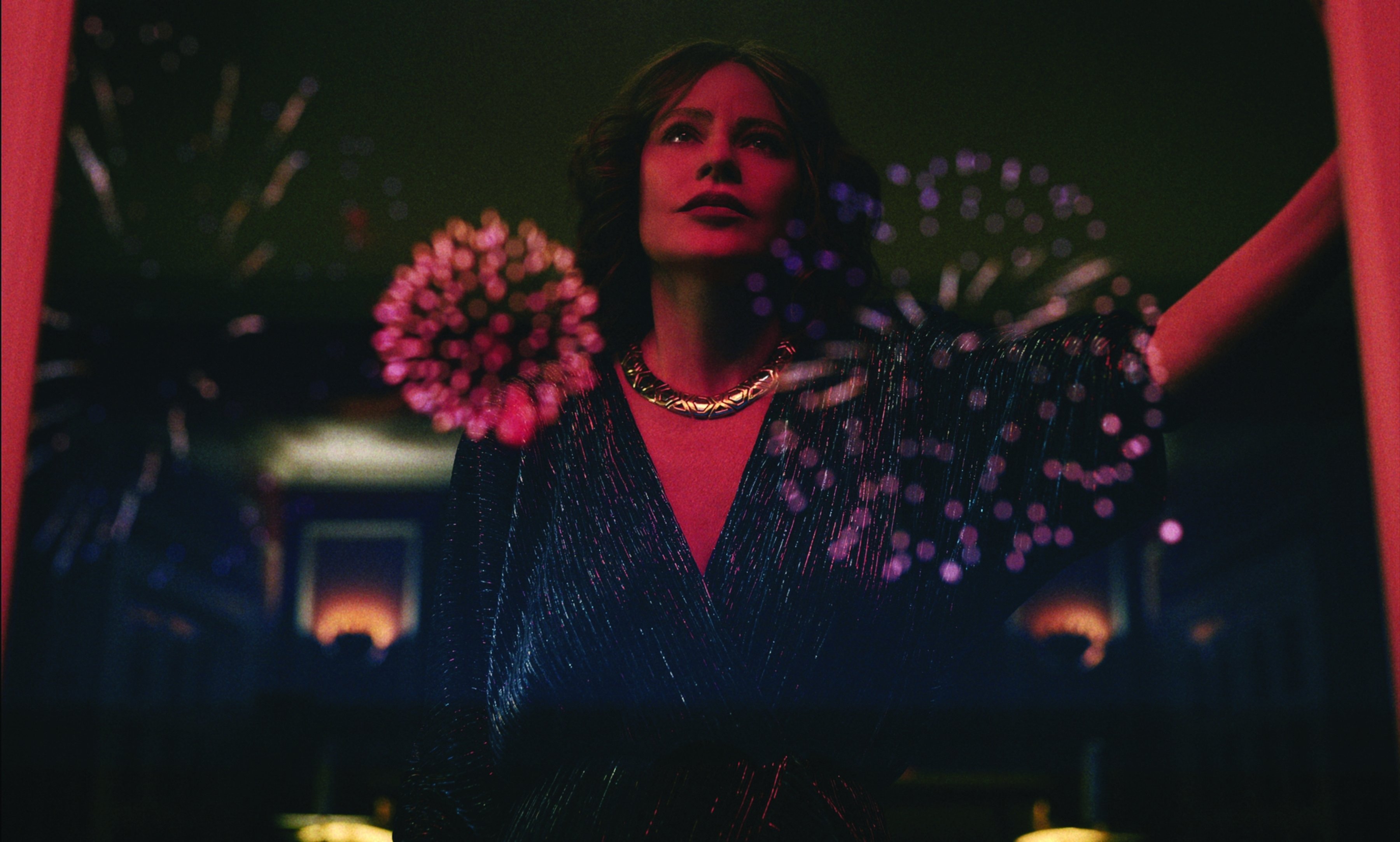
On any given show, Salas devotes a considerable amount of prep time to developing the LUTs he will use. “I do a lot of look development on the LUTs, and then I just light to the LUT. Beyond that, we make all the changes to the metadata on the camera only. So, we’re floating the color temperature and tint to effect matching one camera to another, or to adjust for the base color of a given location. All that information tracks in the color suite — every choice you’ve made is there.
“In this case, we had a very heavy look, and I did three rounds with [supervising colorist] Ian Vertovec at Light Iron, building the look around the reference Polaroids, trying to contain certain colors and mimic how the shoulder of the exposure curve would roll off,” Salas continues. “I then tweaked that LUT based on a camera shootout and had a second iteration we used for hair, makeup and wardrobe tests, with paint and wallpaper samples in the backgrounds provided by the art department. After that, I worked with Ian to finalize two LUTs: one for 1978, with a heavier ‘Polaroid’ influence, and one for 1983, which was more akin to the pre-EXR Kodak days, which had more hardness and less nostalgia.”
Creating Grain
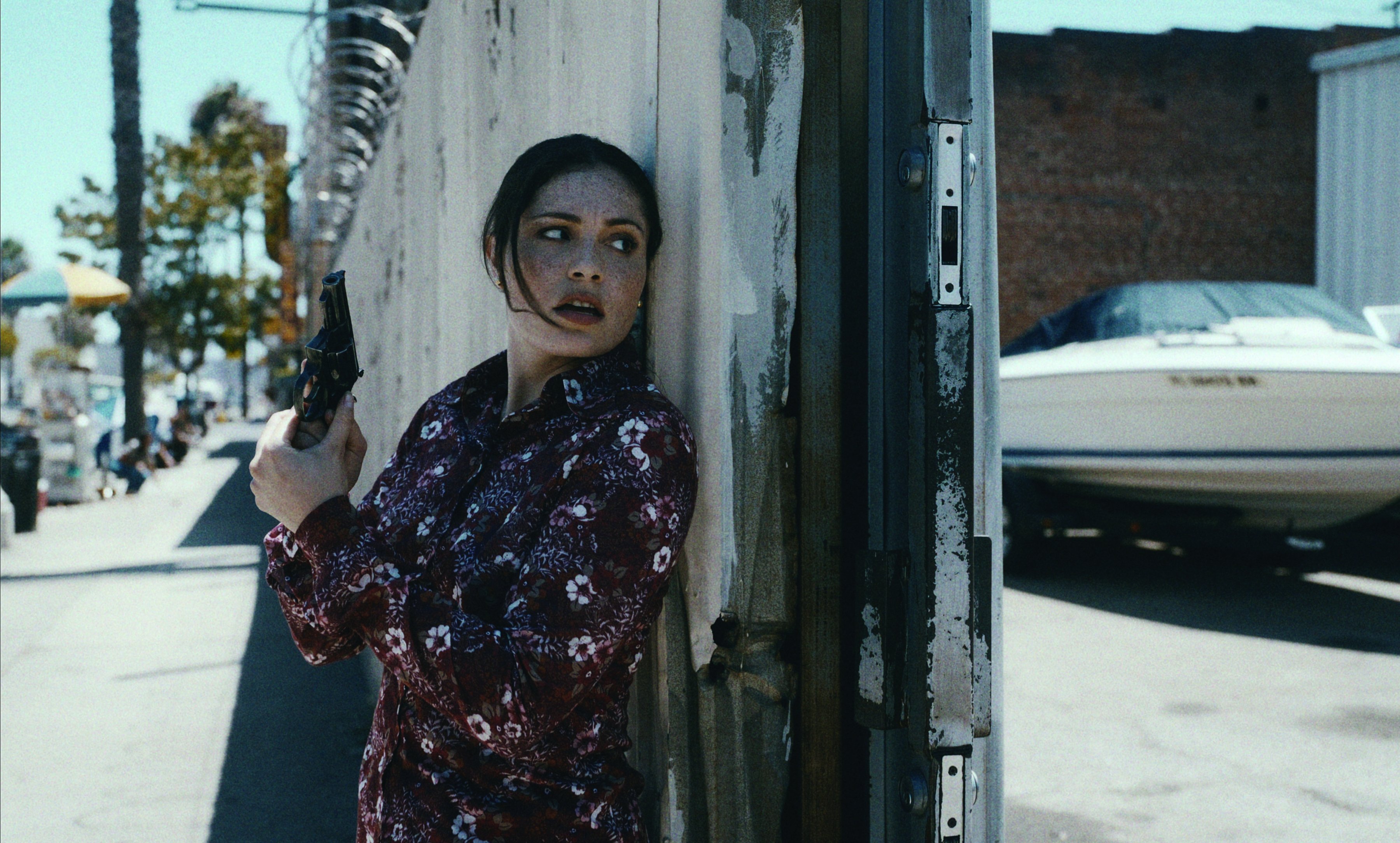
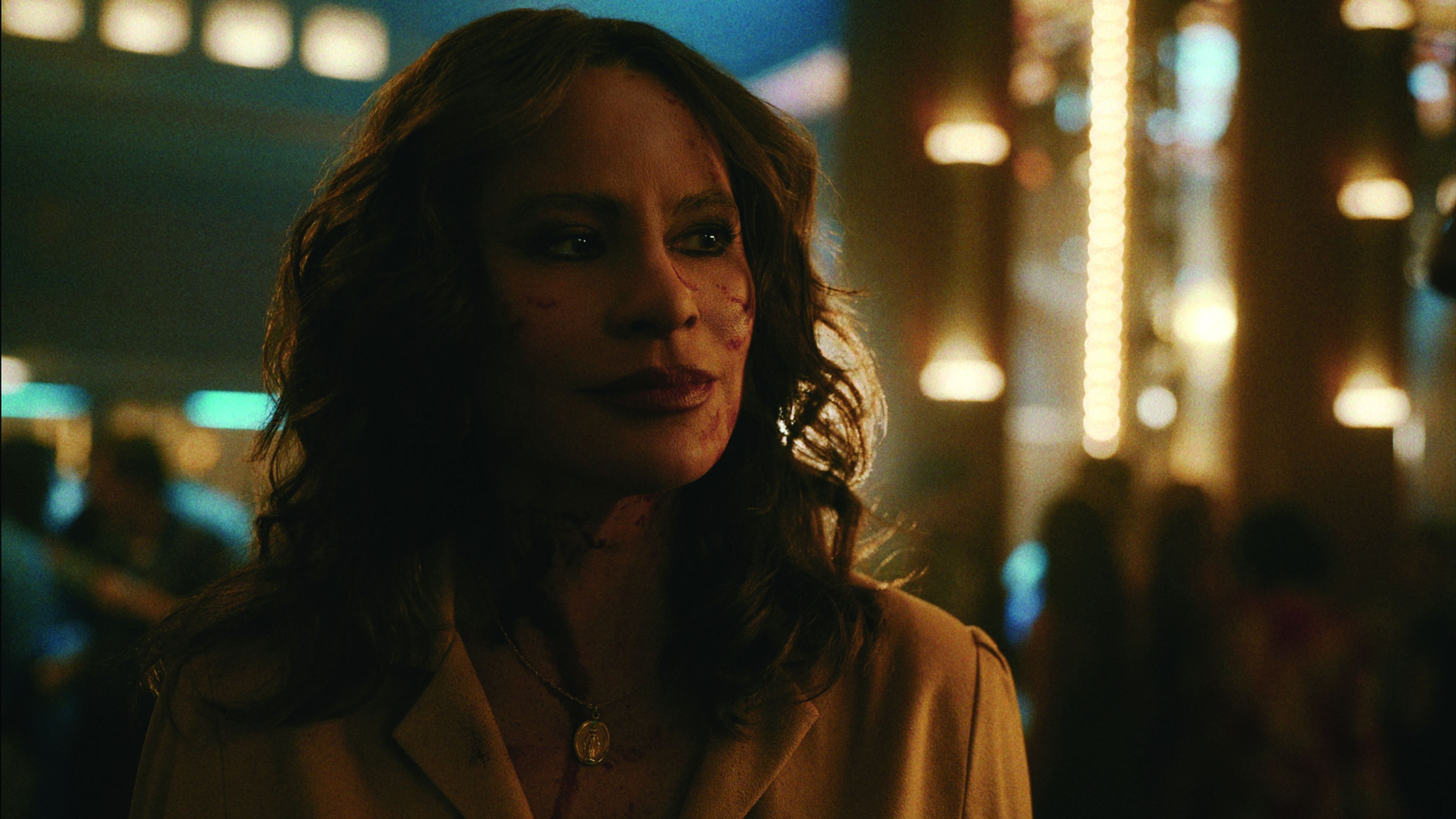
Adding an appropriate level of texture to the images was another component of the LUT development. “We were incorporating grain and halation and deciding how it would evolve over the course of the story,” says Salas. “Adding grain was a multi-step process. I wanted to make sure everyone was buying into the grain early on, and that the look tracked throughout editorial and VFX, so it was built into the dailies we delivered. We even had a live preview on set, which was accomplished by DIT Aaron Pico emulating Ian’s grain and halation using Filmbox in Resolve Live. The halation went from very subtle to 80 nits to full bloom at around 250 nits — at about the top end of our LUT in PQ/P3 — and gave a beautiful blossoming effect in extreme highlights, like sun hitting chrome.
“Those grain and halation LUTS were saved in a Baselight BLG file that dropped easily into Avid and Nuke and countless other software tools, so our VFX team could also use the LUT when evaluating their work, especially in regard to prosthetic cleanup and removing anachronistic elements from the frame. They could easily turn the texture on and off and see how it was looking.”
Bluescreen Skies
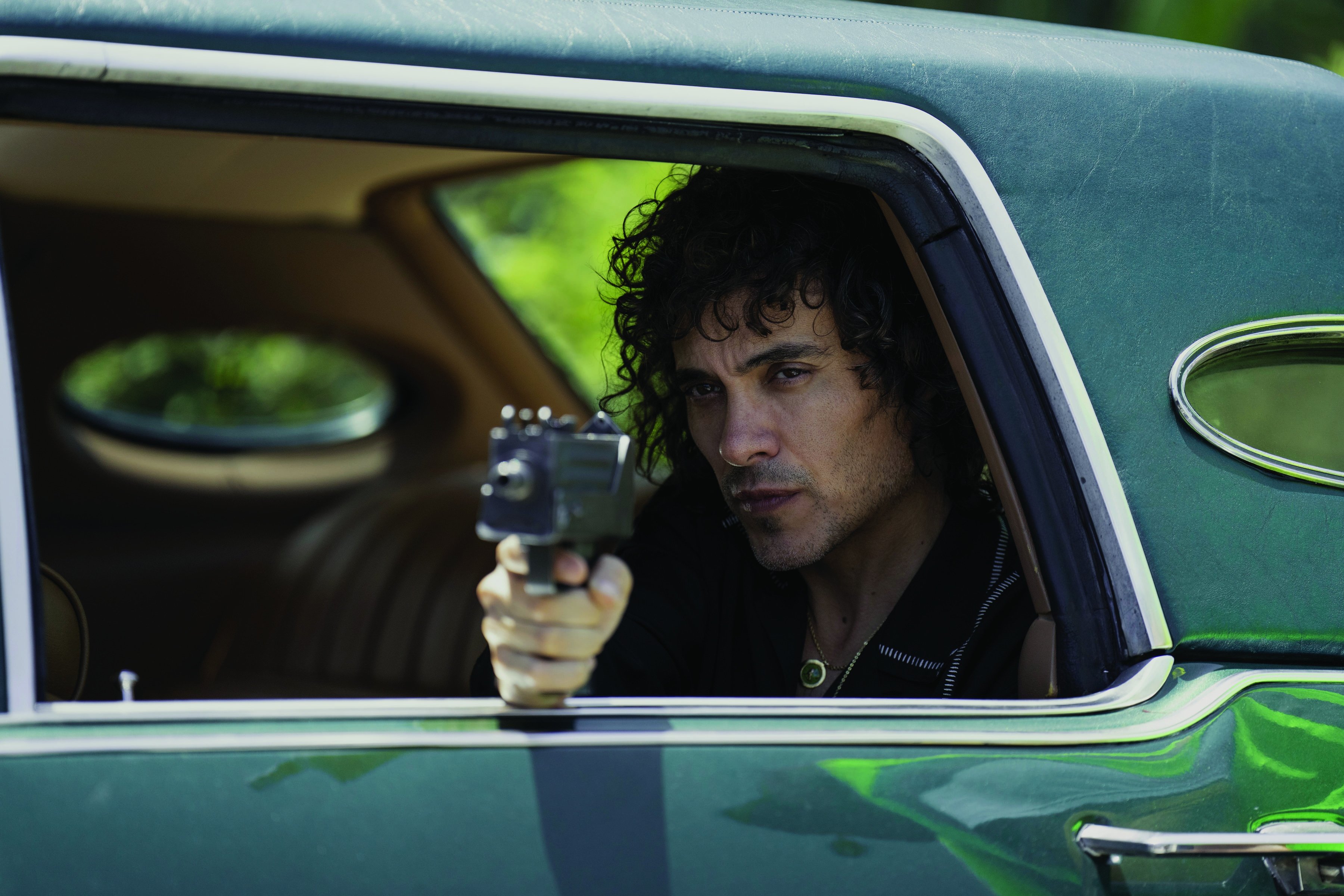
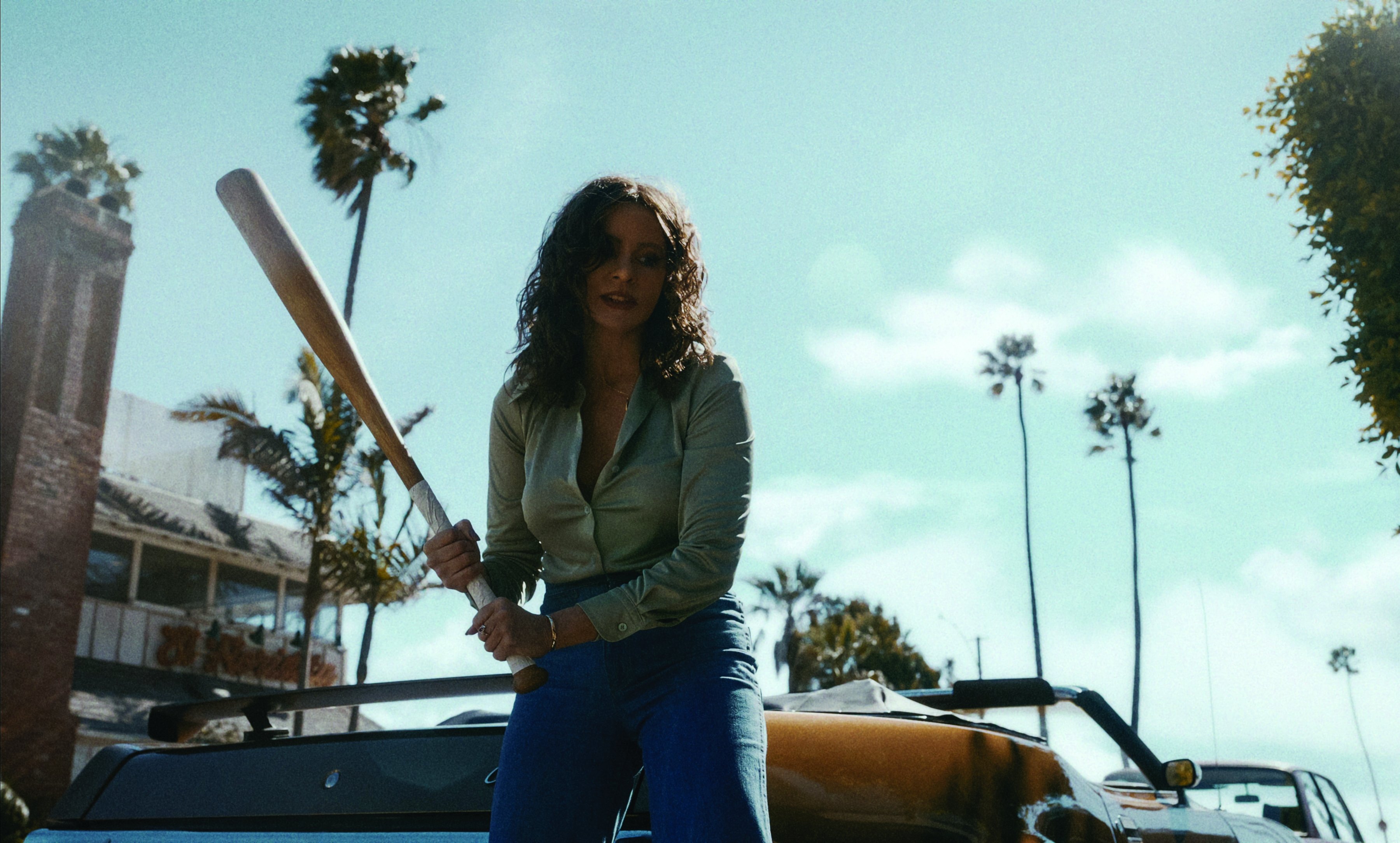
Griselda was shot entirely in Los Angeles, which doubled for locations in Miami, Colombia and other parts of California.
“One of the aspects I knew we had to address, especially having grown up in Miami, was the look of Florida’s skies,” notes Salas. “Los Angeles skies are typically a perfect, pure blue, but South Florida skies are always filled with sculptural clouds — and I knew we’d be seeing a lot of sky in the 1.66:1 aspect ratio! Luckily, the sky in L.A. is like a natural bluescreen, so VFX could [comp] in the necessary Florida skies.”
“We Made a Great Team”
Baiz declares that his first collaboration with Salas was so inspiring, “I would do another project with him in two seconds. The chemistry between the director and cinematographer is so important. As soon as we started collaborating, I saw that he is such a passionate artist, and a leader I could rely on completely. Our minds approach things differently, but we made a great team.”
Salas salutes some other key members of the team for their contributions to Griselda: gaffer Cooper Donaldson, programmer Jeffrey Horbachewski, key grip Craig Riley Jr., A-camera/Steadicam operators Joshua Harrison and Mikael Levin, and dolly grip Stephen “Danny” Mattson “and the rest of my amazing camera team. I would be lost without their tireless and constant support.”
Tech Specs
1.66:1
Cameras | Red V-Raptor 8K VV, Panavision Millennium
DXL2, Phantom Flex 4K
Lenses | Panavision Panaspeed
Lighting Spotlight | Creating a Nightclub Vibe
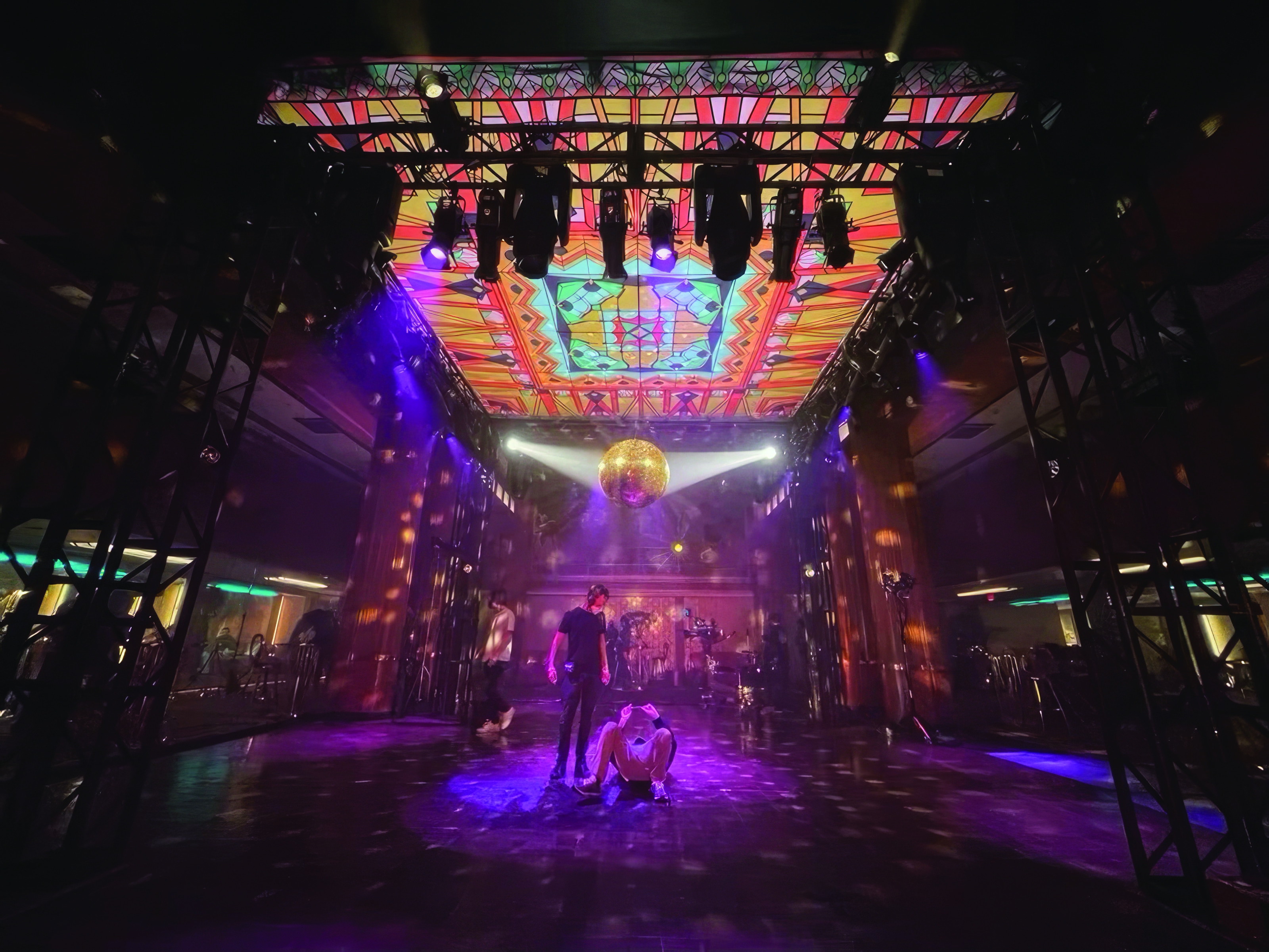
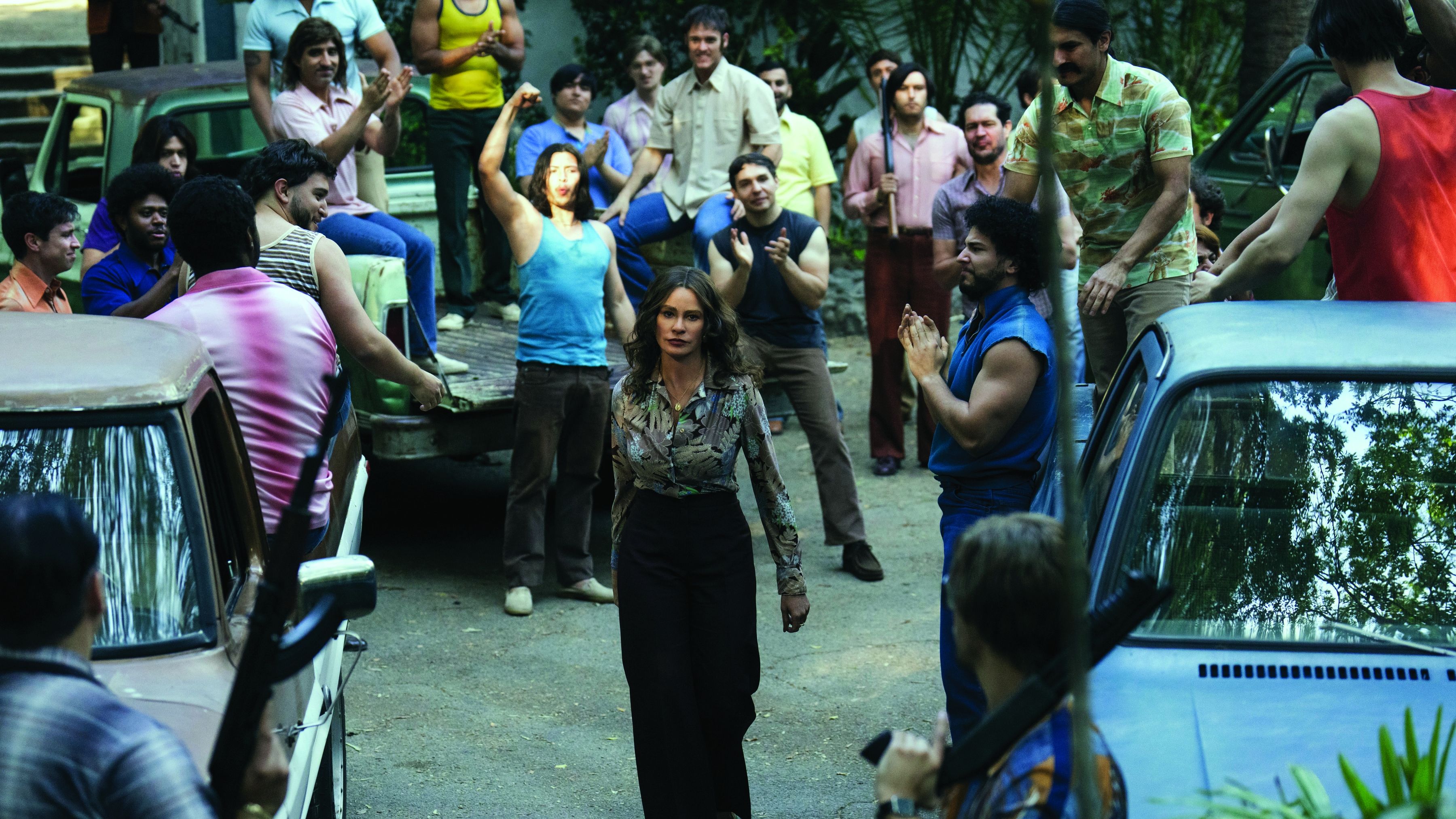
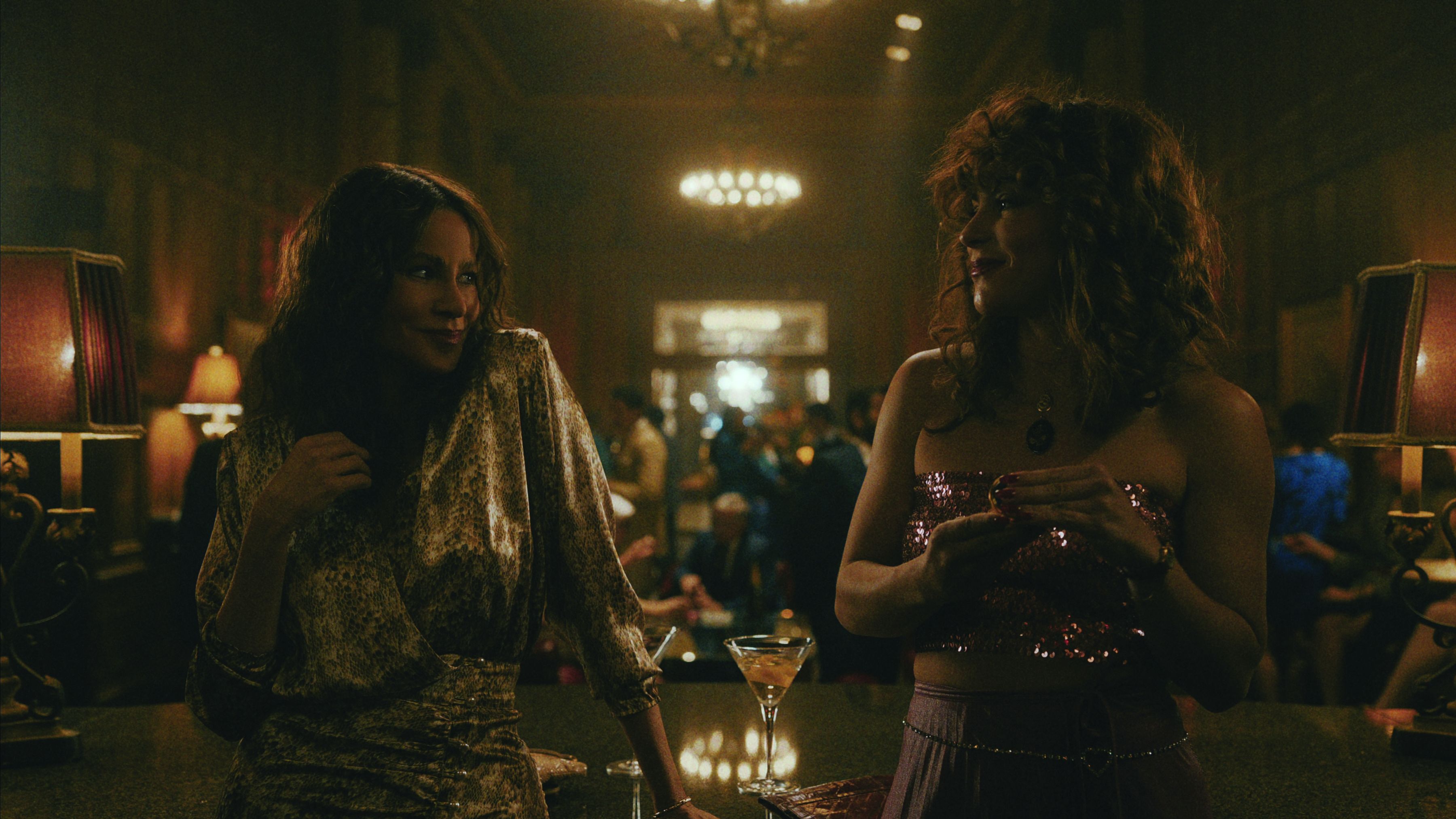
One location that makes a recurring appearance in the show is the Mutiny nightclub, the epicenter of the Miami drug scene. The club’s interior was built inside a ballroom on the Queen Mary, which is docked in Long Beach, Calif.
Salas recalls, “The scale of set we wanted to build was really outside our budget, so we started to look for practical locations that would give us the size and scale we wanted and provide a head start on the look. The Queen Mary’s biggest ballroom gave us that; with its massive columns, period carpet and Art Deco ceilings, it felt like the right starting point. We shot interiors there for about a week, which required a massive lighting installation without damaging the historic space.”
A key addition the production added to the ballroom was a 20'x20' stained-glass Translite that served as the ceiling over the club’s dance floor. Salas and gaffer Cooper Donaldson lit through the Translite with Cineo ladder lights, setting them at 4,000K to balance some of the warmth generated by the Translite’s amber, gold and copper hues, “which created a beautiful, soft toplight that complemented the skin tones,” Salas notes.
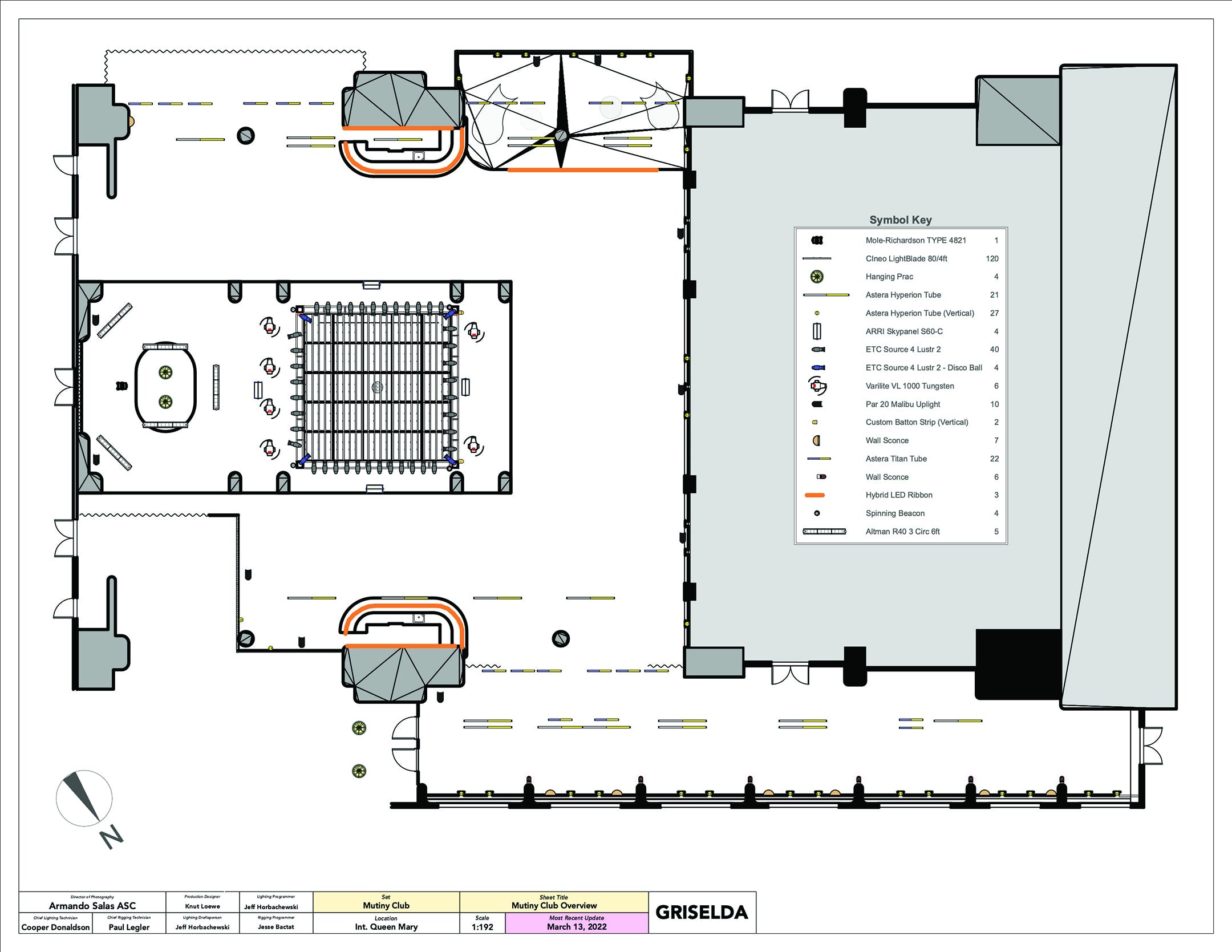
“On the truss surrounding the Translite, we mounted a large number of Lustr LED Source Fours camouflaged with period tungsten Leko and PAR-can fixtures,” he continues. “Everything in frame felt period-accurate while capitalizing on the flexibility of LED fixtures; I knew I had to create enough lighting energy that the vibe wouldn’t feel dull and lifeless to a modern audience, so we used color cues to avoid having to double the number of fixtures. In addition, we had spinning beacon lights and a large disco ball to help generate that energy. Then, we added hundreds of Asteras to the existing antique glass fixtures, and we also built them into the bar and the booths designed by the art department. We set a variety of looks that fell into two categories: amber for the ’70s and pink and blue for the 1980s.”
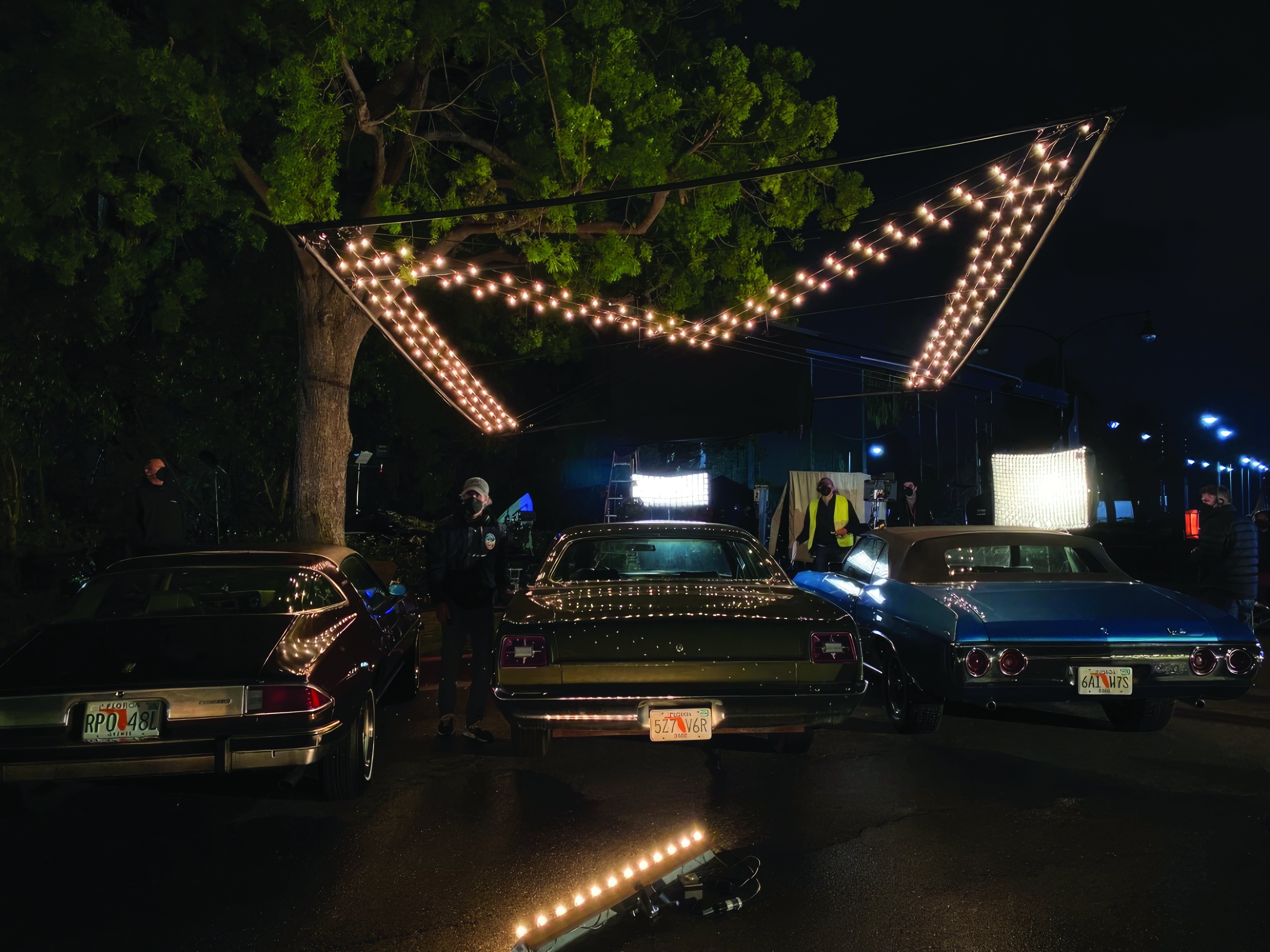
Exteriors at the Mutiny were filmed at the Pacific Palms Resort, where one key build was the club’s valet area. “It was all about reflections on period cars, so we added hundreds of incandescent globes to the hard canopy,” Salas says. “I extended that look to the parking lot in a way that would give me room tone overhead. Instead of a big soft box, where the unit itself would have been reflected in all the cars, creating a mess for CG cleanup, we created a graphic ‘M’ as if it was part of the architecture. To accomplish that, we strung 180 12-watt bulbs in the shape of a giant M on a 20'x20' flyswatter with a matte-black frame. This not only provided a beautiful incandescent glow as a base exposure, but also gave us a perfect reflection of the logo lights on car surfaces. We were able to angle the flyswatter as needed to dial in the lighting and reflections.”
— Jay Holben
