Terror Through Lighting
Fear of the dark is a nearly universal neurosis — it’s why small children plead for a nightlight at bedtime, and why even level-headed grownups might hesitate to descend an unlit staircase.
“What kind of person walks into a dark room and doesn’t reach for a light?”
Fear of the dark is a nearly universal neurosis — it’s why small children plead for a nightlight at bedtime, and why even level-headed grownups might hesitate to descend an unlit staircase. Filmmakers seeking to terrify audiences know this, of course, and are ready to exploit our common trauma trigger for all it’s worth. Ironically, their main weapon is light.
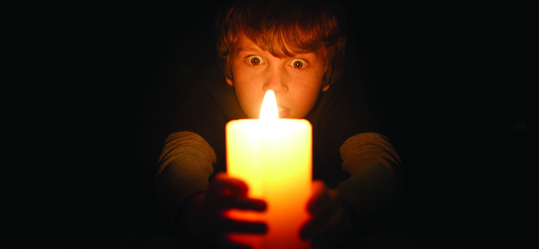
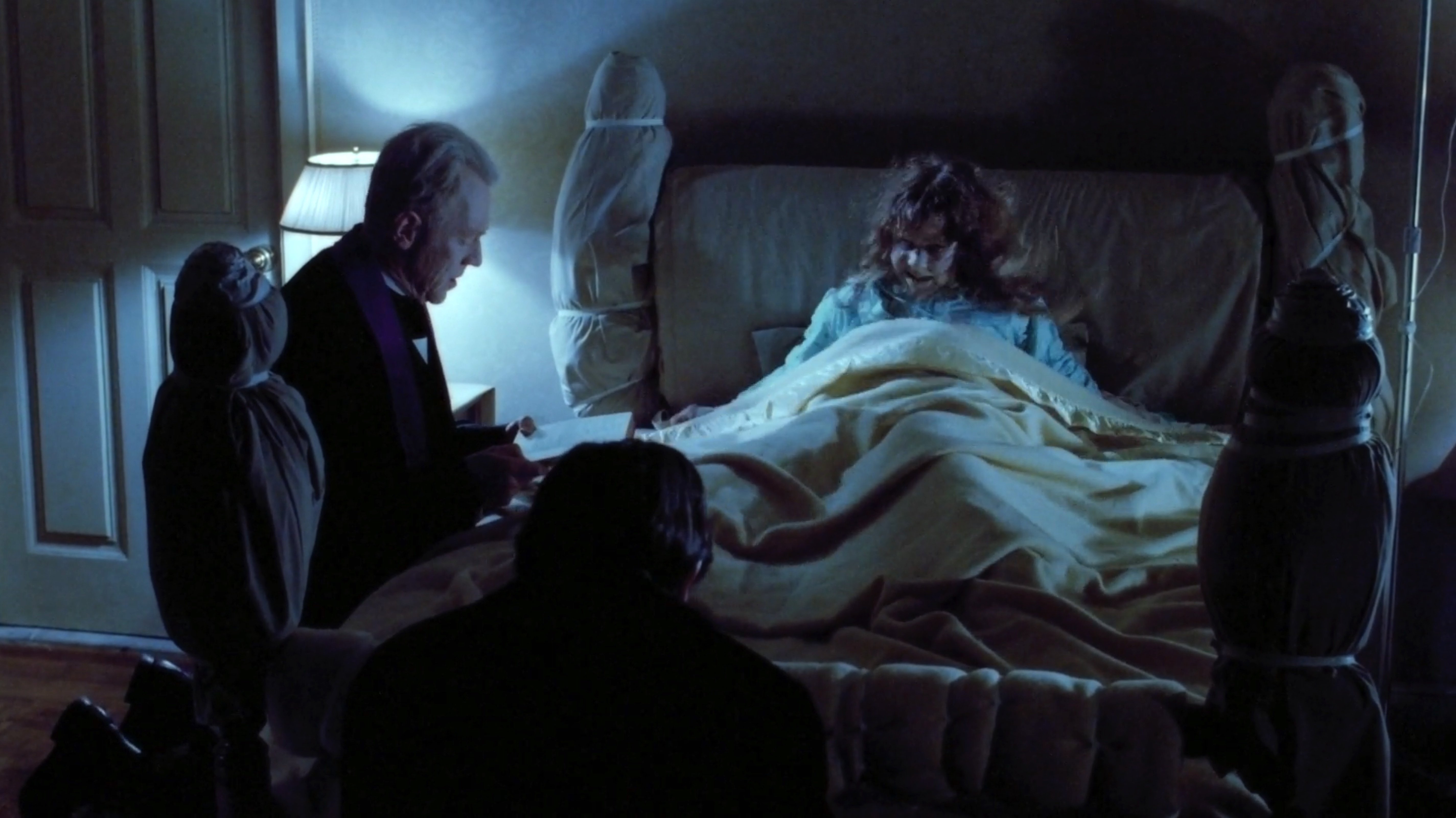
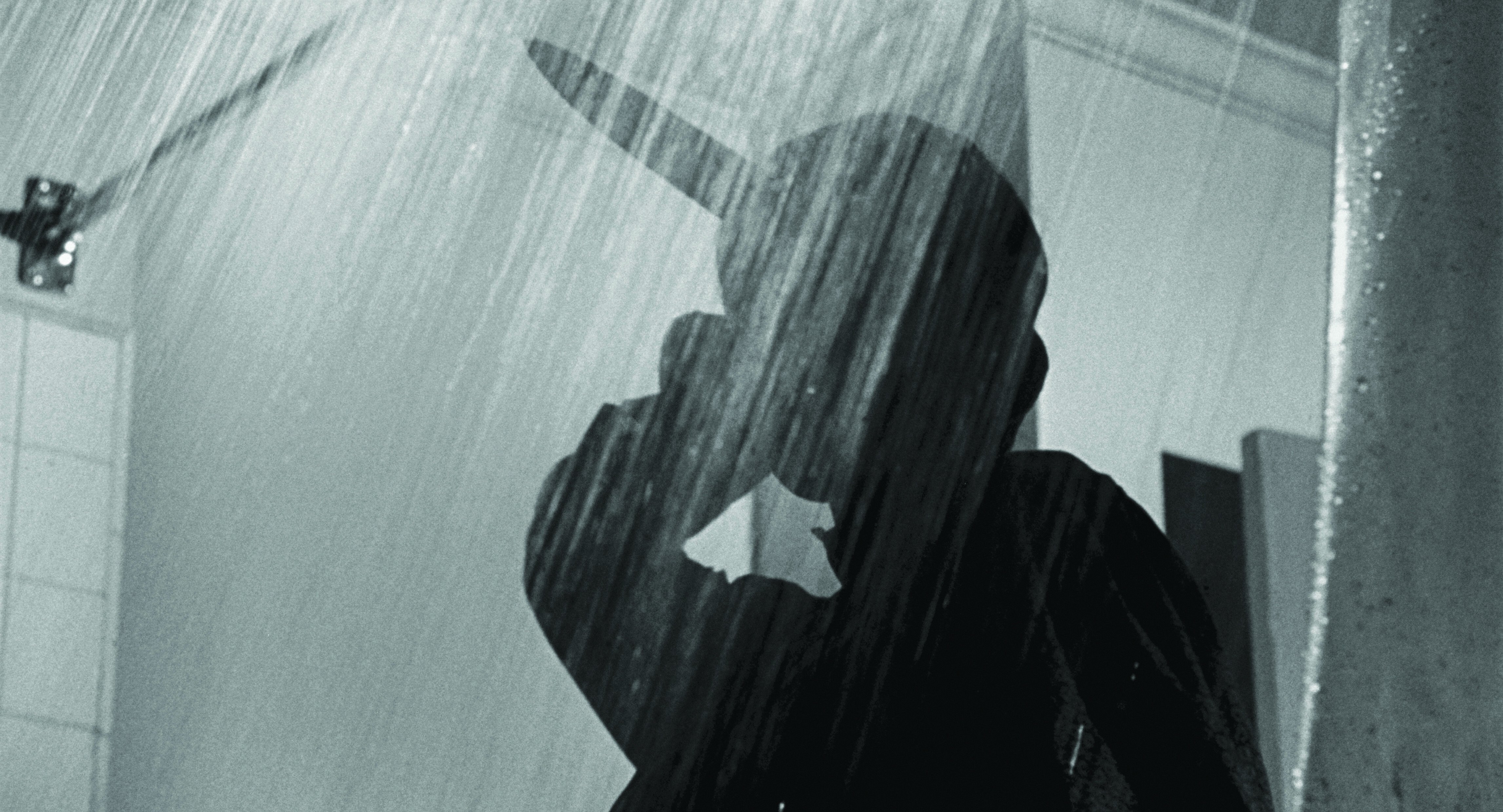
The makers of suspense and horror films can choose from a wide range of techniques to establish an ominous ambiance and ratchet up moments of terror. Strategically directional lighting, silhouettes, spotlighting, underexposure, projected shadows, the creepy placement of practical sources, and washing the frame with saturated colors are all tactics that can make viewers cower and watch a scene through their fingers. Whether the apprehension is caused by a lightning storm (Frankenstein, shot by Arthur Edeson, ASC and Paul Ivano, ASC), a backlit shower curtain (Psycho, John L. Russell Jr., ASC), eerily illuminated fog (The Exorcist, Owen Roizman, ASC), a flashlight under the bedcovers (Don’t Be Afraid of the Dark, Oliver Stapleton, BSC) or the flick of a wall switch (Lights Out, Marc Spicer, ACS), the selective use of light and shadow is a key tactic for raising pulse rates.
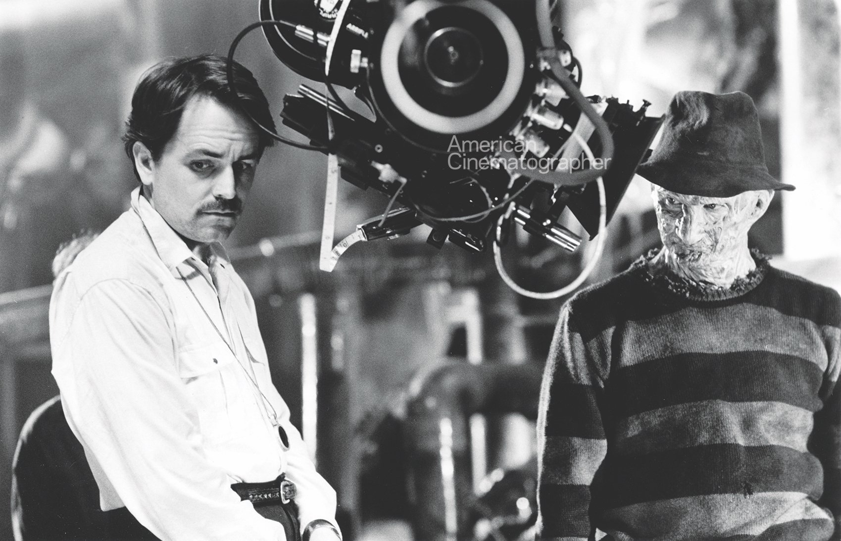
ASC member Roy H. Wagner, a cineaste who began his career with frightfests such as Witchboard, Return to Horror High and A Nightmare on Elm Street 3: Dream Warriors, knows a thing or two about unnerving audiences this way. “In a movie, where the shadows are is where the audience doesn’t want to be,” he says. “What kind of person walks into a dark room and doesn’t reach for a light? But if you put the main character in the light and surround that person with shadows, the audience instinctively wants to know what’s going on in that darkness.
“On Elm Street 3, the biggest mandate I had with Freddy Krueger [played by Robert Englund] was to not let the audience see him fully,” he says. “Exposure was critically important on that character, because we didn’t want the audience to be able to identify too much of who he was. If you reveal him completely, the audience can relax a little. But if they can’t figure him out, he’s scarier. It’s like in real life, if you meet someone and they aren’t giving you any signals about whether they like you or not. It keeps you off balance, and it can make you uneasy.”
“With movies, it’s all about intention — it’s never about reality, so the scenario doesn’t necessarily have to work according to logic. Sometimes, the more illogical it gets, the better it is.”
Terror tactics vary depending on the intent or the genre, but Wagner feels that some younger filmmakers fail to recognize the importance of visual symbolism, and how to use it properly. “Many of them tend to emulate what other people have done, while not truly understanding why it was done that way,” he says. “They just know that it’s effective, which is why we have so many copycat movies now.
“Some of those movies are like funhouse rides, with lots of jump scares,” Wagner adds. “But the problem with those types of pictures is that they often rely heavily on post-production sound and music in order to make them work. If you watch them without sound, they’re not scary at all — it’s all just jump cuts and shrieking musical cues. Films like that don’t take advantage of the classical, subliminal use of strategies like light, shadow, color and composition to frighten you. Personally, I prefer creating the kind of psychological tension that has you dreading what’s coming.”
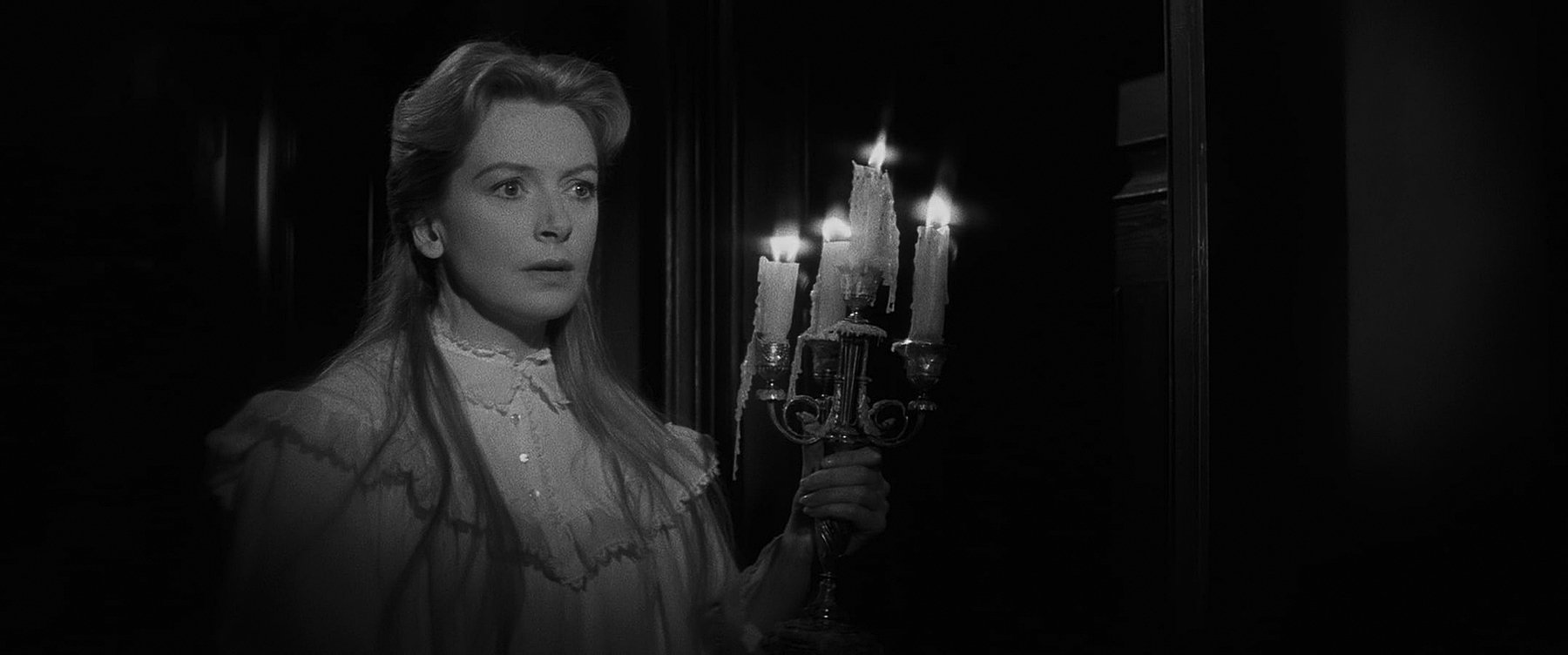
Asked to cite a few films that used lighting to create especially effective moments of anxiety, Wagner is quick to mention The Innocents (1961), shot in widescreen CinemaScope by Freddie Francis, BSC. “When Deborah Kerr’s character is walking through that house at night, the normal thing to do would be to start shadowing the hard sides of the frame so you wouldn’t see the whole CinemaScope frame. But Francis and the director, Jack Clayton, did something really interesting: They allow you to see the whole frame, but they only show you what they want you to see. So, there are things in the frame that are out of focus, or slight movement in the background, which makes you wonder if there’s something back there or not — and that is powerful because now you’re in the room with her. If those shots had been just tight close-ups of her face, you might have thought it was just her neurosis kicking in. But the filmmakers are saying, ‘I’m going to allow you to think that there’s really something there.’ So, when they cut to a shot where there’s a shadow at the end of the hall, as an audience member you think, ‘This is scary — I’m being played.’”
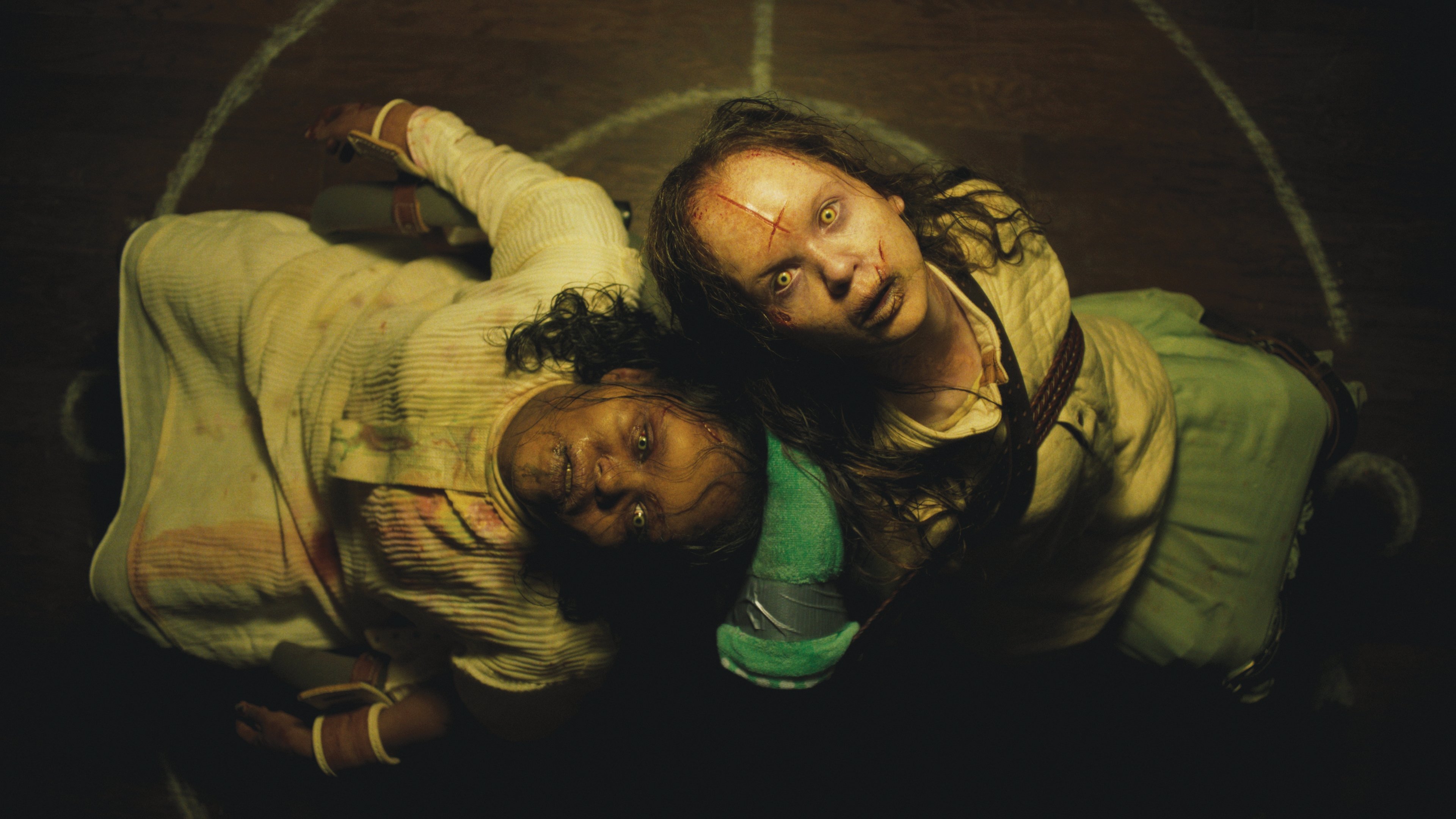
The Exorcist (1973) is another film Wagner feels is ideally lit and structured to disturb the audience progressively. “In the downstairs part of the house, everything looks nice and normal,” he says. “But when you go up the stairs, it gets a bit darker, and when you go into [Linda Blair’s character] Regan’s bedroom, that cold, green-blue color immediately tells you it’s not safe in there — even with Catholic priests leading the way.”
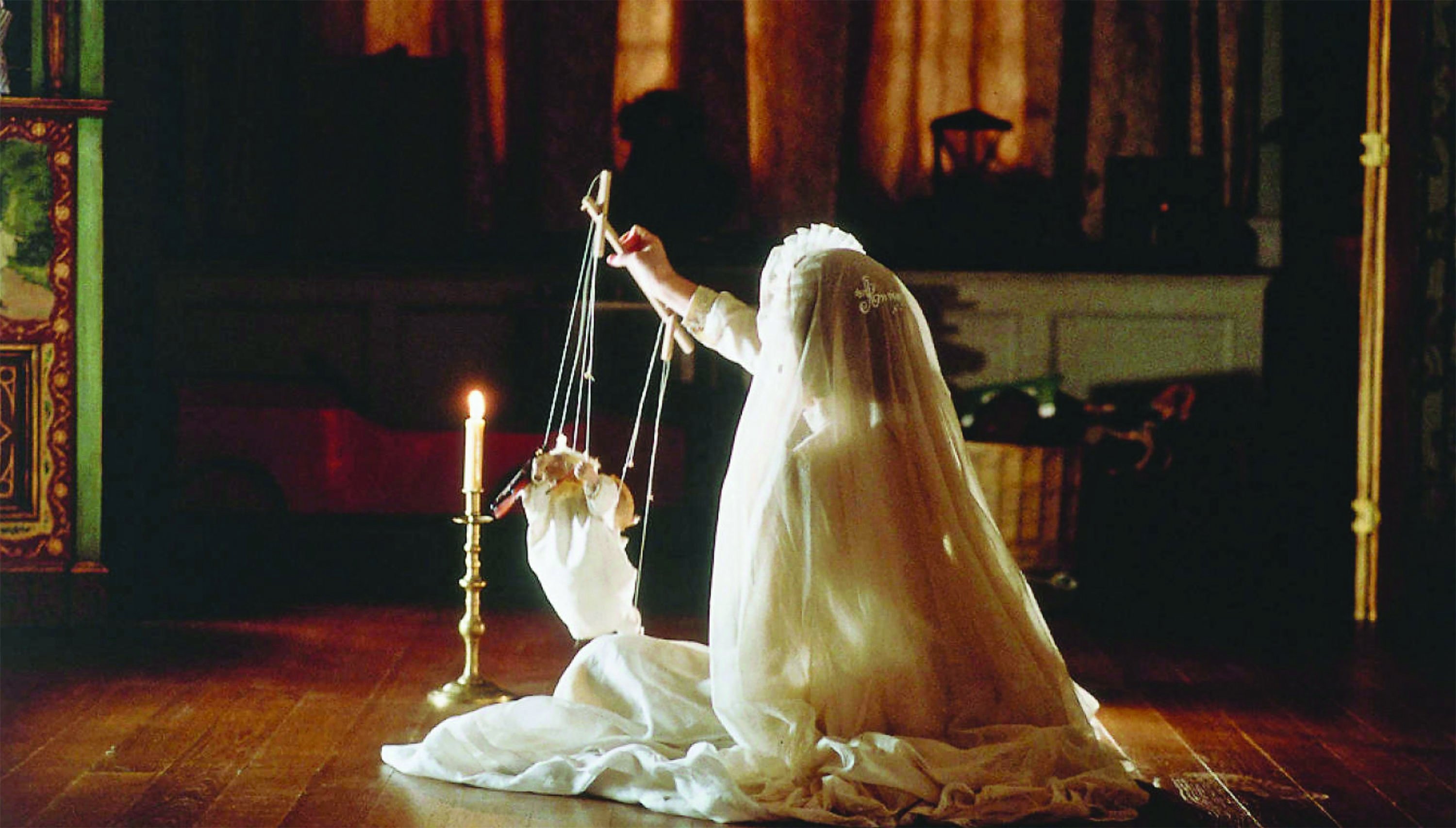
Wagner also mentions The Others (2001), shot by Javier Aguirresarobe, ASC, AEC, as a picture that spooked him with its lighting strategies. “In that movie, the light is a character,” he says. “The movie wouldn’t really work if it was lit normally, but by lighting for shadows, the cinematographer creates the inference that something’s not right. It’s unsettling for the audience, and it’s unrelenting. When the characters go outside the house, it’s a different world. To me, it’s one of the best examples I’ve ever seen of filmmakers using light to scare the audience. It’s not Rembrandt lighting or Gothic lighting; it’s a fairly even, dark-looking film. It’s very subtle — and very effective.”
In addition to establishing atmosphere, lighting can be deployed for many other purposes — including misdirection, by exploiting familiar cues. “If you light someone to look normal, it puts the audience at ease,” Wagner observes. “Or you can go the other way and light a character to look like a villain, even if it turns out they’re not. Those choices are not always in the script, so it becomes a decision you make on the set — whether to light from a low angle or a high angle and where you position the dark areas of a frame.
“A lot depends on how a story is structured,” he adds. “With movies, it’s all about intention — it’s never about reality, so the scenario doesn’t necessarily have to work according to logic. Sometimes, the more illogical it gets, the better it is. That’s especially true of lighting. If you’re dealing with a character and you go inside their mind, the normal rules don’t apply — it’s your perception of where that character is at that point in time, and maybe they’re unbalanced or their perspective is unreliable. Or, you can light something to create a normal set of expectations for the viewers, and then take it away from them to freak them out. Once you establish a pattern for the audience, if you suddenly break that pattern, you’re going to make them feel anxious.”
You’ll find our coverage on several recent horror features below:
Saw X
The Nun II
The Blackening
Talk to Me
The Exorcist: Believer
