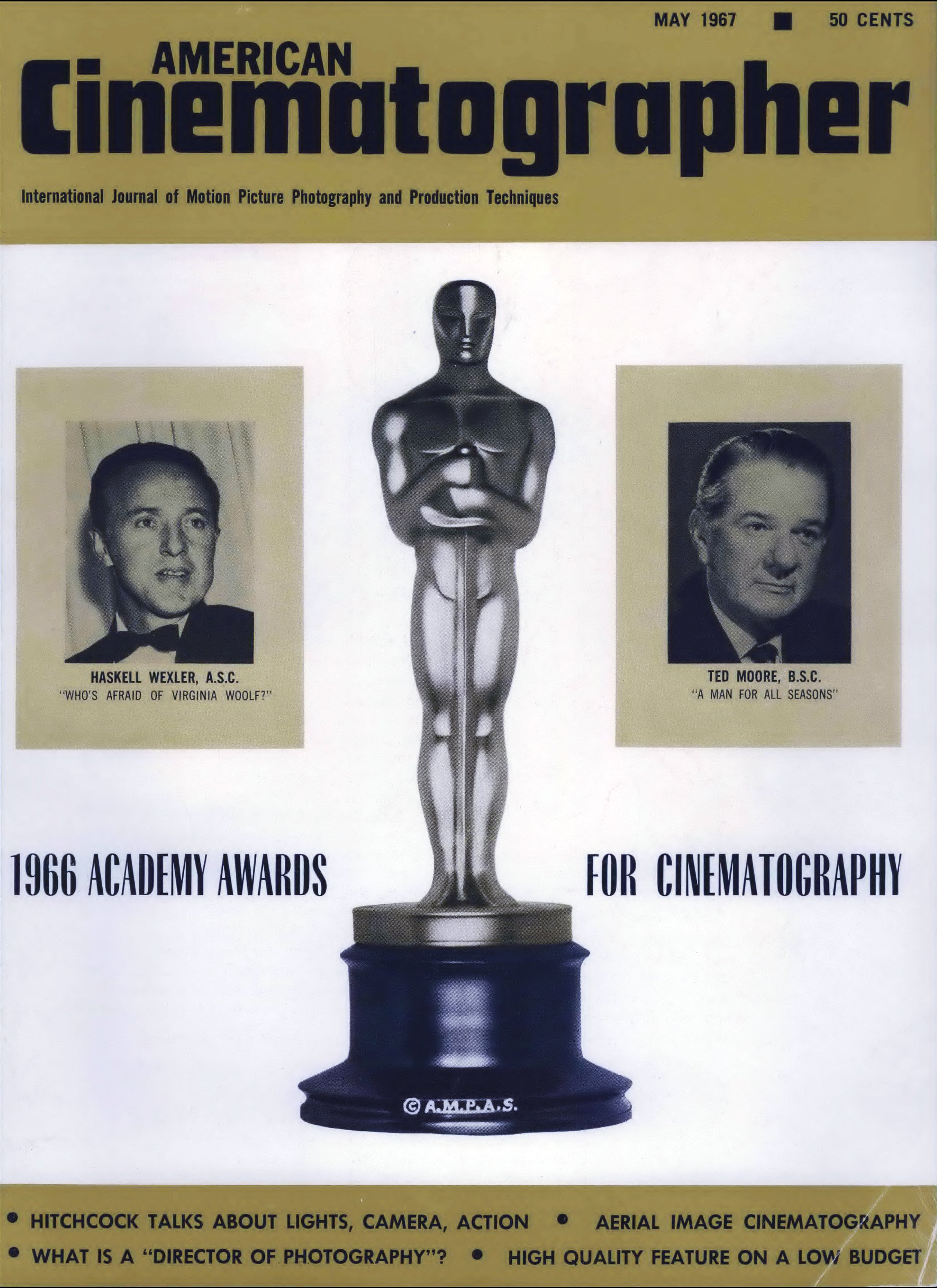
Hitchcock Talks About Lights, Camera, Action
The Master of Suspense regards himself as primarily a film technician, explains his methods of working with cinematographers, production designers and editors.
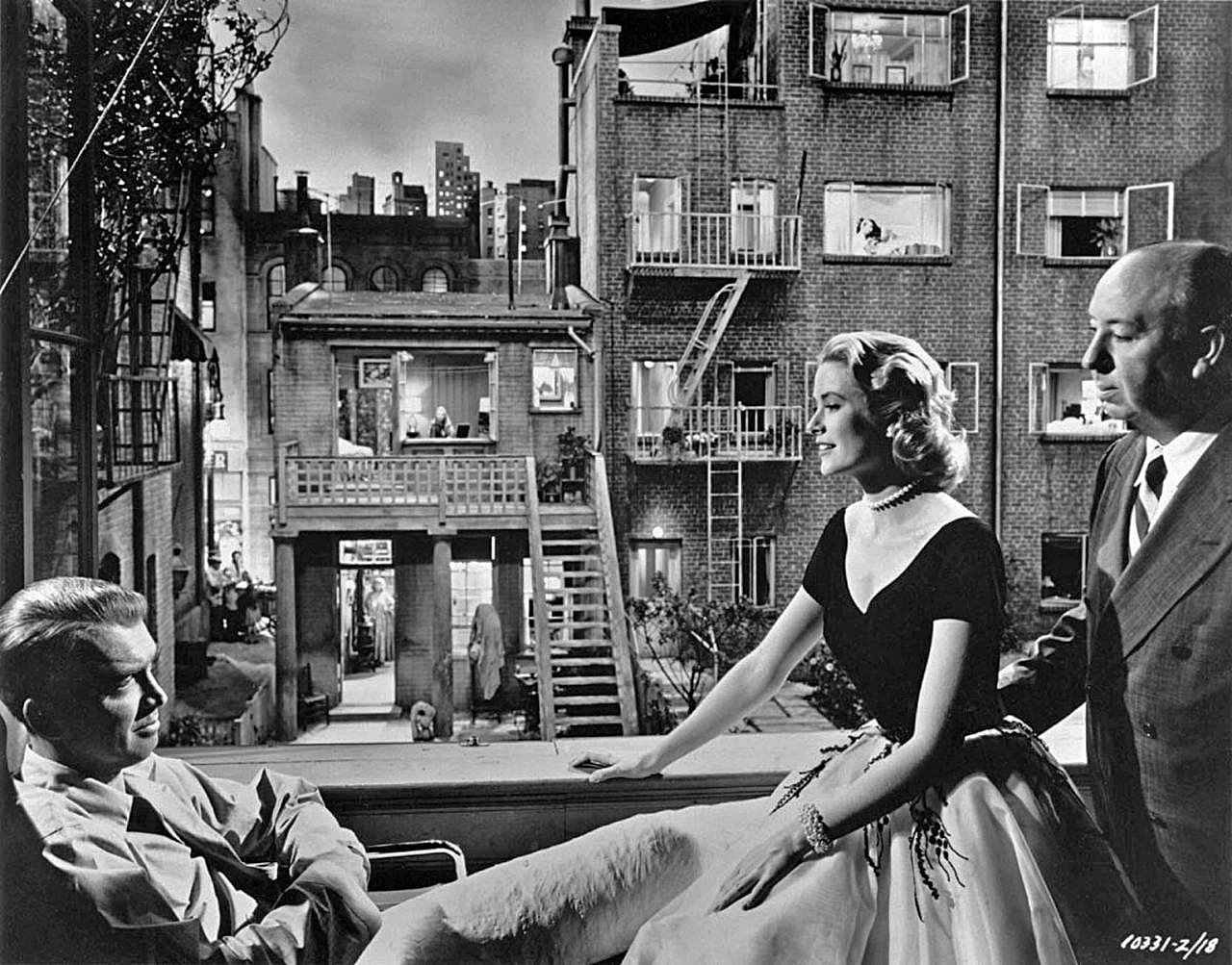
Charles Loring’s article entitled “Filming Torn Curtain by Reflected Light,” which appeared in the October 1966 issue of American Cinematographer, brought forth a tremendous response of interest from readers all over the world. They wanted to know more, not only about the cinematic techniques utilized in this particular picture, but about Hitchcock’s methods of working with cinematographers, production designers and editors in order to achieve the spellbinding results he consistently obtains on the screen.
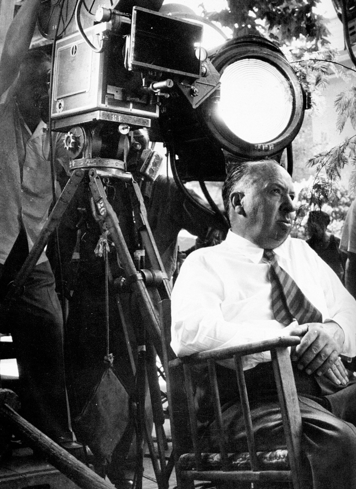
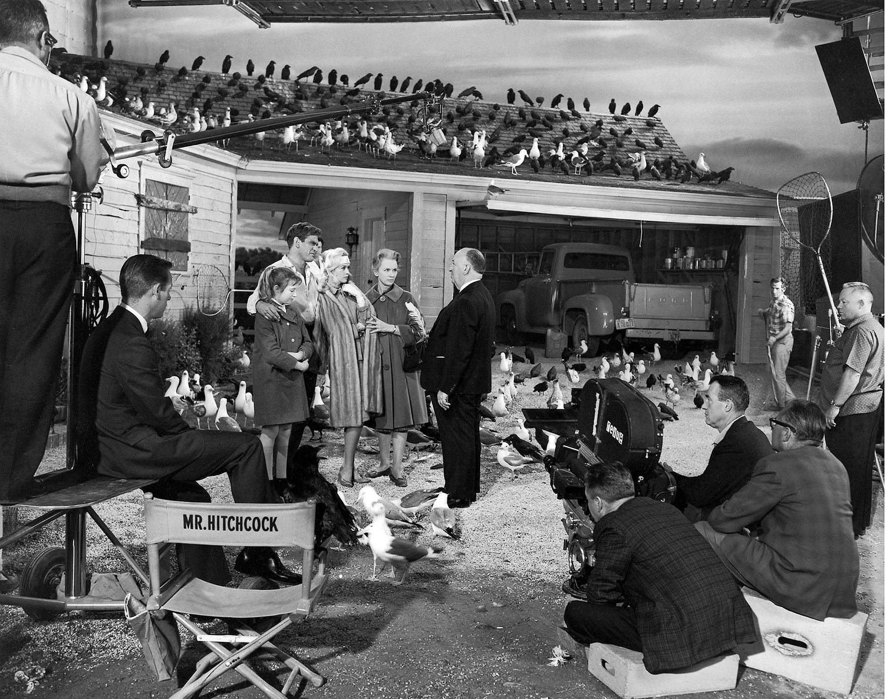
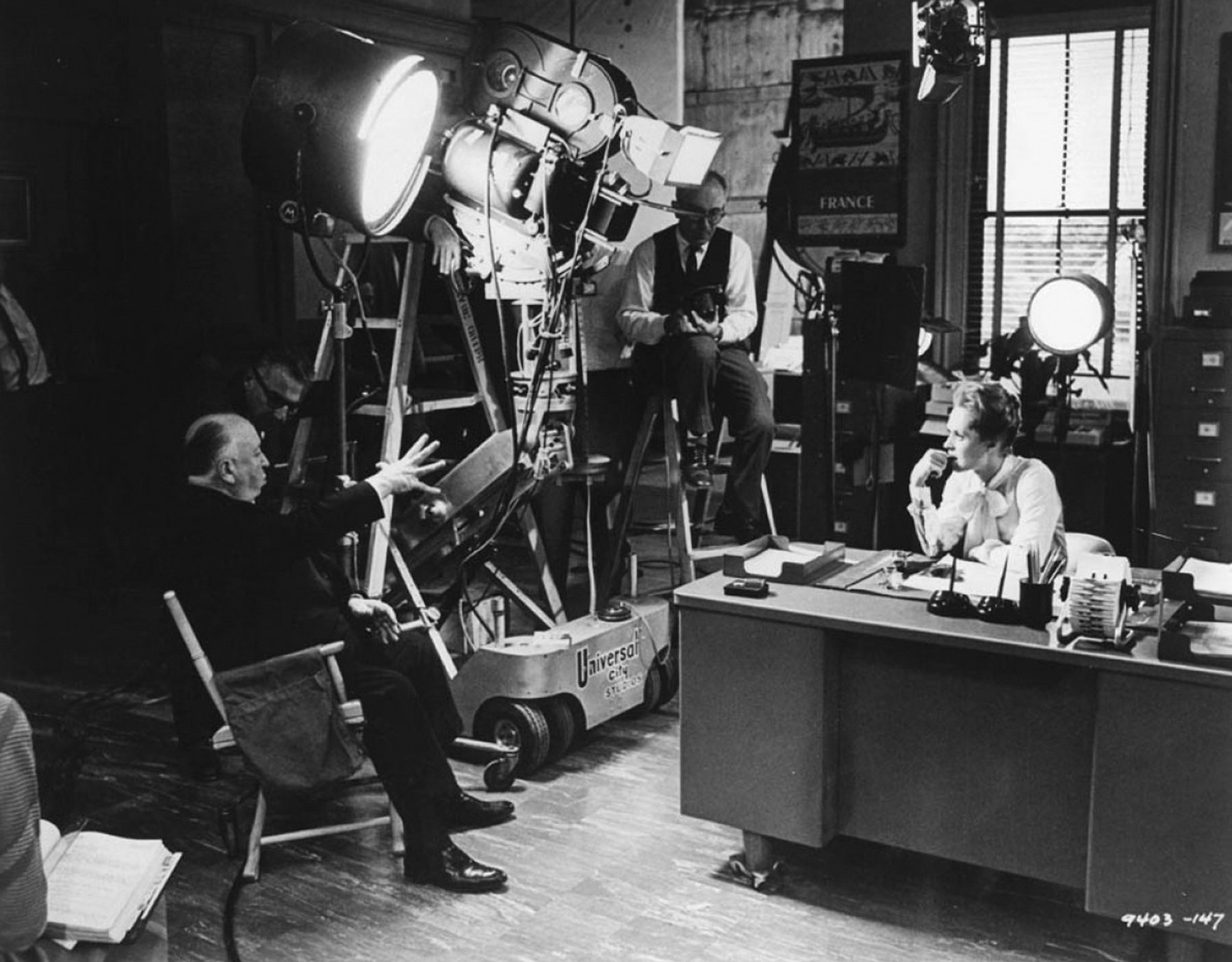
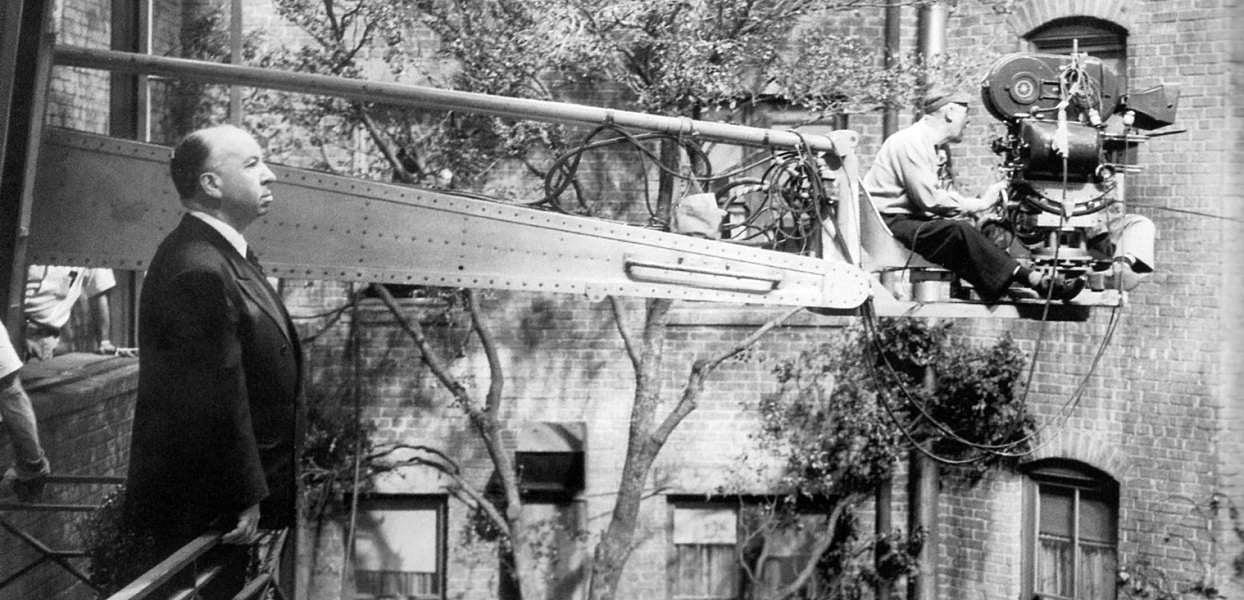
There is perhaps no director in Hollywood better qualified than the “Master of Suspense” to discuss the precise integration of the various technical and dramatic elements that go to make up the cinematic whole. Not only is he, by his own designation, first and foremost a film technician, but having served during his early career (though briefly) as a “lighting cameraman,” he has a very deep appreciation of the vast contribution which a skilled cinematographer can make to the final effective result on the screen.
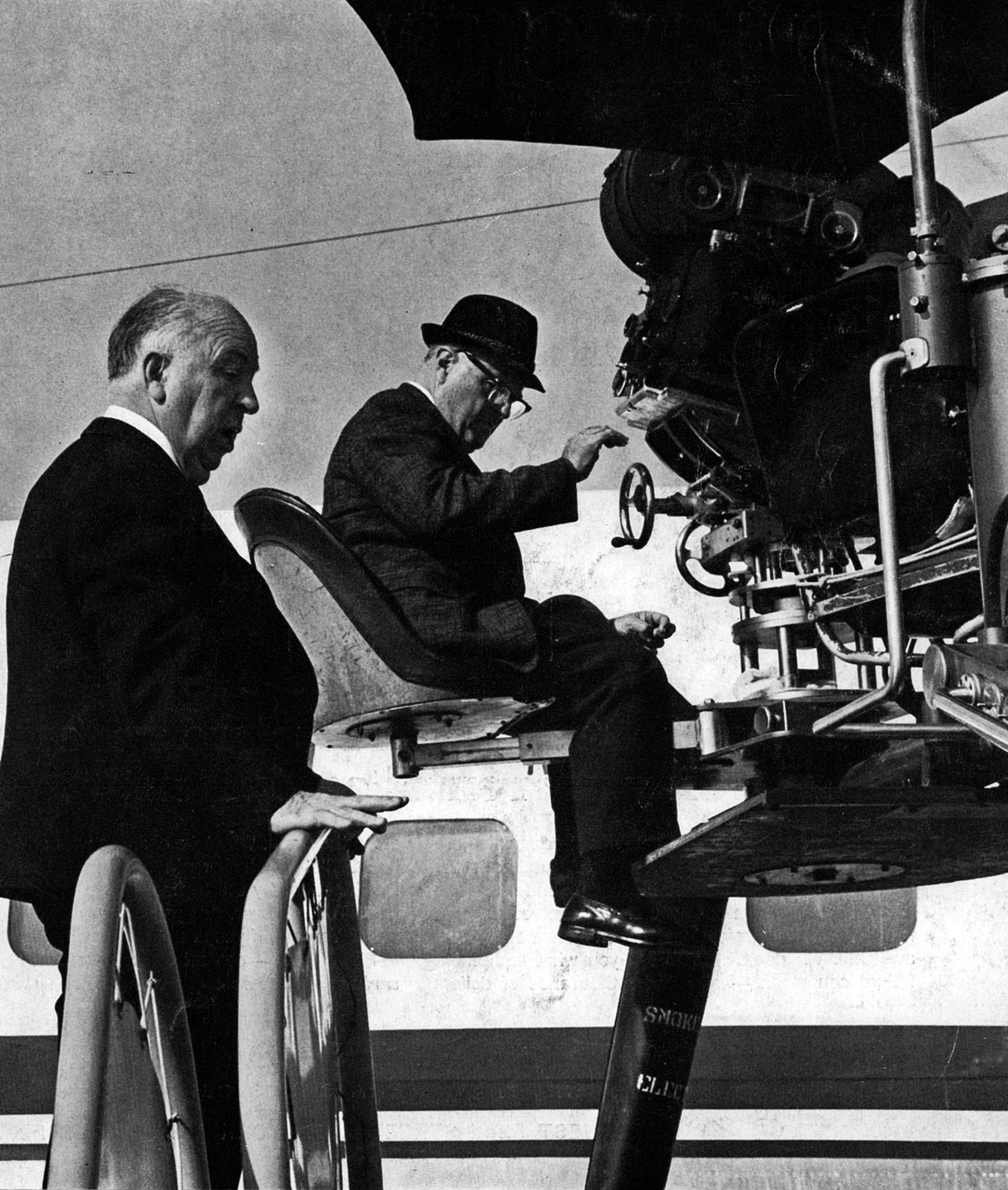
Hitchcock feels that the director of photography is a key artist-technician who should be brought onto the picture long before actual filming begins so that he can make a much more valuable contribution to the film’s conception during pre-planning phases. In response to reader interest we asked Mr. Hitchcock, who has long been known as “The Cameraman’s Director,” to explain some of his techniques and his methods of working with the director of photography and other key technicians in developing the visual approach to his films. The result is the following interview.
Q. What factors are involved in your decision to employ a specific style of photography to realize a particular script in visual terms? For example, what led you to adopt the “reflected light” approach to filming Torn Curtain?
A: Away from here one often hears complaints about what is called “Hollywood Gloss.” When we were preparing to film Torn Curtain, I began casting about for a photographic style that would help us tell the story in a more realistic, not so “glossy” way. Actually, I've felt for a long time that our color films were being photographed in almost the same manner as black-and-white films, I believe there is a hangover from one to the other, especially when it comes to separating the image from the background.
Q: What do you believe are the reasons for this?
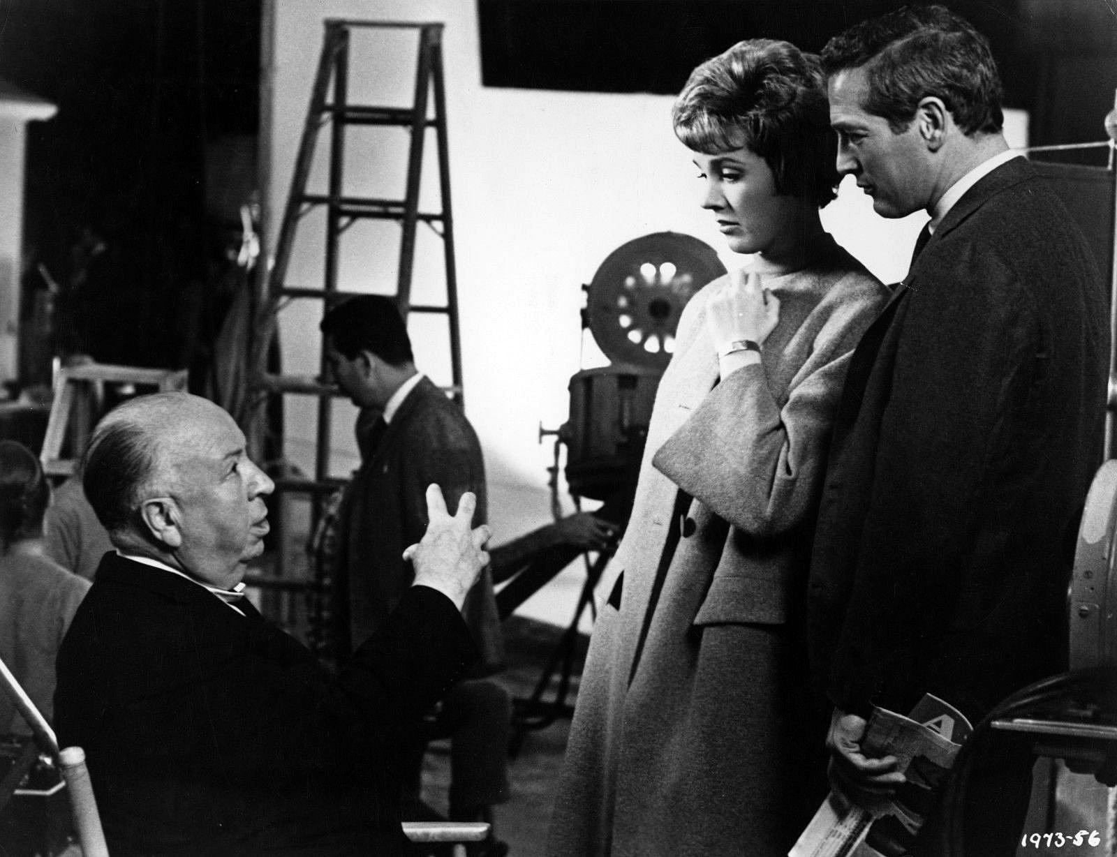
A: To answer that, one must delve a bit into the history of lighting for the cinema. Back in 1919 and 1920, or even further back than that, long before incandescent lights ever came, we used to light from the floor with Kleig arc lights and our general lighting came from banks of mercury vapor lamps. We used in Europe a particular lamp called a “swan neck” which had a diagonal bank of lamps mounted atop a vertical bank. When incandescent light was introduced, the lamp units were used, at first, on the floor and then almost all lighting left the floor and went up on the rail everywhere. It was always high — and that is when the “top-spot type” of backlight came into general use.
This may sound like a history of lighting, really, but I’m only doing this to point out how one element hung over to another. When sound came in, of course, we went all out for incandescent lighting until they were able to silence the arcs, but I can remember that in the days of the very earliest sound films the stage was like a bake oven. It was a mass of these large incandescent lights everywhere. Then, of course, finally, they were able to silence the arcs and the spots.
Q: A lot of this took place before you became actively engaged in directing films. What was your actual production function during the early days of your motion picture career?
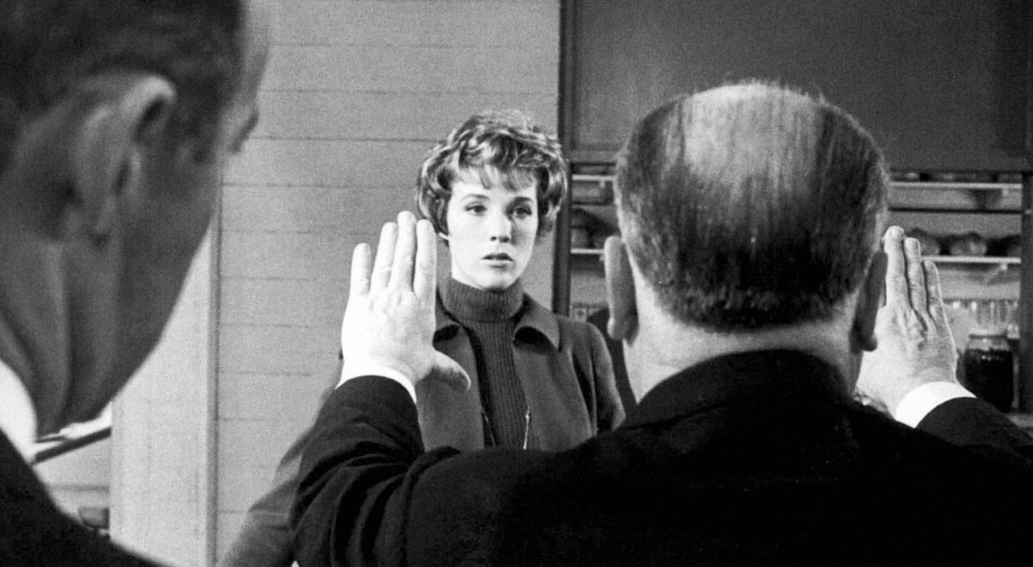
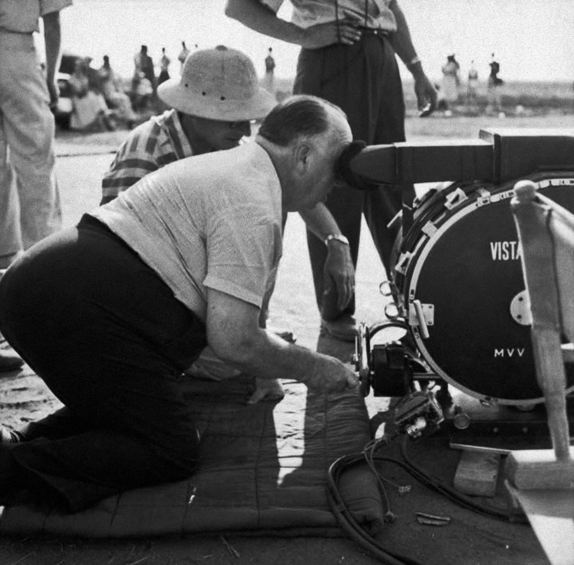
A: Well, of course, I'm a technician as well as a director, and back in 1923, I functioned as the writer of the picture and also the art director and production designer — always on the same picture. I always did both jobs. In addition to that, I was even sent out to turn the camera now and again.
Q: How did that come about?
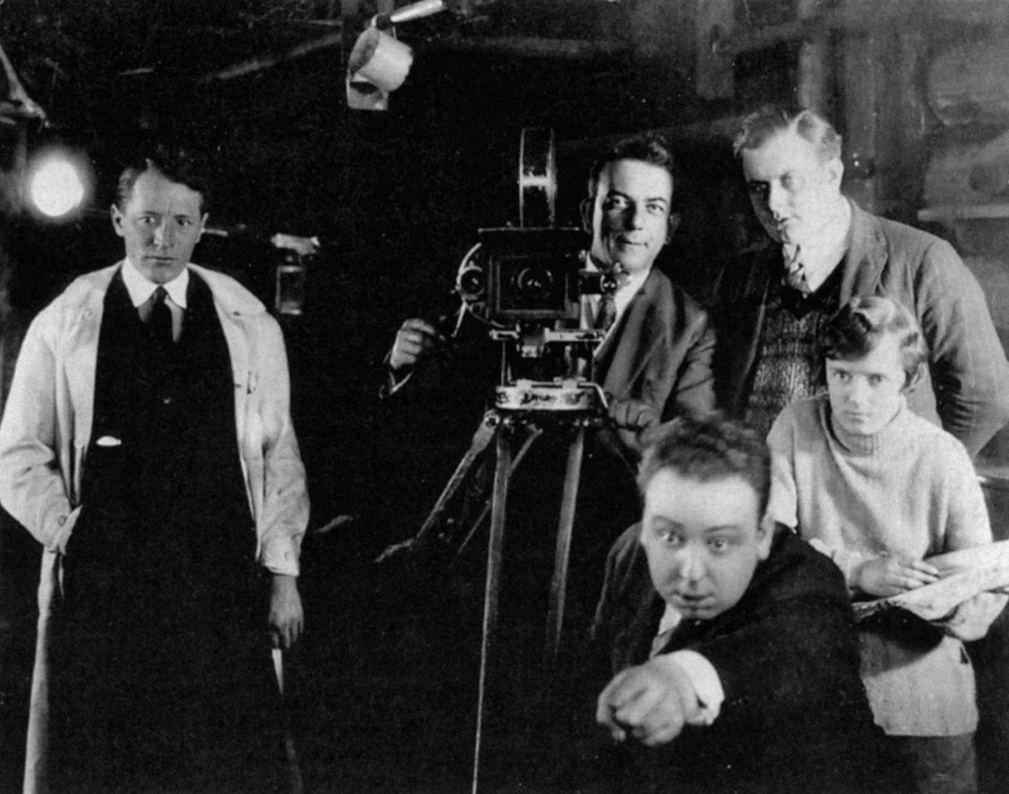
A: I can remember I was on one picture in 1927 when the cameraman went sick and we didn’t have a replacement, so I had to do it myself. I was doing both the directing and the lighting, and it was rather amusing because I would say to the assistant director, “We’re ready to go,” and he would say, “Well, you haven’t lit it yet.” I’d actually forgotten to light it, and I thought, “Oh, dear, now I’ve got to light it. I forgot that.” And on another occasion, I would light the scene and say, “Let’s go.” And they would say, “But you haven’t rehearsed it yet.” So the ability to do the two jobs was rather difficult. I was able to do lighting, but I did take the precaution of grinding off a few feet of every scene and sending it across to the lab, which was on the lot, to have them hand test it. I mean, I wasn’t all that confident of my ability as a lighting man. But even so, it worked out quite well. That was in the days of the lighting from the floor with the Kliegs, and the back spot from the top creating the halo around the head, what they call the “liner” today. What was always at the back of the lighting man’s mind in using this top light technique of lighting was the separation of the image from the background. Then, also he used to go in for a great deal of modeling. In other words, there was this yearning to get a stereoscopic effect. But one wondered, was it worth it, really? Was it worth creating an artificial effect in lighting simply to achieve this separation of the figure from the background? Because, there are other ways of doing it — by focus for example. You can focus on your primary subject and let your background fall out. You have to do it in close-ups anyways.
Q: How do you feel about the practice of having the subject sharp and the background fuzzy in a close-up, rather than having everything sharp from subject to background?
A: My argument has always been: Who wants to see around the close-up? Why should it be sharp behind the close-up? But there was always this aim, and this seemed to me to create an unreal effect — this yearning for the modeled figure, and this separation of the image from the background.
“I remember in the old days, when we used to light a set, there would be about six moons shining through — one for each window.”
Q: What about the danger of the subject “falling into” the background — becoming confused with it, so to speak?
A: There was sometimes that danger in monochrome and, therefore, a fairly good reason for striving to achieve separation. That’s why, in the old days, we never put wallpaper on the walls of a set — because the pattern would grow out of a man’s head. So there was a valid reason, in the days of predominantly black-and-white cinematography, for separating the subject from the background. People may disagree with me, but I'm not sure the reason holds good for color.
Q: Why not?
A: Because I've always felt that color should be used as its own separation, and we should not need to back light so much to separate the image from the background as we do in black-and-white. Now, of course, there’s another “habit,” I call it, of lighting, which has been used since lighting from the rail came into being. There has developed a tendency, for example, if there were flowers in the set, to take a top light and put it on the flowers. It’s often done on a practical lamp, as well. It’s common to see a lit lamp throwing a black shadow on the wall. Now there’s no reason for that at all; it’s just habit. The result is that you have black shadows all over the walls. You should say to yourself, “In real life, in reality, where does this source light come from?” You find a scene, let’s say, in a farm cottage or somewhere, with objects individually lit around the room, instead of having the light come from one natural source, a single window — because the sun doesn’t always come through every window. Although I remember in the old days, when we used to light a set, there would be about six moons shining through — one for each window.
Q: How did this search for more natural lighting finally lead to your decision to use reflected light for filming Torn Curtain?
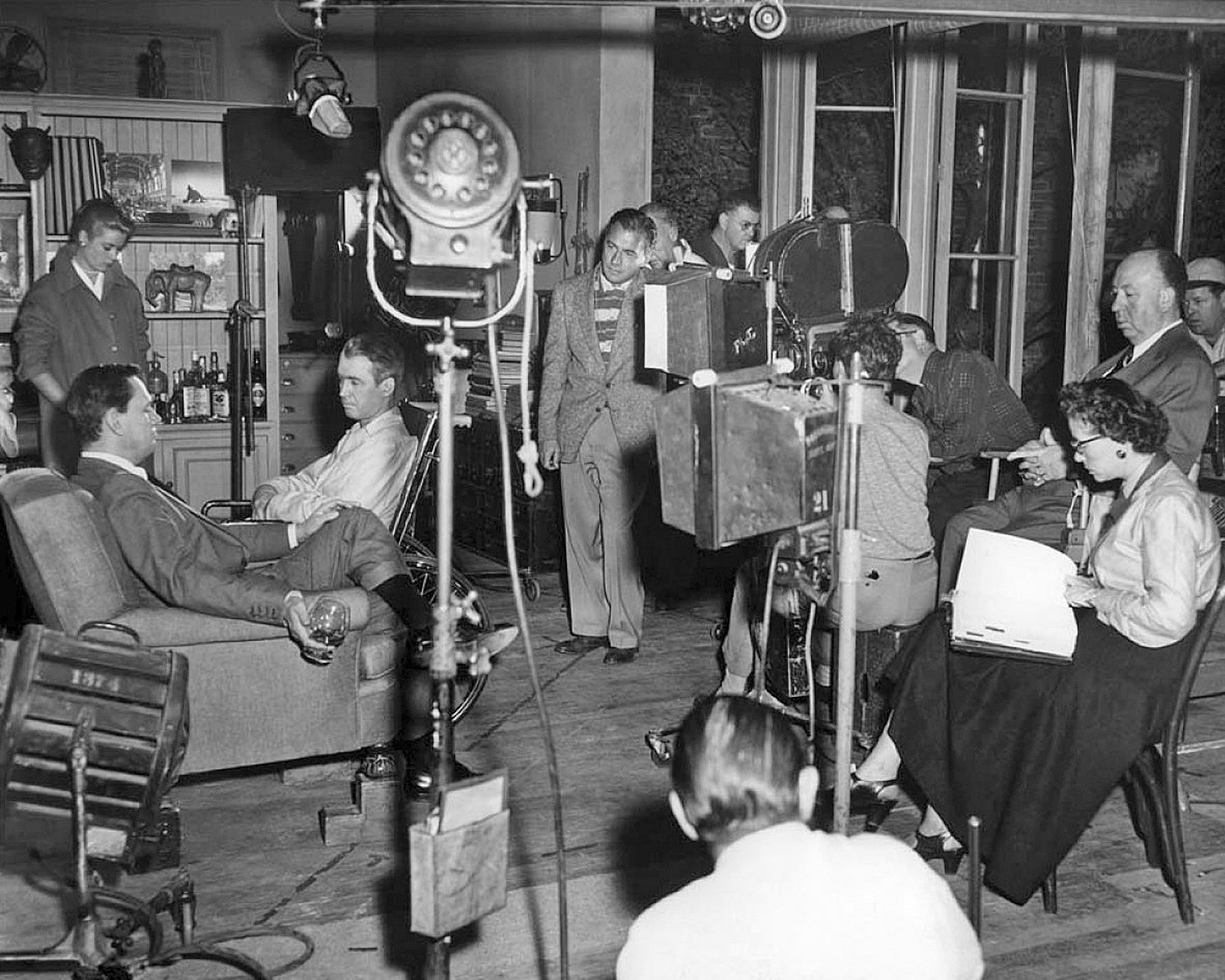
A: It came to the point where one asked: “What is natural light?” That’s when I brought Jack Warren in and I said, “Look at the way we’re sitting here. What is the light like in this room? Are there black shadows anywhere? We’re living in a reflected light. In this office, as we sit here, there’s not one bit of direct light on us, even from the window because the curtains have softened it. The colors are not shouting at us. Everything is soft and there is no artificial element of light in this room. Why can’t we put the same effect on the screen in Torn Curtain? So Jack went to work and decided that the best way to arrive at it was by two methods. By reflecting the light and, where we had to use direct light on faces and things, to soften it sufficiently to match the generally reflected light.
Q: In the American Cinematographer article on Torn Curtain, director of photography John Warren, ASC mentioned that he utilized gray gauze in front of the lens. What prompted the use of that technique?
A: In order to further reduce the risk of color taking over too much, we shot through a gray gauze, which cut the color down. People talk about delicate color or vulgar color, depending upon whichever end of the scale you lean toward. However, that camera will record whatever you give it, so it’s always a matter of taste. Some people think that because it’s a color picture, the girl’s got to wear a dress with flowers all over it, that’s nonsense. When we did Torn Curtain, we set up a rule: the moment we got into East Germany, we’d go to gray and beige tones only. No bright colors — except a spot of red now and again which would reflect the red of the uniforms worn by the Vopos. That was a decision we made, coordinated with the costume designer. All these decisions really relate to the photography. You can’t expect a cameraman to give you a beautiful effect when the thing given him to photograph is vulgarized and unbalanced by excessive color. For example, the set dresser will put in a green settee and then the costume designer, without any consultation, will put the girl in a purple dress or a pink dress and sit her in the green settee. I’m all for the cinematographer becoming more involved in production design. I think he should be brought into it much more than he is.
Q: How would that differ from usual present procedure?
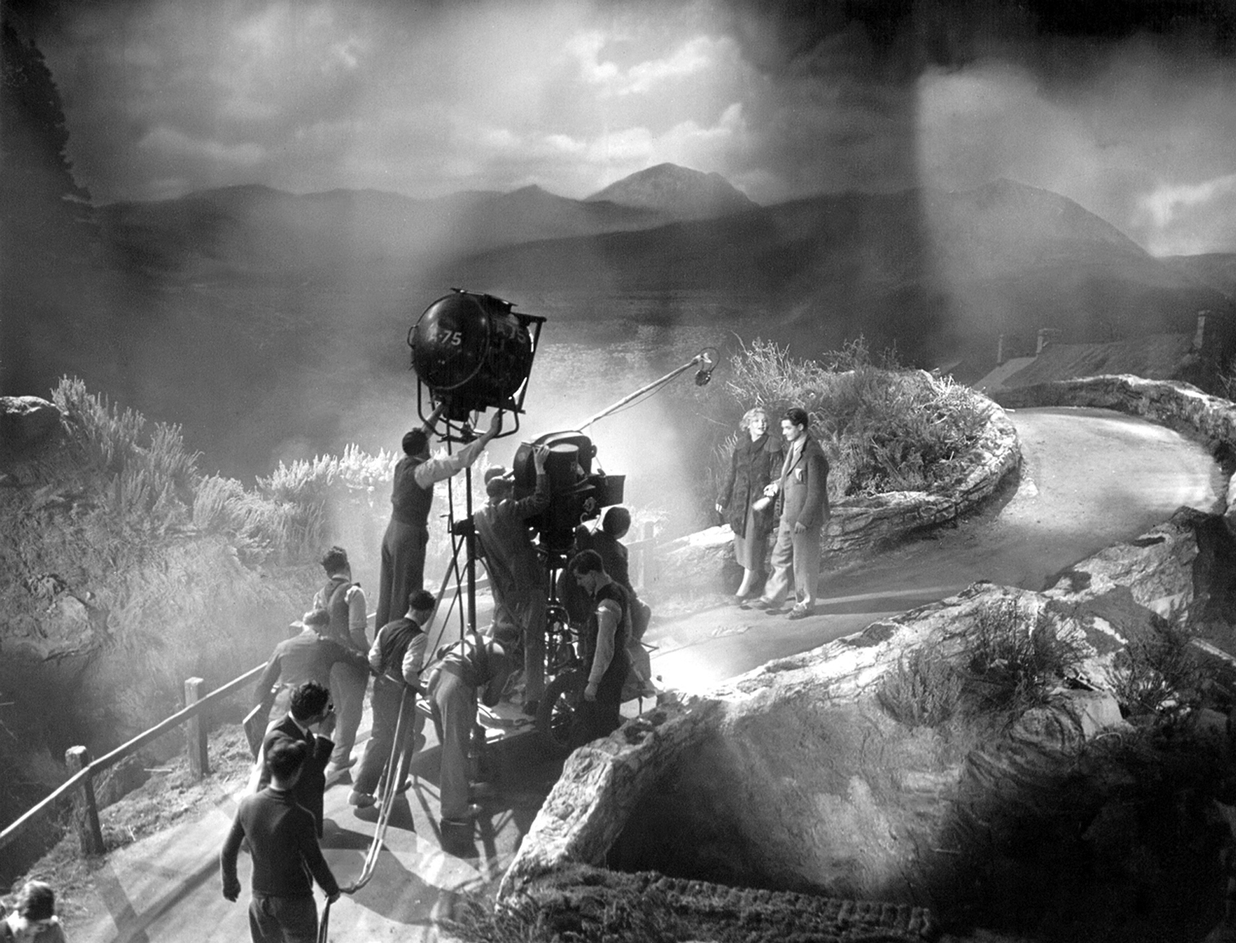
A: According to our system as it is today, the cinematographer comes on the set and he is given a thing to photograph. The matter in which a set is dressed, wherever they put the lamps is very important. Supposing for example, a cinematographer is going to have to shoot a scene which relies on certain lighting effects. Now, he hasn’t had a word to say about where the practical lamps should go in the set. Actually he should get a rough idea from the director where the movement is going to be and then say, “Don’t put that practical lamp there, place it somewhere else.” But the poor cinematographer doesn’t have a chance, because the set dresser’s already put it there. He’s got to color that. What’s wrong with bringing the cameraman in much earlier so that you could say to him, “Jack, are these light fixtures all right? Do you think you’re going to run into any difficulties here and there?” The same with the production designer. He should work in close contact with the cinematographer. But in some studios, the cinematographer comes on the lot maybe only a week before they begin to shoot. It’s ridiculous. He should have at least a month or more to prepare.
Q: At what point in your preplanning do you begin the actual, functional visual design of the production?
A: When I’m writing script, I bring in the production designer very early on, and when I’m sitting there with a writer and we’re designing a scene, I’ll say, “I wonder whether we can do that. What sort of setting should we write this for?” We bring in the production designer while the script is being written. We have another strange anomaly in our business; the art director leaves the set the moment it’s painted. Then the set dresser comes on. And yet the art director plays no part in the set dressing. That’s standard practice. That’s why, on Torn Curtain, I brought in Hein Heckroth as an overall coordinator of production design — also because the film had a German setting and we needed someone who was thoroughly familiar with that particular atmosphere.
Q: Can you cite a particular sequence in Torn Curtain which required especially precise coordination of the functions of the art director and the cinematographer?
A: There was one very effective sequence in the film that I purposely played entirely in long shot. It took place in that East Berlin hotel room where we had the evening sun shining in — just a faint yellow shaft of warm sunlight; the rest was that awful heavy brown, a mood effect. That sequence represents very close coordination between the visual conceptions of the production designer and the cameraman. The lighting, and the color of the light, work in relation to the somber tones of the room.
Q: You are noted for your technique of “pre-cutting” a film. Can you explain just how this works?
A: Yes, I can give you an example. In designing certain scenes, one of the important elements you have to take into account is the period of time that scene will actually remain on the screen. Sometimes a scene is only about a 6-foot flash. The eye doesn’t have time to take it in, and it needs a very sharp delineation, a sharp structure within the composition, to make it arresting to the eye for the short period of time it’s on the screen. In the theater, the eye roves around the set; they’ve got 40 minutes for an act, but we don’t have that on the screen; things flash by so quickly.
Q: How do you arrive at the choice of image size?
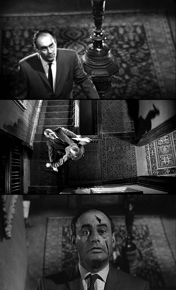
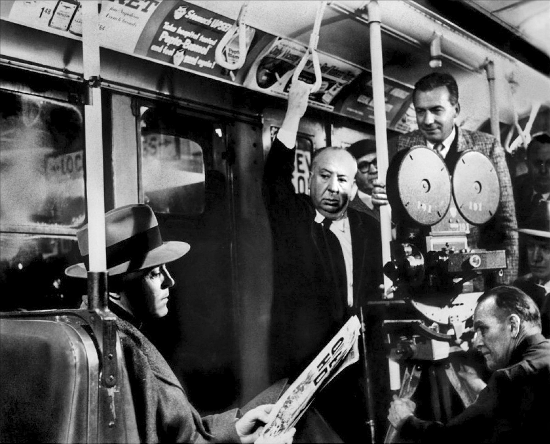
A: The size of image is a very important consideration. To spring a surprise, like when Paul Newman in Torn Curtain goes out to the farm, I have a little tiny figure crossing the field and when he arrives there, it goes voom! To the big head. That’s a change in image size which is very vital. Psycho is full of that sort of thing. There I had the detective coming up the stairs inside the old house. The audience knows there’s a monster lurking around, a female monster. The first shot is quite an ordinary one as he climbs the stairway, but when he gets to the top of the stairs I jump the camera to the ceiling. The murderer comes rushing out in a straight-down rather long shot. Then I drop down and jump to a big head of the detective as the knife slashes across his face. The long high shot serves to accentuate the close-up.
Q: Were you allowed to go into East Germany to film those establishing shots which appear in Torn Curtain?
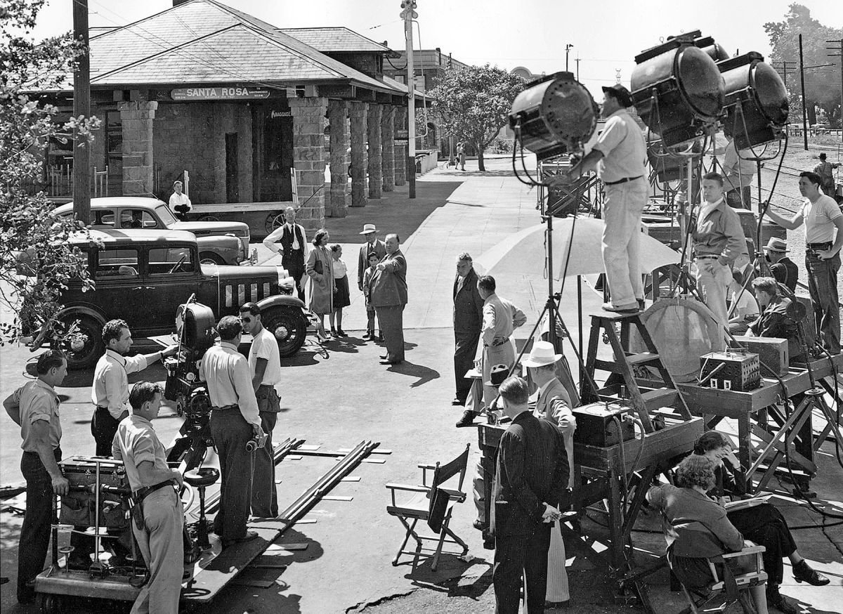
A:No. We had to do a lot of trick cutting and mixing — actual scenes with those staged in the studio. We shot most of our exteriors for the film right on the backlot of the Universal City Studios — but these scenes were intercut with real ones filmed in East Germany. Paul Newman comes out of the hotel in the morning just before going to that museum. He looks up the street. I cut to a real East Berlin shot of a yellow bus coming along. Then he runs across the street and gets on the yellow bus. I match that shot with one of a duplicate bus on the backlot. Those shots made in East Berlin were photographed by a cameraman we sent in from the West who just got us a few pre-described scenes on the pretext that he was doing a travelogue.
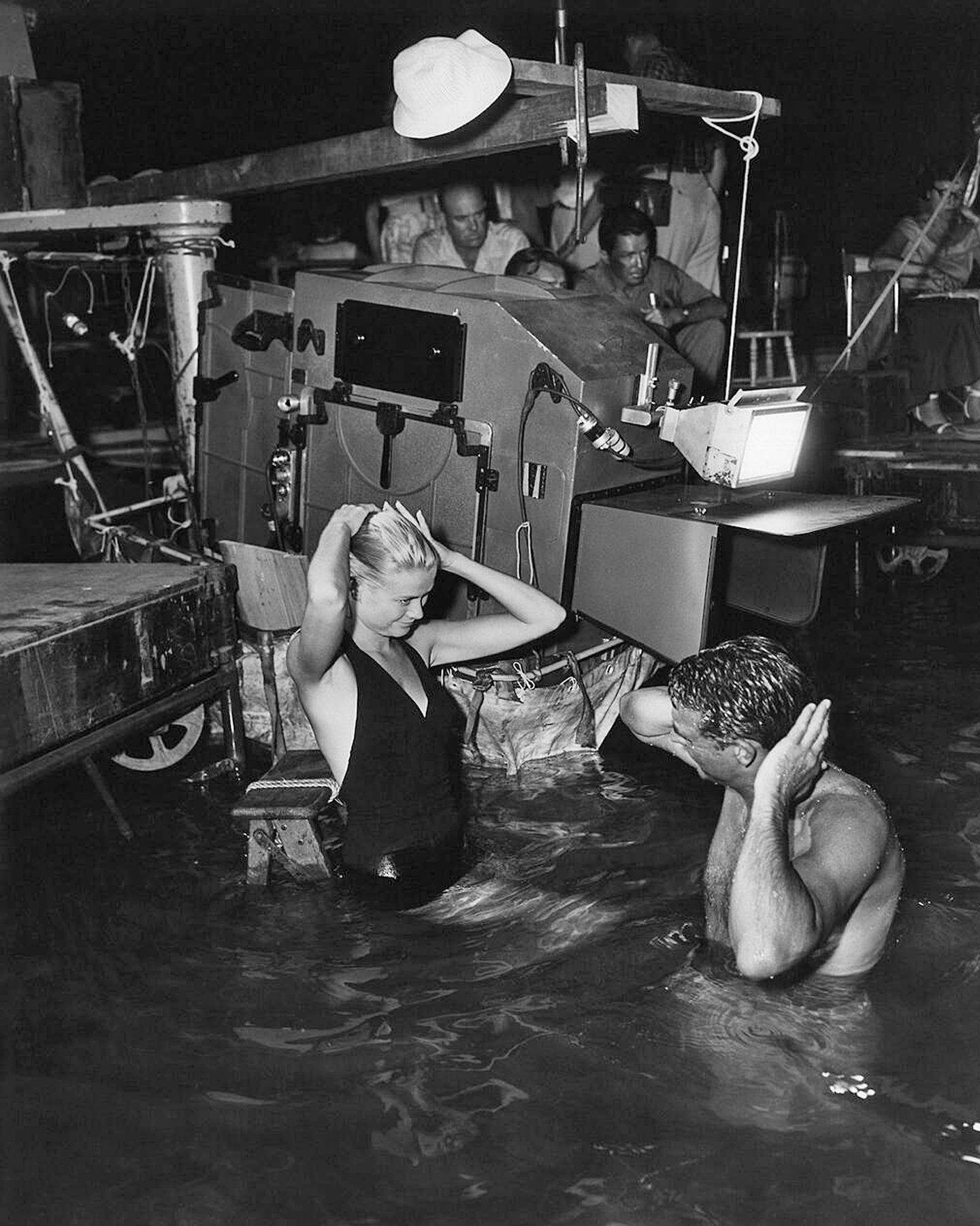
Q: What do you feel are some of the important elements to be considered if actual location shots are to be smoothly intercut with scenes filmed on the backlot?
A: There is an important key to creating reality on the backlot. If you’re content to do a small portion of the set very accurately, it’s much better than trying to do a whole street. This is a principle which I've stuck to ever since I was an art director. I was working on the UFA lot in Germany in its heyday and there I picked up a great deal of insight into the techniques of set building and perspective of every kind. Once I had a scene to do against the doorway entrance into Milan Cathedral. It’s one of the biggest Gothic piles in Europe. I only had to have a shot of a man going through the door into the black interior, so I had to decide how I was going to do it. I would never have been able to build the entrance of the Milan Cathedral; the doors are probably 100 feet high. What I did do was solve the problem by building, in actual scale, the real thing — just one column on the left, but I made it about 8 or 9 feet high only. Its proportions were enormous, and I included half a dozen steps accurately measured, so that we got this big base of a Gothic column and the beginning of the door with a huge hinge on it and the eye did the rest for you. The lines went up out of the picture following the Gothic column and the lines of the set went out to the right. I went to the zoo and asked for a few pigeons. So I had these few pigeons and they flew around and sat on the stone work, but the point was to do a little piece of the building accurately and well, rather than try to do a sort of cheaply built whole structure. I believe if you’re doing a thing on the backlot, you have to go out and get photographs of the real thing and reproduce a portion of it — but with complete accuracy.
Q: The museum “chase” sequence in Torn Curtain gave an impression of tremendous production value, but those apparently huge sets would have been enormously expensive had they actually been constructed full-scale. What did you do instead in order to achieve the effect?
A: That was a very good technical job — that sequence in the museum, but those were all matte shots — except for the few intercut close shots. The trick there — which is another thing that comes out of my training as an art director — is to shoot your long shots from up high with a painted floor. [That’s all we painted; the rest was a matte] and then have a little background piece built for a close shot of the actor against it. It’s important not to go from one long shot directly to the next long shot. Put something real in the middle between your matte shots. I go: long shot, matte — then real background for the closeup. I alternated them all the time.
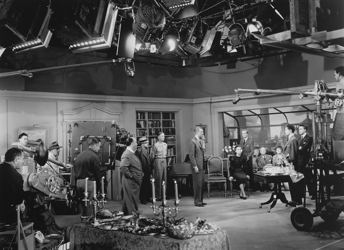
Q: What are some of your principles regarding the use of the moving camera?
A: I believe in using camera movement when it helps tell the story more effectively. I suppose the most outstanding example of that is a picture I made called Rope, in which each sequence was actually a full 10-minute reel filmed without interruption but with a multitude of camera moves to achieve the various angles. It wasn’t actually very cinematic; it was really an extension of theatre. It was like giving the audience opera glasses, all of them, and letting them follow the characters around. I think one of the first essentials of the moving camera is that the eye should not be aware of it. In other words, the eye should be on the character moving, but I'm all for the moving camera when it’s properly used. For example, let’s say you have a scene between two people in a quarrel, a man and a woman. And you’ve got them on a sofa in a close shot cutting just below head and shoulders, the two of them, and the girl gets up angrily and walks across the room. I’ll follow her in close-up across the room to maintain the mood. But very often this isn’t done: a cut-back to a longer shot is used instead. And why? I don’t understand that. Why shouldn’t you stay close? Because the mood of the woman’s emotional disturbance is there, you should never cut back — at least not until she gets over it and calms down. Then you can ease the camera out, case it back unobtrusively.
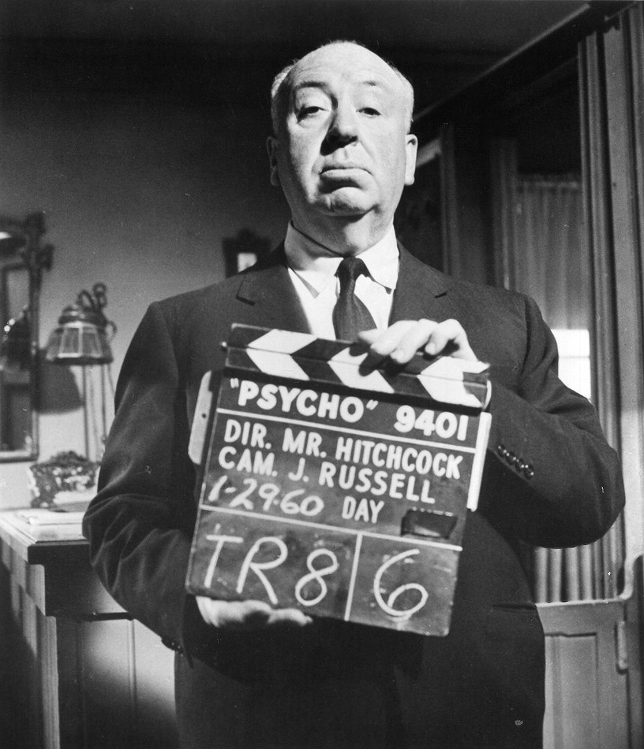
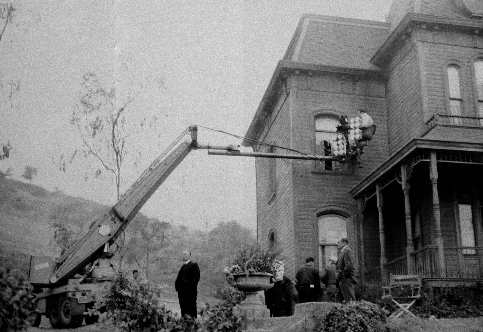
“I think that I prefer making films in color. The reason I didn’t do Psycho in color was because of the blood.”
Q: Are there any definite rules which you follow without deviation, as far as shooting technique is concerned?
A: There are very, very strict rules that I adhere to. For example, never, never use a shot without it having a clear dramatic purpose. But, on the other hand, I don’t shoot “master” scenes, I just shoot the one that’s necessary, unless there’s a dialogue. If you’ve got two people talking at a table, you shoot over-the-shoulder shots and you have to repeat the scene, but otherwise not. Also, to me, it seems that the size of the image on the screen must contribute. You cannot shoot long shots indiscriminately unless you’re establishing a locale. But I think the long shot can be very dramatic when you need it.
Q: For a long time you seemed to prefer making pictures in black-and-white rather than in color. How do your preferences lie currently in that regard?
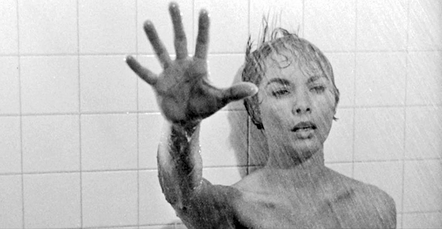
A: I think that I prefer making films in color. The reason I didn’t do Psycho in color was because of the blood. That was the only reason. With all the blood in that bathtub. I knew very well I’d have had the whole sequence cut out — if it had been filmed in color. It just couldn’t have been done.
Q: What do you think of the statement often made that certain films should be made only in black-and-white because even muted color would be too obtrusive, dramatically speaking?
A: There is a theory that certain pictures should be made in black-and-white because of the mood of the picture — which may be true in a few cases, but I think a similar mood can be achieved in color. For example, if you take a country scene in the winter, with a gray mist to it, just fields and bare trees, nothing in bright color, that’s just as effective as black-and-white because you can feel the coldness from the bleak color. There is also the fact that in a color film, if you want to reduce a scene to black-and-white you can use nothing but grays. There were several such sequences in Torn Curtain. For example, there was the scene in the Security office at the airport. It was all gray, everywhere. The only color was in the faces. Just the faces, that’s all. So really, you’re back to black-and-white except for the faces. The set and the clothes and the decor are all gray. It all goes back to my previous comment that whatever you give that color camera, it’ll photograph for you.
“The audience responds in proportion to how realistic you make it.”
Q: What do you feel are the most important elements to be considered in the establishment of mood on the screen?
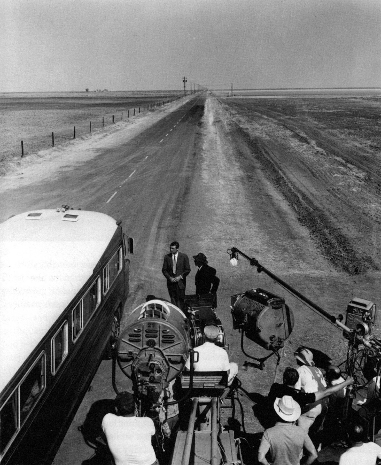
A: I think, to sum it up in one way, the risk you run in trying to get mood is the cliche, the shadows in the room and what have you. I spend half of the time avoiding the cliche, in terms of scenes. In North by Northwest, the girl sends Cary Grant to a rendezvous where we know an attempt will be made to kill him. Now the cliche treatment would be to show him standing on the corner of the street in a pool of light. The cobbles are washed by the recent rains. Cut to a face peering out of a window. Cut to a black cat slithering along the bottom of a wall. Wait for a black limousine to come along. I said no. I would do it in a bright sunshine with no place to hide, in open prairie country. And what is the mood? A sinister mood. There’s not a sign of where the menace can come from, but eventually it turns up in the form of a crop-duster airplane. Someone inside the plane shoots at Cary Grant and he has nowhere to hide.
Q: Do you feel that lighting is perhaps the most important single element in the creation of cinematic mood?
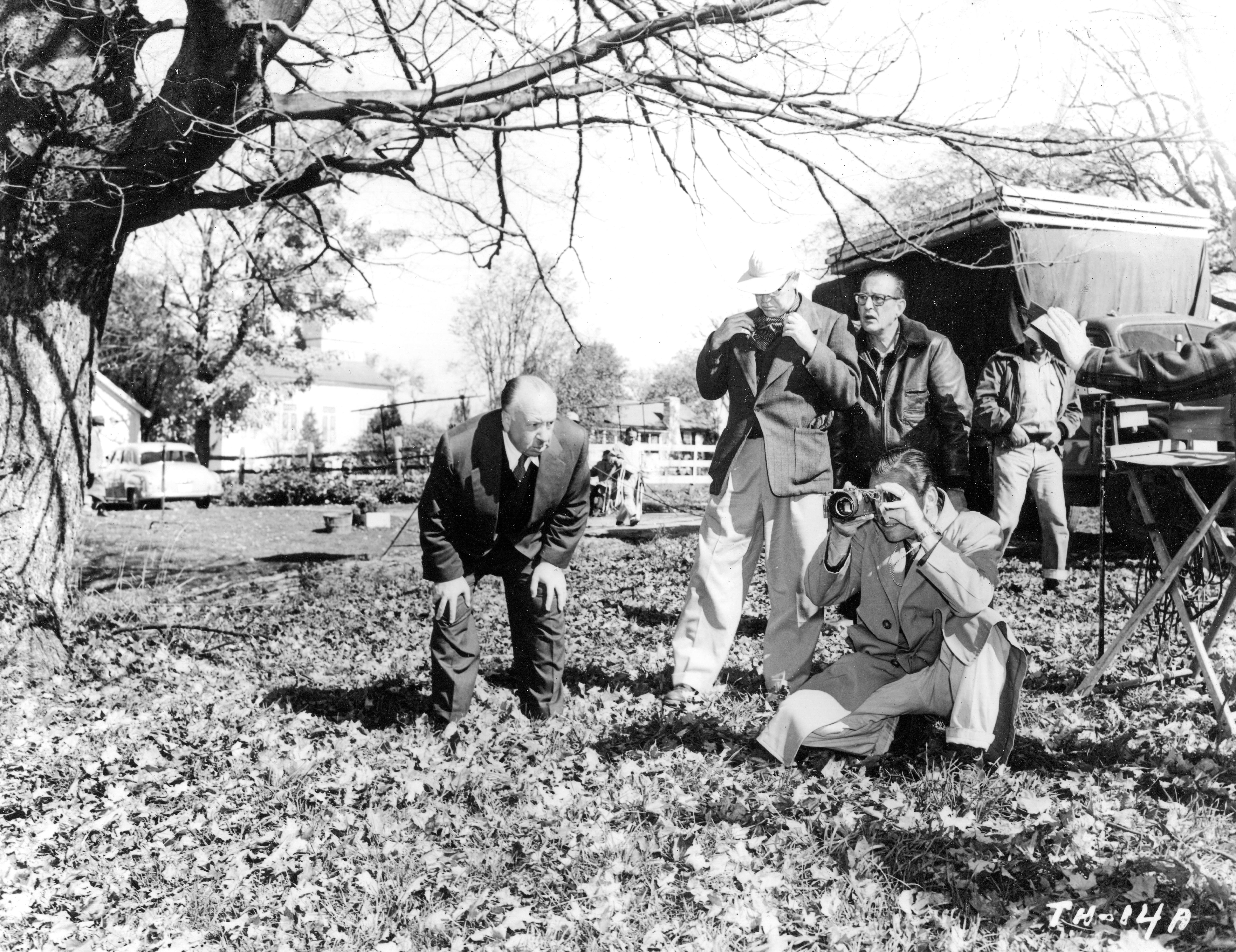
A: Motion picture mood is often thought of as almost exclusively a matter of lighting, dark lighting. It isn’t. Mood is apprehension. That’s what you’ve got in that crop-duster scene. In other words, as I said years and years ago, I prefer “murder by the babbling brook.” you’ve got some of that in The Trouble With Harry. Where did I lay the dead body? Among the most beautiful colors I could find. Autumn in Vermont. Went up there and waited for the leaves to turn. We did it in counterpoint. I wanted to take a nasty taste away by making the setting beautiful. I have sometimes been accused of building a film around an effect, but in my sort of film you often have to do that if you want to get something other than the cliche.
Q: You have spoken of working with the production designer in the selection of locales during the scripting phase of a production. What is your primary consideration in the choice of setting for a particular sequence?
A: A rule that I've always followed is: never use a setting simply as a background. Use it one hundred percent. For example, in Torn Curtain, Paul Newman goes to a ballet. Who discovers him? A ballerina, in the middle of her dance. How does he get the idea to shout ‘Fire!?’ From a scenic fire on the stage. You’ve got to make the setting work dramatically. You can’t use it just as a background. In other words, the locale must be functional. In the crop-duster sequence in North by Northwest, the crop duster is used as a weapons carrier. That is to say, someone in the plane shoots at Cary Grant; but this is not enough. If we are using a crop duster — then it must dust crops. In this particular case, the crops are the hiding place of Cary Grant. So I don’t use a crop duster with only a gun. That’s not enough. It must be used according to its true function. All backgrounds must function.
Q: Certainly one of the most off-beat settings you’ve ever used was in that same film, the Mount Rushmore Memorial.
A: Yes, but unfortunately, I couldn’t use the Mount Rushmore Memorial to function according to my established pattern. The authorities wouldn’t let me work on the faces at all. I had to work between them. I wanted Cary Grant to slide down Lincoln’s nose and hide in the nostril. Then Grant has a sneezing fit, while he’s in the nostril. That would have made the setting very functional.
Q: Isn’t there sometimes a very fine line between a setting that is most unusual and one that is credible to the audience?
A: The basic principle to be observed is to be as lifelike as one can — especially in my sort of material. I deal in fantasy. In other words, I don’t deal in slice-of-life stories. My suspense work comes out of creating nightmares for the audience. And I play with an audience. I make them gasp and surprise them and shock them. When you have a nightmare, it’s awfully vivid if you’re dreaming that you’re being led to the electric chair. Then you’re as happy as can be when you wake up because you’re relieved. It was so vivid. And that’s really the basis of this attempt at realistic photography, to make it look as real as possible because the effects themselves are actually quite bizarre. The audience responds in proportion to how realistic you make it. One of the dramatic reasons for this type of photography is to get it looking so natural that the audience gets involved and believes, for the time being, what’s going on up there on the screen.
