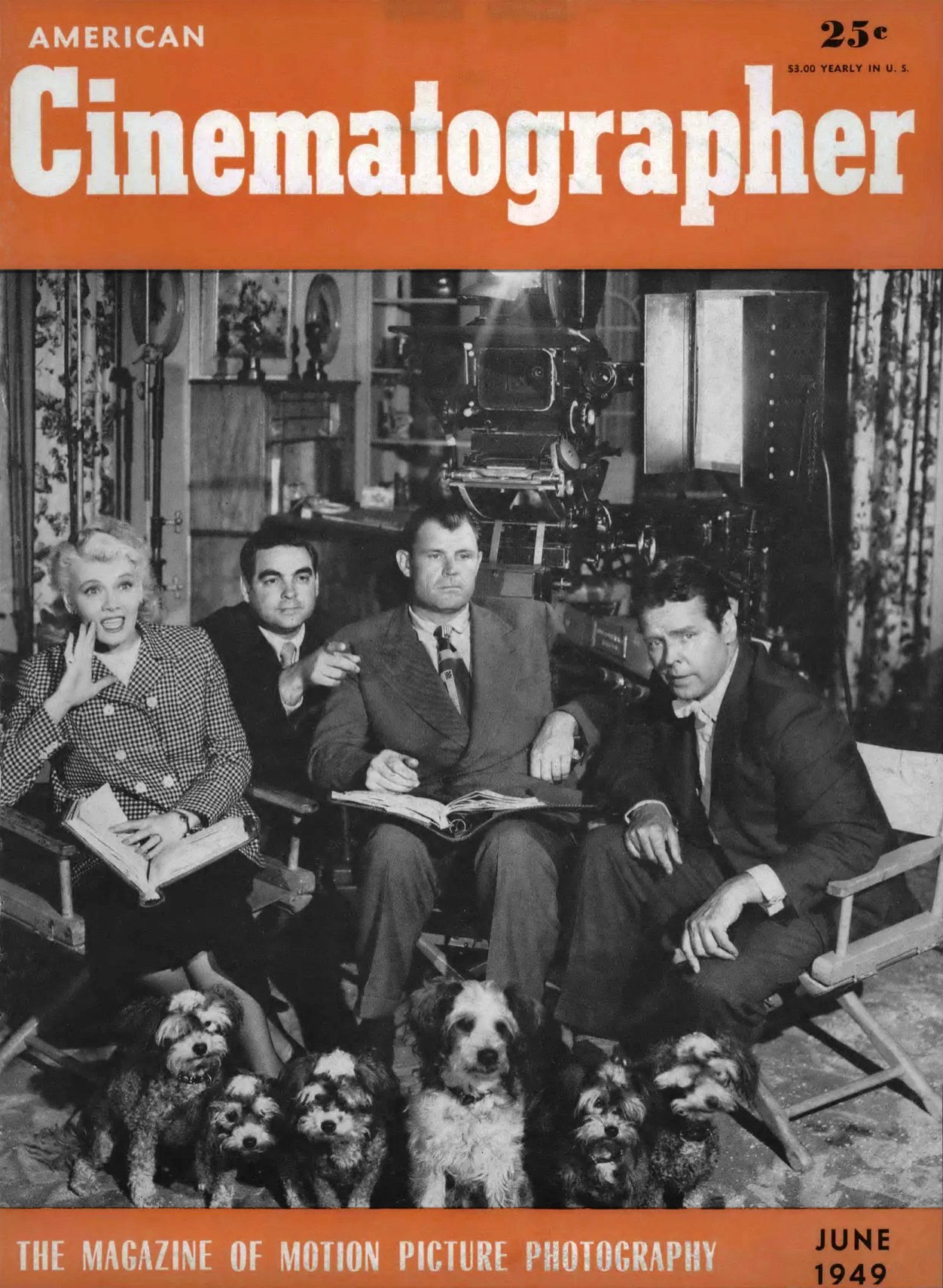
Robert Burks, ASC Photographs The Fountainhead
One of Hollywood’s youngest and most original directors of photography, combined lens and lighting to produce a clean modern style that is perfectly keyed to the mood and theme of this unusual story.
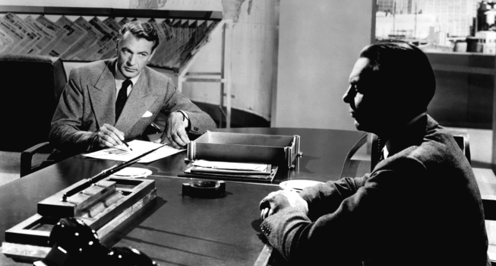
As produced by Warner Bros. Studios, The Fountainhead is a handsomely mounted, beautifully designed, and imaginatively photographed motion picture. Adapted from Ayn Rand’s best-selling [1943] novel of the same name, it is the sophisticated story of an architect whose extremly advanced ideas of functional modern architecture place him in constant conflict with those who favor the outmoded cliches of pseudo-classic design.
Simply stated, it is the story of a clash between two sharply opposed artistic ideologies which the author uses to symbolize a broader conflict between the forces of progress and reaction. Interwoven with this lofty theme is a torrid romance between the incredibly “calm, cool and collected” architect and a beautiful young heiress who quite obviously suffers from an excess of hormones.
Interspersed with the amorous thrashings-about of these two worldly creatures is a good deal of philosophy based upon the concept that a man’s artistic ideals are sacred and inviolable, and that he has a right to defend same even if it means blowing up a whole housing project.
Fans who enjoy reading the highly popular novel may ponder the usual conjecture as to whether the film is as good as the book. Those who view the film without having read the book may find the continuity a bit jumpy as the result of motivating situations which had to be omitted in order to boil the story down to normal running time. But ignoring pros and cons as to the picture’s dramatic worth, it must be agreed by all hands that The Fountainhead, judged purely from the viewpoint of visual presentation, is a brilliantly conceived and executed blend of camera art and architecture.
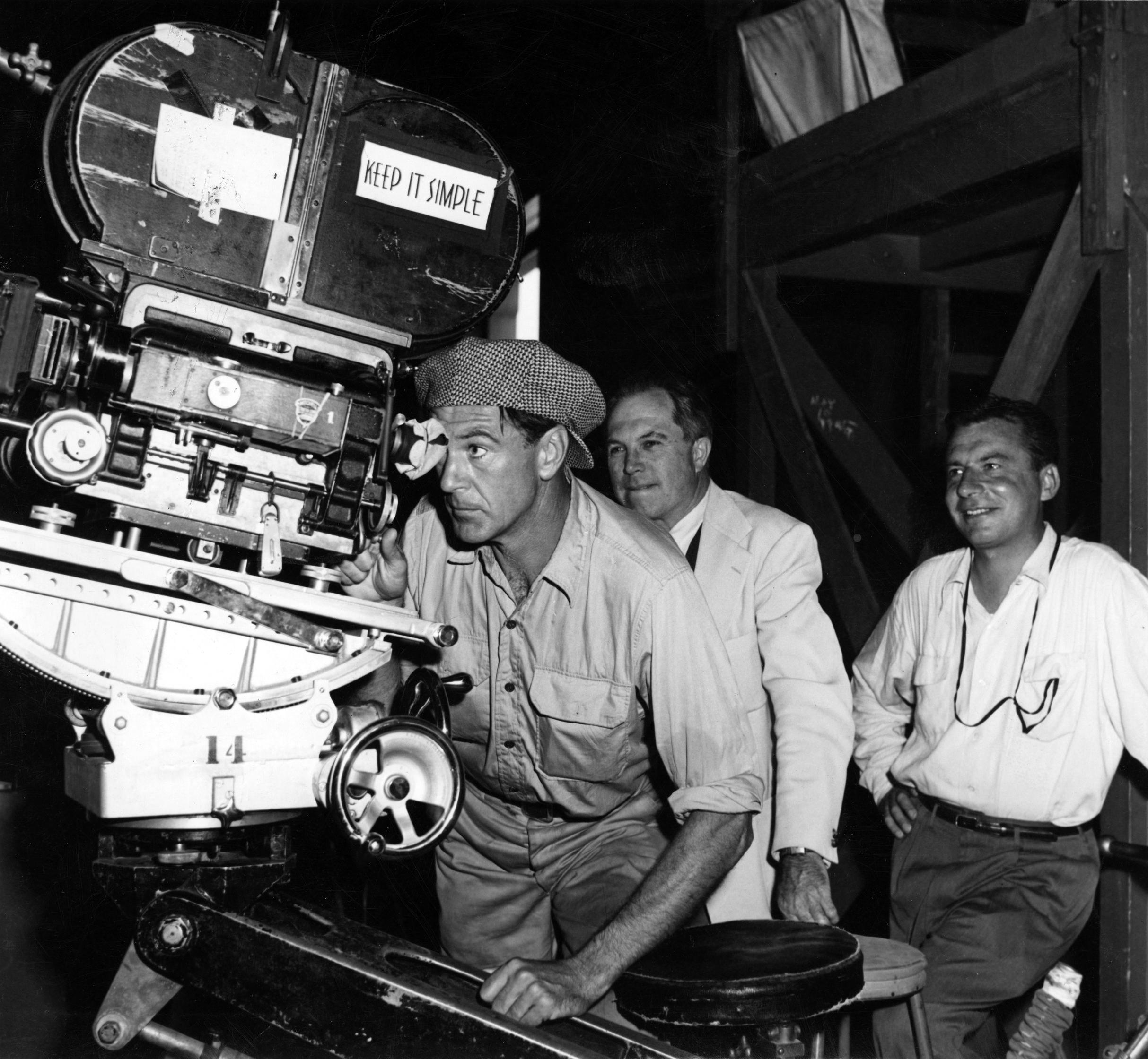
Robert Burks, ASC, one of Hollywood’s youngest and most original directors of photography, combined lens and lighting to produce a clean modern style of photography that is perfectly keyed to the mood and theme of this unusual story. Burks worked very closely with director King Vidor and art director Edward Carrere in pre-planning the visual conception of the film. They all agreed that the settings and camera approach should be kept as simple as possible, since simplicity and functionalism were fetishes with Howard Roark, the story’s hero.
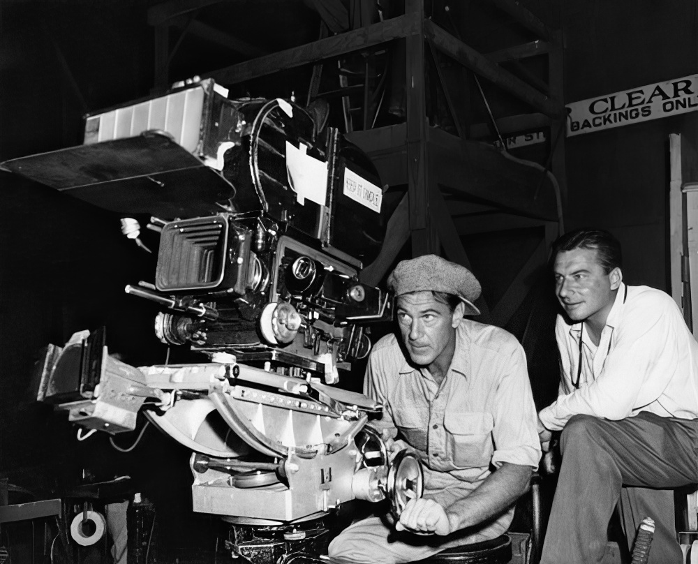
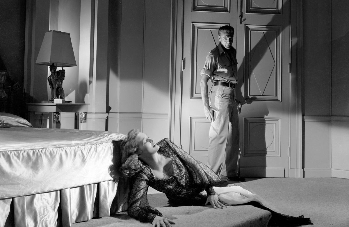
“Our main problem,” Burks points out, “was to present our story in sharply dramatic fashion, without cluttering it up with frills of technique. This meant that settings and camera treatment had to be designed to complement each other, and to accentuate the impression of dramatic simplicity. The sequences dealing with the protagonist and his functional ideas were presented in this manner. By way of dramatic contrast, the sequences dominated by characters representing the oldfashioned approach to building design, were photographed in a conventional style. By contrasting the two types of photography, we aimed to sharpen the gulf between the two opposing trends of thought in the story.”
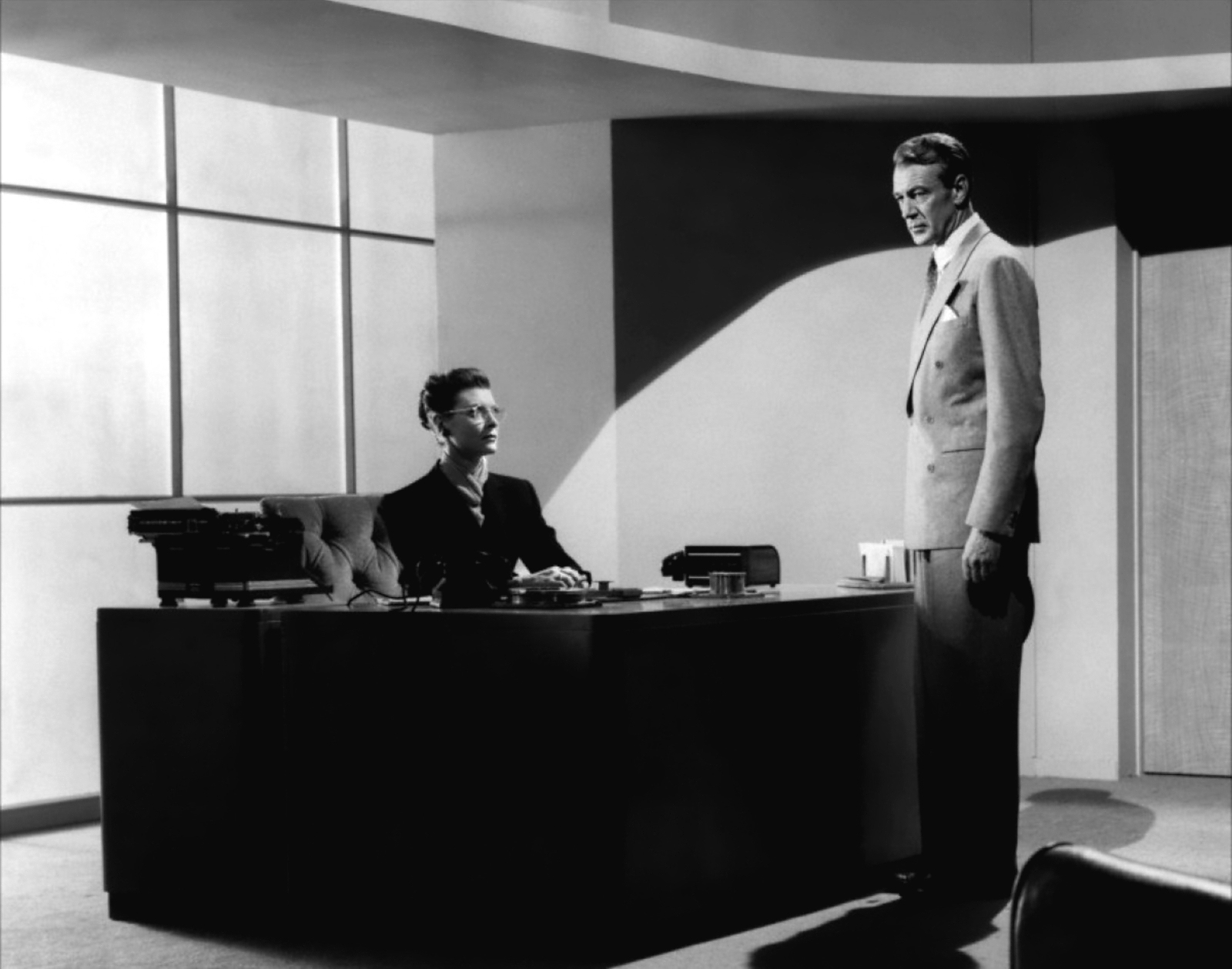
Using this formula of camera treatment, the photography became a graphic ally of the hero — an effect which is, of course, sensed rather than consciously noticed by the audience. Throughout these sequences, single lighting units were used as source illumination and a minimum of fill light was employed in order to preserve the clean black-and-white quality that is so forceful in pointing up the action.
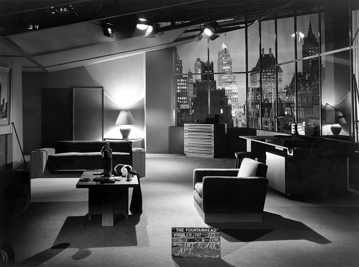
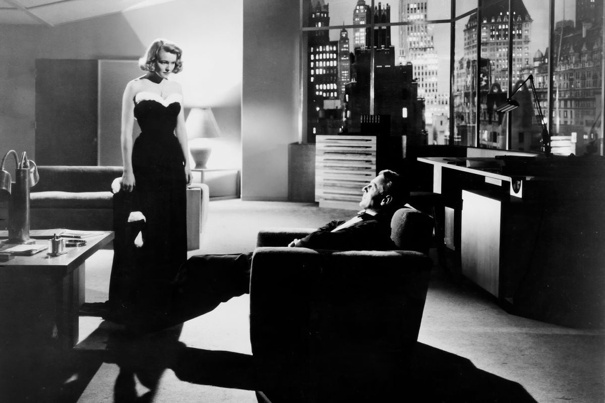
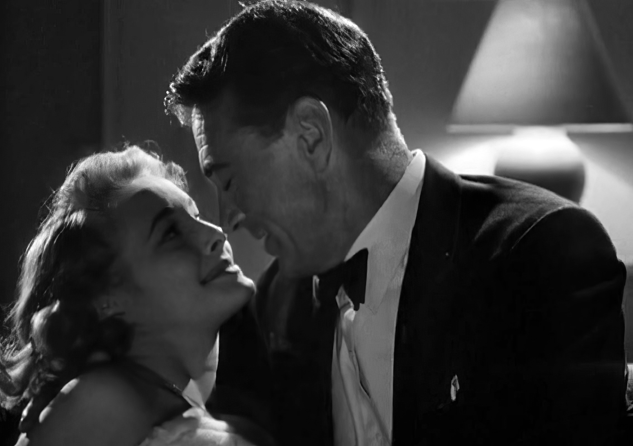
The photography of the film draws great power from the dynamic compositions which the cinematographer used to frame his scenes. The sweeping lines of the modern architecture formed excellent patterns with which to work, and Burks employed them to complete advantage, without at any time going overboard for “arty” effects. But he went beyond the tailor-made dimensions of the interior sets in carrying the modern style of composition over into even the outdoor natural locales. For example, a huge rock quarry serves as one of the important settings for the action.
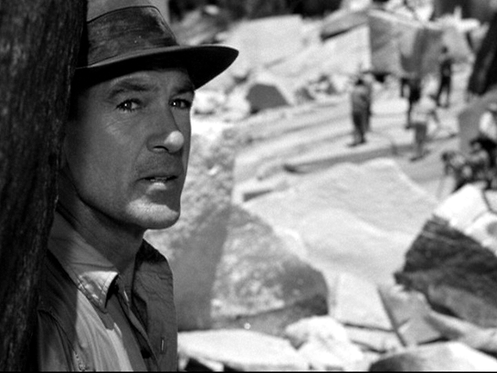
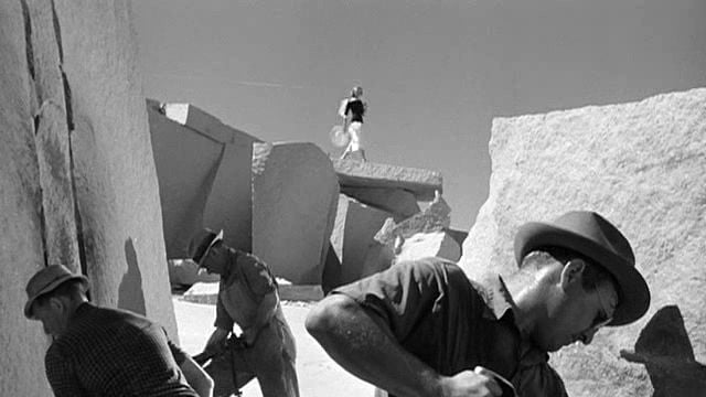
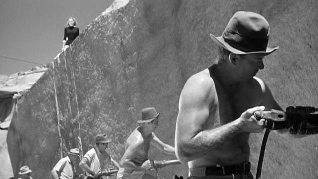
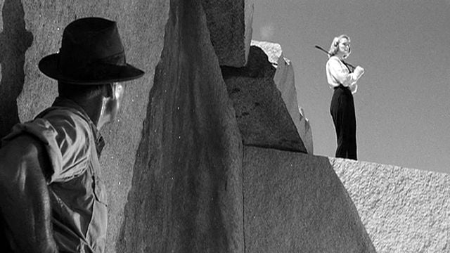
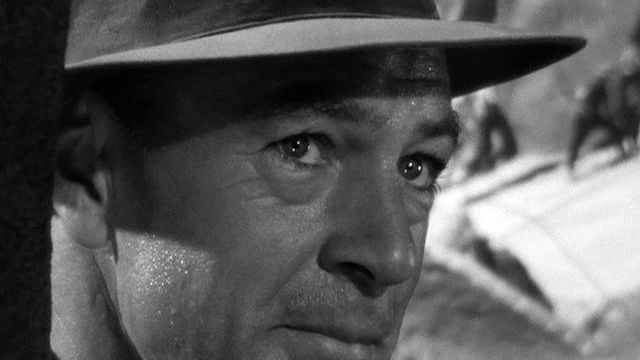
Had this location been photographed in a conventional manner it would have been just another rock quarry. But to the lens of cinematographer Burks, it became a ruggedly modern, almost stylized, mounting for dramatic action. The angular jutting shelves of rock were used as cubistic art forms to frame and balance the composition of the scenes. On paper, this sort of symbolism may sound cryptic and a bit farfetched, but on the screen the visual parallels are most forceful and direct.
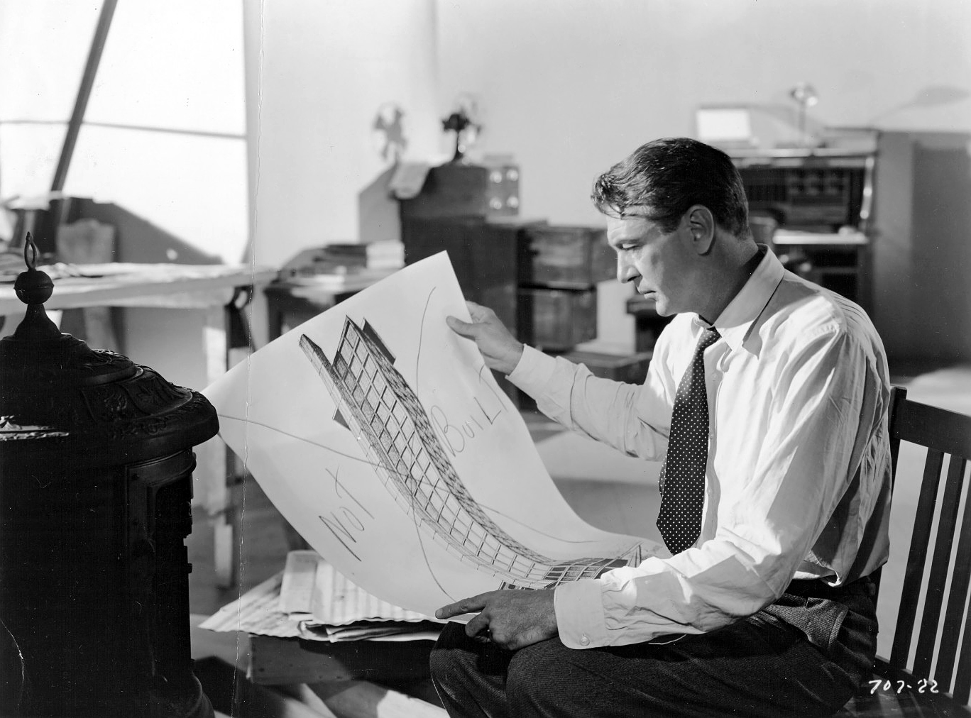
In designing the sets for Fountainhead, art director Carrere was guided by the author’s own descriptions of buildings and planned structures, some of which were described in the novel as “a mass of planes.” He used cantilever design for some of the buildings, and produced some sharply modern, almost futuristic, designs — most of which, he maintains, are practical enough to actually be put into use.
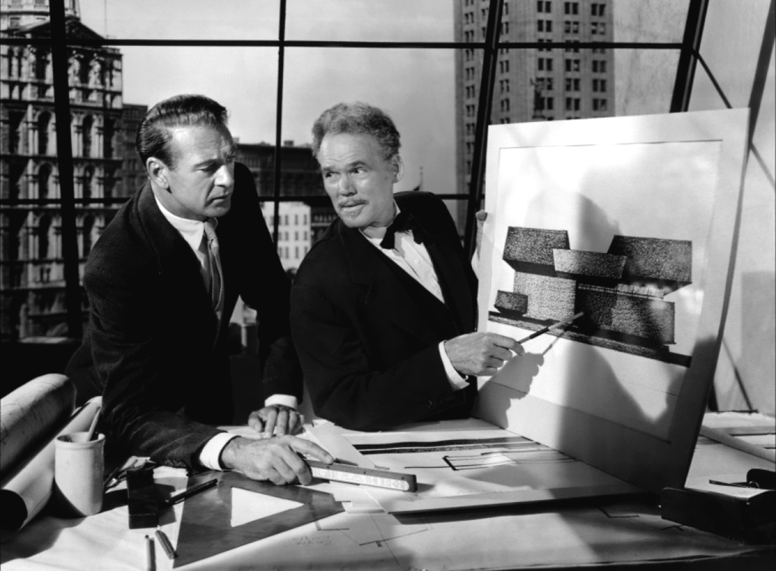
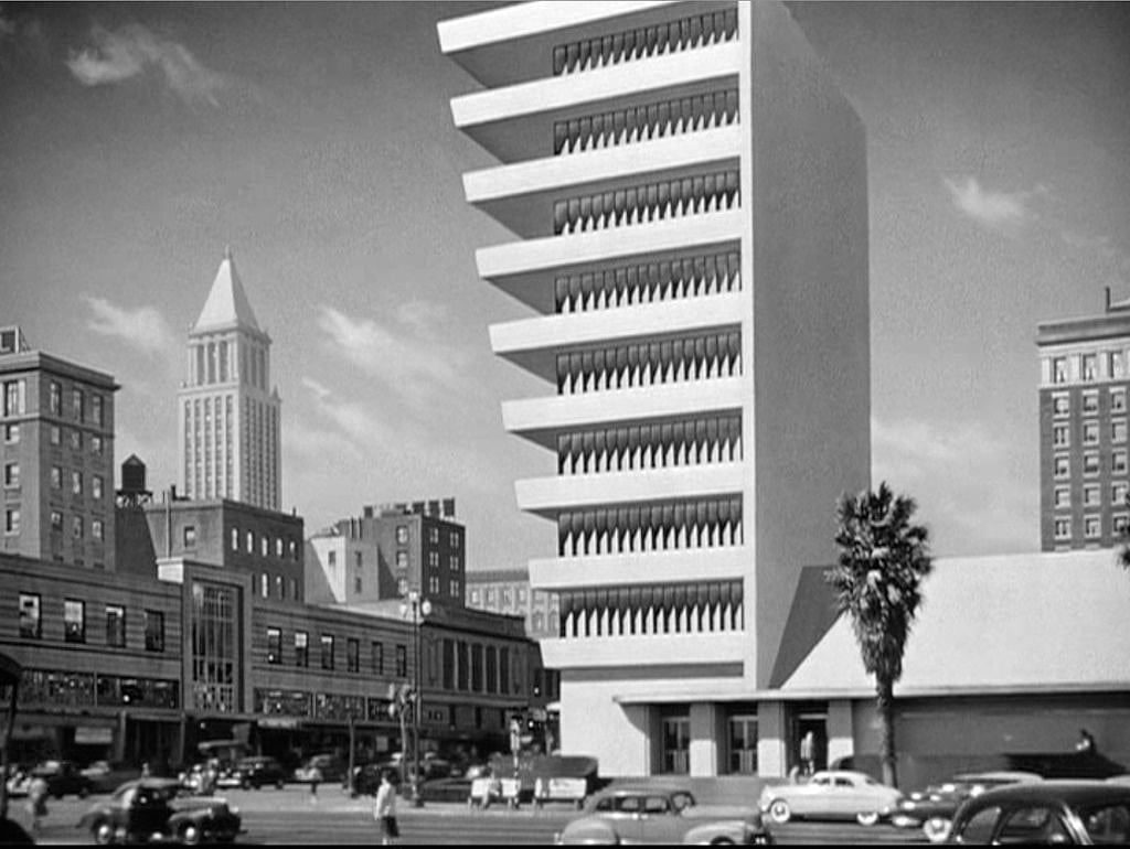
Over 300 architectural drawings were prepared for the film, and most of them followed the ultra-modern style for which the hero fought. Of the 70 separate sets in the picture, 36 were interiors and 34 were exteriors. The modern settings included the architect’s office, his penthouse apartment, the office of the newspaper publisher, and the living room of his “dreamhouse” in the country. All of these settings are characterized by bold but simple lines, plus the use of structural materials of varying textures.
The most spectacular outdoor set is, of course, the stone quarry. Located at Knowles, California, 55 miles from Fresno, it is the largest quarry in California and has been in operation since 1882. It furnished the granite for the City Hall and Hall of Justice in Los Angeles, as well as for many public buildings in other large western cities. The company spent three days shooting on location there, working in temperatures ranging up to 126 degrees.
Models of each set were built in advance and studied by the director of photography in order that he might plan his lighting and camera setups far in advance of construction of the actual sets.
To give the sets the desired “plane-against-plane” effect, Carrere had them painted lighter in the foreground than at the back and then flooded them with a great amount of light to provide sharp shadow lines. To further intensify the light and shadow effect, he painted the shadow areas of the set very dark and the highlight areas very light.
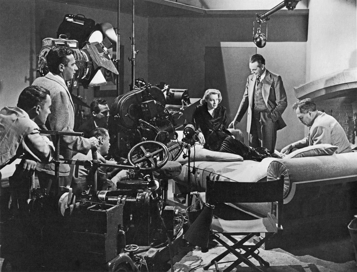
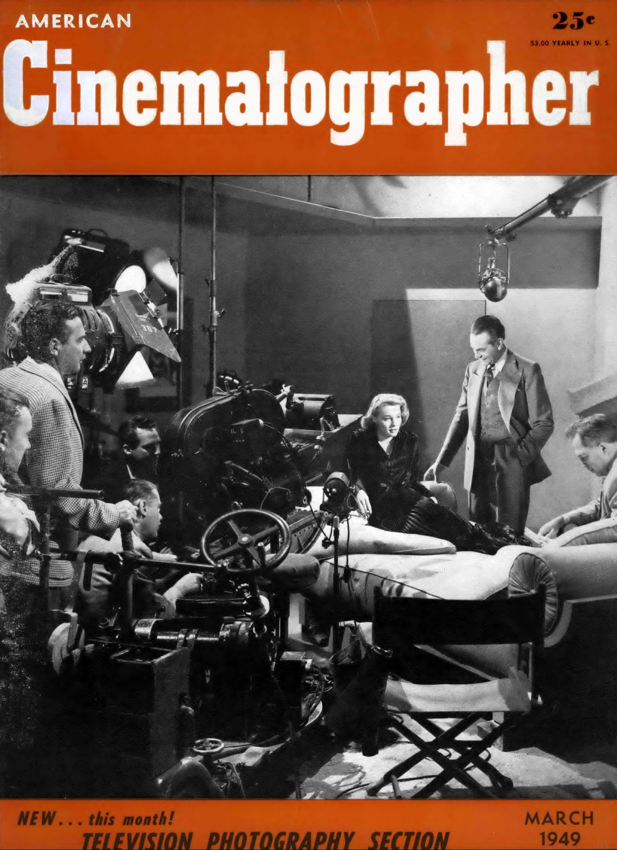
Carrere and Burks followed through with this black-and-white effect in the quarry sequence, also. Here the painters again went to work darkening the shadows for more forceful contrast. The touch of paint gave modeling and depth to the monolithic formations, lending them added force as compositional forms. The one technical nuisance was that caused by the sun moving across the horizon. As the sun moved, the painted shadows had to be washed off and repainted to match the new natural shadow patterns.
The Fountainhead owes much of its visual scope to the special effects created by William McGann and his staff. Miniatures, process plates and matte shots are smoothly executed and succeed in producing illusions that are especially realistic. Unusually effective is the collection of trick shots used in the final sequence which shows the Wynand Building, the “largest structure in the world,” under construction.
The process by which the heroine is apparently taken to the top of the 1,400’ unfinished building to visit her architect husband, required weeks of preparation and involved a nightmare of special effects. Riding to the top on a service elevator, she eventually reaches the point where she is looking down on the Empire State Building. Glancing up she sees the remainder of the building she is ascending, and to make this effect believable, it was necessary to keep the perspective constantly changing from floor to floor as she rose.
The settings for The Fountainhead, besides being visually striking and perfectly matched to the theme of the story, are notable for yet another reason completely unrelated to art: they were economical to construct.
Back in the all-too-recent days when a film’s worth was judged (at least by those in the industry) according to the amount of money spent on it, the consensus of opinion was that settings could not possibly be good unless they were expensive. Now that production economy has become the smart thing on the sound stages, the less expensively a good effect can be achieved, the more it is praised.
The settings for The Fountainhead thus come in for a heavy share of praise, because their simplicity of design and detail made them economical to construct and decorate. Paradoxically, this simplicity is so rich in its clean forceful sweep, chat an impression of expensive production value permeates the entire film.
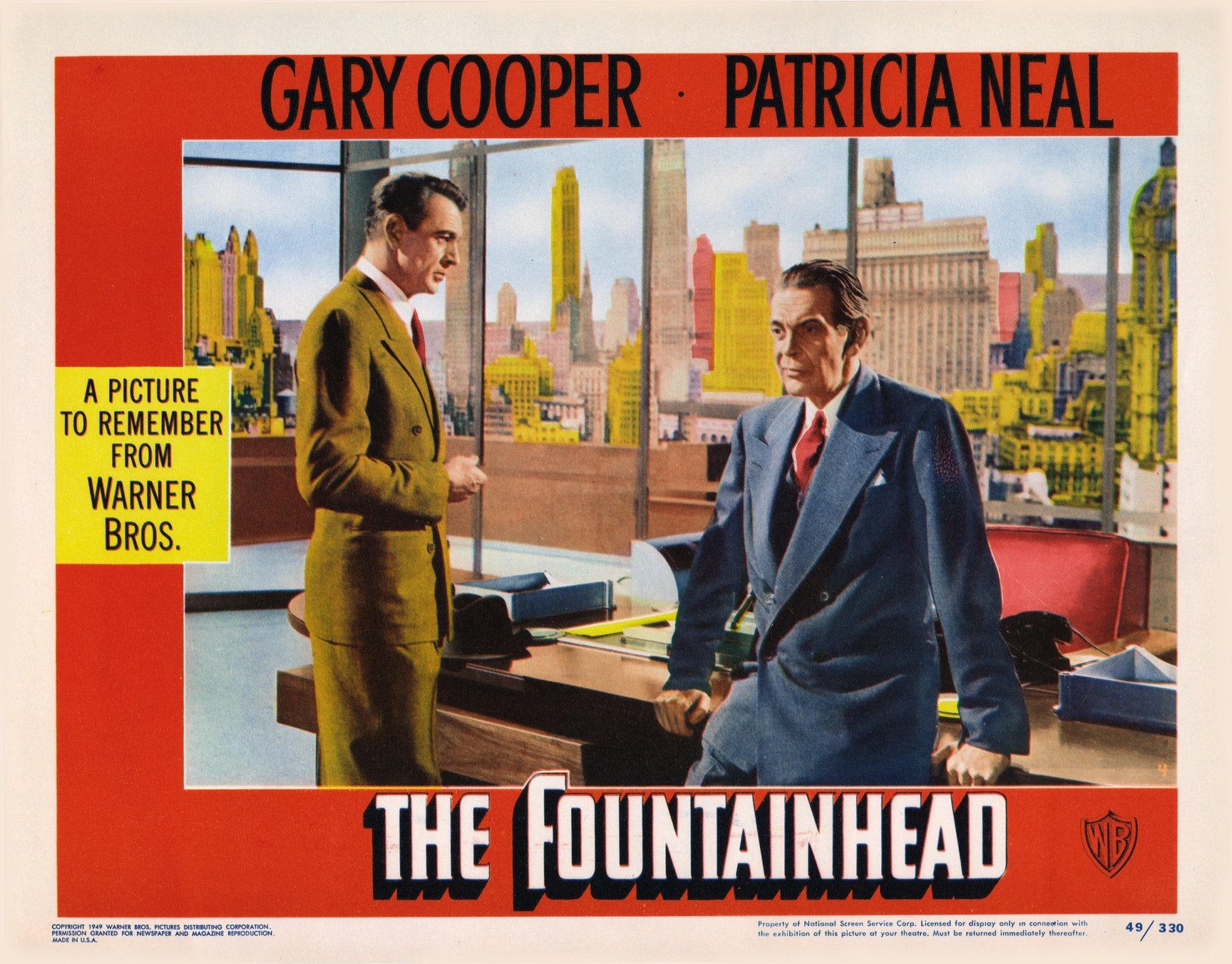
An example of this forceful economy can be drawn from examining the sets for the architect’s apartment and for the publisher’s office. In each of these sets, huge windows take up one whole wall of the huge room. Outside, skillfully executed photomurals form the cycloramic skylines. The remaining walls are absolutely plain, with only a few functional pieces of modern furniture for set dressing.
The Fountainhead, artistically speaking, achieves its visual elegance by understatement.
Born on July 4, 1909, in Chino, California, Burks launched his career in the Special Photographic Effects department at Warner Bros. in 1928. He took over the unit in 1944, and as a director of photography contributed effects shots to such films as King’s Row (1942), God Is My Co-Pilot (1945), The Big Sleep (1946) and Key Largo (1948). But he was also starting to shoot shorts and small features, leading up to his assignment on The Fountainhead (1949), which made great use of his deep understanding of how to photograph miniatures and create forced-perspective shots.
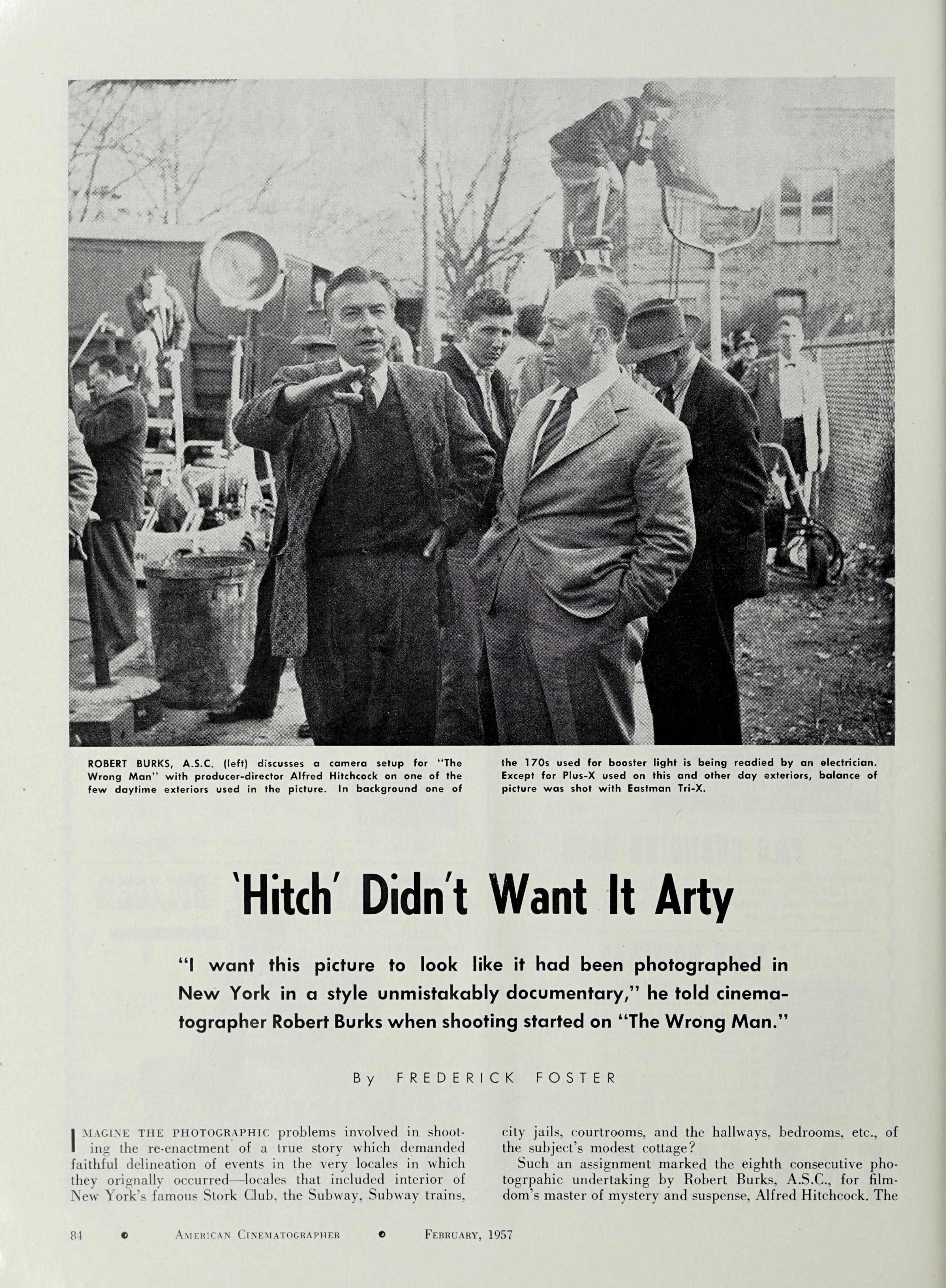
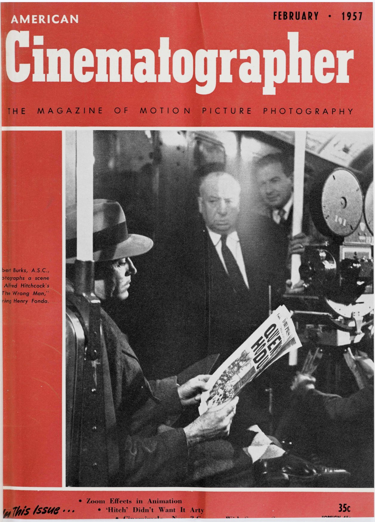
The cinematographer’s work quickly caught the eye of Alfred Hitchcock, who brought Burks in to shoot his thriller Strangers on a Train (1951; for which Burks earned his first Academy Award nomination). It was the first of 12 films they would make together, including I Confess (1953), Dial M for Murder (1954), Rear Window (1954; earning Burks another nomination), To Catch a Thief (1955; for which Burks won the Academy Award), The Wrong Man (1956), Vertigo (1958), North by Northwest (1959), The Birds (1963) and Marnie (1964).
Throughout their fruitful working relationship, Hitchcock relied on Burks to use his effects knowledge to deliver unconventional imagery, often employing rear-screen and matte photography techniques to make possible otherwise difficult productions. Always experimenting, they would also make dramatic use of color, optical effects, large-format camerawork, movement, and even 3-D.
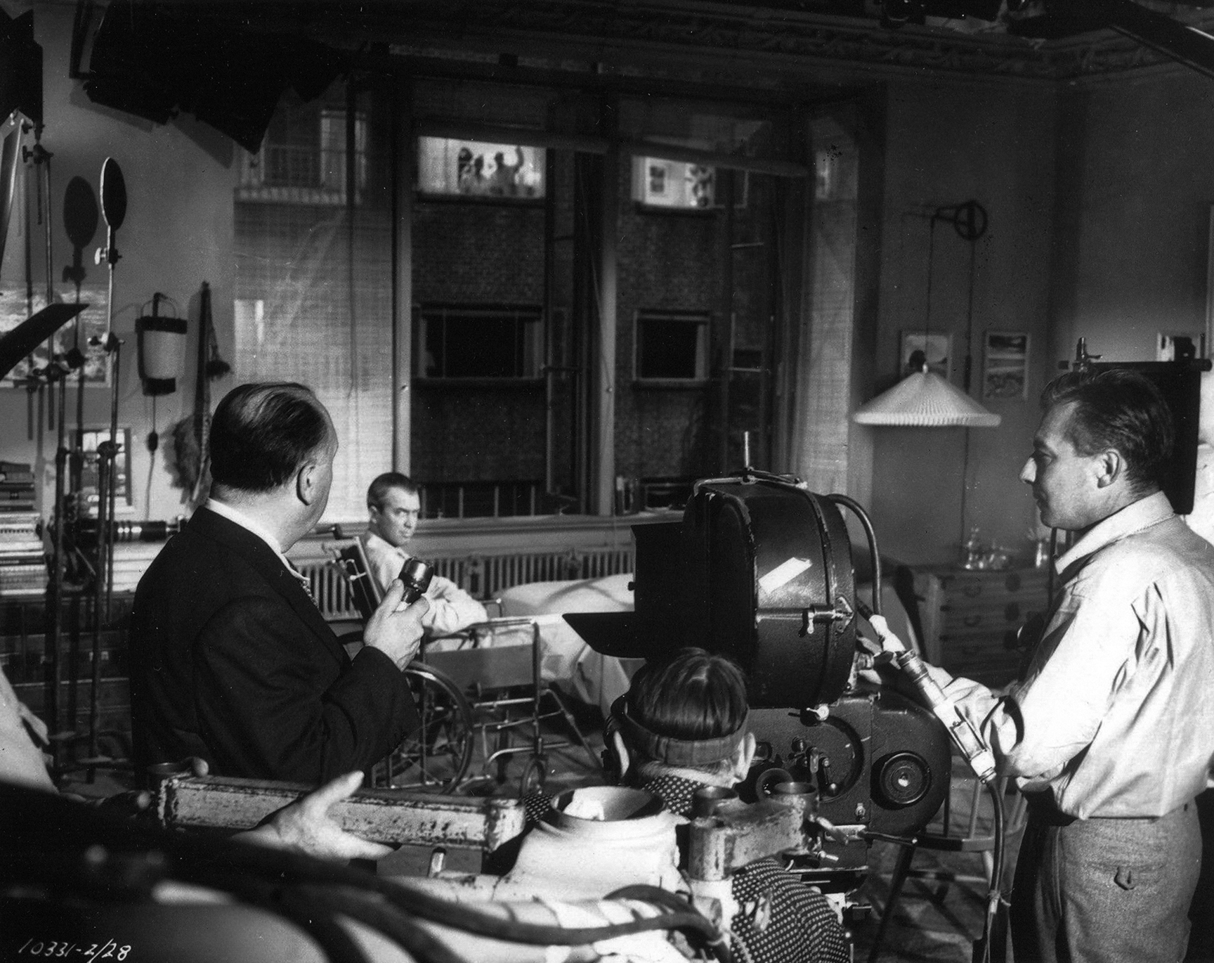
Of note, all 12 of these pictures were also a collaboration with camera operator Leonard J. South, ASC, whom the director had known since making The Paradine Case in 1947.
The ever-adaptable Burks’ other feature credits also include The Glass Menagerie (1950), Hondo (1953), The Spirit of St. Louis (1957), The Great Impostor (1960), The Music Man (1962) and A Patch of Blue (1964; earning his fourth Oscar nomination).
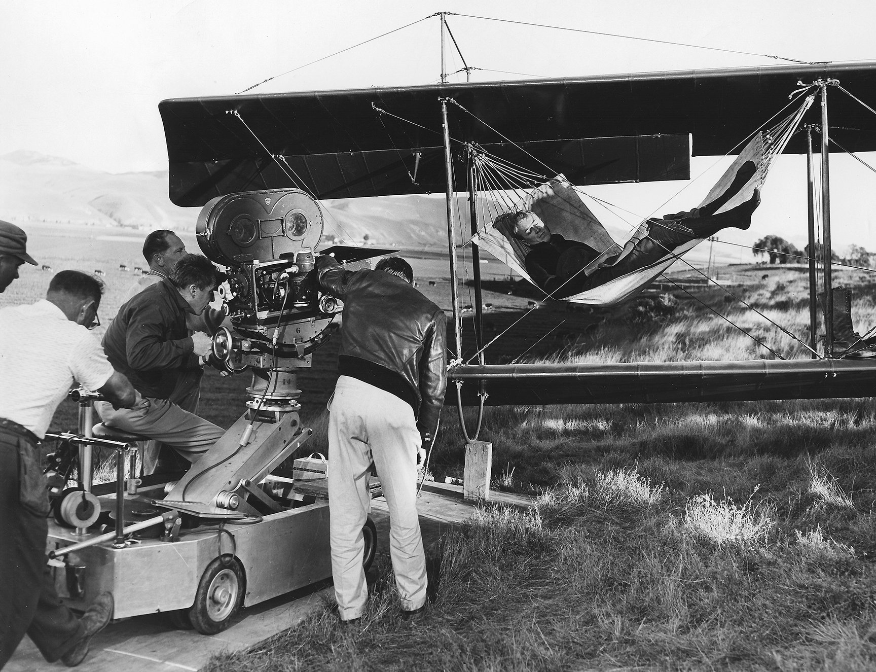
The cinematographer worked again with Fountainhead director King Vidor on the noir melodrama Beyond the Forest (1949).
Burks tragically died at the age of 58 on May 12, 1968, in a house fire that also took the life of his wife.
