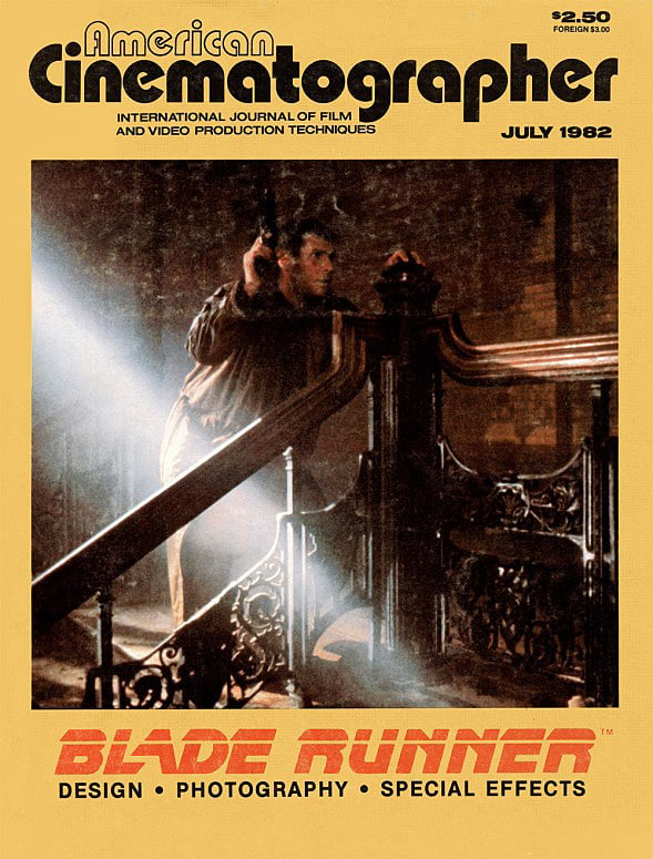
Discussing the Set Design of Blade Runner
Creating the look of the future, and the thought process behind it, as explained by director Ridley Scott and “visual futurist” Syd Mead.
“Films usually attempt to do the future by presenting a rather bleak, pristine, austere, clean look. It could go that way, but I’ve got a feeling it’s going to go the other way.”
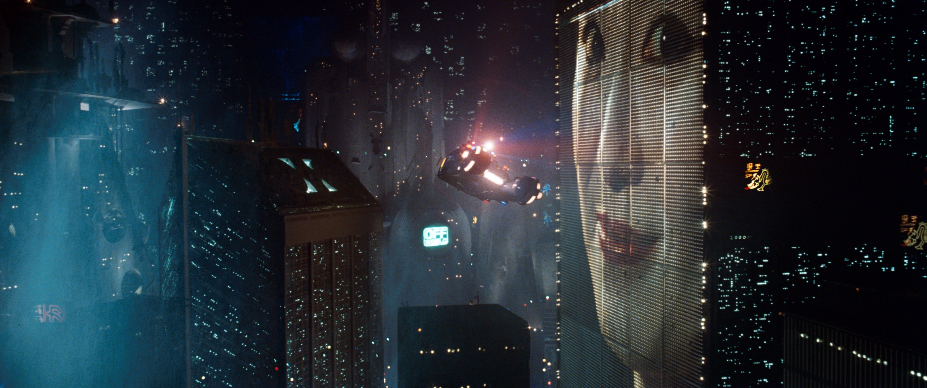
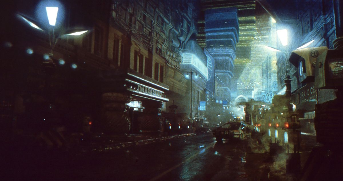
Ridley Scott is discussing his approach in directing Blade Runner, a detective thriller set 40 or 50 years in the future: "Think of Chicago or New York City right now, the over-saturation, how impossible it is to maintain some of these buildings. Think how expensive it’s going to be to take down the Empire State Building. It will cost as much as building it. Eventually, you’ll just have to ‘retrofit’ things on the face of the building rather than having to pull half the side off, re-house the air conditioning or re-wire it. The cost will get so high it’s going to be simpler just to smack things on the outside. So maybe buildings will start to be designed from the inside out. You wear your guts on the outside. That gives us a picture of a textured city.”
Syd Mead, an industrial designer who was the “visual futurist” for Blade Runner, describes the sociological assumptions behind the production design: “The consumer delivery system has sort of broken down. The available capital is all going to research and development and the consumer base is being neglected.”
The story for Blade Runner is based on the idea that overpopulation has forced millions of people to migrate to “off-world” colonies, and that genetically engineered human "replicants" are used as laborers in “off-world” military industrial or mining operations. The result is that the urban environment on Earth is a strange mixture of new technology and old elements adapted to the new conditions. As Mead puts it: “Ridley wanted things to look like they had to be jacked up a little bit to work at all — a panel refitted here, a larger unit clapped on because the old one didn’t work, that kind of accumulative-accretion look.”
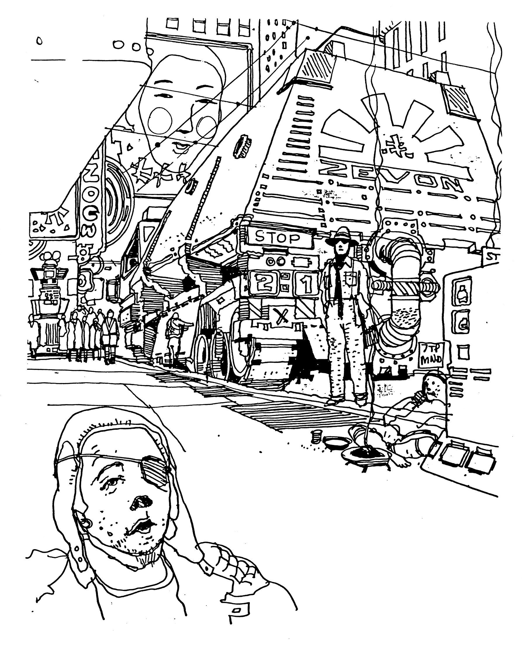
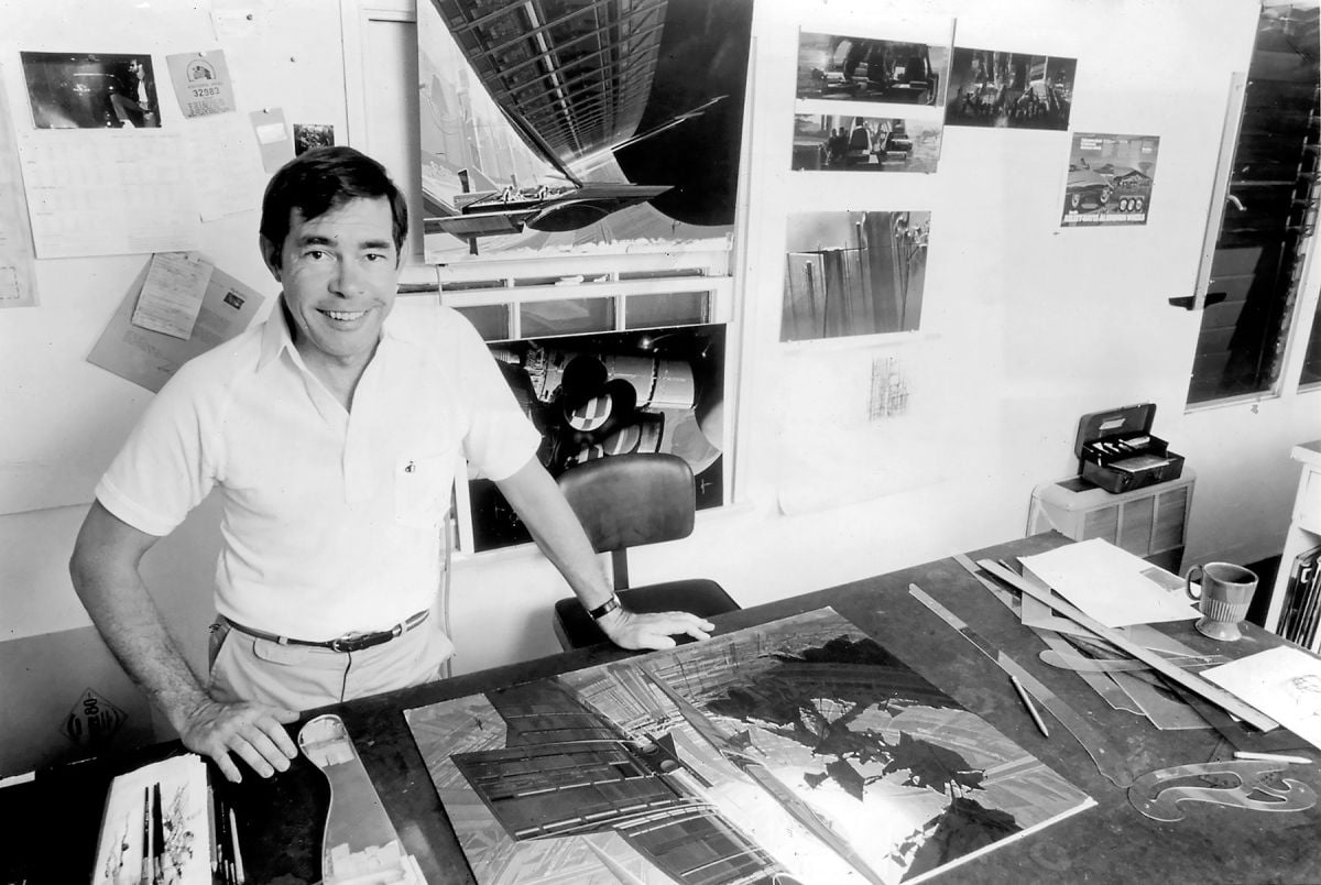
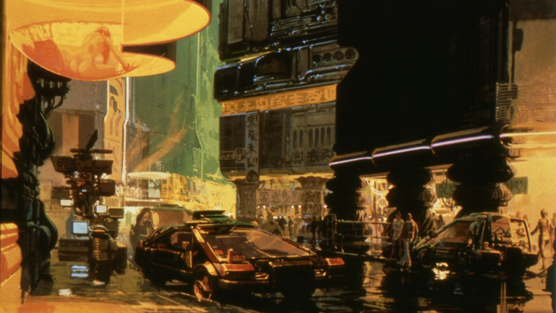
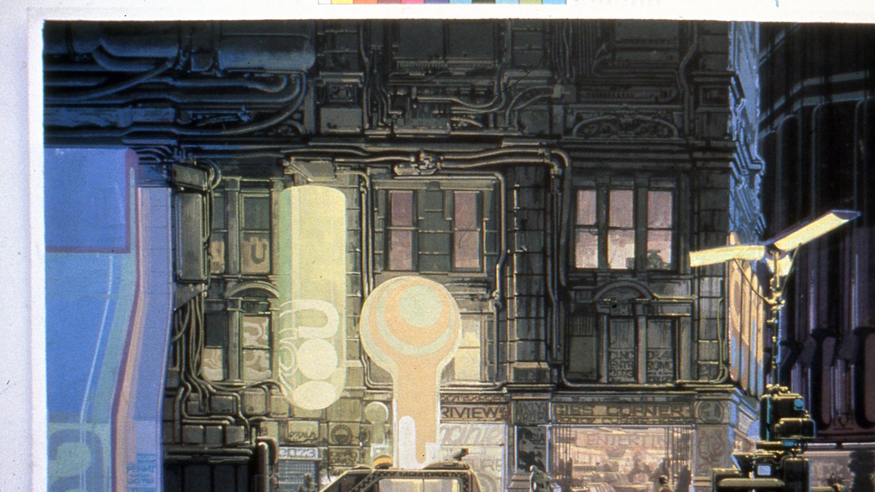
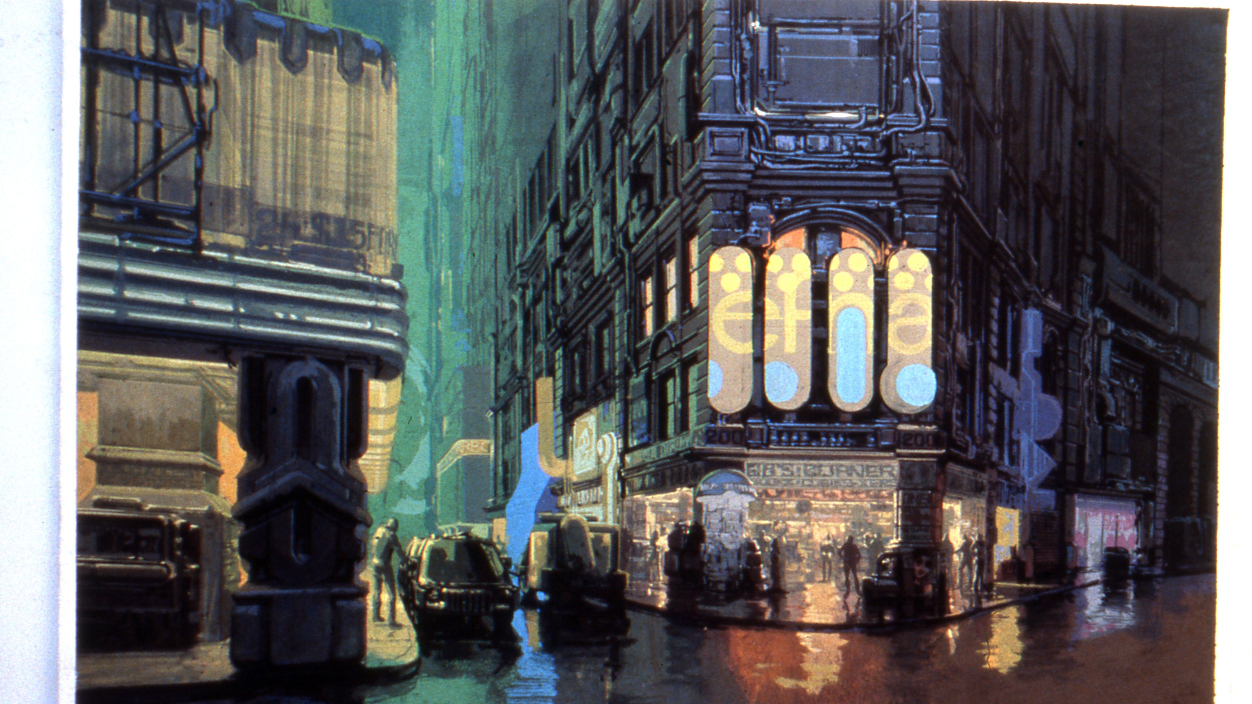
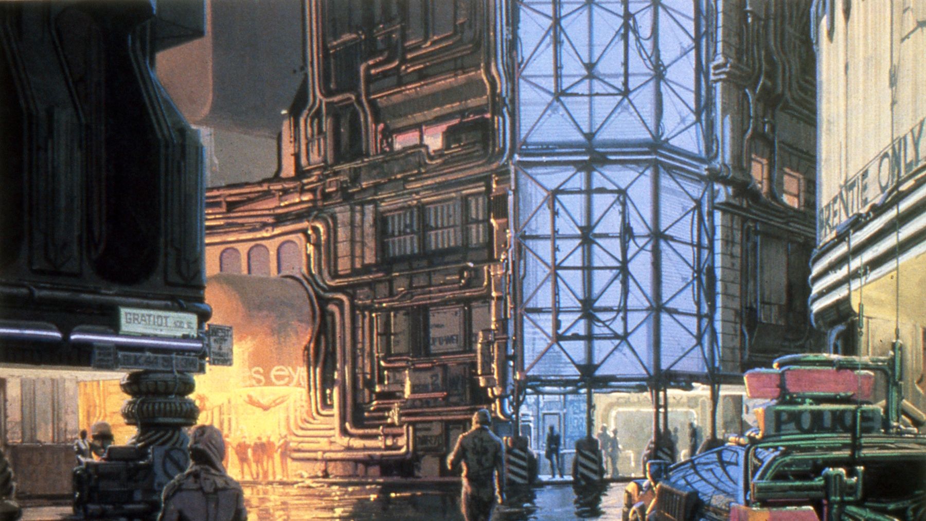
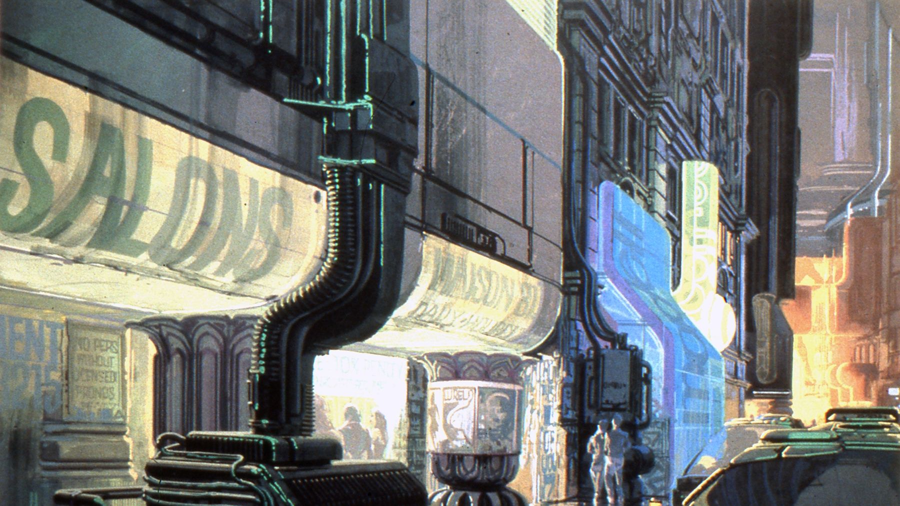
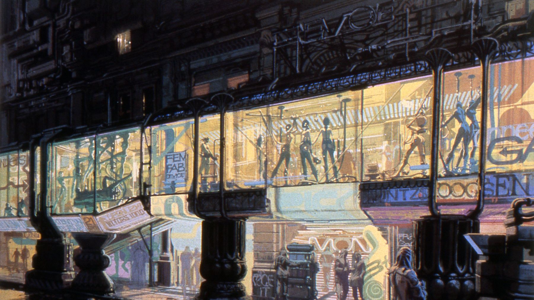
The extent to which the economy no longer benefits the consumer is perhaps most noticeable in the streets of the city conceived for the film. Mead, who was originally hired to design vehicles for the film, began doing sketches of the streets as settings for the vehicles and gradually became involved in visualizing a great deal of the environment for the action in Blade Runner. He recalls the concept developed for the city.
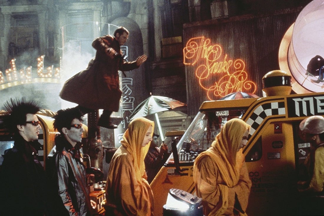
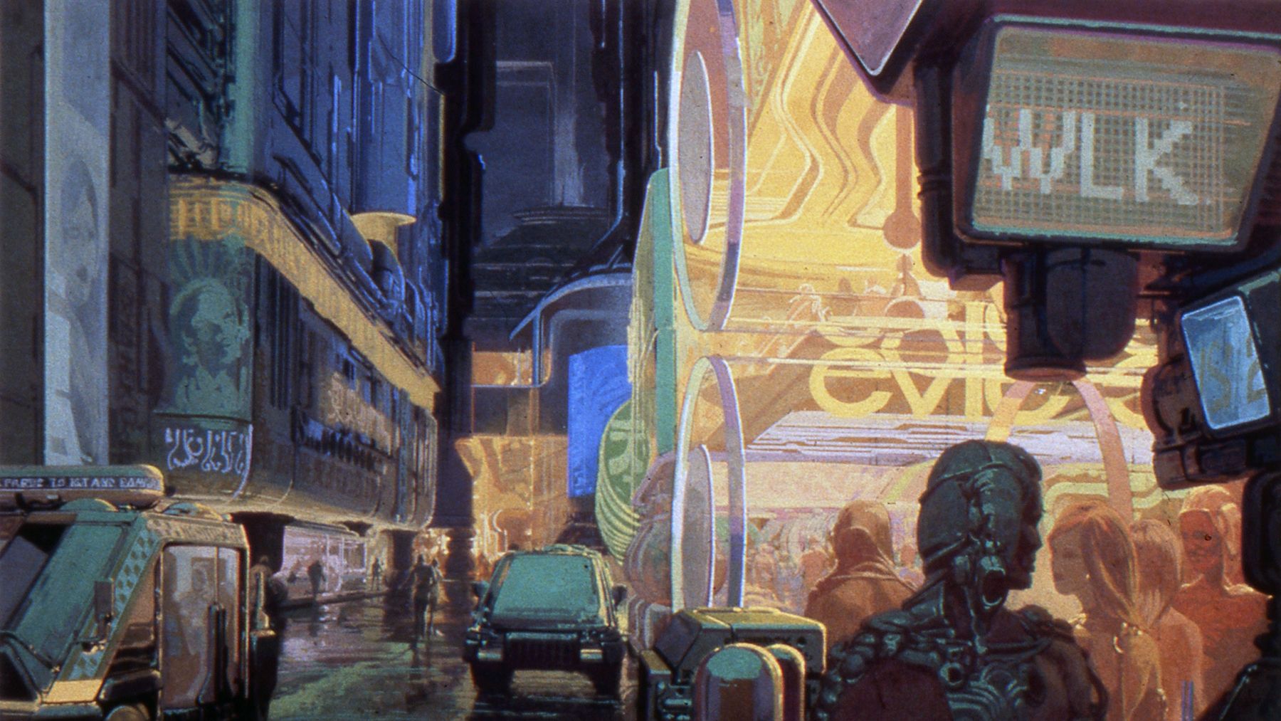
“First of all you had this incredible congestion at street level. The streets had become like the underground sewers of Paris or the leftover space as you built higher and higher.”
— Syd Mead
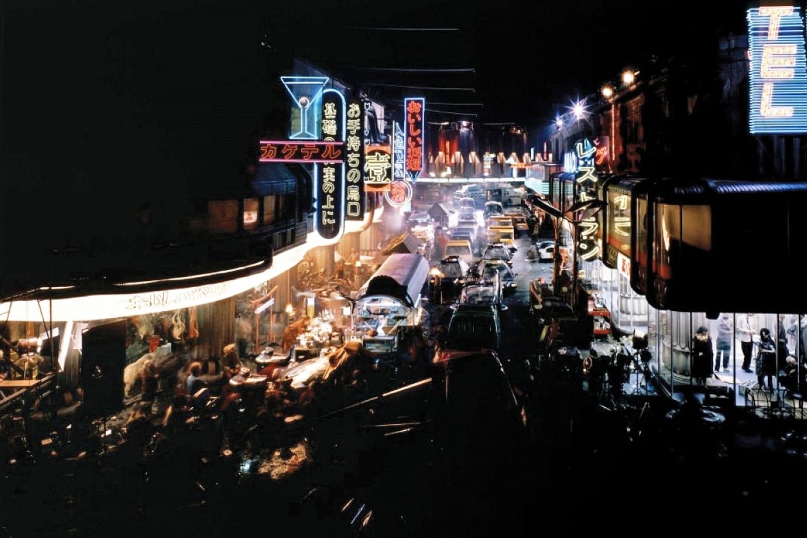
“I made a sketch of the typical new city where we had the World Trade Tower-size building which is now old and the new buildings going up past 3,000 feet high. Then you start to build an entire elevated network of connections because decent people don’t live below 60 stories above the ground. So the street level becomes an access corridor and really nothing more. If you are forced to live there by economic accident or whatever, it's a very unpleasant place to be. You get this congestion of cars and big machines that are just there. They are owned by the city, and they just sit there for a month. People are camping under them, and there is a Hong Kong or Calcutta kind of density that Ridley was after.
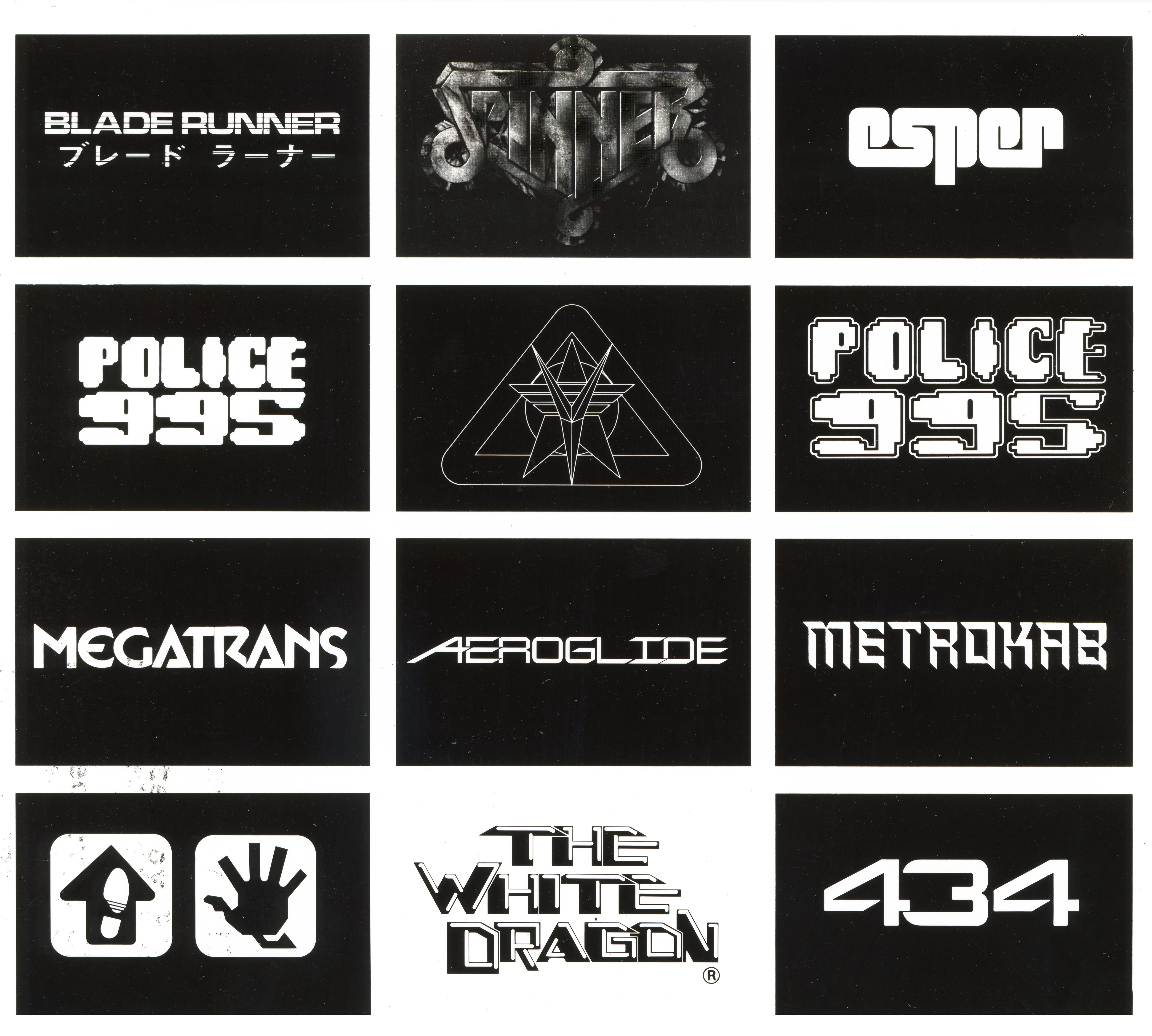
“The Oriental graphics on the streets contribute to that density without being as distracting as English language signs would be for an American audience. They give you the visual crowd and the add-on visual jumble without too much distraction. I had noticed that myself in Tokyo on the Ginza where the signs look incredibly jumbled, but I was not distracted by being able to read them so I could enjoy the pure visual composite they created.”
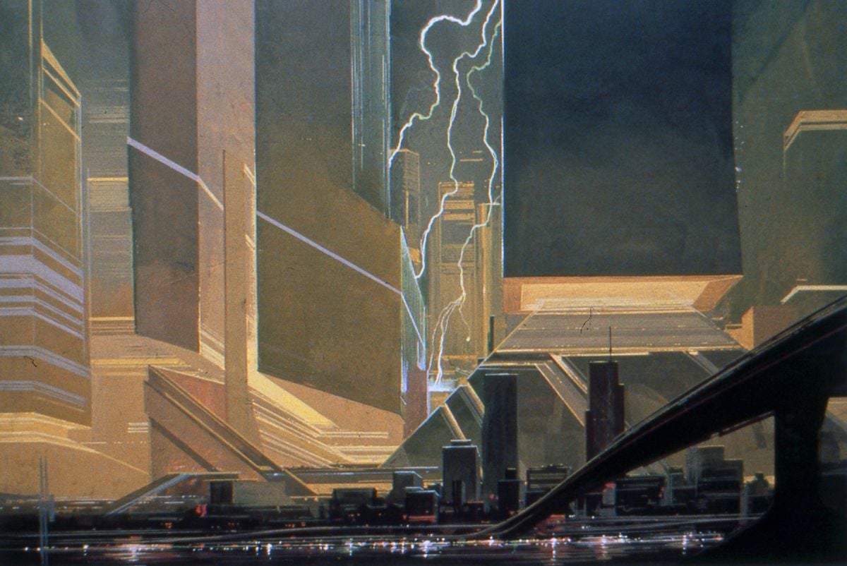
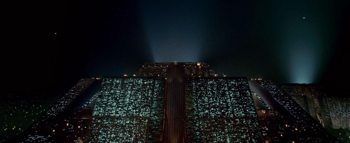
The other extreme in the city is represented by the 700-story pyramid housing the offices of the Tyrell Corporation responsible for the creation of the replicants. Production designer Lawrence Paull describes the executive office at the top of the pyramid as “Establishment Gothic.” It has black marble floors, 20-foot columns, a black marble desk and a huge picture window overlooking the entire city. Although Blade Runner involves a vision of the future and a conception of the impact of genetic engineering, Scott is quick to point out that it is not a “serious” picture, and the production design reflects this basic attitude towards the story. “The film is a tongue-in-cheek idea of what could actually happen if the replicant industry becomes a large conglomerate, a monopoly. If one particular company could become so large that it develops into aerospace, it develops into the space probes looking for mining and military areas. Another side of that company could be genetics and genetic engineering which could easily lead to the development of the first human clone.”
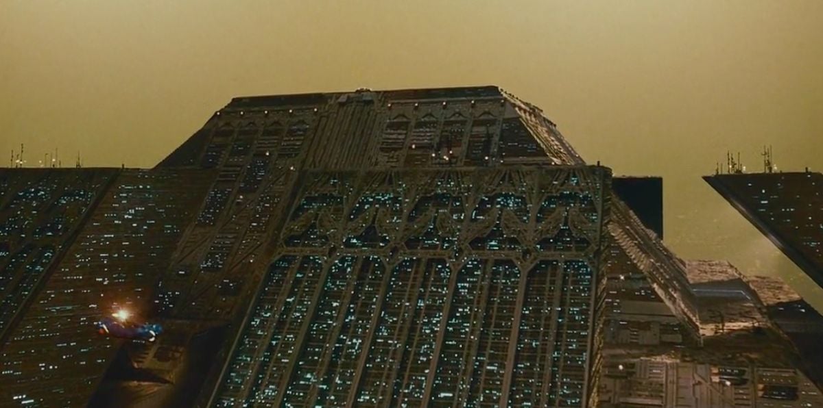
“To do a film like this you can choose to go in one of two directions,” Scott continues. “You can choose to do a film which is about genetics and genetic engineering, which is a very serious subject. A genetic explosion is happening right now. If it develops in the way that science has progressed since the turn of the century through the ’80s, then we're going to see all sorts of things affected, probably to the good. But we decided not to do that kind of movie. We decided to use certain broad elements from that kind of situation and create a kind of comic strip; so this film is not too serious. It’s not a film about genetics. It touches on it, but it isn’t about it. The story situation has arisen because of it.
“Also, this film is not a warning in any sense of the word. At the moment I choose not to do films which are loaded in that way. This film is, hopefully, good fun. The films that have fascinated me the most in the last couple of years tend to have been films which are derived from comic strips. I’ve chosen to go in that direction, and therefore there is a lot of broad strokes, fast, bold action, and colorful characters.”
Mead also makes it clear that the film is not intended to be a realistic vision of the future: “I was hired as a consultant to produce exactly what they wanted for that story, for Ridley’s visualization. The next movie that I’m hired to work on might involve a vision of the future that is slick or marvelous or has a slight kink in the whole framework so it looks a certain way, but I’ll do that just as deliberately. It has nothing to do with my own personal view of the future.”
Scott believes that the best place to start in designing a futuristic picture is with designers working in industry. He will commission drawings and then adapt them to his own purposes with the film. With Mead, he began by commissioning designs for five or six vehicle types.
“The difficult part of designing for a film is that you have to use audience in-head memory. People will believe something is real only if it is done right and compared to what they think it should be.”
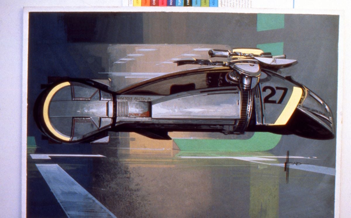
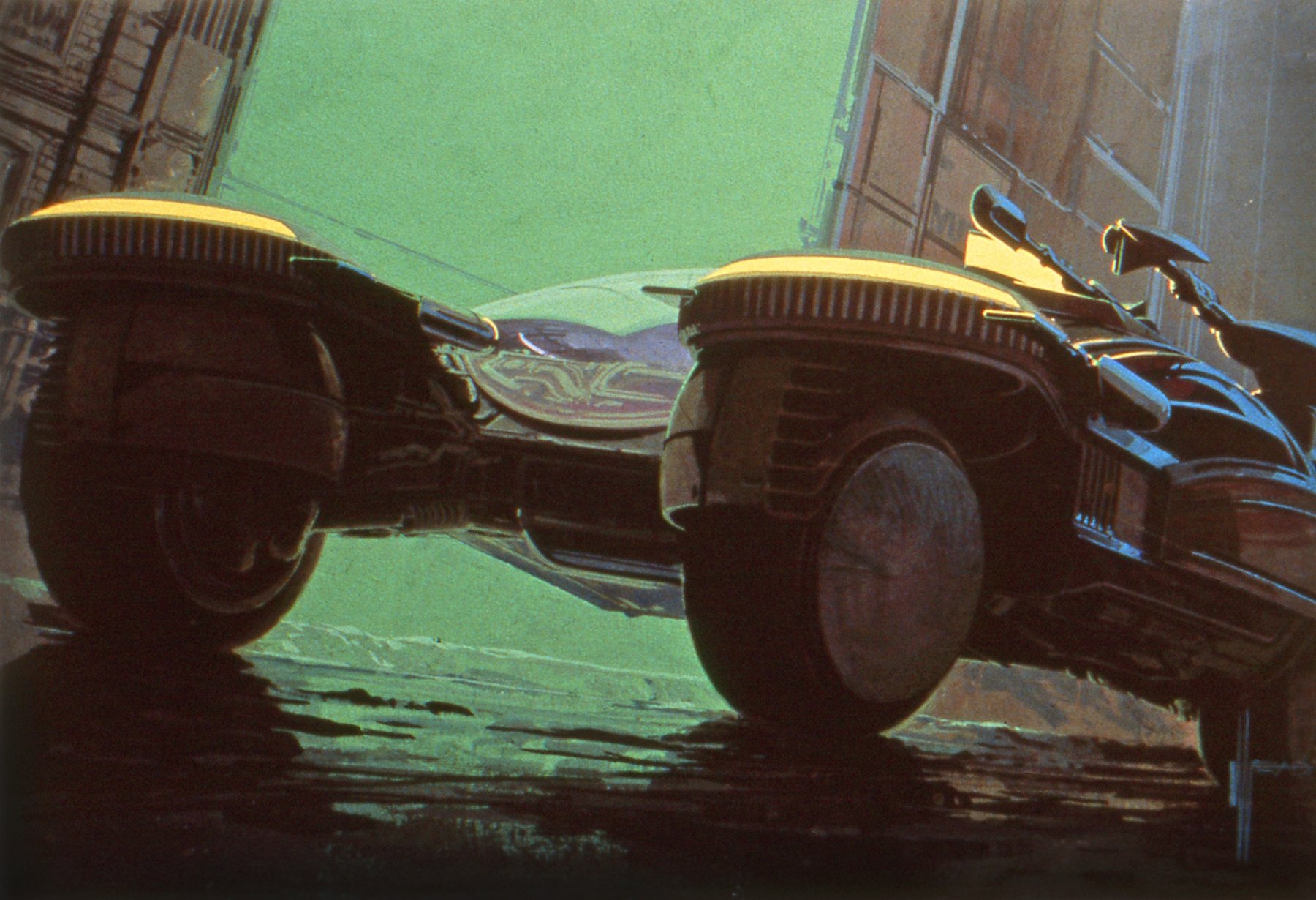
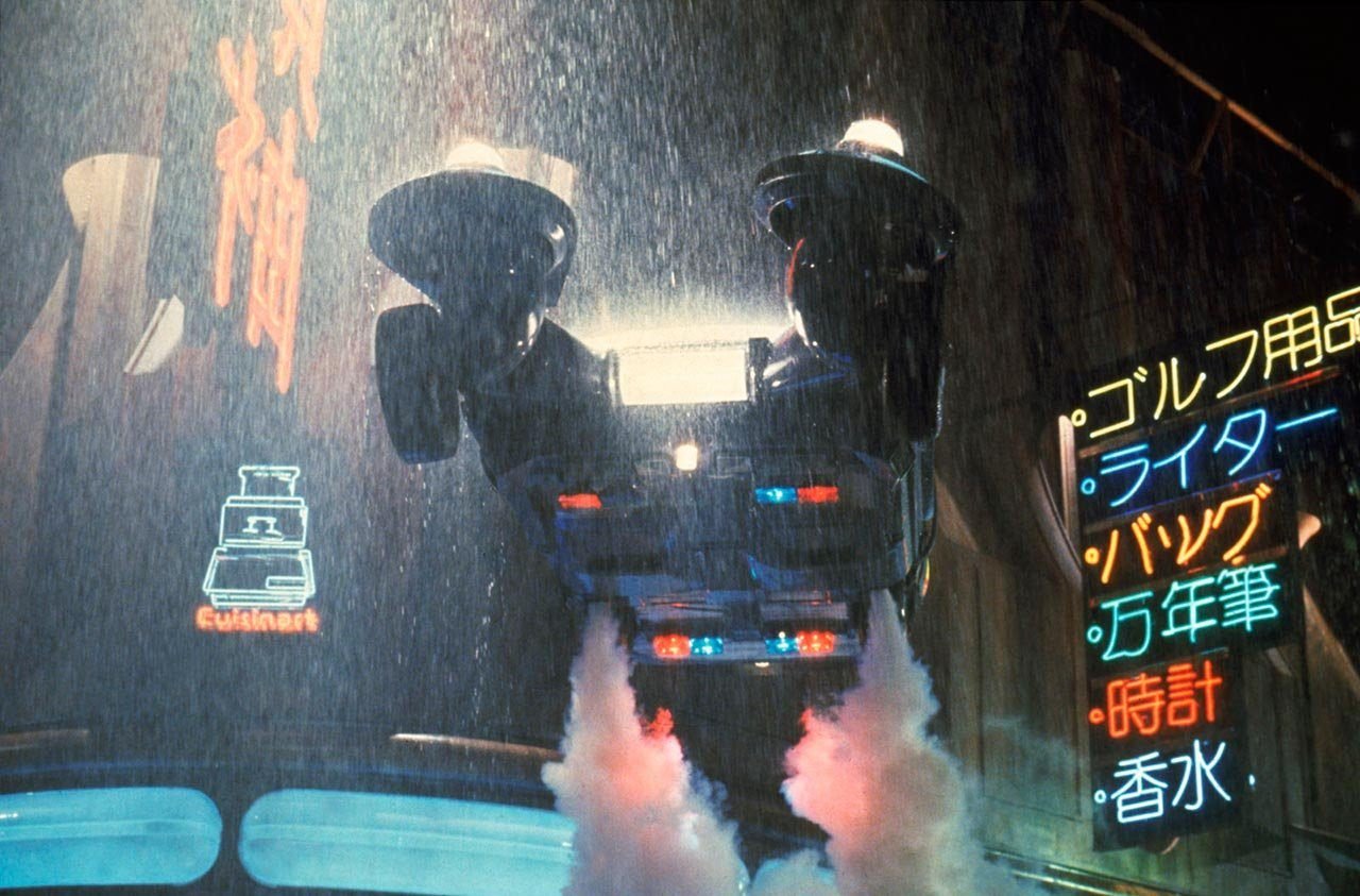
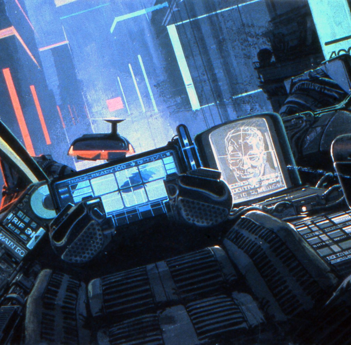
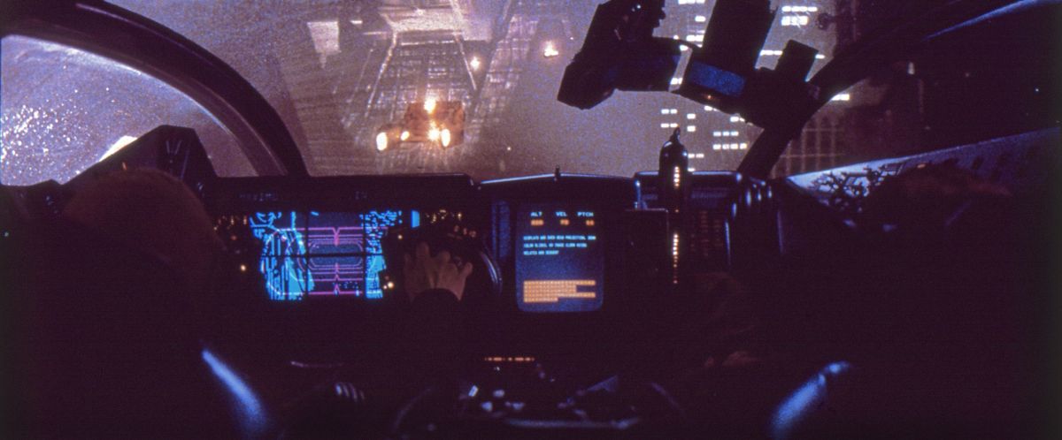
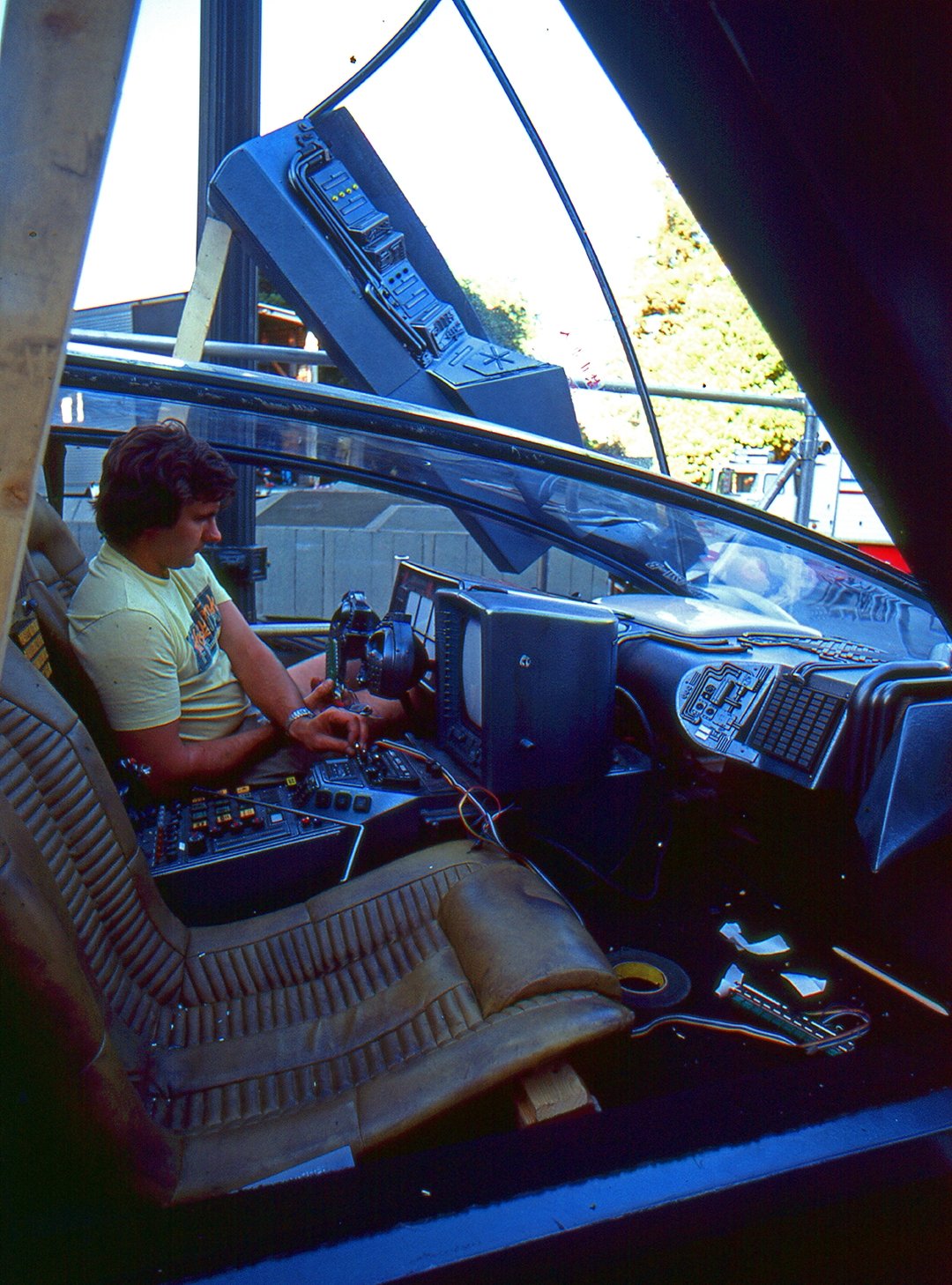
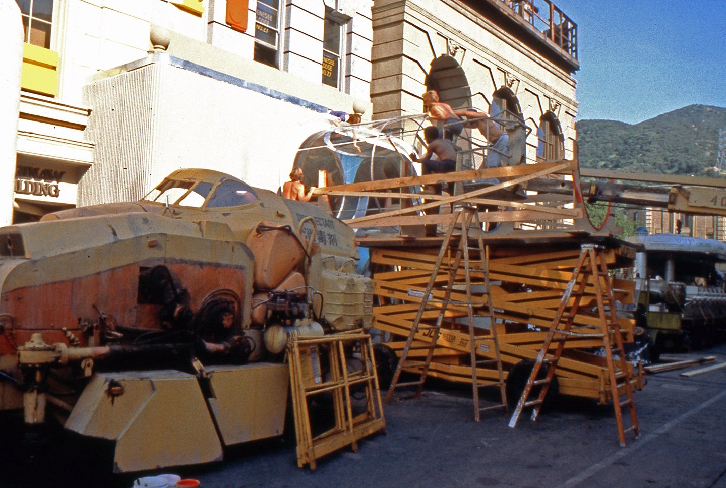
One of the vehicles was the “Spinner,” a kind of flying car that can hover or fly at speeds up to 300 or 400 mph. Mead describes the evolution of the design for the Spinner: “My first comment to Ridley, when he asked what it should look like, was ‘It should be something other than a rotating blade or helicopter or folding wings. That’s been seen in Popular Mechanics for probably 20 years.’ I said, ‘Why don’t we do a very clean, all-enclosed vehicle that's a car that really does fly.’ He liked that idea, so I started designing it using the aerodyne principle of an enclosed lift.”
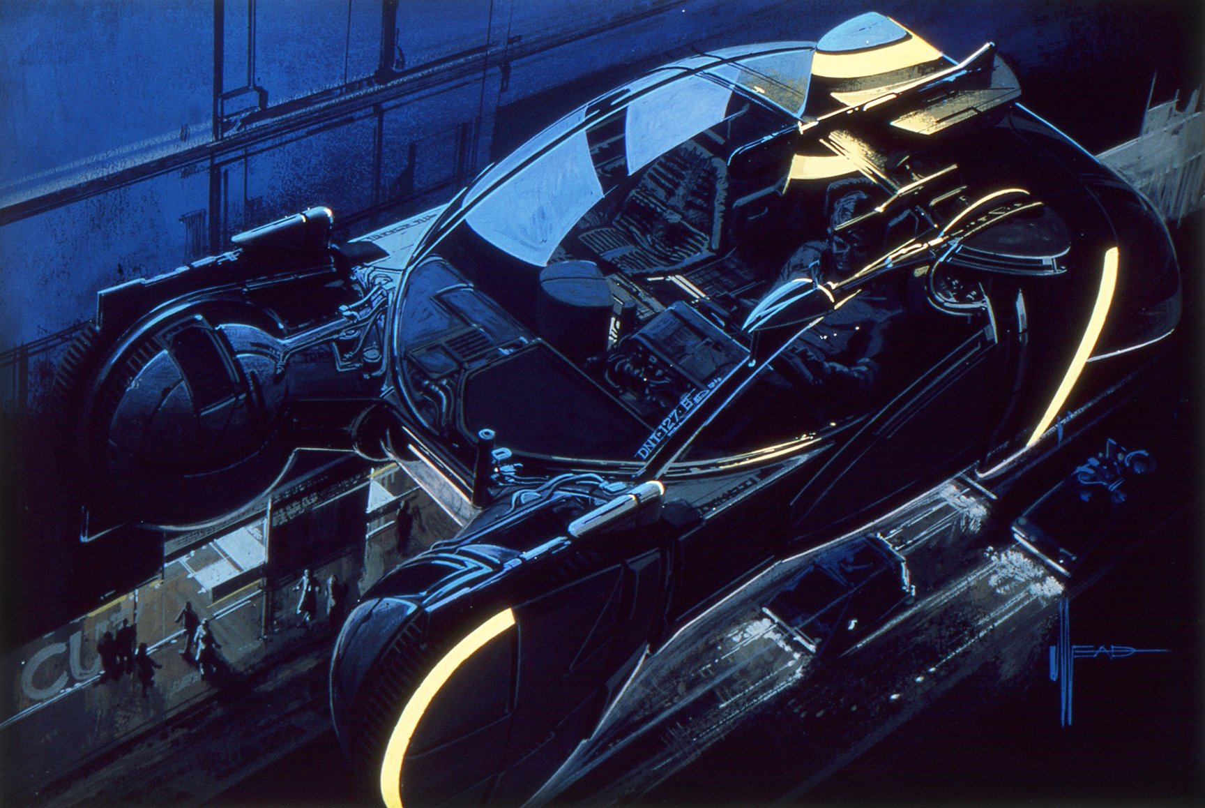
Using what is basically a valid aerodynamic principle and assuming certain technological advances yet to be made, Mead designed a vehicle which could seem plausible. The look of the vehicle was based on a concept of how it would actually work. “We were proposing for the Spinner — as a technological supposed base — that you have turbines inside the car and you vent the exhaust down to the back and to the forward part of the car just to balance it on its center of gravity. So it looks believable. There are fans underneath, and the rain and the dust blow and it lifts off the ground.”
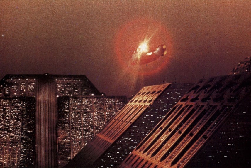
The element of believability was a key factor in the design of other vehicles and artifacts for the film. “The difficult part of designing for a film is that you have to use audience in-head memory,” Mead explains. “People will believe something is real only if it is done right and compared to what they think it should be. The big difference between designing commercial products and designing for movies is the large concession you have to make in films simply to what people will probably believe is a valid rational object for the time frame you are shooting for. And I don’t think you can really make a firm rule about it. It has to be guesswork right up to the time people march into the theater.
“With a commercial product, a company invents in a new object, they advertise it and the public can buy it, so it becomes real. It may look completely different than anybody would have expected it to, but it is real. It is on the shelf, and they buy it; and they have to believe it for that reason. In a movie, if you tell people you are 100 years in the future and people are still walking around with shirts and ties and a funny kind of five-wheel bicycle, you have to work to make that look believable. Otherwise they will laugh. They won’t believe that the car can fly. You have to make it look believable, and you have to use the in-head memory.
“I learned that a little bit just by working with corporations trying to merchandise stuff, because they’ll do pilot tests. For example, when they tried to introduce movie cameras that had flat-stacked reels, people didn’t believe they would work.”
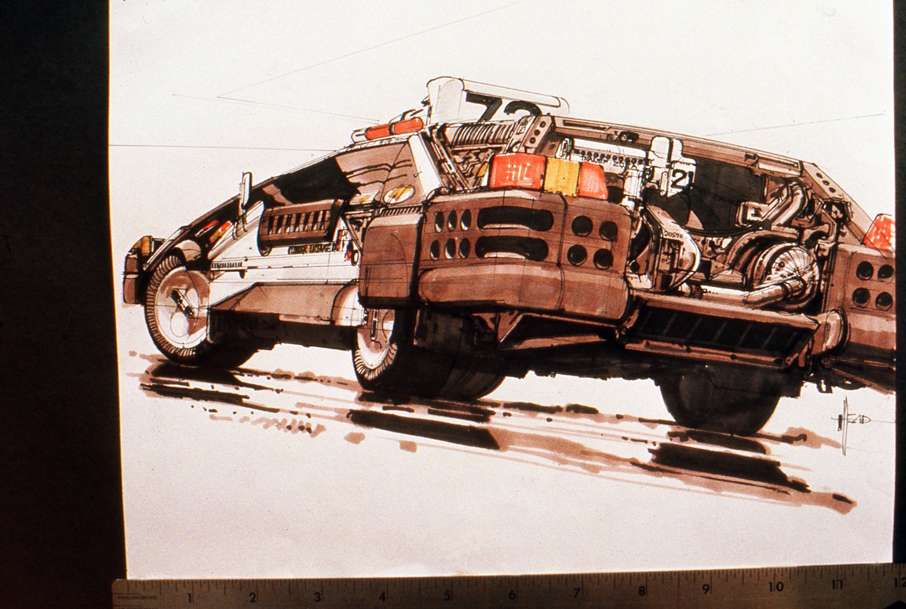
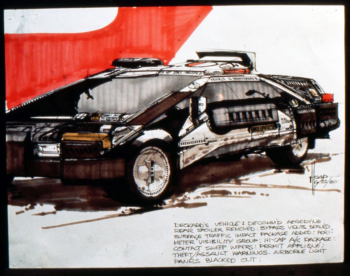
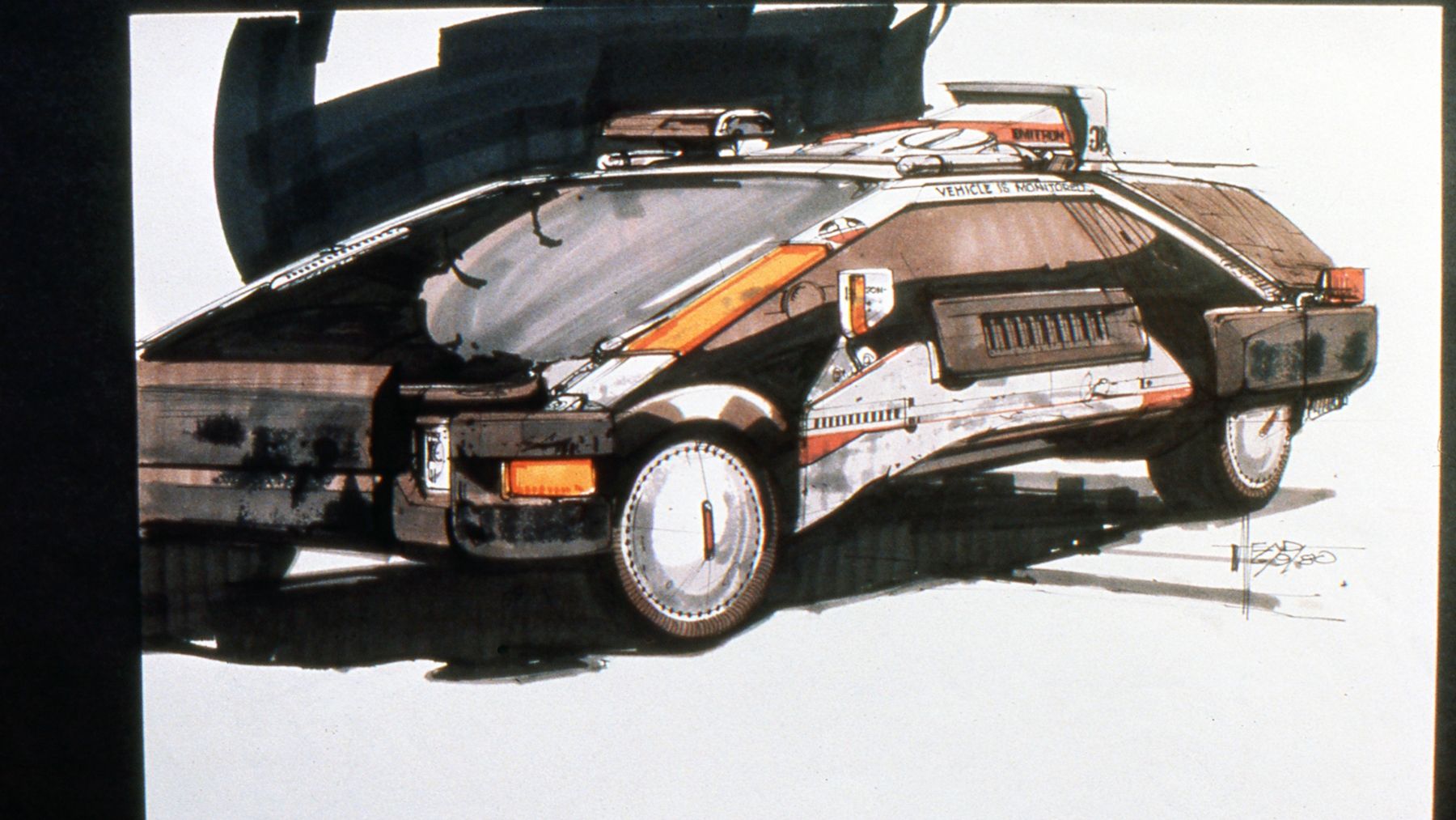
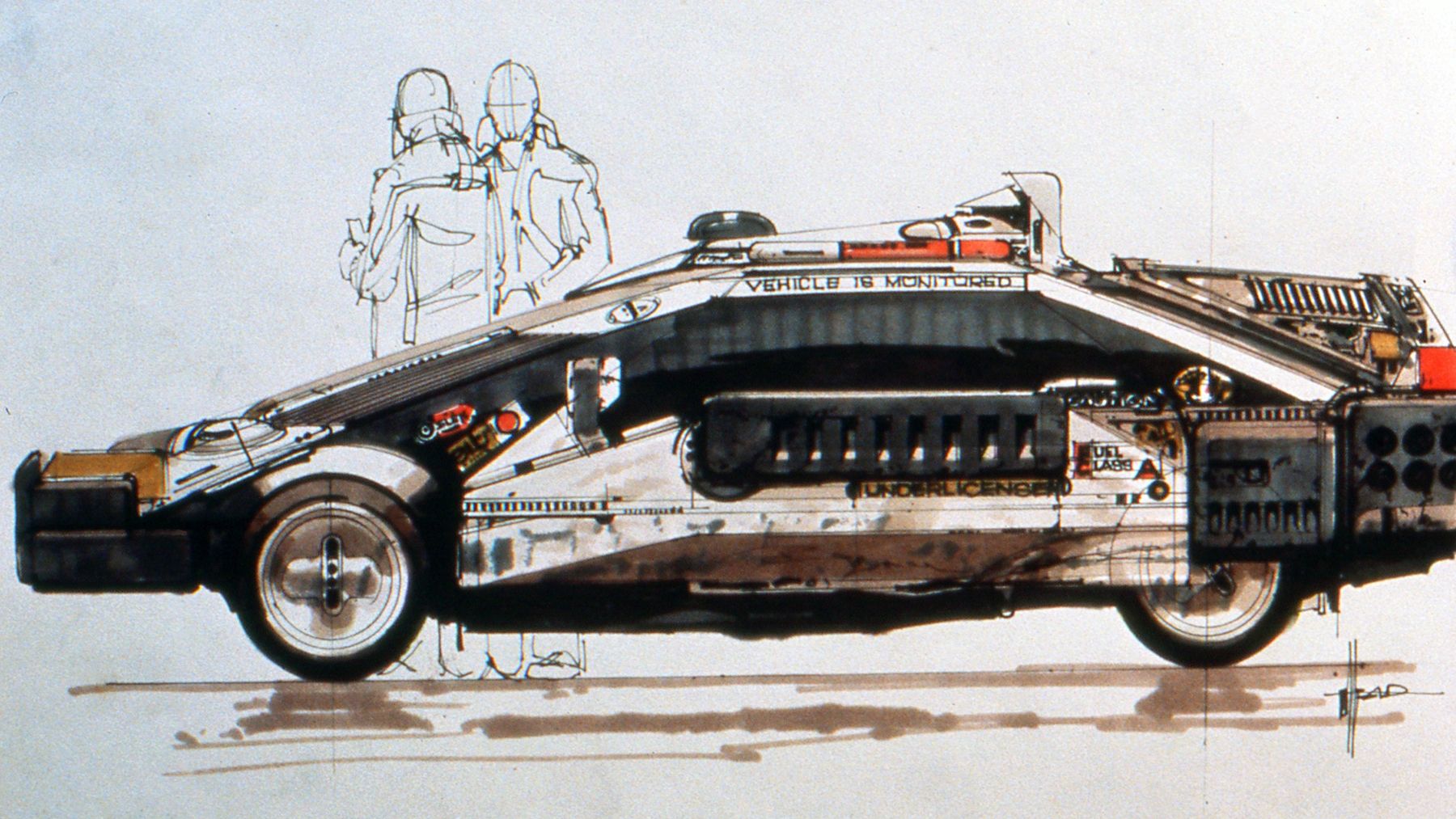
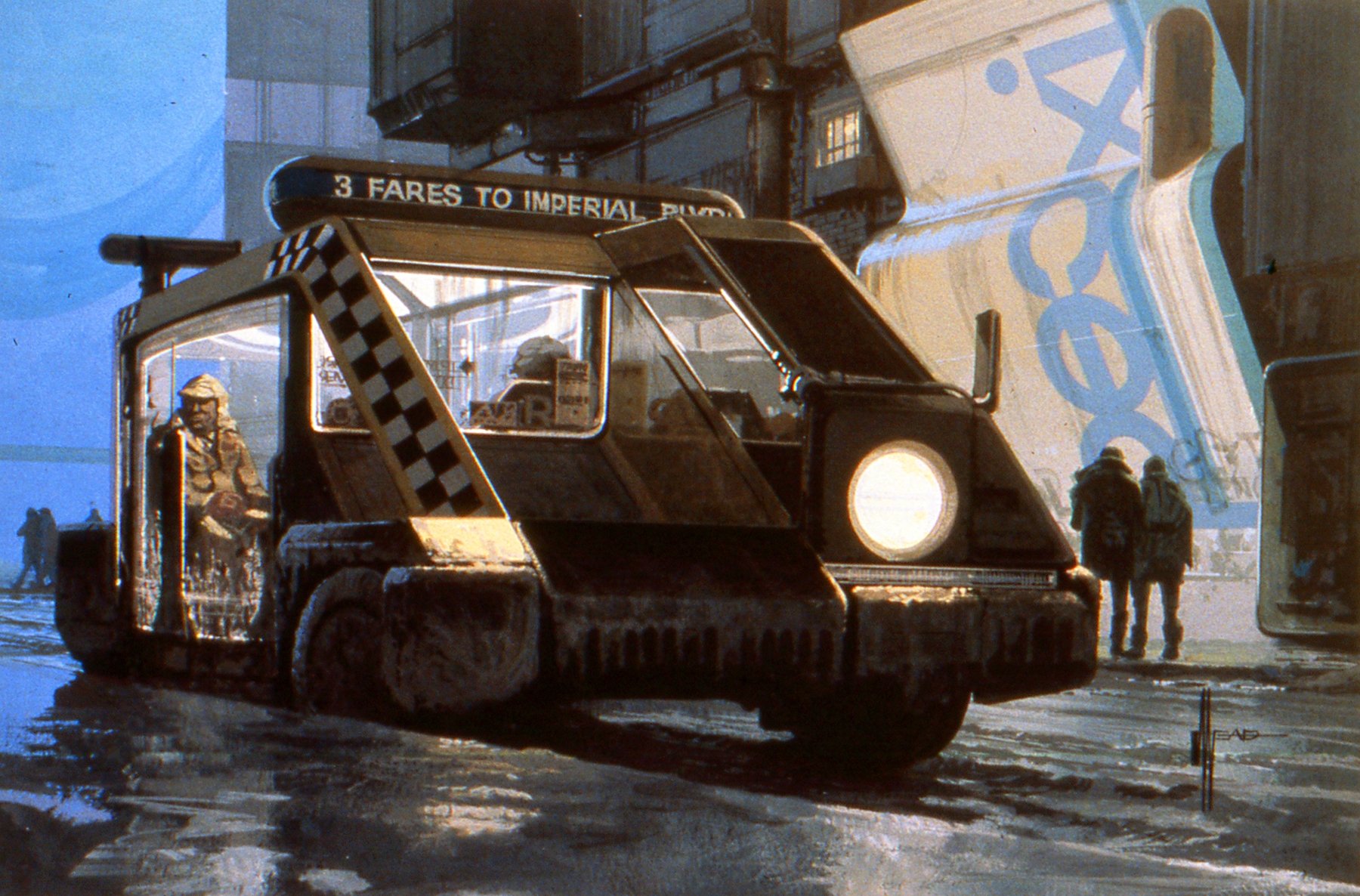
Each vehicle was designed to conform both to the overall sociological concept and tailored for the specific character who owned it. “I started off with clean concepts, as I normally would for a commercial client,” Mead says. “Then we worked out a sociological reason for the look of the movie and the things almost started to build themselves. For instance you’d start with the air pollution and you’d say, ‘If that's true, then they would probably have to have bigger air conditioning units.’ The original car didn't have that so you get a big lump on top. More congested traffic and you get bigger bumpers, and you add light packages on top of the trunk so you can see them better.
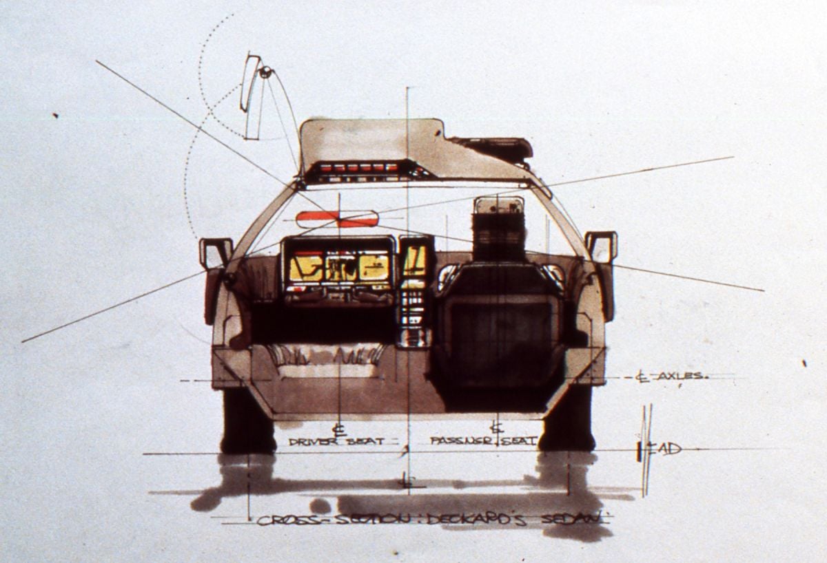
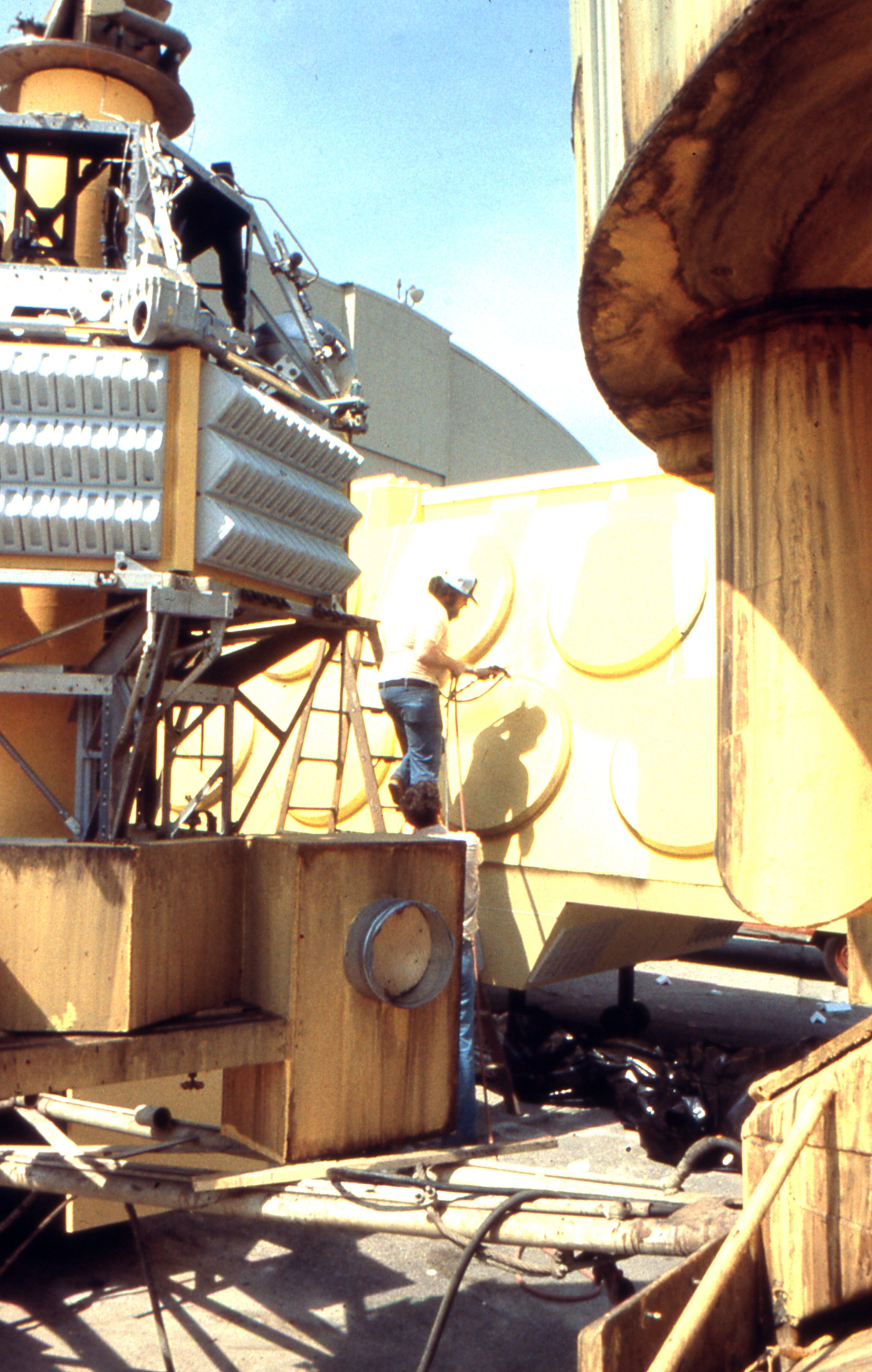
“For Sebastian's truck, we figured he was a tinkerer who had gotten a commercial chassis and covered it. In the original script he was an electronic pet doctor and he hauls electronic pets around in his van. He needed a closed van, so we patched together a truck that he would have built 40 years from now. He might have gone to a junkyard, so we said, ‘What's in a junkyard 40 years from now?’ We thought up odd-shaped plates and molded pieces that he might have picked up from a junk dealer and welded together with neoprene or some odd kind of glue. The truck has that odd beetle shaped back to it because it has all those plates glued together.”
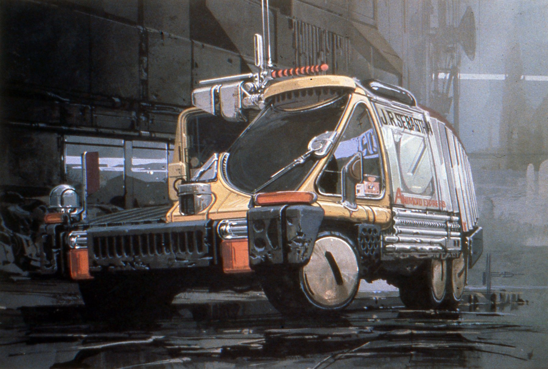
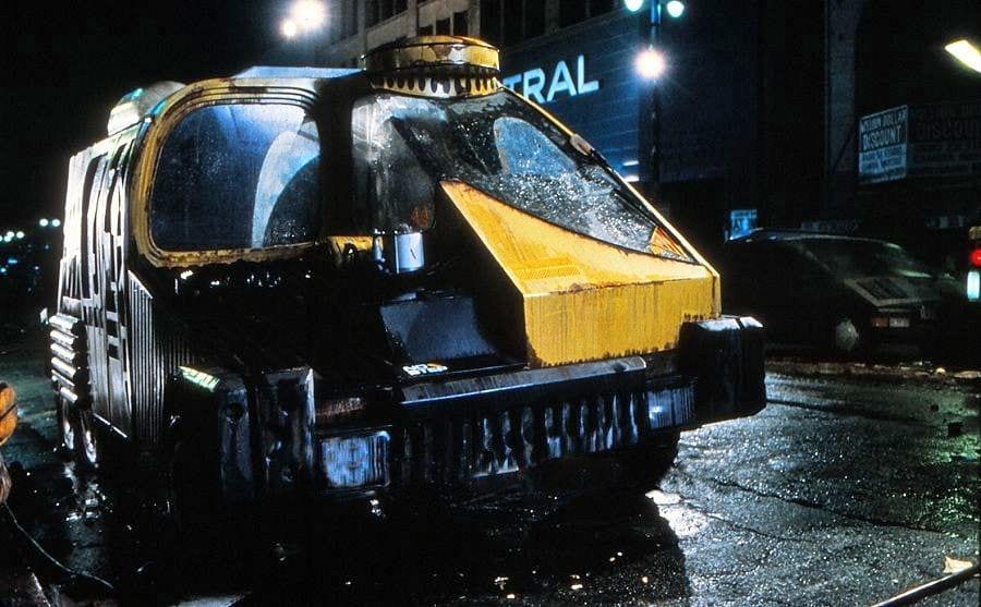
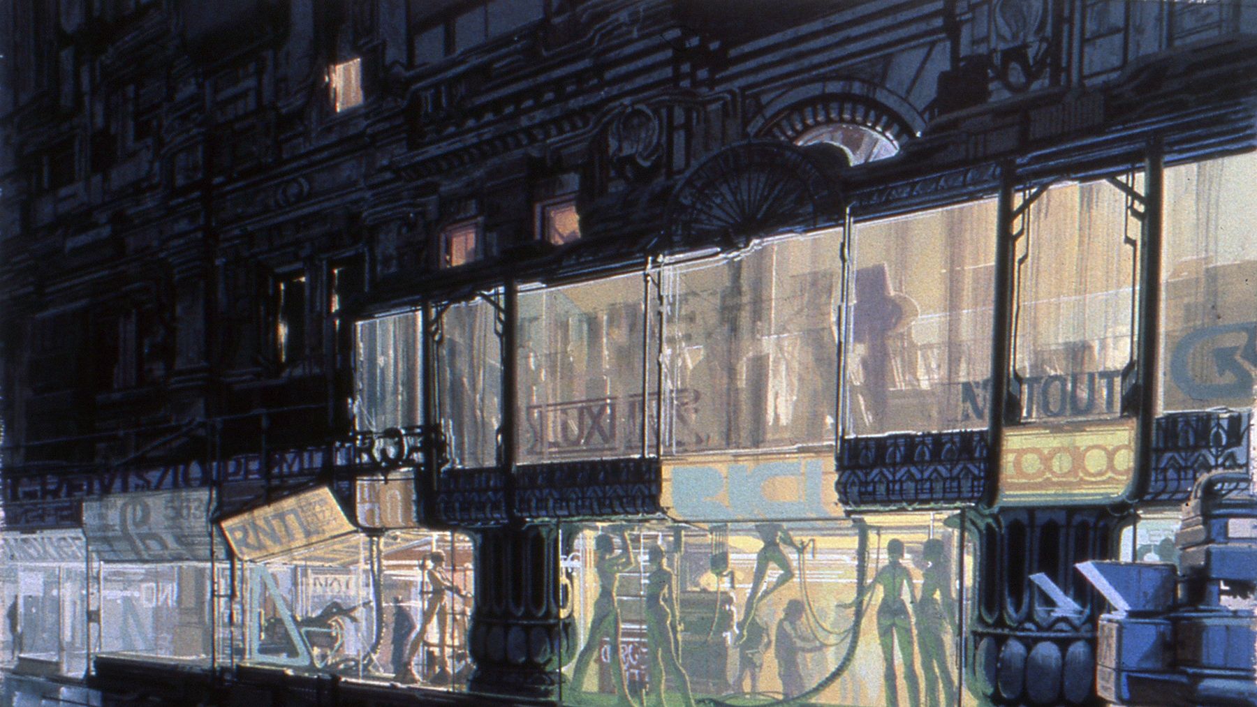
Once Mead had worked out the concept for a design of a vehicle or object or setting, he would do a color illustration about 10"x15" in size and with enough detail not only to satisfy Scott but also to enable Lawrence Paull and his staff to build it. He describes his role in the production as that of a “visualizer” and recalls an instructor he had in art school named Dorothea Redmond who was a visualizer for one of the studios: “She would do these quick tempura sketches so the lighting people and the director and everybody involved could sense the way the shot was going to look.”
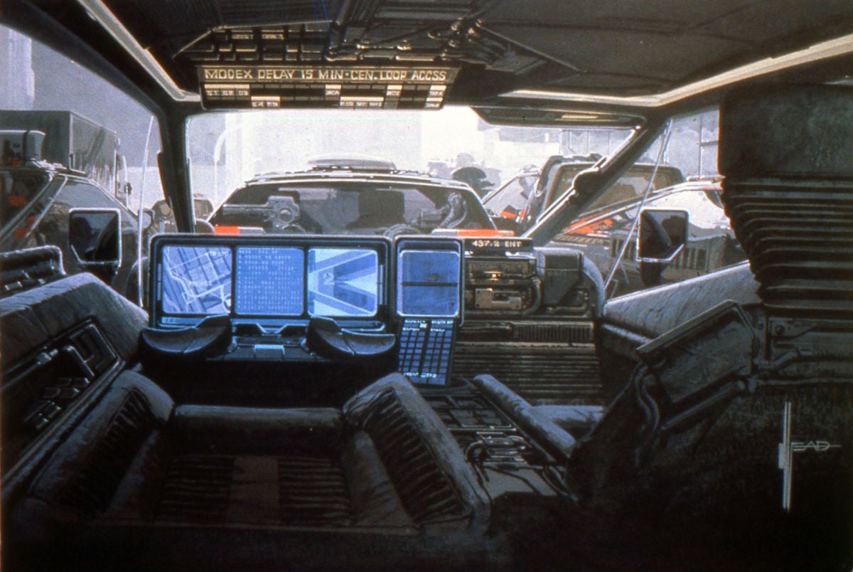
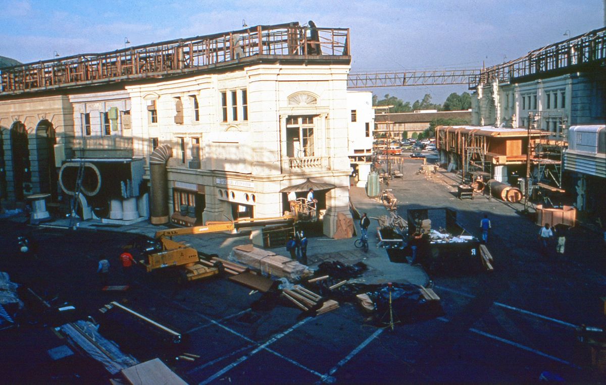
Mead’s efforts to draw the vehicles the way they would look on the screen led to his renderings of the streets and buildings and even some interiors. In his drawings of the vehicles he began inventing reasons why the buildings in the background should look a certain way. Once it was determined that the production would be using the New York Street at the Burbank Studios (appropriately the site of so many Warner Bros. Bogart and Cagney classics), Lawrence Paull provided Mead with photographs of the existing facades: “I made elevations and tempera sketches and started again this overlaying process of putting pipes and ductwork and signs on the buildings.”
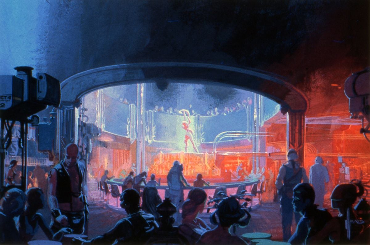
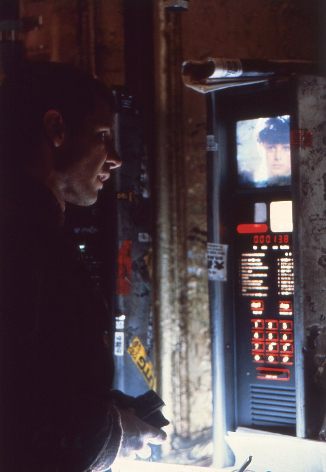
Once these renderings were completed and the production staff began constructing sets, Scott had Mead design some of the other interior sets, such as Deckard’s kitchen, bathroom and bedroom, and Sebastian’s working laboratory:
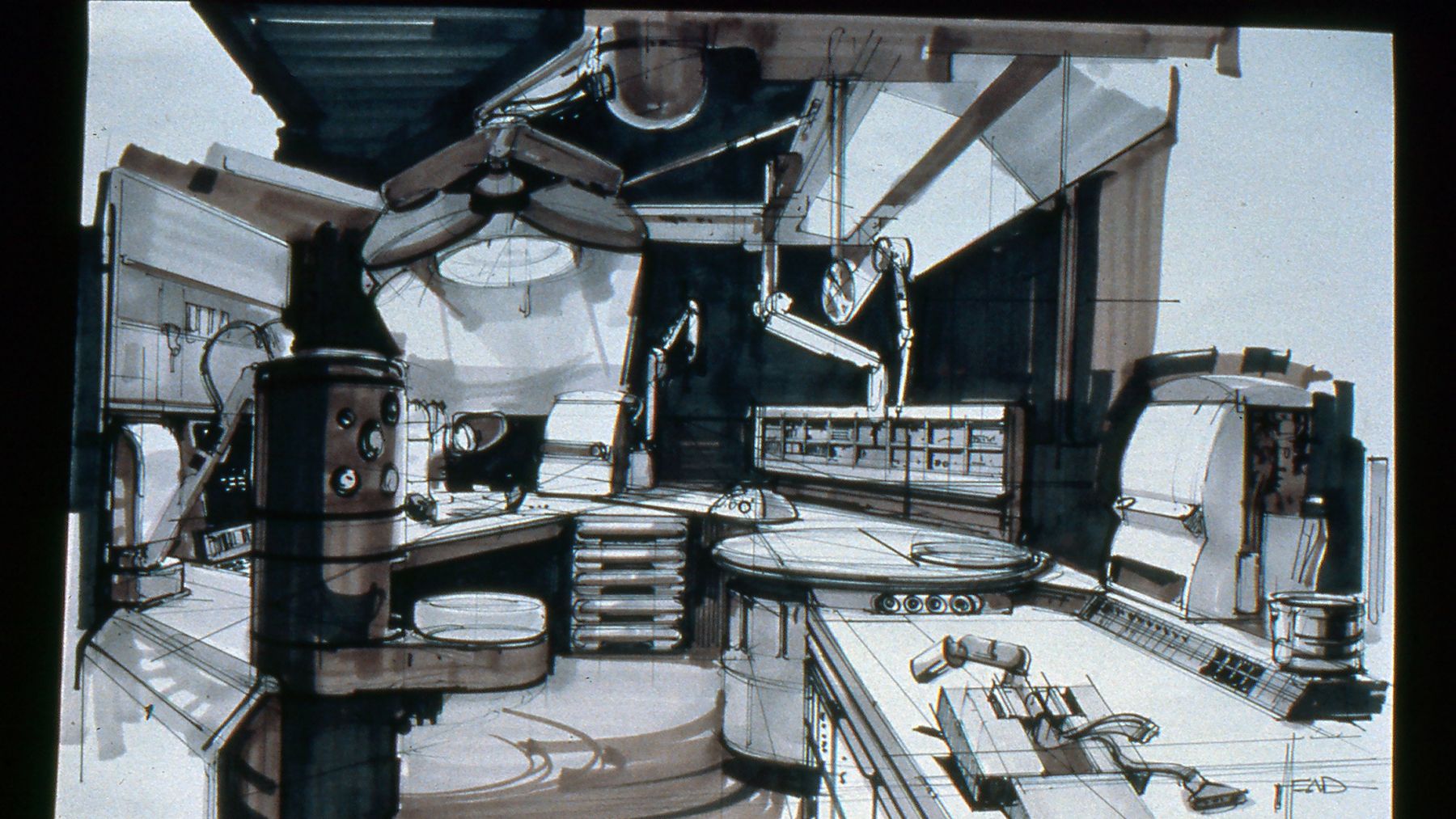
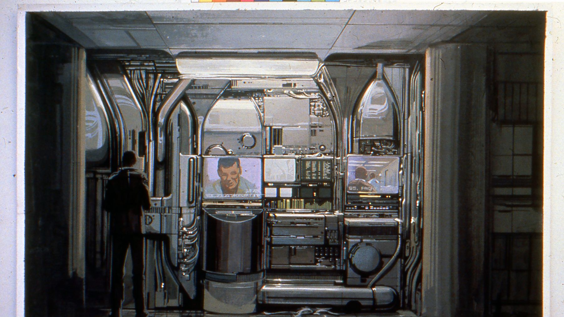
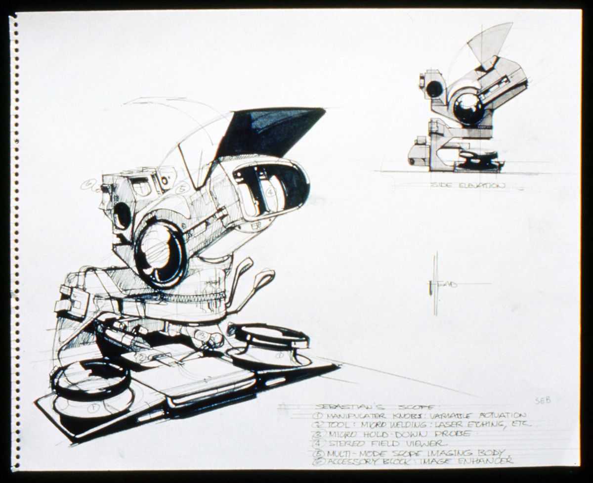
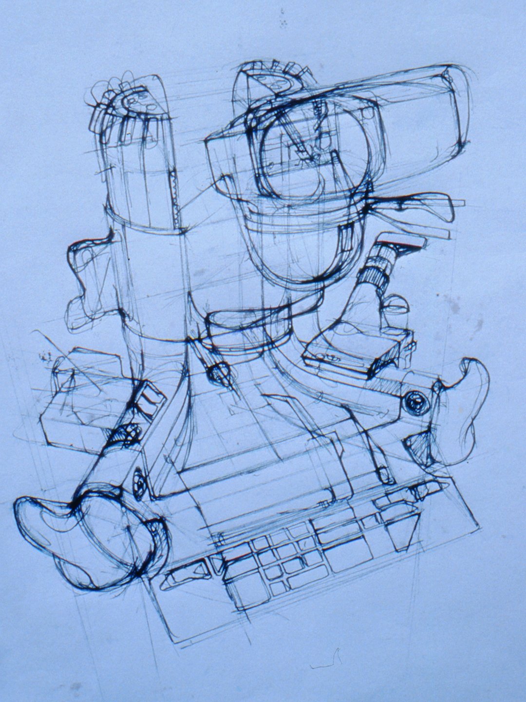
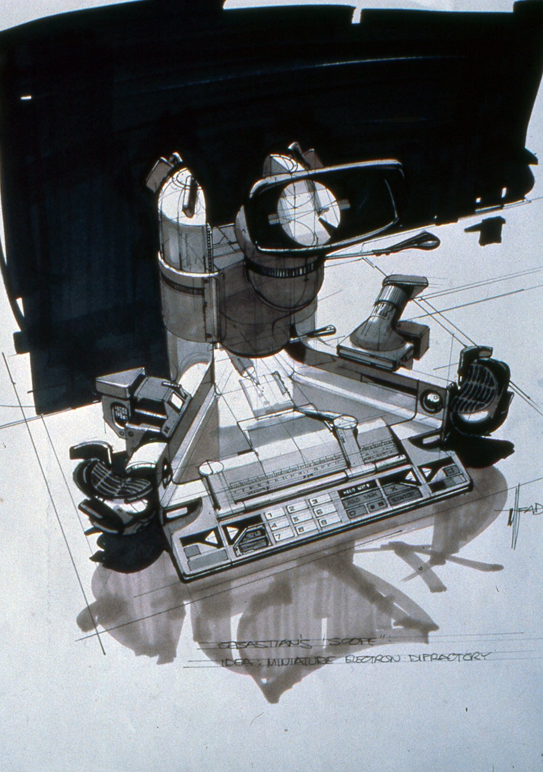
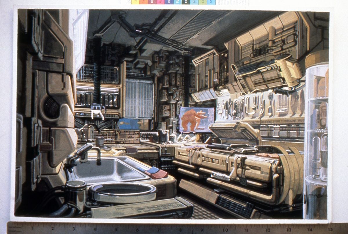
“Again, the same theory: you had a space where somebody lived 40 years in the future, and they would have things stuck around the walls that we don’t have today,” says Mead. “That was the problem, to invent them. What would an automatic fork cleaner look like in 40 years? Or something that makes food in little bunches or puts sauce on it and serves it already made? And you’d have something sitting on a counter that didn’t look like anything you’d ever seen, but it had to be a kitchen appliance.
“Ridley insisted on a kind of strange ivory color as the underlay for the kitchen. When Bakelite and the first Moderne stoves and refrigerators came out, they had this strange ivory color with chrome trim and produced a sort of Moderne Deco kind of look. And it looks particularly nasty when it’s got grease and dirt on it. It looks just really grungy, and he wanted that look. So I rented them with that ivory tone, and we ended up with this molded, vacuum-formed kind of look to the whole kitchen set.”
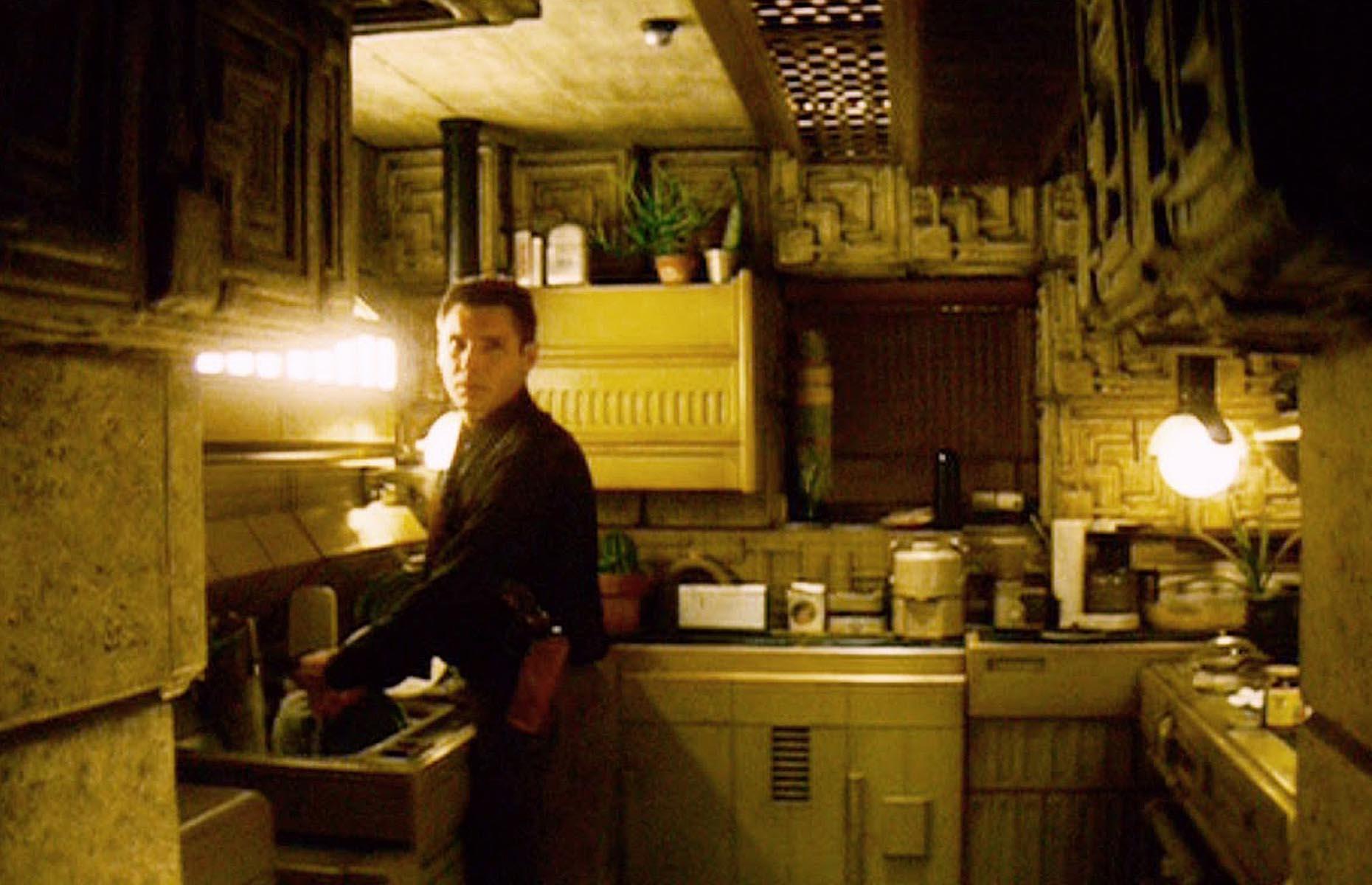
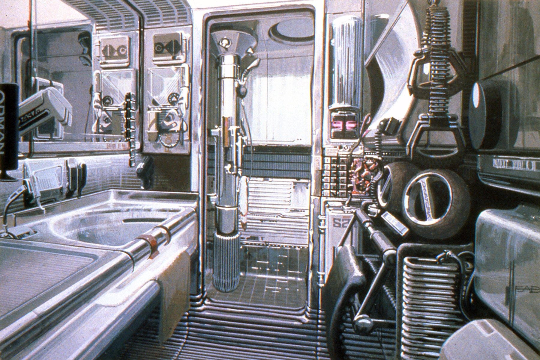
Scott wanted Deckard’s apartment to look as though a bachelor lived there. For instance, as Mead puts it, “You tape something on the wall to hold something. Rather than having somebody come in and re-do the cupboard, you just put a new patch on. The bathroom was much the same. Ridley specifically wanted a pullman type bathroom, as if the owner had moved in a complete unit into an old building and just hooked everything up. That’s why it had a stainless steel look to it. In each case there was a specific visual target we were after. In the kitchen set we had some plates there we left off. I don’t know if the actual set retained that feature, but there was circuitry behind and wires hanging out with a little black end on them like they had shorted out and he just tore the whole panel out and said, ‘The hell with it.’ The whole thing had to have a messy patina as if the cleaning lady hadn’t been in since last Friday or something."
The same approach to visualizing the future is evident in the costumes designed by Charles Knode and Michael Kaplan. Scott wanted to avoid what he calls “the diagonal zipper and silver-hair syndrome.”
Special photographic effects supervisor Dave Dryer aptly sums up the approach: “One of the principles in the design of the film is that while it is 40 years in the future, it is also 40 years in the past. So rather than having people running around in shiny suits with brilliant zippers on them, they took 40-year-old clothing styles. And it has very much a Philip Marlowe kind of detective look to it. And an Art Deco look to a lot of things.”
The production design for Blade Runner appears ultimately to have been rooted less in sociology or a vision of the future than in an appreciation for the style of the old Sam Spade and Phillip Marlowe detective genre. The starting point is the desire to create a certain aesthetic and emotional texture — the nitty-gritty, funky world of a hard-boiled private eye; and the sociology is conjured up in order to give the design a logic and consistency. This is of course completely in keeping with the script, which is a deliberate reworking of the classic detective thriller and has one foot just as firmly planted in the past as the other is in the future. And the same thing applies to the cinematography.
You’ll find our article on the film’s influential cinematography — by Jordan Cronenweth, ASC — right here.
And the film’s Oscar-nominated special photographic effects here.
If you enjoy archival and retrospective articles on classic and influential films, you'll find more AC historical coverage here.
