Re-Crafted Noir: Dead Men Don't Wear Plaid
Cinematographer Michael Chapman explains some of the challenges of pairing Steve Martin with screen icons of the past, intercutting scenes from 20 different films.
This article originally appeared in AC Nov. 1982.
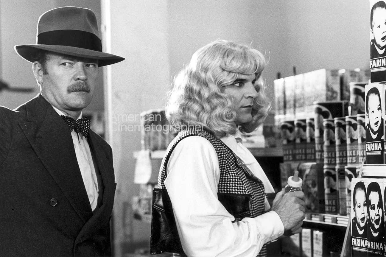
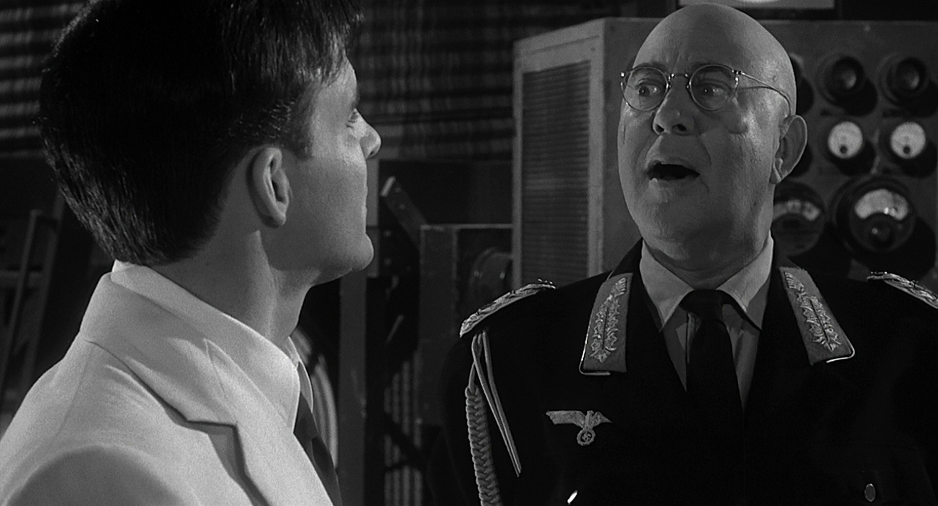
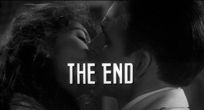
Dead Men Don't Wear Plaid, the recent Steve Martin comedy, directed by Carl Reiner, is a spoof of the film noir of the 1940s and the gangster films of the ’30s. The plot is a device designed to get Martin into clips from 20 old movies so that he appears to play “scenes” with a host of great stars, from Humphrey Bogart and Cary Grant to Barbara Stanwick and Joan Crawford, to name but a few.
Cinematographer Michael Chapman began work on Dead Men Don't Wear Plaid with a complete script and knew ‘‘every bit of old footage that was going to be used, and essentially how it was to be used and where,” Chapman said in a recent interview. He knew that he would be expected to match the photographic styles of more than 20 different films, different cameramen, often on different film stocks, processed by different labs at different times. To a large extent, that could be dealt with. But, as we shall see later, Chapman was to discover that one of the photographic problems confronting him was very much beyond his control.
‘‘It was a kind of archeology,” Chapman said. “We tried to dig up the old makeup. We tried to do everything we could to give ourselves a chance to reproduce [the period style].” Chapman credited the contributions of a number of veteran pros who had worked beside him on Dead Men. Among them, were his gaffer, Don Stott, art director John DeCuir (whose credits include Naked City) and, finally, their costume designer, the great Edith Head.
Dead Men Don't Wear Plaid would prove to be her last film.
“I’m no technician. Never pretended to be. I did Dead Men entirely by guess and what looked right and just fiddling, which is all I’ve ever been able to do.”
— Michael Chapman
Painting By Numbers
With credits that include The Last Detail, The Front, The White Dawn, The Wanderers, Invasion of the Body Snatchers, The Last Waltz, (he was the director of photography, the many other famed cameramen involved were there as operators), Taxi Driver and Raging Bull, Chapman has proved himself to be a fine modern stylist. How had Chapman approached the enormous challenge of stylistic archeology? ‘‘Mostly just common sense,” Chapman began, ‘‘One of the things I did when we got as good a print as we possibly could get of each of the old things, printed up as well as Technicolor could do it, I took frames and had them mounted on slides. Then, I had them build me a dark, black room on the corner of the stage with a projector and a good screen. And I had the screen measured so that I knew that it was 16 foot lamberts, or as close as I could get. And I would study them. I would look at it and think, well, the light comes from here, there’s this much backlight, it seems as though there’s that kind of contrast ratio, the shadows seem very dark, the shadows don’t seem very dark... And I would just try to paint by numbers and match them. That was all I could think of to do. You know,” he concluded, ‘‘if you’re intercutting back and forth and you must match pre-existing stuff, your style, the amount of light and the stop that you use almost become forced on you.”
An introductory sequence takes us to a twisting mountain road. Lightning flashes. A storm rages. A car, dwarfed by it all, goes out of control and crashes. It’s terrific footage, photographed by the legendary William Daniels, ASC, for a Spencer Tracy/ Katherine Hepburn picture called Keeper of the Flame (MGM, 1942). It was printed from original negative; one of the few instances where that was possible in Dead Men.
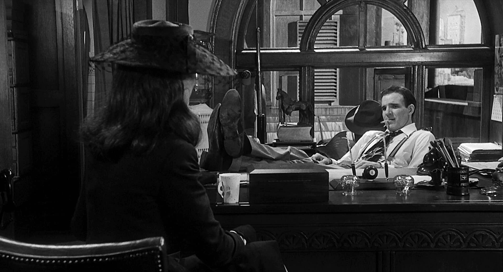
The first original scene in the film takes place immediately thereafter, in Rigby Reardon’s office. Reardon (Steve Martin), a detective (naturally), is visited by Juliet Forrest (Rachel Ward). Reardon is sitting at his desk rimmed by a hard, hot backlight. Ward’s sharply outlined, shapely shadow appears on the frosted glass door to Reardon’s office. Aside from the fact that it’s been photographed in black-and-white, this particular lighting style has been used frequently in various contemporary color films (Blade Runner is a recent example, though the look was augmented in that instance by a great deal of smoke, with hard back light poured through it, creating shafts of often moving light).
Soon thereafter, Juliet and the hard-bitten detective meet in her elegant living room. The lighting is as glamorous as Ms. Ward. Note the practical sources: windows, covered with Venetian blinds; sconces on the walls. But the flattering light on Ms. Ward’s face, seems unrelated to those sources. It was quite appropriately unrealistic. “Absolutely,” Chapman commented, “none of it was meant to be realistic. It was meant to be real to the period movie, not real to reality. I mean, we did this thing of putting diffusion only in the closeups of the woman. Or we did stuff where, if we had a closeup we didn’t necessarily follow the pattern of lighting of where the key light really should be to make it [the closeup] the most flattering.”
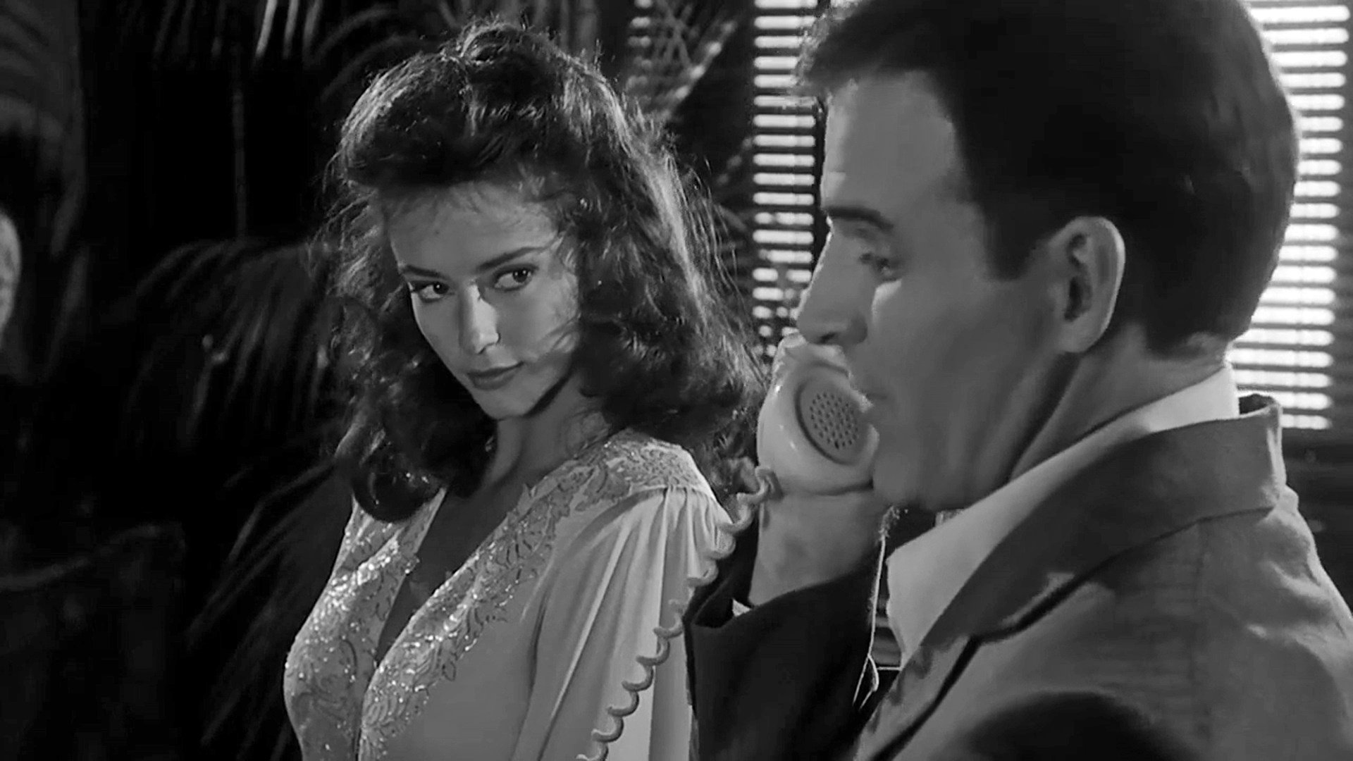
He was dealing with a kind of stylistic tradition. “They’re traditions now,” Chapman agreed, “but at the time they were just trying to hustle out a commercial product to make money; trying to make some dumb chick look as good as she could, and so, even in a master shot they would, and we did to a certain extent, light her clothes and body with the normal light of the scene and then they would take cutters and completely knock the light off her face and totally light her face as a glamour shot, absolutely separately, with no law about where the light was supposed to come from.”
Process Photography
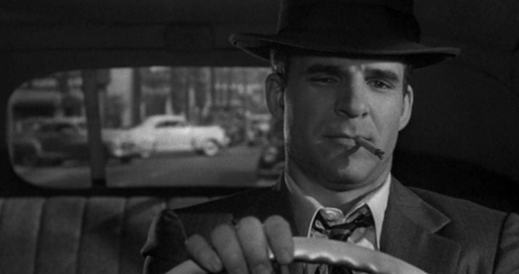
It was obvious that the auto interiors (see Polaroids of day and night scenes below — the actor is Steve Martin’s stand-in) were photographed on a process stage. When asked about it, Chapman said, “You know, you never quite believe they’re driving in old movies. In a modern driving shot, you see the windshield. But in the old times you never used to see the windshield and you’d see the whole curve of a ceiling which, of course, you couldn’t possibly see. You’d see this guy driving and there isn’t anything in front of him. Somewhere, they found some of those old half cars; some old prop man had them.”
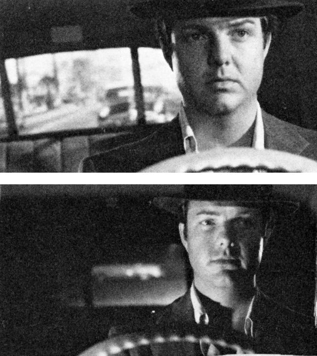
The odd thing about working with the old prop cars Chapman used in Dead Men was that the actor that was supposed to be “driving” didn’t know which way to turn the steering wheel, or whether to turn it at all, since he couldn’t see the rear-projected image of the road he was supposed to be on. So, the actor would clutch the wheel, which was connected to a crank at the bottom of the shaft. There, out of frame, a prop person would sit facing the process screen, turning the wheel in whatever direction was appropriate to the rear-projected road.
“When you think about it,” Chapman mused, “it’s always a cheat when you do any kind of night driving shot, because there is no light on your face, really. All there is is a flash of light as you go past (an occasional source). But you can’t do that ...”
Chapman discovered his Polaroid camera to be an unusually valuable tool for exposure control in process photography. “In rear projection, one of the big problems is to try and get the exposure correct between the foreground which you are lighting and the background, which is already there. The old guys used to do it by eye. I didn’t know anything about this; I had never done it. So, we had some big-time rear-projection men and they would sort of squint and they’d look at it and they’d figure and they’d say ‘well, this is about right...’ It seemed kind of primitive.
“So, I took out my Polaroid and I started shooting. You have to shoot off a whole lot in order to make sure that you get one where the shutter is fully open. If you get one where the shutter is half-closed, then the exposure is all wrong. I would usually take about five. I would have a whole bunch of guys around me and I’d hand them to them and they’d all wait 15 seconds and pull. Somewhere in those five or six shots, you’d get one where the shutter [on the rear projection] was fully open and you’d know exactly your exposure. I would never do rear projection without it again. After a while, these old timers would come sneaking around. At first they were rather scornful at my doing this, but after a while they began to look at it and they saw it really worked.”
Polaroid makes two black-and-white stocks. One requires use of a squeegee fixative following development, the other doesn’t. Chapman tried them both and found that the contrast is better on the one that requires the squeegee.
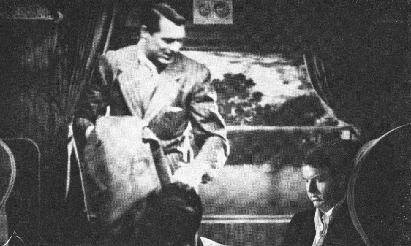
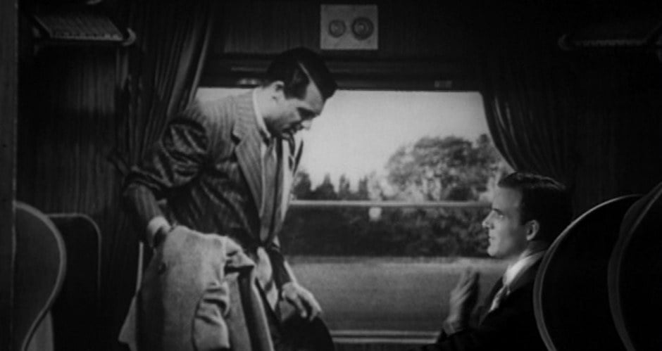
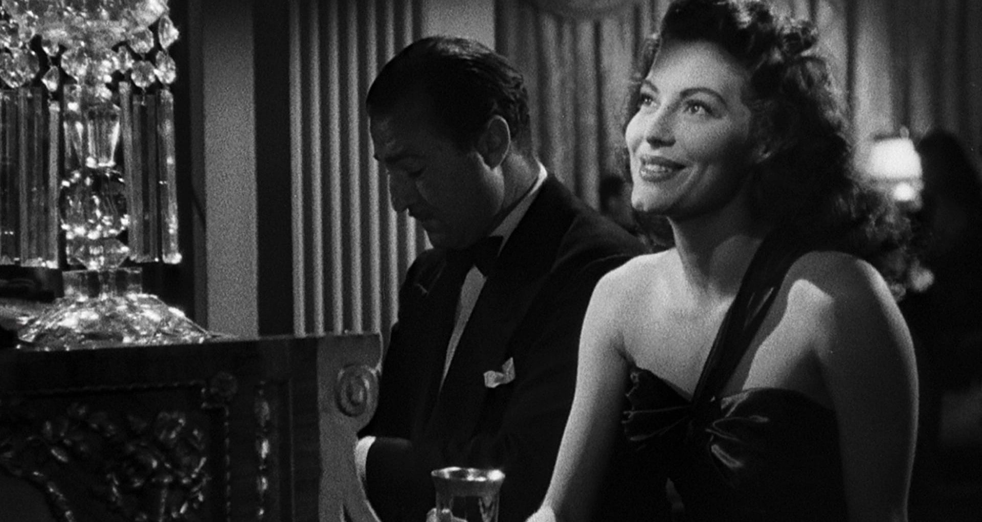
In one scene, Cary Grant (in footage from Suspicion) and Martin appear together in the same two-shot. In this instance, rear projection presented special problems. “You not only have this old material, which is not necessarily in very good shape, but you’ve got to blow it up to be 10 feet high, so it really showed. The one with Cary Grant worked pretty well, mostly because it was so dark — the interior of a train coach coming out of a tunnel — so we got away with a lot then. There’s no way to degenerate half of the frame and not the other half of the frame. I even had half-diffusions and things and I tried to slip it over the half of the frame that [Steve Martin] was in. But, it just never worked. There was another rear projection scene where they’re in the same frame together: an over-the-shoulder shot to Ava Gardner; I guess it’s from The Killers, where he [Martin] walks into a place called the Brentwood Club and he turns and he looks at a woman sitting at the piano: that’s Ava Gardner. There were a couple of other rear-projection shots but, by-in-large, rear projection gave it away too badly.”
Filters
Chapman used a number two low-contrast filter throughout the show. He also occasionally used various Mitchell diffusers. On exteriors, he used so-called cloud filters, various shades of green and yellow filters that darken the sky (and anything else that is blue), thus making the clouds stand out in relief.
If you find the world of colored filters for black-and-white photography a bit confusing you are not alone. “That’s one of those things that I don’t know much about,’’ Chapman admitted. “The old timers used to really know a lot about those exterior filters in black-and-white. There was an enormous mythology of hundreds and hundreds of filters, and this one did this, and this guy only used this, and that guy always had to have that. I think a lot of it was in their heads; psychological. But there was a huge, elaborate body of kind of a false knowledge about filters which is, thank God, totally lost. I don’t have any interest in it, anyway.’
Perhaps Chapman is right about much of that knowledge having been psychological. But, many people feel there are certain expressive qualities in the great old black-and-white movies that seem absent from most contemporary black-and-white films. It is a shame that the old timers’ detailed knowledge about filters has apparently been lost (or is simply unavailable to this writer at this time); if only because, for now, there seems to be no way to scientifically study on the matter for a definitive answer. Veteran cinematographer Milton Krasner, ASC, whose credits include such classics as All About Eve, says now he can’t remember much about the filters he had used in his black-and-white days. When color came along, Krasner gave all his filters away, he didn’t remember to whom, and forgot about all but the basics.
Lighting/Exposure
Chapman’s approach to exposure is pretty similar to that of most other cameramen. “I read the highlights and I expose around them. I mean if I want it to be burnt up, I expose for less, and if I want it to be dark, I expose for more. And the rest of it I do by eye. The other thing you have to worry about is what looks right by eye in one shot, better look the same in the next shot. You’ve got to be consistent.’’ He sees no value in contrast viewing filters, save for looking at the sun
Except for the well known fact that you can’t separate foreground objects and/or actors from the background by color, Chapman sees little difference in shooting black-and-white. The “traditional’’ method for achieving such separation involves the use of the “rim” or “kick” back light on actors that appear in the foreground. This device became known as a fundamental trademark of noir lighting. It is a technique that provided an easy way out and became a Hollywood habit; one that survived long enough to become thought of as a style. But there are other more naturalistic ways to solve the problem. Separation can be achieved by controlling the relative tones of foreground and background elements. This need not be accomplished with lighting alone. Thoughtful consideration of how the color background walls are painted can help solve separation problems.
“I wish desperately that I were much more technologically adept. I know that I could do a lot better if I were. Thank God there are labs and people that know how to do that stuff.”
Another solution to the separation problem is to stop regarding it as a problem and use it as part of the style. That’s what Chapman did in Raging Bull, and it certainly served the picture, giving it a gritty, verity look that was in perfect harmony with the painful, emotionally violent story of fighter Jake LaMotta’s life. It was consciously photographed in the style of newspaper reportage; specifically, the work of Weegee (Arthur Fellig). In fact, though, working in the close quarters of many so-called “practical locations,’’ Chapman could not have set back lights even if he’d wanted to. There just wasn’t any space (except in the boxing ring sequences, where his electricians manned a bank of dimmers so that, as his camera spun around with the fighters, the backlight was hot behind them, no matter where they turned. This surreal, visually heroic counterpoint to the otherwise gritty photographic realism of the film was, I believe, in keeping with the character’s view of himself and his life). Dead Men Don't Wear Plaid was different in every way. As an aid in matching, Chapman had photographed Polaroid tests on almost every scene in the movie. He kept them pasted in a scrapbook. I found that they were far more representative of the timing he achieved in the finished film itself than were the publicity stills. So, we have decided to attempt reproduction of Chapman’s Polaroids to illustrate a discussion about his lighting.
One can always find the location of a light source. The angle of the shadows will lead you to any given light’s location.
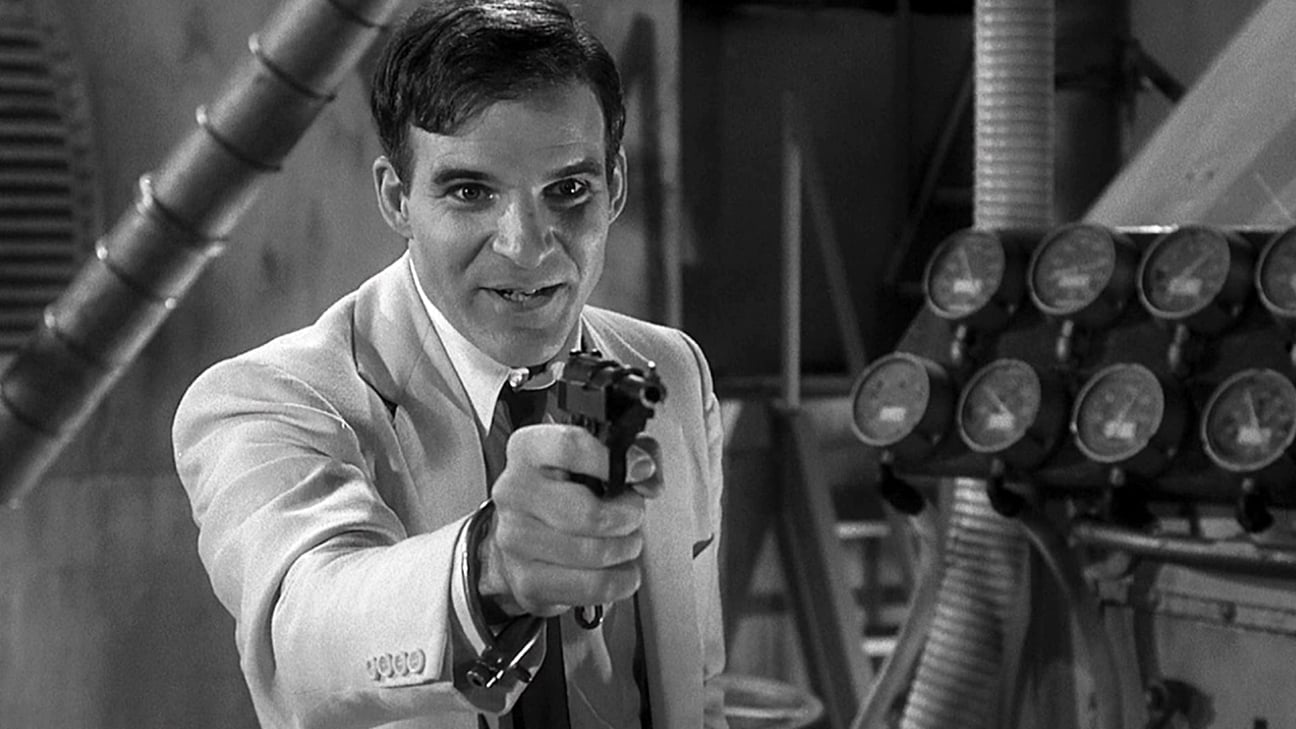
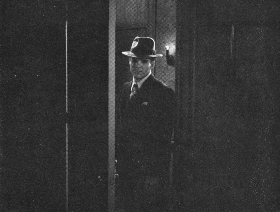
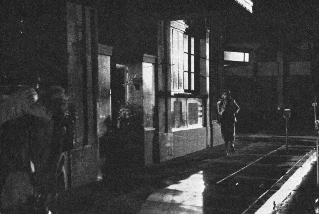
SCENE 51
Again, the classic noir lighting is announced by the hot, hard kick light above and behind him. His face is lit by fill from a 1K softlight with a two foot snoot that projects fill without a lot of spill. It’s one of Chapman’s favorite tools for filling closeups. He calls it a ‘Miss Francis’ (the origin of the name is a long story). In this case, Chapman has placed the unit to the right of the camera with cutters to take it off the door, so it just goes to him. The glow on the wall behind the practical light comes from the light itself. The rest of the light on the wall comes from a deuce (2K) down the hall that rakes it softly. There are two 750s on camera left: one coming in on the wall and a second; close to the door, that hits the other side of his hat and gives him the other highlight on the left side of his face.
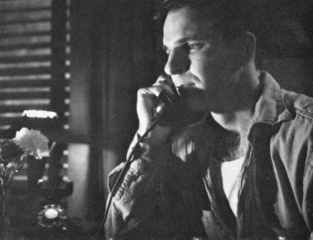
SCENE 228
This shot was lit to match an old clip with Robert Taylor and Ava Gardner. “It drove us crazy to match that,’’ Chapman recalled. “We had to use that corner. There is an actual shot of Robert Taylor walking to this corner and picking up the phone. We had to have exactly this pattern, all these shadows. It was nightmarish. Apparently what they did was light it [the dot patterns on the far left] from inside this table here. That’s the only way we could figure it out and that’s what we finally ended up doing.” The diagonal pattern to the near left of Steve Martin was created by a light and pattern mask placed high and to the left.
SCENE 218
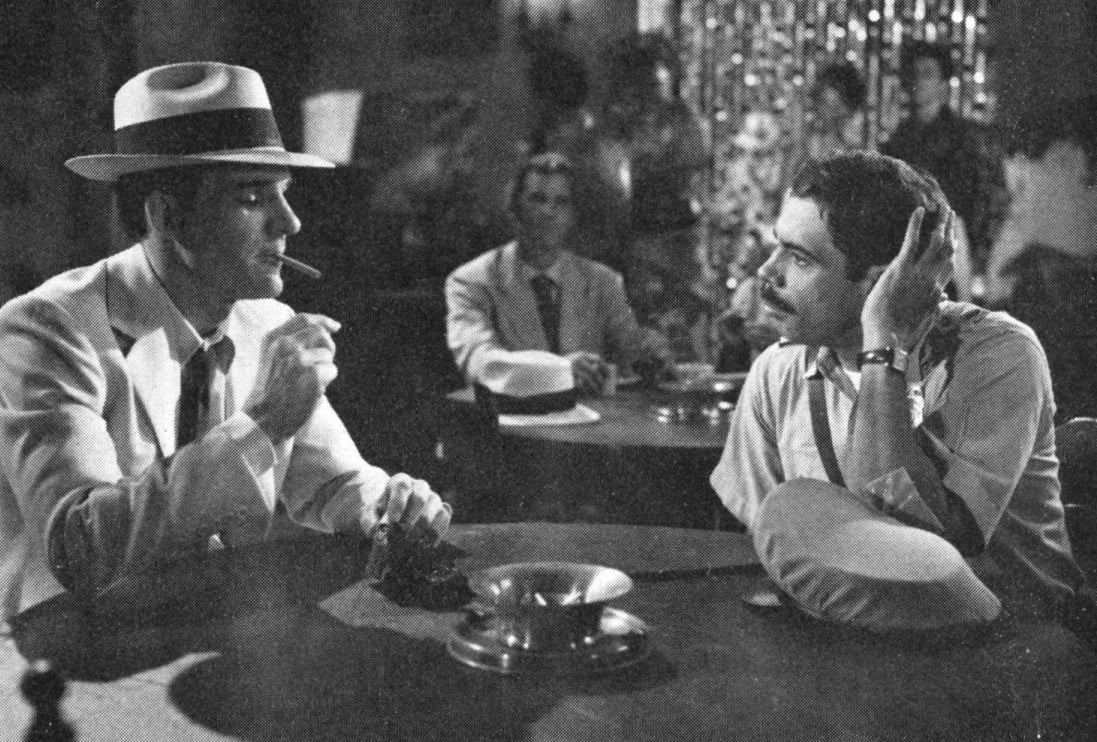
This is part of the same sequence as the shot above. Martin is talking to Reni Santoni. The lighting pattern is classic for a profile two-shot, according to Chapman. Each person’s key light is behind him, on a floor stand out of frame, and comes in at a three-quarter or slightly flatter angle. The front fill comes from a large unit with diffusion placed high (note the shadow of Martin’s hat brim) and well back. The background characters (extras) were filled with a second unit from the rails above, with cutters to take it off the principal actors, so that the balance could be controlled. The fill used for the foreground actors would have carried back somewhat, but not so much as to interfere with balance control of the two areas. The shot is much wider than is indicated in this still.
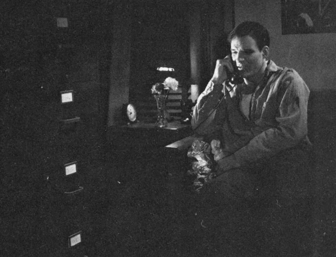
SCENE 214
Note both wide and close shots. The little lamp on the table is the practical source. In fact, he’s lit from a light behind the filing cabinet which is hitting him on our left, but which is cut off of the flower and the lamp so it doesn’t shadow itself. The fill is from the rails, high above with some spun glass as diffusion. ‘‘There’s always diffusion, just about; spun glass in everything. Occasionally I’d omit it for some back lights, when I needed the punch.”
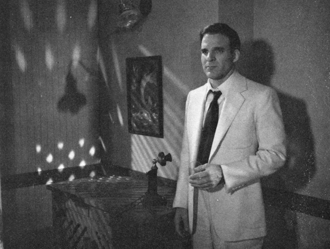
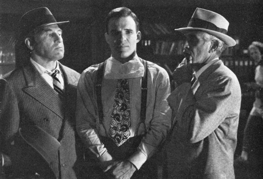
SCENE 133
This scene was lit from slightly below in order to make it somewhat more ominous, because Steve Martin (sporting a tissue in this rehearsal shot to protect his collar from makeup stains) is about to get beat up by the two thugs. Further forward, to the right (out of frame here) is a desk where, in the reverse shot, Kirk Douglas is standing. The desk lamp is the practical source. The actual key is a low floor unit low to camera right. The overall backlight comes from the rails above. General fill is provided by a Miss Francis near the camera.
SCENE 215
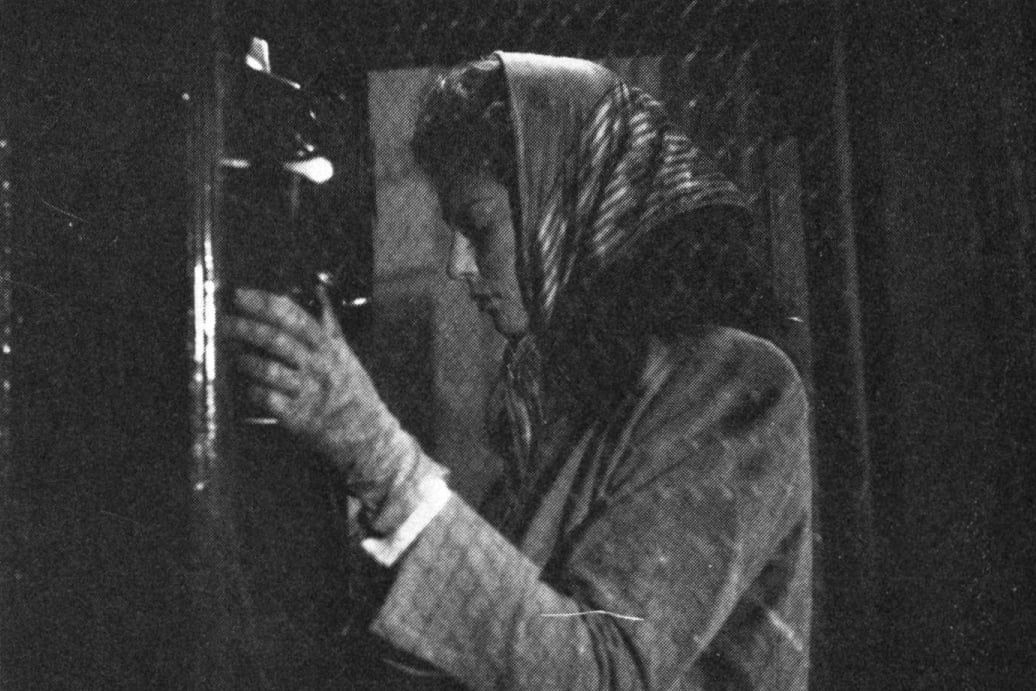
The scene begins wide as Rachel Ward comes around the corner and continues to camera left as she goes to a medium shot in a phone booth, camera dollying and booming with her. There is an brute arc high to camera right. A large unit was placed inside the window to her left (note shadow pattern on the sidewalk in the foreground). Other than that, Chapman just used a kind of overall fill. The scene was shot in special-effects rain.
Grain and Contrast
There are two black-and-white film stocks available in the Kodak line: Plus-X and Double-X. Chapman had photographed Raging Bull on Double-X, but decided to use Plus-X for Dead Men. ‘‘Plus-X was closer to the old stock. It was slower and had finer grain, which was going to be helpful since we knew that we were going to do a lot of futzing around with it afterward, and it had a softer contrast than Double-X. It just seemed to fit with the older stocks.”
When matching new footage to the old clips to be cut in, Chapman was faced with two problems: ‘‘One was to make what I shot match the old stuff within a given scene. And then there was the separate problem, which was to make it all fit together, so that it looked like one movie. And they are different problems. I think that in matching from cut to cut inside the scenes I did pretty well. In making it look like one movie all the way through, I don’t think we did all that well. We did the best we could.”
The problem, was that, typically, anything close to original negative for the old footage he had to match wasn’t available. ‘‘Some of the old clips were from original negative, a few were; the ones, obviously that looked the best. Some were from God knows how many dupes, some were from positive prints, from which negatives had to be made. I’m not sure that some of them may have been from 16mm and then blown up. There is no rational system for where all those old negatives are. Many of them are destroyed. So, there was no one kind of [negative] material to deal with, which is why the matching is of varying degrees of success, frankly. I was just sometimes lost. I would have had to degrade the modern stuff so unbearably to make it match the very best quality that we could get from the negative we had, that it seemed silly. I had to sort of swallow my pride a little bit, in some cases. I didn’t know that, frankly, when I started. We didn’t know. We kept thinking, well, maybe we’ll find a better print somewhere, maybe we’ll finally find the original negative somewhere, and they kept scrounging and hunting and occasionally, I think, we did find, at least, better prints or a better bit of dupe negative to go from. So, we never knew, until we were actually shooting, how bad it would be.
‘‘We did degrade our original footage to varying degrees. If you noticed, there were some places where it didn’t quite match and then there will be the beginning of a dissolve, which means one more generation, and that one more generation suddenly makes it match perfectly.”
‘‘If you noticed, the intercuts at the end are all from a movie called The Bribe and that was one of the very best matches in the film because that was from original negative. I don’t think you can tell where it is intercut, in that case. I wish I could say it was all my magic. It isn’t. It’s just that it was an original negative to print from."
In Dead Men in all the old clips, to a varying degree, there is much higher contrast and a concurrent loss of detail in the shadows and highlight areas, obviously due to generational degradation. Chapman discussed the possibility that he might have been better off if he’d used Double-X. It would have given him more contrast and grain from the start and would have more easily matched some of the old clips. But then, it would not have matched as well for sequences where the original negative was available. Chapman said he had tested both stocks. It comes down to the fact that he was in an inconsistent situation and he did not want to degenerate to the lowest common denominator.
‘‘You know,” he went on, ‘‘I am no technician. Never pretended to be. I did Dead Men entirely by guess and what looked right and just fiddling, which is all I’ve ever been able to do. I’ve no background in chemistry, or in film, for that matter. I never was a still photographer. I couldn’t develop a roll of black-and-white film. I know you go like that,” he said, grinning and agitating an imaginary developing tank, ‘‘and then you hit it to get the bubbles out and that’s literally what I know. I’m not saying I didn’t have an image in my head of what I wanted it to look like, but that had nothing to do with technology. I wish desperately that I were much more technologically adept. I know that I could do a lot better if I were. Thank God there are labs and people that know how to do that stuff. I really do wish I knew much more chemistry, because I know if I did there are a lot of things I would dare to try that I don’t because I don’t know enough. Anyway, on Dead Men Don't Wear Plaid, I really didn’t have any great technological secret about how to do it. There was no way to make an overall scheme.”
Click here for more archival stories from American Cinematographer.