Vampires Next Door for Fright Night
“Following the large-scale productions of Ghostbusters and 2010, this seemed like the perfect project for us,” says Richard Edlund, ASC.
This article was originally published in AC Dec. 1985. Some images are additional or alternate.
In Fright Night, vampires and various other kinds of undead are alive and well and living in the small town of Rancho Corvallis. For young Charley Brewster, a teenage fan of horror films, this fact results in a number of restless nights and several bloodcurdling battles when he tries to rid his neighborhood of these unwanted beasts. Accomplishing such a task is not easy, and Charley (William Ragsdale) soon finds himself in a life-and-death struggle to save his family, his friends and his first love.
Before such creatures of the night could haunt Charley’s hometown, however, they first had to be created by writer and first-time feature director Tom Holland (the screenwriter of Psycho II and Cloak & Dagger). Then, to bring his visions to life, Holland sought out the aid of Richard Edlund’s Boss Film Studios and the Entertainment Effects Group, a move that he says helped give his relatively low-budget film ($9.5 million) a big-budget look.
“Following the large-scale productions of Ghostbusters and 2010,” Edlund says, “this seemed like the perfect project for us. We had our creature shop all set up and, although there were projects in negotiations, we didn’t have any other work at the time. Also, it afforded us the opportunity to show we could do a small project. As opposed to doing a $5 to $8 million budget, we were dealing with somewhat less than $1 million, so it was a good chance to show our flexibility.”
To help him do so, Edlund enlisted the aid of visual-effects art director John Bruno to help design the shots, and supervisors from the various departments of EEG. While Fright Night would only involve about 50 effects shots (as opposed to the 193 in Ghostbusters), the film called for a variety of different techniques from matte paintings and animation to elaborate monsters created by the creature shop.
Fright Night opens with an graceful camera-oriented shot that involved still photographs, matte paintings and a moving live action plate. As Neil Krepela, the matte department supervisor, explains, “The film begins on a shot of the moon. The director wanted a little bit of red tinge in the clouds floating by the moon. We hold on that for a moment and we hear a wolf howl. Then we tilt down from that into black. Through the black we come down onto a nighttime view of a small town and, as we tilt down, we pick up a pan and move across this painting into a live action crane shot. The transition is smooth, and we continue moving across a street, past the vampire’s house and into the driveway of Charley’s house next door. We then move up to Charley’s second-story bedroom window and onto a TV set inside on which is playing a tacky vampire film.
“The moon was actually a real high-resolution photograph from the Lick Observatory, which I shot with a little diffusion and a foreground painting of clouds,” Krepela continues. “We panned by this and then tilted down into black. Then we rewound the film in the camera, started in black at the top of a matte painting of the town, and then continued the tilt down onto the town. Across the bottom corner, we added the moving silhouette of a tree that was actually shot blowing in the breeze in a vacant lot next door to our stages. I shot the tree on hi-con film as an additional element and added the same move I would make on the town painting except that I moved the camera a little bit off nodal. I then bi-packed the silhouette of the tree in the camera when I did the final composite so that, as we tilted down onto the town and then started panning across, the tree added more perspective. As we panned across more, we also added a painted tree to create more depth in the overall painting.”
As the shot continues, the camera moves across the painting and onto a rear-projected plate of the exterior of the hero’s house. Krepela shot this background plate on the Disney backlot where exteriors of Charley’s neighborhood were filmed. Using a Titan crane, the camera smoothly tracked up into the window of Charley’s room where the vampire film was playing on the TV set. This film was actually a videotape that was synced up during the shot to play at the proper speed. In the sequence, the soundtrack of this video movie is heard over the entire shot, beginning with the wolf howl at the start, and then proceeding through various dialogue exchanges. In addition to this opening sequence, the film also features a second matte painting of a daytime view of the town. Both views were painted by Matthew Yuricich and his assistant, Michelle Moen.
Fright Night involved the work of all the various departments but, as Edlund notes, “the film was in a large part the work of the monster shop, which was headed by Steve Johnson and Randall William Cook.” One of Charley’s encounters with Jerry the vampire (Chris Sarandon) involved a wounding trick. In the scene, the creature of the night holds the boy in a deadly throat grip until Charley desperately impales the vampire’s hand with a very sharp pencil. Jerry immediately shrieks with pain, then observes his hand to find the pencil impaled completely through. In reality, the pencil was part of a foam latex appliance designed by Johnson that the actor wore on the palm of his hand. The appliance went all the way around his hand so that the eraser end of the pencil could be seen sticking out of the top, and the point could be seen sticking out of his palm.
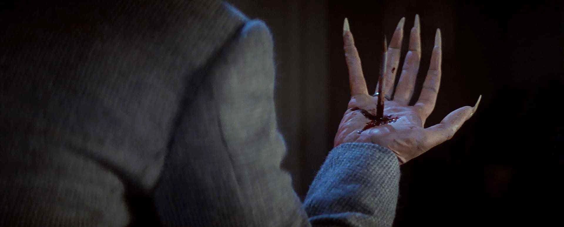
In the sequence, a shot was designed so that Sarandon could turn his hand over and reveal the pencil sticking out of both sides, reinforcing the reality of the effect. Then, grabbing the point end of the pencil (actually a telescoping pencil) he appears to pull it out. In reality, the telescoping pencil grew about three inches as he was pulling on it while, at the same time, the eraser end on the other side of his hand was pulled off by a hidden wire so that when he turned his hand back over, all that remained was an empty, smoking hole.
As Johnson notes, “I got the idea from a fantasy sequence in Excalibur when Lancelot pulls the sword out and he kind of rolls to one side and yanks the tip off. When I originally saw the film, that scene just floored me. I couldn’t believe it. I rented the tape and watched it 20 times before I realized what they had done. I was so impressed with it that I decided to try it myself.”
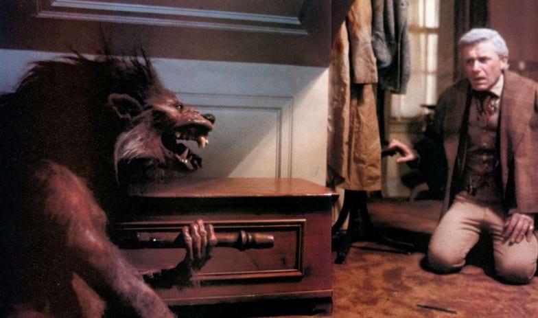
Another major effects sequence in Fright Night involves a wolf-into-man transformation that occurs when Roddy McDowall (as horror-movie star Peter Vincent) drives a stake through the heart of Evil Ed (Stephen Geoffreys). Ed is one of Charley’s friends who gets bitten by the vampire and becomes one himself. In the transformation scene, Ed pursues Peter Vincent in the form of a wolf, only to encounter his own death when the creature is impaled with the stake. As the sequence evolves, the dying wolf pulls itself under a stairwell and slowly makes the painful transition back to its human form as Ed.
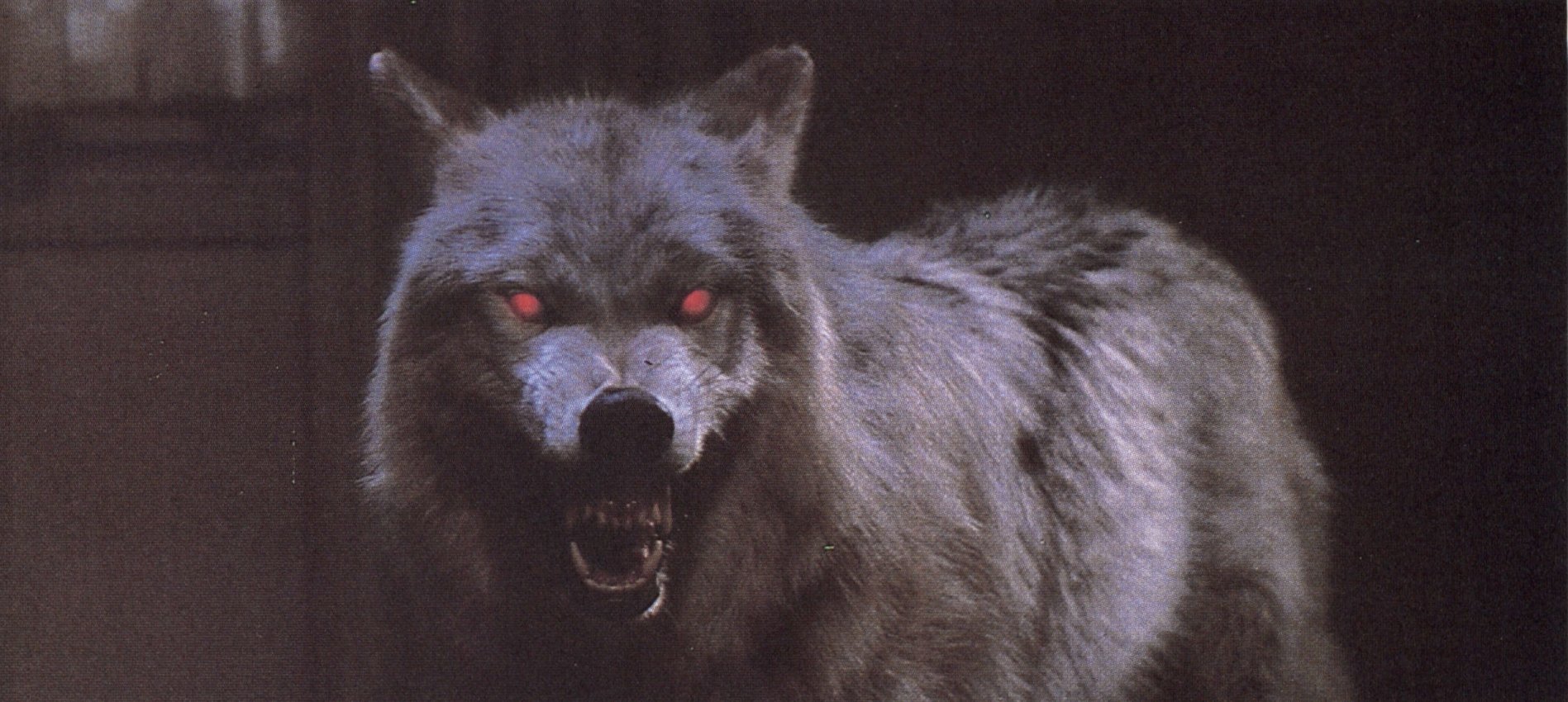
In recent years, similar transformation sequences have been feature attractions in such movies as An American Werewolf in London and The Howling. This notion of the effects as “star” was one Edlund was not eager to repeat in Fright Night.
“My feeling about transformation shots is that they just stop a movie dead,” he explains. “Ever since the original Wolfman [makeup and] series of dissolves, they have in one sense said to the audience, ‘Ok, no matter what action was going on, now we’re going to watch this special effect.’ The result is that everybody’s magnifying glasses are out looking at it. Inevitably, there are problems with that. But I think the wolf sequence for Fright Night is well incorporated into the action. It turned out to be really excellent, and that was really Steve Johnson’s ball of wax.”
From the start, the Fright Night transformation had the novelty of being different from those that have been done before because, instead of men turning into wolves as seen in American Werewolf and The Howling, Evil Ed transforms from a wolf back into a man. To make the sequence even more interesting, Johnson, who assisted special makeup designer Rick Baker on American Werewolf, suggested a new stylistic way to show the body parts of the wolf changing.
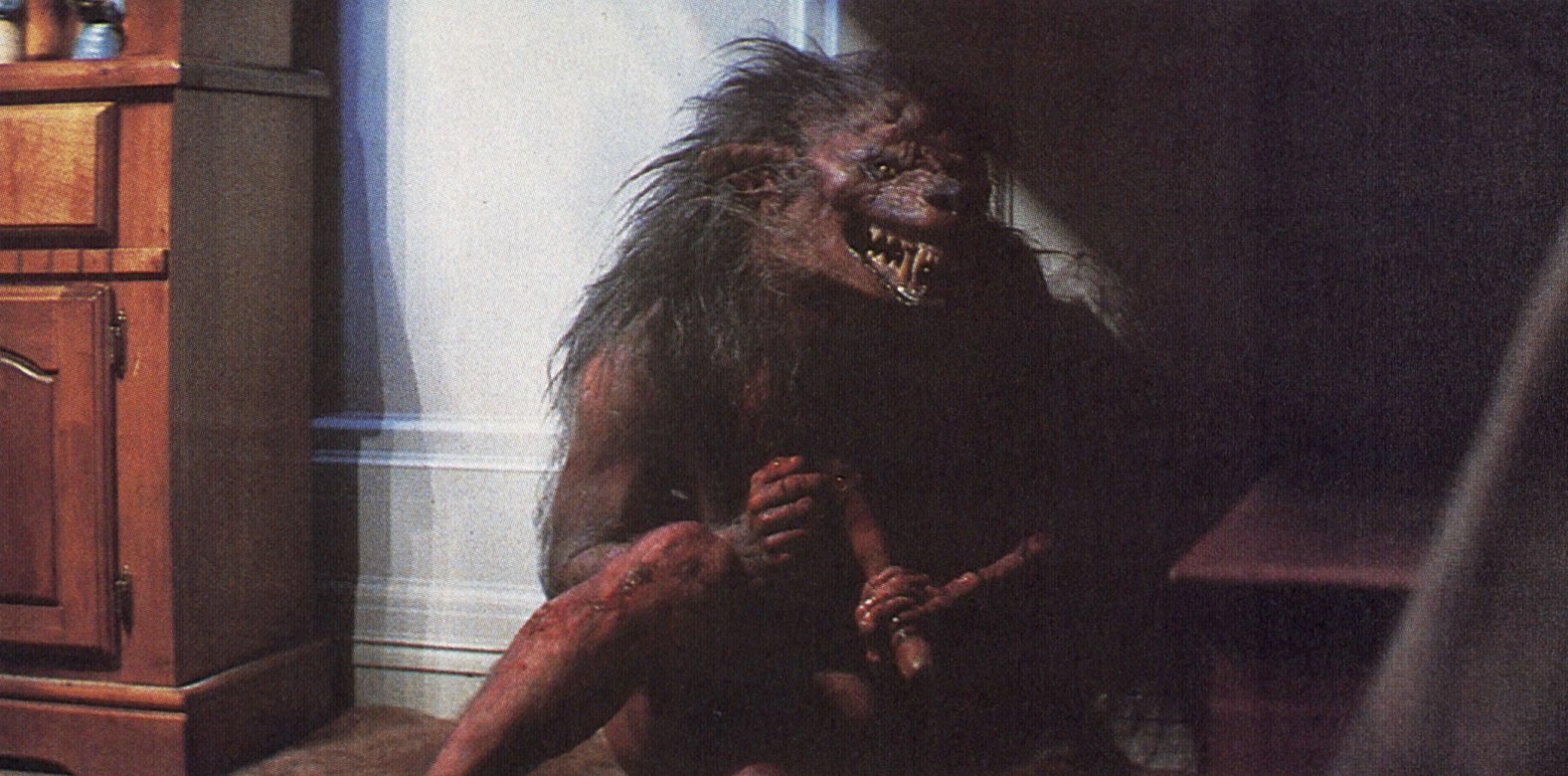
“Ever since American Werewolf, I have been interested in trying something different from the typical transformation heads that just stretch out symmetrically,” he recalls. “So I approached Tom Holland with the idea of an asymmetrical transformation where the body parts did not change evenly or at the same rates of speed. Besides the fact that I thought it would be more naturalistic and something that hadn’t been seen before, Tom was really going for empathy for the character. He wasn’t supposed to be a snarling slobbering monster that people would not feel sorry for. So it kind of works along the principle Charles Laughton or any of the actors playing the Hunchback of Notre Dame followed — that is, if he’s deformed and whimpering, you’re going to feel a lot more sorry for him.
“We also figured that since he was changing asymmetrically in form, why would he necessarily be changing the same way. So we did the insert shots with different techniques. For instance, in one shot, we did something like a meltable reverse effect. We did a closeup of a hand that we made out of rubber, removable, pull-away tendons and bones and muscles layers, and a meltable gelatin skin on the outside. We melted this outer skin and, as it started getting soupy, we pulled everything away and underneath we had a wolf paw. Then we reversed the film so that it started out as a paw which then suddenly grows all the anatomically correct parts of a boy’s hand.”
To bring these various body parts to life, Johnson used many of the techniques established by Baker, including mechanically-operated, foam-rubber puppet rigs. In addition, actor Stephen Geoffreys found himself wearing a variety of elaborate foam-rubber appliances and, when he was fully made up, he had to sit through 17 hours of application work before he could go before the cameras.
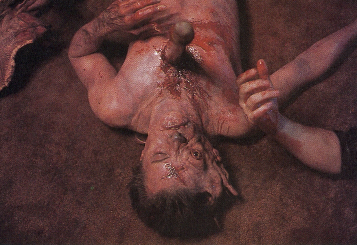
“We kept changing things around for the audience when we filmed the sequence,” Johnson adds. “One time, the actor’s real legs were out, while another time they were through the floor and replaced by monstrous legs. One time, the creature has normal legs and one time it has weird ones. Stephen always had one of his own arms behind him out of camera range, so a rod-puppeted thin, weird one could be seen. Stephen also had his head bent down so a mask could be attached to the top of it to give him a long, skinny dog neck. In the scene, the character’s body is really distorted and deformed. He looked sickly, so I think people will feel sorry for him.”
Besides the asymmetrical aspects of the transformation, Edlund suggested a lighting approach that also greatly altered the look of the sequence. During the battle between Vincent and the wolf, the creature is impaled, crashes over a balcony, hits a chandelier and then falls to the floor below. By hitting the chandelier, which was the principal light source in the scene, the wolf causes it to start swinging back and forth. As a result, some of the transformation that follows is in shadow and some in light, enabling Johnson and his crew to further enhance the bizarreness of the scene.
“We had Stephen wear one foam rubber mask that was wolf-like on one side and like a sick, little boy on the other,” Johnson explains. “He was rolling around on the floor and, since he was turning from a wolf to a boy, we filmed him with the human side pressed against the floor so that it was all in shadow. All you could see was this really weird, distorted wolf face. Then, when the chandelier swung over in a couple of frames of darkness, he swung his head back so that suddenly you could see the boy’s side. This proved to be a nice little camera trick made possible by the swinging of the light.”
“Having the chandelier swing really improved the sequence 1,000 percent,” adds visual effects cinematographer Bill Neil. “If that light had not been swinging and the figure not going in and out of shadow, we could not have held on certain shots as long and it would not have played nearly as well. The fact that you were seeing just brief glimpses of that material made it work out well.”
The scene occurs in Charley’s house and, to accommodate the filming of the effects, the stairway section of the set built on a sound stage at The Burbank Studios was chain-sawed off and brought to EEG. “We also used the same light source that the first unit established,” Neil notes. “Jan Kiesser shot the material of Roddy McDowall over the boy’s shoulder on the set. And then we pulled the stairway and part of the wall here to our facility and shot the Roddy McDowall point of view. Jan actually shot them with all of our technicians. It was sort of a post-production shooting with a minimal crew. Jan was lighting, so the framing and so forth was all his.
“I think it is very important that in effects work, the framing and composition not change radically from the first-unit footage, so I always encourage the director of photography and the production camera operator to participate in the framing and composition of our work. Part of my challenge in doing effects photography is to be able to analyze what the DP has done with their lighting and filmic approach so that our material integrates with his as smoothly as possible,” Neil says.
The elaborate effects themselves created some problems for Neil because while the swinging chandelier helped add to the mood of the scene, it also added to the complexity of the shots. “The close-up material, we were shooting at radically different speeds,” he notes. “For instance, the hand transformation from the paw to the boy’s hand was shot I think at one frame a second, so the swing of the light source and the passing of the shadow had to be timed appropriately. We figured out roughly what it should be and Randy Cook, who is among the best stop-motion animators, worked the chandelier and the shot worked out quite well with his timing and timing scale.”
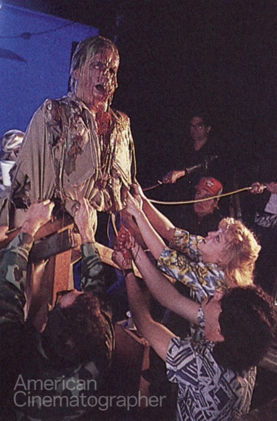
Once Evil Ed has been killed, Peter Vincent goes next door to Jerry’s house to help Charley do battle with the vampire and his soulless assistant, Billy Cole (played by Jonathan Stark). Nicknamed “Billy Bones” by the effects crew, he deteriorates in front of our eyes after Charley impales him with a stake through the heart. In the scene, Billy looks on with horror as he raises his hands up and sees them melt away. Then, in a closeup, we see his head melt down to its skull.
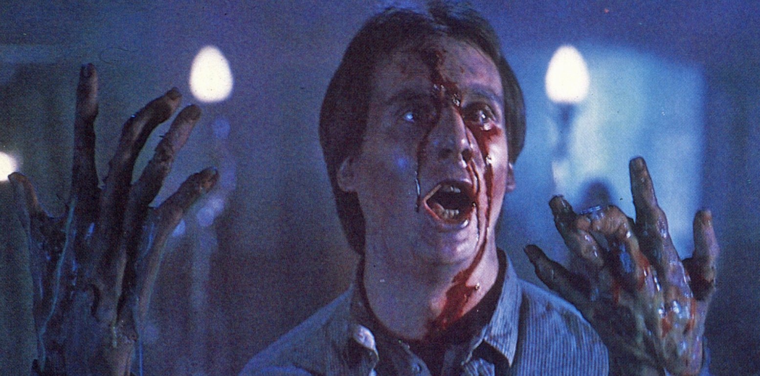
To create the effect of Billy’s messy demise, Johnson and Rob Cantrell took different approaches with each of his hands. For one, “we took assistant Teresa Burkett and made her palm up to look like the back of Billy’s hand,” Johnson recalls. “We built an understructure of hard rubber that looked like muscles and bones, and then put a soft, foam rubber on the outside of that with wire pulls all over it. It was pre-torn, so that when we started pulling all of the outer flesh off, you would see the bones and muscles below. Then, as that happened, we pumped ooze out [colored methylcellulose, a food thickener] and then Teresa started closing her hand. Since the front of her hand was made to look like the back of Billy’s, it looked like the hand was just peeling backwards and all the bones were melting.”
For the other hand, a more skeletal approach was taken. First, foam rubber was placed over a boney understructure. Then, tubes placed inside the hand enabled a green oozing material to be pumped through so that the hand would appear to be melting away as the specially rigged foam rubber was peeled off the skeletal fingers by wire pulls.
In a similar fashion, Johnson, Cantrell and Cook used a rubber head for the shot where Billy’s face melts away. “We went in and rigged a rubber head with a gelatin plug,” Cook explains. “We then cut part of the rubber head out and replaced that part with gelatin because Tom wanted a specific area to melt. So, most of the head was made out of a heat-resistant substance, while the rest was made out of the gelatin, which would deteriorate. After the under-skull was rigged, Steve and I rigged the gelatin. We then used heat guns to melt away the gelatin while we filmed at 12 frames per second.
“We didn’t want to do a fast, rapid melt like the ones seen in Raiders of the Lost Ark, and we didn’t want it to look waxy,” Cook continues. “So we built in different consistencies of gelatin, and we put in lumps of thicker gelatin that would melt more slowly. We also put in different colors of gelatin so that the guy would turn from a skin color to a horrid green as his face melted away.”
During the filming of the sequence, the hands and the closeup head were filmed against a bluescreen. For the early shots of the actor watching his hands dissolve, Stark was filmed against a blue, smoky background on the set and then the melting hands were composited into the plate. The closeup head was, in turn, matted into a separate plate of the blue smoky background. The task of matting all the various elements together fell upon optical supervisor Mark Vargo and his staff.
“Originally we were only going to do four optical shots for Fright Night," Vargo recalls, “but the number swelled into a pretty decent size task as the film progressed. I think the most challenging sequence was the Billy Bones because the shots had to be composited very carefully. For instance, when his hands melt, they have to appear to be right there next to the actor. Fortunately, they shot the background behind the actor as an out of focus blue smoke far in the background, and that was the guide for the color.”
While the blue background provided a good guide to determine the proper color balance for the various elements composited into the sequence, it also created a little havoc with the matting itself.
“In the sequence, the actor on the set was backlit with blue light which is kind of a conflict when it comes to bluescreen,” Vargo explains. “If you shoot an object against a bluescreen and rim light it with blue light, your matte would fall apart there. As a result, we couldn’t duplicate the set photography the same way, yet we still needed to simulate that blue rim light. So, what Bill Neil did when he filmed the hands and the closeup melting head, was he used a white rim light while artificially biasing the color balance of the key lights with a V2 CTO. This added a degree of warmth similar to an 85 filter to the hands and face itself. As a result the white rim light remained unaffected by this added orange tone, but the elements themselves looked horribly tanned. Then, when I timed out the shot, I pulled the whole scene to the cool side and the skin-tones became less tan for a proper match to the actor, while the white rim light went to blue, matching the rim light on the set. This was a questionable technique which we’d never used before, but it worked.
“Another factor we had to take into account was that Jan shot Billy on the set with smoke and a #2 LC filter, so we had to first diffuse the bluescreen element and then flash it and then throw it slightly out of focus to match the on-set characteristics. So, all in all, the three techniques that we employed were manipulating the color, throwing the elements out of focus, and flashing and diffusing them.”
“The main reason we shot the Billy Bones stuff bluescreen,” Johnson adds, “was as a luxury to us because we did not have the time to finish the thing before the set was struck. So we just shot the plate of the set beforehand and waited until we finished preparing the effects and then shot them against bluescreen. It really made it easier on us, and Mark Vargo did an incredible job. Some of the best bluescreen work I've ever seen. The hands looked like they were right there next to the actor. And, on the melting head, the drips actually rooted from the melting flesh really nicely. You would just swear they were all there.”
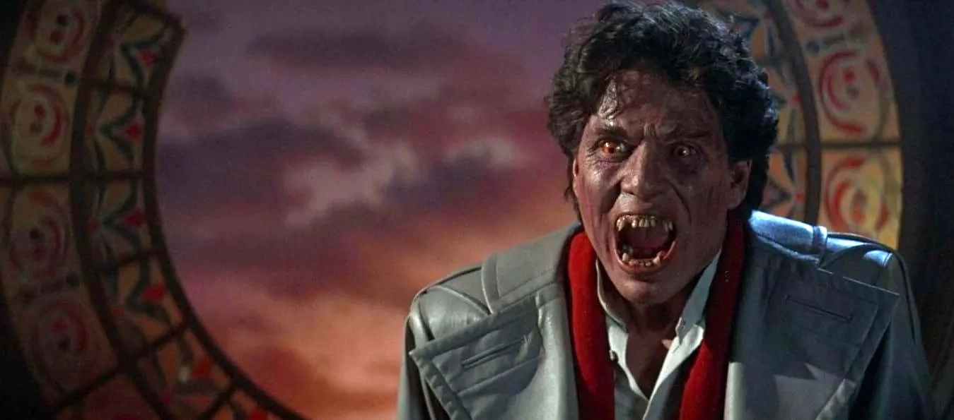
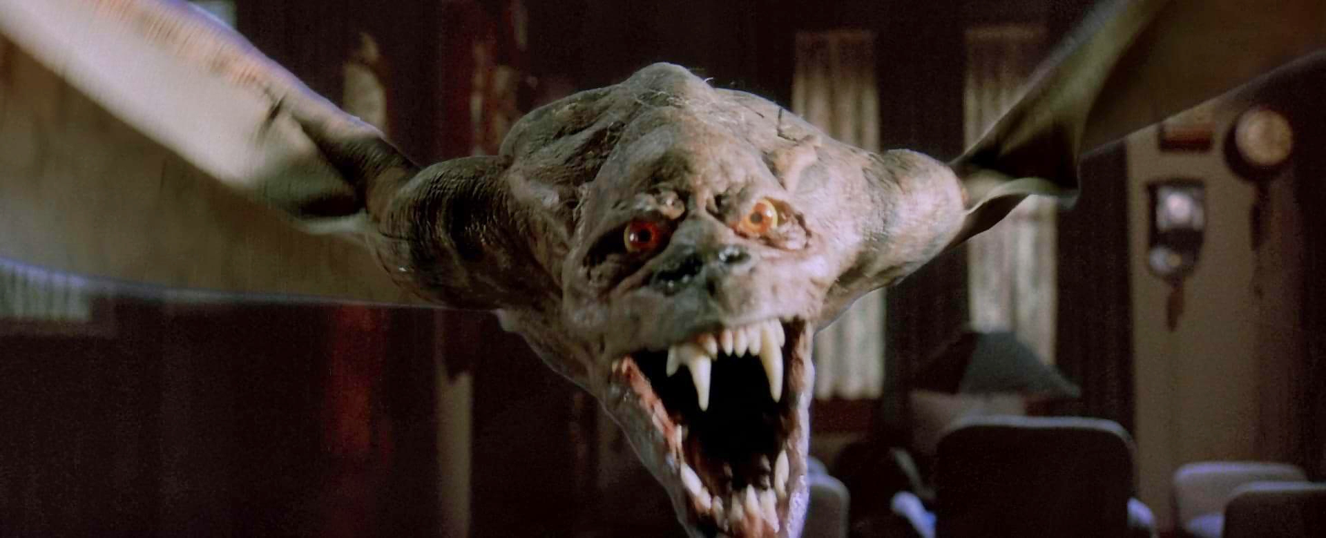
Once Billy is gone, Charley and Vincent fight one last battle with the vampire itself. At one point during the struggle, Jerry is struck by a beam of sunlight and jumps over a banister. Immediately, the camera pans ahead of him and onto his shadow on a background wall, which reveals his shape changing into that of a very large bat. Then, as the shot continues, the camera pan slows down and the bat itself comes back into frame and flies off with lightning speed.
To accomplish this effect, which once again reflected Edlund’s notion that transformations should be integrated into the action of the moment, a stuntman was filmed against a bluescreen as he simulated being thrown off a banister. Then, Neil Krepela shot a 3/4-scale model of the background wall. Once the correct movement and timing of the camera pan on the wall was established, a rough pencil sketch of the animated shadow was drawn by animation department co-supervisor Terry Winded, and a full scale bat was filmed against bluescreen for the tail end of the shot. Then Sean Newton drew the actual shadow animation that connected the beginning of the shot (the stuntman) with the end (the actual bat).
The design for the bat itself was created by Cook, who tried to take a different approach from the squeaking, small bats seen in most vampire films. “I have always objected to the bats in the old movies as being a little bit too mundane,” he says, “so I thought it would be interesting to first keep the creature about the same size as the human vampire. In the script it specified that it was an enormous bat, so I figured, ‘Why not just shift its mass around a little bit while retaining certain characteristics of the actor’s appearance in the face?’ So, we made it basically a fantasy bat.
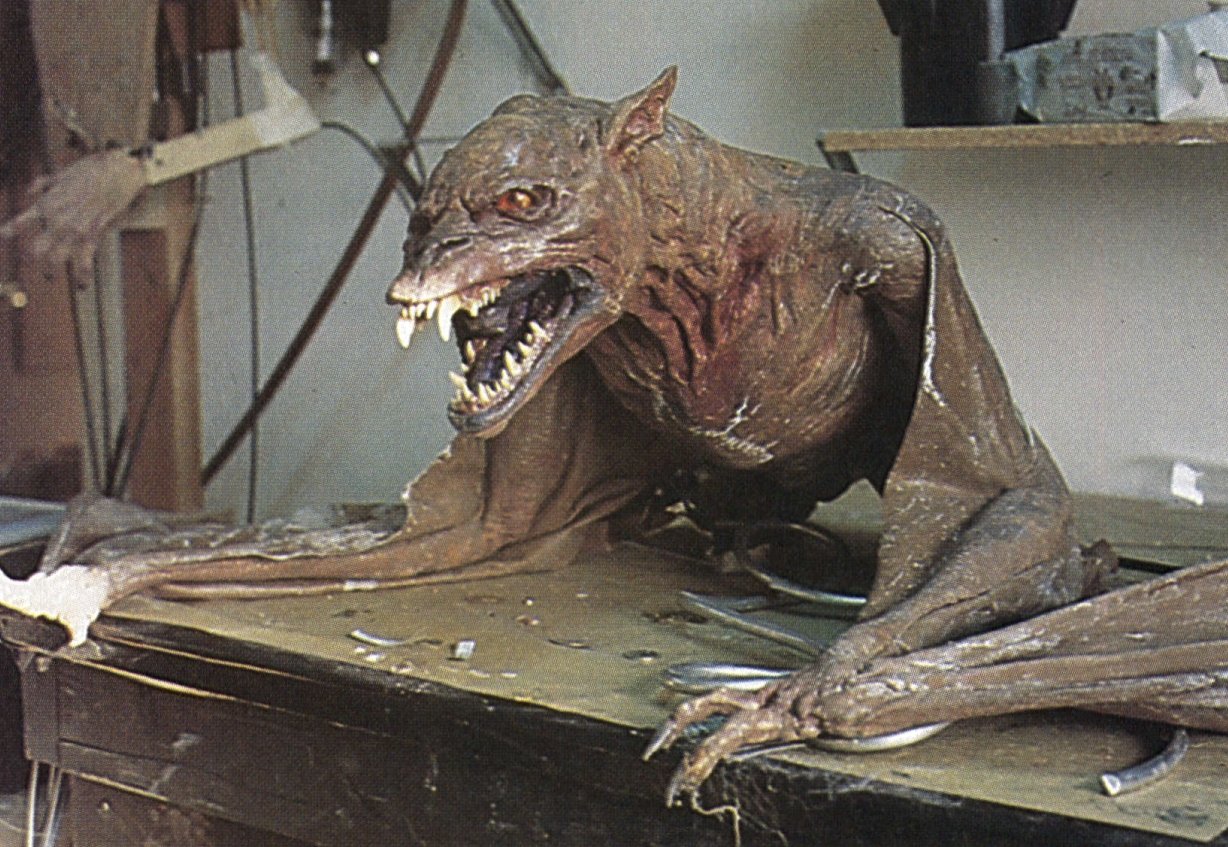
“The problem that arose was that while I wanted to incorporate some of the actor’s look into the face of the bat, we had to sculpt the bat before the part of the lead vampire had even been cast,” Cook continued. “I ended up sculpting the bat hoping that through paint or some other stroke of fortune we would be able to cause the audience to make that association. Fortunately, I was able to design Chris Sarandon’s vampire makeup and work backwards from the bat design, incorporating certain elements of my bat sculpture into my Chris Sarandon vampire sculpture. It was sort of a backwards way to work, but it was the best that we could do under the circumstances.”
The makeup on Sarandon, used to show some transformation on his face when he got angry, was created using foam-rubber pieces, and applied on the set by makeup artist Ken Diaz.
To construct the full-scale bat, Cook first sculpted the complete creature with an 8' wingspan, and then built it out of foam latex and filmed against a bluescreen. Since this full-scale bat was wire operated and posable but featured no internal mechanization, a hand-puppeted version was constructed for closeups of the bat’s face.
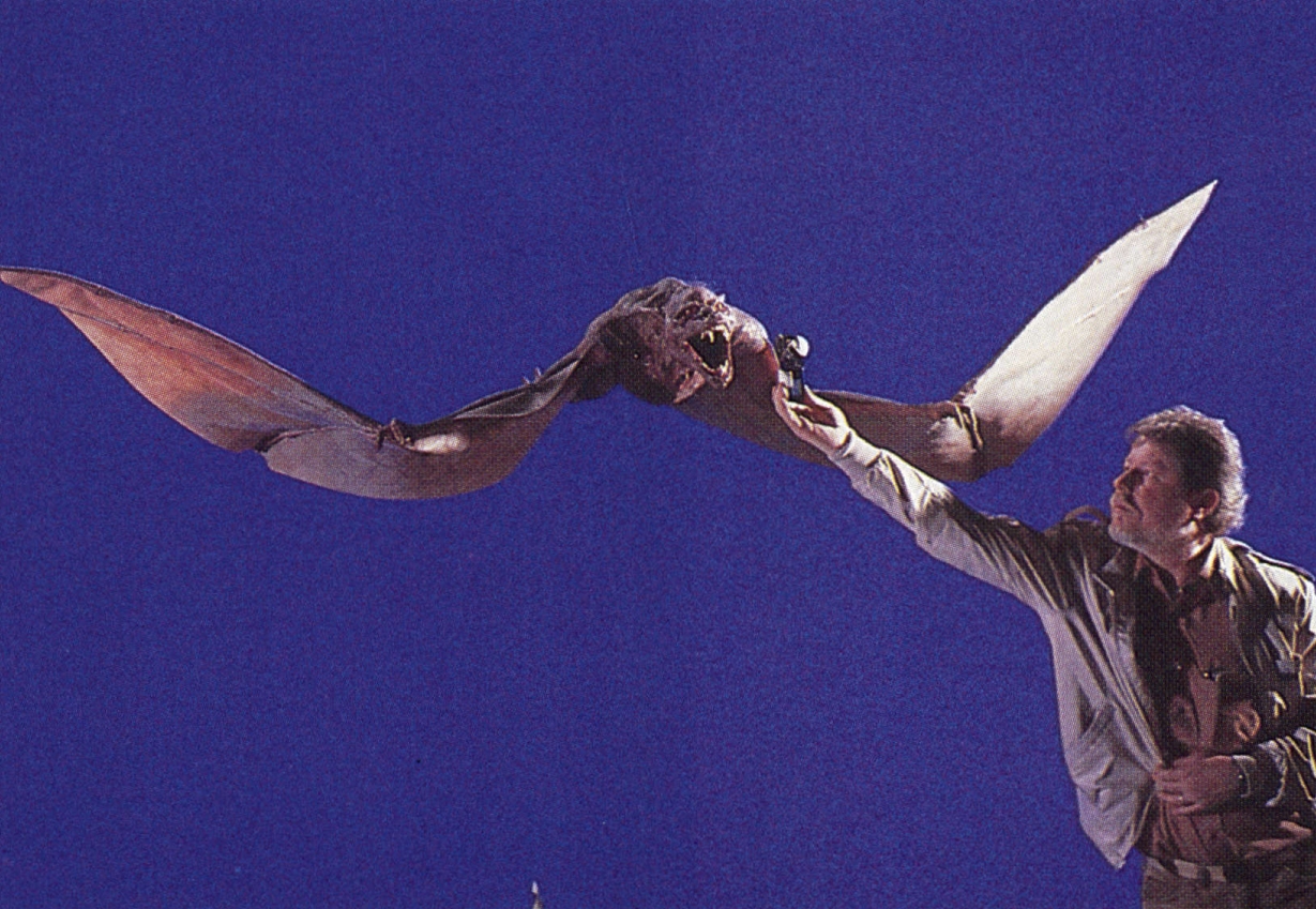
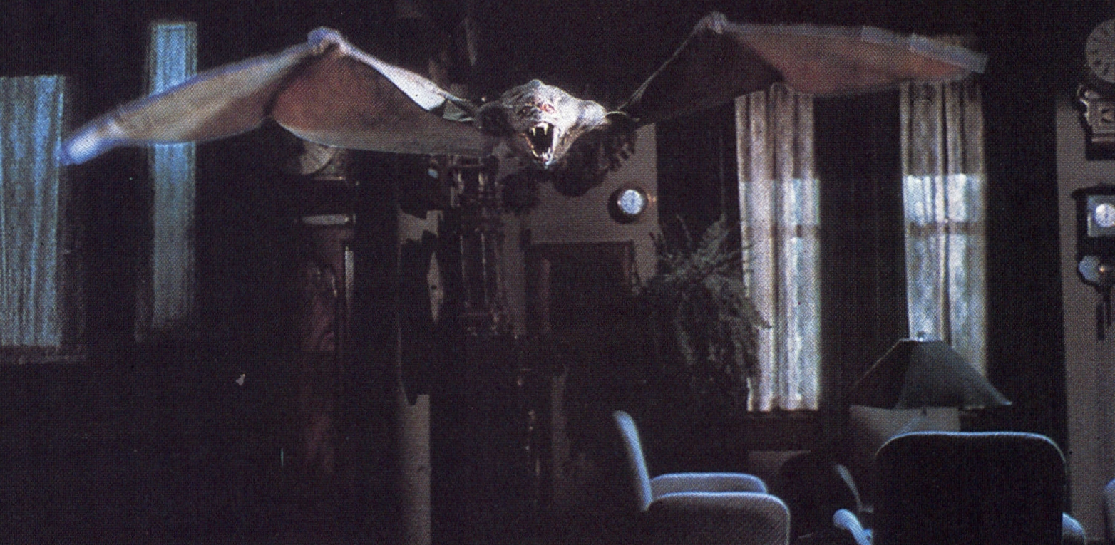
“To take some of the curse off the fact that the full-scale bat was a marionette, we shot it one frame at a time,” Cook notes. “This enabled us to control the movements with a greater degree of accuracy and finesse than would have been possible if we had shot it in real time. We wanted to avoid the old Universal Studios bat-on-a-string effect or what you’ve seen in films like House of Dracula, and if we had shot it in real time it would have been jerky and looked like those rubber bats only bigger and worse because it was bigger. So we shot it very slowly. We made the bat flap in what appeared to be slow motion, and we shot it at about a frame per second. There is one shot where he zips by the camera which we shot a little bit quicker at quarter speed — 6 frames per second — and that worked, too. That latitude from one to six frames per seemed to be the best for our needs.”
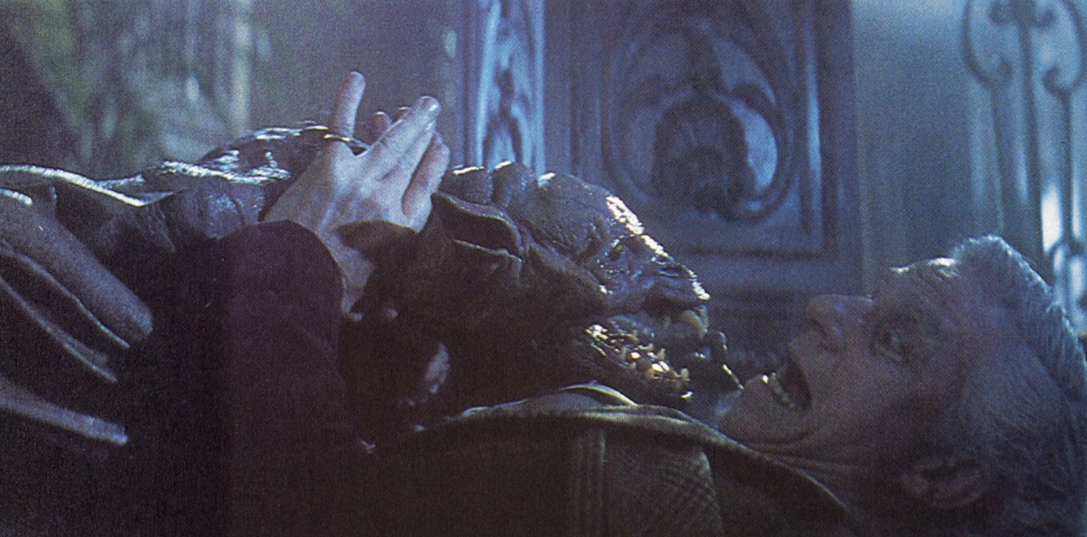
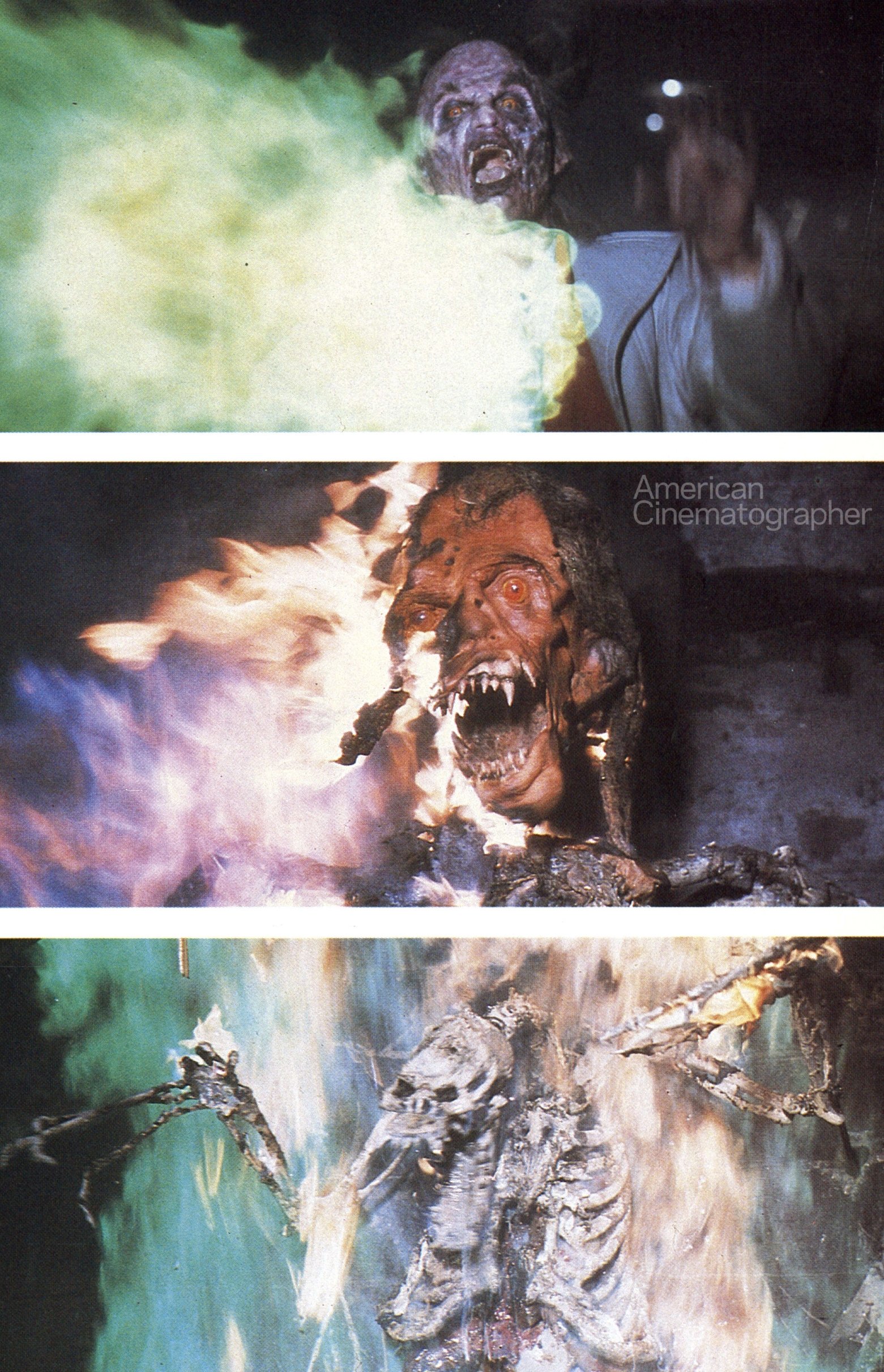
Once Jerry has turned into the bat, he first attacks Peter Vincent and then darts off down to the basement in search of his coffin. Naturally, Charley and Vincent quickly follow. In the final battle scene, Jerry is caught by a beam of light from the rising sun, blown back against a wall in his basement, and incinerated by in a burst of green flame.
“For the beginning of the shot, Thaine Morris built an inverted set and dropped a stuntman so he could really have a lot of impact,” Johnson recalled. “Then we cut to a fully-puppeted dummy we had constructed out of liquid flashpaper. Thaine then rigged a charge in its chest so that it would start burning in the heart and then the whole thing would just flash away. Then we cut to a closeup of his face burning away and the skull coming out. Then we cut back to a fully puppeted demon skeleton that Mark Wilson worked on. It was just really, really nice. We thought it would be real scary and horrific to have Jerry trying to change back into a bat as he was dying so we made this second skeleton real bat-like as if he were trying to change back, but could not complete the transition.
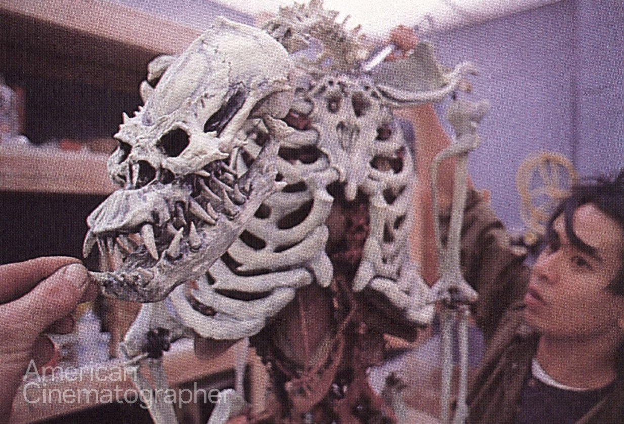
“This final form was made with bondo and acrylics. The chest, the rib cage were changed from a typical human form, and the legs were made shorter while the spinal column was longer. It really looked creepy and we put all kinds of stretching skin on it, and about 10 pumping organs inside that worked until they burned. And Thaine gave me some magnesium tablets and some titanium powder that we mixed into wax and stuck all over it so that when the green flame shot out from below, it set off all of these sparking things. They added a degree of fantasy to it because we got a Disney-like image of green fire from below while the body itself burned orange with all these sparks.”
“They really did excellent work,” Tom Holland notes in retrospect. “Also, I like them very much. I really am fond of those guys because at first they didn’t know me and I didn’t know them. But as we got to know and trust each other, they began to support my vision and to find ways to make it work. They became tremendously supportive and would take what I gave them and improve on it one million percent.”
You’ll find our complete story on the film’s cinematography — by Jan Kiesser, who later became a member of the ASC — here.
